#trying to translate my inking style into digital !
Explore tagged Tumblr posts
Visit Tumblr Blog
Explore Tumblr blogs with no restrictions, modern design and the best experience.
Last Seen Tumblr Blogs


Fun Fact
The average Tumblr user visits about 67 pages every month.
Text

i don’t recommend drawing cowls that aren’t on faces. 0/10 will not try again
#tim drake#red robin#kon and bart are here too but i’m not tagging them#bart (as in bug art)#trying to translate my inking style into digital !#it was fun! i hate drawing tim’s hair always#give him locs i said. it’ll be fun i said.#whatever… i got to draw kon saying hello sailor and giggle about it so#i’m winning in the long run#dc#dc comics#batman
173 notes
·
View notes
Text
Local Man Dying Inside, more at 11
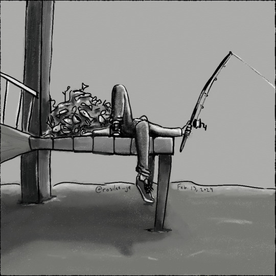
#grian#hermitcraft#hermitcraft 10#hermitcraft fanart#lee speaks#i'm already spotting some mistakes and the anatomy is off but I am far too tired to fix any of it#so this is good enough lol#Trying to see how my usual art style for ink/paper translates to a digital medium
104 notes
·
View notes
Text
Happy Kagepro Day!!!
#kido tsubomi#seto kousuke#kano shuuya#kagerou project#kagepro#choco art#last thursday I was like “oh shit. I don't have anything ready for the fifteenth”#And then rushed to make these#there are a few things I'd like to change or adjust on some of them (like the colors on kido's) but aside from that I'm pretty happy#seto's was the hardest. first I kept trying to daw a bird for the silhouette window thing#but I kept erasing it because I wasn't happy with it#then I was flicking through my screenshots of his song's video and realized "wait. What if the tv him and little him are sitting on is the#ilhouette? Then I kept the birds but put them in a circular pattern in a way reminiscent of how the scissors and knives(?) were around him#in certain shots (btw. does anyone have ANY idea what the gossip he was getting from that bird in his introduction was?)#The background I wish I had done more with but I was drawing a blank on ideas so... the outside of Mary's house it is#kano's - in contrast - was the easiest.#I was like “his silhouette's a cat. the background will definitely be a reference to his song.”#Honestly the masks were the hardest part because it was a little difficult to get good pics of any other than the red-eyed mask#Also something looks off about him to me but I wasn't about to fight the picture so I didn't fiddle with it too much before inking#maybe his face just translates into my style weirdly#not much to say about Kido. Except I really wish I did the equalizer bars differently and will definitely be changing that if I ever get ar#und to making these digitally. Also#I'd alter the shades of colors I chose for the music staffs but that bugs me a lot less than those fri#cking equalizer bars#did I really just go on a whole ass rant about my decisions in these drawings?#I guess I did. Whoops?
33 notes
·
View notes
Text
Another much overdue ask compilation! Some short-ish lore asks (Gale, Gort, DU drow relationships and pet-companion preferences) and a couple of art/advice ones sprinkled in. THIS IS BY NO MEANS ALL OF MY ASKS so as usual I appreciate everyone's patience!
I actually think he'd give them a pass entirely as soon as he noticed. Correct me if I'm mistaken but half-drow get No love from underdark drow and are usually surface babies right? So that fruit is miles away from the tree lol. I think he generally has a bit of a soft spot for mixed kinds since he himself feels like an amalgamation of sorts.
Thank you! They're kind of a pain in the ass to draw at times for that very reason but man I do like the look 😩if other people like it too then that makes it all worth it!
THAT'S TRICKY TO ANSWER BECAUSE OFTEN TIMES I'M NOT... REALLY TRYING. I've draw a ton of horror comics for mine and my partner's series' SAD SACK and SORTIE, so I think it just comes naturally to me 😅 also I do genuinely find expressive and, uh, rugged faces more attractive? (I think they look rugged, again that's what people tell me at least.)
I think the secret might be adding bits of realism in there. I get a lot of comments about the wrinkles and eyelashes I add to my art, as well as the way I draw individual teeth (though I've lately been making an effort to simplify my style in favor of drawing faster, so I haven't done that as much or in as much detail.)
Both symmetry and the lack of it can also add to that effect. I have employed both facial unevenness and almost point-perfect symmetry to achieve something a little frightening or otherworldly in my work. [MORE UNDER THE CUT]
Thank you so much!!! The contrast is very much intentional, that's what DU drow's character is all about ;)
Hahah well I somewhat doubt Bhaal would care that his spawn gets named, but either way he stripped himself of his name as soon as he killed his foster parents and abandoned the Underdark. He had a drow name that I jotted down somewhere but it's completely irrelevant because nobody has used it since he was a child, and he doesn't remember it (even pre-tadpole/having his brain scrambled.) Here's a little write up about his origins that might shed some more light on that: https://meanbossart.tumblr.com/post/739688837431836672/did-drow-ever-have-a-childhood-before-the-temple
And about his original drow-given name and the reason behind it: https://meanbossart.tumblr.com/post/741350986692591616/drow-had-to-have-been-given-a-name-by-his-adoptive
Everyone just referred to him as his supposed race, or as Bhaalspawn or Bhaal's child, and any other similar titles. Orin called him "kin" and "brother" and Gortash likely called him his associate. Post-tadpole the camp grows entirely used to calling him "the drow" and he has no desire to change that or to choose a proper name.
THANK YOU BOTH SO MUCH😭 no reason to be intimidated, I'm just some rando drawing BG3 fan art LOL I've been drawing since I was a child, and started taking it semi-seriously when I was 16 years old, so twelve years ago! That's around the time where I got my first non-display tabled and used that well into my twenties, prior to that I only did stuff on paper and liked to do inks color with pencils. I never really ventured into traditional painting at all except for a little bit of water-coloring in college.
Traditional and Digital art are very much different beasts. Which one you want to start with is, in my opinion, just dependent on what you want to do. Digital art gives you a lot of tools that makes learning easier, but you might find yourself having much steeper of a learning curve if you ever decide to do traditional art instead. If you want to be good at both, you need to practice both, since the skill doesn't entirely translate from one medium to the other.
Naturally you will be able to draw well on either, it's just... Different. I will say though, that I think if you're still learning you should use whatever allows you to look directly at what your hand is doing, so either traditional or display tablet/Ipad. I have no idea what a non-display tablet would do to a beginner, but remembering my experience with it I feel like it might be a huge detriment to developing the skill (feel free to share your experiences in the replies if you disagree, as I would definitely be curious to read them!)

YOU KNOW ME BABY IT WAS MESSY AND COMPLICATED the tldr.: is that they were "buddies", absolutely no romance intended there on either mine or DU drow's part, but due to his nature the friendship was extremely weird.
Here's a couple of replies where I go into more detail about it: https://meanbossart.tumblr.com/post/739191190871818240/i-dont-have-a-particular-question-in-mind-sorry
https://meanbossart.tumblr.com/post/744952815768764416/so-not-sure-if-youve-covered-this-but-i-thought
That's definitely reserved for the vamp LOL DU drow very much enjoys when Astarion teases and fusses over him, and while Astarion probably got a kick out of acting that way around such a big and scary looking guy at first, I think by "now" (later and post-game) he's pretty much immune to DU drow's looks and just enjoys doing it in earnest.
He's not at all averse to being touched (even rather intimately) by close friends, but he wouldn't be quite THAT vulnerable with anyone else.
HE REALLY DISLIKED GALE... He irked him out by seemingly fostering a rather persistent romantic interest in him for at least half the time they spent together (very much based on my interpretation of their in-game interactions at the time, though my Gale might have been a little bugged.)
But also they had a... Fairly in depth relationship still? Gale was a staple in my party, and even though I antagonized him constantly by the end of the game it still felt like they had so much weight in each other's lives, if that makes sense. I might need to do a bit of an "update" on the DU Drow/Gale lore sometime, I feel like I've had some thoughts since that warrant more exploration of their dynamic (you can find a lot of old asks about it if you just search the Gale Dekarios tag in my blog though).
The gist of it is that DU drow found him arrogant and duplicitous, his constant optimist irritated him to no end and felt like it veiled a stream of self-pity (two things DU drow despises) Gale's attempts to get through to him only added insult to injury. By the end of the game he decided to pursue the crown of Karsus and this only lost him even more respect in Drow's eyes, seeing as he doesn't value godly power at all.
I was pretty overwhelmed by the game at the start so I actually missed a lot LOL including Scratch. I did get the owlbear cub though, which DU drow gladly welcomed into camp since it was injured - but I think he would have wished for it to remain a wild animal and to return back to it's home after it had grown up a bit. He didn't really make a "pet" out of it more than he just looked after the little guy in the way it's mother might have, probably with Shadowheart's help.
He wouldn't be opposed to proper pets though if one were to stumble into his life. He'd definitely be more of a cat guy because of their independence and strong little attitudes.
It is very hard to build proper rapport with him. He will be "friendly" to most people who have a good sense of humor about them, but friendSHIP is another thing entirely.
I think it's kind of circumstantial. He's very economical in his relationships and doesn't really seek them out at all - so a situation where he's forced to be in someone's company might be the only way to develop a bond with him, as he doesn't appreciate insistence either and that's more likely to push him away. He doesn't value status or titles either (kind of looks down on them really) so that won't help.
I think he just likes people who are true to themselves and their nature, sometimes even if the nature is one he disagrees with at it's core. This is why he liked Gortash, why he and Shadowheart got along so well, and why him and Astarion fit together so seamlessly despite seeming so different. Likewise I think it's why he didn't jive with people like Gale or Wyll, because they seemed to be rather... Dishonest with themselves and their own end-goals.
161 notes
·
View notes
Note
Hi! I'm a Gobelins GAPY student who got in recently and I absolutely love your work! I only recently discovered it because of having to install tumblr for my portfolio. I am already working on making a portfolio to get into the Bachelors Animation Course however, there is very little information regarding what Gobelins actually wants to get into that course. I was wondering if I could perhaps see your portfolio which got you into the Bachelors Course and maybe some specific advice if that's not too much to ask? I hope you have a wonderful day and great shuake energy! ^^ ✨️💪
Hey there!! Congratulations on getting into the GAPY program! I'd be happy to give you any information I have regarding the bachelor's application process. There is indeed little information regarding what the school wants, and honestly, I think there are no "set requirements" as this will change with each year and who is in the jury. Unfortunately, I cannot share my portfolio, as this current Tumblr blog was originally my portfolio, and now turned personal art blog. So all of my portfolio pieces have since been removed/ archived...
Nevertheless, I can give some general suggestions when applying:
When doing work for your portfolio, I would highly recommend having plenty of observational work. That includes life drawing from models if you are able to have access to that! Avoid drawing from photos or videos if you can; drawing from real life trains your artistic sensibilities and eye much better than a picture could.
Personal projects are really good to include, especially if you can develop a story and concept around that. Show off some line-ups and the environments they live in. If there are specific creatures or animals or buildings/ props in this world, include those. Make style frames of what the "final movie" would look like, or make some boards or even a script! The school really enjoys seeing people who are interested in telling stories (since that is what animation is all about!) Invest research into a project that requires specific knowledge around a topic, and then translate that into your story accordingly. For example, if your story is set in 1800s England about a ship captain; it would be in your story's best interest to understand how boats of the time looked/ country specific boats/ the amount of people needed to operate boats of different sizes/ the attire of the time and how it applies to different classes/ etc etc. The point is, you are the creator of your project, and you set the rules/ tone of said story. Not every project needs to be in as much detail, but compelling stories give attention to the aspects that push the narrative forward. And maybe I am biased, but I love to see attention being given to field-specific details in media.
I know someone who made a bunch of slice-of-life comics. Someone else explored an animated adaptation concept of a stage play. So show off what kind of artist you are and what fascinates you in being an animator/storyteller. Be curious and open to trying different approaches!
Be sure to include plenty of mixed media work, not just digital art. You want to show that you can work with a variety of tools and find creative solutions for any kind of project! When I applied, I tried using a bunch of different tools like aquarells, charcoals, pastels, acrylics, pixel art, sewing, inks, etc.
I cannot tell you how to draw or what to draw, since every person has a unique experience or upbringing. There is no right or wrong. So allow yourself to try things and show off what kind of stories compel you to create!
If you have any other specific questions, feel free to ask, and I will do my best to get back to you! Hopefully, this can help you or anyone else thinking of applying at least a little! I wish you the best of luck!!
7 notes
·
View notes
Text

Did another scratchboard style piece. I felt more confident with this one. Working with digital is not at all like working with traditional media. This is so much harder, but I'm having fun with it so I'll keep going.
More about the piece under the cut for those interested.
This a roadrunner that often comes to visit my apartment. Where I live we see these cute little guys a lot, and there's one that lives in the bushes across the way. I figured he'd make a good model for this.
The decision to work with some of the types of art I did when I was first starting learning art as a whole was a good one. I'm feeling a lot more confident that I hadn't lost as much skill as I thought and a lot of it is coming back to me really fast.
If any of you are nervous about restarting your craft, I encourage you to just try. It will be nerve-wracking at first, but I recommend starting with a style you are super familiar with even if it's not your favorite.
I have the same advice for those moving from traditional media to digital. They are not even close to the same thing so I say to start with something you'd do with ink or a sepia piece. This'll give you a chance to get a feel for the digital medium as well as help you translate your skills to using a whole different plat form.
#my art#not gaming#wildlife#birds#animals#scratchboard art#digital art#roadrunner#fine art#artists of tumblr#procreate#ipad#apple pencil#black and white art#cross hatching
8 notes
·
View notes
Note
HIIIII we havent talked in a while i feel like.. so i wanna ask, whats ur fav medium to draw with? And what do you use for ur digital art? :-00
HIII yess ngl i missed u a bit :)
as much as i looove drawing digitally (looks more polished, can be edited, can be experimented with) drawing with pen and paper makes me feel at home. that way i mostly do sketches, doodles & tiny comic-esque things during classes. they're not that high quality bc they're mainly done for distraction purposes. but still i really really love just drawing with pencils or ball point pens. + drawing with ink & crayons is also super fun
& for digital art i use procreate on my ipad (i have an apple pen)
i was just thinking about drawing mediums actually! i feel like my sketches & comic style art convey way more character than when i try to render my digital art semi-realistically (what i've been trying to do lately). i never feel like i truly hit the mark with that 'art style'. so i was trying to translate my real sketch style into digital art & will post that tmrw!! :)
how have u been doing? :) 💞💗
4 notes
·
View notes
Text
I just want to clear things up. I’m no longer replying to the (in my opinion) more negative comments in my inbox, simply because I don’t want my blog to turn into a negative space (not saying the comments are negative, I just want to be clear).
For the people that stuck up for me, I just want to thank you. It means a lot to me, it really does.
For the people that gave me criticism, thank you, too. I don’t want sympathy, at all, I guess I just want to be understood. I can hang up a story of how ‘rough’ my life is at this moment, but that doesn’t benefit you in any way shape or form.
It started with that first ‘tip’, which I saw as hate. I guess it came across more rude than it was intended to be, so I apologise for taking it like that. It’s just the fact that someone mentioning I threw my text through a google translate, didn’t give it more thought and that the timeline didn’t make sense, are the things that got to me.
Miscommunication through text isn’t something new, it’s difficult to read through emotions when it’s ink on paper (or in this case, digital).
I quickly want to address though that, even though I understand it’s building criticism, it hurts me - personally. That my writing is bad, or any other things that the message I’m referring to in particular mentioned, that came in harder than it should have.
This is something I do in my free time, it might not always live up to your expectations, and that’s okay. It shouldn’t, because that way I can’t improve. I’m always asking for tips, never got them, though, so I guess this one time was a first, and I took it in as hate. I’m sorry for that.
And to the anon that sent me the last couple of inboxes, I’m sorry I deleted them, it’s been a big misunderstanding from both sides, because I never meant to come across as rude. I just want to write and have fun whilst doing so. I’m experimenting with different writing styles, and I hope you’ll understand that not everything I write has to be perfect. I’m trying to look at my English, improve where I need to, and I’ll definitely look into different styles, because I want you and everyone to enjoy it. That’s my downfall, too. I want to please the people, every one, but everybody’s taste in writing is unique and you can never satisfy everyone.
I hope things have been cleared by now, because I’ve been busy in my mind with this yesterday and today.
I love you all, and again, I’m sorry if things escalated
Love, racinggirl ❤️
4 notes
·
View notes
Note
4, 7, 17 and 21 for the specific artist ask game :)
Thank you for the ask! (The ask game)
4. Fav character/subject that’s a bitch to draw:
Zhou Ying from Tai Sui!! I know he's literally a book character with no specific canon appearance, but I accidentally created a massive challenge for myself in designing/drawing him lmao.
I really like the face I've landed on for drawing Xi Ping from the same novel, and since he's supposed to be beautiful in a sharp, overbearing type of way, I tend to draw him with a thinner face and a very prominent chin and cheekbones. And I think that look suits him! The problem with that is that Zhou Ying is supposed to look a lot like Xi Ping, especially in the lower part of their faces, except, especially early in the novel, he's also notably thinner and frailer. He's also got his sort of spooky, all-knowing placid eyes. Yet he's supposed to be beautiful! How do I take a face that's already 70% chin and cheekbones, make it even bonier to an unhealthy degree, give it unsettling eyes, and yet retain the sense of beauty? I haven't quite figured that out yet lmao.
I also struggle a lot with either emulating Jun Mochizuki's art style or translating her character designs to my own, which I why I rarely draw fanart for VnC despite absolutely adoring the series. I'm trying to get better at that though!
More under the cut because this got long <3
7. A medium of art you don’t work in but appreciate
Two answers here. The most immediate and obvious one is digital art in general, since I work pretty much entirely traditionally. I'm always so impressed by the kinds of lighting and color effects that I see in work by people with access to things like photoshop layer adjustments. I know "digital art" is almost an absurdly broad category, but god there are some very impressive pieces out there done entirely with my good friend the computer.
Also, I adore papercraft/papercut art. Every time I see something really intricate made out of cut paper, my brain just, like, short-circuits in awe. It's so cool!! Speaking of Tai Sui, one of my all time favorite pieces of Tai Sui art is this Xi Ping by Yutaan here on tumblr. If you really want to see some really cool papercraft, Yutaan's stuff in general is incredible imo.
17. Do you eat/drink when drawing? if so, what
Not really, no. Since I'm almost entirely a traditional artist, I'm really paranoid about food getting stains on my paper 😔. Even stuff you think is stain free, like, say, a pretzel, can result in unexpected grease spots if you're not careful. So I generally try to keep snack time far away from whatever I'm drawing.
I do drink water when I draw, since I'm pretty much always drinking water no matter what I'm up to, but I have to be careful to keep the glass somewhere that I'm confident can't spill onto my paper. I've definitely gotten water stains on a lot of sketchbook pages in the past lol.
21. Art styles nothing like your own but you like anyways
I was just talking about this with some friends last night! One of my oldest and dearest friends is the artist troubled cryst, which I find hilarious because our art processes are exact polar opposites lmao. I am an incredibly slow artist, prone to spending hours inking fairly simple drawings as I fuss over line weights and try to perfect tiny details in pencil before I ink them. I lean hard into the fussy and painstaking side of things. I also just adore black ink and will fit about as much of it into a drawing as I can. The ink is very much the main character for me, and color's just kind of a bonus.
Meanwhile, my bestie Meg Troubledcryst is, in the best possible way, kind of fast and loose as an artist. Her pieces are full of color and movement, with an emphasis on that expressive motion, and her lineart tends to be on the free and sketchy side. I know from talking to her that she hates to spend too long fussing over any one drawing or any one part of a drawing if she can avoid it. She can probably crank out two fully colored, good-looking pieces in the time it'd take me to do one effortful round of lineart lmao. But I love her stuff! I think it's really cute that we're such different artists even though I more or less started learning how to draw as a tween because of her art.
Go look at her stuff!
I also adore paintings that do a lot of work with light and color, despite the fact that I am, as established, a black ink girlie in my own art. Current obsessions are these sky paintings by autoneurotic and these oranges by itsc.
Anway, as a bonus for being nice enough to send me an ask, here's a little sneak peak at a couple of my wips.

#I'm genuinely so pleasantly surprised that I got a response for this ask meme#and 21 was the question I was most hoping I'd get to answer :3#so thank you!#ask#anon
1 note
·
View note
Note
As someone who’s thinking about creating a webcomic (largely for myself but may potentially make it public), can you provide advice on outlining and panelling? Those are the things I think I’d need some of the most help with other than backgrounds which… I can figure that out myself. Probably.
Good question! I've answered a similar one about paneling in depth here.
Outlining/storyboarding is a different animal, and depends strongly on your personal writing style and how your brain works.
There are a few ways you're "supposed" to write/outline comics, but pretty much all of them start as a script, similar to a screenplay. You note down character dialogue, the panel it takes place in, what the character is doing at the time.

You describe the panel like a shot in a movie - establishing shot, long shot, close up - and contain within that panel the script for what you'll put in the word bubbles. You might also include a thumbnail for what the page layout you're envisioning would look like.
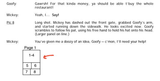
This is because most comics are made by teams of more than one person, and the person who writes the plot/dialogue is not the person who does the layout and sketches - and usually that's not the same person who does the inking, the coloring or the lettering. So each stage of the process needs to be clearly laid out.
This is not how things work for comics made by a single person, and this is also not how my brain works in specific. If I try to write a script first, the characters inevitably end up being incredibly wordy and go off on philosophical tangents, and the dialogue doesn't fit right on the panels. And once I start drawing the actions I've choreographed, half the time I'll only get a few panels in before a character wants to do something unexpected but much more interesting that completely derails all my best-laid plans. None of my scripts ever survived contact with the page.
Fortunately, because I make art digitally, I can do things like "write all the dialogue straight onto the blank page" and then move/edit the text however I want. So the process I've developed that works for me specifically involves me storyboarding out the dialogue and paneling straight on the page rather than starting with a screenplay or script.
That's not to say it goes straight from my brain onto the page. If I'm stuck on a scene I'll usually crack open a little notes file and write out things like "what just happened, what is this character feeling, what do they want to do next" or just spitball possible dialogue options or write out a little mini-timeline of events in linear order. This gives me a guideline to reference when I sit down to storyboard, and it can help me work through a little knot of writer's block. Even then, the dialogue I hash out there isn't going to be as well-paced or as good as what I end up putting on the final page. It's a first draft of a scene - translating it onto the page, it'll play out differently.


This works well for my storytelling approach, which is flexible and character-driven. I like to give myself a lot of options - a toolbox to play with - and that means my outlines are often very loose, and can change a lot before I put them on the page. But this is a strategy I developed for myself through trial and error - it's not going to work for everybody.
I recommend you start off by reading a wide array of comics with an eye for how they were laid out and scripted, and test a few methods for yourself to see what works best for you. And also read Scott McCloud's Understanding Comics, it's an incredibly valuable crash course!
253 notes
·
View notes
Note
Not sure if anyone asked you this, so if someone did I apologise, but how did you get the hang of inking?
This is going to maybe sound pat, but lots of practice. I’ve drawn hundreds of comic pages over the years and, if we break them down into panels, that’s thousands of individual drawings…which gives me a lot of opportunities to work on the skill, and I’m always still learning!
Going to Weather is digital, but it’s the first comic I’ve done where I wasn’t inking traditionally. Everything I’m doing in it now is translated from how I work with traditional inks. I’d recommend practicing with traditional ink because it gives you the opportunity to try out all kinds of different tools to find what sings to you: crow quill pens, microns, rapidographs, brushes, dip pens, etc. The Winsor Newton Series 7 Kolinsky brush is a really nice one for inking, though quite pricey. And my absolutely favorite inking tool are Japanese G-pen nibs, particularly the Zebra brand. They’re really stable and have a great line variation for a nib. I’m ride or die for Zebra G Pens--super versatile tool. But everyone has their favorites.
Practice textures! My favorite professor had many-a-mantra, but one of them was ‘it looks like this, it feels like this’, thinking that as you’re rendering something, render it with intention. The bark on a tree is going to look different from a knight’s armor, or someone’s hair, or a wheat field. Think about how you could best convey what something feels like through your linework.
Also practice different kinds of shading. Try some straight linework with nothing but the line weight to imply light, some stippling, some hatching, some ink washes, some stark black and white chiaroscuro. Try experimenting with how you might render different colors, using just the black ink. It can help you find the ways you like rendering things, and help your brain process light and tone with something that’s just black and white. I learned a lot while having to render sunrises in greyscale for GTW, for instance.
And also look at the work of other artists! It’s helpful to see how others use the medium to do what I mentioned above. I’m most inspired by 19th century engravings, ranging from illustrations to just like…drawings of furniture in the Sears catalogues of Olde before photography did it all. And some artists I personally find very inspirational and masters of the kind of inking style that appeals to me are Bernie Wrightson, Charles Dana Gibson, Rockwell Kent, Henry Clarke, Aubrey Beardsley, and Edward Gorey.
Happy inking!
26 notes
·
View notes
Photo


Oyster Mushrooms. I love to eat them, and recently on TikTok I love to watch people grow them, but I never considered trying to draw them myself, and so because of my nerves ( and my desire to expand my mushroom collection ) I drew them! In different art styles of course, because pushing myself to work on my art, happens in stages~! .
This first style is my sketchy-inked attempt to take a sketch from a notebook and translate it into a digital art piece. I retained the initial photographic layer, thinking that I could develop it into a full and robust image, however, I think I overdid the artwork and create something I am not altogether happy with..
Nevertheless, it is done, and I am still proud of it, so I want to share it~! The next editions I do like much better though, so you can look forward to those ones~!
#mushroom#mushroomcore#mushroom art#aidadaism#aiainight#myart#art#sketch#sketching#ink#inking#oyster mushrooms
2 notes
·
View notes
Note
I think it’s just awful how so much mythology, folk lore, local local legends etc. Aren’t easily available online. But is their a reason why those with access to these stories aren’t able to put them online themselves?
Mainly, as far as I’m aware (keeping in mind that I’m just one person in the field and I’ve not been here for very long), the reason is copyright.
That and, to be honest, a little bit of classism (can’t have the rabble accessing our nice, bright, shiny sources!) My field, while we’re gradually accepting that you can be a Celticist coming from a lower class background, still do kind of pin a bit on the idea of the gentleman scholar - A polymath who’s already studied French, German, Latin, and Greek and who can therefore take to Old Irish and Medieval Welsh like a fish to water. For many in the field, there’s the expectation that you already have at the very least an understanding of Gaeilge, or that you already have a strong linguistic background, and that can cause a massive break between the public and the scholars involved. Especially in the instance of editions which, by their nature, are JUST the Irish, with no English translation. Because, hey, it’s just Old Irish, right? There’s a dictionary at the back!
Both UCC and UCD have, to their credit, done an IMMENSE amount of work in making these resources available to the public. UCC has done wonders with their CELT database and Irish Sagas Online, UCD with their Thesaurus Lingua Hibernicae. They’ve done a truly magnificent thing there, and I wouldn’t have been able to enter the field without the diligence and hard work of everyone involved in both projects. The problem is that many of the sources involved are...well. Old. We’ve learned a lot about the Irish language since a lot of these were done, specifically about Old Irish. A lot of them are in very archaic language, because that was the translating style at the time, and some of them cut out whole portions of text. Because it’s got to be in the public domain to be legal, unless you have an instance where the scholar is able to grant permission for their recent edition/translation to be released, such as in the case of Gray’s Cath Maige Tuired, which was given a special release on CELT. On a folkloric level, Duchas is doing amazing work.
What you have to keep in mind is that, unlike Classical studies....we’re a BABY as a field. Many texts still haven’t been translated. Many texts still haven’t even been given editions. And a LOT of work goes into making both editions and translations happen and there are...very few of us that can do the work to make it happen. I would estimate that there’s fewer than 100 Celticists worldwide. It might be as many as two hundred but I strongly doubt it. Hence why, in many of the cases, the last translation was made in either the 19th or early 20th century. It’s because, frankly, since then, no one’s had the time or energy to go over it again, and people were trying to do new editions/translations. With stories like the Iliad and the Odyssey, you can VERY easily get ahold of one of those online because, while there are a ton of newer translations that you won’t be able to get ahold of as easily (Emily Wilson’s Odyssey, for example), there are a LOT of older translations that are still very viable, because you’ve had people studying these texts for literal centuries. In our case, we’re lucky to have one older translation. We...we’ve been around for a little while, really getting our first breath of life in the 18th century, but we only really hit our golden age with the Celtic Revival and the establishment of the Republic, and then we kind of fell out of fashion. A lot of the time, when I ask my supervisor “Has anyone done anything on x subject?”, he’ll give me this kind of beleaguered “Well....”, not because Celticists haven’t cared about the material, but because their hands have been full in a hundred places.
And it’s worse for mythographers, because we are a very tiny section of Celtic Studies. Tiny. You’ll notice that, in my source list, a lot of the names repeat a lot. Why? Well, part of it’s because I personally like their work, but part of it is also that these ARE the big names in the world of the Mythological Cycle. These are the ones who are REALLY focusing and doing a ton of work on it. Other scholars might touch on it, do an article here or there, but very few really commit to it, in the end. In my own program, I’m basically the only one of the MA students with a mythological focus, and even in the department as a whole...I’m basically one of very few. Ulster Cycle and Fenian Cycle get more, but the Mythological Cycle...I don’t want to say there’s a STIGMA against it, but there’s........a different feeling, being in it. A lot of mythological material is still being transcribed and translated, a lot of it is still being talked about for the first time, and we’re pl
In my time, I’ve done two editions/translations of a text, the latter of which was almost completely incomprehensible at points, the vellum that the ink was written on being of a very poor quality; the bottom third of so of the folio was totally faded. Both of those times, it fell to me to transcribe the material, reading it letter by letter, trying to figure out what various abbreviations meant (Irish scribes used a very specialized form of shorthand that, while perfectly comprehensible to them, isn’t always so to us), and then having to translate it, keeping in mind that in some cases, the Irish was a mixture of later Irish and Old Irish. Translating Old Irish is a bit like trying to wrestle with a snake at times - It’s unpredictable, it’s wriggly, and it feels, at times, like just when you think you’re holding onto the head, it shifts and you realize you’re holding onto the tail. It isn’t something that you can really do just because you feel in the mood to do it one day and then publish on Tumblr; it’s a VERY intense process that involves a lot of time, effort, and tears. (Seriously. A lot of tears.)
And...no one gets rich out of Celtic studies. Every one of us who’s either entering into the field or is actually in the field has accepted that it’s a labor of love; I’m statistically unlikely to get a job IN the field and I’ve accepted it. It could very well end up that I get my MA, maybe even my PhD and then...that’s it, done. Now, this isn’t meant to be a pity party, but it does explain why a lot of scholar’s can’t JUST give out pdfs of their books - They do need to get paid, at least a little, though if I’m not mistaken, once they submit their articles to a journal....that’s it. They’ve gotten as much money as they’re going to get. So that could be a factor in why articles tend to get handed out much easier. Books also....keep in mind, we don’t digitize a LOT of our stuff. It was part of why Covid kicked Celtic Studies’ ass. Suddenly, you had a bunch of scholars around the world used to having access to a library who...no longer had access to a library. Or the books in them. I was personally amazed that Tom O’Donnell’s recent book on Fosterage and Mark Williams’ Ireland’s Immortals were actually released in Ebook format, because that’s still a little on the unusual side. We’re slowly coming to terms with the 21st century, but it’s difficult.
Anyway, that’s the answer: Most of it isn’t INTENTIONALLY trying to keep the public out, and for many of the scholars, I know very well that they really want the public to have access to that stuff, but their hands are tied by copyright law + needing to make some amount of money in the very unfair world of academia. I hope that some part of this makes sense. We do want to do more work with the public, it’s just that...well. Copyright law and academia. They’re bastards.
253 notes
·
View notes
Text
Problem One: The Screen(s) and Digital Workspace
Part one of my multi-part doc about what I learned from doing online college at a non-online institution. This chapter: my Desktop as a Desk
Highlighted points: learning styles, work type/function in relation to the computer
My biggest problem with being pushed online after being at an in-person institution was, and still is, my forced reliance on the computer. I have to sit in front of it for hours: attending classes on Zoom; checking email every three hours; accessing Moodle pages for class and out-of-class work (Moodle is what my institution uses, other web management/e-learning software platforms include PowerLearning, Blackboard, and OU Campus, among others). And the work itself can be watching documentaries, watching seminars, accessing ebook/PDF documents, annotating documents in online portals… it's a lot. People have talked at length about "zoom fatigue," as well as the eyestrain headaches that can come with staring at said screens for hours at a time. I'll talk about my own lessons learned about that later.
The assumption among the administrators and (some) people of older generations than those currently in school seems to be that working online with computers and smartphones is more efficient. That isn't necessarily true; it all depends on the type of task and the person being expected to complete it. In my case, I cannot, for the life of me, focus on dense sections of text presented on a backlit screen. Thus, reading and answering emails is okay, but downloading scanned textbook pages to be read on a laptop screen (along with trying to highlight and annotate them) is hell on earth.
Why is this? Different reasons for different people, but in my case it's because reading/"writing" on a screen interferes with my learning style(s), which are visual/spatial, audio, and kinetic. Audio doesn't come into play for reading on a screen, but seeing words physically in a certain location relative to other words on a page is very important to my memory of the material. Computer screens can display pretty much anything at any given time; book pages can only display whatever was permanently printed onto them. That is, the content of a book page in physical space will always be the same unless you, the reader, manipulate it; a computer screen can have any type of content displayed as long as its pixels can light up and process the information. And for me, that's a problem because I don't have any physical space to relate the information to, plus I don't get a sense of how long the document is. Recalling a passage in a printout, for me, goes like this: "I remember it was on the top-left of a page towards the beginning, the shape of the paragraph was funny too… ah, there it is." Recalling a passage on a digital scan of the same document is much harder for me by contrast: literally any of the paragraphs could have made its way to the top-left of my computer screen, if I moved the window around or zoomed in to better read the text; documents are an endless scroll upward or downwards, with (maybe) a sidebar to tell me what page I've landed on. All of my "landmarks" are functions of the program I am using to access the document. They're static and contained to a window... that can show up anywhere on my computer screen. Not conducive to the way I learn at all.
My kinetic learning style comes into play with the computer, too. Annotating a document? In the physical world, a pen on the document itself does the trick; going through the physical movement of circling a word or making a note are things that solidify the information in my mind. Annotating a PDF document? First of all, it's difficult to do with a mouse (and God help you if you have a trackpad), and it's highly dependent on the program that the user selects to open the PDF. I could connect a drawing tablet, if I have one, but they're very expensive and their use is, again, dependent on the compatibility with whatever reader program the user selects. All this to say: annotating on the computer doesn't work for me, either. My kinetic and visual learning styles come together with note-taking. My memory is highly dependent on seeing words as they are formed by my own hand, processing them, and connecting meaning to them as they sit in a specific place on the page (am I over-explaining this? Basically, writing notes by hand and seeing where those notes are on a piece of paper help me remember them). Typing notes isn't a replacement for hand-writing notes for me; while I'm busy fixing my typos (on words I would never misspell on paper, usually, since my fingers are just moving weirdly over the keys), the professor moves on, and I'm not listening well enough to catch the fact that I've missed new information.
The takeaway here is figure out your individual types of work relate to being on the computer. As I said, the computer hinders many aspects of my learning when it comes to memory and efficiency. As a creative tool, however, it has almost the opposite effect; writing assignments for fiction, poetry, and screenwriting classes are much more efficient on the computer. From creative thought to keystroke, I have less time to second-guess or forget my ideas, and both the immediacy and changeability of word processing programs actually works in my favor for those sorts of things.
What I did differently from first online semester to second:
1) I figured out which materials helped me remember my notes the best. Honestly, I wasn't even doing this when I was at in-person college, and to my detriment, but I couldn't get away with it at all once I went fully remote. Think back to when you were in lower levels of school: were there certain types of materials you gravitated towards in the classroom? Did you like basic composition notebooks with faint blue lines? Wide-ruled or college-ruled paper? Did you discover that graph paper just worked really nicely with all notes besides math, or that blank pages were less busy for your eyes? When you used pens, did you prefer blue or black ink, or did colored ink help certain things stick? If you can control what materials you use to take notes with, consider using ones akin to those from a class you either a) remembered the most fondly or b) remembered the most information from. Scour your memories of class experiences for anything, no matter how small, that may have made your life easier. Equally, take note of what tasks actually worked well digitally. Adjust accordingly.
(Personally, I found my magic formula was a 1-subject memorandum notebook — marginless, with very narrow line rulings; while I hesitate to direct you to Amazon, they are hard to find at a decent price otherwise, and you can get a 12 pack for just over $40 from them — with black ink from a 0.38-size gel pen (I used a basic Pilot G2 pen until it ran out, then bought ink refills in the smaller size). To "highlight" my notes, I circled or underlined information with a blue gel pen of the same variety. Keep in mind again that I'm learning to be a translator; this is just what works for me.)
2) If I needed to print something out, I printed it out. Environmental guilt is something I struggled with a lot, and there was always something about staying on the computer that convinced me I was being "less wasteful" by staying digital. But with how much time and energy I ultimately saved reading a printed document that can be recycled vs the electricity I ate up spinning my wheels in front of the ebook… to me, it was worth it. If you find that helps you, too, don't be ashamed to print certain things out.
(If conserving ink and paper is a concern to you, it is possible in some viewing/editing apps to remove or cover images, either with white squares or by taking the images out completely. I have an old MacBook Pro and on current versions of Preview, one can draw shapes and fill them in white to cover parts of the scan that would eat up ink, such as blurred black borders and scanned images. For documents in a word processing program like Microsoft Word or Pages, it may also be possible to print the documents out at a smaller size, allowing more text or even multiple pages to show up on a single sheet of paper.)
| In the coming days/weeks I hope to be posting more content about how I tried to adapt to fully remote learning and the things I’ve learned along the way! Follow for updates ♥︎ |
#college#university#online#online learning#school#online school#online university#online college#covid#covid 19#studyblr#student#students#blog#writing#my writing#narrative nonfiction#nonfiction#narrative#advice#language#language major#liberal arts#liberal arts college#creative writing#computer#computers#screen#screens#screentime
58 notes
·
View notes
Note
hey alan! this is probably a long shot bc i imagine you're v busy, but i am absolutely in love with the way you use textures! especially the screen tone dots and the grain in much of your limiter illustrations (for example post/618294174475845632). do you have any process videos or suggestions on how you get the textured look you want?
Hey dude! Thanks for asking. I’ve been having a fun time playing around and pushing my textures recently. Glad ya dig!
There’s two parts to this answer: tools and technique. I’ll start with tools.

I buy screentones from deleter-mangashop.com. I mainly use simple gradients and a 40% grey tone. Texture in ink lines comes from g-nib or ink brush on Bristol.
For digital images, I work in Clip Studio, which has an active/non-destructive layer style that translates grey values to screentones (you set dot shape and density). I use digital tools that mimic the traditional tools I like, so my current inker of choice is a brush with about the same flex and texture of the g-nib on textured vellum. Can’t recommend Frenden’s brushes enough (he even provides free updates for life): https://frenden.myshopify.com/
PJ Holden has some nice CS how-to tweets, including a nice thread on using the tone layer style: https://twitter.com/pjhtips
The image of Dazzler below uses a textured pencil for the soft edges. The background uses the same technique for the “airbrush” style coloring.

The second part of the answer is technique. I’ve been focusing a lot on values, edges, and shapes in my artwork for the past year or so. Most hard edges aren’t textured (aside from the inker/paper), but using texture on the soft edges (graphite, colored pencil, screentones, dry brush, airbrush -- or digital tools that mimic them) can describe a lot of information without a lot of rendering. It’s my current go-to.
Mike Mignola’s my idol for that: simple and graphic shapes, clear value stacking, very minimal rendering... but rich with texture. Both the low and high ends of the values are blown out, so silhouette is the main indicator of texture/form in those areas, not any sort of detailed rendering. He leaves that for the midrange, where the transition from high to low value is. Minimal rendering, maximal effect. Look up “3-value study” for some ideas of how to practice this stuff if it sounds like an answer you’re looking for.
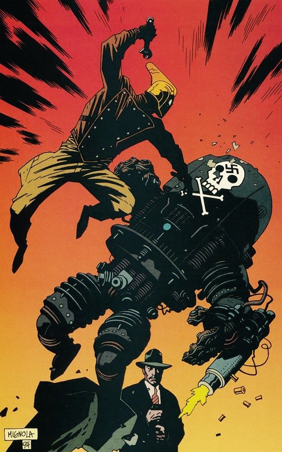
Of course it all depends on what you’re trying to achieve with your artwork. Especially for Limiter, I’m pulling from and trying to achieve a bit of pulp psychedelia and horror. So I’m taking a lot of technique inspiration from work done in those styles. Mostly it’s graphic, low-brow... i.e. done quickly and economically. How do you get a soft edge or gradation of value if your print method doesn’t allow it (screen printing, old xerox, old comics, etc.)? By understanding why artists working in or for certain media render the way they do, it helps me achieve similar effect even if I’m mimicking their media digitally.
I guess to say, you can spend hours stippling and rendering every last inch of your image if that’s the look and method you like. For me, both because of a wrist injury and the low-pay-quick-turnaround nature of comics and my dayjob, my personal trajectory for art is finding the quickest way to get the most control over the maximum amount of meaning. That includes introducing a bit of unexpected chaos using splatters, dry brush, stamps, tones etc. to get textures. If your shapes and values communicate maximally, you can get away with a LOT of random bullshit in the middle. And that’s where the fun is.
Anyone who’s taken a workshop or training from me knows I love using Marco Bucci’s videos, so at risk of sounding like a broken record, check him out. The following are my favorites on this topic, but I learn something from each of them, even the ones I don’t think I care about:
Shapes: https://youtu.be/-ZknWKTpc90
Merging Shapes: https://youtu.be/Nap7dwHjD9Y
Edges: https://youtu.be/nnhj5efzN_w
Style/Texture: https://youtu.be/Fbo6ZAuF914
Thanks again for asking and opening the floodgates of rant. Cheers!
38 notes
·
View notes
Photo
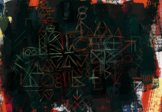
I thought I’d posted this before, but maybe I didn’t? I did this for a university class back in 2018 as an exploration of Stu Stucliffe’s artwork, his influences and his historical context, and how emulating his style through my own lens in the present day would look.
(Disclaimer: This was an English class. I am a mere hobby artist trying to explain art to a professor who knows even less than I do lol)
Long-form essay on art history and my process below the cut, but key takeaways:
Stu’s art conveys a lot of spontaneity and raw emotion, which I tried to do
Visual features of some of Stu’s pieces that I ran with: full canvas coverage, collage, etching through many layers, geometric totems
Instead of collage out of newspaper clippings I used layered screenshots of Tweets and textposts, which is fun
Essay excerpts below the cut if you’re feeling especially academic.
The bulk of Sutcliffe’s paintings are of the Abstract Expressionist style, produced as the Abstract Expressionist movement was in wane. Characterized by its raw emotion and spontaneity, Abstract Expressionism was a means of dealing with the grim realities of the Great Depression, and in the years following World War II, the movement evolved into an energetic, defiant response to the postwar desolation throughout Europe.[1] As a young art student in a still badly scarred Liverpool, Sutcliffe lived amid the realities that influenced the development of Abstract Impressionism at a societal level. However, on a more personal level, he also stood at a juncture for change: deciding whether to pursue visual art or rock music—and after making his choice, forging ahead to create a successful and earnest career in art. As such, Sutcliffe’s works feel particularly raw and true to the spirit of Abstract Expressionism.
To better appreciate the technicalities and spirit of his art, I decided to critically examine and emulate Sutcliffe’s art style. Sutcliffe’s art flourished between 1961 and 1962, after he left the Beatles and enrolled in the Hamburg State School of Art, where he studied under pop artist Eduardo Paolozzi. Sutcliffe’s style grew more original and assured in Hamburg.[2] The traditional paintings of Sutcliffe’s Hamburg period are composed of thick layers of paint, covering all or part of the canvas, which have been scraped away in places to reveal other colors and instill a sense of depth and presence. Sutcliffe also produced a number of mixed-media pieces during this time, often with collaged newspaper cuttings and ink printing. A great many of these pieces, regardless of medium, feature repetitive, messy geometric patterns. These features in combination often convey a sense of anxiety, excitement, or chaos in Sutcliffe’s works.
In emulating Sutcliffe’s art style, I worked with a general goal of producing the unsettled emotions characteristic of Abstract Expressionism that Sutcliffe so successfully captured in his works. I also used a few of the more specific aforementioned style techniques: thick layering, elements of collage, and totemic geometric patterns. However, my piece is purely digital, created with GIMP image software; as such, part of my task became how to translate these three-dimensional features into a strictly two-dimensional, virtual medium.
I attempted to convey a sense of nervousness and anxiety with my piece—feelings I can tap into all too well, with the swift approach of graduation and the scramble to find a job in my immediate thoughts, and the looming myriad social and political problems my country currently faces. I began with a pre-made background image that gave the texture of old paper. From there, I turned to Sutcliffe’s method of using collaged newspaper articles as part of his painting surface. Given that it is 2018, I decided to update this technique to utilize a different means of public communication: social media. I took screenshots of tweets and tumblr posts I had seen recently, but I did choose them with some discretion, selecting statements that touch on my personal worries. From there, I used a set of acrylic brushes I had downloaded to create several layers of indiscriminate colorful strokes. Then, I similarly created several layers of different shades of black atop these (akin to the iridescent black painting of Sutcliffe’s pictured above). I did not extend this black to the very edges of the image, in order to expose small parts of the underlying color and collage layers and to keep a sense of discord and chaos at the edges of the piece. To achieve the scraping effect, I actually added more layers with a technique called layer masking: I superimposed portions of the colorful base layers, in the form of scrawled shapes, on top of the black layers, to make it appear that I had scraped away layers of black. The shapes are rough and spontaneous (some resembling Sutcliffe’s typical totems, some not) to give a jittery and dynamic feeling and to capture both a nervous energy and general impulsiveness of Abstract Impressionism.
[1] Kuspit, Donald. “Stuart Sutcliffe: 1940-1962.” Stuart Sutcliffe: A Retrospective, edited by Matthew H Clough and Colin Fallows, Liverpool University Press, 2008, pp. 8.
[2] Biggs, Bryan. “A Link in Something Larger.” Stuart Sutcliffe: A Retrospective, edited by Matthew H Clough and Colin Fallows, Liverpool University Press, 2008, pp. 62.
29 notes
·
View notes