#tried out a more cartoony style
Explore tagged Tumblr posts
Text

i wonder who's offering him water?
love love love gardener cole RAHH it just makes so much sense
#art#fanart#ninjago fanart#ninjago#ninjago art#doodle#cole#cole fanart#ninjago cole#ninjago cole fanart#cole ninjago#cole ninjago fanart#trying out a new style#been trying out new artstyles recently#i love saturated colors#tried out a more cartoony style#reminiscent of children's books?????#an attempt was made#my art#lavashipping#ninjago lavashipping#forgot some tags oops
366 notes
·
View notes
Photo


You’re looking a bit different than usual! (Patreon)
#Doodles#Clinical Trial#Lee Smith#Angel Martinez#I had to try drawing them in my own style(s)! Somehow my more realistic-cartoony style doesn't suit them as well as Just Desserts haha#They already have a quite cute style to begin with so I guess that's not much of a surprise#I think I didn't make Lee beefy enough - he needs a thicker neck and just - more#Strong and also tummy...#Just gotta practice more oh nooooo#At least he has the RBF that's an important element hehe#I've seen some really gorgeous - and much more androgynous! - Angel renditions out there that I'd really like to try again with them#I've also seen the comparison so I'm glad I'm not alone in thinking that Angel and Anya Mouthwashing have a similar vibe#The blues...... Both the colour and the sads haha ;;#Both deserved better!!!! At least Angel doesn't die but still...#I like that Lee becomes more visibly scruffy in his house clothes hehe <3 Especially so when he's nervous! S'a good look ♪#Brushed hair vs. bed head very cute#I'm also pretty sure I got his work jacket lapels wrong but that wasn't just here lol#Look it's still early doodles I'm still getting used to the both of them! I can be pedantic now that I've seen how they're supposed to be!#Just gotta draw 'em again and right this time lol again I say oh noooo#They really are cute in the JD style.... What kinds of sweets would they be hmmm#Lee could be like a breath mint or something lol#Or like a hospital lollipop - blood donation sweets like Oreos and orange juice hahaha#I know chocolate is such a tried and true but I could see him being a baker's chocolate as well#Who better to pair with a baker! Angel knows what to do with him >:3c And he'd want to be in the hands of a professional hehe#Angel I could see as being something light and tart... Sure a pastry would work but maybe like a galaxy-pour cake#Or one of those many-layered cheesecakes all dyed different colours to make a piece of art by the end#Paired with blueberries :3 Or a blueberry wine reduction sauce ahh#And if their flavours complemented it would be all the better <3#I could see either of them going the Appetite of a People Pleaser route....
33 notes
·
View notes
Text
I know this fandom well. Dead. But consider. I had to doodle about this silly show. First time ever posting drawings on my blog, please everyone be so niceys to me
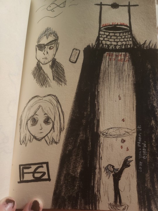


CHIEF MY LOVE I AM SO IMPRESSED WITH MYSELF ON CAPTURING YOUR LIKENESS. HEAD NEEDS TO BE WIDER BUT CMON THAT'S PRETTY FUCKING GOOD
#tried to draw liv in a more cartoony style bc i wanted to draw her peepers all big and spooky#(also for those who havent seen this show chief is the guy with the eyepatch. google 'izombie chief' for reference)#REALLY proud of the well too#i will probably add more quotes to it but those are the only two that really stuck out to me today#also. ignore the fish. that was my warm up doodle#izombie#izombie chief#Angus McDonough#Brother Love#liv moore#jälg arts#<personal art tag as i believe i shall start posting more of my sketchbook ive done a lot that im proud of
7 notes
·
View notes
Text

lark and sparrow be upon ye
#i tried out a more cartoony style with these two and i really like it#i know heyde supposed to be the same man twice but. shhh#dndads#dndads fanart#my art#lark oak#sparrow oak
9 notes
·
View notes
Text

In Arturo lore he is very introverted except with his bestest friends
He fancies a weekend late night alone with a comfy couch, Italian food and watching crazy ppl lose their minds on TV
#my art#arturo#meme#art#aseprite#meme drawing#friday night#google image of a couch special guest#my artwork#digital art#my persona#my sona#bros chillin#I tried shading more better this time#I am actually super proud of this#I just love how he turned out#I am starting to fully embrace my crazy cartoony art style#I am so happy about that <3
4 notes
·
View notes
Text
You'll never believe who just spent a week doing pixel art...... Did the classic "let's take a 3d horror game, turn it into a 2d more cartoony (relatively speaking) style"

Pathologic's shitty DS port, to walk you have to drag the stylus across the touch screen and to attack you just have to circle your enemies a billion times :))))


[COMMISSIONS]
Yapping and close ups below vvv
Oh my god pixel art is hard- it's the second time ever I've tried it, and boy oh boy I was not expecting to spend a week on this fjfj But I had fun ! Especially with the small sprites ;w; they cute ! But yeah next time I won't bother with line art- that was a nightmare
Frankly I've played The Void (Tension) way more than Pathologic, but I can't say I'm not hype for patho 3 fjfjjfj can't wait to play the pompous bitch :))) only downside is that they didn't keep his platforms from the original </3 heartbroken- give me the angel with a shotgun ass paintings and demonia Dankovsky
Also the fact I discovered hbomberguy because one afternoon in 2021 I stumbled upon his pathologic video and went "oh a video about the other big games from this studio I love ! Let's hope it's good :)" kfkfjfjfj Great stuff indeed
Bonus close ups I made for insta but there is no reasons you can't also see them !


PS : The software I used for this is called Aseprite ! You can dl it via steam and it's really easy to figure out :))
#I thought I would never see the end of this-#This took me well over 20 hours help#pathologic#pathologic fanart#pathologic bachelor#pathologic haruspex#pathologic changeling#daniil dankovsky#artemy burakh#clara pathologic#pathologic classic hd#pathologic 2#pixel art#art#my art#digital art#fanart#fake game#ice pick lodge
3K notes
·
View notes
Text
TF2 x SU au fusions!
oof this took too long but i finally made it !
I kept @gracefireheart Andalusite (HeavyMedic) and @cariocay ‘s Turquoise (EngieSpy) (that i just realized their account got deactivated just a few days ago im sad now) fusion designs because i just found them perfect and whenever i wanted to try making my own designs i always ended up with making something similar to theirs since i was very influenced so i just kept them! They’re so awesome plz check the original artists!


my designs :3 :


< Part 2 >
About the fusions:
I tried to choose a theme for every fusion that suits the characters like Spessartite (DemoSolly) is a warrior i put Demo’s sword with Soldier’s shield thing well he doesn’t specifically have a shield but yknow the helmet thing i thought that could work.
He’s very powerful, strong and jump into action without a second thought, while he possesses immense strength and a love for loud and chaotic things, his battle prowess is a double-edged sword since his attacks lack precision. however, this unpredictability often leaves his enemies confused and scrambling to defend. he fights more efficiently when drunk lol
Lepidolite (MedicSpy) is a plague doctor, he is very inspired by Hannibal Lecter (nbc Hannibal lol shout out to that one Anon who recommended it for me to watch it lol) at first i wanted to give him a bistouri as a weapon, since it would suit Medic’s saw with Spy’s small knife, but then i felt the fusion was leaning too much towards Medic than Spy, so i put a cane instead to give that old idk gentleman look :P
He is polished and sophisticated, with a hint of underlying sadism and very precise in his movements, he meticulously analyzes his opponents, exploiting weaknesses with surgical precision before jumping into action and strike right where it hurts the most, the cane appears to be a simple walking stick, but inside is a hollowed core that had a retractable, poison-tipped blade, and his poison isn't fast-acting he enjoys toying with his victims, watching as the venom slowly takes hold, fueling his twisted sense of amusement. they are far from being the strongest fusion but they rely a lot on making their opponent weaker by their ability to attack precise hits as well as poisoning them!
Carnelian (SniperScout) his design was inspired by a equestrian outfit (he was the hardest to design tbh bc i wanted his design to be specifically different from the others since Scout is half human so i wanted this "human" aspect to show in the fusion).
He is a walking paradox, he's got Sniper's calm confidence with Scout's hyperactive energy, he loves a good plan but his execution is often fueled by pure adrenaline, he can zip across the battlefield with incredible speed, dodging attacks and flanking enemies. good at mid range and long range attacks but weak at close range, has internalized monologues with himself a lot, he appears calm on the surface however, his foot constantly taps, he fidgets with his slingshot, he cannot stays in place for too long. enjoys taking challenges.
Rubellite (DemoPyro) is a robot with a 50’s cartoon style but with like a creepy vibe to it, their voice sounds like a broken radio perpetually stuck on a laugh track, is both infectious and unsettling.
They just as powerful as Spessartite but just a bit more agile and lean more on the defense style than offense, their body stretches in a cartoony way and battles become a twisted playground for them, a child's game where they hop and blow things up everywhere. they’re very joyful and loves to have fun while making chaos, they usually make jokes but no one understands their muffled voice so they often laugh all by themselves lol the weapon actually expands where the ball and the shaft of the mace connects there’s a chaine (i didnt draw it cuz there was already too much going on in the drawing lol) which helps them reach target from close to mid range easily, they twist and turn their body in very flexible ways before swatting their weapon at their target.
♠︎ If you want to suggest a pair for the next fusion please just comment here DO NOT send it in my ask box plz !!
And if you want to make your own fusion designs/fanart go ahead ! id love to see other people’s interpretations could be ! just don’t forget to tag me and add the tag ( tf2 x su au) :D
hope you enjoy !
+ early designs :


#tf2 x su au#my art#tf2#team fortress 2#fan art#lennylink#tf2 spy#tf2 scout#tf2 engineer#tf2 demoman#tf2 heavy#tf2 sniper#tf2 pyro#tf2 soldier#tf2 medic#tf2 heavy x medic#boots n bombs#tf2 engiespy#tf2 speeding bullet#tf2 napoleon complex#tf2 demoman x pyro#tf2 fusion#steven universe au#su fusion#character design#hannibal#demoman x soldier#tf2 engineer x spy#sniperscout#art
2K notes
·
View notes
Text
Lancer Tactics dialogue layout crisis of faith
(from this month's backer update)
Every so often, I'll run into something in development that eats away at me until it pushes me to a crisis of faith and I have a breakdown, burn down a bunch of work, and build something better from the ashes. These are moments of transformation and we're almost always able to come out the other side with something much better than what we started with.
This all sounds very dramatic until you take a step back and see the issue in question is just, like, the layout of a menu. But if medieval priests were able to have schisms over angels on pins I can have strong feelings about graphic design, dammit!
This month's episode revolved around how we're doing character dialogue. For reference the plan was to do a standard 4-slot visual-novel talking heads layout. I call it a 4-slot because there's usually four positions that characters can stand; two on the left, two on the right:
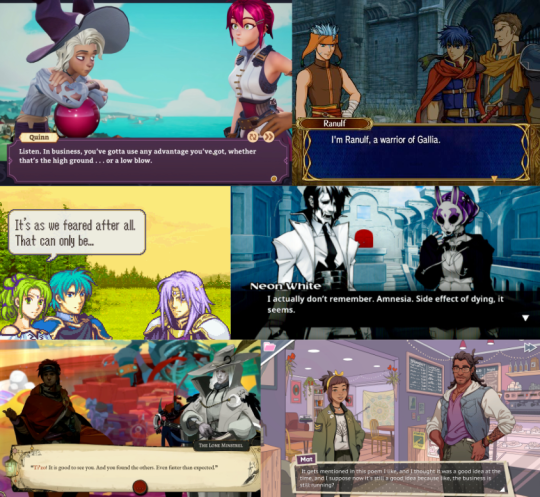
I had it ingame, and it was working. But... something felt off. Do you see the difference between every one of the above examples and this?
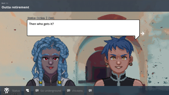
It's all about perspective, baby.
Answer: all the character art in those examples are drawn at a slight angle so they can be flipped back and forth to be made like they're looking at each other.
Trying to do this with the perspective we chose early — straight on — makes for a chorus line of weirdos who are looking directly into your soul as they ostensibly chat with each other. Credulity is strained; the illusion of these puppets interacting in the same space is paper-thin.
(I was skeptical of choosing this perspective for this reason, but we ultimately went with it to make the customizable assets in the portrait maker easier to fit together)
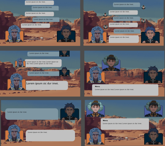
We tried a bunch of different layouts, but they all at least one of these problems:
they'd stare into your soul while ostensibly directing comments elsewhere.
they felt like text messages; this would be fine if that's what we were going for, but we wanted something that could represent face-to-face conversations. (Tactical Breach Wizards was able to pull this style off because they had little 3D dioramas to go along with it)
or, most damning of all, they felt like zoom calls.
So, my heart aflutter and spirit in want, I spent a day doing a research dive into various dialogue layouts (bless the Game UI Database!) to see if any other games had managed to pull this character art perspective off. I ended up with this massive non-chronological taxonomic tree:
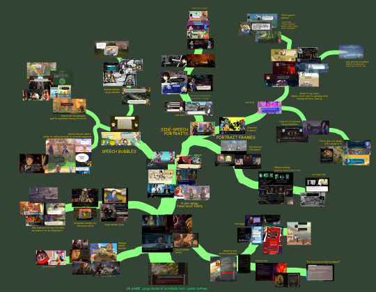
(fullsize here)
The type of layout that particularly caught my eye was this style where each character had their own little box. These layouts borrow a concept from comic books called "closure" where the space and time between characters are left blank. Freed from the constraints of trying to simulate a single space, these layouts allow the reader to fill in the blanks with something that feels more true-to-life than anything we'd be able to render ourselves.
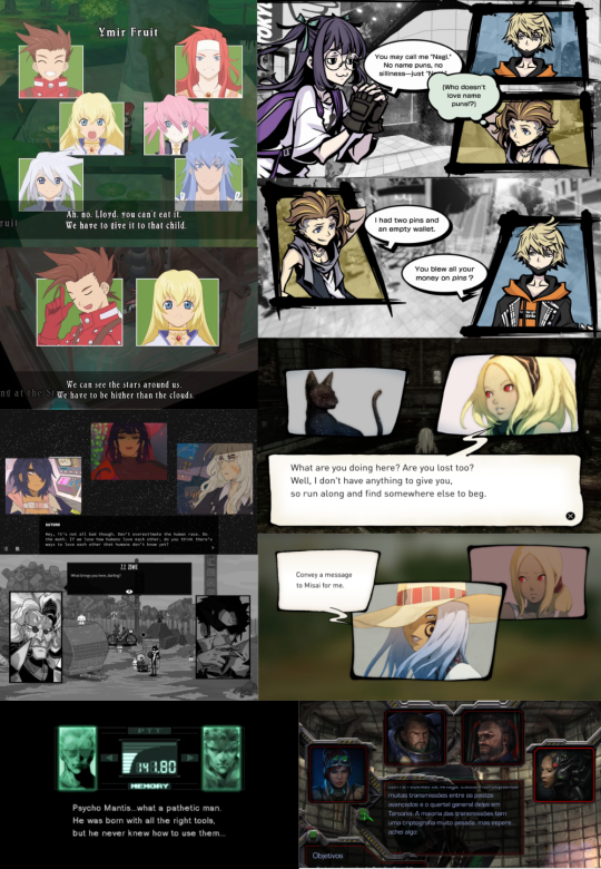
I was especially impressed with the dynamism of Tales of Symphonia and The World Ends With You; rather than sticking to single slots they would animate the entire panels moving around to indicate motion an relative position of characters.
So we threw out the old code and copied them. Here's what we've come up with:
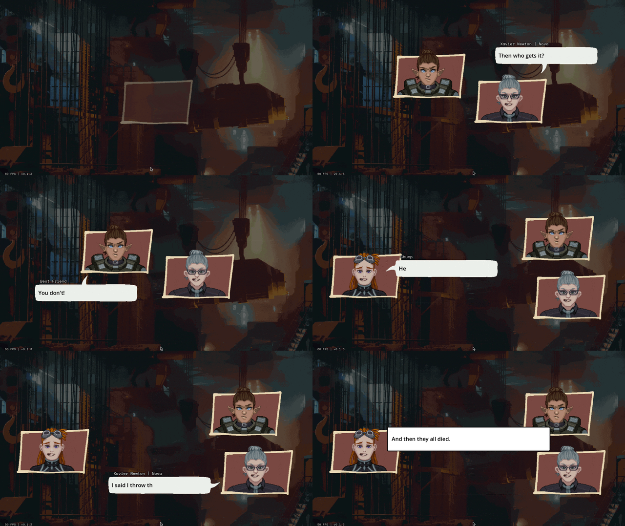
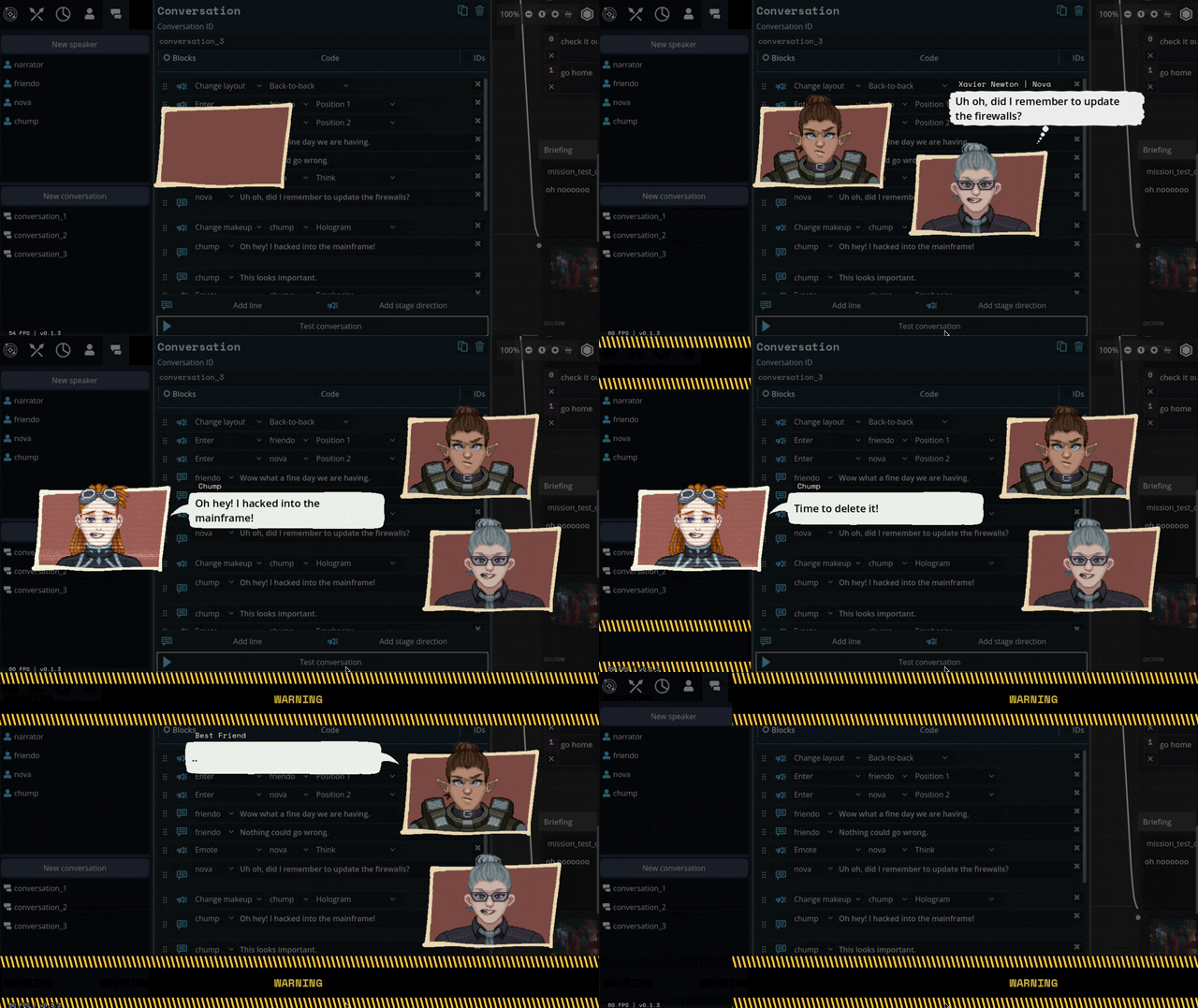
We'll be able to have portraits interact, like smacking each other (I felt like a kid hitting two action figures together, lol)
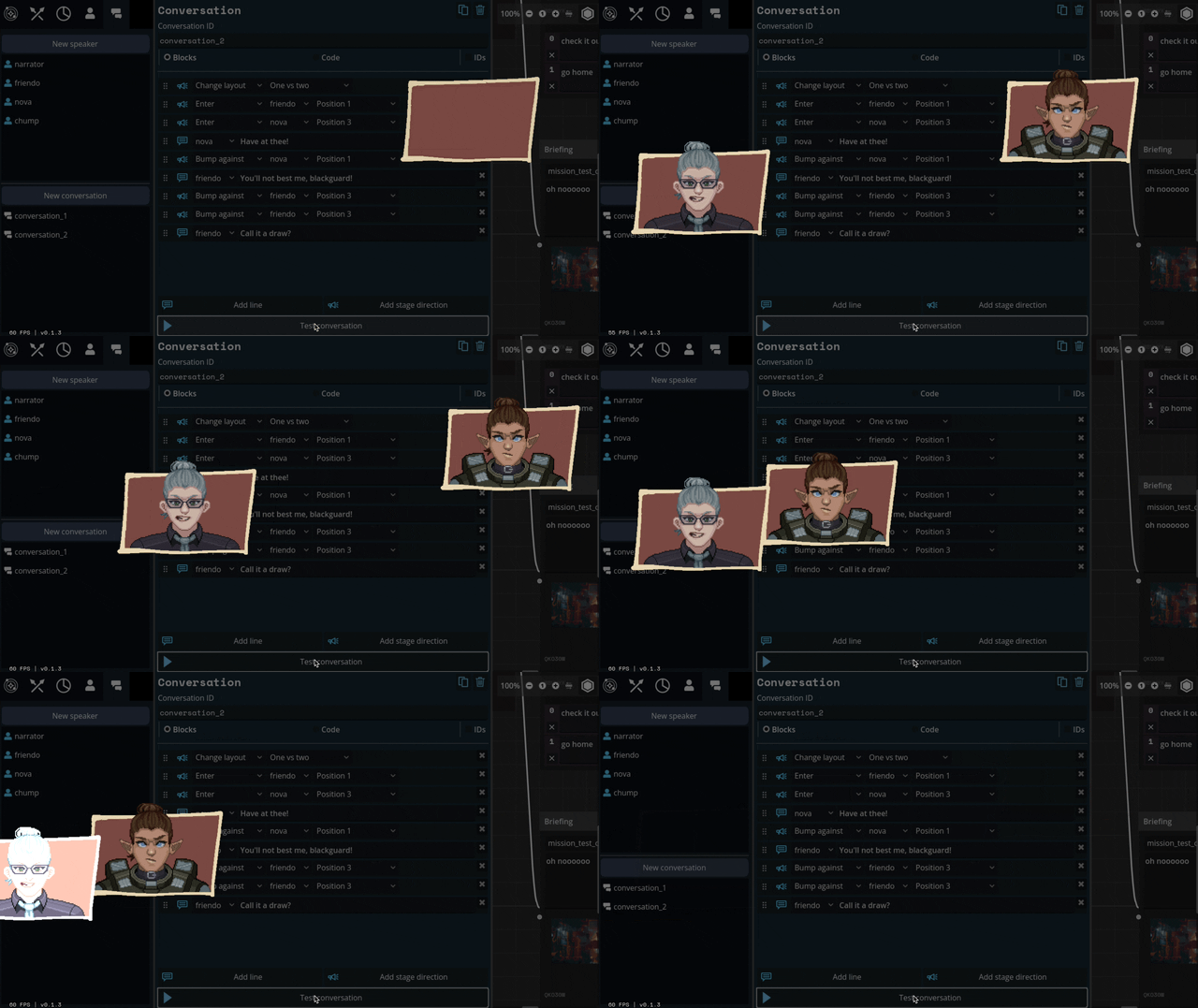
We can also apply effects like princess-leia-holograms and full-screen "lighting" effects like warning banners:
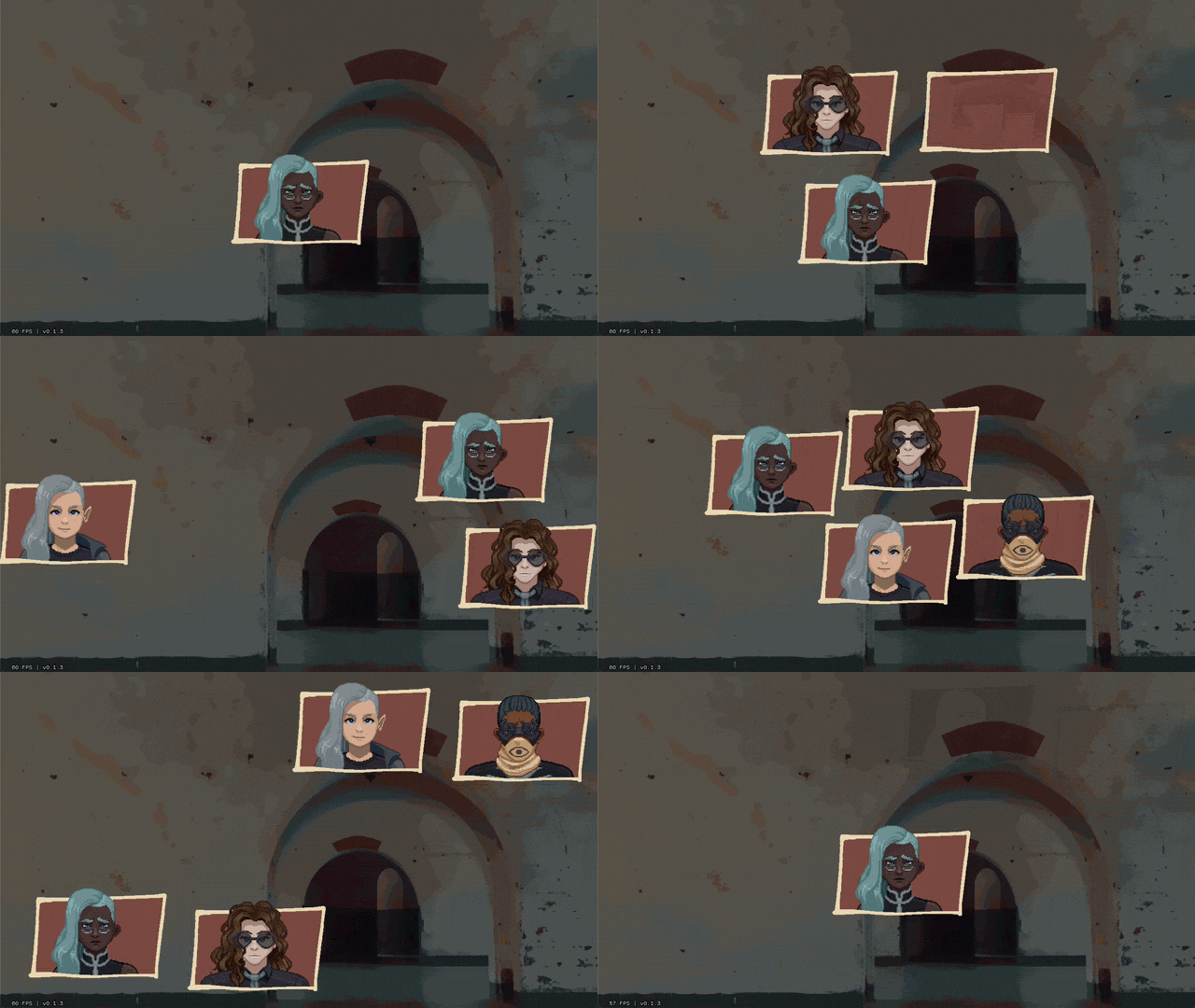
Carpenter and I came up with a number of arrangements that the portraits can smoothly transition between:

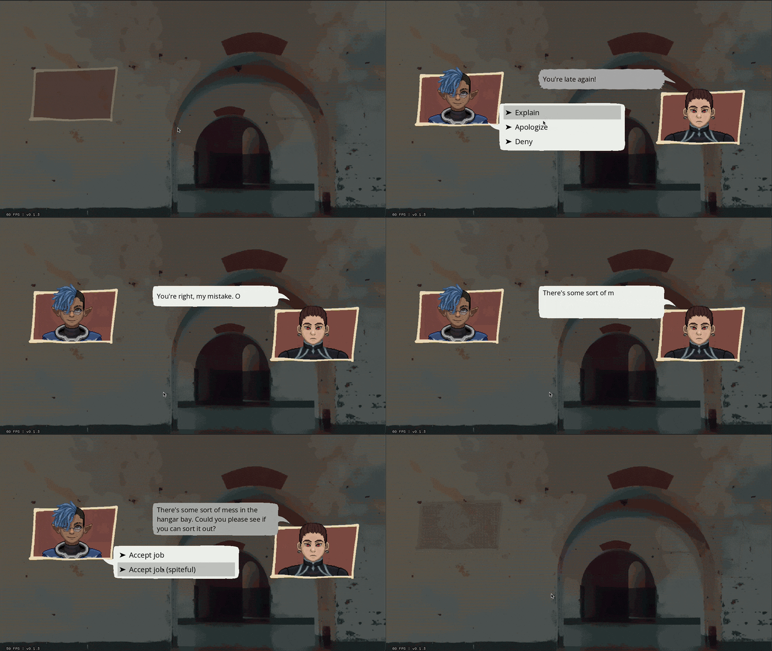
I've also implemented support for choices during a dialogue, potentially leading to branching paths.
Overall, I feel SO much better about this system than our initial designs. It might feel a little more cartoony, but I think we're making a cartoony game so that's not a problem.
Whew. We bit a lot off to chew with this project. I feel like I just made a second visual novel game engine inside of the first. Fingers crossed that it all ends up worth it.
472 notes
·
View notes
Text
// Maxis-Match Eyes Masterlist
Was in mood to compile all of my maxis-match style eyes that I've already published, so here they are 👁️
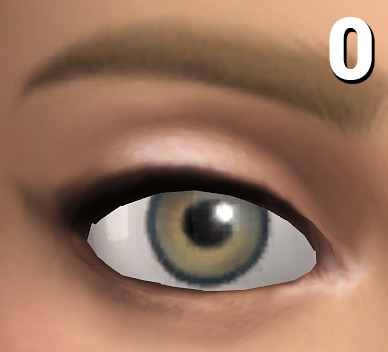
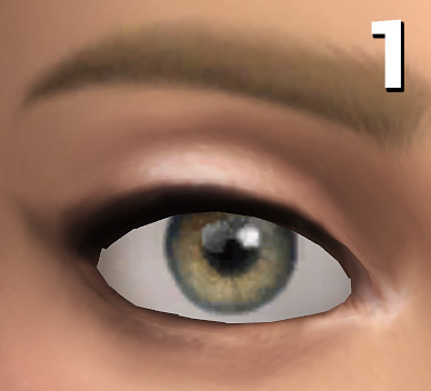
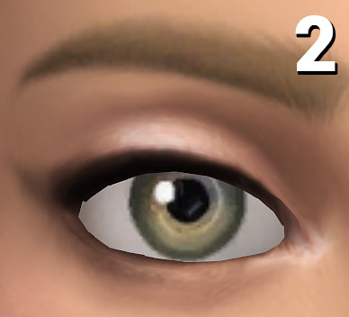
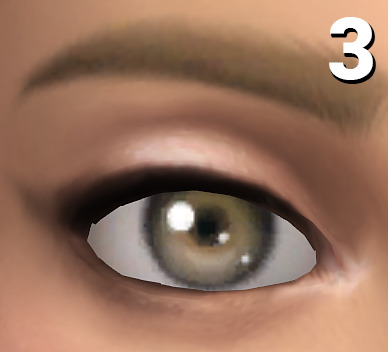
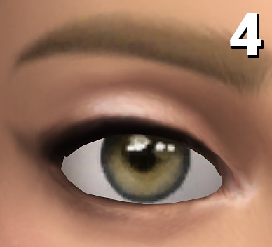
0: only here for comparison reasons, they're the default eyes from EA, the ones your game automatically gets shipped with!
1: Oasis Eyes (very much like the EA eyes, but a bit more textured and not as flat, using these brings a bit of life into sims while not changing the aesthetic. Shown here in the V2 version, the V1 version has a reddish sclera, which is a bit more in line with alpha style eyes)
2: Dazzling Light Eyes (my fav ones! I always have these ingame as my default replacement, as for me personally they're really close to feeling like the vanilla EA eyes but in better, when looking at townies I ALWAYS forget they have CC eyes)
3: Treasure Eyes (with these I've tried to achieve a cel-shading look, so I feel like they make sims look even more cartoony than the regular EA eyes)
4: Waterdrop Eyes + Occults (those have a clean, but different look than the base eyes, while still being really cartoony. May be the most expressive looking ones out of the bunch)
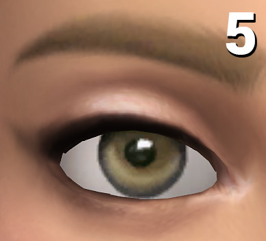
5: Oxygen Eyes (another one which line up pretty well with the general aesthetic of the base EA eyes, but a bit more jelly-like looking if that makes sense?)

And as a bonus, with my DIY eye kit you can turn most eyes into maxis-matchier versions by layering pure white sclera overlay swatches over them!
Example combination: Trauma Eyes + Sclera Color Swatch #20
#masterlist#ts4cc#s4cc#the sims 4#the sims#simblr#ts4#sims 4#sims#sims 4 custom content#ts4 cc#s4 cc#ts4mm#s4mm#ts4 maxis match#s4 mm#ts4 mm
846 notes
·
View notes
Note
I'm going to be asking a lot of artists I follow this question, but how did you develop your style? It SEEMS like most people find their style and stick with it forever, just making improvements and iterations. I tend to work in a lot of different styles because I enjoy doing that, though I know there are things I gravitate towards as well. But I wonder what your journey was and how you got feedback and improved while staying true to what you enjoyed?
Hi there!
I definitely wouldn't say that I've found my style and stuck with it forever-- I feel like each of my projects has asked for a certain kind of art, and has presented new challenges that push me in new directions.
Some of that comes from seeing someone else's work and having something click into place that might fix errors/faults in my own, and then I might try to incorporate that, such as bigger outlines on my characters to help distinguish them from the background, or maybe a way someone else simplifies eyes that can help make mine look less weird.
When I first started drawing, I can see where I encountered certain influences because my sketchbooks suddenly switch to incorporating some new stylistic element that I liked from whatever I was reading/watching at the time. But it was never QUITE right, it was never just copying, there was always something ~wrong~ with it. And that wrongness was my style! As much as I hated it, that was what distinguished my art from being just a copy of someone else's. I hate it less now, and understand that other people see something there that maybe I don't, because it's just what happens when I filter other people's work through my head. My soul, if you will.
There are definitely through-lines with my work, driven by what I like drawing and what comes easily to me-- hatching is almost always a major component, and I like making expressive characters. Here's some of my earliest available stuff, from my old webcomic:

Then not long after that, I started The Last Halloween, which pushed me to challenge myself in both layout and style:

And here's the same comic, years later:

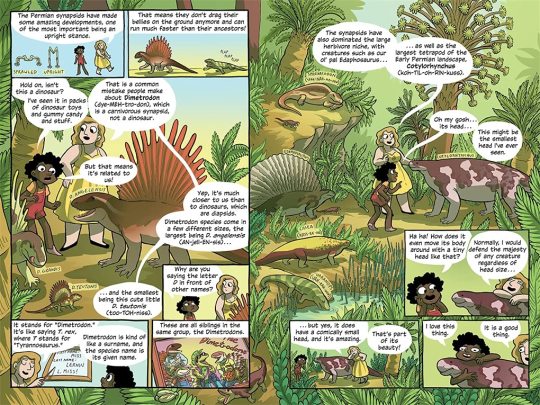
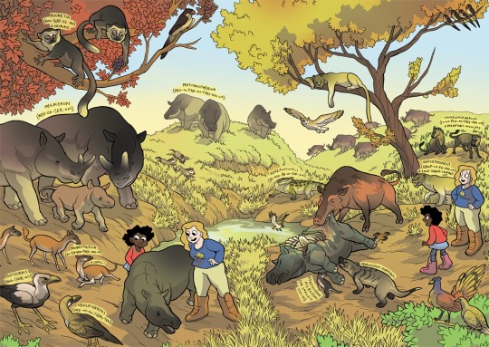
And here's a series I did for kids, where I had to use full color and lay off on the hatching, as well as learn how to reconstruct animals that we have no photo references for, which is definitely a place where style comes majorly into play, whether I wanted it to or not:
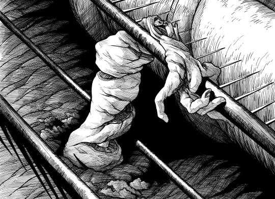
Then there was the horror book I did, where I tried to push my work to be less cartoony overall, and to work very hard on improving my hatching:
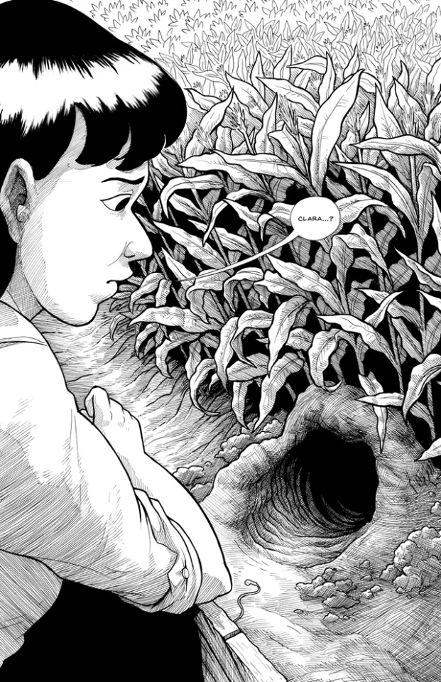
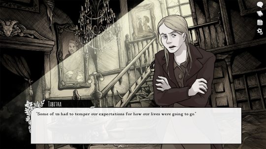
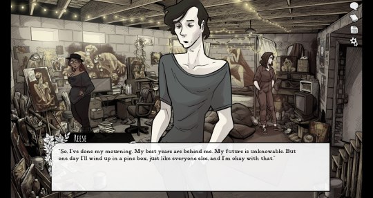
Then I started work on Scarlet Hollow, where I incorporated a limited/muted palette and had to once again push myself to make less-cartoony art, as well as learn more consistency so I could draw sprite sets. This was a big challenge for me, and has helped me grow as an artist so much!
And most recently, I wrapped up work on Slay the Princess, which required that I go back in the cartoony direction, but in a very different way than I was used to. This took a lot of sketching to figure out, and there's still a decent amount of artistic stumbling in Chapter 1 while I settled into it.
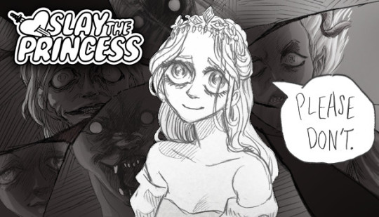
She's drawing on anime/Disney influence, but each Princess required a bit of stylistic variability. Some are more anime, while some are more realistic than even the Scarlet Hollow characters.
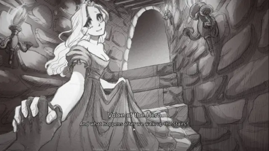
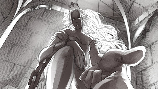
So I wouldn't worry too much, honestly! A person's style is often something that reveals itself over the course of their career, rather than something they choose and then try to stick to forever.
Even if you don't think you have a style, you do. It might vary a lot piece by piece, especially if you're trying to closely imitate another person's art, but the more work you do, the more you'll figure out your own strengths and interests!
#long post#my art#junior scientist power hour#the last halloween#abby howard#scarlet hollow#slay the princess#once you work long enough on art#style starts to feel more like modes you switch in and out of#all based around a core of what you're good at and what you can do#which in itself will change sometimes!#and of course your style with different mediums is gonna be different too#like slay the princess is pencil which is why it looks more distinct from my other work#never forget that at its core art is about messin around#wait shoot i should've put all this in the post#but it's long enough as it is
464 notes
·
View notes
Photo
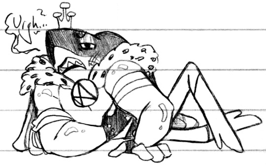
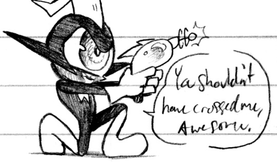
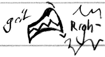
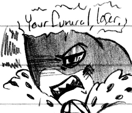
Bitter breakup rivalry (Patreon)
#Doodles#Wander Over Yonder#Emperor Awesome#Commander Peepers#I dunno lol I just wanted to draw Awesome being pathetic and insulting Peepers and maybe immediately regretting it :)#As much as I think their relationship dynamic could go very well I also think it could go very poorly >:3c They have a lot of potential!#Awesome trying to get too close too fast to manipulate him before he's proven a useful asset would basically be a death sentence hehe#Especially if he tried to flex about it - he definitely has physical might over Peepers but honestly I think that'd just piss him off furthe#Like ''You think you can just sling your weight around and intimidate me? Hah! Who do you think I work for?''#Even with the equivalent of a peashooter I think Peepers could take him on ♪ I mean heck he beat the Potted Plant with just his hat#He's very resourceful! Out of necessity but hey it just means he's practiced! I think he could MacGyver his way out of most confrontations#Plus y'know - Awesome is already kinda pathetic haha ♪ He gets a bruised /ego/ and he goes home what would a smack to his face do#That said he was there for the Battle Royale - I think he's aware of his intimidation factor :) Intimidation is also charisma! Haha#I think a fight between them would be interesting Especially if they brought feelings into it but even just a slugout haha#Awesome's really fun to pose I definitely would've drawn more of him being dramatic if I hadn't run out of room#But I mean so is Peepers! They're so fun to draw ahh <3 Look at his shoe/knee contact! Flat foot on the ground! I'm so pleased!#Only took a very cartoony style to finally get me to work on contact points haha ♪
66 notes
·
View notes
Text


Aaaaa okay so I think I’ve finally gotten the hang of how to better utilize my watercolor brushes on clip studio paint! 😭
I’m very happy with how these came out - I tried to find a good mix between the more “realistic” style I’ve been trying out lately and the cartoonier, AtLA-inspired style I had been doing previously (like for the character sheets for my fic).
I’ve pretty much nailed how I like to draw Aang’s facial features at this point, but haven’t quite done the same with Zuko yet. I think this is the closest I’ve gotten to him looking like how I want him to.
#my art#atla#atla fan art#aang#zuko#avatar the last airbender#csp#digital art#zukaang#because i said so
335 notes
·
View notes
Text
Soulmates
Your and Kyojuro’s wedding anniversary is approaching and both of you have secretly prepared a hand-made gift for each other! Although, you were quite surprised what you two have prepared for each other.
Pairing: married!Kyojuro x married!reader


Today was the night of your wedding anniversary, the night both of you prepared for weeks! You knew Kyojuro was just excited as you were, given how he was sneaking around and meeting up with Tengen a lot more than usual. He once even brought a heavy bag home and refused to show you the contents, storing it in a random corner of your attic. That was maybe a prepare kit for whatever is in the box he was holding on his thighs, because that one doesn’t look as heavy or large as you might expected. A large smile was slowly growing wider and wider on his face, his eyes sparkling brightly in excitement. Your husband was side-eying the box you were holding, not sure if he wants your gift first or if he should hand over his.
He has been preparing and handcrafting his gift with Tengen for weeks now! Kyojuro had so many mishaps and failures with previous attempts and hid them from you in shame. His motor skills in his dominant arm has not quite yet returned, even after years of recovering and physical training in an attempt to get back to the level of strength he used to possess. Also, his chubby fingers are not very proficient with handiwork. That’s where Tengen came in.
Kyojuro wanted to make you something out of hand in order to show you how much time and thought he’d put into the gift, so, he made you a pet rock. It may sound a little weird, but he really, really worked hard on this rock… Him and Tengen spend hours choosing a nice rock in the garden, before giving it a little polish and painting your pretty face on it. Or at least he tried. It took him multiple times before he was satisfied with the product. Tengen didn’t want random rocks with your face painted on in his garden, so your husband took them back and boxed the best one! It still looked a little wobbly and not like the best artwork, but Kyojuro really, really hoped you’ll like it!
“Here, open my gift first!”
Your husband offered his box to you and smiled enthusiastically. You slowly lifted the top of the box to reveal… a poorly painted pet rock. It resembled you, or at least you thought so. Kyojuro made a lot of effort to draw your eyes correctly, although he painted just one eye and closed the other by making you wink. You were smiling brightly and he painted a bright blush all over your face, also adding large lashes. The effort of trying to make you look as pretty as possible was really showing. It’s just that…
“Here, open mine! You’ll like it, I’m sure of it.”
You giggled quietly and handed your giftbox over to him. Your husband was a little confused on why you didn’t say anything about the gift or if you even liked it, but didn’t say anything. Kyojuro bowed his head in thanks and slowly opened the box, revealing… another pet rock. It was masterfully painted with his face but with more of a cartoony style, his eyes bright and smile wide. You also painted a couple of his fiery strands along his face to add a little more to his face. The rest of the rock was painted with red and yellow flowers alongside some flowers in your signature colour, representing you and him together. On the bottom of the rock, you painted two stick figures holding hands, also resembling you two. Kyojuro’s smile returned to his face as he loudly began laughing. You couldn’t suppress your own giggles anymore and joined him, taking the painted rock carefully out of the box and held it carefully in your hands as if it’s the most precious thing in the world.
“We truly are soulmates, aren’t we? We had the same idea!”
Kyojuro took his rock out of the box and presented it to you, putting yours and his side by side. He leaned in and placed a warm kiss on your cheek and ruffled your hair a little.
“Let’s put them side by side, else they’ll get lonely without one another.”
You nodded eagerly and wrapped your arms around his neck, pulling him into a tight and almost crushing hug. He placed multiple kisses all over your face before nuzzling his face in your shoulder, admiring the pet rock in his hands.
The only thing missing is another small edition to your now newly formed rock family; a baby pet rock.
🎃
Fictober prompt: “Well, that worked out great” (I kinda strayed from it :,D)
I hoped you liked this one, @starvedluci ! I really have the urge to paint a rock with Kyojuro’s face right now XD
Today I was seriously clumsy, I missed my train and kept tripping in my new boots (they have a rather large heel, I’m very used to sneakers) and almost fell. I dropped my coffee and stained my favourite hoodie and I kept bumping into people and burnt my Tteokbokki :,) It was my favourite and I was really looking dorward to it after a day like this… I hope it’s alright that I’m complaining like this XD
Anyways, make sure to EAT, SLEEP and DRINK enough <3
Take care of yourselves!!
Here’s my event masterlist 🎃
#💠 house of vry 💠#💠vry’s events💠#kyojuro x reader#rengoku x reader#demon slayer#demon slayer x reader#kny x reader#fluff#demon slayer hashira#kyojuro#kyojuro rengoku#kyojuro x y/n#kimetsu kyojuro#demon slayer kyojuro#kyojuro rengoku x reader#kny kyojuro#rengoku kyojuro#kyojuro x you#rengoku#rengoku kyoujurou x reader#rengoku kyōjurō#kny rengoku#demon slayer rengoku
238 notes
·
View notes
Text

Referencing a screenshot from SonicHaXD’s “Mortal Kombat 1 Doesn’t SUCK - Chapter 3: Raiden” on YouTube. Check out that dude’s stuff if you like MK, bro’s hilarious
I tried using a more cartoony style than usual for this one
421 notes
·
View notes
Note
Do you have some REALLY old sketches or drawings of kny characters you could show us, like maybe before your artstyle developed? 😋 (Idk I'm just so curious how you ended up with this fluffy adorable style bc I LOVE IT T-T)
oh my god i absolutely do--
lets use muichiro as an example
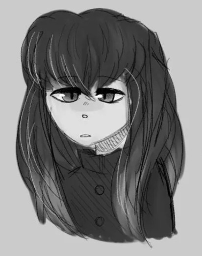
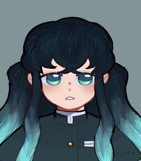
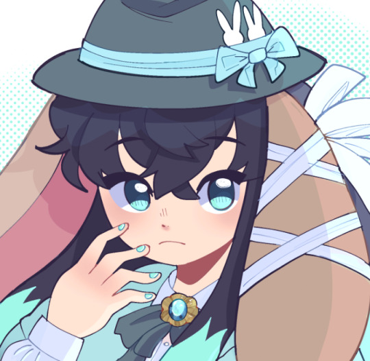
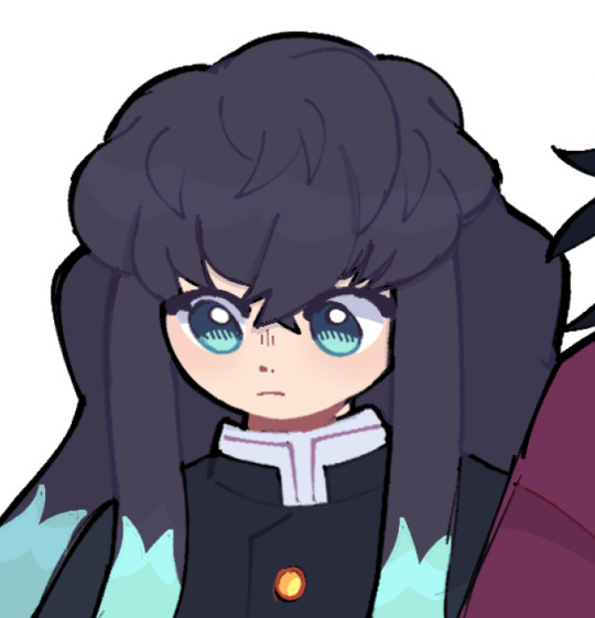
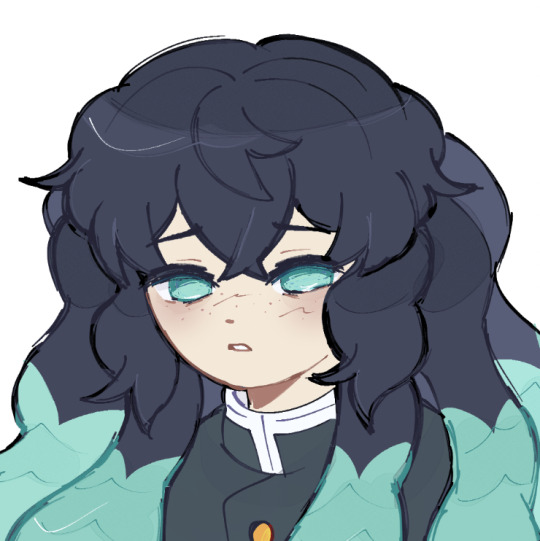
the first drawing was from 2019, to give you an idea of what my art looked like at the time
i had no idea how i wanted to go about drawing humans. at the time it was drilled to me i should draw more realistically, so my work suffered greatly. this is why the hair is so messy and the face just looks so... walten-filesy, i guess
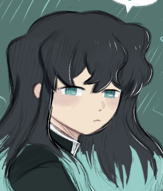
the second drawing was from early 2023, when i tried drawing muichiro again as a result of catching up on demon slayer!
i was still not drawing humans, so you can tell i was kinda experimenting a bit with the brushes. i color picked from his official design
i stopped drawing him for a few months, as i really hated how it turned out. i ultimately gave up on my art for a bit
then, at the end of the swordsmith village arc, i tried again. i ended up getting really attached to all of the hashira, so i drew them little profiles-- as shown in the third image
this is where you can see im staring to develop my style properly. i came to terms with the fact that i wanted a more cartoony style, and i started to embrace it. i also made my own color palette to better fit my art style
from then on, i was fixated on demon slayer, and with muichiro being my favorite, i drew him constantly. the fourth image was drawn a couple months later, after the baby hashira craze
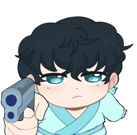
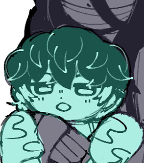

you can see how much it was changing. the detail in the eyes, the way i drew the hair, his palette, etc. through constantly practicing and drawing him, i developed my style more and more
the fifth image comes from the "hugging muichiro" series, in which i had to draw muichiro nine different times
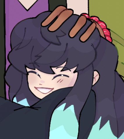
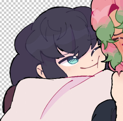
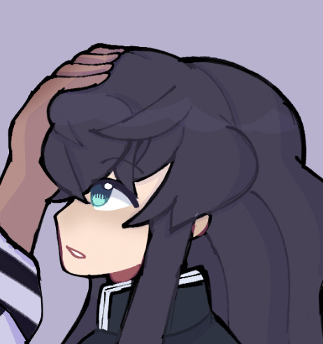
i began studying art styles i really liked, and particularly analyzed the way muichiro was drawn in the manga. i loved his hair, and tried to replicate it in my style. you can also see i revised the palette a bit more to better compliment my work!
finally, the sixth image-- my more recent style!
his current rendition really just comes from me having drawn him so many times. my style just grew and grew and grew! i modified his color palette even more, making his hair more blue tinted and giving him a cool color palette
that saying "practice makes perfect" really does reign true tbh. the reason my style is the way it is was because i kept practicing and revising my work, and i would adopt things i like from other people, such as gotouge themself
i hope this helps!!!
my art literally started off looking like That. trust . everyone has potential!
#askbites#art help#digital art#artwork#art#artists on tumblr#my art#art study#art process#demon slayer#kny#artbites#illustration#muichiro tokito
183 notes
·
View notes
Text
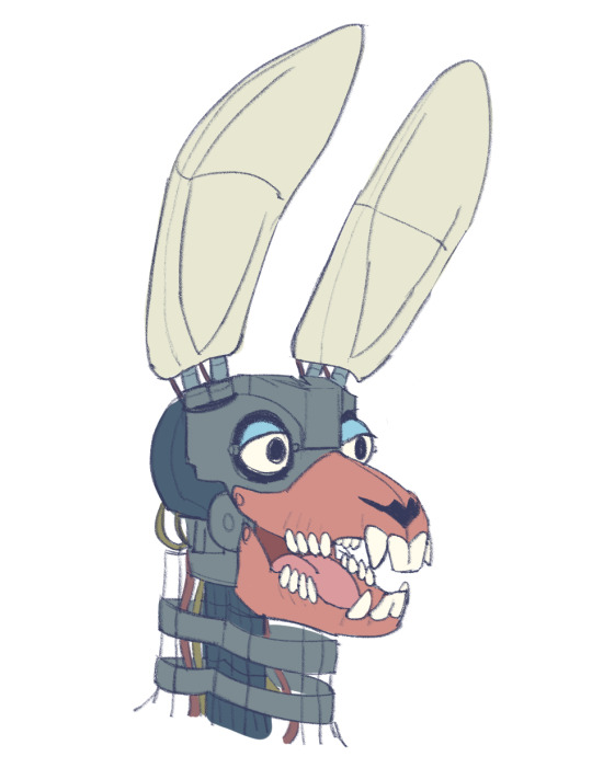
I wanted to try and draw out how I imagine endos look in my style, and I was inspired by an artist’s idea of like a jaw mold to make them more realistic looking and justify my cartoony style and make it make more sense so I tried it out with bonnie.. hope it doesn’t give you nightmares HDJSBSB
inspired by the art of leafyn!
#this was like my first try and studying the endos and different designs#so it will look better eventually KSGFDSJG#and all the glamocks gets personalised molds and endo structures#and for like bonnie his ears are of softer material like silicone so his ears seem more real and soft to touch!#art#fnaf#fnaf security breach#glamrock bonnie
411 notes
·
View notes