#tried a lineless style for fun
Explore tagged Tumblr posts
Text
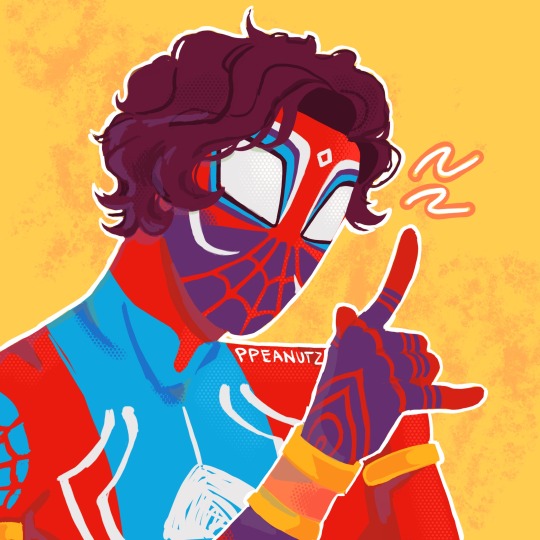
quick Pavitr doodle for spiderverse day! (fyi: click for better quality)
check out my ko-fi
#super excited to see it in theatres tomorrow ^-^#spdv#atsv#across the spiderverse#spiderverse#spider-man#pavitr prabhakar#spider-man india#marvel#my art#fanart#tried a lineless style for fun
2K notes
·
View notes
Text


love jonmartin circa s2 for sheer insanity on both parties
#my art#tried a more lineless style and i loved how it turned out :^) really fun to do#tma#the magnus archives#magnuspod#jonathan sims#martin blackwood#jonmartin#fanart
435 notes
·
View notes
Text

day 302
so APPARENTLY book of life is ten goddamn years old. which is insane. but also a good excuse to rewatch it and look really fucking hard at the art for reference because it's gorgeous SO here's aradia cosplaying la muerte.
#day 302#year 5#aradia megido#homestuck#the book of life#yeah im a decade late to this drawing idea so sue me#GOD la muerte's design is so gorgeous this was so fun#and like an interesting coloring style i tried out in order to get it down#like. simplified semi lineless but textured#idk it's a new one for me i usually dont go this rough w it but i knew i had to get colors down#bc the colors are such an important part of la muerte's design#and like. one of the most fun parts lol
180 notes
·
View notes
Text
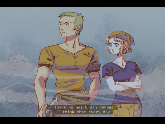
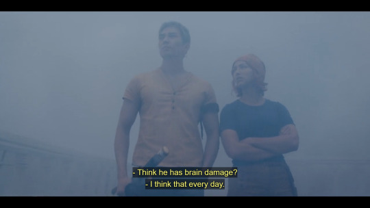
i love...wanpee...........🍊🍶🧡💚
#one piece#nami#zoro#one piece live action#opla#my art#alternate caption: dum dum fruit#im so happy that more and more people are getting into op it truly is the series that keeps on giving#op is a series easily misunderstood by its art style and goofiness but at its core are themes about abuse of power. its so well written#AND IM SO HAPPY I FINALLY HAVE TIME TO DRAW FANART FOR FUN AND NOT FOR LIKE. A CON OR STH AND WORRY IF MY ART IS “SELLABLE” OR “MARKETABLE”#*checks watch* apparently i havent drawn fanart for fun since december so thats like. 9 months#i had the biggest difficulty with this drawing#i actually drew this first in a lineless style. i attempted it lineless TWICE. with 2 diff brush sets/techniques#then i lined it and i was like hmm . i dont like this its too stiff#so i tried it with a lighter hand and im like !!! it clicks#i honestly do think im pretty rusty and bc of not drawing for fun in a while i dont really know what#to do with my art style direction as of late#so i may try a bunch of different things. and i hope people enjoy em regardless!#ill try to do a screencap redraw every few days this is really fun#i also havent had time for video games in months so im also relieved ill have time for more games n game fanart hopefully
986 notes
·
View notes
Text
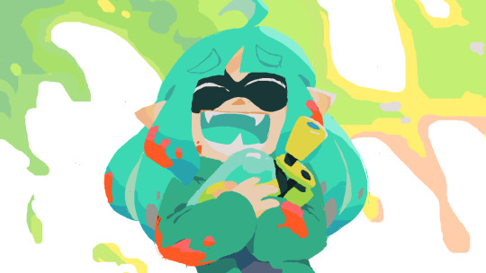
Yo, the Splatoon video I've been working on for 6 months is finally up on YouTube! If you'd appreciate some gameplay tips from a certified Splatoon addict, give it a watch~
A lot of my old inkfish OCs, like Meri here, are cameoing in this video, and will likely be popping up in future installments too. Might as well use 'em for something. ^^;
#this is the first time i've tried to mimic Splatoon's lineless style#it was a lot of fun ^^#even at 2 am ^^#splatoon#oc
38 notes
·
View notes
Text

My trainer kiddos, headed out from the Academy to explore Paldea! (For my little story the school is both Naranja and Uva Academy, one is for the STEM track and the other for humanities!)
#tried a lineless style to match the in game selfie poses and it was really fun!#also made it nice not to worry as much about lineart since that always takes me the longest#pokemon#pokemon trainer oc#pokemon scarlet and violet#pokemon oc#pokemon sv#untitled pkmn story#art tag
12 notes
·
View notes
Text
i also have been testing pngtuber+ vs veadotubemini and heres rhe fruit of a 49 layer model
#not all the emotes are shown in this lil demo theres one i keep forgetting where it is lmao#return of the coke heartthrob#i like that i made a pngtuber despite the fact that i am extremelt averse to being percieved in video formats. i used to stream more#n would do drawing streams specifically while working on projects but. ive been outta the game so long im not. too sure how i feel about#like. going back#i also did yt for like. 2 videos during lockdown to try and chronicle that whole art school mess and ended up exploding#this boy is not made for audio/video formats 💔#this is actually to test run how efficient i could be if i were to make pngtuber a commission option when i open those#this took 5 hours and all his psrts including clothing are separate and he has skin under there (i dont save the images like thst tho)#so i can swap out outfits n stuff n not have over 49 moving parts#the ONE issue with this lineless style though. is recoloring parts#i tried to do recolored mouths for s paragon model and it was a pain so i didnt rlly finish or save it.#i think i still prefer veadotubemini tbh. the blinks feel more natural in it than in pngtuber+#but i rlly like the bounce that pngtuber+ provides for just Talking#so. hit or miss#and before anyone asks no i will not be learning live2d vtubing and will not make a 3d vtuber#all of that is just too scary for me i respect everyone i see who does it WAY more now that ive like. LOOKED it over#scary shit. leaving that to the professionals#my 3d model is strictly for fun and because i like vr and vrchat. but i do not think ill ever make a vtuber in 3d.
8 notes
·
View notes
Text

spiraling 🌀
#my art#original art#personal art#artists on tumblr#digital art#i tried out a new mostly lineless style for this one it was fun!!
8 notes
·
View notes
Text

O BTW b4 i go to bed. heres some silly stupid doodles of my redesigned trollsona since im rereading hs now anyway ^__^
#in a style i have NEVER USED BEFORE#i didnt mean for it to look so similar to the hiveswap style lol#i just wanted to try making lazy doodles while still doing lineless to try it out#bc its been sooooooo long since i did that. and i always obsess over shading when its my usual lineless so they always end up needing more#effort than theyre supposed to#so i tried something new! except its not really new its actually totally old i just tried doing it again after a long time!#anyway. heres everyones beloved zairku after all these years 😁#was debating on whether or not to put this on my main rather than my selfship blog but i decided its ok#my selfship blog is primarily meant for (believe it or not) the actual shipping part#so just sonas and stuff is fine on here<3#doodle#zairku edjera#had fun wit these designs btw it feels so weird to draw any kind of homestuck art again after so so long#also whoops. forgot their gt wings lol#OK EDIT. added god tier wings heehehe ^_^
20 notes
·
View notes
Text
Decided to try a few different ways of rendering the same sketch


#Kakashi Hatake#it was pretty fun#i want to experiment with the lineless blocky style more because it's the first time i've tried it
3 notes
·
View notes
Note

Eddie is waay too excited to get to spin someone as fast as possible! Sorry Poll!
Also there's an extra swing now? Maybe other eggs can swing too!

:D
The slides were really fun with Gemstone!

Now, who wants to join me on the tire swing >:D
#poll's egg playdate#poll the egg#poll's egg playdate shenanigans#Thank you Poll and everyone with eggs these are super fun#also tried something new here with the lineless style
33 notes
·
View notes
Text

[Click for better quality]
Ok yay I'm back from my vacation yipeeeeeee. I started this drawing of Keiki before I left and I was half considering just giving up on it.... until I did a short study of facial planes and then got motivated to work on this again! I'm glad I didn't give up on it though, as I'm actually really happy with this one!
Artist's Notes;
So as I mentioned in my last post about Touhou 17, I wanted to finish this by the game's five year anniversary but with how progress was going I didn't want to rush this so I decided to take a long break from it. Mainly because of the face. For a while now I was kind of feeling like I was stagnating with my drawings, not really in the clothing but in the bodies. There was something about the way I was rendering them that I just wasn't happy with, and after talking with someone else about this issue, I realized that the reason I felt this way was because the faces were too flat and didn't match the rest of the drawing and that I needed to find a way to make the rendering of the face feel consistent with everything else. So after doing a short study of the plains of the face (I used this 3D head model from art station as a reference for my short study, please go give this person some love as they are a lifesaver) I went back into this drawing and applied what I learned here. It was only after that that I finally became motivated to finish the piece, and while it started off as just a simple character sketch like Saki and Yachie's were, the moment I added in Keiki's little fire dragon I knew I had gotten in too deep and now here we are with a full on background. OK it's not super crazy or anything, but it gets the job done and it's better than there just being an empty void behind her. It's rare moments like this when I use brushes other than the Clip Studio Default Charcoal Brush and use the Clip Studio Default Paint Brushes as well (god bless the oil paint and dry gouache clip studio brushes, they were amazing). I don't know why but painting fire has always been really fun for me, there's something oddly satisfying about it y'know? I do think that another reason for this problem was because I was drawing faces like I would in my more sketchy style that didn't mesh well with my lineless style, so I'm glad I've started remedying that.
After adding in the fire dragon I had an idea to kinda make it feel like splash art in the way the composition works... probably because I have been playing Reverse 1999 again and it has taken over my brain. I do feel like Keiki's tools get a little lost in the composition, and I didn't fully render the metal parts of them mainly because I didn't feel like they needed it, but that's just something for me to improve on later down the line.
If you guys are wondering where I went for my vacation, I went to New York and got to go to the MET and the Museum of Natural History. In both places I found Kofun period stuff and I was so happy to see it you have no idea. I remember one of the Haniwa I saw had some neat face paint under the eyes that I tried to replicate with the makeup under Keiki's eyes in my drawing, though I think I'll gave to figure out how to draw makeup on characters because this reads more like blush to me than anything. While drawing this I also looked up some references of Kofun period jewelry and really liked the stuff I found, which also meant that now she has proper Kofun earrings instead of earrings shaped like Kofun tombs. I put some of the things I referenced with a closeup of Keiki's face as well down below. I made her outfit more reminiscent of the outfit I gave her at the beginning of the year with the buttons and all, though I do want to try and draw her in some more period accurate clothing like the Haniwa I took a picture of at the Museum of Natural History. I wish I could find a way to make her handercheif look better though as I wish I made it a little bit bigger, though I think I'm saying this because I've looked at this drawing for too long lmao. Once again something to work on for when I next draw her. Also want to get better at rendering hair, as some details (like the little strands in front of her ears) kinda got unreadable due to the similarities in colour lol.

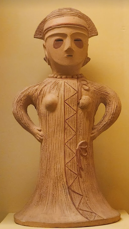


Now you may have also noticed the little cracks I added onto Keiki's face, and that's because I have fallen in love with the idea of Keiki's body being made from ceramic and that she crafted her body herself. While they aren't very visible I also tried to add some doll joints to her body, which is an idea I played around with in the past but never went to far with. I also want to get better at rendering cracks in ceramic, porcelain, etc, as I'm not sure how those read in the drawing. I also have a headcanon where the cracks in Keiki's face show up because of heightened emotions, and while Keiki is aware of this and does her best to make sure her face doesn't break off.... she will still end up with at least a few cracks during any given day, and she can often forget to repair her own body quite frequently so Mayumi has to remind her quite a lot. Mayumi even taught herself some basic sculpting techniques to help repair parts of her body that are so badly damaged to the point where Keiki can't repair them herself, i.e. if both her arms broke off, Mayumi would put them back together for her so Keiki can at least have something to repair herself with rather than nothing. I also like to imagine that if Keiki created her own body, if you took a look at Keiki from the beginning of her life she would look completely different compared to now.
BTW If you guys are wondering what a very very angry Keiki looks like....ok in order for this to make sense have any of you read volume 11 of Land of The Lustrous? Am I bringing back some memories for those of you that have? Ok good, glad we all got that mental image brewing in our minds, I'll probably draw a version of Keiki that is somewhat inspired by that one day as it's an idea I've had for a little while now. And to those who haven't gotten to that volume yet and are confused.... don't worry about it, just keep reading :)
#touhou project#art#fanart#touhou fanart#touhou 17#keiki haniyasushin#wily beast and weakest creature#touhou#東方project#own art
191 notes
·
View notes
Text

@dynamicsimp hope ya like it!
EYESHOT AU DITY
I literally did this in one day- help.
So yeah, I tried out the gosh-dang challenge and honestly?
Quite happy with how it came out! It was very interesting and actually very fun working on a piece with a monochrome pink palette!
Gosh, I haven't gotten to use my REAL lineless style (I use it for stickers but I haven't done any stickers in forever) where all the cel shading is real harsh and as it says in the title: no outline.
Lately, I've been more focused on lighting and texture in my digital works and just making everything 'softer' and more 'realistic' but dang, I forgot how much I missed just using my harsh and more cartoony style.
But because it looked good, here's the one with some light:

I am very happy especially since I do believe there is some improvement in the style.
(In that it doesn't look as amateur as when I first started out. But I think that's mostly cause I used monochrome here)
Does anyone else get that struggle? Feeling like you're not advancing then keep pushing yourself to change and improve but also really missing the original style?
Anyways some of y'all might be wondering where I've been for pride month....
I PROMISE IT'S NOT CAUSE I HATE PRIDE MONTH OR LGBTQ+ PLEASE PUT YOUR PITCHFORKS DOWN!!!!!
Mainly it has mostly been art block and just demotivation especially since I'm STILL WORKING ON THAT BIG PROJECT UGHHGHHHGGGHHGG.
(I'm not blaming y'all I'm just feral)
And just general procrastination.
BUT.
I do have another project in the works. So to any of my lovely marshiemallows who have seen my previous posts,
you'd know that I'm very...opinionated about Macaque. More specifically his attitude in canon and how the fandom treats him.
(Keep in mind the thing was planned before s5)
DISCLAIMER: Again, I do enjoy Mac's character. I just think he's a bit of a d!ck and kinda hates how a lot of the fandom (not all) brushes that over and throws the bucket of Wukong's sins down on the king's head.
(I also would not hesitate to wack him with a stop sign on the chopping block if given the chance /hj)
But without further ado I decided to do something other than complain and present you guys this:
Yay! So if you're into Macaca bullying, join the Mac bullying train! CHOO CHOO!
(also big thanks to @furornocturna for beta reading and helping with characterizations and stuff. There will be another post just detailing bout the fic later but yea go check them out, their work's great)
AND HAPPY ANIVERSARY TO DYNAMICSIMP FOR THE AU!
#lmk#lego monkie kid#my beloved#art#py's_art#lmk au#lmk eye shot au#lmk fanart#shadowpeach#lmk monkey king#lmk macaque#lmk sun wukong#lmk liu er mihou#lmk six eared macaque#the hero and the warrior were like the sun and the moon
223 notes
·
View notes
Note
Not a traditional request, but I'm curious to see how your art is formed and what your process is. It's so cool that your art is similar to comyet's!! I always wondered what other people in their newer artstyle would look like but they only ever drew Ink. I guess now I have a chance :D
Drink water and i hope you have a good day!!!
this is a really interesting request!! thank you for asking, actually! i like questions like these :-D
i'll start by explaining my personal art process—how i, 12-year-old me started out, and then explain how i got where i am with my art today! buckle up, because this will probably be a lengthy post :-)
The Progression of my Art
my first ever art posted online was at the beginning of 2020, when quarantine first hit. i had always had a knack for art; doodling in class, making OCs, etcetc. however, when i heard about undertale through a friend, that's when i really started to take things serious.
i did all the things kids do when they first find out about undertale—i watched countless comic dubs, animation memes, looked up fanart, etc. i first started my real art journey when i began making fanart for undertale and the AUs. this is why undertale is so special to me, and why i have loved it for so long! it has fueled my creativity for almost five years now.
this is the first fanart i ever had done. i posted it on amino sometime in may.

i was SO so proud of this piece. i showed it to my friends & family, and then decided to show people online! this was my first big milestone as an artist.
as time went on, i improved more and more, creating countless UT AU artworks in my spare time. and it was all because of the people who were kind and supportive of my art! the UTAU amino will always hold a special place in my heart, because of the positive experience i had. the positive feedback i got is what drove me to really want to start improving my skills and become a better artist like the ones i looked up to 💛 this is why it's so important to be kind to beginners. even if their art isn't the best at first, you bet your asses it'll be in the next few years!!
SO! i drew and improved, really just trying to find my own style that i liked. i had always loved ink sans, and that prompted me to look into his creator's artwork around late 2022-early 2023. i followed her instagram, and at first, just admired her work from afar.

then, i tried out replicating her style! this is the first piece i ever drew inspired by mye! i made this last fall, in 2023.
after that, i tried to find my own style some more, leaving the lineless style behind. but, in may of this year—2024—myebi decided to hold a DTIYs, and that's when i decided to replicate her style!
i know, i know, kinda defeats the whole "draw this in your own style" thing... but i had been wanting to try and replicate their style for quite some time, and i saw this as a perfect opportunity to try it out!

this is myebi's OC, aheran, that i drew for the contest !! it isn't exactly like her style, obviously, since i didn't want it to be too similar and weird mye out. however, i did replicate the lineless style, the grain textures, and the shading style as best i could. i also played around with shape language.
this piece was SO fun to do, and i did end up earning an honorable mention!
this was also my first post on instagram. after this, i started to draw all my art in a style inspired off mye's!
How do I draw in Comyet/Myebi's style?
here is where i'll be answering your question: what does my process look like when I'm replicating myebi's style?
i'll try my best to break it down into seperate steps that i usually take!
1. References!
References, references, references! References are the most important thing you need when trying to replicate something specific. I am currently at a point in my style where I do not usually need references, but you bet I used them big time when I first began to replicate mye's style!
Personally, I believe her instagram (@mye_bi) is the best place to get recent refs of her style! It's the social they post most often on. For Undertale specific references, I gathered them from her Tumblr (@/comyet) because her insta doesn't have Undertale related art. You may have to scroll a bit, but you'll find it on her blog!
I also have some niche references from other online sources, but I had to dig quite a bit for them. You don't need to be that thorough lmao

all art by myebi/comyet!
2. Sketching
After I gather references, I start with a sketch! Really, it's just taking a bunch of references and finding things you like/need to replicate in your piece. If there isn't a reference for something you are trying to draw, then the best you can do is guess! I have to make guesses on how Myebi would draw something all the time, because I draw a wide range of different characters. It's all about experimenting and doing your best!

sketch by me, ink reference by @/comyet, error reference by @/loverofpiggies
3. Coloring over the sketch
After I finish the sketch, I go straight over it with all my base colors! I typically do everything on seperate layers, which procreate... hates. I use a lot of layers.

And, to finish off, I really just add details! Lines, textures, shading, etc. I can't quite explain how I do it—I just go off Myebi's style!

Finding the right brushes
I have spent a long time trying to find brushes that best replicate Myebi's style, and the one I linked below is the best I've been able to find! It's the pack I use right now.
I use Weak Pencil 3 for any lineart I do, I use Fine Pencil 2 for color blocking, and Weak Pencil 4 for the grainy textures/shading :-)
The pack does cost a bit of money, but unfortunately, I haven't been able to find a free brush pack that gets the job done quite the same!
and that's all there is to it! i hope this answers your question and gives you some insight on how i make my art :-D
DISCLAIMER: i am not attempting to be a "myebi 2.0" or anything like that. i simply really enjoy how their style looks, and i enjoy drawing in a similar style! i mean absolutely NO ill intent towards mye—she is my biggest inspiration, and i will always have the most amount of respect and admiration for them and her work. 💛
#utmv#undertale#undertale au#undertale fanart#error sans#ink sans#errorink#error x ink#frisk dreemurr#frisk undertale#inkblott#myebi#comyet#art journey#i really hope this helps people lol#or inspires people#idk tbh#i love you myebi!!!#sans undertale#sanscest#error sans x ink sans#utilizing sans tags for reach lmao
103 notes
·
View notes
Text
HERMIT A DAY MAY - DAY 10
Stressmonster x Cucumber Quest
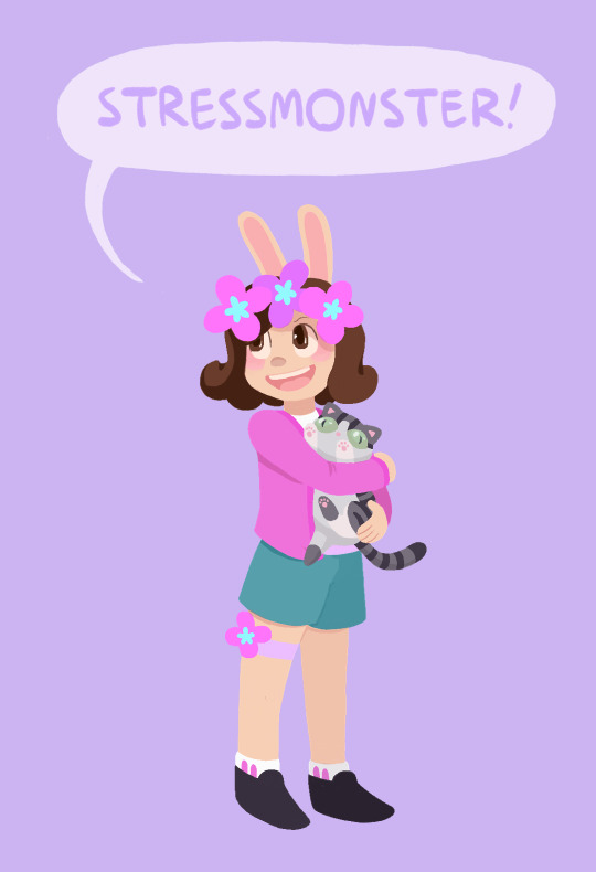
For Stressmonster I chose the wonderful webcomic Cucumber Quest!
I chose this design for her because I thought her colors and aesthetic would work wonderfully with the art style. I also think she would probably appreciate how cute the comic is if she were familiar with it.
This one was very difficult for me and I'm still not entirely satisfied with how it turned out. The rendering for this comic uses a very different style than what I'm used to, and I had some trouble reverse-engineering how the visuals are created, so it didn't turn out as on model as I would have liked. But, that being said, I think she looks adorable anyway. I also totally made up how the kitty would look, since as far as I can remember there aren't any kitties in Cucumber Quest, so I came up with her design from scratch.
To learn more about Cucumber Quest and see my style references, adventure below the cut! (The funds are still raising for Gamers Outreach!)
Cucumber Quest is sweet, beautiful webcomic by the artist Gigi D.G. It follows the adventures of a young rabbit boy named Cucumber and his sister, Almond, as they go on a quest to defeat the Nightmare Knight. Unfortunately Cucumber Quest will not be finished as a comic, due to changing circumstances in the authors personal life, but the story will eventually be concluded as an illustrated script and every one of the over 800 pages of the comic is more than worth reading.
I cannot say enough good things about Cucumber Quest. It has a charming, engaging story, beautiful art, and fun, memorable characters. Please give it a read if you have the chance, you will not regret it. Style references:
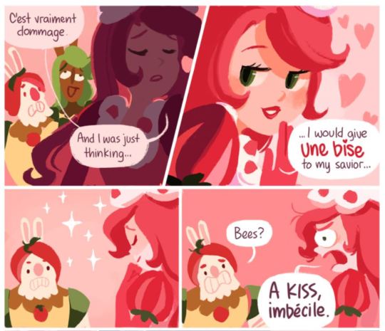
The comic uses a lineless style and soft color palettes. The shading changes drastically with the lighting, but I tried to mimic the style as it looks with flat lighting (such as in most panels of the above example).
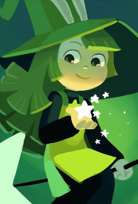
Here's an example of a character rendered with more dynamic lighting (this is Peridot, she is a witch)

Cucumber Quest title banner
#I think one of the issues here is that I do not know the best brushes for this style#but I am still glad I attempted it since I love the art in this comic so much#I also think the original artist might block the characters in with shapes then add detail over top#which I am not very good at and do not have much experience in#since I am a big sketching and lineart guy lol#And yes the kitty is a Jellie cat#hermitaday#stressmonster#stressmonster101#hermitcraft
105 notes
·
View notes
Text

Tried a lineless art style like the new Carmen Sandiego and found its much harder than it looks!~ Fun though!
#digital art#science fiction#original characters#original character#zero#carmen sandeigo 2019#project kaimera#lineless art
127 notes
·
View notes