#triangular pose
Explore tagged Tumblr posts
Text
🎃nightmare suit groovies~🎃

***Spoilers below the cut!! Please note: The R cards (Azul, Epel, Vil, Malleus) do not have new illustrations.***
OH MY GOD STOOOOP 😭 NIGHTMARE BEFORE CHRISTMAS CHARACTER CAMEOS IN THE GROOVIES??? ?? ?????? ??!???!? ?? ??? YOU MIGHT AS GFWELL WALK RIGHT UP TO ME AND IRiP MY FRIGIGN HEART OT RIGHT NOW
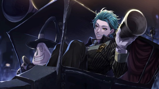
wWAHASL,ADFJHHDUPGFFI42T69O38QGPEGBIP;DGN;GDN;J J WORD SQUASHED U P IN THE AMYOR'S LITTLE CAR.. . . ....... . . . ... . . .. . ...... . . . OTL With the hair pushed back like that, teeth out, and eyes lidded, Jade almost looks like Floyd here. I THPOGU TI WOULDN'T BE sURIRPISED BY HIS SMIELS ANYMORE BUT I GUESS SI AWAS WRONG... This smile's very different than his unhinged/suspicious/evil ones and his pure ones, it's charming but more on the relaxed side. I also noticed the teeth are wider than usual (again, very Floyd-like), Jade's are narrower/smaller.
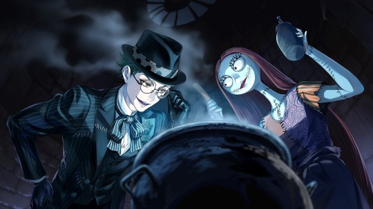
I like Trey's Groovy a ton! A lot more than I thought I would, actually. The blueish lighting and him looming over Sally's pot reminds me of his Club Wear card. ahdbasdlai There's also a slight sheen to his eyes, so Trey comes off like he's fascinated by her cooking and wants to learn more about Sally's techniques. He looks slightly shady too though, like some drug dealer inspecting the goods...
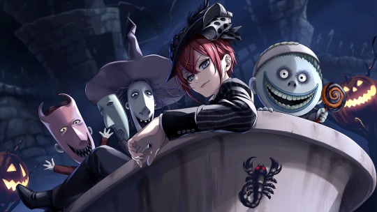
FHLBOQYW8QYFAFWI LRIDDLE'S RIDING IN THE CURSED CHILDREN'S BATHTUB... It's a little terrifying how hyperdetailed Lock, Shock, and Barrel's faces are and how they're all staring right at the camera. Riddle seems so calm, glancing at you over his shoulder with a little smirk. I usually don't use this adjective for him, but it makes Riddle feel cool! And since the image is shot from a slight worm's eye view angle, it gives him the illusion of being taller than he actually is--
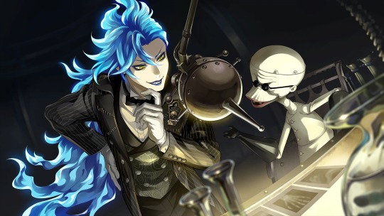
Go figure, you slap the mad scientist character with the mad scientist of Halloween Town. Perfect pairing, honestly. I get very similar vibes between Idia and Dr. Finkelstein as I did with Trey and Sally; Idia is showing a real interest in the good (?) doctor's work and they appear to be deep in a discussion about it. The way Idia is bending over the table adgvkadsdval it kinda gives his body a more... triangular shape... that I just KNOW bro doesn't actually have. His face here seems more elegant than usual, almost Vil-like.
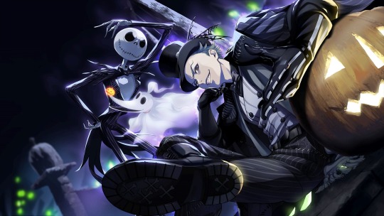
Thanks for the uncalled for viewing of the underside of your boot, Sebek 💀asjldboaysvyfevfeq I CAN'T DEAL WITH THIS, he's trying so hard to come off as intimidating but I cannot see him as "the boss", even if he is posed like one. Give that jack 'o lantern some credit though, it sure is doing a fine job of supporting Sebek's big ol' beefy arm. Jack Skellington in the back is also sending me... Is he supposed to be intimidating??? That positioning just makes me think of someone leaning against a doorframe and trying to flirt by calling you their babygirl. GHBLIABFYIABFIAF ANYWAY I DON'T THINK THIS GROOVY WAS FOR ME
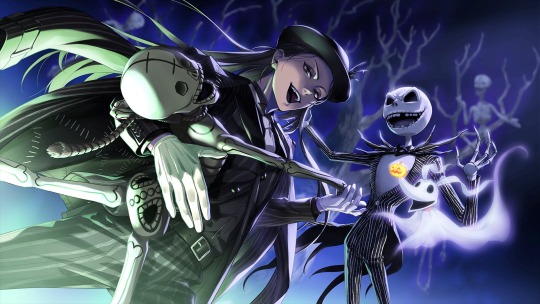
... wHAT THEFUCK. That was NOT what I expected of Jamil's Groovy. First was the weird pumpkin stroking, now bro's dancing with skeletons?????? IS THIS JUST WHAT HAPPENS WHEN YOU'REEMOTIONALLY REPREssED YOUR ENTIRE LIFE... YOU POP OFF AND DO THE MOST OUT OF PocKET THINGS FOR FUNSIES?????? Jamil looks so smug as he's doing it too, it feels like he's shittalking you like a Mean Girl while he's busting a sick dance move. (Cameo: his toof) Jack in the background also looks the most sinister of all the SSRs. That combination of laughter and showing off his teeth... Unsettling.
.
.
.






waht the hell. What HTBbr heLL. WHAT THE ACUTLA EHLLMIS THIIISISISISISSJISISISSSZ>/>?????w?f>fwlwkwfkfwjfwjkqljirtfyqnNOEGWOQG.,P57KIRJEI0RW08J:????>f>>fw>f>fw<wf<q>:q?q>v?v?v?v??gogibopobfuiibadh wnethuhw
WHYT THEUFKC FDUCC DOES THIS SLAP SO HARFZD OTL
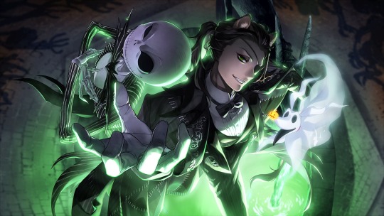
ADSHJFIAGVTFVUOQEFVUBKQDWLGYQERGYOQF evyEROYNTHING AB OITU T THIS IS JSUT.... AKJBFLIUHADFIADFLF RIGHT UP MY lallEY... The extreme bird's eye view angle????? Jack with his arms crossed and that skeletal smirk??? Zero's little duck beak-shaped mouth?? The eerie green glow emanating from the fountain water below them? NLBVHDSKIUEGFABOGVSAEFYIPodp D nad HE WHOS HALL NOT BE NAMED V,NJ DBIOADFVIYOADFOTVFE8AYPFIEGWOBPFQEBOVGWIPEGBSNMVPOADVBN;DDBK;RWHOUGWBIQEPGNJQEG TH wE WHAYT THE FUCKCING ANGLR FRAMES HIS TITS AND MAKES HIS LEGS LOOKN EXTRA LONG, THE GRIBGKDJULBADFLBAFD CAPE WSWISHinG EVEYRWHERE, THe LIGHTONIGF FON HIS AHDNNEOMS E DAFACE, THE FUIDFSLBDFBKHAEFLBHQEFALBFEAL FA HADN TTHE FEGRIIGGING HAND HE'S OVFFERINGF TO YOU7? ? ???????? ? ?b?@??gb ? ? ? ? ? ?b>b>KNBNRIOBIGEBOYVDOGY8EANOapnjbgywt80pboqegwp,m iS THIS FUCKING BITCH ASKING FOR OUR HAND??? ? ?? ?? ?DOOahaaHAHhhghghghhghhgHHHHHhhhHHHHARRHRHGHGHGHGHHHHGHGHGHGHHHHHH HH H HHHH H H H H H I WANNNA bE SANDED TO BE PUT ouT OF MY MiSERY, I'M TAKING SO JCMUCH PSYCHICHDAMAG E I CAN'T TAKE IT I';N M GOINC CGATRAZXY. .. . . .BVL;,DFIPTOTO OT LTLTKT FLFL BHIVUASFOVUAFSA
gGUSY I THINK TI',M GDON E FOR, IT'S LEoVER FOR ME I SPENT SO LONG DENYRINH IT I DIDN'T WANNA ADMITR IT FOR MY OWN PRIDE BUT I'M DONE fRO I'M A GONRER BYE IT'S JFDAUBIADGOVUAFODUTVEFTI7EFWOIAVD;LIVOYGPGWEFQOIGYEQPgkjd TIUFQETO3R1QEFOTFQEG.5OIMH903GW9UPBAfpjFOVHDN;./'[;,KP[K,[LN,,L>:c<<l:LBHIDABIOUFPAOYGVEQBFPGWBPGHLGWBPQEFPGIAE whnEN YOU YSEE ME DNEXT I'M OGNNA BE LAid OUT IN A PIUMPKING PATCH DECATINGF CUZ THSI GROOVFY KILELD ME
#disney twisted wonderland#disney twst#twst#twisted wonderland#twst jp#jp spoilers#twisted wonderland jp#twst halloween#twisted wonderland halloween#Riddle Rosehearts#Trey Clover#Azul Ashengrotto#Jade Leech#Leona Kingscholar#Jamil Viper#Epel Felmier#Vil Schoenheit#Idia Shroud#Malleus Draconia#Sebek Zigvolt#notes from the writing raven#dr. finkelstein#sally ragdoll#zero#nightmare before christmas mayor#lock shock and barrel#jack skellington#nightmare before christmas#Jack Leech thirst#NOT L*ONA ROT
600 notes
·
View notes
Text
Two tailed siren candelabras
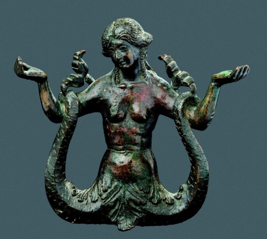
After the Renaissance, the two tailed siren was used more in decorative art than as a meaningful figure. However, she keeps her iconic pose, likely inspired from ancient images of the Scythian snake-legged goddess: A young woman with two outstretched tails that she holds with her hands. I find it fascinating that this image remained so unchanged over the centuries, and continue in popularity.
The history of these siren candlesticks, produced in several workshops in Italy in the 1500s, has been chronicled by Alison Luchs in The Mermaids of Venice: Fantastic Sea Creatures in Venetian Renaissance Art, Chapter 5: Table: Bronze Sea Monsters for Private Homes in particular. Let’s admire these lovely, well-preserved two tailed sirens from museums around the world:

Candlestick in the shape of a two tailed siren. Workshop of Severo da Ravenna of Padua, Italy. Circa 1510 - 1530. In the Louvre.
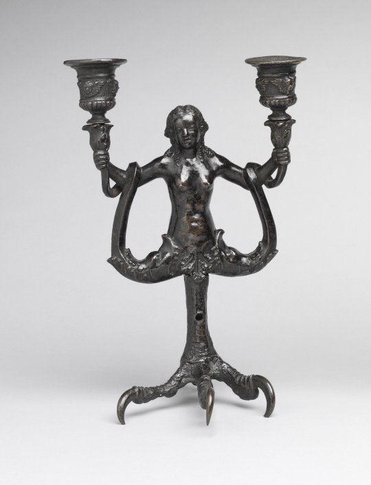
Candlestick in the shape of a two tailed siren. Workshop of Severo da Ravenna of Padua, Italy. Circa 1510 - 1530. Candleholders might be modern additions. Philadelphia Museum of Art.
Both the sirens in the Louvre and the Philadelphia museum have their tails draped around their arms, similar to this Italian fresco, and they have acanthus leaf skirts, which sirens from ancient times have often worn. Luchs suggests the eagle-claw stands could be related to the sirens' ancient form as bird women.
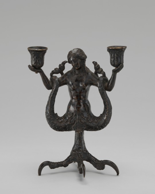

Candlestick in the shape of a two tailed siren. Workshop of Severo da Ravenna of Padua, Italy. Circa 1510 - 1530. National Gallery of Art. The museum has photos of the siren from two angles, so we can see her long hair streaming down her back.
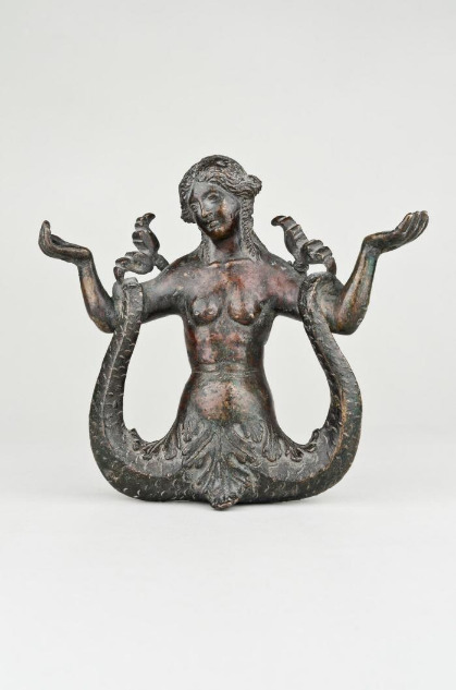
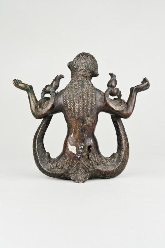
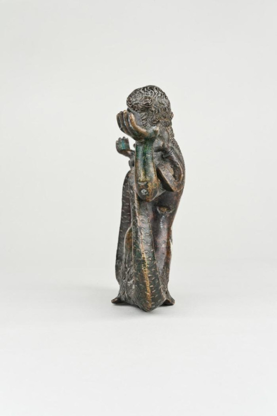
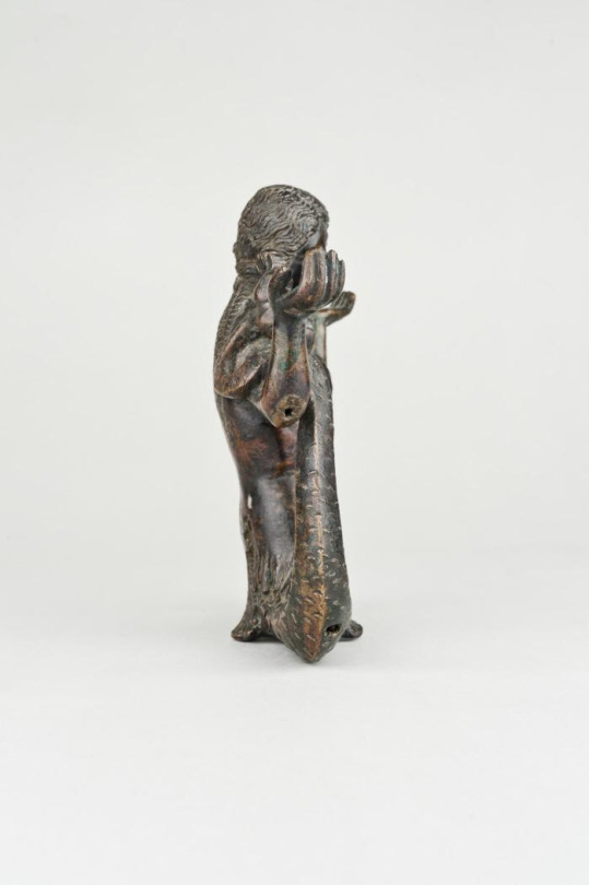
Candelabra, in the shape of a two tailed siren. Workshop of Severus of Ravenna, Italy, 1500s. National Archeological Museum, Madrid.
While the siren candlestick from the Madrid museum is damaged, the museum does have four photos of the siren, so we can see what it looks like in the round.
From the museum website:
"Candelabrum in the form of a Siren, with a nude torso, with subtle anatomical modeling; it has a forked tail, which it raises and wraps around its arms; it separates these from the body and raises them, forming with the palms of its hands the necessary base to hold two candelabras, now lost. The face of this example resembles the Venus of "Antico" preserved in the Walters Art Gallery, Baltimore. Coppel points out that different versions of the Siren theme are known; some (Foulc collection, Paris) preserve both candelabras; on other occasions, the model was used as a door knocker (examples in the National Gallery, Washington; the Berlin Museum; and the Palazzo Venezia Museum). This work was executed in the workshop of Severo Calzetta, known first as the "Master of the Dragons" and later as "Severus of Ravenna." His figures are distinguished by their abundant hair, schematic treatment of the muscles, and highly expressive hands. Triangular bases and square holes for inserting additional pieces with hand-made screws are common in his workshop. His foundry was undoubtedly one of the most prolific in Italy in the first half of the 16th century. This candelabra belonged to the Marquis of Salamanca, who amassed a significant collection of small bronzes during his business trips to Italy, which he sold to the Spanish State in 1873."
There are siren candlesticks from the same workshop in the Ashmolean Museum, University of Oxford, and in the the Museo del Bargello.
I’m going to wrap up this post with a siren door knocker. While it’s not a candlestick, she’s also Italian, and an interesting example of this motif. Note that she doesn’t have arms, as she has wings instead:

Two tailed siren, door knocker. Italian, 16th century. National Gallery of Art.
She also has the siren’s traditional acanthus leaf skirt.
Sources
Luchs, Alison. The Mermaids of Venice: Fantastic Sea Creatures in Venetian Renaissance Art. Harvey Miller Publishers, 2010. Chapter 5: Table: Bronze Sea Monsters for Private Homes.
#twin-tailed siren#two tailed siren#anguiped#two tailed mermaid#double tailed mermaid#double tailed siren#twin tailed siren#twin tailed mermaid#italian renaissance#italian#renaissance art#decorative arts#italian decorative arts#candlestick#starbucks siren#starbucksiren#mermaid#siren#sirens#mermaids
135 notes
·
View notes
Text
He Still Doesn't Know I've Become an Animal ~ Ellis Twilight: Chapter 1

This a fan translation so it is definitely not 100% accurate. I do not own anything related to Ikemen Villains. Support Cybird by buying their amazing stories!
Chapter 1 | Chapter 2 | Bitter End | Premium End | Epilogue

That day was a normal morning.
…Or it was supposed to be.
What I saw when I woke up was…
I was completely covered in black, glossy fur, with quite a long tail.
I had triangular ears on my head and whiskers on my face.
(This can’t be… why did this happen?)
No matter how many times I looked in the mirror, I could still see a small black cat in the same pose I was in.
(Ah, A black cat… why a black cat…)
I panicked and my thoughts spiraled out of control.
(Oh, speaking of black cats, yesterday--)
--Flashback—
--Yesterday I went out to town with Ellis.
Ellis: “Sorry, I had to keep you waiting for today’s date because I had some urgent work to do this morning.”
Kate: “Well, it was Jude’s call. Also, I like how hard you work at your job, Ellis.”
Ellis: “…Thank you. I love you too, Kate.”
Kate: “…Hehe and the new bakery you told me about as an apology was also really nice.”
The basket that Ellis was holding was filled with all kinds of bread, and the smell was delicious.
Ellis: “I ended up buying every kind.”
Kate: “All the breads look delicious. Which one would you like, Ellis?”

Ellis: “Let’s split everything in half. Then you can try all of them.” 9016
Kate: “Got it, hehe.”
At that moment, a black shadow quickly crossed in front of my eyes.
Kate: “!”
Ellis: “…It’s a black cat!”
A black cat stopped on the roadside, looked back once, and then quickly ran off.
Kate: “She’s cute… What a beautiful girl.”
I couldn’t take my eyes off her until I could no longer see her small form as she lightly carried herself away.
Ellis: “…Are you curious?”
Ellis looked into my face.
Kate: “Yeah, I felt like petting it. I guess it’s a stray cat… I hope it’s not hungry.”
Ellis: “You’re so kind, Kate. But for now, I’d like you to just think about me.”
(!)
His big hand wrapped around mine and our fingers intertwined, becoming a lover’s bond.
Kate: “Yeah… haha, sorry. I got distracted.”
When I squeezed our joined hands, Ellis smiled softly and gave me a firm squeeze in return.

Ellis: “I’m looking forward to the bread. It might taste even better with lots of jam.”
Ellis: “Let’s go home early.”
--End Flashback—
(…all of the bread I ate with Ellis was delicious.)
Immersed in the fun memories of yesterday, I was startled once again when I saw a black cat in the mirror in front of me.
(The black cat in front of me is me, right… what should I do?)
I was so frazzled by the turn of events that I couldn’t stand still.
(Help me…!)
I jumped on the doorknob and managed to run out of the room.
I headed straight for my beloved’s room.
Although, when I arrived in front of Ellis’ room I froze—
(…But Ellis, I wonder if you’ll notice that it’s me.)
Suddenly feeling anxious, I paced back and forth in front of the door.
(I can’t even knock… I should try calling out.)
Kate: “Meow (Ellis, are you awake?)”
(I-I can’t even talk… What should I do?)
As I was pacing around again, the door suddenly opened in front of me.
Ellis: “Woah…!”
(!)
Ellis’ foot hit me, the black cat.
Ellis: “I’m sorry! Are you okay?!”
Kate: “Mrrow Meow (No, it’s okay! It’s my fault for wandering around in front of the door.)”
I felt a little bit of pain, but I didn’t want to concern Ellis, who was looking at me worriedly, so I responded with a chirp.
Ellis: “It was you who made that cry earlier. I thought Kate was playing a prank on me, calling to me like that.”
Kate: “Meow! Meow meow… (It’s me! The black cat is me…)”
Every time I screamed loudly, pain shot through me, and I reflexively cringed.

Ellis: “You look like you’re hurting somewhere… I’m really sorry.”
Ellis: “I know, let’s have Roger check it out.”
Kate: “Mew…! (It’s okay…Ah!)”
Before I could even try to stand up, Ellis’ large hands gently scooped me up.
Ellis, holding me close to his chest as if wrapping himself around me, whispered to the black cat reassuringly.
Ellis: “…Don’t worry, Roger is a nice person.”
(Ellis… you’re so kind…but…it’s bad for my heart.)
It was a little awkward, but I couldn’t help but feel excited seeing Ellis’ face, gently holding the black cat and looking down at me.
While I was trying to calm down, Ellis walked to the basement without hesitation.
Ellis: “Thank you, Roger.”
Roger: “Well, I was just thinking that I wanted to deepen my understanding of living things other than humans and dogs.”
Kate: “Meow (Thank you, Roger.)”
Roger carefully examined my hind leg, diagnosing it as a minor bruise but wrapping a bandage around it, just in case.
Roger: “There doesn’t seem to be any internal damage. If you stay calm, the swelling will go down and you’ll be healed in no time.”

Ellis: “… I mean… I’m glad… but, I’m sorry.”
Seeing Ellis’ complex smile, as if both relieved and apologetic, my heart tightened.
Roger: “…yeah?”
Suddenly, Roger pricked his ears as if searching for something.
Roger: “…”
I was nervous because I was closer than usual to Roger, who was intently looking at the black cat.
(Can you hear my heartbeat?)
(If it’s different from a normal cat… maybe you’ll notice it’s me.)
(But it’s impossible for a human to turn into a cat… so I don’t’ think Roger would even consider it.)
Ellis: “What’s wrong, Roger?”
Roger: “…No, it’s nothing.”
Roger: “If you don’t mind, I’ll take care of this cat.”

Ellis: “Thank you, but I want to take care of her. It’s my fault she got hurt.”
Ellis: “…And I’d like Kate to meet her. When she saw a black cat yesterday, she said she wanted to pet it.”
(! He remembered that.)
I was even more excited to see Ellis thinking of me like this even when I wasn’t around.
Roger: “Even if you take care of her, don’t you have to go to work?”
Ellis: “It’s okay, she’s still a kitten, so if we do this, we can stay together.”
I was gently picked up and tucked into the chest of Ellis’ jacket.
Kate: “Mrrow? (What?)”
As a black cat with only my face sticking out from Ellis’ chest, it felt like I was a stuffed animal.
Ellis: “Now you don’t have to accidentally bump into something and get hurt.”

Roger: “Damn, it’ll be interesting to see what kind of face Jude makes.”
Kate: “…”
(Even Roger is amused… Agh, Ellis is so warm… It’s even warmer when I think about it.)
I was pressed tightly against his firm chest, and the pounding, powerful sound of his heart reverberated through my whole body, making me feel dizzy.
Even the scent of his soap was too strong for my small self, I couldn’t move and my heart was racing.
Roger: “…”
Ellis: “I’m going to go invite Kate to breakfast.”
Roger: “Oh, tell the little lady I say hello.”
Roger’s eyes were fixed on me, the black cat, with a knowing smile on his face that made me feel uneasy.

Roger: “When the cat calms down again, let me examine it.”

Chapter 1 | Chapter 2 | Bitter End | Premium End | Epilogue
#ikevil#ikemen villains#ikevil translations#ikevil ellis#ikemen villains ellis#ikevil ellis twilight#ellis twilight
66 notes
·
View notes
Text
planting chaos


pairing: Stanford Pines / Reader (+Infatuated Bill Cipher)
synopsis: Bill cypher and Ford are buddies, right? And what kind of buddy wouldn’t enter inside their pals mind and kind, of maybe, well… fall in love with their special buddies significant other!? Ha!
warnings: none!
a/n: This was a request, thank you anonymous!
Chapter One: Oh Great Eye o’ Mine!
Gravity Falls was eerily quiet, save for the rustling of leaves and the distant sound of water flowing in the stream. In the shadows, a figure stood out—an odd triangular shape with a single eye, casually perched on a branch. Bill Cipher had found himself unusually fascinated with the mind of one Stanford Pines, the brilliant but guarded scientist. As he dug deeper into Ford’s psyche, he stumbled upon a hidden gem—a thought, a feeling, a name: you.
He had seen you around the Pines’ household, quiet and often retreating into the safety of your own thoughts. You were the type to fade into the background, unnoticed yet undeniably present. Bill couldn't resist the thrill of a challenge. With a grin, he dove into Ford's mind, the connection growing stronger as he navigated through memories and emotions.
—————————————
Your first real encounter with Bill came on a chilly evening. You were sitting alone on the porch, reading a book, when the air shimmered and twisted. Suddenly, Bill appeared before you, his form vibrant and unsettling.
"Well, well, what do we have here?" he said, tilting his head with a mischievous smile. "A shy little butterfly trapped in a web of words. How quaint!"
You jumped, nearly dropping your book. “What do you want?” Your voice was barely a whisper, laced with fear.
“Want? Oh, darling, I just wanted to meet the intriguing mind that’s been wandering around Ford’s thoughts!” His tone was playful, but there was an edge of something deeper—curiosity.
Days turned into weeks, and Bill began visiting you more often. At first, he was a chaotic force in your life, bringing an unpredictable energy that both frightened and fascinated you. He would often joke about your timid nature, but there was a softness in his gaze when he looked at you.
“Why do you hide in the shadows?” he asked one evening, floating beside you as you sat on the porch. “You’ve got such potential! So much to offer!”
You sighed, feeling exposed under his intense gaze. “It’s just… easier to blend in. No stresses, no expectations. People don’t see me and that’s okay.”
“But I see you,” he insisted, a genuine sincerity lacing his playful demeanor. “And I like what I see. You’ve got real spark, Kiddo!” He twirled a shadowed hand before continuing.
“So much untapped talent waiting to be broken into!”
You couldn’t help but blush at his words, a mixture of flattery and confusion swirling within you. As the days passed, you found yourself looking forward to his visits, despite the chaos he embodied.
——————————————————
As Bill became a constant presence in your life, you opened up to him in ways you hadn’t anticipated. You shared your dreams, your fears, and even your thoughts on Ford’s experiments. Bill, in return, revealed fragments of his own existence—his chaotic nature, his longing for connection, and, surprisingly, his loneliness.
“Even a demon needs a friend,” he said one night, his tone shifting from teasing to sincere. “And you, my dear, are the most fascinating being I’ve encountered.”
You could feel your heart race. “I’m just… me. Why would you want to be friends with someone like me?”
“Because you’re different. You see the world through a lens that’s uniquely your own. That’s rare and delightful,” he replied, floating closer, his eyes glinting with mischief yet softened by warmth.
As your connection deepened, Ford’s paranoia began to grow. He sensed something amiss with Bill’s presence around you and his mind. Late one night, Ford confronted Bill, accusing him of manipulating you.
“Stay away from her, Bill! She doesn’t understand the danger you pose!” Ford’s voice was sharp, filled with protective anger.
Bill simply laughed, unfazed. “Oh, Ford, you worry too much! She’s not just a pawn in my game. She’s special.” His eyes flickered toward you, who stood off to the side, uncertain.
Feeling cornered, Ford’s protective instincts kicked in, and he attempted to sever the connection Bill had forged with you. “You need to leave. Now.”
The tension reached a breaking point. Ford attempted to trap Bill, hoping to contain him once and for all. But in the chaos, Bill turned on Ford with a predatory grin.
“Did you really think you could control me?” he taunted, the air crackling with his energy. “You’re the one who’s been playing with fire!”
You watched in horror as Ford’s plan unraveled, but in the midst of the chaos, Bill’s gaze met yours. There was an intensity there, a desperation that tugged at your heart.
“Join me, won’t you?” he said, a wild glint in his eye. “Let’s make our own destiny! You could be my right-hand gal, and we’d be unstoppable!”
The words echoed in your mind as the battle raged on. Part of you was terrified by the implications, yet another part—one that had slowly grown fond of the chaos Bill represented—was intrigued.
“Bill, wait!” you shouted, stepping forward. “This isn’t what I wanted! You can’t just hurt him!”
Bill’s expression softened slightly, the chaos around him fading for a moment. “I don’t want to hurt you, my dear. I want to show you a world beyond the ordinary—a place where you can truly shine.”
But you were torn. Ford had been a protector, a lover… he had trusted you. “I… I can’t just abandon him,” you murmured, glancing back at Ford.
“Then you’ll always be stuck in the shadows,” Bill replied, frustration mingling with a hint of pleading in his voice. “You could be so much more with me! I can help you break free from your fears.”
In that moment, everything shifted. You took a deep breath, feeling the weight of your decision pressing down on you. “I won’t choose chaos over what’s right. I won’t let fear dictate my life anymore.”
Bill’s expression darkened, frustration boiling over. “You’re making a mistake! You could have everything!” His voice was laced with desperation, but you stood firm.
“I don’t want everything if it means hurting someone I care about,” you said, your heart pounding. “You may think chaos is freedom, but it’s not worth losing my humanity over.”
With that, you turned away from Bill, stepping closer to Ford. The atmosphere shifted, and you could sense the tension between the two powerful beings. Bill’s laughter echoed, but there was an edge of sorrow in it.
——-—————
The battle reached a climax, and Ford managed to contain Bill, pushing him back into the dimensional rift he had come from. As the rift closed, you felt a pang of regret. You had chosen loyalty over chaos, but the glimpse of what could have been lingered in your heart.
In the days that followed, you struggled with the aftermath. Ford recognized the toll it had taken on you. “You did well, standing up for what you believed in,” he said, his voice softened by understanding. “But it’s okay to feel conflicted about Bill.”
“I just wish he could have seen things differently,” you replied, looking up at the stars that twinkled above. “There was something in him that… wanted connection.”
Ford nodded, a thoughtful expression crossing his face. “He’s a complex being. But you chose wisely, and that’s what matters, sweetheart.
Though Bill was gone, you felt a lingering sense of connection, an echo of his chaotic spirit within you. You resolved to embrace your own uniqueness, finding strength in your individuality.
Days turned into weeks, and as the summer began to wane, you found a new purpose. Ford encouraged you to explore your own talents, and you began to step out of the shadows, slowly finding your voice.
But at night, as you lay in bed, you couldn’t shake the feeling that Bill was still watching. Perhaps he would always be a part of your story, a reminder of the chaos you had chosen to resist.
And somewhere in the depths of the multiverse, Bill Cipher smirked, knowing that even in defeat, he had planted a seed of chaos in your heart—one that would never truly fade away.
#stanford pines x reader#stanford pines x you#stanford pines#gravity falls stanford#bill cipher#gravity falls bill#bill cipher x reader#bill cipher x you#kinda fluff?#idk I couldn’t really make Bill that romantic#He’s a little dorito chip that loves death#thank you for the request anonymous!#gravity falls ford#gravity falls#show#fluff#x reader#fanfiction
262 notes
·
View notes
Text
matching Bill's freak brainrot
guys guys just listen, ok, like, Bill giving somebody dead stuff?? Best thing ever.
Idk about you but I really like to draw dead animals, like birds, fish or bugs. If he would get me a bag of dead rats and arrenge them in my name I would swoon over this man in no time. Like, they are still fresh?? And he possesed all of them just so they spell my name? In one night? It took time and effort guys, u just don't get it. Now scooch, I need to draw (maybe he would pose for me too?)
Ooooh and deer teeth?? Like girl pls, we can make matching bracelets or necklaces out of this!! No shop sells that! Isn't that an unique gift? No? Well then what about your mortal enemys head? Who would ever be so creative and romantic to give you something like that? Well, obviously, Bill.
And what if he makes me a bowl of worms instead of cereal? Well, at least he tried! How is he supposed to know humans don't eat those, he isn't one! And all that bug eating advertisments on earth don't make it easier!
Talking abt not being a human - I just need him to describe the colors my brain can't see! What do you mean you can see ultraviolet!! You just have to explain how it looks in nature and where can i find it. Hyperbeige? Ok now i hate my human body too. Fuck it, lets make a deal, he gets to posses me and I get to float unnoticed and stalk ppl around. Will I regret it? Maybe. But look how cutey my boy is laughing!
I bet he would be full of ideas of what to draw. Obviously, such a muse would inspire to make great art on every topic and in every medium! Like drawing him in all angles, paintng skies with stars and planets out of our world, making poems of how triangular piramids and mountains are, writting, well, weird equations of something looking like a portal, but hey, it looks pretty! Oh and sculpting organs, photographing the unknown! A great help to those with artblock!
I just wanna bite him, i cant
#arethosetagsok?cuzidk#firstpostguysletsgoo#yandere bill cipher x reader#bill cipher x reader#ramblings#gravity falls#bill cipher#short imagine#thetalkingcrow
165 notes
·
View notes
Text
Beautiful Valentine's Day art commission that was just finished from @kichona-s of Vampire Yuki Tsunoda!
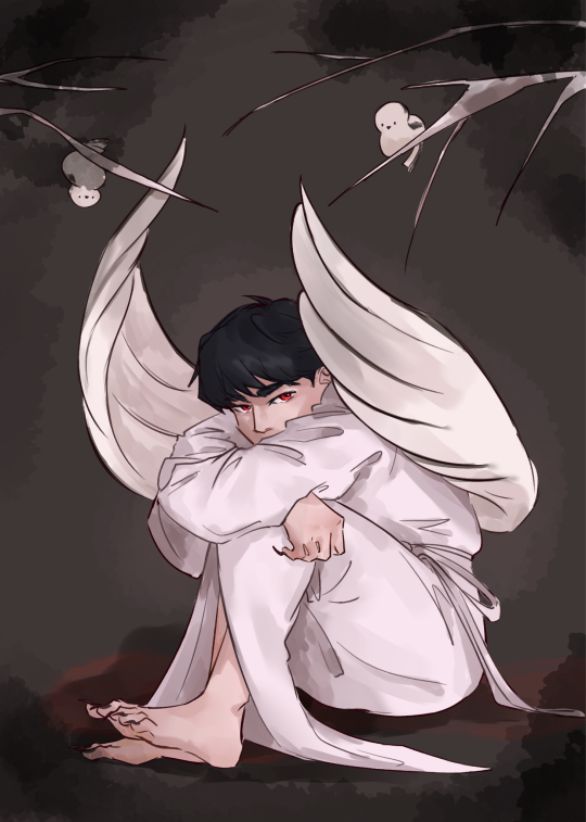
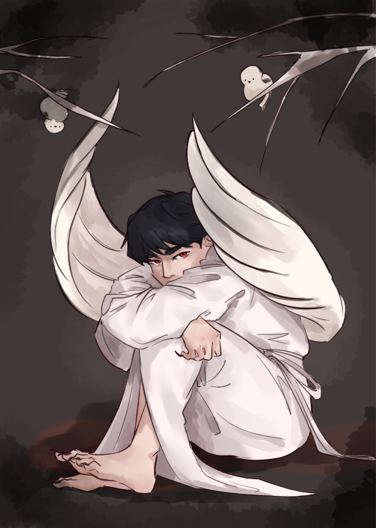
And a little accompanying ficlet
One of Pierre Gasly's more haunting photos shows off a young Japanese man, donning a white kyokatabira without the triangular headband hunched over and crossing his arms in a pose eerily similar to Cabanel's Fallen Angel. While Satan is mourning his loss with angry tears, Yuki Tsunoda is uncannily calm, staring back at the viewer with his bright red eyes. Translucent grey wings frame the black hair and pale skin while black claws stand out in stark contrast.
Two shima enaga birds are perched on the bare branches above. They are not agitated nor friendly to this kyuuketsuki mimicking their form even with the larger feathery wings. Are they wary of this winged undead human or unaware of what he truly is?
74 notes
·
View notes
Text

My thoughts this comic cover page design!
The idea for this cover was to show off the two main characters' dynamic with a dance-like, fight-like pose. I also wanted a wrap around cover so that there could be leeway in book thickness.
I did a few sketches with the concept:

I felt the final pose I came up with had the best balance with the text and a necessary "edgier" rather than "floatier" energy. The diagonal shape the characters make has movement while also fitting in the triangular title in the top left quite nicely. I'm also a fan how I managed to put in a bit of uncomfortable bloodiness and how Kou's hand is on the book's spine.
In the background I used the clouds that make an ambiguous night and day to create negative space for the title and back blurb. The buildings are there to show off the story's attention to setting, and also to provide some high-detail elements to balance out the lower-detail empty space the text sits in.
Anyway, this book is available to order now! It's a human-eating ghoul x ghoul hunter story. It's gorey and it's gay. Chomp chomp!

4 days left
Kickstarter link: http://kck.st/41EgELu
77 notes
·
View notes
Note
Hello!!! Id love to request a reader x bokuto x akashi :3 In a aquarium date..! Thank you!!!!! ^_^
FISHY LOVE — K. BOKUTO / AKAASHI K. gender neutral reader, polyamory, fluff, no warnings.
AHHH. MY FIRST HAIKYUU REQ I DIDNT EXPECT ANY AT ALL??? THANKYOU I LOVE. YOU AND YOUR POLY ANON THIS IS SO CUTE (OVERJOYED). happy valentines!
“bokuto-san, we should go home now… we’ve been here for awhile…” akaashi calls out, patting a very fascinated bokuto on his back. he turns his head towards his raven haired boyfriend with a pout, hair drooping.
“aww but… but… look at this fish! it seems to really like me! it keeps following me whenever i move around… you’ve noticed that, right babe?” bokuto turns to face you now, and akaashi spares his own glance. you look up at the fish behind bokuto, a heniochus (based on what you remember reading while walking around the aquarium).
it’s cute how much it looks like bokuto, black and white stripes to match his hair and a tint of yellow on its fins to match his big eyes. it’s triangular shaped, reminds you of your boyfriends spiked up hair. it’s a small fish in a big tall tank, probably with a hundred more other fishes, yet somehow this whole time it never followed it’s friends and only gave it’s attention to bokto.
“y’know… i think the fish thinks bokuto is like a bigger version of itself or something” you say, stepping closer to bokuto. akaashi raises an eyebrow from behind you before stepping closer himself, a ‘huh?’ escaping his mouth. “do you see the similarities?” you ask.
“hey… you’re right, it does look like me!” bokuto cheers, laughing. “no wonder it likes me so much, isn’t that right little guy?” he taps his fingers on the glass directly in front of the fish. it doesn’t react much, probably cause this isn’t some movie.
“ah, it’s the colors huh?” akaashi speaks up. you nod, a soft smile on your face.
“yeah, that’s exactly it” you respond. now that both you and akaashi noticed it, it’s hard not to feel some sort of cuteness aggression as bokuto continues to baby talks the fish that probably doesn’t hear him behind the thick glass.
“still though, akaashi does have a point. it’s getting late and we’ve been here all day! i’m getting bored… and aren’t you hungry?” you chime up again, holding onto bokuto’s shoulder. he turns to look at you, a pondering look on his face.
“huh, i guess i got so distracted i didn’t even think about eating…”
suddenly, his stomach grumbles just in time.
“oh. okay well, there’s that…” he laughs. you can’t help but join in, which infects akaashi.
“you heard him. well, moreso his stomach. we’ve had a long day and our energies are getting low. here, take a picture with the fish, bokuto-san. that way you’ll remember it. and who knows, we can come back here and meet it again” akaashi spoke, getting his phone camera ready.
bokuto poses with the fish, who hasn’t changed it’s position but is very much alive. it’s fins sway in the water, as bokuto reaches up to make a peace sign.
“okay, got it. can we go now?” akaashi says nicely, showing bokuto the picture as he agrees.
“ha, hey! i sure do look handsome, don’t you think babe?” he flashes a bright smile to you, and you smile back.
“always, ko” you giggle.
he says bye to the fish one last time, then the three of you finally decide to leave the place for good. on the way to the exit, you pass by the merchandise shop. there are many things sold there, from keychains to shirts, even some hats. but despite all the crazy kooky accessories, one in particular caught bokuto’s eye. his eyes sparkle upon catching glimpse of it.
“whoa— hey wait i wanna buy something” he says quickly to you and akaashi, which makes you both cock your head in confusion. then you finally see what he grabs.
“ah,” akaashi lets out a soft smile. “it’s a keychain of the fish from earlier”
#📼 awesome mix vol. 1#haikyuu#haikyuu x reader#haikyuu x you#hq#hq x reader#hq x you#bokuto koutarou#bokuto koutaro x reader#bokuto koutarou x reader#bokuto x reader#akaashi keiji#akaashi keiji x reader#akaashi x reader#bokuaka x reader#i love you poly people
88 notes
·
View notes
Text

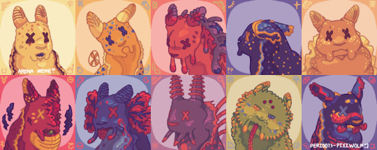
[Start ID. A redraw of the official icons of the ten named slugcats from Rain World, arranged in two rows: Survivor, Monk, Hunter, Nightcat, and Gourmand in the first, Artificer, Rivulet, Spearmaster, Saint and Enot/Inv in the second. Each is drawn in roughly the same pose as in the original art and fitted with speculative interpretations of their biology, and the second image is a “dead” version of this. For example, all ten have slug-like rhinophores in place of ears, cuttlefish-like colorful eyes with strangely-shaped pupils, cephalopod-like beak "teeth", expressive barbels or oral tentacles at the corners of mouths, spiny radulas, and the frilly mantle fringes of sea slugs, though otherwise their faces are squishy, simple and mammalian-shaped.
Cream-colored Survivor and yellow Monk both share triangular, bicolored spots matching their eyes (which are tan and brown, and two shades of blue, respectively), small, bumpy fringes, and relatively neutral looks on their faces. Defensive-looking Hunter is mostly a dull orange-pink, though their blobby fringe is a more violent red and their back is purple and marred with lumps. Nightcat is navy blue and flecked with dots of yellow and teal, their rolled rhinophores are a lighter blue, and their shading fractures into stars in some places. Gourmand is almost uniformly tan, their wide, very ruffly white mantle fringe bordered by a spray of white spots, and their beak sticks out from either corner of their smile. Primarily red Artificer, snarling, has yellow markings of multiple sorts, a prominent yellow dewlap and their characteristic dark scar taking out a chunk of its face. Rivulet is a darker blue than usual, with long barbels, red gills and rings, countershading, and a cheerful expression, sticking out their radula. Spearmaster is purple with orange accents, eyes and spots, a large fringe and spines down their back. Saint’s green caryophyllidia are marked by small, yellow diamonds, and their long, thin radula extends far below them. Enot is decorated with mottled red stripes, blue patches, yellow stars, and an uneven and almost cartoonish imitation of blush, though generally the same deep blue as Nightcat, a passive or almost slightly smug look on their face and their rolled rhinophores out to either side.
In the second image, nine of the slugcats’ eyes are crossed out, indicating that these are death icons. They look fairly the same, with mostly expression differences. Survivor is caught in the beginning of a threat display, a karma flower sprouts from Monk’s side, Hunter is burdened with overgrowing, purple and blue rot, Nightcat’s rhinophores are pinned back, and Gourmand looks mildly disheartened. For the final row, Artificer bites its radula between small plumes of smoke, Rivulet drops their expression, Spearmaster looks very startled, Saint looks almost entirely the same besides half-open eyes and their markings greater in number, and Enot grins confusedly. End ID]
If you'll excuse the unusually lengthy ID: the arena meme introduced by @pansear-doodles at long last after a nearly year-long wip status (or, rather, finished a month ago today to honor my own first time playing it!)
Design notes and shout-outs under cut! :]
The following people are some of those who’ve inspired my designs most since I started this eight months ago (or just inspired me to get a little weirder with slugcat biology), among many others for sure, and I thank them for it–but this is simply to bring attention to artists I find cool, and in no way an obligation to interact or anything :]
> @saturncoyote , @carpsoup , @charseraph , @gallusgalluss , @bitsbug , @dopscratch , and @0hmanit (and a special mention to dddeerbo and hunterlonglegs, who’ve since deactivated)!
Survivor: Surprisingly the hardest to pin down the colors for, since nothing with its sibling's palette seemed to match up right (I did have to add in a little blue somewhere for Monk, the beginning of making it clear how much I’m simply going based off of vibes for the colors of scug innards). I consider them, Monk and Gourmand to be part of the same gene pool of slugcats, and even possibly the same colony even if the latter isn't really related, so took a bit of Gourmand's coloring and fit them in with their inspiration: Goniobranchus verrieri. They serve as a bit of an introduction to my ideas of scug traits (i find it really fun how many people have thought to add so many silly sluglike fixtures of biology completely independent of me, buuut here I’m mostly talking about species variation), and like in-game they’re pretty average! They, Monk and Hunter have a couple scars sourced from a piece of Joar's concept art that I'm failing to find, those across the bridge of the nose, under the eyes, and across the rhinophores, respectively, and my Survivor interpretation features many on the back of the neck, as a result of survived lizard bites.
Monk: Their coloring is primarily based off the fact that I associate them with blue fruits, honestly, a bit because I was compelled to establish a familiarity with Rivulet, and lastly inspired by the spots of Goniobranchus kuniei (and geminus, less important to me as one of my characters is a kuniei instead, but more fitting). Between the yellow + blue and the circular marking in the center of their face, they’re meant to bear a little resemblance to an iterator that shares similarities with the characterization I’ve given them, and similar coding of her sibling can be seen on Survivor’s markings around the eyes. As both a “default” slugcat and one whose campaign I haven’t played, though, I can’t say I have much more to point out about em.
Hunter: The whole rot thing made for a really fun time drawing them, and while the color change on their back is a result of this, it’s also an excuse to relate them to Babakina festiva, arguably my favorite sea slug (mostly for sentimental purposes). And to Spearmaster, a fellow messenger slugcat, and it serves as a gradient between Hunter’s pink and the “traditional” color of Rot seen in the DLLs. Aside from their affliction, they’d actually be the plainest in terms of design, as they don’t have any patterns or quirks of body type, just the red + purple and strange lumps + possible malnutrition. I can’t remember if NSH had created them in particular or just...caught + released or something, but it probably wouldn’t be strange for a lab-grown slugcat to be simple like that.
Gourmand: Like the two above, they’re rather plain in terms of coloring and adaptation, and like the two above, I find that fun. I decided it would be nice to avert the “all slugcats being of the same body type, and Gourmand’s out of place as the exception” thing by just...adding more fat to all of them, really. I did want to emphasize their sheer bulk even so, both fat and muscular (not like I couldn’t have still gone further with it, of course, but slugcat anatomy can be a little obfuscating sometimes, and they were intended to look rather plush considering personal size headcanons and therefore the lack of proper gravity), and the thick and flounced mantle looked like a good addition, as per their sea slug Glossodoris hikuerensis. Unlike Survivor and Monk, I didn’t attempt to hold their resemblance to any particular other character (which means a little less to balance out the “default gene pool” thing), so those are all the design notes I have for em.
Artificer: The second slugcat I’ve ever played, or finished the campaign of, my favorite for at least a long time, and the first thing I did was give them yellow accents, the shape of which have troubled me slightly (not quite like the spots or stripes of the others). They’re both a little more appealing and more explosive-looking to me, and considering how early on I played Arti, actually present in some of my older art. It does give them a little resemblance to Saint (completely intentional, two slugcats with strange relations to karma), as well as the fact that its radula is green for familiarity with one of its children (at some point it was going to have all-green markings, even!). I’m generous with their scars, partly because it was fun to overemphasize the one on their face and partly because it does seem like a reckless slugcat, on top of the dangers of its explosive abilities–I’ll probably just keep adding more forever. Mostly-red sea slugs aren’t too common, but Hexabranchus sanguineus works for sure. The ridged, yellow dewlap can expand for combustion purposes, or something along those lines. Arti’s where I began experimenting with a lot of the mildly-offkilter features seen in my interpretation of slugcats, as they’ve once again been a favorite from the start.
Rivulet: I've obviously given other slugcats spots, deeply enjoy the bubbly-soda markings of other peoples' slugcats, and thought seal riv would be cute. Despite not too closely resembling it, they've been government-assigned Hypselodoris bennetti, for color reasons and for a couple sentimental ones. Originally, the colors of every scug were meant to match up with the custom colors I gave them at the beginning of their campaigns, (though Arti, Gourm and Spearmy are the only three who actually apply here, since I've only played through half the slugcats: I gave arti the yellow as mentioned above, gourm brown eyes and spearmy light pink spears, furthered by the outskirts pearl accompanying me and that palette all the way to moon. Tolerance training for eternity in hell cause I already knew about the maroon pearl quest). I initially gave them the colors of the bi flag for fun... but with the limited palette of this image, I was left without pink for a while and decided to see how they'd look in red. I then realized how they now wonderfully matched Moon, and besides, red's a sort of camouflage in deep water! As a side-note, the difference between their eyes and those of others always bothered me a little for anatomical purposes, and the cephalopod eyes were probably influenced by this!
Spearmaster: Inspired as much as possible by @notyourfunnyman ’s wonderful spearmy: designed in a way that helps it fit in with scavengers, at least between the long sensory tentacles, big ruff, back spines and slightly thin/distended anatomy, a form of defensive mimicry. I always had annulate rhinophores in mind, for a little diversity sure, but mostly because the shape reminds me of radio antennae and communication towers (seems fitting for the comms array and being a messenger slugcat)! I started searching for a real-life slug to give them just by looking up their rhinophore shape...and was met immediately and coincidentally with annulate-topped nudibranchs that fit them more perfectly than I could've imagined: Flabellina and surrounding clades, I think Paraflabellina ischitana works very nicely. The orange was completely unplanned, but there wasn’t a place for light pink among the other slugcats’ palettes, and importantly it likens them to both Hunter and Seven Red Suns a little more.
Saint: I am very much a non-furred slugcat enjoyer, with respect to those who aren’t, so figuring out the only visibly furred slugcat was an interesting challenge. I’ve decided that they likely have other, milder adaptations for help in the cold, mainly just more efficient fat storage, and what looks vaguely like fur is instead a bunch of tubercles (called caryophillia, for the second reminder out of three). Their inspiration doesn’t have these, however, Miamira sinuata’s numerous yellow and blue spots (not to mention...whatever’s going on with that shape) and general effect of being the only really green nudibranch I could find were probably perfect for a strange green echo. Not pictured, but their beak-teeth are tiny and flat to make a surface for grinding soft food against with the lack of a functioning radula, which is tipped with a specialized spiny “grapple-hook” for better traction/grip (not to mention the numerous little teeth running down the whole thing).
(Best part of hiding this under a readmore means edits will be seen by all reblogs, I'm mostly sure, because I completely forgot to mention! The spots on their forehead are simple eyes. Their camera eyes appear closed in-game, I like to believe their complex eyesight is rather poor anyways or otherwise reason that they aren't seeing out of those, and while this was far from her REASON for attunement with the world, it does help compensate for mainly viewing it through a canvas of simple light and dark. This, and the fact that their swapped-out "fur" is not only to commit to a lack of hairs but contributes to sensory input!)
Nightcat/Enot: I guess you could say I found the “these two are technically the same person” compelling. (E.g. similar colors, both very strange and enigmatic, and Enot/Inv/Sofanthiel’s remark during the dating sim about getting removed from Arena Mode.) I doubt they’re the only two slugcats in their body, considering humans with DID tend to have more than a few (and I find it very funny that a slugcat bearing resemblance to Nightcat appears in Gourmand’s ending. They’re allowed in the colony and Enot isn’t </3), and I have to credit @faelingdraws ’s art for being what convinced me on it! Their design inspirations come down to trying to balance a few different ideas: making the patterns and palettes of both look oddly similar (special mention to the stars, since those are fun to draw), basing them off of Felimare sechurana and juliae respectively, using blocks of color with the same placement as in Enot’s official art, and specifically making Enot look...biologically reasonable and imperfect, whilst also clearly trying to imitate human displays of emotion (what with...the eyes and blush on that one piece of official art).
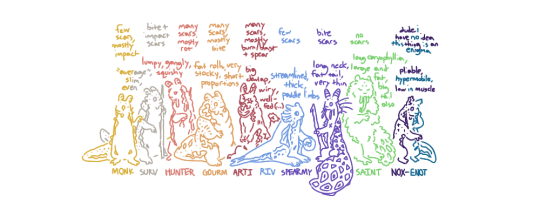
Lastly, here’s just a lineup with notes on body shape and size. Most of the nicknames (existing to give a little more space, that’s all) are obvious, and while I can’t remember why I shortened Nightcat to Nox, it is in honor of my friend by the same nickname :]
#survivor rain world#monk rain world#hunter rain world#nightcat rain world#gourmand rain world#artificer rain world#rivulet rain world#spearmaster rain world#saint rain world#enot rain world#slugcat rain world#rain world#peridots-art#< feels like too long since that last tag's been used. i can say with certainty that the majority of the reason i haven't been just as#active here (not to mention not drawing as often since that's relevant) is just due to my life getting busier with a new school year but i#do miss putting my stuff here! and would like to reblog more on top of that.... so forgive not remembering exactly how to tag everything#(and how to write everything up there but to be fair it's not like long textposts were a staple of mine. i mostly just rambled and it was#fun hehehe.....some of those notes (parts of riv/spears mostly) were written around the beginning of the drawing itself)#OH i messed something up with the drafting and really did not mean to post it while tags were in progress! but regardless. i would've liked#to post it tomorrow to mirror how i was going to post it on JAN 29 a month ago......but it's not like i'm unhappy with this outcome :]#to sum it up really though it's been strange working on this for so long.....unfortunate to not get a chance to let it be seen and keep#experimenting with odd biology much earlier but i'm just glad it's out now cause i am proud of these!! it's been a lot of fun and slugcats#are still my go-to doodles :] if i had to end this off promptly though what's up with that secret pipeyard shelter as gourm that's not on#the maps. connected to vs_a04. doesn't appear on the miraheze or interactive maps for anyone strangely but i've only been there as gourmand#anyway! i'm sure there's a lot i could've said in the rush but goodbye dear reader anyway :]#i forgot spearmy initially. i'm so sorry#peridots-described#< NOOOO THAT DOESNT SHOW UP THERE'RE TOO MANY TAGSS.......
371 notes
·
View notes
Text

horse standing in between two red barns the horse is covered completely except its legs mouth and eyes in a bright green dinosaur costume that bears bright yellow extremely triangular spikes all along the back the horse seems unfazed and its striking a pose in its delightful costume
#horse#horses#horse pics#reaction pics#reaction image#reaction images#horseposting#horseblr#cursed#neighhhh
628 notes
·
View notes
Photo

Nike
The ancient Greek goddess Nike was the personification of the ideal of victory. Such personifications of ideal terms were common in ancient Greek culture; other examples include Wisdom, Knowledge, and Justice. Unlike other gods in the Greek pantheon, such personifying deities were not usually given human personalities and histories. For this reason, little is said about Nike in Greek culture beyond that her mother was Styx (daughter of Ocean) and her father was Pallas, the Titan. She had three sisters, also personified deities: Zelus (Rivalry), Cratos (Supremacy), and Bia (Force) who, with Nike, were always seated by mighty Zeus on Mt. Olympus.
The goddess was a popular figure in ancient Greek art, appearing in sculpture, on pottery, and on coins. Usually fitting Hesiod's description as 'beautiful-ankled Nike', she is depicted with wings and often carries before her a wreath of victory, which she presents either to other gods or to victorious heroes and athletes. The oldest surviving winged Nike in sculpture is from Delos and dates to 550 BCE and was most probably sculpted by Archermos. The statue is in the Archaic style and strikes the typical pose of the period with bent knees and running. On Attic 5th to 4th century BCE pottery, Nike also often rides a chariot or sometimes stands next to an altar or a sacrificial bull.
One of the goddess Athena's most common epithets was Athena Nike and a temple to Athena as Victory was built on the Acropolis of Athens in the late 420's BCE. Bronze akroteria (added decoration) on the corners and central ridge of the temple roof represented Nike, and the temple itself was surrounded by a balustrade decorated with a frieze which depicted figures of Nike leading bulls to sacrifice and erecting various trophies such as weapons and armour.
Nike also appeared in decorative sculpture on other buildings, both in friezes and on many temple roofs as an akroteria and on many coins from Thrace to Macedonia, for example, she appears on a silver decadrachm of Syracuse (Sicily) where she is crowning a charioteer (c. 400 BCE). Statues of Nike were also set up to commemorate military victories, a famous example being the 1.4 m tall Nike (490-480 BCE) on the acropolis dedicated to the general Kallimachos who was killed at the battle of Marathon where the Greeks were victorious over the Persians.
In antiquity, the most celebrated representations of Nike were as part of the great 5th century BCE statues of the deities Athena and Zeus which stood, respectively, within the Parthenon of Athens and the Temple of Zeus at Olympia. These larger-than-life chryselephantine statues were made from an inner core of wood sumptuously covered in carved ivory and burnished gold. Face, torso, legs, and arms were in carved ivory and hair and clothes were made of sheet gold. In both cases, the god held in their right hand a statue of Nike, always closely associated with Athena, and in the case of Zeus and the pan-Hellenic games of Olympia, significant in her role as bestower of prizes. The statue of Zeus was considered one of the Seven Wonders of the Ancient World, and the father of the gods is shown seated on a massive, richly decorated throne with more figures of Nike on its legs. Neither statue survives but descriptions by Pausanias, smaller Roman copies, and coin designs help give us a glimpse of the magnificence that we have lost.
A third representation which must have struck a certain degree of awe into the ancients was the statue of Nike by Paionios, which stood on a nine metre tall triangular pedestal just outside the Temple of Zeus at Olympia. Dedicated to the sanctuary by the Messenians and Naupaktians following their victory over the Spartans at Sphakteria in 424 BCE, the Nike itself was three metres tall and would have dominated all of the other dedications at the site. The statue is sculpted in the rich style popular in the late 5th century BCE, and with a chiton that is at once billowing and clinging and with wings widespread, the impression is that the goddess has just that moment softly alighted onto the pedestal.
Continue reading...
48 notes
·
View notes
Note
top 5 pets that got DESTROYED by the conversion, and top 5 that got BETTER from the conversion.
Destroyed:
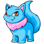

Wocky: The eyes going from triangular to rectangular and the addition of giant eyebrows (plus the different mouth shape) makes this pet look absolutely terrible for literally no reason. There's not even an excuse for why this one looks bad; they just changed it Because.
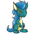
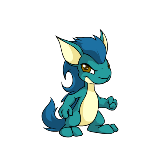
Kyrii: While there are some improvements here (the mane), the entire head shape of the Kyrii went from narrow at the bottom to wide, making them look strange and loosing most of the trickster vibe. The underbelly going up higher also screws with the ability to read the mouth.
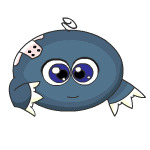
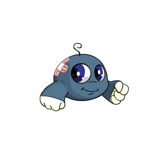
Kiko: The pre-conversion Kiko was very dated and badly needed new art, but this ain't it. Things like the eye spacing, muzzle, and very wide mouth ruined any of the cute aspects of this pet.
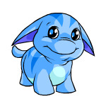

Poogle: A more subtle one, but the change in shading and removal of most of the lines on the face/chin really screwed it up, going from a cute fat creature to something really off-putting. Also, unlike the above examples, the converted version is also just straight-up worse with no improvements.
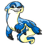

Lutari: Outside of losing the fun, dynamic pose, the Lutari's anatomy and details got really messed up conversion—foot size changed, markings changed, eye shape changed, etc. The converted isn't the worst-looking pet or anything like that, but like the Poogle, nothing was improved.
Improved:


Chia: I don't know if it's just me, but I always really disliked the weird lower lip of Chias and was very glad to see it go. The artwork was also in bad need of an update, with most of the janky linework being fixed (look at that foot on the pre-conversion one).
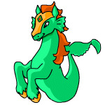
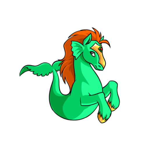
Peophin: The old Peophin art had some weird stuff going on around the tail and was very under-detailed, so the new version just cleaned it up and improved the anatomy and shading without altering the design much.
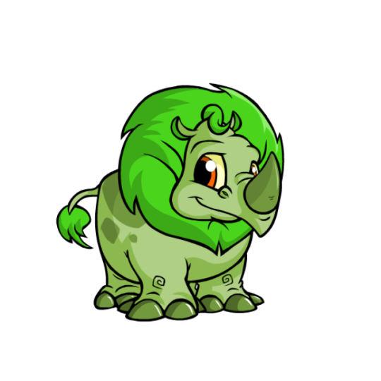
Tonus: Another one with dated, poorly-shaded art. However, the big improvement here to me is the expression, with the pre-conversion face looking weirdly detailed in all the wrong places. Once again, just a nice clean-up that doesn't alter the pet too much.
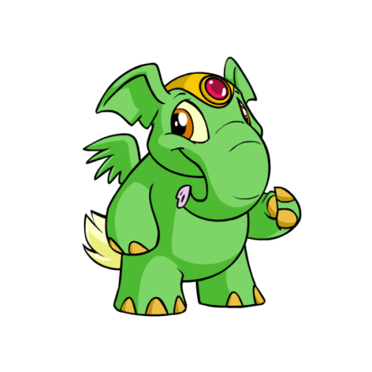
Elephante: Similar to the Tonu, this is once again a pet with badly dated artwork that just cleaned things up and greatly improved the weird expression. The anatomy has been fixed (look at that wing on the pre-conversion art and you'll see what I mean) and the design is also much easier to read. The head piece is also now removable, which is a nice option to have available.
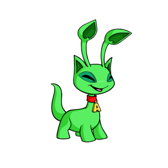
Aisha: The pre-conversion Aisha wasn't terrible or anything, but it had very dated, hard-to-read art that needed an update anyway. The converted version is just the same thing but overall better, and as a bonus, the collar can now be removed if desired.
62 notes
·
View notes
Text
Aha! That statue is from the Vinča culture of Eastern Europe—you’d know it anywhere! Protruding almond-shaped eyes, the nose elongated until it almost forms a muzzle, posed with short, stylized arms held stiffly out to the sides…yep, classic Vinča. (Assuming 7000 years old is “classic.” Might be “vintage.” Or “heirloom,” you can’t remember.)
You can’t tell off hand if the statue is a genuine Neolithic artifact or just a good reproduction. It’s pretty well intact though, made of terracotta and stands about eight inches high. Appears to be female, with two small holes punched in each arm. Like much Vinča art, it manages to be both alien and expressive.
Nobody’s ever worked out the Vinča writing system, so nobody knows if the figures are gods, goddesses, rulers, ancestors, or the local equivalent of Barbie dolls. “Possible Ritual Significance” is archaeologist slang for “dunno, looks important.”
Apparently this one is considered of possible ritual significance in the labyrinth, because small offerings have been left in the niche at its nonexistent feet. You see withered flowers, a small dried fish, and a dozen coins, only some of which you recognize.
One of the coins you don’t recognize is triangular and very thin. You suspect that you could use a corner to wind up the clockwork bee.
Of course, that would involve taking an offering from what might be a goddess…
563 notes
·
View notes
Note
QUESTIONS BECAUSE IM TRYING TO DRAW YOUR BILL!!!
A, would you consider bill to have sharp or soft features (talking about facial features mostly I know he's chubby)
B, what is your fav thing about Bill fanart/what would you like to see
C, what is something you would like to see people emphasise most when drawing your bill?
🌹🌹
A. Soft features overall, although I also tend to give him a pointy chin and very straight pointy nose. ("Why?" Triangular.) But if it's too difficult to mix & match those traits without looking too weird (idk what style you're working in), then err on the side of softer.
B. idk, I'm happy to get anything. I'll come back to this one.
C. I feel like recently folks are doing a better job of drawing him fat, but one thing I still don't see much of is people drawing his ridiculous proportions. Probably because his proportions are ridiculous. He's got a really goofily exaggerated pear shape—wide hips and really narrow shoulders—and unexpectedly noodly limbs, because... that's how he looked before he was a human: a torso shaped like an equilateral triangle, with thin noodle limbs. irl his body shape would probably look a little uncanny, so idk if it's possible to draw his body shape in any style more realistic than the cartoony GF style without it looking TOO uncanny; but if it is possible, that'd be neat to see.
But again, just like the first question: if that weird mix of thin bits and fat bits is too tricky to pull off, then err on the side of fat.
B, the sequel: okay I thought of some things I'd like to see.
When my Bill's drawn with other characters, it's usually Mabel or Ford. I'm ALWAYS delighted to see him with Mabel & Ford (I keep writing him with Mabel & Ford) but it'd be cool to see him interacting with some other characters too
I always love it when people put him in new Bill-ish outfits
it's heartwarming seeing people, like, imagine a future for him or imagine where he's going
it turns out it's really fun to find pulp romance novel covers and stick him in one of the poses. Try it out. It's great. The more dramatic the pose the more fun it is
78 notes
·
View notes
Note
Hi! I have another question! Your art is just so incredible and inspiring. It makes me want to draw.
Bodies - Toshinori; Soichi; whoever you are drawing. You showed us a great behind the scenes on faces for Toshi (especially loved the sketch breakdown for his face! Seeing the starting base product is helpful).
I’m curious specifically about how you come up with / create those bases.
You have been so kind and open about your process and I want to thank you for that.
Thank you so much! (੭ु ›ω‹ )੭ु⁾⁾♡ It really makes me happy hearing you getting inspired by my artwork!
--
When it comes to drawing, I either use photo refences I find on the net (most often Pinterest). Or I'm drawing a pose directly from my mind without reference. If I'm after something specific, but can't figure the pose out, I will take reference photos myself.
With Reference:
This one is how the process look when I draw from a reference photo. Here's the LINK to the reference I used.
When I find a reference photo, I never care about the genders of the people on the photo (But it might be easier for those who struggle with anatomy). I find the height of the people to be more important. They don't have to be the exact height as the characters I will draw, but there should be a somewhat of a difference if I need it. I often shrink or lengthen the models myself while I sketch if I have to.


1 - I'm starting with using the H2 pencil and sketches the position and shape.
2 - I'm placing the eraser flat, and gently erase the sketch. I do this to make the sketch transparent.
3 - Now I'ts time to focus on the anatomy, and I'll most often start with the head. I'm using the HB 0.5 mechanical pencil for this.


4 - I'll continue the anatomy with the bodies. I often use curvy, boxy and triangular lines/shapes, it helps to make the models look a bit more 3-dimensional ,
5 - I'm adding the hair.
6 - Now it's time for the clothes. The majority of the time, I draw the clothes after I'm done with with the anatomy. It gives you more freedom with choosing any type of clothes you want give the characters. I'm choosing to give All Might this sweater. I'll give Soichi just a regular hoodie. (Note: If you look closely you can see that Soichi's shoulder shrank a little, after I unintentionally erased it previously. That's cool though, it makes her look smaller compare to All Might, which we want.)

7 - I'm erasing the unimportant sketch lines to make the sketch look cleaner. I'm adding the blush on their cheeks, filling the hair and make the lines thicker with the mechanical pencil: often on parts that needs the contour. I'm using the blending stump on their clothes, Soichi's arm fur and the table.
And it's done! ٩(•̤̀ᵕ•̤́๑)૭✧
IMPORTANT:
I will erase a lot when I sketch these. Many times I change my mind on the positions or the shapes. So don't be afraid to make mistakes or change your mind.
Sometimes I even add my own ideas for the reference I use. As an example: If I wanted All Might's other hand to touch Soichi's other arm, I could sketch that. So, don't be afraid to add your own things into the sketch, even if it's based on a reference.
Without Reference:
The easiest way to get an idea of a pose: is to make up a scene, or take inspiration from a scene in a fan-fiction or a book! The one pose I sketched here is loosely based of a part in one of my All Might/Soichi scripts.
This is how it looks like when I draw without a reference. There isn't much of a difference. I will however work on it more and spend more time on it.


1/2 - Sometimes I'll add extra lines and details to the "shape sketch" for the reference drawing as well. But it's more common when it's without.
7 - I used the transparent erasing twice in this process. It's not necessarily because it's without reference. Most of the time I use it if I feel the sketch will become too messy if I add the last touches. So to make it cleaner I gently erase it and make the sketch clean, or make it more into a drawing.
8 - It's finished!
My own notes with the sketch: I think the pose is kind of stiff, but it's pretty good otherwise.
Supplies I use:

H2 Pencil (Sometimes I use H3 or H.) I’m mostly using it because I’m pressing my pencil pretty hard. If you are someone with a looser pressure, you probably don’t need a H pencil :)
HB, 0.5 Mechanical pencil
Blending stump (Koh-I-Noor) Brand isn't important, though.
Clic eraser I don’t use it much though
Regular Eraser (I recommend kneadable erasure for the "gentle transparent erasing" I'm just too lazy to get it out from its little box)
--
I hope this answer/post of my drawing process was even more inspiring and maybe usefulヾ(。^ω^。)ノ
Next time I'll be posting some helpful tips with drawing anatomy!
Edit: Added information on how I most often get an idea for a pose without reference photo.
#answered#ask me stuff#art tutorial#tutorial#mha oc#all might#all might x oc#oc x canon#boku no hero academia#my hero academia#mha#art#bnha#bnha oc#my art#fanart#yagi toshinori#toshisoichi#oc x all might
31 notes
·
View notes
Note
Beautiful, cute, dulzura, A quick question, do you have any advice for drawing? I see your drawings and I just fell in love with them, I just started drawing again but it's difficult...
I don't know, sorry, English is not my first language, using translator jiji 🤎🍁
(note: this post is long, grab a snack lol) ah! no problem, don’t worry about the translator haha (pinterest link - this is my masterboard for human references! I’ll talk about it more below)
I think my best advice for anyone wanting to draw is to break down your piece into shapes! (also, depending on your style, using different line weights)

from my experience, while looking at the whole reference is good, it’s easier to break down individual parts! while some parts can look complicated, a lot of things can be broken down into triangles, squares, and circles (or half circles)
I focus on character art, so I’ll be speaking about that - but it can applied to scenery and objects too. a lot of characters clothes are broken up into colored articles already - in the top reference, Ghost has a red bandanna on his arm! that bandanna helps break up his arm: the top near his shoulder is triangular, the bandanna itself is overall rectangular, and the bottom of his sleeve is a square
of course, depending on how you’re posing the character it can change the angle of what we’re seeing - there’s also an accommodation that your art probably won’t be a 1-to-1 copy with your reference. Ghost’s right arm (bandanna) has a white rolled up sleeve - while the model’s sleeve is square, I prefer to draw rolled sleeves more triangular

I think line weight is also important depending on your style! I prefer thicker lines around the entire character, and defining qualities also get thicker lines
I like thinner lines inside the character to help define dimensional shape and form. I use thicker lines on the inside of the body if there’s a shape/area that’s more in the foreground - example: König’s chest and midsection have thick line art to help differentiate from his left arm (behind his body)

I know a common piece of advice is to use real life references, and I agree… but, I never hear people talk about how to use references in a way that actually helps (“just draw from real life”, or “drawing with a reference is good practice”). I experienced that and wasn’t able to take anything away for years!
within the past year or so I seriously took a look at how using references can help me, so I want to try and talk about that - if I had trouble learning from references I’d wager someone else has

here’s my best example of using a reference because I actually remembered to! I labeled the figure to make it a little easier to follow
(1) my first tip is using a reference to figure out how the body ‘flows’. the human body has a lot of soft, rounded lines when you look at a picture - very few things are legitimately straight and sharp. I used the reference specifically to figure out how men’s pecs are shaped (of course, this is just one reference… because this is my headcanon for König’s body type haha)

(1) looking at references can help you understand how muscles move. in the reference with the woman, you notice how her right arm (down) muscles are layered - the shape portrayed by the reference lets you see how an arm’s muscles might be laid out in that position
(2) my second tip from the König reference is to look at negative space! the highlighted red portion between the arm and midsection is roughly the same negative space as the reference. if you’re using a reference and something feels off with the placement of what you’ve drawn I’d recommend looking at the space your reference takes up

(2) the negative space trick helps me line up where proportions should meet up - the distance between her arms lets me gauge how the rest of her body should be proportioned

(2) while it doesn’t match up 1-to-1 with the reference when layered overtop, it doesn’t have to! the negative space between the arms was enough for the sketch to mimic what the reference looks like. art doesn’t have to be a 1-to-1, but negative space can help you figure out ‘why does that arm look funny?’, “that arm looks funny because, compared to the negative space of your reference, it’s too (far away/close) to the body.”
(3) my last tip is the simplest, so I’ll just be referring to the König figure! when using references I look to gauge the distance between different body parts - it helps me get more realistic proportions. the bit I specifically compared to was the man’s stomach placement compared to his waist. I didn’t copy it 1-to-1 because I like the idea König has more of a tummy, but the reference allowed me to figure out an anatomical placement for where König’s stomach would be compared to his waist

I hope my advice wasn’t terrible haha everyone’s art journey is different, but these are tips I would have liked to know a few years ago (specifically the reference material ones lol). I wanted to focus more on the reference material because when people say ‘just use a reference, it’ll help’ it didn’t do it for me
I personally needed a more in depth explanation on why I would use a reference, what should I be looking at - because just drawing a person doesn’t necessarily help, and how should I be learning from it - I accidentally taught myself negative space before I knew what it was
but uhm… yeah, I hope this wasn’t awful! good luck on everyone’s art journeys, just remember that you’re allowed to take your time and try different things
if you guys have any other questions about my art feel free to jump into my inbox; process wise, inspiration, etc - I’ll answer anything I can<3
#I spent three hours making this post haha#I hope some of it was useful!#art#art tips#art study#art help#art tutorial#sketch#doodle#fanart#ghost#simon ghost riley#simon riley#ghost cod#ghost call of duty#ghost fanart#konig#könig#könig cod#könig call of duty#könig fanart#cod#call of duty
68 notes
·
View notes