#those too ig
Explore tagged Tumblr posts
Note
tell me about hb i know he’s yuor fav :3
HELLO HI
this ask (like every other ask) is much appreciated!!! hi!!!
Anyways. GET READY FOR SOME ENTIRELY USELESS PICTURES/DIALOGUE OF THE HBs! There's. Not much to say about him/them. Sorry lol (some text italicized and/or coloured!)
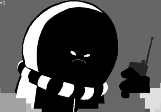
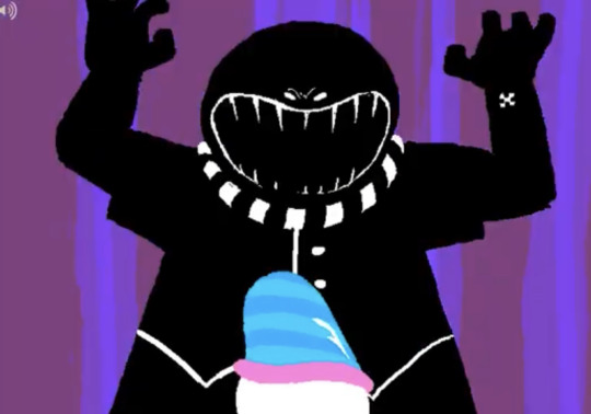
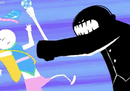
Here's some Brutes i screenshotted from [S] WV?: Rise up! They're nothing special, other than that theyre some of the few glimpses we get of the non-Boxcars HBs. World's only Brute fan signing up for duty. Also check out those fuckin' chompers! Jeez!!!
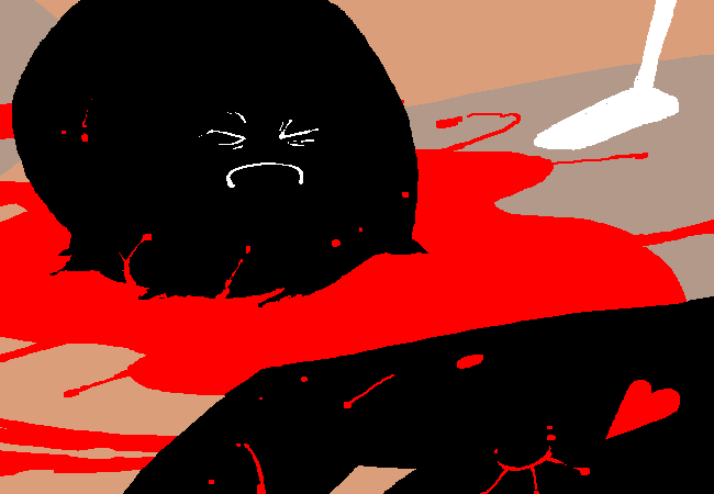
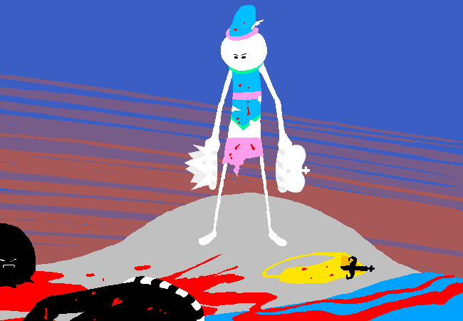
Alas, poor Brute! I knew him, Droll.
Here's some dialogue that gives us a pretty nice picture of how he interacts with people.
(page 1254)
(boxcars' dialogue highlighted in red.)
You tell Slick to get his scrawny ass to the vault. It's goddamn bedlam down here. You tell him you asked Deuce for backup but surprise surprise he's nowhere to be found. Big surprise, you tell him. You tell him that was sarcasm. He says he knows.
This single interaction is so great. The man tries and fails to make a joke. Very fun
How about some... More dialogue! Yay! This one's a fair bit more serious. And what people think of him!
(page 4599)
(tumblr's colours are a bit lacking. Dignitary in orange, Jack in purple. Halloween season is approaching, after all.)
He says one of the brats staged a little rebellion on the moon. Stuck the Brute's head on a pike for all to see. Real black eye for the kingdom and the Condesce. Press is going nuts with it. Wait. The Brute's dead, you say? He says yes. Dammit. He was one of your best agents. You never really cared for the guy but you admired his brutality. We all did sir, he says. This is getting personal you say. What's the status on these little shits. Where are they now?
... Et cetera. This really does sound like neither of them give too much of a shit about him as a person. It's... a little funny, to me. Once again, Love these assholes! They kinda hate eachothers guts! ...Also, apparently, Brute was a really good agent. The brutes we met had a bit of a tendency to get fucked up by kids, fathers and mailwomen, though.

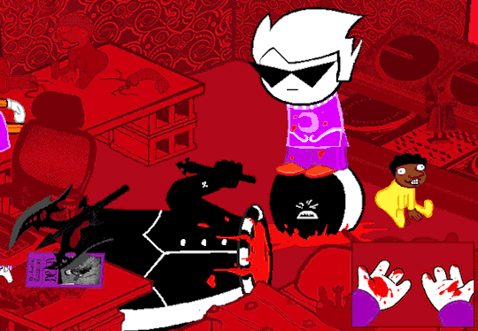
Pictured: Kids and fathers. You already saw the mailwomen.
And, for the final, most important little... Trivia/image/whatever thing...
(page 1265)

Here's him with a minigun.
I'm not much of a word wizard, but i do hope this was at least a little educating/entertaining. Edutaining. I spent way too much time on this. Bye!
#look at me quotin' hamlet#(he wasn't even a court jester)#talky tag#asky tag#reblogs on. for at least some time#now for the. content warnings.#decapitation#blood#fast gif#flashing#gif#hopefully sufficient#and uh...that's that i guess#coloured text#bright colours#those too ig
19 notes
·
View notes
Text

(The spotlight hurts your eyes.)
#isat#in stars and time#isat spoilers#in stars and time spoilers#isat siffrin#siffrin#my art#cw blood#cw gore#mostly for one of those siffrins with their brain half bashed in#you can never be too careful ig#and no i do not mean “eye” because. heh.
3K notes
·
View notes
Text
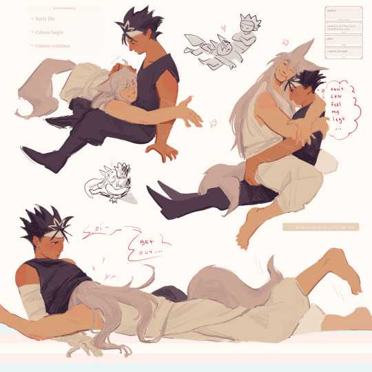
lapdog yoko lapdog yoko lapdog yoko
#lapfox ig..#hes one of those too big lapdogs except he knowsss he is too big but he doesnt gaf. he enjoys it#cus he gets to both feel like hes treasuring hiei but also viceversa and idk yoko w his theiving n hoarding just been on my mind i think it#just be neat if they were both little freaks n like a bit possessive n shit. maybe in like diff ways but ok no ok no i will stop ranting in#the tags i know yes i need to stop this habit but like have you thought abt them#i wwnnwa draw kurama kurama too. this was just bc uhm big fox kurama make for funnier lapdog n im gay#yu yu hakusho#yyh#yyh hiei#yyh kurama#kurahi#my art#ive crawled my way back to them oaahhgjjhwqhh blinking innocently after chewing through the bars of my enclosure 🥺
625 notes
·
View notes
Text
why Aurora's art is genius
It's break for me, and I've been meaning to sit down and read the Aurora webcomic (https://comicaurora.com/, @comicaurora on Tumblr) for quite a bit. So I did that over the last few days.
And… y'know. I can't actually say "I should've read this earlier," because otherwise I would've been up at 2:30-3am when I had responsibilities in the morning and I couldn't have properly enjoyed it, but. Holy shit guys THIS COMIC.
I intended to just do a generalized "hello this is all the things I love about this story," and I wrote a paragraph or two about art style. …and then another. And another. And I realized I needed to actually reference things so I would stop being too vague. I was reading the comic on my tablet or phone, because I wanted to stay curled up in my chair, but I type at a big monitor and so I saw more details… aaaaaand it turned into its own giant-ass post.
SO. Enjoy a few thousand words of me nerding out about this insanely cool art style and how fucking gorgeous this comic is? (There are screenshots, I promise it isn't just a wall of text.) In my defense, I just spent two semesters in graphic design classes focusing on the Adobe Suite, so… I get to be a nerd about pretty things…???
All positive feedback btw! No downers here. <3
---
I cannot emphasize enough how much I love the beautiful, simple stylistic method of drawing characters and figures. It is absolutely stunning and effortless and utterly graceful—it is so hard to capture the sheer beauty and fluidity of the human form in such a fashion. Even a simple outline of a character feels dynamic! It's gorgeous!
Though I do have a love-hate relationship with this, because my artistic side looks at that lovely simplicity, goes "I CAN DO THAT!" and then I sit down and go to the paper and realize that no, in fact, I cannot do that yet, because that simplicity is born of a hell of a lot of practice and understanding of bodies and actually is really hard to do. It's a very developed style that only looks simple because the artist knows what they're doing. The human body is hard to pull off, and this comic does so beautifully and makes it look effortless.
Also: line weight line weight line weight. It's especially important in simplified shapes and figures like this, and hoo boy is it used excellently. It's especially apparent the newer the pages get—I love watching that improvement over time—but with simpler figures and lines, you get nice light lines to emphasize both smaller details, like in the draping of clothing and the curls of hair—which, hello, yes—and thicker lines to emphasize bigger and more important details and silhouettes. It's the sort of thing that's essential to most illustrations, but I wanted to make a note of it because it's so vital to this art style.
THE USE OF LAYER BLENDING MODES OH MY GODS. (...uhhh, apologies to the people who don't know what that means, it's a digital art program thing? This article explains it for beginners.)
Bear with me, I just finished my second Photoshop course, I spent months and months working on projects with this shit so I see the genius use of Screen and/or its siblings (of which there are many—if I say "Screen" here, assume I mean the entire umbrella of Screen blending modes and possibly Overlay) and go nuts, but seriously it's so clever and also fucking gorgeous:
Firstly: the use of screened-on sound effect words over an action? A "CRACK" written over a branch and then put on Screen in glowy green so that it's subtle enough that it doesn't disrupt the visual flow, but still sticks out enough to make itself heard? Little "scritches" that are transparent where they're laid on without outlines to emphasize the sound without disrupting the underlying image? FUCK YES. I haven't seen this done literally anywhere else—granted, I haven't read a massive amount of comics, but I've read enough—and it is so clever and I adore it. Examples:


Secondly: The beautiful lighting effects. The curling leaves, all the magic, the various glowing eyes, the fog, the way it's all so vividly colored but doesn't burn your eyeballs out—a balance that's way harder to achieve than you'd think—and the soft glows around them, eeeee it's so pretty so pretty SO PRETTY. Not sure if some of these are Outer/Inner Glow/Shadow layer effects or if it's entirely hand-drawn, but major kudos either way; I can see the beautiful use of blending modes and I SALUTE YOUR GENIUS.
I keep looking at some of this stuff and go "is that a layer effect or is it done by hand?" Because you can make some similar things with the Satin layer effect in Photoshop (I don't know if other programs have this? I'm gonna have to find out since I won't have access to PS for much longer ;-;) that resembles some of the swirly inner bits on some of the lit effects, but I'm not sure if it is that or not. Or you could mask over textures? There's... many ways to do it.
If done by hand: oh my gods the patience, how. If done with layer effects: really clever work that knows how to stop said effects from looking wonky, because ugh those things get temperamental. If done with a layer of texture that's been masked over: very, very good masking work. No matter the method, pretty shimmers and swirly bits inside the bigger pretty swirls!
Next: The way color contrast is used! I will never be over the glowy green-on-black Primordial Life vibes when Alinua gets dropped into that… unconscious space?? with Life, for example, and the sharp contrast of vines and crack and branches and leaves against pitch black is just visually stunning. The way the roots sink into the ground and the three-dimensional sensation of it is particularly badass here:

Friggin. How does this imply depth like that. HOW. IT'S SO FREAKING COOL.
A huge point here is also color language and use! Everybody has their own particular shade, generally matching their eyes, magic, and personality, and I adore how this is used to make it clear who's talking or who's doing an action. That was especially apparent to me with Dainix and Falst in the caves—their colors are both fairly warm, but quite distinct, and I love how this clarifies who's doing what in panels with a lot of action from both of them. There is a particular bit that stuck out to me, so I dug up the panels (see this page and the following one https://comicaurora.com/aurora/1-20-30/):

(Gods it looks even prettier now that I put it against a plain background. Also, appreciation to Falst for managing a bridal-carry midair, damn.)
The way that their colors MERGE here! And the immense attention to detail in doing so—Dainix is higher up than Falst is in the first panel, so Dainix's orange fades into Falst's orange at the base. The next panel has gold up top and orange on bottom; we can't really tell in that panel where each of them are, but that's carried over to the next panel—
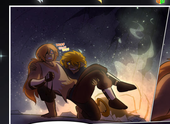
—where we now see that Falst's position is raised above Dainix's due to the way he's carrying him. (Points for continuity!) And, of course, we see the little "huffs" flowing from orange to yellow over their heads (where Dainix's head is higher than Falst's) to merge the sound of their breathing, which is absurdly clever because it emphasizes to the viewer how we hear two sets of huffing overlaying each other, not one. Absolutely brilliant.
(A few other notes of appreciation to that panel: beautiful glows around them, the sparks, the jagged silhouette of the spider legs, the lovely colors that have no right to make the area around a spider corpse that pretty, the excellent texturing on the cave walls plus perspective, the way Falst's movements imply Dainix's hefty weight, the natural posing of the characters, their on-point expressions that convey exactly how fuckin terrifying everything is right now, the slight glows to their eyes, and also they're just handsome boys <3)
Next up: Rain!!!! So well done! It's subtle enough that it never ever disrupts the impact of the focal point, but evident enough you can tell! And more importantly: THE MIST OFF THE CHARACTERS. Rain does this irl, it has that little vapor that comes off you and makes that little misty effect that plays with lighting, it's so cool-looking and here it's used to such pretty effect!
One of the panel captions says something about it blurring out all the injuries on the characters but like THAT AIN'T TOO BIG OF A PROBLEM when it gets across the environmental vibes, and also that'd be how it would look in real life too so like… outside viewer's angle is the same as the characters', mostly? my point is: that's the environment!!! that's the vibes, that's the feel! It gets it across and it does so in the most pretty way possible!
And another thing re: rain, the use of it to establish perspective, particularly in panels like this—

—where we can tell we're looking down at Tynan due to the perspective on the rain and where it's pointing. Excellent. (Also, kudos for looking down and emphasizing how Tynan's losing his advantage—lovely use of visual storytelling.)
Additionally, the misting here:
We see it most heavily in the leftmost panel, where it's quite foggy as you would expect in a rainstorm, especially in an environment with a lot of heat, but it's also lightly powdered on in the following two panels and tends to follow light sources, which makes complete sense given how light bounces off particles in the air.
A major point of strength in these too is a thorough understanding of lighting, like rim lighting, the various hues and shades, and an intricate understanding of how light bounces off surfaces even when they're in shadow (we'll see a faint glow in spots where characters are half in shadow, but that's how it would work in real life, because of how light bounces around).
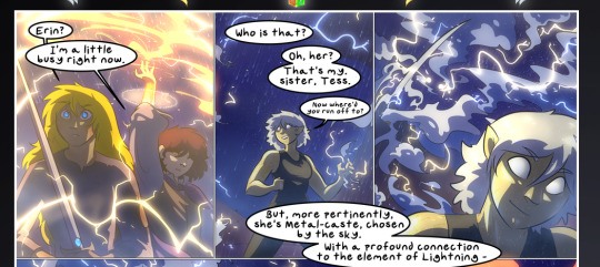
Bringing some of these points together: the fluidity of the lines in magic, and the way simple glowing lines are used to emphasize motion and the magic itself, is deeply clever. I'm basically pulling at random from panels and there's definitely even better examples, but here's one (see this page https://comicaurora.com/aurora/1-16-33/):

First panel, listed in numbers because these build on each other:
The tension of the lines in Tess's magic here. This works on a couple levels: first, the way she's holding her fists, as if she's pulling a rope taut.
The way there's one primary line, emphasizing the rope feeling, accompanied by smaller ones.
The additional lines starbursting around her hands, to indicate the energy crackling in her hands and how she's doing a good bit more than just holding it. (That combined with the fists suggests some tension to the magic, too.) Also the variations in brightness, a feature you'll find in actual lightning. :D Additional kudos for how the lightning sparks and breaks off the metal of the sword.
A handful of miscellaneous notes on the second panel:
The reflection of the flames in Erin's typically dark blue eyes (which bears a remarkable resemblance to Dainix, incidentally—almost a thematic sort of parallel given Erin's using the same magic Dainix specializes in?)
The flowing of fabric in the wind and associated variation in the lineart
The way Erin's tattoos interact with the fire he's pulling to his hand
The way the rain overlays some of the fainter areas of fire (attention! to! detail! hell yeah!)
I could go on. I won't because this is a lot of writing already.
Third panel gets paragraphs, not bullets:
Erin's giant-ass "FWOOM" of fire there, and the way the outline of the word is puffy-edged and gradated to feel almost three-dimensional, plus once again using Screen or a variation on it so that the stars show up in the background. All this against that stunning plume of fire, which ripples and sparks so gorgeously, and the ending "om" of the onomatopoeia is emphasized incredibly brightly against that, adding to the punch of it and making the plume feel even brighter.
Also, once again, rain helping establish perspective, especially in how it's very angular in the left side of the panel and then slowly becomes more like a point to the right to indicate it's falling directly down on the viewer. Add in the bright, beautiful glow effects, fainter but no less important black lines beneath them to emphasize the sky and smoke and the like, and the stunningly beautiful lighting and gradated glows surrounding Erin plus the lightning jagging up at him from below, and you get one hell of an impactful panel right there. (And there is definitely more in there I could break down, this is just a lot already.)
And in general: The colors in this? Incredible. The blues and purples and oranges and golds compliment so well, and it's all so rich.
Like, seriously, just throughout the whole comic, the use of gradients, blending modes, color balance and hues, all the things, all the things, it makes for the most beautiful effects and glows and such a rich environment. There's a very distinct style to this comic in its simplified backgrounds (which I recognize are done partly because it's way easier and also backgrounds are so time-consuming dear gods but lemme say this) and vivid, smoothly drawn characters; the simplicity lets them come to the front and gives room for those beautiful, richly saturated focal points, letting the stylized designs of the magic and characters shine. The use of distinct silhouettes is insanely good. Honestly, complex backgrounds might run the risk of making everything too visually busy in this case. It's just, augh, so GORGEOUS.
Another bit, take a look at this page (https://comicaurora.com/aurora/1-15-28/):
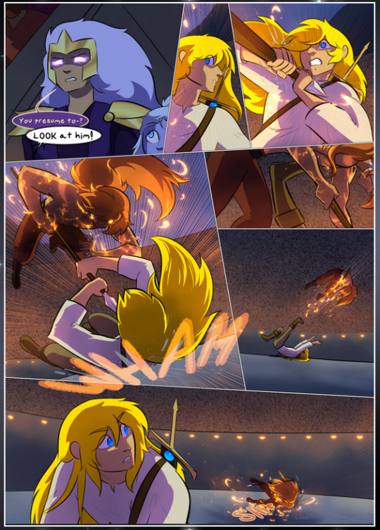
It's not quite as evident here as it is in the next page, but this one does some other fun things so I'm grabbing it. Points:
Once again, using different colors to represent different character actions. The "WHAM" of Kendal hitting the ground is caused by Dainix's force, so it's orange (and kudos for doubling the word over to add a shake effect). But we see blue layered underneath, which could be an environmental choice, but might also be because it's Kendal, whose color is blue.
And speaking off, take a look at the right-most panel on top, where Kendal grabs the spear: his motion is, again, illustrated in bright blue, versus the atmospheric screened-on orange lines that point toward him around the whole panel (I'm sure these have a name, I think they might be more of a manga thing though and the only experience I have in manga is reading a bit of Fullmetal Alchemist). Those lines emphasize the weight of the spear being shoved at him, and their color tells us Dainix is responsible for it.
One of my all-time favorite effects in this comic is the way cracks manifest across Dainix's body to represent when he starts to lose control; it is utterly gorgeous and wonderfully thematic. These are more evident in the page before and after this one, but you get a decent idea here. I love the way they glow softly, the way the fire juuuust flickers through at the start and then becomes more evident over time, and the cracks feel so realistic, like his skin is made of pottery. Additional points for how fire begins to creep into his hair.
A small detail that's generally consistent across the comic, but which I want to make note of here because you can see it pretty well: Kendal's eyes glow about the same as the jewel in his sword, mirroring his connection to said sword and calling back to how the jewel became Vash's eye temporarily and thus was once Kendal's eye. You can always see this connection (though there might be some spots where this also changes in a symbolic manner; I went through it quickly on the first time around, so I'll pay more attention when I inevitably reread this), where Kendal's always got that little shine of blue in his eyes the same as the jewel. It's a beautiful visual parallel that encourages the reader to subconsciously link them together, especially since the lines used to illustrate character movements typically mirror their eye color. It's an extension of Kendal.
Did I mention how ABSOLUTELY BEAUTIFUL the colors in this are?
Also, the mythological/legend-type scenes are illustrated in familiar style often used for that type of story, a simple and heavily symbolic two-dimensional cave-painting-like look. They are absolutely beautiful on many levels, employing simple, lovely gradients, slightly rougher and thicker lineart that is nonetheless smoothly beautiful, and working with clear silhouettes (a major strength of this art style, but also a strength in the comic overall). But in particular, I wanted to call attention to a particular thing (see this page https://comicaurora.com/aurora/1-12-4/):
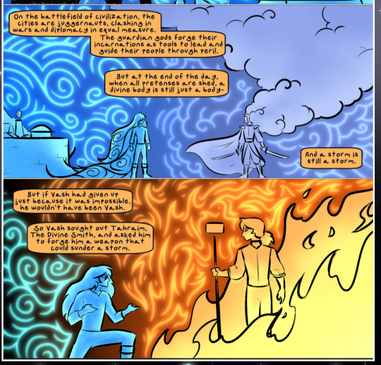
The flowing symbolic lineart surrounding each character. This is actually quite consistent across characters—see also Life's typical lines and how they curl:
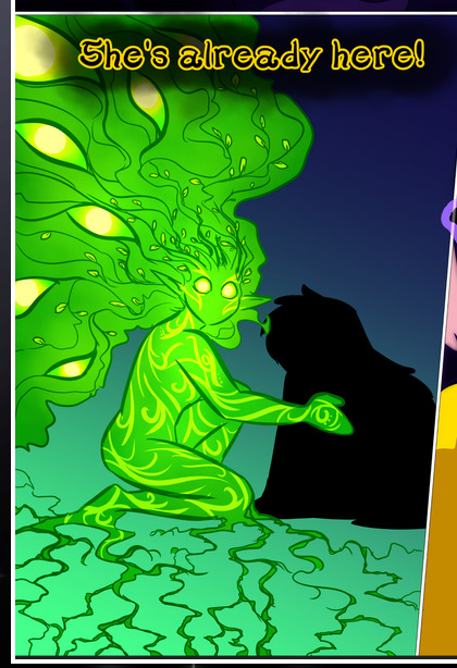
What's particularly interesting here is how these symbols are often similar, but not the same. Vash's lines are always smooth, clean curls, often playing off each other and echoing one another like ripples in a pond. You'd think they'd look too similar to Life's—but they don't. Life's curl like vines, and they remain connected; where one curve might echo another but exist entirely detached from each other in Vash's, Life's lines still remain wound together, because vines are continuous and don't float around. :P
Tahraim's are less continuous, often breaking up with significantly smaller bits and pieces floating around like—of course—sparks, and come to sharper points. These are also constants: we see the vines repeated over and over in Alinua's dreams of Life, and the echoing ripples of Vash are consistent wherever we encounter him. Kendal's dream of the ghost citizens of the city of Vash in the last few chapters is filled with these rippling, echoing patterns, to beautiful effect (https://comicaurora.com/aurora/1-20-14/):
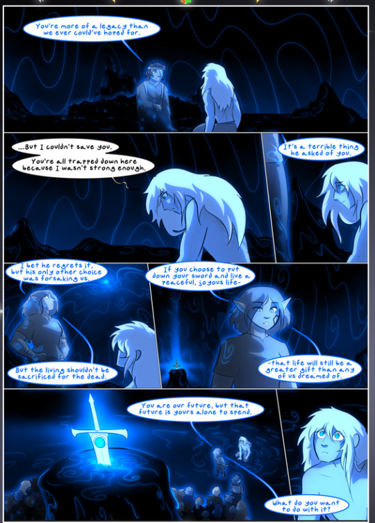
They ripple and spiral, often in long, sinuous curves, with smooth elegance. It reminds me a great deal of images of space and sine waves and the like. This establishes a definite feel to these different characters and their magic. And the thing is, that's not something that had to be done—the colors are good at emphasizing who's who. But it was done, and it adds a whole other dimension to the story. Whenever you're in a deity's domain, you know whose it is no matter the color.
Regarding that shape language, I wanted to make another note, too—Vash is sometimes described as chaotic and doing what he likes, which is interesting to me, because smooth, elegant curves and the color blue aren't generally associated with chaos. So while Vash might behave like that on the surface, I'm guessing he's got a lot more going on underneath; he's probably much more intentional in his actions than you'd think at a glance, and he is certainly quite caring with his city. The other thing is that this suits Kendal perfectly. He's a paragon character; he is kind, virtuous, and self-sacrificing, and often we see him aiming to calm others and keep them safe. Blue is such a good color for him. There is… probably more to this, but I'm not deep enough in yet to say.
And here's the thing: I'm only scratching the surface. There is so much more here I'm not covering (color palettes! outfits! character design! environment! the deities! so much more!) and a lot more I can't cover, because I don't have the experience; this is me as a hobbyist artist who happened to take a couple design classes because I wanted to. The art style to this comic is so clever and creative and beautiful, though, I just had to go off about it. <3
...brownie points for getting all the way down here? Have a cookie.
#aurora comic#aurora webcomic#comicaurora#art analysis#...I hope those are the right tags???#new fandom new tagging practices to learn ig#much thanks for something to read while I try to rest my wrists. carpal tunnel BAD. (ignore that I wrote this I've got braces ok it's fine)#anyway! I HAVE. MANY MORE THOUGHTS. ON THE STORY ITSELF. THIS LOVELY STORY#also a collection of reactions to a chunk of the comic before I hit the point where I was too busy reading to write anything down#idk how to format those tho#...yeet them into one post...???#eh I usually don't go off this much these days but this seems like a smaller tight-knit fandom so... might as well help build it?#and I have a little more time thanks to break so#oh yes also shoutout to my insanely awesome professor for teaching me all the technical stuff from this he is LOVELY#made an incredibly complex program into something comprehensible <3#synapse talks
776 notes
·
View notes
Text

I saw everybody having so much fun with @anaart-stuff 's DTIYS and just had to try it as well! It's my first time actually drawing some of the characters so thanks for the fun challenge.
Prompt under the cut and as always PLEASE CLICK THE IMAGES FOR BETTER QUALITY

#dead boy detectives#chrystal palace#charles rowland#edwin payne#niko sasaki#dead boy detectives fanart#anaartdbdtiys#and of course:#renewdeadboydetectives#this was sooo much fun#I meant to only do a quick lil drawing#but you know how those things go...#well#I roped myself in SOMEWHERE on the way to a fully rendered painting ig#I'm just learning to draw those characters too#so while it's not perfect I can definitely live with how it is now#smoll smule art
247 notes
·
View notes
Text

mhin's moving castle...
#ive been rotating this around in my head for aaaages unfortunately all that i can muster up rn are sketches#we got chimera falin mhin we NEED more bird howl mhin too#touchstarved game#touchstarved#touchstarved vn#mhin touchstarved#touchstarved mc#ocs#noa#my art#2024#sketches#this is the most well dressed ive ever drawn noa idk who coaxed them into those clothes#also hand reveal! i wasnt sure whether to draw their curse or not#but ig in the context of that ss that's like. right at the end of the movie. anyway#howl's moving castle#howl's moving castle au
131 notes
·
View notes
Text
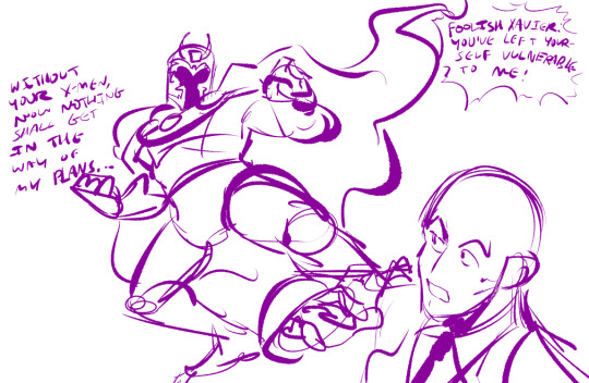
i cant stress how much joy i get from doodling magneto as A Dramatic Comic Book Villain i cannot even lie to you chat
#wip#you guys like wips. im never posting another one again <- this is a lie#rb if you want ig idk#snap sketches#he looks like a fuckass beetle with those horns i love him#i was just gonna post the pose but the fuckass dialogue is necessary. i love it when he talks like that i cant stand him#i usually dont post wips cause i love surprises but idk if im gonna finish this#maybe i will. there's more to this its a dumb comic referencing issue 18 again VJAELKJVKLAJ#but anywayt. Yeah <3#big fan of how his dramatic ass was reasoned to be erik putting on a show to act as a 'lightning rod'#well good job girlfriend you definitely put on a show. only problem is i love you#one of these days i am just gonna make a magneto doodle page of dramatic poses or something#also hi charles. youre here too. obviously.#ok bye i have to be in class i guess#if i post a proper drawing later today or tomorrow it'll be a miracle
144 notes
·
View notes
Text
i needed to express a sentiment in the creative stylings of @dunmeshiminimumwage
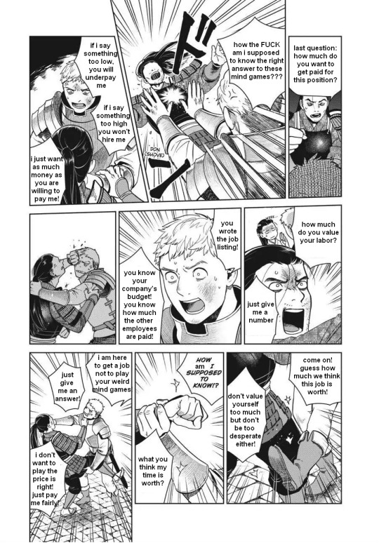
#eliot posts#dunme#delicious in dungeon#dungeon meshi#sorry to put toshiro in the roll of shitty job interviewer lmao#but he was the best fit for ''guy that wants me to read their mind''#laios being my internal monologue here#i was on my THIRD interview of the day i was Dying#tho since the prev two interviews i had were for similar positions and told me their salaries outright at least i could use that number#(though tbh my work persona is more of a kabru. my customer service voice is unparalleled)#(at my first job even my coworkers thought i was sooo cheerful til i got too comfy and casually made a joke abt wanting to asphyxiate on a#plastic shopping bag like a sea turtle. in front of my sweet elderly coworker. oops!)#(also this job was during quarantine and after weeks of working together i took my mask off in front of one coworker for the first time#and she called like half the department over from their registers to look at how pretty i was??? prettyboy powers unmatched ig)#(also my first interview today went SO well i charmed that interviewer so good despite my lack of qualifications)#(she even complimented my social skills and said i seemed like the type who could get along well and make good conversation with anyone!)#(which is important bc i was interviewing for an elder care position. also old people especially tend to think i am a Delightful Young Lad)#(unless i accidentally make a morbid joke around them ig lmaooo. or. well. some of them like those too. but not that one coworker lol)#(if only that skill transferred over to actually making friends irl. my autistic ass has so few close irl connections)#(i hope my exceedingly short list of character references does not prevent me from getting hired)#AND ALSO my first job asked the same wage question and i said twelve dollars#and they were like all our new employees start at 7.75#the union insists that we pay all new employees a whopping 50 cents above min wage. (we'd pay less if we could)#like dawg why did you ask that then??? if my answer did not matter at all???
181 notes
·
View notes
Text
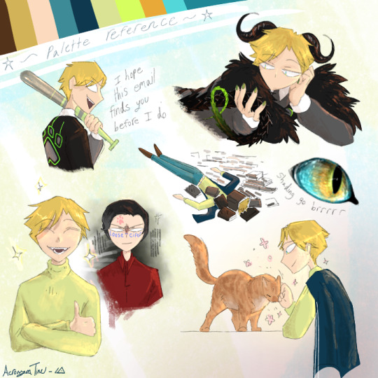
I am ✨️not straight✨️ ♡♡♡
But yeah lmao sketchpage for Satan! And a random eye for some reason bc shading is fun.
Took a bit over two hours to finish.
#Satan#Obey me#obey me shall we date#obey me nightbringer#obey me fandom#Obey me satan#Satan obey me#Satan omswd#Omswd satan#Satan fanart#Obey me satan fanart#Obey me fanart#Omswd fanart#Obey me nightbringer fanart#My cards are so low level but nightbringer's story is drawing me IN#And that's comming from someone who hates time travel plots-#But also I'm a fiend for rhythm games#Piano tiles was my hyperfixation from 10-14 and I even got on the leaderboard#So hearing nightbringer would be a rhythm game? Stoked.#And it's so fun!#I love the music too#The passion remix no 1 and crazy about you are my faves#So far anyways#Im yapping#Bon apetite for those who read the tags ig#Lmao stay hydrated#My works
72 notes
·
View notes
Text

Previous // Next
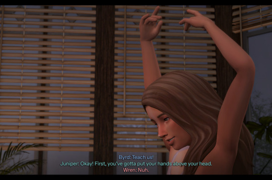
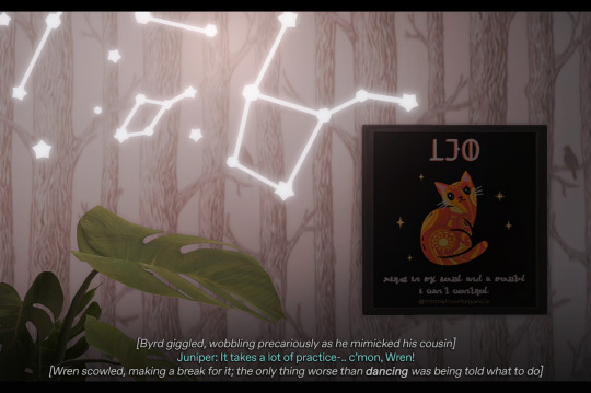
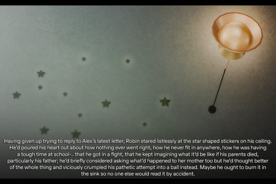
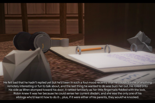
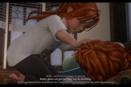
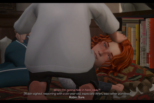
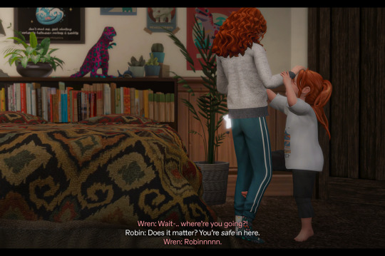
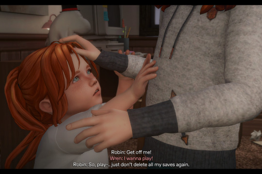
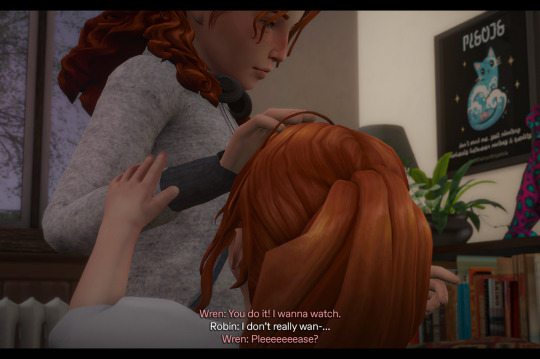
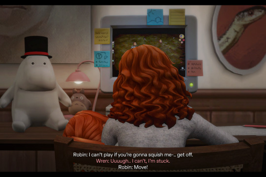
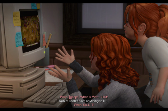
Byrd: Teach us! Juniper: Okay! First, you’ve gotta put your hands above your head. Wren: Nuh. Juniper: This part’s easy. Byrd: Like this?! Juniper: Just like that-.. keep them there and bring your foot up against your leg, like this! [Byrd giggled, wobbling precariously as he mimicked his cousin] Juniper: It takes a lot of practice-.. c’mon, Wren! [Wren scowled, making a break for it; the only thing worse than dancing was being told what to do] … Having given up trying to reply to Alex’s latest letter, Robin stared listlessly at the star shaped stickers on his ceiling. He’d poured his heart out about how nothing ever went right, how he never fit in anywhere, how he was having a tough time at school-.. that he got in a fight, that he kept imagining what it’d be like if his parents died, particularly his father; he’d briefly considered asking what’d happened to her mother too but he’d thought better of the whole thing and viciously crumpled his pathetic attempt into a ball instead. Maybe he ought to burn it in the sink so no one else would read it by accident. He felt bad that he hadn’t replied yet but he’d been in such a foul mood recently that he couldn’t think of anything remotely interesting or fun to talk about, and the last thing he wanted to do was bum her out. He rolled onto his side as Wren stomped toward his door; it rattled familiarly as her little fingernails fiddled with the lock. Robin knew it was her because he could sense her current disdain, and she was the only one of his siblings who’d learnt how to do it-.. plus, if it were either of his parents, they would’ve knocked.
Wren: Juni’s tryna make me dance! Robin: She’s not gonna make you do anything. [Wren grabbed Robin and shook him with urgency, yanking at his hair with desperation] Wren: I’m gonna hide in here, okay?! [Robin sighed; reasoning with a six-year-old, especially Wren, was rather pointless] Robin: Sure. Wren: Wait-.. where’re you going?! Robin: Does it matter? You’re safe in here. Wren: Robinnnnn. Robin: Get off me! Wren: I wanna play! Robin: So, play-.. just don’t delete all my saves again. Wren: You do it! I wanna watch. Robin: I don’t really wan-… Wren: Pleeeeeeease? … Robin: I can’t play if you’re gonna squish me-.. get off. Wren: Uuuugh.. I can’t, I’m stuck. Robin: Move! Wren: [gasps] What is that-.. kill it! Robin: I don’t have anything to ki-… Wren: KILL IT!
#ts4#sims 4#simblr#ts4 story#sims story#forever in between#fib#robin finch#wren finch#byrd finch#juniper finch#skdjsk wren.. KILL IT#no questions asked#😂#reminds me of making my dad play tomb raider for me whilst i watched cos i was too scared to play it myself lmao#poor robin just wanted to wallow in peace tho#😭#damn that “safe” lock that oskie insisted on pfffft#always wondered what the point in those thumb turn ones was cos u can technically unlock em from outside if u can fit smth in the crack#but ig it makes sense on inside doors just in case smth happens 🤷♀️#neway..
181 notes
·
View notes
Text
It honestly baffles me that some people are so casually dismissive of animals' feelings. Istg some ppl only see pets like toys and are barely able to hide it
#vent post alert#but I'm just so frustrated#my mom's dog got hit by a car yesterday and she refused to take him to the vet#she said she doesn't have any money for it and that he's fine#physically he seems fine just bruised. I think he might have something internal but she's been very dismissive of that#anyway. he spent the whole night crying bc he was alone and terrified#I went upstairs and almost begged her to take him to the vet but she still refused saying he was fine#then she put him inside her house and he calmed down after a while#the next morning when she came downstairs to talk to me she kept being dismissive#saying he was fine in the end he just wanted attention#and I'm like yeah?? obviously?? he got hit by a car???? the poor thing is traumatized and terrified#ofc he doesn't want to be alone#and she hit me with the 'dogs don't get traumatized. he's just being dramatic'#I pointed out some dogs have psychological pregnancy so ofc they have psychological problems too#and THEN she hit me with 'but those are female dogs. males are different. because hormones' like. WHAT#this just in not only do human males not have feelings but now dog males don't either. because hormones.#I thought my mom was smarter than this tbh#istg her boyfriend is just making her more ignorant. bc this is the kind of bs I expected to hear from him but not from her#anyway I don't know what to do. I don't have money for the vet either bc I just had to pay for a surgery#we talked and she said she'll monitor the dog and if he looks like he's getting worse she'll take him to the vet#ig I'll have to settle for that#I love my mom but man. this is weird#I just didn't expect it from her#what's worse is that when it's just her and me it's one thing. but when her bf is around I feel like she gets different#like with me she agrees but then around him she doesn't?? how am I supposed to trust her that way#it's all just so weird. idk what to think or what to feel rn. I just feel bad#sleep.txt
59 notes
·
View notes
Text
I did something silly….. I made QL guess who!
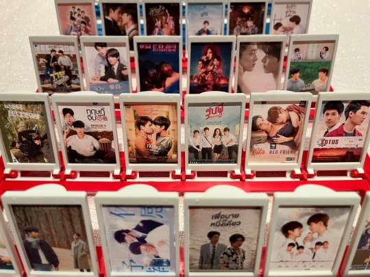
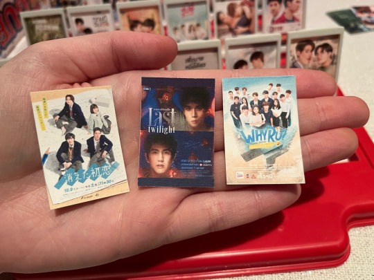
About a year and a half ago I had the idea for a custom ql guess who game but I had no one to play it with so I just put it to the side until I (hopefully) would. Fortunately that day came this weekend when @pondphuwin and I got to play a few rounds (they beat me 4:5 actually lmao)!
Some of the questions we asked were stuff like “is it from gmmtv,” “does your show have a branded pair,” “is there a love triangle,” “is there a debate over whether your show is a bl or not,” and more personal ones like “am I crazy over one of the main actors,” “do we have beef with the way this bl went,” “did we watch this live together,” and so on. Rlly fun stuff!
Since this is a custom guess who I had to make all the pieces manually. At first it seems fine and easy bc there’s already official posters right? But the difficulty is that almost every poster is a different size. So I figured out how to get the proper guess who face piece measurements and manually resized each poster to fit, with a slight gradient in the background where the remaining space isn’t covered by the poster. You can see those gradient bars on the top and bottom in the closeup of the last twilight piece, for example. Also it’s just really funny to hold mini posters of qls lmao (using my hand as a reference)
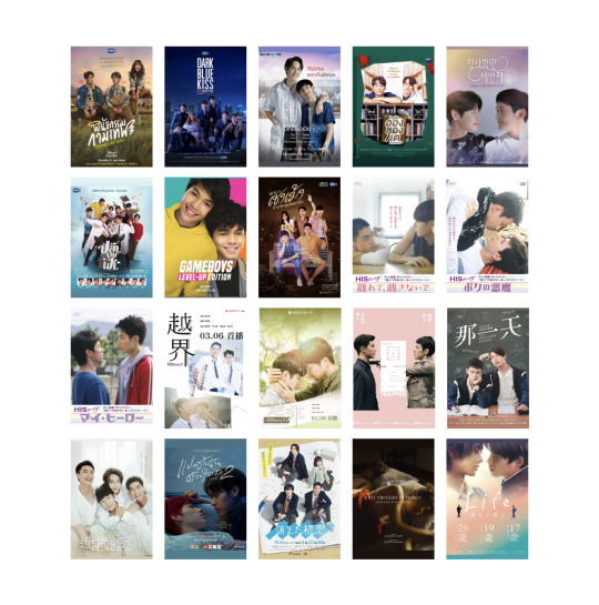
There’s 190 ql poster pieces in total (based on approx. how many I’d seen as of the time of printing) (yes I will add more as time goes on) and they were all put on one big google doc that covered about 10 pages and looked like this!
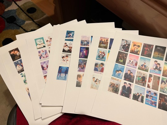
After I had them all set I printed them out on cardstock so they were thicker & more sturdy and then I did a lot of cutting. And since both players need the same posters I had to cut it all twice
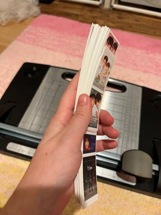
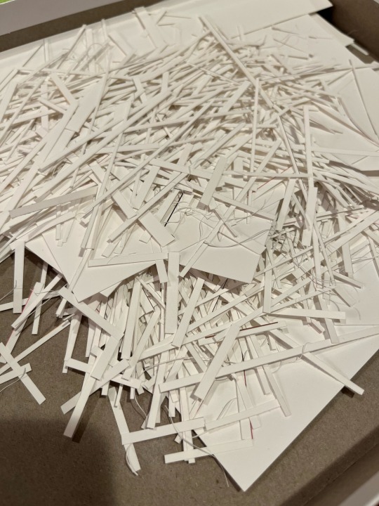
Are there easier ways to do this? Maybe. I’m not sure. Honestly I just did whatever like this is my own gay little art project lol
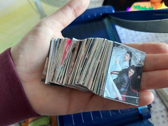
Once I had them all cut and held them in my hand I felt quite proud of my work and now that I’ve actually played it I really do
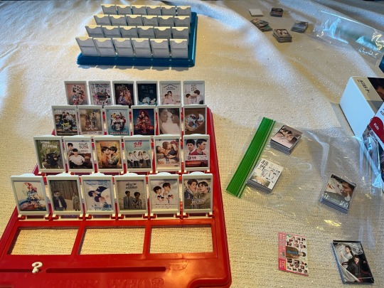
Here’s just like a pic I took when we were playing a round. Since there were so many, after every round we took out the two qls we just selected and replaced them with new ones and we never ran out lmao. It took quite a bit of effort but it was totally worth it hehe
#next time I wanna do it with actors hehe#might get working on that later#but yeah this is so silly and fun and idk fellow ql watchers u might appreciate skdjdjd#it was fun to choose which posters to use too#the only thing I didn’t have time for was the bigger face cards & designing the backs but I will do those too later lol#b.txt#idk what to tag this as#I’m just gonna tag some of the qls u can see in the photos ig lol#it’s relevant…..#last twilight#bad buddy#utsukushii kare#bed friend#pit babe#me when I had two shows open left and one of them was pit babe: does ur show have omegaverse… KDJSJDJ#cooking crush#until we meet again#ok I rlly don’t kno what 2 tag this as so I’ll leave it here lol
264 notes
·
View notes
Text
Angel Dust Turns Human - pg3
tw - slight gore!


Part1
Part2
Beginning of how they met, YAYAY!🙂
Sorry about the quality again, I don't like how it sometimes cuts the drawings but I'll settle💔. I've never actually drawn human Alastor till now, but I do like how he turned out so o(≧▽≦)o!
In not gonna do the math about their ages, and I don't think it'd line up w/Canon, but ik Angel died around the 40s near his 20-30s so he'd had lived two decades prior. I'm pretty sure Alastor died around the 20s, not 30s, but that doesn't matter - the point is, Angel would've been a kid before Alastor yknow, died. (Don't take my word for it, I'm probably wrong, but in this lil comic, that's how it is😔) Angel's around 8yrs old and Alastor is somewhere in his late 20s or early 30s (teehee Alastor w dimples🙂!)
Angel playing around with a dead deers head WILL be explained, trust!🙏 I got the idea of domino's bc I think it's a nice game to bond over, also I just like the game and I remember my Dad teaching me how it works so FATHER AND SON MOMENT RISE!💥💥 Anyways, Angel's childhood won't align w Canon (sorry, so ooc, but I like it☹️).
Hope you like Human Alastors and Kid Angel's design🙏!!
#hazbin hotel#hazbin art#fanart#angel dust#alastor#no romance#yandere love#/platonic#parental yandere#found family#fan comic#parental alastor#parental figure#yandere parent#backstory#charlie morningstar#Sorry if I got the dynamic between Husk & Angel wrong but I see them having their rough patches too. Husk is an alcoholic#Theres no way Husk hadnt said something rude while drunk or w a headache. And anyways Angel can sympathize - he'll forgive him♡#This part didnt have much yandere screentime Ik😔 but itll develop I promise. I cant wait to draw them getting closer TEEHEE🙏#Alastor walks in an alley and finds a kid playing w an animals head and thinks nothing of it. Hes seen enough blood by now to not care✍️#A possessive parent w a child. I love those dynamics☹️🫶 an added plus w being a killer ig#ANGEL DUST ILYSM🧎🫶#comic art
100 notes
·
View notes
Text
im glad to see im not the only one going all feral over his battle voice lines so i put together the rest for the non lycaon havers (its just chain attack/assist/swap lines only tho, theres much more he says ofc)
"dont look straight at the moon" - "a deep clean" - "at your service" - "yes, master" - "stand still" (losing my mind over this one) - "amateurs"
#von lycaon#ft bonus soukaku lines ig AHHAHAH YOU WILL LISTEN TO MY DAUGHTER shes my favorite character#anw i wish those who want him that they get him...hes so fun to play and too hot to look at like damn.....#love a prim and proper standing man going feral in battle#one moment hes standing w perfect posture and in the next hes crouched on hands and feet and ready to pounce and kill uwauuwauu#own#zzz tag#tbd
119 notes
·
View notes
Text
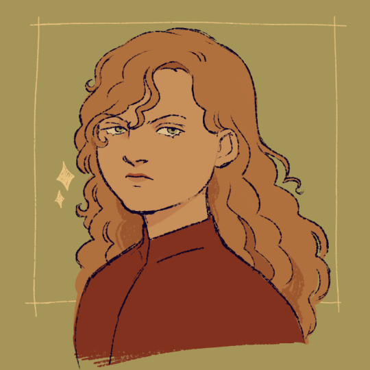
world's evilest middle schooler
#asoiaf#a song of ice and fire#valyrianscrolls#joffrey baratheon#my art#guys um idk how to tell you this...I amputated his emo fringe#t'was annoying to draw#and his siblings' too...it WAS just a phase after all 😔#its ok ive kept a lil strand of hair there. as an homage#unironically why ive been drawing their show vers lately i didnt know how 2 break the news. lol jk its also bc its fun#but damn its been a while. ok ig he was in the pmv but i drew those frames a while ago it doesnt count#n also ive changed his design a lil bit. he's slightly more 🔺 now. and he's got eyeliner
625 notes
·
View notes
Text
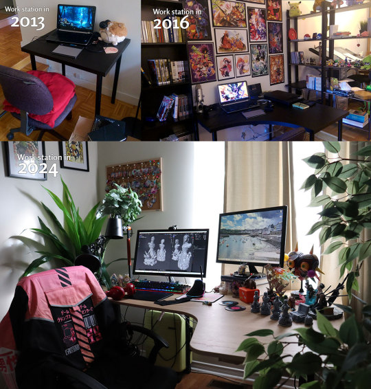
holy shit time flies...
#random#idk the other day i was just looking at the sun coming through my window and it dawned on me#life changed so much in the last 11 years#for the best... but damn#i'd only want to go back in time#only for my health#but i would never give up all the experiences i went through#the friendships made and lost#the failures and victories#ig it really is just life#it still makes me laugh tho how back in the days i had my majora wallpaper#fast forward and one of my best friend gifted me the 3D figurine... ig some things never change#i'll always be a mm fan and i love her sm#but really...#the fucking disgusting chair with pillows in 2013?#disguting#i didn't care tho... i was a poor student who lived constantly for 7 years under 1k in my bank account OTL#i usually hang my left over merch because...#idk#i want to be proud to look at them too#i spend HOURS ON THOSE T0T#then i got that one other wall that's just craking down with artist merch OTL#it's weird to feel like you've lived a long time now...#like i remeber very clearly 10+ years ago#it's so strange...
49 notes
·
View notes