#they blended 2D and 3D WAY better than most
Explore tagged Tumblr posts
Visit Tumblr Blog
Explore Tumblr blogs with no restrictions, modern design and the best experience.
Last Seen Tumblr Blogs


Fun Fact
Tumblr has a low social media market share in South America.
Text
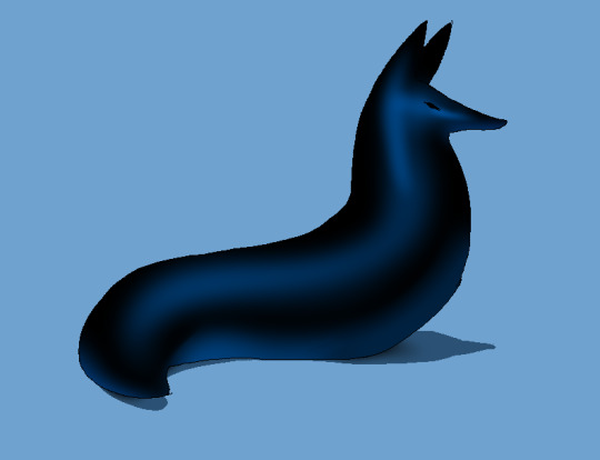
So anyway I watched the Slam Dunk movie today and it was SO GOOD.
The animation level was INSANE
#and the story too was good without being cheesy#but seriously the way they changed style when the moment required it#they blended 2D and 3D WAY better than most#while keeping the original designs#damn. good fucking job.#slam dunk#sunny blabbers
2 notes
·
View notes
Note
your shading is AMAZING specially when its conveying organic forms..... do you have any tips for people who dont know wrf going on (with shading)
ok so HI. hi. my old tutorial pisses me off so i will make a new one
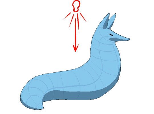
i made a guy whose sole purpose is to be shaded so dont worry he likes it. and his name. his name will be mr. Boob. mr boob does not have to be blue
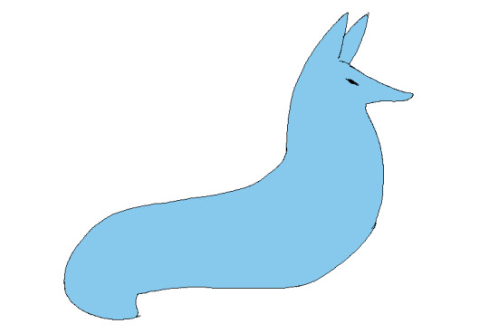
theres probably way better explanations of how to do it but unfortunately trying to "emulate" shading does ask you to somewhat understand ur character in a 3d way. like what would the 2d shape be if you "sliced" it? mr boob is made of so many circles. his tail also does a kind of weird perspective foreshortening thing because its pointing at you. is this being conveyed
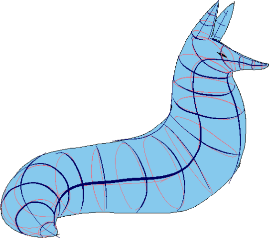
you obviuously dont have to draw a horrendous grid on your characters skin to do this . BUT it helps you put down (or at least envision) the lines of the form shading :
dont worry about cast shadows or the shading color because this is FORM SHADOW time only. think about what surfaces of the character are obviously facing away from the light source and put down the "separation line" of the shading based on that. thr most important thing is that youre trying to separate light from dark
im going to pick the first one for cast shadows bc it will be the most obvious to me
ok so. his ears and snout are blocking other surfaces of his body from the light, which means a shadow is cast!!!! bam. i saw someone describe cast shadows as what the light's pov "can't see." his entire body is putting down a cast shadow on the ground too

im impatient so i blended the form shadows now. its usually the easiest to just NOT blend cast shadows as a way of conveying that they are still cast shadows. but you can still blend them if you want to show "distance" between the obstruction and the surface its blocking. but its just a way of saying form and cast shadows should not be treated the same even if their softness coincides
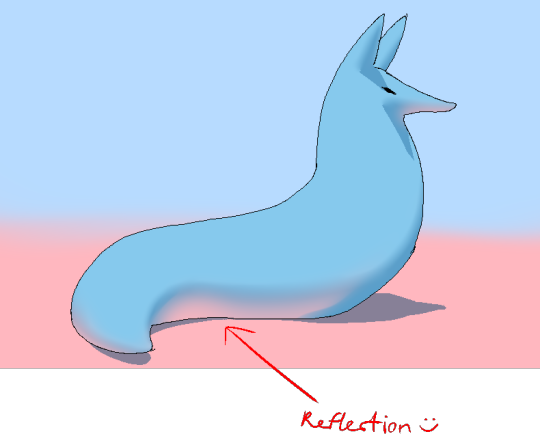
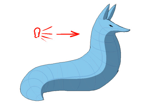
im going to lump reflection and ambient light together because theyre like. similar. reflections dont just happen in mirrors
since the sky is blue, making the ambient lighting, i tinged mr. boobs existing shadow to be a bit blue. (*this is kind of important because it can help you decide a shading color, which should USUALLY be based on the environment) (unless your character is just in the transparent void then it doesnt matter)
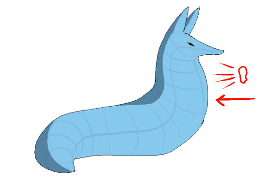
since the ground is pink, i made pink light bounce off of him. pointed and labelled. i dont rlly know how to go more in depth than that

contact shadows are literally shadows formed from direct-touching contact. very little light can reach in there, even from how reflections disperse, which means youre free to use the darkest color available (black). in this case mr. boob is making contact with the floor. because he is sitting on the floor.
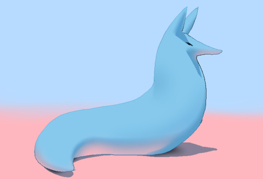
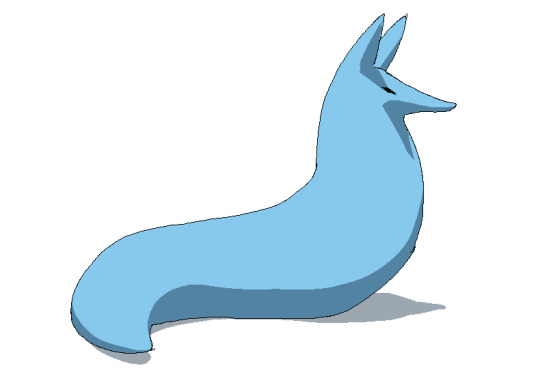
i touched him up a bit and wow!!!!!!!!!! look at mr. boob!!! he is so beautifully sculpted.
and one more thing
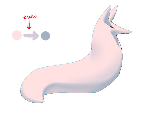
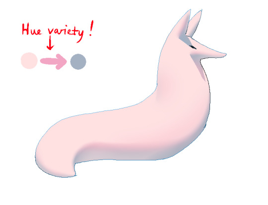
thats right. i made mr boob PINK. hes fucking ruined now. just kidding i would never say that to him
what im trying to convey here (its the easiest with really light colors) is a transitional color. this can also show subsurface scattering depending on how you use it which is fun to look at. the mistake i made on my last tutorial was "Just pick a warm saturated color!" which is really wrong in examples like Blue mr boob. because it would be weird to use a warm color to transition from blue to blue.
if you have a character that isn't bright enough then obviously the shadows wont be as visible. its BEST to bring more attention to highlights and reflections to reveal the form a bit. they play the biggest role with darker colors
thats all i can think of. fun things to look up:
structuralization + contour lines + foreshortening etc. 3d lingo
form shadows
cast shadows
ambient light
contact shadows
subsurface scattering
im also just speaking out of my ass otherwise. i didnt look up any of these terms until the end now im inferring and hoping i got them right
and remember every time you shade mr boob will be rooting for you
2K notes
·
View notes
Text
Dream Animated Movie Musical Tournament Seed Round Group F
For information on this tournament as well as the seed poll for group A go here
Why these musicals should be animated movies (in my opinion)
Once On This Island: it's basically a fairytale (so kinda feels like a Disney musical without really being one) and animation would be the only real way you could capture some of the things this show tries to do on film (just imagine "Mama Will Provide" alone and see the potential here)
The Music Man: classic old-fashioned musicals always seem like they could work well as animated movies to me and The Music Man seems to be one of the most still-beloved from that era (also the closest thing it's had to a movie recently, that 2000s one with Matthew Broderick, is kinda not well liked among fans of the musical so, like Harold Hill, this could deserve a chance at redemption)
Newsies: on the one hand it's a successful Disney musical adaptation of a successful Disney movie so some cynics might say the next step is to make a movie of that musical for even more money, on the other hand due to things like the addition of Katherine the stage musical does feel like enough of a unique entity it could be made into an animated movie without feeling like Disney's doing that kind of recycling (also one of the closest things Disney's ever done to a project with a pro-labor message, we could use that right about now)
City Of Angels: due to the dual-world nature of the story this could either blend live-action and animation (but animation less goofy than what Who Framed Roger Rabbit did) or black-and-white and color animation, either way this would definitely push some boundaries
Venice: although to some the book could use a few touch-ups (but that's what the second look a movie'd give a show like this is for) I still think at its best it's an underrated powerful show that deserves a way to reach a wide audience and as for why animation it'd help provide a layer of distance between some of the content both for soft-hearted viewers when the plot, y'know, Goes There, and for those in positions of power such that they might feel its political content hit dangerously close to home otherwise
Spring Awakening: the messages of this show are timely enough for it to deserve a movie and animation would both help the distance like with Venice and play into the whole dark romanticism of the show's aesthetic otherwise (if I had my druthers over how this would be an animated movie it'd (even if it had to be "drawn" via computer animation and would have to be 3D-animated as long as it could look close to the 2D vibe) do that thing Batman: The Animated Series did with the black backgrounds but have a more "flowy" sort of style like a dark version of certain Disney movies' aesthetic)
Caroline, Or Change: this is another one where it just feels like it'd work better animated but I don't quite know how to say how but this powerful story does deserve to get more notice
#dream animated movie musical tournament#tumblr poll#tumblr polls#tournament poll#polls#tumblr tournament#tumblr tournaments#musicals#movie musicals#once on this island#the music man#newsies#city of angels musical#venice musical#spring awakening#caroline or change
6 notes
·
View notes
Text
Sonic - official art VS official models.
Sonic and Shadow - heads
I said i'm trying to do 3D sonic models for everybody to play with. And I aim to make them more faithful to the art rather than to in game models. But I'm a total newbie with Blender. I approached it years ago to create new morphs for DAZ studio. And I did some architecture stuffs. While originally I wasn't interested in 3D art (I though it was boring to do), I found myself having fun. I realized I could do things I was unable to do by drawing alone. I use 3D to enhance my own drawings.
But is about Sonic models I'm talking about now.


Shadow just needs same Sonic base, they look identical. Everything that works for Sonic, works for Shadow. His natural eyes are round, the scowl is his defensive expression, not the shape of his eyes.


Although I do not like the modern, angular, smuggy style, the core is still here. The new art is as valid as the old one to analyze. I think the old one should be kept as reference to inject that nice, soft, rubber hose style of early '2000s.
If you don't like the rubber hose style, then keep the modern art as reference.


Side view (it seems in art the forehead is way thinner)


Actually the only good front view reference. I didn't like the Terios ones. (A curiosity - in cat languages, those flared out ears indicate anxiety and is a submissive demeanour. The aim is to scare the opponent but is from a position of vulnerability).

An official Amy, side view. Sonic, Shadow and Silver have the same head shape. In Silver is clearly visible even in the model since he has way fewer quills.
Cheeck also official art
In Sonic's Uekawa's art - arcs and forms wrap nicely, forming a pleasant, balanced figure. The head is roughly round (Slightly egg shaped from the top, similar to a real life human head).
To draw this starting with a good looking sphere should already do a lot of the job.
But is 2D art. a bit tricky. You can cheat in 2D. You can't in 3D.
The head models
SA2


A good model, cute and close to the art. Its full potential was wasted, I tested it a while ago and it's base allows for a lot of expressions, the very same from Sonic adventures. The eyebulb is roughly round, easy to animate. A bit too thick eyebrows, probably for a better readability (it was low poly).
The negatives are the quills, it seems Shadow looks good only on front view, Sonic only on side view. Also, on sideview the muzzle is too flat.


Modern head models

About the modern head, a thing I strongly dislike is the tall, elongated cranium. Eyes also look elongated and ugly. The angular cheek is another negative point. Lack of brow, stiff expressions. Usually when I work on this model, I enlarge the head - X plane - by about 30/50%
The positive are a better silhouette for the quills in all view and clearer proportions. On sideview, the head is fine.
Overall, I don't like it.
Sonic Prime

Sonic Prime is a interesting blend between modern and adventure design, with some original elements like the more horizontal shaped eyes. The quills are very long The overal look is soft.
The negative is the lack of brow and the prominent cheeks.
Is a very nice model.
Sonic Boom

Sonic Boom's lanky and stiff bodies are certainly ugly. But the model of the head is surprisling close to the art and very interesting to analyze, it has a lot of strenght.
The cheek wraps nicely around the head and does not stick out more than necessary. The most positive thing are the expressions. the double eyebrow here doesn't happen. Is unfortunate it has not much brow.
the bad are certainly the quills, they're too short and the extra mini quills makethe silhouette unneccessarily jagged.
Overall a good head model.


The forehead wrinkle appears when needed...
I won't analyze the movie models simply because the style is totally different and I'm focusing on game style.
6 notes
·
View notes
Text
I saw The Wild Robot a few days ago, and I think I would need to see it again to know how I feel about it. Visually, it was gorgeous: the coloring, layout, animation, effects, etc etc were all just a treat to look at, and while it seems to be following the recent trend of blending aspects of 2D and 3D, it's stylistically distinct from the others. Like Puss in Boots: The Last Wish, it would've been worth seeing for the art alone even if everything else had sucked. I felt like the score was doing a lot of heavy lifting in terms of narrative and emotion as well. I did cry a couple times in the theater.
That said, I couldn't help but be hung up on the writing the whole time I was watching it. It often felt too straightforward and preachy. There were multiple times where a character would make a statement about an emotion and I would wish that we had instead gotten to witness the emotion for thirty seconds instead. (To be clear, this isn't an issue with Roz or overly literal robot speech styles: that's my jam and I love it. All characters were guilty.) This would ruin most movies for me, but again, the art and music were carrying so hard that I'd end up feeling the emotion anyway.
It also felt like the pacing was strange: it felt very storybookish in that one thing happened and then another thing happened and then another thing happened and now the movie's over. There were three climaxes: Brightbill's migration, Roz saving all the animals from the blizzard, and the final robot fight, but all of them felt like they were fairly equally weighted so each subsequent one felt less impactful because, what, again?
I feel like I would have liked the movie better if:
1. Less dialogue period. Maybe Roz is the only one who speaks, and the animals communicate through body language. If they must talk, maybe rather than learning animal language through a scan in a montage, Roz slowly learns their language throughout the film from the ones she's close to. I feel like that would've been more impactful for their relationships and the theme of Roz having to learn how to do things differently than she was programmed to. (see footnote)
2. If they took out that stupid old freaking goose. Mentor death was a layer that did not really add to the movie, the goose wasn't there long enough for me to care, and having one old goose who doesn't hate Brightbill for some reason doesn't really help connect him to the other geese at all. Have him form a connection with someone rather than having this wise old grandpa bird show up out of nowhere for no good reason. I'm not even glad he died because I'd rather he hadn't been in the movie at all.
3. Give the movie a little more time and use it wisely. Everything is in montage form. Give us a couple non-montage scenes of the characters doing stuff together so it's more impactful when they break up. Alternatively, take away at least one of the three climaxes so the focus doesn't feel so scattershot.
4. Tie the human civilization into the themes more. I don't think there should actually be humans in the movie, but there seems to be something there about how the animals learn they're stronger together, and the human civilization seems to have sealed itself away from nature in biodomes (probably for safety from the effects of climate change), and they chase the geese away, unlike Roz, who takes all the forest animals into her own dome-shaped house. But like, the humans seem to be doing fine. I feel like it'd be way more interesting if there were background glimpses of things beginning to fall apart juxtaposed with the shiny advertisement videos for the robots. I think it'd help make that theme of outward focus and making the world a better place stand out more.
In conclusion, I do think it's a very beautiful and worthwhile movie to see. However, it could have been a masterpiece with less heavyhanded writing and tighter, more coherent theming and plot. And that kinda bugs me. It could've been perfect.
(Footnote: Pet peeve territory, but it also would've made more sense. Roz is presumably programmed to pick up human language with grammar and syntax, and while I'm willing to suspend my disbelief for talking animals in an animated movie, they are absolutely not talking like humans would be even if they appear to be speaking English for the audience's convenience. That montage literally showed Roz doing like a find-and-replace language reconstruction on those little projector screens, and like... really? Animals have a language that is analogous to human language structures and nobody has put that together yet or it would be in Roz's database. Shut up. People have been WISHING animal communication worked like that for ages, but it doesn't. No way algorithms designed for human language syntax structures would work on animals and no one would know. Either handwave it completely or get me a semi-satisfying explanation; don't put that crap on the screen and force me to think about it.)
#pickle pontificates#I'm probably not gonna tag this for the movie. i still haven't seen any reviews so I'm looking forward to seeing what other people think#i know response has been generally positive and I think that's deserved#but like. the fact that I feel so conflicted is both praise and condemnation#i would not care if it were straight up mediocre#it's just that it was so close to being amazing that I can't stop thinking about it#also I didn't think this was important enough to put in the post but like#personal preference? i would've loved it if the animals has less stylized faces. that would've really elevated the film for me personally#i don't want hyperrealism at all but like#smaller darker eyes at least?#i think it would've made it feel a lot more ''wild'' and less... disney idk
2 notes
·
View notes
Text
Happy New Year and welcome to 2025!
Hello everyone, Random Gamer Riven editor of this blog here, hello and welcome to 2025 here at Randomised Gaming hope you all had a good Christmas. So posts are going to be a little slow to start with this year as I work on a novel, I've been writing on and off for the past two years and I intend to finish it this year, it is gaming related, but I won't say more until it finished.
So how about I give you a run down of the games I've been playing over the Christmas period and some of the best titles I played last year. I spend the early part of the year playing Armored Core VI, Cyberpunk 2077 and Elden Ring the latter two I'm still playing through as they've been on and off games due to their size.
Three playthroughs later and I had finished every mission and S Ranked it all in Armored Core VI. Really great single player game, however the multiplayer was rubbish compared to the world map battle system of Armored Core V and its follow up Armored Core Verdict Day. So far there has been no word on if Armored Core VI will get a follow up titles like all the other numbered releases in the series.
I finished 2024 playing the excellent Unicorn Overlord the latest title from the excellent Vanillaware. This strategy RPG really is quite unique blending elements of most of the main tactical and strategy titles in the genre, but still creating it's own special gameplay. It remains me of bits from titles like Ogre Battle, Dragon Force, Shining Force, Langrisseer, Fire Emblem and more, all rolled into one.
I would say, it might just be my game of the year for 2024 and 30 hours in I'm still enjoying the story and battles. It will get a bit repetitive towards the end I can see, but it just looks and plays so well.
Another surprised and a game I picked up near Christmas was the new video game version of the 2003 Manga, Sand Land from the late Akira Toriyama who sadly passed away last year. It's an action adventure title that sees you driving around a desert in a tank in the search for water. There's a great cast of characters and the story along with the voice acting are very well done.

It's fun to drive around in the various vehicles, battle monsters on foot or in a tank and just explore the world and towns. Really is well done.
Last year I played through the excellent Blast Brigade vs. the Evil Legion of Dr. Cread over the Christmas and new year windows. The game is what I call an open world platformer. To most people that what people call a Metroidvania, but I dislike that name as it snub earlier games in the genre like the C64 title Below the Root. Blast Brigade really was great and some some excellent 2D style visuals, which I think were in part 3D.
One of the best modern looking game in the open world platform genre I've seen in recent years and a game few people have played.
So this year first off for less than £2 I got Imp of the Sun on PlayStation and the game is now often on sale at a low price. It's not a big game took under ten hours, but it was said to fall into the open world genre and it does to some degree, but all the stages follow the same path route of Mini-boss > Upgrade > Map > Boss.
Not a perfect game, there were a few bugs and the hit collision could have been better, but I collected everything and beat the game's normal mode and got the hidden ending. Didn't beat the harder mode but for the price it was good stuff. I don't think it was worth the full price of £16, but for £5 or less I'd say it's well worth it.
Having also finished Bloodstained: Ritual of the Night this year, unlocking everything. I can say that was a good not great open world platformer. In Bloodstained case the end of the game is just unfinished and rushed and don't get me started on the awful food quest.
Still it turned out to be better than the Prince of Persia: The Lost Crown which I'm over 65% of the way through right now.

The first major boss battle looks nice in the screenshot, but the game draws to much from the worse elements of Hollow Knight.
Lots of empty rooms with nothing to fight, not many power ups, lots of jumping sections that require perfect timing, large map areas with not much in them and big doesn't always mean better. It has a terrible story with some truly flat voice acting and plot holes left, right and centre. I'm near the end now now, but I have zero interest in what happens to the main character. I'd heard good things about it, but all the open world platformers I mentioned in this piece are far better games. Prince of Persia: The Lost Crown really isn't that much fun, combat is decent, but flawed and for a big budget team I expected better.
On the indie front I have been enjoying the Hammerwatch series, I got sent a coverage copy of the original game some years back. It seems like a nice enough game at the time, but I picked up the sequel and remake recently. Turns out the original is a really great Gauntlet clone when I played through it on PlayStation 4 in December. The sequel is more like Diablo in gameplay, but still a very good game in its own right. I liked the pixel style artwork to the first game which reminds me of Cannon Fodder.
Really enjoyed it finished the main game and the temple of the sun quest, still not done the survival quest due to it being insanely hard. The music bug was really annoying in the original game, first time players would be better with the remake of the first game now which uses the second game engine and looks great.
While I'm been playing my fair share of retro games this year and remakes like Myst as always. I did picked up a few Japanese SEGA Saturn games for Hz testing.
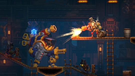
One sequel I enjoyed playing in 2024 was SteamWorld Heist 2 a rather long over due follow up, but worth the wait. Sadly it's not clear if we will see any more Steamworld games as Thunderful let go of most of their development staff in 2024 and there hasn't been any word on DLC for the game.
Last game from 2024 I'll mention is Outcast: A New Beginning, always enjoyed the original PC game and it's remake, sequel likely didn't do that well, but looks great.
All the best to everyone for 2025 and thank you all for your support!
Follow Randomised Gaming on Tumblr, YouTube, Twitch & Twitter for video gaming & video content! Buy us a tea on Ko-fi
1 note
·
View note
Text
the enigma of (art) blend modes, and how doing brain research taught me how to better utilize them
(DISCLAIMER--I'm not actually going in-depth on different blend modes; there's other resources for that sort of thing! Rather, I'm just planning on talking about how they've been captivating to me in the past.)
I've been working with digital art programs for quite some time now, mostly for my game development pursuits, but also more recently just for fun.
Whatever program I'm using, be it Aseprite, Krita, or Paint.net, there's always this goofy little feature referred to as "blend modes". Really, all it refers to is how new colors should be made when two colors overlap on an image--particularly from different layers.
Back when I was young and naive, those layer blend modes hardly did more than just exist. Maybe I'd pull down that drop-down menu and switch around the modes every once in a while, but this was never used to help me during the creation process.
There's something about starting to use a new art program and getting overwhelmed by all the buttons on the UI. Of course, it takes time to master those menus, but when you do, it's nothing short of rewarding.
Which brings me to one of the most interesting programs I've worked with: Fiji.
Fiji isn't an art program--it's anything but. Instead, it's open source image processing software, designed for life science related analyses.
I've had the (mis)fortune of becoming acquainted with this software through my internship. When it was introduced to me last year, it was... overwhelming, to say the least.
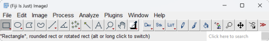
This is what it looks like when you open it:
Not too overwhelming yet, right? Wrong. Here's what the dropdown menu for "Analyze" looks like.
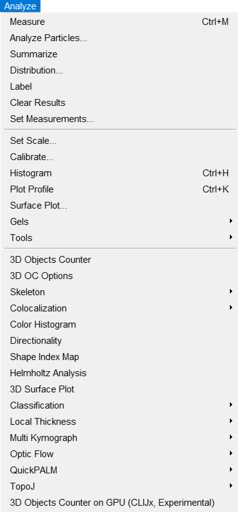
(I like how it starts with normal sounding words, before devolving into things like "Helmholtz Analysis" and "Multi Kymograph".)
If any of you are already super-mega-brain-nerds and know how to utilize all of these options, then good for you, I suppose. For the vast majority of the people who are unacquainted with neuroscience (such as myself), however, this is INCREDIBLY daunting to navigate. Imagine something just as confusing as this for the other menus.
Hell, even just importing imaging data proves labyrinthine:
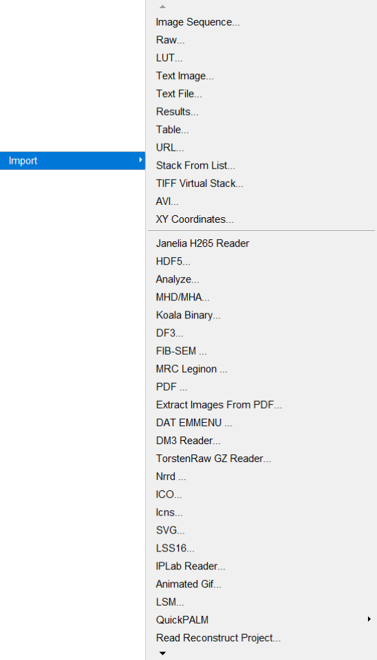
Okay. I'm done fussing over how convoluted Fiji's menus are.
I've worked with them for long enough to understand them a little better, though I still couldn't tell you what half the buttons do.
...like most of the art programs I use.
Yes, I've used Paint.NET since, like, 2018. No, I still have no idea what the "Clone Stamp" button does.
(by the way, if you're still using Paint.NET yourself for art, 1. what are you doing, and 2. Krita is much better for what I needed from an art program, so I might recommend trying that out if Paint.NET is getting on your nerves!)
Anyway, loading imaging data into Fiji usually gives you a video you can pan through. Most imaging data usually either represents a z-series, t-series, or both.
A z-series is imaging done on several layers of the subject's brain at a single time point, to create a 3D stack of images with time substituting for the depth into the brain.
On the other hand, a t-series is imaging done (usually) on a single layer of the brain throughout several time points. (Data I've worked with has ranged from 15-minute-long t-series to 100-minute-long t-series.) This again creates a 3D stack, though this time, time represents, well, time. (This is how most video is stored--even if the video itself is 2-dimensional, you're still "technically" viewing 2D slices of a 3D stack--though only super-nerds call video 3D.)
A zt-series can also be imaged by making several z-series over time, which can be processed into a 4D video. (Usually, though, the slices have to be processed through software to order them properly.)
Last year, I worked with zt-series a lot. This year, however, I've got easier work--I'm just working with t-series this time, to analyze calcium activity.
They're nicer to work with, to say the least. I've worked on automating the collection of calcium activity data by comparing the minimum and maximum values of each pixel throughout the whole t-series in order to determine where there's potentially calcium activity happening.
...in fact, once you get an image of the minimum and maximum values of each pixel across the whole t-series, you then work with those images as layers and use different functions to extract a mask that shows only potential calcium activity regions.
...
So it's adjacent to blend modes in a way.
Specifically the "Multiply" and "Divide" modes.
...
It's a bit of a stretch, of course, but working with these black-and-white images has helped me better grasp what's going on under the cover when I use those same blend modes for art.
Of course, I'm not using them masterfully yet. Really, I'm just using them to add blocky-ish shading to translucent objects.
...I'd show an example, but I can't find any pictures right now.
...
Sorry about the tangent.
I just feel like somehow this contributes to the intimate interconnectivity of everything.
Art and brain research being related on a software level.
#blog#neuroscience#neuroscientist#brain research#internship#art#art software#interconnectedness#blend modes#paint.net#krita#fiji software#imagej2#i dont know why i bother with the imagej2 tag#i highly doubt there's a vibrant imagej2 community active on tumblr#blogging about imagej2 on their blogs.#what a bunch of nerds
2 notes
·
View notes
Text
I was not prepared.


Let's talk.
I was expecting Addams Family 2019 to be bad. I really was. My expectations were on the floor. I'd seen clips and I knew the cast. I knew the general breakdown of the plot. I wasn't expecting there to be so many parts that I would actually like.
Don't get me wrong, the thing is terrible. One of the worst Addams Family movies I've ever seen. (It's above Addams Family Reunion because that one put me to sleep five minutes in three different times over the years and I have yet to watch it all the way through. Also, I haven't seen Addams Family 2.)
The thing is, there were a lot of moments, jokes, and even plot points that I actually really liked, but the execution for most of them was 💩. I think a good half of it or so could potentially work on paper if not in an animated (or even live action) movie.
My favorite joke (that is to say, "the one that made me laugh the hardest") was the cotton candy bit.
Then you have the "lime in the coconut" nonsense.
The spider bridge followed by "surfing the web".
WTF.
Also, I'm saying this as an Addams Family fan and not a crazy fan of any of the cast specifically, even though I love so many of them, these guys were WASTED on this thing. Oscar Isaac was probably the best part (cause he's the only one who consistently sounded like he either gave a shit or was just trying to have some fun with terrible material) and I hate that he was in THIS version. I think that Oscar Isaac, Charlize Theron, Chloë Grace Moretz, and Bette Midler would be really good in live action as the same characters they voiced. Also, Finn Wolfhard was pretty good as Pugsley, but I can't see him trying to do it in front of a camera.
As an Oscar Isaac fan I'm gonna say that my boy got done DIRTY.
Before I wrap this up, I just want to talk about the character designs.

I can get behind using the original comic designs for an animated movie. It's been done before. I think that's a pretty neat idea. HOWEVER, that works a lot better with 2D animation than 3D.


The arms and legs on the kids are so pencil thin that there were times I couldn't see their limbs as they moved. They just blended into the background.


Like so much else, the idea was good, the execution was not. Everyone is too thin, too smooth, and too weirdly simple despite clearly being complex at the exact same time. They look like clay balanced on pencils and toothpicks. Basically, give these guys some carbs, and add more details like Wednesday's noose braids. As is, they make Vivziepop characters look heavy and healthy by comparison.
Like I said earlier, it's not the worst Addams Family movie I've seen, but it's right next to the bottom. If Addams Family 2 is anything like this first one, it might get bumped up a notch though. I can't say. Have to see it first.
Going from worst to best (movies only):
Addams Family Reunion (1998)
The Addams Family (2019)
The Addams Family (1991)
Addams Family Values (1993)
ONE OTHER THING!
If I had a nickel for every time an actor I thought could be a good Gomez Addams ended up in a terrible version, I'd have two nickels. It's not a lot, but I think it's funny that we've failed both Tim Curry and Oscar Isaac.


2 notes
·
View notes
Text
I'm so late to Arcane LOL
I did know it was going to be a wonderful series just based off their art and animation alone!!
But such a gut-wrenching, powerful series.
I didn't binge watch it though! I wanted it to be so special! I just finished episode 8😭
I am also just inspired by the specific way they've drawn the characters, they look like they're from the pages of graphic novels! It isn't just this spiderverse-like blend of 2d and 3d. Literally there's this consistent drawn streak over their skin, like color marker pens! And all their sparkly eyes, but it's not exactly anime. They're bright, sparking and colorful!
The OST is blended in to the situations and events so seamlessly!! I know Imagine Dragons gets a bad rep from most online voices, and while I think they're an okay band, their contribution to have such a good song that does tell a very cold story fits the series. And its orchestral version is MUCH better than the one on the radio, at least I'm assuming the intro song is a different version. I personally love Ekko vs Jinx's sound track!
100/10 would put amnesia on myself and make me "watch" it again
8 notes
·
View notes
Text
Demon Slayer Season 3 Review

Hey everyone how's it going? Dan here and today I'll be reviewing Demon Slayer season 3!
Spoiler Warning (if you wanna watch it, just do the free trial for two weeks on Crunchyroll)

Now I've been looking forward to this season after season 2 which I thought was a near masterpiece thanks to the animation and the story as well as the characters. Season 3 has been hyped up for the last year and people have been frothing at the mouth (myself included honestly) waiting for this to drop. Though I will say I'm sure some people weren't happy it was exclusive to Crunchyroll only whereas Season 2 was on Hulu and Crunchyroll. Either way, people were ready to watch season 3 and I will say it's great but I think season 2 was slightly better.

I love Tanjiros journey and how he's slowly becoming a stronger swordsman and demon slayer and how we got more background into his ancestors and how they knew Yoriichi as well as more background into the dance that was passed down to them. I also liked that we finally got Muzans backstory animated and how he became a demon. If you've read the manga you already know how it goes but even so I always enjoy when we get these scenes in the pages animated since I love the medium. Speaking of animation, I also want to point out how they used 3D animation as well and I'll admit it, it looks well done. Doesn't clash badly with the 2D style and it blends well enough to be a pleasant visual experience.

Now the demon slayer cast this season was interesting. Instead of the main cast which consist of Tanjiro, Nezuko, Zenitsu and Inosuke, we get two Hashira's and someone from Tanjiros class Genya. Tanjiro and Nezuko are still the main protagonists and I did enjoy the Hashira's in this season. Mitsuri and Muichiro had great backstories but the one I think I liked most was Genyas backstory (though Muichiro was a close second) and explains why he is the way he is and why his brother Sanemi is the way he is as well. The upper moon demons this season were pretty insane. I thought the last seasons Upper moon was insane and to be honest, upper moon 6 was definitely better than the upper moon 5 demon. Upper moon 4 however, that was a complete unit themselves. Its a shame Muichiro spent almost all his fighting on Upper moon 5 who I thought was a bit underwhelming compared to upper moon 4 and definitely compared to upper moon 6. Though I will say the backstories for the Upper demons were near nonexistent. Upper moon 5 didn't get one and Upper moon 4 got a little bit of backstory but compared to last seasons Upper moon, it's not as significant but still decent.

Now my main complaint here is the absence of Zenitsu and Inosuke. Inosuke is my favorite character of the demon slayer cast while Zenitsu is my least favorite. Even with that as the case, I still feel they should have been in the swordsmith village arc. To me, Tanjiro, Nezuko, Zenitsu and Inosuke are a package deal. I enjoy seeing them train, go on adventures and battling demons together. They only appeared in the first episode and that's it, they made a little post credit cameo but that doesn't count in the main story. I'm sure they'll have a huge part in the next season but I felt it was the same without these two fighting along side Tanjiro and Nezuko continuing to get stronger as they battle upper ranked demons.
Overall I enjoyed season 3 and the ending to it. Despite my nitpicks here and there, this is still a great anime and a great season. Now I'm excited to see how things go in Season 4 with Muzan plotting to take Nezuko to complete his goal of being the ultimate lifeform. I hear the Infinity Castle Arc will be the best Arc in the entire series and with what's suppose to go down, I am once again ready for it!
Rating this I will give it:
8.5/10
I like it just like I like the other seasons, each one has its strengths and weaknesses but overall its still a great anime series and I highly recommend watching season 3 as well as the other seasons and movies of Demon Slayer.
That's all I got for today.
See ya!
#dans den#demon slayer#swordsmith village arc#anime#crunchyroll#tv show review#demon slayer season 3#tanjiro#nezuko#muzan kibutsuji
6 notes
·
View notes
Video
youtube
Resident Evil (1996) Jill Part 5: Life in the mines kinda sucks
So this is the area that I couldn’t show as Chris: the Underground Caverns!
They suck!
Structurally they’re nothing awful, rather small and simplistic. The issue is that this place looks ugly as sin, and look I’m not gonna go around saying that “RE1′s graphics have aged badly” because I know full well that this is a 1996 PS1 game, and unless you were a Bandicoot back then, chances are your 3D PS1 game would look pretty crap by today’s standards, that’s not the game’s fault, hell I actually think that RE1′s graphics do the job rather nicely: while the game is 3D the actual environments are all pre-rendered, meaning that they’re technically kind of a blend of 2D and 3D. The actual image quality of said environments is pretty damn blurry when compared to the sequels, which again: 1996 game, but they successfully help sell this feeling of going around a decrepit old mansion
But the Caverns just look ugly and samey, most of the pre-rendered backgrounds here are all the same rock tiles repeated over and over again with that yellowish vomit inducing color. Combined with the blurriness of the image this place is just not pretty or interesting to look at in the slightest
When your playing as Jill this place is rather straightforward, the only thing of note is Barry, who asks you to come along and if you want to go first or not. Berry is a lot more involved than Rebecca as a companion, to the point that you may get completely different cutscenes with him depending on the order in which you do certain stuff, there’s a whole diagram about this on fan sites and the like. This moment is important because if you either refuse to join Barry here or tell him to go ahead first he will die killed by a Hunter and you’ll be locked from achieving the good ending
When you’re playing as Chris this are is a bit of a pain: this is where you’ll find a weapon exclusive to Chris, that being the Flamethrower. This may sound awesome, but the Flamethrower actually kinda blows as it consumes fuel way too quickly, doesn’t do that much damage and, above all else, is required to complete the area as you’ll have to put it on a bunch of hooks in a room after the boss of this place, the giant Tarantula called Black Tiger, in order to unlock a door. With Jill none of this is even necessary as there is no Flamethrower
Also this area has a typewriter at the start but no item box, only the save room after the boss has one, so if you happen to have one too many items on hand you’ll have to backtrack all the way to the mansion just to make some space in your inventory, which is just stupid and one of the things that are just flat out better in the Remake, which adds an Item Box at the start of the area
1 note
·
View note
Text
Game of the Year 2019
Originally Posted January 2020

2019 saw a lot of change in my life. I’m not sure I can say any of it has been… pleasant. I had to move back to the USA. I have been unsuccessful in finding new or better work. And let’s not even get started on what my living situation has become due to all of this. Suffice to say, games in 2019 were a much needed escape for me throughout the year, and here are the top 5 games I played this year.
Honorables
Slay the Spire
Slay the Spire IS a top 5 game this year. Every part of the game is wonderfully tuned; the flexibility of the decks you can make even within each character class, the pace of the encounters, and the challenge of the bosses. So why isn’t it up there? Well… I spent most of my time with this game in 2018 during its early access and I just don’t feel right putting it IN my top 5 because of that.
Gato Roboto
Metroid games are all about exploring to find new items and abilities and using those to go explore even more. Gato Roboto manages to hit those beats and nail those feelings despite being a fourth of the commitment those games usually ask. It was surprising, charming, and just an all around wonderful experience.
World of Warcraft: Classic
Ok, yes, World of Warcraft did originally release in 2004, and no this wasn’t some kind of remake. That is a part of why it isn’t on the real list. Back in 2005 I spent way too much time with this janky game. Despite all the rough edges, confusing choices, and much slower pace than I remembered, the game still managed to be surprisingly immersive. While I have moved past this game, again, it was a nice way to escape and pretend it wasn’t 2019 anymore.
5. Apex Legends

When Playerunknown’s Battlegrounds hit the scene in 2017 it took the industry by storm. Now, two years out, we have franchise shooters putting in Battle Royal modes, a bunch of other full releases in that style, and even Tetris 99 putting a very silly spin on it. Apex Legends really managed to stand above the rest with its UI design, great feeling movement, and its unique characters. Adding in the special abilities for the handful of characters, and defaulting the game to a squad based format, means that even if you aren’t the best shooter in the world you can still be a huge benefit to your team. Then you add in the incredible contextual pinging system to point out enemies, items, and more allowing extreme ease of communication with strangers even without voice chat.
The whole package just adds up to being the best Battle Royal experience out there.
4. Anodyne 2: Return to Dust

Anodyne 2 is such a strange blend of early 3D exploration and 2D puzzle solving. What’s magical about it is how it begins to build the connections between them. Forging connections with each other character by diving into them cleaning away the nano-dust starts to reflect back on how these raelms are connected to. Only to figure out that while the connections are good, maybe the cleaning isn’t. As the game turns into a story of self-discovery and living up to being who you want to be instead of who others intend for you to be, it becomes clear just how earnest the developers at Analgesic are in exploring all these themes.
One section in particular resonated with me so strongly the game had to be on this list. Before I get into it though, here is your big SPOILER WARNING.
In one segment of the game you seem to glitch out while trying to start the connection to go nano-scale. Instead of coming to the 2D plane you end up in an isometric environment. An apartment, with a rather normal looking person as your avatar. In this segment themes of depression, fear of stagnation, and the desire for escapism are all explored in such raw detail… In this segment the game built a connection with me, the player, as if I was one of the characters who needed nano-dusting.
3. Outer Wilds

A few years back I found myself entranced by The Witness. A small island full of puzzles that slowly but surely teach you a sort of language that the whole world is speaking with. Outer Wilds steps away from the overt puzzles, to instead open up a tiny solar system full of mystery for you to explore. Instead of teaching you the language this world speaks with, it sends you through time-loop after time-loop to discover everything you can about the highly advanced but dead culture of the Nomai. Unfortunately the learning curve for the janky controls and the sheer openness of the solar system does create a slow start. Once you explore a planet or two enough to see the interconnectivity of everything the game starts to shine.
I got over the hump when I realized the information I just discovered on Brittle Hollow could grant me access to new places on Giant’s Deep. I was hooked. Why were the Nomai looking for this Eye of the Universe? How can I find my way onto that station speeding so dangerously close to the sun? How can I traverse this mind-bending space inside of the core of Dark Bramble? Answering these questions and more was extremely satisfying.
2. Teppen

In 2018 Android: Netrunner, a tabletop card game, had a licensing agreement expire causing the end of official support. I love that game, and while I have all the officially released cards, I don’t really have a place or people to play it with anymore. There are lots of other card games out there, but none of them grab me that same way. Teppen doesn’t quite get there either, but there is some DNA in the way deckbuilding function that scratches a few of those itches. Capcom completely blindside me with how much I like this game, particularly considering I am generally not very big on mobile gaming.
One of the biggest draws about Teppen is that it is not a turn based game. This real-time flow brings a fast-paced style of play to the game that I have not experienced in any other card game before. They make some really smart moves with simplicity of card types, only two, letting the deck construction and the timing of piloting that deck be where the complexity and depth shine through. Building a deck is super fun because the game really allows you to lean into the style you want. I’ve loved my time with the controlling style of my Morrigan Temptation deck full of ways to stun the enemy units and chip away at my opponent, or my Chun-li Kikosho deck where my units gain multitudes of defenses to allow them to slowly gain strength and overwhelm my opponent.
In six months they have already introduced two new sets of cards, and I can’t wait to see what they add next.
1. Sekiro: Shadows Die Twice

The first time I started banging my head against a FromSoftware game, I thought “maybe this just isn’t for me.” I had gotten through that tutorial zone of Dark Souls with the lesson that I needed to observe and wait for my chances to attack, only to walk into a graveyard full of skeletons that seemed to have more HP and do more damage than the fucking boss I just killed. I’ve come a long way since then. I fell in love with FromSoft’s careful encounter design, the sprawling environments, and even the use of death and punishment to teach. But after three Dark Souls games, I really wanted to see them do something different.
With Sekiro, they finally did. While they did pull forward many of the house design choices that shot them to popularity, this time they made a pure action game. The combat a true masterpiece that, even after 70+ hours of play and going through something like six layers of New Game+, never stopped being engaging in every moment. The big system at the heart of this combat is the posture gauge, which everyone in this world adheres to. When posture is broken the target will be stunned granting the opportunity to perform a deathblow. However, because posture recovers quickly you must be learn to be aggressive, or you will get stuck in long fights that whittle you and your resources down. Sekiro isn’t about waiting to find your windows of attack, but about making them through relentless attacks and quick thinking defense.

This whole system turns every fight into a dance of clashing swords, both parties wrestling back and forth to lead the steps. Time after time I would find a new dance partner who was better than me. I would work and work to learn their steps so I could lead rather than stumbling as I tried to follow. Then, when I would feel like the moves are just too hard for me, I would start the music one more time. Each of my movements would put them in just the right place, every parry they performed would flow right back into my own, and when they were desperate I would step on their blade, completing the dance flawlessly.
All that said, the game does have some issues. The world is full of beautiful vistas looking out across the mountains of Feudal Japan, and it goes into the spirit realm to explore the magical Fountainhead Palace full of fish-like people. Unfortunately the game tends to shy away from the fantastical, while I wish it had embraced more of it. And out of the fourteen bosses in the game, four of them are remixed versions of previous ones. But I never got bored of these fights, I just wanted more.

Sekiro: Shadows Die Twice is now my gold standard action game. I want to dance to the sound of metal striking metal as it rings out over the mountainside again.
Glance, glance, CLANG!
0 notes
Text
Initial Aesthetic/Ideas
This example was the most engaging visually and enriched a topic I already found interesting and I know that I want to head in this sort of direction however I need to temper my expectations and keep things simple because I simply won't have the time to make something like this.
I know I want to explore character animation in this module with a blend of 3D and 2D animation if possible. I want to push my character animation further to create a more nuanced performance than I have done previously. Despite this, I can't let it restrict my ideas and I want to push the design & performance of my character(s) so that they enrich the audio and add their own creative flair.

I'm staying as far away as possible from the corporate style on the right but this contrast of character design gives me a better idea of how I can make my explainer video more engaging through the use of abstract interpretations of simple topics. I'll have a further look into Laurie Rowan's work for this animation. I'm not sure if I'll be able to figure out a way to rig a face onto my character so this is a great compromise in which I can merge 2D and 3D animation.
youtube
I think the way that Mr Madila fluidly splices character animation with abstract visuals would be great for this sort of project so I want to keep this in mind for my animation. If I can manage my time well I can hopefully pull something off which makes good use of all of these different techniques, I need to plan it early so that I have time to work around my ideas which go too far.
0 notes
Text
I am going to use this opportunity to infodump about my ideal g4 pony, but please know i mean this respectfully and im not just trying to be contrary, but this post comes back every once in a while and I've wanted to add to it for a while, especially since I've gotten more g4 toys myself
The funko pop vinyl MLP figures are accurate on a technical level... from a specific perspective, in their display poses and from their display direction.


They can't be show accurate in 3D because the animation of MLP:FIM breaks the rules of perspective a ton, especially in the face. They are "fake it til you make it"-ing the 3D perspective by making it look nice from one angle- which is my problem with like 75% of the original line of MLP:FIM toys anyways.

...and in addition to not having any poes, in my opinion most of their expressions look very blank. (maybe thats just because i hate the funko brand so much tho lol)
I really dislike the very literal interpretation of the MLP:fim style. It's best exemplified by this pinkie pie funko:

ive heard a lot of people give the original blind bag pinkie pie shit for looking "not show accurate" but to me, this is at least an actual interpretation of curly hair, not balloons:

Personally, I prefer to aim for a toy that doesn't follow a super literal interpretation of the show and because I'm more fond of the older sculpts I am interested in sculpting more detail into them, not less.


That's why I gave Twilight a more pronounced chin/separation between the chin and muzzle, a slightly larger body, and indents for the eyes-

IIRC none of the toys I could find even had indents for the eyes, which like, to me is just a sign of lazy manufacturing. If you don't have eye indents you don't have to line up the eye screening (which is why my Candace toy has messed up eyes... sigh)
Some of the later toys actually did get slightly larger muzzles and more dynamic poses, which I would have preferred, but I think their eyes look way too goofy on their perfectly round faces:

I do think the average Tempest looks better because of her large, more sculpted muzzle; I also generally prefer the Princesses because they have more detail too!
The pose in g1 MLP terms just refers to the mold, and I am particularly fond of them because the pose gave each pony more personality rather than just standing there:
(Mimic Pose, which is what i based this Twilight off of)


I never liked the g4 poseable figures because I think their... "shoulder" and "knee" joints look way too wrong. On any other horse toy you can see why: that "shoulder" joint is technically two joints, the shoulder and elbow, while the middle one is the wrist.

Lauren faust is very good at adapting horse anatomy to a cartoon, its just the top of the shoulder doesn't appear in most 2D visuals- like in the original My Little Ponies, it blends in with the body
but the toy designer appears to have looked at the 2D visuals instead of considering how a horse looks, which to me produces. extremely ugly ponies. just my opinion, as someone who looks at too many horses, and horse toys. the animation and the 2D style can break the rules of physics, but breaking it too often leaves the result a jumbled mess.
now, is it presumptuous for me, a person who has been 3D modeling for a scant 2 years and has no professional experience or formal education to speak of, to say i think that a massive company full of talented designers did a poor job at interpreting this childrens toy? hm.

well in retrospect I would change the hoof and face to look more like the above (with the spiral horn, its just late and i dont feel like fixing it), and i would have the hair styled straight but i still think mines better
nobody tell my twilight sparkles, they'll feel worse than they already do.


My dream gen4 my little pony toy
The discourse has long since passed on this since MLP Gen 4 has been out for years, and now they have the g5 toys which are even worse, but anyways.
I think its a real shame they didn't make the g4 pony toys have like... any poses.
Lauren Faust has such a dynamic artstyle and I understand how it was hard to make into 3D but I refuse to believe this was the best they could do:
When theyre posed they have ugly little tube legs and no elbow. I think lauren fausts artstyle works with horses because she actually tool the time to look at horse anatomy and make it unique and stylized but these look so bad and not even very dynamic when they do do the poses but usually they dont do any poses at all.
#3d model#fanart#my little pony#long post#my partner went to bed an hour ago and i stayed awake doing this#hm#well#sorry i do really hate everything funko pop stands for#the devils company#i would really say that my response is “oops all caveats”#i dislike the my little pony toys with a deep and nuanced passion
559 notes
·
View notes
Text
My fascination for strange games #1: Red Tape
It’s no secret that I am drawn to the weird, the mysterious and strange, the things nonsensical and beyond any reason. I admire the stuff that just exist, because the creator thought: “There’s no reason why this should exist but I can make it exist!”. This mindset is something I can’t help but to hold it in high regards. The pure determination, the will with which the creator created the thing in question, the level of not caring, not having any regards of what the world will think of the result; this is something any artist, creator, and maybe everyone should have.
Not that people only should care for themselves; no, quite the opposite actually. People should do stuff just because they can, because it makes them happy, and not change their thing, creation or personality, just because it could make them popular or rich. The best things in life are true, unfiltered and often unrecognized by the general public and yet they create so much joy not only to the creator, but to other people too.
This approach is lived by many indie game developers. Sure, a calculated AAA can be fun, but does it really have a soul? How much personality does a big title by EA, Activision or Ubisoft really have?
Before I drift off too much into the current state of the gaming industry, a state that isn’t too glorious and unfortunately is dominated by predatory microtransactions, countless sequels that change almost nothing and unpolished releases, because companies care about their investors more, rather than releasing a good product for their customers, let’s look at some strange games, as this essay-esque post exists because of those.
Whenever I see a weird game, there’s a huge chance I buy it. If you ever asked yourself “Who would even buy this game?!”, the answer is most likely me. One of the most recent examples would be Red Tape, a pretty new release by DreadXP developed by Pollaris Studios. DreadXP often publishes niche horror games with often outlandish concepts.
Red Tape was their first release of 2023 and sends the player to the scariest kind of hell; corporate hell. You play as an angel that happens to land in hell due to an error in some paperwork and to escape hell, you need to ascend through the 9 levels of hell, or rather descend if you look at the hierarchy of the corporate hell the same way as the layers work in Dante Alighieri’s Divine Comedy, where the deeper the layer, the more severe sinners are located in. So I don’t know if you ascend or descend in your career.
Anyhoot, the game comes in a charming style, where PSX-style 3D environments are blended with 2D paper characters. You start the game as mentioned before, as an angel. I really appreciate the fact, the developer used a biblically accurate angel, an entity that defies anything a human can comprehend.
Soon enough though, you get turned into a demon, so you can work better for hell, your new workplace. Hell becomes a mundane office space, where those who were doomed to spend their life in hell, fulfill trivial tasks or take part in meaningless conflicts with their coworkers. It seems purely comedic, but if you really think about it, wouldn’t that be a terrible fate to suffer? There’s a reason why so many people are unhappy with their jobs, and doing that for the rest of eternity, being forced to interact with people you can’t stand, all what you do are pointless, unfulfilling tasks. This is truly depressing in my opinion, perhaps even more as it is such a fantastic satirical comment on work culture nowadays, If Dante wrote the Divine Comedy in the 21st century, Red Tape is most likely how the result would lookl like.

Maybe I look too far into a silly game that was only made for comedic purposes but that feeling stuck with me during my entire playthrough. I can only highly recommend playing Red Tape for yourself. The game doesn’t have too much gameplay besides walking around corporate hell, talking to characters and going from one point to the other, but the entire experience, the historical and mythological characters you meet along your journey, the way hell is portrayed creates an interesting experience for sure.
0 notes
Text
IFY Project 5 Week 1 - Proposal
Overview
For our final project, we were given the task to do... well, something. Something we wanted to do, but possibly related to our course next year. For me, that's game art. I was told to keep my sights and hopes not too low but not too high, as I'm expected to push myself but not overscope and attempt something way out of my ballpark.
What do I want to do?
3D Diorama
My pitch for my final project is meant to be something that will not only help me push towards my Game Art degree better, but also help me find my more unique voice in my own personal works.
Firstly, I want to improve my 3D modelling skills, as our course is centred upon that as the forefront in most aspects. I really enjoyed the texture work aspect of Project 4 that I had taken up as one of my tasks, as I thought deconstructing the materials I had gathered and slowly building them up was interesting.
I had thus landed on the idea of making a diorama landscape, to create a little snippet of land that I could shape and form into something of my own creation to work on my UV Mapping as well as general modelling skills. To make it more interesting, however, I want to include characters within it and as I have been nudged to implement it within Unreal Engine 4, some possible interactivity.
The reason I want to make this within UE4 is due to lighting and interactivity obviously being much easier to make within that engine than trying Maya. This will also allow me to use the other half of my project - 2D illustrations and objects. I've enjoyed a lot of RPGs and similar games that have a blend of sprites and 3D geometry, typically low-poly and it has always interested me as quite a beautiful style even if it may come off simple. Maya obviously wouldn't be as friendly with this type of content so combining the two in a proper game engine would be the best move.
I'll need to figure out how to create this diorama, make it interactive, give it good lighting and possibly some camera shots. This will make me also learn culling and billboarding as techniques, then I'll have to figure out fully how to implement this into an exhibition space.
First Draft Proposal


First Draft Time Management


0 notes