#their core design elements and their shapes are SO easy for me to draw that i can just draw them in a couple mins and it looks like them
Explore tagged Tumblr posts
Text


i love to draw these two actually
#dragon's art#🗡️ killer in the mirror#🧲 all this effort to make it look effortless#their core design elements and their shapes are SO easy for me to draw that i can just draw them in a couple mins and it looks like them#both of these images took me under 10 mins#finally they made f/os that are easy for me to DRAW#the reason i dont doodle my f/os as much is they fucking. are a pain in the ass for me to draw#not thse two tho!!!!!!!!!!!!!
15 notes
·
View notes
Note
My apologies for likely spamming your notifications, but your art style is so amazing I eat it up EVERY time!!
May I ask how you came to creating such a style with Fiddleford and Stanford?
You fluctuate between styles with them, and I find it fascinating how you can still weave in your own touch without altering too much of the original style (at times). You also have the ability to draw them in your own style with their specific attributes to show you have a deeper understanding to what makes these characters, well, them.
I apologize if not I’m wording this all coherently, so in short: how you draw is so unique I love it so much!! How did you figure it out? Any tips on incorporating your style with the style of a show?
Thank you for your time and your whimsical & inspiring art!
hello!! first of all i want to thank you for you astonishingly kind words, reading this after waking up this morning was a nice treat! (and I would also like to apologize for how long this reply is going to be lmao)
the first thing that comes to mind when I talk about my art style is what art program im using. across my account i've used at least 4 different drawing programs to draw various drawings, all which produced different results. i do this because its very easy for me to fall into boredom with one drawing program.
i think this is where the variation in my styles come from (based on what brushes im using at the time) and what style is just easier to replicate with those brushes!
with fire alpaca, its easier for me to draw in the "gravity falls" style people see here because the art style is already critically laid out for me, all i have to do is follow it. when i want something more complex and realistic (that i have to draw from my brain), i switch to clip studio paint.
when i first started drawing them i was very scared to draw their prominent features as prominent as they were because i felt my style didnt fit it. so i made my style fit. i took their core design elements (their big noses, different face shapes, and hair shapes) and used that as starting grounds for building my style around them.
when i draw fiddleford, i almost ALWAYS start with his nose. when i draw ford, i almost ALWAYS start with his chin. heres a very quick visualization
a tip i have for trying to incorporate your style with that of a shows is to try and draw in the shows style first. that way, you can get in some muscle memory on what base shapes these characters follow. once you figure out that fiddleford has a very round peanut shaped head with little to no chin and hair larger than his nose, and that ford is a square with a muppet-like face and sideburns, you can replace these key attributes with the ones that follow your own style.
tldr; basically, have fun with it!! the more you draw them, the more your style will change around them!!
#ask#once again thank you for the very flattering ask it means a lot to me that someone looks this hard at my art
20 notes
·
View notes
Text
PLEASE READ ALL
Hey there Puparoonies! With December fast approaching and a new 101 Dalmatian Street trending party set up for Jan 2- Jan 3, I figured I should make some ART! I've made an all new drawing grid just for Drawcember and made it vague so people can reuse it for whatever fandom they want! (A shout out back to me so I can see your art would be great if you do btw!)
HOW ITS GONNA WORK- I have made a grid of aesthetics that will be the theme of the piece. Basically I'll draw a characters in an outfit that matches the aesthetic provided. They will get a hat, a bag and a piece of jewellery and I'll try to make it match their personality if I can! (For example, if Dylan got the Space Aesthetic I'd go more sciency. For Dawkins, more sci-fi show. For Dolly, cool aliens!)
HOW DO WE PICK THE CHARACTERS TO AN AESTHETIC?! - I'll be holding polls to decide now that Tumblr can do that. We have an A team and a B team. So we'll be voting on two Aesthetics at a time. I'll post the Aesthetic and a description so you know what to expect.
WHAT ARE THE AESTHETICS?!
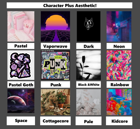
(Photos just grabbed off of google. All pictures here are not mine.)
Descriptions
(Please note that aesthetics can very from person to person on what they mean, and what they include!These are just my takes.)
Pastel- The pastel aesthetic is just as straightforward as its name, focusing on everything that's less saturated and in lighter hues. In particular, the word “pastel” refers to a soft and delicate shade of a color produced by adding more white.
Vaporwave- The Vaporwave aesthetic incorporates early Internet imagery, late 1990s web design, glitch art, and cyberpunk tropes, as well as anime, Greco-Roman statues, and 3D-rendered objects. VHS degradation is another common effect seen in vaporwave art.
Dark - Dark aesthetic covers a wide range of different things. If its dark and edgy , it can fall under this same system. Sometimes there's horror elements, but it can also be cutesy. All you really need is black, greys, and sparse uses of blood red and neon green. Some spikes can't hurt either!
Neon- The Neon aesthetic (Or Glowwave.) Is the use of bright, almost glowing colors on darker scenes. Reflective surfaces, sparkles and bright 'neon' pink can dominate this aesthetic.
Pastel Goth- Pastel Goth is an aesthetic that is a result of mixing goth or grunge with the sweet pastel elements of the kawaii aesthetic. Think if horror was cute, or cute was horrific if that's easier. Lots of black and pastel colours here.
Punk-Punk aesthetics determine the type of art punks enjoy, which typically has underground, iconoclastic, and satirical sensibilities. Punk can be as messy or minimalist as you want. It also tends to be more focused on the handmade, reused and recycled. Newspaper collages, safety pin, metal spikes, oh yeah!
Black and white- Contrast. That is the core of the Black and White aesthetic. Using only grayscale to convey detailed images. Tends to be fancy, simple and clean!
Rainbow- COLOUR, COLOUR, COLOUR! Rainbow is all colour all the time! With clear, fun shapes and fun splatters, rainbow is just... colourful fun.
Space- Spacecore is a type of aesthetic that is centered around astronomy, stars and planets. It can also be called astrocore or cosmic core. Spacecore uses lots of stars and planet type things in clothing or decor. Many spacecore aesthetics will have pictures of the sun, the moon or the stars.
Cottagecore- Cottagecore is an aesthetic that celebrates simple living, particularly in the countryside. It encourages a lifestyle rooted in traditional skills—like baking bread, gardening, and sewing your own clothes. Basically you live in a modern day Jeremiah Puddleduck book.
Pale- Palewave centers around muted and pale colors with a very relaxed and comfy vibe. Think light, easy, breezy and gentle designs. Nothing pops out right off the bat in this muted aesthetic.
Kidcore- Bright colours, cartoon designs, nostalgia, and fun! Its somewhat similar to rainbow, but you can't escape consumerism in this aesthetic usually! Toys, games, anything to do with just being a kid and enjoying life is included!
NOW WHAT?!
Now you vote in the polls! Just pick whichever character you want to see in the aesthetic listed. Please note that in order to draw this all in one month, I will be making the polls quick! The first one I'll have last a week, to help spread the word, but after that they will likely only last a day! That being said, each character will only be used ONCE. So once they're picked for an aesthetic, their off the voting board. Were you hoping a character would get a different one? Well don't worry! I may do this again, or you can try it yourself to! Just have fun!
Make sure to follow @bks-blogs for more 101 Dalmatian Street news and updates for the trending party!

17 notes
·
View notes
Text
had an excuse to list a few physical books I love for furthering your art practice
so it seemed worthwhile to crosspost in case anyone else was interested!
For just getting the painting-studies-from-life fire lit under you, I recommend Hawthorne on Painting : https://store.doverpublications.com/0486318745.html -- it's a collection of lecture notes from the cape cod school of art, and there's no pictures, and that seems so counter-intuitive, but the sheer passion for light and colour that shines through honestly is really inspiring. The core concept I took from it is that a painting study doesn't require expert knowledge of anatomy, perspective, structure etc; just a passion for seeing colour, and then putting the right colour down in the right shaped mark in the right place; a simple and infinitely difficult skill to learn and a great way to get out of your own head when the subject matter feels overwhelming. It's a very affordable little pocket-sized book and you can likely track down a used version as it's been a classic for a long time.
For more visual instruction, another classic-and-affordable book I have used to the point of disrepair is Jack Hamm's Drawing Scenery: Landscapes and Seascapes : https://www.penguinrandomhouse.ca/books/352897/drawing-scenery-seascapes-and-landscapes-by-jack-hamm/9780399508066 -- it starts with the bare bones of composition, but it goes into amazing detail on all sorts of elements of scenery from trees to skies to lighting and more. I keep his spread of Types of Clouds bookmarked for easy reference!
And for the fun of discovery and clear, direct instruction, I've really liked the Think When You Draw books : http://theetheringtonbrothers.blogspot.com/ -- while this isn't my personal visual style, they have such great, punchy, memorable instruction on such a huge, wide array of subjects, it's been a great tool to get me over the "okay but cars/bikes/horses/spaceships are HARD" etc threshold!
And finally for figure drawing, the book that really unlocked drawing people for me was Ron Tiner's Figure Drawing Without a Model : https://www.scribd.com/doc/103174602/Ron-Tiner-Figure-Drawing-Without-a-Model -- he covers a few different mental models of the figure to help build it from the ground up in your mind, and he connects these models very clearly to real life anatomy, drawing from life, and character design. Again, not a visual style I personally pursue, but immensely useful concepts that I still use today, 24 or so years after I first read this book, whenever I draw without a reference.
And I always recommend hitting up a used bookshop or two for some collections of art that inspires you -- even if it isn't your chosen medium, or subject matter, or style, if it gets your brain running then why not spend some time with it and see what you can get out of the book? Personally I always come back to my collections of Frank Frazetta, Rodney Matthews, Edward Hopper, Gian Lorenzo Bernini, and Caravaggio artwork, and most of those were random used bookshop discoveries.
Hope there's something interesting amongst this list for you, and please reply/repost with your favs as well!
16 notes
·
View notes
Note
If you already have the basis for a character(backstory, personality, beliefs, place of birth, family, setting, etc. etc.), how do you narrow down traits to express through the design? Personally I've tried for literal years to design this one character and I am never satisfied, yet you're posting new content all the time. I'm so envious!
Keep in mind that while the character's design should clue a person into what their overall story is (or throw you off what the character's truly about, depending on what you're thinking), that doesn't necessarily mean it should be a walking advertisement for every little detail about the character. The design is a summary, not the entire picture.
As such I suggest you figure exactly what core elements make that character them. For my own personal sanity I always focus on the actual personality first, because the first thing you're gonna know about the character is who they are as a person, not what they've been through and how they got there.
Is your character friendly? Outgoing? Standoffish? Are they perpetually angry, or shy, or charismatic? Do they wear their hearts on their sleeve, or are they sneaky, hard to read? These are things you need to know about your character full stop because they can help dictate one of the most important aspects of the character: their silhouette. After you come up with one, then you can begin focusing on finer details of their design, such as the outfit they wear, or the scars borne to their bodies, their hairstyles, so on.
Character design is literally building the character. While you can sometimes do it in one fell swoop it all follows steps of starting from the ground up. And that process is almost always:
-Research/inspiration: ya need to know what the hell you're drawing before you draw it, even if it's to design a character. What I typically do for the research part is in three parts, which is : A) find characters that fit the vibe I want for inspiration, B) Find outfits or photos that fit what I want the character to possibly wear, and C) color palettes I think would fit. There is no finalization, this is just me gathering things to spur my head into thinking "okay, what does this character look like". I usually find a minimum of 3-5 inspiration pieces.
-Rough stage: explore the character's base silhouette/design. Highly recommend doing thumbnail sketches or ruff drawings; the point is to explore their look, not make a pretty drawing)
-Exploration 1: You got their base look figured out. Now it's time to dig a little deeper into it. This is usually with more exploration, but with a direction. What sort of close do they wear? their hairstyle? How do they carry themselves, what does their face actually look like? Finer details are starting to be shown here but the point is still the exploration of the design
-Exploration 2: You have something that feels like it could be the final design. Time to move on to the colors. Once again, exploration. By this time you might have a good idea of the colors you want but it's never a bad idea to play around with what you have in your head by thinking outside of that box. You might find something you like better.
Finalizing: You have a clear picture of what the character looks like. Time to-- guess what?-- explore further as you finalize their design. For me that typically means fine-tuning their design, whether that be adding scars, or tweaking their body shape a bit, or adding (or subtracting) elements from their outfits. Whatever it may be, don't be afraid to fiddle around with the design a tad before you say it's completed.
This is all easier said than done in practice. Character design is never easy, I personally just enjoy the fuckin' hell out of it so it's part of why I can churn out a design so quickly.
As for how long it's taking you to build a character? Don't fret too much over it. For OCs in particular, it could take a long while before you reach a point where you're fully satisfied with their design. It took me a full year and some change before I reached a point of complete satisfaction with my own OCs, but it does help to know what you're after when you're designing them instead of just shooting in the dark. That's why quick, sketchy exploration is so helpful (at least to me); gives you an idea of what they could look like before you fully commit to an idea.
Hope this helps. uwu
68 notes
·
View notes
Text
Why EVE is The Best
Heads up. I’m basically gonna sperg about this whole film, so spoilers for this twelve year old film. Enjoy!
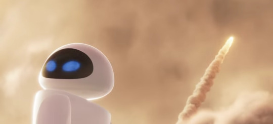
Wall-E is one of my favorite films; I would gladly kill and extort to bring the sequel I had in mind to life in any way; animatics would pleased me if nothing else but anyways. I love this film and one of the biggest reasons for that is the character EVE, a character that stuck in my mind longer than most if you can believe. So, better time than any, Imma just ramble about why I love this character. And, before we begin, I’m gonna say EVE is a girl, Wall-E is a boy due to my brain believing they were respectively female- and male-coded for most of my life but do NOT let this stop you from envisioning them however you please. If they’re both girls or boys to you, all power to you. With that said, here we go...
The Design
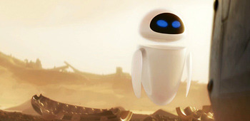
Now I’m not saying she has the greatest robot design ever; I don’t look at eggs and remember better days when I got to watch that film for the first time in my old house. But Pixar certainly knew how to make simplicity work to perfection. Simple shape, simple mechanics, simple movements. All feeling right at home with her coming from the more advanced future, especially compared to Wall-E where he’s literally a more grounded looking robot. Thematically, this design is fucking genius. A scouter robot with the ability to fly with ease and yet carries a literal arm cannon with incredible fire power. Both expressing how she can have her head in the clouds, observational when necessary, and yet trigger happy amidst the slightest inconvenience or surprise. *MWAH* What the fuck? It’s a great duality where the hard, more logical exterior possesses a sweet and approachable core just waiting to be shown and it’s wonderful seeing Wall-E, this literal block head, fumble his way into having a simple conversation with her. Now I can’t really disassemble how the programming in Wall-E works where they can behave like humans but follow objectives like a machine... but, I can try. With this scene.
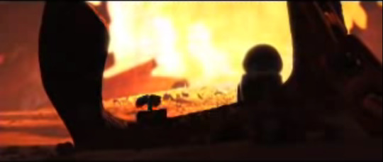
Now take this with a grain of salt, the inferencing is more to the imagination otherwise the fun of this movie is tarnished. But from this scene, it’s clear that in this universe robots can show feelings for one another but can’t be romantic with humans because they can recognize human emotions and reactions but do so in an automated sense. The film expresses their curiousity just enough to where their reactions to human things and functions are within reason and yet doesn’t toy with the viewer’s believability. EVE is capable of responding to Wall-E’s advances but doesn’t 100% reciprocate his feelings because Wall-E isn’t her directive (least not yet, that’s for later). Not to mention, she isn’t that adept at romance unlike Wall-E who, by being alone with Earth’s technology, was able to learn and process human romance through the Hello Dolly VHS and potentially other things over the years. So this conversation works with the two having their limited knowledge, we don’t know how much they know, and the film keeps focus on having a balance between somewhat logical reactions and minor impulsive humane reactions that makes them alive but only just enough so it doesn’t feel like them being robots is pointless... Phew. Speaking of which, you know what isn’t pointless? Her motherfucking buster cannon.
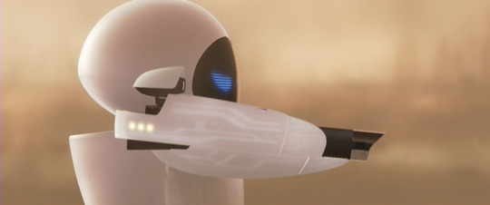
Her whole ass arm houses a gun capable of nuking an entire cargo ship in a matter of seconds and it makes sense that she’d have it cuz how can a scouter robot defend themselves but beyond that, it’s just so goddamn cool. Like yeah, I can express how this symbolizes about America and... how they want to fuck their guns or something but who cares. She has a FUCKING ARM CANNON and it’s badass, end of discussion.
The Hanger Moment

Much as I love the moment where the two are in space flying, I honestly say that this moment where the two are in Wall-E’s house during the darude sandstorm is incredibly important. EVE is reasonably taken to his home and naturally, when the lights come on, she looks through the stuff he gives to her. She gets to take it easy for once, things can be quiet after she blew up a whole ship, have a giggle or two at the trinkets he’s collected, with the cigarette lighter being a good tool that’ll be used for later.
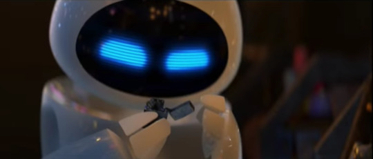
She’s curious, bouncy, still a bit quick on the draw, but is nonetheless taking in a lot this robot on Earth has to offer. It’s this and the small 1v1 they had before that is a lovely seedling to not only their connection but EVE’s development on her own, where we hardly need dialogue to show how she’s feeling about it all. And yeah, I’m with plenty of people to say that if this movie was just about the two of them being on Earth it probably would’ve been the greatest Pixar film of all time for many. Fortunately the plot kicks in when Wall-E shows EVE the plant, forcing her to go dormant, thus pulling Wall-E into an adventure on the Axiom ship. And I say fortunately cuz this is where EVE goes from good to great as a character.
The Axiom
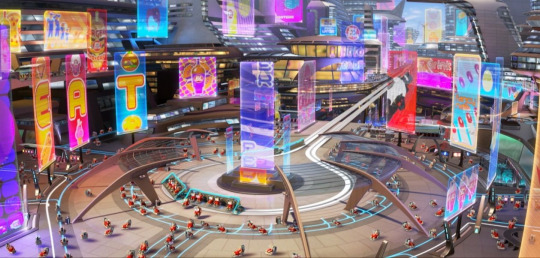
While it’s something where we all wish that this film wasn’t the densly plotted, society driven second half, I say the second half on the Axiom carries the film’s themes and character building for EVE to good heights. We enter EVE’s territory, the slick, iPhoney synthetic world where humans have become literal potatoes and everything’s more or less automated. For EVE, the first half of the film lets us see the more playful side of her and doesn’t mind being around Wall-E, but isn’t immediately won over with the concept of love. She’s still goal-oriented and trying to keep the two stuck on Earth would’ve made her arc as open-ended and ambiguous as The Good Dinosaur. Time on the axiom puts her original sense of thinking to the test when Wall-E tags along.

To share the bigger picture real quick, the human element of Wall-E is complimentary to Wall-E and EVE’s humane behavior. To quote RealJims’ honestly flawless analysis, “What better way to show the humanity in a robot than to be among humans that act like robots?” For Wall-E the robot, this works perfectly as a fish out of water story. His time on Earth affects not only a few humans, but other robots like MO and the secretary machine, as minor as it seems.
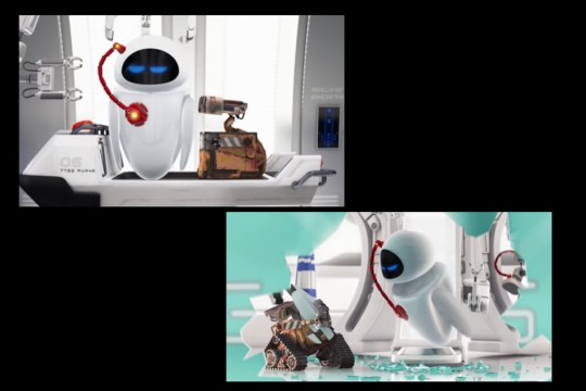
So when Wall-E seemingly fucks things up, EVE is rightfully peeved. His slip ups especially with the Diagnostics scene tests her goal-oriented nature and patience, to a tasteful comedic strength. Doesn’t mean they now turned Wall-E stupid, the film makes sure the monkey wrenches are only accidents from someone severely out of the loop of things. This leads them and us well into
The Depths of Space

The scene where Wall-E gets launched in the escape pod thrills me with joyfully painful suspense every time. EVE making a mad dash to him as Wall-E madly tries to get out of the soon exploding pod, leading to it exploding and we get this from EVE. The wide eyes of terror followed by the whispering “No”s gives me shivers every time I see it in full.

Now one could argue her concern was more for the plant getting destroyed, but I say she was more frightened at the idea of both Wall-E and the plant getting nuked. While Wall-E did make her mad, she nonetheless cared about him and wasn’t expecting the tiny bot asshole to send him to death. So it’s like, “Oh no, both my purpose and the one that helped me are both gone.”
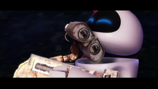
Luckily, thanks to some foreshadowing, Wall-E made it out alive with the plant in safe keeping and EVE seeing Wall-E actually care about her goal makes her beam with joy, being that reasonable spark that brings the two closer together. I mean if your love interest cheated death to help you out, why wouldn’t it? Everything about this moment is what made EVE stick with me long after I watched the film; the emotional journey the director was able to convey with her is so well-built to this point, it’s still amazing how they were able to do it with little dialogue or facial expressions. I especially love the emptiness we get of the two of them in space, where it adds focus to the two of them especially. But my god, that’s only half of it...

The space dance sequence between the two is still one of Pixar’s most gorgeous scenes. The way Wall-E is able to keep up with the fire extinguisher after having trouble in the film’s beginning, the wide shots of space, the lovely glow of the engines, the music. I especially like to think of this scene as a parallel to EVE’s initial flight on Earth. For her, it was that rite of passage after the touchdown and now she gets to share that same moment with someone she’s grown to like or appreciate. Then again, this isn’t the moment where EVE loves Wall-E. We’re close, but we need that one inch to finally show her the truth. That’s when she sees
The Recordings
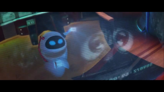
The moment where EVE gets to see the memories of her time on Earth, including her dormant stasis, is where shit finally clicks. She essentially gets to know how Wall-E felt not only about her, but about love. Even when she couldn’t be there, she sees now that Wall-E cared about her and is able to process what Wall-E processed when he looked at Hello Dolly at one point. Scene also works because getting her directive, or the plant, was generally done and done with, she finally gets time to focus on something else, on her feelings for someone else. This leads well into... the well that leads to...
The Dumpster Moment
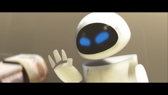
The scene with the recordings is where things finally click, but the moment with EVE and Wall-E in the ship’s dump is where it comes together. After getting betrayed yet again by AUTO, EVE’s concerns are now less with the plant and more for Wall-E and thanks to the moment previous, I can totally buy this. It’s teeth gritting seeing her try to rescue a now broken Wall-E from getting ejected into space and losing his energy thanks to a destroyed chip. So when we see her finally toss the plant aside and says Wall-E is her directive now, I tear up. It feels like a genuine, built up declaration on her part; the moment where EVE can rationally return his feelings ten-fold and truly be there for him. But that isn’t all to it, because Wall-E reasonably struggles his way to the plant to show that to save him, they need to get to Earth which means getting the plant back to the core of the ship.
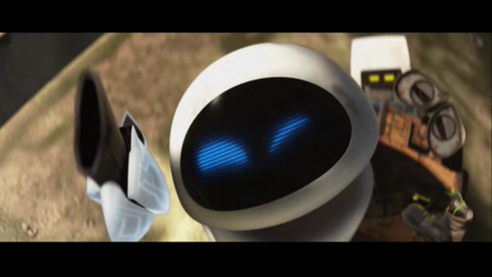
This gives EVE newfound resolve and puts that to the test, where she has to basically defect against AUTO who’s become the physical antagonist of the film. The escape sequence is a bit of a step down since putting humans in danger doesn’t really affect the film’s themes all that well, but I can’t argue that pitting the captain against AUTO is a bad climax.
The Death to Wall-E

Thinking about this film after so long, it is still pretty fucking shocking to realize how punishing they treat Wall-E in the final act. It’s even more shocking when you realize how the roles have reversed, where Wall-E focuses more on EVE’s goal with the plant instead of EVE herself and vice versa. Then again, I say it’s fair that they did this, to show how much Wall-E was willing to sacrifice for the one he loves which makes the painful wails we hear from EVE feel all the more impactful. Like you’re serious with her as she struggles to accept his death before they reach Earth. And speaking of Earth...
The Finale
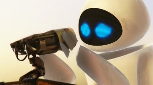
Now, I can’t help but argue it’s an unfortunate plothole that EVE is somehow able to fully repair Wall-E in spite of never fixing anything else in the film. Then again, it’s fucking pumping seeing her move quick to put him back together and it’s that final stomp on the heart when, even when he’s fully restored, Wall-E bares no memories of her or anything. You see her desperately try to get him to remember anything only to be met with an emotionless, reset shell. In finally understanding Wall-E’s feelings of love, she can’t really be with him. Until...
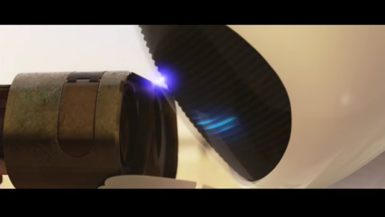
True Love’s Kiss Saves the day
I can get scientific with how getting his memories back was possible, but I won’t because the scene just works. It’s quiet, takes it time, and that last eureka moment with the two truly get to hold hands makes up for any scattered logistics. I’d say this is where Wall-E finally gets the love, but the same can be said for EVE, after everything she went through. I’ve admittedly seen a few talk about how the female lead is only valid through the love of another, typically male, but I believe what works 120% here is that the two characters basically have themselves figured out, Wall-E more than EVE, and EVE’s journey is never hindered for a sudden realization to love. She still succeeds in her mission, but the stakes for her have risen once she comes to terms with her newfound feelings and these feelings aren’t out of pocket. Wall-E has his feelings for EVE from the getgo, but dedicates to helping EVE with the goal, even if it means death. The connection they get to have is earned and is what drives the plot. EVE earns what she realizes she wants and that makes her a great female protagonist in my eye.
The Conclusion

Wall-E is a pretty warm movie; a film how the love of two brings humanity to salvation and vice versa. How EVE and Wall-E’s love is synonymous to the intertwining of modern and older technology to shape the world. But honestly, that probably wouldn’t have worked as well without how great they made EVE as a character. Wall-E is great too, but it’s astonishing to see EVE’s journey with Wall-E and show her natural growth of understanding something as warm as romance. Her journey is pretty synonymous to how I feel with the movie overall. The time we get of them on Earth is symbiotic to the time we get in space; we get an intimate journey that expands to a film about society but remains personal and intimate nonetheless. And with EVE, we get this superbly fleshed out character that’s emotive, understanding, and above all gets a resolves that’s awesome to see every time I catch or just think about this film. What else is there to say?
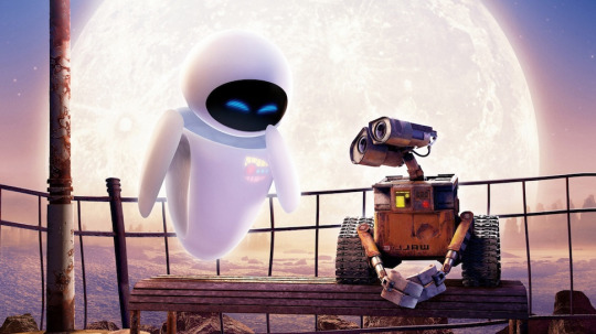
They’re the Best.
129 notes
·
View notes
Text
22)Sustainable Fashion Designers linked to my trend.

WGSN cites that the action points for this trend is to:
Use colour to revitalise perennial stories: bold, vivacious colour is a core element of our Euphoric forecast. Explore naturally derived brights and mid-tone mixes to brighten up core lines sustainably.
Revisit the transformative power of fashion: this trend surpasses the minimalist leanings of everyday dressing, focusing on the lavish, the glamorous and the eccentric. Far from being throwaway, however, it offers sustainable ways to achieve maximalist appeal via eco-friendly textiles, trims and materials.
Collaboration makes for more creative communities: a more inclusive world view will open gateways for collaboration. Don't design for; design with. Empower artisans from around the world while reaching a more global audience.
Use deadstock as a key opportunity for custom capsules: circularity is high on the agenda. Look to aesthetics that encourage reuse, repair and re-design for an individualist consumer.
Return to retro with a modern lens: the familiarity of retro makes for easy commercial centrepieces.
The trend I have chosen under the ‘Euphoric’ category was ‘Repurposed Rave’. Ukranian and Central Saint Martins graduate, Masha Popova is the key designer in this trend; developing textile techniques from traditional smocking which has allowed her to experiment with silhouettes and shapes without having to use conventional pattern cutting.The garment creates a ‘fabric memory’ as it moulds and shapes itself on the body. In her work, she often recreates familiar garments using unexpected techniques and is committed to “making boring things cool”. Interested in craft techniques and pieces made by artisans she cites that Borys Mikhailov’s photography, and artists Pipilotti Rist and Marlene Dumas are also inspirations. She states “I was fascinated by how badly-fitting clothes, which have associations with hand-me-downs and second-hand wares, could be turned into something luxurious when recreated with craft techniques.”
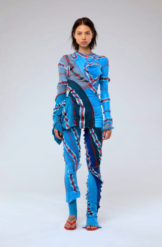
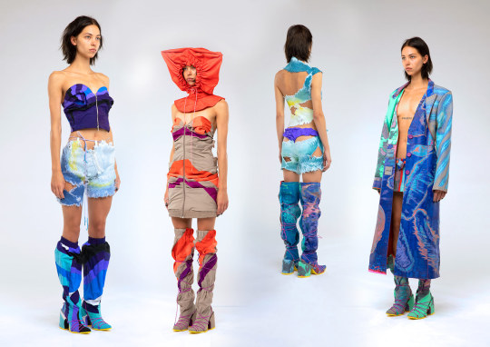
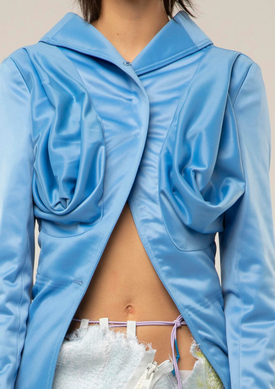
Images found and taken from: https://metalmagazine.eu/en/post/interview/masha-popova
Instagram: @mashapopovap
JJ vintage is another sustainable designer prevalent in this trend. She upcycles activewear for her designs. Her instagram bio cites ‘Recycle, Reuse, Repurpose’
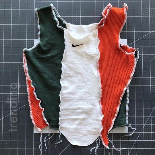
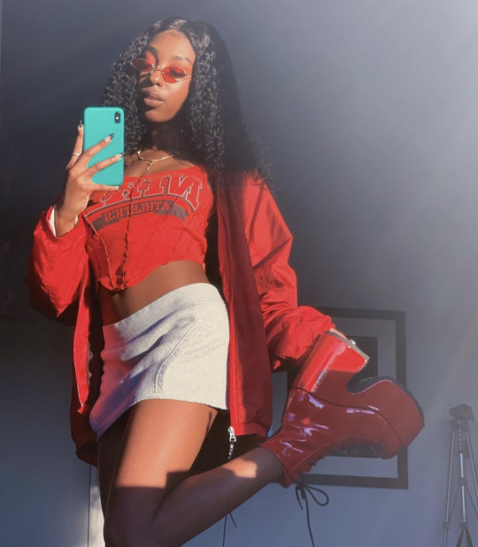
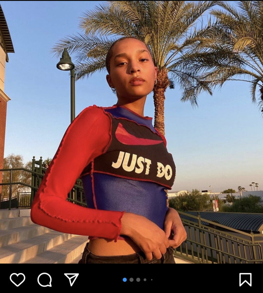
Instagram: @jjvintage__
Instagram and depot are great source for finding sustainable wear and designers. Many of them use the same patchwork design and incorporate the tie dye marbled effect that is reemerging in popularity or up cycling streetwear/active focusing on brands like Nike.

Instagram: @jadore.vibes
Looking through instagram I also found a brand called ‘Auné’. Their garments are made handmade to order and so are perfect for supporting the fashion on demand theory.
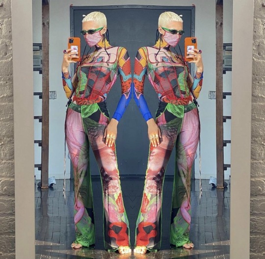
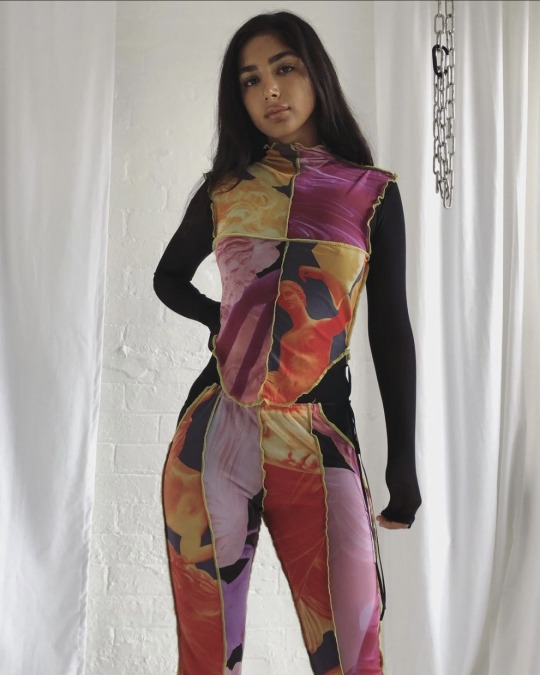
Instagram: @aunecollections
Uk company Matacomplex is another made to order, slow fashion brand promoting ‘becoming more and more sustainable’. A lot if not all of of their designs have a torn and loose thread effect and pops of neon colours.
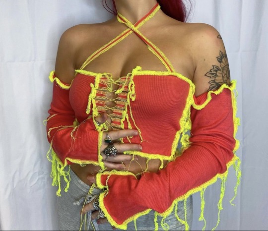
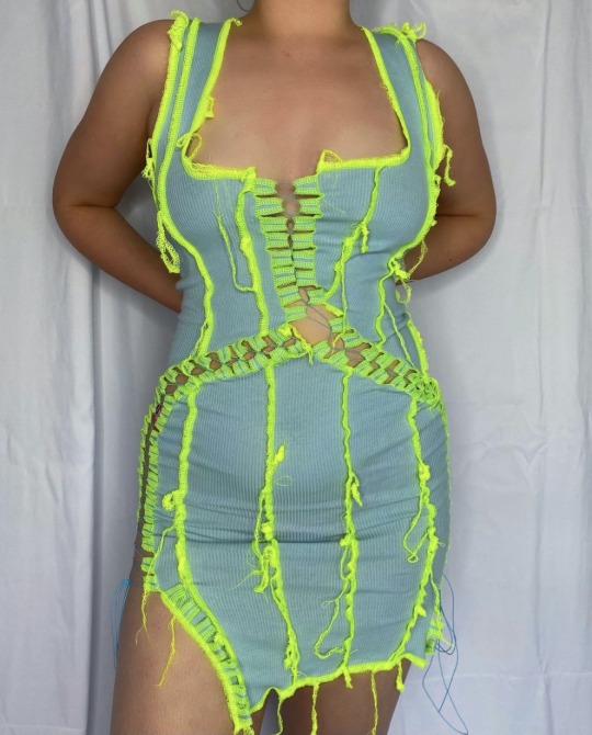
Instagram: @matacomplex
‘Challenging waste culture’ designer Rua Carlota experimenting with up cycling knitwear and ties- creating patchwork and weave-like designs.
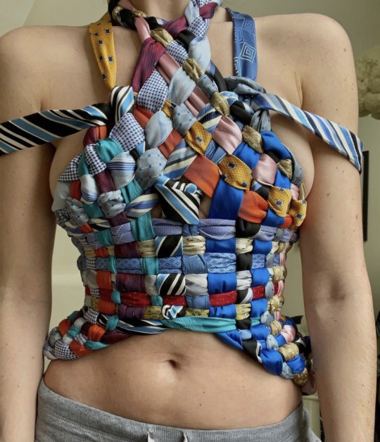
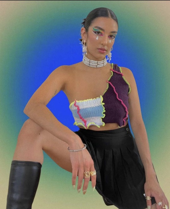

Instagram: @ruacarlota
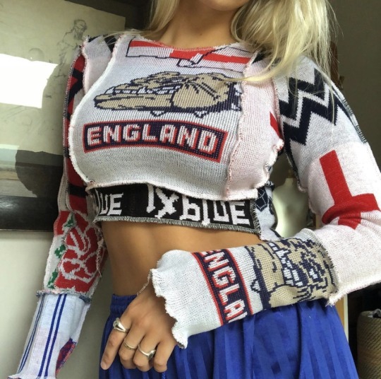
Often playing about with branded Nike or PALACE new graduate and designer Lois Saunders (1xBLUE) revives football scarves beyond their former glory; drawing parallels from tapestry. Sifting through eBay and her local charity shops Lois has discovered a range of recyclable material.
Having ‘always been aware of how problematic fast fashion can be Lois’ veiw points on sustainability stands as this “Trying to be as sustainable as possible is something I want to continue within my brand. Reusing old footie scarves also gives my label a nostalgic theme, which is a bonus for me as it promotes sustainability.”

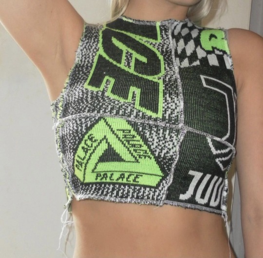

Instagram: @lois1xblue
3 notes
·
View notes
Text
Making of Deep Sea Settler
Download any play Deep Sea Settler from itch.io.
Comment on the game jam entry for Deep Sea Settler LDJAM.com.
Deep Sea Settler is a puzzle-ish colony builder made for Ludum dare 48. It's loosely inspired by Reus, Dorfromantik, and Solar Settlers by tumblr's own @brickroaddx. Based on the theme "deeper and deeper", you have to slowly build out your underwater colony by placing buildings in a hostile environment - without destroying said environment.
Day 1
I came up with two main game ideas for this theme: The first was a game about a submarine navigating in complete darkness based on sonar and dead reckoning. The second was an under-water colony builder with an ecological theme.
The first would either have looked really boring, with no visible environments, only 2D submarine controls and instruments, or it would have been too much work to mode the interior of a submarine and interesting underwater environments.
I decided to work on the colony builder, and to set it on a hexagonal grid. You start out just below sea level, and as you go on, the sea bed gets deeper and deeper, sunlight becomes scarce and pressure increases, so the game gets more difficult. (The depth and difficulty mechanic did not make it into the final game, but tiles of varying depth did.)
I started by working on the art and rendering code.

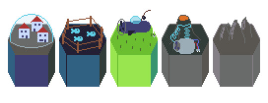
I made a simple renderer for infinite hex tilemaps (stored in a hash table), and drew some tiles. They all had a "base" or "depth" to them, allowing me to raise or lower them a bit without "floating" over the playing field. After seeing the tiles arranged like that, I decided to re-work the tile shape to allow for a better perspective when drawing tile contents, and I drew a bunch of tiles based on an ecological and "humorous" theme:
A fishing submarine with a fishing rod and a fish farm with fish fenced in in a 2D enclosure felt like the peak of humour to me at the time.
Day 2
I drew some graphics for UI elements and cursors, and started making the map clickable and interactive. For this, I repurposed the drawing code and the hex marker that shows the selected tile. After a broad-phase collision check, the game checks if the mouse is inside the drawn tile by checking a collision mask at the positions of nearby tiles, preferring the tile nearer to the "camera" if two or more overlap. This was easier to code than convex hex shape collisions, and allowed me to stay a bit more flexible with depth and overlapping tiles. At this point I was still thinking about making depth a more prominent mechanic, but the interaction with the map and judging of distances got a bit too difficult when tiles were occluded too much.
Then I added the wavy underwater effect. It took me way too long to add it, and although everybody tells me it's a bit too distracting, without it it's not clear that you are underwater, which is an important thing to convey at all times, because of the theme.
I drew some sprites for resources and tile products, but I was still unsure which should become which.
After playing around with different configurations, I decided to focus on just building, without a way to destroy built structures, and without "turns". There were discrete actions, but no "turns" and no way to pass time. There was also no way to accumulate resources over time. The only action was clicking on a tile and building, with instantaneous effects: Left-click a tile, select what to build, repeat.

This gave the way a much more puzzle-ish feel, that I really liked, but it also meshed with the "ecological" theme: Every action is irreversible, every tile is a precious resource, every decision is meaningful. Using a tile for building can cost you food or oxygen production. Expanding can destroy synergies between tiles.
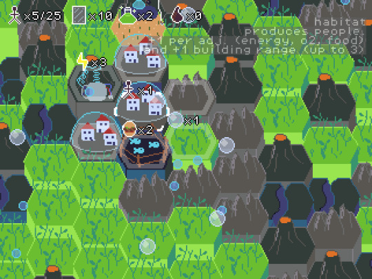
To make this more obvious, I added a UI that shows a tile's output when you hover your cursor over it.

Day 3
The game was "feature-complete" after the second day, but I felt a bit unhappy with the balancing and the UI. I took a third day and spent Monday evening adding mining tiles to make tile space more precious, and UI improvements like drawing the perimeter of the buildable area (instead of the range of the current habitant) when the cursor is outside of the buildable area.
The farms were too easy to build, and the power plants were too difficult, so I added power lines to distribute energy (at the expense of building over more tiles) and mining of rifts for science juice to build farms. This way, food, energy, and oxygen are more of a trade-off, and you can't just tile the world with farms, but you can upgrade some of your farms to undo your worst mistakes. If there are not enough volcanoes where you want to build, you can build power lines, but that will make habitat placement more difficult.
What Went Right
Scope: I am really happy with the tight focus of the game, but at the same time, this game mechanic has "legs". It would be easy enough to add more tile types, make the map bigger, and to increase the goal population in the future based on what I have now. But as it stands, it's an interesting game already. Adding more systems would have made it harder to balance, and I am glad I didn't add turns with actions per turn, or tiles that generate resources over time.
Art: For the most part, I stuck with the db32 palette, plus some transparent shades of those colours in the domes and bubbles. I don't think the tiles are as funny as I first intended, but they are distinctive and legible enough.
Balance: After playtesting the game for hours, it's really easy for me, but it's a decent challenge the first few times. Some of the difficulty stems from not knowing what tiles are available and the lack of undo, but it's replayable for some time without feeling "solved" even after you have internalised all the mechanics. None of the tiles is too abundant or too rare.
Game Design: The core loop is build habitat->connect food and energy->expand range->build habitat, but it's also possible to go back and increase the population of existing habitats by mining, upgrading farms and connecting more energy. In the endgame, the player can sometimes increase the population by densely packing the centre of the map with habitats after spreading on the map, and sometimes, it's the other way round. That gives this game a thinky, puzzle-ish feel.
Tile products follow the pattern [adjacent tiles->built tile->product->habitat], so that there are no loops. It goes kelp->fishing sub->food->habitat; rift->power plant (->power line optionally?)->energy->habitat; kelp forest->oxygen->habitat; farm->food->habitat. Evaluating the output of a tile is straightforward both for the computer and the player.
Theme: I tried to work in an ecological theme, where Oxygen is in short supply, built structures cannot be reverted into pristine nature, and tiles are an important resource. Players picked up on that.
What Went Wrong
Jam Theme: Unfortunately, the jam theme "deeper and deeper" got a bit lost in the process. The game was already difficult enough without making tile depth contribute to building costs, and complicated enough for a jam game without adding more mechanics. Making the terrain generation more extreme would have made tile adjacency hard to determine. I would have needed to use a 3D engine to make 3D game mechanics.
Tutorial: There is no in-game tutorial that introduces the tiles gradually. I added some text on the itch.io download page and the LDJAM submission, but that can easily be missed.
UI: The UI is too busy and the mechanics are not discoverable enough. Adding more things to the UI would make it busier, removing things would make it harder to see what's going on. The UI needs a complete overhaul if I add anything more.
Time: Looking back, I could have implemented all this and some more polish, animations, and sound effects within the time constraints of the compo, if I hadn't had anything else to do that weekend. I really wish I could have added some audio.
What I learned
Don't try making depth a mechanic thing in a 2D game if you can't rotate the camera and look behind things
Some users get annoyed by waves even if they don't get sea-sick
People call every visual effect a "shader", even if it doesn't use the GPU
Hexes are cool. Some games don't work on a square grid
My visual jokes are not as funny as I think they are
I can do LDJAM without feeling hungover and tired on Monday
Try not to accidentally take out the jam theme when cutting down the scope!
Download here: https://blubberquark.itch.io/deep-sea-settler
1 note
·
View note
Text
Electric Daisy Carnival (EDC)
Exploring other festivals that are similar to my subject matter, I started by looking at festivals which I know of on a bigger scale to get a range of ideas which I can implement into my work.

Electric Daisy Carnival is a worldwide event, but I am specifically focusing on the Las Vegas events.
Held at the Las Vegas Motor Speedway and Orlando, it provides an easy barrier of what goes in and out the festival for security. It also keeps everything contained in one area and provides a flat surface to build upon and to use a wide surface area for such a large event.
Audience
EDC is an event open to everyone and they preach for that, which is a heavy link to my festival and the idea of equity. These beliefs are something that I can consider in my festival and advertise these beliefs as the core message of the festival. What EDC believe in is:
- Fuelled by positivity - We create unforgettable experiences driven by imagination and positivity, where music and art can inspire transformative moments around every corner.
- Love, Care, Connection Above All - Everything we do comes from a place of love, striving to create safe spaces where people can connect on and off the dancefloor. (can I make activities which connect people together, not just the dance floor?)
- Built on Inclusivity - Our community stands for unity, celebrating and welcoming everyone. No matter your shape, size or color—All Are Welcome Here. (This links heavily to my festival which is something I need to include and consider to make sure it is open to all)
- Creativity in Everything We Do - From the stages to the art, we ignite the senses with relentless creativity. We see no boundaries in what we can create, and neither should you. (creativity is an important aspect which I can explore in my work. Could I create different worlds and an overall immersive experience. Using the abandoned building’s graffiti to make different worlds? create activities which spark creativity?)
- Taking risks and breaking rules - We don’t chase trends, we create culture. We push the envelope to make things you’ve never experienced before (how can I push my festival?)
The audience overall is anyone who loves EDM, it is very open to everyone of all backgrounds and who and what they strive to be as a festival is something for my to consider when deciding on the visual direction of it.

Branding
The electric daisy carnival logo is really simplistic. The tracking makes the letters flow across the word and have this futuristic look to it with the sans-serif and rounded letterforms. The solid hue also enhances that. Keeping it simplistic aids the readability and having the letters instead of the full words, also makes it so the logo and shrink and still be readable which is something I can consider in my work. I also like the angular shapes to it as it adds this sharp look to it which makes me think of the sharp beats in the music.

The colour palette of this festival normally has this dark palette with bright neon accents to convey this night time look with the lasers and the neon lights, like in an EDM concert. How can I make my palette and design represent the environment that it is set in and the atmosphere I want to convey?

Advertising
Looking at the advertising for the 2014 festival, they have this consistent theme which is important. They use the same flowers in the design as well to maintain the visual consistency as well as colour palettes and typefaces. I really like the pop out feature of the owl in the billboard as it brings the animal to life, conveying that energy of the festival. Could I make my advertising three-dimensional. I also like in that billboard how the eye is drawn to the middle with having that central bisected composition and then we expand outwards conveying that movement with the owls wings. I like how the instagram post draws our eye to the middle with the flowers around the edges so we see the important information. As the theme changes each year, it is important that the name of the festival is shown so they do that by the use of size and the central composition well?
The website design I also really like as they advertising for the tickets is the first thing you see, to engage the viewer and get them intrigued that they can easily get access to the tickets.
I also really like the packaging that the tickets come in. Is packaging something I could explore to deliver the tickets in an inventive approach? Could I explore pop-out features to bring my festival to life and get the energy going before it has even begun to have this prolonged effect of excitement? The packaging also uses the flowers consistently but adds movement and excitement to the design with exploring composition and size elements. How can I manipulate my design?
https://www.youtube.com/watch?v=EChd8F4mw_g
The promotional video for the 2020 EDC showcases the highlights. I really like how they have edited it with make the music flow with the video of the festival. I also like how they showcased different areas with its own moods throughout the song and how they progressed throughout the day to show this journey.

Events and Features

What is missing?
In the festival I believe there are a few things missing which I could consider in my own to make mine better than the competitors
- Due to it being a big and popular festival, there is not much creative advertising.
- There is not a lot of inclusive features which is bad as it does not fit with the identity of the festival
1 note
·
View note
Text
Species Profile 001: BROUSCARI
Basic Information
Common Name: brouscari
Scientific Name: Hexonychus brouscari
Phylum: Mollusca
Base Element: carbon
Home Planet: Brouscar
Sentience Index: 10
------
Anatomy
The brouscari are characterized by a six-part radial body plan. Six flexible limbs, each tipped with a keratinous claw, radiate from a central hub, containing all their organs and their mouth. These limbs are connected by a thick webbing. Positioned in a ring around the mouth, on the underside of its body, are the brouscari’s six nostrils, used for both smell and locomotion. An eye is located on the body at the base of each limb, giving the brouscari 360 degrees of visibility (Fig. 1).
An average brouscari weighs around 14kg, and measures 3.5m from the top of its mantle to the tip of its arms.
Brouscari are usually red in color. Some individuals with scarlet or magenta skin have been encountered, but blood red seems to be the most common.
Due to their specialization for low-gravity environments, brouscari have incredibly delicate bodies. They are so brittle that they could theoretically be burst like a water balloon, not that one would ever let you get close enough to try. As a result, whenever they leave the microgravity sanctuary of their ships, they must remain inside pressurized suits, lest they be crushed to death by their own blood.

Fig. 1: Sketch of a typical brouscari. (drawing by me)
------
Ecology
Brouscar, their homeworld, is exceptionally small. It is almost as small as a planet can be while still holding onto a breathable atmosphere. As a result, the gravity is roughly 1/16 that of Earth. All life on Brouscar is soft-bodied and perfectly adapted for this low-gravity environment.
However, the brouscari themselves stand out. They abandoned their home planet 7 million years ago. And tens of thousands of generations of life in space have turned them into zero-gravity specialists.
All evidence points to the brouscari having descended from cephalopod mollusks. Their anatomy resembles the squid and octopus of Earth to a striking degree, and all of their adaptations for space could work just as efficiently in aquatic environments (Fig. 1).
For example, the webbing between their limbs likely allowed them to quickly swim through Brouscar’s primordial oceans. Now, a similar movement of their limbs allows them to powerfully move through microgravity.
For more precise movements, the brouscari use their nostrils. By exhaling through any one of their six nostrils, they have a greater degree of control over their locomotion. These, too, likely developed as jets for underwater movement, and were repurposed once the brouscari arrived in space.
A brouscari’s mouth is simple and rasping, most closely comparable to that of a snail. Lacking teeth, or any other way to break down food, it seems likely that they simply slurp up their prey; a logical assumption, given Brouscar’s abundance of soft-bodied life.
But, the brouscari are utterly unique in one respect. On a planet ruled by soft organisms, the brouscari are the only ones to develop a hard keratinous claw at the end of each limb. Undoubtedly, this evolved as a formidable killing tool. A brouscari could slash at its soft-bodied prey, rupturing their delicate bodies, before slurping up the spilled innards. This innovation made the brouscari the undisputed apex predators, and no doubt contributed to their characteristically aggressive behavior.
------
Culture
Brouscari culture is defined by one clear aspect: intense racism towards all other intelligent life.
As stated, the brouscari have been a space-faring race for nearly 7 million years. As such, they believe they have a sovereign right to every object within their space. They were here first, they alone are adapted for life in zero gravity, so they deserve to be respected as the true masters of the cosmos.
As a result of this belief, they see all other races as not merely inferior, but as property. Objects they rightfully own, and which they can do with as they please. Any race that attempts to oppose them is swiftly struck down, like a child throwing away a defective toy.
The only Alliance race to avoid war with the brouscari thus far are the vom. However, given that the vom are highly radioactive, this seems a decision more made out of pragmatism than anything else.
More recently, it appears that the brouscari have recognized the bargaining potential in taking prisoners, and have constructed large “prison-ships.” Conditions aboard the prison-ships are deplorable, with each prisoner provided with one cubic meter of living space, and enough nutrition to maintain basic functionality
------
Technology
Having dominated space for millions of years, brouscari technology is so advanced it puts the Alliance’s comparatively meager accomplishments to shame.
Long-abandoned brouscari outposts litter the galaxy, indicating millennia of conquest and colonization. Indeed, radiometric dating of these outposts confirmed that they left Brouscar before humanity even started walking upright.
While the brouscari have yet to break the speed of light, their ships are significantly faster than any Alliance vessels, and study of wrecked ships has revealed the presence of a device that seems to negate the effects of time dilation caused by near-light travel. As of this writing, Alliance scientists have yet to replicate this device, though not for lack of trying.
By far, the most well-documented, and most dangerous, pieces of brouscari tech are the “needleships”. So named for their thin shape (Fig. 2), needleships are essentially glorified projectiles. They have no thrusters, and all propulsion is generated when they are launched out of the primary battle cruiser. Though they are officially designated as ships, they cannot be used for transportation of resources or infantry. Their primary function is bombardment.
When faced with a hostile target, the primary ship launches dozens of needleships. Their narrow shape and high velocity allows them to easily slice through anything they hit. If launched at another ship, the impact and subsequent hole instantly decompresses the atmosphere, killing anything onboard. If launched from orbit at a ground target, the velocity gained on re-entry can produce equivalent damage to a 7-meter-wide asteroid.
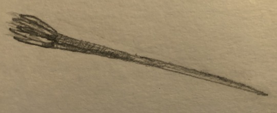
Fig. 2: Sketch of a brouscari needleship. (drawing by me)
As they can only support their own bodies in microgravity, the brouscari have developed protective suits to allow them to survive in planetary conditions (Fig. 3). The suits consist of a roughly spherical core, around 1 meter in diameter, suspended within an artificial gravity field. The brouscari pilot can move, manipulate, and attack by adjusting the gravitational strength of specific areas of this field. The brouscari are the only known sentient race to have successfully weaponized gravity in this manner.

Fig. 3: Sketch of a brouscari grav-suit. (drawing by me)
------
Language
Due to their immense xenophobia, brouscari do not communicate using the standardized Alliance tongue. Instead, they speak through a high, almost musical, warbling sound. Those who have heard it compare it to whalesong.
Brouscari writing resembles a series of vertical slashes. Most likely, this form of writing developed out of convenience - it is very easy to make a simple slash mark in clay when every limb is tipped with a claw.
Interestingly, the language can be roughly translated into Alliance Standard, albeit very loosely:
| is spoken as a medium-pitched note, representing a consonant.
/ is spoken as a high-pitched note, representing a vowel.
\ is spoken as a low-pitched note, and is used to mark the start and end of a word.
As an example, the word “brouscari” would be written as “\||//||/|/\”.
More work is currently being performed in the hopes of fully unlocking the brouscari language.
------
#my writing#my ocs#my art#writing#writeblr#Species Profile#scifi#worldbuilding#aliens#oc#oc: Brouscari#long post
2 notes
·
View notes
Text
Callout Response
(Contains reference to many triggering items including mentions of pedophilia, transphobia, homestuck, racism. I am simply trying to make amends and clear up miscommunications. If you are okay with continuing....)
I am going to go through all the things mentioned in the call out and give my defenses, apologies or other statements on the regards to these. I am sorry if my wording is very poor here, as I started this at 1 am and worked on it across a few days with review from friends. I had asked for someone to also get me a list of my offenses from someone I know is a part of the callout but they didn’t get back to me with it so I may have missed things.
"Aging up a Minor for NSFW Content" and "Transphobia"
I can understand how me making NSFW content of a character build off of/inspired by a minor would make people extremely uncomfortable. When this was brought to my attention, I deleted the art in question on my main. I have no interest or intent on making further lewd art using Oe/Oeya, or any lewd art at all for that matter. (Should merevent return, I will likely create a new event muse entirely). After having it brought further to my attention, I feel nothing but regret for making it at all. I had thought that establishing him as much more different than his inspiration and making his age clear would keep this from being a problem but it appears that I was mistaken.
The transphobia I can also understand how people could see it, as I was toying with their shape shift ability in one of my first attempts at NSFW art. I deeply apologize if this experimentation made anyone reading this uncomfortable: know that it will never happen again. I am not transphobic.
To whoever in the ring of callout anons is distributing one or both of the deleted pieces of art, please stop.
"Homestuck Crimes"
I acknowledge that Homestuck has problematic elements. I understand that to some or even many that the negative outweighs the positive aspect. Homestuck also has a lot of creative elements that I like exploring. I properly tag Homestuck and those of the Homestuck AU I used for Bethesjo with "-character name- (HS)", to try and make it easy to avoid. If I mistag, I am open to people telling me so I may add the desired tags.
To repeat: I do not support many of the views expressed in Homestuck, but find some of the positive core aspects enjoyable, inspiring, or simply fun to mess with. It is something I enjoy, even with its problematic points and I apologize for making continual use of it for inspiration and ideas.
"Racism in making bestial / feral event versions of a PoC muse"
I, again, am very sorry for this. I tend to go wild with ideas for these events and create things without thinking of major implications.
When I made CnC Okuyasu an orc, I simply felt that it clicked. I always enjoyed Orcs aesthetically! The uncontrolled magic played into a favorite fantasy trope of mine, so I decided to use that too. When I created Oe, I, in all honesty, was just trying very hard to avoid drawing fish in any capacity or arms and had recently watched Moana. (Once again, I will likely create a new muse should merevent return for round 3) Magical Girl event Okuyasu was inspired by the combination of Tokyo Mew Mew and part of Magical Girl Apocalypse (that too having problematic things but I could not overlook them in their quantity, causing me to drop interest in the manga itself but not its concept). The Okuyasu embedded with the flesh bud (Okuyasu (Dio) in my tagging) was spawned by an art meme, but I grew to enjoy the idea. His minimal time shown due to lack of asks for him also paint him in a low point that does not reflect their state most of the time. When I created Nijimi, I wanted to play off the idea of deities being shaped by the human idea of them, using Okuyasu's money imagery to create a deity of charity turned into a beast of greed. (Should the deity event return, I will try and create a new muse for it: not only in light of this, but because I am unsure what else I can do with them and Nicho.) WoF Okuyasu was born from my interest in Mr. Nijimura's condition in context of undeath, wanting to do something similar with WoF Okuyasu while also playing with other tropes. The former Stand Infection event Okuyasu, now dubbed Ghost in the Machine, was meant to be a play in the unpredictable nature not only of glitches but someone hyped on caffeine. He also was the result of working with dio-theshitpost-brando and I was pulling too from their concepts. The new Stand Infection Okuyasu being identified with a number as shown in a few art memes was inspired by the SCP Foundation, not the holocaust or anything of the like. I know no one mentioned this in any call out material but I know that it would likely be used out of context too should I avoid acknowledging it.
As I hopefully go further into the future, I will try and think more of the implications of this, under all of the AUs, is a PoC minor. Again, I am sorry for causing any offense.
"The Cow Incident"
I will say that I should have been more firm but I will say that I view the general idea of adding horns, ears, and tail does not inherently make something negative, mostly the context or the content being made with this concept. The blogs, from my understanding, made multiple references to the act of milking, which then makes it awkward and uncomfortable. Making a direct comparison between PoC and cattle is also bad. Doing it simply for a cute design or without ill intent, in my eyes, is okay. I'm sorry if my stance still remains unclear or poorly worded or if you disagree.
"Comment Deletion and ignoring asks"
For those commenting on my YouTube channel, I did not do so because I was afraid or being overly defensive. I had stated my stances, apologies and regrets in other replies and felt like I was not being listened to and hounded. I deleted these comments and asks for the sake of my mental health, as I had fallen into a depressive episode at the large wave of angry anons.
Comments and asks deleted in the beginning of the cow incident were deleted to keep the discourse off The Hand blog and to minimize further asks on the matter, as it was 2 am at the time and I was getting very stressed over it.
“Headcanoning a Minor as Ace”
The funny thing is, I don’t headcanon Okuyasu as ace. As for saying that having headcanons of this nature is sexualizing minors I will say this: it depends on the age. Headcanon, say, a 6 year old as bi or gay or what have you seems a bit off but the teenage years are often when one discovers the labels for themselves and grows to be comfortable with them. Understanding your orientation is not inherently about someone having sex, but understanding what you as an individual find attractive in one way shape or form. I, myself, am ace. I used Okuyasu as my icon on my main for a long while now. I put Okuyasu with the ace flag for my main blog’s profile pic because I am proud to be ace and Okuyasu is who I associate with. Not to turn the gun, but the suggestion that headcanoning a character as ace is seen as worse than any other orientational headcanon is rather aphobic.
I am trying to improve myself every day. I want my blogs to be nice places, not just for me, but for the visitors. I had no ill intent when doing anything, but I also was unaware of the severity of the implications of my work. I am open to criticism and reminders to tag or rework things, but please be mindful that I’m only human and prone to human error and lapses in judgement. I also can try my damndest to fix what wrongs I have done.
I am going to let this circulate for a few days and then hopefully I can turn on anon once again without large waves of anger. I am sorry and I hope WE won’t have to do this again. - Z
17 notes
·
View notes
Text
Keeper of Stone
Written for @goldcaught. I deleted your ask, sorry! It was something along the lines of “AU Mafia. Do what you will.” Well, my muse did what it wanted. This is part of my newer batch of prompts. See, I am working on them!
Warning: Violence!
Caroline sighed in relief as she closed door to shop, cutting off the blustery winter wind. The weather mages were predicting a frigid December and Chicago was already knee deep in snow. But here, at least, she was safe from the worst of the elements. Blowing out a slow breath, she moved to the cold fireplace and set about carefully building a fire.
Usually the task didn’t take long, the spell treated logs easy to light. But this morning, she was being forced to work one handed. Mason Lockwood’s men had cornered her on her walk home to make a point. The bruising on her wrist was better today, the worst of the swelling having eased thanks to Bonnie’s excellent care. She still wore their fingerprints as a visible reminder that powder keg that was Chicago was going to blow sooner or later.
Sooner if some parties had their way.
She’d managed to stay relatively under the radar, but her time was clearly running out. She’d need to pick a side soon. She was also certain she’d made her decision years ago. Carefully balancing the box of matches on her thigh with her right hand, Caroline cursed when her door opened, the sudden gust of wind putting out the tentative flame. Twisting, she froze at the man who stood in the pre-dawn morning, eyes glimmering hotly with sparks of magic and wolf.
Klaus. The reason she was in this mess and why she couldn’t give Mason what he wanted. He looked warm in his thick jacket and sweater, the coat designed to hide any spells or weapons he hid on his person though she knew he preferred to kill with his bare hands.
Hands she thought if far too often. Scowling, she jerked her chin towards the room. “Shut the door. You’re letting in the cold.”
He stepped inside, the door banging shut loudly in the silence. His jaw tightened beneath the scruff of his beard, lips drawn thin. His gaze roamed her with more familiarity than she should allow, but she was tired and stiff. And for all her blustering, Klaus brought a strange sort of safety with him. He always had. A wolf brought to heel by choice.
She just didn’t know when he’d bite.
“You shouldn’t be here.”
Klaus ignored her words and strode forward, dropping gracefully next to her to catch her wrist with careful fingers. She tensed, but his touch was feather light. The shimmer of anger in his eyes grew, and she fisted her good hand. His touch had always felt too good, his hands always open for her own. She’d known he was trouble when he’d shown up in her shop two years before with those dimples and his clever tongue.
And magic. So much magic. Caroline could shape it, twist it into wards as unbreakable and flexible as spider silk but she couldn’t make magic. She could only take what she was given the way a blacksmith heated iron and forged a weapon, gave their vision shape.
Klaus could do so much more.
He’d come to Chicago looking for a throne, and what he’d found was the darkness of a city drowning in sin. She thought it’d suited him, the man he’d become. Both werewolf and witch, with a handful of witch siblings, and he’d slowly turned Mason Lockwood’s city on its ear.
“You pay your protection fee,” Klaus said quietly, voice a rasp. “I watch his men collect it.”
She forced herself to extract herself from his hold. Klaus has always been an inexplicable draw and now worn to bone, she wanted to linger. “It was a warning. One I could have stopped them from giving.”
Her reminder was cool, and his mouth tightened. Letting Mason know the full extent of her abilities, letting anyone know them, was dangerous. A ward maker with her skills was highly prized. Klaus, she thought, knew more than most but he had never once pressured her into using her skills to help him build his empire.
But it was clear that someone had noticed Klaus continued presence here or perhaps had they had picked up on how his men rotated through the neighborhood. It was likely that someone had been offered coin about Caroline’s visitors. But regardless, Mason’s eyes were now firmly planted on her doorstep and that was a problem.
Klaus’ head finally tilted in agreement. “I do not doubt your ability to halt such a thing. But you should not have had to. So I too, have sent along a message.”
Caroline straightened in alarm. “Klaus you cannot…”
Her words died as the wolf bleed into his eyes. “I can do as I wish, Caroline. This quarter of the city belongs to me, now. Soon, so will the rest of the city. The hands of those who touched you were boxed up and tied with a pretty ribbon, were sent to make that clear.”
Her throat ran dry. “You’ll start a war.”
His dimples cut deep. “Oh, I hope so.”
“People will die!”
“People are already dying, love. Mason’s grip is too tight, too desperate. He pulls strongly on this city and the magic is taking a terrible price. There are cracks not even your magic can shore. How long until only blood can fill what Mason takes?”
She swallowed. “Will you be better?”
It was the question that kept her up at night. Did this man who drew her so utterly have the same rotten core as Mason Lockwood? She wanted to believe he didn’t. But she’d been wrong before.
Klaus leaned close, eyes glittering. “I am not so careless with what is mine, to crush it beneath my boot. I do not need this city’s magic to rule. Mason is weak. He will fall. It is only a matter of time before this city will be mine in all the ways that matter.”
Caroline didn’t flinch at his words. The arrogance and promised violence. Their world was a cold, bloody one. And Mason’s death would leave a vacuum that needed to be filled. She had no doubt that Klaus would step into it, bloody and victorious, ravenous. His wolf and magic demanded it from him. “And what will your price be?”
What would he ask of them to ensure the peace was kept? Mason demanded magic and coin. He took the price no matter the cost.
Reaching back out, Klaus carefully brushed his thumb down the line of bruises on her wrist, the sudden burn of magic as brilliant as the spark as her fire came to life. Those flames caught his eyes, turned them molten. Her bruises faded, stiffness eased. Caroline jerked back, eyes wide.
She had not known he could heal.
“From you?” He stood and shook his head, a lone curl tumbling across his forehead that he pushed back impatiently. “Nothing.”
She scrambled to her feet. “People will talk.”
His teeth flashed. “Good. What I want from you cannot have a price, and we both know that I will accept nothing less.”
“I am not a prize, Klaus.”
He laughed and spun towards the door. Outside, snow fell in soft snowflakes, the glimmers of dawn bright against the horizon. “You’re mine, love. You have been since if first saw you defiant and proud. We’ve both known it. I’d never make it through this door otherwise.”
Caroline stared at the door as it shut behind him, the fire warm on her skin. It galled her, that he was right. She just wasn’t sure what she would do about it.
69 notes
·
View notes
Text
2018 in Movies - My Top 30 Fave Movies (Part 1)
30. MANDY – easily the weirdest shit I saw in 2018, this 2-hour-plus fever dream fantasy horror is essentially an extended prog-rock video with added “plot” from Beyond the Black Rainbow director Panos Cosmatos. Saying that by the end of it I was left feeling exhausted, brain-fried and more than a little weirded-out might not seem like much of a recommendation, but this is, in fact, a truly transformative viewing experience, a film destined for MASSIVE future cult status. Playing like the twisted love-child of David Lynch and Don Coscarelli, it (sort of) tells the story of lumberjack Red Miller (Nicolas Cage) and his illustrator girlfriend Mandy Bloom (Andrea Riseborough), who have an idyllic life in the fantastically fictional Shadow Mountains circa 1983 … at least until Mandy catches the eye of Jeremiah Sand (Linus Roache), the thoroughly insane leader of twisted doomsday cult the Children of the New Dawn, who employs nefarious, supernatural means to acquire her. But Mandy spurns his advances, leading to a horrific retribution that spurs Red, a traumatised war veteran, to embark on a genuine roaring rampage of revenge. Largely abandoning plot and motivation for mood, emotion and some seriously trippy visuals, this is an elemental, transcendental film, a series of deeply weird encounters and nightmarish set-pieces that fuel a harrowing descent into a particularly alien, Lovecraftian kind of hell, Cosmatos shepherding in one breathtaking sequence after another with the aid of skilled cinematographer Benjamin Loeb, a deeply inventive design team (clearly drawing inspiration from the artwork of late-70s/early 80s heavy metal albums) and a thoroughly tricked-out epic tone-poem of a score from the late Jôhan Jôhannsson (Sicario, Arrival, Mother!), as well as one seriously game cast. Cage is definitely on crazy-mode here, initially playing things cool and internalised until the savage beast within is set loose by tragedy, chewing scenery to shreds like there’s no tomorrow, while Riseborough is sweet, gentle and inescapably DOOMED; Roach, meanwhile, is a thoroughly nasty piece of work, an entitled, delusional narcissist thoroughly convinced of his own massive cosmic importance, and there’s interesting support from a raft of talented character actors such as Richard Brake, Ned Dennehy and Bill Duke. This is some brave, ambitious filmmaking, and a stunning breakthrough for one of the weirdest and most unique talents I’ve stumbled across a good while. Cosmatos is definitely one to watch.
29. THE GIRL IN THE SPIDER’S WEB – back in 2011, David Fincher’s adaptation of Stieg Larsson’s runaway bestseller The Girl With the Dragon Tattoo became one of my very favourite screen thrillers EVER, a stone-cold masterpiece and, in my opinion, the superior version of the story even though a very impression Swedish version had broken out in a major way the year before. My love for the film was coloured, however, by frustration at its cinematic underperformance, which meant that Fincher’s planned continuation of the series with Millennium Trilogy sequels The Girl Who Played With Fire and The Girl Who Kicked the Hornet’s Nest would likely never see the light of day. Even so, the fan in me held out hope, however fragile, that we might just get lucky. Seven years later, we have FINALLY been rewarded for our patience, but not exactly in the fashion we’ve been hoping for … Fincher’s out, Evil Dead-remake and Don’t Breathe writer-director Fede Alvarez is in, and instead of continuing the saga in the logical place the makers of this new film chose the baffling route of a “soft reboot” via adapting the FOURTH Millennium book, notable for being the one released AFTER Larsson’s death, penned by David Lagercrantz, which is set AFTER the original Trilogy. Thing is, the actually end result, contrary to many opinions, is actually pretty impressive – this is a leaner, more fast-paced affair than its predecessor, a breathless suspense thriller that rattles along at quite a clip as we’re drawn deeper into Larsson’s dark, dangerous and deeply duplicitous world and treating fans to some top-notch action sequences, from a knuckle-whitening tech-savvy car chase to a desperate, bone-crunching fight in a gas-filled room. Frustratingly, the “original” Lisbeth Salander, Rooney Mara, is absent (despite remaining VERY enthusiastic about returning to the role), but The Crown’s Claire Foy is almost as good – the spiky, acerbic and FIERCELY independent prodigious super-hacker remains as brooding, socially-awkward, emotionally complex and undeniably compelling as ever, the same queen of screen badasses I fell in love with nearly a decade ago. Her investigative journalist friend/occasional lover Mikael Blomkvist is, annoyingly, less well served – Borg Vs McEnroe star Sverrir Gudnasson is charismatic and certainly easy on the eyes, but he’s FAR too young for the role (seriously, he’s only a week older than I am) and at times winds up getting relegated to passive observer status when he’s not there simply to guide the plot forward; we’re better served by the supporting cast, from Lakeith Stanfield (Get Out, Sorry to Bother You) as a mysterious NSA security expert (I know!) to another surprisingly serious turn (after Logan) from The Office’s Stephen Merchant as the reclusive software designer who created the world-changing computer program that spearheads the film’s convoluted plot, and there’s a fantastically icy performance from Blade Runner 2049’s Sylvia Hoeks as Camilla Salander, Lisbeth’s estranged twin sister and psychopathic head of the Spiders, the powerful criminal network once controlled by their monstrous father (The Hobbit’s Mikael Persbrandt). The film is far from perfect – the plot kind runs away with the story at times, while several supposedly key characters are given frustratingly little development or screen-time – but Alvarez keeps things moving along with typical skill and precision and maintains a tense, unsettling atmosphere throughout, while there are frequently moments of pure genius on display in the script by Alvarez, his regular collaborator Jay Basu and acclaimed screenwriter Steven Knight (Dirty Pretty Things, Locke) – the original novel wasn’t really all that great, but by just taking the bare bones of the plot and crafting something new and original they’ve improved things considerably. The finished product thrills and rewards far more than it frustrates, and leaves the series in good shape for continuation. With a bit of luck this time it might do well enough that we’ll finally get those other two movies to plug the gap between this and Fincher’s “original” …
28. ISLE OF DOGS – I am a MASSIVE fan of the films of Wes Anderson. Three share placement in my all-time favourite screen comedies list – Grand Budapest Hotel, The Life Aquatic With Steve Zissou and, of course, The Royal Tenebaums (which perches high up in my TOP TEN) – and it’s always a pleasure when a new one comes out. 2009’s singular stop-motion gem Fantastic Mr Fox showed just how much fun his uniquely quirky sense of humour and pleasingly skewed world-view could be when transferred into an animated family film setting, so it’s interesting that it took him nearly a decade to repeat the exercise, but the labour of love is writ large upon this dark and delicious fable of dystopian future Japanese city Megasaki, where an epidemic of “dog flu” prompts totalitarian Mayor Kobayashi (voiced by Kunichi Nomura) to issue an edict banishing all of the city’s canine residents to nearby Trash Island. Six months later, Kobayashi’s nephew Atari (newcomer Koyu Rankin) steals a ridiculously tiny plane and crash-lands on Trash Island, intent on rescuing his exiled bodyguard-dog Spots (Liev Schreiber); needless to say this is easier said than done, unforeseen circumstances leading a wounded Atari to enlist the help of a pack of badass “alpha dogs” voiced by Anderson regulars – Rex (Edward Norton), King (Bob Balaban), Boss (Bill Murray) and Duke (Jeff Goldblum) – and nominally led by crabby, unrepentantly bitey stray Chief (Bryan Cranston), to help him find his lost dog in the dangerous wilds of the island. Needless to say this is as brilliantly odd as we’ve come to expect from Anderson, a perfectly pitched, richly flavoured concoction of razor sharp wit, meticulously crafted characters and immersive beauty. The cast are, as always, excellent, from additional regulars such as Frances McDormand, Harvey Keitel and F. Murray Abraham to new voices like Greta Gerwig, Scarlett Johansson, Ken Watanabe and Courtney B. Vance, but the film’s true driving force is Cranston and Rankin, the reluctant but honest relationship that forms between Chief and Atari providing the story with a deep, resonant emotional core. The first rate animation really helps – the exemplary stop-motion makes the already impressive art of Mr Fox seem clunky and rudimentary (think the first Wallace & Gromit short A Grand Day Out compared to their movie Curse of the Were-Rabbit), each character rendered with such skill they seem to be breathing on their own, and Anderson’s characteristic visual flair is on full display, the Japanese setting lending a rich, exotic tang to the compositions, especially in the deeply inventive environs of Trash Island. Funny, evocative, heartfelt and fiendishly clever, this is one of those rare screen gems that deserves to be returned to again and again, and it’s definitely another masterpiece from one of the most unique filmmakers working today.
27. VENOM – when Sam Raimi’s Spider-Man saga came to a rather clunky end back in 2007, it felt like a case of too many villains spoiling the rumble, and it was pretty clear that the inclusion of bad-boy reporter Eddie Brock and his dark alter ego was the straw that broke that particular camel’s back. Venom didn’t even show up proper until almost three quarters of the way through the movie, by which time it was very much a case of too-little-too-late, and many fans (myself included) resented the decidedly Darth Maul-esque treatment of one of the most iconic members of Marvel’s rogues’ gallery. It’s taken more than a decade for Marvel to redress the balance, even longer than with Deadpool, and, like with the Merc With a Mouth, they decided the only way was a no-holds-barred, R-rated take that could really let the beast loose. Has it worked? Well … SORT OF. In truth, the finished article feels like a bit of a throwback, recalling the pre-MCU days when superhero movies were more about pure entertainment without making us think too much, just good old-fashioned popcorn fodder, but in this case that’s not a bad thing. It’s big, loud, dumb fun, hardly a masterpiece but it does its job admirably well, and it has one hell of a secret weapon at its disposal – Tom Hardy. PERFECTLY cast as morally ambiguous underdog investigative journalist Eddie Brock, he deploys the kind of endearingly sleazy, shit-eating charm that makes you root for him even when he acts like a monumental prick, while really letting rip with some seriously twitchy, sometimes downright FEROCIOUS unhinged craziness once he becomes the unwilling host for a sentient parasitic alien symbiote with a hunger for living flesh and a seriously bad attitude. This is EASILY one of the best performances Hardy’s ever delivered, and he entrances us in every scene, whether understated or explosive, making even the most outlandish moments of Brock’s unconventional relationship with Venom seem, if not perfectly acceptable, then at least believable. He’s ably supported by Michelle Williams as San Francisco district attorney Anne Weying, his increasingly exasperated ex-fiancée, Rogue One’s Riz Ahmed as Carlton Drake, the seemingly idealistic space-exploration-funding philanthropist whose darker ambitions have brought a lethal alien threat to Earth, and Parks & Recreation’s Jenny Slate as Drake’s conflicted head scientist Nora Skirth, while there’s a very fun cameo from a particularly famous face in the now ubiquitous mid-credits sting that promises great things in the future. Director Ruben Fleischer brought us Zombieland and 30 Minutes Or Less, so he certainly knows how to deliver plenty of blackly comic belly laughs, and he brings plenty of seriously dark humour to the fore, the rating meaning the comedy can get particularly edgy once Venom starts to tear up the town; it also fulfils the Marvel prerequisite of taking its action quota seriously, delivering a series of robust set-pieces (the standout being a spectacular bike chase through the streets of San Fran, made even more memorable by the symbiote’s handy powers). Best of all, the film isn’t afraid to get genuinely scary with some seriously nasty alien-induced moments of icky body horror, captured by some strangely beautiful effects works that brings Venom and his ilk to vivid, terrifying life. Flawed as it is, this is still HUGE fun, definitely one of the year’s biggest cinematic guilty pleasures, and I for one can’t wait to see more from the character in the near future, which, given what a massive success the film has already proven at the box office, seems an ironclad certainty.
26. SOLO: A STAR WARS STORY – the second of Disney’s new phase of Star Wars movies to feature in the non-trilogy-based spinoff series had a rough time after its release – despite easily recouping its production budget, it still lost the $100-million+ it spent on advertising, while it was met with extremely mixed reviews and shunned by many hardcore fans. I’ll admit that I too was initially disappointed with this second quasi prequel to A New Hope (after the MUCH more impressive Rogue One), but a second, more open-minded viewing after a few months to ruminate mellowed my experience considerably, the film significantly growing on me. An origin story for the Galaxy’s most lovable rogue was always going to be a hard sell – Han Solo is an enjoyable enigma in The Original Trilogy, someone who lives very much in the present, his origins best revealed in the little details we glean about him in passing – but while it’s a flawed creation, this interstellar heist adventure mostly pulls off what was intended. Like many fans of The Lego Movie, I remain deeply curious about what original director duo Phil Lord and Chris Miller could have achieved with the material, but I wholeheartedly approved Disney’s replacement choice when he was announced – Ron Howard is one of my favourite “hit-and-miss” directors, someone who’s made some clunkers in his time (The Da Vinci Code, we’re looking at you) but can, on a good day, be relied on to deliver something truly special (Willow is one of my VERY FAVOURITE movies from my childhood, one that’s stood up well to the test of time, and a strong comparison point for this; Apollo 13 and Rush, meanwhile, are undeniable MASTERPIECES), and in spite of its shortcomings I’m ultimately willing to consider this one of his successes. Another big step in the right direction was casting Hail, Caesar! star Alden Ehrenreich in the title role – Harrison Ford’s are seriously huge shoes to fill, but this talented young man has largely succeeded. He may not quite capture that wonderful growling drawl but he definitely got Han’s cocky go-getter swagger right, he’s particularly strong in the film’s more humorous moments, and he has charisma to burn, so he sure makes entertaining viewing. It also helps that the film has such a strong supporting cast – with original Chewbacca Peter Mayhew getting too old for all this derring-do nonsense, former pro basketball-player Joonas Suotamo gets a little more comfortable in his second gig (after The Last Jedi) in the “walking carpet” suit, while Woody Harrelson adds major star power as Tobias Beckett, Han’s likeably slippery mentor in all things criminal in the Star Wars Universe, and Game of Thrones’ Emilia Clarke is typically excellent as Han’s first love Qi’ra, a fellow Corellian street orphan who’s grown up into a sophisticated thief of MUCH higher calibre than her compatriots. The film is dominated, however, by two particularly potent scene-stealing turns which make you wonder if it’s really focused on the right rogue’s story – Community star Donald Glover exceeds all expectations as Han’s old “friend” Lando Calrissian, every bit the laconic smoothie he was when he was played by Billy Dee Williams back in the day, while his droid companion L3-37 (voiced with flawless comic skill by British stage and sitcom actress Phoebe Waller-Bridge) frequently walks away with the film entirely, a weirdly flirty and lovably militant campaigner for droid rights whose antics cause a whole heap of trouble. The main thing the film REALLY lacks is a decent villain – Paul Bettany’s oily kingpin Dryden Voss is distinctive enough to linger in the memory, but has criminally short screen-time and adds little real impact or threat to the main story, only emphasising the film’s gaping, Empire-shaped hole. Even so, it’s still a ripping yarn, a breathlessly exciting and frequently VERY funny space-hopping crime caper that relishes that wonderful gritty, battered old tech vibe we’ve come to love throughout the series as a whole and certainly delivers on the action stakes – the vertigo-inducing train heist sequence is easily the film’s standout set-piece, but the opening chase and the long-touted Kessel Run impress too – it only flags in the frustrating and surprisingly sombre final act. The end result still has the MAKINGS of a classic, and there’s no denying it’s also more enjoyable and deep-down SATISFYING than the first two films in George Lucas’ far more clunky Prequel Trilogy. Rogue One remains the best of the new Star Wars movies so far, but this is nothing like the disappointment it’s been made out to be.
25. AQUAMAN – the fortunes of the DC Extended Universe cinematic franchise continue to fluctuate – these films may be consistently successful at the box office, but they’re a decidedly mixed bag when it comes to their quality and critical opinion, and the misses still outweigh the hits. Still, you can’t deny that when they DO do things right, they do them VERY right – 2017’s acclaimed Wonder Woman was a long-overdue validation for the studio, and they’ve got another winner on their hands with this bold, brash, VERY ballsy solo vehicle for one of the things that genuinely WORKED in the so-so Justice League movie. Jason Momoa isn’t just muscular in the physical sense, once again proving seriously ripped in the performance capacity as he delivers rough, grizzled charm and earthy charisma as half-Atlantean Arthur Curry, called upon to try and win back the royal birthright he once gave up when his half-brother Prince Orm (Watchmen’s Patrick Wilson), ruler of Atlantis, embarks on a brutal quest to unite the seven underwater kingdoms under his command in order to wage war on the surface world. Aquaman has long been something of an embarrassment for DC Comics, an unintentional “gay joke” endlessly derided by geeks (particularly cuttingly in the likes of The Big Bang Theory), but in Momoa’s capable hands that opinion has already started to shift, and the transition should be complete after this – Arthur Curry is now a swarthy, hard-drinking alpha male tempered with a compellingly relatable edge of deep-seeded vulnerability derived from the inherent tragedy of his origins and separation from the source of his immense superhuman strength, and he’s the perfect flawed action hero for this most epic of superhero blockbusters. Amber Heard is frequently as domineering a presence as Atlantean princess Mera, a powerful warrior in her own right and fully capable of heading her own standalone adventure someday, and Wilson makes for a very solid and decidedly sympathetic villain whose own motivations can frequently be surprisingly seductive, even if his methods are a good deal more nefarious, while The Get Down’s Yahya Abdul-Mateen II is more down-and-dirty BAD as David Kane, aka the Black Manta, a lethally tech-savvy pirate who has a major score to settle with the Aquaman; there’s also strong support from the likes of Willem Dafoe as Curry’s sage-like mentor Vulko, Dolph Lundgren as Mera’s father, King Nereus, the ever-reliable Temuera Morrison as Arthur’s father Thomas, and Nicole Kidman as his ill-fated mother Atlanna. Director James Wan is best known for establishing horror franchises (Saw, Insidious, The Conjuring), but he showed he could do blockbuster action cinema with Fast & Furious 7, and he’s improved significantly with this, delivering one gigantic action sequence after another with consummate skill and flair as well as performing some magnificent and extremely elegant world-building, unveiling dazzling, opulent and exotic undersea civilizations that are the equal to the forests of Pandora in Avatar, but he also gets to let some of his darker impulses show here and there, particularly in a genuinely scary visit to the hellish world of the Trench and its monstrous denizens. It may not be QUITE as impressive as Wonder Woman, and it still suffers (albeit only a little bit) from the seemingly inherent flaws of the DCEU franchise as a whole (particularly in yet another overblown CGI-cluttered climax), but this is still another big step back in the right direction, one which, once again, we can only hope they’ll continue to repeat. I’ll admit that the next offering, Shazam, doesn’t fill me with much confidence, but you never know, it could surprise us. And there’s still Flashpoint, The Batman and Birds of Prey to come …
24. THREE BILLBOARDS OUTSIDE EBBING, MISSOURI – filmmaker brothers Martin and John Michael McDonagh have carved an impressive niche in cinematic comedy this past decade, from decidedly Irish breakout early works (In Bruges from Martin and The Guard and Calvary from John) to enjoyable outsider-looking-in American crim-coms (Martin’s Seven Psychopaths and John’s War On Everyone), and so far they’ve all had one thing in common – they���re all BRILLIANT. But Martin looks set to be the first brother to be truly accepted into Hollywood Proper, with his latest feature garnering universal acclaim, massive box office and heavyweight Awards recognition, snagging an impressive SEVEN Oscar nominations and taking home two, as well as landing a Golden Globe and BAFTA for Best Picture. It’s also the most thoroughly AMERICAN McDonagh film to date, and this is no bad thing, Martin shedding his decidedly Celtic flavours for an edgier Redneck charm that perfectly suits the material … but most important of all, from a purely critical point of view this could be the very BEST film either of the brothers has made to date. It’s as blackly comic and dark-of-soul as we’d expect from the creator of In Bruges, but there’s real heart and tenderness hidden amongst the expletive-riddled, barbed razor wit and mercilessly observed, frequently lamentable character beats. Frances McDormand thoroughly deserved her Oscar win for her magnificent performance as Mildred Hayes, a take-no-shit shopkeeper in the titular town whose unbridled grief over the brutal rape and murder of her daughter Angela (Kathryn Newton) has been exacerbated by the seeming inability of the local police force to solve the crime, leading her to hire the ongoing use of a trio of billboards laying the blame squarely at the feet of popular, long-standing local police Chief Bill Willoughby (Woody Harrelson). Needless to say this kicks up quite the shitstorm in the town, but Mildred stands resolute in the face of seemingly overwhelming odds, refusing to back down. McDormand has never been better – Mildred is a foul-mouthed, opinionated harpy who tells it like it is, no matter who she’s talking to, but there’s understandable pain driving her actions, and a surprisingly tender heart beating under all that thorniness; Harrelson, meanwhile, is by turns a gruff shit-kicker and a gentle, doting family man, silently suffering over his own helplessness with the dead end the case seems to have turned into. The film’s other Oscar-winner, Sam Rockwell, also delivers his finest performance to date as Officer Jason Dixon, a true disgrace of a cop whose permanent drunkenness has marred a career which, it turns out, began with some promise; he’s a thuggish force-of-nature, Mildred’s decidedly ineffectual nemesis whose own equally foul-mouthed honesty is set to dump him in trouble big time, but again there’s a deeply buried vein of well-meaning ambition under all the bigotry and pigheadedness we can’t help rooting for once it reveals itself. There’s strong support from some serious heavyweights, particularly John Hawkes, Caleb Landry Jones, Peter Dinklage, Abbie Cornish and Manchester By the Sea’s breakout star Lucas Hedges, while McDonagh deserves every lick of acclaim and recognition he’s received for his precision-engineered screenplay, peerless direction and crisp, biting dialogue, crafting a jet black comedy nonetheless packed with so much emotional heft that it’ll have you laughing your arse off but crying your eyes out just as hard. An honest, unapologetic winner, then.
23. RED SPARROW – just when you thought we’d seen the last of the powerhouse blockbuster team of director Francis Lawrence and star Jennifer Lawrence with the end of The Hunger Games, they reunite for this far more adult literary feature, bringing Jason Matthews’ labyrinthine spy novel to bloody life. Adapted by Revolutionary Road screenwriter Justin Haythe, it follows the journey of Russian star ballerina Dominika Egorova (Lawrence) into the shadowy world of post-Glasnost Russian Intelligence after an on-stage accident ruins her career. Trained to use her body and mind to seduce her targets, Dominika becomes a “Sparrow”, dispatched to Budapest to entrap disgraced CIA operative Nate Nash (Joel Edgerton) and discover the identity of the deep cover double agent in Moscow he was forced to burn his own cover to protect. But Dominika never wanted any of this, and she begins to plot her escape, no matter the risks … as we’ve come to expect, Jennifer Lawrence is magnificent, her glacial beauty concealing a fierce intelligence and deeply guarded desperation to get out, her innate sensuality rendered clinical by the raw, unflinching gratuity of her training and seduction scenes – this is a woman who uses ALL the weapons at her disposal to get what she needs, and it’s an icy professionalism that informs and somewhat forgives Lawrence’s relative lack of chemistry with Edgerton. Not that it’s his fault – Nate is nearly as compelling a protagonist as Dominika, a roguish chancer whose impulsiveness could prove his undoing, but also makes him likeable and charming enough for us to root for him too. Bullhead’s Matthias Schoenarts is on top form as the film’s nominal villain, Dominika’s uncle Ivan, the man who trapped her in this hell in the first place, Charlotte Rampling is beyond cold as the “Matron”, the cruel headmistress of the Sparrow School, Joely Richardson is probably the gentlest, purest ray of light in the film as Dominika’s ailing mother Nina, and Jeremy Irons radiates stately gravitas as high-ranking intelligence officer General Vladimir Andreievich Korchnoi. This is a tightly-paced, piano wire-taut thriller with a suitably twisty plot that constantly wrong-foots the viewer, Lawrence the director again showing consummate skill at weaving flawlessly effective narrative with scenes of such unbearable tension you’ll find yourself perched on the edge of your seat throughout. It’s a much less explosive film than we’re used to from him – most of the fireworks are of the acting variety – but there are moments when the tension snaps, always with bloody consequences, especially in the film’s standout sequence featuring a garrotte-driven interrogation that turns particularly messy. The end result is a dark thriller of almost unbearable potency that you can’t take your eyes off. Here’s hoping this isn’t the last time Lawrence & Lawrence work together …
22. WIDOWS – Steve McQueen is one of the most challenging writer-directors working in Hollywood today, having exploded onto the scene with hard-hitting IRA-prison-biopic Hunger and subsequently adding to his solid cache of acclaimed works with Shame and 12 Years a Slave, but there’s a strong argument to be made that THIS is his best film to date. Co-adapted from a cult TV-series from British thriller queen Lynda La Plante by Gone Girl and Sharp Objects-author Gillian Flynn, it follows a group of women forced to band together to plan and execute a robbery in order to pay off the perceived debt incurred by their late husbands, who died trying to steal $2 million from Jamal Manning (If Beale Street Could Talk’s Brian Tyree Henry), a Chicago crime boss with ambitions to go legit as alderman of the city’s South Side Precinct. Viola Davis dominates the film as Veronica Rawlings, the educated and fiercely independent wife of accomplished professional thief Harry (a small but potent turn from Liam Neeson), setting the screen alight with a barely restrained and searing portrayal of devastating grief and righteous anger, and is ably supported by a trio of equally overwhelming performances from Michelle Rodriguez as hard-pressed mother and small-businesswoman Linda Perelli, The Man From UNCLE’s Elizabeth Debicki as Alice Gunner, an abused widow struggling to find her place in the world now she’s been cut off from her only support-mechanism, and Bad Times At the El Royale’s Cynthia Eriyo as Belle, the tough, gutsy beautician/babysitter the trio enlist to help them once they realise they need a fourth member. Henry is a deceptively subtle, thoroughly threatening presence throughout the film as Manning, as is Get Out’s Daniel Kaluuya as his thuggish brother/lieutenant Jatemme, and Colin Farrell is seemingly decent but ultimately fatally flawed as his direct political rival, reigning alderman Jack Mulligan, while there are uniformly excellent supporting turns from the likes of Robert Duvall, Carrie Coon, Lukas Haas, Jon Bernthal and Kevin J. O’Connor. McQueen once again delivers an emotionally exhausting and effortlessly powerful tour-de-force, wringing out the maximum amount of feels from the loaded and deeply personal human interactions on display throughout, and once again proves just as effective at delivering on the emotional fireworks as he is in stirring our blood in some brutal set-pieces, while Flynn help to deliver another perfectly pitched, intricately crafted script packed with exquisite dialogue and shrewdly observed character work which is sure to net her some major wins come Awards season. Unflinching and devastating but thoroughly exhilarating, this is an extraordinary film (and if this was a purely critical list it would surely have placed A LOT higher), thoroughly deserving of every bit of praise, attention and success it has and will go on to garner. An absolute must-see.
21. JURASSIC WORLD: FALLEN KINGDOM – Colin Trevorrow’s long-awaited 2015 Jurassic Park sequel was a major shot in the arm for a killer blockbuster franchise that had been somewhat flagging since Steven Spielberg brought dinosaurs back to life for the second time, but (edgier tone aside) it was not quite the full-on game-changer some thought it would be. The fifth film, directed by J.A. Bayona (The Impossible, A Monster Calls) and written by Trevorrow and his regular script-partner Derek Connolly (Safety Not Guaranteed and JW, as well as Warner Bros’ recent “Monsterverse” landmark Kong: Skull Island), redresses the balance – while the first act of the film once again returns to the Costa Rican island of Isla Nublar, it’s become a very different environment from the one we’ve so far experienced, and a fiendish plot-twist means the film then takes a major swerve into MUCH darker territory than we’ve seen so far. Giving away anything more does a disservice to the series’ most interesting story to date, needless to say this is EASILY the franchise’s strongest feature since the first, and definitely the scariest. Hollywood’s most unusual everyman action hero, Chris Pratt, returns as raptor wrangler Owen Brady, enlisted to help rescue as many dinosaurs as possible from an impending, cataclysmic volcanic eruption, but in particular his deeply impressive trained raptor Blue, now the last of her kind; Bryce Dallas Howard is also back as former Jurassic World operations manager turned eco-campaigner Claire Dearing, and her His Girl Friday-style dynamic with Pratt’s Brady is brought to life with far greater success here, their chemistry far more convincing because Claire has become a much more well-rounded and believably tough lady, now pretty much his respective equal. There are also strong supporting turns from the likes of Rafe Spall, The Get Down’s Justice Smith, The Vampire Diaries/The Originals’ breakout star Daniella Pineda, the incomparable Ted Levine (particularly memorable as scummy mercenary Ken Wheatley) and genuine screen legend James Cromwell, but as usual the film’s true stars are the dinosaurs themselves – it’s a real pleasure seeing Blue return because the last velociraptor was an absolute treat in Jurassic World, but she’s clearly met her match in this film’s new Big Bad, the Indoraptor, a lethally monstrous hybrid cooked up in Ingen’s labs as a living weapon. Bayona cut his teeth on breakout feature The Orphanage, so he’s got major cred as an accomplished horror director, and he uses that impressive talent to great effect here, weaving an increasingly potent atmosphere of wire-taut dread and delivering some nerve-shredding set-pieces, particularly the intense and moody extended stalk-and-kill stretch that brings the final act to its knuckle-whitening climax. It’s not just scary, though – there’s still plenty of that good old fashioned wonder and savage beauty we’ve come to expect from the series, and another hefty dose of that characteristic Spielbergian humour (Pratt in particular shines in another goofy, self-deprecating turn, while Smith steals many of the film’s biggest laughs as twitchy, out-of-his-comfort-zone tech wizard Franklin). Throw in another stirring and epic John Williams-channelling score from Michael Giacchino and this is an all-round treat for the franchise faithful and blockbuster fans in general – EASILY the best shape the series has been in for some time, it shows HUGE promise for the future.
#mandy#the girl in the spider's web#isle of dogs#venom#solo a star wars story#aquaman#three billboards movie#red sparrow#widows#jurassic world fallen kingdom#2018 in movies
2 notes
·
View notes
Text
ANALYSIS OF PACKAGING THAT LOOKS INTERESTING - ONLINE
Exploring and analysing a range of unique and interesting packages will help drastically within the beginning part of this project allowing me to get inspired by what I see and helps with the start point of idea generation.


Agency: Goh Jia Hern
This distinctive design and shape of this rebranding a chocolate product from Cocoraw, a local Malaysian chocolate brand. It was done in order to capture the unique taste and culture of the Malaysian chocolate. This grabs the attention of tourists as they wish to take a part of this home with them or as a gift to a loved one. They mentioned that the issue with a lot of the chocolates branding within Malaysia is very bland and boring, lacking detail or reference to the country and its rich history / culture.
The design is incredibly thought through with the packaging is designed to be compact and easy to store whilst also having an engrossing design. As the products target audience are the tourists coming to visit the country and understanding that they have to travel with it, the size and sturdiness of the packaging was crucial.
The theme of the design is based off of Malaysia’s favourite national animal, the Malayan Tiger with the secondary aim to educate and bring awareness for the critically endangered animal. Designing the product so when seen from a different angle you are given facts and information on the animal.
The design sicks with hand drawn illustrations for the majority of the packages to give off the sense of tradition and nostalgia.
The chocolate itself is packaged with a range of colours, patterns and complimentary typefaces relating to the flavour.
I believe that this rebranding is very successful. It was able to reach all of the design elements needed in order to create an interesting design filled with meaning and purpose.

Designed by: Hatch
“Sumo Citrus is one of the world’s largest and sweetest mandarins, celebrated for its incredible taste and distinct looks. This rare seedless variety was originally cultivated in Japan in the 1970s by a grower who set out to develop the ultimate citrus experience.”
The design is incredibly bold with the shape inspired by the fruit pooping with the addition of the Japanese pattern. The design is very distinctive and easily recognisable from afar which is key to attract new customers and allowing returning ones to easily find the product. Being able to draw people in by the joyful complimentary colours and the secret meaning of Japanese heritage.
The addition of a custom typeface, which is designed to be edgy whilst having some elegance, complimenting the graphic adds a hint of sophistication and premium.
The graphic adds a ‘taste’ / feeling of juiciness representing the unbelievable censorial experience you go through whilst enjoying the product (Packaging / using the product).
Overall I believe that this is a strong design. This one in particular cares to think more of the ‘Branding’ design than the overall physical packaging of the product. This grants me some interesting insight into this aspect of the product. A lot of thought was put into that aspect in order to create interest and meaning within the design. After exploring my product further I need to begin thinking about what I could include within the packaging to create meaning.

Agency: Commersart Agency
“The legendary Heinz company has been “growing, not just making” world-renowned ketchups and sauces for over 150 years. Creating high-quality products with a wide range of flavours which meet the growing needs of target audiences is one of the brands core values.”
The the customers looking for a new surprising taste for their dishes the target audience for this is very clear. As Heinz already is developed, with everyone knowing of the brand, the target audience was easy to track down. This also counts for the taste of the product as the target audience trusts Heinz as a company and their skill in creating new condiments.
This designs holds two packaging designs with the container and the sauce packets inside the container. The container has been constructed in an interesting way inspired by ‘Warning’ / ‘safety’ signs we see quite consistently within life. I believe that this is a very creative way to produce this as we all understand it. The box opens up within a unique way with easy accessibility to the chilli sauce packets. They created a pepper-shaped package whilst saving brand recognition. The design stands out among the wide range of Heinz products due to its shape, which allows the narrow target audience to find their hot sauce easily.
The only issue that I have noticed is the storage capabilities of the product due to the odd shape of it there could be some issues storing it within a normal house cupboard. Overall this design is very intriguing and powerful. This design doesn't hold as much meaning in comparison to the others but the little meaning it has it uses nicely in order to create a powerful final outcome.


Agency: Moloko Creative Design Agency
“Project: Idemitsu Kosan Co., Ltd – is a large Japanese oil company. OBKstandart, LLC is an official dealer of Idemitsu motor oils in Belarus.
Task: To develop the network, it was necessary to create a unique gift for partners that would highlight the Japanese roots of the brand.
Solution: We decided to create a craft souvenirs for partners and present a unique Japanese story and sushi. For this we made a package in the form of three towers, in construction like the Idemitsu tower, which houses the company’s headquarters. The images show a vibrant and fulfilling life, and sushi is a traditional Japanese dish that is familiar to everyone. In this way we were able to leave a piece of Japan to each partner.”
This design is very well thought through in terms of look. I am incredibly impressed by this design every element of it works in collaboration with each other to create a strong overall finish.
The main attraction point of the design has to be the joyful illustration that accompanies the packaging. The illustration reflects the multifaceted culture of Japan and attract attention. They are vivid sketches of life in Japan, created with humor and creativity. Here you can see references to tradition, history and culture. The images are interesting to study and see into.
Overall I believe that this design is very well put together. It completes and passes the goal that they had set for the design. The visual interest within the design strikes the customer and allows them to begin to look into the illustration to find meaning.
I decided to take a look at products that didn't really relate my mine. However I believe that looking into them allowed me to explore a range of interesting design aspects that could be included within my design if developed well. This look into these product designs really helped how I think about how the designs work, they can be as creative as possible, and in doing so you get a strong final outcome. Including these odd but intriguing design elements into some design ideas will expand the interest of them creating a range of strong designs to be developed. I am very glad that I took the time to take a look into these products found online.
The work I have analysed within this task will influence and help me develop my design ideas in order to create suitable visual interest and meaning within my design to create a successful final outcome.
0 notes
Photo

So I heard Superman is going back to the classic costume for Action Comics #1000. I guess It makes sense to go back to an iconic style for such a monumental occasion. When I heard the news I was really excited, it’s like DC was finally embracing their history for once instead being embarrassed and reactionary like they usually were.
Yet, when I looked up people’s reactions I was surprised to find so many mixed responses about the whole thing. Some hated the idea of the trunks coming back believing that it somehow regresses the character instead of moving him forward. Some were happy about the iconic red briefs making a comeback believing that the trunks were as essential to Superman’s look as the cape and S-shield are.
I don’t necessarily mind if Superman wears the trunks or not, but I mostly disagree with both sides trying to prove the other wrong. Most “legit” criticisms against the red trunks don’t really hold any water, (how can the trunks be outdated but the cape still be relevant?) Most of the real criticisms come to the idea that the trunks are “just too goofy” which is somewhat true, but honestly I’ve always felt Superman should be goofy and his outfit should reflect his fun, ridiculous life. The trunks have been around longer than Superman’s iconic S-shield which has gone through numerous revisions before finally looking like the one we know. Yes, they were added to emulate the circus strongmen of the 1930’s which isn’t really a thing anymore, but I feel superheroes have become such a huge pop cultural phenomenon that the trunks have been more synonymous moreso with them and especially Superman.
But the Trunks are “too goofy”. This really bugged me to say the least, that people are too shallow to look beyond a pair of pants. And it ain’t the opposite on the other side of the argument. Some believe that a Superman without the trunks is merely a shadow of the true Man of Steel. I won’t say that the trunks aren’t iconic, but to say that the Superman costume can’t work without them isn’t really true in my opinion. The problem is that the original costume works so well because it’s easy to draw and simple to understand. The trunks break up all the blue and gives it an overall ruggedness or “homemade”, makeshift feel that really fits for the character. The trunks also gives the overall design a core/center allowing the viewer to look exactly where they need to get the full effect of the design. Taking the trunks away makes the costume very top heavy and shifts the color balance in an off-putting way, which is why DC gave Superman’s current costume a red belt, which kinda makes sense. Unfortunately, the belt doesn’t have much going on to give it the amount of balance and “emphasis on the core” effect the trunks had.
But just because the current costume doesn’t have it yet, doesn’t mean it can’t be done. So I spent hours trying to come up with redesigns on both sides to try and challenge the criticisms that either side had for the other. I partly hated the idea of messing with the classic costume in any way, but I wanted to see if I could “modernize” the trunks for this day in-age. After all, if the trunks are as essential as the ’S’ and cape, then why not update and revise them just as the ’S’ was constantly revised.
As for the traditionalists, I wanted to find a way to make a Superman costume without the trunks work. I personally don’t think the current costume does a good job at selling the concept, though it certainly tries. It’s mostly that metallic belt; aesthetically it doesn’t work, and logically it looks uncomfortable. So I tried looking at what made the original so good, which was it’s simplicity, color balance, and importance on the center. It’s important to have the costume draw the viewers eyes all over it. I’m mostly happy with the results of how these turned out, and I’m really curious how people might feel about them.
Trunks Row:
1. Just the old suit but the trunks are slightly stylized. It was my first attempt at changing the classic look, and I hated every second of it. This went through numerous changes before I was finally somewhat satisfied with the look. I played it real safe and didn’t try to go too crazy, like I said before the classic look is great because of it’s simplicity. But yeah, as a first attempt go; it’s my least favorite one.
2. I love old sci-fi fantasy, Buck Rodgers, Flash Gordon type aesthetics, and I somehow wanted to incorporate that into a Superman costume. So I came up with really sleeking up the trunks and belt, I also changed up the boots as well. This is my personal favorite of the trunks bunch mostly because I felt the old sci-fi nature and aesthetics really work for a character like Superman.
3. This was more of my tribute to the bygone eras, this was an attempted fusion of all of Superman’s Golden-age costume elements to create something very familiar yet new. I took inspiration to lengthen the trunks from the late, great Darwyn Cooke (RIP). I also looked to the Fleischer Superman serials to give him a black belt instead. To compensate for the length in trunks, I had to shorten the boots a little. I wanted to bring back that tough, ruggedness that those early designs and the classic costume were known for.
4. Probably the closest to the original costume, I magnified the belt and stylized it to give it some much needed emphasis. It practically takes up half the trunks. I also shaped the belt to that of the S-shield, because why not.
Trunk-less Row
5. Just the Reborn costume, mostly used as a comparison. I personally don’t like this outfit, like I said it’s that belt. It just doesn’t make any sense, how does Superman put it on? It’s metallic and is pointed at the bottom always over his crotch. Thankfully Supes is invincible, otherwise everytime his sits down, that belt will always be stabbing at his crotch. Another reason I really don’t like it is that it’s too top-heavy, it might look alright when it comes to his upper body at first but you’ll start to get bored with the suit as you go down. It’s that color balance; you need to add more either to the belt or boots, through color or design, to keep us viewers interested to continue to look around. (Plus: the shield belt buckle is redundant and unnecessary)
6. I kinda took inspiration from the Smallville season 11 comic costume for this one. I personally found the yellow trim on the belt works really well as it makes the midsection pops out. but like the Reborn costume it wasn’t enough to draw your eye down, luckily I decided to put some yellow on the boots making them pop out as well. Now my eyes were going all over the place. This is probably my favorite out of the trunk-less bunch, because it looks like something DC might be able to reasonably pull off sometime in the future, if they decide to permanently retire the trunks.
7. So obviously, the midsection was kinda a problem when it came to trunk-less Superman costumes. Belts weren’t gonna cut it, so I wanted to try a different way to make the costume core work without resorting to a belt, I tried using a different shade of blue on the sides to distribute the focus of the costume. Usually, I’m against the idea of having more than 3 colors when designing a superhero costume unless it’s minor or for a good reason. Surprisingly, in this scenario it works pretty well.
8. The biggest issue of taking the trunks away was that there was too much blue. So why not make the belt huge? That’s basically the mindset I had when making this costume. I even added a stylized redundant shield on the belt to add appeal. It honestly has a WWE champions title belt feel to it.
So yeah. This happened, I really want to know if anyone thinks it’s possible to find a compromise to this debate. Is there a costume you like the most? Dislike? Which one would you tweak to make it better? Where do you guys fall in the debate? Are the trunks still relevant, and can they be modernized? Or are they too stuck in the past and it’s time to let it go?
#superman#kal-el#clark kent#dc#dc comics#dc universe#dc rebirth#action comics#red trunks#daily planet#lois lane#new 52#new 52 comics#krypton#superboy#action comics 1000#jimmy olsen#comics#superhero#dc superheroes#warner bros#the trunks are back#debate#redesign#jonathan kent#martha kent#smallville#metropolis#justice league#supergirl
48 notes
·
View notes
Text
My next instalment of the creatives series features the amazingly talented concept artist Ev Shipard who worked on art concepts for the Engineer city, David’s Lab and the Egg chamber.
Clara Fei-Fei: Thanks so much for taking time to answer my questions, could you start by telling me what was your favourite Alien/sci-fi movie?
Ev Shipard: That’s a tough one- if we are talking about creature films then it’s a very close tie between Alien and The Thing- both get a lot of screen time in the studio. The level of tension in both of these has you on the edge of the seat looking into the shadows. Obviously Alien has stunning production design and cinematography which I find myself constantly coming back to for inspiration- a defining moment for Science Fiction. But let’s not forget the original trilogy of Star Wars. I was a kid of the late 70’s/80’s so it was my foray into the world of sci-fi film… and of course the toys!
CF: Who’s your favourite character in any alien/sci-fi movie?
ES: I think David’s character arc has been great. Getting my head around his approach with his Lab and Room during the design phase was a unique opportunity. Of course, I do have a soft spot for Private Hudson.
CF: Which variation of the xenomorph is your favourite?
ES: I always thought Fincher’s Alien 3 creature was great- it felt more animalistic and I remember moved a little better than the suits in Aliens. The browns and ochres were an interesting departure and Giger created a very cool looking variant initially for that film. I love the look of Fincher’s film and absolutely love the production design. Norman Reynolds interestingly enough also worked on Raiders and the original Star Wars Trilogy. Prior to Fincher, Vincent Ward has a very interesting approach to this film- the story is pretty much unchanged but it’s worth perusing his site for some of the visuals. On our ‘Covenant’ the creature department did an amazing job revisiting the Xenomorph- walking around the studio looking at the sculpts in progress was great inspiration for some of my work on David’s Lab.
CF: If you could enhance any part of your body using robotics, which would it be and what abilities would you choose to give it?
ES: I am a traditionalist at heart so I’d steer clear of any mods.
CF: What got you interested in being a concept artist? Which concept artists do you admire? What sort of advice do you have for others considering this line of work?
ES: I think I’d have to owe that to Star Wars and Bladerunner- seeing McQuarrie and Mead’s work in books as well as a drive to tell my own stories visually from a young age. I was the kid drawing in all my class books- massive battles starting on the back page. These days as an artist I am always looking for a creative outlet for personal expression which is usually drawing or oil painting.
Being an artist in the entertainment industry in a global market is very competitive and requires a real commitment to study. I think the best advice is to focus on fundamentals and be prepared to be the perpetual student- always willing to learn and grow. Not just with skill and aesthetic but also with the myriad of software packages that allow us to do what we do. An artist perceives the world in a unique way and I believe it isn’t a vocation but a way of life. It’s the curiosity about even the most mundane aspects of what most people take for granted and how to represent this visually often within a story.
This slideshow requires JavaScript.
CF: What sort of things did you have to consider when creating concept art for David’s lab?
ES: Initially, the space for the lab was supposed to resemble the egg chamber- we had this favourite reference of a bunker and the ceiling would have a stone spine with arches that we could utilise across the two sets. This changed as many things invariably do within the context of the story and the idea. Often Ridley would sketch out in pen a rough idea, we called these Ridleygrams, and this would become the basic idea of our direction. Sometimes they would be very simple but all the information was there for a visual starting place. Ridley had an affinity for a photo reference of a catacomb in Malta and It was my job to take this aesthetic and shape language and bring it into David’s Lab and also his room. David was repurposing the space for his own work so the Lab would have aspects of its previous history plus all his experimentation and failed attempts at biology. We see again the ampules and canisters which were recreated for this film. One of the striking features were the drawings that Dane Hallett and Matt Hatton produced hanging from the walls and ceiling. These were originally supposed to be drawn on stretched flesh and mounted on frames above. I scattered these around as compositional elements in my paintings and used them to refract light and create interest- when the camera moves you would have nice overlapping elements and parallax. I built this set in 3d after the initial sketches and handed this over to the set designers to refine, create plans and accurate dimensions to build. The table was also a 3d model which started out life in ZBrush. My take on it was a large obsidian slab but with a fine blood channel through the centre and on the ground small drains. The idea was that it could have been a sacrificial chamber below the cathedral- David had repurposed this as his workbench. All this is my hypothesis rather than direction from above but these little things all become part of the bigger picture and it’s great to put your stamp on aspects that you consider have merit within the overarching narrative.
CF: What is your favourite piece you ever created?
This is a hard one- most commercial work and even my personal work is only really a favourite till the next one. It’s always a challenge and rarely comes easy but this is all part of the process.
CF: What sort of concept art projects have you worked on in the past? What was the major difference between those projects? e.g: Large-scale vs small scale
ES: I’ve worked on a broad range of projects with the majority being period films from 300 to Unbroken. Every project has a unique with vision spearheaded by the Director and Production Designer. I’ve worked with the same crew many times however on both large and smaller budget projects. Sometimes there is more of a focus on design with pure concept art and sometimes it’s more about rendering sets already designed in the context of the story.
CF: What’s it like to work on concept art for a movie vs games?
ES: With games projects, I have only really worked with cinematics or live action marketing campaigns, like the Halo and Battlefield spots, so that is very similar to preproduction and postproduction on films.
CF: How long does it take to work on a piece? How many hours?
ES: Some artwork is executed in hours, some days, it really depends on the context and requirements of the work. I produced a lot of b/w studies or story beats from the script on Covenant which was used by Ridley Scott and Chris Seagers to work out the expedition from the Lander to the City and what we would see. some of these were done very quickly but for the most part, a rendered frame takes me around 2-3 days. This isn’t including the many iterations based on feedback/comments or script changes that occur throughout the process.
CF: I became familiar with your work through Alien: Covenant, what sort of concept art did you do for the movie?
ES: My work encompassed many sets and potential locations but my main focus was the Engineers World. I spent the most time working on the Hall of Heads which included digitally painted art, sculpted clay maquettes, digitally sculpted pieces to mill for the set and worked with story points and dressing throughout it. I worked on an early rendition of the plaza and digital sculpts of statues that were also milled from foam full scale for the sets. David’s lab, his room and the egg chamber also took up a major part of my time. A lot of my work focuses on mood and lighting within these environments. I also worked on the Lander in the air and on the ground with Steve Burg’s amazing design. There were lots of location-based pieces of art using photos from various places in Australia and New Zealand- these are contextual paintings with script elements and used to help the production settle in a specific location. This is a big part of what we do on a lot of features.
CF: What details could you share about your pieces featured in the art book? ES: The art book… a point of contention. I am grateful that I had many pieces featured but the lack of image credits for a lot of the art just really gets my blood boiling. Of course by the time the book is produced most of the art department is no longer involved in any of the process, it’s another publisher and marketing team working on it and rights and deals mean there is no requirement for any credit but still some of the best ‘making of’ books out there credit the artists. I’ve been involved in many projects where this is the case and it’s a frustrating aspect of the experience.
CF: As for the Engineer city and scenes, did you get much of a say in aesthetics? What sort of design brief were you given to adhere to?
ES: Ridley and Chris have accumulated tons of references- beautiful photographs from classical art, architecture, and design to really get the feel across. These were collated on large black foam core boards and posted in the ‘War Room’ which became our go-to place for inspiration. All this was replicated across the servers but it was nice to peruse all this together in the room. Stephane Levallois who is an amazing storyboard artist explored the city early on with some architectural designs in pencil. We also referenced Steve Messing’s earlier work. I was tasked with following this aesthetic and the look and feel of what we designed with the Plaza and interiors bringing it all together. I spent a lot of time designing profiles of buildings and structures to make sure the aesthetic flowed through into post-production. Our pre-production nestled nicely into the post with a lot of communication with the VFX supervisor. Chris Seagers (Production Designer) was very savvy and aware of this- he wanted it to flow smoothly.
CF: For the hall of heads did you use the elder Engineers from the initial Sacrificial Engineer scene cut from Prometheus as a reference?
ES: They were part of the reference library but more specifically we tried to create an original look and feel for this culture that tied back to what we had seen in the previous film. Ridley had these great photos of elder indigenous people from all over the world and aspects of these were sculpted into all the 7 heads. The heads started life as ZBrush sculpts, clay maquettes and later milled foam sections from the digital file. These were reproduced in detail for the epic heads we see on the set. Each one is individual, however with the final lighting and framing that is a little hard to register. We built a bit of a hypothetical back story here with the heads being effigies of the elders of the society- this place was a meeting room where decisions were made. Initially there were specific seats, a fire pit in the middle and of course the large table which was a variation of the table in David’s Lab. 7 heads with 7 a prime number and perhaps they used a base 7 system- so a kind of history and culture was sketched out to give it all a foundation. I guess with many early Earth cultures tied into this we can hypothesise about the Engineers and our planet, seeding life etc- I’m making presumptions here as Ridley and Chris didn’t specifically explain this. The concept art room was a fun melting pot of ancient alien ramblings and conspiracy theories, to much of the Art Department’s entertainment. I’m not sure how serious we were considering this though, with this project I guess it comes with the territory.

CF: What sort of things did you have to consider when creating concept art for David’s lab?
ES: Initially the space for the lab was supposed to resemble the egg chamber- we had this favourite reference of a bunker and the ceiling would have a stone spine with arches that we could utilise across the two sets. This changed as many things invariably do within the context of the story and the idea. Often Ridley would sketch out in pen a rough idea, we called these Ridleygrams, and this would become the basic idea of our direction. Sometimes they would be very simple but all the information was there for a visual starting place. Ridley had an affinity for a photo reference of a catacomb in Malta and It was my job to take this aesthetic and shape language and bring it into David’s Lab and also his room. David was repurposing the space for his own work so the Lab would have aspects of its previous history plus all his experimentation and failed attempts at biology. We see again the ampules and canisters which were recreated for this film. One of the striking features were the drawings that Dane Hallett and Matt Hatton produced hanging from the walls and ceiling. These were originally supposed to be drawn on stretched flesh and mounted on frames above. I scattered these around as compositional elements in my paintings and used them to refract light and create interest- when the camera moves you would have nice overlapping elements and parallax. I built this set in 3d after the initial sketches and handed this over to the set designers to refine, create plans and accurate dimensions to build. The table was also a 3d model which started out life in ZBrush. My take on it was a large obsidian slab but with a fine blood channel through the centre and on the ground small drains. The idea was that it could have been a sacrificial chamber below the cathedral- David had repurposed this as his workbench. All this is my hypothesis rather than direction from above but these little things all become part of the bigger picture and it’s great to put your stamp on aspects that you consider have merit within the overarching narrative.

CF: What was it like creating your version of Giger’s Li?
ES: For me, this was a fun diversion. It plugged into David’s lab but the script was constantly moving with this and I wanted to create something early on- a tribute to Giger. It became a bit of a talking point then we moved on still not knowing what was happening with Shaw even up to the shoot (from the perspective of the Art Department). Then I started to see some of the work Creatures were doing and I ended up producing a painting later with Shaw on the Slab and David and Oram looking over her. The interesting thing I found with the Li painting was how much Noomi started to resemble Sigourney as I worked the face in. There were a number of variations done of this with more or less biomechanoid features and elements.
CF: What did you think about Alien: Covenant? if there was something you could change, what would it be?
I think our work in the Art Department was showcased well. I’m proud of how the Engineer’s world was resolved ultimately. Personally, I would like to have seen more of our city and spent the time to delve into the culture and most people I have spoken to loved this aspect of the film and wanted to know more. Perhaps this will be dealt with in other avenues- audio books, comics, novels etc but I guess the test screenings wanted more aliens in space and we ended up with what we got. There was a lot more of the culture designed(loosely)- gardens, the graves, a tree of life etc that was ultimately cut. Ridley always produces a stunning looking well-designed piece of entertainment and it was a pleasure to work as part of his team.
Thank you for reaching out and the opportunity to talk about this project that I consider a career highlight. I can be found at http://evshipardentertainmentart.com/ and for those that are interested in behind-the-scenes and my sketches… https://www.instagram.com/evshipard/
Creatives: Ev Shipard My next instalment of the creatives series features the amazingly talented concept artist Ev Shipard who worked on art concepts for the Engineer city, David's Lab and the Egg chamber.
#alien#alien film#alien movie#alien prequel#alien: covenant#art department#behind the scenes#catacombs#concept art#concept artist#David&039;s lab#elders#engineer city#engineers#ev shipard#giger&039;s li#hall of heads#planet 4#production#tribes
4 notes
·
View notes