
• Graphic Designer + Collage Obsessive = Creative Individual • BCU Graphic Communication •
Don't wanna be here? Send us removal request.
Statistics
We looked inside some of the posts by amber-l-art and here's what we found interesting.
Average Info
Notes Per Post
8
Likes Per Post
6
Reblog Per Post
2
Reply Per Post
0
Time Between Posts
8 days ago
Number of Posts By Type
Text
11
Video
6
Last Seen Tumblr Blogs


Fun Fact
Tumblr was attacked by a cross-site scripting worm deployed by the Internet troll group GNAA on Dec 3, 2012.
Text
Critical Proposal
L6 - 60 credits. Practical work and a dissertation which are linked.
Reflect and evaluate your own learning and describe personal route for exploration at L6. Worth 25%
Area of practice. Just summarise it (multi but feature more in). Construct from professional futures presentation.
Scholary research. In-depth. Primary research of what you want to find out.
Choose what format I can do for my dissertation. Does it have to be an essay?
Rationale. Personal connection, past module.
Primary research. Interview people in front of you and talks that we have had.
Secondary sources. Plan at least 10.
Reading list. Identify list over the summer.
Action plan. E.g. interview HDY for example.
Narrowing down the research. For example take the main idea and think about the 5ws and then narrow it down from there. These can be things such as cultural aspects, groups of people, time period etc.
Sources I can use
- A-Z database
- The conversation
- Learning on screen
- endnote
Draft date - 25th April 10am
0 notes
Text
Module Launch
- Industry focused
- Basic knowledge can be revised to refine
- Gain confidence in visual languages
- Focused and reflective form of study
- L6 Direction through reflection of L4 and L5
Professional Futures Presentation
- 10 minute presentation
- Highlight skills and experiences
- Pitching your future
- PDF portfolio and online portfolio
- Personal Brand
- CV
- LinkedIn
- Grad+ Silver and/or Creative Lives In Progress
- Looking into job roles through Creative Lives In Progress
- Building industry network
- Showreel
- Mapping the industry - researching agencies
Body of Work
- Large competition brief
- Live brief and a smaller brief can also be considered.
- Key to go beyond with research - e.g. interviewing target audience and primary research.
- Lots of iteration and development
- Self-written briefs can be considered.
Critical Practice Proposal
- 1800 words.
- Deep research into subject matter
- Extended reading
- Working title for dissertation as well as reading list and bibliography, chapter structure, planning primary research and an extended piece of writing giving context around the chosen theme.
0 notes
Video
tumblr
Flipbook of one of my animations perfect bound
1 note
·
View note
Video
tumblr
AR video example of my zine front cover
1 note
·
View note
Video
tumblr
One of my inside experiments with AR. I wanted to imitate the concept of the page washing away and changing the narrative to ‘wash away men’
1 note
·
View note
Video
tumblr
This AR experimentation plays with magazine teasers as well as this low-fi look with the stop motion feel to the design.
1 note
·
View note
Video
tumblr
This is another AR experiment. I played around with the front cover being split down the middle like an arcade sort of machine revealing the woman collages
1 note
·
View note
Text
LinkedIn
Do keep your profile up to date
- Experience, job titles and career activity is up to date
- Add information about recent projects and achievements
- Commenting on posts will get you noticed
Highlight strongest selling points
- Regularly update bio
- Show why people should connect with you
- Detailed bio with education, experiences and achievements
- Make it easy to identify your strengths. Use the right key words
Connect with people in the industry
- Add a personal note such as ‘really like the work your agency does, love to connect’
- Adding note for curtesy
- Add photos of profile
- Sharing posts
Follow companies, publish content and join relevant groups
- Write a short post
- Share live projects
- Join groups
- Adding in about what you have done such as conferences and volunteering
- Tag people in
- Add in hashtags
Make your intentions known
- ‘Looking for a job in...’
- Use hashtags in your posts
Don’t use inappropriate photos
- Black and white works well
- Avoid clutter in the photos
Don’t rely on jargon or cliches
- No CV cliches
- No empty words
- Make people endorse skills
Don’t fib or exaggerate
- No white lies
Don’t use LinkedIn as a social media site
Don’t have spelling errors in your profile
- Typos are unprofessional
- Proof read and get someone to proof read
1 note
·
View note
Text
Portfolios
General Tips
- Condensed and curated
- Consider it a project in itself
- 16:9 resolution and no more than 10mb. You can sort out resolution in Photoshop for images. Bring it down to 60-80%
- Can have a range of portfolios tailored for different jobs
- Websites can show longer projects so make sure the portfolio is condensed
- Understand how you fit into the organisation you are applying for
- Best projects first and last
- Should tell a story
- Choose images carefully
Introduce Yourself
- Your passions, goals and strengths.
- Add name and location
- The name of the company at the front
- Creative freedom on the front cover page. Maybe include a monogram, title yourself and personal tone of voice which can include hobbies
- ‘Nice to meet you’
Bio
- Small bit of your CV (Introduction, Education, Experience, Awards and Exhibitions
- About me. Be quirky/show personality.
- Keep it clean
- Continue this identity throughout the design
- Can include a picture
- Contact details
- Social medias
- Optional to include a contents page
How many projects to include?
- Depends on the role you are applying for
- Only include the work you are proud of, no filler pages.
- Below 10 projects
- 3-4 is also okay as they are more interested in new voices and experiences.
- Show ones expanding technical skills
- Rough drafts, experiments, things that did not work
Switch up the length of your projects
- 3-4 pages for each is good
- Include hero pages without text
- Make sure to see detail so the images are not too small
- Behind the scenes photos
- You can include breaker pages which introduce the project
Pace
- Small vs long projects to maintain visual interest
- Include scamps and experimentation
- Ideation. Include description when it comes to adding scamps
Design and layouts
- Vary the spreads
- Create a template
- Let images breathe
- Alignment
- Keep it clean and simple
- Can include a full bleed own the images
Avoid cluttering the page too much
- Include page furniture
- Name of the project and numbers
- No busy backgrounds
- Don’t use the same image in different perspectives
Check for pixellation
- Photoshop can help with the resolution of images
Categorisation
- Captions and credits
- Navigation - especially multi disciplinary designers
- Keep personal and commercial work separate
- Could use header page as description
Keep captions and concise and remember to credit
- Collab - what part did you play
- Short explanation - paragraph will do
- Interview will go more ion depth with the work so leave the employer wanting more
- You can include hyperlinks
Show work in context
Include more of there work you want to do
- Set small projects to expand that
Include competition briefs of well known brands
Endnote
- Thank you/Thanks for your time
- Name, email, phone. number, website
- Create an approachable tone of voice
1 note
·
View note
Text
CV
- Socials present. Portfolio. Design Instagram. LinkedIn.
- Name and contact.
- About/Profile. Changes every time you apply for a job. Grab words from job description. (Graphic Artist based in)
- Education. Degree as you got it (2020-2023) and then include the results are pending. GCSEs (amount of GCSEs, Maths and English and grade B and above) (A-Levels include everything)
- Skills. Can include drawing. Think about what software I know. Hard skills and soft skills (they can be separated). Soft skills can include punctuality, teamwork and creativity).
- Experience. Unpaid freelance. Live projects (Name, approach, role and outcomes). Freelance work. Collaborative projects. Jobs (think about the description.being generic yet professional). Volunteering.
- Highlights. Coffee lounge. Shortlisted. Any other events and articles that I have been featured in. Awards. Curation. Fundraising.
- Interests. How it links to the job description. Do not have to always include it.
- References. Two. Taken upon request. Name and role, company name and address, email.
- Illustrations in the background can help define who you are
- Cover letter will include research into the agency. Think about how being a new designer means bringing something fresh to the role.
- Check work with Graduate+ CV 360 checker.
0 notes
Text
Printing my Editorial
Key Info:
- Last submission Tuesday 4th January and sent directly to Vis Com.
- Files must be saved in a PDF format
- Margins 10mm on the outside and 20mm on the inside
- Save as single pages with a 5mm bleed
- Image resolutions - 300 dpi (view - display - high quality) (Shift and w for presentation mode)
- Can be printing onto matt or silk paper
- Make sure it is saved as an Adobe Print
- Include crop marks and bleeds ( crop marks and bleeds ticked when exporting)
- Always make sure the value of black is 100% K
- Request a test page
- Consider if the cover is different in terms of finish/weight
0 notes
Text
Motion and Interactivity
GIFs - a motion dynamic that you can add to your work and projects. You can use a fun non-technical starting point and expand on that by using After Effects.
Ideas:


- Use woodblock type to split up and rearrange
- little elements could subtly mood to create atmosphere
- stop motion and step frame animation
- one element can move and be the subject
- idea of something blooming and opening up
- digital dynamics can support the story
- thinking about how it can loop
- moving type
- layering
- using masks
- consider the speed of the moving elements
- consider how many elements are moving
- keep it simple, less is more
- utilise the 3D space
- argument reality through Artivive
ReadyMag ideas
- Scroll certain sections down
- Create hotspots
- Embedded videos
- Horizontal scrolls
- Drop caps become part of the style
- Text can fade in
- Video files can move as you scroll
- Customise the cursor
- Menu can remain static
- Reveals
- Scroll across
- Auto-play videos
0 notes
Text
Construct/Deconstruct/Reconstruct/Repeat
Create a typeface and expand it further to make more iterations and variations (e.g. sharp and then round)
- Work with it in negative space
- Typography can become the form and then use it within graphic design
- You can also turn found typefaces into graphic elements
- Don’t worry too much about readability
- Create physical aesthetic within type
- Could I make typefaces out of shapes?
- Typeface structures can be used in the background
- Overlaying elements can be used to the point where it becomes a pattern
- Could it become a drop-cap?
0 notes
Text
Advanced Typography
Typography for editorial
- Think about pace, contrast and scale
- Complimentary typefaces
- Using good margins to aid (gutters half the width)
- Learn the Anatomy of Typography
- Consider using a key line to separate columns
Rule 1 - Flush left, Rag Right
- Eye can easily read the copy
- Justified can cause rivers
- Do not add too much rag
- Can use the same typeface just in a range of weights
- Be expressive by using pull quotes
- Negative space to bring that out
Rule 2 - Limit typefaces
- Avoid 2 of the same classifications
- Using different classifications can help
- 2 or 3 that will work well together
- Use negative space to bring out the type
- Consider audience - can they handle a smaller typeface
- Consider symmetry when laying out the type
Rule 3 - Skip a weight
- Consider typeface contrast (light and bold)
- Choose typeface with a full family (adobe fonts)
Rule 4 - Double point size
- example: 30 header, 15 sub-heading, 7-8 body copy
- the size and tracking will not be the same when it comes to different typeface
Rule 5 - Get a handle of widows and orphans
- No word drop on its own
- Make sure to return a word to reduce hyphenation
Rule 6 - Prioritise readability
- Line length. Narrows means to read more quickly and wider means to read more slowly
- optimal 38-45 characters
- Can be found in the information bar in InDesign to keep track of this information
Rule 7 - Large text must be kerned
- Turn type upside down to help see the kerning better
- Only tracking for the body copy
- In the character bar, look at metrics and optical
- Kerning can make it into a graphic device
- Play with scale to create the message
Rule 8 - Print it out
- Faults can’t see on the computer
0 notes
Text
Consumerism and Graphic Communication
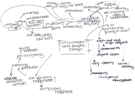


Apple can be seen as a Lovemark for these reasons :
- Obsessive
- People defend them even when they say it is cheaper to buy a new iPhone then fix your old one
- People get hooked on the UI
- People spend so much money on the product you do not want t say it is bad
- The physicality of the product feels good
Can you buy happiness?

Hype
Celebrities and trends are what makes products successful.

It is important to think about the strapline and the importance of that


Vaulte magazine creates a design that is intentionally ugly in a trendy way and uses it to critique the language. How does the language of my editorial communicate the message I am talking about in my essay?
0 notes
Text
Making and Breaking the Grid (The lost art of paste up)
This lecture gave me a refresher on grid systems but also provided me with new knowledge which I can apply to my editorial piece. As I really enjoy energetic and grunge aesthetics, I was really engaged in learning about how to break the grid and play around with those characteristics.
Layout - An arrangement of design elements
Grids - Framework/ skeleton
Anatomy of the grid
Format - full area of the design
Margins - empty space between the content and the edge
Flowlines - Parallel bands to aid alignment.
Modules - Spaces created between horizontal and vertical flow lines
Spatial Zones - Adjacent modules
Columns - Vertical spacial zones
Rows - Horizontal spacial zones
Gutters - spaces between rows and columns. When they are equal they create visual balance. (Gutters are half the size of the margin)
Types of Grids
Baseline - invisible units of consistent vertical lines. Useful for text blocks and they unify scale.
Manuscript - large and rectangular which take up the format space. It is normally aligned with the margins and is used in novels and books. Tension is created with narrow margins as the eye is moving outwards whereas with wider margins, it is more visually pleasing.
Column - Multiple columns on a format. Useful for organising loads of information/elements and useful for dividing information up. It can help with proximity for image to caption. Elements can cross over columns.
Modular - Horizontal and vertical divisions. They create spatial zones and add an extra bit of flexibility when placing elements.
What is Paste Up?
Paste Up is a method of creating and layering publication pages which pre-dates computers and publishing programmes. They would cut out sections of type onto a hand-drawn grid and then a printing plate is used to paste the final design.
Breaking the Grid
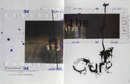
David Carson
- Overlapping and taking away the gutter in his designs.
- Communicates energy and attitude
- Visual storytelling
- Deconstructs the design rules
- Anti-establishment and rebellious (relates back to my design, something to consider)


Chris Ashworth
- Distorted and broke the rules of Swiss Design
- Attacking typography
- Slice off the type and using the fold to his advantages.
- Collage approach
- Overprinting the design
- Type is rotated and spontaneous
- Creates a graphic aesthetic into the artwork


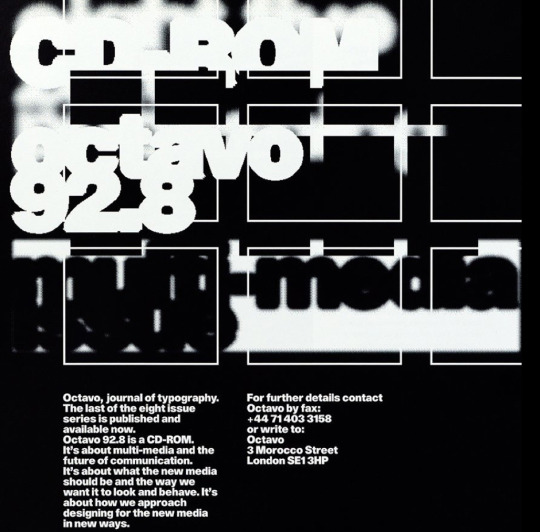
80V
- Breaking the grid where the modular is visible.
- The grid is disregarded
- Juxtaposition is saying something in the design


John Warwicker
- Skyscraper I love you publications
- Sound and visuals inspiration
- Disregards legibility
- Type becomes part of the compositions
- Uses scenography techniques
- Generates design accidents to form new ideas


0 notes