#the sets are gorgeous tho
Explore tagged Tumblr posts
Text
Are my takes on Reign too hot dgdkfbfjfj
Rewatching Season 4, probably my favourite because it feels more grown up from and shed the CW-isms of the first 2 and some amount of seasons. I like how many stakes there are for everyone on all sides. I like how flawed and stubborn Mary is and how her ambitions and actions define the season and her story, not having to share it with Francis, despite the show pinned as being about her. I like that Darley is deeply flawed but that Adelaide has chemistry with everyone she is on screen with so her and Will are hot and cold and tempestuous as Mary and Darnley.
They definitely could've cut out the short Gideon proposal and given Darnley and Bothwell more time as characters in Mary's story though.
I really wish Mary and Darnley had the same amount of screen time as she had with Francis, though much of their time was wasted on petty squabbles and drawn up issues of nothing in a story that forgot what direction it wanted. I do like that the shorter season moves the plot forward with Mary's storyline more rapidly like the usual short order fare for period dramas, though Darnley definitely deserves a full season, as does Bothwell, both of whom are charismatic and interesting in their own way.
Apparently I'm in the minority in liking the new setting and characters. Period dramas tend to move fast and have massive casts and shed dead weight or needless storylines or characters who no longer exist in the history. I think it's more interesting that the plot focuses more on the queens and their struggles, though the French Court storyline is lacking by comparison as it also dawdles with Charles. I do wish that one sped forward to Margot, as from what I remember reading about her, she was quite interesting, and even though Reign is super fast and loose with historical accuracy, I would've liked another adaptation with her.
#le whiny text post#the sets are gorgeous tho#iirc Scotland scenes were filmed at historic houses around Canada but French Court remains#one of my favourite set designs ever. and I like the distinct look all 3 locations have#I also love the gazebo thing in the English court courtyard
0 notes
Text

Pair 3/5 — Queen & King of Hearts ♥️
#this one's my favourite so far#the roses on rui turned out a bit too dark... it looks lighter irl tbh... but thats fine....#i totally didnt spend a good while drawing out those roses only for them to get mostly lost under the blue....#i forgot that even tho it looks good by itself the linesrt will make it look darker 😔#anyway would love to play with them and lay down this gorgeous rui only to cause emotional damage to thr next person (+5 cards)#kerizart#prsk#wxs#kamishiro rui#kusanagi nene#ruinene#polysho poker set
83 notes
·
View notes
Text


Vincent Price as Cardinal Richelieu - The Three Musketeers (1948)
#vincent price#the three musketeers#cardinal richelieu#his eyes tho#god hes gorgeous#i need a moment#so sexy#*drools*#bicon#bisexual#that stare#fuck me sir#horror#old horror movies#vintage#classic movies#movie#actor#handsome#gif#gifs made by me#gifs#gif set
104 notes
·
View notes
Text
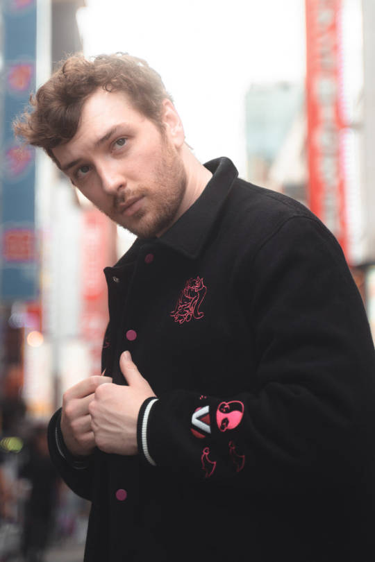
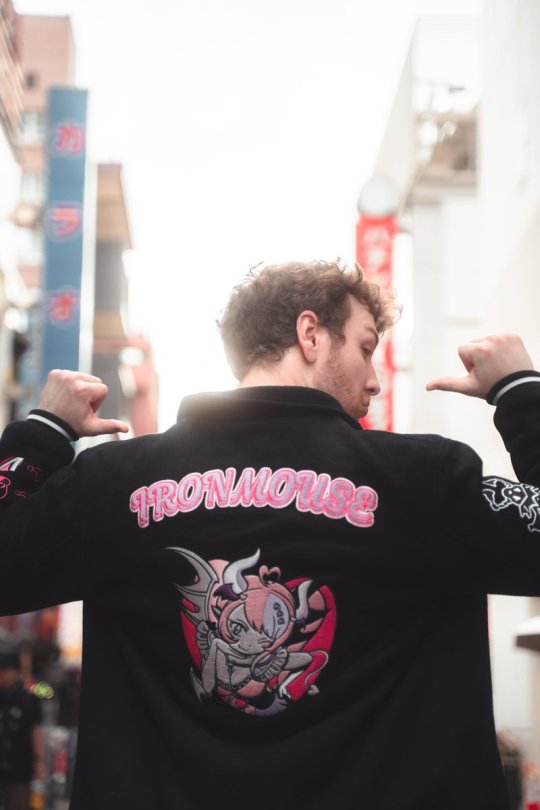
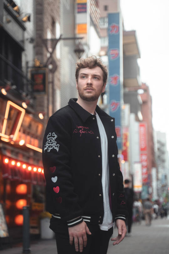
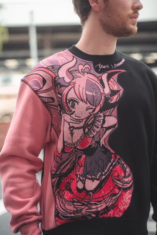
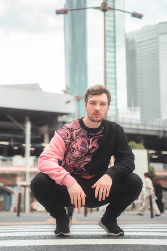
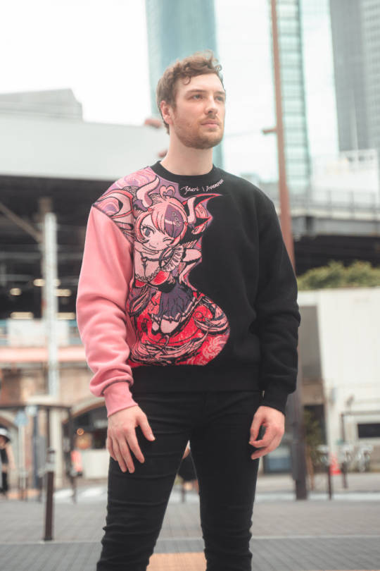


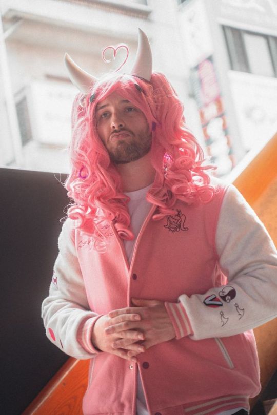
Connor Modeling Ironmouse x Apari | 2023
#He's so gorgeous fr#He's gotten so much better at modeling i think 😊#The squatting one made me laugh#Ugh but his hands tho#LIKE THE 1ST AND THE 7TH IMAGE. BRO IM-#NEVERMIND SHUT UP 8 TOO AAUUGHHHHH OOOOUUGGGGHHH#cdawgva#connor colquhoun#youtuber#streamer#photo set#Apari#Modeling#Ironmouse#photoset
174 notes
·
View notes
Text
rewatching the lord of the rings for the first time in years and experiencing emotions i didn't even think were possible for me anymore

#literally the grinch with my heart growing 3 sizes or whatever...forgot i could feel this still. lol#oughhh........... samwise gamgee character of all time#i also just bought a really gorgeous box set of the books too after having nothing but a massive floppy movie tie in of all 3 for years#im locking in. i would reread them too except im reading the wheel of time atm already which will probably take. all year lol#if not even longer. really enjoying it tho#and especially reading it thru audio like im about 25% in i think#and i started it right at the start of this month#but it's almost like my bed time story LOL like idk it adds to the vibes like someone is telling me this story over a fire#and that someone. is rosamund pike#like it's my ritual to listen to a little bit before bed or when im on a walk... and ofc when im at work before we open#i should get lotr on audio is what im trying to get at
9 notes
·
View notes
Note
The art style of Cloud Castle is absolute ass bro why are their eyes so big
Idk man it just looks.... off
I wish they brought back the og art style like Blue Scarab Hunt because that was gorgeous
Well if you’re referring to the book's artstyle as a whole, then calm down buddy the illustrations as a whole are pretty good all things considered (believe me some of the illustrations in the later books are waaaaayyyyy iffier)
But if you are referring to Danilo Barozzi’s illustrations in the book then uhhhhh… yeah I don’t blame you, I didn’t like the big anime irises either, she didn’t cook with this one,,,
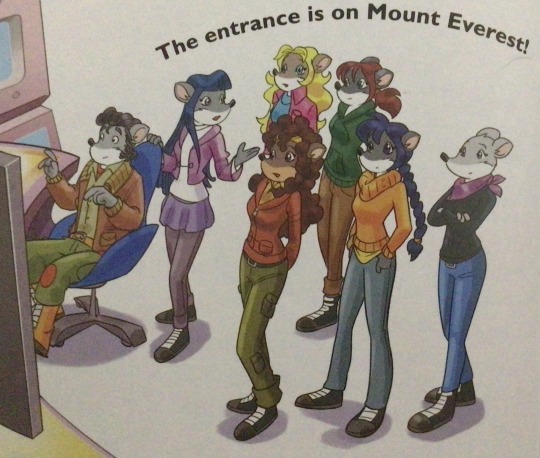
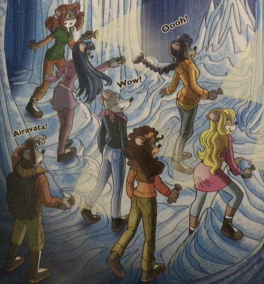
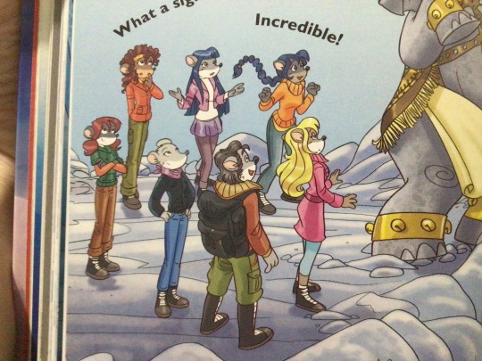
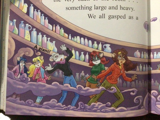
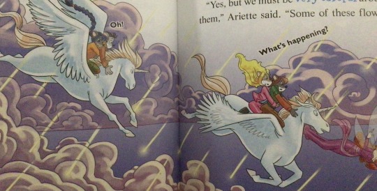
The interesting thing is Barozzi also did pieces for Secret of the Snow and those looked fine (she did well enough that I have to squint to determine which ones were done by her). My guess is either she did a lot of the illustrations for the latter half of SotS and we just got used to it, or it’s because the artstyle of special editions 2 and 3 were more… experimental? Books 4 onwards developed a very specific… look for the artstyle that adhered very closely to the main book illustrations of Spanish Dance Mission onwards, thus the illustrators had to follow suit, resulting in whatever looks off to look especially off.
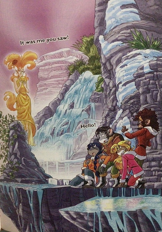
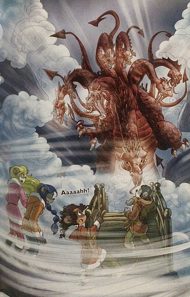
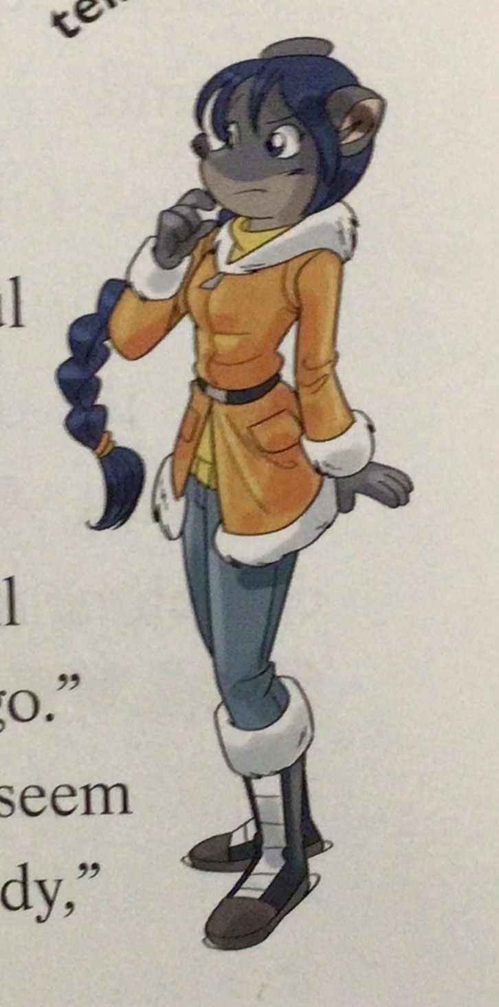
(Even with this set of pictures, I’m only about 70% sure these are Barozzi’s because of how alike yet different the styles are from each other in the book. The first one could be Barozzi’s, but it could also be Giuseppe Facciotto’s, since he also did illustrations for SotS and his stylization means he sometimes puts the eyes really close to each other in a way that’s weird but still makes sense somehow.) On the contrary, books 2 and 3 (and I would probably even include book 1 there) had a more experimental look to the illustrations, which seems to be based more on (and this is just a theory of mine) Giuseppe Facciotto’s iconic work for the covers of Mouseford Academy books 2-12, 14, 15 and 17 in the English books (he did waaayyy more covers for the Italian Mouseford books— he was basically the cover guy for the Mouseford books for a WHILE) as well as the books from Spanish Dance Mission to Lost Letters. If you’re wondering why those covers go as hard as they do, then now you know why.
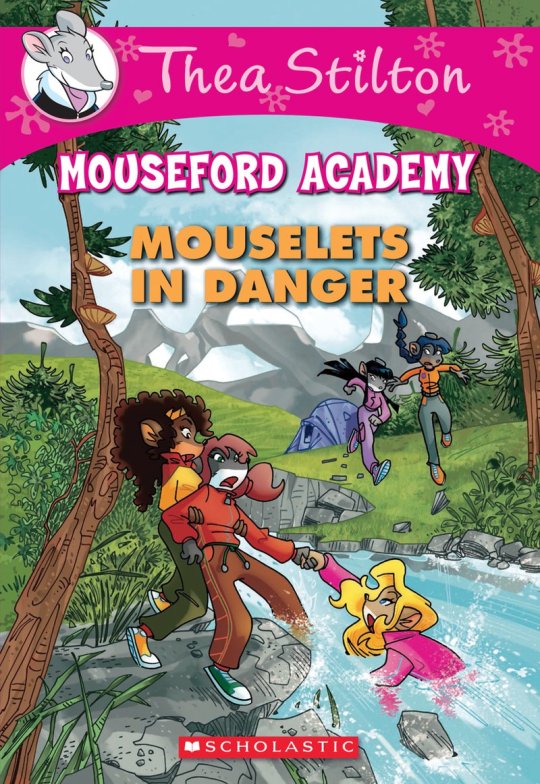
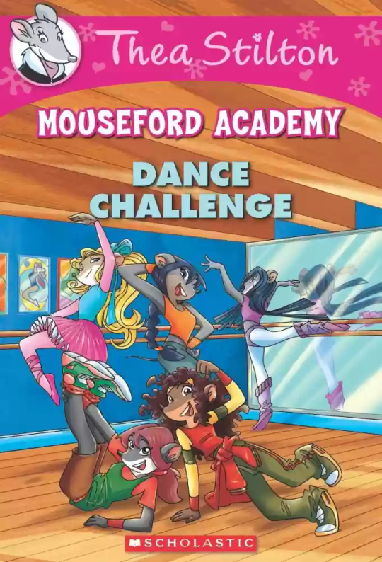
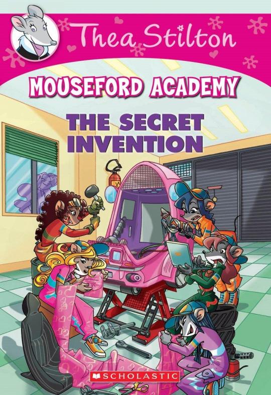
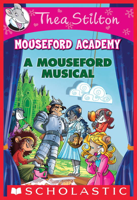
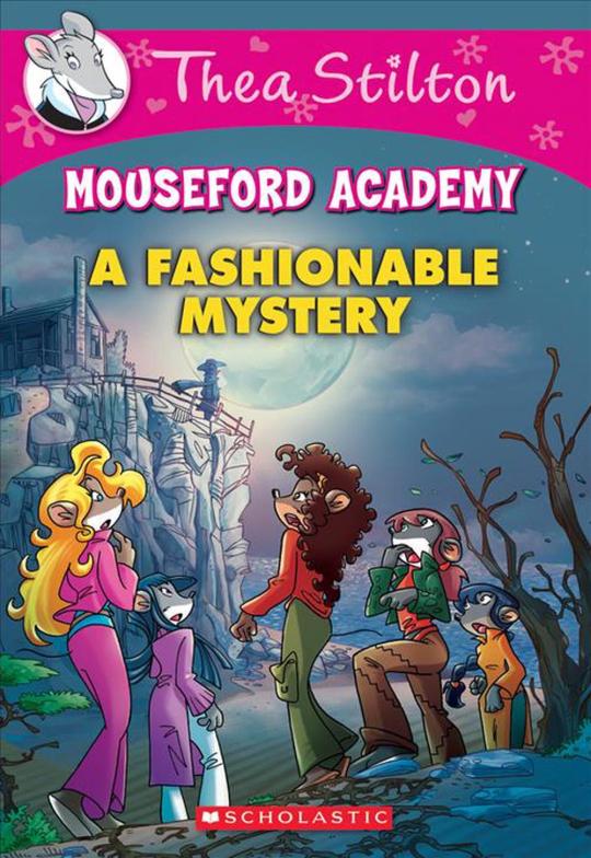
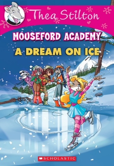
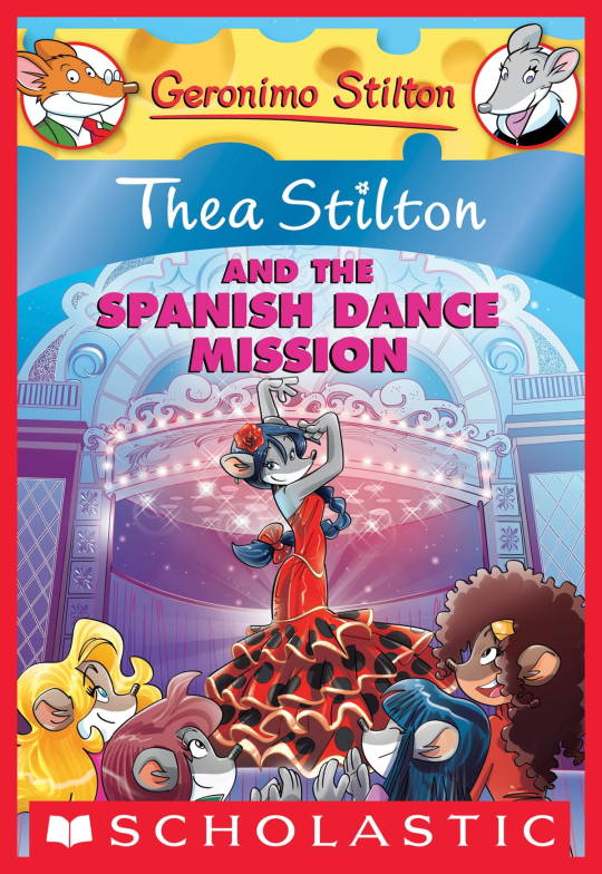
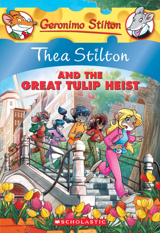
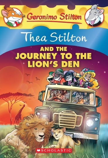
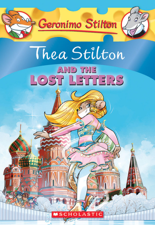
(These aren’t all of Facciotto’s works for the covers we know in English but you can see that he popped off <3)
But yeah as you can see with special editions 2 and 3, the art direction seems to be heavily inspired by Facciotto’s artstyle.
However, when Barbara Pellizzari’s works became the aesthetic poster child of the books’ brand, that was reflected in the illustrations and how their aesthetic changed, as seen in the main books and how they look currently, special editions 4-9, and the Treasure Seekers trilogy.
This new profile thing of the girls? This was done by Pellizzari (coloring was done by Flavio Ferron), and thus it became the main reference for how the girls look in the book’s illustrations.
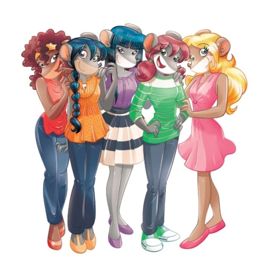
And it’s not just in the general direction to the artists for how to draw the Thea Sisters, but also in the direction given to the colorists. Alessandro Muscillo was the colorist for the special edition books since book 1 and the Treasure Seekers trilogy, and you can see that the direction for the style varied through books 1-3, like maybe direction was experimenting with the mood the illustrations were to convey, beginning with the cartoony and bright colors of book 1, easing into the more grounded and layered palettes of books 2 and 3
Then book 4 was when they transitioned to using digital art /j
I jest, but seriously book 4 was the debut of the coloring style we end up keeping for the rest of the special editions and for all of Treasure Seekers, which is very… bright :D
(I would show more picture examples but I manually took pictures of my physical copies for the Cloud Castle and SotS illustrations and gwuh I’m too lazy to grab my entire collection just to take pictures,,)
Bright as in like… the colors are very defined and saturated. I dunno how to describe it, but when you see it, you get what I mean. It’s very bright and pretty and colorful and it stands out. There are still variations that happen on occasion (Star Fairies in particular uses a good dose of airbrush for the lighting and shadow effects, and Crystal Fairies looks like someone had a bit of fun using sparkle brushes), but other than that, it’s very bright. I don’t hate it, but I do acknowledge that yeah, if I was introduced to the series when it had fully transitioned to the new style, I never would’ve gotten into the series in the first place, because the older books had something that didn’t make it feel specifically catered to girls. The colors were bright, but not too bright. Colorful, but unified. They weren’t that complicated, and they didn’t have to be because the colorists (plural, there were at least 3 per book once upon a time) were popping the hell off with the colors they were given. But y’know, the newer books’ consistent style did give me a good spot to practice drawing mouse furries so I’m not complaining too much about the newer style, haha.
(Tiny baby E’s (it’s literally from 2020 what’re you on about mate) her first mouse Violet drawing using Barbara Pellizzari’s artstyle in Treasure Seekers 1 as an anatomy guide!!)
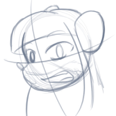
With that said tho, yeah I miss the old books -m- dunno if it’d fit the aesthetic of the special editions but m a n we could’ve had it and it probably would’ve looked cool
Also the illustrations go way harder in the older books, like Prince's Emerald? I've talked about Prince's Emerald and how it goes hard before, and I still stand by it and say that it does in fact still go hard
Maybe it won't fit the uh splash of color they gave the hardcovers, but imagine they grabbed Giulia Basile's coloring work for the graphic novels and used that as sort've a basis for the coloring style of the hardcovers. Not exactly the same-- would probably still add a touch of whimsical watercolor and/or paint to the very cel-shaded style, but we could've had something pretty dope -m-
Anyway that's my ramble simultaneously defending the hardcovers' artstyle and reminiscing on what could've been haha
#geronimo stilton#thea stilton#thea sisters#questions with e#rambles#the style of the older books is gorgeous but the main thing I'm wondering is can it pull off fantastical whimsy#that's the main thing i dunno if it can do (i would love to be proven wrong tho)#the style is so grounded that i'm wondering if it can pull off what the hardcovers needed it to do#which is convey the otherworldly fantastical thrill of exploring the fantasy worlds (which uh the newer books were able to do but#my main gripe is that fantasy and reality are near indistinguishable in vibes coloring-wise#sure there are sparkles and stuff is more saturated but the girls' dorm in book 4 still has the same-ish feel of the land of clouds#i dunno what it is. the bright colors just feel mundane somehow and don't take a shift when returning to reality)#looked at my books again and i think it might be the fact that the later books have no grounding color?#compare book 3 to book 5 and you'll see it the most distinctly methinks#the newer coloring style doesn't have a color that grounds the illustrations' palettes and thus everything's always bright 100% of the time#the girls' colors are always at their most saturated#like they're always under broad daylight in terms of lighting#it's not eyebleeding or anything but they don't look affected by the lighting in the setting they're currently in#and the result is it looks.... meh?#we get so used to the bright colors that they end up looking meh somehow#i'm not an art expert by any means this is just my observations as someone with a little too much brainrot
42 notes
·
View notes
Text
I finished the mhyk april fools stories:) here's my ranking:
1. Alter ego's creed (2024)
2. Sea rover squama (2023)
3. The nostalgia of youth and fluttering petals (2020)
4. Paradox roid (2021)
5. A mysterious tale of the moon and flowers (2022)
#alter ego and sea rover the stories killed me personally with my favorite characters loving each other in a different world#the highschool au well. they made cain an influencer and faust a meme. heath and shino were idols. it was just hilarious. mustache murr??#pararoid im sorry you ended up 4th...i did hype myself up a lot for it and then just found myself missing technoroid overmind in the process#and the youkai story. well. the story didnt really wow me at all? the cards are gorgeous tho#i do lije the setting i just found the plot not particularly interesting and i didnt get any new insights into the characters dynamics
9 notes
·
View notes
Text


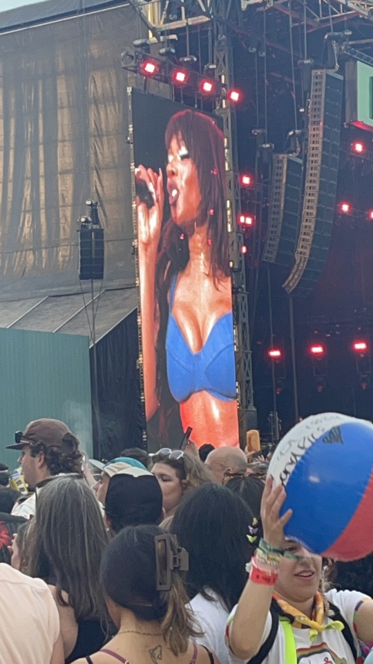
next set was Megan Thee Stallion and christ i’m such a whore. she’s such an amazing performer and in no world will be sorry or guilty for loving her music. so so so fucking cool i stg~🎃
#also she’s fucking gorgeous#like jesus fucking christ#just LOOK at her#i wish i could have been closer but i was waiting at another stage for the next set there#no regrets tho because yk thank everything holy for huge ass monitors and killer speaker systems#frnkiebby#megan thee stallion#boston calling ‘24#boston#non frank post
9 notes
·
View notes
Text


ngl his lil rainbow bow is winning me over very quickly
#i agree tho get the hell out of jokers seat WHO do you think you are#its a good thing this man is gorgeous or else i would be setting him on fire#crime fighting card fellas
6 notes
·
View notes
Text


even demons cant stop her mewing streak
#rambling#dragon age#dragon age the veilguard#datv#i do not like combat system#and even on my outdated pc it runs ok on low settings#also am i the only one with weird mouse sensitivity problems? however i change it its always the same speed and this speed is too fast#ngl she looks gorgeous in every single cutscene i really popped off with her looks#mourn watch advanced fit is tragic tho hope we are able to change it somehow
3 notes
·
View notes
Note
Is that Len on your new pic?
it is! it’s from this pjsk card :D

#posts#he’s GORGEOUS here#the whole set is so gorgeous i put all of my socials’ pfps as the entire set#like. discord is tsukasa - bsky is emu - insta is nene - and tumblr is len#i dont remember my askbox tag so i’ll put it later#also i have bsky now. i’ll make a separate post abt that tho
3 notes
·
View notes
Note
Hellii Hellooo
Ignore my previous message, my keyboard was being STUPID and submitted it-
Anyway- 1) Does Pico know or understand the concept of a 'date'? 2) If yes, do Pico & Bao go on dates? 3) & if yes again, are they rare or common occasions?
I witness ALL MOON👀👀👀
lmao hoi anyways
I'd think so yes! I'd consider Pico being the one to ask out Bao, cuz where he grew up the animals he'd see when it came to courting each other they make their point very upfront, so if he takes interest in someone he's just gonna go for it. Plus he sees his uncles Warren and Hypno all the time and can already tell how smitten they are with other, he's no stranger to that.
Also yesssss!! I haven't drawn anything yet for them cuz I wanna draw their first meeting with each other first and foremost before I do sweetsy stuff (whenever that comes to pass)
Okay Date stuff or more like outings tho. I think Bao would enjoy taking Pico out around the Hidden City, showing him all of his favourite spots, catching in the sights etc. Pico would love it, but he still is basically a farmboy, so I think he could only handle being in large crowds and the overwhelming bustling city for so long and stick by Bao's side so they don't get separated once the wonder wears off. Bao would take this into account and try to think of areas where it's less noisy and crazy. On Pico's end of setting up dates, he'd invite him out to the forest, maybe spend some time with the dogs, go on picnics or hikes/walks. It's a good break for Bao too since he's busy running the tea shop all the time and could go for some peace and relaxation once in a while.
3. Hmmmmmmm I'd say they'd happened pretty frequently :3
#rottmnt ocs#pico lore#look i havent been in a relationship since i was 13 im a bit rusty#plus aromantic so i kinda view romance differently in my book#i had such a good date idea for them tho that i dont know if i'll ever draw it#the one day i was on the train i passed by this weeping willow tree outside#i thought of bao takin pico to an area in the hidden city with a gorgeous giant fantasy lookin weeping willow tree since he's a nature guy#the inspo struck#pico would instantly love it and take to climbing the tree#prolly set up a lil picnic while theyre at it#if you wanna do something with that i'd say go for it#i assume youre asking cuz you always be plotting stuff against me and wrecking me xD#pico opossum#bao the tanuki#also another thing#i personally dont like the use of saying i love you when it comes to romance. it almost feels loaded or just weird#i find “i like you” to be more cutely endearing
9 notes
·
View notes
Text
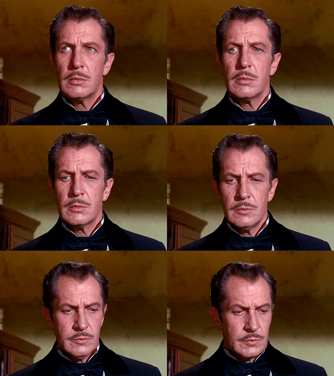
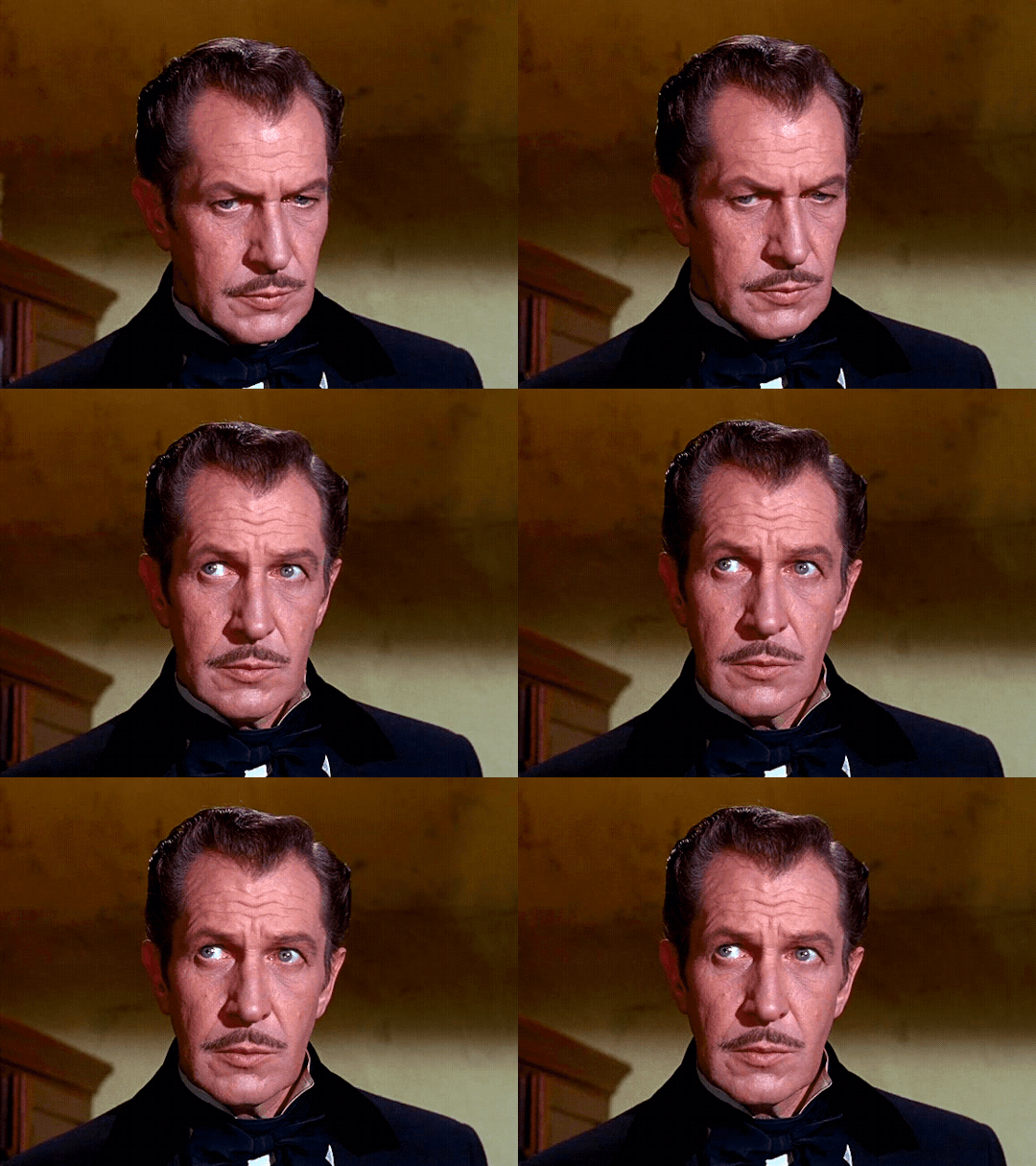
Vincent Price as Gerald Pyncheon
Twice Told Tales; House of the Seven Gables (1963) dir. Sydney Salkow
#vincent price#twice told tales#the house of the seven gables#house of the seven gables#nathaniel hawthorne#hes so handsome#he is so sexy#unf#god hes GORGEOUS#so pretty#bicon#bisexual#sir!!#his lips tho#sexy actors#horror classics#classic horror#horror#old horror movies#vintage#movie#actor#handsome#gif#gifs made by me#gif set#gifs
82 notes
·
View notes
Text

girlie that claymore is bigger than you (what they deserve)
#kalyna orben#leigh plays ffxiv#ffxiv dawntrail#ffxiv dawntrail spoilers#i miss them (wol which i have one thousand pics saved of on my phone)#this might eclipse the shb drk armour for me............JUST A LIL THO#i'll always love you shb drk armour nothing could ever completely replace you for me#THIS SET THOUGH...........FUCKING GORGEOUS#especially how shiny it is under certain light
2 notes
·
View notes
Text
i wish i was taking part in polin week, loves! but i don't feel much like creating atm..
but day 1 is songs/fave scene, right? feel like this set i made a while ago fits both 🥰
#feeling so much better but i'm not feeling creative again yet#i have one set in my drafts tho!#but idk if yall will care about it rn cos of all the gorgeous polinweek sets being posted lolol#courtney rambles#(does it mean official polin songs tho? cos that's obvi just a song i like for them)
4 notes
·
View notes
Text
anyway the con last weekend was fun! i got merch of TWO!!!!!(!!!) special interests AND my favorite movey AND my favorite tv show AND my favorite manga. and a keychain of a yuri ship. life is so fucking good
#(items in order listed here) vriska keychain aradia print nepeta print saw print (special interest and fave movie) madoka magica print#chainsaw man keychain millymeryl keychain#oh i also got alpha kid earrings (not really one set was cotton candy like the food and one set was game pieces one of which was green and#the other was orange. dirkjake colors thus dirkjake earrings.) uhhh what else did i get#i think thats it. good stuff.#just saying shit#conposting#cosplays i wore were roxy then godtier vriska then karkat#got lots of complements on my godtier vriska which was nice bc i sewed it!!#drafted the patterns and everything!#and i dyed those boots and made the cuffs and painted the soles. not that the sole paint lasted lol#i had so much funnnn i love conventions. next thing i have 2 look forward 2 is my friends bday party and a concert (same day)#the saw print is so cool ive only hung up aradia and nepeta so far but im excited 2 hang it in and the madomagi print up#omfg the madomagi print is gorgeous. ive said it before but madomagi artists r some of the most talented people alive#ran into ppl cosplaying 3/4 alpha kids (no jane 😔) and terezi and nepeta and grimdark rose and june (who didnt recognize my friend who was#also cosplaying june? it was so weird 😭) and two gamzees#gave most of them bracelets and/or buttons that we made#also saw a person in a space hoodie who i also gave a bracelet to#met three vendors with homestuck tattoos!#two of them were matching subtle moirail symbols w each others favorite flowers it was adorable ☹️#uhhh what else. didnt get a shark keychain due to money i rly wanted it tho i fucking love sharks
2 notes
·
View notes