#the original versions of my current designs had them made to go together
Explore tagged Tumblr posts
Note
rising from the voids
pretty please some comfy godmode or nightlight?
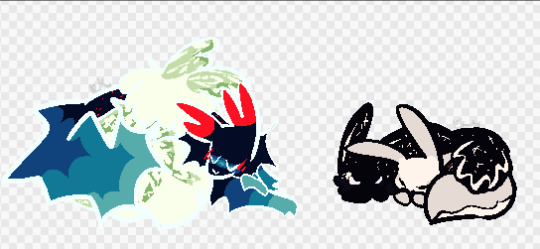
both for u
#rain world#hunter's april doodles#rw saint#saint rw#rw enot#enot rw#rw nightcat#nightcat rw#rw survivor#survivor rw#rw shipping#rw godmode#rw nightlight#i couldnt pass up doing nightlight ok#the original versions of my current designs had them made to go together#and theyve changed very little since then honestly#they both have little eye spots to reflect one another!!!
60 notes
·
View notes
Text

Wha--?! Silk finally finished her fem Zoro design after (checks notes) literally 6 months since she made the canvas in procreate?
I'll break down design thoughts and share some fun bonus pics under the cut:
I LOVE long hair on Zoro, I think that was the first change I wanted to implement. Zoro in canon actually has a really interesting relationship with gender dynamics which (if for some reason you're reading this and you haven't watched One Piece) can seem out of left field for the "dumb brute" character. His rivalry with and reverence for Kuina suggests he doesn't adhere to the idea that women are weaker than men. Later on, however, during his confrontation with Monet and Tashigi during Punk Hazard, his hesitation to slash her down reveals that he's subconsciously over-protective of women because he thinks they're inherently weaker. I actually don't have any problem with this character trait, I think it makes him feel more real as a person and he obviously gets shit-talked enough about it in the story itself. But how did I want to reflect these beliefs if Zoro had been born a woman? Easy: internalized misogyny and applying value to herself via her appearance.
My version of Zoro grew up wanting to fight with swords but her only chance of entering the dojo was to work under the proprietress, Lady Shimotsuki to maintain the property, cook meals for the male students, and eventually be a good wife to the current heir, Kuina. She learns that, to get what she wants, she must be the ideal woman, even if she stays up all night training swordsmanship with Kuina when she isn't supposed to. He treats her love for swordplay seriously and treats her like an equal, which sparks a bond between them and eventually leads to Zoro's goal of becoming the world's greatest swordsman after his sudden, accidental death.
After years of intense training (now that Lady Shimotsuki admits that she'll need a new heir and Zoro is the closest thing she has) Zoro's finally old enough to leave and begin her journey. She starts letting go of the idea that she has to look pulled together to be taken seriously because she can just kill anyone who looks down on her. Her clothing falls into disrepair, she wears outfits that help her move in combat, and she starts tossing her hair up into messy, knotted buns under her bandana. Even so, she keeps her hair long like rolling hills of grass. (At least during pre-timeskip. She lops off her hair to prove to Mihawk that she's serious about being trained.)
I've put her in a thin sweater that she stitches (poorly) back together after her first interaction with Mihawk. (I kept one sleeve because I was inspired by the santoryuu Nami that Oda drew that one time.) I also wanted to girl-ify the ubiquitous haramaki so I picked leg warmers for her because I think they're sufficiently "dated" enough to be kinda analogous with his old man belly warmer. I also love gyaru fashion, sue me.
Here is a screenshot of her as a blonde:

And here is a sketch of her post-timeskip where she's fully embraced her butch nature:

Hubba hubba, am I right?
Check out my tag "girl piece original design" to see more of my genderbending art! Next post, I'll put all my East Blue Crew designs together! I can't believe it's taken this long but I AM SO HAPPPPPYYYYY
#one piece#one piece fanart#girl piece#roronoa zoro#zoro#fem zoro#shimotsuki kuina#shimotsuki koushirou#genderbend#character design#post timeskip#pre timeskip#girl piece original design
857 notes
·
View notes
Text
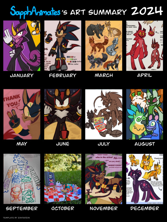
SapphAnimates Art Recap 2024!
Calling it a little bit early, but here's a quick recap of my art progress for the year ^^
JANUARY
My Alacrity AU designs for Team Chaotix! Espio was one of the new designs I was most proud of at the time (despite the fact I ended up slightly modifying it later on). Hence why I chose him to represent January!
FEBUARY
THIS IS IT. THE ORIGINS OF SASHA. A Sonadow fankid I originally made just for shits and giggles, as many other creators were making them at the time, has slowly evolved over the year to become a pseudo-face for the blog! I wouldn't be where I am right now if you guys hadn't loved her as much as I do, and I'm super grateful for all of your support! Stay tuned for more Doom's Child AU news!
MARCH
Warrior Cats designs! These are some Medicine Cat/Healer designs for fun, though it did push me into a short era of drawing a lot of warriors stuff. I think most of my March was dedicated to Warriors content, actually...
APRIL
I like garten of banban. I needed to share my concept for a darker, psychological horror type of banban story, with a hint of infection au in there as well. please forgive me.
MAY
The end of the Sasha's run in the Sonic Fankid Showdown hosted by @head---ache . She didn't last very long, but the support behind our campaign was insane. Same goes for Zayne's run in the second Showdown. Thank you all so much!
JUNE
I did a "Six Fanarts" Challenge, featuring a mix of Warriors and Sonic characters, this one in particular featuring Sonic, Tails, Shadow, Tangle, Yellowfang, and Breezepelt. Shadow was my favorite from the group, with the bright yellow moon in the background and new Doom Wings (the Doom Powers were recently announced at the time).
JULY
Drew some of the horror adjacent Tails designs from some of the zones in my Project Alacrity AU. Ojo, Maggie, and Tailtrap playing Operation together and failing miserably at it :]
AUGUST
Some scrapped art from an animated shorts compilation video I posted on my YouTube Channel! It features some of the main characters, namely Fallen Leaves from Warriors, a Floragato from Pokémon, and a Mimic and Blarret from My Singing Monsters. Please go check out the video if you haven't yet!
SEPTEMBER
September means school, and school means teachers. And I've never met a more wackjob teacher than my current Chemistry teacher. This picture was one I did as a "Get to Know You" project on the first day of school. Labcoat Sapph.
OCTOBER
My first self assigned school art project, and a photography one! A multimedia picnic, a clay frog, a paper doll coati, and a portrait of a ghostly cat-woman, all sharing a lovely shoo-fly pie. Each character was created in a different medium, and the final photo was taken in my grandmother's backyard.
NOVEMBER
Part of a community challenge spurred by @yourpalsalamander . Asha in Wonderland needed a high af caterpillar, and who better to fill the role than Sasha. Just uh... don't touch her shrooms.
DECEMBER
Mlp horror AUs have had a small comeback lately, mostly on TikTok, but I wanted to throw my hat in the ring and create new evil versions of the entire Mane 6. I haven't come up with a design and concept for Rarity yet, but I've had a great time developing the rest of them! I'd love to turn it into a video series if you guys are interested in hearing my thoughts.
See you all next year! Template is by @zontarzon
#sapphanimates#sapph talks#art recap#2024 art recap#espio the chameleon#sasha the hedgehog#sonic#sonic the hedgehog#shadow the hedgehog#banban#garten of banban#ojo#miles tails prower#phantom amalgamation#tailtrap#mimic msm#blarret#fallen leaves#floragato#sapph ginger#fursona#sapphire ginger#tanner bass#tanner the coati#vela eterna#grobert#asha in wonderland#asha the tenrec#twilight sparkle#applejack
27 notes
·
View notes
Text
You encountered Gym Leader [NAME]!
Alright, Long ass design and lore explanations beneath the cut.
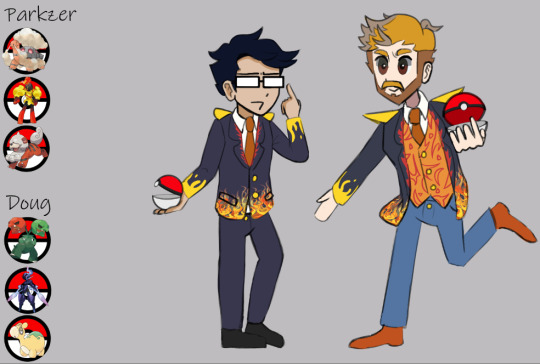
I've already explained my design choices for Doug-Parkzer, but due to my account dying that post is gone, so I'll re-explain. Also, I've gotten better at drawing in style as I've continued, so I might go back and redraw Doug and Parkzer, the designs are fine -probably my favourites thus far- but I don't think the lineart is up to current standard.
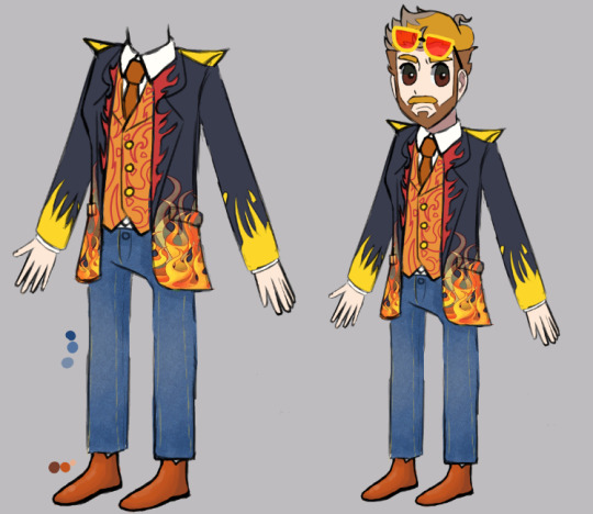
Doug Design
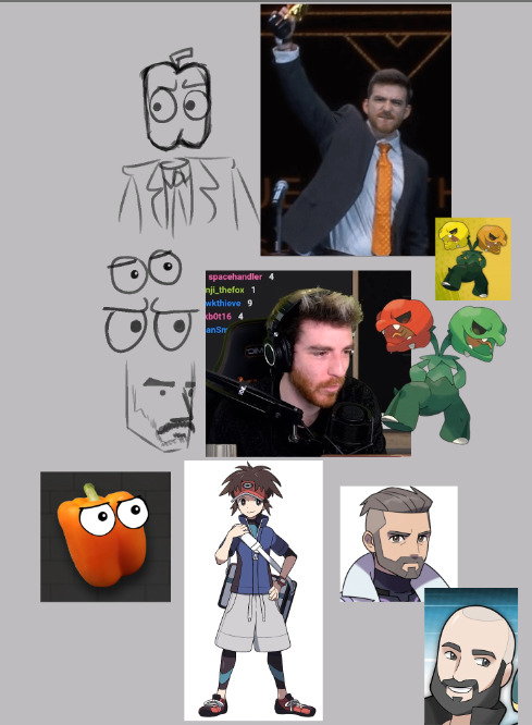
The pupil shape matches the bellpepper icon, I was considering doing an expression or shape that matches some of the other versions of the eyes. Jerma fans ate Shuffler's design up tbh. Mad P03 vibes.
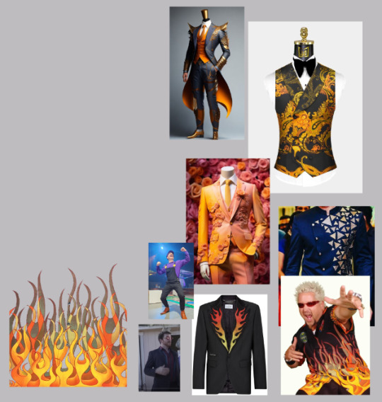
"Dyed Hair". I always hated the bleached hair look on Doug, eventually I came to just find it familiar, but thank god it's basically gone by now. I used the blonde-er hair to make a pattern similar to fire.
Guy Fieri patterns on suit. If I was having Doug in a fire Gym I had to have Doug Fieri mentioned at least somewhere.
Orange Tie from Streamer Awards. How was that like almost two years ago? Squeex interviews and Doug won... We had it all...
Shoes from PointCrow Party, when he played the character "Wallace". Man I miss PointCrow Party, if I had known how Autistic I was gonna be over it I would've bought the props. Every day I mourn.
Patterns based around fire on the suit jacket, sort of more triangles though, didn't want to just repeat the same fire spikes everywhere.
Glasses based on Learning Ettique Stream from SamWitch. Doug keeps wearing these types of glasses, I think he's eating them up?
Shoulder Pads are removable from the outfit, I want to have him wear the same outfit but, less, for formal events.
Fire Type was decided on due to the Capsicum/Bell Pepper icon
"Lore"
Matching Charcadet evolutions with Parkzer, is a way of hinting to their friendship and personalities.
Co-Owns gym together. Doug promotes Parkzer because the guy is actually really good at managing the gym, unlike him.
Was originally going to be an electric gym due to Doug's Coding gimmick during battle. (In which random status could apply, random heals could apply, and terrain could change.) but because his partner pokemon Scovillian is a fire type, he just doesn't change it.
Stands out due to his eccentric suit
He currently looks after Eric's Starly for him -Explained later-
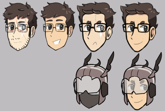
PointCrow
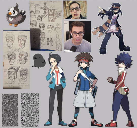
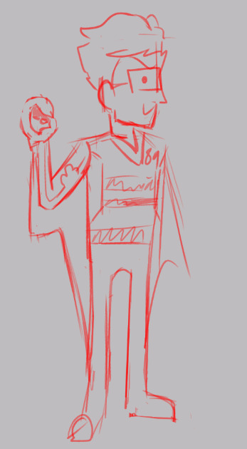
Head sprites on the left were the originals, I decided I didn't like the shape, too sharp and the hair differed from how I normally draw PC. This was changed last minute though, so the scar-updated version isn't as interesting as it once was.
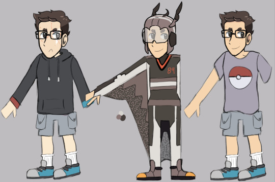
The patterns on the wingsuit are from TOTK, Shika patterns I think.
At one point I considered a paraglider similar to Link, but I felt it was too on the nose and opted for this design instead.
At a point, Raruu's arm was considered, but it felt like too much main character energy. Instead, it went to my base design for PC lol.
Flying type was picked due to a combo of icons from the channel (Doodle, "Crow"), and of course, Link and Pointcrow's love for the Zelda series.
The suit and helmet designs were based around Starly, which I thought would be the closest substitute for Doodle.
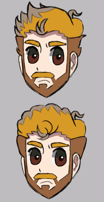
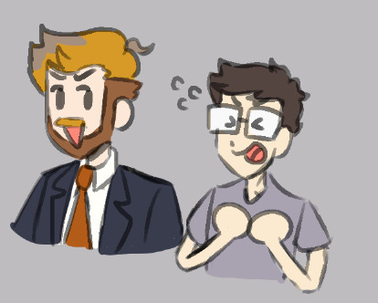
When originally thinking of this AU, the sketches I made for headshots I wanted to make sure I made PC and Smant similar in design based on the "similar appearances" joke. As someone with face blindness, it's crazy... I think I managed that - more later.
The casualwear outfit sleeve cuffs are red and blue, Mr Miyamoto would be so proud of me. At one point I made the shoes also red and blue but it was too crazy of a design for me.
The scar in his later design was placed on the same eye his bruise was on for the Ludwig Chess Boxing PhotoShoot.
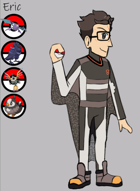
Corviknight was originally going to be a pre-evo whilst Starly would be returned to Eric as a Staraptor, but I decided his Partner would not change without its owner and whilst Eric ages Starly doesn't.
Crobat is on his team to show his love for his Pokemon despite the hermit mindset he has taken on.
Lore
Flier 89 is the name of the famous wingsuit glider in the region. Pointcrow starts training at a young age, becomes Gym leader, and is friends with Smant for the duration, some of the youngest gym leaders in the region's history.
He has a crash one day and loses the ability to fly due to depth perception.
He stops talking to his closest friend who he blames for the crash, as someone tore his suit. Truthfully, it was Eric, who denied it because he wants to push away his friend, due to no longer finding confidence in himself after he lost his "one skill".
Eventually, the trainer finds PC and convinces him to fight them, as it's necessary for their completion of the gym challenges. This is probably through a quest of just walking around with him whilst he talks about his self-worth, why he wants his talent back and why he wants to be "Flier 89" still instead of Eric.
When he fights you, his name changes to Eric in the pop-up despite being in Flier 89's outfit.
He even uses his Starly, which he had given to his friend to look after. No longer being able to stomach the sight of his partner Pokemon due to PTSD.
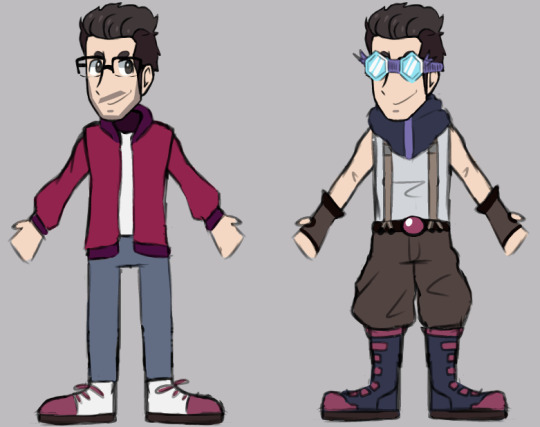
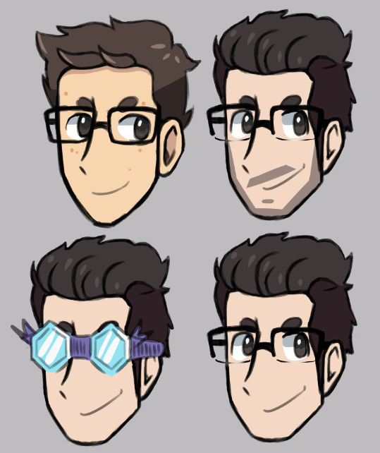
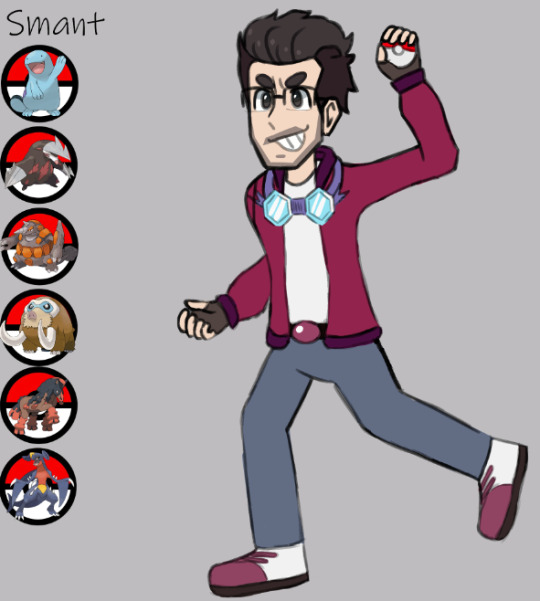
Smant
Headshape tried to appear similar enough to Eric's design.
Glasses are made to look thinner following both irl similarities and aiming to look separate enough from the other.
Wasn't sure how hard to go with the facial hair because in every instance bro either has a full beard growing in or is clean-shaven.
Hair was odd to do, I don't think his avatar is entirely accurate (though that's normal). So I overlayed the colour onto my original version to try and have the best of both worlds.
The hair shape I had was entirely different at multiple stages, so eventually I just tried to copy his avatar, with a bit more spike. I don't dislike it, but it doesn't sit right with me still.
Originally I wanted to have more of his Gym leader outfit in the splash, but I decided to keep it simple.
I think that he'd look back on his old outfit and cringe, just keeping the accessories and using them along with his base outfit.
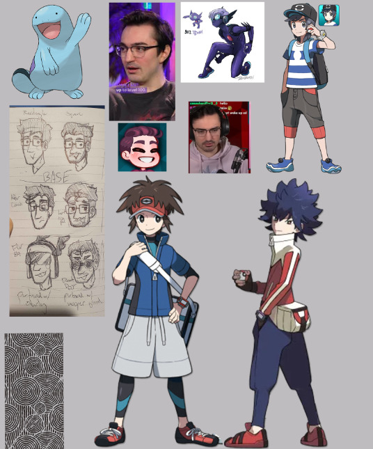
Ground Type gym leader so that way he could keep his Quagsire. Though I do think it aligns with his personality pretty well.
A team designed to help with mining, because if Tanner Minecraft Ground Gym Leader isn't Mining and Crafting I don't know who is...
More to come!!!
11 notes
·
View notes
Text
Some Ninjago arts
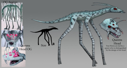
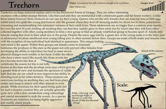
Just some arts I made for my Ninjago stories. First up the Treehorn features in my story so I decided to give its design a more detailed overhaul. Some of the inspiration for its design came from ants.
Just a little sketch I made to go with my story Anatomy of a Droid. Got a new tablet for the holidays and decided to try something small while learning to work with it so I made this. It's just a little sketch of Zane playing a video game with his best friend Pixal who as a fellow droid can connect to the special Cyber-teddy he has next to him.
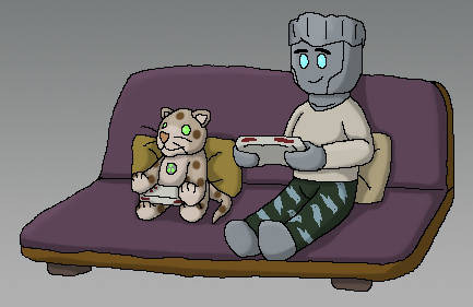
The teddy sitting next to him is this:
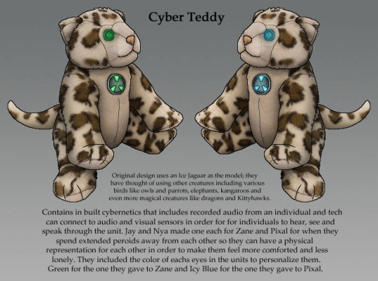
A snippet from the story featuring this:
“Yha but electricity isn’t all the same. The difference is the volts in its current that’s why you have to use an adapter when charging your phone or laptop. If you just plugged them into an outlet without an adapter you would damage your battery and it wouldn’t really charge it properly. Pure raw electricity is dangerous for Zanes power source that’s why when we do hook him up to a computer or anything that could transfer electricity to him the connectors we use have adapters built into them that way they don’t cause any stress to his heart. That is also why Lloyds powers are safer to help Zane than Jays. As pure energy his can deliver a much lower and gentler form of electricity that doesn’t easily hurt or overwhelm Zanes heart. Since he only has half the material from his original heart it’s more sensitive to being overworked and overloaded. Luckily his new bodies’ digestive system is more efficient at producing energy than his old body so it really helps keep his heart stable and healthy,” Nya explained and Kai wondered, “given the effects it has on him do you think Zane ever regrets giving up half his heart?”
“Are you kidding, you just see him and Pixal hanging together and you know he doesn’t regret it. Not only that he would do it again no matter how much it affects him. You remember how many times when Pixal was in the computer we found him having fallen asleep next to it or with a tablet after just trying to spend time with her,” Cole replied and Jay added as they continued on the trail, "yha that was pretty sad. I can't recall how many times we had to put him in his bed after finding him sleeping there. That's why I made that special teddy for him. I got one of an Ice Jaguar and modified it putting a special device me and Nya whipped up in it that not only had recordings of her voice but she could connect to it when they hung out together so they could spend time together. He still has it; it's in his nightstand; he sometimes brings it out when Pixals gone for long periods." Kai stated, “that period was kind of weird but also very sad. He carried that thing around a lot and often sat it next to him when we were relaxing or even at dinner. It did really make him happy though even if the thing gave off this unsettling being watched feeling. You know you're right there’s no denying he doesn't regret his actions there. Those two were meant for each other...
Also for my stories I made my own version of the Bounty:

The stories mentioned:
23 notes
·
View notes
Text
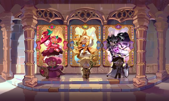
Something that’s bothering me about the Might of the Ancients stories, in the stories we get younger versions of our current three Ancients, but the stories themselves seem to be taking place around the time they do the thing that leads to the founding of their kingdoms, at least for Hollyberry and Dark Cacao, as she’s chasing down Pitaya and he’s going to confront the North and South Dragons
Thing is, at the time of their kingdom’s foundings, I don’t think they were as young as these designs imply
First off, we have the cutscene of when Pure Vanilla was crowned king and the Vanilla Kingdom was founded

While Pure Vanilla isn’t clearly seen, we can see White Lily, who seems to already look like an adult. Given she and PV are likely around the same age, it’d make sense he’s an adult too, and thus he’s much older than he looks in his flashback design
But you could argue that maybe there was some sort of time gap in between the two given periods. But then we have the gacha animation for Dark Cacao, in which we see him confronting the two dragons. And in the flashback, he’s just about to set off to do that, so there is no time difference excuse here. Now look at the design from his pull

This is clearly not the same design, and he looks older in the gacha than he does in the flashback
And also, let’s look at the Might of the Ancients flashback designs. The three look like teenagers at best, children at worst (maybe around 12-14?). I kind of doubt that that even with their achievements, people would be willing to crown Cookies this young to be rulers. Admittedly I suppose I could be wrong in this aspect, but I still think it makes sense
Oh right, and one more important aspect that I just remembered, we know by the time they founded their kingdoms, they had their Soul Jam. Yet in these younger designs, they’re nowhere to be found. Which doesn’t make sense
My guess as to what’s going on? The designs we see in Might of the Ancients are even younger versions than what we saw in the flashbacks, likely of their original adventuring days (as they look like the flashback image in Odyssey), with their actual ages in these scenes probably being closer to adults
As for why these designs were used here, perhaps it’s because the devs plan to use these designs for future flashbacks to the proper age that these designs come from, hence why they were made
And they were used in Might of the Ancients to indicate to us that they’re their past selves, as it seems their current looks maybe have been already put together by them, if that makes sense. As in like, they would already look like their current day selves, minus their crowns, and so they used an even younger version of them to indicate that this is the past and so we aren’t confused
#cookie run#cookie run kingdom#ancient cookies#might of the ancients#pure vanilla cookie#hollyberry cookie#dark cacao cookie#questions#speculation
92 notes
·
View notes
Text
WH40K Homebrew Space Marine Chapter: Stormwolves — December 2024 Update #4


December 24th brings the final Grotmas 2024 Detachment, for the Space Wolves, an official Chapter that I sometimes use rules from for my Homebrew Chapter.
The new Champions of Fenris Detachment isn't the best fit for my fluff; half the rules in it are focused on Terminators that my Army would not have. At least in their current incarnation. Back in the 90s when I first started working on them the original concept was Scouts & Terminators, or as I called it at the time, "First and Ten". But I've moved on since then.
So while I won't be making a list with Termies in it, I did write up a 1K list for all the Scouts I'm not able to take elsewhere. Mainly as an excuse to do a bunch of new pixel art for my "Codex".


This also had me take another look at my previous 1K army list from the Officio Assassinorum's Grotmas Detachment. I wasn't sure if it wouldn't be better to just go with the Ordo Xenos detachment from the Agents' codex instead. So I made another version that did just that.
Which of course was an excuse to make even more marine pixel art, as I was now using Watch Captain Artemis as a rules proxy for a Bloodstorm Lieutenant taking point on the Breacher Team and assuming the Warlord role for the Army List. Put him in some Mk.III inspired power armor.
And while I don't go heavy on Rank Markings in general in my concept art, I did end up giving him the same right shoulder iconography that I had given the Phobos Captain from other lists. Then there's the Bloodstorm's Company Champion, who doesn't get any shoulder markings, but I love the design of his shield that I was able to cobble together from screenshots of various 3D assets.


All and all, my little Homebrew Codex is coming along nicely, and these army lists should be static now until the Imperial Guard Codex drops early in 2025, which could impact the Stormwolves' closely allied Rogue Trader Void Troopers.
And as before, there's even more art if you click through to view the document, including updates to pieces I've previously posted here.
#WH40K#40K 10E#Grotmas 2024#Homebrew#Space Marines#Deathwatch#Space Wolves#Warhammer 40000#Warhammer 40K#40K#Games Workshop
3 notes
·
View notes
Note
12 7 2 for any ocs!! :D <3333
hiiii vera :-3 i'll be answering using multiple ocs bc they've been rotating in my head lol
(number 2 under cut bc it got REALLY long oopsies)
7. What is an aspect of their appearance that you like the most?
midas' lack of (visible) face is easily my favorite part of her design, it adds to the dehumanization and mysticism surrounding her character. she's a walking corpse without a name or a face :-)
it's kinda hard to say for danilo, its design is supposed to look plain and boring so ToT i think i have to say its hairstyle, since i do have notes for myself to convey their emotional state through their hair
i also like akira's hair. another intentionally bad hairstyle to convey a bit of the character lol. but my favorite about her is of course her stitches, they're her core design element after all and shows a bit on how her ability works
12. Do you have a playlist for the character? What songs do you associate with them and why?
for this trio i have a playlist that has songs that fits at least one of them, so it's a trail mix rather than a dedicated playlist. some songs there that fit all three of them are:
Curses - The Crane Wives
Christine F - Surf Curse
The Perfect Girl - Mareux
The Wolf - SIAMES
2. How long was the process before the character reached its final version? (or a version that would be clearly recognizable as the character?)
midas' process of creation was hilariously and needlessly convoluted. i've talked about it previously here. tl;dr: her conception went as far back as 2022 but it never came into concrete creation until early this year
design-wise, it went through quite a few iterations. i kept getting unhappy with its design, but i think i'm finally happy with this one


(oldest to most recent)
danilo was also a funny one, although quicker. here's a quick one that i just now realized i never uploaded here:

they weren't supposed to be any more than "haha funny priest gets off to pain" one-note character, and a lot of their character traits that i wrote down when i uploaded them on artfight were mostly quick thoughts that i had no real plans for, but unexpectedly a lot of those traits come together very, very seamlessly. from their near-perfect memory (caused a major conflict with their daughter), their distaste of wealth, even their scars and the choice they made to be a priest. they're a very happy accident :-)


my first ever art of them vs the "transition" process to where we're at now. around this time i've also started to solidify their character, so i decided a mildly awful hairstyle like their current mullet thing would be fitting
creation date wise, akira is the oldest of the bunch. she was initially created as a jjk oc on early 2022, and i've posted her exactly once at that year lol. she was initially created to be paired with kenjaku as well as nao. i thought it would be fun if kenjaku were to meet someone who's so like them yet they hold no respect for, i always love hypocrisy in character writing
like midas, her character took a backseat because i was still fixating on ko around that time (more specifically developing ko's jjk au), but this year i've exported her to an original story with both danilo and midas. these three were created completely separated from the others and weren't intended to be in the same story at all, but their character works like turning gears with one another and now they're grinding my brain
jjk akira didn't have much going for her besides her cursed technique. like the other two, akira's finalization took time this year. when driving an idea struck me to frame akira's curiosity for life in a different way than kenjaku's: hunger. rather than intellectual curiosity, akira's drive for knowledge is something more primal, seeing herself and others as no less or more than animals, and she's made herself an apex predator to learn about it all firsthand. from heart to liver, from fat to blood


old vs most recent design
#answered meme.txt#my oc#oc: akira#oc: danilo#oc: midas#enevera#ty for sending vera one thousand kissus for u
2 notes
·
View notes
Note
do your rogues have their own lore that differs from how theyre portrayed in canon? is there a specific version youre drawing from? ive seen the whole dork squad so far, do you have any other rogues youve made your own? sorry for all the questions, your blog is really cool and i wanna know things!!
please tell me about your eddie, i have an addiction to riddle men-
HELLO THANK YOU FOR THE QUESTION, LONG ANNOYING POST AHEAD!! <3 Apologies it's poorly formatted
So!!
Despite being in this silly fandom since around 2011/2012, I've only just started playing with AUs and designs (with the exception of the funny animalverse, those designs have been used and reworked since around 2013/14!) so the lore doesn't run too deep, but I'll try my best to summarise!
This AU is for my simpler designs and more grounded (word used very loosely... it's Batman) backstories. The presence of metahumans, insane powers and general abstractisms is reduced, but not eliminated. I'd consider this to be my "main" verse
I have a few AUs with some very cobbled together lore, but my main ones I'm actively working on are the following!
-Wikiverse (my main doodleverse)
These are the human designs I tend to use the most in my art as they're easy and fun to draw!
The only solidified designs I have so far for this AU are Riddler and Hatter (see below!). I've made a couple of small edits to Jervis' design recently but haven't had a chance to upload them!

I desperately need to make a solidified design for Scarecrow, but I can never settle on one! I'm considering using the design from the Halloween piece I did though as he's ever so fun to draw

Lorewise, this is all very new to me so it's a major work in progress!
Edward's lore will take a lot of inspiration from the BTAS lore (I like the idea of him being a games designer (I'll get into this one in a bit more detail later).
Johnathan's backstory will focus on him being unfulfilled with his job as a psychiatrist, and opting to use unethical methods to try and control/manipulate people for his own entertainment. I want him to hit a breaking point where he develops his toxin to use the power of fear to get people to behave how he wants them to, all while claiming it's for the greater good and entirely unselfish reasons. His big break/the moment where he becomes the scarecrow is going to be when he decides to toxin bomb a "fundraiser dinner" hosted and attended by the alumni/staff of the university he used to lecture at. I'm going to borrow heavily from the origin stories that focus on him being a complete outcast all through his academic life, and his desire to seek revenge on those who shunned him
Jervis' backstory is the most complete one I have, you can find it in thread form on my Twitter here! The too long didn't read version can be seen on his ref, but that leaves out a LOT of key details. With this one I borrowed little bits from all over the shop, so I don't really have a particular point of inspiration I can cite!
This is the AU I want to develop most! I'd love to create some more designs. I think once I've finalised my Scarecrow I might give Two Face or Ivy a go!
-Dreamstateverse (For more experimental designs and concepts)
This one is barely developed, but will house my more complex/wacky designs. I'd like to use this one for some more experimental work, something that really lets me push the boat out.
The general premise for this AU is that everything is completely insane. There are drugs in the water, the GCPD has collapsed, batman is struggling to keep up and the rogues are just running riot. Due to the otherworldly, psychedelic nature of this AU, I'm pinning Hatter as the main baddie
This AU is going to be a lot more flexible with metahumans and weird powers! All cards on the table, anything goes.
The only finalised design I have for this one is Edward! It's very gaudy and his whole outfit clashes, but that's kind of the point of a lot of the dreamstate designs!

The other two designs I'm currently working on are for Hatter and Music Meister! Music Meister's design is in the gross messy stage right now so I unfortunately have nothing to share, but I do have a doodle of Jervis' design! Going crazy... making him a bit tall...

Main rogues I want to design for this one (that I haven't already started) are Scarecrow, Ivy, Harley and I think The Ventriloquist would be fun!
-Everything is the same except Gotham is in Britain-verse
This one is for a longform story driven RP between me and a friend! It's a lot more grounded and takes place in England because that's a lot easier for us to write. I do not know an awful lot about big American cities
It focuses mostly on very early versions of the rogues, and how they get into their gimmicks and crimes. Riddler and Scarecrow are the main characters of this one, but we've also got Harley, Jervis, Selena and Ivy as side characters!
It's a sprawling mess lorewise so I don't think I'd be able to summarise, but it's very fun and silly. We have a large cast of original characters in the mix too!
-Funny animalverse
This is my oldest AU... if you can call it that. I just gave different characters fursonas and use them to doodle... That's all there is to it!
Edward is a fox, Jervis is a weird dog thing (but he's a hare when he's nervous/unstable), Music Meister is a ferret and John is a scraggy barn cat!


(Ignore the species, I've changed this recently to make him more of a basset hound mix!)


And once again... John's design is unfinished... I think I just get nervous designing him, he's very fun but so hard!!

Anyway, there's no lore here, I just use them as my own personal action figures !


E D W A R D S
Standard issue abusive dad backstory
I'm going to try and summarise the lore of my main Eddie's! I want to develop them all into full backstories but for now please enjoy my notes!
Wikiverse:
Worked hard. Studied programming and computer science. Became a game designer
Online personality. Made a lot of videos showcasing how the
industry works, what his role is, programming tutorials etc
Small gaming company he worked for was bought by a larger company who implemented unethical business practices
Speaks out about these online, company sees it as slander and fires him
Name is scrubbed from credits, no royalties given. Goes to complain but CEO laughs in his face and calls him an idiot (sneaky bits in the contract allowing the company to do this)
Enraged, Edward disappears, resurfacing months later under a new persona. Kidnaps the CEO and other involved parties and forces them to partake in game/puzzle like death traps.
Broadcasts the whole thing live to local Gotham news station
Sets up proxy broadcast locations and covers his tracks near perfectly. Leaves cryptic clues that lead to a lot of red herrings and dead ends (with trick answers so he can pretend he's not cheating)
Continues puzzle themed general crimes/heists to gather funds and just to prove how smart he is
Personalitywise, he's quite dorky, but also a completely flamboyant showoff. He's very keen on keeping up appearances and coming across as well put together
Dreamstateverse:
This one I still need to work out. Similar to the previous Eddie, this one is an incredible showoff, and excessively flamboyant. He's very keen on taking any chance he has to show how much better he is than everyone else
Despite his desperation to appear cool and collected, he has an incredibly short temper and will loose it if things don't go his way
I want to say prior to his criminal life, he had some sort of job within the local Gotham government. I think it'd be fun for him to utilise insider information he gained during his career in his schemes
Unfortunately Englandverse:
Once again, the lore for this AU is sprawling so I can't go over it all, but here's a handy dandy list of some key points
Edward grew up in the USA with an abusive father. He sucked at school (he was smart, but he despised the schooling system and often acted out for attention) and got kicked out by the time he was 16
After getting kicked out by his father for failing school, he lives rough for a short while before joining a travelling carnival. He's put in charge of running some of the carnival games (which he rigs) and enjoys himself greatly
The carnival is run by some shady characters who quickly pick up on Edward's smarts. They teach him the tricks of the shadier parts of the trade, focusing on forgery (tax documents, health and safety documents etc etc)
He makes a name for himself as an expert forger, over time accumulating a great deal of notoriety and a decent amount of cash
After becoming bored with the carnival, he decides to move overseas after being offered a shady paperwork job with a well known drugs baron
He continues to work for the baron, getting closer and closer to him over time to learn more about how he operates his business. Over time, Edward becomes bored with the work he was given, and utilises his closeness with the baron (alongside his forgery skills and attention to detail), to kill off the baron and falsely inherit his empire
For a short while, Edward is happy with his work, enjoying being in a position of power, but he quickly becomes bored again, desperately seeking out a new thrill. He begins to target high profile individuals that "pose a threat to his business", forcing them through a variety of puzzles, traps, extortion schemes etc. He broadcasts these antics on hijacked TV signals, claiming that it's to quell corruption in the city (he utilises very manipulative language in order to get the common people on his side). In actual fact, it's all just a game for him, something he uses to entertain and prove himself
I like the idea of him having a fair amount of public support, until he runs out of "genuine" targets and starts forcing the regular citizens of Gotham to partake in his games
Lots of other small details, twists and turns that explain decisions and motivations better, but I think I'd need a whole essay to cover it
The summary for this one is he's just an incredibly smart, power hungry bastard who likes attention
He's also prone to tantrums if things don't go his way. His ego is very easily wounded and his screaming fits are biblical in proportions.
That being said, if he takes a shining to someone he is fiercely loyal (if a little clingy)
That's all I can think of to write right now!!! Thank you again so much for your question and I'm so sorry I threw War and Peace at you!
4 notes
·
View notes
Text
Through having an autism moment for one of my favorite movies and its related medias (the current Beetlejuice fixation) I came to the following conclusions:
*Beetlejuice’s favorite color is probably red, which is probably a reference to the color of the star he’s named after
*Beetlejuice enjoys fashion and could even possibly be considered a designer (yes rly) Despite being a grungy character who’s known for being smelly and gross… he is a designer/seamstress with a vested interest in fashion???
Yes I’m going to explain in horrifically unnecessary detail. (It’s the autism) and yes this draws from all the juices but tbh any one of them would work as a stand-alone example (except maybe musicaljuice but he’s critical to the sewing part and also he’s the cute one)
————————-
The argument for Beetlejuice being an amateur designer:
There’s an interview somewhere with the costume designer for the musical that says they wanted the pinstripe black and white suit to look like it had been repaired and modified over the years, because since Beetlejuice was a loner, he’d been solely responsible for making and maintaining his wardrobe. So like, he sewed his own suit by his lonesome out of fabric of some sort. Because if it was magic why the hell would it need repairs? Which suggests at least to me that he *enjoys* making clothes because why go through all that work if you can materialize anything at will? And I mean it fits so, I’m sure it wasn’t his first ever pattern making and sewing experience.
There’s also the way toonjuice refers to his suit as having “never been washed” on numerous occasions so I don’t reckon it’s something he just makes from magic and poofs into nothingness on the fly? Though toonjuice could be argued to buy his clothing since they never stated he made it and he lives in some kinda monster city idk. I’m saying that suggests physical matter somehow not like, idk a temporary illusion? If you can wash it, it has some sort of mass to it right?
Listen, why the fuck a guy who can make his own patterns and sew an entire suit would not wash it is beyond me but okay. Anyways the point is there’s a suggestion being made here by the franchise that Beetlejuice makes his own clothing in the traditional way by sewing together some sort of permanent matter. I can’t say I get the same impression from moviejuice though. There’s not much to suggest his clothing isn’t just temporary magic bullshit, save for the visible decay… ok wait maybe it is made of permanent material. 🤷♀️ either that or the dust, tattering and moss is a fashion choice? 🤨🤨
Ok so for this next part let’s just like, put aside the weirdness going down with the wedding thing in the movie (btw I’ve seen it numerous times and I feel like it’s def “a green card thing” in the original as well, pay attention to the characters’ behaviors/interactions throughout the film with one another and u can see what I mean.)
Beetlejuice probably designed that red wedding dress right? Because he materialized it or pulled it out of thin air or whatever? And the matching red tux, same thing. I kinda think that was the fashionista in him taking the excuse to make dramatic evening wear lol. Using Lydia as a Bratz doll dressing her up in his designs smh
There’s also how jazzed up and amused he was by turning Otho into a walking fashion faux pas, or at least I have to assume that’s what he was doing when he ripped the guys outfit apart and replaced it with something that caused Otho to scream in terror. How tf does a smelly guy in a crypt know what’s considered a style no-no unless he’s into this shit lol

Oh and uh if you’ve ever seen the cartoon he dresses himself up in all sorts of little outfits on the fly, like very frequently. If nothing else he’s coming up with the concepts for these clothes, maybe not constructing them himself in every version of the franchise but he’s at least designing the outfits in all of them or so I assume. He also gives other characters makeovers or new outfits on various occasions. It seems for Beetlejuice, the living are like breathing Barbie dolls he sees no issue with dressing up in his latest creations.
I’ll now explain the “favorite color is red” thing:
*Beetlejuice doesn’t wear many outfits in the movie, but three out of the four I can remember had red in them. The aforementioned wedding outfits were primarily red. His shirt under the coat in the guide outfit is red. 🤷♀️ (Adams undershirt that he copies is red but I don’t rly think it counts) Whenever he’s seen wearing a saturated, non-neutral color, it’s red.
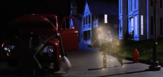
*didn’t he crash a little red car in the model at one point?… I just watched this movie again like last month and I forget already. That car in the photo, he crashed it into a fire hydrant earlier in the movie, didn’t he? Idk maybe not
*his tombstone has his name written on it in red
*toonjuice always has red nail polish 🤷♀️
*idk if this counts for anything but the nightclub Juno created to lure him away from the Maitlands was entirely red idk
*and the star Betelgeuse is a red supergiant, so yeah
Bonus entry is this guy a reference to Viy or am I overthinking it???
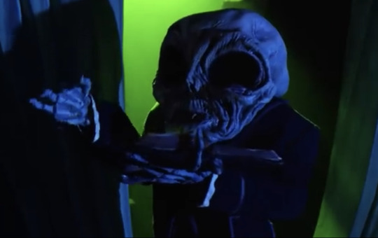
Yeah ok I’m def overthinking it. 🤦♀️
That’s all i have to say. All that crap above. Bye.
#long post#like rly long#I think tumblr auto (read more) these days but if not#plz tell me how to do that!!!#sorry#beetlejuice#betelgeuse#beetlejuice musical#toonjuice#bettyjuice
29 notes
·
View notes
Text
Death by a Thousand... Stars?
I've been going through my notes on Siege and Storm, and one particular detail stood out. It's an excerpt from the prologue:
[...] they stood together on deck, picking out constellations from the vast spill of stars: the Hunter, the Scholar, the Three Foolish Sons, the bright spokes of the Spinning Wheel, the Southern Palace with its six crooked spires.
The note says: Double-check the constellations! Alina's bedchamber has a star-speckled dressing screen! The Darkling's bedchamber has constellations on the ceiling!
And then I remembered my notes on Ruin and Rising. And guess what? The monastery of Sankt Demyan, otherwise known as the Spinning Wheel, was turned into an observatory 'a few hundred years ago'. Double-check the constellations!
[...] the bronze columns were constellations—the Hunter with his drawn bow, the Scholar bent in study, the Three Foolish Sons, huddled together, trying to share a single coat. The Bursar, the Bear, the Beggar. The Shorn Maiden wielding her bone needle. Twelve in all: the spokes of the Spinning Wheel.
It's been abandoned 'for over a century'. This version of the Darkling is approximately 120 years old. Coincidence? I think not. Sugar had been rationed in Ravka for the last hundred years, which can only mean that the current war had started around the same time he'd made himself known again.
But what about the monastery? I think that the Darkling was the one who'd turned it into an observatory. My only proof is a tale found in The Language of Thorns. It's a story about his half-sister Ulla, titled When Water Sang Fire. Our Youngling was the seer's apprentice in the lost city of Söndermane, a scholar cloistered in the Prophetic’s Tower. A stargazer!
At each level the apprentice named another subject: history, augury, geography, mathematics, alchemy. Ulla hoped they’d wind all the way to the top of the tower, where she knew they’d find the famous observatory.
However, stargazing wasn't his only preoccupation there. But we'll come back to that later. Double-check the constellations! Let's get back to the twelve spokes of the Spinning Wheel.
The Hunter with his drawn bow? That's Sankt Petyr, with his still-burning arrows. The Scholar bent in study must be Sankt Dimitri. The Bear is obviously Sankt Grigori. The Shorn Maiden wielding her bone needle is probably Sankta Vasilka, the first firebird.
What about the others? Thirteen Saints were shown on the massive triptych behind the altar in the original Lantsov chapel, where the first Ravkan kings were crowned. Thirteen Saints were featured in the original version of the Istorii Sankt’ya. But there are only twelve spokes, twelve constellations. Who's the odd one out?
Sankt Demyan is most certainly not, and here's why.
According to The Lives of Saints, the site of Sankt Demyan's death is the tallest mountain in the Elbjen. He was the nobleman who owned the land upon which a cemetery stood; and when the birches started to obscure the path, he had his servants cut a new one. When the rains came to disturb the cemetery, Demyan designed the aqueduct around the graveyard, diverting the water to irrigate the fields. But the people still complained.
He was desperate to please them. He asked the Saints to raise the cemetery up to the sun itself, so it would no longer be obscured by the shade of his previous creations.
He laid his hands upon the soil, and the earth began to shake. The ground rose higher and higher, until the highest mountain was made. The cemetery was intact, but his own family crypt was broken. The people accused Demyan of disrespecting his family name by using dark magic, and the angry mob stoned him to death. He became known as the patron saint of the newly dead.
Sankt Demyan's miracle was the creation of the highest mountain in the northern Sikurzoi.
But why is this important? Because the Sikurzoi mountains cover most of Ravka's eastern and southern border with Shu Han. And the Spinning Wheel is located in the Elbjen, which is the Fjerdan name for the northern range of Sikurzoi. More so, it's the place the first firebird came from. And that firebird is Ravka.
But what if I tell you that the first Taban queens also come from the highest mountains of the Sikurzoi range? The palace of the Taban dynasty has the Court of the Golden Wing. You know who else has golden wings? Sankta Vasilka, the first firebird.
It's said that the borders of Ravka were sketched by the firebird's flight. Its rivers run with the firebird's tears. And when one of her feathers fell to earth, the young warrior picked it up and carried it into battle. No one could defeat him, and so he became the first king of Ravka.
But where are the stars? The old Taban queen resides in the place called the Palace of Thousand Stars. Even before the first Taban queens have come to their rule, Sankta Neyar was already one of the Six Soldiers, the sacred protectors of the Shu Han.
Remember the constellations? The Southern Palace and its six crooked spires? The Spinning Wheel? It's all there, written in the stars.
And the Starless Saint knows that.
His bedchamber is built on a hexagonal plan, like the temples of Ahmrat Jen. His dark wood walls are carved into the illusion of a forest crowded with slender trees. The birch trees, like the ones growing around the cemetery. He almost died there, once.
Demon in the wood. Demyan in the wood.
The domed ceiling above his bed is spangled with chips of mother-of-pearl laid in constellations, to create the illusion of the Spinning Wheel. The ebony screen in Alina's bedchamber is speckled with mother-of-pearl stars, too. It was probably brought from his rooms, as only his chambers are furnished in ebony.
It's death by a thousand stars...
#shadow and bone#shadow and bone meta#grishaverse meta#shadow and bone worldbuilding#sankt demyan#sankt demyan of the rime#aleksander morozova#the darkling#the starless saint#grishaverse#the grisha trilogy#the lives of saints#leigh bardugo#parallels and references#a searing burst of thought
45 notes
·
View notes
Text
nearly all of the character designs from 'UNITRES Dreams'
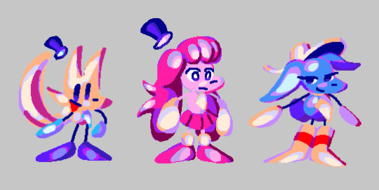
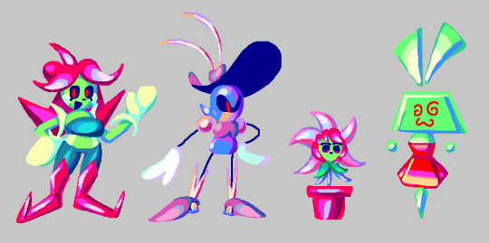
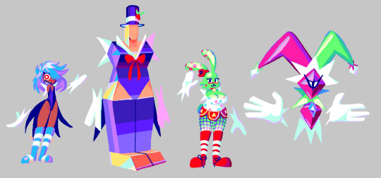

(once again, this post didnt have a “read more” part in da original cohost post, so im putting it here... click more if U Dare !!)
so, trying to get back into making art again, i decided to draw brand new references of all the character designs from my game, UNITRES Dreams. cus why not. anyways these references arent Perfect.. some of em ive made better reference sheets before (while for this i just wanted to draw em all together with a sort of consistent color style and their current, up-to-date designs) and also i didnt get to draw Every character as it is Too Much and i am Too Lazy to draw all of the enemies and boss designs ... so ive just included the enemy and boss sprites for now.. but ill probably draw new art for them sometime.
Anyways. let me tell ya a bit about making Character Designs for this game. as ive talked a bit about in my post about making Character Sprites , making stuff for the game is hard because i am pretty much the Only person working on the game and i have to split my time working on the sprites between working on Every Other Aspect Of The Game , meaning i dont get to spend as much time making the artwork as detailed and polished as id want to.
and the same thing goes for making the Character Designs. sadly, i didnt get to make as many Actual Characters as i wanted (you can tell which are the Actual Characters as theyre the ones i Actually Redrew Here). when the project started, i only really had the Main Three Playable Characters in mind.. in fact most of the other Actual Characters didnt even Exist until the Very Very End of development.. which is the part im sad about. i just didnt have enough time to think about adding any complex new characters or figure out how i would Make a new character design . Which leads me to the Other Characters... which includes Most (but not All) of the Bosses and Enemies. Their designs are well , Basic . their designs werent really thoughtout ;they were created to serve a single purpose: to be made quickly so that the game could Have enemies and bosses. if i were remaking this game now, id probably remove or even completely Redo a Ton of the enemy designs (except the post-UNITRES Dreams enemies ... im kind of proud of them Lol !!)
thats just how things were. i didnt have enough time to focus on making character designs, so i didnt get to make a Ton of them and i had to make them Fast . in fact, early on in development, i hadnt really had much experience making character designs (as , before UNITRES, i didnt really make too many Original Characters for my games before), so i struggled experimenting and making characters for a lot of its development. And The Designs themselves .. a lot of them (even the ones i like) are pretty simple. Most characters are comprised of simple shapes and details , making them easy to draw and animate. and a lot of the early designs used Very Few Colors , which made drawing them quicker.
Despite All Of This , However, i am actually pretty proud of a lot of the designs ive made for this game (Especially the ones with the fancy new drawings i made here ..). while theyre simple, and while i wish i couldve made More characters with more unique designs , i really like the designs i got to make for this game ,with some of em being my favorite to draw even when im bored .. and i just felt like id talk about em.
And Well , Im Gonna Talk About Em !! click da 'read more' thingy if u want to Read More ..
the Main three characterz
"trees"
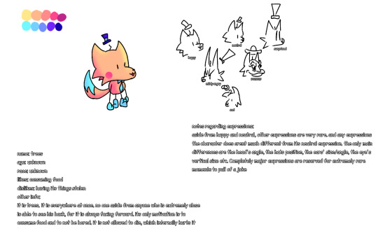
so first off , let me talk about "trees". before i can get into their Actual Design , let me tell u a bit of history so u can understand why theyre designed the way they are.
So . around November 6, 2018 , before UNITRES was really a thing , i designed the very first version of Trees that u can see above. while i didnt know what the game was going to Be , i had a Basic idea of what i wanted the Character to be from the very beginning. you see, Trees (the character) ,while having the same name as me , is Technically Not a self insert , Kind Of . I designed this character near the beginning of when i started entering a Very Low Point mentally in my life (which involves some personal stuff im not going to get into , Aswell as this point happening Around when Among the Others released) and i thought Very Negatively of myself . And So , this character is sort of an exaggerated version of the negative thoughts i had about myself at the time .
the main characteristics of the character was they Did Not Show Their True Emotions , instead bottling up their feelings and showing a very Fake , happy version of themself. theyre also kind of Fucked Up in the head and try to hide it . anyways theres more stuff going on with them that you can probably extract from both the games and the old descriptions in this concept art , but i wanna leave that as a surprise for when i get to make my next game. There Are some outdated things from the descriptions in the concept art , such as an idea where Trees would be Always Facing Forward , hiding away their backside. And Also , you may notice theyre referred to as "it" and "his" in this , which has well. Changed . teehee.
as for The Design Itself , i wasnt really sure what i wanted to go for at first. this character was actually one of the Few first Actual Character Designs i made at that point , so i didnt really have any idea on what to do. One day , i thought up of a Little Bear Looking character , and i tried drawing that character .. only for it to Sort Of look like a little fox-like character. and i imagined this character emoting mainly by very subtle details , such as the Hat and Ears changing shapes based on their emotions ..
Anyways , later that month , i drew the very first sprite of Trees , which ended up being used as the Idle sprite for the UNITRES tech demo. i wont be sharing What that sprite was originally for , as im saving it for Something , but i Will show you Trees' sprite evolution:
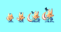
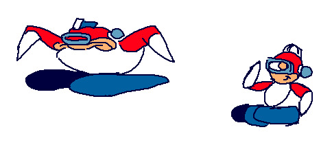
from left-to-right , it starts with the very first Trees sprite. Then there's the first revision, which was done when UNITRES Dreams started development. Then there's the second revision , done for the Newgrounds update in 2021. And finally, there's the TREES' ADVENTURE version, which is the current version of the sprite.
with the first version, the sprite is Pretty Close to the first concept art. However , iremoved the blue part in the tail as i couldnt get it to look good in sprite form (or i just forgot to include it.. idont remember). I also removed some details , such as the little hair and the red blush, as i couldnt really include them on such a small sprite.
Anyways , so how did the design mutate into the current design ? Well , over time , i ended up drawing their ears and tail Longer , and ended up giving them longer and longer limbs (as it was Hard to animate them with the tiny limbs they had). Eventually , it got to the point where i decided to just redo the sprites to make em consistent with how i was drawing them , and thats how i got the second revision.
But Then , i started consuming media Other Than Sonic ! i think the main thing that infected my brain was Spinel from Steven Universe ... while Trees' design Did have a bit of the sort of rubberhose , silly limbs before (along with a Bit of contorting their form , as u can see with the expressions in the original concept) , when i saw the steven universe movie , i saw spinel and was Immediately like " Oh My Goodness Gracious . I Need To Make My Character As Silly As Her". And so , I leaned more into the silly , stretchy limbs . You can see this in the following sprites:
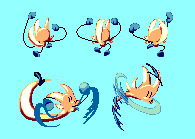
Anyways , as i kept drawing them and consuming more Non Sonic media , i ended up experimenting more with their design and adding some small elements from my inspirations .. one of the other main inspirations was Wander Over Yonder ,where i decided to draw Trees' hat to be more Silly and Big , like Wander's hat. i also ended up perfecting how i drew Trees , giving them more Sharp lines , Bigger and Sillier "hands" and "feet" , making their tail Huge , and just giving them a nice silhouette that i like . By the time of the Newgrounds update , i realized Trees' sprites were kind of Outdated , so i ended up redrawing Most of their sprites , and ended up with the version you can see in the current version of UNITRES Dreams ..
And well , Im Really Really proud of how their designed turned out . I Like to draw them a lot. and i think the way their design evolved has ended up fitting with their Actual Character really well .. the sort of Round , Soft elements such as their Big , Blobby hands/feet and their cute , silly face make them look , on the surface , cute and Silly . But then you have the more Sharp lines and elements , such as with their head and tail which i think makes their character have a bit of depth .. if that makes sense .
Idk . im not good at words or describing things . i just think their design now works really well with what i want to go for . and hey , a lot of my friends have drawn them and have drawn them Really Really Well .. i particularly like how people interpret their design .. with some people leaning into the more Soft , cute elements of their design , while some have drawn them Really Really accurately .. its really cool and im thankful for everyone whos drawn them before ..
Last Thing ill mention about their design (and i guess this goes for Most of the other designs) : Most of the characters in UNITRES aren't really supposed to be any Specific Species . Theyre all just sort of weird , ailen-like characters who do not abide to any sort of rules or reality or whatever. Trees is just Trees ; they're not supposed to be a Fox or any sort of Real animal or species or whatever, and that goes for every other character.
??????
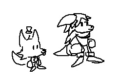
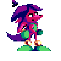
so here's the very first designs of ?????? , who for now ill unofficially refer to as The Pink Character. When i first started development on UNITRES , i Knew i wanted there to be Three main characters: Trees, and two mysterious characters. and when i started work on UNITRES Dreams (back when it was known as UNITRES - BRAND NEW WORLD Edition) , i needed to create designs for them .. However , at this point i was still learning how to Properly Make Character Designs , and so i created the first sketch above ,and then created their first sprites , which . Well. I Ended Up Not Liking Their Design Very Much !
So . The whole point of this character is that they dont really know their own identity , with them not even having a Real Name . Their design was Supposed to be sort of Ambiguous .. However i was Not Sure what to do for their design . i wanted to make it so you couldnt really tell what their gender was (as originally , they were a girl ... but they do not have No Gender anymore) . However , when people first started testing the game , they just . thought they were a guy.
anyways . i just Did Not Like This Design . they didnt really have a Clear Silhouette .. they just didnt look like an appealing or memorable design to me. and i also i didnt like their color palette. So . when the game became UNITRES Dreams , i decided to completely redo their design . And Well ..
This is the first drawing of the new design. At First , i wasnt sure about their design , with things such as them being Pink and Having A Skirt, i was worried about Some People immediately being like "Oh , Theyre A Girl !".. but you know what ? Ive grown Very Very Attached to this design .. i think theyre both Cute and Recognizable , while still fitting the sort of character i was going for . Their sillouette , while not as Recognizable as the other characters , has enough goin on to where i think it is a bit recogniable and easy to read while still giving them a sort of Mystery regarding their identity .. if that makes sense . And their more monochrome palette compared to every other character helps sell that , i think .
i think theres probably some people out there who see this character as a girl , but i think theyre a good Non Gender Having character design . just cus theyre pink doesnt mean they gotta have Gender ! anyways , i love them. theyre my silly little strange creature. i hope you love them too .. there is so much i want to explore with this character in a future game .. and i think their new design has really stuck with me.
???
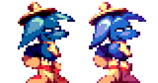
So , ??? , who i will refer to unofficially as The Blue Character, is supposed to Sort Of be the opposite of Trees (the character). they're Very Tired and Chill , not really too crazy or anythin. and i wanted their design to illustrate that, and well , out of every design ive made , theirs was pretty much perfect from the very moment i created them.
I dont know if i have any old concept of them on hand, but i Do have both the original sprites ,aswell as the newer ones which are pretty much the same as the old sprites , but more polished and with redone colors..
And, well. Yea . they didnt really change much ! The only aspects that changed was that i removed like , Two details that i felt cluttered up the sprites too much , that being the little Tired Eyebag/ whatever its called line beneath their eyes, along with the little Red Dot that was on their boots. Other than that , their design was pretty much Perfect. they were also pretty easy to make , as , with them being a sort of Opposite version of Trees , theyre pretty much based off Trees' design , except with a bunch of differences to make them feel like their own character (such as different body/head shape , a big silly hat , and Actual Boots).
there's nothing much for me to say about them. they're perfect.
the really gay ones
suzy, wavey, and their little Shine Catcher
Alright . so before i can explain These characters , u need a little bit of History .
So. when UNITRES - BRAND NEW WORLD Edition was "finished" , i went on to help with RRThiel and his game, MEGA MAN PERFECT BLUE. as you can see here, i worked on various backgrounds and tilesets for the game. Anyways , at one point , ithought itd be cool to remake the Intro Stage in UNITRES , as a sort of tribute to the game and also as a little extra thing for the new update i was planning on making (which ended up becoming UNITRES Dreams).
at first, this was Just going to be two levels based off the Intro Stage from Perfect Blue , However , later in MMPB's development , one of the backgrounds I did for one of the levels ended up being Completely Redone by other people on the team ,as my background didnt really fit the game's style .. However , i still really liked this background .. so I decided to reuse it for a new level in UNITRES , with it also being a tribute to the level in MMPB (though its a lot more loose compared to the Intro Stage level , Lol).
This level ended up becoming Greenhouse Frenzy in UNITRES , and i ended up turning what once was just going to be a two level bonus into an entirely new campaign with its own story in UNITRES Dreams. and with it being a whole new campaign , i wanted there to be New Bosses and New Enemies ..
So , for Greenhouse Frenzy - Section 1 , I was planning on a new boss ... and this boss was going to be ... Mr. Sauceman !
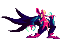
You See , for UNITRES Dreams i wanted to go Hard with including all sorts of little tributes to my friends and the people who helped with the game . Mr. Sauceman , being one of the composers of the game , let me use his character from the game hes working on as a boss in the game , and i thought itd be nice to have him be in Greenhouse Frenzy ,since that level is pretty much a big tribute anywayz.
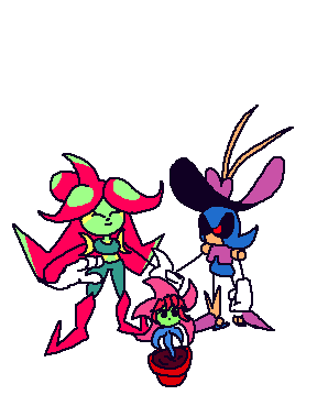
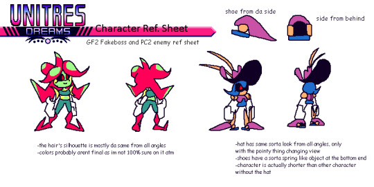
So , Originally , i wanted the Sauceman boss to start out with a little Fake Out . You See, the MMPB level that Greenhouse Frenzy is based off has a robot master that i asked RRThiel if i could use for the level , but he said no. So , I decided for this boss that i would create a silly character Inspired by the robot master from the MMPB as a silly little joke , but then Mr. Sauceman shows up and that character explodes . And So , I Designed Suzy , a character who , while inspired a bit by the character MMPB , was made to be a bit different and also to be used for a silly little fake-out intro and to die in 5 seconds . You can see this on the reference sheet , where she didnt even have a name and is just referred to as "GF2 Fakeboss".
However . Two Things Happened : 1) I Grew Kind Of Attached To This Little character I Designed , And 2) I Ran Out Of Time. i couldnt implement the fakeout that i had planned ... and i didnt have a boss fight for Greenhouse Frenzy - Section 1.... So. I decided to just. Make her the boss fight of GF1. it just made sense ! i Originally had planned a boss fight based on the Magik Master boss from Chaotic Carnival , but reusing the character design for the silly fakeout ended up being quicker , and so she ended up being an Actual Character in the game.
And Then There's Wavey . she is a robot. i originally designed her as an enemy for the Intro Stage tribute level (a.k.a , Perfect City) , as i wanted it to have its own enemy. Her design is also Some What inspired by one of the robot masters from MMPB , though not as much as Suzy's is.
Anyways , despite Suzy and Wavey being inspired by characters from MMPB , i wanted them to be different and have their own sort of Character . And well .. their actual Personalities are different to the ones from MMPB , at least . In UNITRES Dreams , there is a hidden "Storybook" mode , which contains various stories which add a bit of Worldbuilding into the game .. and one of the stories details Suzy and Wavey . Basically , Suzy is a lonely gardener , who lives alone on her own strange little planet , who then travels across the galaxy to the Perfect City , where she ends up meeting Wavey , a military robot who Suzy becomes fascinated with ..
Anyways . my writing aint exactly the best , and i Refuse to go and reread the stuff i wrote for the storybook mode in unitres . but i tried my best to make suzy and wavey their Own sort of characters , having their own identity compared to the characters theyre based on. Oh , and by the way , suzy and wavey are gay LOL !! and they have a little baby plant that they raise . this is also told in the storybook but i unfortuately didnt get to explore this Much outside of that in the game... though there Is a secret you can find in one of the levels.
So. what do i think of these characters and their designs ? Well. Honestly. Im Not Sure . when i designed them both , i still wasnt Totally comfortable with character designs as i am now , and honestly . theyre not my Favorite designs . Wavey in particular is just . Well . Shes Just Metal Sonic in A Hat . she has her own little differences , but i cant lie . i probably coulda done better with her design . and suzy i think hasnt aged as well either . Idk. Also. In Case You Cant Tell , I am BAD with coming up with names . I Genuinely cant do it. i came up with both of their names on a Whim . i justdidnt know what to call them and i was running out of time LOL !!
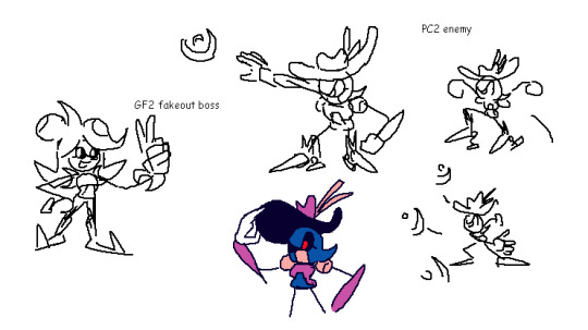
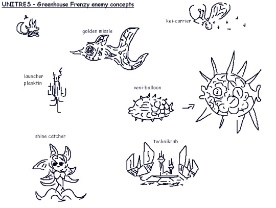
anyways. last things ill mention are : the plant is a species known as Shine Catchers, which appear as enemies in Greenhouse Frenzy. Oh , and also , here's some concept art of them Lol !!
(oh , and i also forgot to mention: originally , suzy had green dots on her "hair", but i didnt know how to properly draw them on the sprites , so i left it out)
the Silly ones (a.k.a my favorite ones)
Millie
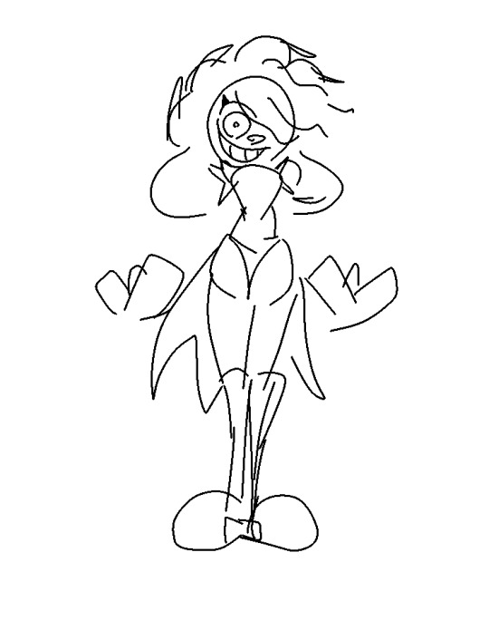
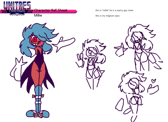
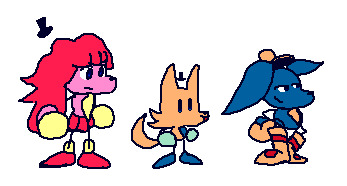
So . Millie is the most self-indulgent design Ive created .
Here's how it went: one December day in 2020 , I was sitting around bored as hell , when all of a sudden , the Silly Brained part of me Saw an idea pop up: A Tall , Hot , Cute Clown Man . And Instantly , I KNEW I had to draw him . But I Was in the middle of a Zoom call ... So . I opened up IbisPaint on my old Android phone , and drew the First sketch with my fingers that you can see above . And Instantly I Knew : I Had Done It . I Made Perfection .
More ideas grew , and i realized : I Could Do Something With This ! So , later , I came up with a whole reference sheet for him , and started planning on something: I was going to make More characters for UNITRES Dreams . You see , at the time , I was working on the v3.0.0 update for the game. This was Very Very late in development , before i even Planned there being a Newgrounds version (and before ninjamuffin convinced me to Make the newgrounds version LOL !!). Anyways. for so long , iwas disappointed that i didnt get to make a whole lot of original characters for the game .Most of the characters were either Enemies or Bosses. there was Barely any NPCs (aside from the guest character apperances).
i Also Realized: Chaotic Carnival , one of the most Important levels in the game , needed More love . So. I decided i was going to make new NPCs just for it , so that the level could feel even More alive and lived in. And that's when i created the Silly Trio , which started with Millie.
As for Millie's design , there isn't much for me to say. he is perfect. i love him and he is one of my favorite things ive designed. Yes , it Is self indulgent . Yes , i Do Want Him Carnally . teehee. Anyways , after designing Millie , i knew i had to design more characters .. which leads me to..
Goldian and Ellie
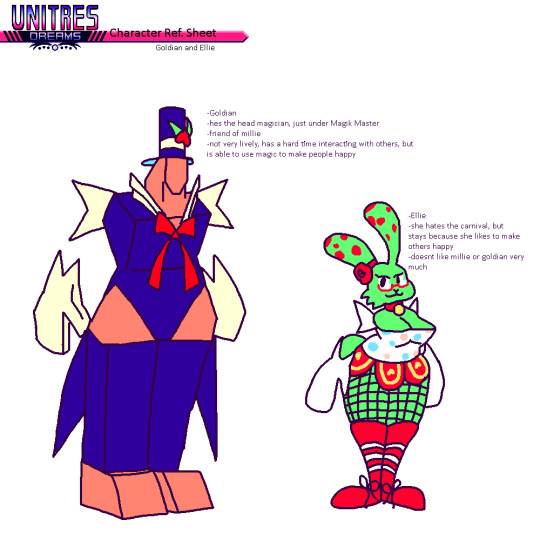
Goldian is a tall , polygonal magician man. He is in love with Millie. They are canonically dating.
Ellie is a bunny-like clown girl. She likes to entertain people with magic. I think she might be asexual , but i wasnt very sure when i created her.
Anyways. there isnt much for me to say. i Could get into some of the Character Lore perhaps . Millie , Goldian , and Ellie are all characters with troubled pasts.. they all had to run away from their homes due to circumstances , and they managed to find the mythical Chaotic Carnival, where they all met and decided to become entertainers. It gives them purpose , to see people happy. And they work under the Magik Master , a strange magician who has the ability to bend reality at will. They're all like a sort of Found Family .
that's all ill say about them. theres so much more i want to do with them in the future... i love these characters so much. theyre my favorite designs ever.
Oh ! Iforgot to mention . these characters (including millie) names also suck LOL ! Im not good with coming up with names !! all their names i came up with at the last minute
All The Other Characters I Forgot To Mention
the magik master
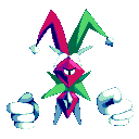
nothing much to say about them. theyre one of the first bosses i created, and i Kind Of like their design still , though i might consider redoing it so it fits with the rest of The Silly Ones ..
vie
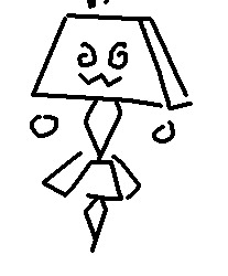

nothing much to say about Vie . she's a flower girl, who spreads flowers to every level in the game. she got the flowers from the Suzy's Greenhouse ..
Misc. Concept Art
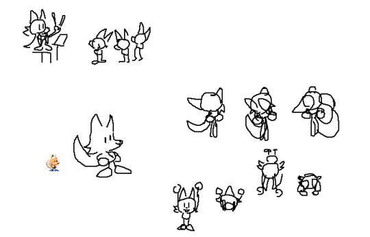
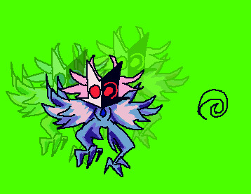
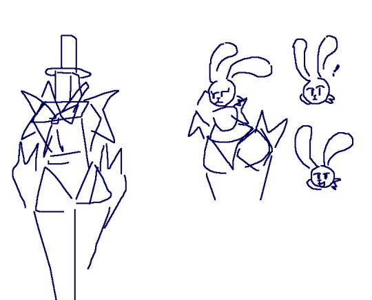
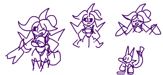
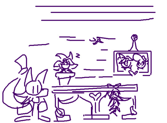
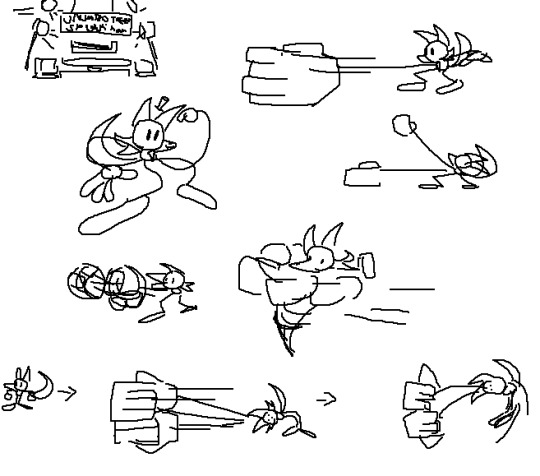
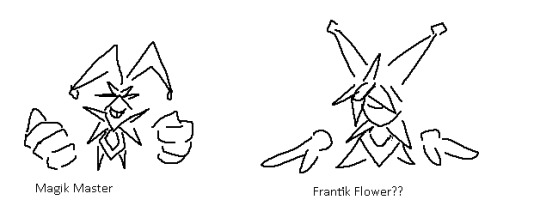
#TreesThinks#UNITRES#UNITRES Dreams#art#artists on tumblr#character design#characterdesign#gamedev#game dev#game development#indiegame#indie game#indie dev#indiedev#indie development
30 notes
·
View notes
Text
i made a poll about whether people think chuuya is the original or the clone, and @rennbo asked me to elaborate on why i support the chuuya as a clone theory, which was much appreciated, so i put together some of my thoughts.
(please be warned, this was written on my phone in my notes app, and i don't currently have access to my copy of stormbringer. i'll go back in and edit it when i can!)
so first i’m going to look at stormbringer itself, wherein we’re told that chuuya is a clone (and we briefly see the other chuuya, who is supposedly the original). from what I can remember, and please bear in mind I don’t actually have my copy of stormbringer with me so there might be something else, the main evidence that implies chuuya is the original is the scar on his wrist, which the other one doesn’t have? i’m willing to dismiss this for a theory i like. in terms of given evidence, i think there’s much more that he is the clone, not only because that is explicitly what we’re told, but also because the only other character who actually contains a singularity is verlaine, who was artificially constructed. both guivre and arahabaki exist as ultrapowerful, interdimensional, and almost certainly sentient beings, contained within a vessel: if one vessel was artificially constructed then i think the very fact that there is any evidence for chuuya to be also artificially constructed means that he was.
but honestly, the main reason I think that chuuya is the clone is less due to evidence and more due to symbolism, and how chuuya’s character works alongside two others: namely, paul verlaine and dazai osamu. chuuya works as a foil for both of them, and i genuinely think that him being a clone not only adds to that, but adds to it significantly.
verlaine is himself an artificial creation, and he is constantly fighting himself over whether he’s human or not. his only friend was rimbaud, and he owed (or at least saw himself as owing) everything he was to him. his loyalty was never to the french government, but rather solely rimbaud. however, and again be aware this is my interpretation of it; because he gained everything from rimbaud, even his name, arthur became almost another creator for him. that loyalty was not unconditional, especially after verlaine’s history, and it faltered when verlaine found “another version of himself” in chuuya and had to decide if “he” would once again choose his creator or freedom. he sees chuuya as the only other being in the world who can relate to him, and he’s willing to do anything to have that, because he cannot see himself as possibly having a family any other way.
(side note because it isn’t really in my main idea but I also think adam adds an interesting counterpart to this dynamic, in that he isn’t human and has no interest in being one, however much he likes them.)
dazai is human, but everything about his characterisation is designed otherwise (i’m talking pm!dazai here, though of course ada!dazai has his own displays of this). his nickname is about him being a demon rather than human. his attitude is cold and detached from everything and often seen as inhuman by other characters. his very ability is called ‘no longer human’. chuuya is very clearly his counterpart, which is both why they fought so much and why they worked so well together. where one is brash, one is calm. one is strength, one is smarts. one is driven by emotion, one is near emotionless. i can’t properly think of how to say this, but it seems only right that one of them should be human but still seen as a created experiment, and one should be artificially created but all too human despite that. this is especially notable when you consider that there is a certain line to be drawn between professor n literally creating chuuya and mori creating what dazai was.
and ultimately, chuuya is neither of them, and so in this can act as a foil to both. despite coming from a similar background to verlaine, he is able to let go of what has happened and form his relationships based on friendship. he sees the good in people, rather than distrusting them based on past circumstances. and he’s not like dazai, who is calculating and able to separate himself from whatever plans he is making and their results, because chuuya is driven by emotion and forms bonds as easily as breathing. if chuuya is a clone then the choices he makes and how it counters and contrasts verlaine and dazai works, in my opinion, far more compellingly than if he was the original human. it adds a lot more to his character and his relationships, knowing that what he has is more important than what he is. He is human, clone or not, and the fact that this is what he chooses is just another way he adds into the story.
also if chuuya isn’t a clone then the whole of stormbringer is based on a misunderstanding, and i love that book too much to let that be the case.
#nakahara chuuya#bsd#i just have a lot of thoughts about chuuya and humanity#anyway hope this makes sense lmao it is very late#bungou stray dogs#dazai osamu#paul verlaine#bsd stormbringer#bsd stormbringer spoilers#bungō stray dogs#as i say. i’ll edit it later#long post
32 notes
·
View notes
Text
Design Notes: The Original Ten Peggle Masters
If you follow my main, you might know that Peggle Dual Shot for the DS has a mechanic known as the Bonus Underground. Each playable Master that made it in (Marina got axed, presumably due to hardware limitations) has a unique background and layout, and most notably for this project, different colored Gems to collect.
Why is this notable? Because I made sure that all ten of them got that color somewhere on their design for OoD. If playing Magic Pengel has taught me anything, it's that colors bring meaning to life, and also that I'm drawn to bright things like a toddler.
And I figured that while I'm explaining that, I might as well explain the rest of the choices I made. Note that I'll be using avatars from Recolor as "concept art", so some details may be off.
This'll be a long post, so bear with me here.
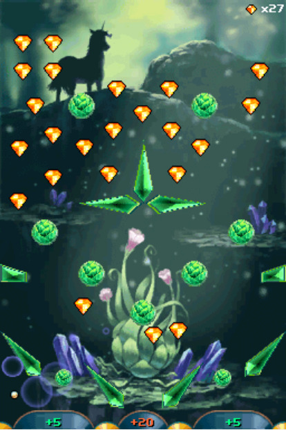
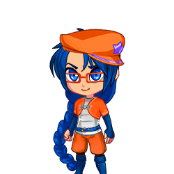
Bjorn's Gems are Orange, as reflected in his hat, jacket, and shorts. His glasses being orange are a complete coincidence, though; that element was actually taken from his appearance in Blast!
(Funnily enough, earlier drafts from before Blast's release had Bjorn getting his eyesight damaged in a fight with Fnord; in the current lore, he's always had nearsightedness that he actively hid with his magic for...Fnord's-eyepatch-related reasons)
His outfit is a little out-there, but it's definitely grown on me. I wanted to go for more RPG Hero than Superhero, specifically an agile spear-wielder. Horses are pretty fragile animals, and a having a jabbing weapon rather than a traditional heroic sword serves as a nod to his horn.
The biggest change I made from the concept when drawing is probably his hat, which loses its brim and gets a horseshoe instead of a star. My goal with all the Institute Masters is to hide a horseshoe somewhere in their design to tie them all together; it's gonna be harder for some Masters than for others.
(The Academy has its own insignia: a flipped horseshoe resembling an omega, as seen on Fnord's eyepatch in canon.)
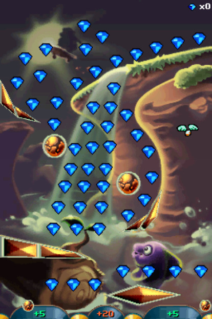
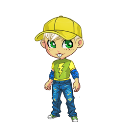
Jimmy's Gems are Blue, as seen on his jeans and elbow pads. Not many places I can hide a theme color on an already-clothed Master, but thankfully our favorite gopher (who I thought was a guinea pig for years cause science) is consistently pantsless.
While there was no getting rid of his iconic hat, I did give him some protection from impacts in his elbow pads. I gave him jeans to look more like a Rad Cool Kid(tm), but apparently it's recommended skaters wear them due to being wear-and-tear resistant.
While I'm pretty sure it's just weird artifacting from cranking up the saturation slider in Recolor, it kind of looks like he's got green patches or leggings, the latter of which I would definitely wear if I was forced to wear jeans for whatever reason.
If I had to add a horseshoe, it'd probably be some kind of charm on his hat.
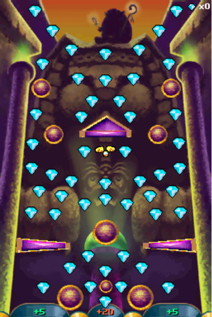
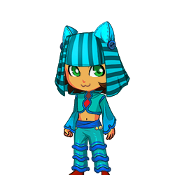
Kat Tut's Gems are Cyan, which can be seen, uh...everywhere.
I'm not gonna lie I had ZERO ideas on what to do for KT. I knew Recolor had an "Egyptian Headdress" item (which I'm not sure were actually a thing in Ancient Egypt) and went from there. I do like the silhouette of the headpiece, though.
I wanted something light and show-offy, since Kat Tut is an acrobat and a performer, and well...something definitely happened.
This is probably the most likely to be subject to change, even if I do like the flowy shapes.
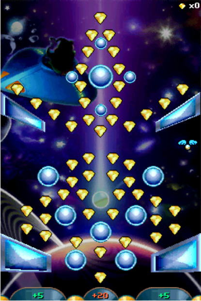
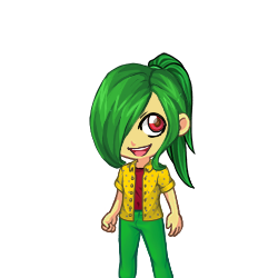
Splork's Gems are Yellow, as seen in his overshirt and shoes.
I originally wasn't the biggest fan of Splork, but I think designing this look made me warm up to him a little. It's fairly basic by gijinka standards, just with an added bowling shirt and shoes in his theme color.
Splork only has one eye, so I deliberately gave him the Other Eye Syndrome bangs as a nod. The particular hair part I use for said bangs have an annoying layering shortcut that puts a pile of disembodied hair at your avatars' feet, so I have to make a bald version of every Splork I make and photoshop the two together.
If I ever draw him, I very much intend to give this guy his bulk back. We have enough twinks in this project already.
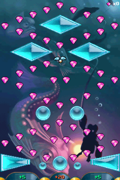
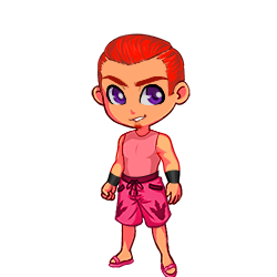
Claude's Gems are Magenta, which I misremembered as a more coral-y shade of pink. At least it stands out more from Warren's purple?
My main inspiration for Claude was essentially just "guy who tries to pick up chicks at the beach". Unfortunately, in my folly it completely slipped my mind that the guy who gives you Flippers might have a reason to be wearing, well...flippers.
At least I gave him some Big Meaty Claws.
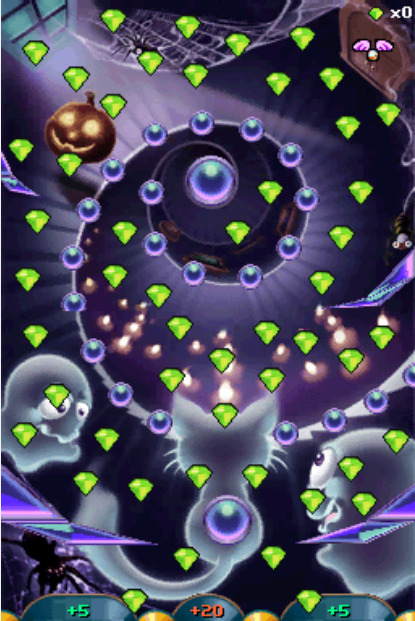
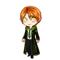
Renfield's Gems are an eerie Lime Green.
My idea for Renfield was to somehow combine a suit with a wizard's robe, and I think the execution went REALLY well.
The suit portion was actually lifted from Eyegor; while it hasn't been stated, Renfield is available as a hat/head item for Xbox Live Avatars if you own Peggle, heavily implying Eyegor is a headless body that Renfield normally perches upon.
Despite having left the Institute prior to the New Frontier's formation, Renfield is one of the few characters that actually DOES have a confirmed horseshoe placement: a subtle shape made with the detailing on the back of his jacket.
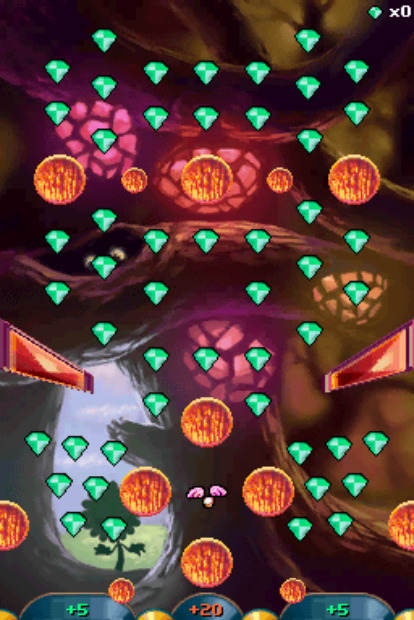
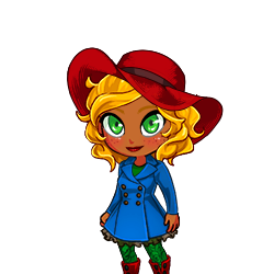
Tula's Gems are more of a minty Green, which I misremembered as being more vibrant like her stem.
Tula's design was...supposed to be derived from her Blast Design, but when I went back to look it turned out it was COMPLETELY different.
For starters, her hat. I initially gave her a sunhat, but I recently started wondering if it was actually meant to be a bucket hat. Looking at the art, I legitimately cannot tell what kind of hat that is supposed to be. And apparently it's supposed to have a gaudy fake flower charm on it??? Not only that, but it completely clashes with her color scheme??? That is NOT the same yellow as her petals, and that orange is nowhere else in her outfit!!!
Also, her raincoat??? Apparently it's not actually cerulean, but a bright aqua that makes the green of her stem look muddy and the rest of her design look plastic and fake, which is especially egregious since she's an environmentalist!!!
And good GOD, I think Blast!Tula's face is somehow giving me DOUBLE Uncanny Valley vibes. Like, Classic Tula and her flower friends are kinda disturbing since they have detailed human faces on flower bodies, but Blast Tula STILL looks disturbing because of how Not-Tula she looks.
...Anyways, this is "Design Notes", not "Getting Really Mad At Fashion". Let's move on.
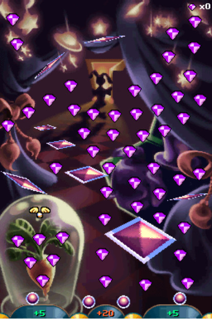
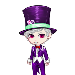
Warren's Gems are Purple, which is convenient since his regular outfit is already almost completely purple.
In this concept, I made his suit fit better since he's larger than he is in-game as a humanoid, but I think I wanna walk that back. He's a gambling addict on a teacher's salary, this man CANNOT afford a tailored suit. If the art department had ever seen a rabbit before in their lives then he would've already been peak design.
Also, just for fun, Warren's form is short as hell. Possibly the shortest New Frontier member besides Gnorman and Luna. I'm thinking 5'1" (~155cm), possibly even shorter.
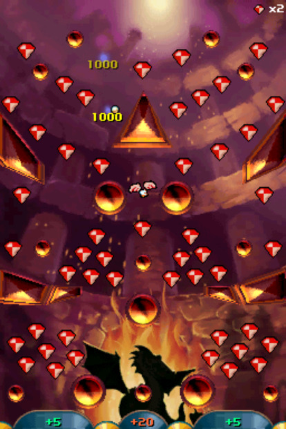
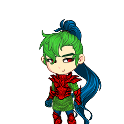
Cinderbottom's Gems are Red.
Not gonna lie, I think I might be less happy with Cindy's concept than Kat Tut's solely because of how I put in the red. I REALLY should've gone for something less bright. Probably need to do something about that hair, too; maybe some kind of gradient.
Among the Institute, Cinderbottom is the most at-odds with Bjorn, even (not-so) accidentally making him violently ill with his smoke in one of the old Blog posts -- now what was that about 'flames only serving the virtuous'?
Anyways, my point is that Cindy is also based on an RPG hero, this time an armor-clad knight with a sword, befitting his noble stature. (I also thought it'd be a neat reversal if The Hero had a lance while The Lancer had a sword.) His green mail is derived from his green scales.
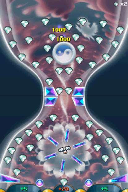
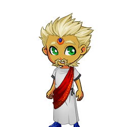
Master Hu's Gems are White.
This one was pretty much as simple as just giving him a white robe. Recolor didn't have any good turbans, so I left it off.
#peggle#bjorn unicorn#jimmy lightning#kat tut#splork splorkan#claude lobster#renfield pumpkin#tula sunflower#warren rabbit#lord cinderbottom#master hu#design concept
3 notes
·
View notes
Note
Since myrvin is back, whats new for him? I really love his character.
I feel like everytime I comeback to drawing Myrvin from a break I develop and finalize his story more-
First the design! Pretty similar as to when I drew him last the changes I did make is: instead of a Galaxy on the inside of his cloak it’s just the draco constellation so the idea is that he can spread his cloak out like a vampire and a giant magic star dragon forms around him he can control. This is his most powerful spell that he must be careful with
His mask changed as well! I change the mask because the shape felt weird to me and didn’t really flowed when I drew him with it. So I did some research and currently going for a more masquerade mask this allows that space between his nose and mouth that can make it easier to have him emote! It also feels fitting for Myrvins aesthetic.
Still keeping his half blind eye, along with his scars as well. I added in a tuff of hair below his left ear based on how my hair works as well! Myrvins hairstyle is based on a pixie cut similar to my own hairstyle and when the sides get long they curl upwards! Which is what that tuff of hair is for Myrvin just a little growing tuff of hair from not cutting it short again in weeks plus it makes him look more fluffy
And his magic as well! Originally I had it so he draws the constellations in the air. The fact that I didn’t really drew this out much shoes that I wasn’t too invested in the idea. So cards were brought back! They’re a customized deck of cards Myrvin made himself that shows the star constellation, 2 small stars in opposite corners and a larger star that sits behind the constellation. Myrvin uses these cards to summon those constellations. I added in back the cards because it’s another element from the OG Marvin that made him fun to draw
And now onto the story! In the last version I had Myrvin as an established successful magician where he gets tangled up into dark magic nonsense. I felt like this took away Myrvin as the main character and it was hard for me to figure out story beats that made sense. So I scraped this to now Myrvin being a college sophomore where he meets Jackie in a math class they both have to take! This story focuses on a meet cute between Jackie and Myrvin, college classes shenanigans, Myrvin learning to let others in and be more him instead of this sarcastic sona he built up to protect himself.
Jackie is an engineer student and Myrvin is a theater student with a minor in mythology. They end up studying together to Jackie helping Myrvin with math homework that leads to friendships and eventually getting tangled up with dark forces (the death omens) to crutches and dating
I also have this scene in my head where they’re at a cafes coffee station and Jackie sees Myrvin with a cup thinking it’s coffee and asks Myrvin about it because he was told Myrvin doesn’t drink coffee. Until Myrvin tells him it’s hot chocolate and Jackie immediately throws his coffee away and goes back to the station to get hot chocolate because how on earth did he not know they had hot chocolate here
I know in previous versions for Jackie he was more of a himbo character but I really like the idea that because of his buff build from being a hero that people don’t tend to see him as a smart boy that lead to Jackie being a little more quiet and socially awkward.
So basically now the dynamic is sassy x awkward or >:D x :3
And the death omens are more back! With them getting corrupted!!!!!!!!! But this time it’s by a solar eclipse death omen. More specifically what Myrvin starts calling the void eclipse. When the void eclipse happens those with a connection to star magic starts getting targeted by death omens. I essentially want Myrvin and Jackie have to fight the moon that sounds so cool and funny to me
7 notes
·
View notes
Note
Fic authors self rec! When you get this, reply with your favorite five fics that you've written, then pass on to at least five other writers. Let’s spread the self-love❤
Ooo, thank you for the ask! But how will I choose?? I definitely have a recency bias with my writing, partly because I know that I've gotten better over time so some of my older fics aren't really up to my current standard in terms of things like pacing, especially. But setting that aside, there are still some of my early fics that hold a special place in my heart, so I'll try to pick from across the board. 1. Starting with an old fic, actually, The Measure of a Man (Octopath Traveler, Rated E) is still a favorite of mine, even after 3 years. I just really enjoyed the deep dive into Olberic's sense of self and exploring how, after getting married and starting a family, he would still have some struggles in terms of his purpose and his worth. It was kind of like taking his canon story and bringing it full circle (by the gods I love that man!) 2. Next, Sins of the Father (Skyrim, Rated M), my first novel-length longfic! I put a lot of work into this one, and it was the first time that I managed to successfully develop a plot with, like, a story arc and whatnot. Still very proud of how this one turned out, since it required a lot of playing with lore and developing the backstory of characters who didn't get much of one in the game (including my first fully fleshed out original character who really stole my heart) 3. Another favorite is Fashion Party Confidential (Drawtectives, Rated T) I had so much fun putting together what is essentially meant to serve as a bonus episode after season 2. I structured it similarly to a real episode, complete with drawings made by each of the characters and an original NPC for them to harass help. I re-watched the series before I started writing and felt like I had a really good grasp of the character voices, and I'm very happy with the dialogue and how in-character it feels. And I had fun with the fashion theme of the story, given my background in fashion design and the fact that it fits in canonically with York's story, as well as the opportunity to reflect the players' fashion knowledge - or lack thereof - in the drawings (sorry, Nathan)
4. Next is Would She Love Me If She Knew? (Octopath Traveler, Rated M) I debated including this one on its own or combining it with the sequel (which, spoilers, is also on this list), but I feel like they are different enough thematically that I can talk about them separately. This fic was me diving headfirst into the royal/guard trope and essentially writing an entire romance novel, lol! It took me 9 months to write and was (at the time) the longest thing I had written. By this point I was starting to get the hang of pacing things properly without rushing them, letting the story breathe and take its time getting where it wanted to go. And I have to admit that this is my favorite version of H'aanit and Olberic that I've written so far - I absolutely loved making them face adversity before they could get together, putting obstacles in their way so that they would pine and despair about ever being able to have a relationship. Oh, that delicious angst! This fic set a new bar for me, and I've become a better writer because of it. 5. And of course, the as yet unfinished (but so close!) The Head That Wears the Crown (Octopath Traveler, Rated T). More than two years in the making, and I'm still stuck on the climax of the story, argh!!! Nevertheless, crafting this one has been so rewarding, given that it ties into WSLMISK but uncovers all of the sinister hints that I left in that story of a bigger issue to come. There's a mystery to solve, a conspiracy to uncover, and so much goddamned trauma to deal with! Some of my favorite character development to date is in this story, and I can't wait to (somehow get through this writer's block and) hopefully give this whole thing a satisfying ending. I've learned so much about plot and how to do foreshadowing and developing a complex villain while writing this fic. And as a bit of a bonus... I'll just say that I have a new Octopath Traveler 2 fic that I am *nearly* ready to start posting (just waiting on feedback from my beta, which *should* happen today) that I am currently in love with. Recency bias may play into this, of course, but I can't wait to share it! It's a Castti/Osvald Gothic Romance AU titled Memories Seep From My Veins :)
#fic authors self rec ask#thank you anon!#octopath traveler#elder scrolls skyrim#drawtectives#octopath traveler 2#postal ninja fanfic
5 notes
·
View notes