#warren rabbit
Explore tagged Tumblr posts
Visit Tumblr Blog
Explore Tumblr blogs with no restrictions, modern design and the best experience.
Last Seen Tumblr Blogs


Fun Fact
In 2020, 27% of US Tumblr users had an annual household income of over $100,000.
Text
This probably has a target audience of only like 3 other people, but I’ve been playing Peggle since I was like 4, and I realized recently that ever since, I’ve unconsciously headcanoned all but one of the Peggle masters as not-straight. I wasn’t even aware of it, I never actually thought to myself “that character is gay”, that’s just how they were in my head, and I never had to think it specifically, it was practically subconscious.
Sorry if this doesn’t matter to anyone but I needed to talk about it and my friends don’t know the game and my brother doesn’t care
Anyway here’s what I headcanon each of them as now that I’ve been able to think about it for real. Pt 1:


Bjorn Unicorn: Gay
Jimmy Lightning: AroAce


Kay Tut: Pansexual
Spork Sporkan: I’m not sure but just not straight. (it kind of works cause he’s an alien so maybe his species has different understanding of gender and sexuality)


Claude Lobster: Bisexual
Renfield Pumpkin: Gay/Ace


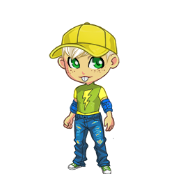
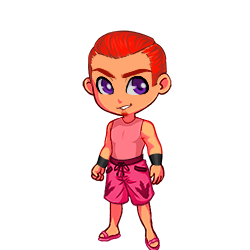
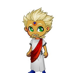
Warren Rabbit: Bisexual
Tula Flower: Bisexual


Lord Cinderbottom: Gay
Master Hu: Asexual
#peggle#lgbtq#gay pride#gay#bisexual#pansexual#asexual#aromantic#aroace#bjorn unicorn#jimmy lightning#Kat tut#splork sporkan#claude lobster#renfield pumpkin#warren rabbit#tula sunflower#lord cinderbottom#master hu
19 notes
·
View notes
Text


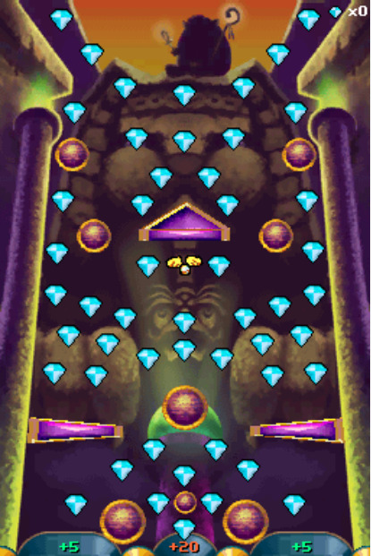

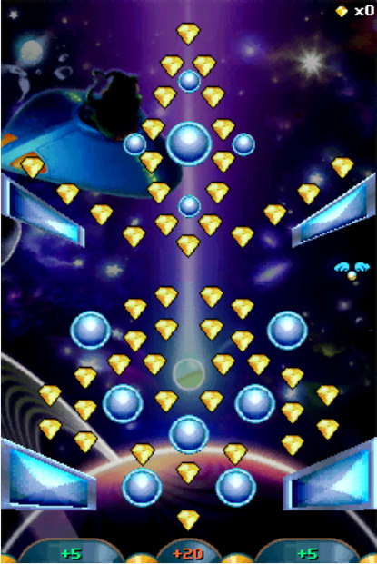
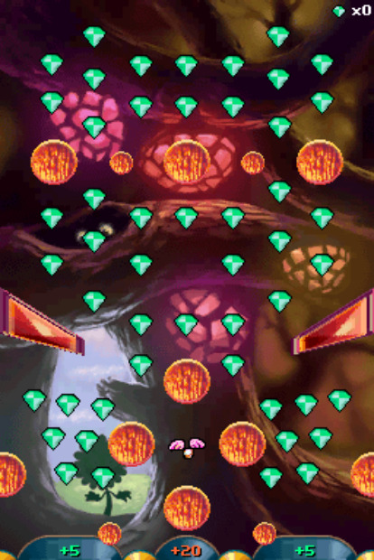

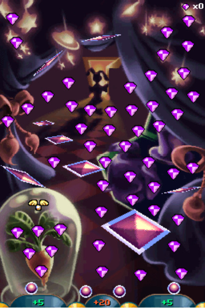
Apparently literally NOBODY on the internet has any kind of documentation on the extra features in Peggle Dual Shot; not even SPRITER'S RESOURCE, of all places!
Therefore, I took it upon myself to download a ROM (it was NOT hard to find) and screengrab all 10 of the Bonus Underground areas.
It's actually pretty interesting how seamless they look on emulator (barring the literal seam in Hu's hourglass); usually DS games put in some kind of invisible gap in two-part images to accommodate the gap between screens in the actual hardware, which looks awkward on an emulator.
#peggle#peggle dual shot#bjorn unicorn#lord cinderbottom#claude lobster#master hu#jimmy lightning#kat tut#renfield pumpkin#splork splorkan#tula sunflower#warren rabbit
10 notes
·
View notes
Text
Design Notes: The Original Ten Peggle Masters
If you follow my main, you might know that Peggle Dual Shot for the DS has a mechanic known as the Bonus Underground. Each playable Master that made it in (Marina got axed, presumably due to hardware limitations) has a unique background and layout, and most notably for this project, different colored Gems to collect.
Why is this notable? Because I made sure that all ten of them got that color somewhere on their design for OoD. If playing Magic Pengel has taught me anything, it's that colors bring meaning to life, and also that I'm drawn to bright things like a toddler.
And I figured that while I'm explaining that, I might as well explain the rest of the choices I made. Note that I'll be using avatars from Recolor as "concept art", so some details may be off.
This'll be a long post, so bear with me here.

Bjorn's Gems are Orange, as reflected in his hat, jacket, and shorts. His glasses being orange are a complete coincidence, though; that element was actually taken from his appearance in Blast!
(Funnily enough, earlier drafts from before Blast's release had Bjorn getting his eyesight damaged in a fight with Fnord; in the current lore, he's always had nearsightedness that he actively hid with his magic for...Fnord's-eyepatch-related reasons)
His outfit is a little out-there, but it's definitely grown on me. I wanted to go for more RPG Hero than Superhero, specifically an agile spear-wielder. Horses are pretty fragile animals, and a having a jabbing weapon rather than a traditional heroic sword serves as a nod to his horn.
The biggest change I made from the concept when drawing is probably his hat, which loses its brim and gets a horseshoe instead of a star. My goal with all the Institute Masters is to hide a horseshoe somewhere in their design to tie them all together; it's gonna be harder for some Masters than for others.
(The Academy has its own insignia: a flipped horseshoe resembling an omega, as seen on Fnord's eyepatch in canon.)

Jimmy's Gems are Blue, as seen on his jeans and elbow pads. Not many places I can hide a theme color on an already-clothed Master, but thankfully our favorite gopher (who I thought was a guinea pig for years cause science) is consistently pantsless.
While there was no getting rid of his iconic hat, I did give him some protection from impacts in his elbow pads. I gave him jeans to look more like a Rad Cool Kid(tm), but apparently it's recommended skaters wear them due to being wear-and-tear resistant.
While I'm pretty sure it's just weird artifacting from cranking up the saturation slider in Recolor, it kind of looks like he's got green patches or leggings, the latter of which I would definitely wear if I was forced to wear jeans for whatever reason.
If I had to add a horseshoe, it'd probably be some kind of charm on his hat.

Kat Tut's Gems are Cyan, which can be seen, uh...everywhere.
I'm not gonna lie I had ZERO ideas on what to do for KT. I knew Recolor had an "Egyptian Headdress" item (which I'm not sure were actually a thing in Ancient Egypt) and went from there. I do like the silhouette of the headpiece, though.
I wanted something light and show-offy, since Kat Tut is an acrobat and a performer, and well...something definitely happened.
This is probably the most likely to be subject to change, even if I do like the flowy shapes.

Splork's Gems are Yellow, as seen in his overshirt and shoes.
I originally wasn't the biggest fan of Splork, but I think designing this look made me warm up to him a little. It's fairly basic by gijinka standards, just with an added bowling shirt and shoes in his theme color.
Splork only has one eye, so I deliberately gave him the Other Eye Syndrome bangs as a nod. The particular hair part I use for said bangs have an annoying layering shortcut that puts a pile of disembodied hair at your avatars' feet, so I have to make a bald version of every Splork I make and photoshop the two together.
If I ever draw him, I very much intend to give this guy his bulk back. We have enough twinks in this project already.
Claude's Gems are Magenta, which I misremembered as a more coral-y shade of pink. At least it stands out more from Warren's purple?
My main inspiration for Claude was essentially just "guy who tries to pick up chicks at the beach". Unfortunately, in my folly it completely slipped my mind that the guy who gives you Flippers might have a reason to be wearing, well...flippers.
At least I gave him some Big Meaty Claws.
Renfield's Gems are an eerie Lime Green.
My idea for Renfield was to somehow combine a suit with a wizard's robe, and I think the execution went REALLY well.
The suit portion was actually lifted from Eyegor; while it hasn't been stated, Renfield is available as a hat/head item for Xbox Live Avatars if you own Peggle, heavily implying Eyegor is a headless body that Renfield normally perches upon.
Despite having left the Institute prior to the New Frontier's formation, Renfield is one of the few characters that actually DOES have a confirmed horseshoe placement: a subtle shape made with the detailing on the back of his jacket.

Tula's Gems are more of a minty Green, which I misremembered as being more vibrant like her stem.
Tula's design was...supposed to be derived from her Blast Design, but when I went back to look it turned out it was COMPLETELY different.
For starters, her hat. I initially gave her a sunhat, but I recently started wondering if it was actually meant to be a bucket hat. Looking at the art, I legitimately cannot tell what kind of hat that is supposed to be. And apparently it's supposed to have a gaudy fake flower charm on it??? Not only that, but it completely clashes with her color scheme??? That is NOT the same yellow as her petals, and that orange is nowhere else in her outfit!!!
Also, her raincoat??? Apparently it's not actually cerulean, but a bright aqua that makes the green of her stem look muddy and the rest of her design look plastic and fake, which is especially egregious since she's an environmentalist!!!
And good GOD, I think Blast!Tula's face is somehow giving me DOUBLE Uncanny Valley vibes. Like, Classic Tula and her flower friends are kinda disturbing since they have detailed human faces on flower bodies, but Blast Tula STILL looks disturbing because of how Not-Tula she looks.
...Anyways, this is "Design Notes", not "Getting Really Mad At Fashion". Let's move on.
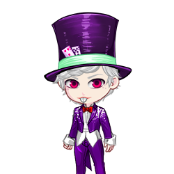
Warren's Gems are Purple, which is convenient since his regular outfit is already almost completely purple.
In this concept, I made his suit fit better since he's larger than he is in-game as a humanoid, but I think I wanna walk that back. He's a gambling addict on a teacher's salary, this man CANNOT afford a tailored suit. If the art department had ever seen a rabbit before in their lives then he would've already been peak design.
Also, just for fun, Warren's form is short as hell. Possibly the shortest New Frontier member besides Gnorman and Luna. I'm thinking 5'1" (~155cm), possibly even shorter.

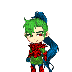
Cinderbottom's Gems are Red.
Not gonna lie, I think I might be less happy with Cindy's concept than Kat Tut's solely because of how I put in the red. I REALLY should've gone for something less bright. Probably need to do something about that hair, too; maybe some kind of gradient.
Among the Institute, Cinderbottom is the most at-odds with Bjorn, even (not-so) accidentally making him violently ill with his smoke in one of the old Blog posts -- now what was that about 'flames only serving the virtuous'?
Anyways, my point is that Cindy is also based on an RPG hero, this time an armor-clad knight with a sword, befitting his noble stature. (I also thought it'd be a neat reversal if The Hero had a lance while The Lancer had a sword.) His green mail is derived from his green scales.
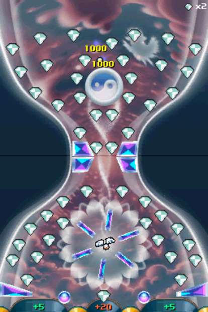
Master Hu's Gems are White.
This one was pretty much as simple as just giving him a white robe. Recolor didn't have any good turbans, so I left it off.
#peggle#bjorn unicorn#jimmy lightning#kat tut#splork splorkan#claude lobster#renfield pumpkin#tula sunflower#warren rabbit#lord cinderbottom#master hu#design concept
3 notes
·
View notes
Text

Warren Rabbit from Peggle Deluxe in Gacha Club
1 note
·
View note
Text

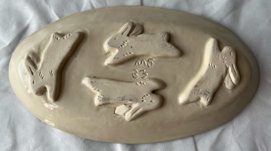
the fox is hunting, but the rabbits are all safe in their warren
#fox art#rabbit art#fox#rabbit#warren#hand built pottery#pottery#ceramic#sgraffito#claypigeon#glazeware
768 notes
·
View notes
Text
I just encountered the most greedy-ass Landlord Bullshit today
so I'm trying to move from the fairly nice but Landlady In UnitTM apartment I ended up in post-fire to something hopefully just with other tenants, and ideally Victorian-er (not to knock my current place, which is from 1913 and still has some pretty period details). I went today to see an apparently promising apartment in a house from 1900. the listing pics were gorgeous- stunning fireplace with artistic tiles! bay window! pretty doorknobs and plaster molding! It seemed to have been cut up from a single-family at some point, but no matter- the little flourishes remained. delightful
but when I got out there, the landlord cheerfully told me about all the work he was having done. the second-floor apartment with the pretty fireplace didn't NEED a living room and dining room both, surely! so he was going to close the doorway between them, cut a tiny new doorway, and rent the living room as a bedroom. one common room and a kitchen would suffice, for this new three-bed apartment :)
and that big kitchen- well, they didn't need all of it! that could be halved to make a small kitchen for the third floor tenants. so that the kitchen up there could become a living room, and their living room could be a fourth bedroom. as opposed to the three already crammed into what I guessed had once been housing for...two servants? maybe three? not a large space at all
I just nodded, imagining three people stuffed into the not-overly-large second floor of this upper-middle-class Victorian home and four in the even smaller attic. with one (1) common space for entertaining and relaxing, neither of THOSE large either. each room rents for over $1,000/month, so one can't even argue that he's creating affordable housing
he and his wife just bought another c. 1900 house. they're going to rent half of that, too, "once it's renovated"
I can't imagine being that greedy
#landlords#apartments#and no I will not rent there. I might pay that for a room in an actually nice place but a rabbit warren with pretty fireplace tiles? hell n
152 notes
·
View notes
Text
Credit for discovery: @misscloudiedays
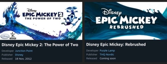
So a lot of people are confused as to how Epic Mickey Rebrushed meaning Disney probably isn't getting profits works, so let me explain real quick:
What's the Sitch?
If you go to the Steam Page, Disney is not publishing EM Rebrushed themselves like they did with the original EM games, another company ,THQ Nordic, whom Disney does not own is.
This likely means they sold the licensing rights to that company rather than accepting profit cuts.
How this works
Copyright holders often do this if they think the product would make less profits than what they sold the licensing rights for. For example, this happened with the author of the Witcher books, who thought the games would flop and sold the licensing rights instead of accepting a percentage of the profits. He later acted like the victim when the games actually ended up being wildly successful. This also happened to the writer of the American Pokemon Theme Song, who didn't know the Pokemon franchise was going to go on for decades and remain popular, though he was more chill about it and worked something out.
Basically, Disney likely had so little faith in the game, they chose to sell instead of accept profits, which would mean whether you buy or pirate the game wouldn't affect them, since they would have already gotten the agreed upon amount, and they'd probably piss themselves if the profits Purple Lamp gets is more than what they sold it for.
Would they actually do that?
For anyone who questions if Disney would really be dumb enough to do this, REMEMBER THIS IS THE COMPANY WHO:
SHUT DOWN AND ENTIRE VIDEO GAME DEVELOPMENT COMPANY JUST BECAUSE EPIC MICKEY 2 DIDN'T MAKE AS MUCH MONEY AS EPIC MICKEY 1
THOUGHT PEOPLE WOULD ABANDON CONSOLE GAMING IN FAVOR OF MOBILE GAMING
THOUGHT KINGDOM HEARTS COULDN'T POSSIBLY HAVE SEQUELS
HAD A CEO WHO THOUGHT ADULTS DON'T ENJOY CARTOONS
AND THE MOST RECENT BLUNDER OF ALL, THOUGHT DISNEY FANS WOULD PREFER A LUMA KNOCKOFF OVER STARBOY IN WISH, BECAUSE THEY WANTED A MARKETABLE PLUSHIE
Yeah, I think they're that dumb.
Bottom Line
For those participating in the Disney boycott, it is probably safe to get the game, and will not be a breach of your boycott. Buying the game would instead show support to those who actually care about the game while not benefitting the company that abandoned it.
That being said, this is not guaranteed to be completely correct. Keep an eye on things as it develops, and make your own decisions on the matter.
#disney#epic mickey#epic mickey rebrushed#kingdom hearts#oswald the lucky rabbit#mickey mouse#warren spector#purple lamp#thq nordic#junction point#mickey and friends#wii#Nintendo switch#steam#pc#xbox#playstation#playstation 5#video games#gaming
276 notes
·
View notes
Text
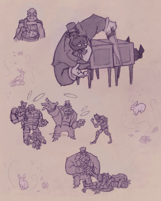

Day 24 of TMayNT: Favorite turtle + villain dynamic
I chose Hypno-potamus from Rise of the TMNT for this prompt :]
I love his character development and how he seems to grow a soft spot for the turtles.
These sketches are redrawn from screenshots except for the doodles of rabbits, doves etc :]
(Note: I chose to draw Hypno in a top hat rather than a turban because one of the writers who worked on the show said that Hypno was not wearing the turban for religious reasons. It was part of his costume. Also, Hypno’s canon design, especially as a human, has similarities to harmful stereotypes of Romani people—so a few of Hypno’s fans on here including me like to depict Hypno with a top hat instead.)
the TMayNT challenge is hosted by @mikasleaf see more at @tmaynt
#sofia’s art#rottmnt#rise of the tmnt#rise hypno#hypno potamus#rise leo#rise raph#rise donnie#rise mikey#rise april#tmaynt#tmnt art challenge#studies#sketches#leave hypno and leo alone for a moment and hypno starts putting on a magic show#leo loves magic so much it would have been fun to see those two become friends#i think hypno would have been excited for a fan unlike ghost bear and meat sweats#hypno really did seem happy when donnie mikey and leo reunited in battle nexus: new york#and he took his role helping donnie seriously even though he didn’t know how to play chess and it seemed like only donnie was in danger#in the movie neither hypno nor leo seemed to take their fight very seriously hypno didn’t even take out his rings#also I didn’t draw anything about it but in a deleted scene for the movie in the bad future hypno and warren are on the turtle’s team#not only that but they appeared to be in leo’s inner circle they were with the people who we’re going to go back in time#in case you were wondering the little creature with the rabbits and doves is a character of mine
128 notes
·
View notes
Text


the children yearn for the mines
44 notes
·
View notes
Text
Spoilers for season 1-2 of Red Valley Podcast!!!
I'm just realizing how much hypersleep, specifically in Warren's case, functions as a metaphor for relationship abuse.
Like to start with, the only reason his life even lead to this situation is his patterns of behavior that resulted from his trauma. We don't have the full picture, but we see his tendencies to let people push him around until he snaps and turns violent are all trauma related. And I assume that something like this was what lead him to kill someone.
He stays at Red Valley for a few reasons: 1. It's the easiest option. Being here doesn't require him to think, make choices for himself. He gets to (literally and figuratively) shut his brain off. 2. he genuinely likes being useful. 3. Deep down he doesn't believe he deserves better. So he stays, lets them put him into life-threatening peril over and over again. Lets them push him around and mistreat him. Tells himself (any everyone else) that he's ok with it.
And all the while he's being told that this is what makes him valuable: the fact that no matter what they do to him he will still come back. Everyone else who has ever been treated this way is gone, and that makes him special. Makes him different. Gives him provable to base his self worth upon.
All he's wanted for so long is for anyone to tell him he's valuable for any reason. He's proud of the fact that he's the only one who can take it. It's the one thing he has that no one can take from him.
And when he finally decides to stand up to Bryony and tell her she can't tear him like this anymore, the first thing she does is throws everything he has ever done wrong in his face. Reinforces the idea that he doesn't deserve to be treated any better, because she knows that if he stops consenting to the treatment she doesn't have legal grounds to keep him there. And while I think she'd probably try to keep him there against his will anyway, it would make things a lot more complicated for her.
And the reason he keeps coming back (both literally AND figuratively) is because of his trauma. It's so important to me that the only reason he can take the level of abuse he is currently taking without either dying or running away *is his trauma.*
The thing that makes him special, the reason he is valuable to them, is because he is damaged.
And this is both what's keeping him alive and what's killing him.
So yeah anyway how's everyone else's weekend going
#warren godby#red valley#red valley podcast#red valley pod#I'm so normal about this show#I am very invested in the stressed rabbit man
28 notes
·
View notes
Note
Hella azzrie! Did u have some Warren headcanons? I remember u dgaf abt him but cmoooooon, saysaysay
My opinion of Warren has actually improved on almost every rewatch of the show surprisingly, he’s not my favorite but I definitely don’t have the burning hatred I did when I first saw him.
. Warren thinks he’s an eagle because the first thing he saw as a baby was a huge eagle who was trying to eat him (and he imprinted on it, of course)
. Kleptomaniac, he has stolen at least one thing from anybody he’s ever known
. the most knotted hair in existence like PLEASE use a hairbrush dude
. Always slimy and it will drip onto your hand, DO NOT give that worm a handshake
. Joker kinnie probably
. “No, you guys don’t understand, I’m literally Creep by Radiohead!”
. Does have the ability to change into that monster form at will but he mostly transforms due to intense anger
. And if he’s extremely sad/injured, he just becomes so small that he looks like a normal worm
. Rights eyes a little scared from the friendship episode (Joining Coffin in that fucked up right eye club)
uh…yeah. *stomps him affectionately*

#Fucked up little thing#I’ve grown an appreciation for him unfortunately#Blame it on Rabbit for having that Warren shrine it kinda made me hate him less#Still wanna kill him though#:3#dhmis#dhmis warren the eagle#dhmis warren#dhmis warren the worm#paula the postbox!!!#dhmis headcanons#headcanons#don’t hug me i’m scared
27 notes
·
View notes
Text

⭐I FINALLY HAVE NEW ART (besides my ref) art trade w/ new friend Alubune (goes by that on any site) of alters Alu and Warren! wanted to shake off rust and try going back to the old sketchy style do y'all prefer this or the cleaner look with thick lines? ;w; *ragdolls*
118 notes
·
View notes
Text
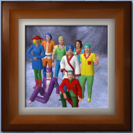
Peggle: The Netflix Reboot
#sims 3#peggle#bjorn unicorn#jimmy lightning#kat tut#splork splorkan#tula sunflower#warren rabbit#lord cinderbottom#master hu#renfield is missing cause this is dreamatia#claude and marina are missing cause i only have 8 slots#they'll get their own house
0 notes
Text
Anyone getting into Epic Mickey should check this video out.
This was made by Game Informer as a companion piece to the iconic November 2009 issue announcing the original Epic Mickey.
Epic Mickey by Warren Spector
youtube
20 notes
·
View notes
Text
Someone needs to write a feminist retelling of Watership Down, but it’s Hyzenthlay and her gang trying to get out of Efrefa.
In the book it mentions that she tried to get permission to leave the warren and start a new one somewhere else, but is denied. You could totally write that and all the backstory leading up to when the Watership Down crew turn up, and then everything that happens then but from the perspective of the does.
I think this is an untapped resource! You don’t need to turn Strawberry into a girl, or Clover into this wonderdoe *side eyes the bbc mini series* you just have to work with the original cannon. Because Hyzenthlay is AWESOME. And there’s so much room for a commentary on female rights and society when it comes to how Efrefa is run vs Watership Down.
#watership down#hyzenthlay#efrafa#and the fact that she gets to be the chief rabbit’s mate#like she’s Hazel’s second for sure#and they can lead as a pair#which I’m sure Hazel would love#in contrast to how General Woundwort rules as a dictatorship#thethuthinnang#nettle#literally in the wikia page it says ‘after hazel’s death she presumably keeps leading the warren by herself’
32 notes
·
View notes
Text

This was done in conjunction with the game and the first set were promotional and only on the iPad. All of these were writing by Peter David. They are lots of fun. You can preorder on Amazon
#peter david#epic mickey#warren spector#game to comic#lots of laughs#mickey mouse#oswald the lucky rabbit
18 notes
·
View notes