#thank you pinterest for showing me this panel
Explore tagged Tumblr posts
Text
ok fine. i’ll read dandadan.
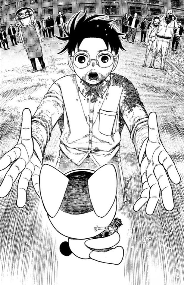
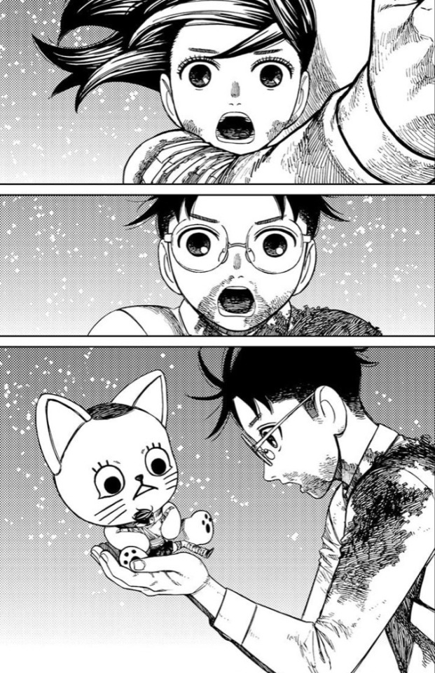
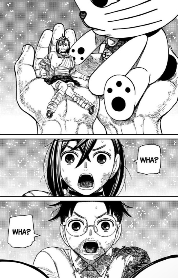
#thank you pinterest for showing me this panel#dandadan#g/t#g/t shitpost#i was going to anyway but now i know there’s gt…#hell yeahhhhhhhhh#chapter 163 btw
169 notes
·
View notes
Text
every day i wish the block feature on pinterest did literally anything
#i cant look up panels to do summer edits without having to see that one artist that just like pisses me off for no reason#which like isnt that big of a deal but usually you can just#block them and move on. but noooo pinterests actual dogshit#i guess maybe they cant like message me. wow. thanks. theyd literally never do it so that does nothing#how hard is it to stop showing me posts from someone i blocked#jello shut up challenge
3 notes
·
View notes
Text
Spy × Family analysis (English)
Analyzing the anime's all episodes with English subtitles~
I decided to do an observation & analysis of the currently famous anime Spring 2022 SPY × FAMILY. After my previous-of-previous-of-whatever-previous post, I continued watching the episodes, started thinking about analyzing them, and see if there are any spoilers or interesting facts.
This main post consists of: analysis of full episodes; facts & opinions about chapters & series, characters, ships (if possible); forms to support blog's activity (currently closed); my arts including my OCs, S×F characters (if possible); answers for ask box; help requests & instructions, and other stuffs.
Spy × Family: Season 1, 2, and Movie
I colored the episodes with each color to find the Arcs of the anime/manga easier
Episodes/ Missions:
Season 1: 25 episodes: 1-25
Season 2: 12 episodes: 26-37
Operation Strix [part 1] [part 2.1] [part 2.2] [part 2.3]
Secure a Wife [part 1] [part 2.1] [part 2.2]
Prepare for the Entrance Exam
Interview for the Prestigious School
Pass or Fail
Operation Buddy-Buddy
Target: The Second son
The Counter-Secret Police Cover Operation
Show Off How in Love You Are
The Great Dodgeball Plan
Stella
Penguin Park
Project Apple
Disarm the Time Bomb
A New Family Member
Yor's Kitchen/ The Informant's Great Romance Plan
Carry Out the Griffin Plan/ Fullmetal Lady/ Omelet Rice ❤️
Uncle the Private Tutor/ Daybreak
A Revenge Plot Against Desmond/ Mother Becomes the Wind
Investigate the General Hospital/ Decipher the Perplexing Code
Nightfall/ First Fit of Jealousy
Underground Tennis Tournament: The Campbelldon
The Unwavering Path
The Role of a Mother and Wife/ Shopping with Friends
First Contact
Follow Mama and Papa
Bond's Strategy to Stay Alive/ Damian's Field Research Trip
Mission and Family
The Pastry of Knowledge/ The Informant's Great Romance Plan II
Plan to Cross the Border
The Fearsome Luxury Cruise Ship
Who Is This Mission For?
The Symphony Upon the Ship
The Hand That Connects to the Future
Enjoy the Resort to the Fullest/ Bragging About Vacation
Berlint in Love/ Nightfall's Daily Life
Part of the Family
Movie: Spy × Family Code: White (Japan: December 22, 2023, theatrical release in the United States (and the rest of North America): April 19, 2024)
part 1: reviewing+dessert recipe
Facts & Opinion:
first announcement, second announcement (1), (2), (3), (4), (5) Twilight/ Loid Forger (Part 1/?), (6), (7) Twilight/Loid Forger (Part 2/?), (8) Anya Forger (Part 1/?) spoilers for (5), spoilers for (8) Chapter 96 opinion, Chapter 97 & 98 (Part 1/3), Chapter 103, Chapter 104, Chapter 106+continue family dinner, Chapter 107 (pt1), Chapter 103 (1), Chapter 108+fav panel, Chapter 109, Chapter 110 SPECIAL ONLY!!! Did you know?(+poll done)
Google forms: Spy x Family analysis: A small survey, SPY x FAMILY: Questions of choices~ (yeah currently not hyped for any forms)
Arts:
Christmas 2022 Thank you 37 followers, Christmas 2023 (main blog), Christmas 2024 Thank you 130+ followers, Tet holiday 2025 Update my OC as spies (Spoilers 1), Post before official art coming out, OC art spies+Bonus, OC doodles, silly doodles when they rest, Old+new+silly OC doodles, Some other doodlez SxF (ft. FNF MFM) (Pinterest), SxF (ft. FNF MFM) (Twitter), Anya and Yuri tutor funny vid, Wedding (X) Uni life pt1: Microscope on shallot's epidermal cell, (Not) uni life pt2: Update drawing progress (will I stop?) Happy birthday to me (18)
Polls: Anya Forger or the Garden, OC art spy edition, (Spoilers 2) OCs: hair colors, What post should I continue working on first?, Should I do analysis for Dandadan?(from special only!)
Ask box: The Desmonds and Project + addition in reblog, Question about Desmond's eyes, Help me :")))
Help request: Drafts posts & Art collaborations!!!
Other cool stuff ig lol: (911 posts) funny meme (?), Instructions if you can't click the links above, Some important news that might affect my future, Sh*tpost abt the instruction, Spot logo difference?, Sh1tp0st rly wut the helm?, My ALL 3 MIGHTY!!!, update my temporary pin post
I have added the link of the posts above so you can look for them much easier. Moreover, please check other reblog posts from other Spy × Family fans as they also go deep in the anime and manga and "contribute" to the Anime World of Art with amazing artworks of Spy × Family.
Thank you for 147 followers everyone!~
~~~~~~~~~~~~~~~~~~~~~~~~~~~~~~~~~~~~~~~~~~~~~~~~~~~~~~~~~~~~~~~
Author(me)'s words: Don't worry, I don't change anything much from the pin post. I just remake it, since there are some weird errors (?) when I tried to update and change the pin post (I posted it on June 21 2022)
-> Pin post Vietnamese version
#Spy x Family analysis#spy x family#spy family#anya forger#loid forger#yor forger#spy x family analysis#yor briar#facts#damian desmond#fun facts#damian x anya#anya x damian#damianya#spy x family damian#loid#loid and anya#loid x yor#loidyor#spy x family loid#sxf loid#yor x loid#sylvia sherwood#yuri briar#sxf anime#agent twilight#spy x family anya#anya spy x family#spy x family anime#spy x family art
23 notes
·
View notes
Text
I am reading the BSD Manga right now—
(Am trying so hard to catch up so I can see why people have said certain things..... Like that it's no point trying to describe the plot to someone at this point.....
((Lookingforwardtothenewchapers--
Do You remember the whole talk about:
"HOW THE HECK does Fitzgerald understand Japanese??"
Still in love with this thing- Have been seeing it around on Pinterest: BIG credit to whoever made this:

He likely learned Japanese, I mean come on, he's rich, AND in the business work, of course, he could or would learn it. If not for anything else, then likely for the Work.
I feel like Royalty and Rich people tend to learn many languages, compared to "commoners" -of various reasons-, I mean at least in movies, I don't know how the real world works—
That's what I'm thinking now, but not gonna lie in the start I was like: YEAH HOW THE HECK DOES HE!!????
But Anyyyhoww, I was reminded of it again as I was reading the manga and came to this panel:

Even though Fitzgerald DOES speak Japanese, he has difficulty remembering some of the names -at least, parts or sounds of the name.
This is something shown more or less as a joke at least two times in the series of what I know of, possibly more.
Here in the panel, I showed just now, which is from Chapter 64 of the manga - Atsushi directly SAYS (or well, "thinks") that Fitzgerald's bad at remembering JAPANESE names. Not just names. Specifically JAPANESE NAMES.
And it was the same that one time in the anime when he couldn't remember Akutagawa's name.
Chapter 34 in the Manga:


THAT WAS LEGIT ME IN THE START—!
As a person from the West who does not speak any Asian language- ((YET—) I can relate to this.
(( I Swear I relate SO MUCH with the fact that he couldn't say Akutagawa's name right, -and just ended up with:
"Yes. That."
I relate to it with more names than just Akutagawa🥲
Heck I even first learned how to write it here recently- Thank all I am not the only one and it's actually a thing-
So you see, I have especially had difficulty remembering Japanese names. Something I noticed after beginning to watch much more anime.
In the start, I always switch the names up, don't hear, or more exactly: don't remember the little differences between names such as for example Tetchō and Teruko.
Until I hear them a couple of times, see them written, hear them clearly, etc.
-When I see it written like this I find it obvious, but not when I hear it for the first couple of times -
I assume it's because the sounds are so foreign to -in this case- English-speaking users, and therefore we easily mix the small differences up.
But it wouldn't sursprise me if some might be better at it than others, for various reasons of course -for example watching a lot of Japanese media, and hearing the language a lot - like watching Anime, but not the dub ofc- but well, generally speaking I think there must be more people who has it like this.
I mean even IN the show-! That's kinda relieving—
Like, I have an easier time remembering Chinese names than Japanese. Are Chinese names simpler? Is it because I have watched AND read a lot more Chinese material? Maybe because I'm learning Chinese? Or am I just better at remembering Chinese names??
Sorry me rambling there *ahem* back on track-
POINT BEING:
This definitely shows that even though Francis definitely SPEAKS the language he's still a Native English speaker, having apparently not been in Japan long enough -or whatever reason- to stop mixing the sounds in names up as we sometimes do.
Or perhaps he just isn't bothered enough to try, I could imagine he could be like that-
A little Fun Fact which I found cool, since I relate to it!
Can't believe Francis is the first character I "officially/publicly" announced I could relate something with.
I mean it's not like I am the only one who can relate with this, it's not that rare to speak English but still, that it was the first thing- It's not that I don't like it, I had just not expected it.
Some people out there must relate to it as well? Guys??
Please don't tell me it's just me -and apparently Francis- who has it like this-
Although, having an In-character-from-the-show on your side isn't bad. Especially when he's one of my favorite side-characters- ~
But anyhow! No matter what, Thanks for reading~! ✨ Hope you found it interesting-!
#bsd#ramblings#bsd manga#f. scott fitzgerald#francis fitzgerald#bsd fitzgerald#fitzgerald#francis#bsd francis#japanese#english#native speaking#foreign#bungou stray dogs akutagawa#bungo stray dogs#bungou stray dogs#akutagawa#bsd akutagawa#bsd teruko#teruko#bsd tetchou#tetchou#Tetchō#manga#bungou stray dogs manga#bungo stray dogs manga#bsd anime#anime#bsd manga chapter 64#bsd manga chapter 34
19 notes
·
View notes
Text
This is not an update to the Comic, but it still has something to do with it !!!
(call it a little gift for the Wish Rewrite and KoW fandom)
Hello my little stars! How are you?
I mentioned in the last post in the series that I would be traveling for a week or two and that's why I wouldn't be working. Well I'm still traveling Lmao.
It's been a lot of fun, I'm visiting my Prince Charming and family, both of whom I haven't been to in a long time. Still, I couldn't stop thinking about KoW and Wish's Concept Arts. Disney sealed the fate of its fan artists by discarding so much good material, now they are embedded in our minds and we will not be able to rest until we see them realized. This is crazy but it's beautiful to see how much these discarded concepts generated creative potential in the fandom.
Because of all this I couldn't help but make some small sketches! And well, I came to show them here. They are not sketches of Comic panels, but they have something to do with it and I will show the photos and explain how.
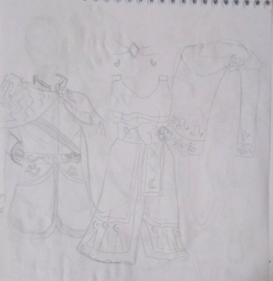
This first one, very faded, are Magnificent and Amable's clothes (designed by @uva124, for the characters in @annymation's rewrite of Wish "The Kingdom of Wishes"). The drawings that Aled did are very complex, I don't judge her for that, in fact I thank her, she gave beautiful clothes to the centuries-old Disney villains and they are perfect. I really wish I could draw them with all the details, but I will do everything by hand, alone and seeking a minimally professional quality (I want to be a comic artist/book illustrator one day. This comic is my first step Lmao, and I want to do something that conveys the best I can give at the moment), so I need to make some things easier for myself. The costumes are one of those things.
" Better something simple and well done than complex and poorly done." — This is my motto for this Comic and for my life.
The next sketches are related to aesthetics. I've been watching a lot of "Analyzing the Art" videos of some Disney films and I was inspired to adopt some "Disney Style" features in my arts for this comic (not everything obviously, because I don't want to be sued by Disney lmao).
What you'll see next is me trying to mix this influence with my own style in some KoW character sketches.
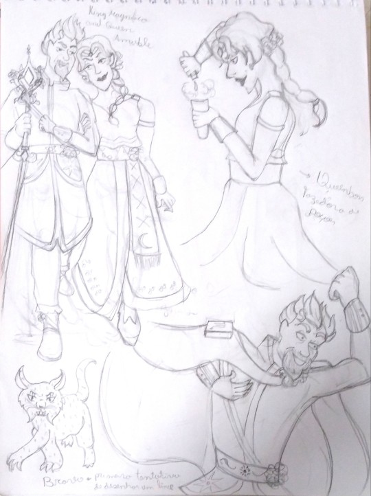
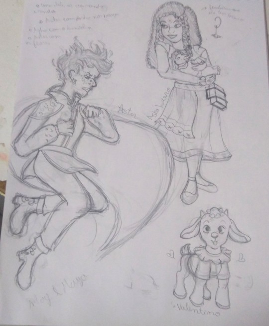
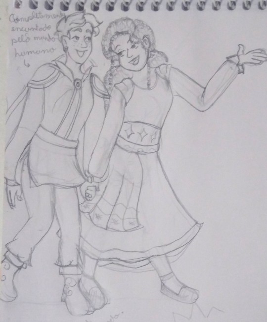
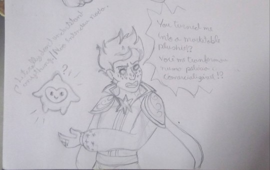
(this last art specifically references a meme in which @rascalentertainments tagged me, Thanks for that, by the way! <3 )
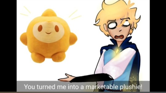
(credits to the artist, I don't know who it is because I was just tagged in this meme and I was busy So I didn't look for more information, but I'll leave the post link and you can check the official credits)
Speaking of aesthetics. Anny received Chiara's aesthetic from someone — the north star, "daughter of Aster", created by his magic at the very end of Anny's fanfic. This Aesthetic inspired me to create an aesthetic for Asha and Aster too and these were the results:
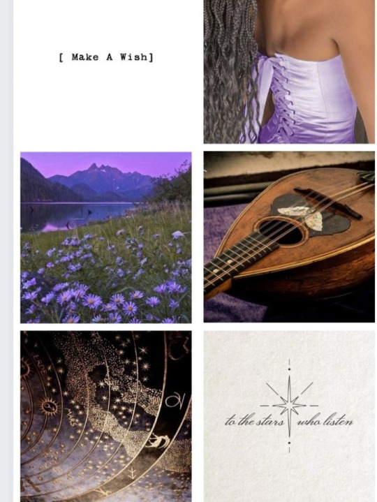
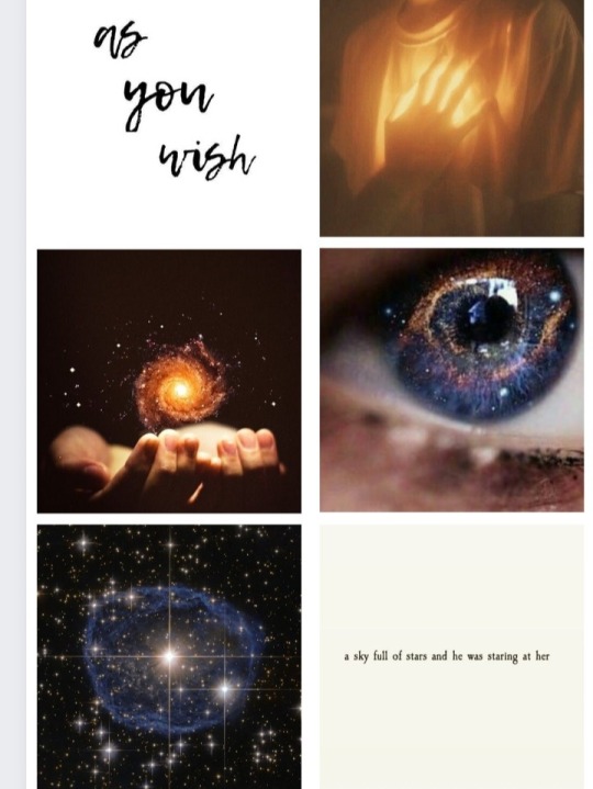
What's your favorite?
Lmao, It took a lot of work to make Aster's. There are almost no things for "starboys" on Pinterest.
I'm leaving this up to you to share as you wish, consider it a gift to the fandom!
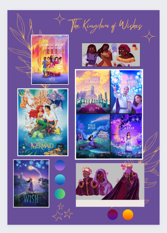
Lastly, I want to say that the artistic analysis videos They also inspired me to put together a moodboard for KoW and I'll be leaving it here. Not even Anny and Aled know about this and I can't wait to see their reactions! I wish I could print this painting and leave it on the wall, but unfortunately I don't have a printer T-T.
This moodboard is helping me with the artistic direction of colors, style and is a visual motivation to stay active at work.
I hope you like it too!
That's it for today, it's already midnight in Brazil and I should be sleeping instead of posting crazy things on the internet. I'm going to tag my friends and go to sleep, Lmao.
Kisses full of light and stars!
~ Emy
@wings-of-sapphire @flicklikesstuff @frogcoven88 @chillwildwave @gracebethartacc @gracebethartacc @kstarsarts @oh-shtars Come and get your therapies after the anguish caused by certain publications by Anny!
#kingdom of wishes#wish reimagined#wish rewrite#wish 2023#disney wish#artists on tumblr#asha wish#starboy#starsha#the kingdom of wishes desings#the kingdom of wishes au comic#the kingdom of wishes au#behind the papers?#behind the scenes#aesthetic#scketchbook#scketchs#please write tags for me when reblogging#I am feeling lazy
29 notes
·
View notes
Text

Hallo! It's that time to say Good Night to everyone! I hope that your day went well and the night treats you well too. Here is a little OtaYuri to help you sleep!
NOTE: This is, once again, an image off Pinterest that does not reveal the artist's name. I discovered that you can slightly edit the images on Pinterest, like cropping and other small adjustments. This was originally a fan comic page, I simply cropped it until it only showed the first panel. I will STILL give credit to the artist for the image and insert the page the comic came from.
If you know the artist, message me their name so I can give credit.
If you ARE the artist, I mean no disrespect by cropping the image, but if you want it taken down, tell me and I will do as you wish.
EDIT: @alexseanchai pointed out the artist's username at the top left corner of the image. The artist is @kuckoonut... I think anyway. If this is, in fact, you. Message me if you want it down, or give me your permission to keep it. Thank you very much in advance!
Good Night Everyone!
#yuri on ice#otayuri#yuri plisetsky#otabek altin#yuri on ice fanart#yoi#yuri on ice comics#not my art!!!!!#good night everyone!
70 notes
·
View notes
Note
i LOVE the way you draw faces and expressions—where do you usually get references/learn how to do it? i’ve been trying to make characters of my own and the face just always throws me off
thank u!!! faces are the most important thing about a character to me and they are my absolute FAV thing to draw
i feel like i learned mostly from manga, but have been bolstering that foundation by just LOOKING at art in general. i dedicate a lot of time for looking at art and finding inspiration. i mainly use twitter to find cool artists and pinterest to find everything else, ie manga panels, fashion photography, random insp stuff. helps to find a lot of artists u like so u can have an idea of where u wanna take your style
nothing beats refs of actual ppl/studies but sometimes it can be kinda hard to know where to start. i personally pull a lot from the manga i read. i'll use takehiko inoue's art as an example for this post bc hes my fav artist.


these are some of the characters from vagabond. takehiko inoue's style is super realistic w unique faces. i esp like how he does his characters' eyebrows and the ridge of the eye socket. the latter literally was a revelation to me earlier this year in establishing shading and planes of the face, which always gave me trouble before.


each character is super consistent. no matter his age, this guy's (kohei tsujikaze) face is unmistakeable bc of his bottom eyelashes, eyebrow shape, light irises, and full bottom lip. kohei makes that same smirk with the left corner of his mouth all throughout his life. i think details like that are cool so i try to keep my character's facial features and expressions consistent too. it depends on the character a bit. some characters are more emotional than others and might show a wider variety of expressions.
so what i usually do is define in my brain what each facial feature looks like for each character. for example, rohan has bold eyebrows and small, downturned eyes w no visible pupil. he has heavy eyelids, a strong nose w a bump, :3 mouth expression, and a wide chin. he looks calm, gentle, and mature. he has a lot of square-ish shapes


vs volo, who has a pretty mid appearance in game (lol) so i like to exaggerate the sharpness of his features to show his energy. he is loud and passionate, so i like making him look kinda wild. his points make him look like a dangerous porcupine beast which is funny but also cool and fun to draw


takehiko inoue is like my one example here bc if i had to pic a singular artist who's had notable influence over my style, it'd be him. but really the list of influences is enormous. i really stress just looking at art while making time to practice. with time your eyes and hands improve, so keep pushing
#THANK U!!! 🤍🤍🤍#hope this helped omg i tried to keep it only about faces specifically#but yeah manga is my no. 1 and pinterest is what i recommend most as a resource for insp#ask#long post /#also this pertains heavily to my own style and experience w drawing but hopefully#translates across to anyone who was wondering and wants to go w a different look#also part 2: do style studies. some ppl are ok w u posting them some arent so make sure to ask#but its totally ok to do it privately to figure out how ppl approach different stuff
14 notes
·
View notes
Note
I just wanna say i wanna eat ur art u draw the crows immaculately and imma combust please keep doing what you're doing you're litrly amazing and ur art is so expressive and unique and just shows ur love for the characters <3
aw thank you! I love this story and these characters so much. I'm glad it shows in the art! It makes me so happy to be able to work on a project that allows me to spend time in this world. That makes it sound like this isn't a self-motivated project (which it is), but part of deciding to continue with chapter 3 was the immense amount of support and excitement you all have shown for it, so thank you for that. :)
As for Chapter 3, I thought I'd share some info about it before it comes out next week. It's gonna be 56 pages total, so 14 more pages than the last chapter! Unlike last chapter, there wasn't really anything I had to cut, so I didn't. That also means I have no material for the bonus page, but I'll see what I can do when the time comes. I'm also excited for this new chapter since it comes with a lot of challenges I'm excited to tackle! Lots of internal monologuing (thanks, kaz), psychological imagery, and worldbuilding stuff.
In all honesty, I'm not as far in progress as I'd like to be, but I'm really proud of what I've got so far (I'm on vacation, after all). Right now, I'm about finished inking page 5, and that might just be my favorite of the pages I've done. Remember the last panel of chapter 2? I'm really trying to push all the backgrounds to have that level of detail. And what surprises me is that I'm enjoying it! Big thanks to my 1890s Amsterdam Pinterest board.
Anyway, thanks again for your patience. I can't wait to start up what I hope to be a truly weekly comic next Wednesday (not tomorrow). Time to finish inking page 5.
#hijacking an ask to share more about the comic?#it's more likely than you think#asks#soc comic adaptation
38 notes
·
View notes
Text
World Building in Five
Thank you for the tag @kaylinalexanderbooks
I’ve looked forward to doing this for The Blood Cleaners ever since I saw it.
Rules: post 3-5 pictures that capture a setting in your world and tell us about it!
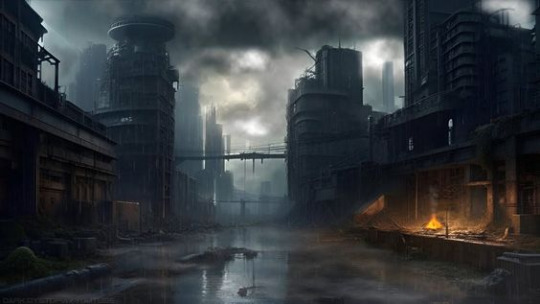
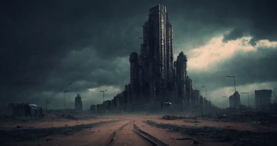

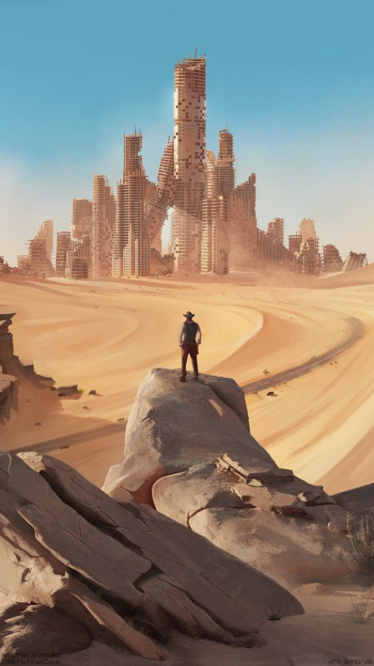
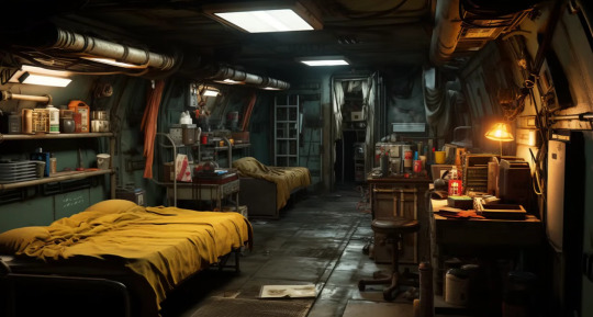
Source 1: Thumbnail of Dark Dystopia video
Source 2: Still image from Earth’s Last Echoes video
Source 3: Photo of Quarry by Claude Meyers on Pinterest
Source 4: artstation.com
Source 5: Thumbnail of Selcuk Celebi Ambient & Music video
The Blood Cleaners takes place hundreds of years into the future (no specified year). The setting is a city called Corpa, located in post-apocalyptic Arizona. Corpa is not the ruins of a real life city. It is a city that was formed after the great nuclear war (which they call The Last War).
There are nine sections of Corpa. There’s the Steel Castle, often called the Steel, a fortress that looks like a cluster of skyscrapers fused together. It’s hard for me to find or create an image that portrays what the Steel is supposed to look like. I found a great image from a still in a YouTube video by Earth’s Last Echoes that conveys what I had in mind. I also use the image from Artstation to show the aesthetic of the city in the middle of the desert, though Corpa is not in ruins. The Steel is the home of the Fists, the ruling class of Corpa.
The underground section is a series of tunnels that are built to be like a bunker. The underground consists of many storage rooms, closets, homes, labs, classrooms, medical bays, cafeterias, shops, offices, gymnasiums, and a boiler room. I use a thumbnail from a video by Selcuk Celebi Ambient & Music to portray what a home in the tunnels would look like. The tunnels mostly house the poorest residents of Corpa. Even tunnel workers with well-off occupations like teachers and doctors are less prosperous than their surface counterparts. One cool feature of the tunnels are the vaculators, big holes where garbage is dumped and transported through ducts to the incinerator. People who live in the tunnels are called Tunnelers.
The surface section consists of the city above ground, the urban and suburban areas surrounding the Steel. The urban area includes a section of administrative buildings where the Fists carry out their government jobs. The surface is made up of many hospitals, shops, restaurants, houses, schools, research labs, parks, office buildings, and plazas. People who live on the surface are called Surfacers, including those who don’t live in the urban or suburban sections, but do live in the farmland, lumber farm, industrial district, energy district, quarry, or mine.
The farmland is the spacious section of land used for agriculture purposes. They grow the crops and raise the livestock that feeds most of the city.
The lumber farm is a lumber mill in the midst of a forest grown for the purpose of providing lumber for the city.
The industrial district is made up of many factories used for making anything and everything used in the daily lives of Corpa’s residents. I portray the factory district using a thumbnail from the YouTube channel Dark Dystopia. It portrays the overall mood of the setting.
Past the factory district are the rocky areas where quarries and mines can be found. I chose to include an image of a quarry because this location is especially important to the plot. The quarry workers live under especially harsh conditions.
The city is surrounded by the energy district, which consists of solar panels and wind turbines that provide electricity.
Corpa covers a fifty mile radius, which is 2500 square miles. There are some other interesting aspects of Corpa that I’m going to have to keep secret because they would be plot spoilers. The residents of Corpa have been fed misinformation about the city’s founding and purpose by their corrupt, totalitarian government. The plot involves MC Justin uncovering the secrets of the city.
Tagging: @buffythevampirelover @tryingtowritestuff24 @selenekallanwriter @constellationandcompendium @gottestod-writes @willtheweaver @poethill @primroseprime2019
#writing#writeblr#writers on tumblr#creative writing#world building#the blood cleaners#dystopia#post apocalyptic#young adult#world development#world design#wip#my wips#wip intro#novel writing#novelist#writer tag#tag game#open tag#scifi#writer#fiction writing
12 notes
·
View notes
Text


A/N: Well, hi there! Chapter five, done and dusted! I’m thriving on your feedback, seriously guys it’s keeping me alive x
Based on the actors portrayal/hbo show and written with no disrespect to the real life veterans. Also all images found on Pinterest.
TW: some swearing, meal skipping……. Is there more???


Made of Glass
Chapter five: Don't Diss the Help
The colossal barrier loomed over her minuscule frame and when Birdie looked up at it, the wall seemed to sway in the sky as if teasing her. If she looked at it long enough she began to get dizzy.
“Lead with my right foot.” Bernadette recalled Joe’s advice, whispering it to herself in case anyone around her heard. “Just jump up the fuckin' wall.” She repeated that phrase like a mantra, “Just do it. Just jump! Come on now, Birdie!” Birdie took off running, remembering to raise her right foot earlier than she usually would’ve, it connected with the wooden wall and she focused all her physical strength into leveraging her body upwards.
Lo and behold! Her body went upwards!
It was like the moment moved in slow motion, Birdie saw the top of the wall approach her and reached out her hands. She successfully latched on and pulled herself the rest of the way up, one leg hooked up and over and within a second she was sitting. On top. Of an eight foot mountain.
“What the fuck?” Birdie whispered to herself in disbelief, she barely had time to register her accomplishment before whoops and cheers trumpeted out.
At first Birdie was too focused on the stacked panels of wood beneath her to realise the cheers were aimed at her, then her ears perked up a call of her name, “Yeah, Birdie!” and she beamed. The night of exhaustion behind her. The lack of food forgotten. All the snarky comments about her gender, her body, her face, her lack of muscles or bravery meant absolutely nothing to her now.
Bernadette truly was on top of the world and she was glowing.
“Dismount.” A voice said to her, tone low and close to a murmur. Her heartbeat stuttered momentarily, after working out the voice belonged to Winters and not the dreaded Sobel she was expecting, her heart calmed and the smile returned to her face. Birdie swung her legs and body over the edge and lowered herself with her arms. She let go and dropped to the floor, landing on her feet with ease.
“Congratulations, Private Coldwell.” Winters spoke out to her, his eyes shone with mirth when he noticed the way her whole body animated gleefully. Her eyes were just about sparkling and the wide grin could not be wiped off her face.
“Thank you, sir.” Said with a lighthearted giggle. The lieutenant gave her a head nod, suggesting she loop round and start the course again and Birdie complied happily.
Richard watched the young lady retreating, chuckling lightly when he noticed the tiny skip in her step. He observed from his spot near the base of the wall, he was supposed to be encouraging Easy company and keeping up morale but he took a momentary pause and noted which men she had approached.
Joe Toye and Bill Guarnere brightened at the sight of her, they hooted words of encouragement and gave her proud shoulder pats. Toye even outstretched his arm to ruffle her hair as a rewarding gesture which she laughed at and brushed off, swatting his hand in mock offence.
Winters felt a swell in his chest, he knew he had no reason to worry about the girl but he often found himself silently checking up on her social progress.
Richard was aware she could handle herself physically, she had proved as much when she beat him up Currahee by a full two minutes in her first week and now by getting over that wall (which seemed to be her only struggle). He was a tad concerned about her fitting in, he saw her isolating herself at every meal time. He was aware that she had befriended the mess hall staff was less than pleased, the mess hall staff wouldn't be following her into war. Not in the way it mattered.
They wouldn't be there to cover her or lay down suppressing fire. They wouldn't be there to wrap her wounds or drag her to an aid station if she ever needed it.
Winters could finally still his troubled mind, evidently, she was making friends and her choices were of high quality. Toye and Guarnere were tough, they would defend her till the end, they were smart and reliable.
Yes, she had chosen well.
———————————————
“And it's all thanks to you.” Birdie told Toye while grinning, he raised his eyebrow at her, questioning her statement. The two slid their lunch trays across the counter, waiting for it to be filled with whatever was being served for lunch.
“That so?”
“Your advice worked! I was fixin' to set that wall alight!” The southern girl's words were laced with mirth, her cheeks ached from smiling, “Seriously, I wouldn't've made it up there with you... so thanks.” She playfully thumped her fist on his bicep, her way of showing gratitude. It truly had meant so much to her to climb up and over that ruddy wall.
Joe didn't say anything back to her, he didn't have to. He was proud of her and she knew it, the last thing he'd do was ruin the moment by announcing it. It was better left unspoken, like a secret between them.
“Hey, I know a way you can really thank him.” George Luz had snuck up behind the pair and waggled his eyebrows with the suggestive remark.
Both Birdie and Toye paused for a second, taking in the connotation. Birdie scrunched up her nose, lips curling in disgust.
“Don't be gross.” She told the jokester at the same time Toye raised a hand and smacked him on the back of his head. Luz raised his palms in mock surrender and backed away from the duo with a quiet, “Okay, geez, try and tell one joke around here.”
Bernadette's stomach gurgled the closer they go to the front of the line, she hadn't eaten a bite since this time yesterday and boy was she feeling it. She was bouncing on her feet, ready to consume anything that came out of that kitchen, beige slop, green slop, burnt toast or hastily made sandwiches, it didn't matter to her, she would scoff it down happily. She looked into the open window the food was collected from and saw Javier dressing up a special plate for her. He glanced up and winked.
Javier, the cook who began smuggling her Hershey's bars every lunchtime, had told her that the meals they cooked here were an abomination compared to his typical meals. Something he couldn't change, they had to prepare the food as they were ordered and it was his undoing. That didn't stop him from adding an extra pinch of salt or pepper onto Birdie's plate, sometimes he'd even garnishing it with a sprig of parsley.
He came from a flavour forward house and usually took pride in his creations, Javi shared his plans with her to open up a restaurant when all this was over and invited her to be his first customer, provide her some ‘real food’ and not the army issued stuff. Birdie learnt that he had signed up for the years of kitchen experience, saying it would help him with his restaurant.
Birdie stepped up to the window, making eye contact with her beloved chef as he lifted the plate and stepped toward her, she may have drooled a little bit, eyes locked onto the food.
Just as she was about to receive her meal she heard the devil himself speak. Sobel's agitating voice stirred up a new kind of anger in her. His presence alone caused her to clench her fists and steam to blow from her ears, she tried her best to ignore him but when he called her name she was forced to turn and look at him.
“Yes, sir?” She willed him to hurry up so she could take the dish from Javier and devour everything atop of it. Sobel didn't say anything to her, which only made her concerned.
Then she noticed it. His hand.
It was at his side, pointing downwards. She followed the aim of his digit and felt all happiness drain out of her.
The chalk circle.
She wanted to scream out in frustration and throw the nearest object across the room but instead she dutifully walked over and stood inside, keeping her face void of any discontent.
Sobel smirked at her and walked away, apparently proud of himself and his little stun.
Birdie's shoulders sagged, she wanted to smack her head against something hard over and over until the pang in her stomach subsided. Toye and Guarnere shuffled to sit at the table in front of her, same as they did at breakfast, a number of men joined them all giving her pity looks.
Toye wanted to toss her a piece of bread but every time he was close to trying, Sobel looked over at them. She noticed what he was trying to do and shook her head, it would only get him reprimanded and her in trouble and nobody didn't need that. Almost all of the surrounding men had gone quiet, glaring and stoic. Bill was grumbling things under his breath and George kept on shaking his head in disbelief. The typical lunch time mood had turned gloomy and tense.
Even Javier came out of the backroom of the kitchen once every one had been giving a serving. He huffed, swinging a hand towel over his shoulder and placing a hand on his hip, “You not eating, Chica?” Birdie only shook her head, last thing she needed was Sobel overhearing her curse him and she didn't exactly trust herself not to speak ill of her CO at the moment. The chef spat out a flurry of what Birdie assumed were swear words in his native language as he stomped back into the kitchen.
“Since when are you so chummy with 'the help'?” The snarky comment was dropped by the skinny guy at the end of the table, the furthest away he could get from her. She squinted at the white tag on his chest which read: Liebgott.
Birdie hadn't interacted with him much, if not at all. All she remembered about him was the pissed off look he had on his face every time she entered the room and the high quantity of eye rolls aimed at her.
“Excuse you?” Her eyes narrowed, she was not in the mood to tolerate rude remarks and Javier was her friend, she'd be damned if she let some asshole insult him behind his back.
“Wanna pull your head out of your ass and try that again? Without the attitude?” Nobody was expecting her to respond like that, a collective gasp rocked the table and eyes flickered between Liebgott and the fuming woman.
Liebgott himself eyeballed her, stunned only for a second before his natural scowl returned to his face. He scoffed and shook his head, mumbling a calloused “Whatever.” and returned to the consumption of his meal, simply ignoring her to avoid a fight.
“Just ignore him, sweetheart. He doesn't know when to keep his mouth shut.” Bill said, raising his volume to make sure Liebgott had heard him, like he was warning the brooding man.
In response, Liebgott rolled his eyes and huffed, getting up dramatically and exiting the crowded mess hall, his boots stomped the whole way out.

A/N: Has anyone guessed the story pairing yet? I'm lowkey interested to know who y'all would pair Birdie with
~ next-autopsy ~
Chapter six
#band of brothers#hbo war#easy company#band of brothers fanfic#fem oc#oc#made of glass#made of glass chapter five#next autopsy#joe toye#bill guarnere#richard winters#george luz#joe liebgott#not edited we die like men#ww2
21 notes
·
View notes
Note
Hey! I've been obsessed with your Champion art for years but didn't find your account until now! (I blame Pinterest) I have some questions about your Sam/Nova headcanons. What is the face scar about? From the stickers on their skateboard, do you think they're ace, bi, and nonbinary? Whether or not that's your headcanon it's mine now :D Thank you so much for contributing to the Nova community (it's too small) and YOUR ART IS AMAZING :DDDD
I give you mediocre Nova art in return for answers (I swear my art has gotten better I just haven't drawn him for a few months)

HIII, omg this entire message made me so happy, it makes me really happy that other nova fans like my art !! For the face scar, i dont really have any specific situation in mind, but i added it because of that one panel where hes in the doctor and it shows a lot of moments of him hurting his head (and then the doctor says that he should get a helmet, i love this gag) so i added a face scar, was it from a mission? was it from a reallyyy bad fall from the skate? who knows. About the other headcanons, yes! i do hc him as bi, enby (he/they) and ace (but the last one is more of me projecting)
and your art is not mediocre!! i really liked it and i would love to see some recent art of him by you if u make it someday !!
5 notes
·
View notes
Text
"The Doctor Foxglove Show" Lost Media - Poll
Hello!
I've had this question on my mind for a while and I figured I should do a poll about this to see what you all think:
I believe I have all the pages to Chapter One for The Doctor Foxglove Show BUT they need to be identified since only 3 out of 8 pages have been identified so far thanks to the WayBack Machine, Tumblr, and Twitter.
I was going to wait to post anything related to Chapter One until ALL the pages were identified like with the Intro Chapter and Chapter Two but I'm not too sure when that's going to happen and, currently, my personal and work life has been busy for the past month and will be for a few more weeks which sadly means, too busy to do any lost media research and collecting! 💔
An anonymous user submitted a question (HERE) that had me thinking that maybe I should post the incomplete Chapter One to The Doctor Foxglove Show, with both identified and unidentified pages, to maybe see if you all would like to take a look and see if maybe you could put the pieces together?
The main reason Chapter One of The Doctor Foxglove Show has been a difficult to put together for me is for the following reasons:
No Dialog: There are no words in Chapter One so it's hard to piece scenes together that have no words;
Abstract Scenes: The comic panels and scenes seem abstract themselves so it's hard to see which page goes next. I think I have an idea for two pages that might go together but then the other page orders don't make sense; and
Minimal Online Information: There is so little info online about Chapter One for The Doctor Foxglove Show that the only reason the 3 pages where identified at all was from a photo from a zine Rachel Smythe made about TDFS and one Tumblr post on the WayBack Machine. I got super lucky to find all the pages to Chapter One on Pinterest! PINTEREST! LOL! (Of course, I cross-checked to make sure they were Chapter One pages on the WayBack Machine but imaged my shock, lol)
Let me know and vote on the poll!
Thank You!
6 notes
·
View notes
Note
Hey thanks for your perspective! I like seeing what other people think of a piece of media I engage with, and I can take in what another person’s perspective can be compared to mine. I always thought it was tough to keep up with HS^2, and before Yiffy it was boring. I read the prologue for HS^2 and it was nice, but ultimately pointless.
You make a good point about Jane, and I gotta describe the surreal decision for how they builded up to Jane’s villain arc.
So there is a series of snapchats from 11/11/2016 to 12/31/16 (I think) showing conversations between Jane and Roxy (calliope is there) discussing the celebration of the return of the gods on Earth C by blowing up the moon. Jane has her transportalizer hijacked by the felt, run by Jack Noir and Jane’s account now gets post updates from felt members. Roxy and Calliope attempt to get help but Jane successfully defends herself against the felt and enslaves Jack Noir with a tiaratop, and then puts Clover in charge of her snapchat account. She escapes before the moon explodes.
So the buildup to Jane being racist was her being kidnapped and then giving her social media to a leprechaun, who worked for the main bad guy of Homestuck who is last seen on his knees with the evil red Betty Crocker thing around his neck.
Yeah I can see why Jane became evil, she was the CEO of a corporation, and running corporations just make you literally irredeemably cruel to everyone. (If you can’t tell I’m being sarcastic)
To give credit to epilogues/postcanon apologists when they argue that the story’s character’s are not acting out of character, just rather changed over time or were always like this, but just didn’t have the unrestricted worship and authority Earth C gave them, they are in a sense, correct.
What postcanon apologists forget to argue is if the execution of this change in character works within the media it is produced under, and I gotta say, an obscure set of snapchat posts released after the credits that were only dug up by fans following the Homestuck Pinterest account which preluded a character’s villain arc by having her kidnapped and unkidnap herself was a poorly executed start to a vaillain arc, maybe they should have done more with the whole Jack possessed by the tiaratop thing and Jane running the most powerful corporation on Earth C, but I don’t write Homestuck.
The tiaratop thing only gets elaborated on in Homestuck^2 later on when in panels you can see tiaratops on Crockercorp soldiers in the April 2020 updates, nearly a whole year after the epilogues dropped. Before that I’d just assumed all the people decided in unity to be racist because Jane said so and most people can’t think for themselves actually, and just believe what a nice looking authority figure says. That last part might be true considering how well James Roach has gotten along with the Homestuck fandom.
So what is the moral of the story to all this? Well being a CEO of a corporation makes you a fascist because being in a position of power makes you think you’re better than everyone else and that they should be sorted into categories you consider lesser and better by your standards.
Sure there is actual human history to the rise of fascism and why some aristocrats and corporate businessmen supported the cause but I ain’t reading all that, my hypothesis is simple to understand and affirms all the premonitions I have about the world around me, so it must be correct!
So basically the Homestuck snapchats predicted Elon Musk buying Twitter and retweeting conspiracy theorist tweets because Elon Musk is the CEO of 5 companies now.
And look out for Disney CEO Bob Iger, he’s making bad and boring Disney movies with minority lead actors ON PURPOSE to radicalize fans of old, better cinematic franchises to bring about the 4th reich!!!
Funny enough, the aim for Jane Crocker being the villain in Homestuck 2 was also to make her an allegory for DONALD TRUMP. Even the bonus story for these random nothingbuger OCs made by WhatPumpkin, were suppose to be people getting BERNIE SANDERS to become President. They even advertise support for Bernie Sanders on the official HOMESTUCK TWITTER ACCOUNT. Of course, Bernie Sanders dropped out of presidential election. HS Twitter had to delete it and WhatPumpkin had to cancel that side story. Needless to say, the force of politics in Homestuck 2 was that bad.
#Bernie Sanders#Homestuck#HOM3STUCK#Homestuck 2#HS2#HS^2#Homestuck2#Homestuck Beyond Canon#HSBC#Donald Trump#Jane Crocker#Homestuck Snapchats
11 notes
·
View notes
Text
Greetings mortals! I still have to write out the next chapter before I start drawing it, and I wanna start a backlog so I don't go too long without updates. It's gonna be at least a day or two before new panels, but just please remember to be patient. I wanna thank you all so much for all the love I've received in the past few weeks. It means so fucking much, you have no idea. I've never even gotten close to finishing a comic before on my own, let alone posting it. This is such a big accomplishment for me and I'm very proud of myself. I wanna say thanks one more time for everyone who's given notes, and love, and say that you guys make it worthwhile. It would be pointless to post this without people seeing it. Thank you all so much. I hope you're looking forward to future updates! Anything to add, Cartman and Kyle?
-Salty
If you thought that was a good show, just wait till you see what we have in store...
-Cartman
I don't like that look in your eye, fatass...
-Kyle
Well put, boys. Thanks. Here's a moodboard I made based on chapter one with images from pinterest. Sorry this was a long one, I just wanted to share the love back to all you lovely mortals!! ❤️❤️
(p.s., in case you missed it here's the very last update for chapter one)
-Salty

12 notes
·
View notes
Note
I can see from some of your posts you do entrelac on knitting looms. I have looked everywhere but have been unable to find directions or better yet, a video tutorial for doing it on a round loom. Like if you were making a hat. If you have any sources, even something I would need to purchase, your help would be greatly appreciated. Thank you.
Unfortunately, the only video tutorials I know of are by Kimberly Carrigan (and me for casting off) on YouTube, and those demos are only for flat loom knitting. I do keep getting posts showing up from Pinterest about regular knit entrelac for hats, and I'm aware from GoodKnitKisses that translating a knit pattern to a loom isn't all that difficult (you pretty much have to just take each wrong side row and swap the stitch with its opposite since looms don't have wrong sides while we work).
I wish I could help more, but honestly, I don't know beyond what I've just shared. I have used round looms for entrelac, but each time, it's still been for flat panel work.
3 notes
·
View notes
Note
hii!! i love ur blog sm!!! i was wondering where u find ur manga panels n how u change the black + greys to a diff color? :D
aaaa thank you sm darling!!! and ofc I'll tell you baby <3 i use Pinterest to get all of my manga panels!! i use ibis paint x (completely free) to change the color of them and its really easy!!! let me show you here <3
when you open the app you can hit the plus button to make a new picture, when you do just hit the "import picture" button like i highlighted there and also hit "extract line drawing" when it pops up!


after you've done that, you're going to make a second layer on top of that layer and just fill the WHOLE page with whatever color you want your panel to be!!


once you've done that, you're going to hit that little arrow in the bottom left corner that i circled in the screenshot!


and once you've done that, voila!! a colored manga panel for all your aesthetic needs <3 like i said ibis paint x is completely free and i do all of this on my phone super easy, once you find your manga panel it takes less than a minute to beautify it <3 i hope this helps you darling!!
1 note
·
View note