#tend to use blue as highlights for black
Explore tagged Tumblr posts
Visit Tumblr Blog
Explore Tumblr blogs with no restrictions, modern design and the best experience.
Last Seen Tumblr Blogs


Fun Fact
Mobile Tumblr US users spend an average of 4.04 minutes per session on the app.
Text
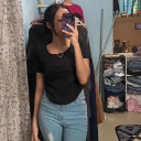
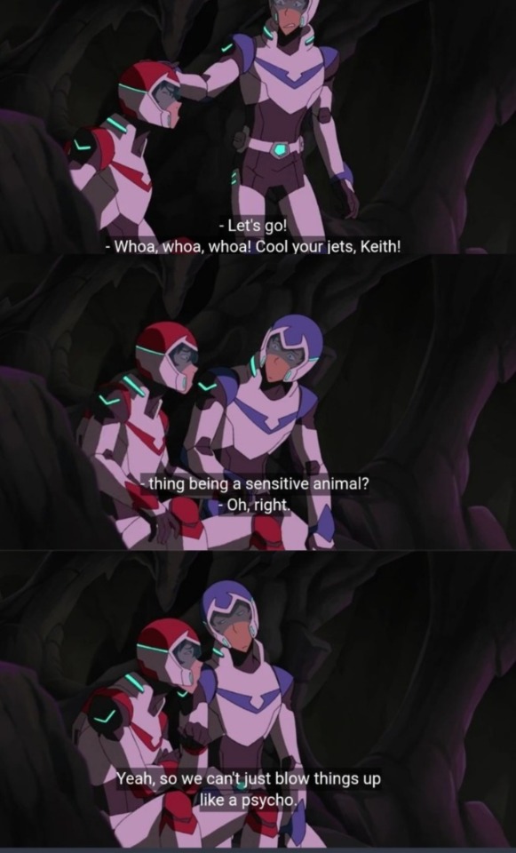
discowing + jaybin ! press for quality
txtless + ref under the cut
ignore my horrible art please i drew this on ibis paint x with my finger and the soft felt tip pen brush. and my crappy penmanship.
#discowing isnt actually that bad guys i swear in this essay i will-#isn’t the discowing suit mainly dark blue? no#thats actually a commen phenomenon in comics#because comics#especially older ones#tend to use blue as highlights for black#and oftentimes that leads readers into mistaking the black for blue#common examples of this are in the discowing suit#in batman’s cape#and in spider-man’s outfit#sometimes like with the discowing suit or the spider-man suit#so many people think that it’s blue that it just starts to be drawn and portrayed as blue#thank you for reading my yap session#if u did#dc#dc comics#batman#nightwing#robin#dick grayson#jason todd#discowing#jaybin#NOT A SHIP btw#please dont tag as ship#its not#i cant believe i have to say that
2K notes
·
View notes
Text
been messing with this for a while, but i think i’ll finally post the first three dorms for my swap au!!
these aren’t necessarily what i think the rsa uniforms would be in canon, just how i’d personally adapt them to the main cast in these positions. i don’t think a dorm based on the lion king would even exist at all in canon rsa.
design notes below the cut!
the pictures above the characters are the iterations/versions where i drew most inspiration for each design, both physical and writing. riddle and ace had the most inspiration taken from different places.
Heartslabyul —> Eccentryul
riddle’s design is painfully obviously ripped off of the alice in wonderland black butler ova. i spent so long sketching out ideas for him then ended up rewatching some black butler episodes and literally stole ciel’s clothes.
since eccentryul doesn’t have a dress code, all students are free to dress as they please. riddle is meant to look like an outlier among the other members of his dorm to highlight his role as the alice of the group while still looking like he belongs there. every character is wearing some kind of coat, however riddle is the only one with something overtop of it. all characters have slightly more muted colors in their clothing whereas riddle’s blues are a bit brighter.
trey and cater, as the third year pair, have flat colored hair without any change. ace and deuce as the first year pair have two colors in their hair. and riddle has no coloring to his hair at all as the only second year.
riddle’s headband is tied to resemble bunny ears! he no longer has his heart ahoge, unfortunately too much damage to his hair has made them recede back into his hair. but! his bangs have the general shape of a heart to make up for it!
deuce’s shoes were inspired by chat noir from ladybug. the paws look is adorable and i use it whenever i can. ace also has pawbs shoes, but they’re slippers! specifically the kind of slippers you could wear outside with the firm bottoms.
Savanaclaw —> Savirvana
i looked at so many possible references and did my research on kenyan clothing trends and traditional styles, but NOTHING i did came out right, so i just ended up basing it off of the outfits from leona’s hometown event. i simplified them a bit more than those, because event outfits tend to be more dramatic and detailed than the base outfits.
leona’s skin was shifted to a darker, more red tone, to match the deeper red tones of his hair. his warmer colors give off a more approachable feeling compared to the cooler, dark tones of his original design. his tattoo is a butterfly to symbolize the change simba experiences in his character arc in the movie.
ruggie is still pale, however he’s now tanned due to his constant time outside in such a hot and sunny environment. his freckles are kind of hard to see in the image quality but they’re still there! ruggie really doesn’t change much, his personality is already very firting to timon and pumba-
jack’s hair color also sees a significant change, mostly because there were too many white-haired characters LMAO. the brown colors give him a calmer look, fitting his personality more than the bright white hair and tail. unlike leona and ruggie, since jack grew up in an environment with a wider variety of temperatures and climates, he isn’t as used to the sun and thus keeps his arms covered and protected to prevent damage from too much uv light. don’t mind how the stripes of his pants look different compared to leona and ruggie’s, they were so annoying to draw and i got sick of it by the time i got to him 💀
Octavinelle —> Sidonis
i got the idea to base the uniform for the dorm of the sea off of sailor outfits/uniforms and that was my peak design moment. i will never reach that level of genius ever again.
sidonis’s uniform consists of light, flowing fabrics in order to not drag them down in water. their shoes resemble water shoes! for obvious reasons, so they aren’t ruined by salt water or just water in general.
jade and floyd still remain opposites, and i tried to portray this more with their hair. jade’s hair is neatly styled, with a black coloring to further symbolize his supposed “maturity.” floyd’s is unkempt, with the same black streak more highlighted among the white, to showcase his unpredictability.
floyd also seems to be missing a tooth. i wonder if jade knows anything about that.
azul’s housewarden uniform has a trail of tulle(? maybe chiffon?) tied into two, flowing tails to replicate ariel’s mermaid fins. he has a lot of diy and homemade jewelry to reflect her creativity and resourcefulness, including the shell necklace.
#twisted wonderland#twst#my art#riddle rosehearts#ace trappola#deuce spade#trey clover#cater diamond#leona kingscholar#ruggie bucchi#jack howl#azul ashengrotto#jade leech#floyd leech#twst rsa#swap au
385 notes
·
View notes
Note
What color palette(s) do you use for thrawn/chiss
I can never seem to get the right shades.
And yours are always so spot on and amazing!
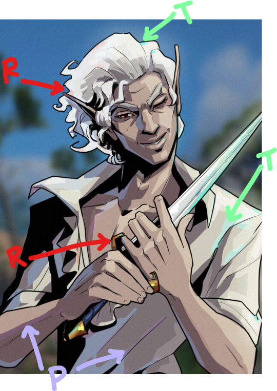
*claps with glee* color picking for chiss? you mean my favorite subject to ramble about ever? don't mind if i do 🔴〰🔴
this will be primarily for chiss skin. for anyone who wants to know how i do chiss eyes and haven't seen the tutorial i made, here it is
so for thrawn, i go the self-indulgent route and pick the brightest, most saturated cerulean blue as my base color:


then, before i add any shadows or highlights, i add the blush to his nose and cheeks/general middle third of the face. even if you're not trying to make your chiss look like they're blushing, it's good for adding some life/variation to the skintone
my chiss blush is, naturally, purple


your blush should be slightly darker than your base color. seeing as this saturated purple is naturally darker than the base blue i picked, i don't need to worry about manually picking a deeper shade, but in a lot of other color palettes, i would.
then for shadows, i shift the hue a little towards the royal blues with each darker shade, while maintaining max saturation


this is key if you want your chiss to be So Blue It Burns Your Eyes
for highlights, i like to shift my hue in the other direction, towards cyan, but after a certain point it doesn't matter as much as it does with base color and shadows.
for darker thrawn paintings, i will pick a darker base blue, but every other principle remains the same

and finally, if your chiss is not turning out blue enough (i've been there, despite my best efforts), try slapping an overlay layer with a midtone blue-grey on top. play around with the exact shade and the layer opacity based on what you're looking for and your chiss should become Even Bluer
i did it with my lesser evil fan poster


(and also in the very first example, from the thrawn and nuso esva painting)
now for other chiss, i like to add some variety in skin color, which does make my approach to color picking a little different. for example with ar'alani, i tend to choose a lighter blue


and then when it comes to shadows, i do pick more saturated shades as i go darker, as well as shifting the hue the same way as i do for thrawn

when it comes to blush, i pick a darker and more saturated purple. for characters whose base skintone is more cyan, i go for a more indigo color, and for characters whose skintone is more in the deep blue/royal blue category, the blush color is more purple

in this case, even if bomarmo's skintone is light, its hue is still less cyan than borika's, therefore his blush is more purple than hers
for darker or more grey skintones (like i do for samakro and my oc vuarum respectively) my principle is still the same, except the less saturated the base color, the less saturated the shadows are going to be. (even though we're still going slightly to the right and shifting the hue. i even do this when i'm painting evereni or other grey skintones)


there is a stopping point to the hue shifting though. i stop shifting the hue for my darker shadows once it reaches that cusp between indigo and purple. i generally don't put purple shadows on my chiss unless the lighting specifically calls for it
then for chiss hair, there's a lot less nuance to my process
the white circle is where i like to start if i'm doing a low committment sketch or very bright painting, but if i'm doing a darker painting i'll usually just start with black and every other shade is sort of a highlight after that.
generally you can go more saturated but i find the less saturated color selection creates a very nice contrast between the Very Blue skin and more muted blue-black hair. i do occasionally like picking more saturated base colors for some chiss though


in general i like to treat chiss hair colors similar to humans except if their undertones were blue instead of yellow and their version of "ginger" was purple.
finally, just a disclaimer: don't color pick from any of these. they're not going to be accurate to the colors i picked on my art programs. between screenshots and file compression, the colors are Slightly Off. that's also why i didn't just drop a bunch of color swatches and skedaddle. it's much more fruitful to learn how to pick your colors :3
thanks for reading! if you have any more questions, feel free to reply or send me an ask! i love talking about this stuff 💙
63 notes
·
View notes
Text
A study on Lance's underrated role on the team.
Or, "Yes, there was a Space Mom"
Some time ago, I made a post saying that, the closest thing to a "Space Mom" the paladins ever had was actually Lance and I wanted to make a post elaborating more on why I thought so.
Now this is not me saying that we have to put this Team in neat nuclear family boxes, even Shiro, the one who the fandom collectively agrees to call "Space Dad" doesnt fit perfectly the Team Dad trope, but what I mean is that, this role is one that most of the time it appears naturally in any group of friends/people.
So, lets start with seeing how TVTropes describes what is a Team Mom:
"In an ensemble show, especially of the fighting kind, there needs to be someone to hold this Ragtag Bunch of Misfits together before they kill each other or wander off into the woods like so many Player Characters."
"The Team Mom basically acts as the mother figure for everyone else in the group, regardless of age or family relations."
"Although the role itself is traditionally female, the overprotective dad or older brother can qualify for Team Mom"
"They are by definition never the loner, and will in fact tend to be the one who pulls them into the cast's orbit as a Sixth Ranger. If anyone can break through and bring about a Heel–Face Turn or Cooldown Hug, it's them"
"if any of their surrogate children or siblings are threatened, they can snap into angry Mama Bear mode and kick some ass"
Basically, this role is less about gender and age and more about how the character threats the rest of their peers.
It is hard to imagine resident flirty goofball Lance as fitting in a role like this since, usually, characters that are referred to as the "Team Mom", seem a bit more responsible and mature.
And, admittedly, it is a role that he has to grow into a bit, but even in the first episode he already had some shades of this:
Covering for Pidge and taking the brunt of Iverson's anger, running to aid someone who had fallen from one of the pods (before knowing it was a pretty girl) and protecting Coran from a explosion.
Overall through the show, Lance actually ends up being very caring and protective towards his teammates.
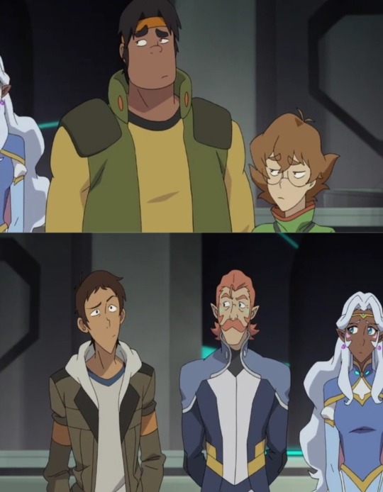
I was unsure on how I wanted to do this analysis since, there is actually quite a lot I want to talk about, so I decided to highlight how Lance acts with every member of the team from this angle.
Keith
The Lion Switch and Keith stepping to pilot Black is what, for a lot of fans, kickstarts Lance's arc of becoming a more mature individual and team player.
But even as early as s1, we do have moments of Lance keeping Keith grounded, like when he stops him from being reckless and hurting the balmera.
In season 3, when Keith is dealing with the loss of Shiro, everyone present decides to turn to Lance to handle it, Lance doesnt even notice what they are doing and instead goes to talk to Keith.
It is interesting that, even Coran and Allura (the adult and the diplomat) also look at him to handle the situation. And it's not a case of just looking at the next person in line, since Pidge is very clearly looking in his direction.
They eventually join to talk to Keith too but not before Lance makes the first approach.
And even when it was clear he really wanted to be chosen, Lance still quickly went to support Black's choice and thus, Keith's new position.
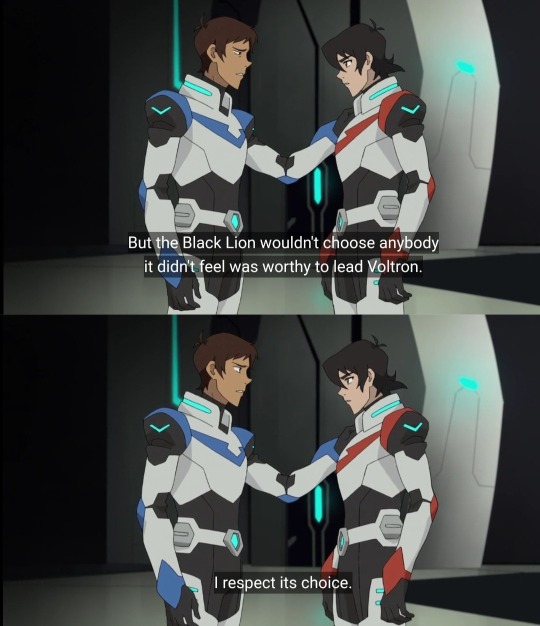
Like Allura tells us later, this is what makes Red, the literal right hand lion to call for Lance.

"You value a strong team"
Because thats what makes Lance really shine. His utter love and care for his team.
Even when he was clearly disappointed about not being chosen he decides to forget his own hurt to instead show to his unsure teammate.
And support he did.
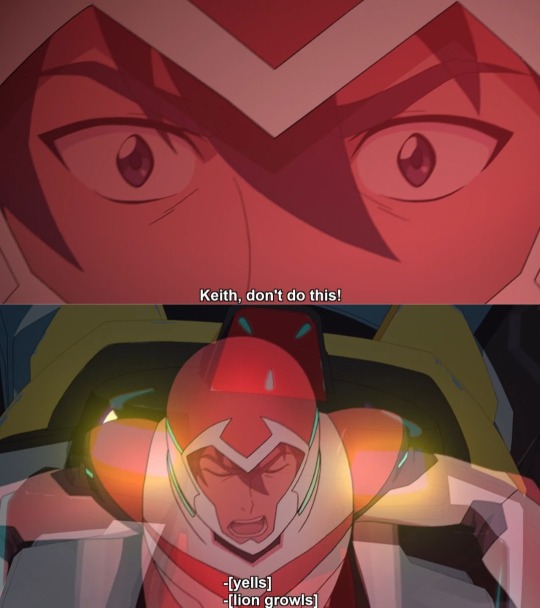
After Keith goes to follow Lotor and makes the team enter a difficult situation while Allura is struggling with Blue, it's Lance the one who manages to make him stop and return.
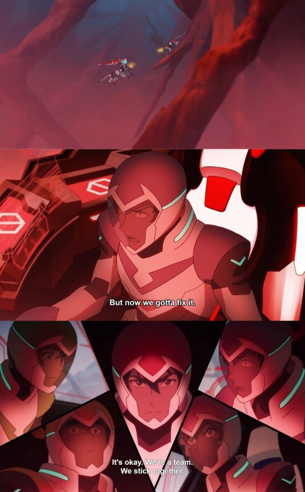
Keith returns with Lance and shows he is regretful of his actions, one would think that Lance would take this chance to scold his "rival" but instead, he just acknowledges that Keith did mess up but now they are going to fix it. Showing Keith he is not alone in this.
After this incident Lance keeps being very vocally supportive of Keith (when he agrees with his orders).
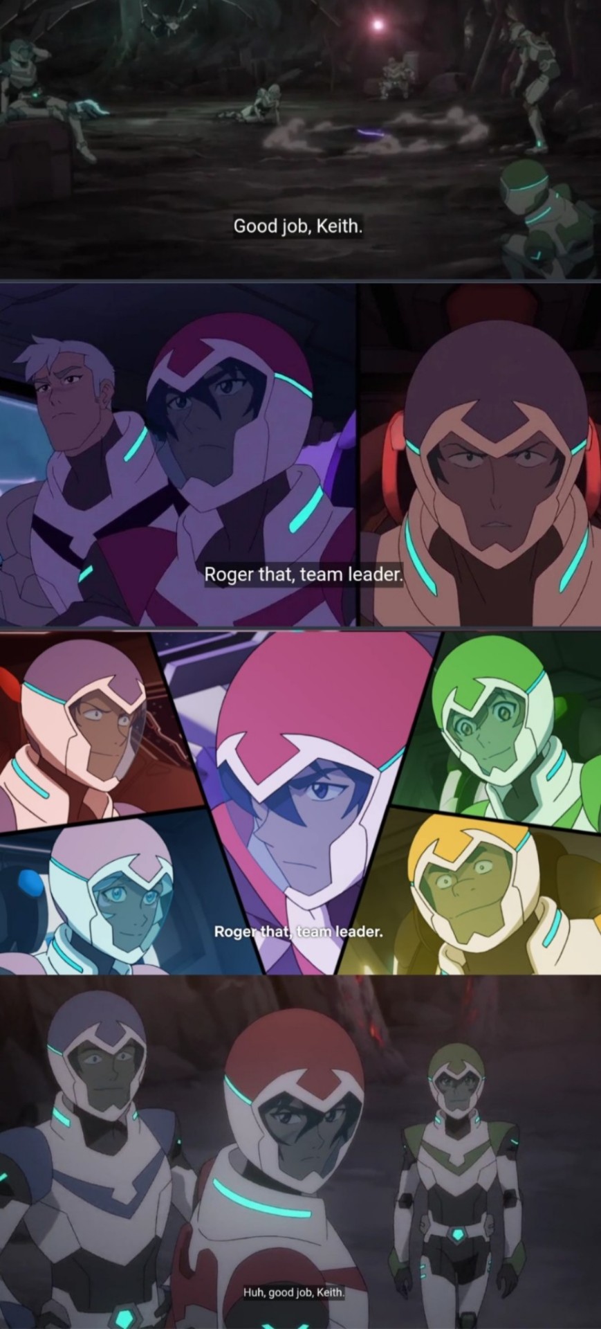
And will usually follow his orders to a T. For example in "The Journey Within" Keith made a system for the team to sound off every certain period of time, and when Keith stops seeing a point to it, Lance keeps going and the team follows his lead.
It is also interesting to mention, these moments of Lance speaking softly to Keith when he is freaking out.
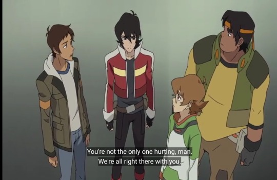
Another example would be when they get captured and Keith calls the name of his teammates, Lance being the first name he calls and the first to answer.
This ended up being quite long and the 10 pic limit doesnt help either so I will be splitting this in parts.
Keith and Allura's section is, unsurprisingly, quite long but I managed to gather a little evidence to talk about Lance's relationship with all the team.
Hope you guys enjoyed this first part
[Masterpost] [Part 1] [Part 2] [Part 3]
#voltron#voltron legendary defender#voltron meta#vld meta#vld lance#lance mcclain#keith kogane#vld keith#unsure if tag this as klance since i'm trying to be unbiased#and i know some dont have the best opinion of tvtropes#so lets say this is just “Lance was actually a very supportive and nurturing team member and i want to talk about it” post
131 notes
·
View notes
Text
i was asked by @matthew-macfadyens for a colouring tutorial, so here we go ! i've been making gifs for almost 4 years now and finally feel comfortable and confident in my skills to make a full tutorial on my colouring process. there are so many different ways people colour gifs, and there's no wrong way, this is just how i do it ! i learned to gif by reading so many tutorials and picking and choosing what works for me, so hopefully this can help someone out !
if this tutorial helps you, please considering supporting me ! buy me coffee ♡

TUTORIAL UNDER THE CUT
what you'll need: - photoshop ( i use ps cc 2023 & frame timeline ) - basic ps knowledge ( how to make gifs, how to sharpen gifs, general understanding of adjustment layers, layer masks and blending modes ) - a whole lot of patience
helpful resources:
the beginner's guide to channel mixer by @aubrey-plaza
giffing 101 by @cillianmurphy
gif making for beginners by @hayaosmiyazaki
colouring yellow-tinted shots by @ajusnice
becca's mega colouring tutorial by @nataliescatorccio
@usergif
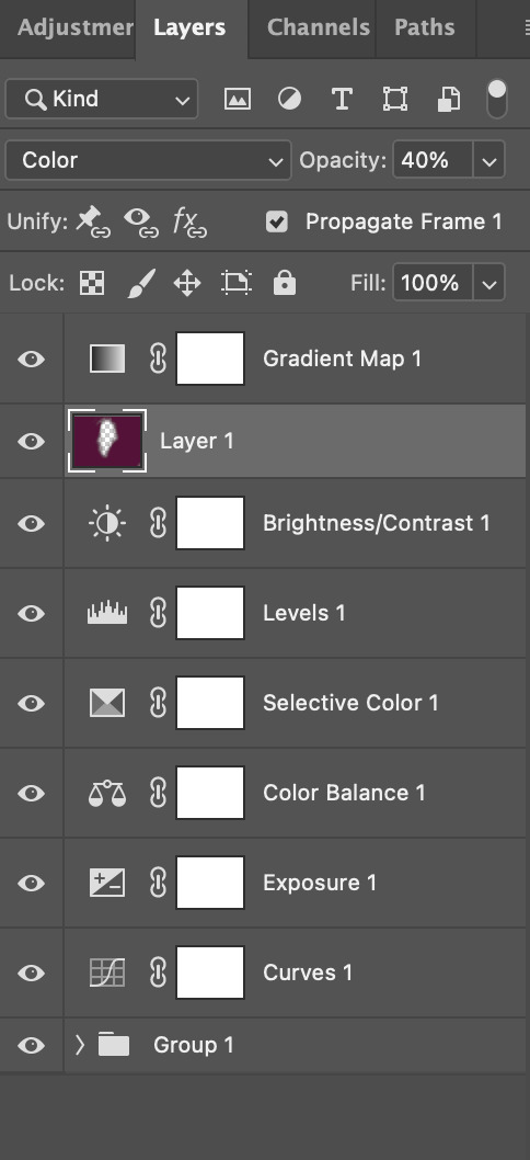
PART ONE: BASE COLOURING
- step 1: curves - step 2: exposure - step 3: colour balance - step 4: selective colour - step 5: levels - step 6: brightness / contrast - step 7: gradient map
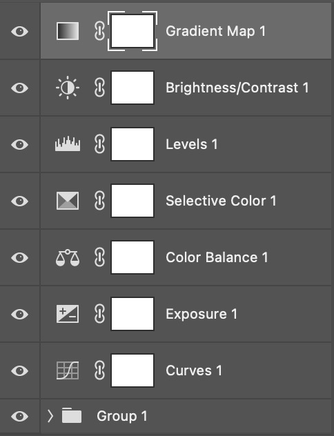
okay so, before we get started, this tutorial is for colouring only. at this point, i've already gotten my screencaps, imported them into photoshop, made the actual gif & sharpened the gif. the above image includes what my typical adjustment layer stack looks like !
STEP ONE: CURVES
a lot of people do the majority of their heavy lifting in curves...i'm not one of those people. i've never gotten the hang of curves and haven't been able to fully taken advantage of everything it can offer. i use curves to mainly brighten up my gif and to start my process.
i use the "auto" button in the curves function - this automatically corrects the curves for your gif ( mainly the brightness / contrast )
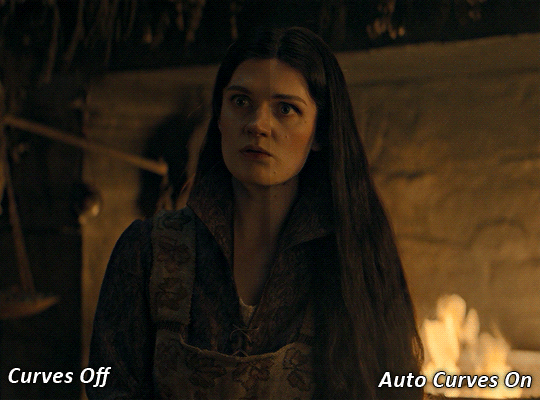
you can see that the auto curves has brightened up the gif and evened out the brightness/contrast. i just find this gives a better starting point for the colouring process.
STEP TWO: EXPOSURE
this step is for, you guessed it, brightening the gif more and evening out the contrast and blacks. i don't have any real rules for doing this, the amount i highten the exposure and contrast is different based on the scene and the show, however, i tend to stay around +1 on both exposure and gamma correction.
exposure effects the brightness of the gif and gamma correction effects the blacks and contrast. this step also effects the saturation of the gif, so it's important not to go too crazy. i often end up coming back to this step every now and again to adjust and fiddle with it.
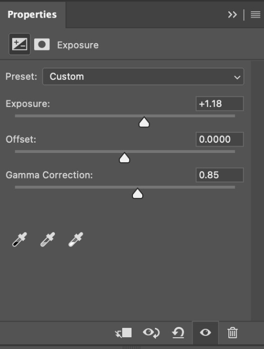
for this gif, i put the exposure at +1.18 and the gamma correction at 0.85
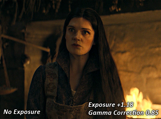
you can see this step serves to add some more brightness and contrast - it also adds some more saturation, that we don't always want, but don't worry, that's what the next steps are for !
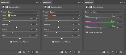
STEP THREE: COLOUR BALANCE
i use this step to do a lot of my heavy lifting - i'm a whore for colour balance. this serves to even out the colours and help neutralize the colours for an easier canvas. it's important to understand the basics of colour theory for this, i recommend checking out the channel mixer tutorial i listed above, because a lot of those steps applies to colour balance.
essentially, there's three separate profiles to edit on - highlights, midtones and shadows. in each profile, you have 3 colour sliders. the top one is your cyan to red, middle is magenta to green, and bottom is yellow to blue. the colouring of the scene will decide where to move your sliders.
for example: if your original scene has a cyan tint to it, you'll want to pull your slider to the right, towards the red to help neutralize the cyan. if your scene has a green tint, you'll want to pull it left towards the magenta. as you move the sliders, you'll notice that sometimes it brings out other colours you don't necessarily need, you can adjust the other sliders to help neutralize further.
i always do my main correction in the midtones profile.
since this scene has a heavy yellow tint, my first step was to adjust the bottom slider. i pulled the slider to the right towards blue at +22. you can see this helped get rid of a lot of the yellow, but adding in the blue warmed up the reds and made it more saturated.
to help with this, i pulled the top slider left towards cyan to help neutralize that red.

i pulled the top slider to -28 and you can see this cut out that heavy saturation and redness. it's looking a lot better, but now it's a little too green for my liking. this is where that middle slider comes in!
i pulled the middle slider to -6 towards the magenta to help counteract the green that came in. ( i ended up going back in and adjusting the bottom slider to +10 instead, as it was a little to blue )
you can see this step really did the heavy lifting, helping to neutralize the canvas so that it's easier to work with...but it's not quite perfect yet!
STEP FOUR: SELECTIVE COLOUR
a lot of the same principles around colour theory apply to selective colour! this is where i go to adjust the colours according to what my colour palette is. for this gif, the overall colour is going to be purple, so i'll adjust the individual colours with that in mind.
i only ever adjust my red, yellow, white and black profiles! sometimes i'll do the other colours, but that's only for tweaking the final colour. i normally don't touch them at all.
ps: you'll notice i prefer a cooler toned gif, and almost always go for a more magenta looking red/yellow.
i always start with my yellows:

in the yellow profile, i pull my cyan towards the left to -38 (this helps eliminate the green in the yellows) and my yellow slider to the left to -27 (this cools down the yellows. i top it off by adjusting my magenta slider to -10, to help lower the saturation of the yellows.
you'll notice this step got rid of most of the green undertones - that's because the green was nested inside the yellows, so by taking out a lot of the cyan and yellow, you're left with a warmer yellow as opposed to a cooler yellow.

next i go on to my reds. this step will mainly effect the alys's skin tone, but i'm going to do pretty much the same as above but with much less dramatic of a change. lowering your colours in your red profile too much can lead to a very saturated gif, which is not what i'm going for.
i pulled my cyan slider to -19, magenta to -9 and yellow to -15. you can see this helped add some more cooler tones to the reds.
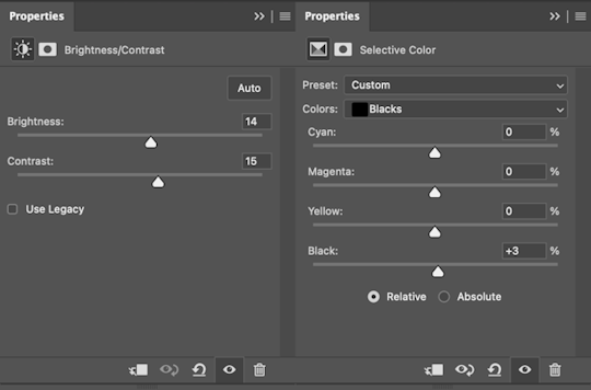
the next profiles are your white and black profiles. i use white to brighten the lightest parts of the gif. no rhyme or reason here, i just pull the black slider towards the left...usually around -25. for the black profile, i always move the black slider towards the right. anywhere from +3 to +8, depending on the gif. for this gif, i did +8. this darkens the blacks and, in my opinion, helps the gif pop!
you can see this step got rid of the yellow tint, gave the gif a more neutral look and adjusted the reds to better compliment a purple colour scheme !
STEP FIVE: LEVELS
this adjustment has three toggles - i'm not 100% sure what each toggle really does, i just know that by pulling the leftmost toggle to the right, it darkens your gif, and pulling the rightmost toggle to the left brightens your gif.

this step is so hard to explain, but really i just pull the toggles around until it looks good...sorry !
STEP SIX: BRIGHTNESS / CONTRAST
this step is exactly what it says on the tin...it brightens your gif. this step is based on your scene and personal preference, there's no real guide to it.
i always pull my brightness slider to the right ( brighter ) and my contrast slider to the left ( less contrast ).
STEP SEVEN: GRADIENT MAP
this last step is something i learned from @nataliescatorccio ! i add a gradient map to the top of my stack, and choose a lighter colour of what i want my overall gif to be. in this case, i used a very light purple!
i then set the blending mode to "soft light" and lower the opacity to anywhere from 20-30%. for this gif, i did 30%
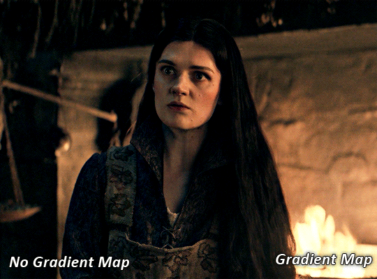
this step will help make your colour pop once you do your main colouring!
PART TWO: PAINTING & COLOURING
- step 1: layer 1 - step 2: layer 2 - step 3: layer 3 - step 4: final touches
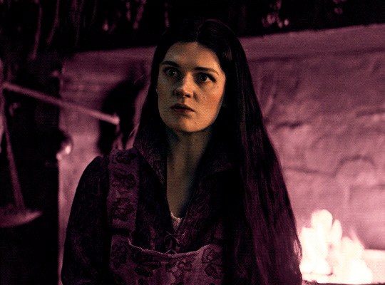
okay, so my actual colouring process is based in 3 layers. for this gif, i'm using a deep purple/mauve colour !
STEP ONE: LAYER ONE
between your brightness/contrast and gradient map layers, add another blank layer. change the blending mode of this layer to "colour" and set the opacity to 40%.
then, using a soft round brush with an opacity of 100% ( size of the brush is your preference, i typically use around 108 ), colour the parts of the gif you want coloured !

you can see this helps us get the canvas to a more uniform purple colour!
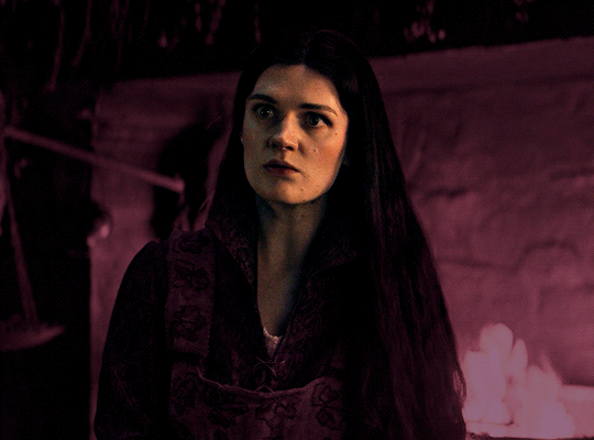
STEP TWO: LAYER TWO
for layer two we're going to do the exact same thing. add a layer above your previous, set to "colour" at 40%. we're going to go over the same areas!
you can see this helped get the purple so much more vibrant and closer to what our final colour is going to be!
STEP THREE: LAYER THREE
for our final layer, add another layer above the previous 2, set your blending mode to "multiply" and your opacity to anything from 60%-100%. for this gif, i did 60% !
now, our colouring is pretty much done but you can see that, now that our colour is down, alys's face is still a little too blue/green/yellow for the background purple. the next step, we're going to adjust and add final touches!
STEP FOUR: FINAL TOUCHES
at this point, i went back into my selective colour layer and adjusted my yellows & reds and went back into my colour balance layer to adjust everything overall.

at this point, i'm going to go in and add some adjustments layers above everything - i usually add some brightness/contrast, and a selective colour layer to darken the blacks.
which brings us to our final result:
#usergif#dailyresources#pscentral#ps tutorial#tutorial#coloring tutorial#allresources#userbecca#tusermich#userjoelle#ughmerlin#mialook#*tutorial#**
222 notes
·
View notes
Note
hello!! i love your art so much, your colors are beautiful and your characters are just so 👁️👁️ and i adore seeing them on my dash :)
i had a question about how you do the details on your fabrics: how do you keep the patterns on clothes on a body looking so,,, clean and readable while also making it make sense on the form under it?
like the cape/sleeve(? idk what it is but it looks cool as hell) on the magnolia commission pattern looks so cool and it's still readable on the fabric (like, if i wanted i could probably do a silly sketch of it) BUT ALSO it seems to make sense with the folds so it doesn't just look unnatural and stiff?
i'm so sorry this is kind of a long ask but like. would you be down to talk about your process for patterns on clothing? it's cool if you're not, that's totally fair, just figured i'd ask
have a wonderful day!!
OOOH Thank you so much for the ask!! I wanna do a more in depth tutorial, but I tend to make patterns in two different ways, with one being fully hand-drawn and the other playing with mesh transforms or the... Uh, liquify CSP tool? Let me find examples

This is an example of a fully hand-drawn pattern. No trickery here- Only trying to eyeball everything. It's kinda a lot of work to draw it manually, but it's the more convenient option if the character I'm drawing doesn't have files for the patterns, or if the files are a bit too different from my usual style, as they could potentially not look great with my linearted or painted style
And then- For cases such as Nolia's cloak, I did the entire pattern as a separate file, then placed it using Photoshop's mesh transform!

Here's a WIP file from when I placed all the patterns after finishing the lineart, where you can see them in full contrast. I tend to keep my patterns in different files- The black parts here are not joined with the base color of the cloth, so I can bring nice highlights and texturing when they're meant to be golden inlays, for example. Now, the Photoshop mesh transform is a bit finnicky to use, and I don't have any proper step by step of it- I could potentially record how I do it someday. But let's take the humble cylinder and demonstrate it quickly:

So, the mesh warp tool is the one on the right- You can see these sort of blue lines creating a mesh. I'm sure CSP has it in it's pro level or something? Correct me if I'm wrong. You play around with the different sections, move it to the right place, and put it on the cylinder. This is a very simplified form. You can make many subsections to your meshes (that's 3x3- you can have stuff such as 20x20) for when you have multiple folds.

And then you can just shade your pattern accordingly so it fits the volume of the drawing, and- ta-daa!
This is by no means an easy method. Sometimes you can get away with the Liquify tool (which CSP has and it's very decent), which I've used when the pattern in question was over a simpler surface with few folds. It takes some practise to use that well, and it isn't gonna be the best for complex ones, but it's also an option. Let me do a lil compilation of some patterns I've done and which tools I used for each!
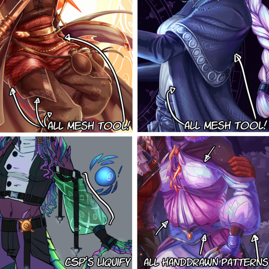
The tool I use highly depends on the time I have, the level of finish for the drawing, and so on. CSP's liquify is probably the fastest but gives simpler results, drawing them manually works better with some styles and more organic/less geometrical patterns, the mesh tool takes a bunch of time but it's great for small repeating patterns that are meant to be very precise or geometrical.
If people would be interested in it, I may someday do a video tutorial of me doing a pattern and then putting it over a folded cloth. I do hope this can help a bit tho!!
122 notes
·
View notes
Text
Greenridge ABO Series
Series Masterlist Masterlist
Characters:
I just kinda made things up for them/their personalities. Sorry if it's weird or cringe. Also.... sorry to be another "Alpha I.N." story as well but I like the idea lol
Omega Y/N L/N
- Bought at a young age by the Nyko pack.
- Abused by them (mostly the alpha) and forced submission (almost died from a sub drop once).
- Lived with them for nearly ten years.
- Convinced you that the neighboring packs are worse than he is....they would kill her just for being on their property unwelcomed.
GREENRIDGE PACK

Alpha Chan
Leader of the Greenridge Pack
Amber eyes, black hair
True Alpha known to be ruthless
Rumour is he killed his older brother to be Alpha (did not, was there when he was murdered and got blamed)
Protective of his own
Secretly a softie for those he holds dear - barely sleeps worrying over his pack
Doesn’t do well with disobedience/defiance
Usually with Jisung or Seungmin during his ruts

Alpha Minho
Second to Chan
Menace
Brown hair, dark eyes
Doesn’t open up to people easily
Refuses to submit to anyone but Chan
Helps guide Jeongin and teach him how to control his Alpha urges
House chef
Favors Jisung to help with his rut
Gets aggressive leading up to and during his ruts if he doesn’t get what he wants

Beta Changbin
Head Beta
Dark hair, dark eyes
Keeps the other Betas in check
In charge of training to keep everyone in shape and fight ready
Also does interrogation with Minho and tortures if needed
Intimidating but softie
Gets babyish and pouty leading up to his rut (and during)
Pouts and begs for Hyunjin to help with his rut (eventually Hyunjin reluctantly caves)

Beta Hyunjin
Quiet, keeps to himself
Best tracker and hunter
Black hair, dark eyes
Tech savvy and good at reading people
Becomes clingy and touchy leading up to and on his rut, slightly aggressive during it. Very jealous
Prefers Felix or Changbin during his ruts

Beta Jisung
Loud and boisterous
Brown hair, dark eyes
Impulsive and acts without thinking a lot
Has the messiest room
Gets aggressive leading up to his ruts and Only minho gets thru to him.
Prefers Minho during his ruts

Beta Felix
Sweet and kind
Blonde hair, blue eyes
VERY Sensitive to emotions
Trusts too easily
Usually helps Minho with cooking
Training to be pack medic with Doc Quinn
Prefers Minho or Seungmin during ruts (likes it rough)
Very emotional leading up to and during his ruts and exhausts himself worrying about everything.

Beta Seungmin
Laid back and even tempered. Takes awhile to get a rise out of him.
Light hair, dark eyes
Reads often and likes photography
Leading up to his rut, his tolerance is shorter and he gets lazier.
Usually gets help from Minho or Felix with his rut

Alpha Jeongin
Newly presented alpha
Was thought to be a beta originally
Dark eyes, dark hair with highlights
Eager to learn from Minho
Does well with just the boys - only an occasional loss of temper
Still training and practice with Omegas, pheromone control, and urges
Gets antsy and quick tempered leading up to and during ruts
Usually has Chan or hyunjin help him
They are all mates with each other so yeah LOL
I'm VERY OT8 for SKZ but I do have a bias....hopefully I don't make it obvious :)

Doctor Quinn
Pack medic
Also helps with a few other ally packs but priority is Greenridge
35 years old
Been tending to injured since she was 15
Rogue Beta
NYKO PACK

Alpha Lewis
Leader of the Nyko Pack
Has 2 little brothers in the pack: Hayes and Milo
Pack also contains 4 other betas and 3 omegas (including y/n)
Used y/n for his own needs and couldn’t care less about her
Keeps her locked in the basement until he’s ready to use her.
Ruthless and feared by most the neighboring packs. No one dares to cross him
Took over 2 neighboring packs and expanded his territory, gaining their numbers as well

Alpha Hayes
Little brother of Lewis
Alpha in training
Older than Milo by 1 year

Beta Milo
Little brother of Hayes and Lewis
With Hayes always doing the alpha’s bidding
Other Betas:
Samuel
Triston
Frankie
Mallory
Omegas:
Y/n
Asher
Harper
#stray kids x y/n#stray kids abo#bang chan#lee know#lee minho#seo changbin#hwang hyunjin#lee felix#lee yongbok#han jisung#kim seungmin#yang jeongin#stray kids x reader
73 notes
·
View notes
Text
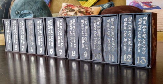
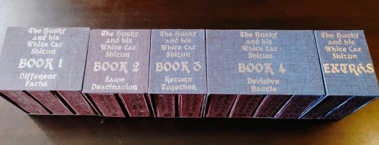
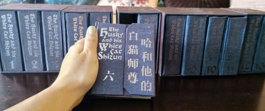
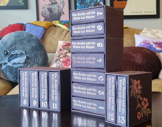
It's time! for! 2ha!!!!!!! I've had 'the husky and his white cat shizun' on my radar as a bookbinding project basically from the very start, back when I thought it was impossible that any of these danmei novels would ever be licensed for english translations. But this book is so long, and besides, the translation wasn't complete, so it went onto the backest of back burners. Until now! So, the book has been licensed. It's started releasing! As usual, please support these authors, they have a passionate english-speaking fanbase, and I very much want them to enjoy that success in a practical sense and not just an abstract one. And I also want more of these novels translated, haha. But the nature of licensing means I've also gotten a lot more interested in preserving prior translations in formats that can't casually be yoinked from the internet.

Now, this is a big novel. This was 1.1 million words. The stack of pressed text quarto blocks was over 15 inches, and once I added covers (very thick, for reasons I'm about to cover) and boxes, this thing was 22 inches long. Oh my god. This sustained effort naturally overlapped with an international trip and two crucially Important work presentations. I almost died. I had to split it into multiple boxes because I wasn't sure I could laminate boards thick enough to support so much weight at so much length and still cut it with any precision, lmao
And those covers? I took inspiration from notebooks I've sent with cover flaps like these, and also decided to see if I could incorporate the strip magnets I bought for peller box experiments and barely used. The downside that didn't make itself apparent until late in the construction process was that laminating boards to match this depth made the covers REAL thick, and difficult to cover with a crisp finish. Duo bookcloth can get wrinkly and fragile when it's wet, so it didn't entirely take me by surprise, but it's something I'll be accounting for next time I try this construction!
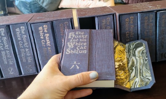
I tried to stick to a black and blue and silver color scheme, because it matches the book, but I also accepted some gold highlights on the endpapers. The duo bookcloth tends to photograph with a bit more brown in the color shift than I see in person, but I think it plays out well in person or in photos! The endpapers make for a nice striking pop when the book opens and don't blend into the cover fabric, which was something I definitely wanted to avoid.
And, speaking of thematically appropriate, I found this image for chapter headers that was almost perfect, but the wrong kind of flowers. So I did change those to haitang blosoms, haha. That happened early in the typesetting process, but I did also have that on my mind as I worked out decorations for the boxes! Mostly, I just titled what book of the novel it was on the top and left it there, but the very last detail I added was a pair of foil flowers done in pink and silver, on the outside edges of the boxes for book 1 and the extras. I finished that last night and then went to bed SO excited to take pictures in the morning. I really had an incredible time with this book, and the whole adventure reminded me just how much I love 2ha. I'm so happy I did this, I really had just an incredible time!!!!!
#crafts#bookbinding#2ha#the husky and his white cat shizun#erha he ta de bai mao shizun#long post#with any luck ill be pulling together instructions for my case construction here soon
1K notes
·
View notes
Text
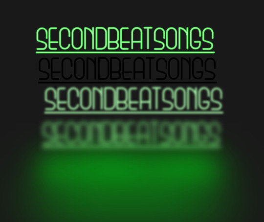
how to make neon signs in inkscape!
I lost my mind and spent a large amount of hours yesterday perfecting my methods and figuring out how to do this, so if you're interested in making something like this:

here's how to do that!
step 1: cover your workspace in a dark grey rectangle, and lock that layer down.
I've been using 80% or 90% grey - you want this so you can see your neon effect, but you don't want it entirely black at this stage, or you won't be able to see your shadow layer.

step 2: create some text!
pro tip: rounder sans-serif fonts look the best for this, because think about what a neon sign is made of - it's tubes, bent into shapes! so if your font or design looks too sharp and pointy, it'll feel unrealistic when you make it neon.
(this is, of course, a perfectionism thing on my end, so feel free to ignore any and all rules in order to make the thing that you want to make. as with all art, you can do whatever you want forever!)
bonus pro tip: if you, like me, have over 1400 fonts installed and programs tend to lag when you browse through all of them, nexusfont is a great free software that lets you sort your fonts into categories, search them, and preview what any text looks like in different fonts! I love it. it is my best friend
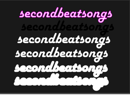
now I'm going to do this with a few different fonts, so that you can see how it works with them. so today, I'm picking Futura Round, Harlow Solid Italic, and then to challenge myself, Beauty School Dropout and Block

make the text white, and also select the text and go to Paths -> Object to Path, because some things don't work right if they're not paths.
let's start off easy with Futura Round!
Step 3: duplicate your text layer
now bear with me here. but you need to take the text you're working with, and either right-click duplicate or copy/paste the layer until you have seven total copies of the text you're working with.

arrange them like this, making sure the top one is the first layer on the list (and so on), and then in the layers tab, label them like so:
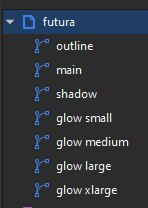
pro tip: if you don't have the layers tab open, go to Objects -> Objects and Layers, and that'll pop it right up
Step 4: blur time!
switch to the Fill and Stroke tab, and make these changes to the paths:
glow small: 15% blur, 100% opacity
glow medium: 20% blur, 90% opacity
glow large: 50% blur, 70% opacity
glow xlarge: 70% blur, 70% opacity
your workspace should now look like this:

this is good!
pro tip: these numbers are just loose guidelines! at the end, mess around with everything to make sure that the glow looks right to you! nothing is an exact science
Step 5: shadow and outline
for the shadow layer, make it solid black, and then change the opacity to 50%
for the outline layer, we're doing something fun and weird. so right now it's a fill object, but we want it to be an outline instead! so let's hit the X in the lower left to make it empty, and then shift-click on...for the sake of this, let's say blue. to make our nice blue outline.
now's the weird part
now. use the align tool (Objects -> Align and Distribute), select the outline layer and the main layer, and align them so the outline text is exactly centered on the main one.
then go to Paths -> Path Effects, and when the tab opens, select just the outline layer, then click the drop-down arrow in the Path Effects tab and select Offset
here's our goal right now:
we want to offset the outline until it fits inside the text underneath it, and also mess with the stroke layer settings until you have a nice thick outline that doesn't overlap itself.
mess around with the plus and minus buttons. there are no exact numbers here; you just have to know when it looks good! but for me, the settings were a -0.34mm offset, with a stroke width of 0.700mm
this is roughly what you want it to look like:
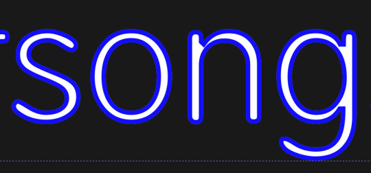
now, with the outline layer still selected, blur it out just a bit until it looks fuzzy, and like the white center is a highlight rather than a separate layer. for me, the right number was about 8.3% of blur, to get a result like this:

Step 6: layering and changing colors
okay! at this point your work should look something like this:

you now want to select every layer except the shadow layer, and use Align to center them all on top of each other.
pro tip: make sure to untoggle "move/align selection as a group", otherwise this will not work.
you should now have something that looks like this, with the shadow layer sitting all by itself somewhere off to the side

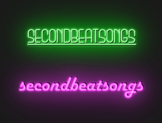
now's the fun part: colors!
since we've decided that this neon light is going to be blue, it's time to change the glow to reflect that!
here's what it looks like when you change all of the glow layers to be that same, #0000FF blue as the outline layer

and here's what it looks like when you take the glow small layer and make it just a bit lighter (#4343FF) using the stroke and fill tab

in general, mess around with the layer colors until you like how they look! I find that it generally looks better if the glow small layer is a bit lighter, and the glow medium layer is as dark as the original color. everything else is fair game.
also the main layer can stay white (if you want it to seem very bright), or you can make it a very very light blue if you want it to be a bit more subdued.
Step 7: final steps
take your sad, neglected shadow layer, and move it slightly up and to the right of your main layer, so that it works...well, basically like a drop shadow.
then take your original rectangle, and switch it to 100% black.
now. gaze upon your masterpiece

that's a good neon sign if I've ever seen one.
but now. now's when we lose our minds
Steps 8-??: perfectionism and nonsense
so let's move the Futura one aside (and hide it! inkscape lags if there are too many blurry layers visible at once, so hide anything you're not using!), set the rectangle back to grey, and move on to Harlow Solid Italic.
I've sped through a few of the steps here (out of order) so you can see what I'm doing. I've added outlines to the large glow and xlarge glow, and bumped them up a bit so they'll have a larger glow area in general
this time I've made the large glow a little bit lighter than the xlarge glow and medium glow, and made the main layer a very pale pink instead of just white. I also blurred the outline layer just a bit more, because this font needed a bit more fuzz to make it look good.

hell yeah. this rocks.
now, one detail for perfectionism: in neon signs IRL, if you look closely, there are wires attaching them in the back, often connecting each letter to the next. so...let's do that!
get your pen tool, set it to spiro path, and then make little droopy lines connecting each letter.
make these thin, 100% opacity, and a very light (almost white) grey color. then group all of them together, and move this group under the small glow layer
pro tip: some of the cords might go mostly through the shadow layer. if this is the case, just put the cord group one layer above the shadow layer instead, and then it'll be fine. but you might make the cord color a pale-greyish pink to make it look like there's glow hitting it.
ultra advanced technique: duplicate the cord group, make it black and 50% opacity, position it slightly up and to the right of the original, and then move it one layer below it. you've got cord shadows babey!
lookit that. stare at that beautiful perfection. I love it. this brings me joy.
and now: the one that will be the most work
let's gooo Beauty School Dropout!
this one I'm using as an example for what to do with a font that's a bit too pointy to look realistic

this font is really fun and bendy, but the ends of the letters are flat instead of rounded, and the corners are a bit too sharp. so...let's fix that!
now, there are several ways we can do this (after doing Object to Path ofc).
one way is to edit the path yourself, going slowly, and making sure everything is perfect, editing the nodes individually.
or, you could select the text layer using the node tool, then click the button in the top bar labeled Add Corners LPE, and then drag the little circles and triangles around to smooth out the corners
I've decided to do the LPE method, but the problem here is that if you apply the LPE effect before making sure all of the corners look good nodes-wise, it's hell to try and fix it. so before LPE-ing, look at all the spots that you're going to apply the effect, and make sure each has one point at each sharp corner, with no weird overlapping bits. okay? okay.
also for the line beneath the text, it looks like it's made up of a bunch of different segments

and since I want to keep this line because I think it looks cool, we're going to have to deal with that, and make sure that it's all one solid piece, otherwise the outlining won't work. so I've gotta delete all the extra segments, and then move the points on just one of those segments until it's the full original line width, before rounding those corners as well.
basically I've got my work cut out for me here, this will all take a bit.
...aaand an episode and a half of Supernatural later, here's this!

look at how nice and round that is! perfect for the rest of the neon process
and with cords, shadows, layering, etc

hell yeah.
more things: it's block font time
let's make an outline-style neon sign!
my seven layers:

for all but the last two, I've not used the fill option with them at all - I have simply used the stroke outline.
now don't be worried! the stroke-to-path still works just the same way even using an outline to begin with! so it's easy to get an outline of an outline, and do the offset thing just like you did before
however, because this font is more complex-looking, there will probably be some errors when you offset it

for example, it didn't fully outline the second half of the Os, so I just copied the left halves, mirrored them, and replaced the right half with the complete left half
pro tip: keep in mind that you have to re-apply the offset to any bits that you add to the outline layer!
doing the same steps as last time, editing the glow blurs as I see fit, once again we end up with beauty and perfection.

another thing you can do: turn off the lights!
I'm going to use Beauty School Dropout and Harlow for this, but after making your beautiful neon signs, here's how to make it look like a turned-off sign, for if you want to make...idk, a gif of a light turning on and off, or a burned-out sign, or something like that.
so start with (ideally, duplicated copies of) your neon signs:
and then simply delete every glow layer, change the outline layer to 90% grey and your main layer to 70% grey, change the cords' color to a darker shade of grey than whatever it already is, and lower the opacity of the shadows by about 10-15%.
doing that, you end up with this

bam! lights turned off!
last thing: logos and other stuff
you can make neon signs with images as well as with text! the steps are essentially the same, though you may have to do more editing to make it look good, and use simplify on the path if it's too detailed.
and if you're using anything besides an .svg, you first go to Paths -> Trace Bitmap to turn your image into a vector! but unfortunately I've already used 29 images in this post, so here, just look at this Keith Haring thing I made as an example:

is it messier than the text? yeah for sure. does it have some pointy bits I could smooth out more? definitely. but, I've watched three episodes of Supernatural today, and that is more than enough time spent on this. so this is what you get.
but yeah, that's how I make neon signs in inkscape! I used to do it in GIMP, but this works much better, and looks so nice and clean! <3
(man, graphic design really is my passion)
#tutorials#inkscape#reference#neon#graphic design#tbh this is definitely for my own reference too because I know I will eventually forget this process#but I want it to also be useful to other people#so here!#inkscape tutorial#enjoy#graphic design is my passion#tutorial
137 notes
·
View notes
Note
I'm making a memorial drawing for my parents' late cat, but he is black and white and i wanted to make a lineart with color and shading, but my color and shading isn't top notch
do you have any advice?
(i love your art and style so much btw, your lineart, color and shading is absolutely stunning)
Oh that's lovely! I'm gonna do my best to explain how I do my colours and shading for you :)
Black and white are both the hardest colours to shade because they end up looking boring very quickly, but there are some tricks you can use to spice up your rendering a little bit.
If you look at the examples below:

The base black of this boot is not only not a true black, but it's not a true grey either, it's a very desaturated pink, but it does have a colour to it. Something like that should be your starting point. You want to stay away from true blacks and true whites, and only use them in places where they'll have a lot of impact. Like your lines, or the white highlight in someone's eye!
When I shade anything at all really, but especially anything that is meant to come across as white or black I try to cram as much colour into my shading as possible. in the piece above you can see that the deepest point of my shadows tend to get another colour added into them, sometimes i use a cold tone, sometimes a warm one, it just depends on the rest of the piece. The one above has a bit of both!
Same goes for white:

The base colour of Røst's white fur is a cream, not white, the highlight is a very light teal, and the shadows are a warm-ish royal blue, though with the opacity turned down.

In this one, on Rudi's belly, the white of her spot is actually split into two colours, warmer on top, and cooler on the bottom, since the snow would cast a bounce light up onto her fur. On top of that though here you can see how wild you can get with mixing other colours into your base colour to make it pop a little more. You can get away with way more than you think! And it doesn't always have to make sense :)

Baisically the hue slider is your best friend. That's the slider on the outside of the colour wheel in this type of setup. You can achieve a lot of variation in your shading just by fiddling with the hue slider and a bit of saturation and then slapping some of that in there!
I hope this is actually useful and not just gibberish :')
#my art#digital art#honestly my best advice is to not be afraid to go a little crazy with it#I did a watercolour pet portrait for my friend a little while ago of their cat that has a lot of grey on her#and i filled those spots with little bits of blue and i think yellow too#just to make them a little less flat#anything goes if you're brave enough!#long post#ask
40 notes
·
View notes
Text
Dandy's World OC: Stitch the Ragdoll (REDESIGN)
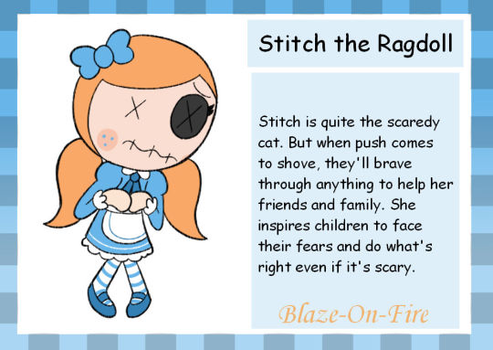


Bio and details below!
“Stitch is quite the scaredy cat. But when push comes to shove, they’ll brave through anything to help their friends and family. They inspire children to face their fears and do what’s right, even if it’s scary”
Full Name: Stitch Seamley Other Name: Stitch the Ragdoll Species: Ragdoll Gender: Nonbinary (She/They) Voice Claim: Madeline Dorroh (Ratatoskr - Fire Emblem Heroes)
Dandy Store Quote
“Hey that’s Stitch! Ain’t she a doll?”
Requirements
1250 Ichor
25% research on either Twisted Goob and Twisted Scraps
Appearance
Stitch is a humanoid Toon with fair skin (fabric). Their right eye is a black button with black eyelashes, while their left eye is a small black “X”, implying they’re missing the other button. They have strawberry blonde “hair” (yarn) tied into long pigtails.
She wears a blue dress with a white collar and dark blue ribbon as the tie. Her dress has long sleeves with white ruffles at the end of them as well as a white apron with a blue stripe, a white stripe at the end of the skirt, and a white petticoat underneath. She also wears a pair of white and blue striped socks and dark blue mary jane shoes.
Their mouth, wrists, and forearms have visible stitches on it. Indicating where their parts have been sewn. She also has darker peach cheek blush with blue freckles.
Personality
Stitch is, to put it simply, a nervous wreck. They’re a usually soft spoken, easily frightened and stressed toon that tends to worry a lot, and can be quite jumpy. She tends to avoid confrontation or frightening situations whenever they can, which sometimes allows others to walk all over them.
That being said, Stitch will muster up the courage to stand up for themselves, for others, and for what’s right should the need arise. They’ll stop at nothing to help a friend in need, even when she’s scared. Stitch is generally kind, helpful, and caring to almost all toons and has a passion for sewing and fashion making.
She also tends to speak with a stutter.
Stats
Rank: Uncommon Health: ♥️♥️♥️ Skill Check: ⭐⭐ (Size 100/Value 1.5) Movement Speed: ⭐⭐⭐ (Walk 15/Sprint 25) Stamina: ⭐⭐⭐ (150) Stealth: ⭐⭐⭐⭐ (15) Extraction Speed: ⭐⭐⭐ (1.00)
Ability
Adrenaline Passive When spotted by a Twisted, this toon gains a 15% boost to Movement Speed. Their speed is reduced back to normal when they’re no longer spotted. Does not stack with multiple Twisteds.
Dialogue
Finishing extraction
“Phew…finished with that.” “Oh-oh! thank goodness, it worked!” “The things I do for friends…”
Descending to the next floor
“Whew…s-safe, for now…” “P-please tell me we’re done…” “I wish - s-should have stayed home today…”
Twisted Stitch
"This uncommonly seen Twisted’s eyesight has faltered greatly, but her hearing has not. She cannot tell the difference between friend and threat, so make no sudden movements around her. Or else you’ll face her pins and needles…”
Rank: Uncommon
Speed: Below Average (17)
Attention Span: None
Detection Range: Below Average
Twisted Stitch is a roaming twisted who wanders the halls aimlessly. Similarly to Twisted Glisten, does not chase after players, instead she’ll just wander around aimlessly and harmlessly. However, if a player uses an item or their active ability around her, she will attack them if they're in her range (indicated by a black ichor circle around them which follows them around.). It is possible to avoid this attack if you escape from the circle quick enough.
Twisted Research Trinket: Missing Button
Trinket Category: Other
Highlights items within close proximity of your Toon.
Trivia
She is the cousin of Scraps and Goob, as like them, they’re technically a kind of craft, being made of fabric, stuffing, and stitches.
Originally, Stitch was going to be a needle named “Trypin” (after Trypanophobia, the fear of needles) but was changed to a ragdoll. The needle toon idea would then be reworked into Shotson.
Personality wise, Stitch is based on Courage the Cowardly Dog, Arnold from The Magic School Bus, Piglet from Winnie the Pooh, and Pomni from The Amazing Digital Circus.
Design wise, Stitch is based on Lost Doll from Gregory Horror Show, STAT from Regretevator, Jinx from Jinx and Minx (with the X for an eye), and Pickles B.L.T from Lalaloopsy.
Stitch’s line “The things I do for friends” is a reference to Courage the Cowardly Dog, who sometimes says “The things I do for love…”
The line “I should have stayed home today…” is a reference to The Magic School Bus, as it’s a slightly shortened version of Arnold’s line “I knew I should have stayed home today..”.
Stitch is capable of crying. But instead of crying tears, she cries sequins.
They’re pretty easy to carry, as they don’t weigh much.
Stitch is currently the only Toon without the usual white and black eyes, instead having a black button for an eye, and a black x where the other should be.
Stitch is the one of only two Toons to have mismatched eyes, the other being Astro. Rodger, Ginger and Goob could technically also count, as the former two have only one eye, while the latter is cross-eyed.
#dandys world#dandy's world#dandy's world fanart#dandys world fanart#dandys world ocs#dw fanart#dandy's world oc#dandys world oc#dw oc#stitch seamley
22 notes
·
View notes
Note
If you wouldn’t mind sharing your secrets, can you drop a quick tutorial for the hades art style? You seem to capture it very well!
Hey anon! Thanks so much, I’m flattered you think so!
To be honest there's really no secret, just a lot of trial and error. I am an amateur, but I’ll point out a few of my observations of the amazing Hades team’s work that I attempted to incorporate into this Astarion drawing, especially SuperGiant Games art director Jen Zee. Everything below is just my layman’s observation of her much, MUCH better work. You should check her out yourself!
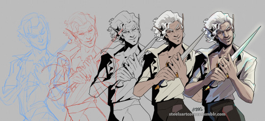
First off, here’s a simple split out of the whole process (this will be long, more below the cut:)
POSE & PERSONALITY
Hades art is full of personality so the first challenge was to pick a pose that illustrates just one or two aspects of the character. For example, Dionysus from Hades 1 below has a languid, draping pose that reflects his chill-guy party vibes. Just looking at him you get an immediate idea of his personality.
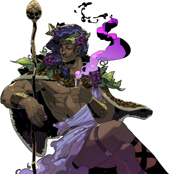
And as much as I love the later wet-cat version of Astarion as he matures as a person, for the purposes of illustration in this style I chose a pose and expression that leaned into his early, less complex, more wily self. The dagger, wink, jaunty hips and head tilt are meant to communicate, without additional context, that he’s both trying to be appealing and is not trustworthy.
LINEWORK & SHADING
Next is the linework and blocking! The Hades art team tends to use a combination of near-mono-thickness black lines, where exterior lines are thicker and interior lines are thinner or have no lines at all. They will often forgo an interior line to communicate form via color blocking instead. The style also makes heavy use of absolute black for the deepest shades, especially on more sinister characters or spooky aspects of a characters design. (See: Zagreus’ three dog head skulls and his red eye perpetually cast in deep shadow.)
It took some back and forth to find the right balance of black shading for Astarion. Too much and he looked too sinister and not approachable enough. Too little and he looked too innocent.
Picking a strong light source helped with determining the direction and placement of the shadows so that just enough was obscured/revealed. It also helps in differentiating forms from each other so that, for example, the arm doesn’t disappear into the chest and become unreadable.
Using heavy black shading was a particularly useful trick in Astarion’s case, because his camp clothes color palette is fairly monochromatic between his light hair, pale skin, and white/cream shirt. That much light color can easily blend in too much and become boring: the flats I used were slight variations of white, from a warm reddish-peach to a yellowy cream to a cool light gray for the dagger.
COLOR & LIGHTING
Last is color! In Hades 1 and even more so in Hades 2, the lighting schemes are deceptively complex. There are often multiple light sources and use of bounce lighting to add a lot of visual interest. For example, check out this lighting on Polyphemus from Hades 2:
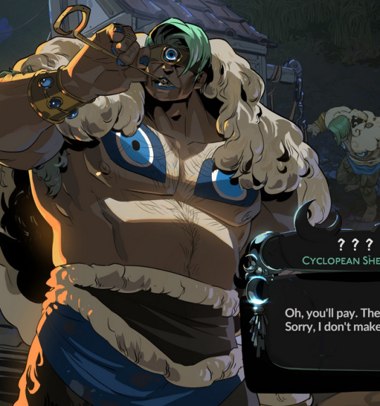
Not only does he have a cool moonlight hitting him from above, he also has a warm orange rimlight lighting him from the left, AND cool lavender bounce light bouncing off the ground and hitting him from below. All these combine and layer on top of one another to help emphasize the forms of the cyclop’s musculature and the textures of his sheep wool coat.
I don’t think I was as successful in my own lighting scheme, because I’m an amateur, but I determined that the scene in which I was placing Astarion has a high sun and was outdoors. This means that the light hitting him from above would be a light, warm yellow and the bounce light hitting him from the left would reflect the nearby water and blue sky of the environment.

To achieve this, I made use of different layer modes in my art program (Clip Studio Paint) to apply purple shadows (via the Multiply layer mode) and highlights (via the Soft Light layer mode) in a light sky blue and a light yellow for the primary and secondary light sources.
I ran into trouble with the blade, because it was also a light metal in an already light-color-heavy color scheme. At first, it was blending in too much and hard to read. So I decided to give it a bit of a magic teal glow to help it stand out, which meant adding a few specks of magic light reflecting back onto the face and clothes as well.
INTEREST & DETAILS
Speaking of, Hades style art makes extensive use of adding little speckles of high-saturation color to add visual interest and cohesion. See this Zagreus portrait which is primarily made of grays, a tan bone-color, and reds:
But sprinkled in are neon teal and magenta that don’t relate to the lighting at all. It’s just there to break up the blocks of color, bring unique colors like his green eye into the rest of the portrait, and direct the viewer’s eye. These highlights are slightly less bright in Hades 2, but still there, such as in this depiction of Apollo, who mostly glows with a warm sunlight but also has random pops of sky blue and green flecking his armor and hair.
The pops of color are often placed more centrally on the figure to keep your eye on the important parts of the portrait, like near Apollo’s face and on his armor. The color pops aren’t as frequent at the extremities; too much on the arm and your eye would be drawn away from his face.
I took a similar approach where I grabbed some of the brighter colors (like Astarion’s red eye, and the teal glow of the dagger), to add dabs of color that normally would not “make sense” from a lighting perspective, but add a little visual interest:
Also I totally studied their approach to Apollo’s curly hair to create the impression of Astarion’s curls!
Anyway, I think that's all I got for now, I hope this helps! There's more but this is already REALLY long so I'll stop here. In the end, it's really just a process of observation and replication of things you love in artwork you admire. Give it a try, it's a lot of fun :)
138 notes
·
View notes
Note
I love your style and how you utilize halftones and textures and colours. It’s just so tasty! I’m curious if you’d be willing to show a bit of your process on how a comic page comes together?
Ah, thank you! ; w ; And sure, I can try, at least! Usually I start with some kind of a script. Sometimes it's a bit more detailed, like this:
... And other times they look more like this.
It just depends on my mood! But either way, I typically have a pretty good idea in my mind's eye of what the comic is generally going to look like. Once I know what I'm making, I do all the rough sketch pages.

... And then I line it!. For Gemini, I go for a dark blue rather than black 'cause I like the way it feels, and it lends to the overall 'papery' vibe. I usually lay down a grid pattern at this stage, which helps a lot with keeping panels and dialogue straight, and with perspective. I always do the gutters and the words first, then the figures and backgrounds. I been leaning a lot into really heavy shadows recently-- one of my professors in college told me once that a black-and-white comic page should be about 50% black and 50% white, and I've been trying to bring that to the table, lol.

I can ditch the grid at this point, and I put down a really light, pale-gray 'wash' on all the panels. It's a pretty subtle effect, but helps separate the panels from the 'background' of the gutters/negative space, and also just adds texture.
I lay down all the color next. Flat colors first, then a second pass over some parts to add depth/shadow, and then all the spot-colors like Leo's red stripes, light gray eyes, etc.

I use a pretty fine-grain half-tone brush for the background, and then a slightly more defined one (layer set to overlay) on the characters.

Once that's done I go back in and add highlights and such (white shine to eyes, hair, etc.) and go and add light outlines to any areas that need a little help being defined-- like Big Mama's arms and hands, for example.

And then the absolute last step is adding paper grain textures and gradient overlay over the top of everything!
(A lot of the brushes I'm using for this comic I got from True Grit Texture Supply, just by the by for anyone who's curious.)
... With Swanatello I kinda tend to just. Go for it. I (sometimes) start with a vague script and then I just draw it. 🤷🏻♂️ No thumbnails, no sketches, no heroes, no gods--
Just Swanatello.
#asks#fidgetwing#i hope this makes sense/is helpful? ; w ; ive never done a lil step by step like this before lol
192 notes
·
View notes
Text
MLQC & LaDs Comparison: Sylus and Gavin
This is the first post in my planned series comparing the LIs of LaDs to the ones from MLQC. I am doing this as InFold has already shown they have a few things they tend to gravitate towards in their writing, and common themes between the two stories can help better understand both and possibly even come up with theories. Originally, I planned to do a comparison between Sylus and all the MLQC LIs, but I just had too many things to talk about with these two so I'm going to do it one by one. For clarity's sake, the MLQC MC will be referred to as P!MC (producer MC) and the LaDs MC will be referred to as H!MC (hunter MC).
MAJOR SPOILER WARNING FOR BOTH GAMES
General Stuff
Sylus and Gavin are practically polar opposites if looked at from afar. Sylus is a criminal, Gavin is a cop. Sylus loves fancy suits, Gavin absolutely hates them (even if he looks great in them :3). Sylus's main colors palette-wise are black and red, Gavin's are blue and white. Sylus has very particular tastes and will barely touch anything he finds to not be "good enough" (you will not catch this man wearing Shein) meanwhile Gavin just wants his stuff to be functional. Sylus does not have the best musical abilities, while Gavin can play the guitar and sing on-tune. I could go on and on about the things they are complete opposites in, and they are on a surface level, but there's a lot more to look at with these two. Dates and Birds
The first thing that came to mind while I was thinking about this is the fact that they have dates that are terrifyingly similar in concept. When I was reading Sylus's Nightplumes memoria, my jaw hit the fucking floor. The concept is fairly simple. H!MC finds an injured dove and asks Sylus to take care of it when she has to leave Linkon. When she returns, they have a cute romantic moment when they meet up and when they free the dove.
Now, let me tell you the concept for Gavin's Brilliant Date. This date is attached to a card from an event in which the player had to log in daily and do a small task to eventually get the free SSR card. The story behind the event is this: Gavin finds an injured dove and begins taking care of it, however he gets a mission and has to leave, so he asks P!MC to take care of it. The date attached to the card shows their meet up once Gavin comes back and the romantic moments that takes place before, during and after they release the dove.
Sound familiar?
While the romantic moments that take place in the dates (as in, the scene with the snow and fireworks for Nightplumes and the window and rooftop scenes for the Brilliant Date) are very different, the overall concept is practically identical, the roles are just switched. And listen, I don't know if "nursing an injured dove back to health while the character who first found the bird is out of town" is a common trope in Chinese VNs (I have only played LaDs and MLQC. I tried Tears of Themis, it wasn't my jam), but in all other otome games that I've played, and I've played a lot, I have only seen this happen in these two occasions. Please correct me if I'm wrong, tho.
Now, what does this imply about the connections between these characters? Well, I feel like this was mainly just to strengthen both of the characters' bird connections, as they are both associated with birds. Sylus's bird association is much more concrete, with the crow imagery basically being yelled at us every other second. Gavin, on the other hand, is much less connected with one bird but rather all birds (that can fly). Gavin acts a lot like a bird- he eats everything with little complaint, he prefers to enter P!MC's apartment through the window, he is very curious and often gets into shit he shouldn't. As such, these two dates serve to highlight these two characters' "birdiness". Tracking MC and Protectiveness
You read that right, both of these characters track MC (with her consent, ofc), albeit in different ways. Sylus tracks H!MC via Mephisto and Gavin tracks P!MC using his Evol (although at first he tells P!MC it's through a GPS tracker in the bracelet he gifted her, probably because this was only a few hours after she found out Evol existed and didn't want to freak her out even more and to have a easy way to identify her). The reason they track MC is the exact same, to keep her safe. Both of them know their MC is being targeted by dangerous forces, and they are unwilling to risk her getting into danger.
However, there is one major difference in the ways they track MC that show a key difference in their protectiveness. Due to Mephisto having a camera and microphone, Sylus doesn't just know where H!MC is, he also knows what she's doing and what she's saying. This gives him a perfect image of what she's up to and, more importantly, who's around her. Sylus knows H!MC is in extreme danger not just because of her Evol and the aether core and whatnot, but also because she's involved with him. She's a target for countless of people. Not only that, she's a hunter. Her job puts her life on the line constantly as she fights to protect Linkon from wanderers.
Sylus knows how reckless H!MC can get if it means saving others. He's experienced that first hand. He knows the lengths she went to just to save him. Of course, we all know how that ended, since he was willing to do the same. But H!MC way back when they first met didn't love anyone aside from him. Now, there's so many people she loves, and he's terrified of that being used against her in any remotely similar way to how it was used in the past. Gavin, on the other hand, only knows where P!MC is. From what I gather, his Evol lets him "feel" what's in the wind. The bracelet was probably just a way for him to easily know that it's her since it's one-of-a-kind. Once he got used to how she felt, he didn't need it anymore. And while he may be protective of her, and he may be terrified of what could happen to her, he has much less to fear than Sylus.
Unlike Sylus (so far), Gavin knows he's not the only one looking out for MC. At the bare minimum, he knows Lucien will protect her, and implications from chapter 18 show that he might also be aware that Victor and Kiro are also looking out for her. And those are just the strongest. Minor and Anna are also keeping her safe in their own ways. Gavin will protect her the most he can, and is willing to go to any lengths to keep her safe, but his worry is much less about who could be a danger to P!MC, it's about what. When P!MC is about to get shot, who saves her? Gavin. Because he knew where she was and he could feel both the sniper and the bullet. And this happens twice. When P!MC is falling from Loveland TV Tower, who saves her? Gavin. Because he could feel her falling and could save her quickly. And in all but one of these situations, Gavin isn't the only one keeping P!MC safe. The first time someone tries to shoot her, Lucies further protects her with a force field. When P!MC is falling, Kiro is making sure Black Swan doesn't get to her.
So yeah, this is something where they are both extremely similar and also very different.
MC Saving them Through Music
The way Gavin's Evol awakened is pretty iconic (if you're in the MLQC fandom). For those who are unaware, Gavin fell off the roof of his and P!MC's high school. Unless something miraculously broke his fall, he was going to die. But then he heard P!MC playing the piano. Something about the tune she was playing awakened the Evol within him, allowing him to fly by controlling the around him. This made a ton of gingko leaves fly around him, and he was able to survive. Had it not been because of P!MC's song, he would have died.
Then there's Sylus. The way her song saved him is in a much less physical sense, but it was because of her song that he was not only able to begin understanding human emotion, but also get the will to survive for long enough to save H!MC. When he first hears the song on the organ, he is genuinely moved. Up until that point, he thought he was basically unable to feel anything aside from desire. Whether it was the desire for acceptance, the desire for gold or the desire for revenge, that was all he knew. But the song made him feel something different. When he was injured to near-death, it was that song that gave him the will to live. Of course, we all know how this story ends.
Honestly, both of these moments are extremely heart breaking. Neither Sylus nor Gavin really cared about their own lives. Sure, Sylus pretended he was happy just collecting treasure and getting revenge on those who trapped him, but he was absolutely hated by everyone. As soon as his horns started growing, his world fell apart. Everyone attacked him, everyone thought he was a monster and he hated it. And then Gavin was made to feel like dirt by his father. The only reason Gavin was alive was to protect his mother and his brother, but eventually he lost them both. And as soon as his father saw any potential in him, he became just another pawn in his games. Music reminded both of them that there's more to life then just surviving.
Other Stuff
To wrap it all off, I'll just list some other things I noticed about these two that are worth mentioning but don't have enough juice for me to write paragraphs and paragraphs of.
Both of them went through some kind of "rebirth". Gavin had his rebirth with his Evol awakening (keep in mind he thought he had no Evol as far as I'm aware) and Sylus had his dragon rebirth
Both of them learn that justice isn't as simple as it's made out to be in the worst way possible. Sylus through how he was hated by everyone due to being a dragon and how P!MC was tried in court and Gavin through basically his entire arc in S1
Both of their backstories are heavily linked to a plant. Gavin has the ginkgo while Sylus has the datura
Both of them are often perceived to be cruel or monstrous by others, especially when they were younger
Both of them have several occasions where their MC has to patch up their wounds
And that's it! Hope you enjoyed this very thorough comparison. Up next will probably be Zayne and Gavin because I just cannot stop thinking about their similarities. No promises, tho! -Fluffy
#lads#lads sylus#love and deepspace#mr love gavin#mr love queen's choice#sylus#sylus qin#l&ds sylus#lnds sylus#sylus love and deepspace#l&ds#mlqc#gavin bai#bai qi#mlqc gavin
27 notes
·
View notes
Note
you have a good point about the increasement of non con/dub con fanfiction. i just want to add that it's not surprise that Joel Miller's fanfiction are the one that always sexualize the word "kiddo" or are mostly about age gap because the fandom (and i'm talking here about Pedro Pascal fandom generally) has been more toxic in the recent years. big problem here is they tend to fetishize Pedro Pascal a lot so, when you scroll in his character tags, the stories you always found are about daddy kinks, age gap kinks, dbf/bfd, etc. it's look that a reader that is over 30 is a crime.
funny thing, this doesn't happen when i'm looking in other characters tags that aren't latinos, like Bucky Barnes or Steve Harrington, i wonder why🙄
This is an interesting perspective for a lot of reasons <3
The ask above and the text below is a response to concern about the growing number of infantilization and dub con/non con content that is taking over certain fanfiction spaces.
I will be using tags from those spaces to spread the message and further encourage conversation, so if you do not want to see my posts, block me now
Honestly, until reading this ask, I didn't realize just how severe the overt sexualization of Pedro Pascal has gotten.
I remember seeing videos of him reading certain fan tweets filled with the term daddy and I would cringe, but I just figured it was because I was a bit put off by one of my favorite actors being put in that situation.
But I do remember, before Pedro really started picking up traction as Joel Miller, his most sought after character was the Mandalorian, and I don't recall ever seeing as much non-con and infantilization content as I do now.
All of the dynamics explored, at least in the fics I read, where all based upon mutual protection because of the environment that Mando was in. Mutual respect, mutual responsibility, because it was life or death. And even if age was a concern, the term daddy was hardly ever uttered.
With Joel, it's almost the complete opposite. Despite the landscape for the show literally being the end of the world, it seems as though the most popular works for the fiction focus on age gaps. And a good number of them, aren't even focused on the actual plot line. It's all: Dad's best friend, hot older man next door, perv! Joel, etc.
And I get it, I do! It's fanFICTION for a reason, you're supposed to create your own stories, but there seeks to be an underlying theme here that I don't believe I'm comfortable with.
What was the shift?
And I can't help but view your other point as one of interest as well.
A post I made a while ago highlighted a lack of representation, or rather an exclusion of POC in fanfiction due to descriptive terms often catering to a white demographic.
In a follow-up post I made, a response to an ask, I said that I couldn't help but wonder if the seemingly deliberate exclusion of inclusive vocabulary was because there has been a growing number of content feeding into this very lolita-esque style of reader. One of pink, princess purity, and sexuality found in corruption. And, because POC do not fit this image of purity in your mind, we are subconsciously removed from these spaces.
But now I'm wondering about other repercussions.
It's no secret that Latin women have been sexualized since Christopher Colonizer sailed the ocean blue, but I truly haven't looked at how Latin men may be as well.
As a black women, I know black men, (black women as well, but not as frequently) are often sexualized by other races for various reasons, but I wasn't aware that this may be happening in the Latin community as well.
Is it possible that Pedro, or rather his characters, present an easy target for blatant sexualization, even of graphic and exploitative content, because of this ideology?
Again, open to discussion.
#fanfiction#writers on tumblr#x reader#joel miller x reader#aaron hotchner x reader#jjk x reader#pedro pascal x reader#bnha x reader
18 notes
·
View notes
Note
Hi! I really love the way you color, and I was wondering If you could make a tutorial about it, I of course completely understand if you Can't/don't want to do it thanks in advance If you decided to do it and have a good day/night.
Hello hello! Ooooh, a color tutorial! I've never done one before so I'm not sure if I'll be any good at it haha. But I don't mind sharing my thinking process when it comes to coloring my works. So when it comes to color, I very much have a traditional painter's approach since that's how I learned color in art college. My painting professor never allowed us to use black or white paint, we could only use other colors to create darker colors or new colors altogether. And you're probably thinking, "What the hell? That's insane." And I wouldn't blame you haha. But this approach helped me a lot to not rely on tints (colors mixed with white) and shades (colors mixed with black) when I color. For the most part, I purely thinking about value and hues when I'm coloring.
Finding the right values:

So for this drawing, I did two different takes (one with direct harsh lighting and one without). The reason why I'm showing this is because when it comes to color it's very important that your values aren't clashing with each other. When I started out, all my coloring felt flat because I was using colors with the same values so there was little to no depth. A lot of people don't realize this but color does have value!
If we put the primary colors on greyscale, you notice how each color has its own value. Blue tends to be a dark value, red has a mid to dark value , and yellow is a much lighter value. This is why if you ever look at my work, the color I use for shadows lean into blue/purple tones. You can also have warm shadows since red does have a deeper value compared to yellow. But these values are when the primary colors are at the highest saturation. What would happen if we knocked down the saturation levels?
The values start to become more similar. Since we're not always using the most saturated colors, it's important to understand the values behind the colors you'll use. Once you unlock that, you can pretty much do whatever you want with color haha. That's why I hardly ever use black or white in my digital art when mixing (also I don't mix color with a brush, I just pick from the color wheel which might be insane).
While it's not wrong to use white or black to create darker/lighter colors, color in real life doesn't always act that way. Shadows and highlights can have color. For myself, letting go of white and black has opened a world of color combinations that I didn't think of before taking my first ever traditional painting class. Now, I can freely pick colors and experiment with palettes since I've blocked out what values I need (like the image below).
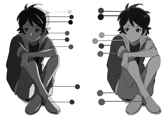
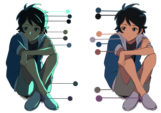
Even if I'm using blending modes like in the next image, I'm always thinking about making clear value separations. If I can't understand the image in black and white, then I'll have a hard time seeing it in color.

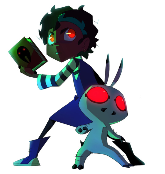
And when you get very comfortable, you can start placing characters in different color environments and match them (which essentially is the job of a color designer in TV animation).
The right image is the official color palette for my character which already uses a lot of blue/purple for the shadows. But on the left side, she's in a night-time environment so I leaned even more into the cool colors to the point that the white T-shirt is actually a very very light purple/pink color haha.
Or like this example where the left drawing gives a more sunset/golden hour lighting while the right one is more blue hour/night time lighting. But you can read the colors clearly 'cause the values are clear to begin with. While that wasn't really a tutorial this is pretty much my thought process when I'm coloring my digital works. ^^; I very much do follow an academic approach to color theory but even then I think it's okay to break the rules. As long as you have understanding of colors' value, I think you'll be able to unlock any color style you want! I hope that answered your question and was helpful!
#digital art#digital illustartion#color#anon#ask#send me anon#send me asks#color theory#tone and value
240 notes
·
View notes