#teach me something new
Explore tagged Tumblr posts
Text
They should have dwelled more into Merlin’s skills (and I’m not talking about just magic)
As I rewatched Merlin, I realised this man has so many skills?!
We often talk about how surely Arthur must have thought him how to use a sword (I agree 100%) but Merlin also knows how to hunt?
He dislikes it, yet years and years of going hunting with Arthur proves to be fruitful. Merlin founds the deer in season four before the entire Camelot patrol. He knows how to recognise tracks on trees and traces of feet in the mud (he knows how to build them in the right way with magic, too). And I have proof that Arthur teaches Merlin, because in season five, Arthur makes Merlin see what was wrong with the branch. when they went out and Arthur noticed that someone (Mordred) had walked past the woods.
Also, season four, episode two? Merlin wakes up before Lancelot and HE IS HUNTING FISH LIKE A MASTER?!
Have we talked about this? Who taught him? I believe most things he already knew how to do, since he grew up in a village with a single mother where everyone had to fetch up for themselves.
He also knows how to cook. And he gets compliments (even if they are jokes) from the Knights and Arthur himself too.
HE IS A PHYSICIAN, and I wished we could have seen so much more of that, because he is hot, because it proves that is so good at learning, listening and also teaching. He tells Daegal how to get rid of the poison, poison, in his body and HE IS STILL SO HUMBLE ABOUT IT?! He spent more than ten years being an apprentice and when Daegal tells him he is a good physician, Merlin denies it?! Bro has low self esteem.
Merlin also has all the skills required from a servant, like sewing, cleaning specific fabric in a certain way, polishing armour and so many other things, adjusting swords and weapons ecc.
I guess it pisses me off when Merlin is described (heavily in fanfictions too) like an incapable manservant, unable to do things for himself or defend himself without magic, when he spent ten years in Camelot doing new work after new work. Just because he was scared at the end of season five without his powers (because he had never lost them before) it doesn’t mean Merlin isn’t capable of using a sword, or help himself, since he does and challenges Morgana too, even without powers.
EDIT:
Merlin also knows how to use a crossbow and how to fight side by side with Arthur and he knows where to head, where north and south are, based on the scent of the air?! Merlin knows so many things.
#MY BOY HERE IS SO TALENTED#also people want me to believe in fanfictions that after all these centuries he HASN’T LEARNED ANYTHING ELSE?!#be for real please i bet merlin has like 300 degrees or whatever#he had fun with it#i bet merlin is they type of man who likes to learn so much and has round eyes whenever someone teaches him something new#also we know that arthur jokes with him in so many ways but he never actually complained about merlin’s servant work#because he knows he is good at it#THIS IS CANON BRO I BELIEVE THIS FIERCELY#MERLIN SO SKILLED CAMELOT CALLS FOR HIM LEFT AND RIGHT#my babygirl#merthur#bbc merlin#merlin#arthur pendragon#merlin bbc
296 notes
·
View notes
Text
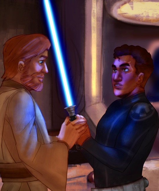
@codywanweek day 2: cody with a lightsaber
lightsaber training 🤺
#zephs art#star wars#codywan#cww2024#commander cody#obi wan kenobi#codywan week#tried something new. dk if i like it but its almost the end of the day for me so here it is#is it gay to refer to a lightsaber as one’s life and then teach your right hand man how to wield it and trust him with it#asking for a friend
400 notes
·
View notes
Text
gnawing on my arm because i think there's something to be said about how stede not only dreams about himself with a beard, but ed with his full beard back too. like, the dream seems to be riddled with imagery that he thinks ed would want.
and i say this especially because of how stede reacted when ed had to shave his beard. he freaked out on his behalf. he shrieked in horror whereas ed was entirely unbothered. he feared he had ruined him, had dragged him down to some despicable level, when in actuality, ed was completely content to shed that part of his persona.
and then there he is dreaming about ed with that part right on back.
so there's very clearly still a part of his mind that's convinced that's what ed wants. because why wouldn't he? everyone else seems to. and why would he want the softness and femininity stede had been bullied for his entire life?
which in turn plays into his own imagery too. bearded, masculine, fiercesome, rugged...
because how could someone love what everyone has hated him for? how could someone want what everyone has tried to quite literally beat out of him?
#OFMD#OFMD Season 2#OFMD S2 Spoilers#Gentlebeard#Blackbonnet#Edward Teach#Stede Bonnet#Revenge Rambles#ALSO#I SAY ALL OF THIS TO SAY#I really REALLY hope they have a conversation about it#Because Stede clearly has some issues going on with his self-worth still#He's getting BETTER#But he's definitely still having issues#And I really hope I'm on the money when it comes to that one shot where Ed seems to be looking at him drinking/partying in Spanish Jackie'z#And is looking TROUBLED#I keep envisioning an exchange where Ed is like 'Well this is...different'#And Stede cheerily goes 'Ah yes. Trying something new! Do you like it?'#And Ed looks him dead in the eye and goes 'Do YOU?'#Also it kills me how they're both sort of having the same issues just in different fonts#Ie Ed worrying that he's unlovable how he is#And Stede ALSO worrying that he's unlovable how he is#They both want to change parts of themselves/shy away from parts of themselves#When in reality both of them love each other for who they really are#AND I HOPE THEY HAVE A CONVERSATION CENTERED AROUND JUST THAT#I HOPE THAT'S WHAT AAAALLL OF THIS IS BUILDING TO
1K notes
·
View notes
Text
why Aurora's art is genius
It's break for me, and I've been meaning to sit down and read the Aurora webcomic (https://comicaurora.com/, @comicaurora on Tumblr) for quite a bit. So I did that over the last few days.
And… y'know. I can't actually say "I should've read this earlier," because otherwise I would've been up at 2:30-3am when I had responsibilities in the morning and I couldn't have properly enjoyed it, but. Holy shit guys THIS COMIC.
I intended to just do a generalized "hello this is all the things I love about this story," and I wrote a paragraph or two about art style. …and then another. And another. And I realized I needed to actually reference things so I would stop being too vague. I was reading the comic on my tablet or phone, because I wanted to stay curled up in my chair, but I type at a big monitor and so I saw more details… aaaaaand it turned into its own giant-ass post.
SO. Enjoy a few thousand words of me nerding out about this insanely cool art style and how fucking gorgeous this comic is? (There are screenshots, I promise it isn't just a wall of text.) In my defense, I just spent two semesters in graphic design classes focusing on the Adobe Suite, so… I get to be a nerd about pretty things…???
All positive feedback btw! No downers here. <3
---
I cannot emphasize enough how much I love the beautiful, simple stylistic method of drawing characters and figures. It is absolutely stunning and effortless and utterly graceful—it is so hard to capture the sheer beauty and fluidity of the human form in such a fashion. Even a simple outline of a character feels dynamic! It's gorgeous!
Though I do have a love-hate relationship with this, because my artistic side looks at that lovely simplicity, goes "I CAN DO THAT!" and then I sit down and go to the paper and realize that no, in fact, I cannot do that yet, because that simplicity is born of a hell of a lot of practice and understanding of bodies and actually is really hard to do. It's a very developed style that only looks simple because the artist knows what they're doing. The human body is hard to pull off, and this comic does so beautifully and makes it look effortless.
Also: line weight line weight line weight. It's especially important in simplified shapes and figures like this, and hoo boy is it used excellently. It's especially apparent the newer the pages get—I love watching that improvement over time—but with simpler figures and lines, you get nice light lines to emphasize both smaller details, like in the draping of clothing and the curls of hair—which, hello, yes—and thicker lines to emphasize bigger and more important details and silhouettes. It's the sort of thing that's essential to most illustrations, but I wanted to make a note of it because it's so vital to this art style.
THE USE OF LAYER BLENDING MODES OH MY GODS. (...uhhh, apologies to the people who don't know what that means, it's a digital art program thing? This article explains it for beginners.)
Bear with me, I just finished my second Photoshop course, I spent months and months working on projects with this shit so I see the genius use of Screen and/or its siblings (of which there are many—if I say "Screen" here, assume I mean the entire umbrella of Screen blending modes and possibly Overlay) and go nuts, but seriously it's so clever and also fucking gorgeous:
Firstly: the use of screened-on sound effect words over an action? A "CRACK" written over a branch and then put on Screen in glowy green so that it's subtle enough that it doesn't disrupt the visual flow, but still sticks out enough to make itself heard? Little "scritches" that are transparent where they're laid on without outlines to emphasize the sound without disrupting the underlying image? FUCK YES. I haven't seen this done literally anywhere else—granted, I haven't read a massive amount of comics, but I've read enough—and it is so clever and I adore it. Examples:


Secondly: The beautiful lighting effects. The curling leaves, all the magic, the various glowing eyes, the fog, the way it's all so vividly colored but doesn't burn your eyeballs out—a balance that's way harder to achieve than you'd think—and the soft glows around them, eeeee it's so pretty so pretty SO PRETTY. Not sure if some of these are Outer/Inner Glow/Shadow layer effects or if it's entirely hand-drawn, but major kudos either way; I can see the beautiful use of blending modes and I SALUTE YOUR GENIUS.
I keep looking at some of this stuff and go "is that a layer effect or is it done by hand?" Because you can make some similar things with the Satin layer effect in Photoshop (I don't know if other programs have this? I'm gonna have to find out since I won't have access to PS for much longer ;-;) that resembles some of the swirly inner bits on some of the lit effects, but I'm not sure if it is that or not. Or you could mask over textures? There's... many ways to do it.
If done by hand: oh my gods the patience, how. If done with layer effects: really clever work that knows how to stop said effects from looking wonky, because ugh those things get temperamental. If done with a layer of texture that's been masked over: very, very good masking work. No matter the method, pretty shimmers and swirly bits inside the bigger pretty swirls!
Next: The way color contrast is used! I will never be over the glowy green-on-black Primordial Life vibes when Alinua gets dropped into that… unconscious space?? with Life, for example, and the sharp contrast of vines and crack and branches and leaves against pitch black is just visually stunning. The way the roots sink into the ground and the three-dimensional sensation of it is particularly badass here:

Friggin. How does this imply depth like that. HOW. IT'S SO FREAKING COOL.
A huge point here is also color language and use! Everybody has their own particular shade, generally matching their eyes, magic, and personality, and I adore how this is used to make it clear who's talking or who's doing an action. That was especially apparent to me with Dainix and Falst in the caves—their colors are both fairly warm, but quite distinct, and I love how this clarifies who's doing what in panels with a lot of action from both of them. There is a particular bit that stuck out to me, so I dug up the panels (see this page and the following one https://comicaurora.com/aurora/1-20-30/):

(Gods it looks even prettier now that I put it against a plain background. Also, appreciation to Falst for managing a bridal-carry midair, damn.)
The way that their colors MERGE here! And the immense attention to detail in doing so—Dainix is higher up than Falst is in the first panel, so Dainix's orange fades into Falst's orange at the base. The next panel has gold up top and orange on bottom; we can't really tell in that panel where each of them are, but that's carried over to the next panel—
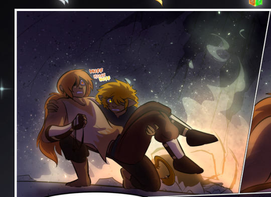
—where we now see that Falst's position is raised above Dainix's due to the way he's carrying him. (Points for continuity!) And, of course, we see the little "huffs" flowing from orange to yellow over their heads (where Dainix's head is higher than Falst's) to merge the sound of their breathing, which is absurdly clever because it emphasizes to the viewer how we hear two sets of huffing overlaying each other, not one. Absolutely brilliant.
(A few other notes of appreciation to that panel: beautiful glows around them, the sparks, the jagged silhouette of the spider legs, the lovely colors that have no right to make the area around a spider corpse that pretty, the excellent texturing on the cave walls plus perspective, the way Falst's movements imply Dainix's hefty weight, the natural posing of the characters, their on-point expressions that convey exactly how fuckin terrifying everything is right now, the slight glows to their eyes, and also they're just handsome boys <3)
Next up: Rain!!!! So well done! It's subtle enough that it never ever disrupts the impact of the focal point, but evident enough you can tell! And more importantly: THE MIST OFF THE CHARACTERS. Rain does this irl, it has that little vapor that comes off you and makes that little misty effect that plays with lighting, it's so cool-looking and here it's used to such pretty effect!
One of the panel captions says something about it blurring out all the injuries on the characters but like THAT AIN'T TOO BIG OF A PROBLEM when it gets across the environmental vibes, and also that'd be how it would look in real life too so like… outside viewer's angle is the same as the characters', mostly? my point is: that's the environment!!! that's the vibes, that's the feel! It gets it across and it does so in the most pretty way possible!
And another thing re: rain, the use of it to establish perspective, particularly in panels like this—

—where we can tell we're looking down at Tynan due to the perspective on the rain and where it's pointing. Excellent. (Also, kudos for looking down and emphasizing how Tynan's losing his advantage—lovely use of visual storytelling.)
Additionally, the misting here:
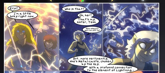
We see it most heavily in the leftmost panel, where it's quite foggy as you would expect in a rainstorm, especially in an environment with a lot of heat, but it's also lightly powdered on in the following two panels and tends to follow light sources, which makes complete sense given how light bounces off particles in the air.
A major point of strength in these too is a thorough understanding of lighting, like rim lighting, the various hues and shades, and an intricate understanding of how light bounces off surfaces even when they're in shadow (we'll see a faint glow in spots where characters are half in shadow, but that's how it would work in real life, because of how light bounces around).
Bringing some of these points together: the fluidity of the lines in magic, and the way simple glowing lines are used to emphasize motion and the magic itself, is deeply clever. I'm basically pulling at random from panels and there's definitely even better examples, but here's one (see this page https://comicaurora.com/aurora/1-16-33/):

First panel, listed in numbers because these build on each other:
The tension of the lines in Tess's magic here. This works on a couple levels: first, the way she's holding her fists, as if she's pulling a rope taut.
The way there's one primary line, emphasizing the rope feeling, accompanied by smaller ones.
The additional lines starbursting around her hands, to indicate the energy crackling in her hands and how she's doing a good bit more than just holding it. (That combined with the fists suggests some tension to the magic, too.) Also the variations in brightness, a feature you'll find in actual lightning. :D Additional kudos for how the lightning sparks and breaks off the metal of the sword.
A handful of miscellaneous notes on the second panel:
The reflection of the flames in Erin's typically dark blue eyes (which bears a remarkable resemblance to Dainix, incidentally—almost a thematic sort of parallel given Erin's using the same magic Dainix specializes in?)
The flowing of fabric in the wind and associated variation in the lineart
The way Erin's tattoos interact with the fire he's pulling to his hand
The way the rain overlays some of the fainter areas of fire (attention! to! detail! hell yeah!)
I could go on. I won't because this is a lot of writing already.
Third panel gets paragraphs, not bullets:
Erin's giant-ass "FWOOM" of fire there, and the way the outline of the word is puffy-edged and gradated to feel almost three-dimensional, plus once again using Screen or a variation on it so that the stars show up in the background. All this against that stunning plume of fire, which ripples and sparks so gorgeously, and the ending "om" of the onomatopoeia is emphasized incredibly brightly against that, adding to the punch of it and making the plume feel even brighter.
Also, once again, rain helping establish perspective, especially in how it's very angular in the left side of the panel and then slowly becomes more like a point to the right to indicate it's falling directly down on the viewer. Add in the bright, beautiful glow effects, fainter but no less important black lines beneath them to emphasize the sky and smoke and the like, and the stunningly beautiful lighting and gradated glows surrounding Erin plus the lightning jagging up at him from below, and you get one hell of an impactful panel right there. (And there is definitely more in there I could break down, this is just a lot already.)
And in general: The colors in this? Incredible. The blues and purples and oranges and golds compliment so well, and it's all so rich.
Like, seriously, just throughout the whole comic, the use of gradients, blending modes, color balance and hues, all the things, all the things, it makes for the most beautiful effects and glows and such a rich environment. There's a very distinct style to this comic in its simplified backgrounds (which I recognize are done partly because it's way easier and also backgrounds are so time-consuming dear gods but lemme say this) and vivid, smoothly drawn characters; the simplicity lets them come to the front and gives room for those beautiful, richly saturated focal points, letting the stylized designs of the magic and characters shine. The use of distinct silhouettes is insanely good. Honestly, complex backgrounds might run the risk of making everything too visually busy in this case. It's just, augh, so GORGEOUS.
Another bit, take a look at this page (https://comicaurora.com/aurora/1-15-28/):
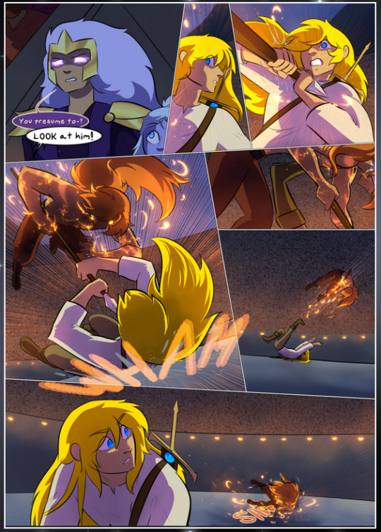
It's not quite as evident here as it is in the next page, but this one does some other fun things so I'm grabbing it. Points:
Once again, using different colors to represent different character actions. The "WHAM" of Kendal hitting the ground is caused by Dainix's force, so it's orange (and kudos for doubling the word over to add a shake effect). But we see blue layered underneath, which could be an environmental choice, but might also be because it's Kendal, whose color is blue.
And speaking off, take a look at the right-most panel on top, where Kendal grabs the spear: his motion is, again, illustrated in bright blue, versus the atmospheric screened-on orange lines that point toward him around the whole panel (I'm sure these have a name, I think they might be more of a manga thing though and the only experience I have in manga is reading a bit of Fullmetal Alchemist). Those lines emphasize the weight of the spear being shoved at him, and their color tells us Dainix is responsible for it.
One of my all-time favorite effects in this comic is the way cracks manifest across Dainix's body to represent when he starts to lose control; it is utterly gorgeous and wonderfully thematic. These are more evident in the page before and after this one, but you get a decent idea here. I love the way they glow softly, the way the fire juuuust flickers through at the start and then becomes more evident over time, and the cracks feel so realistic, like his skin is made of pottery. Additional points for how fire begins to creep into his hair.
A small detail that's generally consistent across the comic, but which I want to make note of here because you can see it pretty well: Kendal's eyes glow about the same as the jewel in his sword, mirroring his connection to said sword and calling back to how the jewel became Vash's eye temporarily and thus was once Kendal's eye. You can always see this connection (though there might be some spots where this also changes in a symbolic manner; I went through it quickly on the first time around, so I'll pay more attention when I inevitably reread this), where Kendal's always got that little shine of blue in his eyes the same as the jewel. It's a beautiful visual parallel that encourages the reader to subconsciously link them together, especially since the lines used to illustrate character movements typically mirror their eye color. It's an extension of Kendal.
Did I mention how ABSOLUTELY BEAUTIFUL the colors in this are?
Also, the mythological/legend-type scenes are illustrated in familiar style often used for that type of story, a simple and heavily symbolic two-dimensional cave-painting-like look. They are absolutely beautiful on many levels, employing simple, lovely gradients, slightly rougher and thicker lineart that is nonetheless smoothly beautiful, and working with clear silhouettes (a major strength of this art style, but also a strength in the comic overall). But in particular, I wanted to call attention to a particular thing (see this page https://comicaurora.com/aurora/1-12-4/):
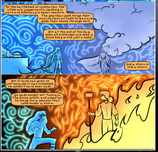
The flowing symbolic lineart surrounding each character. This is actually quite consistent across characters—see also Life's typical lines and how they curl:
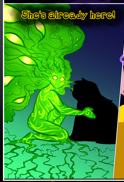
What's particularly interesting here is how these symbols are often similar, but not the same. Vash's lines are always smooth, clean curls, often playing off each other and echoing one another like ripples in a pond. You'd think they'd look too similar to Life's—but they don't. Life's curl like vines, and they remain connected; where one curve might echo another but exist entirely detached from each other in Vash's, Life's lines still remain wound together, because vines are continuous and don't float around. :P
Tahraim's are less continuous, often breaking up with significantly smaller bits and pieces floating around like—of course—sparks, and come to sharper points. These are also constants: we see the vines repeated over and over in Alinua's dreams of Life, and the echoing ripples of Vash are consistent wherever we encounter him. Kendal's dream of the ghost citizens of the city of Vash in the last few chapters is filled with these rippling, echoing patterns, to beautiful effect (https://comicaurora.com/aurora/1-20-14/):
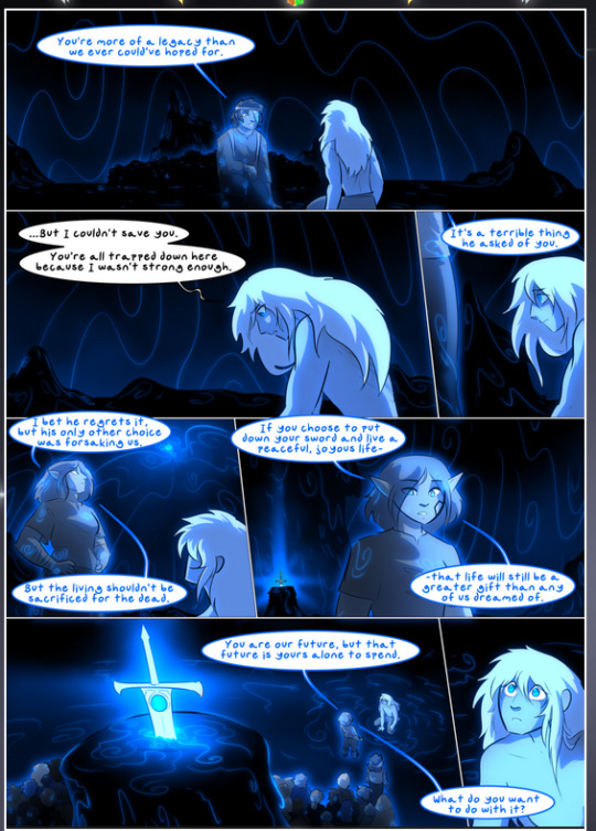
They ripple and spiral, often in long, sinuous curves, with smooth elegance. It reminds me a great deal of images of space and sine waves and the like. This establishes a definite feel to these different characters and their magic. And the thing is, that's not something that had to be done—the colors are good at emphasizing who's who. But it was done, and it adds a whole other dimension to the story. Whenever you're in a deity's domain, you know whose it is no matter the color.
Regarding that shape language, I wanted to make another note, too—Vash is sometimes described as chaotic and doing what he likes, which is interesting to me, because smooth, elegant curves and the color blue aren't generally associated with chaos. So while Vash might behave like that on the surface, I'm guessing he's got a lot more going on underneath; he's probably much more intentional in his actions than you'd think at a glance, and he is certainly quite caring with his city. The other thing is that this suits Kendal perfectly. He's a paragon character; he is kind, virtuous, and self-sacrificing, and often we see him aiming to calm others and keep them safe. Blue is such a good color for him. There is… probably more to this, but I'm not deep enough in yet to say.
And here's the thing: I'm only scratching the surface. There is so much more here I'm not covering (color palettes! outfits! character design! environment! the deities! so much more!) and a lot more I can't cover, because I don't have the experience; this is me as a hobbyist artist who happened to take a couple design classes because I wanted to. The art style to this comic is so clever and creative and beautiful, though, I just had to go off about it. <3
...brownie points for getting all the way down here? Have a cookie.
#aurora comic#aurora webcomic#comicaurora#art analysis#...I hope those are the right tags???#new fandom new tagging practices to learn ig#much thanks for something to read while I try to rest my wrists. carpal tunnel BAD. (ignore that I wrote this I've got braces ok it's fine)#anyway! I HAVE. MANY MORE THOUGHTS. ON THE STORY ITSELF. THIS LOVELY STORY#also a collection of reactions to a chunk of the comic before I hit the point where I was too busy reading to write anything down#idk how to format those tho#...yeet them into one post...???#eh I usually don't go off this much these days but this seems like a smaller tight-knit fandom so... might as well help build it?#and I have a little more time thanks to break so#oh yes also shoutout to my insanely awesome professor for teaching me all the technical stuff from this he is LOVELY#made an incredibly complex program into something comprehensible <3#synapse talks
806 notes
·
View notes
Text
People will see two characters who are entirely devoted to each other and whose lives are intertwined in cosmic ways, and be like "what if they were just buddies? 😊" But then one second later go ape shit about a more popular ship with less than half the chemistry, but a dynamic that is considered more appropriate for the surface level, overused, interchangeable fandom tropes that have replaced any sort of genuine character interpretation
#sheith#wasnt gonna tag this but im already in the tag and Tumblr is auto tagging so like. yeah.#god. this ship went so hard..#and you know it went so hard because of just how hard people tried to fight against it.#they could've literally just been like “nah. not for me. sorry” and it would've been fine.#but what is fascinating to me in this famdom landscape (and this was even years ago 😬😩)#is that instead of accepting diffeences of opinion on things that largely Do Not Matter.#there is a certain type of person who not only believes that just because they dont like something that no one else even should#but also that it is their inherent duty to educate others on why their ship isnt just not good. but also Legit Morally Bad.#BECAUSE there is this other (obviously far superior) ship. which makes the crimes of the original ship in question (op not liking it)#even worse.#it is nothing new aat all. but like. its very christian. like. yes. it is your duty to teach sinners the fault in their ways#(also so that you can feel superior)#because you cannot fathom a world where someone could disagree with you and not be evil and wrong
59 notes
·
View notes
Text
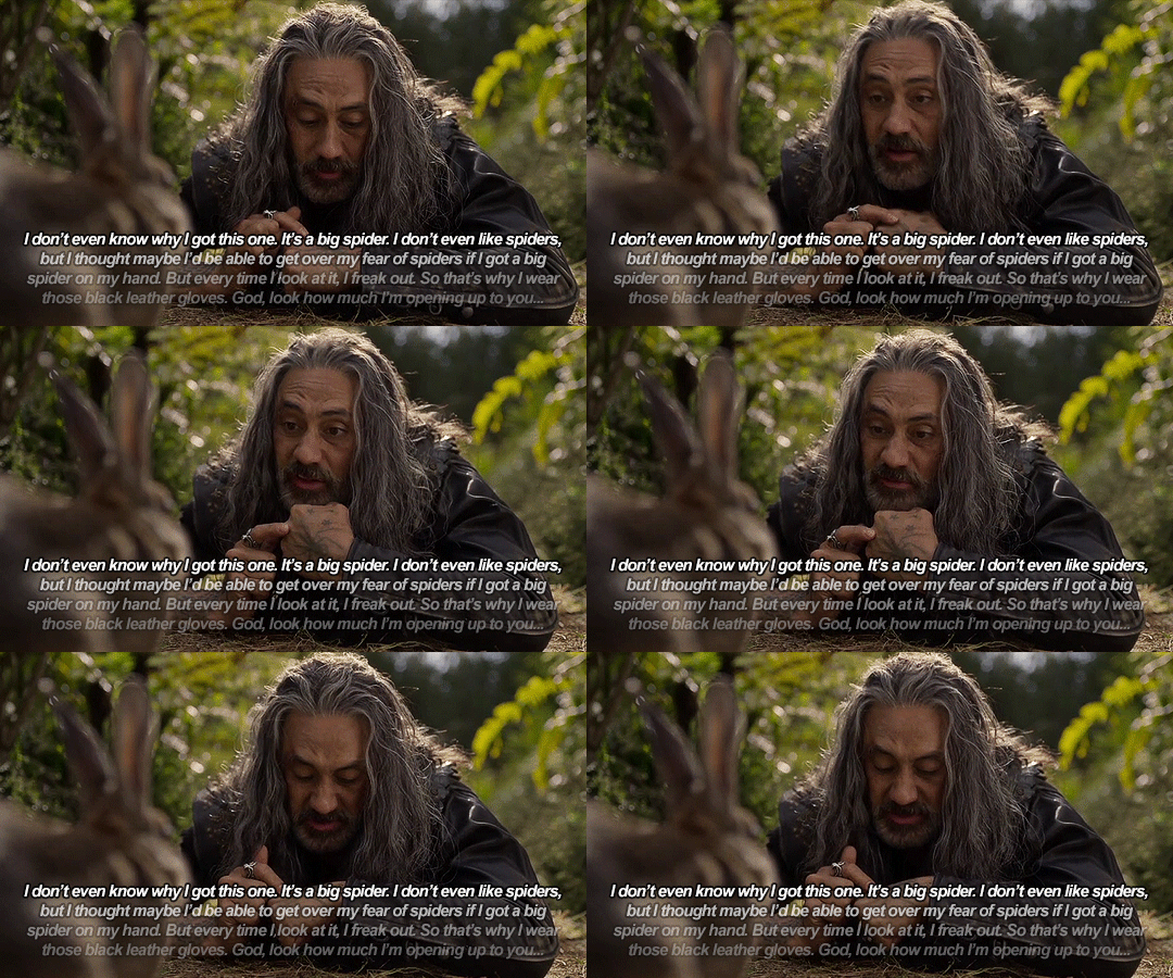
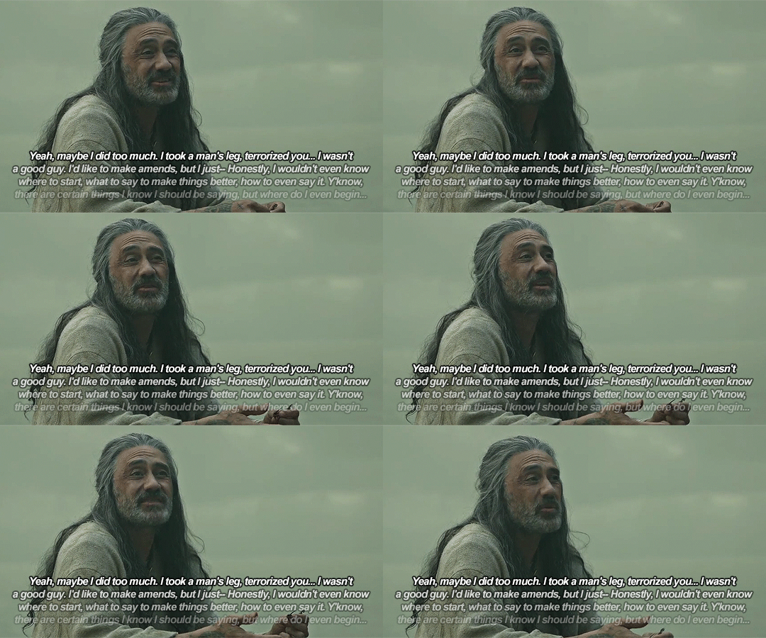
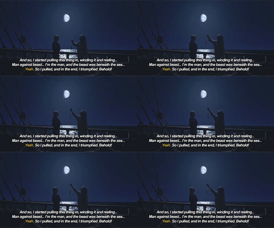
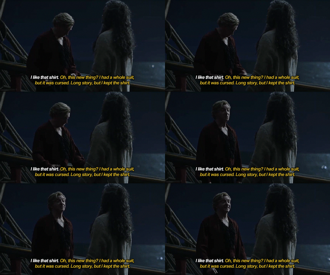
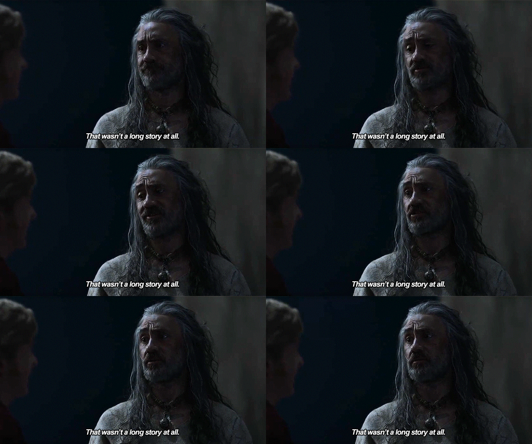
If I could just make an observation... Do you think you talk so much because you don't wanna know how to sit with yourself?
#ofmd#our flag means death#ofmd edit#ofmd gif#blackbonnet#gentlebeard#stede bonnet#edward teach#ed teach#ofmd s2#ofmd s2 spoilers#*#my gifs#idk if these came out right i tried something new and now im running late for work lmfao#but anyway someone please come cry with me about ed#admiring stede being sure of himself - being able to sit with himself comfortably#wahhh
409 notes
·
View notes
Text
Haladriel Drabble
I felt it too, she’s confessed. Halbrand has left, and Galadriel is alone once again. The forest is silent around her, as the sounds of the previous battle feel distant. Finrod’s knife is a solid presence in her hands, grounding her as her thoughts whirl. She tries to calm her racing heart. Halbrand. Who is this man? How did he manage to get under her skin so quickly? How could she let this happen? Galadriel has spent so much time chasing after a ghost; she never expected to find him on her journey. A companion, a friend, or something more?


#the rings of power#rings of power#rop#trop#lotr rings of power#galadriel#haladriel#halbrand#sauron#saurondriel#This is my gift to the guest who commented on my fic#I did not know what a waifu was#but now I do!#kudos to you for teaching me something new!#And for making me laugh!#and inspired me to write more!#thank you!
22 notes
·
View notes
Text
Random thought but I do think that fun can be such a good marker of whether or not something is healthy for you or even sometimes if it’s just good in general.
#of course not always! because we can be really blind#and stubborn#but also I mean over the course of time if something is still#fun#and it’s GOOD fun pure fun TRUE fun. the kind that bubbles up like joy and surprise and delight#and a bit of soda pop fizzle#that’s such a good sign that it IS good and it is good for you!!!#anyway I’ve been thinking a lot about investment in celebrities’ personal lives#and yes yes not a weakness of many but absolutely a weakness of MINE#I was thinking about how it often happened that at the height of an obsession of mine with a celebrity/their life it would stop being fun!!#And I would become absolutely miserable#because I was expending emotional energy where I didn’t need to be#and so I would have to draw way back. and when I did time would pass and life would unfold#and now it’s like—-I hope Taylor and Travis get engaged#it would be sooooo fun for me as a long time swift stan and care-abouter of Taylor’s happiness#and as a lover of romance and engagements#and also because engagements are front-facing in nature! they belong to the public a little bit!#in some small measure! so it would be appropriate to care and rejoice#and also I couldn’t take it very far or for very long until it was (again) no longer my business#but I guess my point is: fun is a good indicator of where that line is#it will stop being fun when it stops being relevant/personal/applicable/news I can actually participate in and rejoice in honestly#on another note sometimes in my teaching I will hear students discussing who I should marry#and it is—for a brief moment—so fun for me actually. it’s pure and funny and a reminder that THEY believe I could find romance#and should. and also if I were to take them seriously for a second. if I were to be like ‘hey can you guys set me up’#it would instantly become Not Fun anymore for them AND for me and that’s just !!!!!!!#idk i think it’s super important (and also super important to have a well-honed sense of fun I guess) (but that’s another conversation#ANYWAY#some THOUGHTS
39 notes
·
View notes
Text
learning to code!
When I was 9 years old, I learned enough html to code neopets pages, my own geocities websites, and I even made forums on my own sites so my friends could all roleplay together or rant together lol. And then? I forgot so much. I no longer no how to make a forum, or even a 'next page' button - so even the dream of just making a simple blog or webnovel site feels like a huge hurdle now. (9 year old me could probably figure it out in 2 hours).
So I'm relearning! I figured this would be a fun post to place resources I find for coding, since there's coding languages, and I figure maybe if you like running you're blog then you also might be interested in tools for making blogs!
First, for those of you who miss the old geocities and angelfire type of sites to make your own free site on: neocities.org
You can make free sites you can code yourself, the way 9 year old me did. A lot of people have made SUCH amazing sites, it's baffling my mind trying to figure out how they did, I definitely wish I could make an art portfolio site even a fourth as cool as some of the sites people have made on here.
And for those pressed for time, who aren't about to learn coding right now: wix.com is the place I recommend for building a site, it requires no coding skill and is fairly straightforward about adding pages or features by clicking buttons. I used it to make my art portfolio site, I am testing out using it for my webnovel - the alternative is Wordpress, but wix.com is letting me basically make a wordpress blog Inside my own site. It's very beginner friendly in terms of "how the fuck do I set up a 'sign up for updates' message and have my site actually email these people my novel updates?" and "I need a 4x20 grid of my art down the page, that lets people click the art to see it's information and make it bigger."
I did neocities.org's little html tutorial today, it's the part of html I DID remember (links, paragraphs, headers).
My next step is to go through htmldog.com's tutorials. They go from beginner, to intermediate, to CSS. Unlike many a coding tutorial I've seen, they explain what program on your computer you need to WRITE the code in and then how to save it and how to open it. (You'd think this isn't a big deal but I've been looking into how to learn Python for months and I can't find a tutorial explaining what fucking program to write my python in... notepad? do I need something else? I don't fucking know!! My dad finally gave me a printed textbook which supposedly tells you what to download to start... I learned C++ in college and for that you needed Visual Basic to code C++, so I figured I needed Something to Write the fucking python IN.)
#coding#rant#wooh my new CODING TAG#learning to code#i feel very. odd if im honest?#i genuinely knew how to build full fucking forum websites as a child including user sign ups#and i studied Computer Science Engineering in college so i did everything with C++ we were asked to and got As#and then i promptly BLOCKED IT OUT because i#HATED studying c++ SO fucking much. i hated my whole major. i did not like Engineering. i hated it. i was so mentally destroyed#by my college major that when i graduated i got a DIFFERENT job#and do NOTHING related to my major#i want to get into a more tech focused career eventually...since that is what my fucking degree is in#but i've been looking into something with less coding OR trying to teach myself#to like coding as long as its not fucking c++ again... i cant do it. too many bad memories#i think cybersecurity sounds like a fun job.#but u know me. im a person who likes knowing the BASICS#so i feel like i need to Relearn to code and learn python decently#before i try to study cybersecurity specific shit
37 notes
·
View notes
Text
Started watching 3BSkyen’s helluva reaction and while I don’t agree with certain things, he called the show sincere and self-indulgent and honestly.. that is accurate and also such a big reason to why I love it so much. (He also mentioned the thing about Marvel that I’ve mentioned before)
Honestly I can appreciate most things if you can just tell that the creator loves their product. You feel that with helluva. The creators are doing a show THEY want to do and are inviting you to witness it. It’s ultimately for them but it also resonates with people like them. I think that’s a big reason as to why I don’t mind the tonal whiplash or whatever else people like to point out makes the show lesser. Cus to me it’s just proof of them being able to do whatever they want. This show is free as fuck.. they are able to tell the story however they want to and I’m just enjoying the ride and seeing what they can come up with.
Like…I have been a movie fan for such a loong time. Especially animation. Me and my father share this hobby and we’ve both gotten very good at predicting what’ll happen just cus of pattern recognition. This makes helluva so exciting for me, cus they don’t have to follow the mold. They don’t have to use the same established tools as anyone else and therefor… I’ve never been fully sure about what they’re gonna do. Which is also why I’m perfectly fine with their use of clichés. Cus, ye sure they’re overused in general BUT they’re not usually used in this setting.
So I’m perfectly content with the classic romantic tropes and ”cringiness” because who wouldve put that in a gorey, sexually deviant show about demons in hell? Starring a gay couple too???
I don’t care what they could’ve done, I’m really only interested in what they will do. I want to know THEIR vision. I wanna know THEIR way of doing it. Nothing they’ve done has hindered me in following the story or getting to know the characters. I honestly feel like I know them really really well, so I’m really really good.
#helluva boss#stolitz#seriously i am a huge fan of creators who are selftaught#cus education usually teaches you tools and patterns that are universally used#and sometimes that can hinder creativity#there’s no wrong way to do art imo#there are just different ways#and im so invested in people who wants to try new things#brandon rogers is one of those people who i look up to for that reason#his humour doesnt always resonate with me#but by god that man just does whatever he wants and i admire that sooooo much#and i admire vivs whole journey too#cus goddamn isnt this every oc creators dream?#do be able to do something like this?#it’s so cool for her
24 notes
·
View notes
Text
Tumblr India, I know it's JEE season now so just relax. Your efforts are not wasted even if you don't get a seat in an IIT.
(personally, I actually think it's quite dumb. A lot of IIT students I knew actually got scammed by a fucking fake elon Musk account. That was interesting cus I got a msg in a group chat saying elon Musk is doubling your crypto and I immediately knew it was a fucking scam. How tf can people be this goddamn dumb my fucking god!)
Just remember one thing. The college you study does not represent who you are. Life is too short to worry about the college you get into. Do what you love <3 <3
(to people elsewhere in the world, I want to provide context but where do i even begin 😔)
#I actually did not write the the advanced exam and let me tell you#I am so glad I didn't#1. I'm not sitting for 6 fucking hours#2. There are about 4 IIT graduates working in my staff and they don't know shit#I even considered firing two of them a couple months ago#TRUST Me#They don't teach you the fucking spells to success there#Everyone is equal levels of dumb everywhere#Just try to be dumb and informed#Or something idk#I just read the news and it's so fucking depressing
25 notes
·
View notes
Text
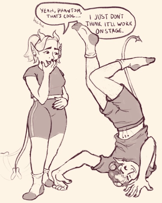
sometimes when you’re new to having a body, you gotta see what kinda crazy stuff it can do
#aurora ghoulette#aurora ghoul#phantom ghoul#aeon ghoul#ghost bc#the band ghost#ghost fanart#nameless ghouls#phantom is like a little kid#look at me! im gonna do something cool! look!#and then he does that shit#to aurora especially since she’s new too#maybe she hasn’t tried that yet…. maybe she doesn’t know about this cool feature! it’s called balance on your head and stretch your legs!#i imagine someone set out a yoga mat for him to do his little poses on#rain tried to teach him some proper yoga but he gets bored#and starts doing weird stretchy stuff with his weird stretchy body#weensyart
373 notes
·
View notes
Text
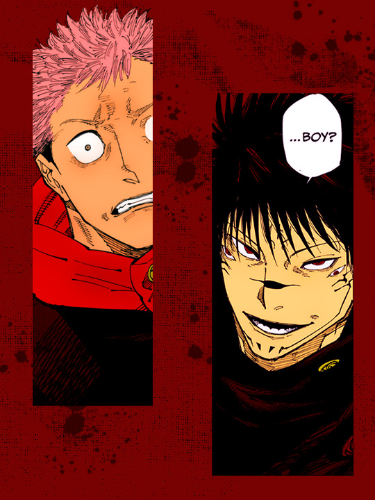
i told you we'd get to see something interesting, didn't i...
#practicing something new#why is designing the graphic itself the hardest part?#am i... dumb?#shoutout to itz for taking the time to teach me how to color#hyeahjujutsu#jjkedit#jujutsu kaisen manga#jujutsu kaisen#itadori yuuji#ryomen sukuna#icybtchedits#manga coloring#usermica#userdabiluna
61 notes
·
View notes
Text
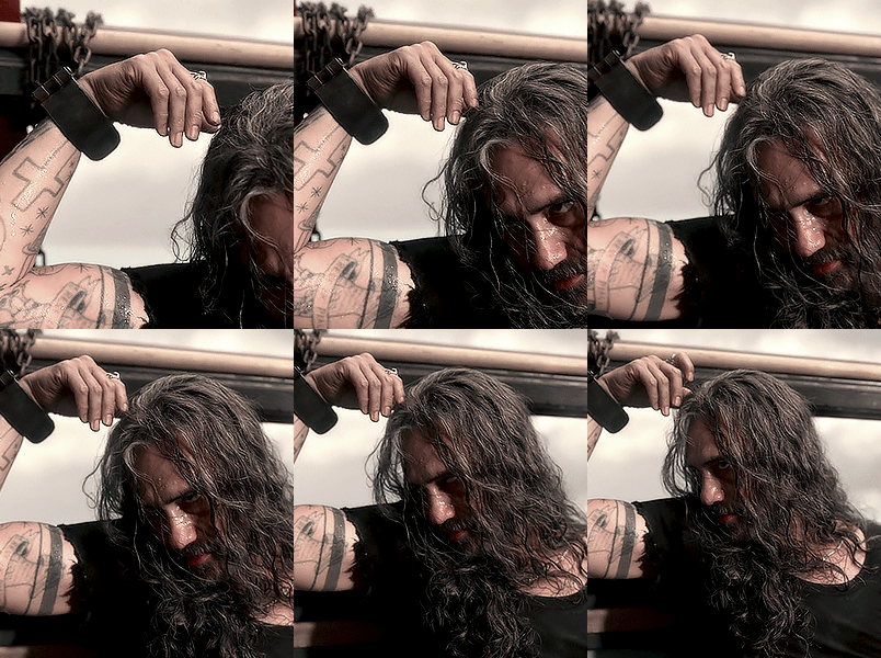
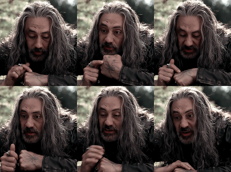
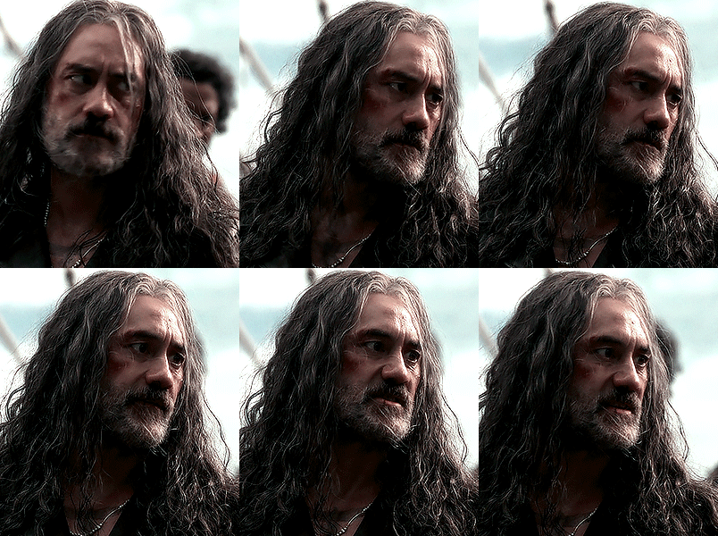

ed teach // S2E4 fun and games
#ofmd#ed teach#blackbeard#ofmd s2#ofmd edit#hiiii this is my first gifset in like a year... i'm trying to get back into it lsdnfkj#i only really gif when im hyperfixated on something so i will be doing the next episode as well :)#i'm also trying to get used to the new quirks about giffing since ive been doing it for so long and some things have changed#blackbeard TO ME is so... gender i am very jealous#*mine
191 notes
·
View notes
Note
I can just imagine Matar Paneer learning Telugu from her dad while Pepper Jack refused to, but hen Golden Cheese also learned Telugu and now the three of them have whole conversations in Telugu at, like, the dinner table or smth, and Pepper Jack’s like: “what are you guys talking about?!”
idk I just find that funny-
Pepper Jack would not let that stand for even a single moment lol. I don't really think he'd reject learning it in the first place tbh, doesn't seem like something he'd do; a learning opportunity plus a way to bond with his father, whom he is already desperate to understand and please because he's scared that Burning Spice doesn't like him (not true but he's a child, he doesn't understand)? He wouldn't say no to that.
But to play along with your idea: if Jack saw his parents and sister talking and enjoying each other's company in a way that he can't partake in or mimic, he'd be so upset. He'd be frustrated and kind of hurt, because A) it comes across as a way to exclude him, and B) it comes across as an attack on his intelligence in some way, and there is nothing Jack hates more than that. He tries to deny it and keep humble, but he does have a bit of an ego wrt his intelligence, and also, he's extremely curious and loves to learn/know things anyway. People communicating in a foreign language in front of him only serves to make him want to learn it himself, because he's dying to know what they're saying lol
So not only would that light a fire in Jack's heart and make him master Telugu all by his fucking self, he'd go ahead and learn a few other languages just to one-up his family. He'll say something in Telugu to his sister, then immediately switch to Tamil when he talks to his mother, then switch to Hindi with his father. All quite seamlessly. With this aura 😎🖕
(except they would all think Jack is cool as hell for doing this lol. Burning Spice especially would be SO proud of his son. And touched that he's gone the extra mile to connect with his heritage. Cue Jack's grudge immediately deflating bc it's obvious his family loves him and were never trying to hurt him in the first place, and now he feels like an asshole because he was motivated primarily by resentment during this endeavor and that's not a good reason to do anything)
It is a funny idea tho. Thank you for the thought experiment, anon :P
#I actually never heard of Telugu before this did you know? So thank you for teaching me something new today#everyone please feel free to send me stuff like this. I like imagining the BurningCheese fam in different situations#it's fun and it helps me flesh out the kids' characters + interpersonal dynamics#cookie run kingdom#burning spice cookie#golden cheese cookie#burningcheese#goldenspice#pepper jack cookie#merchant asks
34 notes
·
View notes
Text
first of all happy mayday and then also happy mermay
so au where anakin, human, falls in love with padmé, young mermaid queen of atlantis, and he finds a way to become a merman to be with her (she helps him because she's a queen lol it takes a bit of political maneuvering to get the sea witch to do the magic and ok now the sith have a small piece of their own territory in atlantis but it's worth it because they get to be together) but now someone has to show anakin how to be a merperson because it's not intuitive and he's really fucking bad at it like 'got his arm bitten off by a shark because he couldn't figure out how to swim faster that the shark' bad at it
and padmé is much too busy being queen and preparing for their wedding ceremony so...enter her most trusted advisor, obi-wan kenobi
obi-wan doesn't know what he did to deserve this sort of punishment. it's bad enough that the queen went rogue like this, gave the sith their own legitimate territory, and messed with dark magic just to get some tail (lol) but now obi-wan has to deal with it?? obi-wan has to teach anakin how to swim? the correct titles of their royals and how to pronounce them? the correct way to eat? obi-wan has to show him how to dress and deal with his sometimes surly countenance and his incessant need to touch everything he sees, up to and including the bright blue scales of obi-wan's fins--something only mates are supposed to touch??? obi-wan has to put his hands on anakin's waist and move his body to pump up and down and not side to side as humans walk??? obi-wan must carefully brush out his hair and treat it with their special concoctions so as to preserve its curl despite being underwater all the time now???
(they definitely fall in love which makes them both feel very, very guilty, except the truth is anakin and padmé's match is less true love and more fleeting infatuation now that they get to spend longer than a few seconds together)
#kit's silly lil aus#obikin#mer au#bedraggled merman obi-wan teaching new merman anakin how to do basic things#because hes gonna be the future king but he's shit at being a merman#is everything to me now that im thinking about it#also just to be clear obi-wan is THE most worried when anakin swims out because he's angry#about a lesson or something#and then doesn't come back for a while#and he's the one that goes after him just in time to save him from the shark lol#he bitches and moans but he's never swam faster in his life#than when he was trying to find anakin#and it wasnt because he's the queen's intended#lol i think i figured out my may kofi
98 notes
·
View notes