#so forgive the change in art styles or whatever
Explore tagged Tumblr posts
Text


Toxic yuri
#First one is from september#2nd part was made only a few days ago#so forgive the change in art styles or whatever#anyways#gravity falls#giffany#ddlc monika#ddlc#giffany x monika#whats their ship name please im struggling
308 notes
·
View notes
Text
“ LOOKS-MAXXING ” pick-a-card reading.💝
Your next glow up.
What can you do in order to have a big glow up?
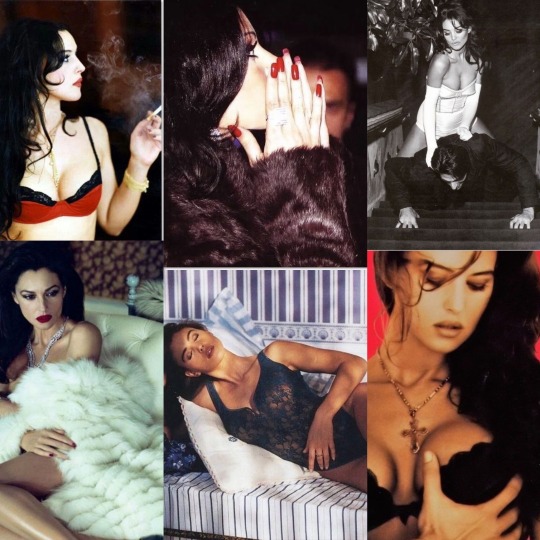
Pick a pink 90s magazine cover:
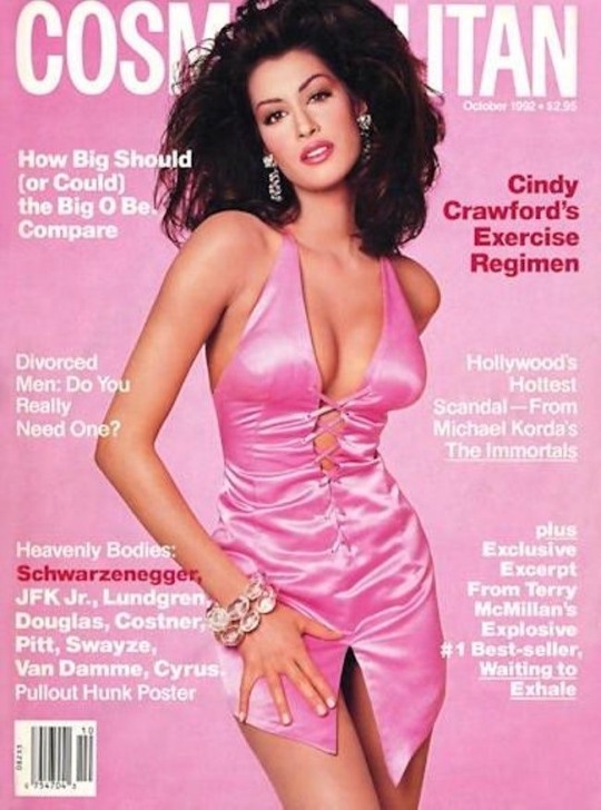
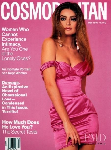
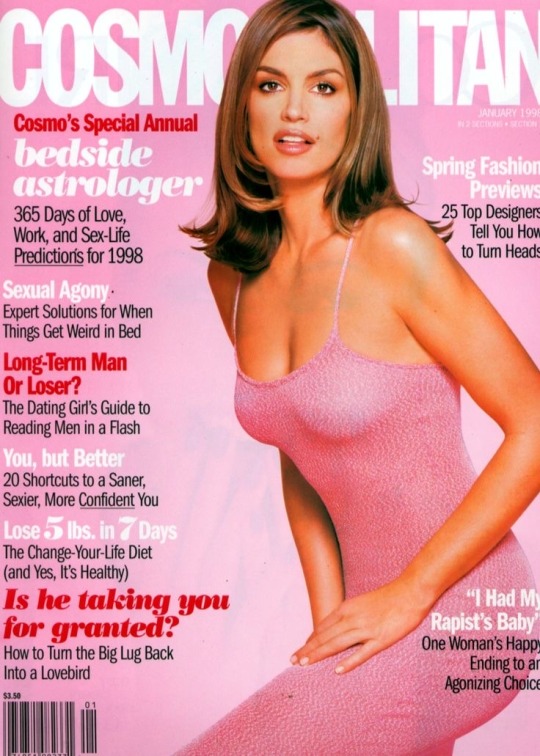
—>Pile 1
Your next glow up will most likely be related to getting « in peace » with your s€xuality prior to glowing up both physically and mentally. What I mean by this is you will probably need to get rid of any self doubts about your looks, any shame around your $£xual side due to past traumas or for some the way you were raised, some may have been raised in a controlling or conservative family.
One of the ways you can make this glow up happen is if you really enjoy your life and what you do. Try to practice your hobbies more and work on bettering your natural talents, by doing that you may find your purpose in this world and this will lead to the biggest glow up ever.. for some it may lead them to their dream career.
Something which appears in the cards is that you may need to forgive your parents or parental figures for the way they treated you in order to reach peace within yourself and your physical body. Forgive yourself as well for not acting in the « right way » or not looking a certain way, this is the best you could do at that point of your life . It is all in the past.
As for a physical glow up: judging by the pictures shown on the cards that fell, maybe start focusing on a regular work out routine, focusing on legs, butt or whatever you feel like you need to improve. Updating your clothing style may benefit you a lot. Stop caring about what others would say and pick clothes which give you freedom of expression, be yourself shamelessly. Some of you who chose this pile may have some creative vision which they may have been scared to express - do it. Meditation may help with your « glow up » in some form as well. Try bolder makeup looks and outfit choices.
Moodboard/Vibes for pile 1:
The vibes I get from this pile is totally Julia Fox as a persona,not only style wise. She’s unapologetically herself, maybe for some she’s a bit weird. But the main point is, despite people’s opinions and perceptions of her, she has always followed her own rules and expressed herself. Before she got famous she was a dominatrix, did a photobook, an art exhibition aand starred in a famous movie in which her character was inspired by her real life . All this happened because she was authentic,lived her life the way she wanted and followed her heart, exactly what u should do as well,pile 1.
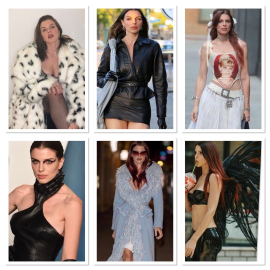
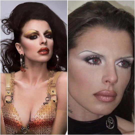
Songs which remind me of this pile’s vibe:
—>Pile 2
Pile 2, you’re going through or will go through a huge transformation.. luck will definitely be on your side and you may find out answers for things which you’ve always wanted to know about. ( it can be pretty much about anything. If we are talkibg about a physical glow up exclusively, you may learn some very good beauty hacks soon. It can be about makeup, diet, exercise, skin care, personal development etc.. this is a general reading so I cannot be exact but whatever your case is it will lead to a HUGE glow up. Two of the cards are talking about some « secret knowledge » so whatever it is it will be significant for you.
This pile is very different from the first one as the glow up that appears here is not just about one or two things in your life or looks, it’s about everything. The things you can do in order to glow up faster, pile2, is maybe start watching makeup tutorials and pay attention to new techniques or products you haven’t heared before, ask people for where they shop they may tell you some secret thrift store with really cool clothes which can uplift your style.. anything which can help you get this « secret knowledge » which appeared in the cards. Another thing I can say for this pile is: focus on manifestation, envision the changes in your looks or life as a whole you would like to have and act accordingly in your 3D universe in order to get to where you want to be. Positive affirmations and subliminals (as in subliminals I mean not the crazy unrealistic ones, but those about self concept, confidence and beauty in general) may also be helpful in your case.
Moodboard/Vibes for pile 2:
The vibes I get here are Fran from “The Nanny” and Maddy from “Euphoria”. Fashionable, bold, colourful. Radiating confidence. Crystals, glitter, sparkle, feathers, bold and colourful makeup, everything of that sort. Do not dim your own light to make someone else feel better about themselves if they are insecure.
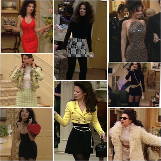
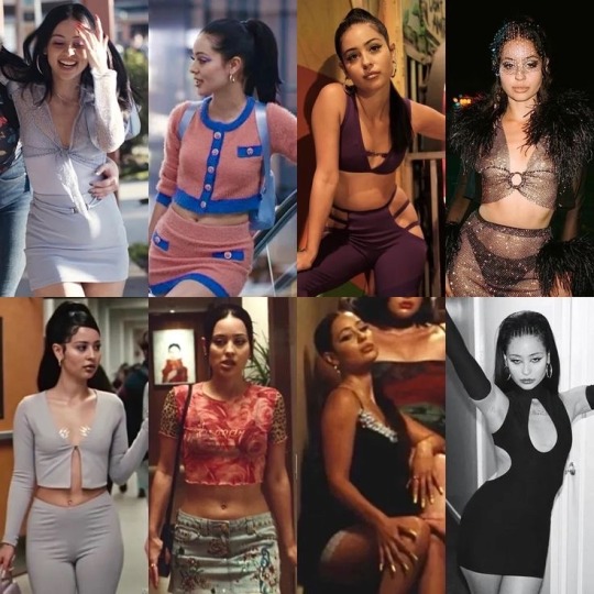
Songs which remind me of this pile’s vibe:
—>Pile 3
Pile 3: I think you would definitely be bettering your financial situation sooner than you may have even expected, this may help you get a glow up. You would be able to afford nicer things, skincare, clothes, procedures etc.. If you’re not already on a path to improve your finances, then you would definitely be motivated to start working on this problem soon and be very committed on your mission of « glowing up » in every way possible. Physically, mentally, spiritually even. You will be finding yourself after a long period of feeling lost and unlike your true self.
You would become much more intuitive, confident and cut throat even, you won’t let energy vampires use you as they may have done in the past and this would lead to a more beautiful and healthy version of you, because you would not have to deal with others’ negativity anymore. When it comes to relationships you would not be satisfied with with mediocrity, you will be finally standing your ground and being true to your standards and what you deserve. You will be getting your justice if you’ve been mistreated in the past.
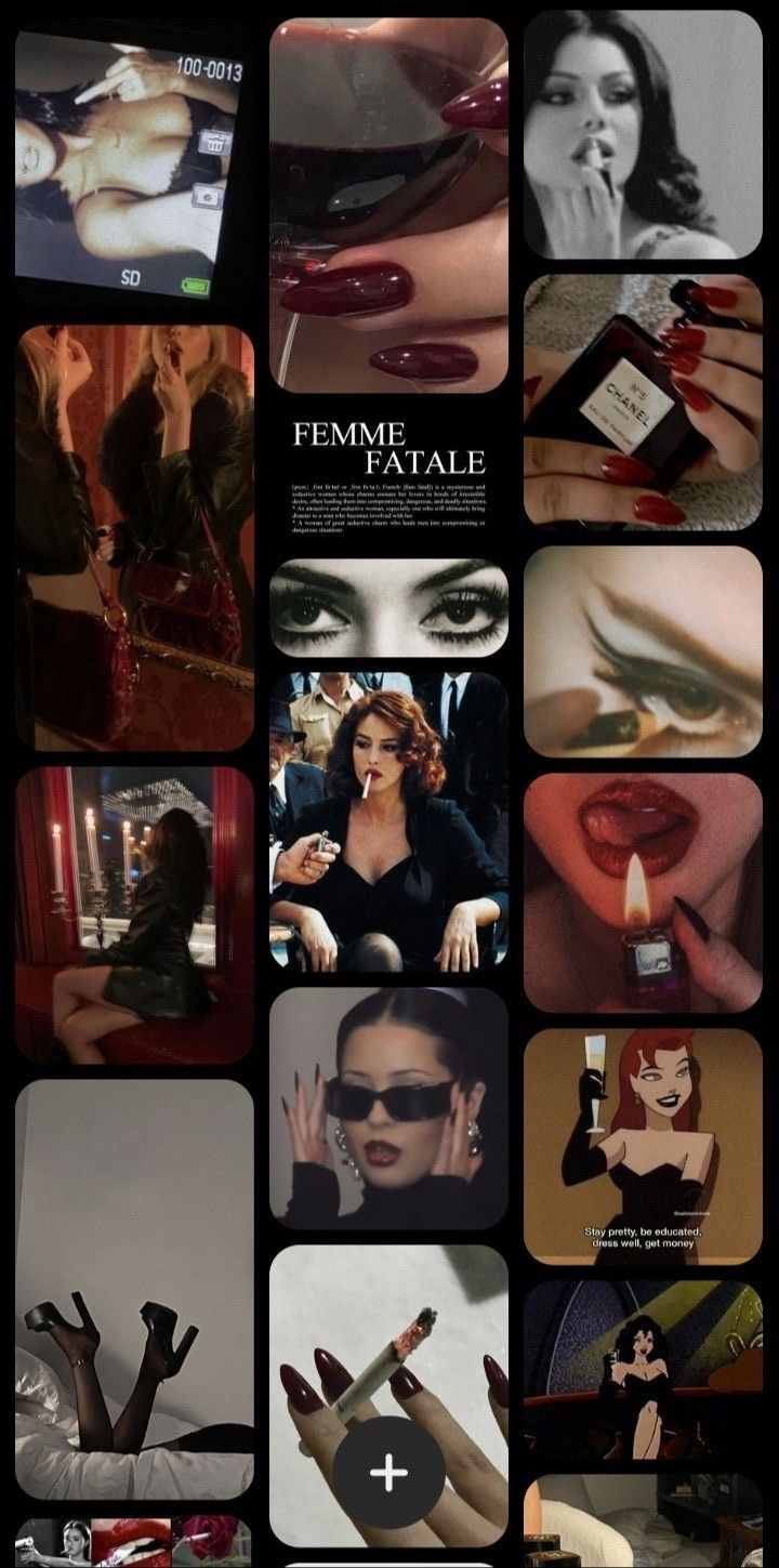
This pile has huuuge « femme fatale » « dark feminine » vibe. This may be the energy you will be channeling after you have your glow up. Doing classic makeup like red lipstick+ black eyeliner, black smokey eyes and nude lips combo might help you channel this energy that i am seeing here better. Wearing colours like: red, black, gold and nude might help you elevate your look. Also wearing jewelry, lace and high heels. Don’t be scared to embrace your « dark side » which you may have ignored in the past in order to fit in with the crowd.
May sound trivial, but follow your intuition and do what makes you happy, it will make you glow in ways which you have not expected..
Moodboard/Vibes for pile 3:
The vibes I’m getting here are as I said in previous paragraphes: femme fatale, dark feminine energy,monica bellucci core type of look/aesthetics..
Songs which remind me of this pile’s vibe:
That was all from today’s PAC. It was a bit different from previous ones and I myself did not expect it to turn out the way it did, but sometimes completely different information pops up in readings because someone needs to hear a certain thing.. Hope you enjoyed it!!
Leave a comment/feedback if it resonated, share and follow for more.
Thank you for reading!
- La Sirena💋
Decks used: ‘$£xual magic’ oracle deck by Lo Scarabeo; ‘Manara’ €rotic tarot deck by Milo Manara/ Lo Scarabeo;
Photos are from pinterest; all credits to their respective owners.
#SoundCloud#tarot#tarot blog#tarot reading#lasirenatarot#pac#free tarot readings#tarotblr#pick a card#free tarot#tarot pac#monica bellucci#dark femininity#femme fatale#tarot spread#tarot readings#maddy perez#julia fox#glow up#looksmaxxing#looksmaxx#self growth#self improvement#pick a card reading#pick a picture#pick a pile
1K notes
·
View notes
Note
Forgive me if you’ve answered this already, but what is the timeline you work with for the CR character art? Do you do them all at once, or one at a time? I saw on the Dorian ask you mentioned the deliberation started long enough ago that Robbie didn’t know his brother died. Did you know they were going to a cold location? Or were the outfits designed for any weather? If you were to design their winter outfits now, would you do it any differently?
Your art is very cool! No pressure to answer all/any of these :)
Timeline varies WILDLY. The very first round, back before Bells Hells even premiered, was like 4 months out. But that took a lot more effort. Messing around and zeroing in on a thing. I can turn a character around in a week, as long as that character isn't that important to anyone. Like I know all guests love their characters, but Erika Ishii's first round took like three days (and then I heard about Yu, which took two weeks). Bordor scared the shit out of me because it was so effortless that I was worried that I either missed something or didn't know something.
I start them all at once, within reason. It's really important to get final designs (pre-rendered) to Ian, the mini painter. So one tries to work them in waves. Start as soon as you get the first brief, and then don't get too stuck on anyone. Try to keep a wide open mind so you don't accidentally railroad yourself. I have a tendency to freeze up at the render stage, because it requires a drastic change of style. So I will have to spend a day relearning how to color.
So yeah- no one told me they were going to a cold climate. They try to tell me what I need to know, but "need to know" is different for everyone. I've gotten clips of descriptions of what they are wearing, before, but generally it's just whatever they tell me directly! And no, I don't think I'd change anything too much if I knew they were going to Aeor. I enjoy a Seasonal Design as much as anyone, but only for like a one-shot (I'd love to do a holiday one shot with everyone in swim gear or christmas sweaters or whatever). But if they are going to be playing the main game in an outfit, I'd rather that outfit be iconic than specific.
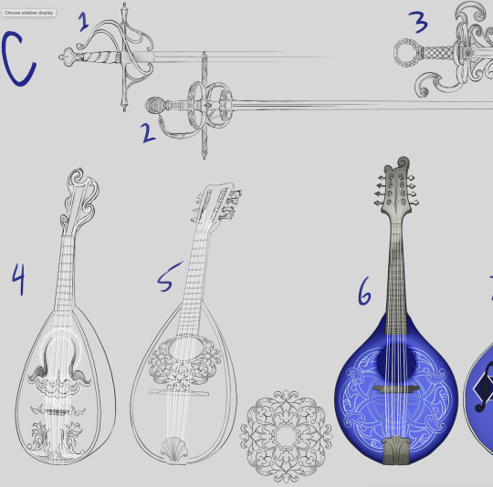
Check out some Dorian gear concepts!
300 notes
·
View notes
Note
i love reading your fic thoughts!!
are there any fics you'd recommend or read where you like the way they are characterized? i'm a writer and hope i accurately represent them but i'm never sure, but it's fun to see you doing similar things (going over voice lines and scenes to get their voice down and stuff)
and i think inspiration can help!
hiya! ahh thank you so much, i'm glad you found them interesting! and i perfectly understand your struggle :( it's a ritual at this point to watch their interactions so i can get a feel of them for ongoing fics, i'm considering rewatching a parade of providence at some point as a treat <3
and !! i agree! the fanfiction community is a circle of never ending ideas, so it's amazing how we all inspire each other! for characterisation here are some that stand out to me in my mind <3
Patron of the Arts - nevergreengale, volansvultar - ongoing and (hopefully not) discontinued, but a really interesting take in alhaitham asking kaveh to be his architect for him to move in! kaveh's inner monologue is just him, i especially love his musings about altruism, and the rift between him and alhaitham. a nice mystery going on with whatever is occupying alhaitham as well!
Strawberry High - etherealnara - this IS the drunk alhaitham fic for me, i love seeing him interact with inazuma characters, as well as being competitive. the dynamic between alhaitham and kaveh here is sighworthy, you can really feel the strain towards the end!
The City of Gold and Dust - Amayax - ongoing. pov switch with each chapter, mishaps with time and a really intriguing mystery! both voices truly shine here, i particularly love the prose of alhaitham dealing with grief, and how you can feel how much kaveh means to him, whereas kaveh can feel the burden of missing something obvious, but not knowing what. the contrast is lovely!
(self-recommendation) Change is Imp(ur)rative - completed. mentioning this because this is my fav piece of work i've done for them so far! really hoping the characterisation works, this is a slowbuild into the progression of their relationship, i'm a sucker for them actually talking and what them airing their grievances could look like <3
Old Habits, New Beginnings - thvndaga - completed. amnesiac alhaitham. this is such a lovely lovely fic with alhaitham entirely forgetting himself, but knowing that he's in love with kaveh, but kaveh refusing to believe it? very addictive to read and an incredible journey!
in the market for forgiveness - chaoticloutral - this is so cute, the rising tension over the mundane, the major misunderstanding based around (1) interaction. kaveh's perspective is perfectly rationalised, and alhaitham dogging after him to explain himself! also the atmosphere here! lovely!
best of r/relationship_advice - farozaan - completed. reddit style fic, this is HILARIOUS! kaveh coming to terms with his feelings about alhaitham (but really knowing all along) and alhaitham's quiet patinece is just so ahhh it's them <3
When Sun and Moon Align - Undercover_Owl - ongoing. a time travel fic with kaveh being flung back into his days as a student, attempting to fix his vision with his inquisitive best friend/junior alhaitham, all the while alhaitham is struggling to adjust to kaveh's disappearance in present day. LOVELY! the mystery and prose are enticing, and kaveh's shifting understanding of current alhaitham is so scrummy!
To Dream in Shades of Green - Intensely_Reading - completed. this is such an addictive fic, with kaveh being involved in an experiment (courtesy of yae miko) where his dreams become light novels, only for his dream to take the form of an otome game! so fun and the development between dream alhaitham and kaveh, with him comparing this relationship to real alhaitham is so well done! and real alhaitham going about to locate the cause of kaveh's anxiety is so real <3
six ways to friday - mousiekosmos - completed. this fic is INSANE. the prose is so lovely and alhaitham's perspective makes me want to eat my hand. so rational and logical and yet completely overthinking when it comes to matters concerning kaveh. the hesitance and misunderstanding in their initial relationship is so gutwrenching, and kaveh being the one to chase it !!! i thoroughly recommend
bad days, good days - emigmatic - a wonderful oneshot, kaveh's voice really shines through here, the uncertainties and his anxieties and tiptoeing around alhaitham, while alhaitham is so patient, just MWAH.
flower of my flower - bringingglory - completed. hanahaki alhaitham time. the mounting struggle of alhaitham's rationale in not telling kaveh and seeing kaveh worry from the side culminates perfectly! a very addictive read!
Briars and Roses 'Round Your Heart - sonotfine - completed. hanahaki kaveh time. one of my fav hanahaki aus! i love love the tension building from alhaitham's side as kaveh tries to downplay the progression of his sickness. the confrontation scene lives in my head, the suspense culminates perfectly!
#haikaveh#kavetham#alhaitham#kaveh#genshin impact#thank you for the ask anon!! my fic rec list is a MESS i really have to sort it out#i hope everything goes well with your writing!!#inspiration really can be found anywhere#which also can be a bad thing because of the amount of wips that build up hehehe#thank you to all fanfic writers for supplying what the canon cannot <3333
58 notes
·
View notes
Text


4 dreamtale redesigns done!
A bunch of words explaining designs and everything below the cut.
Also plz forgive me for misconceptions, I'm writing this at almost 4:am and I'm not well versed in dreamtale lore.
I see nothing wrong with the original designs, they just don't fit with my style. Dream's colors didn't really sit with my art well, and I always felt unsatisfied with the results, so I changed it a bit. Plus, the little... Glove/shoe cuff things???? Took too many layers and were a bit hard to add, so I wanted a design without cuffs... At the expense of overcomplicating Nightmare because I had my mind deadset on giving him cool whispy cape things. There were also the crowns... Circlets... Whatever.
I personally didn't like Nightmare's crown designs, but I dislike even more that it doesn't parallel Dream's crown. One's a moon, and the other... Isn't. Even though they have a sun and moon motif. So, I just made them a bit different, to both make them parallel visually, and fit with the rest of the redesign.
I also just really wanted to draw shawls and ponchos.
Ok, separate explanations.
Dream's palette was designed to be a bit softer, less of a stand out yellow. Like a warm sunny day. Still a happy, light color scheme, but more subdued and mature than his more playful younger self, which, while it has similar colors, was meant to portray much more of a stand out color scheme. At the same time, I did want the older and younger outfits to pay homage to each other. There's the crown, sure, but there's also the shoes, similar stripes on the shirt, and the poncho » shawl change is meant to look somewhat similar.
Nightmare time!
His Corrupted form is meant to mimic his younger self much less. I feel as though Nightmare would try to disconnect himself from his younger counterpart. No crown. No shoe apples. No matching colors.
His passive colors are meant to portray a much more quiet and subdued feel to him. Someone who doesn't want to stand out. It was also meant to be what I perceive as sleepy colors (I feel sleepy writing this, I'm going to pass out so hard as soon as I hit post).
HOWEVER, you may notice that Nightmare's shawl is pretty close, save for the colors. That's the only connection I wanted there to be, just a general shape that's consistent over both designs, connecting them without being super obvious.
Edit: sorry for the cut off, I fell asleep while writing this. Editing in the morning.
In conclusion, the hardest part of drawing these, was trying not to post them one by one.
#art#artists on tumblr#artwork#digital art#digital drawing#goopyart#undertale art#sans undertale#undertale fanart#undertale au#undertale#dreamtale nightmare#dream sans#dreamtale#dreamtale dream#passive nightmare sans#passive nightmare#nightmare#dream#reference sheet#ref sheet#character reference sheet#fan redesign#long post.#i almost fell asleep writing this#rambles#nightmare sans
52 notes
·
View notes
Note
Sorry for the ask but just generally curious cuz I feel like ive missed lore or info?? About 8ot (hope that's the right name) what are they cuz like- visibly he looks female but I see u call him 'he' so I'm just generally confused what is happening
I couldn't find any info about 8ot so I thought I'd ask forgive meh
All confusion aside I adore your art/art style every time I see it I'm just in aw I am steal yo hands and in exchange I give heart 💕


Ahh yes, the black sheep of the group, 8ot/ 80t/ Bot
Long story short, He started off as virus that took over a headless feminine looking mannequin only made to pose and do fashion, hence why he got scrapped, like a zombie he roamed the scrapyard stealing parts, met a woman, that decided to take care of the mannequin, give it clean clothes, civilizing the zombie into something more human. Unfortunately she passed away which took a big hit on the guy, once he upgraded his vessel, using the money he gained from the life of crime that costed his dear human’s life; he decided to add a head to his headless design using her face. (But then changed his face up and cut his hair for the sake of individuality)
8ot barely has an identity from square one, he wasn’t built as a character mascot (like the space friends bots), doesn’t have a nationality (he’s a robot), and didn’t even have a face to begin with. Strangely he finds comfort in the shape of his body, taking pride in his curves since he ties that to his identity, completely separating it from the fact it might give off human woman anatomy vibes :pp
Use whatever pronouns for him, and u can refer to him as woman, man, whatever, cuz he doesn’t mind getting called any :pp <33
98 notes
·
View notes
Note
idk. To me it just seems more likely that they have separate rooms. Bc why would Phil put his closet and bathroom in a a different room than the one he sleeps in? He'd have to go to the green room to shower and get ready. That's such an inconvenience. I think the green room is probably just Phil's room. There's no trace of Phil in the other room either, whereas the green room seems to be more his style. Idt the picture or phil's books being on the shelf confirms anything bc they'd just moved in and might have put whatever they had unpacked on the shelf to make it seem less empty. That bed also seems way too small for two people over 6'. I'm not saying that them potentially not sharing a room/sleeping in the same bed means they're not together. There are numerous reasons why a couple might want to have separate rooms or not share a bed. I just wouldn't take it as a foregone conclusion that they share a room when there's quite a bit of evidence to the contrary.
my haunches go up when i detect a patronizing tone. so forgive me if this comes off as harsh.
'quite a bit of evidence to the contrary' is a very strong claim to make when the pictures we have feature both of their things intertwined; phil's phlonde selfie is in that room; dan says if phil fills this room with cardboard boxes, he'll poo on the floor (if it wasn't his room, why would phil leave boxes in it); they had to have a discussion on putting carpet on the floor vs hardwood (separate bedrooms they couldve done whatever they liked); and dan only ever calls it 'the bedroom'--missing the possessive adjective.
'theres no trace of phil in the other room either' - it'd hard to tell which room you mean here, so i'll cover both. his stuff is in there, firstly. the 'maybe they needed to fill it for a picture' excuse is based off of nothing. next, consider the rest of the house: is there anything in the office that screams phil? what about the kitchen? or the dining room? or the lounge? i think dnp have much more compatible styles than people realize--he even says in the keep or yeet video that he doesnt wear super bright colours anymore. his rooms used to embody 'geek core'--and remember, we haven't seen phil's actual room since their first london apartment. and not that people can't keep their style while they grow up, but maybe his tastes changed. especially when his bedroom was no longer his video background. yknow, the one that was supposed to compliment his online persona and be the main part of his branding?
and the 'green room seems more his style' because the wall is green? there's literally nothing else in that room. no art on the walls, beyond the japan trip bamboo paintings from his dad, nothing on tables, no chairs--we haven't even seen the bed. what in that room seems more phil? not to mention them saying the green towels were in the guest bathroom.
re: the bed. we haven't seen a full picture of the bed. we've gotten the catboy pictures, and it looks to me like there's room for 2 people in it. like maybe they don't own a king bed, but i don't know how a queen mattress wouldn't be able to fit them. (i say this as someone with a double--there's no fucking way it's a double) sure they're long, but be fr.
in terms of the convenience of getting ready--they didn't used to have an en suite bathroom. he can walk, he'll be fine. again, we don't know where the closet is. phil seems like the kind of guy to just hang out in his pjs if he doesnt have to get ready for something. so putting his clothes near the shower/bathroom would be convenient, instead of both of them wrestling over one. and it kind of has to be by a bathroom, as why else would dan need clothes when he had to borrow some when the builders had blocked off his closet?
you're saying this isn't you claiming they aren't together, which, okay fine, but to me it sounds like another person overcomplicating their relationship. why are you so adamant they don't share one? genuinely, all you've presented is theories and opinions supported by no evidence. if they do share one, cool! if they don't, cool!
i don't enjoy being talked down to, and if that wasn't your intention, i apologize, but the way this was presented is very antagonizing.
#it's just a bedroom. it's not that serious. but it also is that serious.#thank you for sharing your opinion; i dont agree#but we're allowed to disagree. i just didn't appreciate the tone of this message.#dnp#c.text#phan#answered
26 notes
·
View notes
Note
This probably feels weird to ask
But I love how you draw dipper in general and your art in particular! Is it possible you could do a little tutorial on how your process goes?
If you don’t want to, I understand completely. I felt really hesitant asking this lol. Anyways, love your art!!!
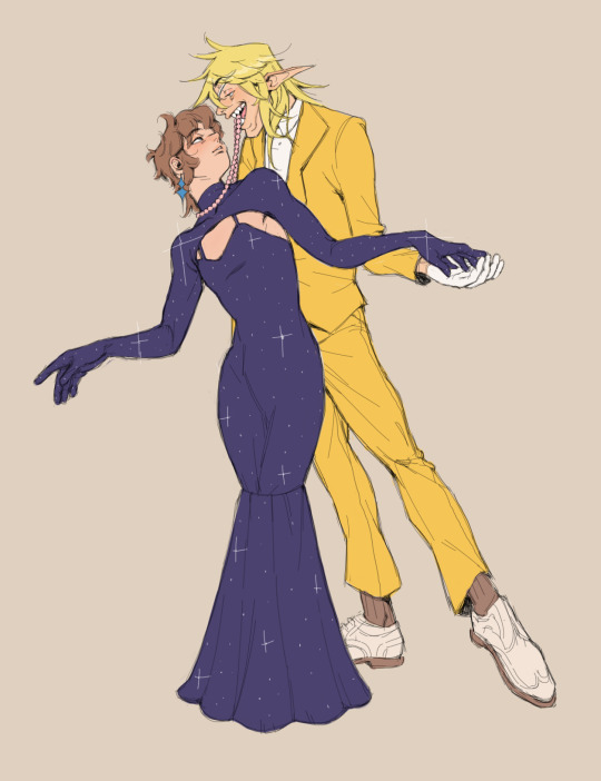
I'm not the *best* at talking technicality, and certainly not about drawing Dipper; I have three distinct styles when dealing with him, that being Billdip Dipper, Canon Dipper, and AU Dipper, all of whom have entirely different purposes both visually and narratively. This results in some pretty inconsistent representations:
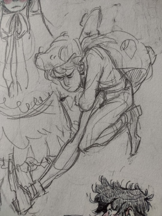
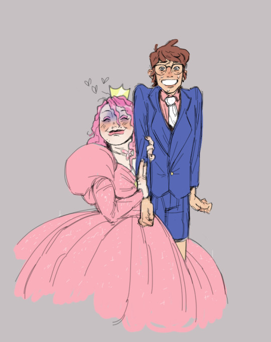
That being said! I'm totally cool with going over my process with you! Layout, technique, brainstorming, all that.
Generally speaking, I like to start my digital work on paper. Nothing crazy, just a basic idea that captures the pose, expression, and clothing (these things are destined to change by the end).
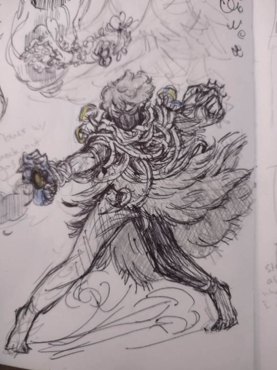
Notice the cloud of dirt kicking up at his feet. Look how I position one arm out while the other pulls farther back, and his hair blows from his face. There's a clear emphasis on motion here, both in body language (feet turned against the force) and added attire (Pinetree cloak flowing back, dust cloud at his feet, etc.)
This design is destined to change, but for action scenes like this, it's good to begin with an expressive foundation, so that once we start chipping away at and remolding our concept, we're building off of a design that encapsulates the *scene* we're wanting to convey. That is, no matter how much we shave off, we still have a strong foundation to reference towards and lean into for inspiration.
The next step is transferring our rough sketch into a digital setting.
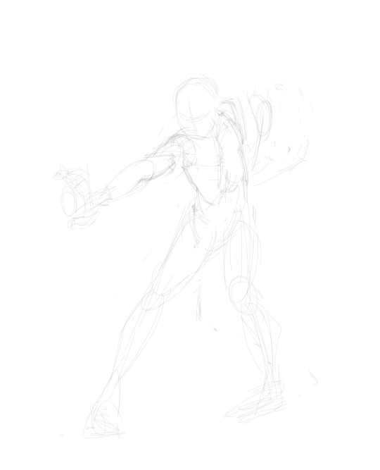
This is where I tinker with the lasso tool, maybe take reference photos of the exact pose I had in mind. Here, I'm just breaking down my original sketch on a tablet. I readjusted the feet's position, pulled that other arm in to his chest, and straightened his arm out for a more powerful pose.
The next step focuses on pushing the pose and correcting anatomy errors.
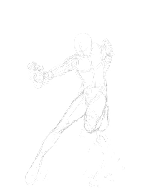
Alright, cool! Now he's not just bracing for action, he's *jumping* into it. The back arm's pulled in like a fist, his shoulder bunched up close to his ear. We see how his body's twisted at the torso, chest out, legs stretched, arm extended.
Notice too how I utilize my shapes to empower the pose. Front arm and leg, extended. Lots of straight lines. It *curves* because of muscle and fat, but outside of that, they're pointed in a distinct direction. Contrastly, his right side curves at the hip and follows subtly up to his chest. This helps emphasize his lean into whatever he's attacking, sort of like a bow.

Now we've added details! You'll notice I've changed a lot of my initial design from my rough-sketch to fit more into the style and personality of Dipper in this setting. Since he's, you know, a "Pinetree," I figured his clothing should reflect it. I'm still working in pencil at this point, blocking out the general shapes of what I want, but not really exploring my options.
The cloak follows a slight gust, his hair flows back, the mushrooms on his shoulder lean out from the action, but these are still only guidelines. Keep it loose! Explore things! Have fun with it!
Next step, Inking. Digital art is *very* forgiving, so I'm a lot less concerned about moving forward without a full idea of my vision. This is usually the step I'm most inspired at because it allows me to go back over my loose sketch and add those minute details that excited me so much. I do not recommend moving forward without full confidence in your initial sketch when using traditional art! YOU WILL CRY!
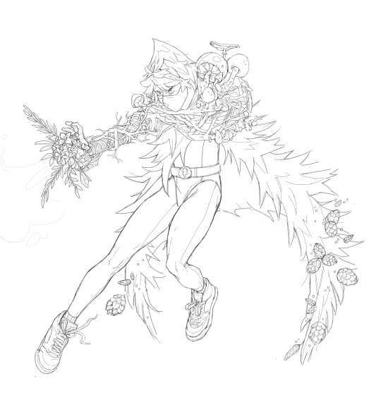
Clothes: changed. Pose: changed. Details: expanded on.
This is where a bit of knowledge in anatomy is really going to serve you well. Bridging the gap between sketch and ink has always been very difficult for me, and it's due in part to those uncertain, not-quite-right bits I have to build off of from my initial sketch.
It's good to keep your rough draft light and fluid so that they capture the emotion and general pose of your character, but it's also important to keep in mind how you'll have to balance *maintaining* that level of expression while incorporating more realistic aspects of their design.
Take for instance Dipper's left foot that went from being tucked up under his butt, to being in a more braced position- like he's about to land, or skirt to a halt. As a loose sketch, it captures the motion very well. However, incorporating muscle and kneecaps and detailed shoes brings out a lot of the visual flaws. Proportion and angle become a serious issue if you aren't entirely sure how a particular body part would flex/squish/shorten in a particular position. The more realistic you go, the more jarring your mistakes.
This is, of course, not me saying you're forbidden from drawing your characters with a leg under their butt with big, meaty thighs. It's *actually* me letting everyone know that I tried working with the pose, building on it looked weird, and I decided to take a different approach. You are 100% allowed to try something else if your initial plan doesn't work out.
This step is where we adapt and improve. Our digital rough sketch didn't really capture the full power of his motion. His cloak kinda billows out like "Yeah, I'm a cloak, I billow gayly." It's flat, hollow, uninspired. Here, you're looking at photo references of Pinetrees, both real and not-real. You're gonna have to make it look like needles and branches, while *also* being a flowy bit of clothing.
For this, keep in mind how *cloth* moves with a more exaggerated, majestic rough sketch to overlay atop our failure of a branch jacket. Die.
See how despite the spikey pine needles, his cloak follows a distinct pattern? Additionally, this coat works in 3-dimensions. There's an outside and an inside, and it curves like a dome around him. It floats behind him, curves in front of him, lifts up, dips down. Really, it's up to you, but always consider your work on the third plain.
ALSO! Very important: Keep an eye on your line weight! Seriously, this took a long time for me to get a firm grasp of. Not *shading* really, but put a bit more emphasis on those bent spaces with darker lines. See that bold line connecting his thigh to his glutes? And the one behind his knee? DEPTH!! IT ADDS DEPTH!!
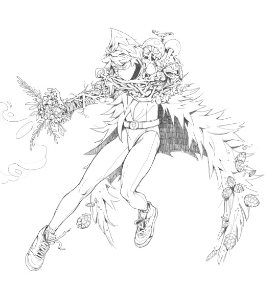
And *here* is the final product! This is the shading section, arguably my favorite and least-favorite part about my drawing process. Working in black and white, you don't really have to worry about getting every little shadow on your character. Just shade what needs emphasizing; everything with a shadow gets an added layer of depth as well. This is the part that gives your work an additional POP.
Consider too that shading isn't just solid black, even if you're working in black and white. His arm and under his hood are pretty solid black, but the interior of his cloak is far more textured and light. We see where it's darkest at his sides, but leading out, it lightens into distinct markings that (in my opinion) are visually more appealing. Using this tool is ultimately up to you, though.
Okay, the end!
106 notes
·
View notes
Note
can I have an outline of how you draw bodies for reference please ^^ if u can and want too
I’m not good with tutorials because I’ve never been asked, but I’ll try my best tee hee
Also forgive the crusty art, it’s 2 am and I’m drawing mermaids.
Now, personally, I have a very different style that’s mainly culminated of many other styles that I have studied from other artists that I like, so this might not work for you or any other person that sees this, but I think trying in general is a big step in the right direction!
1. BLOCKING!!

Funny enough, I just started this step very recently, so if anything, it’s just an extra step to make sure everything is right. It’s actually helped me quite a lot since I have problems with anatomy and posing, so I really recommend it as a first step.
Think of it as a really messy sketch. In this step, you can do literally anything without being upset for getting frustrated because it doesn’t look right. It’s just a silhouette of an idea that you will expand on in the next step. I also recommend this for character design since silhouette is a BIG part of it and can make or break a line of characters. The last thing you want is for everyone character to look like a recolor of each other. ^^’
2. SHAPES!

I cannot stress enough how important shape language is for literally every single thing. Everything is made of shapes. People, animals, buildings, food. It all can be broken down into squares and circles. This is a part of anatomy that takes a little study, but once you get it, you get it.
For me, it’s changed a lot, but to put it simply: trapezoid and triangles. That’s all you really need for torsos really.
Now, for people of different body types, that’s a whole different story. Of course pear shaped people are not going to be built the same as people that are under rectangle or apple. That’s for another day, though. Slow and steady winds the race. If you take in too much, you’ll stress yourself out.
3. DETAILS!

Warning! If this part stresses you out the most, you are not alone.
I am better at drawing women and femmes because that was what my first Ocs were, so I’m still learning maize anatomy, but whatever. Nothing to worry about now.
This is completely reliant on what the person looks like. People have different bodies so not everyone is going to have a perfect hourglass figure. That being said, simply making the body wider or taller is not enough!! People have fat, it’s just one of the many things we are made of. Some people have more, some have less.
Think of it like a blanket almost. If you were to put a bed sheet over a chair, you would be able to see almost everything regarding the shape of it. If it was made of something thicker, like chunky crochet yarn, it would be harder to see the shape of the chair underneath. That’s putting it very simply. Things like muscle and stuff would be like throwing clothes onto the chair before putting the blanket on. Not a nursing major or anything, so take this with a grain of salt. I’m a stupid little guy.
It would take me forever to explain all of this, so I suggest looking into it on your own time in order to get a more in depth understanding of bodies and stuff like that. :)
EXTRAS!

If you haven’t noticed already p, which I completely understand, I am not that good at robots. I joined fnaf when Security Breach came out cus I like Suna nd Moon and I started this account with the intent of gaining an audience for my other Ocs. You goobers reeled me in and now I’m stuck here.
Anyway, when it comes to metal people, I draw them slightly different. They don’t have organs or anything, and are video game characters, so they don’t need a space for them. And nothing is better than saving space :)
I also make their bust a literal circle because I come on this app each day and see someone else draw them better and I start to sob uncontrollably. /j
This is completely up to you since people draw them all kinds of silly ways and I see no problem with that.
I don’t know how to end this but I hope this helped in some way :)
#mxiize#askcornmxiize#art help#artists on tumblr#original art#digital art#tutorial#helping#i don’t know what i’m doing#don’t hurt me#i so tired#honk shoo honk shoo
18 notes
·
View notes
Text
Welp EarthSpark is officially done in Japan via the latest Figure King magazine.
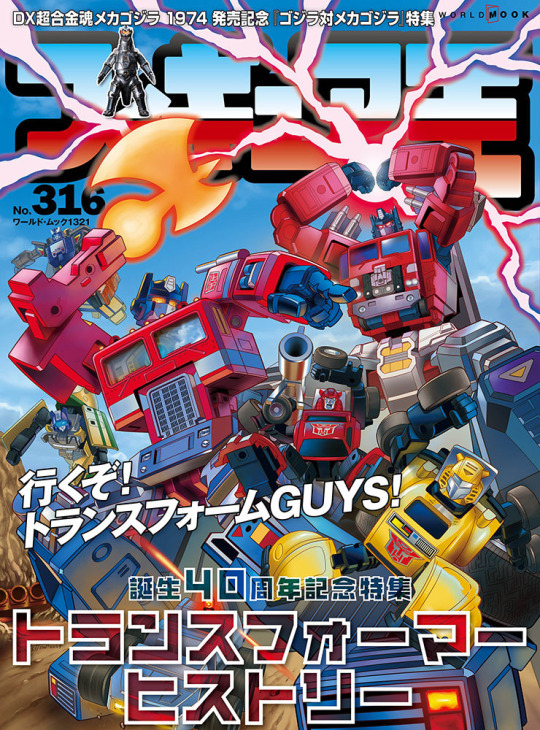
Sorta rubs the Nucleon in the Energon wound that the news of cancellation comes in a magazine celebrating 40 years of Transformers, with a cover drawn by the Kiss Players guy no less, huh?
It’s also looking more apparent EarthSpark is finito in the States too. And some staff of the show are looking to blame fans for being the b-word and the p-word. Look fella, those words lost meaning just as much as “woke” did, just take your lumps like the rest of us and admit your show didn’t work because people simply had no interest in it. Also just terrible, TERRIBLE writing and pacing. I can forgive Rise of the TMNT’s faults due to Nick not knowing what to do with it and giving the staff unhelpful feedback that kept changing it (the Netflix movie finale was a much better look at what the show was trying to be and could’ve been, but alas), but EarthSpark I have no such compunction.
Hasbro was allegedly pretty hands off and was fine with what they were doing (at least at first) so the blame can only land on the writers who clearly misunderstood what they had. I detest modern shows that have uneven pacing, tone and characterization. It’s why I don’t look fondly on Adventure Time the moment it stopped being a goofy kids show and started being some college art student’s angsty wet dream.
Clearly something changed for EarthSpark internally, and I can’t help but think Hasbro and Paramount looked at the abysmal launch of the first batch of episodes and told the staff to drastically change the story for S2. That the trailer is a more traditional Autobots vs Decepticon conflict with them hunting for Emberstone pieces ala Transformers Animated and most importantly having evil Decepticon Terrans (something fans had stated as happening in some form from the start), shows they wanted to make this into a better boy brand thing again.
The first season overcompensates by focusing too heavily on the female cast, most of them bordering on obnoxious, while making most of the male characters into morons, again Robbie dying for contrived reasons but the Maltos instead choose to love up Mo while Robbie lays there clinging to whatever life force he has left at that moment.
Instead Robbie seems to be the primary focus, with a b-plot about him having a crush on someone. I’m guessing this is where the rumors saying Hashtag comes out as gay comes from as I suspect Hashtag remarks on Robbie’s female crush being adorable and tries to be his wingman (with probably the same results when she tried helping Jawbreaker).
I feel like the intention may have been to have Mo be the focus of S1 and Robbie for S2, but it doesn’t fully come off that way as the focus is too rambling on top of trying to focus on the Terrans and Bumblebee in an RiD15 style role again.
Also what the slag is this?
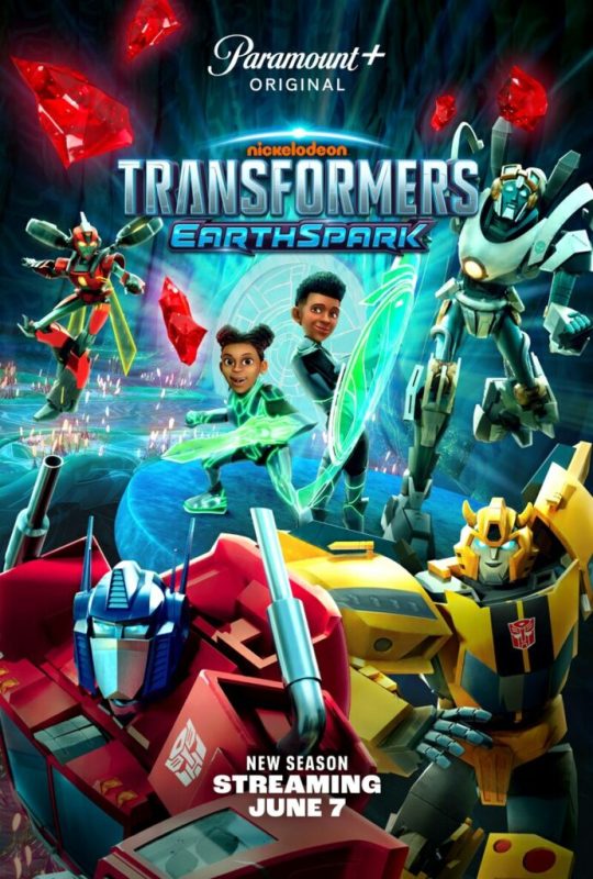
If there’s one thing I hate more it’s lazy photoshopping.
Not only do they just swap Bee and Prime’s renders around, they just crudely put the kids heads on these altered bodies from their preexisting stock art… Like no Quintessons or Terracons or nothing. Nothing to make you more legitimately excited for something new. Just the same Autobots and the kids in ReBoot Guardian Code suits, ick. It’s a bit of a downgrade compared to the Prime Apex Armor suits the toys use.
Despite the cancellation, the Japanese magazine refers to a “Slash Malt”(o). Presumably this might be a Terran version of the Dinobot Slash, whose only proper media presence has been a minor cameo in Japanese manga as the kid sister of the Dinobots and a supporting role in Rescue Bots Academy.

Frankly becoming a Terran might be the best thing for Slash, and it’s something I’m surprised toy wise wasn’t attempted anyway with characters like Lightbright, Lickity Split, Rubble, Gauge, Nightscream, and others.
So once again, what comes next? We don’t know still as of typing. Skybound is still knocking it out of the park with its Energon Universe, with the Joe portion moving on to Destro and Scarlett after having wrapped up Cobra Commander’s miniseries. Of note on Destro is the possibility MASK might be getting another go again, as what appears to be Miles Mayhem, the leader of the villainous VENOM faction, makes an appearance. The MASK and VENOM teams tend to be depicted as off shoots of Joe and Cobra in modern material, and with the pitch of the EU mentioning Energon being able to power machines, the transforming vehicles might be among the first specially designed vehicles developed to combat the Decepticons… Especially since Destro took interest in the idea of a transforming jet when he learned of Starscream.
The next cartoon is being worked on now, but we don’t know yet what it is. The easiest assumption is it’s a spin off of TFONE like how Mutant Mayhem has Tales of the TMNT, but it may be something else altogether. Barring anything TFONE does, EarthSpark was the last hold out of IDW’s post war ideas, and with Autobot Megatron mark II being viewed like this:
youtube
I think Autobot Megatron is largely done as a concept and with how merciless Skybound Megs is shown to be (though interestingly he did spare some Cobra-La guys when they told him what he wanted to know after stepping on one), I think we’re gonna be back to a traditional Megatron.
People are still not really feeling TFONE via recent upload on a TF fan convention YouTube channel, calling it terrible and cringey, so at this point I’m honestly just writing it off now (even though I’ll personally like it fine like the new Garfield Movie).
I stand by a new TF anime with a fun Mini-Con like gimmick built in the story is the way to go, because this incessant need to reject its toyetic roots is aggravating. At this stage I say let Skybound do the comics, and let Japan handle the cartoon, because clearly most people working now can’t write a decent TF cartoon without getting out of their sanctimonious way.
It’s time to Transform and Rise Up from this nonsense, and hopefully One helps with that more, but atm it’s all on Skybound until the next cartoon is ready. No pressure.
16 notes
·
View notes
Text
Preaching to the Chorus
About three years ago, Troy Baker pitched the idea of a video game musical called Chorus. What struck me, beyond the fact it was asking for donations as it was a crowdfunded project, were the high profile voice actors taking part, the art style, the bringing on of composer Austin Wintory and that it was being developed by an Australian developer! Years later, there was almost no word or hint of the game and I feared the worst. For a good long while, I wondered if I had just imagined the game being announced. Until, of course, Summerfall Studios announced the upcoming release of Stray Gods in August 2023! Suddenly, we had a release date and songs to enjoy after years of what had felt like absolute silence.
Yes, Chorus had changed its name but it was still the same premise I was promised: an urban fantasy Greek-mythology inspired musical where I got to make decisions on where the songs went. Needless to say, I was excited!
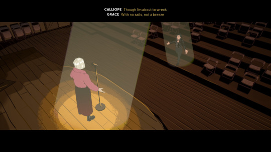
Despite it releasing in August, I didn't get to play the game until much later in 2023 when I finally got a bit of a breather between all my lengthy video games sucking up most of my time (and the fact I work full-time and commit to writing my stories and watching endless TV shows to be up-to-date on whatever is popular). Well, no. That's a lie. I've put a few games on the back burner like Octopath Traveler II and Like a Dragon: Ishin! (they are totally going to be played soon, I promise!)
In any case, I purchased the game while it was on sale (a measly 20% or so) and then stepped into the shoes of Grace. And almost immediately connected with her feelings of being cast adrift. Like so many people who have graduated university, and who didn't immediately apply for graduate programs, she's a little lost and unsure of her direction in life. Enter Calliope.
After the two share a duet together, Grace returns to the apartment she shares with longtime best friend: Freddie. As she rests, there's a knock on the door and lo! Calliope staggers through clutching a ghastly wound. With her last breath, she passes on her eidolon (the soul? and memories of an Idol) before dying in poor traumatised Grace's arms.
As Grace, understandably, panics, at the sudden turn of events, Hermes steps through the front door and tells Grace she needs to meet the Chorus. Within moments, Grace is taken to an upscale office room where she is greeted by Apollo, Persephone, Aphrodite and Athena. Before Grace can get a word in edgewise, these Idols (as the Gods now call themselves - although it makes me wonder if other pantheons exist in this world created by Summerfall), decide to execute Grace for the crime of maybe-possibly killing Calliope. That is until Apollo protests.
And protest he must consider later plot points. Such as him divulging the prophecy leading to Calliope's murder!


Honestly, so much of the story could have been resolved if Apollo stopped being a sad boy and actually used some brains to more cleverly resolve Grace's predicament. Instead, we have Grace run around the city for a week in a bid to prove her innocence and figure out the truth behind Calliope's death.
But what a wonderful week it was as several Idols help out, from the fast-talking Pan to the scary Medusa (with a very cute monster voice from Anjali Bhimani). But who can forget, and forgive me as a I fan myself and swoon over, the dommy mummy: Persephone. The design! The voice! The attitude? Gosh, I just wanted Persephone to step all over me. And considering the height difference she had over Grace?
Just...
I'm just going to die in a corner over here now.
Anyways, diversion aside, the plot was serviceable. It wasn't the most mindblowing story to be told but I liked how it introduced us to many of the Greek Gods and mythological creatures hiding in America, whilst weaving it in the murder mystery plot at its core. While the game threw out new leads often, I didn't ever feel an urgency to solve the crime or fear I'd not be able to figure out the murderer. Sherlock Holmes, this is not.
Rather, no matter which scenes you may wish to complete first (and I always went back to the Underworld to chat up Persephone), I feel like the end-point is almost always the same with our villain being unmasked as the smiling cookie-giver!

From a gameplay perspective, Stray Gods doesn't offer much. It's pretty much a visual novel where the player selects dialogue options or the next part of the song they wish to sing. There's no walking around or exploring the wondrous set pieces you find yourself in. Nor is there any random clicking on background objects for some light commentary or to pocket away clues to be presented at some other time.
In fact, there's no real animation to the game either. Most of the characters are stills, changing their posture as the dialogue or songs demand. Like flipping through a comic book or going from pane to pane.
But what does make Stray Gods stand out are the songs. Yes, there are some where I felt like it faltered: Asterion and Hecate's song (with the volume turned way too low) and some of the weaker blue options in Challenging a Queen. To me, it just wasn't as melodic as they could be and sounded a little jarring. Still, these were glossed over by several other standout songs like The Throne and the Ritual.
Speaking of The Ritual, while I did feel for Aphrodite, I didn't much like her selfish actions of dying and passing her trauma onto another poor soul. Like, either go to therapy and work on your issues or just die permanently and stop inflicting someone else with your trauma! Forgetting is not the path forward. And maintaining the cycle of the next Aphrodite reawakening to your traumatic memories of the Second World War whilst your son, Eros, deals with the fallout is NOT healthy.
On a side note, I liked how the melody of Adrift was used in the background of the game and was also revisited during The Trial.

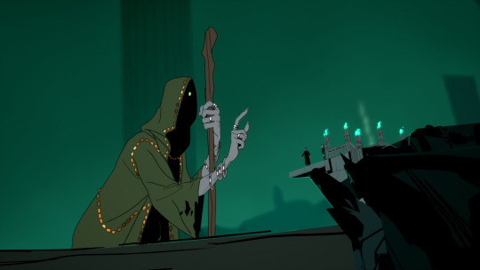
As for the actual singing, I'm still impressed by the singing of so many of the voice actors. I mean, I wasn't surprised by Troy Baker considering he was a musician before he was a voice actor. And Felicia Day...well, considering I'd stumbled upon her back in her The Guild days, knew she could sing because of the songs she released. And the fact she appeared in Dr Horrible's Sing-Along Blog alongside Neil Patrick Harris and Nathan Fillion.
While I did like Laura Bailey, there were moments when I felt her vocals were just a little too raw and weren't able to hit the notes as well as could be. No shade on Laura, though. I love Laura Bailey! And she had a tough task with so many variations to sing!
Still, I did like her rapping. MORE LAURA BAILEY RAPPING PLEASE! Especially in the Challenging a Queen song.
But I do wonder what Stray Gods might have been like if we had actual Broadway actors brought in for the singing with stronger vocals and/ or melodies.
But I must say, my absolute favourite singer was Mary Elizabeth McGlynn. How could I not? She voiced Persephone! And I so wanted to romance her!
In the end, though, I foiled my chances because I was trying to play in-character by asking myself 'What would Grace do?' in most situations, especially when she was down in the Underworld and was especially traumatised by her best friend's death.
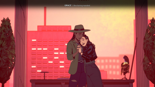
So, yes. I obviously brought Freddie back and the two ended up getting together in one of the more wholesome relationships there is in the game. Because, if you ask me, Pan? He just shows up out of the blue and is all sneaky-sneaky. A girl with her head on her shoulders wouldn't immediately fall for him, even if his intentions were good.
And Apollo? I know my friend @mrsarmageddon likes a 'I-can-fix-him-sad-boy' but he was too set in his ways and a little too unwilling to be of any proper assistance until all his secrets had been unveiled.
As for Persephone, she's a very angry woman and also wouldn't have been a healthy choice considering her romance with CALLIOPE in the past. Still, I couldn't help but want her step on me.
I don't know what that says about me. I'm probably secretly a sub/ omega who just wants someone to take care of me.
But let's not dwell on what this revelation could be and instead talk about how Stray Gods pushed the gaming genre to try and be more inclusive in ways no-one had thought of before. Beyond that, I loved the characters. The narrative, while simplistic, was entertaining enough to pull me through my initial playthrough of six and a bit hours. So, it's not even all that long. Which is perfect when you're gainfully employed and have a ton of time-consuming hobbies.
The one major downside to me was the fact it didn't have a chapter select after the first playthrough. If it did have it, allowing me to skip ahead to say 'Act 3' to redo my conversation with Persephone so I could romance her, or skip to certain songs so I could try out different combinations or variations, it would have heightened the gaming experience for me. Instead, Stray Gods forced me to play through the entire game again just for the occasional tweaks I wanted to do in my playthrough.
And now, during The Game Awards 2023, there's been an announcement for ANOTHER musical game called Harmonium. And it features sign language! So, it's definitely something I want to keep an eye on!
YES! TO MORE VIDEO GAME MUSICALS!
But also, don't let it become too overly saturated. During the Game Awards, I couldn't help but notice more Souls-like battle systems, using Japan as a setting (for Western developers) and more mechs/ robots.
Now, if you'll excuse me, I need to go and admire the Queen of the Underworld a little bit more. For perfectly REASONABLE purposes.
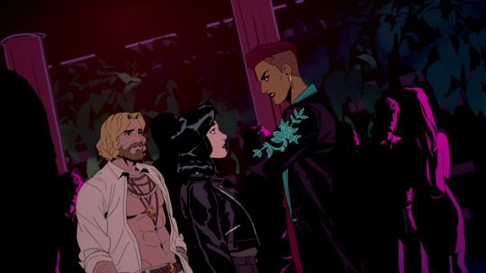
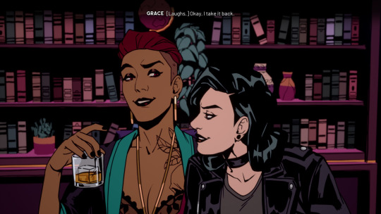

#video games#stray gods#grace x persephone#grace x freddie#musical#why are there so many musicals about the Greek Gods?#charon just wants to play a game
23 notes
·
View notes
Text
welcome to: rizz's extensive uksies notes, which will discuss differences in characterization, sure, but also more important things like staging, scenic and dance changes, and directorial choices (i do talk about the principal characters at the bottom so i'll forgive you for skipping down there if you wanna). i haven't looked at anyone else's posts since i didn't want them to influence my thoughts, but i'll be whipping out the third-of-the-way-through stage management degree for this shit so buckle up. spoilers/major reveals will be in this post, and this post (among all the others relating to major reveals/moments in this version) will be tagged with #newsies spoilers!!!
lets get into it, starting with the reason this show was able to be as much of an experience as it was: the space.
i think it's very important context to this version of newsies that the troubadour theater, previously, had been housing an immersive peaky blinders (popular tv show) experience. this review gives a pretty good idea of what immersive theater is, and it is... a big feat. it's more of an experience than theater, and that same goal was at the heart of the way newsies is done, too, which worked so well. both are historical fictions and are based on real things that happened, which makes it kind of easier to involve an audience imo and lets them believe what's going on.
the stage is a sort of round thrust-style in the shape of what i'm guessing is a flash/flashbulb in reference to obviously the pics we have of the strike and how "big photos attract readers" (aka the audience in this case :)). as yall know from the photos its got the same tower/skeletal setup as bway...to an extent. for bway, that's tbh all they have, but by losing the proscenium stage and moving into a space with so much more free reign, there didn't have to be one big scenic element, and it didn't have to be the only thing to steal the show. like the "big moment" for bway is when the three towers track forward in once and for all, and there's like....at least three different moments just like that in uksies and they don't even need the towers for any of them! because they didn't rely on one thing, they did so many things, and they did them everywhere. to the walls, to the aisles, to the landings, to the air, this show made sure it used every definition of the word 'space' to its fullest. initially it sounds distracting, but making sure they're all around us and making sure that ensemble characters are able to be on their own without the principals near them really humanizes the ensemble as a group of real kids who fr went on strike. i'll come back to humanizing stuff in a bit, but since we've been talking about the theater space, lemme talk abt these scenic elements because damn...
there was a slide jack used a couple times through a hatch door to escape the delanceys thru (with a little >:) wave) and escape the strikebreakers
there were mini trap doors in the stage where items were stored and revealed, and they kind of looked like the grates that sidewalks have/used to have for like rain to drain into in cities <3
there was a rope jack used to swing through and kick a strikebreaker in the face!
the penthouse actually felt like a home rather than literally just a bare bway balcony lmao, like they had mini portraits sticking to a skeletal roof-like overhang that jack probably built on his own, his art was much more obvious and hung up and personalized.
the cart with all the papers on it actually got to be used in staging in really fun ways- it was both chariot and podium for jack and crutchie mainly but they like rode around in it it was cool
medda has a huge lit-up sign for her theater instead of like. an overhang or whatever it is for bway, which is the upgrade she deserves <3
the children's crusade banner wasn't a projection, it actually dropped as a huge literal banner from one of the line sets and jack stood as a shadow behind it with a fist raised >:)
the tables for king of new york weren't the longer bigger ones from bway, it was like actual restaurant-style table for two's like in 92sies!! and they were on wheels, so they had table-ography– this was also possible due to how much more depth, physically, the stage had, like they wouldn't have had room on a proscenium. davey was pushing les around on a table and the kid was just flying around it was super cute and rly well done
speaking of 92sies, remember at the end of their king of new york when the one newsie grabs the ceiling fan and spins around? yeah, uksies does that with these huge practical lights that fly down from above- newsies get to not only hang off of them and do some acrobatics, but they can spin on them, and they not only go insanely fast, but they also are able to go higher the faster they go. seriously one of the most insane displays i've seen in a staged musical of all things, like it felt like a show and not just a musical.
The abundance of scenic and spatial elements leaves a director/choreograoher (because this guy was both, and it is visceral even in the scenes that he's both and it's perfect) with so many options, and fuckin man, did this guy absolutely use all of them to the fullest. i hadn't realized how like....recycled the blocking had been through bway and also touring, because idt they're allowed to really change it. but guys. we'd been watching the same exact movements for years, and NOW THEY'RE ALL NEW!! everything they do, each location of the stage people move to is all different than we've ever seen as a fandom, which is major, because staging is a storytelling device– since if it wasn't, we wouldn't have it. where people are in a space, where people are in relation to others in a space is also huge. the other main thing again is that it isnt a proscenium stage, so it's much easier not to stage people "in a line". think back to the livesies staging for right before the world will know when jack is telling davey about "if your father had a union". picture where they are on the stage in relation to the cart w all the newsies. its in a fucking line, bro.
this show? abused depth beautifully. the stage pictures were extremely memorable, so choreographed, and set the dynamics for scenes so effortlessly. davey is way downstage when jack's trying to convince him to join the strike, so we can see his exact thought process before the final "i guess...you do, mr. president". (speaking of, ryan kopel is genuinely the first davey to actually make that line a weirdly emotional journey?? like davey takes so long to finally say it, like he's getting over the stakes and letting jack's words sit before finally, yes, agreeing.) or when jack has his pre-seize the day monologue (of which i might make an entire post for for personal reasons and i'll link it here if i do), the three scabs are center stage, arranged in this triangle with their backs to each other and their heads down so jack gets to circle them while addressing the stage at large- it just looks so intentional and frankly very pretty to watch since they're all dancers and their posture is so clean. even something to believe in's scene staging is more dynamic because the towers themselves aren't even in a line- they're angled downstage, so even when jack and kath are high up on a more skinny platform there's still depth and an upstage and downstage they can travel on!! it's so thought through. i'll also make a post about more individual moments, but a lot of people have done that so im making the more important post first lmao.
the staging ofc was very intentional, but the transitions were also...like seriously integral to the narrative. idk if you guys know this or not but transitions can make or fuckin break a moment fr and some directors fucking suck at them LMAO but wow. these? the newsies taking on katherine's platform with the same "mornin' miss" air to their movements and kath saying a small 'thank you' to them before she sits for watch what happens, versus the transition into the bottom line where newsies push pulitzer's platform on with heads and backs bowed down, pushing slower, with more effort, like it looks painful when they push on his platform. newsies lifting medda's footlights and sort of "working at the theater" with their movements mirroring dramatic vaudevillian theatre. it was all so fluid and nearly all of it was done by the newsies and none of it was really...hidden, either, and seeing them literally "work" onstage cemented them as "the working boys of the city" really specifically, and in a very special way. like yeah, the invisible workforce, of course they're doing the transitions. beautiful, a+.
among other added elements were the new orchestrations. newsies has never sounded like this before, even excluding the new music they added. there was more base, guitar, and drums, and the tinny trumpet was much more subdued which felt more...realized and less disney, which is for me always welcomed lol. honestly it made the music sound less disney as a whole. very grounded sound overall- ALSO the sound design was so fucking excellent like you walk into the theater and it's the sounds of the city in 1899 and it's so cool...but! yes! there was new music because guess fucking what: every single dance break was extended. every single one. they all of course had new choreo (finallyfinallyfinallyfinally) but also literal new parts to the dance breaks. each by like 3-5 mins. cemented this as a show more so than only a musical which i fucking adored. in a diff post i'll go through each song (though it might. be after i see it again) and talk about the extensions because just....come on director/choreographer!! yes!!
rounding out this post specifically, im gonna nail down some characters and relationships, since honestly they were very different than we've seen before, but there's merit to all of them for real, and i appreciate a shift from how we're used to interpreting them, and honestly i hope it changes our characterizations as a fandom and adds more depth/possibilities!
starting with the romantic hero of the year, jack kelly.
he is distinctly a romantic hero in this- not in the perceived lovesick/floaty way. he's a very raw version of himself, and he's almost a loose canon (until he's forced not to be via blackmail). he's staged very intimately with others when talking one-on-one, which i know is a usual jack trait, but at michael's jack's core is "come on, look at me." every moment with those he loves is personal to him, is treasured and valued. a baseline example is crutchie, of course, who he says "look at me" to in the prologue after crutchie gets discouraged with himself. they aren't staged outward toward the audience, because jack doesn't let it– he is in line with crutchie, really looking at him, and making sure crutchie's looking back. he does this with the scabs too, except he gets to move around them because of how that trio is staged (my god that scene looks and is so beautiful..fuck).
but i think this is very exemplified with davey, actually, because what i love about michael's jack is that the emotions he wears on his sleeve aren't only ones of love- it's all passion, which includes anger. jack and davey do not get along initially. the exchange of "well if he's the best then what's he want with me" is kind of charged, which is exciting- davey really is just there for his family, he doesn't need eyes on him, and he wants to shut it down....but it's shutting it down via undermining jack, which is made clear by jack's reaction that that isn't something that happens around here. "cause you got a little brother" really feels like an 'i don't need you,' in how it's said, and any back and forth they have through that scene is an interesting animosity... which changes the moment davey and les are in danger, when snyder appears and they run (they run SO MUCH in this show oh my god, they run everywhere across everything and up and down), and once they run to the theater and jack gets them out of that situation and davey is seriously like. 'who the fuck was that guy, we had to go through that bc of you, that wasn't okay', and the way jack explains who snyder was...for the first time, jack doesnt match davey's animosity and instead just explains, in lieu/as an apology, the details on who snyder is and to steer clear of him. and instead of saying "right" as davey normally does, he says "thanks for the advice", with the staging squared and head-on to jack. and it isnt sarcastic, it's just genuine, and from that moment on, davey gets the "look at me" treatment. and jack even holds the back of davey's head during i think seize the day and lets his hand slide down his shoulder to daveys chest and daveys hand is on jack's shoulder and they're staged square and not outward like the moment is just for them.
jack's emotions are more visceral than they've been, he's very hot-blooded and it just makes everything hit more. the fucking seize the day monologue. poc fans we finally won. michael took so much time with it, making sure each line was heard and intentional and the audience was doing that thing they do at more serious straight plays with the little "mmhs" when they agree with something and like. he just made sure it was taken so seriously, same with the something to believe in scene. "what is this.. about, for you?" just the way michael structures jack's word is so smart and emotional. he also has this sort of break in his speaking voice that reminded me of jerjor actually, but it obv is just the way he acts and a choice for jack, this cracking of the self when he's vulnerable with someone at the expense of himself.
lemme say that again. this jack's voice literally has an emotional crack in it when speaking vulnerably at the expense of himself, which is SO FUCKIGN SPECIFIC GOD I LOVE HIM FSKDFJSDJ FUCK. it's genius. he does it with katherine during "i ain't stupid, i know that... girls like you, don't end up with.. guys like me." oh my god the FUCKING NOISE THE AUDIENCE MADE. oh it was heartbreaking, like it was genuinely crushing. made me tear up for sure, for obvious reasons lmao. michael is the jack i've always wanted- a little vain (he admires himself in a hand mirror during carrying the banner<3), absolutely turbulent, and painfully, horribly aware of his own stakes in this all. and black LMAO I WONNNNNN HAHAH I WON!!
speaking on crutchie next because he is the narrative of this production.
the fandom has sort of strayed away from the jack+crutchie team and fallen into this jack+race team, and this production makes damn sure that doesn't happen. it is so jack and crutchie, all the way, to the end of the fucking line. he is with jack, central, through all of act one's staging and major numbers- by jack's side for carrying the banner, with him on the cart when it spins around center and moves around the stage for world will know, he leads the newsies up to the world's door to make way for jack, les, and davey to enter it, he's included in seize the day choreo moments, he cries out for jack to get away ("jackie, run! run!!" im. i am. a mess) at the end of the brawl when he knows he's in a situation he can't get out of.
he also has this hug with jack and race when he returns from the refuge that nearly made me yell out loud LMAO (me and @roideny grabbing hold of each other in the theater and all), and the three of them have a personal spot of the stage together looking over the paper when davey makes his first appearance- crutchie is just staged very intentionally near anyone with leadership, cementing him as a leader and is certainly no longer jack's kid-brother anymore. any infantilization is really worked on getting completely gone in this production, the effort is apparent likely especially bc the actor (matthew duckett!! sweetheart supreme!!) is disabled himself!
another really key thing about this crutchie is how loud he is, in every way he possible could be. his color palette is the most stark right along with jack's, he's wearing overalls which no other newsie has, his speaking voice is almost abrasive- it's not rough, per say, but it's sort of coarse and nasally (he's so new yorker and im in love w it), and very distinct. he's also taller than jack (michael my beloved is 5'9", furthering my jack is 5'9" agenda) and like... most of the other newsies tbh.
this production does not give you a choice but to notice him, does not give you a choice but to look at him, does not allow you to ignore crutchie in any way. it's visually and audibly impossible, and that is spectacularly intentional.
he is also like... sunshiney in a rough-around-the-edges way, in a this-is-all-i-have way. he's so himself, he's abrasive and almost snide in how he talks. very self-aware, but choosing actively to be brighter about it even though you can tell his situation weighs on him. crutchie is genuinely so dynamic in this show and he's amazing to watch, and he is finally, finally, truly shown as equal to the rest of the newsies, and certainly to jack.
this is so specific but the "we have the right to starve, let's just get our papers" line is so decisive of him. like i'm realizing that that line hasn't given him power before, but it does in this show- he can raise a definitive solution to the group without being jack, and i.. don't think anyone else does this, at all, when they're discussing the strike. it's just crutchie who states what he believes they should do. like. that's never been emphasized before thats so fucking cool for him idk
alright davey time woooooo
davey is the king of defensiveness in this and i genuinely fucking love that choice for him. because he is trying to find a 'way out' within the text but also metaphorically within the story before world will know. so like– this production had davey try and contradict every time someone comments on what davey says. he'll start to say "i didn't say-" "that's not what i-" "i didn't mean-" before cutting back into the script's dialogue again, which is SO fascinating. since initially, davey is trying to separate himself from the newsies, so he uses ad-libs like that to break away, but then after world will know, those same ad-libs are used inversely it felt like, like he'd say something in a way that didn't quite fit and he'd try to rephrase so that it did? very interesting to watch.
he also was very nervous to speak in his first appearance when getting his papers, like he was very nervous about speaking in front of wiesel. this davey had sort of trouble finding words in a timely manner, but what he always has are the right ones, which was a good dynamic for he and jack. he does know what to say, and what he says is intentional, he just isn't great at saying it until act two which is so. cool. even in act 2 at the rally he's still finding his footing, and then when he's at pulitzer's office with jack and spot, he's in his own. he's nearly flippant about his words, since he's found his confidence in them through jack uplifting them the whole show. it almost..... like he and jack kind of have a mentor-y relationship? jack really feels like he does show davey the ropes (despite how biting the "well my father taught us [indicating that jack shouldn't lie so easily in front of les] not to lie" is), and davey learns from jack while jack learns from davey.
speaking of les though wow is mans protective as fuck. his arms are always around this kid, he rests his chin on his head really casually and les is so easy with it too like yeah they're brothers asf. and their moments in king of new york are so precious, and they have the center table together at the start of act two.
speaking of act two! can't talk about davey without discussing wwh reprise :). the way he talks to jack in this scene is so confident that jack's "have they busted up your brains or something" feels like it's more about that- davey hasn't spoken against jack since before world will know, and jack isn't used to the dynamic davey is trying to establish. he's so persistent, and urgent, and like... in it. "won the battle, jackie think about it" like this davey wants to win. at every single turn in this show, davey wants what he believes to win. he will speak against anyone, he will try and change his words' meaning ("that's not what i mean-"), and he will persuade whoever just so that he can win. he feels so competitive and it shines in different ways and everything he says really is so argumentative. maybe he's a little quieter, his voice is shyer, but davey isn't shy, and that's made clear. also ryan kopel hugged me at the stage door and i love him and he's so fucking sweet wowowow
ok katherine and we'RE DONE i promise.
staging made absolutely sure to ground her. she was watching a lot of the scenes she wasn't in, like she appeared during world will know in one of the aisles- felt very much like those moments in 92sies when we'd just see denton around takin notes, which i loved. showed her as a very active journalist. she also like... spoke like an american newscaster?? like she had a News voice lowkey? which was a fun choice.
her scene with jack when she's asking him questions is so serious for her and i love it, it really makes sure that she cares about what she's writing and who she's writing for. jack's "we both got a lot riding on you" takes her downstage as her desk gets set up, and we get to see jack's words weigh on her which is fuckin nice as hell.. like she just felt more grounded than she's been. she still got to be bubbly, but she was more aware of the situation than like... kara lindsay's katherine. she knew the stakes for the newsies i feel like, which is why the name reveal was more intense and the STBI pre-scene was... the best i've seen. she was embarrassed at herself for lying to jack- not telling him everything, and when she defends it she knows it's weak and doesn't try to back it up.. i just appreciate it bc that scene normally feels so superficial despite its context and what they're talking about, but kath and jack really did everything they could to save that scene's writing... they reeeeally fuckin tried LMAO. this katherine was more willing to put herself in the action for sure
her back and forth with jack in jacobi's was so fun, and the defining line of their arc through the show was definitely "this is entertaining...so far." because it's fun to flirt, until it isn't, and someone you care about his ruining his name at the city-wide rally, or revealed to be the daughter of the man sending cops to beat kids into submission. whew. they're really good together.
very quickly: THIS PULITZER IS >>>>>. HE IS SO GOOD. I CANT LIE LMAOOO HE'S SO EVIL I HATE HIM!! and MEDDA WAS SO. that's jack's mom. she also really does serve independence, and i love it so much.
anyway thanks for reading this far guys LMAO i now this is so extensive and i didn't even talk about the ensemble fr... but that's for the second viewing. the direction this production underwent took major precedence, since it's so different and so much more fleshed out.
hope this gave a clear picture on the vibe of the show and the principal characters/relationships!! more to come asf!!!
#newsies spoilers#WHEW OK WE DID IT for now#newsies#uksies#newsies uk#west endsies#britsies#analysis#newsies design#fizz freaks#jack kelly#crutchie morris#davey jacobs#katherine pulitzer#medda larkin#rizz.analysis
167 notes
·
View notes
Note
hellloooo!!! i was a big fan of your fics from i think over a year ago (?) now and then my life got busy and i couldnt keep up w your newer fics :( i just wanted to say reading mh and eventually with sooo many consecutive chapters has been an absolute delight, not only is it a brilliant read with such fantastic ideas (you bet ive caught up on as much jasper lore as i can find under the tags) but youre such a consistent writer i was shocked to see the times between the chapters postings!! how do you do it? my writing style changes per MINUTE im very impressed!!!! this is so cool!!!
ps. i was wondering if you ever plan to write more oneshots about hunter in the canon universe (ish, ykwim!!), or if youve moved on now to your own aus?? no complaints either way i LOVEEE all your toh work, but your vee & hunter fics DO hold a special place in my toh-based heart and i was wondering if there'd ever be more?
I think one of my strengths is that I'm good at changing styles, both at writing and art! It's obviously a lot more noticeable in art, so I've gotten lots of comments from people who are used to seeing one style from me really surprised to see me do stuff that looks totally differently. I think I'm pretty good at it in writing, too! I've got lots of fics written totally differently and I hope they're all good. I think my second person work is my best though, teehee.
I've been jasperbrained for awhile but I DO actually have a ton of ideas I've scribbled in my notes for non jasper fanfics in my notes, even if I haven't written them. AND I've actually got a vee and hunter fic I've got outlined that I've been rotating in my head recently that I just need to sit down and DO but I totally do intend to. I think it's gonna be a really good one. It's about like, how and why vee is able and willing to forgive him even though he killed one of the other basilisks, how she could not only forgive him but live and trust him as a beloved brother. Cuz it's something I have a lot of feelings about, like, vee, who she is, how she thinks, her reasoning and her feelings. And I really wanna share them!!!!
I don't know if I'm really gonna post lots of non au toh fics again like I was... I have a tendency to go through cycles. ADHD brain. So like six months, a year, I will do One Thing and absolutely nothing else. Like I will be writing fanfic obsessively or I'll be animating 12 hours a day and nothing else or I will do nothing but original content or nothing but a fandom. And unfortunately I do not control the brain fjejfjfn rip. So I cannot predict if my brain will decide I'm allowed to again or not! But whatever the brain says I can do I hope is good and will be enjoyed by someone, but also I totally understand when it's like "welp. That is definitely not something I'm here for" lol. I am always swinging around between stuff.
7 notes
·
View notes
Text
Girl-Dad Hongjoong
Yes I know you can do this stuff with a baby boy too (and you bet your ass Joong would) but I'm dying at the thought of Hongjoong being an absolute simp for his little princess and hiudhsvubi
Now that that's out of the way...
Crying when she's born and he gets to hold her for the first time
His eyes swimming with all the memories he wants to make with this tiny human
Always having heart-eyes for his little girl...always
He could be changing a soiled diaper and still have heart eyes
Just staring at the baby for hours, completely in awe that he helped bring her into the world
But also getting super anxious as 'what if's swirl through his head
Channeling all his fears into incredibly heartfelt songs that he sings to her as lullabies
Sitting at a tiny little table wearing a toy crown and earrings while his baby girl serves him imaginary tea with the cutest little tea set ever (that Hongjoong totally personalized for her)
She would be the most well-dressed toddler istg
Always looks forward to their cute morning ritual of him picking her outfits from a big-ass closet (seriously, this man would LIVE for buying and customizing baby clothes)
But like, if she wants to wear bunny ears or smthin with whatever chic outfit Joong picks out she will and he'll let her
Probably even encourages her to pick out wacky, unique pieces to add some pizzazz to the fit
Daddy-Daughter dates!
Gives her flowers, takes her shopping or to see a movie or something, always getting ice cream on the way home
Mans is wrapped around her finger so tightly you have to force him to leave whenever y'all drop her off somewhere
He will 110% cry on her first day of school
He's like the classroom mom to end all classroom moms
Definitely the Dad that all the teachers and other Moms (and Dads) are in love with...every single one
Like, you know the scene in "The Game Plan" where the Rock's character is sitting in the dance studio and all the moms are like lusting after him? Yeah...every day
Then when she gets older it continues, only now her friends are crushing on her Dad too (DILF Hongjoong anyone?)
But ofc he doesn't even notice, too engrossed in watching his baby do her thing
Going all out for Daddy-Daughter Dances
Buys her a new dress and accessories, making sure he has pieces to match, giving her a cute little corsage that he probably made (or at least designed) Himself
Protective!Dad Hongjoong 24/7
It's not much of a problem when she's little, but when she gets older and boys (or girls) and crushes are a thing watch tf out
I feel like he would have like a sixth sense for judging peoples' characters and if someone gives him a weird vibe he'll keep a closer eye on them
Never says "I told you so" when she comes to him in tears when someone is actually a shit human
Just makes some tea and brings her blankets or plushies or something
He WILL hold a grudge against anyone who hurts his baby girl
Even if she forgives and forgets...he will not...
Tries not to spoil the shit out of her but honestly can't help it
Always buying pretty gifts for her, plushies, jewelry, clothes...the list goes on
Tries to foster a love for music and the arts from a young age
Piano lessons, dance classes, etc.
Always wants to do crafts with her and probably having a whole art room that's more often than not covered in glitter and ribbon
Hyping up everything she makes
Always wearing the things she makes for him
Literally styles outfits around pasta necklaces and decorated ties
Family trips to the nail salon to get matching manicures
Dancing with her standing on his feet
Gets more excited for dino nuggies than she does
51 notes
·
View notes
Note
pokes inbox
hi do you have girlmeep ideas... i wanna try drawing girlmeep and your brain has magical things according to what i've seen from your posts :0
runs
[CRACKS KNUCKLES] ohhh do i have girlmeep thoughts. these will be a little scattered between deeper character insight and aesthetic stuff so forgive the rapid chopping and changing
• FIRSTLY i think certain elements of 09s story are made stronger by a female interpretation of the character. anyone whos lived as a woman at some point in their life knows how much society hates women and how its expected that they make themselves "smaller" and more paletable so theyre not labelled as annoying or rejected by the world at large
• i think mikotos emotional repression and meticulous social maintenance line up incredibly well with this, particularly the suppression of "ugly" emotions so others dont think less of him
• in a female interpretation john (jane?) can also be read slightly differently as a manifestation of the concept of female rage- anger and social rebellion against the pressure and everday injustices against women that people are shamed for (typically by men) if they so much as acknowledge them in any capacity
• i think she would mostly dress the same as canon (showing very little skin, preferring baggy clothing but styling it a little differently, sticking to casual street fashion etc) but instead of ONLY having trousers she also switches it up with shorts or skirts from time to time (always paired with tights or high stockings depending on the length). i dont think she would wear dresses very often outside of formal events like weddings, funerals etc
• shirts stay the same though i think shes only wearing t-shirts or button-ups. again always things that dont show much skin, if any
• i dont think girlmeep would be immune to perpetuating internalised misogyny in the way a lot of girls tend to do with each other- looking at women who are more brash and unrepentant in their self-empowerment and going "so rude, i could never be like that" or "just put up with it like the rest of us..." rather than allowing herself to consider how freeing it must be to stop caring about what men think
• im not gonna pull a hideo kojima on why i draw her with huge boobs 85% of the reason why is just that im a lesbian who loves huge boobs. HOWEVER. the remaining 15% is because anyone with boobs will attest that the larger they are the more total strangers feel like they can comment on them and objectify you for them and i think this would shape her "if i endure it, ill stop being irritated and get used to it eventually" mindset
• i prefer girlmeep with mikotos canon haircut but i think theres a case for her having both long and short hair. long hair is more traditionally feminine but i think mikotos style and trend-conscious nature makes the canon cut possible. however trying to figure out how to accurately place her blond tips without her ceasing to look like mikoto can be a pain in the ass with the longer hair so i say reject realism and just do whatever you think looks best if you end up drawing her (I REALLY REALLY HOPE YOU DO I EXIST FOR GIRLMEEP ART DROPS)
4 notes
·
View notes
Text
INTRODUCTION POST*.✧
HELLO THERE EVERYONE!! ^_^
I'm Cosmicx, but I also go by Cos or Kyu! Any name you call me is fine.
Though I am cis, I use any pronouns. My sexuality is unlabeled, but I am also polyam.

——————————————————✧
★ I am a minor, and I'm just trying to have fun drawing and posting here. I like interacting with fans and friends, but do please remember that I am not only a person on the internet, but a person irl. So do know that I have boundaries and am capable of human feelings and emotions.
★ I have an art style crisis a lot and will constantly change my art style, so please bare with me.
——————————————————✧
» I pretty much post and make sans au content, even sans OCs. I myself am a sanscest shipper and a multishipper, so if youre not a big fan of that, you don't have to interact with me!
» I REALLY love Errorink. They are my faves and I love them so much :(
» I love ships like Errorink, Destructivedeath(reaper x geno), Sci x Fell, Dream x Swap, Kustard, Dudebruh/Crepic, Swap x Outer(pls hear me out on them), Crossmare, Kross, etc!
» I have a huge liking for Swap and Nightmare.
——————————————————✧
« I will say that I *am* autistic, and do need tone tags because sometimes I can't tell someone's tone in text. Tone tags are things such as /j(joking), /hj(half joking), /nf (not forcing), /p(platonic), etc! It'd really help if you could use them.
« There will be times when I take jokes too seriously, overreact, am being sensitive, send paragraphs if I'm being a nerd, etc., so forgive me if it annoys you 💔
——————————————————✧
× Not only will I post art/shit post art and doodles here, but I'll probably have rambles and rants about random things. They could be ships, headcanons, scenarios, even normal or odd things. I like to talk and let what I think. Like earlier, I am a HUGE nerd.
× Also if anybody has read Neverworld Wake by Marisha Pessl PLEASE TALK TO ME I'M BEGGING. I need to nerd out about it with people.
——————————————————✧
DNI
Basic DNI List
• Racists, homophobes, transphobes, any of that sort
• OC x Canon haters along with Sona x Canon haters (what's wrong with people having fun..)
• Proshippers, darkshippers, whatever label they go by. I don't want any of those interacting with me whatsoever. Proship/darkship neutral. I don't want them interacting with me either. I don't tolerate nor do I like it or the people who are these. I do not wish to start drama, do not interact with me whatsoever.
• Like the above, people who support/like incest, non-con, dubcon, lolicon, etc. Shit's gross.
• Dreammare shippers(it doesn't matter which au or anything. I don't wanna hear it.), fontcest shippers
——————————————————✧
° I like to roleplay. A lot. It's fun.
° I will admit, I am cringe...! But as long as I'm having fun.
° To anyone interested in my OCs and are curious about shipping them with your OC or sona, I do not mind it at all in any way unless it is deemed problematic to me. Have fun with them man, ship my sans with yours or your ocs, ship yourself with my sanses, I don't care!! I do the same anyways

——————————————————✧
That pretty much concludes this! I'll add anything else if I need to... If you wanna know more about me, just ask and I'll answer(though if it's a little too personal I'm not answering LOL). Hope we can be friends if anyone wants to be!
9 notes
·
View notes