#shades of yellow and gold lol)
Explore tagged Tumblr posts
Text
with suits like those they may as well be hosting a TV game show
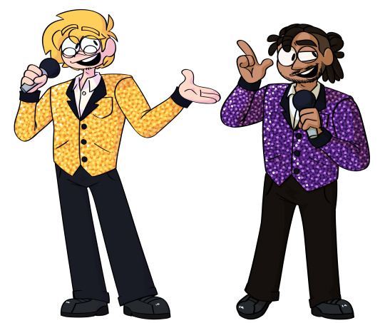
#failboat#jaymoji#first off: never ask me to draw anything sparkly ever again#second idk what kind of background to do so idk just look at the guys#i hope this is accurate i didnt use any references lol#also another thing i thought it'd be fun if i shaded them in the opposite colors#love love purple and yellow (totally jealous of jay why cant i have a sparkly purple suit :( )#actually i have like a black n gold suit that's sparkly but in a different way and it has small hints of blue n purple. it's so gender#it'd be even more gender paired with a t-shirt#so tempted to draw myself in it. might do that next
132 notes
·
View notes
Text


kayascodelorio's 3.5k celebration 🎶💓 + august vachiravit in my love in the countryside รักท่วมทุ่ง & taylor swift for @clairedaring
#*3.5k#*#my love in the countryside#august vachiravit#lakornsource#his smile can heal us as a society and also kill us simultaneously love you king#so much fun to gif some lakorns in fun ways like this i was having the time of my life (minus the mental breakdowns i was having over#shades of yellow and gold lol)
10 notes
·
View notes
Note
Which colors correspond to which emotion? For the Moon!Cass rock theory.
hmm, actually, as i far as i can remember from my thought process when i drew it, the concept of 'colours = emotions' was pretty divorced from the drawing itself; i was a lot more interested in drawing different kinds of rocks and cass's expressions were more secondary
that's why the pale purple is hard to place and the red doesn't look like fear: i just wanted to draw cool rocks
#cass-hector-simp#i think i've seen someone tag/reply/say they thought purple was 'love'#i will retcon and say 'inaccessible' (surprise killing-eve moment!)#black for sullen? green for cold rage/someone-is-going-to-die-green-is-a-stereotypical-evil-colour-lol?#to drive home the point that i didn't think that hard about it for this drawing:#in my fic gold/yellow (like the golden rocks in the finale) were love#and black was detached#and there was a different shade of yellow that was regret
11 notes
·
View notes
Note
Hello :D
I have been following you for the last year or so (a few days after I got my Tumblr lmao) and I absolutely love your art!
I have been wanting to study your art style for a while but don't really know where to start,,,
Could you please show me a small portion of your art process, if it isn't too much trouble of course. Thank you and have a nice day!
hello. oh my god. this took forever to find.
im sorry it took 2 WHOLE FUCKING MONTHS for me to respond to this but i wanted to put it off until i felt happy with my art process again, so here it is
my fall 2024 rendering tutorial!
(this will be very very long)

FLATS AND WHATEVER YOU WANNA DO WITH LINES GIRL. then make sure to recolor the lineart to better match your base. trust me it helps, bold dark lines are Not your best friend when rendering. wait for that post-rendering
i start off with a doodle or a sketch, and then filling it in with flats and other details such as blush

FIGURE OUT YOUR LIGHT SOURCE. FIGURE IT OUT GIRL YOU CAN DO IT you can make it as simple as possible, make it as big as possible, dont even THINK about the details.........just make it really fucking big so you at least know where the shadows and the light goes THEN add smaller shading details LISTEN TO ME. LISTEN TO ME OKAY!!!!!!!!
my key point with this is for you to learn lighting fundamentals.
it's SOOO ANNOYING but alas......they are all correct. it helps a lot.
one thing i also really want to point out is that i like creating a big shadow shape first before fixing up the little details (such as folds and whatever) because it helps me focus on the way the lighting actually works instead of tunnel vision-ing into making the shading make sense on the clothing.

contact shadows (i dont remember if thats what theyre called okay) theyre fucking ugly because im not actually thinking sorry 💔
okay so basically:
contact shadows (if that's what they're called) are the spots in shading and lighting where light will NEVER hit.
shadows are still influenced by the colors and lights around it (it's why a blue shadow and a yellow shadow feel completely different, despite both being shadows) so it's not always COMPLETELY dark.
BUT! there are small points in shadows where light never hits, and they're almost always super dark or pitch black.
it's hard to explain shadow and light so briefly for a tutorial, but you'll notice it when watching fundamental studies and when trying it out for yourself


YES i unclipped the multiply layer YES its ugly and terrifying but it makes coloring the multiply layer easier okay the colors merged w multiply so now it looks cool and has depth overlaying colors that actually make sense
so basically what i did was color the multiply layer that i used to shade the overall drawing
adding a band of red/orange/yellow around where the light hits, and blue where the shadows get big and wide, gives it a fake ambient occlusion effect in the way that a person would get if they stood under the sun with a clear blue sky
the colors don't have to make sense, especially because i never draw backgrounds, but coloring the shadows really help it give a sense of depth and extra subtle detail and effect that just helps make the painting look nicer
around the end, i also put in colors (in an overlay layer with a low opacity brush) that actually make sense in context of the drawing, which is the lit cigarette and the yellow eyelights
mostly because none of the colors were making sense and i needed to actually make use of the lighting that DOES exist in the drawing lol

adding a muddy golden yellow pin light layer (opacity turned down to like 40-50%) to make the light colors less ugly lol
i SWEAR by the fucking pin light layer style. it's so useful and so so underrated.
i used an almost brown-ish gold color on stop of all the layers, and with the pin light layer, it helped make the bright (almost blue-ish) white colors more warm and more yellow. it just helps make things more warm (something i prefer)
i could probably show what it looks like without adjusting the layer opacity to truly show off what i mean (like in the coming section) but i sadly forgot to do that lol


make a layer on top of your drawing with this color in these ranges YES the drawing is fully merged NO don't be afraid, the base was fucking ugly anyway 💔 make this layer into an exclude/exclusion layer style TRUST turn down your exclusion layer opacity from a range of 10% to 40% literally until you're happy with the contrast and the way the color over the drawing. use your eyeballs. i know you can do it im so proud of you
this is pretty self-explanatory instruction-wise, so i'll go into why i do this instead
i really like art that seems like it has low contrast, with almost mid-gray shading and lines. i don't personally use dark and bold lines and shading, unless i find it necessary for the tone of the piece, so using this method helps lower the contrast of the art and make it look "pleasantly muddy" in the way that it's easier and softer on the eyes.
the inverted blue color also helps makes things warmer!
the exclusion layer style is still a bit of a mystery to me but i really like the effect it gives, even if i don't completely get how it works lol
if you want an alternative method to this, and if you have access to it (because i primarily use sai and sai only),
i absolutely encourage you to play around and experiment with gradient maps.
there are so many out there you can make yourself or even get from others that just give the painting an extra amount of depth and color variation. they're SO fun.
personally, if sai2 gets a gradient map update, it's over for y'all it will literally be so over no one will be able to stop me


then i merged everything and actually adjusted the contrast back up because it was looking too muddy for me 💔 but the color adjustments are still there so all hope is not lost here's a comparison of the adjusted contrast in black and white (adjusted on the left) (newly merged layer without adjusting the contrast on the right)
as you can see, i actually turned the contrast back up (despite talking all about how i liked things with less contrast lol)
i wanted to demonstrate that doing adjustments should be done in moderation, and is why i adjust layer opacity often when making color effects
you are free to play around with colors to help your style, but don't lose your initial idea and colors along the way.
you still need to trust your own colors and intuition!
along with that, i just want to say that it's completely okay to change your mind mid-painting, and it's okay to make somewhat drastic changes.
don't be afraid to change things you don't like or change your mind about certain aspects way later on
that's basically the whole thing of this!!! don't be scared!!!

now im gonna hold your hand when i say this..........but you need to learn how to render by yourself. it seems like i can teach you but i literally can't, because rendering is different on every piece and depending on how clean your base is. i have to render A LOT because of how fucking ugly my sketches are LMAO to simplify it, think of it as obsessively cleaning up every detail you can see, but with a color picker and a clean, hard edged brush. if you have shit lineart, you don't have to redraw it cleanly over and over, just paint over it. that's basically what rendering is
THIS especially is where you need to be brave and stop being scared.
like i said, i can't teach you how to render, and it's something you have to discover yourself because rendering is something that will always be personal to every single piece you make. the way you render on every piece is different.
on one piece, you will barely need to render, and on another, rendering is more than half of your ENTIRE process.
don't be afraid to paint over your old art.
rendering is a process that's both very perfectionist yet also very careless.
find your balance and just go for it.

and then that's it……..u did it………..now yuo know how to paint and render. it's literally just layering shading and lighting knowledge until you think it makes sense and looks okay lol additional note: since i render in only one layer (you don't HAVE to do this, but it'll be harder for you…), i also made slight adjustments with the transform (and liquify, if you have it) tool to make things more proportionate. (i drew the head too big lol)

if you compare the finished piece to the final unrendered base, you can see that a LOT changed, including a bit of subtle proportion adjustment.
particularly, the sleeves changed A LOT (because i really didn't like them)
but it's also over all cleaner and more coherent, instead of having haphazard colors and shading just thrown about.
rendering is when you finally use all 100% of your brain to finalize and figure out where the shading should go, where to clean up your lines, where to ERASE or ADD BACK in lines, and make sure all your colors look coherent.
it's not as intimidating as it seems, i only use a hard edged brush with a little bit of color mixing and my color picker.
it's like dragging and dropping colors to cover up mistakes, it's really quite fun when you get used to it
i wish i could explain it clearer but it's hard to describe without visuals!
i hope this helped, and i hope all my yapping isn't annoying (art as a special interest beloved)
have fun studying and trying to render in my art style!
#long post#art tutorial#rendering tutorial#art help#art tips#tutorial#kia doodles shit#artxstic-scr1bbles#tutoriel
192 notes
·
View notes
Text
Spy x Family Operation Diary - Forger outfit coordination
One of my favorite things to do in the SxF game is color-coordinate the outfits that the Forgers wear on their family outings! Here are some photos of my better attempts.
Turquoise polka dots (Anya and Bond got matching sunglasses so I added those as well).

The "celebrity set" (part of the extra downloadable content). Added red berets for Yor and Anya since they were visiting the art museum!
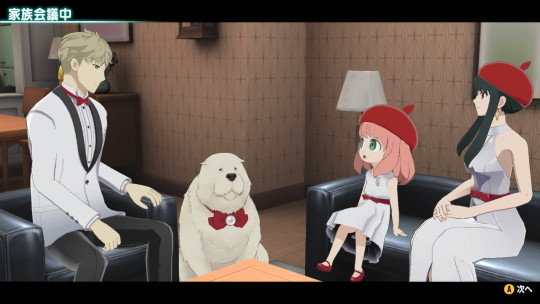
The "denim set" (also downloadable content).
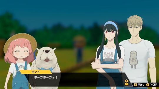
Black formal attire.
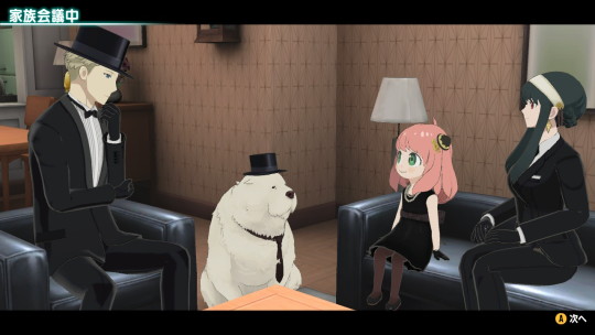
Yellow polka dots (added the yellow ribbon for Yor and the sunglasses for Anya and Bond).
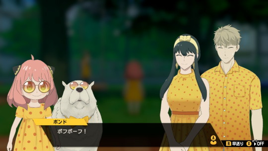
The "punk set" (downloadable content as well…also added the horns for Anya and Bond, and the black headband for Yor).
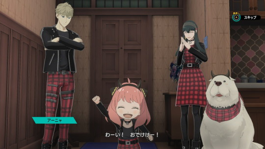
Different shades of blue.
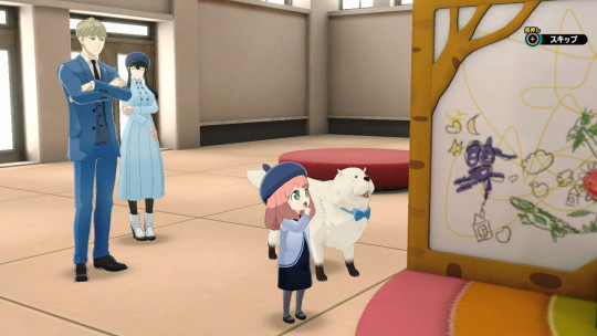
White and turquoise (there were a few cases like this where I couldn't get all four of them to match, so I did two and two: Anya and Yor have matching white dresses and straw hats, and Loid's turquoise shirt matches Bond's turquoise bandana. Also matching sunglasses for Anya and Bond again!)
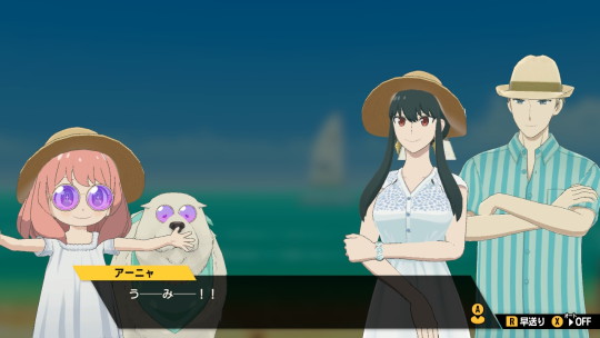
Pink polka dots.

The blue outfits they wore in the anime when visiting the aquarium! (obviously Bond didn't have one so I got the closest matching bandana for him!)
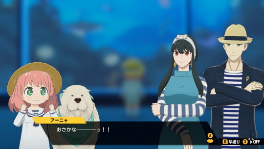
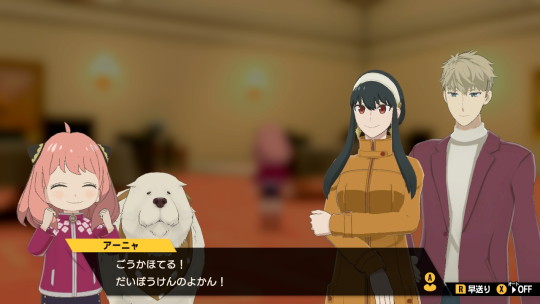
Another case where I matched two and two instead of all four - Loid and Anya are both wearing some shade of magenta, and Yor's brownish coat matches Bond's brown bandana.
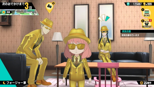
The gold agent set you receive for completing the game! (I thought the hats and sunglasses were a bit much, so I removed those when they went on an outing, lol. Bond didn't get one so I improvised his!)
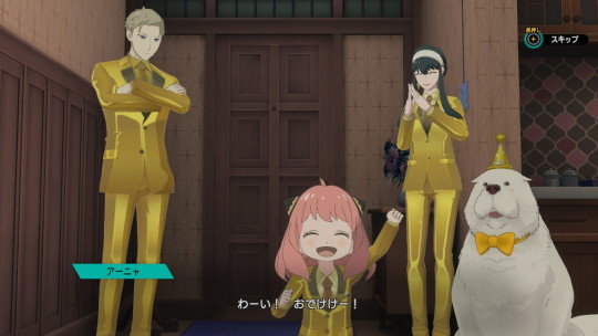
But this one is probably my favorite - you can get Loid's spy infiltration outfit, Yor's thorn princess outfit, and Anya's spy outfit she uses in episode 26! Bond also gets goggles for some reason so I threw those on too...we're just a totally normal family here 😅
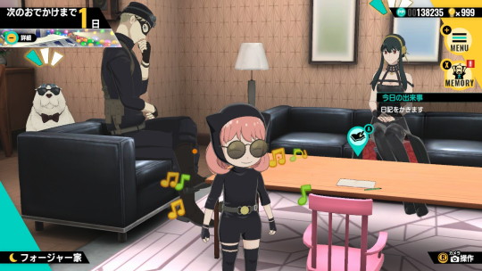
If you want to see more of my posts about the SxF game, check the sxf game tag on my blog here.
#spy x family#sxf#spy family#spyxfamily#loid forger#yor forger#anya forger#bond forger#sxf game#spy x family operation diary#spy x anya
217 notes
·
View notes
Text
I got color names for the AvAvM characters
I used four websites which I will bullet in order for each one:
- color-name.com
- colornamer.robertcooper.me
- chir.ag/projects/name-that-color
- colors.artyclick.com
I will also sometimes be pretending their names become their literal personality/design because its fun for this post
EDIT: I forgot to say but the reason I am doing this is cuz I found out Alan Revealed official hex codes for a lot of the characters (idk when this was, I usually look at the AvA wiki and I suddenly saw it there and was like ooh this is useful) I did not do TDL or TDL cuz they are straight up just pure black and red (usually gives no other names for such pure colors although I technically never checked). The mercs did not get hex code reveals sadly (but they are multicolor so I wouldn’t do them anyway). I am not sure who else got hex reveals that I did not do other than hangman and Vic’s gray workers, but hangman is also pure black and I didn’t feel like doing anyone else. (Edited this again)
THE SECOND COMING
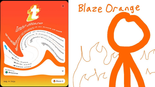
- Orange (wow basic)
- Safety Orange (honestly fits their personality)
- Blaze Orange (last two websites had this result. ArtyClick said it was a 100% match!)
- ArtyClick always says 4 similar color names. One was Mango Tango and surprisingly King didn’t have that from any website or the similar names list.
RED
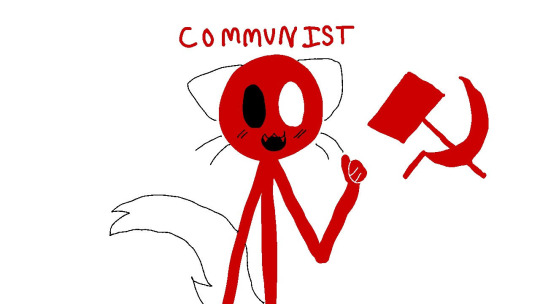
- Boston University Red (That’s his future university now)
- Communist (Red’s a Communist?! :0)
- Guardsman Red
- Rosso Corsa
YELLOW
(Sigh no yellow text color on Tumblr I swear they used to have yellow)
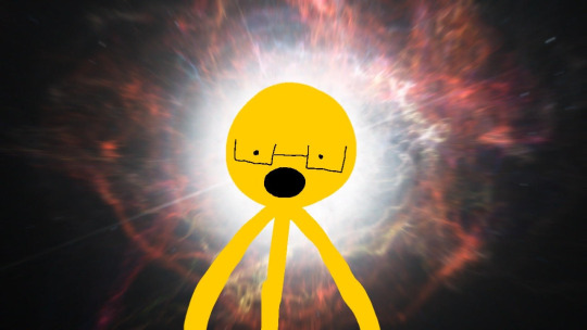
- Tangerine Yellow (their new fave fruit)
- USC Gold (Yellow’s future University)
- The last two sites said Supernova which is a very cute name
GREEN
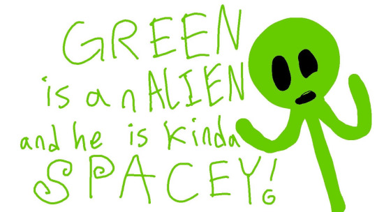
- Alien Armpit (BAHAHAHA THAT NAME- rip Green's ego)
- Blinking Terminal
- Limeade (that’s better)
- Alien Green (never mind he’s an Alien again) (Green is an Alien and he is kinda spacey)
BLUE
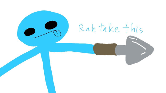
- Spiro Disco Ball (fits their personality since they are very good at dancing)
- Shovel Knight (Kinda fits cuz Blue likes gardening) (Shovel Knight and Guardsman Red should be in the same kingdom)
- Dodger Blue (her favorite sports team)
- Bright Sky Blue
PURPLE

- Heliotrope Magenta
- Magentle (A gentle Magenta?)
- Violet Eggplant
- Barney Purple (LOL Barney the dinosaur)
PURPLE’S MOM
I call her Sakura but she has other names so I just put Purples Mom

- “Shocking Pink (Crayola)” (Crayola? How shocking…)
- This and the next website both said Pink Flamingo
- Fuchsia Pink
PURPLE’S DAD
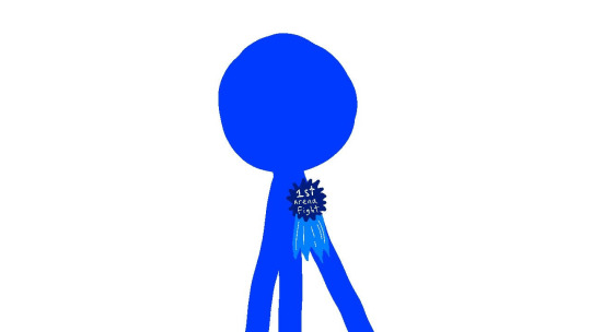
- Blue (wow basic #2)
- C64 Blue (...interesting name)
- Blue Ribbon (cuz he won so many fights I guess)
- ArtyClick Ocean Blue (The website name is in his name?)
- Similar name ArtyClick gave me is “Blue Orchid” which is cool since many people hc Pink to be called Orchid. Blue Orchid and Pink Orchid!
Bonus for Blue Ribbon and Blue Orchid:
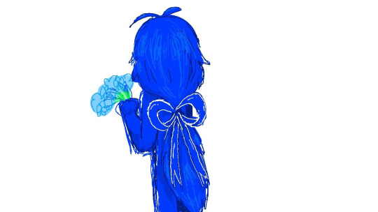
Bonus for the first ribbon drawing except the ribbon says something else:
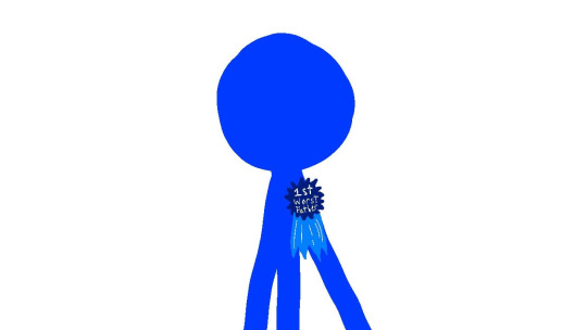
King Orange
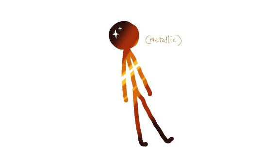
- Metallic Orange
- “Apple II Chocolate”
- The last two sites said Bamboo (aren’t bamboos green?)
Gold
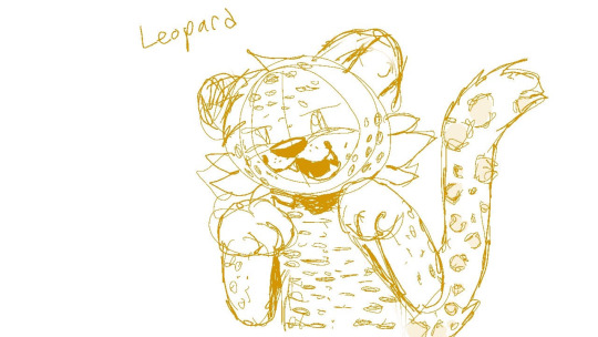
- Chinese Gold (so he’s Chinese?)
- Leopard (cute ^ ^)
- Buddha Gold (and he's Buddhist?)
- Yellow Ochre
Victim
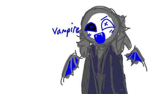
- Dark Liver
- Fiftieth Shade of Gray
- Emperor (Guardsman Red and Shovel Knight serves xem)
- Vampire (Vampire Vic :0)
Corn Dog Guy
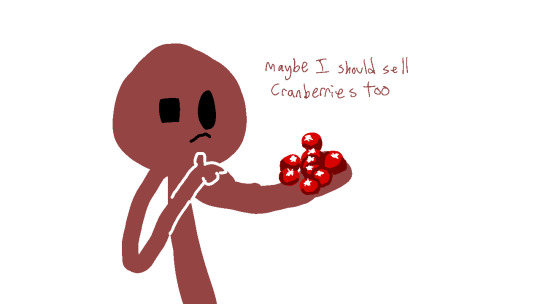
- Smoky Topaz
- Cranberry Zing
- The last two sites said Copper Rust
#stickkittyart#Alan becker#animator vs animation#ik vampires don't have wings on the human-like version but I felt that it was... less obvious without them? and it looked cool
71 notes
·
View notes
Text
This will update in time, but for now all I have
I don't have the courage to post this myself so this will probably be scheduled for some horrendous time at night. I also don't have the courage to point out who is who because I'm scared maybe they won't like how they sound, though maybe if I go into detail too hard it might be possible to tell. Lol. This isn't everyone yet. I still need some more time to see who everyone is, blah blah blah, bunch of stupid abstract brain stuff, but. Playlist of my friends I've made here... yeah
Wounds- doesn't count because that's me. Decided to put it there because why not. I don't need to talk about myself let's be real no one cares about that
Norduris. Funny, somehow right away this was you. I love when that happens, when a song just reacts so strongly with the whole person in my head I'm searching for. Everything I've seen of you screams this song and it's. Beautiful to me. Always is but it doesn't get tiring. So much of you seems like it was locked away and buried in worry. Wistful thinking and hoping for the future. There is so much good in you. I think I'll stick around for as long as I can to help you see that. Kind and comforting. Creative and inspired just about every time I've seen you, I think. But I think you worry too much. There's fear and anger in there and I think, maybe, I wish there didn't have to be. Well, not the unjustified ones at least. But it all pools together for a strength that I think fits you. Still hopeful and still going. I like that about people... That might be a recurring theme for everyone really. But it's still you, too. Such slow waltzing shades of gray, like fog and the cover of rain. Pastel yellow like the sun, deep, deep green accompanying the rest. There you are, Kry.
Lost. You know the song titles don't really mean anything before you might ask. I never take it into account. Just the way it sounds. I also think you worry far too much but then again you've gone through for too much. But you are creative, and fun, and uplifting. Think you have a little bit of a habit of subduing yourself in fear of something I never quite know. But you are patient, so patient and I value that a lot. Especially when it's given to me. Nervous at times, needing permission before letting yourself shine. Wisdom about you that sometimes I really need to hear. You really know how to rile someone up in a playful way and I don't think enough people play into such things anymore. Wonderful to see really. Like a slow stream in a still air, deep, deep gray and neon blue. Streaks of white too, liminal in a way that reminds me of a barren tundra with nothing to be seen in any direction. Nothing but you. Hey there, Gold <3
daydream. Augh, I feel like my brain is stalling over how to put everything I have seen into words. Something about you just feels so positive, an upbeat air to you even if you're not feeling okay. You're still there, and I see you. Confident a lot of the time, and it's well warranted I believe. Other times not so much. Kind and caring like everyone I know here is, and a childlike excitement every time we talk that I do adore. God you know so well how to make other people excited with you. And you care, so much, I know everyone does but there's something about it with you that's just... electric, is the word I think. There's different styles of care but that one is yours. Funny. I think you make me feel safe in all the fucked up ways my own mind will talk to me. Maybe it's because I think we have a lot of similarities. It's always been positive with you, even when it isn't because you make caring about you easy. You know how the light of the sun shimmers on a body of water? That's kind of how you move, a sweet caramel brown and autumn orange, little drops of red about your air. So wonderful to meet you, Karl.
demise. Again, I swear the titles do not come into play with this. I suppose there's only so much I can repeat about someone being kind, caring, and fun before it starts feeling less special. I promise that never happens, no matter how many people I know like that in my life. Especially when your style of caring is just so... calming. And determined. Offering so much to people you care about even if maybe they haven't earned it yet. That doesn't seem to matter to you. You're giving it anyways. You're a giver, I suppose. You do a lot of creating and it's stunning. And you offer so much to others because you want to. Able to make people feel safe and like they matter. Love the mischief you get up to a lot too. Dedicated to so many things. Greens of jade and pastel grass, white all between them like a snow flurry. A bit of silvery undertones. I'm glad that I get to know you Shed.
Night Beacon. I held off for a few days more before considering you because I wanted to be accurate. There is something to be said about being quiet, in a sense that is positive and not whatever I say when talking about myself. A good kind of quiet, maybe mellow is the word I am looking for. I like when my friends are passionate and you are no exception. A certain type of calmness that I can't quite explain. I think there is a kindness in your ability to just exist and that may not make, sense, but it's the best I can say. You tough through a lot of things you might not want to do but there's a strength in that. And of course, you are creative. I make friends with creatives a lot. I think maybe you are the kind of person I would pick first to surround myself with. Chill overall that can swap into a more serious frame of mind whenever needed, knowing how to navigate around vibes and situations while being kind. And still someone who is enthusiastic about things you like in a way that isn't overwhelming. It's nice. Might put you on a loop more often than I should, lol. Peach and bright orange, with yellow mixed in with it. Along with a pretty desaturated beige, the best I can put it. Literally like the air of the world during a sunset. You should be proud of that Isaac.
Autumn Afternoon. I'd like to think you quite pleasant and lively despite your words of "This group space of which I have butted in". Who cares if you did do that? You butted in and we let you because we wanted to. You belong here with us, and with me. In my head singing sweetly the soul of who you are. You worry a lot. Hey, I do too. Maybe we both definitely worry too much. Being anxious kinda sucks. But you know what? Here you are anyway. You worry about your place but you still sit here and take it. That's wonderful strength and you might say "I owe it to everyone else" but you are still here. You have a lot going on that tries to work against you. A lot of us do too, if not all of us. But you power through anyway. Underneath all that anxiety sits so much passion. Excitement for things you like. You're a damn good artist and a life to have around. Pastel lime and steel blue, dancing like petals swept into the wind of faded silver, hinted with aqua blue. Yeah. You're a wonderful one there, Storm.
Hope. Honestly I take you for a very lively and bubbly person. You have a lot of ideas and you are eager to do them, to share them, stuff like that. Eager is a good word. I think that fits you the most really and that's not to be taken as a bad thing. Nothing in these are really meant to be taken as bad. Just to be taken as you. Curious and learning seems important to you. Being there, being around, I suppose you kind of bring an air that isn't something I can quite find words for, but it's a positive, I promise. Upbeat is a nice thing to be regardless of what you've ben through or are going through. Maybe sometimes you don't even feel that way but you still manage to convey that for the people around you and I think that's special. It's funny because most people wouldn't say gray and silver are necessarily colors that match to that idea but there you are. Lavender is there too, and a specific hue of blue that reminds me of warm and tropical water. Don't know the exact name for it. Kind of like a mix between a pinwheel and a wind chime, and I think it's very pretty, Lunar.
epitaph. You know we may not really talk as much compared to others on this list but that doesn't mean I haven't gotten to know you. You are still very outspoken about the things you believe in and the things you like or dislike and that's a strength I wish I would have myself. I guess the way I see it is you have a strong vocal presence regardless of what's being talked about. But despite that you can still be very hesitant and worry a lot about things, which is something I have to share. Doesn't always have to be bad. Can also mean that you care, and I really don't think enough people now how to do that these days. Caring is good. Space to keep people on your mind because you want to. Maybe there are still things you need to figure out and that helps to play into some hesitation, but when has anyone ever had things all figured out anyway? Stability is always something to seek, but you don't have to consider yourself any less for not knowing all the time. Things can be okay without it being certain. But you still work towards it, and that's admirable. Like having strength and perceived weakness in a balance. Gold and olive green, I think, off-white and a type of orange that seems like it's burning as it exists. Maybe that doesn't make sense. But, it is you, Damien.
32 notes
·
View notes
Text

My first commission of the entire fucking year.
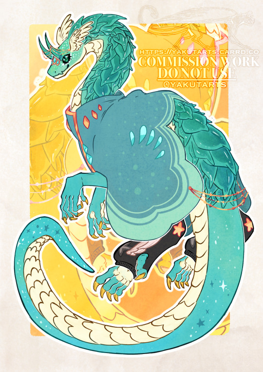
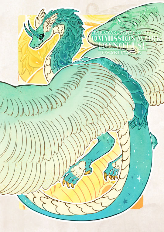
Explanation why this has the Undertale tag under the cut ⬇️
This is a Discord commission for Reef, thank you so much for commissioning me, it truly means a lot and it has been a really long time since I drew for someone else. ♥️
Wtf this has to do with Undertale? This is a dragonized version of the client’s OC, Pearl. She’s a ship child of Dream and Blue, for further context, see this post. Basically his OC if she was a “dragon” like Dream and Nightmare (Dragon is between “” cuz they are not actual dragons, because that wasn’t what I intended while creating the designs, it isn’t a “them but dragons AU”, but a “Them if they didn’t had skeleton vessels AU”. But I will continue use the term because it stuck and it’s the most simple way to describe them.)
BOY do I have things to yap about this. It’s been SO LONG since my last client (August 2023), and I was actually a little nervous, worried that it might not look good but it turned out quite amazing! There is no better motivator like money! /hj
The top 3 hardest parts of making this was figuring out how to place the neck and back plates and how they are going to overlap each other, the neck angle and how it bends was not helping at all lol, had to revise it 3 times to make sure it was right. Tried to make them pearl shaped while having some resemblance to Dream’s plate design since that’s his child and all.
Second hardest part was the coloring, since this is a custom design and my reference was a skeleton, I had to cook some shit up. I spent some hot time wandering how I should color this without making it look boring, this is a flat body comm so I had to figure out how to make it look interesting without shading everything so it wouldn’t look bland. Coloring with watercolor made it easier, more textured. Decided to pick a gradient between green and blue, in the beginning it kinda felt like I was coloring a beach. The underbelly was actually gold before it got changed to pale yellow, the star pattern, white freckles and the darker color in the plates is what made it stand out the most.

The last hardest part of this was resisting the urge to shade it, cuz damn I really wanted to.
But well, that’s pretty much it! I hope to get more clients with more frequency, instead of 1 every six months or I this case 1 per year 💀.
Honestly I have been really happy with everything so far, I really like the UTMV community and I get fuzzy feelings at the thought that somebody liked my “true form apple twins” AU so much that they diced to commission me a piece based on that idea. It really means everything to me after the things I have been through (dw about it).
ALSO ALSO! Since this is a Dreamberry ship child, during the whole commission, start to finish, I could only think about this /j :

Yes I made this yes I hyper focused on making this right after I finished the main drawing no I’m not normal.

Pearl belongs to Reef
Dreamtale belongs to @ Jokublog
Ink!sans belongs to @ Myebi / @ Comyet
Swap!sans created by PopcornPrince / now Community Owned
True Form AU / Designs belong to me ( @ yakutarts)
#artists on tumblr#art#artwork#drawing#digital art#digital artwork#furryart#design#dragon#undertale#undertale au#utmv#undertale multiverse#commissions are open#procreate#dreamberry#sanscest#ship child#ship kid#fan child#utmv sans#utmv au#utmv fanart#true form AU#TrueForm!Nightmare#TrueForm!Dream#commission#commission artwork#commissioned art#commission art
51 notes
·
View notes
Note
Hi hello, I love your art so much LIKE MY BROTHER. IT'S SO YUMMY, THE SHADOWS THE EXPRESSIONS, I love how you draw Timur , Felwinter and Osiris together 🙏 little bird with his two funky adoptive parents. I stare at your art like , I'm always ready and hyped to give traditional art another try ✨
If I was to go back, any tips for which watercolours to pick? I so far got only aniline colours.
Aah, thank you so much!! 😳💙
Hmmm, the thing is, I use fountain pen inks almost always for painting. I don't use watercolour much, so I can't really suggest anything in particular… I have a selection of colours from different brands, of course, I know quite a lot about pigments, and I like using watercolour from time to time to add some special effects to my works. For sketching outdoors it's also the easiest to use among all other paints, probably. But painting a whole artwork with it……… I try doing it sometimes, but every single time I end up thinking "God, I wish I used inks instead, I hate this so much, why is it so BLEURGH". I guess watercolour just isn't my medium 😂
I can share my thinking process when building up a palette though, I use it with all mixable mediums I use, be it inks, watercolour, gouache, etc. I found it to be the most effective (and money-saving, lol) approach for me.
So what I want for my main mixing palette is to have 3 sets of primary trios. All colours also must be as smooth as possible, with no surprises or unwanted colour separation. For watercolour - not granulating ones.
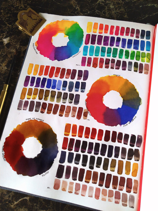
(my camera tends to make all colours brighter and also fails to see the subtle difference between some shades, but you can still get the idea)
The first trio is extremely vivid, consisting of bright cool colours - lemon yellow, cyan, magenta-leaning pink. It gives you access to all the bright, open colours.

Second is the classic they teach in all art schools (probably, from what I've heard, I never went into one alkjdshfk) - sunshine yellow, bright warm red and ultramarine blue. This gives you a huge selection of warmer, natural colours, like all shades of golds, eggplant purples, olive greens, etc. It also allows some nice selection of wood browns.
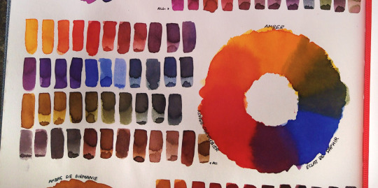
Third is my personal favorite, the muted trio. You kinda can get similar colours from the previous trio, but I prefer having these separately, because of how often I use them all. It consists of golden ochre-leaning yellow, dark bloody red and dark indanthrone blue. It gives you the most beautiful browns, beiges, blacks and other rich, deep colours.

On top of that I also like to have at least one decent black (in my case it's Quink Black ink, I cannot live without it). And these 10 would be my essentials. Other colours I add to my mixing palette are basically shortcuts to the shades I find myself mixing the most - like a few browns and violets. There are also a few inks that I need for some very specific purposes - like, I have a very vivid cold magenta ink to mix a certain bright cold shade of the Void, and also a fluorescent orange for adding shiny Exo LED lights. And etc.
(Actually I'm currently in the process of re-organizing my main palette and also considering making a few small sets for painting some characters specifically)
I also have a separate selection of chromatographic inks, which can probably be compared to granulating watercolours… But not quite. A few examples:
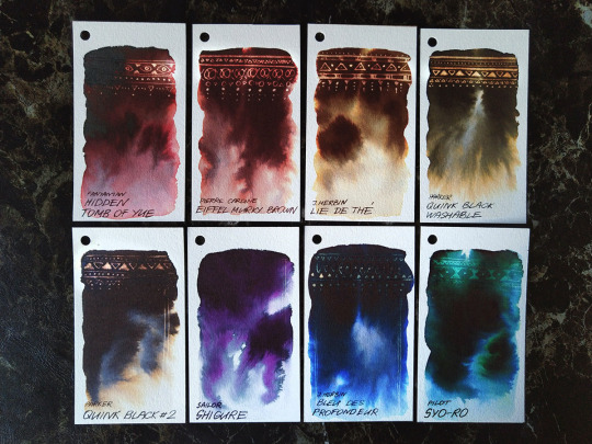
Here I don't have any special notes or advices, just get the ink you like and enjoy it. Some of these I use so often that I always keep them in my main palette, and others I only get out for some special occasion. These are also mixable btw - I constantly add other ink in Quink Black to get different shades of it.
However, I must say that not all of the ~special effects~ inks are polite and well-behaved, some will agree to work only on some specific paper after a significant amount of coaxing, and others will straight out say "fuck you" at the most crucial moment, even if they worked perfectly just a moment ago.
Btw, when working with inks, I really recommend to put it into smaller bottles with a dropper, so you don't have to open the big bottle each time. It's both easier to use for you and much safer for inks!
ANYWAY, I hope this post was of some use for you 🌈
53 notes
·
View notes
Text

Angel eyes
Just some silly eye studies with the angels <3
It's my silly design hc that most angels have a sparkle in their eye (their pupil). The only angels that don't have this feature are winners
This is the main way to tell who is a winner and who isn't.
Also not really a complete hc I believe but I like to think angels in a similar rank or status have the same shades of color for their eyes. In this case, excorsists have more yellow eyes, ranging from shades like gold to warm honey to pale yellow, and seraphim have shades ranging from sky blue to ocean blue to cotton candy blue, etc. (watch this get debunked lol)
#hazbin hotel#hazbin art#hazbin hotel fanart#hazbin hotel vaggie#vaggie#hazbin hotel lute#lute#hazbin hotel sera#sera#hazbin hotel emily#emily#fanart#my art
27 notes
·
View notes
Text
Public domain character designs. I keep failing to draw full body lineart lol.


[ID: Twelve versions of the same digital drawing showing a wolf or dog character from the chest upward against a light grey background. Each has blank eyes with no pupil, and a spiked collar. The first is black with a light grey chest, and red stripes on its face, shoulders, and ears, with blank white eyes. The collar is matching red. The second has dark blue fur with gold stars and thin stripes, with white chest and central stripe on its face surrounded by sky blue, and red-brown eyes and collar. Above this one is a simple drawing of the character from the side on all fours, showing a white belly and tail, with white paws and lower legs light blue. The third is light purple with slightly darker purple stripes, with a white chest, and cheeks, and uneven large white or black patches. Its eyes are gold, the collar dull brown. The next three have the same base, of black fur, with white rib-like markings on the chest, and a skull like pattern on the face, and a black collar. The second and third versions of this have additional splashes of red and then green liquid, like blood or slime, drenching the neck, upper shoulders, and the crown of the head, dripping down the face and arms. The seventh is striped with dark and pale-grey purple, with dark teal and purple stripes going down the face and chest, with purple eyes and collar. The eighth is pale orange, with a thick gold band down the center, and more curved gold bands on the sides. The eyes are pale yellow, the collar red. The ninth is dark orange, with gold stripes, purple cheeks and chest, lower arms white, and white markings on the ears and around the eyes and nose. The tenth is dark blue, with a purple chest and stripes on the forehead, and pink markings around the eyes and above the nose. The eleventh is stripes in different shades of sea-foam, ice blue, and dark teal, with wing-like bands flaring out from the green eyes. The collar is black. The twelfth and last is monochrome black and grey, with stripes of different shades vertically on the face, then horizontal on the cheeks, chest, and arms. End ID.]
Feel free to donate some public domain full-body lineart for me to make more designs with lol...
#Rjalker does art#described images#public domain#public domain characters#public domain art#furry#anthro#feral#doesn't really matter#sprarkledogs#sparkledog
14 notes
·
View notes
Note
https://www.tumblr.com/aryas-faces/759627378192465920/the-house-of-the-dragon-writers-are-so-jealous-of?source=share
Lol just lol
Wow. Reading so much crap at once should be banned.
The delusion that Aegon II took the throne for his family is reported by Eustace, a maester pro-greens and anti-Blacks / Rhaenyra, who spends his time whitewashing them as much as possible. What he says about the Greens is still highly questionable. Especially since this bullshit of only wanting to protect one's family as a motivation to take the throne can quickly be challenged when we see how different Aegon II seems to be with the crown on his head, ready to do anything to keep it for himself and absolutely not mischievous. Firing Otto and refusing the peace agreement proposed by RhaeRhaenyra which would precisely save his family, except his grandfather who... well that's good because he doesn't care! Not to mention calling Rhaenyra a whore as easily as he breathes when apparently before taking the throne he actually respected Rhaenyra saying what kind of brother would steal what belongs to his older sister ? A little common sense. Eustace's comments about the Greens / Aegon II taking the throne are not at all consistent with Aegon II's behavior after that.
Then, the same, the so-called great exceptional link between Syrax and Aegon II is propaganda bullshit. Did Sunfyre love Aegon II? Yes. Is the opposite true ? No. He saw it as a kind of replaceable accessory. As proof, when he loses Sunfyre, he says that he wants a new dragon which will be an even more efficient Sunfyre. That doesn't sound like someone who cares about their dragon. Unlike Rhaenyra who just says that her team just needs dragons otherwise they are lost to the war. At no time does she look for a better, more efficient Syrax. Also, if we really have to decide who seems to have a better connection with her dragon in a deep way, it is undeniably Rhaenyra with Sunfyre. I remind you that Sunfyre was hatched for Rhaenyra and that she rode him from the age of 7, making her the youngest dragonrider. Syrax also formed a mated paur with Caraxes, Rhaenyra's husband's dragon. But apparently, it is Aegon II who has an exceptional bond with his dragon ? My eye. Once again, we must differentiate between the words of propaganda and the facts in the book. Also, gold and yellow are almost the same color. When you put official images of Syrax and Sunfyre side by side validated by GRRM sorry but... Well Syrax is also golden from what we see. Honestly, who tells you that the maesters didn't just try to tone down the color of Rhaenyra's dragon to highlight Sunfyre and Aegon II ? See here for more development on the color of Syrax :
If the writers wanted to make Rhaenyra want to participate in the battles in HOTD, it's simply because they didn't know what else to do with the character and give her a false badass look. Not to show off her doing to Aegon II or make her as brave and selfless as him. This literally has nothing to do with your dear Aegon II here. It's just that the writers have no imagination. Then, sorry to shatter your dreams, but there's nothing brave about Aegon II going into battle. It's unconscious. A monarch generally does not go to the battlefield. Because life is precious because... well it's the fucking monarch ?! Sending him to death's door is stupid and counterproductive. Also, people seem to forget that Rhaenyra couldn't even fly a dragon in Fire and Blood when the war started, because she had just had a complicated stillbirth with Visenya. But obviously, no one is going to take all that into account. Let's forget the historical context and Rhaenyra's physical state to treat Fire and Blood's version as cowardly and selfish for not going onto the battlefield when there's no the fucking point here. All this to try to make Aegon II appear brave and selfless ?! Aegon II ?! He is neither of those two fucking words.
I remind you once again that no, the idea that Aegon II was forced to take the crown is bullshit, completely invented by Maester Eustace.
And no, Rhaenyra doesn't take the crown to protect her family in HOTD. She doesn't even have children when she accepts to be heir in 1x01. Rhaenys' words in 1x10 are just a classic fucking warning. Rhaenyra was already planning to be queen before this because she saw it as her duty and did not expect to be usurped the way the Greens went about it. So what are that person talking about ?! Rhaenyra even considers giving up her crown and her youngest boys (Aegon III and Viserys II) to the Greens to ensure the peace of the kingdom. So once again, what are you talking about ?! Rhaenyra didn't accept the crown at all to protect her family in this whole situation. Also, when you are designated heir, you accept and you keep quiet, that's all. Do you think 7 / 8 year old Rhaenyra was an aide to the throne or something ? Reading this kind of bullshit you might think that's what is being insinuated. To say that the Rhaenyra of the show is forced to have the crown is essentially saying that the 7 / 8 year old Rhaenyra who was named heir was completely on board and wanted it, when we're talking about a child who probably only accepted what was his duty in the first place, to then grow up always having this perspective in mind and having been educated for it, and then obviously considering the crown as rightfully his. Because it is. Quite simply. But apparently, with Green stans it's horrible... On the other hand, an impersonation if you have a dick is okay for them.
I also remember that in Fire and Blood, when Aegon II was crowned, the population demanded Rhaenyra...
On the other hand, I don't know in what universe this person lives to believe that Aegon II is the favorite of those who watch the show ? All the polls that are done on the internet simply prove the opposite. Yes, we all recognize the actor's performance on Team Blacks side, but he is certainly not one of our favorites and even less the favorite. Even some of the Greens Stans hate him... And yes, a large part of the Greens stans love an Aegon II that they fantasized in their heads, but they are not at all representative of the majority of the fandom. Again Aegon II is not a fan favorite in general in HOTD. This place is rather held by Daemon or then (to my great despair) Aemond (ironically because he is precisely a poor version of Daemon).

#anti aegon ii targaryen#anti aegon ii stans#anti greens#anti green#anti greens stans#anti green stans#team black#team blacks#pro team blacks#daemon targaryen#pro daemon targaryen#the rogue prince#rhaenyra targaryen#pro rhaenyra targaryen#the realms delight#the black queen#queen rhaenyra#the dragon queen#the half year queen#the rightful queen#house of the dragon#hotd#anti hotd#anti house of the dragon#fire and blood#f&b#f&b spoilers#fire and blood spoilers#pro team black
26 notes
·
View notes
Text
i’m tired and blasting outsiders so here’s my explaination for what i see whenever one of them sings
With brody it’s kinda like…deep red? I don’t know why, it’s just a deep red. Warmer tones. The only cool color is like a navyish blue. It’s a spectrum honestly-it can kinda be a toss up? It really depends but usually it’s a nice shade of seeping red and navy blue with some warmer tones (yellows and oranges) in there as well. riffs are kinda fun because it’s like…i don’t know how to describe it but it’s like each note is an individual ring and it’s kinda like this gradient effect between either red and blue or red and yellow. It really depends. It kinda gets that silvery misty look with some of the higher notes.
Jason was kinda funny because if I didn’t have synesthesia I wouldn’t guess his voice would be a dark color but it’s like…kinda neon? Y’know how you watch those neon painting videos? That’s kinda what it’s like. Usually it’s uber bright colors on a black background. Kinda like bioluminescent light in a way. It sounds uglier than it is but trust me-it’s kinda got a more splashy feel to it. Like just splashes of chan and magenta against the black background. I dunno how to describe it lol
With Brent it’s kinda more woodsy? Shades of green and brown-kinda more earthy in a way. It’s kinda like going through the woods at sunset. Golden shimmering through leaves and lighting up a path iagaknst brown dirt in a way. It sounds weird but y’know. Even in his more aggressive tones it’s still that woodsy, earthy feeling. It’s never really dull but it’s never too bright. Like ai said it’s like a forest at sunset where the gold is just barely peeking through the green leaves. It’s prettier in retrospect.
Sky’s got a bit more f an orange/beige pallets? Like it’s kinda desert like in a way. sjust sandy and earthy-not quite in the same way as Brent but y’know-It’s also got some lavenders and violets in there? Like it really depends with him on the notes he’s singing but usually his voice is a rustic orange color with swirls of beige or tan and little flecks of purple. Think desert like with some purple in there. Sometimes the brown can kinda fade into a yellowish color; or a more muted gold. Just sandy colors. Desert hues.
Josh is purple. Alllll purple with some gold. Little Brother is SUCH a fun experience because it literally has such a strong grape purple to it and it just slowly bursts into more vibrant purples. It never goes beyond say a violet? But if randhes in spectrum. There can be some very dark red-darker than Brody’s voice but definitely still visibly red-or well, reddish pink. But it can also have little bits of gold or yellow. It’s like if you were stuck in grape jelly or something and the only thing visible was sunlight. It’s like that. Just smooth. Sometimes it can be midnight blue too but usually it’s shades of purple or something.
I don’t egg to hear much of Daryl’s voice but it’s definitely some form of yellowish brown. Not like Sky…think more sunrise colors. Pale. Sometimes muted. It really depends. Now again there’s not much audio I’ve heard of Daryl but he definitely has like dark orange/yellow vocals. Sprinkle a bit of sort of denim blue in there for good measure and boom. Sometimes he can have bursts of bright colors like bright pinkish red or bright orange but other than that it’s kinda hard to tell with such little audio lol
Emma’s all purples and pinks to me. Mostly light purples and pinks and kinda bubbly in a way? Like I just picture bubbles lol-white bubbles on a purple and pink gradient background kinda just floating around. During I Can Talk To You All Night it kinda also leads into a royal blue. But for the majority it tends to be pink and purple and kinda bubbly lol-kinda giving Sylveon vibes if I say so.
Anyway. I know this probably makes me sound high off my ass but figured it was worth a share.
#the outsiders#the outsiders musical#brody grant#jason schmidt#brent comer#joshua boone#sky lakota lynch#emma pittman#i wish i was high off my ass
31 notes
·
View notes
Text


This was the fourth of my revamped Whinfell designs. 🐎✨ Originally posted on my alt instagram account.
Meet the Tanzi Whinfell. 🏵️
The name Tanzi is an English variation of the name Tansy, which is the common name for many flowers in the genus Tanacetum. However, Tansy is most often used to refer to Tanacetum vulgare (AKA common tansy, bitter buttons, cow bitter, or golden buttons). Like most species in this genus, it displays a bright yellow color that was sometimes used to create dyes that produced a golden-yellow shade. Lore:
"The Tanzi is considered one of the rarest subspecies of Whinfell as they are very difficult to find and observe. Very little is known about their ecology other than they seem to primarily eat Wingstem plants as they are usually found around large patches of the bright yellow perennial. Because these plants tend to grow in moist soil by rivers in nutritionally rich, heavily wooded areas, it can be assumed that the Tanzi Whinfell prefers to live in these environments. Some Jorvegians theorize that the Tanzi's shimmering body is used to either attract mates or perhaps to blend into the bright browns and golds of the woods it inhabits.
The Tanzi's magical coat was based on the Gold moth, while their neutral coat is a palomino roan (yes, roan was a very popular vote for a lot of the coats. There's one more redesign in this lineup that features a roan coat lol).
You may also notice the neutral coat has a dorsal stripe and a small spot on its forehead. This was intentional. The Tanzi may be able to magically hide its form, but these are tiny giveaways to their true selves."
Whinfell redesigns: [1] [2] [3] [4] [5] [6] [7]
References:
Star Stable Online, Normalhorse.jpg, digital art, 754 × 373 pixels (7.854 * 3.8854 in), Star Stable Wiki, October 24, 2018, https://starstable.wiki.gg/wiki/Whinfell/Gallery#/media/File:Normalhorse.jpg.
Star Stable Online, Magichorse.jpg, digital art, 754 × 373 pixels (7.854 * 3.8854 in), Star Stable Wiki, October 24, 2018, https://starstable.wiki.gg/wiki/Whinfell/Gallery#/media/File:Magichorse.jpg.
Jennifer Hoffman, “An Interactive Introduction to Equine Coat Color Genetics," horse.jenniferhoffman.net. accessed August 12, 2022, http://horse.jenniferhoffman.net/horse-color-genetics.html.
Diane P. Brooks, Photo 31291868, photograph, 1275 × 1081 pixels (13.28 * 11.26 in), iNatrualist, August 4, 2018, https://www.inaturalist.org/photos/31291868.
Monica Krancevic, Photo 89612721, photograph, 1238 × 1095 pixels (12.896 × 11.406 in), iNatrualist, August 11, 2020, https://www.inaturalist.org/photos/89612721.
Ryszard Szczygieł, 15927555494_89f272880f_o.jpg, photograph, 1024 × 768 pixels (10.667 × 8 in), Butterfly Conservation, https://butterfly-conservation.org/sites/default/files/styles/large/public/2019-01/15927555494_89f272880f_o.jpg.
#ssoblr#star stable art#star stable online#star stable tumblr#starstableonline#sso#star stable horses#shire horse#whinfell#palomino
20 notes
·
View notes
Text

[Image ID: a depiction of Batman. His trademark costume is depicted as black with a blue bat symbol, a gold and grey belt, yellow eyes, and a blue cape with starry patterns. He is tan. The background is pinkish purple. End ID.]
Nanananananana Batman!
My design for the Bat himself! Got a bit experimental with the shading lol. Wanted to do a bit of my own spin without going to far and unrecognizable, hence the yellow eyes and starry night cape.
21 notes
·
View notes
Text
"what a waste of a lovely night"

circumstances leave you stuck with leona on a night with sights made for romance. shame you and the prince have no interests in each other in that way, though. right?
~leona kingscholar x gender neutral reader~ based and inspired by la la land's "a lovely night" scene !!
i basically just wrote leona and the reader into mia and sebastian's parts in this scene from la la land lol. can you tell i'm going through brainrot?

“Just so you know, you’re not my type.”
Reluctantly grumbling into the setting sky of the streets in the Isle of Sages, Leona Kingscholar had walked on carefully—making sure to keep a safe distance away from you—as an irritated tone tainted his voice. The gentle, yellow glow of a nearby lamp had illuminated onto the both of you as you and the beastman had tread along the pathway created by a resting neighborhood. Stars had begun to peek from the dimming stratosphere, leaves of trees surrounding you had waltzed with a small breeze gliding it into a lyrical sway, even the lights of homes miles away from you had sparked in a soft luminescence that complimented the gleaming of the lamppost beside you. The night had been perfect. Well, up until you had regrettably bumped into the Savanaclaw housewarden, that is. Seriously, how did you two end up at the same exact places at the same exact times? It’s happened before and was completely uncanny at this point. You had grown tired of this sick joke with fate. Turning to Leona, you proceeded to give him a sour look as you both had followed the path back to the college after spending the hours of daylight on your own separate adventures. Lamenting quietly on your own, you found that all you wished to do was return to Night Raven and forget that this night had ever happened.
But that would be proven difficult if you and Leona had both been traveling towards the same place, yes?
A sarcastic scoff escaped your mouth at the arrogant man’s assumptions. “Really?” defensively shooting an arm up to your chest, another arm had crossed with your other in retaliation, “Cocky for you to assume that I want anything to do with you, Kingscholar. I think I’ll be the one to make that call.”
Leona dryly laughed at your comment as he caught sight of your own gaze pointed directly at his form. Your eyes trailed from top to bottom, appearing to be deeply analyzing the housewarden, as he took note of the way you had never failed to maintain a stable reach away from him—close enough to acknowledge that you both were walking together, but not so close that your shoulders would gradually touch. The third year’s head had turned away from your glances, smirking to himself as he still felt your eyes following his, “Then quit staring. Didn’t whoever raised you tell you to never stare at people? It’s rude.”
“Oh, my apologies,” you breathed, teasingly poking at the man’s shoulder, “I was just glaring at that wrinkled polyester suit of yours. Didn’t whoever raised you say to never take a cat nap in the middle of nowhere?”
Leona halted at a bench, deadpanning at the banter he had enabled himself, “... It’s wool.”
“Whatever.”
A strangely peaceful silence then befell each of you as you rested your exhausted feet at the pathway’s concrete bench. The sky above had shown off colors of pink, scarlet, rose, orange, and gold, all while being dim enough for it to not overshadow the lights of the isle’s villages. Lanterns scattered all over the land and left a silver shine that stretched to the shores of the island. Constellations shimmered like diamonds trapped in the atmosphere. The moon became an enigma of fluorescent rays among the trees of the empty streets. A perfect view crafted just for two.
“The sky really is pretty tonight,” you sighed aloud, gaping at the plethora of shades within the nightfall. “Shame I’m stuck with you of all people, though. Sights like these are made to create feelings for lovey-dovey couples, y’know,” you added as a matter-of-factly.
“Yeah, well, I’m not exactly thrilled about this either, (Y/n),” the lion-like prince snarked back. If you were going to act that way, then so would he. He held a burning hate for you anyway, so there was simply no trouble for him to do so.
Although the unnoticeable tinge of rose that formed on the man’s cheeks said otherwise.
With the only sound playing through the night being the lively owls perched on numerous branches, another moment of silence crossed you and Leona as the two of you had watched the sights unraveling before you. Leona had sat beside you by now, and you felt an unusual pull at the depths of your heart as a nervous sweat started to form from the way he carelessly scooted closer to you—with your gaze looking anywhere but Leona’s way.
The third year, trying to swiftly shake off an odd fluttering sensation within his own stomach, then arched his body back and yawned, feigning relaxation, “You feeling anything?”
“Fortunately, no.” A warm shade of heat proceeded to flow to your face.
Leona then brought his attention back to the glistening lights of dusk, stars reflecting back to the irises of his eyes, “Right. Same here.”
“It’s just a waste of a lovely night.”

a/n: the more i write for leona, the more i start to think whether i'm just in denial when i say i don't like him-
#twisted wonderland#disney twisted wonderland#disney twst#twst#twisted wonderland x reader#twst x reader#twst imagines#gender neutral reader#leona kingscholar#twst leona#leona twisted wonderland#leona twst#leona kingscholar x reader#leona x reader#savanaclaw#♢the scribe♢
271 notes
·
View notes