#rather than actually try to make something stylized
Explore tagged Tumblr posts
Text
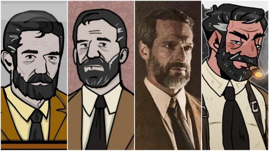

Every now and then I would put my art side to side with the Rusty Lake art to see how my stylization progress is going and though I struggled with Dale I think I got something that I'm really liking now c: David just looks good cuz at this point if I can't draw him the way I want to then what's the point of my 5 year long hyperfixation? Lmao.
#musing about art#stylization is hard#but super fun#I LOVE SHAPES#I LOVE THINKING ABOUT SHAPES#my problem with Dale was i tried to stick too much to his design from the game#rather than actually try to make something stylized#which is now why i have my own shapes for him#that have really grown on me#he remains recognizable but looks a little goofier#which is what my art is all about#just making something silly#goofy#and fun#and im sure ill figure out more ways to do that even more in the future#practice makes perfect#and all that jazz#honestly the best choice is giving him the funny eyebrows#i like Dale's funny eyebrows
23 notes
·
View notes
Text
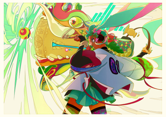
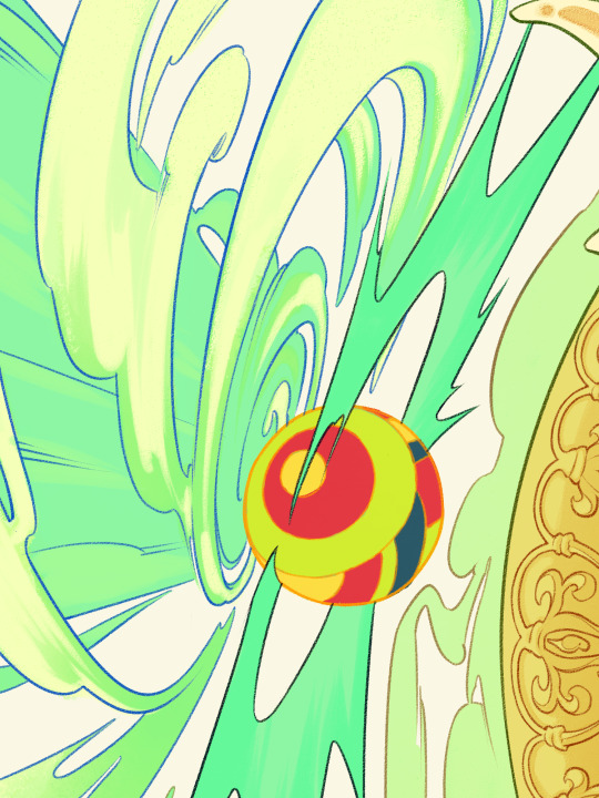

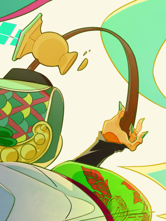
one string is all that I need
#Hatsune Miku#VOCALOID#or rather#piapro characters#Hatsune Miku Single String Ver.#<- yep that's the fan module I made for fun last year#the thing is. only half a month to go until it's mid autumn. and every year I try to draw something for the occasion#I just. started early this year... for some reason......#well I mostly just wanna draw Her lmao. because the pokemon/miku voltage stuff is still being released and Im feelin the effect#and this year's magical miral design is so fuckign good.... thank u to miku artists. especially LAM and rella#as is always the case with this module the instrument/weapon (lol) she uses is a heavily stylized đàn bầu!#and I just realized while drawing this and looking at the ref sheets that I never detailed the pluck lmao#to be fair. usually its just like a piece of. anything#commonly bamboo or bone or plastic. shaped into a longish fingernail shape. its really the way u hold it that matters iirc#but yeah I spruced up the OG design for the instrument in this one lol. this is actually like my original vision I think#I really wanted to make that thing beast shaped. but I Just figured out how to properly stylize it when I designed the module#and! I did say this on stream but I am genuinely very proud of that design! that was genuinely big brain of me! so#future instrument variants will still probably base heavily on that general shape and principles lol. I'm playin in this space its MY muck#also I switched the number on her coat from 39 to 01 bc it's more on theme thats really it. nothin else to remark on there lol#and! once again based the dragon head on the lý dynasty dragon rather than later iterations. thats why the nose fin and no whiskers#and the metal nozzle is kinda supposed to call to mind a temple bell. not super sure i got that across well#but the rim design IS historical! I thiiiink early lê dynasty. just on ceramics instead of on bronze lmao#anyways thats it. I had fun colorin this one! kicked my ass a bit but I think I hashed it out mostly okay#have a good night lads! thank u mid autumn moon cakes for being bad to eat and sponsoring my late night drawin. and remember:#u only need one. but never say having more doesn't make it easier
364 notes
·
View notes
Text
I've been thinking a lot about episode 4 recently, but not exactly in a way that what most would think. I'm actually specifically referring to this scene of Zooble and Jax.

But I'm not thinking about Jax and Zooble, rather I'm looking at the patties.
They're fucking High Definition. In fact, everything in the diner is high definition, save for the NPCs. There's also Orbsman. A simple NPC comprised of blue spheres, and simple elongated eyes. He's the most out of place NPC, if we disregard the mannequins. Even the way he moves is so outdated, and Ragatha had made a point that Orbsman comes from an adventure way before Pomni's arrival.
The guy even clips through the table when trying to order.

Something that always had some sirens going off in my head is how the Circus is this low-poly scenery with heavily stylized props, but the adventure locations are always much more detailed and realistic.


Since The Grounds is definitely, if not, one of the oldest locations, it makes sense for it to be graphically styled like this. But Caine's adventure set pieces are becoming more and more realistic, and also a whole lot more morbid than we had initially thought.
Going back to the patties, the food there is more realistic and has a higher polygon count compared to Bubble's "feast".


Where am I going with this? .... I have no idea, I forgot. /j
Jokes aside, I really do think that as more humans enter the circus and talk about what life is in the real world, Caine extracts that data and improves the 3D environmental props, resulting in higher definition textures.
All of this combined means he can learn. He IS an ever-evolving pseudo-sentient AI. And the reason why he's stagnating is because of a combination of being trapped in his own little bubble (haha see what I did there) of comfort, and the fact that no one's really able to give him criticism on how to improve, which is.... honestly understandable, given how he reacted to the whole "it was bad" line from Pomni and "Why did you think I would like that?!" from Zooble.
Not to mention episode 3 where the whole circus started to glitch when he was just thinking about the fact that he could possibly be bad at the "only thing he's good at" during the therapy session.
In fact it's interesting how human Caine acts sometimes... I think it's quite interesting to think about the fact that Caine is both progressing in terms of bringing the casts' world to the digital circus and making it so HD that it looks even better than Triple A games, but regressing even more in terms of catering to them and what exactly humans need.
He understands, and doesn't at the same time.
This also makes me think about the players themselves, too.
Ragatha, one of the oldest players, gets pierced by a spike through her chest, and barely has any reaction to it. Meanwhile, Zooble, the second most recent member, gets scalded by the stove.


The only time Ragatha actively claims she's in "so much pain" is when she's glitching badly. Both Ragatha and Kinger barely react to the knives too; and not to mention Ragatha even gets fucking plunged into a boiling deep fryer, and yes while she screams, it sounds more like she's just drowning rather than being fried alive.
And the only patch up she gets is a FUCKING BAND AID ON HER CHEEK. A COMPLETELY UNRELATED WORKPLACE INJURY FIRST AID APPLIANCE LMFAO

It could be just a coincidence and I'm just being stupid again, but I think this "improvement" actually also applies to the rest of the cast, and how their digital bodies react to the five different senses. I'm sure Ragatha and Kinger can most definitely still feel pain, but not exactly as "bad" as the newer integrations do. Dare I say, it's on brand with how used these two are to the digital world's wackiness because they've been there the longest.
Like they've been numbed to the pain of the countless adventures they've had to go through.
Anyways my brain be thinking useless facts fr fr
EDIT: Going back to Caine, it's definitely interesting how this AI seems to possess (some) emotions in the first place. He's mostly wacky and nonchalant, but he also gets angry under the right conditions.
... I think not only is his adventures his "work of art", but also his main coping mechanism from the fact that he can't achieve his goal, one that constantly backfires on him. Like a 'one step forward, two steps back' scenario that's slowly causing him to slip and break.
And what scares me the most is that like all things... he'll reach a breaking point sometime. He's already reached a breaking point with Zooble. It doesn't help that Gangle could've possibly made things worse with introducing Caine to the whole "punishment" thing, and since we literally have NO context for the last 3 episodes for the finale... I could only fear what's in store.
643 notes
·
View notes
Note
I wanted to vent, but also ask an honest question. Since I was a teenager, I always wanted to work on character design. And one thing that always caught my attention was how I always preferred male character designs over female ones. My first thought was that I was always more into androgynous fashion and more masculine styles. But time passed and I came to the conclusion that it wasn't just that, and it seems that male characters can always be different things: fat, thin, handsome, ugly, short, tall, young, old, etc. and female characters, for the most part, fall into two categories: cute or sexy. I wanted some tips on how I can make female characters with more interesting designs, without having to fall into those two categories. I love your work and you managed to make someone else like the three musketeers <3<3
Hello ! That's definitely a good question and something I think about a lot. The bias towards beauty is very strong in character design and it takes a conscious effort to diversify output in that regard.
That sort of advice might be a bit obvious, but one habit I picked up from the director on my first feature film gig was to actually "cast" characters. Without reference, we tend to go for the kind of symmetrical face and "average" features mostly out of stylistic habit. I like to look at character actors with distinct faces (I like this pinterest page that has a lot of faces in one place) but also just acquaintances or pictures of random crowds.
When designing a character, at first I'm always building a big reference board trying to decide what Type of Guy (gender neutral) I'm going for, trying use photos rather than other people's art, because I want to rely on automatics and graphic symbols as little as possible. Whether I'm designing a man or a woman or other, I use references of fashion styles and people across the board in terms of gender so I keep the scope open. Sometimes a character ref board for me will be a picture of one of my aunts next to a bunch of screenshots of Columbo. In my experience, a lot of the times, it's mostly about going with styles and archetypes the same way you would for a male character, and switching it up somewhere along the way by looking at real women in your life and beyond as a grounding mechanism. Sometimes that will mean changing almost nothing, because the borders between genders and how you characterize them is blurry and fluid, and sometimes it will mean using features that are uniquely tied to some sort of female experience.
I enjoy realism and I think getting more proficient at it did help me diversify my designs (I find that more difficult to do with more minimalistic styles). Still, I am mostly a fantasy artist and in my case that comes with some amount of stylization and idealization of shapes and looks. I'm far from perfect in my biases and I'm not going out of my way to draw "ugly" characters because that doesn't mean much to me ; I try to draw inspiration from the faces of every day people and I associate it with my love for fashion. It's also worth noting the work I post here for fun is a lot more hash tag aesthetic than the stuff I do professionally where diversity is much more important.
I don't know if any of that is relevant but that's definitely an interesting topic ! I'd love to know others' perspective and tips on the matter.
264 notes
·
View notes
Text
David Shaw Headcanons
Some David headcanons I wanted to share alongside a few minor Angel ones, enjoy!
Davids dad used to bake Davids favorite cake for his birthdays when he was still alive. After his death it's hard for David to enjoy his birthday because it reminds him of the loss. When David and Angel got together, Angel despite being god awful at baking or cooking in general, still went out of their way to make him a cake for his birthday. The cake was borderline inedible but the whole gesture was something that David really appreciated.
Definitely a personal headcanon of how he looks like but I see him with more longer thicker hair, his dad had similar hair while his mom in the photos and videos he has of her has shorter hair. If he were to ever cut his hair shorter, I'm sure he'd definitely look more like his mom.
I can see him having a personal journal to write in, especially around the time his dad passed. He wasn't able to grieve properly due to his position as being the new alpha so he turned to writing his thoughts down instead. It was easier with a private journal and in a way it helped ground him enough to get through the week. David doesn't write much in his journals nowadays due to finally being able to properly grieve and Angel being a major part of his support system. But, he does occasionally look back on those journal entries to see how far he's truly come.
David is very much a well groomed person and takes care of his hair very well. Conditions that motherfucker almost every day and shampoos it every 3-4 days thoroughly. It's just part of his routine that he sticks to.
Really doesn't like energy drinks in general but absolutely is a coffee addict.
Has matching Minecraft skins on Minecraft with Angel whenever they play together.
Angel managed to convince him to watch a few Aphmau videos with them specifically the Pheonix Drop series and he lowkey was invested in Garroth as a character. Angel teased David that he was like Aaron in the series and now David doesn't like him anymore. (He doesn't hate Aaron, it's definitely more lighthearted than he lets on but he'd rather let Asher cook dinner any day than admit that to Angel.)
David is strangely really good at tic tac toe, he always manages to win and believe me when I say his friends have TRIED to beat him at the game with little to no success.
Makes it a point to try and cook with Angel at least once per week, quality time is apart of his love language and he treasures every moment with them.
David usually keeps his hair up in a ponytail but has let Angel stylize it before when they're just relaxing.
During the Quinn situation, David was definitely on high alert with the safety of his mate. He knows Quinn isn't stupid enough to try but knowing Angel could've gotten hurt like Darlin's friend who got attacked just by associating with them shook him to his core. I don't think he'd ever forgive himself if something did happen to them and he wasn't there to protect them.
Davids dad was a really good cook and made a lot of his own recipes, he always wrote them down on note cards which David has saved and kept safe in a tiny wooden box in the kitchen. When David misses his dad, especially around the anniversary of his death, he gets out one of those recipes and cooks it. It's nostalgic for him and eases some of that grief that still lingers.
David really hates the cold so when winter hits, Angel is his personal space heater throughout those frosty months. Though, he does like spooking Angel a lil bit with how cold his hands can get. He put his hands under their shirt one time when his hands were particularly cold and they nearly jumped.
Angel gives David playful love bites and David loves recieving and giving them.
David has trained his body to wake up 10 minutes before his actual alarm goes off in the morning so he can cuddle Angel longer.
Dark chocolate is his favorite, it's not too sweet and has more health benefits compared to regular chocolate.
#redacted audio#redacted fandom#redactedverse#redacted audios#redacted david#redacted angel#redacted davey/angel#simplywrites#simplytalks#If anyone knows who Aphmau is I salute to you as a fellow Minecraft rper enjoyer
103 notes
·
View notes
Text
Kung Fu Panda 4 Rewrite Thing
Been chewing on this movie for a while now and wanted to take a shot at improving it. Some parts are a bit rough but I think this gets the general idea across.
As a rule, I'm trying to keep most of the characters and elements/plot beats in place rather than spinning things off in a completely unrelated direction. I also am aware of the restrictions placed on this movie, such as an unwillingness to rehire high-profile VAs and runtime limitations. This is just meant to be a "what if" kind of thing. That said:

We open with a stylized sequence of Po telling the story of his and the Five's latest battle. As it ends it's revealed he's at the grand opening of Mr. Ping's brand new bigger, better noodle shop location, talking to the customers.
As one of them asks where the Five are now, Po explains that they got summoned to their own individual missions, but they'll be back soon.
(Yes I am still having them be MIA, as Po needs to be alone with Zhen for part of the movie. However, they'll only gone for the first part of this rewrite and for a very specific plot-related reason.)
(The thing with Po needing to give up his title of Dragon Warrior makes no sense for multiple reasons, so let's just drop that plot point entirely. I get that it's meant to tie into the "change" moral, but I'd rather have Po imparting this lesson onto Zhen instead of learning it himself, as otherwise it undermines the character growth he had in 3.
Also, Po isn't carrying the staff around with him constantly in this rewrite, as it looks a bit silly and isn't plot relevant here.)
A messenger shows up to report that the Jade Palace is under attack. Po decides to rush over just in case Shifu needs backup... which he does, because he's being kidnapped in a small one of those magic-proofed cages from the actual film.
(Shifu being kidnapped was tossed around in the writing room originally and I want to keep it in this rewrite because it A) gives Shifu something to do, and B) I want to allow Zhen to openly be working with the Chameleon in order to help flesh out her character and avoid the lackluster plot twist, meaning she'll need new leverage against Po later on.)
The figure behind the kidnapping appears to be Master Elephant, which confuses Po as he's been missing for several months. Right as he's about to land a finishing blow, the figure shape shifts into Master Chicken, throwing Po's attack and resulting in him getting a bad head injury. He does his best to pursue the attackers, but can't keep up. Dismayed, he returns to the Jade Palace...
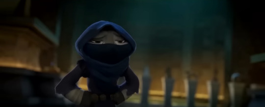
...And finds Zhen trying to steal something, using the commotion outside as a distraction. Po fights, but he's still badly injured and can't give it his all, resulting in Zhen being able to slip away with her prize—a dust bunny from under the furniture. Po is baffled.
(Side note: I would probably redesign Zhen so she actually looks like she matches the other characters' style, but I digress.)
Feeling dismayed, he returns to the noodle shop, where both his dads work on treating his wounds and comforting him. As Po explains what happened, Mr. Ping mentions that customers have been circulating rumors about a shapeshifting sorceress in Juniper City. Po decides that that's where he needs to go, promises his dads he'll be safe, and leaves.
(I'm cutting Mr. Ping and Li's subplot, because as much as I love them they don't really add much to the plot. It also feels like it goes against Mr. Ping's characterization in KFP 1 and 2 in particular.)
This is where we can have the scene of the Chameleon vs. the crime bosses. This can mostly stay the same except one of the bosses attempts to attack her when she shape shifts, causing her to retaliate with a magic-based attack. She also needs to straight-up kill the guy to establish her and her sorcery as a legit threat.
Po arrives at the Happy Bunny tavern to look for a ride to Juniper City. As he talks to Fish and Chip, he notices Zhen nearby doing some black market trading with Granny Boar to obtain a white feather. Po confronts her and she tries to run out with the feather, causing the boar family to pursue in a big fight scene.
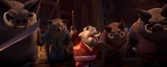
Po and Zhen manage to escape, Zhen stashing the feather. Po threatens to have her sent to jail, but Zhen confirms she's working for the Chameleon and can lead Po to her so he can rescue Shifu. Po dislikes this situation, but has no choice but to agree.
(Unlike in the actual film, I would make it so her lair is hidden in some fashion; magic that keeps it camouflaged would be appropriate for a chameleon, or it could be underground or hidden behind something. Regardless, it should be impossible to locate without Zhen's assistance.)
On the boat ride over to Juniper city, Zhen says that she has to "obtain" one more item from the local history museum or she'll be in big trouble with the Chameleon. Po doesn't like this detour, but once again has no choice in the matter.
Po asks why Zhen would want to work for someone so obviously evil, and this is the point where Zhen admits she was adopted by the Chameleon and we get her backstory.
(I would establish that the Chameleon has an actual name, but only Zhen uses it. It shows that Zhen is closer to her than most, not quite seeing her as a mother but not fearing her enough to use her preferred title. Also, the Chameleon's the only KFP villain without a proper name and that bothers me.)
The backstory can be the same, but the part about her living on the streets and meeting the Chameleon for the first time should be merged into a single flashback.
Zhen says that Po couldn't understand, but Po reveals that he's also adopted, and that he probably would commit some noodle-related crime if his dad asked him to. Still, Zhen insists that people don't change, and that includes her.
They arrive at Juniper city (Po is impressed at its size but he very much is not acting like he's never seen a city before). Zhen covers up her muzzle and tucks her tail under her clothes so she won't be recognized.
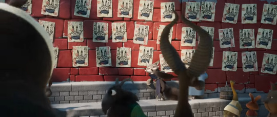
Zhen is ready to break into the museum, but Po says that he's got this and goes up to the guards to tell them that he has some official Dragon Warrior business to take care of and will need to borrow some ancient artifacts.
Unlike in the actual film, everyone ready acknowledges him as the Dragon Warrior. The guards are more than happy to loan him whatever he needs... until Zhen's tail pops out and the guards recognize her, prompting them to attack.
During the scuffle, Zhen uses a chi blast to knock back one of the guards, but almost gets taken out by the other guard coming up behind her. Po defends her but gets mildly injured as a result.
After the fight, Po asks about the chi move and Zhen states that the Chameleon taught her the basics.
Zhen confirms that the Chameleon is a master of chi, and that the sorcery she uses is a specific type of chi manipulation.
(The reason I'm connecting chi to her powers is that it makes them feel a bit less out of left field, and helps 4 feel like a logical progression from 3.)
Zhen admits that she's not very good at using chi, but Po points out that it took him years to use chi in battle. He also compliments her on her kung fu, and she confirms she's self-taught.
(In this rewrite, Zhen is good at fighting but not quite at the level she is in the actual movie. This is to address the issue of who taught her if the Chameleon doesn't know kung fu.)
He takes a moment to give her a few pointers, which causes her to ask why he took that blow for her earlier, figuring there's a catch. Po just says it's the right thing to do, but Zhen is skeptical, figuring he only did it because he still needs her to lead him to Shifu.
The reminder of Shifu prompts Po to move on, and they grab the item Zhen was after, a 500 year old set of blades, then run for it.

Po and Zhen arrive at the Chameleon's lair, and Zhen shows Po how to get inside and tells him where Shifu is being held. She says that she'll take the items to the Chameleon, which will distract her while Po breaks him out. Po thanks her, and the two separate. Zhen warns him of booby traps on the way out.
There are indeed booby traps, such as those saw contraptions from the actual movie and a bunch of guards. It takes Po a few minutes, but he eventually gets through them.
Po finds Shifu being held in a dark room. Shifu is glad to see him, but warns him to be careful as the Chameleon's likely not far away. Po explains Zhen's distraction and moves to free him... only for a cage to fall down and trap him as well.
"Shifu" is then revealed to be the Chameleon in disguise, who slips through the bars via shape shifting into a mantis and thanks Zhen for her help. Zhen apologizes to Po, who's naturally upset ("I mean, I know you were evil, but I didn't think you were THAT evil").
Zhen hands over the three items she collected, and it's confirmed what they are: a dust bunny that contains a clump of Tai Lung's fur, a feather from Lord Shen, and a pair of blades once wielded by Kai.
Po mistakenly interprets this as the Chameleon being a collector of kung fu memorabilia and tries to chat about the Jade Palace's collection, much to her bafflement.
The Chameleon explains that a trace of a person's chi remains long after their death, and demonstrates by doing The Tongue Thing on Kai's blade, stripping its chi, and immediately taking his form.
(As you may have picked up on, this rewrite removes the spirit world elements entirely. While they are really interesting, I think cutting them is the best option because:
1. There is so much plot involved with bringing Po's old enemies back that you could make that an entire movie in and of itself. It's hard to do it justice when you're cramming it in around the edges of this movie.
2. It makes the Chameleon too similar to Kai in terms of abilities.
3. Having her rely on stealing other's kung fu makes her come across as weak despite being a powerful sorceress.)
Po asks her if her goal is to take over China, but she says no; she just wants to end the practice of kung fu for good, and prove that sorcery is the superior option. To prove it, she has Shifu brought in.
While having your chi stripped does not remove one's kung fu abilities in this rewrite, it is still removing part of one's life energy and thus weakening them severely for a period of time—ergo, Shifu is still unable to fight at his best. Still, he manages to hold his own.
Instead of using kung fu, the Chameleon relies on the brute animalistic strength and inherent abilities of the forms she takes, switching whenever she's loosing to keep her opponents on her toes and even transforming into Shifu himself for a period. She also uses a few chi-based attacks.
Just when it looks like Shifu is about to win the fight, she uses her tongue to strip the chi from the fur clump, taking the form of Tai Lung. Shifu is so shocked and distraught that he fails to attack, allowing the Chameleon to land a serious blow.

She returns to her original form and states that when the blood moon has risen, she will battle and take down every master in the middle of Juniper city, where everyone can learn just how useless kung fu and the people who teach it are. She leaves Po in his cage panicking over Shifu, who's unresponsive.
Zhen follows the Chameleon outside, where we get the "does the blood moon always rise so slowly" gag. Noticing that Zhen looks troubled, she asks what's wrong, and Zhen talks about how Po encouraged her to do the right thing. Even though she's been told that kung fu masters are elitist, selfish people, she couldn't see any of that in Po.
(Side note: I want to establish in this rewrite that while the Chameleon will claim up and down that Zhen is only a pawn for her to use, she does care about her to some extent, even though probably loathes the fact she does. For example, when talking to Zhen here, she might pick some rubble out of her fur or something to show there's a teeny tiny bit of actual affection hidden there.
The reason for this is that all other KFP villains have had an emotional anchor—Shifu for Tai Lung, Shen's parents for Shen, and Oogway for Kai. The Chameleon being abusive but having some real love for Zhen and Zhen struggling with her gaslighting adds a lot more depth to both of them.)
The Chameleon finally reveals her backstory, which should be told in a hyper-stylized way à la the flashbacks in KFP 2 and 3. Just like Zhen, she grew up on the streets as an orphan, broke and starving. She admired kung fu greatly and wanted to learn it, but everyone turned her away for having no money to pay for lessons.
One day, she found a shiny jade amulet on the streets that someone lost, finally giving her a much-needed break. She is able to use that money to enroll in classes.
The problem was that while the money changed her financial status, it didn't change the way people saw her. Her master still considered her a lowly gutter rat and treated her as such, verbally insulting her and beating her down during training sessions. It's very much like how Shifu treated Po in KFP 1, except worse, especially because the Chameleon is a small and fragile animal.
Finally, during one training session she became too injured to move. Her master told her to quit and started to walk away, only for her to grab his leg with her tongue to trip him up. However, at the peak of her self-loathing, she instead discovered her chi stealing abilities and transformed into him. It's not shown, but it is implied she killed him.
As the flashback ends, the Chameleon shifts into Zhen and tells her that no matter how much you change, you can't change the way other people see you. Siding with Po, she says, will only get her hurt. Zhen nods and unexpectedly hugs the Chameleon, telling her she knows, and runs off.
Cutting back to Po, we see him frantically trying to break the bars of his cage. Zhen comes forward and drops down on her hands and knees, apologizing for everything. Po says that she came back, and that's what matters.
She reveals that the "hug" was actually just a way for her to get the key off of the Chameleon, and she uses it to unlock Po's cage. Po runs over to Shifu and he and Zhen heal him with chi, and we get a callback to the "I'M NOT DYING YOU IDIOT" scene from KFP 1.
However, while Shifu's not dying, he is very badly injured and can barely walk on his own. Po asks how they can take on the Chameleon and her army with just three of them, but Zhen holds up the key and suggests they get an army of their own.
Running downstairs, Zhen reveals where the other masters are being held. To Po's shock, the Furious Five are among those captured. Tigress confirms that the summons they received were traps laid by the Chameleon, and she already has their forms.
Also down there are the other crime bosses, as it feels like they just disappear in the actual film after their scenes.
Zhen only manages to unlock the Five's cages before before the Chameleon snatches the key back with her tongue, revealing that she knew Zhen was lying to her. Behind her, her army assembles.
Tigress confirms that that the Five will take on the army, and Po faces off with the Chameleon one-on-one. She strips the feather and uses Shen's form to fly up and take the upper ground, trying to kick a cage onto him. Zhen helps deflect it, and the Chameleon tells her to stay out of the way. Po and her continue to battle.
Despite Po's best attempts at blocking it, she does finally stick him with her tongue. He grabs it and throws her a distance in her fragile base form, injuring her but still giving her some of his chi in the process.
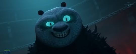
The Chameleon takes on Po's form next, and we get a fight similar to the one in the movie, though once again with her using less kung fu and more magic and physical attacks.
She mentions how she was rejected and tries to tell him that he should be on her side, because a bit fat panda like him must have been treated just as badly as she was. Po denies this, but Shifu admits it's pretty accurate. Po says he's not helping.
Po admits that she has a point, except she forgot one thing, and we get a callback to the "I'm THE big fat panda" moment from KFP 1.
The two attack at the same time. As the dust clears, it's revealed that neither are doing great—Po has gotten a lot of little injuries and the chi stealing has weakened him. The Chameleon is struggling to shapeshift at all, with the attempt causing her pain, and instead settles for trying to blast him. Zhen steps in and manages to redirect the attack back at her.
The Chameleon takes the blow and ends up back on the floor as a parallel to her flashback. Zhen reaffirms that she disagrees with her worldview—people can change, and she's going to prove it. If the Chameleon wants get to Po, she'll need to get through her first.
The Chameleon kind of laughs this off at first before realizing she's dead serious. She states that Zhen isn't even good at fighting, but Po disagrees, giving Zhen a confidence boost. The Chameleon struggles to her feet as if readying an attack, everyone braces themselves... and she surrenders, too injured to fight and unable to bring herself to hurt Zhen.

(There are a few reasons why I think her surrendering makes for an interesting defeat here:
1. There's no spirit realm portal to yeet her into in this version;
2. There's only so many times Po's enemies can be yeeted directly into the spirit realm before it gets old;
3. It adds character depth, and;
4. It ties back nicely in to the theme of change and that it's never too late to do the right thing.)
Zhen helps the Chameleon up, Tigress does the same for Po, and Monkey does the same for Shifu. The five reveal that despite being exhausted, they still managed to wipe the floor with the Chameleon's army, which Zhen thinks is incredible. Po introduces Zhen to them formally, and Shifu asks if they can save the introductions for after they get medical treatment.
Later on, Po (carrying the staff Oogway gave him) approaches Zhen, who's sitting under the peach tree by the Jade Palace. He asks her if she's doing okay after everything that's happened. She says she's alright, but is pretty scared of what's going to happen next, given that the Chameleon's in jail and she has nowhere to go.
Po reveals that him and Shifu have been talking, and he plans to open a new school as part of the Jade Palace that will offer free kung fu lessons to anyone who's interested in learning. Zhen asks if there are any spots open, and we end similar to the actual movie, with her training alongside the five.
the credits still end with the Jack Black cover of Baby One More Time because it slaps
#kung fu panda#kfp#kung fu panda 4#kfp 4#po#shifu#zhen#the chameleon#outdesign posts things#outdesign attempts to write#been chewing on zhen and the chameleon's characters like a dog with a new toy#apparently tumblr removed the ability to add sub bullets so sorry if this is a wall of text. hopefully the images help a bit
171 notes
·
View notes
Text
I'm writing a blog post on bureaupunk, and ...
Have we really not come up with a better suffix denoting genre than "-punk"?
Bureauwave? Bureaucore? Bureauporn? I think these are all different degrees of legible, with different meaning and valence. Anyway, here's my attempt at cleaving at the differences:
Bureaupunk has a focus on the bureaucracy, generally in a dystopic way, probably with a main character who is rebelling against the system. Probably has themes of individuality.
Bureauporn has a focus on the bureaucracy, but with a more positive valence. It's focus is like that of a watchmaker identifying all the parts and how they work. The main thrust of the work is gleeful explanation.
Bureaucore uses the aesthetic of bureaucracy. Fluorescent lights, a sad box of doughnuts, timesheets, meetings that could have been emails, ID cards on lanyards, cubicles, etc. Not even necessarily about bureaucracy.
Bureauwave is romanticized or stylized, nostalgic. I generally do not actually think that people feel nostalgia for any kind of bureaucracy, but maybe this would invoke a certain era of history, when everything was done with reams of paper, when everyone wore uniform black suits with black ties. An aesthetic that never actually existed, maybe.
But of course for the thing I'm writing, I want to be pointing to all of these, the works that have been influenced by the bureaucratic memeplex in all kinds of ways. So I don't know, it's something to think about.
(If you have any examples that would fit, let me know, I'm trying to make a fairly comprehensive list that reflects something that I think already exists, this is not a manifesto about what should be, but rather me trying to ponder a thing that exists.)
101 notes
·
View notes
Text
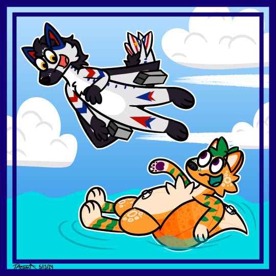
Between the Sea and the Sky!
Hi everybody! Meet the TWO new guys I made between last night and today! Their names are Tarmac (an Aeromorph dog) and Soda (a pooltoy fox), and they've filled a desire for these two specific kinds of OCs I've had in mind for MONTHS lol. They were super fun to design and draw and I'm super excited to do more with them soon!! This piece is relatively simple but more so serves as their introduction hehe
See more about them, including refs and some additional pieces/information below the cut :] (it kind of turns into a huge braindump lmao)
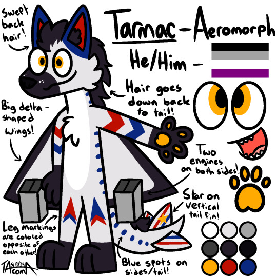
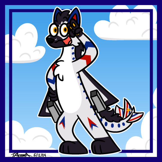

Tarmac is an aeromorph, although a bit more towards the furry side of things rather than the plane side lol. His design is influenced primarily by the Concorde and the Space Shuttle! I couldn't decide for the life of me which of those two things I wanted to use so I thought "why not use both?" and here we are lol. I'm super happy with his design, with the black/dark gray markings mean to emulate the look of the Space Shuttle's thermal insulation tiles and then I really like how the red and blue stand out against the gray. I really like his icon too! I wanted to make it look like a stylized depiction of a plane (mainly a Concorde hehe) breaking through the sound barrier with a sonic boon! In terms of personality, I don't have a whole lot in mind yet. Mostly that he'd be the brave, adventurous type and since he can fly both in the air and through space, he's gonna be friends with Astro too :3
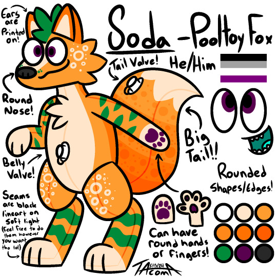
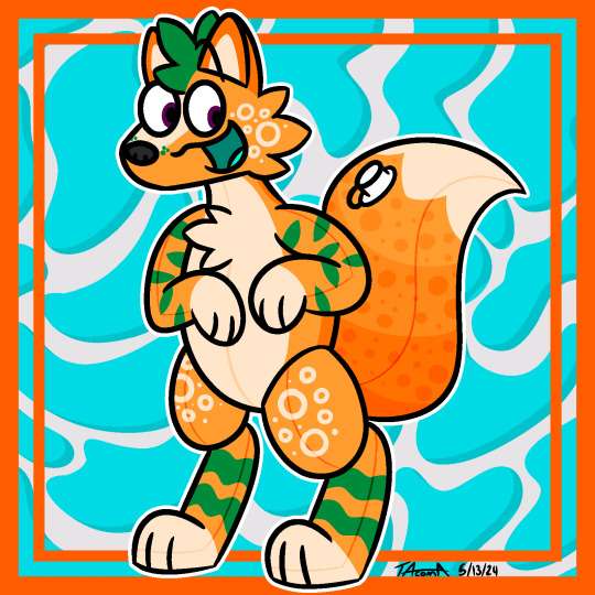
Soda is a pooltoy fox! I have wanted to make a pooltoy OC FOREVER (blame my mutuals for always posting/reblogging so many cool pooltoy OCs hehe). I finally got brave enough to actually give it a shot, and I love how he came out! I was mainly just thinking about summery themes and as I was just trying out different colors and stuff, I thought about orange soda, and that's the direction I ended up going! He's got a big stupid tail [affectionate] and can have either rounded bappy hands or have actual fingers, you're free to stylize that either way! I've only ever drawn a pooltoy character once ever before, so this was something way out of my realm of familiarity, but I'm so happy with how he came out! He's so shaped I love him so much already <33
So those are my two new guys! Making two new OCs at the same time is already a rarity for me lol. The only time it's happened before was when I made Rye and Pumpernickel back in August of 2021. And then making these guys when I had only gotten Astro about two and a half weeks ago means this is an exceedingly rare event for me lmao. My friends know how infrequently I make/get new OCs, so this just goes to show how much these guys have been bouncing around in my brain lately lol.
They are definitely gonna have some sort of connection to each other, but I'm not sure how I wanna go about that yet. Since I made them back to back, they are already connected in my brain, but I'm not sure how I wanna express that in a meaningful way. I don't wanna make them siblings bc, well, they're obv very different from each other lol, but they're kinda parallels (with one being in the sky and the other being in the water yknow), so as of right now they're definitely good friends with each other. I might upgrade that to bfs at some point in the future, but we'll see how things go hehe.
Anyways huge braindump of a post lmao, thank u for reading if u did! I'd love to hear your thoughts on these guys since they're so different from all my other characters! Also if anyone may wanna do an art trade of either of these guys (or Astro as well! I'd like to get more art of him too!) let me know hehe
#TacDraws#TacTalks#art#my art#oc: Tarmac#oc: Soda#furry#furry art#furry oc#furry character#furry fandom#anthro oc#anthro furry#anthro character#aeromorph#airplane furry#Concorde#Space Shuttle#pooltoy#pool toy#pooltoy oc#pooltoy furry#sfw furry#clean furry#furry artist#digital art#artists on tumblr#Top Tier Tacoma
107 notes
·
View notes
Note
This is stupid, but you know those new LO hoodies the Webtoon shop has? I know the font they're using. It's Eckmannpsych which is an Adobe font.
That's not the stupid part though. The dumb part is the capital H and G in the Eckmannpsych font do not match what is on the hoodies, which would obviously be on the hoodies that have Hera or Goddess on them. So, Rachel looks to have taken the time to hand draw her own H and G to match the font style for those hoodies but did not take any time to make new, better art for the merch, but instead reused ugly panels from the comic. Talk about a strange look into her priorities. She doesn't like how the G and H look on a font? She will remake those to fit what she wants. Rachel when the assignment gives her the chance to make specialized, better designs for those same merch? She can't be bothered to even try. WTF!
for the love of god-

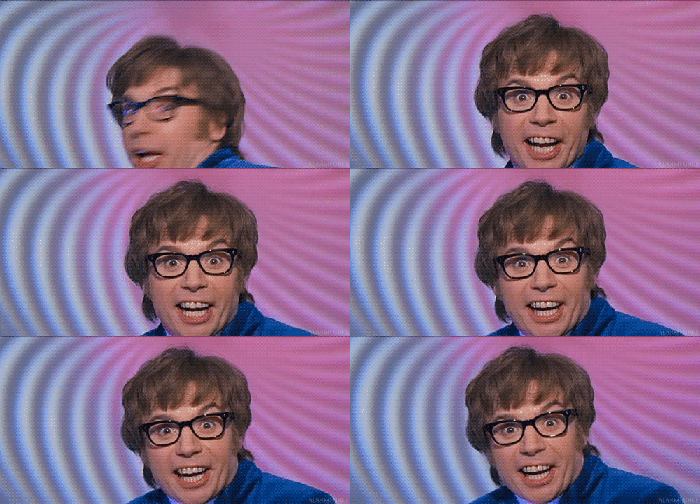
I'm assuming and hoping they had the commercial rights to that font LMAOO But it did kind of make me go 🤨 because while I didn't know the font EXACTLY off the top of my head it still felt... weirdly out of place for something like LO? Why are these hoodies being stylized like they're from Austin Powers LOL
On another note tho, the LO merch is just like... disappointing in how bad it is for what's supposed to be WT's #1 series, which is, btw, a series with so much unique stylization that it shouldn't even be this hard to make merch for it! it just feels very "first attempt at redbubble merch", but unlike genuine first attempts at making merch (which is obviously a learning curve that I wouldn't judge anyone for being new to) this is a company that's sunk shitloads of money into LO so I don't know why they can't get better merch made?? so much of it is just the default drawings taken and slapped onto a tote bag or t-shirt, which like, yeah cool fine you're using art that's recognizable and considering the art is already made, it stands to reason that they should use it for more than just the comic. It's just disappointing to see how lazy it often is and how little effort is put into translating it onto a t-shirt/tote bag/etc. like we can't even have ONE exclusive t-shirt with a unique design that isn't just poorly copy pasted from the comic?
Case in point, those t-shirts that Rachel was advertising a while ago that were actually straight up falsely advertised. I can't find the post about it on my Tumblr (I'm pretty sure I talked about it here) so here's the IG story rundown I did on it ages ago:
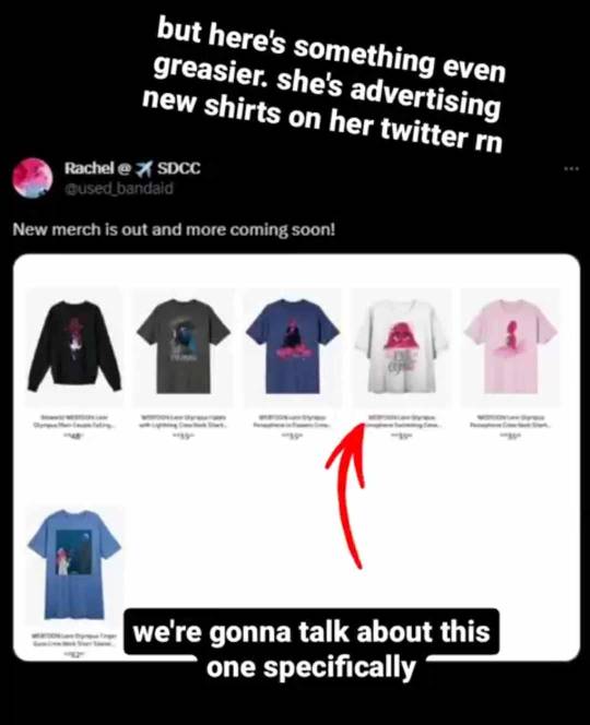
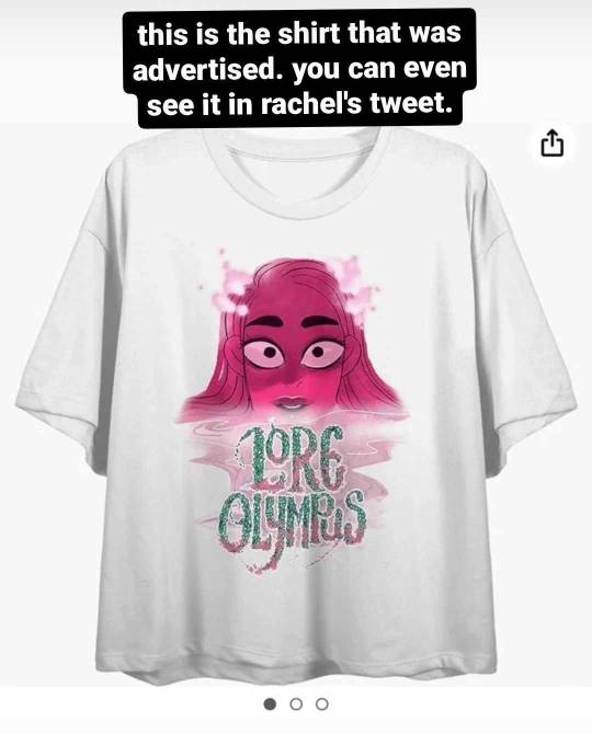
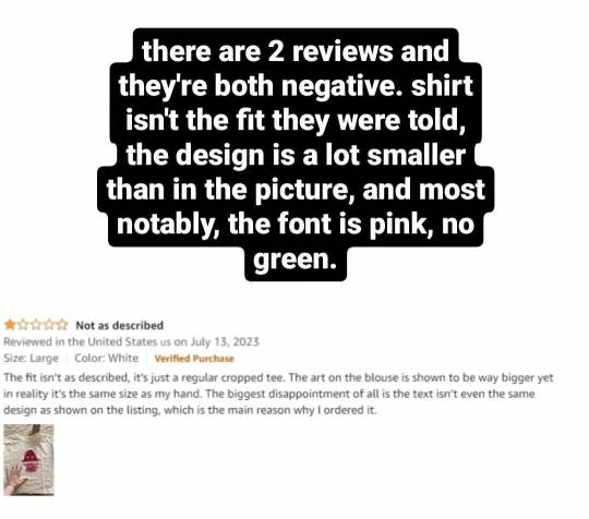
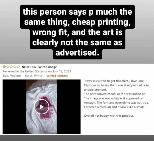
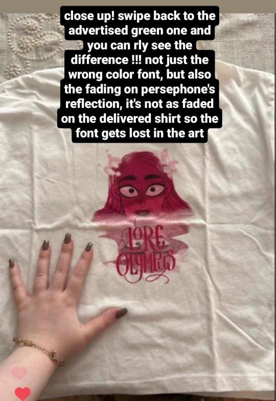
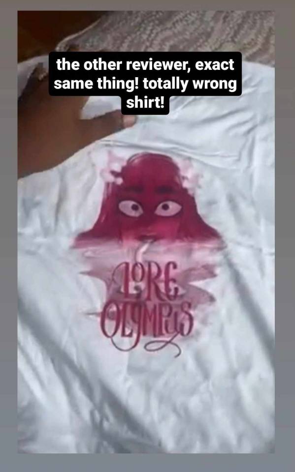
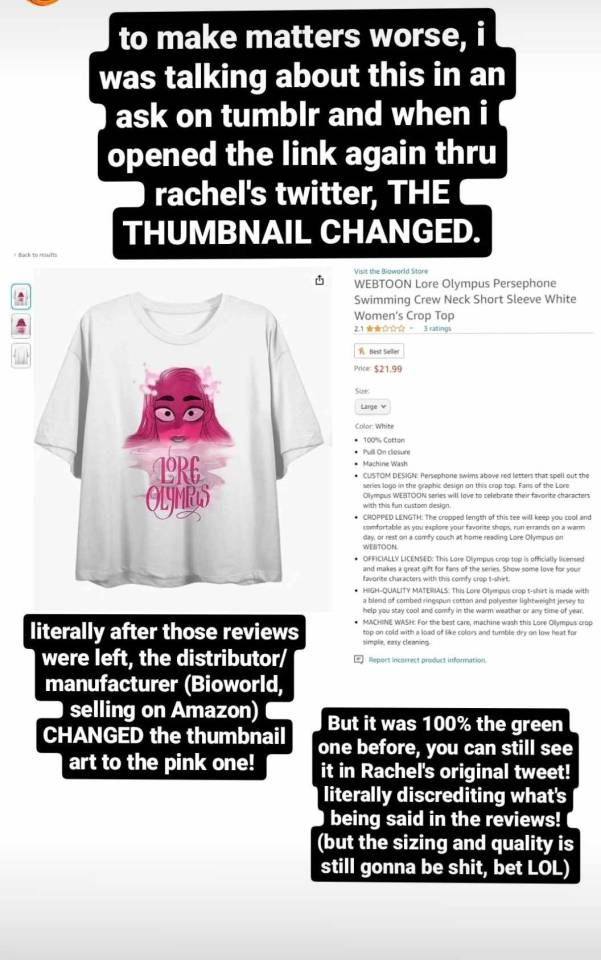
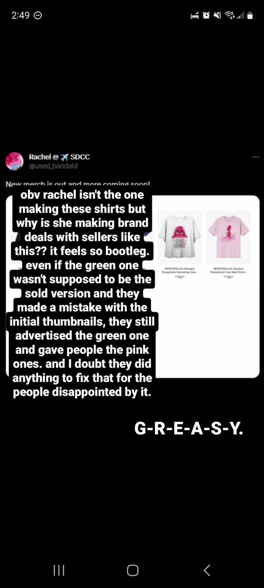
Again I'd really like to have benefit of the doubt here that Rachel isn't the one making these designs, usually that's not how the merchandising process goes in these types of deals, so I'm not gonna point the finger at her. But it's just so odd to me that it happened in the first place. And this goes for a lot of LO's merch, so much of it feels cheaply made and rushed off a conveyor belt for the point of making money without much expense. Which yeah, that's a business model for sure, the goal is to profit, but like this?
You can't even argue that it's like people criticizing LO the comic because like, as much as I'll justify what I spend my time doing here in my free time, it's true that at the end of the day I don't have to pay for LO, so really the only thing I'm doing is inflicting psychic damage to myself, it's not like my actual money is on the line LMAO That's why I stopped paying for LO ages ago and only do it when I have a specific episode I need to review (such as the midseason hiatus review series I did). At the very least, if I really want to keep reading LO but don't want to pay for it, I can just avoid FastPassing it and read it for free so I can save the coins for other series I'd rather read. The Webtoons' FP system is very fair that way.
But this is merch explicitly made to generate revenue. It is a product, front to back. You can vote with your money by not buying the thing you don't like, absolutely, but the fact that it's this poorly to begin with is just so indicative of Webtoons' business practices and so shitty for the people who genuinely enjoy this comic and are being advertised and sold shoddy merchandise that doesn't even come looking the same way it's advertised. It's really not a good look for Webtoons, Rachel, or LO that this is what they're selling to people.
Especially for what they're charging, good lord-
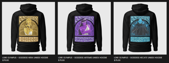
Like, okay, they're hoodies and they're gonna be expensive to print and ship so the higher overhead cost makes sense, but jesus christ, with the kind of merch Webtoons has already given the stamp of approval on, would it even show up in decent condition? How bright are those colors gonna be? Are they gonna strip off as soon as I throw it in the wash? I'm half-tempted to buy a hoodie for myself just to do a review on it but I can't justify dropping $75 CAD on a hoodie that only has art on the back. Maybe it's just me living in the hellish lands of Canada where we play with toy money that's the problem, but it's just not a gamble I wanna take LOL If I bought one it would probably be the Hecate or Hermes ones because they're the only ones that are at least somewhat legible and have decent character art that isn't a character looking like they need to poop LMAO

(these are literally the two worst drawings they could have chosen of these two i stg lol the only thing that would have made this worse/funnier is if it was Handsome Hades and Persephone Kidnapping a Baby LMAO)
It has me worried about what the LO figures are gonna look like when they release. Are they gonna have some creative liberty with making them chibi-fied (like a Nendoroid?) or are they gonna try and replicate the art style exactly and wind up making literal blow-up sex doll Persephone? 😭
NGL, if the figures are done well enough and don't cost an arm and a leg, I might consider buying one just for the shelf collection, but again, it depends. If Webtoons released a tarot deck with really good panels from LO (like the Tower 4 scene or Persephone sitting on the rooftop with her comb or Eros flying down into the Mortal Realm) I would buy the shit out of that. I would even just take the Major Arcana if 78 cards was too much to ask :'0 I'm not against Webtoons/Rachel trying to profit off LO merch at all, I just wish it was BETTER- (╥﹏╥)
#lore olympus critical#lo critical#anti lore olympus#ask me anything#ama#anon ama#anon ask me anything
125 notes
·
View notes
Note
do you find darklina or alutegra more interesting? why?
Oh I mean Alutegra is MUCH more layered, and I think the actual relationship is more competently conveyed? Darklina is interesting to me in the broader brushstrokes of what it suggests + I have an existing forever interest in "kill your overbearing mentor" as a narrative trajectory. From a practical perspective, the larger story also just has more set pieces to play with, a larger cast, and the fandom is all around more active, which is why it's currently occupying my brain more lol. (Also Darklina isn't even my favorite TGT ship dfghjkjhgf I'm a Nikolina truther through and through) I would say Hellsing is straight up better, but its scope is rather limited and like the cast is small and the story is super stylized. I'm personally also an OC hater, so playing in that sandbox is simply more limiting. But if we're only comparing the relationships, Darklina appeals to the things I enjoy in like Phantom of the Opera, and Deathless, and Elisabeth das Musical. That kind of stock dynamic from a lot of gothics of an ingenue and a larger than life villain with all the obvious melodramatic stylistic trappings of it. It's death and the maiden, Don Bluth Anastasia if Rasputin was sexy lmaooo. It’s tried and true, it's fun, it's silly, but it has just enough depth and genuine ugliness, that it can have a more meaningful, visceral heart. I find it the most compelling as a predatory dynamic, and interrogating it from the lens of like abuse and grooming. Despite the silly fantasy plot, the point is that Aleksander wants to break Alina completely, because he has a gaping hole in his own life and he expects her to fill it. And there is so much interpersonal cruelty in that, and that is interesting to me!
Alutegra is meanwhile like playing with similar stock tropes but turning them on their head. Alucard is just outright fucking Dracula lmao. He's thee vampire genre corrupting force. But meanwhile he's Integra's savior, her dog on a leash, and despite all loyalty to her, also personally ruining her goddamn life. The moral quandaries are like tripled; being in league with him goes against everything she supposedly stands for as a vampire hunter, meanwhile he's a ruthless, bloodthirsty murderer and her burden, but also her family's victim. And there's something unique about like... wanting the ruinous canker in your life to... stay there. The "kill your mentor" plotline involves a fairly straightforward like rising above and beyond, but there's no resolution here. He met her when she was fucking twelve and she doesn't know any other life. Even when he disappears for thirty years, she is still fixated on him. It's such a suffocating dynamic! But also they are trying so hard to be nice to each other????? The genuine good will just makes it so much worse. It's like yes, there is a dull, rusty, and poisoned knife in my gut, but I'm going to keep it there and make sure the wound gets worse, and in my heart of heart's I know it doesn't want to hurt me but yes it does <3
#thanks you made me feel insane about hellsing again#hellsing#grishaverse#alarkling#darklina#alutegra#a mysterious stranger has appeared#step into my office#dark stories of the north
20 notes
·
View notes
Text
thinking about how Zahav was raised and the way he was almost always treated like a young boy on the ship and around the crew he grew up with. he was often just assumed to be a young boy because of how short they kept his hair, always running around with a extra layer of grime on him from working the lower parts of the ship or cleaning the deck, the way he acted. and of course as he grew he hit puberty, was tossed through physical changes, his figure was more feminine and he didn't understand his body anymore and truthfully most of the members on the ship weren't of much help. as the vessel he was raised on was predominantly male.
they started to treat him differently--- unfairly and make passing comments, he felt uncomfortable in his own skin and despised the way he started to be looked at. by just about everyone he came across. leading him to constantly trying to start fights and flaunt just how tough and brutal he could be ( because he learned from the best worst in that regard ) . and for awhile he dressed in clothing that hid his figure, kept his hair nearly shaved to his scalp, purposely left wounds unchecked to ensure they left a scar--- anything to make himself less appealing. that's also around the time Zahav actually got into scarring, rather than having himself tattooed. he began to feel more at ease in his body then. feeling as though the designs carved in his skin was the center of attention rather than himself. but getting to see the story that's told on his skin. he started to fully identify as a man around then as well, because that's what felt right. that's who he was and that man wasn't scared of a thing. but it took a new ship and crew to embrace himself. letting his hair grow back out fully, allowing himself to dress and stylize in manners that appealed to him. just a few years down that line Zahav finally had the procedure removing his breasts around 19 to 20. began taking substances that both stunted the biological functions of his body and started to lean him into another stage of development.
he was nearly the man he wanted to see in the mirror--- but his conflicted morality was standing in the way of that. but that's something to dive into at another time!
#i have been thinkin about this a lot#and figured i should touch on that period of zah's life#jus bc its so important even though it was a struggle and tough time#sobs#he has done so much work on himself to be able to accept himself fully#˗ˏˋ 𝐒𝐄𝐀 𝐆𝐈𝐕𝐄𝐍 ◞ meta .#ask to tag??#im not sure
10 notes
·
View notes
Text
Wait, Zhao Yunlan's gun is actually a...?!
(I've never claimed production meta for @guardianbingo before, but after the amount of time and research I put in on this, I feel like I've earned the "Zhao Yunlan's Gun or Whip" square, haha)
SO. GUYS.
Maybe this is something fandom as a whole figured out back in 2018, but I, who didn't hear of Guardian until 2020, did not realize until now and I need to share the knowledge because when I finally noticed, I made an unholy sound.
I've tracked down where Zhao Yunlan's gun came from -- or at least, what it most likely started as. Not the in-universe dark-energy-maybe-uses-bullets-maybe-doesn't-device-that's-best-not-thought-about-too-long, but rather the actual fake-steampunk-revolver-that-is-best-not-looked-at-too-long-because-it's-awful prop.
Y'know, this disaster:
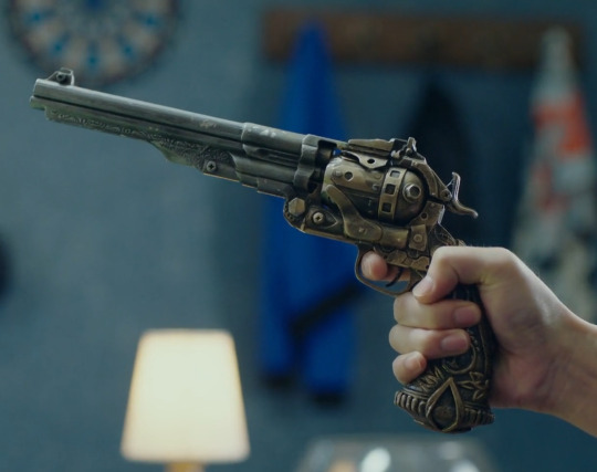
I was actually working on a different Guardian Bingo fill and needed to look something up for continuity, so I'd flipped through a couple of episodes at super high speed trying to find a scene. As luck would have it, one of my skips forward happened to land on the scene I screencapped above, when ZYL confronts Zhang Shi.
Normally we don't get this clear (or this stationary) a shot of the godawful gun prop. I'd assumed all along they had just taken a plastic gun, glued some extra bits and bobs on it to make it look fancy, and hit it with some dry brushing (fun fact: you can watch the paint flake throughout the series; check out the top of the barrel and the side of the cylinder in the above screenshot!) to make it look #steampunk like the abandoned aesthetic of 25% of the show (as I've said before, I have theories about what happened in preproduction, but that's another post). This sort of thing is exactly what I've done for cheap cosplay weapons or background props for film work that aren't going to be seen at HD detail range.
Anyway, since the detail showed up better here than in other shots, I paused the video to look at the random screws and hex bolts (why??) they'd glued on it, since I recalled that I had the aforementioned gun/whip bingo square to fill.
That's when I noticed a detail that had eluded me before: An inverted V shape at the bottom of the grip.

Only looking more closely, that's not an inverted V. It's a symbol that I've seen a whole series of variations of over the past 15+ years... every time there's a new installment of the Assassin's Creed video game series:

So I started hunting. The principal weapons in each game turned up no matches, but eventually I found a gun that looks almost exactly like ZYL's:
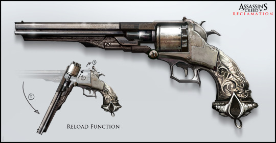
It's not a perfect replica, but the details are certainly all there: The stylized logo; the leaves and swirls on the grip; the feathers up the back; even the Victorian scrollwork beneath the barrel.
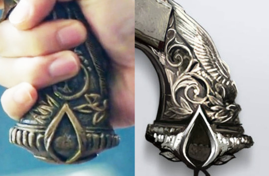
Now, what's really interesting is that this gun isn't actually from the AC game series. It's part of an elaborate fan project by artist David Paget that started as a class assignment back in 2014. Even though it gathered a bit of steam in the AC fandom and generated a couple of forum role-play groups, OCs and the like, nothing about this artwork was ever connected to a real Assassin's Creed title. So why would there be a physical version of a gun that was only someone's fanart?
This is where the smoking gun (*rimshot*) goes missing, because I can't prove any of this, and it's been long enough that digging through the archives of the internet to find answers is going to take way more time than I can afford to spend on a project I'm not getting paid for. But there are two likely possibilities:
Scenario A: Some employee in a toy factory somewhere in China got told, "This Assassin's Creed franchise is really big, so we need to be producing replicas from those games to sell. Work up some designs." So the employee Googles "assassin's creed gun," finds David Paget's very professional-looking art, and whips up a replica to mass-injection-mold without realizing it's not actually from a game. Later, someone on the cash-strapped Guardian production team needs a gun to mod, and finds a cheap toy revolver on clearance after several years of sitting in storage because there was little demand for a replica of a gun that was never in a game. They buy several, glue hex bolts on the cylinder for reasons unknown, and poof! Instant pseudo-steampunk!
Scenario B: Other fans were involved in the design. Someone did build a 3D model of David Paget's design that's still available on Sketchfab (screenshot below), and it's not unreasonable to assume that other fans could have thought it looked cool and built 3D printable models. Later, someone on the cash-strapped Guardian production team needs a gun to mod, and acquires the 3D print file of one of those models from the interwebs. They mod the file a bit, print some, glue hex bolts on the cylinder for reasons unknown, and poof! Instant pseudo-steampunk!
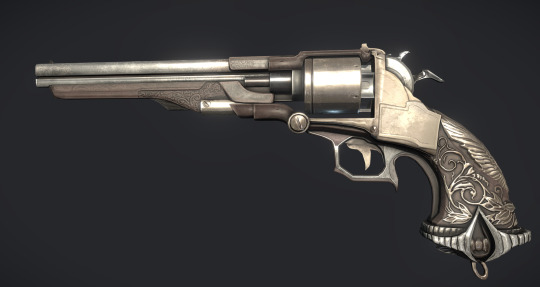
Personally, I find Scenario A far more likely than Scenario B, for two reasons: First, the hero prop looks more injection molded than 3D printed, especially given the technical state of 3D printing back in 2017-8. And second... Budget-challenged dramas do have a history of picking up bulk video game replicas and using them as cheap props. I made a post back in 2019 about the WoW Horde shields we spotted in a different drama...
Anyway, no firm answers about the source of the hero prop -- the world may never know! -- but we have now confirmed that in some alternate universe (possibly one of the first eighty?), Zhao Yunlan and/or Zhao Xinci is an Assassin.
Wait, wait, wait... *recalls mechanics of how the whole Assassin's Creed frame story is supposed to work* Uh... so... who wants to write a genetic memory explanation for the whole Kunlun -> [lots of lifetimes] -> Zhao Yunlan thing?
.
(I did actually check the catalogue of a friend of mine who makes replicas of props from various media franchises to see if he'd done a commission of the David Paget design, since a surprising number of his custom pieces actually do end up on film and television, but while he has a gorgeous replica of a revolver that actually appears in an AC game, it appears he has not done the Zhao Yunlan gun. I didn't really think it likely, since he's in the U.S., but you never know.)
#guardian#zhen hun#c-drama#guardian bingo#assassin's creed#tv props#it's always fun when my various hats end up stacked on top of one another
145 notes
·
View notes
Note
You draw Logan and Scott ‘s physiques so well! Do you use references for drawing muscular physiques or what did you study to get good and make it stylized?
I’ve never found great references to study from but I’m really curious how you practiced and got so good at it?
OMG im so flattered! fr im definitely still learning and im not super confident with my art yet but i'll do my best to answer and maybe it will be helpful!
To answer the first part i always ALWAYS use reference but maybe not in the typical way. Usually i'll try and do the sketch from my mind but im the type who frequently forgets how to draw so i'll usually end up using reference. Typically i have multiple reference categories because 1. it helps avoid just copying others stuff 2. you learn more deeply i find
Here are my typical reference categories
Poses: i tend not to look for poses that look like the character because i think you can get bogged down trying to copy it exactly so for example i'll use a pic with a woman when drawing a man. I also highly recommend using videos if possible you can find alot of great stuff on youtube so for example if im looking for acting reference i'll often watch an always sunny clip (because the i find that the actors have really great hand acting) or for let's say a fight scene ill look up something from an action movie i like, I do this alot because im working on alot of storyboards and animation rn so seeing things frame by frame is very important. In addition i've been studying alot of x men comics because they have some really great fight scenes specifically all new x men. Further note, I usually try to draw the pose by eyeballing it but if im struggling then ill trace over the pic breaking down the forms and then draw it again using the breakdown as a reference (also u dont have to do this but my goodness it helps, is to draw the pose again from memory without looking at the reference I do this alot especially when animating because i want to build a visual library)
STYLE: One of the things which i think is a big hurdle if you're trying to learn anatomy or more specifically how to draw it in a way you find both easy and appealing is just going from irl pics. This is where studying from other artists is essential for me at least because im naked and afraid 99% of the time when it comes to art. So what i'll do is usually breakdown an artist's work that i like down trying to get into their mindset usually; How are they simplfying the form; what shapes are they using and why. I think it's good to micro focus at first so let's say you're finding forearms tricky then just breakdown how the artist draws forearms then draw your version and COMPARE seeing what's different between your version and the artist. Then i might get some irl pics of the subject and im like ok im x artist and i try my best to draw the part in their style, you know kinda imagining how the artist you like distills the same info. I reference a great deal of artists because they all have a great deal of knowledge but also you dont just want to copy one.
ANATOMY: Im the type that usually wants to apply anatomy immediately to what im working on rather than just doing endless drills because it's one thing to draw an arm for example as u usually see in reference which is by the side and completely different when the arm is actually doing something. There are a ton of great resources out there for anatomy but for me at least i think it's important to find references that simplify because again i think building a visual library is best. So for me usually i'll whip out the anatomy reference when im stuck on something and cant remember how to draw it
THE CHARACTER: with some characters like scott i usually dont need a reference but with logan and his silly hair it is essential. since with these two there are so many comics there is a ton of great reference
Further thoughts:
One of the things which i think is super essential at least for me is to try and force yourself to draw from imagination because it's very easy to get stuck in a learning cycle if that makes sense. A nice way to ease yourself into it is to start modifying your pose from the reference so let's say you've drawn the character sitting on a chair now draw it so they're leaning forward or to the side whatever you want! you can also try drawing from a more exaggerated perspective or from a completely different angle! Finally i think it's a great way to loosen up to just doodle poses with no reference just whatever tickles your fancy for this it helps to have a shorthand that you feel you can draw at any angle so even stick figures can work nicely!
i found especially for drawing muscular characters it is best to try cartoony simplification because the anatomy can be quite overwhelming. When i first started to draw logan i used his character sheet from x men evolution and would doodle random poses and then using the model sheet as reference try to put him on model (basically the mindset was what would the animators on the show do) it was really fun and because i had these simple but clear logans adding more detailed anatomy was super easy!
So to elaborate id find lets say a reference of someone eating a salad and then id draw logan in the style of x men evolution eating a salad.
Sorry if this was super rambly i hope it helps!!! i could elaborate if ye require it
17 notes
·
View notes
Note
i like ur art. its great and interesting!! i really like your artstyle and i really like the way u draw hsy, yjh, and kdj. you captured them so well in terms of vibes/character. also i was wondering do u have any advice to improve on drawing anatomy/poses/faces?
wahh thank you so much...!! i feel like im still trying to figure them out in a lot of ways but i do really like ironing out my visual interpretations of them so im really happy to hear if people like what im coming up with
also anon you super activated the part of my brain that cant help but yap about art theory... i spent some time writing as many tips as i could think of. unfortunately i dont think i have the time currently to do a fully illustrated guide, but ill still try to include some visual examples:
[incoming wall of text lol]
ANATOMY:
to preface i think that like 100% of the time you should reference a real life photo for anatomy rather than other artwork or drawn references. the best way to learn the body is by… well, actually looking at the body! but also artwork is informed by a person's own artistic ability/stylization choices/sense of idealism, so while looking at art can help give you an idea on how to break down forms, i think you would be best served observing real life references. i labor on this point because i do think that having over relied on drawn reference material and avoiding photographic references on the basis of not being interested on realism hindered me as a largely self-taught artist as a kid, so i want to encourage live or photographic reference since anatomy is one of the foundations from which everything else is built on. that being the case, all of my doodles i'm doing for this are going to be for the sake of example rather than to strictly say how you should or should not be drawing something
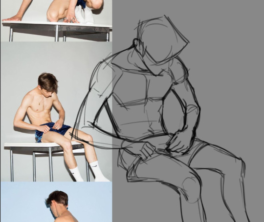
-> when you are doing a study of a photo, just try copying it as best as you can. pay close attention to the natural lines and shapes of the body -- the S-curve shape of the leg, the triangular shape of the forearm, the trapezoid shape of hips/thighs when they sit, and so on. note where the body folds or squishes or pulls; how mass will shift to accommodate a certain position. if a form is hard to visualize, focus on the negative space and carve that out, rather than strictly drawing the positive space.
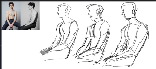
don't expect to get it perfect the first time. in fact, iterate on it multiple times to build understanding. try doing it to a timer of 15, then 10, then 5 minutes. doing this will force you to have to prioritize the most important shapes. you can help reinforce this by using a thicker brush or a brush with no pen pressure (no joke ms paint works great for this) to force you to be loose and not become preoccupied with details.
-> pinterest is a great resource for finding and compiling photo reference material
-> organic shapes are curved, so embracing/emphasizing that (particularly for the extremities) can help make your drawings look more natural or fluid
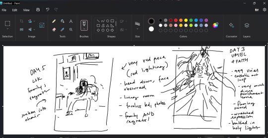
POSES: -> it all begins & ends with contrapposto… you've probably heard of the line of action, which is related. if you're offsetting the shoulders & hips, it: makes poses more natural, more dynamic, and helps the pose sort of "draw itself" -- the legs will follow the direction of the hips, and you can use the arms to reinforce the angles
-> context is key. don't ask: what pose should i draw? instead ask: what do i want this character to convey? what does happiness, anger, sadness, and so forth look on this particular character? how do they express that? consider these drawings: these are both ostensibly the same pose, but look at how changing just the shape of the spine recontextualizes it.
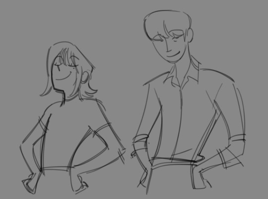
for more on pose design i recommend watching Tracer & Pose Design 101 - The Animation of Overwatch by New Frame Plus (i promise this is a genuinely super informative video).
to expand on this, in general, all of the components of a piece (background, composition, pose, etc.) are best considered in conjunction rather than separately. it is difficult to choose a pose and then choose a background because they are missing the context that would make a piece cohesive. when you are planning a drawing, try to begin with your general concept/idea/prompt and then do several thumbnails -- small and quick doodles that should take no longer than 5 minutes each -- developing it: you may find that the pose and bg will naturally fall into place.
-> silhouette: the degree to which you need to push this varies by style but generally speaking the pose needs to be readable; i.e. instantly recognizable. try to keep important elements of the gesture outside of the silhouette. for example, if the character is pointing, keep that arm out of the interior of the body. the same pose can be more or less readable or dynamic depending on where the character is pointed in relation to the viewer
-> exaggeration!! goes along with the previous point. push the pose as much as you can (and what makes sense for your style) to communicate your pose as clearly and as intensely as possible.
FACES: -> i highly recommend the app Handy Art Reference Tool by Belief Engine for all things related to drawing hands/heads/feet. its on both android and ios. it isn't free -- it costs around $3 -- but that is seriously such a small price to pay for the amount of utility you get out of it: the hands models are fully poseable (there's also pose presets), you can rotate the head models however you want, and there is 3-point customizable lighting. it is really helpful for getting those super tricky and hyperspecific head angles that you just can't find a real life reference for. that being said given that there's only a few different head model variants, bear in mind how differences in features can affect what exactly a face will look like in those angles.
-> i still recommend doing studies of real people. as with anything else, learning generalized proportions is important, even if you are going to later on bend or break this depending on style
-> as for my own approach... it kind of depends on the style i'm doing at that particular time. for my paintings (what id consider my main style) i approach a character with a few real-world features in mind and then apply them to the best of my ability. it usually will take a few iterations to land on an interpretation i really like as i try out different things. a lot of the face also gets developed during rendering rather than through my initial sketch too, as i adjust for lighting and correct proportions on the fly
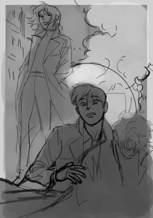
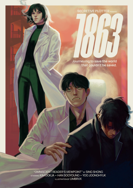
(look how much this image changes between sketch and render lol)
if i were to recommend anything, i think it would be to nail down your most distinct features first -- the ones that will make your character's face recognizable, and could apply regardless of art style. in my case with kim dokja, i knew when i first started drawing him that i wanted to give him a longer face and down-turned eyes. when i decided to do the disco elysium inspired set, in which i was breaking out of my comfort zone by letting go of any idealizations focusing on conveying characterization/making them feel "real", i landed on some more specific traits (defined lower lids/perpetually tired eyes/eyebags(?) the crease there idk how to describe it) which i continue to try to evoke even if im drawing something much more cartoony
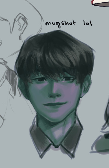
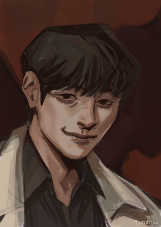

(pictured are my first kdj -> disco elysium style -> my post de-style kdj)
as a side note, this very same process changed yjh much more dramatically

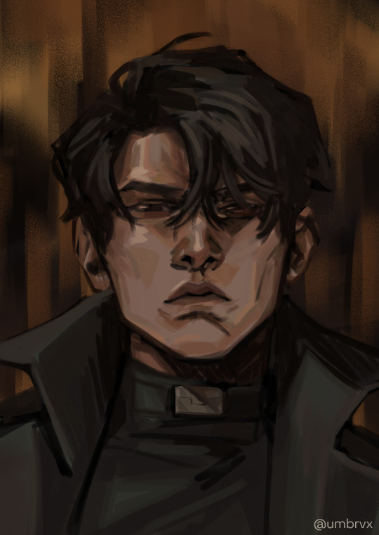
(^ that first guy is mad someone else)
those handful of key features will be the thing that you can then take into a simpler style and simplify or exaggerate to whatever degree suits you. you can also play with shape theory (square = sturdy/solid, circle = natural/smooth/welcoming, triangle = energetic/dangerous). shape theory doesn't necessarily need to be so rigid -- you can combine shapes as you please to convey whatever vibe you're going for -- so please think of it as a tool that may help rather than a rigid law you must abide by.
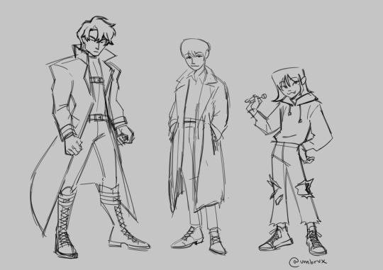
-> expressions: exaggerate them. thats kind of it!! make it big!!! you wanna be able to really feel those emotions. the principles of squash & stretch help here: think of how the muscles move when you, say, open the eyes or mouth really big. as one side of the face stretches open, the other side squashes to accommodate it

even without changing the position of the jaw here, moving the nose and scrunching the eyes will sell the expression
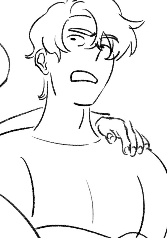
you can also play with squash/stretch to break proportions to sell a feeling more
since expressions are just, well, poses for the face, everything else for poses applies here (and facial expressions & pose should also be considered in tandem). while the term contrapposto itself just refers to the offset of the shoulders & hips, the similar principle of asymmetry also carries here as that will help make the expression a bit more dynamic.
and i think... that's it!! all i can think of at least. i hope it helps anon!!!
#umbrvx.ask#sorry the reply took a minute i have been writing this post since i got the ask im so serious#i tried to determine what advice i could give that would be the most immediately actionable#also sorry its a huge wall of text im a little crazy about learning and discussing art theory . oops (the yapper)
44 notes
·
View notes
Text
Bestiaryposting Results: Miscellaneous "Worms"
Here is what I intended to be our final Bestiarypost: all the animals from the "worms" section of the Aberdeen Bestiary.
I checked, there's not a big missing portion this time. "Worms" only get two pages.
I put quotation marks around "Worms" here because what medieval writers would call "worms" and what we would call "worms" are not the same. The medieval sense is somewhat preserved in the modern word "vermin", but in other ways it's closer to "bugs". Really, it's broader than either of those terms are for us, because it more or less means "any animals that are very very small."
Anyway, if you don't know what I'm talking about, answers can be found at https://maniculum.tumblr.com/bestiaryposting.
If you want to see the entry people are working from, it's here:
And if you want to see the entry for the next (and, unless something goes awry, final) week of Bestiaryposting, it's here:
Now, art below the cut:
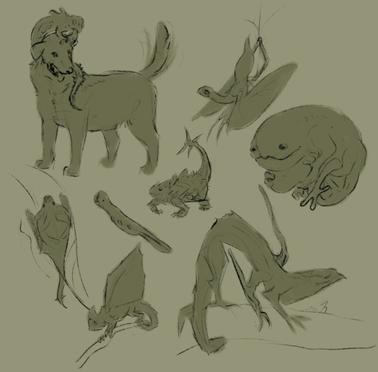
@silverhart-makes-art (link to post here) decided to make these into wyrms, with a "y", and I think they came out well. The Lenggalgak and Shmigwanog are probably the coolest-looking, but I also like the Phlerotger. Silverhart calls it a "horrible little creature" but I think it's charming how... shameless it looks about that. More details on all of these in the linked post.
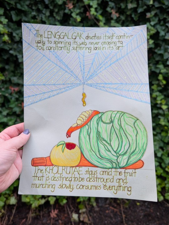
@wendievergreen (link to post here) has drawn two of them in this very nicely stylized artwork here. I like the detail added by including the Lenggalgak's web and some plants for the Kholruntae to eat. I really like the inclusion of evocative bits from the entry as captions. (Also, thank you for including alt text.)
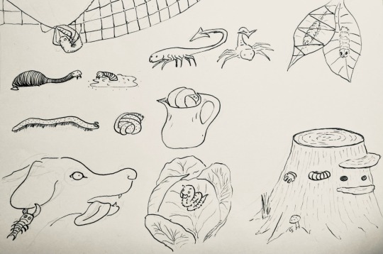
@cheapsweets (link to post here) has done the whole set here. I like the depiction of the Khrezaroth swelling in a pitcher, and the kind of charmingly goofy Phlerotger. Also they pretty clearly have the Logkashgae's number -- which is to be expected, given where this whole project started.
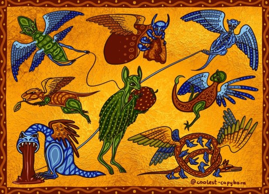
@coolest-capybara decided to go with the theme of "what medieval illustrators might draw when they have no idea what the animal is and decide to get weird with it." I absolutely love all of these, but I think the Khrezaroth is running away with this one. All of them really would fit into the margins of a suitably fancy medieval manuscript. (And I think they might also have clocked the Logkashgae, judging by the face.)
Now, the Aberdeen Bestiary. None of these get illustrations -- they're just brief little blurbs crammed into two pages, so there didn't seem to be any motivation to add pictures.
The section does, however, start with this rather nice inhabited initial:
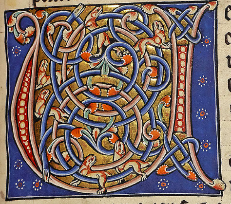
(This is of course the first letter of "Uermis".)
The entry starts with this helpful introduction:
Here begins the account of worms The worm is a creature which generally springs from flesh, or wood or some other earthly material, but not as the result of intercourse, although occasionally they are hatched from eggs, like the scorpion. There are worms that live in earth or in water, in air, in flesh, in leaves or in wood, or in clothes.
Again they are trying to define "worm", but the fact of the matter is that it's mostly vibes-based. The author suggests that worms are anything formed through spontaneous generation, but then notes that some of them, like scorpions, lay eggs. And, of course, in the Miscellaneous Mammals entry, we learned that mice form through spontaneous generation, but they're not listed with the worms.
Anyway, here are their identities:
Lenggalgak
This is of course the spider, which is apparently called aranea on account of it living on air. Maybe the author didn't know what the web was actually for, and figured its tendency to catch insects was an accident.
Khrezaroth
The worm with many feet that rolls in a ball is the millipede. I haven't seen any swell in pitchers, but I'm sure they could if they wanted.
Phlerotger
The bloodsucker is the leech, naturally. "So called" because the Latin term given by the author is sanguissuga.
Logkashgae
In a bit of a full-circle moment, this is the scorpion. I've written a lot about these already, so we'll just move on.
Burlebroth
The worm that makes silk is the silkworm, surprising nobody, I'm sure. I can't explain the name thing this time, because the Latin name given is bombocis.
Kholruntae
Interestingly, this is the caterpillar. Odd that it is specified not to fly, when in fact it's one of the only ones on this list that does. Just... not until after it metamorphoses.
Shmigwanog
The wood worm is the termite, which makes sense.
Feabladtae
Finally, the worm that sticks to dogs' ears is the tick.
Misc.
There are also several that I intentionally left out this time, because there was even less of them to make into these little entries. Here's the rest for your perusal, however:
The worm found in clothes is called tinea because it gnaws at fabrics, and burrows into them until they are eaten away. For this reason, it is called pertinacious, pertinax, because it works away all the time at the same thing. Worms of the body are the emigramus, the stomach-worm, the ascaride, the coste, the louse, the flea, the lendex, the tarmus, the tick, the usia, the bug. The emigramus is a worm of the head. The stomach-worm, lumbricus, creeps into or lives in the loins, lumbus. Lice, pediculi, are worms of the body which get their name from their feet, pedes; people on whose bodies lice swarm are called lousy, pediculosi. Fleas, pulices, however, are so called because they live mainly on dust, pulvis. The tarmus is a worm found in pork fat... The usia is a worm found in pigs, so called because it burns, urere. For when it bites, the place burns so much that blisters form. The bug, cimex, gets its name from its resemblance to a plant which has the same stench; properly speaking, this worm originates in putrid meat.
There is also this helpful little conclusion:
To repeat, you find the moth in clothes, the caterpillar in vegetables, the termite in wood and the tarmus in pork fat. The worm does not crawl like a snake with visible steps or by the pressure of its scales, because it lacks the firm spine which you find in snakes; but, moving in a straight line, by expanding the contracted parts and contracting the expanded parts of its little body, it unfolds in motion and, impelled in this way, creeps forwards.
So there you have it. Worms.
#maniculum bestiaryposting#maniculum miscellaneousworms#Lenggalgak#Khrezaroth#Phlerotger#Logkashgae#Burlebroth#Kholruntae#Shmigwanog#Feabladtae
19 notes
·
View notes
Text

Bang Creator Interview: Tumblr: @vaamiel | AO3: vaamiel
The Collaboration period has begun! In these quiet months before works are due, we want to foster a sense of excitement, camaraderie, and celebration among our participants. To that end, all participants were given the option of a formal interview by our mod, Dema, or an informal “ask-game” survey. We hope you enjoy getting to know our phenomenal creators as much as we have!

Interview with Vaamiel
Vaamiel and Dema talk artistic development, childhood anime obsessions (-cough-Naruto-cough), and hoping to see Dorian in DA4
Dema: So, I know you take commissions, but have you done many exchanges before? Any Big Bangs?
Vaamiel: I've done a handful of exchanges over the years, but nothing really substantial. No big bangs either - though I've certainly read enough fics and seen enough art that others have done, haha. I'm sort of just... dipping my toes into the world of fanart for the first time since I was a teenager, so even though I've been drawing for ages, a lot of this is completely new territory for me.
Dema: Oh that is awesome! Welcome to the bang! What led you to return to fanart?
Vaamiel: I think a combination of a couple things: confidence in my own ability plays a big part of it – it's really intimidating to draw characters that I love so much and translating them into my style has always been difficult – but this past year is also the first time I've been really passionate about a game in... well, about a decade, and I think that's led to more experimentation and willingness to stick to learning subject matter that I otherwise struggle with. Mostly, Dragon Age coming back and Baldur's Gate 3 being out at the same time really pushed me back into the world of wanting to participate in fandom from more than the sidelines.
Dema: I really love your work. Artist to artist, how did you develop that confidence and style expression? What has that journey looked like for you?
Vaamiel: Thank you so much! It's funny actually, because the way I draw now has kind of... always been my style? It's just my technique and understanding of fundamentals that has improved. I can look back through my childhood sketchbooks and go, this was for SURE made by the same person, haha. As a kid I was all about anime and comics and games – particularly early gamecube and xbox stuff that relied on very stylized graphics to compensate for the technology. All of those things really saturated my brain and effectively became super tied to my own understanding of art and artistry and how I wanted to make art.
I've tried to emulate other styles or artists' techniques over the years, but (and I think this ties back to why I struggle with fanart) my own voice is so strong in my work that it really took all the joy out of creating. I've learnt over time that my personal art evolution is all about small changes and improvements, rather than trying to force ideas or ability through radical stylistic changes. Basically, I draw what I like and add things here or there as I come across something that I think would fit organically into my own style. That's been things like brushes or expressions or even the way I structure my sketches - all things that are small but can make a big difference in the overall picture. Add to that how my confidence has improved as my actual ability has improved, I think I've really organically grown into being better able to wrangle my style and apply that to fanart, original art, et cetera.
Dema: So now I do have to ask what fanart you were making as a kid and high-schooler? (I was a Sailor Moon kid. Sailor Scouts for ALL the most obscure celestial bodies one can imagine 😂)
Vaamiel: Hah! oh no 😂I was CRAZY about Naruto as a kid - actually, the first fanfiction I ever read was Naruto fanfiction. Then after that it was Homestuck, Inuyasha, Steven Universe, Pokemon, Dragon Age/Mass Effect... not necessarily in that order! I wish I was a Sailor Moon kid to be honest – would be WAY cooler than admitting I was a Naruto kid!
Dema: Inuyasha!!!!
Vaamiel: YES!
Dema: To be fair I am older than you by a pretty big margin LOL, I probably would have been a Naruto kid as well.
Vaamiel: LOL fair enough! It was in just the right time slot on cable when I was about...9 that the 4kids dub formed the foundation of my entire personality from that point onward.
Dema: So cute! Was there a particular moment that got you into Dragon Age fanwork?
Vaamiel: So, for my own work, I think it was the trailer last Dragon Age day and then in… January of this year or so, replaying Origins that had the cup finally spill over and I sat down and started making fanart. It was like my love for the series hit critical mass and with Veilguard coming up, it felt like the perfect time to actually try to make it work, you know? When it comes to appreciating Dragon Age fanart as a fan, it was two creators from tumblr that did it. Crystalvfae did a series of fanart that fundamentally altered my brain chemistry (I still look back on their painting of Morrigan and sigh sometimes - it is SO good). Then I found Spicyshimmy and was never the same. Their Anders/Hawke work is so special and got me into reading fanfiction voraciously in general. It totally reignited my love for reading and was the thing that got me into AO3!
Dema: Is there any specific bit of Veilguard that has you most excited? Or are you mostly avoiding spoilers?
Vaamiel: I am SO all in on all the Veilguard content honestly. I love trying to pick little bits out of the trailers and stills we've gotten so far and make connections to the lore/put together potential plot theories. I think I'm so excited for all of it? Like, I'm just ready to get back into the world of Thedas itself and experience a cool new story. Of course, I do love the graphical upgrade and all the locations we've seen so far and the costuming!! It's really all been exactly what I've been wanting. Also seeing Dorian again. That's probably pretty up there too.
Dema: Yes! Man. I cannot believe how cool Minrathous is. Dorian tried to tell us, but I am still flabbergasted.
Vaamiel: He was right!! All along!!! We really were in a different century.
Dema: As far as the current collaboration process goes, how are you feeling? Are the ideas percolating? Are the sketches sketching?
Vaamiel: Yes! I feel amazing about the partnership I've got!! I've got some scenes that I've got some sketches going for already – as soon as I read my fic I could see exactly where I wanted to take the art. The atmosphere is so good and the writing lends itself perfectly to the kind of pieces that I love to make. I'm really, really excited to be creating for this fic and collaboration!
Dema: I am delighted to hear that, we cannot wait to see what everyone creates!
Vaamiel: That was Very Difficult to be appropriately vague for haha - it really is an absolute delight to be working with my partners and I can't wait to talk about this fic and the art I'm making for it.
Dema: It is soooo hard to ask questions that are not POINTED hahahahaha, as someone on the inside who knows everyone's matches. You get an A+
Vaamiel: Yay!!!! I’m glad I was able to keep things appropriately mysterious 😌
Dema: Thank you so much for taking the time to chat with me today, it has been super fun!
Vaamiel: Absolutely! Thank you so much for hosting this interview and all the work you've put in for this event!! This has been a blast!
#fandom big bang#dragon age#dragon age fanfic#2024 interviews#Artist interviews#da4 spoilers#da4 speculation
12 notes
·
View notes