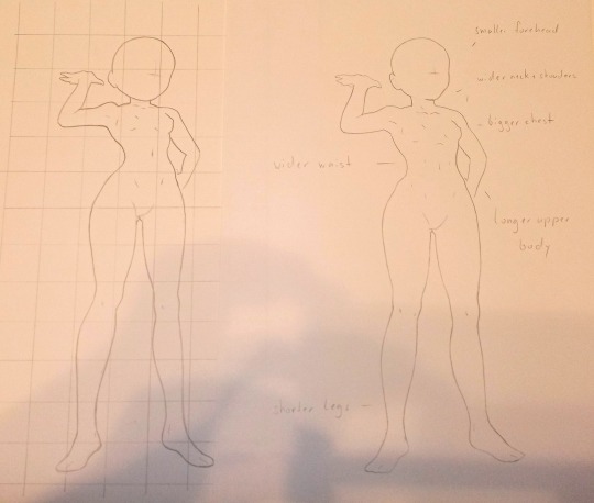
#proportions
Explore tagged Tumblr posts
incorrectbatfam · 7 months ago
Text
Tumblr media
2K notes · View notes
skulsakz · 2 months ago
Text
Tumblr media Tumblr media
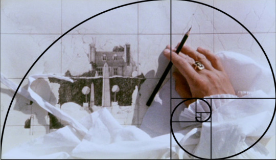
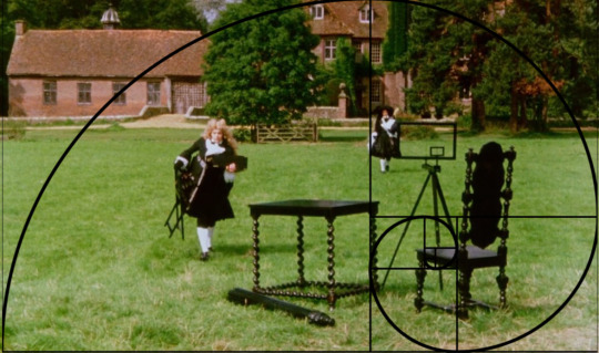
the draughtman’s contract, 1982
220 notes · View notes
Text
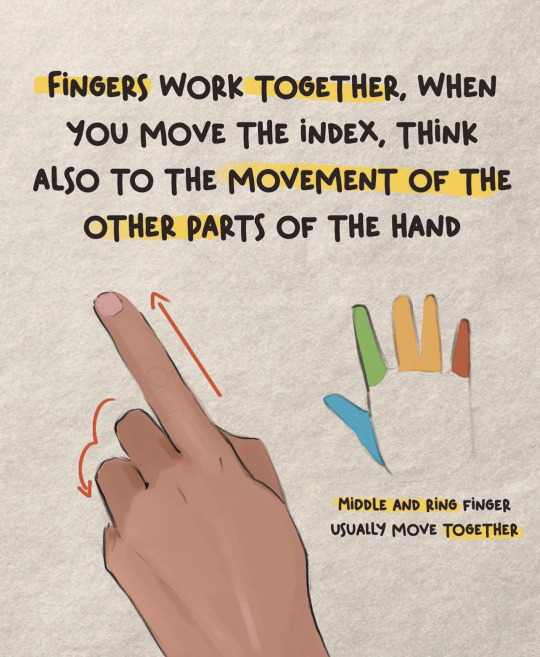
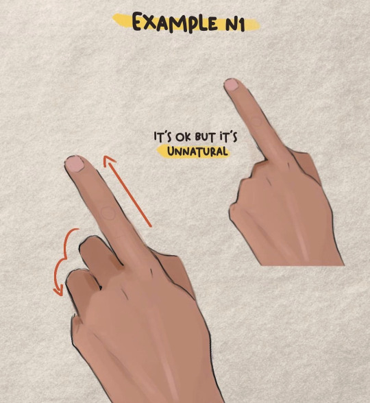
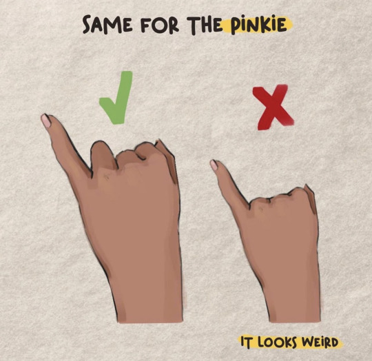
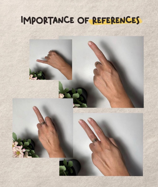
How to draw: The position of the Fingers in Hand Poses Correctly (FINGERS WORK TOGETHER)
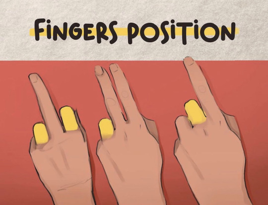
Tumblr media Tumblr media Tumblr media Tumblr media Tumblr media
Credit: Valentart_
2K notes · View notes
ninximagiccat · 4 months ago
Text
XD
63 notes · View notes
nr1-logo-design-inspiration · 4 months ago
Text
Tumblr media
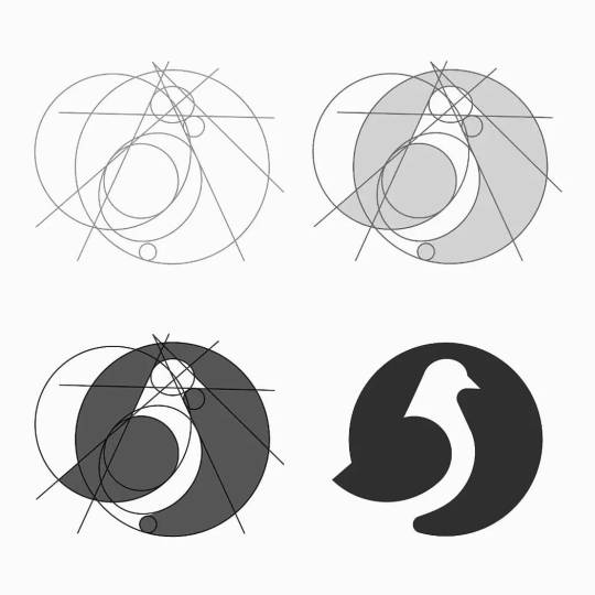
Pigeon logo - creative process ♡
Need a logo for your business? PM us!
72 notes · View notes
danskjavlarna · 2 months ago
Photo
Tumblr media
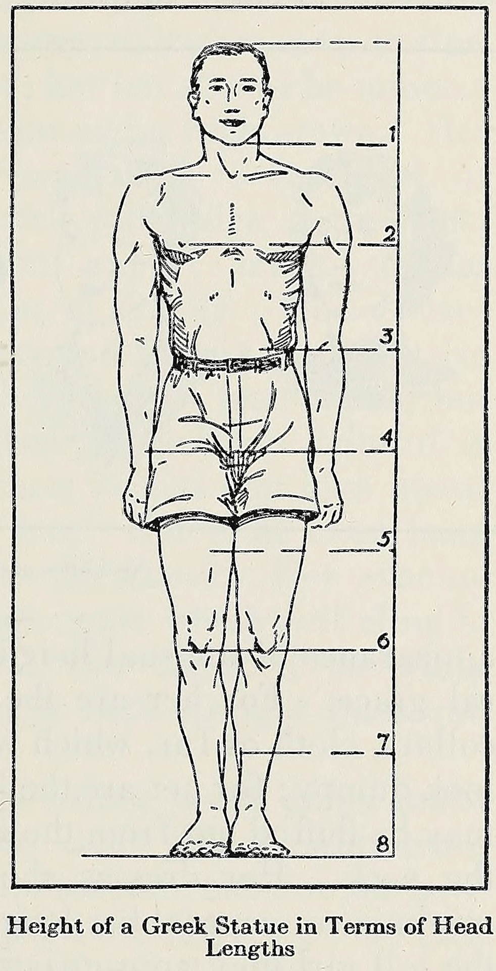
Source details and larger version.
Some strange and unusual vintage diagrams.
32 notes · View notes
snazzyraccoon · 6 months ago
Text
So hear me out ✨✨ Most opposite aus I see tend to literally just switch the positions of catnap and dogday BUT…
I liked the idea that while dogday is more opinionated and loud etc, like more likely to stand up for what he believes in even against his best friend - Catnap would do the opposite! When DD of this one like tries to convince the other critters, catnap is the only one that follows because he’s quieter and more like free flowing?? Basically joins DD because he wants to join his best friend and make him happy even if he doesn’t particularly believe in the prototype! Does that make sense?? 😭
So instead of being tied up as badly as we find DD originally, catnap in this version is found chained in that room that was speculated to be theirs in the main game with more mobility and “freedom” that original DD had. CN is still a bit miserable tho 😓
Tumblr media
The gas of dogday is still physically them opposite, wakes people up/ doesn’t let them sleep ✨The arms will be another story
58 notes · View notes
fatpikachuu · 1 month ago
Text
Tumblr media
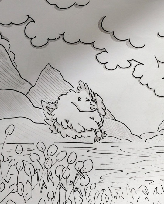
BAWKtober Day 21 Lake
21 notes · View notes
robinsceramics · 1 year ago
Text
157 notes · View notes
sonicjustbecause · 10 months ago
Text
Neotenic characters with huge head when they lie on teir back.
Tumblr media
When standing the round shape of their head goes far back, is quite difficult to not make them look awkward when supine (not true only for Sonic characters)...
Tumblr media
in 2D it can... somewhat work, in 3D however is harder... to not forget sonic and his friends also have large foot.
Tumblr media Tumblr media Tumblr media Tumblr media Tumblr media Tumblr media Tumblr media
you can ignore that quills are stiff and make behave them like hair when necessary, still cheating with the cranium is tricky. Even those who don't know how to draw know wery well the consistence of the cranium and if you make it soft, everybody would think something is off.
Tumblr media Tumblr media Tumblr media Tumblr media
Something to consider (and this is the reason why my characters tend to have smaller heads... even children).
50 notes · View notes
incorrectbatfam · 8 months ago
Text
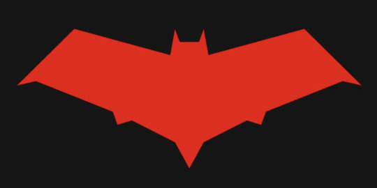
Let's give the Batman logo a makeover
Tumblr media
If this goes well I might do the rest of the fam (and other characters) too
2K notes · View notes
etinceelle · 6 months ago
Text
I've been thinking about it for some time now, and I don't know if that can be seen in my art but I'm trying to give a more realistic and adult look to my characters, because some of the proportions have been bugging me for a while (especially with the eyes).
Last year with RWBY I took a really anime style, and it's not a bad thing of course ! I just feel like I really want something that looks like "real", but still not too much, because I like cartoon style lol (Arcane is honestly a good example of how I'd my characters to be).
Like this looks so pretty and painterly while having realistic proportions, face details and shapes. I'll have to study that style again aha
Tumblr media
46 notes · View notes
whenhatemeetslove · 7 months ago
Text
Tumblr media Tumblr media Tumblr media Tumblr media
32 notes · View notes
petricorah · 1 year ago
Text
Tumblr media
Thanks for the ask, @strrwbrrryjam ! i'm flattered that you think I do a good job of that, because I'm still learning! (and I also struggle heavily with proportions. I have to resize my heads and arms so, so much...)
I'm afraid I don't have any secrets. I think the answer is to just practice, over and over again. But specifically, this is what I try to focus on as I'm learning:
references
quick practices - 30 second to 5 minute studies that help with getting a full scope of the shape and energy of the body, not meant to be perfect
studies - deep dives into certain anatomical structures (videos linked below)
Below the cut is how I use references go from this to this:
Tumblr media Tumblr media
References:
Use a bunch of references! Pictures you take, stock images, from shows--practice real people. Even if your style is heavily stylized, it all starts from an understanding of anatomy.
How I Use a Reference When I Struggle With Proportions:
The first step I take while looking at a reference is to just draw a very loose sketch with a line of action that goes then entire length of the piece, and I try to section it out. I find if I don't think about the body as a whole, and just start drawing a head, the head will be way bigger than the rest of the image. So my first step is just really boxy and basic, just to get all appendages on paper. My first pass could look like this:
Tumblr media
Okay, not bad. But the right arm is going way too far down--the forearm is really long. The head is too big for the style I want, and the left arm is at a 90 degree angle, unlike the picture. But, I have the general scope of everything on the page, so it's easier to adjust and look at the full picture!
Then, I try to focus on landmarks. I look at where certain body parts fall in the reference. For instance, Blackbeard's right elbow doesn't reach his belt, so his elbow shouldn't be near his waist. I can tell that his left arm is closer to being straight than at a right angle, and I can see that his head isn't as big on his shoulders as I have. I can also look at the negative space and see that the gaps between his right arm need to be smaller. So my next pass might look like this:
(I don't usually draw on the reference image, and I just "draw" the lines in my mind, but the for sake of things...)
Tumblr media
Now it's looking a bit closer!
The next is the harder part. It's making things shapes, and is closer to the lineart stage. I try to follow curves, separate the chest from the torso, get the angle of the shoulders and head, etc. I have some video links at the end that explain this step much more in def.
Tumblr media
You may notice that the head angle is a bit different than the image, and the shoulders are a bit lower. Sometimes, following a reference image completely either doesn't fit your style or, in some cases, the more accurate drawing following a reference can actually look "wrong" (anatomically) when drawn. Figure out what works best for you, and for the message you're trying to get across in the piece!
[sliiiight flashing in timelapse]
And here is the final timelapse, with a little refining and polishing of the anatomy. Not everything is completely accurate to the reference image, but I've created a believable image in the likeness.
I hope this helped! This was a quick and dirty post of something I'm still learning. Here are some youtube tutorial artists, resources, and books that I use to learn!
Youtube:
-ModerndayJames has lots of videos on creating shapes and understanding anatomy, and placing people in perspective. He has a lot of free videos, and then some cheap ones on gumroad that go more into it.
-Proko has lots of videos on anatomy!
Practice Resources:
-Pose Maniacs - figures in different poses. You can move the camera around to see different angles.
-QuickPoses has images for figure drawing and quick gesture drawing! You can even have different timers.
Books:
Morpho Series. There used to be the one on "Fat and Skin Folds" that was a free PDF download that was on tumblr for a while, but I don't believe the books are that expensive.
Taco's Books, published by Lezhin. This is heavily anime styled, but talks a lot about anatomy, and is a great resource!
59 notes · View notes
nr1-logo-design-inspiration · 10 months ago
Text
Tumblr media
Grids & proportion behind McDonald's logo ☆
Need a professional logo for your business? PM us for details!
102 notes · View notes
thearunadragon · 1 month ago
Text
Tumblr media
Vanir during Eragon’s training in Ellesméra. (Recent pencil sketches will eventually receive their digital versions.)
12 notes · View notes