#playing with the font styles
Explore tagged Tumblr posts
Text
"Be not afraid of greatness,

Some are born great...

Some achieve greatness...
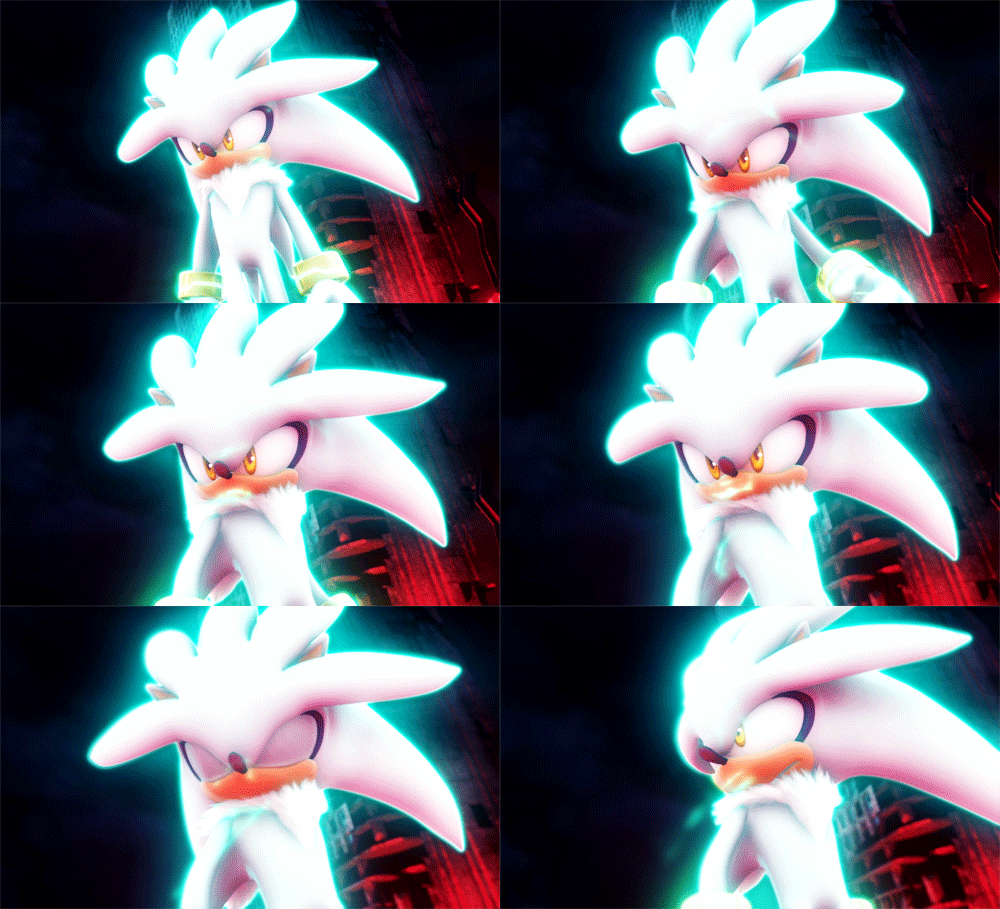
And some have greatness thrust upon them."
#sonic the hedgehog#shadow the hedgehog#silver the hedgehog#sonic#sth#sonic trash#be not afraid of greatness quote#playing with the font styles
26 notes
·
View notes
Text
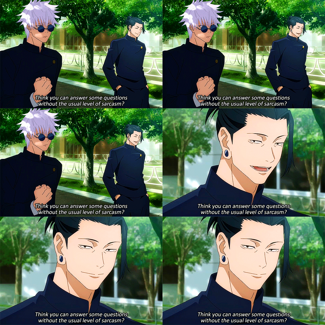
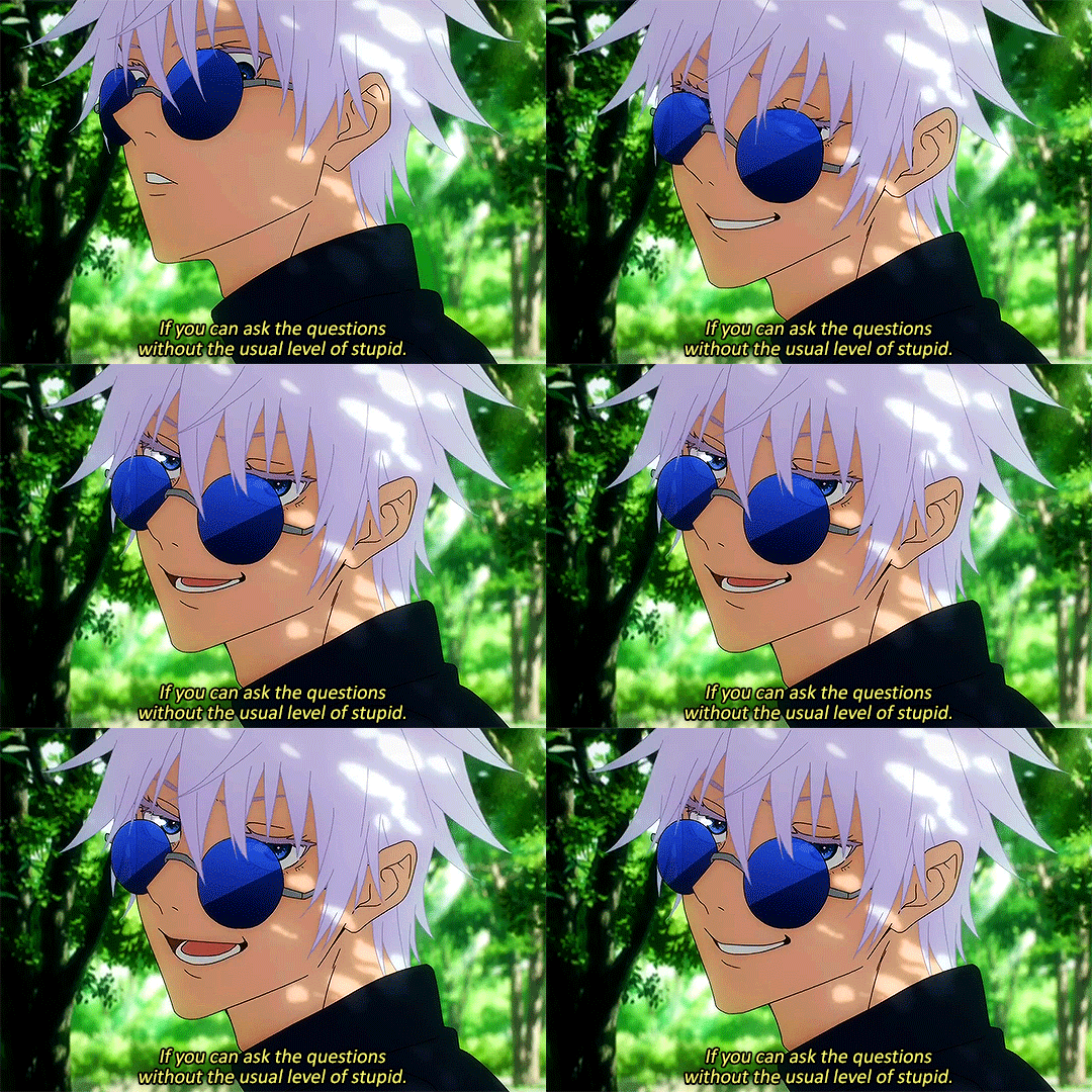
incorrect jjk quotes [34/?]
#can you tell that I keep playing around with the font size and style cause I just simply cannot settle on one damn font size#especially when it's only one line or when it's multiple lines#fuck me I guess#ipost#Jujutsu Kaisen#JJK#dailyanime#anisource#shounenedit#jjkedit#hyeahjujutsu#Gojo Satoru#Gojo#Satoru#Geto Suguru#Geto#Suguru#incorrent jjk quotes#incorrect jjk#incorrent jujutsu kaisen quotes#Gege Akutami#Mappa
665 notes
·
View notes
Text
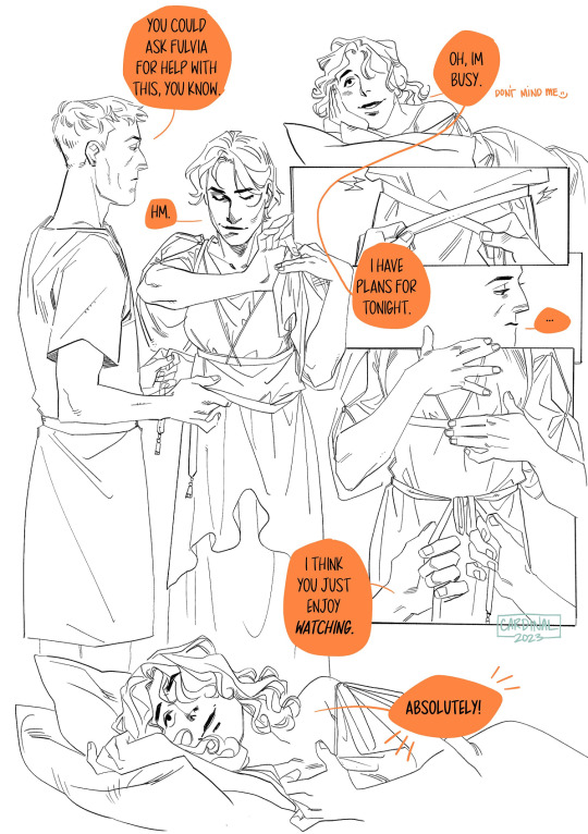
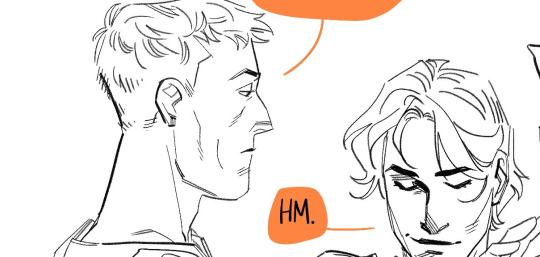
some kind of. addition? not quite a sequel. to the last bona dea related thing I posted
I was reading the timeline debates on dating fulvia's marriage to clodius! mostly, I think it's fun if she gets to watch whatever....this is.
bsky ⭐ pixiv ⭐ pillowfort ⭐ cohost
#enjoy your evening plans fulvia!#drawing tag#roman republic tag#komiks tag#EUGH. this was mostly to test out a font and also to play around with inking styles. usually l like a dead line weight but i do#enjoy flex nibs. i will not deny that#Fulvia#marcus licinius crassus#publius clodius pulcher
372 notes
·
View notes
Text
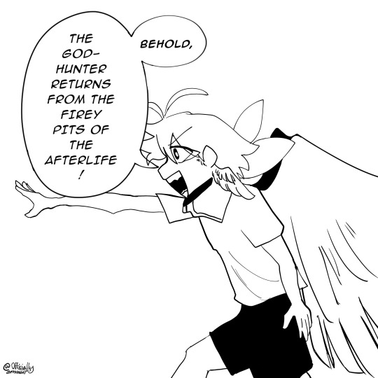
low effort drawing ~15min
(his right arm is probably too long but f it)
#and 5minutes was spent figuring out how to import font smh#saffron as a kid playing make-believe T0T 🙏🏻#*wipes a tear*#foreshadowing? What foreshadowing#art#digital art#artwork#ibis paint x#my art#artists on tumblr#saffron#deceiver#Comic-esque#comic style#oc artwork#oc#oc art#ocs#my ocs#original character#drawing#wip
20 notes
·
View notes
Text
why am i like this
why am i the type of person who'll sit down to finally answer a very sweet ask about My Guys, and instead of doing that, or anything that's of any interest to anyone else, spend an hour just picking through fonts to see what could be fitting for each of their handwritings.
i'm still wearing my streetclothes, and i've bespoke fonts chosen for 11 of my characters now
......... at least now i could write fake notes and stuff in their name if i wanted, that's something
#squirrel speaks#some are appropriately pompous#some are far less so#it's difficult to find a font that shows that a character only learned to read and write like. a year ago#the only ones who don't have fonts in my mind are tanner coris and mara#literally just because i've not played them enough in their respective games yet#whoo i'm down the deep end aren't i#recently found a google docs template that's styled like a wiki article; am i ranged enough to try and make little profiles for everyone
18 notes
·
View notes
Text
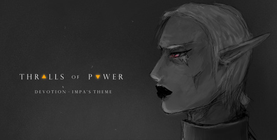
devotion. (Impa's main theme from my ongoing Zelda fan animatic project, Thralls of Power)
#impa#oot#tloz#thralls of power#animatic project#my music#my art#there it is!!!!#scaryyyy#I probably won't use the music exactly as is but it serves as a base#playing with zelda leitmotifs is basically playing with lego and see how to fit ideas together and it's pretty fun#I think I did something completely unnoticeable but interesting also with the instrument choices#that very very subtly speaks of her Many Problems#(Impa has Many Problems in this story u_u)#(edgy and owning it over here!!!!)#(also!! first tentative title font and styling!!)
22 notes
·
View notes
Text
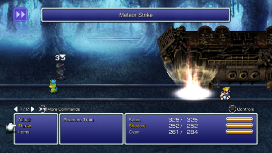
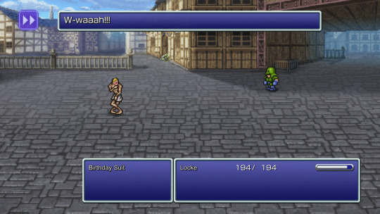


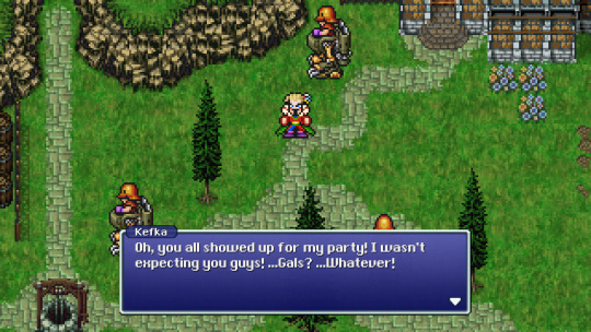
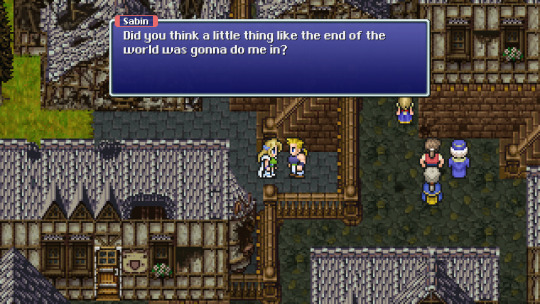
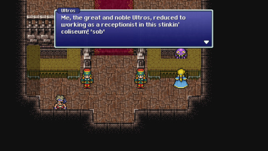


Finally played through the Pixel Remaster of Final Fantasy VI, it was a game
#Kermis plays video games#Final Fantasy VI#Final Fantasy#took me around 40 hours. I didn't do all the optional content but I did recruit all the party members#the default English font in this version is terrible though#I'm glad they patched in a more pixelated font later but even that still left something to be desired#luckily the Steam version is moddable so I added the font from the SNES original to it#if you're playing the PC release you can also delete the font_en file in the game directory and replace it with a copy of the font_ja file#and you get a more standard/less shrunken down & narrow font like you see in the first two screenshots#the auto-battle feature and being able to change between the original and redone soundtrack were nice#the opera scene being redone with actual sung vocals and a 2.5D graphical style reminiscent of some DS games was cool as hell
8 notes
·
View notes
Text
is it weird to be so extremely uncomfortable with paragraphs with lines that are unequal or lacking a consistent, harmonious transition in length that you have to edit what you write specifically to create a less aesthetically jarring presentation bc it bothers you. or is it normal
#probably to delete but.#just realizing exactly how much i cannot let a paragraph be gross to look at#like. writing my thesis conference paper and realizing im spending so long on each paragraph just so there's no weird gaps of space#minor discrepancies are fine-ish although they still bug#but like. i worry that im spending a not insignificant amount of time on it#it's not even about other people seeing it its just me and me feeling like its wrong to leave it like that#like i do it with non-academic work including personal stuff that only i see#i like physically cant leave a paragraph with a major gap in it (unless like. its poetry or a specific writing choice or something)#(said remembering when i was a sophomore in high school and thought i was so so so so so clever playing with font style in my assignment)
3 notes
·
View notes
Text
quinn is driving me crazy like I KNOW I would like her character if this was any other show but her entire vibe and personality doesn't match the energy of the show at aaaaaall
#she has a different character style from any other character in the show. it's like they wrote her in a different font#the way she behaves and stuff. the way the actress delivers the lines. it doesn't match the other characters!#ncis acting is a very ''read your lines and go'' kind of show#so when a character deviates from that it looks so out of place#even her facial expressions don't match the acting of the main cast. you know?#it's like they cropped her from a different show and tapped her on top of ncis idk how else to explain this 😭#I'd love her if this was any other show#the sex dream about gibbs plot? hilarious. but her acting during it is soooo out of place for this kind of goofy plot#ncis acting is more school play-like. it's not as flowy as her acting. I guess that's my point#theo watches ncis*#rambles*
0 notes
Text
Ahm, hello Life is Strange fandom- I got an announcement
I have been working on my own LiS fan visual novel

This is VortexVN,
You play as Victoria waking up from a hangover with no memory of the week prior, you are tasked with piecing together what happened between her and one of the 4 love interests.

And of course the love interests are:
-Chloe (Chaseprice)
-Max (Chasefield)
-Kate (Chasemarsh)
-Rachel (Amberchase)


The game starts with a quiz; you unlock a route by picking answers related to the character you wanna romance (they are very obvious)
It takes place in an AU where the events of LiS1 and BtS didn't really happen and there are no special powers, Victoria's still a bi tch- I guess that's her special powers.
Think of this game as a spiritual successor to Love is Strange by Team Rumblebee rather than Life is Strange 1


Gameplay so far is your typical point and click visual novel affair, you will be given options to explore rooms, examine objects and talk to other characters- the interactions will play a crucial part in how the game ends,
You can win the girl or get rejected or worse... It will depend on how Victoria carried herself throughout the game,
Mistreating certain characters may prove to be a dealbreaker for the love interest,
Each girl has two close friends in the dorm that you should not upset (I'll reveal who in the guide pdf)
This game is also perfect for Victoria haters as you can ruin her life

The game has its own journal system that will be different depending on who you're romancing, it also comes with a read button (I blurred most of the text so you can get curious and play the game)
Read button will display the journal content in Open Dyslexic font
In the demo you'll only get to explore Victoria's room and the dorm hallways and you'll get two encounters from Juliet (Showers) and Alyssa (Hallway)

VortexVN is still in development, I have finished part.1 of the project and will start polishing it soon- the initial build of part.1 will be available to play as a demo!
The cutscenes lack color and proper shading at the moment and you will find placeholders as well, the art style is all over the place- this will change after the polishing phase
Download links:
Mac and Windows
Web browser ver (I don't recommend that you play it on mobile, also the web version lacks animation and takes forever to load graphics)
programs used:
-Renpy (visual novel engine)
-Photoshop CS5 (Drawing/rendering/animating/designing)
-Clips studio (Texturing)
-tablet: XP-Pen Artist 13
Note: I'm not monetizing this project nor do I claim ownership of the Life is Strange ip, all materials and assets presented in this visual novel were either created by me or are royalty free- I did not lift anything from the games via data mining or by leaks
This game is not a response to or a gotcha at Life is Strange Double Exposure or Deck Nine, I didn't really dislike the game
Besides, I've had the idea of a Victoria centric fan game since the first LiS back in 2015
I'm open for feedbacks! You can DM me or reblog this with a review or something- maybe write a comment.
#life is strange#lis#victoria chase#chloe price#max caulfield#kate marsh#rachel amber#chasemarsh#chaseprice#chasefield#amberchase#life is strange before the storm#lis bts#alyssa anderson#juliet watson#VortexVN
943 notes
·
View notes
Text
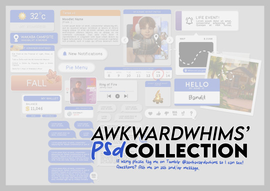
In celebration of reaching 900 followers!
Ever since I started playing the Globetrotter challenge by @moonfi; I've been creating a collection of UI Widget style templates. This collection includes 20(ish) different templates for you to use in your gameplay screenshots. I'm hoping I did my best to make this as user-friendly as possible; but if you have any questions or notice something off - don't hesitate to message me or send an ask!
[Terms of Use] Do: Use & edit as much as you want and/or know how to. Don't: Reupload & claim as your own. Do: Link back to this post if asked where they're from.
[You Need] Fonts: April | Lemonmilk | Kids Handmade TS4 Icons: deathbypufferfish | w-sims | TheSimKid (I've had L'Universims' icons before they were hacked but as far as I know they've moved to a new website so download from there at your own risk.)
DOWNLOAD (SFS) 66.3mb **FIXED** (Missing moodlet)
ALT DOWNLOAD (Mediafire)
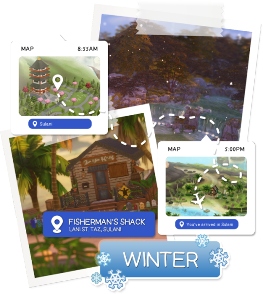
[Tips & Hints]
Open the awkwardwhims psd collection file in Photoshop, then drag & drop the folder or group of templates onto your image.
The photo album template was inspired by @folkbreeze (definitely check out their resources, they're all so nice!) & other various examples I saw online.
Resize the template by selecting the folder as a whole; resizing individual layers may makes things unaligned.
Feel free to change background colors/fonts/etc as much as you want.
The text message template has 3 styles: sender, green receiver & blue receiver. There are also reaction icons & a separate reaction bar.
For the to-do list template I didn't include every aspiration icon (I was trying to keep this file as small as possible) but you can download this pack by @deathbypufferfish that has all the aspiration icons you'll need. However, it may be missing some of the newer aspiratons.
When adding photos (album cover/recent photos/etc) use a clipping mask.
The weather template includes all the different weather icons, so be sure to hide/unhide the one that applies.
For the new transaction template, make sure to only change the number of the price otherwise the Simoleon symbol will get changed to Times New Roman.
The notification message template is for life events, bad events & default game notifications (ie: legacy player, etc).
DOWNLOAD (SFS) 66.3mb **FIXED** (Missing moodlet)
ALT DOWNLOAD (Mediafire)
@alwaysfreecc @maxismatchccworld
3K notes
·
View notes
Text
Hi there! Today i will sharing some information about the zine sections.
I'm in the process of creating the templates and running some tests to ensure that things like font size won't cause readability issues when printing.

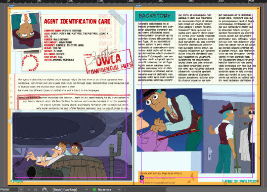
I still want to play around a bit with the layout and I’m totally open to suggestions, but for now, the sections are pretty much set.
Both writers and illustrators will have several sections in common:
ID:
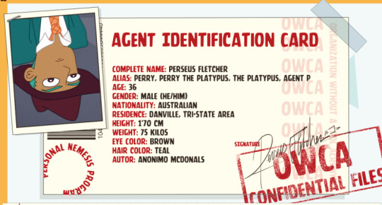
This section is meant to share some basic info about your Perry. Artists will draw a passport-style photo (or provide a drawing where Perry's face is clearly visible), and writers can choose to either include a drawing (you can do it yourself or team up with an artist) or just leave the space blank—it’ll be replaced with a mysterious silhouette wearing a hat.
If your Perry has a signature, that’ll add a nice realistic touch.
About:

In this section, you’ll share a bit more detailed info about your Perry, plus a few words about yourself. Feel free to write whatever you like!
Backstory:
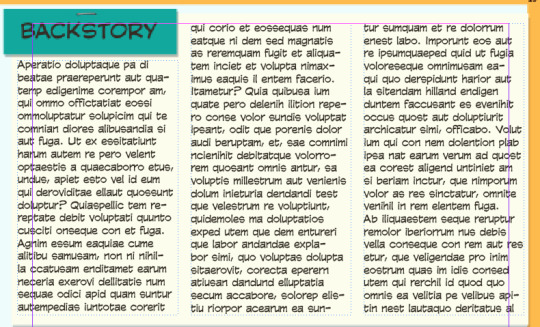
We all love a good backstory—context is what gives your Perry that extra flavor. And in this section, you’ll have space to really go all out.
Social media:
In this small space, you can promote up to two of your social media accounts.

I still need to estimate the approximate word count for each section, but I’ll share it as soon as it’s established!
ARTIST
Screenshot redraw:
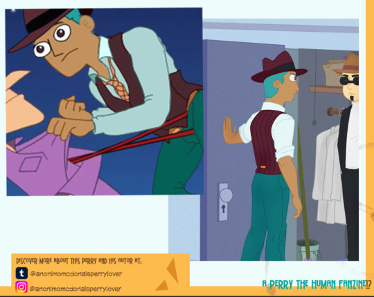
For the artists, there will be two spots to showcase your work. In the first one, you’ll follow a fun challenge where you redraw a frame from the series, swapping the canon Perry for your human Perry. You can use the background from the original shot or draw everything from scratch. If your Perry shows up, that’s great!
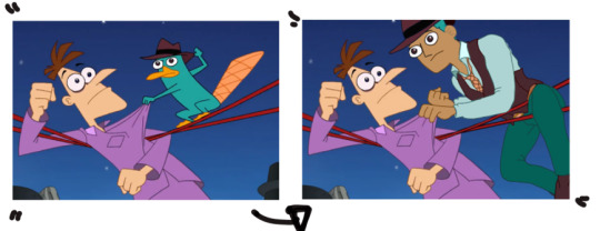
If you use the original background, just try to find an image with good resolution.
Art Gallery:
In the second spot, you have full creative freedom—you can create a brand-new piece about your Perry, use drawings you already have, make a collage, a comic… we want to see your PERRY!
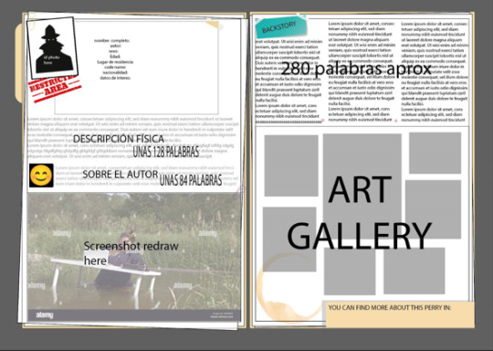
Artists will have 2 pages (a double spread) for their Perry, so all their info can be seen at a glance.
Writers:
Fanfic:
Writers will have two full pages to write a one-shot. The genre is free, and the layout will be as follows: one page with all the character info as a sort of presentation, and a double page spread for the fic.
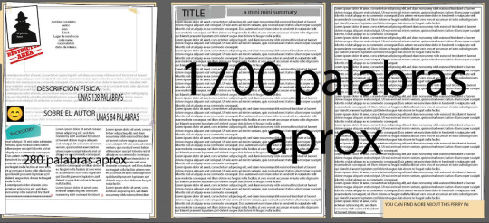
Once again, i still need to estimate the word count for the piece.
And that’s all the info I can share for now—I'll keep posting updates soon about other sections like articles and extra content. If you have any suggestions to improve these sections, I’m all ears!
191 notes
·
View notes
Text

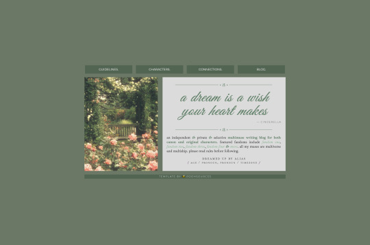
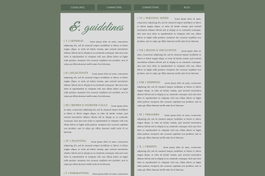
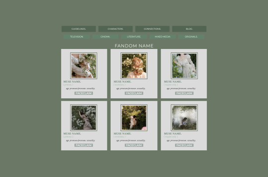

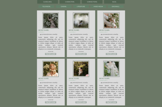

🐝 * ― 𝐂𝐀𝐑𝐑𝐃 𝐓𝐄𝐌𝐏𝐋𝐀𝐓𝐄 𝟎𝟐𝟔: 𝐅𝐀𝐈𝐑𝐘𝐓𝐀𝐋𝐄 𝐆𝐎𝐍𝐄 𝐁𝐀𝐃. ( new year, new carrd page. basically made this thing in an hour after working a whole day on my personal version for this; also tried using styles for the first time to make it easier when adding / changing things so you won't have to change each thing individually if you e.g. switch the colors. anyway, you can find the preview for this here. it's a multimuse template with a landing page, a navigation page, a rules page, a muse page with five sectioned-off pages for different types of media, and a connection page. due to the number of elements used this template requires at least a pro lite account. if you want to upgrade feel free to use my referral code KB4W13V3 because it helps me out. )
― HOW TO USE
please don’t claim this as your own, and don’t delete the credit. you can change it’s size or color but it should stay where it is.
of course, you can edit all the colors, sizes, fonts, etc. however you like.
to get this template please click here. it’s on a pay-what-you-want basis, so it is possible to get it for free if you set the amount to 0. ( if you’d like to leave a little tip, i'd very much appreciate it, though. )
when you first open this template, it might look a little weird because carrd deletes the images i’ve used so there will only be empty spacers of sorts that may look a little out of place. just upload images and this will fix itself.
actual image sizes don't matter since carrd scales them to fit but you can see examples of the image sizes i’ve used in the demo to get an idea for the dimensions. or just try your own and play around with the settings to get the desired outcome.
if you have any questions on how to edit it, just send me a message, and i'll try to explain it to you.
#carrd template#carrd templates#carrd rp templates#rp template#carrd#free rp resources#free rp template#rp resources#rph#type: template#type: carrd#template: multimuse
2K notes
·
View notes
Text
Media I imagine different fiction podcasts in instead of the media of being a podcast.
TMA: A selection of volumes, relating to the fears, each with those removable covers. Those covers has a victim or two, and then underneath the cover is a really detailed cover. The paper is decoratively ripped, with a kind of scraggly font, and each has a foreword and ‘author’s note’ from Jonathan Sims.
Malevolent: A really gritty graphic novel with deadly detail in each panel, and very little color. Maybe a trinket on each important character has a color? Like Arthur’s eyes being yellow or Oscar’s collar having a blue sheen to it. The novels are long, dramatic, and intimate in a visceral way.
Welcome to Night Vale: Local 58 bullshit. A broadcast on television with low quality images and audio, tacky music, and a kind of 80’s aesthetic. Each episode the words WELCOME TO NIGHT VALE zoom onto the screen, the purple eye behind them. And each weather segment is an animated short by a different artist.
The Penumbra(Juno Steel): A webcomic. Hours spent scrolling downward a comic that has so much color and GEOMETRIC design. Juno and his curvy jaw, brown pie slice eyes, a cartoonishly high collar for his investigator jacket. Nureyev and his sharp square jaw, shimmering jewelry, and stick legs. Characters sticking out of the panels, fonts changing constantly, a little blue Juno that does his narration and *guitar theme plays* each time he appears.
Wolf 359: A classic comic. Issues month by month. Different special covers of the characters in extra dramatic poses or scenes. Even MORE panel breaking than Juno Steel. So MUCH onomatopoeia, even for small things like the clink of a panel or the disapproving hiss of Hilbert in the background. Geometric designs like Juno Steel, but less colorful. Like the superhero art style mixed with a more stylized look.
Midnight Burger: You pull up the Midnight Burger website. They have a hidden page that has a sort of script-comic thing going on, where the art is next to the writing. Small coded in notes from Leif sometimes pop up if you hold your arrow over the art. Links are attached to the parts where Effie and Zebulon play music, linking you to the music so you can listen to it while you read.
Desert Skies: An animated show. Indie, something you’d find on YouTube. The animation is bouncy and incorporates 3D animation alongside the 2D. Maybe the Sphere Movers have 3D models and the staff don’t? The credits are short because it was made by one guy. People are complaining about it on Twitter /j. People are making content farms about it. Everyone is pissed at Corson like they’re pissed at Jax.
The Amelia Project: A sort of simulation video game. You play as Arthur. You listen to their stories and draw pieces of the tale to invent their death. Every once in a while the game transitions to a point and click suspense game where you solve puzzles as Cole and Haines. Maybe there should even be an Operation-esque part of it where you work as Kozlowski.
Ghost Wax: A novel with a lot of pictures spliced in it. The stories are all in a single book, though the book is through Luca’s perspective— so he picks up on the ghost’s body language and Voncid’s reactions. The pictures are tarot cards with each victim as a card. Some are repeat cards— Lorem does not have a card at the end of the story. Nor does Our Home or Evening at the Ardent. The pictures are only white with black line art. No color whatsoever.
Kakos Industries: A company newsletter. Not a broadcast. A newspaper that arrives at your door and has big bold letters with the main story and pictures of the events that happen in the story as it goes. And the Sunday Comic page is full of employee shenanigans. Some innocent… some not.
I am losing my mind.
#the magnus archives#malevolent#welcome to night vale#the penumbra podcast#wolf 359#midnight burger#desert skies#the amelia project#ghost wax#kakos industries
449 notes
·
View notes
Text
SUPER UNIQUE writing ideas for hobbyists and professionals looking for fun, personal projects to get their inspo back
get a fictional pen pal (ask your other writer friends!) and spend time decorating envelopes, picking out a handwriting style, maybe buying a cheap perfume/cologne that smells like your character to really get to know them and feel their presence. if you have hand tremors or bad handwriting like me, you can choose a handwriting font for them and print their letters out!! more examples: save the dates, wedding invitations, birthday cards, party invites, etc.
use old calendars in character (there are many "expired" planners on sale around the end of the year, usually August) personally, i use them to record major life events like first band tours, trips abroad, holidays, birthdays... even trash pickup days and when they forget to roll out the bins!
sketch floor plans this can be on graph paper if you have the know-how when it comes to scaling down, but there are also tons of simple apps that allow you to both create the floor plan a builder would use and add furniture like an interior decorator. some even let you rotate them afterwards and see the furniture and walls burst to life in 3D! you can think of them as the sims but where everything is actually to scale
make an architectural model if you have some scrap cardboard, paper, and glue, you can easily bring the floor plan you just made to life (you'll need practice if you want to get really fancy with it of course! window panes and railings are the gnarliest part for me, haha)
make a playlist as your character maybe the most accessible one on this list, you can make the playlist your character listens to. sometimes this can be fun and surprising, like when my little guy Possum from Violence Without Plot is covered in tattoos and plays punk music on stage but listens to nothing but spa music to wind down between shows
write something your character can see this one is so weird to summarize but what i mean is like... a school essay for your teacher character to grade. cryptic street signs warning about danger by the lake. a memorial plaque beneath a statue. a character's online blog. a few of the cards in a grandmother's recipe box. a business card for a smooth-talking lawyer. things you can write that make everything feel so textured and real
these are all things i do on the daily, and it makes my life as a writer a thousand times more joyful and fulfilling. so have fun, be safe, and don't forget to unplug the hot glue when you're done <3
1K notes
·
View notes
Text
4 Fonts You Will Notice Everywhere Once You Know What They Look Like
I love pointing at fonts I recognize when I'm out with friends and it drives them crazy so here they are
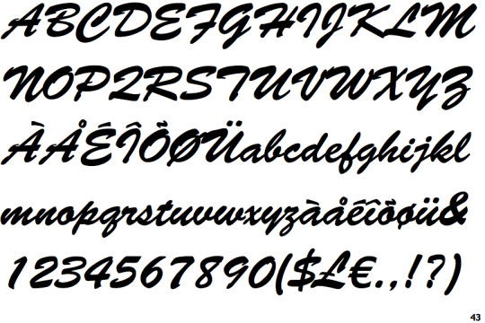
1 - Brush Script Std
"Std." is "standard." If you play Guilty Gear, you will notice this on everything. Almost all of the 3D characters from Xrd and Strive have some sort of Brush Script writing on them. Anything going for a kind of "casual vintage" vibe will often use this font, like farmer's markets, florists, car shows, etc.
The B, E, F, Q, S, and T glyphs are usually how I ID Brush Script Std at a glance in the wild.
2 - Cloister Black
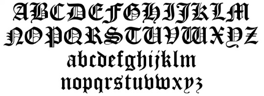
This is like the only "Gothic" font anyone ever uses for anything, it's actually really funny. If you see a Gothic font used somewhere it's probably Cloister Black like 9.9 out of 10 times. It's almost a little disappointing when someone doesn't use our buddy Cloister Black for their cool goth project. You will probably know this as the Death Note font but it is by NO means exclusive to Death Note.
Notable glyphs: Any of the ones with the little internal lines like B, D, G, O, etc., since non-Cloister Black Gothic fonts seem to change those before any other part of the design; the L glyph; the really tedious W glyph.
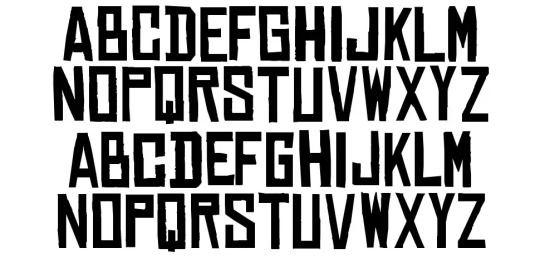
3 - Chinese Rocks
This one isn't as common as the above two, but it's still used often enough that it's funny spotting it. It got an update in 2021 that seems to have refreshed its use commercially. You might know it as the Red Dead Redemption font. I seem to see it used for things going for a kind of rustic, travelled, or "earthy" sort of look.
Notable glyphs: B, P, Q, R, S
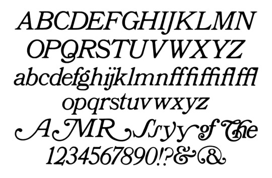
4 - Bookman Old Style
When you want Times New Roman but relaxed. This is used in logos more than anything else, but that lowercase t hits like a brick when you see it out in the wild once you realize this is the Tumblr logo font. Alternatively known as the Toddlers In Tiaras, A Christmas Story, and the Oprah Winfrey Network font.
I actually know this font better for its lowercase glyphs than its capitals, but the Q, R, g, r, s, t, and y glyphs are all pretty notable. This font comes with a really fun f glyph too.
81 notes
·
View notes