#organic typography
Explore tagged Tumblr posts
Text


Typography Tuesday
PLANTS & FLOWERS
This week we bring you a few experimental fonts made with flowers and plants from The Making of Artistic Typefaces by 50 international designers published in 2016 by SendPoints Publishing in Hong Kong. Shown here:
Blossom Type: handcrafted with natural flowers with Photoshp for color correction by designers Nikita Shchykin and Alice Mourou of Oddity Studio based in Hong Kong.
Wanto 3 Aroma Living: letterform overlaid with a flower arrangement from Victor Design Corp.
Garden, Flowers, and Ice: as the name implies, this font, designed by Manuel Persa of Voluminica based in Asturias, Spain, is made using wild flowers placed in letter-shaped silicone molds, filled with water and frozen, and then removed from the mold.
Good Vibes: typographical wooden frame filled with living moss, designed by Camilo Rojas of CR-eate based in Miami.
Good Enough: original clay pottery with small plants as an illustration in the Dutch Volkskrat Magazine from the design studio Autobahn based n Haarlem and Rotterdam.
View more designs from The Making of Artistic Typefaces.
View more Typography Tuesday posts.
#Typography Tuesday#typetuesday#fonts#organic typography#The Making of Artistic Typefaces#SendPoints Publishing#type desingers#type designs#floral typography#flowers#plants
151 notes
·
View notes
Text

Dorianne Laux, from her poem titled "The Orgasms of Organisms," featured in Smoke: Poems
#lit#dorianne laux#poetry#smoke; poems#the organs of organisms#writings#typography#fragments#dark academia#p
497 notes
·
View notes
Text

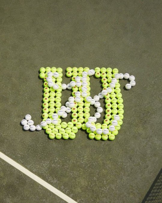
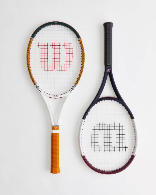
Kith x Wilson
(not a paid ad, although I wouldn't mind it...)
165 notes
·
View notes
Note
Dear Supporter,
I hope this message finds you and your family in good health. My name is Eman Zaqout from Gaza. I am reaching you out to seek your urgent help in spreading the word about our fundraiser. I lost both my home and my job due to the ongoing genocide in Gaza and we are facing catastrophic living conditions. 💔
I kindly ask you to visit my campaign. Your support, whether through donating or sharing, will help us reach more people who can make a difference. Thank you for your continued support for the Palestinian cause. Your dedication brings us closer to freedom. 🙏🕊
Note: Verified by several people as 90-ghost and aces-and-angels. ☑
.
#hatchetfield#starkid#hatchetverse#nightmare time#the magnus archives#the magnus protocol#the mechanisms#percy jackon and the olympians#sherlock and co#botany#organic chemistry#my chemical romance#candle making#magnus chase and the gods of asgard#marine biology#math#television#typography#tech#diy tutorial#ecology#entomology#epic the musical#quantum physics#quotes
10 notes
·
View notes
Text

TWYG
#TWYG#skinecare#natural#scientifically proven#New Zealand#beauty#products#organic#super-ingredient#red#shop#typography#type#typeface#font#Neue Haas Grotesk#Alpina#2024#Week 14#website#web design#inspire#inspiration#happywebdesign
21 notes
·
View notes
Text


some stuff i've been doing lately uuuurrp
84 notes
·
View notes
Photo

Authenia is a casually written brush script with organic, authentic characteristics, featuring two lower case sets for variation and contextual alternates for random variation.
Link: https://l.dailyfont.com/qwLvw
#aff#Love#Fashion#Design#Typography#Fonts#Handwritten#Script#Authentic#Organic#Variety#Alternates#Contextual#Random#Artistic#Creative#Unique#Beautiful
2 notes
·
View notes
Text
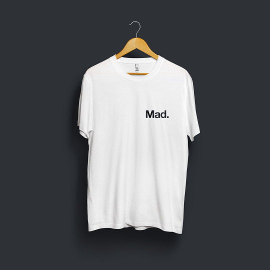
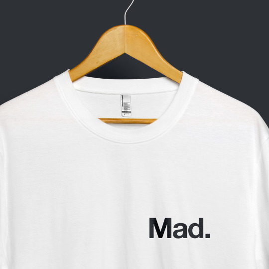
“Here's to the crazy ones. The misfits. The rebels. The troublemakers. The round pegs in the square holes. The ones who see things differently. They're not fond of rules. And they have no respect for the status quo. You can quote them, disagree with them, glorify or vilify them. About the only thing you can't do is ignore them. Because they change things. They push the human race forward. And while some may see them as the crazy ones, we see genius. Because the people who are crazy enough to think they can change the world, are the ones who do.” ― Rob Siltanen Do Not Destroy NFT Store: Mad Organic White T-Shirt. Addition Details • Size: 3200 x 3200 pixels (10.7 x 10.7 inch) • Channels: 3 (RGB Color, 8bpc) • Kind: JPEG image • Resolution: 300 pixels/inch • Edition 1/100 Both physical and NFT items are now available in our store.
#do not destroy#do not destroy store#tee#tshirt#typography#graphic design#organic#sustainable#environment#green#mad#NFT#NFT Art#NFT Artist#Digital Art#Art#Artist#quotes#quote of the day#_#Mad#nftartist#streetstyle#billionaire#digitalartist#streetfashion#nft#bitcoin#metaverse#millionaire
1 note
·
View note
Text
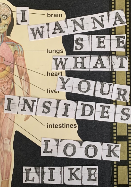
Image Description: A cutout of the muscular system against a black paper background with sepia film on the right. The words "brain", "lungs", "heart", "liver", "intestines", and a covered word pointing at the calf muscles all point at their respective organs. The lyric "I wanna see what your insides look like" are typed in a serif font on notebook paper and seperated individually, reading from up to down.
/End ID
Bury me in black ⚰️♥️
#tw organs#mcr#my chemical romance#disclaimer: i do not listen to mcr or are aware of them beyond their name and fame#I just love artworks like this#the scrapbook-like art which combine real life photos and typography#it may not be an illustration but not all works of art are illustrations#are they?#art#artists on tumblr#artists cooking gourmet#reblog
2K notes
·
View notes
Text
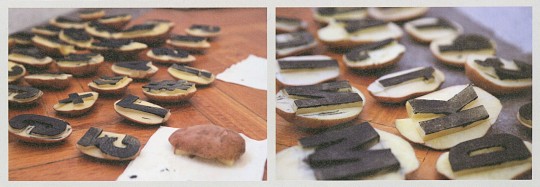
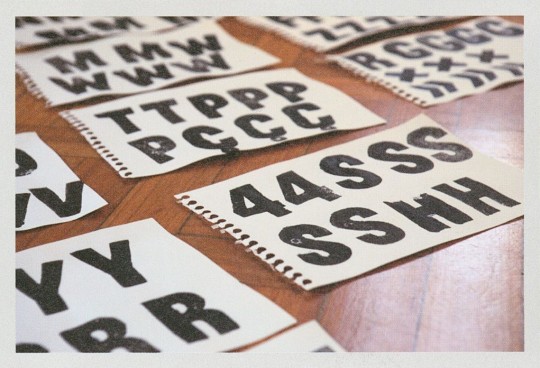

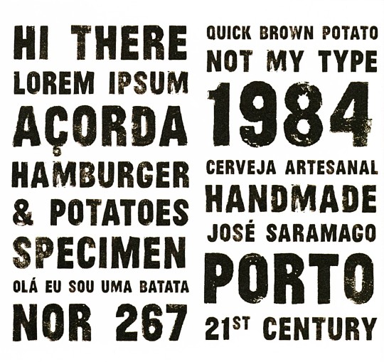
Typography Tuesday
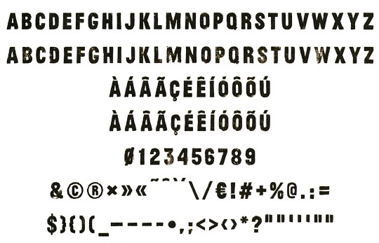
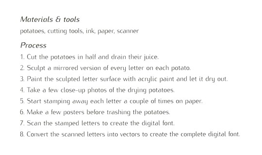
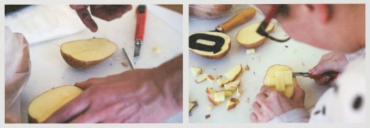
Portuguese designer Ivan Alves created the Wild Potato font for Nor267 design studio in Porto, Portugal. Although used to working digitally, the designers for this project got off their computer screens and approached their work in a different way, creating a typeface made from handcrafted potato stamps. After three days of cutting, drying, painting, stamping, and drying again, the alphabet was finally completed. Then all the letters were scanned and turned into the digital font known today as Wild Potato.
These images are from The Making of Artistic Typefaces by 50 international designers published in 2016 by SendPoints Publishing in Hong Kong.
View more designs from The Making of Artistic Typefaces.
View more Typography Tuesday posts.
#Typography Tuesday#typetuesday#fonts#organic typography#The Making of Artistic Typefaces#SendPoints Publishing#type desingers#type designs#Ivan Alves#Wild Potato type#Nor267#potato prints#potato type
66 notes
·
View notes
Text
0 notes
Text
some graphic design resources cause im bored and itching to write something but i cant write anything i'm happy with--- anywayssss
unsplash for lots of royalty free pics
heres a cool site to learn how to pair fonts together
heres another site to learn kerning [spacing]
in fact heres a bunch of games to help u get better at graphic design stuff
some free online video editors x x x
color accessibility resources :]
savee.it - like pinterest but for designers!! unfortunately it has a save limit for free users but u should still be able to browse it for inspo i think?
some free fonts
aside from coolors i really love adobe color!! it has color palette generator [triads, monochrome, complementary, etc.], accessibility tools, palettes+gradients extractors, and color palettes inspired by trends within diff industries.
make moodboards online for freeee i miss u polyvore
spline and womp for web based 3d design! + blender of course [go make that donut!]
we all know and love them: photopea [photoshop but free and on a browser?!] and canva [no introduction needed im sure]
upscale the resolution / quality of pics it says anime but it works really well with most stuff like video game screenshots [gets rid of hard edges/pixels]
typography inspo
more color palette generators [already meets accessibility guidelines]
filmgrab - a curation of movie scenes 💕
here's another one but for color palettes from films
more inspo and tutorials
cargo - for web design stuffs
an archive of BRANDING GUIDES
free online zine hosting
milanote - very very useful for organizing creative projects :D kinda like a mix of notion and pinterest ? [its basically notion but more visual]
a collection of free luts
lots of pngs for editing
freepik - lots and lots of free design assets.
flaticon - lots of flat icons / vectors. i haven't used this in a while, but it was free last i checked
in case u need more help pairing fonts go here and here
idk ilu all have fun!!!!
4K notes
·
View notes
Note
Help Needed for Fatima Shahin and Her Family in Lebanon
My name is Fatima Shahin from Choueifat, Lebanon. Our home was destroyed in the war, and we urgently need food, shelter, and basic necessities.
Please consider donating to support my family and others affected by this crisis. Your assistance can make a significant difference. 🇱🇧
Thank you for your generosity.
https://www.gofundme.com/f/help-fatimas-family-survive-lebanons-crisis
.
#hatchetfield#starkid#hatchetverse#the magnus archives#the magnus protocol#the mechanisms#nerdy prudes must die#film photography#painting#periodic table#pixel art#plushies#programming#poetry#typography#television#diy tutorial#magnus chase and the gods of asgard#rise of the teenage mutant ninja turtles#the heroes of olympus#percy jackon and the olympians#marine biology#microbiology#nightmare time#animal crossing new horizons#nail art#organic chemistry#the owl house#watercolor#quantum physics
15 notes
·
View notes
Text
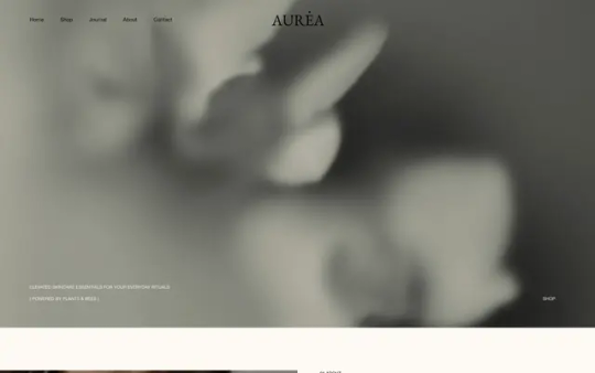
AUREA
#AUREA#beauty#nature#rituals#golden bee#organic#botanical oils#skin#skincare#grey#shop#typography#type#typeface#font#Helvetica Neue#Big Caslon#2024#Week 15#website#web design#inspire#inspiration#happywebdesign
6 notes
·
View notes
Text
5 tips for proofreading & their pros and cons
Define your objectives for each chapter. In my case, some of my chapters are better written than others. My objectives for them will differ. Before starting my proofreading, I list my needs and areas of improvements, and I write them down somewhere so I have them in front of me rather than in my head alone.
Pros : allows you to know which points you need to focus on ; provides a guideline adapted to your needs.
Cons : risk of losing homogeneity and fluidity + flaws may be shifted to other chapters that didn't have them before due to a sudden imbalance.
Plan several proofreading sessions, each one of them addressing ONE NEED AT A TIME. (E.g., one for grammar, another for style, and a final one for coherence. ) And I insist on the "one need at a time" part. Even for those who can multitask (unlike me), I really don't recommend settling for a single proofreading session. It could interfere with your concentration and let you skip some flaws. And please, always give your chapter a final read after your edits to ensure that the elements make sense as a whole, and are not repeated every two paragraphs (I plead guilty, your honor)
Pros: allows you to focus precisely on each point, and give it dedicated attention.
Cons: you can quickly get confused and risk multiple re-readings + significant time investment.
I make my corrections on a separate file. Whatever you do, it's always better to have a backup and therefore to save your files (don't blindly trust autosave) to create archives. I think it's a two-ways process : 1) you open two files simultaneously, one with your V1 and one, blank, where you'll rewrite your chapter as you make changes. Eventually, this new doc will become your V2 ; 2) you copy the parts to proofread into a new document and edit directly in there.
Pros: allows you to rewrite as you wish without being discouraged by the following paragraphs - especially in case of the first way.
Cons: requires multiple files (maybe multiple screens to be at ease) and better organization.
Change the typography. I don't know about you, but after a while, I'm struck by semantic satiation (click on the link - it's Wikipedia -, it's very interesting) and nothing makes sense anymore. After the 52,846th proofreading, I might as well read in another language. I've found a relatively effective trick - not as effective as a complete break, but sometimes you need to move forward - which consists of changing the typography. I can't remember who gave me this advice though, but be sure they've been thanked more than enough in my mind. In any case, seeing words change their shape significantly helps my brain to stay focused and attentive. (Maybe it's just my mind playing tricks on me but I only see the results.)
Pros: it's simple to implement.
Cons: I don't know if this trick works for everyone or if I'm the only weirdo (you can tell me in the comment section).
Take notes. This is a very personal tip but I keep a proofreading logbook. Like, I record in a few sentences the first time an element is mentioned, how it's describes, and most importantly… I MENTION THE DATES. The story I'm currently writing is heavily governed by a chronological system, so I have an absolute need to keep the day count up to date.
Pros: helps avoid inconsistencies and oversights.
Cons: very tedious to maintain and creates (a lot) of extra work.
I've started my prooreading journey yesterday and I already want to die. If I find in the edits something that is worth making a post, be sure that I will. Or let me know if you're simply curious.
Gentle reminder : Best is the worst enemy of good so, at some point, you'll have to let it go and let your chapter live its life to its fullest. Don't be hard on yourself and be proud of your work - or know that I am.
#writing#writing advice#writing a book#writeblr#writing resources#writing tips#writing tools#writing help#creative writing#writing process#writer problems#writer blog#writing journey#novel writing#writing challenge#about books and writing#essays#fiction writing#writerscommunity#writing style#books and literature#resources for writers#writers on tumblr#writing resource#writebrl
304 notes
·
View notes
