#oh this is going to be aWESOME
Explore tagged Tumblr posts
Text
oH OH OH
HANG ON
HOLD UP
NOT ONLY DO WE GET THIS
BUT THERES A WHOLE FUCKING EP COMING OUT ON THE 16TH?????
HOLY SHIT
OH MY GOD
MY WORLD HAS BEEN SHAKEN AND TURNED UPSIDE DOWN
THIS IS THE BEST THING THAT HAS HAPPENED IN AGES
#madilyn mei#the bard#apparently#but the songs#they’re all the storytelling ones the whimsical ones the myth-y type ones#oh this is going to be aWESOME#wOaH iM aCtUaLlY oRiGiNaL
7 notes
·
View notes
Text
being aromantic is like. hey btw you're going to live a life that is the culmination of most of society's worst nightmares. sorry lol ✌️ but then you turn around and take a really good hard look at it and it turns out that living in that nightmare is fucking awesome and you get to wake up every day and take that fear that other people have and laugh and hold it close until it's a great joy for you instead. and being happy is a radical act that you define instead of someone else. and you're sexy as fuck that's just a fact of life i don't make the rules on that one
#aromantic people are just sexy i'm not making the decisions here it's just facts#course ur hot as fuck. it came free with the aromanticism#being sexy is just default settings for aromantic people 👍#hope this all helps. anyway i'm on my 'i hope i die alone <3 i can't wait to die alone <3' kick rn#i think the existential fear that people have of Not Partnering specifically is so. well.#obviously that shit is strong and it is SO awesome to be free of it.#realizing you're aro and you don't Want a partner can be such a hit to the solar plexus#cause society says that's the only thing that'll make you happy. so either you go without that thing or you force yourself#into doing something you don't want which would make you unhappy anyway.#so you think it's a lose lose situation and you have to come to terms with what amatonormativity presents as the worst possible situation#but then! whoa! turns out personhood is inherently valuable in and of itself and romantic partnering is just a construct!#and that nightmare is now your life to do with as you please... define as you will... structure as you want...#best case scenario. is what i'm saying.#every day i wake up ready to spit all that amatonormative rhetoric back in life's teeth by being alone and being happy#and it's so fucking satisfying. every day.#fucking JUBILANT being by myself. and i love being a living breathing 'fuck you' to the romantic system#you need a partner to be happy? oh that's sooo fucking crazy guess i'll go be miserable then. in my perfect fucking dream life lmao#yeah obviously it's the worst possible outcome on earth to die without a partner. so terrible. can't wait for it :)#aromantic#aromanticism#aro positivity#aroace#arospec#sorry to bitches who are sad about not having a partner. i could not give a fuck though get better soon#you couldn't EVER pay me enough to go back to a mindset in which my inherent value wasn't enough by myself.#FUCK that shit. absolutely miserable and a bad life outlook in general. like genuinely do the work w/ amatonormativity and get better#life is something that can be so fulfilling whether someone wants to kiss you or whatever or not#i'm on antidepressants and i have people i care deeply about. what the fuck would i need a partner for lmao
8K notes
·
View notes
Text
the whole "jason rules crime alley and none of the other bats are allowed there!!1!" thing is so funny like. tim LITERALLY lives in the theater where bruce's parents died,
#rimi talks#sorry. thought about tim doing that again. what is WRONG with him kfjshakjdshfkjd#WITHOUT EVEN TELLING BRUCE UNTIL AFTER HED ALREADY DONE IT TOO.#TIMOTHY. WHY.#this is the other thing abt why i just dont like seeing jtodd in fanwork#whenever he appears like 99% of the time its in a way that is directly contradictory to actual comics#the 1% of people who actually read the comics and write him in such a way? fine great awesome!!#however i still am filtering that bitch out because hes kind of a catch-all for the most annoying batfanon tropes.#because. yknow. theres no other tags to filter out bc they dont Fucking tag it#alas. oh well. anyways can we go back to going hey tim what is wrong with you#because for real i think he got off way too easy for this one.#forget identity reveals i want the core four sleepover where tim's apartment gets its lore reveal#give me cassie doing such a dramatic spit take that she gets ice cream on the ceiling. picks up tim like a weasel. and goes WHY???#and hes just like. idk seemed like the right thing to do :)#tim
702 notes
·
View notes
Text
I love libraries.
I'm browsing the WWI shelves (as you do) and notice a very old book about the war. I glance at the first pages that talk about how one day the war will be over and we'll look at this place and not see any signs of the battlefield.
Then it hits me. And I check the publishing date.
This book was printed before the war's end. Not written. Printed. The physical object was created in 1918, while the war in question was raging and the end was as yet uncertain.
Now I'm standing on the other side of the apocalypse, with this physical link to that era in my hands. I'm living proof that the war did end and life did go on and we can all look at the end of the world as a long-ago memory.
Reading old books is cool enough, connecting our minds and hearts through the ideas of people who lived long ago, but there's something extra profound about holding a copy of the book that comes from the time that it was written. It's a physical link between the past and the present connecting me to those long-ago people. A piece of the past come into the future that gives me the chance to almost take the hand of some long-ago reader, to hold something they could have held, connecting not just mentally but physically to their era, a moment of connection across more than a century.
Excuse me while I go weep.
#books#history is awesome#of course i checked it out#i had no real intent to read wwi non-fic but i couldn't just leave my new friend there it'd be lonely#i want to break out in tears every time i look at it#it's so stupid but sometimes something stupid just kicks you straight in the heart and you just gotta deal#it's old front line by john masefield#i know nothing about it except thinking the author's name sounded vaguely familiar#also the interior design is fantastic#these old books know how to use white space and make something super readable#if you must know i was in the wwi section because i was at the history museum the other day#and saw a local author had a book of wwi letters#thought i'd see if the library had it#looked at the selection of non-fic surrounding it and thought of the wwi persuasion#saw many books that could be useful#and thought 'oh no this looks like fun'#it won't go anywhere i know i won't be able to focus long enough to do real research#but darn if it wasn't an appealing little daydream
1K notes
·
View notes
Text
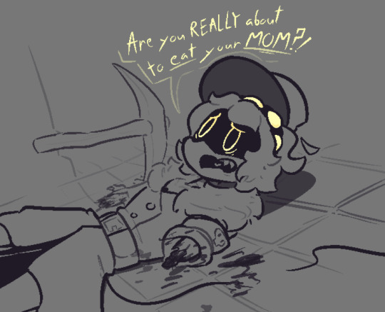
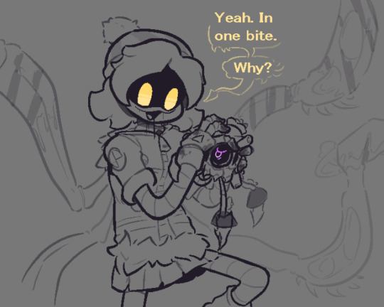
you'll never guess which movie i finally watched after 2 years of being lazy
#dont you just love it when your artstyle changes like 5 times in the span of a day#i saw emmachen1003 give them the glove type thingys and went “that looks cool. im stealing it”#so uhm. props to them for being awesome and making cool art#anyways that was a fun movie#not gonna say the title here cause i think it messes with searching and i dont wanna do that#that n frame is like the first time i have ever done a decent angle/perspective thing#im so proud of it you don't even know#murder drones#murder drones uzi#murder drones n#serial designation n#murder drones nori#absolute solver#i guess#or is it absolutesolver#whatever#oh yeah uhmm#murder drones episode 7#murder drones episode 7 spoilers#murder drones spoilers#its been 2 weeks but im gonna give it another day just to be safe#just realized i fucked up the quote and its pissing me off so edited. go fuck yourself
2K notes
·
View notes
Text
Watched Electric Dreams (1984) … The most me catered movie I have ever seen and also the most I’ve ever understood what romantic love is like. Truly incredible

(ID in alt) (Tumblr also ATE the quality for lunch and dinner so. Click on it if necessary LOL)
#LOVE EDGAR. ME AAND MY FRIENDS ALLLLL LOVE EDGAR.#AWESOME GUY.#anyway#id in alt#oh yeah btw the reason why Madeline’s face is scribbled out is because he can’t actually see her#or well anything for that matter#I didn’t intend for there to be any other meaning behind it but if you want to draw some conclusions go ahead!!#I give you the free reins on that#tech#robots#electric dreams#electric dreams 1984#electric dreams (1984)#edgar electric dreams#electric dreams edgar#madeline electric dreams#electric dreams Madeline#eclipsed art
1K notes
·
View notes
Text
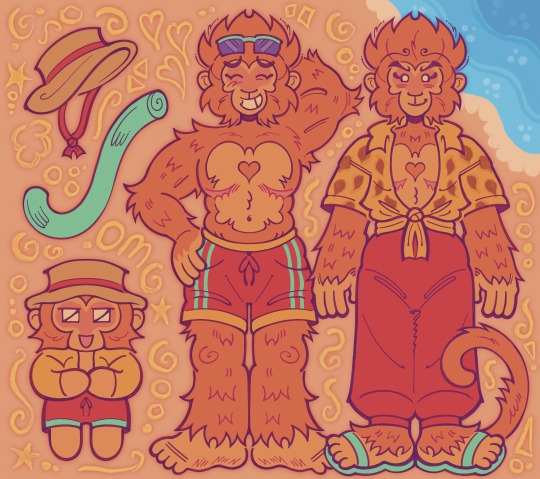
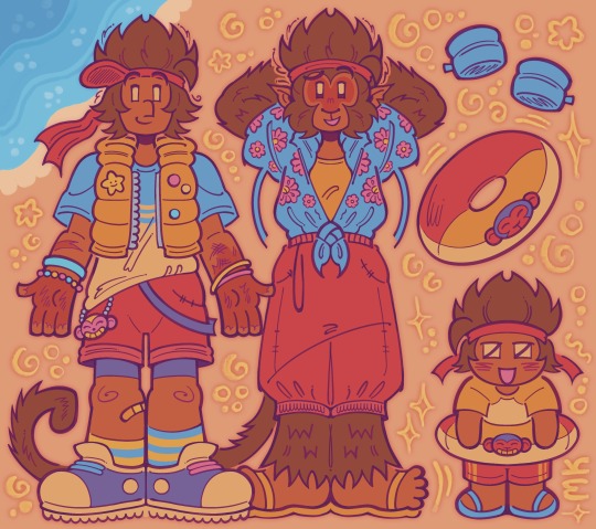


⚠️ warning for cartoony gore after this drawing!! 🫀
.
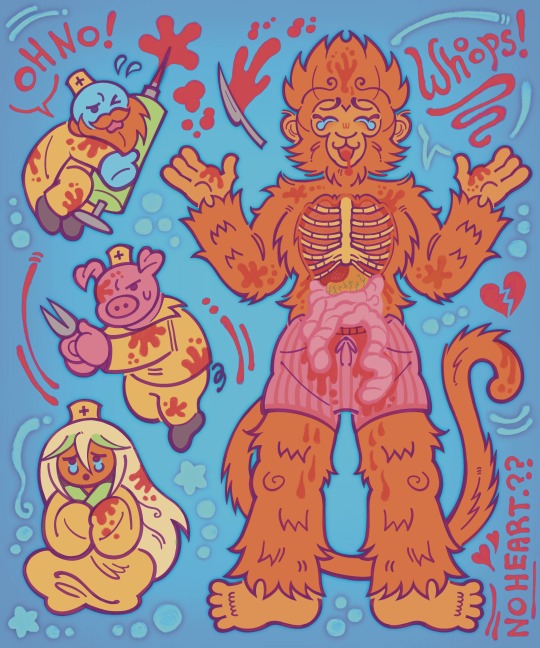
how about those new monkie kid season 5 lego sets. the new monkie kid sets. have you seen the new monkie kid sets? the new monkie kid sets? seaosn 5 monkie kid sets? have you seen the new season 5 mon
#i am going insane#on another note am i a furry chat#monkie kid#lego monkie kid#lmk#mk#qi xiaotian#sun wukong#monkey king#lmk mk#zhu bajie#sha wujing#ao lie#jttw#transgender monkeys#awesome burger#tw g0re#tw gore#tw blood#tw body horror#lego#the new sets.#my friend saw me shaking over monkie kid sets#and he said i need to be medicated#oh my gyatt...#i am so normalpilled and saneburger
503 notes
·
View notes
Text
i think the way the book became 3rd person pov when kim dokja got off the train is one of the most fucking genius literary moves ive seen in years
#maybe im being dramatic#but im sooo serious i thought it was fucking AWESOME#orv#omniscient reader's viewpoint#orv spoilers#kim dokja#sorry im just so#i think about it a lot#it was SO SMART#i was like oh???? why is it 3rd person????#is something going on????#and then fucking. then yes!!! something WAS going on!!!!!#screams#that being the last chapter before the epilogue made me scream#if there wasn’t an epilogue it would have been such a fitting end too but then you check the page count#and realize there’s like 500 left and you’re like ‘WHOAH WHAT THE FUCK’#and keep reading and with dread in your heart you turn the page and are like OH SHIT#god i fucking love this book
557 notes
·
View notes
Text
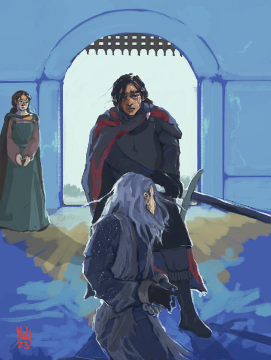
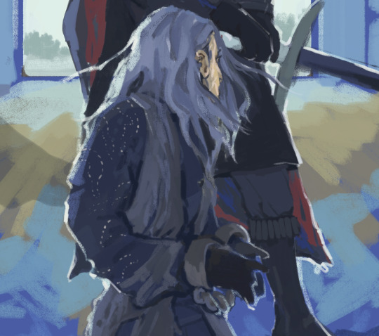

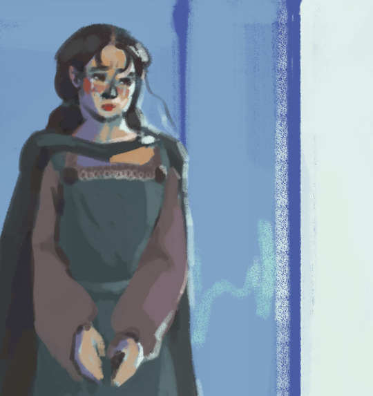
i knew you once (+details)
#my art#asoiaf#valyrianscrolls#theon greyjoy#jon snow#jeyne poole#i think this is going to happen and it is going to be charged and awesome. and hes not gonna be able to go through with it#and it's gonna be the coolest thing to ever happen to me#i dont even know if this makes sense proportion/perspective wise oh well doesnt matter GOOD NIGHT AMERICA!!!!#late addition jeyne bc she would probably be there woohoo jeyneeee save me jeyne!!!!!#i actually started this months ago x___x
1K notes
·
View notes
Text
why Aurora's art is genius
It's break for me, and I've been meaning to sit down and read the Aurora webcomic (https://comicaurora.com/, @comicaurora on Tumblr) for quite a bit. So I did that over the last few days.
And… y'know. I can't actually say "I should've read this earlier," because otherwise I would've been up at 2:30-3am when I had responsibilities in the morning and I couldn't have properly enjoyed it, but. Holy shit guys THIS COMIC.
I intended to just do a generalized "hello this is all the things I love about this story," and I wrote a paragraph or two about art style. …and then another. And another. And I realized I needed to actually reference things so I would stop being too vague. I was reading the comic on my tablet or phone, because I wanted to stay curled up in my chair, but I type at a big monitor and so I saw more details… aaaaaand it turned into its own giant-ass post.
SO. Enjoy a few thousand words of me nerding out about this insanely cool art style and how fucking gorgeous this comic is? (There are screenshots, I promise it isn't just a wall of text.) In my defense, I just spent two semesters in graphic design classes focusing on the Adobe Suite, so… I get to be a nerd about pretty things…???
All positive feedback btw! No downers here. <3
---
I cannot emphasize enough how much I love the beautiful, simple stylistic method of drawing characters and figures. It is absolutely stunning and effortless and utterly graceful—it is so hard to capture the sheer beauty and fluidity of the human form in such a fashion. Even a simple outline of a character feels dynamic! It's gorgeous!
Though I do have a love-hate relationship with this, because my artistic side looks at that lovely simplicity, goes "I CAN DO THAT!" and then I sit down and go to the paper and realize that no, in fact, I cannot do that yet, because that simplicity is born of a hell of a lot of practice and understanding of bodies and actually is really hard to do. It's a very developed style that only looks simple because the artist knows what they're doing. The human body is hard to pull off, and this comic does so beautifully and makes it look effortless.
Also: line weight line weight line weight. It's especially important in simplified shapes and figures like this, and hoo boy is it used excellently. It's especially apparent the newer the pages get—I love watching that improvement over time—but with simpler figures and lines, you get nice light lines to emphasize both smaller details, like in the draping of clothing and the curls of hair—which, hello, yes—and thicker lines to emphasize bigger and more important details and silhouettes. It's the sort of thing that's essential to most illustrations, but I wanted to make a note of it because it's so vital to this art style.
THE USE OF LAYER BLENDING MODES OH MY GODS. (...uhhh, apologies to the people who don't know what that means, it's a digital art program thing? This article explains it for beginners.)
Bear with me, I just finished my second Photoshop course, I spent months and months working on projects with this shit so I see the genius use of Screen and/or its siblings (of which there are many—if I say "Screen" here, assume I mean the entire umbrella of Screen blending modes and possibly Overlay) and go nuts, but seriously it's so clever and also fucking gorgeous:
Firstly: the use of screened-on sound effect words over an action? A "CRACK" written over a branch and then put on Screen in glowy green so that it's subtle enough that it doesn't disrupt the visual flow, but still sticks out enough to make itself heard? Little "scritches" that are transparent where they're laid on without outlines to emphasize the sound without disrupting the underlying image? FUCK YES. I haven't seen this done literally anywhere else—granted, I haven't read a massive amount of comics, but I've read enough—and it is so clever and I adore it. Examples:


Secondly: The beautiful lighting effects. The curling leaves, all the magic, the various glowing eyes, the fog, the way it's all so vividly colored but doesn't burn your eyeballs out—a balance that's way harder to achieve than you'd think—and the soft glows around them, eeeee it's so pretty so pretty SO PRETTY. Not sure if some of these are Outer/Inner Glow/Shadow layer effects or if it's entirely hand-drawn, but major kudos either way; I can see the beautiful use of blending modes and I SALUTE YOUR GENIUS.
I keep looking at some of this stuff and go "is that a layer effect or is it done by hand?" Because you can make some similar things with the Satin layer effect in Photoshop (I don't know if other programs have this? I'm gonna have to find out since I won't have access to PS for much longer ;-;) that resembles some of the swirly inner bits on some of the lit effects, but I'm not sure if it is that or not. Or you could mask over textures? There's... many ways to do it.
If done by hand: oh my gods the patience, how. If done with layer effects: really clever work that knows how to stop said effects from looking wonky, because ugh those things get temperamental. If done with a layer of texture that's been masked over: very, very good masking work. No matter the method, pretty shimmers and swirly bits inside the bigger pretty swirls!
Next: The way color contrast is used! I will never be over the glowy green-on-black Primordial Life vibes when Alinua gets dropped into that… unconscious space?? with Life, for example, and the sharp contrast of vines and crack and branches and leaves against pitch black is just visually stunning. The way the roots sink into the ground and the three-dimensional sensation of it is particularly badass here:

Friggin. How does this imply depth like that. HOW. IT'S SO FREAKING COOL.
A huge point here is also color language and use! Everybody has their own particular shade, generally matching their eyes, magic, and personality, and I adore how this is used to make it clear who's talking or who's doing an action. That was especially apparent to me with Dainix and Falst in the caves—their colors are both fairly warm, but quite distinct, and I love how this clarifies who's doing what in panels with a lot of action from both of them. There is a particular bit that stuck out to me, so I dug up the panels (see this page and the following one https://comicaurora.com/aurora/1-20-30/):

(Gods it looks even prettier now that I put it against a plain background. Also, appreciation to Falst for managing a bridal-carry midair, damn.)
The way that their colors MERGE here! And the immense attention to detail in doing so—Dainix is higher up than Falst is in the first panel, so Dainix's orange fades into Falst's orange at the base. The next panel has gold up top and orange on bottom; we can't really tell in that panel where each of them are, but that's carried over to the next panel—
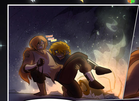
—where we now see that Falst's position is raised above Dainix's due to the way he's carrying him. (Points for continuity!) And, of course, we see the little "huffs" flowing from orange to yellow over their heads (where Dainix's head is higher than Falst's) to merge the sound of their breathing, which is absurdly clever because it emphasizes to the viewer how we hear two sets of huffing overlaying each other, not one. Absolutely brilliant.
(A few other notes of appreciation to that panel: beautiful glows around them, the sparks, the jagged silhouette of the spider legs, the lovely colors that have no right to make the area around a spider corpse that pretty, the excellent texturing on the cave walls plus perspective, the way Falst's movements imply Dainix's hefty weight, the natural posing of the characters, their on-point expressions that convey exactly how fuckin terrifying everything is right now, the slight glows to their eyes, and also they're just handsome boys <3)
Next up: Rain!!!! So well done! It's subtle enough that it never ever disrupts the impact of the focal point, but evident enough you can tell! And more importantly: THE MIST OFF THE CHARACTERS. Rain does this irl, it has that little vapor that comes off you and makes that little misty effect that plays with lighting, it's so cool-looking and here it's used to such pretty effect!
One of the panel captions says something about it blurring out all the injuries on the characters but like THAT AIN'T TOO BIG OF A PROBLEM when it gets across the environmental vibes, and also that'd be how it would look in real life too so like… outside viewer's angle is the same as the characters', mostly? my point is: that's the environment!!! that's the vibes, that's the feel! It gets it across and it does so in the most pretty way possible!
And another thing re: rain, the use of it to establish perspective, particularly in panels like this—

—where we can tell we're looking down at Tynan due to the perspective on the rain and where it's pointing. Excellent. (Also, kudos for looking down and emphasizing how Tynan's losing his advantage—lovely use of visual storytelling.)
Additionally, the misting here:
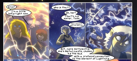
We see it most heavily in the leftmost panel, where it's quite foggy as you would expect in a rainstorm, especially in an environment with a lot of heat, but it's also lightly powdered on in the following two panels and tends to follow light sources, which makes complete sense given how light bounces off particles in the air.
A major point of strength in these too is a thorough understanding of lighting, like rim lighting, the various hues and shades, and an intricate understanding of how light bounces off surfaces even when they're in shadow (we'll see a faint glow in spots where characters are half in shadow, but that's how it would work in real life, because of how light bounces around).
Bringing some of these points together: the fluidity of the lines in magic, and the way simple glowing lines are used to emphasize motion and the magic itself, is deeply clever. I'm basically pulling at random from panels and there's definitely even better examples, but here's one (see this page https://comicaurora.com/aurora/1-16-33/):

First panel, listed in numbers because these build on each other:
The tension of the lines in Tess's magic here. This works on a couple levels: first, the way she's holding her fists, as if she's pulling a rope taut.
The way there's one primary line, emphasizing the rope feeling, accompanied by smaller ones.
The additional lines starbursting around her hands, to indicate the energy crackling in her hands and how she's doing a good bit more than just holding it. (That combined with the fists suggests some tension to the magic, too.) Also the variations in brightness, a feature you'll find in actual lightning. :D Additional kudos for how the lightning sparks and breaks off the metal of the sword.
A handful of miscellaneous notes on the second panel:
The reflection of the flames in Erin's typically dark blue eyes (which bears a remarkable resemblance to Dainix, incidentally—almost a thematic sort of parallel given Erin's using the same magic Dainix specializes in?)
The flowing of fabric in the wind and associated variation in the lineart
The way Erin's tattoos interact with the fire he's pulling to his hand
The way the rain overlays some of the fainter areas of fire (attention! to! detail! hell yeah!)
I could go on. I won't because this is a lot of writing already.
Third panel gets paragraphs, not bullets:
Erin's giant-ass "FWOOM" of fire there, and the way the outline of the word is puffy-edged and gradated to feel almost three-dimensional, plus once again using Screen or a variation on it so that the stars show up in the background. All this against that stunning��plume of fire, which ripples and sparks so gorgeously, and the ending "om" of the onomatopoeia is emphasized incredibly brightly against that, adding to the punch of it and making the plume feel even brighter.
Also, once again, rain helping establish perspective, especially in how it's very angular in the left side of the panel and then slowly becomes more like a point to the right to indicate it's falling directly down on the viewer. Add in the bright, beautiful glow effects, fainter but no less important black lines beneath them to emphasize the sky and smoke and the like, and the stunningly beautiful lighting and gradated glows surrounding Erin plus the lightning jagging up at him from below, and you get one hell of an impactful panel right there. (And there is definitely more in there I could break down, this is just a lot already.)
And in general: The colors in this? Incredible. The blues and purples and oranges and golds compliment so well, and it's all so rich.
Like, seriously, just throughout the whole comic, the use of gradients, blending modes, color balance and hues, all the things, all the things, it makes for the most beautiful effects and glows and such a rich environment. There's a very distinct style to this comic in its simplified backgrounds (which I recognize are done partly because it's way easier and also backgrounds are so time-consuming dear gods but lemme say this) and vivid, smoothly drawn characters; the simplicity lets them come to the front and gives room for those beautiful, richly saturated focal points, letting the stylized designs of the magic and characters shine. The use of distinct silhouettes is insanely good. Honestly, complex backgrounds might run the risk of making everything too visually busy in this case. It's just, augh, so GORGEOUS.
Another bit, take a look at this page (https://comicaurora.com/aurora/1-15-28/):
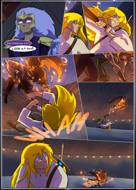
It's not quite as evident here as it is in the next page, but this one does some other fun things so I'm grabbing it. Points:
Once again, using different colors to represent different character actions. The "WHAM" of Kendal hitting the ground is caused by Dainix's force, so it's orange (and kudos for doubling the word over to add a shake effect). But we see blue layered underneath, which could be an environmental choice, but might also be because it's Kendal, whose color is blue.
And speaking off, take a look at the right-most panel on top, where Kendal grabs the spear: his motion is, again, illustrated in bright blue, versus the atmospheric screened-on orange lines that point toward him around the whole panel (I'm sure these have a name, I think they might be more of a manga thing though and the only experience I have in manga is reading a bit of Fullmetal Alchemist). Those lines emphasize the weight of the spear being shoved at him, and their color tells us Dainix is responsible for it.
One of my all-time favorite effects in this comic is the way cracks manifest across Dainix's body to represent when he starts to lose control; it is utterly gorgeous and wonderfully thematic. These are more evident in the page before and after this one, but you get a decent idea here. I love the way they glow softly, the way the fire juuuust flickers through at the start and then becomes more evident over time, and the cracks feel so realistic, like his skin is made of pottery. Additional points for how fire begins to creep into his hair.
A small detail that's generally consistent across the comic, but which I want to make note of here because you can see it pretty well: Kendal's eyes glow about the same as the jewel in his sword, mirroring his connection to said sword and calling back to how the jewel became Vash's eye temporarily and thus was once Kendal's eye. You can always see this connection (though there might be some spots where this also changes in a symbolic manner; I went through it quickly on the first time around, so I'll pay more attention when I inevitably reread this), where Kendal's always got that little shine of blue in his eyes the same as the jewel. It's a beautiful visual parallel that encourages the reader to subconsciously link them together, especially since the lines used to illustrate character movements typically mirror their eye color. It's an extension of Kendal.
Did I mention how ABSOLUTELY BEAUTIFUL the colors in this are?
Also, the mythological/legend-type scenes are illustrated in familiar style often used for that type of story, a simple and heavily symbolic two-dimensional cave-painting-like look. They are absolutely beautiful on many levels, employing simple, lovely gradients, slightly rougher and thicker lineart that is nonetheless smoothly beautiful, and working with clear silhouettes (a major strength of this art style, but also a strength in the comic overall). But in particular, I wanted to call attention to a particular thing (see this page https://comicaurora.com/aurora/1-12-4/):
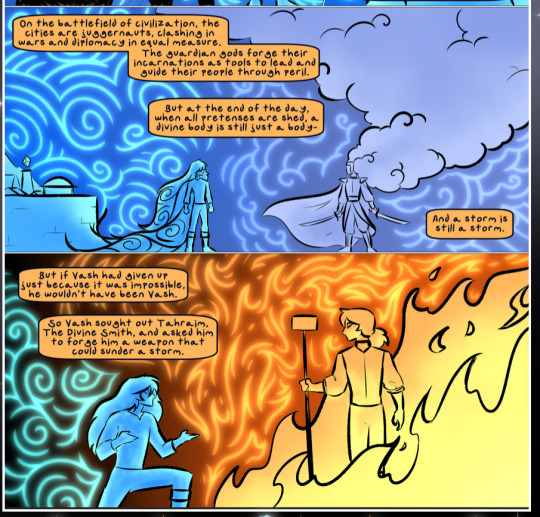
The flowing symbolic lineart surrounding each character. This is actually quite consistent across characters—see also Life's typical lines and how they curl:
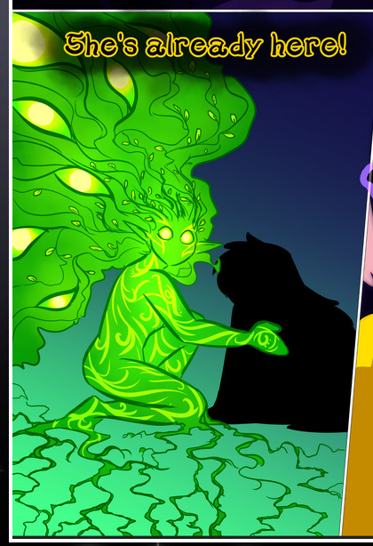
What's particularly interesting here is how these symbols are often similar, but not the same. Vash's lines are always smooth, clean curls, often playing off each other and echoing one another like ripples in a pond. You'd think they'd look too similar to Life's—but they don't. Life's curl like vines, and they remain connected; where one curve might echo another but exist entirely detached from each other in Vash's, Life's lines still remain wound together, because vines are continuous and don't float around. :P
Tahraim's are less continuous, often breaking up with significantly smaller bits and pieces floating around like—of course—sparks, and come to sharper points. These are also constants: we see the vines repeated over and over in Alinua's dreams of Life, and the echoing ripples of Vash are consistent wherever we encounter him. Kendal's dream of the ghost citizens of the city of Vash in the last few chapters is filled with these rippling, echoing patterns, to beautiful effect (https://comicaurora.com/aurora/1-20-14/):
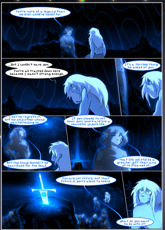
They ripple and spiral, often in long, sinuous curves, with smooth elegance. It reminds me a great deal of images of space and sine waves and the like. This establishes a definite feel to these different characters and their magic. And the thing is, that's not something that had to be done—the colors are good at emphasizing who's who. But it was done, and it adds a whole other dimension to the story. Whenever you're in a deity's domain, you know whose it is no matter the color.
Regarding that shape language, I wanted to make another note, too—Vash is sometimes described as chaotic and doing what he likes, which is interesting to me, because smooth, elegant curves and the color blue aren't generally associated with chaos. So while Vash might behave like that on the surface, I'm guessing he's got a lot more going on underneath; he's probably much more intentional in his actions than you'd think at a glance, and he is certainly quite caring with his city. The other thing is that this suits Kendal perfectly. He's a paragon character; he is kind, virtuous, and self-sacrificing, and often we see him aiming to calm others and keep them safe. Blue is such a good color for him. There is… probably more to this, but I'm not deep enough in yet to say.
And here's the thing: I'm only scratching the surface. There is so much more here I'm not covering (color palettes! outfits! character design! environment! the deities! so much more!) and a lot more I can't cover, because I don't have the experience; this is me as a hobbyist artist who happened to take a couple design classes because I wanted to. The art style to this comic is so clever and creative and beautiful, though, I just had to go off about it. <3
...brownie points for getting all the way down here? Have a cookie.
#aurora comic#aurora webcomic#comicaurora#art analysis#...I hope those are the right tags???#new fandom new tagging practices to learn ig#much thanks for something to read while I try to rest my wrists. carpal tunnel BAD. (ignore that I wrote this I've got braces ok it's fine)#anyway! I HAVE. MANY MORE THOUGHTS. ON THE STORY ITSELF. THIS LOVELY STORY#also a collection of reactions to a chunk of the comic before I hit the point where I was too busy reading to write anything down#idk how to format those tho#...yeet them into one post...???#eh I usually don't go off this much these days but this seems like a smaller tight-knit fandom so... might as well help build it?#and I have a little more time thanks to break so#oh yes also shoutout to my insanely awesome professor for teaching me all the technical stuff from this he is LOVELY#made an incredibly complex program into something comprehensible <3#synapse talks
774 notes
·
View notes
Text

Huzzah! It's birthday time! I'm slowly accumulating more and more things I like (latest additions this vest I made and a travel typewriter! Still need to fix the latter one though)
Sure has been a year.
#terri#niart#got my wisdom toofies out#well 2 out of 4#still got stitches#idk if this removal lowkey fixed my fear of the dentist?#it was so easy and painless#also finally i'm on anxiety meds jkahsdjash#i also got depression meds but i haven't tested them yet#I'm going to see the love of my life soon again!!!#only 2 more months to go....#i've also finally found awesome friends who don't make me feel like i'm insane for wanting to be cared for#the difference is like night and day#old friends saying hey let's surprise another friend of ours oh also i think it's your birthday on that day#new friends reminding me to pick a brunch place for us to go on my special day#i am sobbing#the right people are out there#don't lose hope#i've never felt this platonically loved honestly#also yes i'm working on the next dragon's lair aksjdhasjkd#just#a lot of things happening and i'm sooo burnt out#this piece was such a strain and i just#don't have patience for art rn#this is photobashed btw there's an actual photo of my typewriter under all those layers#i'm not about to spend 300 hours just to draw a typewriter from this angle kajshdjkasdh#ALSO ONE MORE THING CAN I JUST GUSH ABOUT THE ANASTASIA BROADWAY OKAY?!?!?!#I didn't realise until now that they made it way more historically inspired and i mean bruh BRUH#i have been having a recording of it playing on the background nonstop for like 3 days now#Vladimir Popov I want to inject you straight into my veins holy shit he is a perfect man
250 notes
·
View notes
Text
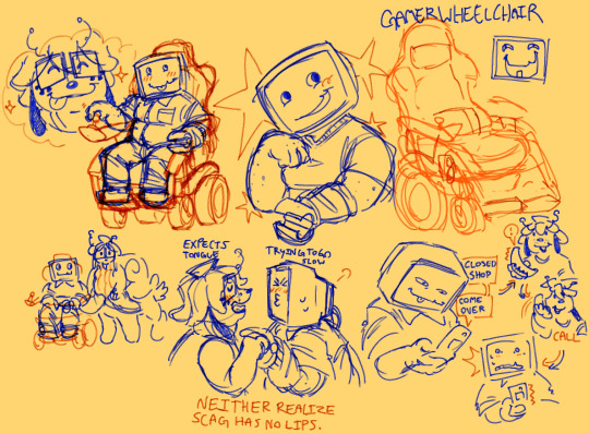
hear me out on scag x split guys. they both start with "s" it's practically canon.
#labyposting#yes i know split x bive but guys we have other women for the both of them. let's explore!!!#don't bully me on my wheelchair drawing skills i have both never drawn one and also attempted a mashup for it so. no real accurate refs#i also couldn't think of how to attach the claw prosthetic to scag's arm so we got tha arm warmerrrrrrrrrrrrr.#probs will change it at some point cus i don't like it. sigh. more references and studies.#not enough time for that now though i must create lesbians#futch4butch my beloved...#they would be so awesome together guys do you have any idea. DO YOU GUYS EVEN KNOW??!???!?!??!#someone ask me about them i want to think about their relationship more but im stuggling with ideas. of what to think.#somebody else ship this with me also. i need a friend in these lonely and trying times#cleft lip gamer electric wheelchair butch nonbinary lesbian IT worker and shop owner scag for the win#oh my gooddddd someone PLEAASEEEEEEEEEEEEEEEEEE#my newest freshest brainrot born straight out of my mind. i'm not going to stop thinking about this.#i want what they have.#ok now i will actually put tags#soz guys i got a little carried away#labyart#my art#regretevator#regretevator roblox#roblox regretevator#regretevator fanart#regretevator art#roblox#roblox art#roblox fanart#fanart#regretevator split#split regretevator#split
286 notes
·
View notes
Text

I’m currently hyperfixated rereading Ftfo and can barely do any drawing but I’m trying!!! ‘^’ Designs are easier to draw for some reason so might see only those for a bit T-T
anyways have my version of Lord Lunar’s Gemini! They get fun new outfits!!!
#my artwork#fnaf#tsams#tsams au#tsams Lord lunar au#tsams castor#tsams pollux#tsams gemini#laes castor#laes pollux#laes gemini#the lunar and earth show#tlaes au#tlaes#little rant incoming#feel free to ignore#bro I’m recognizing the difference between a fun interest and a hyperfication and it’s not fun#I really wanna finish rereading ftfo but i keep having to force myself to be like ‘Take a break#go draw and such’ ect#because I’m just not moving for such long periods of time and I physically have to force my brain to stop skipping lines because I genuinely#can’t focus#and#if I stop for too long I’m so worried I’ll lose interest#want to finish ftfo but hyperfication is so bad#T-T#anyways#drink some fucking water#y’all#(don’t worry to much about me btw I’m doing okay and still taking care of myself just a lil frustrated)#(oh and ftfo is an undertale fanfic btw For the Forgotten Ones by I’m_Sorry_Buddy on Ao3 it’s freaking awesome)
115 notes
·
View notes
Note
I let the brainrot win, I made a Fusionsprunt OC
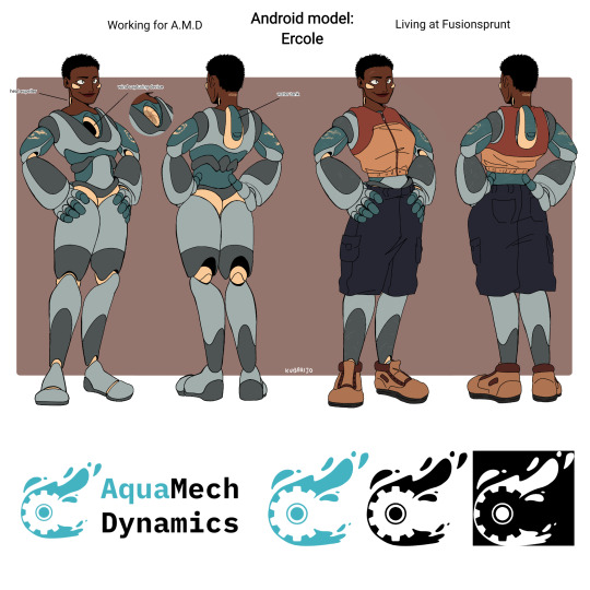
I took the liberty to came up with a whole new company that focuses on building ships, mechanics and androids to use in the ocean field (because I'm an ocean nerd HAHA)
She doesn't have a name yet, but her model was built to lift heavy things on a transportation ship (Ercole= Hercules) and doing minor fixes on machineries of the ship. Also the number of her neck is the date in which I created her (so the day I am sending the ask LMAO I WAS HYPERFOCUSED ON HER THE WHOLE DAY), making it like her series number or smth
I am no scientist but I try to make things have sense HAHAHAHAH So:
Ercole androids are powered by water. They get water into their system like a human drinking water, for then extracting the hydrogen from it with a fuel-cell and releasing the excess water in the water tank on their backs (that can be reused) and the heat from their necks. Extracting the hydrogen from the water is a process called electrolysis, that requires a source of electrical energy, in this case wind power. The hole on their chest serves to capture wind and store the energy created by it, used for the electrolysis. It can open and close, because excessive wind can result in overriding the android's system.
I wanted to make her one of the androids that B2 rescued from their absusive owner (that also broke the wind capturing device making it unable to close, that's why she wears a shirt. Not that she really needed a reason to, but oh well HAHA) 👉👈 For then starting her new life at Fusionsprunt. She ofc helps with heavy lifting (BIG FOREARMS RRRAAAAAAAAAAAAAAA-) and sometimes with machineries repairment
I will make doodles of her interacting with B2, Hunter and Guto because- *cries in wholesomeness*
Also I hope the design makes sense HAHAHAH I am very new to this robo thingy
(SORRY FOR THE LONG ASK AHVHDBFJSBHDBSHS)
WOOAAAAAAHHHHHGAAAAAAAAA AAAAAAAAA💕💕💕💕
#EBABBSAHBSB AAAAGSGQHHAAHGQHWUAAAAAAAAAAAWWWWWAAAGAKAOWOAH#WOAHEOAHWOAHEOAHAAAAAAA#NEW ANDROID SPOTTES#SPOTTED#NEW ANDROID SPOTTED IM GONN#WOAGGHABS#ERCOLE IS AMAZING#SOBBING#YOU EVEN DESIGNED A SYMBOL FORHEGGBGGRRRRRRHGGRGGE#literally so freaking awesome oh my gos#THIS GOES CIENTIFIC WHICH IS SO FUCKING COOL OKAY. OKAY#LOVE ERCOLE SO MUCH#FAV#AWOAHH#fusionsprunt#ERCOLEEEE#PEAK CHARACTER DESIGN: BIG FOREARMS
199 notes
·
View notes
Text
normalize being a little bit in love with your friends
normalize being not at all in love with anything
normalize love being confusing and weird as hell
normalize love not being romantic
normalize love not being
normalize not loving
normalize loving in the wrong way
just. normalize being unapologetically yourself
#sleepyposting#i 100% should not be awake right now#i'm a little bit in love with a lot of things and people#aromantic#actually aromantic#lovequeer aro#loveless aro#this post is loveless aro inclusive#cuz it's awesome#it's like being around people who say they don't do bad things bc god says not to and rhen not understanding why an athiest doesn't do them#and by it i mean: being around people who think love is necessary to be good or a person or whatever#and oh it doesn't have to be romantic. and then they get confused by loveless aros and they go#like oh you actually do feel love you just don't call it that. oh you actually do believe in god you just don't call him that#like no actualy#god and love are unnecessary for goodness and personnenes and uh. *draws a big line around everythung* that#OKAY GOGOD NIGBT NOW <3#i primise#probanly
680 notes
·
View notes
Text
I’ve been highly confused as to why Michael “deeply openly thirsting on Twitter about David Tennant for half a decade” Sheen is half-in half-out the closet but apparently Wales is absurdly homophobic lmao what the fuck how is a country the size of New Jersey that much of a hater bruh we out number the shit out of you
#i thought googling ‘how to say gay’ in welsh would be funny but it just made me sad#i knew the uk in general had a problem with trans people but WOW it’s fucked up in wales like. there are 8 of you what are you doing#i feel bad now lmao#wales#my weird welsh hyperfixation has taken me places let me tell you#cymru#homophobia#gay#lgbt#lgbtqia#good omens#bbc staged#michael sheen#i thought he was just ‘oh i’m quiet about my personal life’ but that’s not even true like my man’s probably actually scared#what a fuckass country lmao awesome#uk politics#united kingdom#david tennant#what is it with this tiny ass island taking over the world and being shitty lmao and this is coming from an american#bisexual#<- bisexual gang gang feel bad you fuckin haters lol#yes the whole world is homophobic i know etc but it’s like outrageously bad out there apparently#stay mad that i think nationalism is dumb ‘how dare you ever have an opinion you american’#you’re white you are not going to like where the power + privilege argument inevitably goes
243 notes
·
View notes