#oh right it was me ehe~
Explore tagged Tumblr posts
Text

who hurt you 🥺😭💔
#oh right it was me ehe~#IM KIDDING IM KIDDING#give him an apple for his troubles#im procrastinating on work#genshin impact#venti#wheat art
104 notes
·
View notes
Text
have realized that while i am not a fan necessarily of "people meet and immediately fall in love" i am a fan of "people meet and are immediately obsessed with each other." the love can come later but the absolute fixation should be immediate
#important text posts#about me#vegaspete and xuexiao in particular come to mind#it's the 'how unhinged does this look from the outside' question maybe#if it just looks like two people hitting it off and being cute together right away then eh not my thing#if it looks like two people who have suddenly zeroed in on each other in a way that makes others go 'oh that doesn't seem good'#i'm there baby
41K notes
·
View notes
Text
forever thinking about Cardan absentmindedly running his finger along the curve of Jude’s ear while they were lying side by side under the stars
#and then realising it in shame and pulling away!#oh early jurdan….#everyone moved on but i stayed right there.........#this was one of the scenes that made me go from 'cardan? eh whatever jude deserves better' to 'OHMYDJKFHEKJL jurdan crumbs help me save me'#jude x cardan#jurdan#tfota#cardan greenbriar#jude duarte#the cruel prince
977 notes
·
View notes
Text
why Aurora's art is genius
It's break for me, and I've been meaning to sit down and read the Aurora webcomic (https://comicaurora.com/, @comicaurora on Tumblr) for quite a bit. So I did that over the last few days.
And… y'know. I can't actually say "I should've read this earlier," because otherwise I would've been up at 2:30-3am when I had responsibilities in the morning and I couldn't have properly enjoyed it, but. Holy shit guys THIS COMIC.
I intended to just do a generalized "hello this is all the things I love about this story," and I wrote a paragraph or two about art style. …and then another. And another. And I realized I needed to actually reference things so I would stop being too vague. I was reading the comic on my tablet or phone, because I wanted to stay curled up in my chair, but I type at a big monitor and so I saw more details… aaaaaand it turned into its own giant-ass post.
SO. Enjoy a few thousand words of me nerding out about this insanely cool art style and how fucking gorgeous this comic is? (There are screenshots, I promise it isn't just a wall of text.) In my defense, I just spent two semesters in graphic design classes focusing on the Adobe Suite, so… I get to be a nerd about pretty things…???
All positive feedback btw! No downers here. <3
---
I cannot emphasize enough how much I love the beautiful, simple stylistic method of drawing characters and figures. It is absolutely stunning and effortless and utterly graceful—it is so hard to capture the sheer beauty and fluidity of the human form in such a fashion. Even a simple outline of a character feels dynamic! It's gorgeous!
Though I do have a love-hate relationship with this, because my artistic side looks at that lovely simplicity, goes "I CAN DO THAT!" and then I sit down and go to the paper and realize that no, in fact, I cannot do that yet, because that simplicity is born of a hell of a lot of practice and understanding of bodies and actually is really hard to do. It's a very developed style that only looks simple because the artist knows what they're doing. The human body is hard to pull off, and this comic does so beautifully and makes it look effortless.
Also: line weight line weight line weight. It's especially important in simplified shapes and figures like this, and hoo boy is it used excellently. It's especially apparent the newer the pages get—I love watching that improvement over time—but with simpler figures and lines, you get nice light lines to emphasize both smaller details, like in the draping of clothing and the curls of hair—which, hello, yes—and thicker lines to emphasize bigger and more important details and silhouettes. It's the sort of thing that's essential to most illustrations, but I wanted to make a note of it because it's so vital to this art style.
THE USE OF LAYER BLENDING MODES OH MY GODS. (...uhhh, apologies to the people who don't know what that means, it's a digital art program thing? This article explains it for beginners.)
Bear with me, I just finished my second Photoshop course, I spent months and months working on projects with this shit so I see the genius use of Screen and/or its siblings (of which there are many—if I say "Screen" here, assume I mean the entire umbrella of Screen blending modes and possibly Overlay) and go nuts, but seriously it's so clever and also fucking gorgeous:
Firstly: the use of screened-on sound effect words over an action? A "CRACK" written over a branch and then put on Screen in glowy green so that it's subtle enough that it doesn't disrupt the visual flow, but still sticks out enough to make itself heard? Little "scritches" that are transparent where they're laid on without outlines to emphasize the sound without disrupting the underlying image? FUCK YES. I haven't seen this done literally anywhere else—granted, I haven't read a massive amount of comics, but I've read enough—and it is so clever and I adore it. Examples:


Secondly: The beautiful lighting effects. The curling leaves, all the magic, the various glowing eyes, the fog, the way it's all so vividly colored but doesn't burn your eyeballs out—a balance that's way harder to achieve than you'd think—and the soft glows around them, eeeee it's so pretty so pretty SO PRETTY. Not sure if some of these are Outer/Inner Glow/Shadow layer effects or if it's entirely hand-drawn, but major kudos either way; I can see the beautiful use of blending modes and I SALUTE YOUR GENIUS.
I keep looking at some of this stuff and go "is that a layer effect or is it done by hand?" Because you can make some similar things with the Satin layer effect in Photoshop (I don't know if other programs have this? I'm gonna have to find out since I won't have access to PS for much longer ;-;) that resembles some of the swirly inner bits on some of the lit effects, but I'm not sure if it is that or not. Or you could mask over textures? There's... many ways to do it.
If done by hand: oh my gods the patience, how. If done with layer effects: really clever work that knows how to stop said effects from looking wonky, because ugh those things get temperamental. If done with a layer of texture that's been masked over: very, very good masking work. No matter the method, pretty shimmers and swirly bits inside the bigger pretty swirls!
Next: The way color contrast is used! I will never be over the glowy green-on-black Primordial Life vibes when Alinua gets dropped into that… unconscious space?? with Life, for example, and the sharp contrast of vines and crack and branches and leaves against pitch black is just visually stunning. The way the roots sink into the ground and the three-dimensional sensation of it is particularly badass here:

Friggin. How does this imply depth like that. HOW. IT'S SO FREAKING COOL.
A huge point here is also color language and use! Everybody has their own particular shade, generally matching their eyes, magic, and personality, and I adore how this is used to make it clear who's talking or who's doing an action. That was especially apparent to me with Dainix and Falst in the caves—their colors are both fairly warm, but quite distinct, and I love how this clarifies who's doing what in panels with a lot of action from both of them. There is a particular bit that stuck out to me, so I dug up the panels (see this page and the following one https://comicaurora.com/aurora/1-20-30/):

(Gods it looks even prettier now that I put it against a plain background. Also, appreciation to Falst for managing a bridal-carry midair, damn.)
The way that their colors MERGE here! And the immense attention to detail in doing so—Dainix is higher up than Falst is in the first panel, so Dainix's orange fades into Falst's orange at the base. The next panel has gold up top and orange on bottom; we can't really tell in that panel where each of them are, but that's carried over to the next panel—
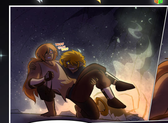
—where we now see that Falst's position is raised above Dainix's due to the way he's carrying him. (Points for continuity!) And, of course, we see the little "huffs" flowing from orange to yellow over their heads (where Dainix's head is higher than Falst's) to merge the sound of their breathing, which is absurdly clever because it emphasizes to the viewer how we hear two sets of huffing overlaying each other, not one. Absolutely brilliant.
(A few other notes of appreciation to that panel: beautiful glows around them, the sparks, the jagged silhouette of the spider legs, the lovely colors that have no right to make the area around a spider corpse that pretty, the excellent texturing on the cave walls plus perspective, the way Falst's movements imply Dainix's hefty weight, the natural posing of the characters, their on-point expressions that convey exactly how fuckin terrifying everything is right now, the slight glows to their eyes, and also they're just handsome boys <3)
Next up: Rain!!!! So well done! It's subtle enough that it never ever disrupts the impact of the focal point, but evident enough you can tell! And more importantly: THE MIST OFF THE CHARACTERS. Rain does this irl, it has that little vapor that comes off you and makes that little misty effect that plays with lighting, it's so cool-looking and here it's used to such pretty effect!
One of the panel captions says something about it blurring out all the injuries on the characters but like THAT AIN'T TOO BIG OF A PROBLEM when it gets across the environmental vibes, and also that'd be how it would look in real life too so like… outside viewer's angle is the same as the characters', mostly? my point is: that's the environment!!! that's the vibes, that's the feel! It gets it across and it does so in the most pretty way possible!
And another thing re: rain, the use of it to establish perspective, particularly in panels like this—

—where we can tell we're looking down at Tynan due to the perspective on the rain and where it's pointing. Excellent. (Also, kudos for looking down and emphasizing how Tynan's losing his advantage—lovely use of visual storytelling.)
Additionally, the misting here:
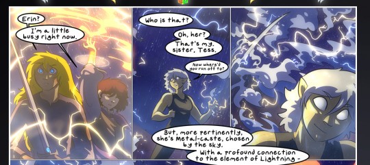
We see it most heavily in the leftmost panel, where it's quite foggy as you would expect in a rainstorm, especially in an environment with a lot of heat, but it's also lightly powdered on in the following two panels and tends to follow light sources, which makes complete sense given how light bounces off particles in the air.
A major point of strength in these too is a thorough understanding of lighting, like rim lighting, the various hues and shades, and an intricate understanding of how light bounces off surfaces even when they're in shadow (we'll see a faint glow in spots where characters are half in shadow, but that's how it would work in real life, because of how light bounces around).
Bringing some of these points together: the fluidity of the lines in magic, and the way simple glowing lines are used to emphasize motion and the magic itself, is deeply clever. I'm basically pulling at random from panels and there's definitely even better examples, but here's one (see this page https://comicaurora.com/aurora/1-16-33/):

First panel, listed in numbers because these build on each other:
The tension of the lines in Tess's magic here. This works on a couple levels: first, the way she's holding her fists, as if she's pulling a rope taut.
The way there's one primary line, emphasizing the rope feeling, accompanied by smaller ones.
The additional lines starbursting around her hands, to indicate the energy crackling in her hands and how she's doing a good bit more than just holding it. (That combined with the fists suggests some tension to the magic, too.) Also the variations in brightness, a feature you'll find in actual lightning. :D Additional kudos for how the lightning sparks and breaks off the metal of the sword.
A handful of miscellaneous notes on the second panel:
The reflection of the flames in Erin's typically dark blue eyes (which bears a remarkable resemblance to Dainix, incidentally—almost a thematic sort of parallel given Erin's using the same magic Dainix specializes in?)
The flowing of fabric in the wind and associated variation in the lineart
The way Erin's tattoos interact with the fire he's pulling to his hand
The way the rain overlays some of the fainter areas of fire (attention! to! detail! hell yeah!)
I could go on. I won't because this is a lot of writing already.
Third panel gets paragraphs, not bullets:
Erin's giant-ass "FWOOM" of fire there, and the way the outline of the word is puffy-edged and gradated to feel almost three-dimensional, plus once again using Screen or a variation on it so that the stars show up in the background. All this against that stunning plume of fire, which ripples and sparks so gorgeously, and the ending "om" of the onomatopoeia is emphasized incredibly brightly against that, adding to the punch of it and making the plume feel even brighter.
Also, once again, rain helping establish perspective, especially in how it's very angular in the left side of the panel and then slowly becomes more like a point to the right to indicate it's falling directly down on the viewer. Add in the bright, beautiful glow effects, fainter but no less important black lines beneath them to emphasize the sky and smoke and the like, and the stunningly beautiful lighting and gradated glows surrounding Erin plus the lightning jagging up at him from below, and you get one hell of an impactful panel right there. (And there is definitely more in there I could break down, this is just a lot already.)
And in general: The colors in this? Incredible. The blues and purples and oranges and golds compliment so well, and it's all so rich.
Like, seriously, just throughout the whole comic, the use of gradients, blending modes, color balance and hues, all the things, all the things, it makes for the most beautiful effects and glows and such a rich environment. There's a very distinct style to this comic in its simplified backgrounds (which I recognize are done partly because it's way easier and also backgrounds are so time-consuming dear gods but lemme say this) and vivid, smoothly drawn characters; the simplicity lets them come to the front and gives room for those beautiful, richly saturated focal points, letting the stylized designs of the magic and characters shine. The use of distinct silhouettes is insanely good. Honestly, complex backgrounds might run the risk of making everything too visually busy in this case. It's just, augh, so GORGEOUS.
Another bit, take a look at this page (https://comicaurora.com/aurora/1-15-28/):
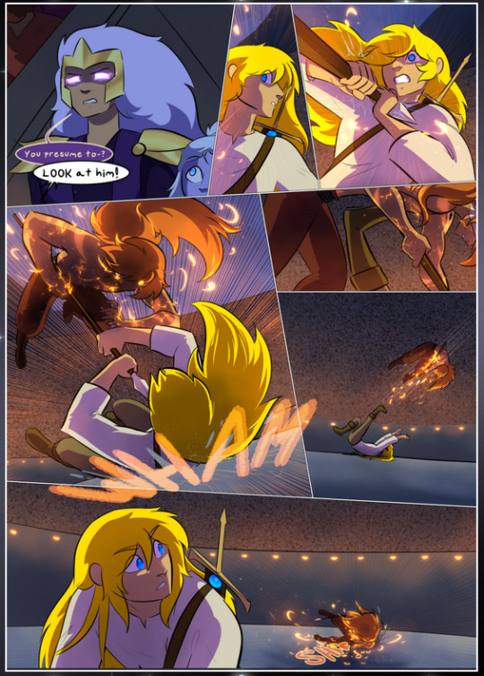
It's not quite as evident here as it is in the next page, but this one does some other fun things so I'm grabbing it. Points:
Once again, using different colors to represent different character actions. The "WHAM" of Kendal hitting the ground is caused by Dainix's force, so it's orange (and kudos for doubling the word over to add a shake effect). But we see blue layered underneath, which could be an environmental choice, but might also be because it's Kendal, whose color is blue.
And speaking off, take a look at the right-most panel on top, where Kendal grabs the spear: his motion is, again, illustrated in bright blue, versus the atmospheric screened-on orange lines that point toward him around the whole panel (I'm sure these have a name, I think they might be more of a manga thing though and the only experience I have in manga is reading a bit of Fullmetal Alchemist). Those lines emphasize the weight of the spear being shoved at him, and their color tells us Dainix is responsible for it.
One of my all-time favorite effects in this comic is the way cracks manifest across Dainix's body to represent when he starts to lose control; it is utterly gorgeous and wonderfully thematic. These are more evident in the page before and after this one, but you get a decent idea here. I love the way they glow softly, the way the fire juuuust flickers through at the start and then becomes more evident over time, and the cracks feel so realistic, like his skin is made of pottery. Additional points for how fire begins to creep into his hair.
A small detail that's generally consistent across the comic, but which I want to make note of here because you can see it pretty well: Kendal's eyes glow about the same as the jewel in his sword, mirroring his connection to said sword and calling back to how the jewel became Vash's eye temporarily and thus was once Kendal's eye. You can always see this connection (though there might be some spots where this also changes in a symbolic manner; I went through it quickly on the first time around, so I'll pay more attention when I inevitably reread this), where Kendal's always got that little shine of blue in his eyes the same as the jewel. It's a beautiful visual parallel that encourages the reader to subconsciously link them together, especially since the lines used to illustrate character movements typically mirror their eye color. It's an extension of Kendal.
Did I mention how ABSOLUTELY BEAUTIFUL the colors in this are?
Also, the mythological/legend-type scenes are illustrated in familiar style often used for that type of story, a simple and heavily symbolic two-dimensional cave-painting-like look. They are absolutely beautiful on many levels, employing simple, lovely gradients, slightly rougher and thicker lineart that is nonetheless smoothly beautiful, and working with clear silhouettes (a major strength of this art style, but also a strength in the comic overall). But in particular, I wanted to call attention to a particular thing (see this page https://comicaurora.com/aurora/1-12-4/):
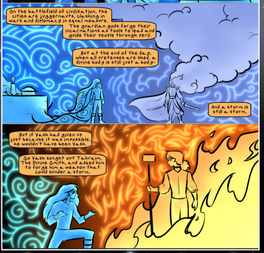
The flowing symbolic lineart surrounding each character. This is actually quite consistent across characters—see also Life's typical lines and how they curl:
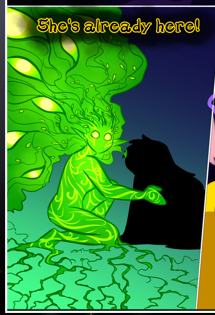
What's particularly interesting here is how these symbols are often similar, but not the same. Vash's lines are always smooth, clean curls, often playing off each other and echoing one another like ripples in a pond. You'd think they'd look too similar to Life's—but they don't. Life's curl like vines, and they remain connected; where one curve might echo another but exist entirely detached from each other in Vash's, Life's lines still remain wound together, because vines are continuous and don't float around. :P
Tahraim's are less continuous, often breaking up with significantly smaller bits and pieces floating around like—of course—sparks, and come to sharper points. These are also constants: we see the vines repeated over and over in Alinua's dreams of Life, and the echoing ripples of Vash are consistent wherever we encounter him. Kendal's dream of the ghost citizens of the city of Vash in the last few chapters is filled with these rippling, echoing patterns, to beautiful effect (https://comicaurora.com/aurora/1-20-14/):
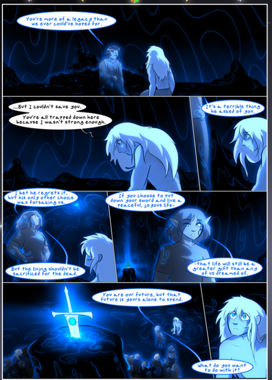
They ripple and spiral, often in long, sinuous curves, with smooth elegance. It reminds me a great deal of images of space and sine waves and the like. This establishes a definite feel to these different characters and their magic. And the thing is, that's not something that had to be done—the colors are good at emphasizing who's who. But it was done, and it adds a whole other dimension to the story. Whenever you're in a deity's domain, you know whose it is no matter the color.
Regarding that shape language, I wanted to make another note, too—Vash is sometimes described as chaotic and doing what he likes, which is interesting to me, because smooth, elegant curves and the color blue aren't generally associated with chaos. So while Vash might behave like that on the surface, I'm guessing he's got a lot more going on underneath; he's probably much more intentional in his actions than you'd think at a glance, and he is certainly quite caring with his city. The other thing is that this suits Kendal perfectly. He's a paragon character; he is kind, virtuous, and self-sacrificing, and often we see him aiming to calm others and keep them safe. Blue is such a good color for him. There is… probably more to this, but I'm not deep enough in yet to say.
And here's the thing: I'm only scratching the surface. There is so much more here I'm not covering (color palettes! outfits! character design! environment! the deities! so much more!) and a lot more I can't cover, because I don't have the experience; this is me as a hobbyist artist who happened to take a couple design classes because I wanted to. The art style to this comic is so clever and creative and beautiful, though, I just had to go off about it. <3
...brownie points for getting all the way down here? Have a cookie.
#aurora comic#aurora webcomic#comicaurora#art analysis#...I hope those are the right tags???#new fandom new tagging practices to learn ig#much thanks for something to read while I try to rest my wrists. carpal tunnel BAD. (ignore that I wrote this I've got braces ok it's fine)#anyway! I HAVE. MANY MORE THOUGHTS. ON THE STORY ITSELF. THIS LOVELY STORY#also a collection of reactions to a chunk of the comic before I hit the point where I was too busy reading to write anything down#idk how to format those tho#...yeet them into one post...???#eh I usually don't go off this much these days but this seems like a smaller tight-knit fandom so... might as well help build it?#and I have a little more time thanks to break so#oh yes also shoutout to my insanely awesome professor for teaching me all the technical stuff from this he is LOVELY#made an incredibly complex program into something comprehensible <3#synapse talks
778 notes
·
View notes
Note
what is the age gap between the Broker and Brooklynn? I’m just curious how old the broker is and how long she’s been doing this dinosaur trading venture
Mmhm, of course hehe.
This is a very funny question to me because I remember having this discussion about Santos' age with some of the other storyboard artists back when there was talk about leaning into more of a Killing Eve angle with her and Brooklynn (the final decision on how far we leaned into that was not our decision to make, I will note), and whether or not fans would find an age gap between them 'problematic' if we did lean into it too far LOL.
Because Dichen Lachman was TECHNICALLY around 39 or 40 when Dominion was filmed and took place... but I honestly have no idea if SANTOS is supposed to be that age, as well. Dichen's just got that really ageless look. If you told me Santos was in her late 20s to mid 30s I'd believe it just as easily.
#somewhere in her 30s honestly feels right to me personally#but Santos has no canon age that I am aware of#I think the board team discussed this once and went 'eh'#lol#jurassic world chaos theory#jwct#spoilers#soyona santos#ask#anonymous#storyboard artist#chaos crew#but also on the topic of whether the age gap is problematic.... this woman kills people who get in her way with dinosaurs#she tried to kill Brooklynn and the N5#I think the age gap is the least of their worries haha#oh and as far as how long she's been trading dinosaurs... long enough!#I think Dichen Lachmen herself came up with a whole backstory for her that she's talked about in interviews#and we used some of it in the show
100 notes
·
View notes
Text
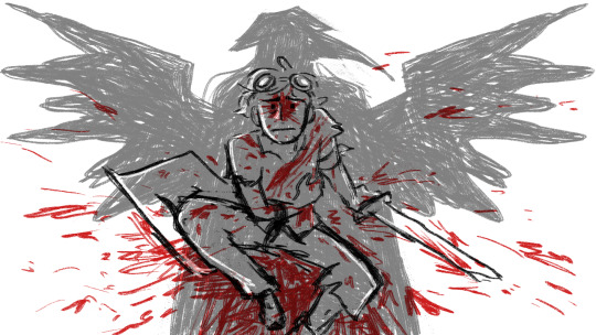
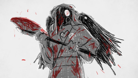
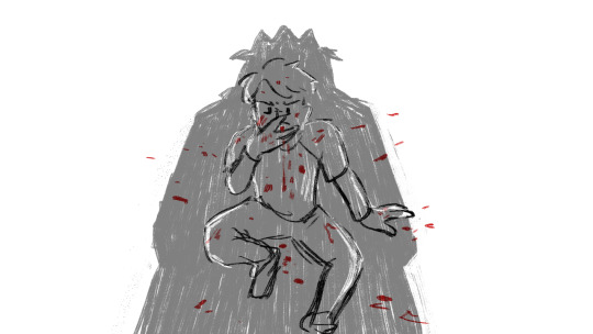

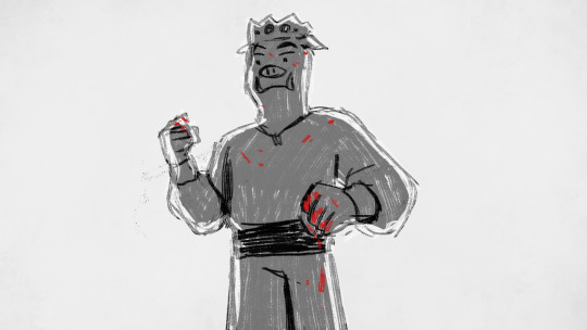

the only universal language
(inspired by @duckcoin 's post and based on two frames from how far we've come)
#bearscratches#i havent made art in ages but this compelled me#qsmp#dreamsmp#qsmp tubbo#qsmp philza#tubbo#philza#blood#its a little messy but eh. theyre based on frames from a video. i probably put less effort into the originals#i rewatched hfwc and i found the post at just the right moment that i was like. oh ive gotta redraw this Now#edit disclaimer i am dramatizinf events here it didnt go down like this. i just liked the parallels ‼‼
442 notes
·
View notes
Text
okay but why is this season of the boys such a mess. like. episodes 1 - 5 were actually pretty good (especially 4 and 5, specifically the homelander + hughie and his dad plotlines respectively in those were SO good), then ep 6 was a clusterfuck outside of butcher's stuff, and i kinda thought we were on track for something pretty okay when annie took hughie's assault seriously at the end of the episode only for it to just be brushed off this episode AND hughie gets SA'd AGAIN?????? HELLO?????
#also is it just me but something was. off. about episode 7#the dialogue was clunky#it was shot weird. like idk it didnt feel right but dont ask me to explain#the ashley and a-train stuff was good but homelander firecracker and sage were just. weird#webweaver scene felt unnecessary and a very forced “ohoho homelander kills someone in a gruesome way!”#and the deep subplot was??? okay i guess??? the stuff with the octopus was absurd and funny which was kind of always deep's thing(tm)#but then his fight with annie and everyone was. eh???#oh and kimiko and frenchie#like they were cute as always but. idk. i feel like frenchie's stuff is getting kind of rushed + kimiko having a whole other reason she#doesnt speak felt like it came out of nowhere. but thats a nitpick#anyway yeah idk. ill still watch the next episode since im this deep in but i am NOT optimistic for a good conclusion#the boys#billy butcher#hughie campbell#annie january#kimiko miyashiro#frenchie the boys#homelander#firecracker#the boys s4#the boys spoilers
98 notes
·
View notes
Text
Kaeya visits the Dawn Winery... a lot.
He has multiple reasons and excuses that change every time he is greeted by Adelinde.
An investigation on the Darknight hero.
A mission he received from Jean.
A short detour from his patrols.
One time, all he did was ask for a glass of wine before he went his merry way.
Another, he spent a bit more time within the building, creating jam with Adelinde.
Diluc occasionally catches the man approaching the winery from a distance. If he was lucky enough to evade Kaeya's attention, he would send Adelinde to talk to the cavalry captain in his stead. As for the other times, Kaeya would glance up to meet his eyes from where the cavalry captain was standing by the entrance - thru his tinted windows somehow. The younger man's eyes would be glinting mischievously, his ever-present smirk slowly growing on his face.
"Gotcha," his face seemed to imply.
Diluc simply huffs in frustration before leaving his room to spend a couple of moments bantering with the other.
Diluc knows how frequent Kaeya's visits were. He fully expects at least 2 visits in a week...
...The idea that Kaeya frequently visits but never stays... leaves a bitter taste in Diluc's mouth.
Kaeya himself had said that Dawn Winery was his home. If he thought so, why was he always doling out excuses just to be here?
Doesn't Kaeya know he is welcome any time?
Does Kaeya know he could stay?
.
.
.
Like clockwork, Kaeya visits the Dawn Winery.
This time, Kaeya manages to meet his eyes- thru the tinted windows somehow.
Diluc huffs, leaves his room, and meets the other by the entrance.
Kaeya tries to give an excuse for his visit.
Diluc interrupts by saying "you don't need a reason to come home".
.
.
.
'Gotcha' Diluc thinks. He feels as if he won something upon being met by Kaeya's stunned face and hearing Adelinde's giggles at the background.
#oh wow im not done with the kaeyangst huh#kaeya you do know you can visit without making an excuse right?#and no diluc he doesnt know he could do that hnghh#watch me pull up with a miscommunication oneshot#kaeya#kaeya alberich#diluc#diluc ragnvindr#yeah i want a repeat of what happened during weinlesefest#GIVE ME ANOTHER MOMENT LIKE WEINLESEFEST#at this point i should just tag kaeyangst#i might continue this someday though coz i have more thoughts#maybe hints of tism ehe#kaeya and diluc are adhd vs. autism btw but thats just an HC#a kaeyachi HC
344 notes
·
View notes
Text

#playtesters will be able to talk about da4 after 19th right?#hear me out... was it supposed to come out late september ?#they had a pre launch party and everything ... eh...#playtesters: good luck with the spoilers ...hope you can avoid them#for a whole month :D#oh bioware you fked it up so badly#at this point im like ' dude? i wanna be a playtester tooooo? the fuck? :D'
21 notes
·
View notes
Text
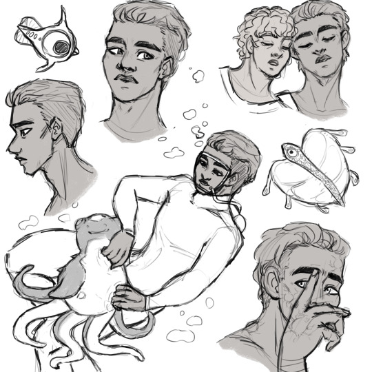
Here, some Ryley sketches ft. Cuddlefish skritches, Peeper, Bladderfish, and This Is Ozzy From The Cafeteria What The Hell Guys!
i haven't drawn in quite some time but yknow its exam phase so :/ ofc my motivation comes back when I really should be doing something else like idk study? or somethin
#subnautica#ryley robinson#ozzy from the cafeteria#subnautica ozzy#digital art#subnautica fanart#artists on tumblr#yeah some parts are kinda fucked up but eh i still like this#this is actually my first time drawing ozzy and i hadn't really thought of a design for them so this is probably gonna be subject to change#haven't really gotten a grasp on them as a whole either like i used to think i knew but i've changed since then and also replayed the game#kinda thinking ozzy maybe would use neopronouns? like im headcanoning and projecting onto both of them#you could say ive hit them with the enby beam#also the aspec beam ngl#but yeah my characterisation isnt finalised yet#where was i going with this#anyway i AM really proud of that cuddlefish#cutest crusty ass motherfucker ever#sorry but trivalves or whatever theyre called just kinda dont compare? like for me#oh right! also kharaa pustules ryley! i wanted to make them glow green but i really wasn't feeling like colouring#and also it looked ass when i tried#ive written a bloody novel in the notes again#eh :P at this point this is just a proof its really me asdjakdnjlkaslafaiwdajdawijdlafnjgdn#RIGHT ozzy and ryley are in a qpr CHANGE MY FUCKING MIND WAIT U CANT#jk ur interpretation of these fictional chars with minimal information on them is valid! to each their own and all that
61 notes
·
View notes
Text

pals and other things :D
#art#my art#artists on tumblr#digital art#oc#cat cup#doodles#eye strain#! ! ! they are like terrarium creatures to me hbsfh :3#//my brother reed had the idea for them to have little goats for their wagons and honestly. Yea lfsfhv#//oh so the other two cats are Smokey (or Smokes sometimes (he/him)) and Quarry (she/her) :D#there are about 6 other characters in their group but they are not so important so bfsh#/the dragonflies are fairies!! it's only right imo lol :>#for species i have so far are 1) the cats 2) humans 3) trolls (small guys) 4) fairies and 5) hags#'what's with the hags' technically they're just magical old people and can be of any species but i think it's funny so hfbhs#asked some of my siblings which species they'd like to be and they all deeply considered hag so it was a hit hgshf#OH! i almost forgot about 6) The Beasts#<- they're kinda inspired by whatever those things were in the wizard of oz#genuinely scared me as a child so hbfsh :>#forgot what they were called though!! creepy guys lol <3#/oh there may also be banshees 👍 another thought from reed ehe :3#//oh and i'm using the little drop thingies to represent spirits in this story !#which include ghosts and fairies and banshees and da da da da ykno :>#//yep yep!!#i'm gonna head off rn though..#toooodles toodles [waves handkerchief]#hey i can write handkerchief first try!! sick :D#bye though hbfsv - bye !!
18 notes
·
View notes
Text
yes, i do think that we don't have enough fucked up sisters representation in media actually, thank you arcane
#mse's watching arcane#i'm seeing the ~vision~#i can't believe vi just left caitlyn chatting with some woman in a brothel that was hilarious#poor viktor though he's getting neglected by his ~partner~ for sure#anyway surely i can watch one more episode right? it's not like i have work tomorrow... oh wait#eh who cares my anxiety would keep me up anyway
10 notes
·
View notes
Text
sometimes i want to make a post about a particular aroace experience but 2015 ace discourse fucked me up too much to feel comfy posting that here, especially because some people apparently haven't fucking moved on given that i saw a bunch of it in the notes of an unrelated post a couple of days ago
#sigh.#somethingsomething almost more pressure to experience attraction if there are more possibilities for attraction#i.e. being entirely surrounded by queer people means you know there are SO MANY different types of relationship and genders and whatever#it almost makes me feel MORE broken because there are MORE things i'm not experiencing#if it was just that i couldn't vibe with heteronormative monogamy that would only be one thing i wasn't able to do right#but it's almost more frustrating that i KNOW there are so many options out there#i see so many options demonstrated in my personal friendship circles#and my brain can do NONE of them?? really??? fuckin inconvenient#feeling broken and weird around straight people: eh the problem's them#feeling broken and weird around queer people: oh the problem's me :/#<- person who spent like 8+ entire years being totally fine with / proud of being aroace#and is now firmly in camp 'well it's 100% fine for other people but for me personally.... ffs it's pissing me off'#bad representation for my own identity. i'm aware of that#personal
24 notes
·
View notes
Text
Next time we should just skip over ep 3 and do a chapters 84-87 reread
#Mmmmmmhhhh.#Well. If anything you can always tell when there's a ss/kk episode by the fact that it takes me two hours to watch it lol#What can I say. I'm a compulsive screencap taker#Mmmmmmhhh... I was right it wasn't as bad as I remembered it. Still moderately bad but not all bad.#It's just. I can feel the animators did their best.#I suppose it's just a difficult episode to animate within a short time frame since it's a specifically action packed one.#And the lack of time really shows. Like there *are* some detailed animated passages here and there. But then there's also these long static#shots that stretch on forever that are just... Idk. A little saddening to see I guess? Like the animators really ran out of time for them#There's also a big component of... I just can't vibe with the newfound artstyle. Like it looks soooo much worse than s1 in my opinion#Which you know‚ is only subjective! But eh... The distance between s2ep11 and this feels abyssal.#Everyone looks so ugly oftentimes. Like even in curated shots‚ they're just very rough and ungraceful.#Which like?? How could you look at Harukawa's art and come up with //that//??????? But it's whatever#And the pacing is so so off 😭😭😭 God please to death with 11 episodes long seasons give us filler episodes back. Please!!!!#The pacing is atrocious and it has not even to do with the animation. Even greatly animated episodes suffer from it.#Mmmmhh... I don't particularly like Fukuchi's vacting... He doesn't sound tired enough. Nor as pitiful as much as he should tbh#Among the three I feel like only Uemura really nails the job. I'm so sorry Onoken but I feel like even Akutagawa needs to sound vulnerable–#once in a while‚ you know? Although‚ if he's only going with how Bones depicts him‚ then I get why he would act him out like that 😭😭😭#There were so many reused shots too... The ones from the end of s2ep11... The s3ep12 kokko zessou one... Ss/kk running in the corridors...#Overall. Not as bad as I remembered it. But at the same time I get why I was so distraught because they really wasted the best four–#chapters of the manga just like that.#The “is his life that precious to you” moment was terrible 😭😭😭 Head in hands fr#Oh well. I babble a lot but it was okay. Like at least it wasn't season 3 kind of bad. And definitely wasn't t/pn s2 kind of bad LOL#I just hope ss/kk will be made justice in the future (╥﹏╥)#Especially since their new scenes (current manga events) are possibly going to be adapted in the first episodes of the new season.#If Bones pulls another s5ep3 on them you're going to see me on the news#Then again I have hope the arc finale will be adapted in a movie... Who knows...#Most of all I hope they change art style direction again D:#random rambles#Whaaaa it's so late already!!!#Edit: Oh also to not forget I've made like. One hundred posts. Maybe it's time to unfollow me now if you haven't already D:
8 notes
·
View notes
Text
In honor of Machine Monday (and also since I'm able to draw again >:3), I whipped up a special background x3

My PC doesn't have a capture card so I couldn't screenshot but look!!!!!! It's!!!!! :DD its Static!!!!!!!!! In the fle- In the tech!!!!!!!!!!!!
#:DDDDD#im so full of joyous whimsy rn SHES RIGHT THERE!!!! IN FRONT OF ME!!!!!!#HES SO PRETTY!!!!!!! THEYR SO HANDDOME!!!!!!!!!!!!! IM oh no im. im goin bonkers over my own OC#eh idc IM SO PROUD OF HER I WANNSA HUG EM#GRAH#my art#my oc#MACHINE MONDAY#storm doodles
16 notes
·
View notes
Text
“omg I have stuff to do today I need to get up why am I so tired”
the leif i absentmindedly doodled past 11pm because I suddenly found the airbrush tool to be Very fun:

#not really tagging this as anything cause this isn’t art I put any effort into#I am just pissed off at myself lmao#spoilers in the upcoming tags#the majority of this post’s content is gonna be in the tags lmao#I watched a vid yesterday abt cordyceps. what a terrifying thing#iirc ants will actually carry away infected ants to protect the rest of them. isn’t that insane#ants are social bugs and I don’t think moths are (look I love bug fables but idk shit about bugs)#but it got me thinkin#ya think that if anyone else found out abt the whole leif cordyceps thing they might try to quarantine him or smthn?#his cordyceps couldn’t infect anyone else but moths so it’s not like the greater public is in danger#but idk if it would be seen as acceptable for him to hang out around muze and tod when he has a parasitic fungus that could kill them#eh who knows!! i am just spitballing.#my brain was just tossing around fic ideas. fics I will never write#like what if zasp knew. like when he was trying to save him from the scorpion attack he realized#‘oh shit there is a fungus in this guy’#like that wound was pretty deep right. he’d probably definitely see some cordyceps hanging out in there#even if he didn’t know exactly what it was#anyway idk what I’m talking about. I’m gonna shadow at the vet clinic in like. four hours#so I should probably get out of bed and stop thinking about parasitic fungi#but rambling abt bug fables while I sit in bed listening to pop music is so fun……
8 notes
·
View notes