#not sure how I feel about the preset I used but we'll see
Explore tagged Tumblr posts
Text

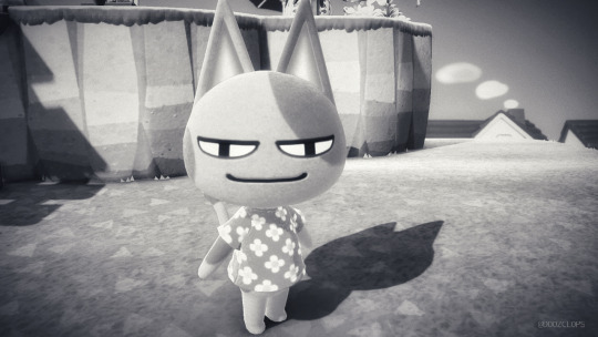
ANIMAL CROSSING: NEW HORIZONS ↳ Very Normal Dreams [1/?]
#acnh#animal crossing#new horizons#virtual photography#video game scenery#acnh dreams#not sure how I feel about the preset I used but we'll see#I wanted to visit random dream islands and portray them in a dreamy way#so hopefully it gets across#doozvp#Dooz plays games
1 note
·
View note
Text


ok i finished carrie!! still working on the rest (started by making their faces this time) . i feel like miranda and charlotte might need the most work? ofc they are not going to look like carbon copies but they could look closer. i need to put my presets back but i took them out when i was trouble shooting (zerbu's more presets are so amazing i hadn't realized how much i used them lol) something about them doesn't look cohesive and idk what it is!! like the "style" is just inconsistent im not sure if i'll upload them when im done just cus of all the cc but we'll see
Edit ok yeah i thikn im gonna redo charlotte and change miranda
#also probably not uploading cus i feel like ppl will complain about their outfits#i didnt try to copy exactly
5 notes
·
View notes
Note
Hey I have a question about how you make stuff like this (the photo). I really want to try it but I have no idea where to start. 😅
Thanks in advance!
Hi! I would love to help you! 😊I am gonna go through this from the very beginning, so if you already know some of this stuff feel free to skim around! I thought I'd be thorough in case it helps anyone else too :)
Update!! : After you read this, Part 2 is here!
So first things first, you'll need to be on PC cuz we'll need some mods. Be sure to download all required dependencies and read the main page to make sure they install and work! To start with the basics, the mods I use for photomode capabilities are these ones here:
Photo Mode Unlocked (PMU) This mod adds extra features to photomode and removes a lot of the restrictions.
Appearance Menu Mod (AMM) This lets you do all sorts of things like place decorations, spawn NPCs, change character's outfits, teleport to other locations, and so much more! It's basically crucial for taking photos a wide variety of photos! I will say, a lot of people do their character spawning and posing directly through AMM. Using AMM is a great way to do it and allows for more variety and ease, but unfortunately I frequently get a bug that makes it frustrating so I just don't Lots of tutorials out there on it though, so look around if you'd rather use this method! Personally I use something else which I will describe below!
Nibbles to NPC
This mod allows you replace Nibbles in photomode with an NPC of your choice! This allows you to pose them together with V directly in photomode. You still need to download AMM for this to work!
Again, make sure you've downloaded all the dependencies for these! Under the cut I'll explain how I set up a basic shot. :)
So to start with the basics, once you have everything installed let's pick a spot and set up our Nibbles replacer! So, using the hotkey I set up through Cyber Engine Tweaks (there should be instructions on how to do this on the CET page), I'll open up CET and start messing with the AMM tab. Let's teleport to Vik's clinic! You can go wherever you'd like though. You can save these location presets yourself with AMM or you can download large location packs from Nexus.
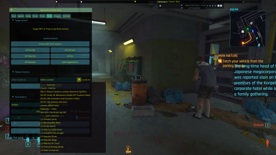
So the first thing I'm gonna do is look at Vik, open AMM, and send him to the shadow realm so that we won't risk any clones of him in the background of our shots. Don't worry! If you teleport out of the location and then return he'll come back! You can ignore this step if there are no background characters you care to remove from the scene.
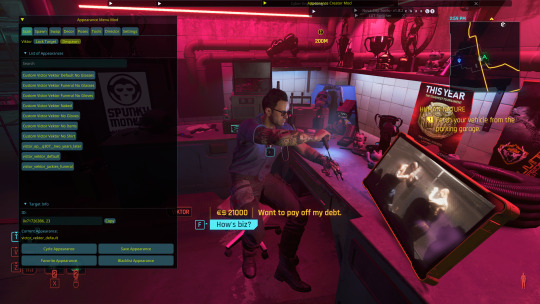
Now, in the AMM window I'm gonna go to the settings tab. If you installed Nibbles Replacer correctly you should have have a sub tab called Nibbles Replacer. Go ahead and click on that then select what category of NPC you want to spawn. Masc is most male NPCs, Fem is most female NPCs, and MBig are the large NPCs like River, Jackie, Ozob, etc. I don't use NPVs (custom characters) so I can't explain that unfortunately. I'll select Masc because that's the section Vik is in, you can choose whatever you'd like! Note: You cannot switch this inside photomode, you have to select the category outside of it.
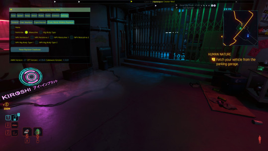
Next, open up photomode and go to the pose tab and click the arrows on the character section until it says replacer. Turn this to on! You'll see Mr. Hands appear for Masc (or Songbird for Fem). Open AMM and go to the tools tab. Select "target replacer". Now go over to the scan tab and you should have a list of characters with this body type. You can change the character in photomode as much as you like, you just can't, say, switch from fem body type to masc without closing and reopening photomode. I'll scroll down and select Viktor. There's a few outfits to choose from, but I'll select his default outfit without the glove.
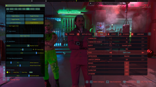
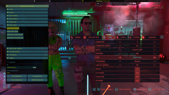
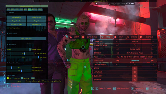
Next, I'll get the two characters aligned by making sure their location values are all set to the same thing (in this case zero). This is crucial for making sure two-person poses are synced correctly. For this I'll be using Rev's bromance pose pack. I'll choose the corresponding A&B poses for them. You can do this by selecting which character you're working with in the photo mode character tag. Now go ahead and choose whatever expressions you want for each of them too!
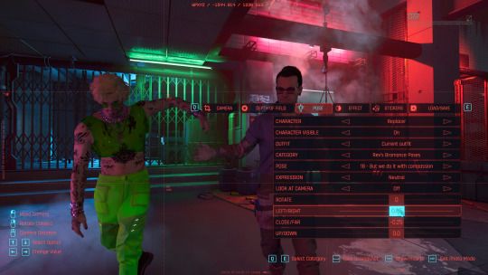
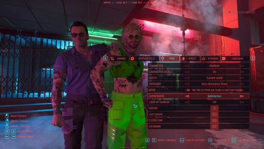
Now I'm going to go back into AMM in the tools tab and hit "target V" then go down to the look at section and select "eyes only". I'll do the same for the replacer. Now I'll close AMM and turn on look at for both characters! This is not mandatory but it really helps characters not have a lifeless stare.

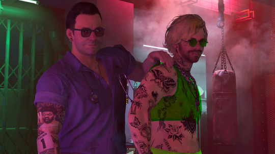
Now we have the basics of our scene all set up! It looks a little something like this!
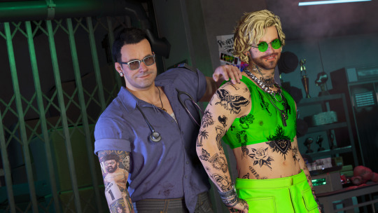
It's totally fair and valid to stop here if you'd like, but I personally use some additional mods to add in artificial lighting, get a better FOV, and so on! I'll explain that in another post (and tag you so you can see it!) since I've almost hit the image limit 😅 Here's how it could look with said additional mods and tweaks, as a little preview:
4 notes
·
View notes
Text
Dragon Age: The Veilguard HYPE Q&A
What was the first Dragon Age game you played?
Origins. My husband encouraged me to play it, saying that he thought I would like it. And then I loved it more than he did. lol!
2. Which Dragon Age game is your favorite so far?
Inquisition. That cast of characters just sucked me in.
3. Do you usually play as a warrior, mage, or rogue? Which class are you planning to try first this time around? Which subclass?
I tend to switch it up. Origins, I played rogue because that was recommended to me. Exodus (DA2), I played warrior because I wanted Bethany in my party. And then Inquisition, I was like, well, I haven't done mage, so I'll do it. Thinking of going full circle and going rogue again in Veilguard.
4. What does your worldstate look like going into DAV?
That's a little difficult to get into since we don't know what will be important. But:
Romanced Solas / vowed to save him
Leliana Divine
Inquisitor didn't drink from the Well
Do you typically use a preset character and name or spend hours in the character creator coming up with a custom one?
I can get overwhelmed in the character creator. I tend to start with a preset and then customize it a bit and then jump into the game. I'll make tweaks to the character overtime though as I play. I prefer coming up with a my own name though, just because I don't want my character to share the same name as other players. And I will spend hours on that.
Do you have your Rook(s) planned out to any degree? If so, would you share some details or ideas you have?
Waiting for more information, but I'm thinking elven and red head. I like the idea of a non-magic user who joined the Veil Jumpers. Just because you can't use magic, doesn't mean you can't be fascinated with it.
Which character from the previous games or other media are you most hoping will make an appearance in DAV?
FENRIS! I need, need, need Fenris!
Dorian feels like a given.
There's more, but those two are tops!
What faction are you most excited to learn more about?
Veil Jumpers!
But also, all of them, to be honest. I can't wait to learn more about each one.
Which romance, if any, do you plan to pursue first?
I was thinking Bellara because I like elves. And then I heard about Lucanis being the angst romance, and I'm a sucker for that (as long as it end happily - I'm already in hell over Solavellan). But then I heard Emmrich is a total nerd and loves learning - and like... I don't know anymore!
Which location are you most excited/hoping to explore in-game?
It was Tevinter, but now... Arlathan forest? I also really want to see Rivain and learn more about the culture there.
There's so many place we'll be visiting. I'm excited for them all!
What's one thing you'd really like to see in this next game?
Resolution to the Solas romance. I've been in hell for 10 years! Please release me from this prison!
What's one thing you're hoping we DON'T see in this next game?
Anyone dying. Please Bioware. DO NOT give me the Hawke / Warden choice again.
What's one thing you've seen confirmed so far that you're a fan of?
The theme of regret. I can't wait to dive into that.
Developing a relationship between Rook and Solas. I have no idea how that is going to work, but I am so excited.
The Lighthouse. Just... gimmie.
What's one crack theory you subscribe to (yours or someone else's)?
Solas and Ghilan'nan were a thing (mine).
Are you interested in all the lore and speculation or do you focus more on the games and stories themselves?
All of it. All the lore, all the stories, all the characters. I just eat it up.
Which aspect of fandom are you most looking forward to? (e.g. reading/writing fic, the bounty of gorgeous art, getting to know new people, etc.)
Very excited for all the companion fanart and meta that is going to come out. Also all the fanfic I'm sure I'm going to write.
Are you planning to replay any of the previous games, watch Dragon Age: Absolution, or read any of the books/comics/short stories, or are there other games you want to play in the meantime?
Reading through Tevinter Nights now. Then going through the World of Thedas books. I WISH I had time to add the comics in there as well.
Post a picture or gif that conveys your current level of excitement for Dragon Age: The Veilguard!

2 notes
·
View notes
Text
diary16
9/20-21/2023
wouldn't you believe it, i have a smile on my face right now.
i'm so really for real happy right now for some reason, or for a few reasons, but i'm really happy. one reason why is today was errand day and i kept it together and it wasn't so bad and maybe they won't be that bad ever again. i don't want to jinx it but i feel very optimistic i guess. second reason why is i did 3 songs today, i thought i'd only do 2, and like yesterday i created more presets that can move between songs and will really help out in figuring out these songs. more cool guitar synth sounds, i'm really happy about them, i'm excited to put them in songs and eventually write with them. some actually kind of expand what i can do i think. or what i wanna do, at least. third reason i guess is the song i'm listening to.
youtube
their hair is so giant it's kind of hilarious. it's such a pretty song, and really sweet too. the 'funny it's me' part is seriously incredible to me. it's interesting, the daughter of the woman on the left posts under a lot of their songs, it's crazy how the past still lingers like that. i guess not, it's always super obvious ultimately, it's just shocking. the other day i was thinking about jukeboxes, and how we barely experienced them as like, anything beyond something that plays music, meaning, they used to be or could be annoyances, quotidian to the point of drawing ire and so on, and that's just beyond us, it's not shocking to know, but it's an experience we're not going to have and we're also not going to be caught up in the pushing and pulling of living amongst that technology and all the ways the bourgeois manage that annoyance by inventing ways to silence jukeboxes (the thought was spurred by how they had silent vinyl in the machines you could put money in to play). obviously we have many similar situations, technology is designed to be at least 10-20% annoying always (don't ask about my numbers) because if it agitates and there's a way to alleviate that, then you've invented an industry out of your invention, sorta. this is all like, 101 type stuff, it doesn't really need to be repeated, everybody knows, i know it, obvs.
so i'm up to 16 songs done, 9 more to go, i'm thinking with some of the new plugins today one thing i'll do on my final pass of all these, or in the returns what i'll do is an evolution of my saturator return track idea, where i use the saturn 2 and do some subtle tube distortion in the mids, to get kind of what my mic setup was doing to all the sound, and try to reign that in, so i can have the positive qualities of that in the mix. if all the guitars sound better, and that happens, and they still sound good, i feel like that might be kind of 'sick' or 'dope' or something. idk why i'm saying that, i guess to entertain myself a little.
i'm really sort of dreading going back to the first 5 songs i did in this pass, but i'm sure it won't be as bad as i think, i mean dreading listening to them even. but we'll see. i'm excited to finish up this process and get to doing vocals again, and then even just writing some stuff. who knows if it's gonna be for this album or not. if it's like a 10 second long song though yeah it'll be on the album probably. i also did get some writing out today, not music, prose, in the laundromat, ideas i had in the shower, nothing super hefty but it feels like it belongs. funfunfun.
currently still thinking about getting (you know) softube plugins to see if their distortion stuff speaks to me anymore than any others.
i did find a new saturation thingy just now. i hope it's gooder (lol) than some of the other stuff.
when i said i wrote in the laudromat that was wrong, it was on the way there. i don't know why i remembered that wrong. in the laundromat i just listened to the plot to blow up the eiffel tower's first album and stared at the spinning water and clothes. it's crazy how everything that band did after was so much better. it's not bad but they kind of just spend a lot of time goofing around with the jazz stuff, but maybe it is just beyond me. i feel like if i asked someone who knew anything about jazz they'd agree with me though. just a hunch. maybe i will ask my friend huck about that.
also thinking hard about the songs i'm gonna have to begin doing, cuz they're all older ones that are way less 'guitar' heavy, and some even have different drums which means they will take longer.
feeling the itch to go digging on flickr for random photos for collage stuff. that's fun.
one final thing i guess cuz i'm feeling out of it now, today i saw a white goth woman with dreads, really fucked up stuff, cybergoths are still out there, you'll find them working in your local smiths or vons or whatever. kroger. whatever. isn't kroger terrifying as a prospect.
byebyebye
1 note
·
View note
Text
Lyskari's Monday.com Tutorial: The Status Column
Ξ Introduction Ξ
Hello and welcome to my second Monday tutorial! Here I will cover Monday's Status Column. Originally I was going to create a single post for all columns, but it would be too long. Hope you enjoy! None of the suggestions here are an exhaustive list, Monday is literally built to test it's own bounds and capabilities, meaning there is a nearly endless list of possibilities. If you would like to read-up about columns on Monday, check out their article on Column Basics. Their Support Center can also be searched by individual column type. Onto the tutorial! These tutorials and posts are not sponsored. They also will not cover every single fact about columns, as doing so would be a herculean task. However, if there is an aspect you'd like me to cover, please ask!
━━━━━━━━━━━━━━━━━━━━━━━━━━━━━━
Ξ Status Column Overview Ξ
What is the Status column? Status columns are one of Monday's main powerhouses. Created initially to track the status of any item you need, it has become a powerful tool due to it's flexibility of use. Statuses are individually coloured labels, and can only used by selecting one status option per status column. You can edit the status names, and the associated colour for each individual status option.
━━━━━━━━━━━━━━━━━━━━━━━━━━━━━━
Ξ Tutorial: Setting Up A Status Ξ
Once you've added the column to your board, feel free to give it a name that will make sense to you. » Step One.
For this tutorial we'll create a status column called "Temperature".

» Step Two.
Pretend we've thought about the column and how we desire the information to show up. Imagine we've decided on:
Critical
High
Moderate
Low
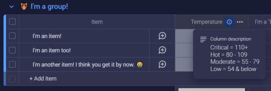
And imagine we know that we'll forget which temperatures fall into which status, so we decide to add a description to our column that will explain which temperatures fall beneath which status. So let's change that.
Hover over the "Temperature" column, and select the (...) dots that show up on the right hand side. It will open up the column's menu. Then hover over Settings, and select Add description.

Write your description and save it.
Once done, a (i) should appear next to the column's name.
Click the (i) and the description will appear.
» Step Three.
Now, let's edit our labels since we've figured out what we want. There are a couple different ways to begin editing labels:
Open the column menu (...) -> Settings -> Customise Status
Click the blank status next to an item -> Click "Edit Labels"
Both are viable options, with #1 being important only if you wish to choose which colour signifies some form of completion as Monday plays a small animation for completed statuses. You can choose to ignore this, or if you wish to turn it off entirely, utilise option #1 and simply deselect any selected colours at the bottom of the Status Customisation area.
For the sake of this tutorial, though, I will utilise option #2. By doing so, I see this:
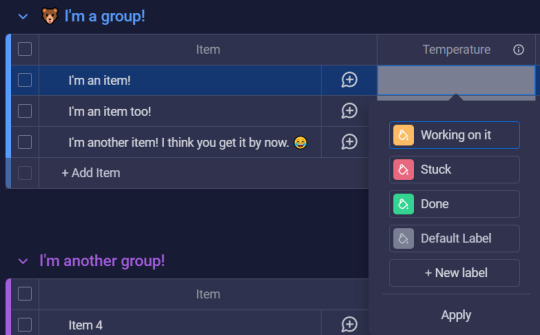
The screenshot did not capture it but each label on hover will create a drag/drop icon (for easy label reorganisation) to the left of the label, and a "x" (for label deletion) to the right of the label. And then you can see the paint can icon in the coloured squares, which is what you would click to change colours. Monday colours are preset currently but they do have a wide variety of options.
Once you have named your labels, reordered them, and selected their colours, be sure to hit Apply so the change sticks.
» Step Four.
From here, your status should be setup! So all you need to do is select the appropriate status for each item that the column is relevant for. This is done by selecting the empty status next the appropriate item and selecting the appropriate status label! After I add my statuses, my Monday board looks like this now:

CONGRATULATIONS! You've created your very first Status column!!
━━━━━━━━━━━━━━━━━━━━━━━━━━━━━━
Ξ Additional Information Ξ
In this section I will attempt to cover any additional information that may be good to know about Status columns. If there is an aspect that you need help with but don't see listed, please do not hesitate to reach out and send me an ask or leave a note!
- - - - - - - - - - - - - - - - - - - - - - - - - - - - - - - - - - - - - - - - - - - - - - - -
❖ Potential Use Cases (Just a friendly reminder that this is not an exhaustive list!)
Tracking Process Status Not Started, In Progress, Frozen/On Hold, Cancelled, Done, etc.
Tracking Departments Community, Marketing, HR, etc.
Mood, Energy, Focus Tracking Good, Bad, Meh, Excited, etc. 5 - Energised, 4, 3 - Moderate, 2, 1 - No Energy 5 - Focused, 4, 3 - Normal, 2, 1 - Not Focused
Item Type/Information Umbrella, Pens, Pencils, etc. Green, Red w/ White Dots, Royal Purple, etc.
Broad Categories House, Car, Health, Finances, Personal, etc.
- - - - - - - - - - - - - - - - - - - - - - - - - - - - - - - - - - - - - - - - - - - - - - - -
❖ Status Column Settings Breakdown
Each column comes with a collection of settings. Some share similar settings, while others have different settings, pending what column you're looking at. Since we're focused on the Status columns, then this will be focusing on the Status column settings! Note: I won't be going over settings that I've already mentioned above!
Restrict Column Edit This does what it says. You can restrict who can edit the column. This isn't important for personal boards, but this is useful when utilising Monday with multiple people.
Restrict Column View Similar to the above setting, this allows you to restrict who can view the column. This can be good for personal boards (where you share it with a spouse or helper) if there are certain columns you don't want anyone to see.
Hide Column Summary In the final screenshot you'll notice a collection of the different label colours at the bottom of the group. This is called the Column Summary. It consolidates all the answers provided in that column for that specific group, and you can see how the different groups are broken up by percentage and by fraction (for example: 1/3 / 33%) by hovering over the different blocks of colour. If you don't want the Column Summary, than this setting will be your friend!
- - - - - - - - - - - - - - - - - - - - - - - - - - - - - - - - - - - - - - - - - - - - - - - -
❖ Status Column Menu (...) Breakdown
This will exclude settings for obvious settings-are-literally-above-this reasons. 😅
Filter This is the long way around, but you can select filter and filter your entire board by a status column. And you can even save alternate table views that are already pre-filtered, but that's another show-- I mean, post!
Sort This sorts the Status columns on your board by ascension or descension, with the order being dependent on the order of your labels. Just be sure that if you like a specific sort, go back to the sort function and select "Save". (Or select the "Save" to the right of the sort arrows that will show up when you select this!)
Collapse Does what it says on the tin! It will collapse the column so it is no longer visible. And they are simple to uncollapse. You simply click the ↔ that will show up on the collapsed column after you've collapsed it!
Duplicate This will duplicate the status column. This is a quick way to add more statuses to your board, I like to use this when I'm in flow and just want to quickly add more of the same column type. They do give you the option to "Duplicate" or "Duplicate Column & Values" in case you need to double up on a status due to there being potential for two different values that you wish to track separately. It's up to you and it depends on what works best for YOUR board and it's purpose!
Add Column To The Right Yeah they don't have an Add Column To The Left... but anyway! This is a quick way to add additional columns that aren't status columns (or are because you didn't wanna duplicate which is valid!). It can be any type of column that Monday supports.
Change Column Type This can update your Status column and turn it into a different type of column. As of this tutorial the options are: Text, Long Text, and Dropdown. However, Monday is always making improvements and additions.
Delete This deletes the column.
- - - - - - - - - - - - - - - - - - - - - - - - - - - - - - - - - - - - - - - - - - - - - - - -
❖ Other Things To Know
You can only select one status per column. If you would like the ability to select multiple, then you'll want the Dropdown column type.
Statuses are one of the most supported column types on Monday, so if you have access to automations, play around with them!
Status label names are also emoji friendly! (There's just something satisfying by selecting a "🎉 Done" status!)
A board's search bar searches statuses as well!
Status columns can also be pinned columns! Pinned columns won't move when side-scrolling. Think of it like freezing cells in Excel or Google Sheets.
━━━━━━━━━━━━━━━━━━━━━━━━━━━━━━
Ξ In Conclusion Ξ
I hope this tutorial has helped you understand and feel confident in setting up and utilising Statuses. Though it has potential for complex workflows, it also works as a simple identifier, giving it a broad range of use cases.
Please feel free to ask me if you... • Have any questions relating to this tutorial, • Have any questions about Monday in general, or • Would like to see me cover a specific Monday topic!
And, finally, if you enjoyed this tutorial and would like me to continue making more, please consider liking this post and reblogging it so that I can get more eyes on it. 🧡
If you enjoyed this tutorial and wish to leave a tip, you can do so on my kofi which you can find here: Lyskari's Ko-Fi Whether you share, like, reblog, leave a tip, a mix of these, or all of them, thank you for your support! And please please let me know if you'd like me to cover other aspects of Monday, or if you'd like me to give my thoughts on other programs! And let me know if you liked this tutorial!
If you want to read my other Monday tutorials you can find them here: The Lyskari One Stop Shop Master Post under the "My Organisational Tutorials" heading.
#Tutorial#Tutorials#Monday.com#Monday.com Tutorial#Monday Tutorial#Project Management#Life Management#Task Management#adhd#adhd struggles#just adhd things#adhd brain#adhd problems#attention deficit hyperactivity disorder#neurodivergent#executive dysfunction#Status Column#Monday Status#Status#lyskari#Lyskari Tutorials
0 notes