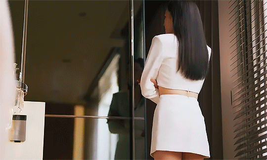
#not good things I'm afraid
Text

Too late, now. Have fun.
POV you're a kid in a vent who didn't listen, didn't obey, and now you'll become just another poster on the wall.
I don't think I'll finish it. Pardon the weird crop, but it's fine. Builds character. We love a black void of a vent.
#dca#fnaf sun#sundrop#fnaf vanessa#fnaf vanny#fnaf#fnaf sb#fnaf security breach#fanart#daycare attendant#villain.jpeg#this was not the og concept for this fanart#but oh well.#no comment you decide what's happening here.#not good things I'm afraid
178 notes
·
View notes
Text
anyone else have multiple traumatic memories associated specifically with holidays/family vacations? because that is a topic I never see discussed in all the So You Had A Shitty Childhood, Now What? self-help books i've been reading. but for me, it was a significant thing. and the more i think about it the more it seems like this would be an (unfortunately) common experience. would be grateful to hear if this matches other peoples' experiences...
#not a shitpost#serious post#ask to tag#tw trauma#cptsd#c-ptsd#and if so we should TALK about it#because it means there are a whole group of survivors out there whose mental health regularly worsens during holidays#like i know i am most certainly not the only person who feels an undefined Dread hanging over christmas/my birthday/july 4 etc#bc too many shitty things happened during those times and now my brain is hypervigilant bc traditionally these are the Danger Times#and this seems like it would be particularly common for survivors of abusive/dysfunctional households (aka most people with c-ptsd)#because holidays/vacations typically mean 1) the whole family is together/being forced to interact#2) and undergoing external stressors e.g. travel/relatives aka 'outsiders' visiting/routines & coping mechanisms being interrupted etc#3) there is social pressure for this to be a Fun Family Bonding Experience which only highlights the cracks in the foundation#and exposes the common Everything Is Fine/We Are A Happy Family lie#4) the cognitive dissonance of feeling tired/anxious/stressed/afraid during a time when you are 'supposed' to be Making Good Memories#and then everyone is angry/tired/anxious/triggered and things boil over and something or someone goes Very Wrong#weird that i'm posting this in october when halloween is...sort of the ONLY holiday i have only good and happy feelings towards#i got lucky there#also i have positive feelings towards Labor Day but that's for socialist reasons
4K notes
·
View notes
Text
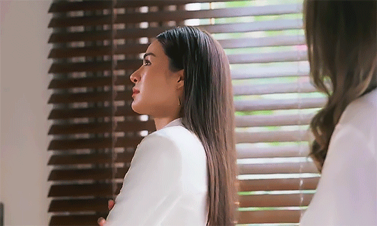
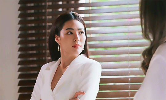


#the secret of us the series#the secret of us#tsou#ladaearn#diagnosed with chronic clownery I'm afraid#the way she averts her gaze to everywhere but Earn's tiddies or something#and then going to her 'idgaf' mode in the end#appreciate the effort eventhough it was unsuccesful#sigh she has a long long journey to heal but good lord she's such a simp too#clown sapphic rep appreciation#that aside Ling did phenomenal job because Lada's loserism is so entertaining to watch#she does this thing and then looks like she's on the brink of crying whenever Earn does some asshole move#the RANGE#also therapy for dr Fahlada
375 notes
·
View notes
Text
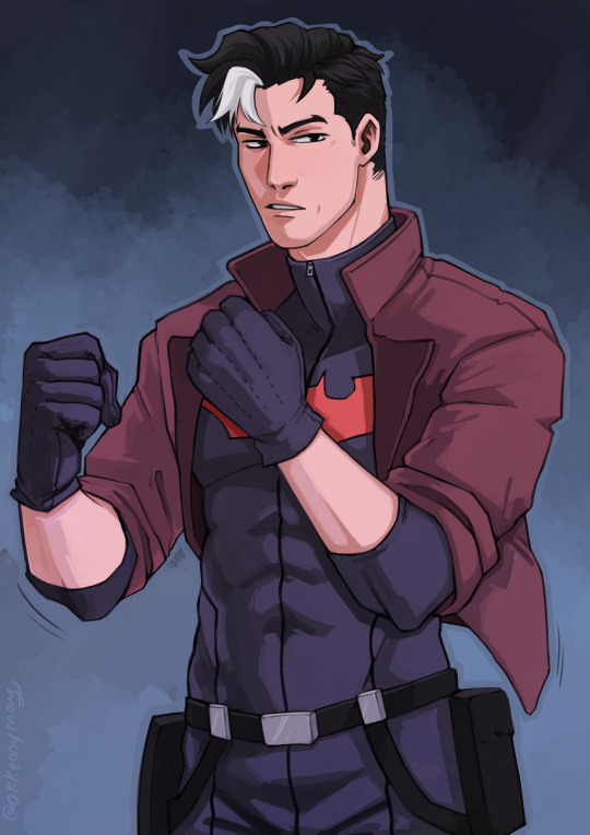
Commission for @jaxinkh
Ooooo lookin fiIIINE Jason Todd! Ahhh This new year has been going better than I'd ever hoped it could!~ Ahh You waited so long Jaxinkh, Thank you for being so patient- I'm most definitely putting a disclaimer on my next commission page that the times they may take may vary wildly thanks to my health o(* ̄▽ ̄*)ブ
#Batman#Wayne Family Adventures#Jason Todd#Commission#Okkennymay#jaxinkh#Painted commission#JUST ONE MORE CLIENT AND I'LL HAVE FINALLY REACHED YOU MARCUS! WOOOOOOOO#after so so so many months#goodness I've been so lucky to have the most patient friends and clients in the world ;w; You guys are the best#thank you for not getting angry at me for things taking so long-It's something I fear greatly#But time and time again i'm met with kindness and understanding it's finally dawning on me that I don't have to be so afraid all the time
407 notes
·
View notes
Text
residents of copperdale 🎡 no cc sim dump
oh man, the teen pack. why did ea did all their faces so........ ugly? i like most of these sims but my god they needed plastic surgery. they still look like themselves tho, just more human! for every other townie i've made so far, click here!
you know the drill, they come with one outfit for each category, pronouns, sexual preferences, likes, dislikes and more! i used most packs.
pictured but not included: default eyes & default skin
origin id: alelelesimz
download (sfs)
#ts4#simblr#sims 4#ts4 vanilla#sim dump#noccsims#a#turns out eloise hiddlestix is supposed to be inspired by ms frizzle#good thing that unlike ea; i'm not afraid of success#and she now looks very funky :)
247 notes
·
View notes
Text
I came up with the idea for today's love fest over the weekend when I saw a lot of comments from people expressing sadness about the cancellation, and then also some embarrassment for feeling that way, or feeling alone in their emotions. I wanted to do something positive that felt personal and that would remind people that fandom isn't going anywhere.
Originally I thought to do it a few days after the WJW with DJenks, figuring we'd need another boost after that high wore off. Obviously the WJW didn't end up happening, but then I realized it was Rhys' birthday today, so that also felt like a great reason to spread a bit of love (not that you ever need a reason for that!).
And honestly, while the whole point was to make other people smile, the whole experience really boosted my own spirits tremendously. While stalking perusing everyone's blogs for inspo, I was reminded quite powerfully just how many extremely kind, talented, smart, funny, insightful, beautiful people there are in this fandom.
So I just want to say thank you. All of you who create gifs, make art, write fic, analyze the show, share shit posts, or reblog all of the above so we can see it again and again and again, you have made a difference in my fandom experience. With every post, you made me fall in love with Ed and Stede and the whole crew just a little bit more. Whether you're someone who's always in the tags or someone who prefers to quietly reblog, you have made my time here very special and I'm so grateful. 💕
#emynn.op#ofmd#also please know I tried to get to as many of you as I could but I'm still just one person#I'm also afraid there may be a bit of user error when I was trying to submit some of the asks from switching between tabs#and also I don't doubt tumblr ate a few since APPARENTLY there's a limit of 10 asks/hour and I sent...about 130#so please know even if I didn't reach out to you directly I am still giving you all the love and good vibes in the world#and I'm so happy you're here 💕#and if you're ever feeling down or alone just reach out#to me or to some other friendly face on this site#bc if there's one thing I got out of today#it's the knowledge that this fandom has a whole lot of love to give#basking in all the love tonight and I hope you are too#💕💕💕💕
155 notes
·
View notes
Text
I think about how some people actually hate on Yuji, Nobara and Megumi and get confused because I went into JJK and by episode 3 I adored them.
#like what you mean you don't like them?#best girl and best boys? unbelievable#they easily became my favorite anime trio#their dynamic actually feels fresh and enjoyable#like genuine you know?#individually i say they're great on their own too#nobara being a girl into girly things while also not afraid to get blood she instantly won me over#true to herself good for her#I'm sorry megumi isn't some angsty teenager who has that typical 'I'm better than you' attitude#he actually is relatable because sometimes i don't care to have all that energy and I'm usually energetic!#he has a heart and his actions can be understood IF SOME OF YOU ACTUALLY TAKE A STEP BACK AND READ AND OPEN YOUR MINDS#then there's yuji! HE IS THE MC! HELLO?!#even though he's gifted yuji is humble about it#he's selfless he's a goof and sometimes he isn't with the bull some characters pull#i can go all day about my fave but i already got posts#just kiya's thoughts#jjk#jujutsu kaisen#itadori yuji#kugisaki nobara#fushiguro megumi#megumi fushiguro#yuji itadori#nobara kugisaki
47 notes
·
View notes
Text

do you ever think about how all you used to draw when you were 10 was ponies and that you should still know how to do that, then get an idea and proceed to draw something like these in nearly one sitting and it turns out better than any drawing you've done in the entire past month
sooo anyway does anyone have cutie mark or pony name ideas for them?? lol
#(the b girl lineups are older than a month because i procrastinated a lot on doing minor fixes. nothing i drew in the month of june 2024#is really worth showing it's all shitty doodles lmao)#bnha#class 1b#mlp#?#yui kodai#setsuna tokage#itsuka kendo#ibara shiozaki#(i love how she came out in particular! creature :3)#reiko yanagi#tikto's art#you may be wondering why pony of all people isn't here.#i did draw her! but i kind of ran out of steam so i ended up not really liking the result lol same for kinoko#anyway shoutout to elementary school me i was SO obsessed with mlp. brony stuff was one of the first things i used the internet for#and you know what. i wouldn't say it ruined me it was a pleasant experience#i just read what was basically a polish version of equestria daily and constantly checked the deviantart profile of one (1) specific artist#that i liked a lot#i did watch some weird speedpaints (yknow the horror ones) but i honestly dont remember being very bothered by them i just liked the art#i was just chilling there lurking and never actively participating due to being 10 and afraid of online strangers (good for me tbh)#i remember having an identity crisis though because can i really call myself a brony if i'm a little girl? the target audience of the show?#lmao anyway i would also draw ponies constantly and write oc fanfics (and the ocs were actually my irl friends ponified)#and i even had my own little g5 concept. good times good times#tag story time over god bless enjoy your day
60 notes
·
View notes
Text
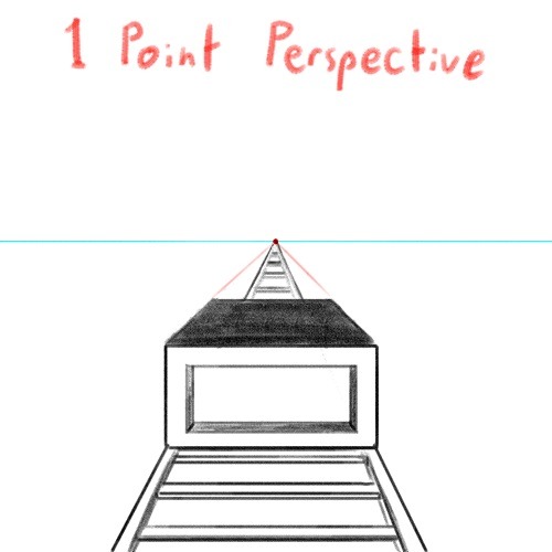
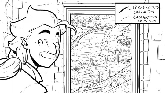
DRAWING BACKGROUNDS: TIPS AND TRICKS
So many people are afraid of drawing backgrounds and I think it's a shame, so here's some tips and tricks, because I'm not perfect at it myself but I think the hardest part is really just knowing where to start.
First off: Perspective
Yeah, yeah, that's the scary word. But I promise you, once you're familiar with the basics, backgrounds are a LOT less intimidating. Don't get discouraged if WHEN you have trouble with it. Even professional artists struggle with it. I promise you, screwing it up is good and normal. That's how you learn after all!
Now I'm not going to go into detail on how to do it here, because honestly there are a thousand and one free resources online and in libraries that can explain it far better than I ever could in a singular broad-strokes tumblr post. But I AM at least telling you you should familiarize yourself with these basics:
Important Terms:
Horizon Line: A horizontal line across your canvas, showing your viewer's eye level and providing a location for most of your vanishing points.
Vanishing Point: Integral to drawing in perspective. The sides of a 3D object get smaller as they become farther away from the viewer in space. This point is where the parallel lines of a side eventually meet.
The Basic Types of Perspective:
One Point Perspective: Good for drawing things that you're looking at straight on.
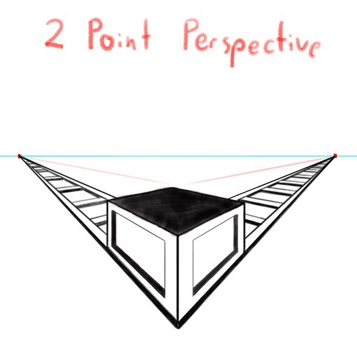
Two Point Perspective: Good for drawing things at an angle.
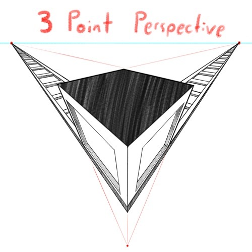
Three Point Perspective: Good for drawing things the viewer is looking up or down at, especially at an extreme angle.
[Click images for ALT descriptions]
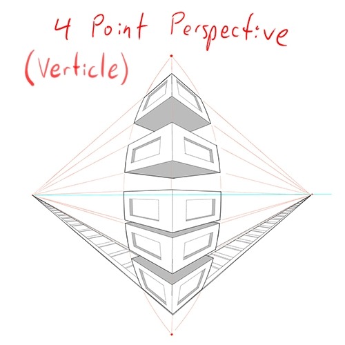
And if you're comfortable with these and serious about improving your skills for use in storytelling, I also might suggest looking up:
4 Point Perspective: Great for extra wide or tall shots and for camera tilts if you're doing an animation or animatic. I think some other names for this in animation include "banana pan" and "warp pan."
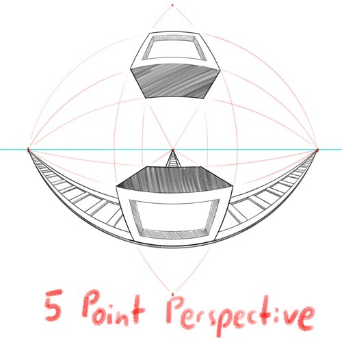
5 Point Perspective: Fish-eye lens. Good for all your angsty anime boy slipping into madness needs!
Some perspective tips I wish someone had told me earlier:
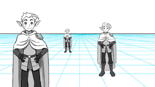
Objects' relation to the horizon line is constant.
A super helpful tip to remember when placing a character or object in space is that they will always (assuming they aren't changing in size or moving up or down) have the same relation to the horizon line no matter how far or close they are. If your horizon line is at shoulder height for your focus character in the foreground, any character of the same height in the background will still line up with the horizon line at the shoulders.
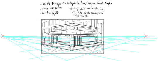
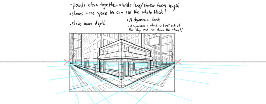
How to pick the distance between your vanishing points:
2 pt perspective uses 2 vanishing points, 3 pt uses 3, etc, etc, but how close should they be? Well, first of all, for anything that isn't one point perspective, one or more points will usually be off the canvas. Super annoying, I know, but the closer your vanishing points are, the more warped your drawing will become.
Second, a helpful thing to know is that choosing the distance between your points is basically the illustration equivalent of picking your camera lens! Photography buffs will know that wider (shorter focal length) lenses show more space and make the distance between foreground and background more dramatic, while longer focal length/telephoto lenses are flatter, and more focused and intimate. The same is true of vanishing points that are closer (shorter focal length) or farther apart (longer focal length).
2 point/3 point/etc doesn't actually mean you're limited to that many points total on your page.
this one confused me a lot when I was getting started, lol. A lot of examples will show you drawings of nice, neat cities or something, in which all the buildings are facing the same way in order to demonstrate perspective drawing. But in real life, buildings don't all face the same direction. They're at all sorts of different angles. So how do I do that??? Answer: Just because you're drawing in 2 point perspective or whatever doesn't mean you... have to actually keep your 2 points in the same spot. You can move them around, just keep them the same distance apart, so you're not screwing up your camera lens.
Other Tips:
Use reference!
The instant you try to draw a house, you're going to forget every house you've ever seen. That's just how it goes. Buildings are complicated. Do yourself a favor and collect a few reference images first, buddy!
Consider details (like architectural style, amenities, and materials)
Your building will look more like a building when you keep in mind that buildings have gutters and door knobs and light switches and paneling and stuff, and aren't just boxes with roofs on them. Again: reference! You will forget electrical sockets and baseboards exist immediately. Art brains are dumb.
Use details and texture to fill in negative space
Giant stretches of blank space tend to be boring and distracting. Put a few suggestions of wood grain or something on that wall back there, bud, just don't overdo it.

Line weight
Darker, thicker lines draw more attention, look heavier, and look closer to the viewer than lighter, thinner lines do. Take advantage of this to draw the viewer's attention to your focal points, de-emphasize less important details, and imply depth. It's up to you to decide how you want to use this and what your style is, especially once you start getting into combining or replacing it with shading, values, and color, but a helpful rule of thumb is to try reserving your thickest lines for focal foreground characters and use thinner lines on backgrounds, especially details in the far distance.
Perspective guides
If you're drawing digitally, take full advantage of any perspective tools you have access to! A lot of art programs lately have begun adding perspective guide features that let you set up vanishing points and then literally guide your hand as you draw so you stay in perspective. Some of these include Procreate, Clip Studio Paint, and Adobe Fresco. (still sadly none in Photoshop as far as I'm aware, what the heck, Adobe!). Check through the settings of yours to see if it gives you any perspective guides or other similarly useful tools. They're 100% worth it! And for god's sake, if you've got any skew or perspective warp tools, draw your complicated shapes flat and then warp them instead of spending an hour on it! Don't make my mistakes!
#backgrounds#art tips#tutorial#art reference#drawing tips#perspective drawing#the owl house#hunter toh#doodle art#doodletext#rambling topic#yes i'm using my blorbo to demonstrate art tips what about it#this took longer than i meant it to lol. i got really into the examples#thank you for your patience guys#this turned out to be a GREAT exercise for me as an artist too actually. Trying to explain things is rlly good practice#I didn't even get into values and such. I can only ramble so much I'm afraid
972 notes
·
View notes
Text
here to weaponize my music degree bc what hozier did with from eden is fucking insane
a bit of music theory background: the song from eden is in 5/4, meaning that there are 5 beats in each measure. most western music is felt in groups of 2's and 3's, and a good majority of that time, it'll stick to just 2's or just 3's (4/4 vs. 3/4, for example) in the case of music that is in 5, it's felt as a combo of groups of 2's and 3's. with from eden, it's a group of 3 combined with a group of 2, literally described as 3+2.
in the medieval period, music that was in groups of 3 was considered to be "perfect" as it was in reference to the trinity, and music in groups of 2's was often secular. there was definitely overlap, but generally speaking these were the idealized practices of the time. re: music in 3 being considered more holy, composers still to this day will use this idea in their music to convey an inherent "holiness" to their music.
here's where hozier gets me absolutely catatonic: so the song at its simplest is about the devil tempting people into sinning. hozier himself said that he wrote it from the pov of the devil bc he loves the theme in the blues where the devil is a character who walks and talks.
but the imagery of the serpent in eden is what we can't forget bc that's what this boils down to. the serpent tempting eve to eat the apple is thought of as the original sin, but in reality it's maybe the most beautiful moment in christian mythology–where a human was first encouraged to challenge the world around them. to eat the apples of life and to not be afraid to disobey. it's where humans find free will, and where humans met humanity for the first time.
so the song being in 5 is absolutely bonkers to me bc that idea is LITERALLY built into the structure of the song.
the 3 = god. the 2 = humanity/secular soceity. 3+2= humanity finding free will.
3+2=5.
#im losing my shit over here#hozier#from eden#thoughts#this has disastrous implications for good omens also i'm afraid#music things
335 notes
·
View notes
Text
Old school fanvid time!
Bojere: If I were
music: Stephen Lynch - Gay
Another time
another scene
I'd be right behind you, if you know what I mean
Edit. testing this tumblr hack (post a photo to make your video show up in the tags)

photo: @vita_orehek_photography
#käärijan#bojere#bojan cvjetićanin#käärijä#fanvid#my hand slipped#I'm afraid to post because new content can drop any time#also this is just for funsies#I mean no harm or offence#is this a good time to confess that I was the original “top 5 things that made you think he's not straight” anon?#I told you it was FOR SCIENCE#I also loved how it took off#good work everyone 😆
181 notes
·
View notes
Note
I'm sure you get loads of these but heck I said I'd give it a shot anyway!
Your artwork is so inspiring and beautiful. I recently graduated from art school with a degree in Animation Production but I've decided I'd love to be an illustrator some day. Your work really motivates me and gets my brain juice buzzin. Keep it up!!!
.
#oh thank you! I'm glad you did!#first off as a general rule I think it's always okay to message any individual independent artist/creator#and tell them that you like their work#you may think they probably get lots of positive feedback and such and another one doesn't matter#but I would bet money that the actual amount is almost always smaller than you'd think#so every kind comment has the potential to cheer them up and inspire them#and motivate them to continue creating and posting their work online for people to see#messages like that can linger at the back of your mind for ages#I regularly think back to the nice things people have said about my art over the years#especially when I'm struggling with art block and feel like what I make isn't worth anything and that I'm bad and my stuff is bad#this got a little long winded and I'm probably preaching to the choir#but what I wanted to say is don't be afraid to let creatives know if you like their work it's always appreciated#I'm flattered to hear my dog doodles motivate and inspire you!#animation and illustration are both good choices imo#I wish you all the best on whatever you end up doing#answered#starfruitwyne
109 notes
·
View notes
Text
GOT A JOB ON MY LAST DAY AT WORK LOL
#YAYYYYYYY#independent contracting but THAT'S GOOD WHILE I SORT OUT WHAT I WANT IN LIFE!!!#life is going well. I am almost always afraid but things are good :))))))))#going to miss my current job so much that I'm staying on to volunteer LMAO!!!
29 notes
·
View notes
Text
the thing that is actually making me giddy with the possible angst is that i really think that we are about to see the most monumental shift in not only how we saw these characters but also how they previously saw each other.
the fact that we literally now have confirmation that a) they knew each other before the fall, b) aziraphale has had heart eyes since before time began, and c) crowley... possibly not so much, completely changes the context on not just the eden scene but also all the historic scenes that followed.
aziraphale knew crowley as an angel, and knew even then when crowley was meant to be 'perfect' that crowley was maybe a bit different, always asking questions and toeing the line. maybe out of a bit of bastardy himself, or out of begrudging awe of his ability but also his audacity, or just plain attraction, aziraphale immediate takes to him. but this has meant that aziraphale has placed crowley, perhaps unconsciously, upon a pedestal. and the pedestal that aziraphale puts crowley on from that moment may have wobbled throughout their history together, but it's stayed relatively intact.
this worries me, that aziraphale may not have quite let go of the fact that crowley just isn't that person any more, maybe never was to begin with, and continues in some measure to idolise him. my interpretation of this is that yes, crowley can be a bit of a dick (because, well, obviously) and aziraphale knows this, has done since the beginning, but aziraphale continues to hold crowley to an overall moral ideal that is so firmly ensconced in aziraphale's first perception of him as an angel that crowley will never be able to live up to it. not because he isn't a nice person, or because he can't live up to it, but maybe... he just simply doesn't want to.
but the issue is that throughout the ages (including the job minisode which ive had corrected for me, so Crowley Anger is now simply simmering), crowley's actions have only reinforced to aziraphale that despite being technically a demon, he has a huge heart and is not a horrible person. bit of a bastard, but not cruel. all of this just feeds and feeds into this image of crowley that aziraphale has built of him, and when crowley has his flashes of, in fact, not being honourable or kind, this threatens to upset the pedestal altogether.
these wobbly moments - when he thinks crowley is going to kill the children, when crowley snaps at him in rome, when crowley first proposes the arrangement, the prospect that he came up with the french revolt, the holy water request, the bandstand, "how can someone as clever as you be so stupid?"... moments where just for a second, in a small or huge measure, aziraphale's faith in crowley... flickers.
and of course aziraphale has been here before, right? he's had his faith, his devotion, his loyalty tested to the absolute limit of angelic endurance. so when his faith in heaven (never lost it in god) was obliterated, well - it had to cling to something. something that wouldnt mean that aziraphale has to lose the concept of faith altogether. so we're back to the old standby of idolatry, that aziraphale's heavenly faith is replaced by his faith in crowley, this angel that despite never originally giving aziraphale the time of day, aziraphale cannot see - for all of crowley's faults and bastardy and the frustration he poses - crowley as anything less than something to be worshipped.
this is exactly why i think that one of the main points of s2 is going to be a rift between them both. obviously i haven't talked about crowley's perspective of this and maybe i will in another post, but i do think that crowley is going to do something, a bad thing for the right reasons, but aziraphale isn't going to see it like that. that crowley will do something awful to protect aziraphale, but all aziraphale will be able to see is the betrayal or the cruelty or the despair, he can't see wood for the trees, and just lose that last vestige of faith he had altogether.
i feel like once all the disillusion and disenchantment has been swept away, and they're both laid bare at each other's feet... that they may not quite like what they find. from aziraphale's perspective, that whatever crowley does in s2 might be crossing aziraphale's line in the sand, and now aziraphale is starting to see crowley as someone that is truly grey, fluctuating between doing things that are Good, and things that are Good for Crowley.
and it's not as if aziraphale was blind to this before, but instead now... he kind of finally sees who crowley is? who he has been all along? the film has lifted from his eyes. realises that love and worship are not the same thing. what he loves, who he loves, doesn't equate to worshipping it/them, idolising them. there's a very big difference that echoes down to the very core tenet of who aziraphale is and his experiences with having and losing faith, but love having remained.
so stripped of the pedestal, crowley is now just simply... crowley. a person, not an angel, not a demon. and there is the distinct possibility that aziraphale might be completely blindsided by what he finds.
#good omens#good omens season 2#ill let you in on a secret - no idea where i was going with this#but what im essentially saying is that aziraphale has this shiny picture of crowley in his head and heart#and when crowley continues to do crowley things aziraphale kinda steps back and is like#“huh... has it been this was all along?”#and if I'm wrong well honestly THANK GOD#but i feel like there is going to be a real reckoning at the end of s2 where faith and love is concerned#that the two are very different but aziraphale kinda confuses the two#anyway#good omens spoilers#good omens 2 spoilers#good omens... speculation? Sure why not#not a shitpost but its good omens babyyyy#im saying theyre in somewhat of a toxic and disillusioned relationship and its likely going to (temporarily) end v badly im afraid#rhi needs to stop manifesting
227 notes
·
View notes
Text
just having a normal one thinking about how badly Armand wants to be loved but every time he gets close to it, he self sabotages and ruins it. almost as if. he subconsciously doesn't think he deserves it.
#I'm fine I'm good I'm so normal about him#he does it with EVERY romantic relationship we see him have it's insane#first with lestat and their whole Thing. especially the nicki stuff we haven't seen yet.#then louis. like he lets himself have it and then realizes it's possible for it to work and IMMEDIATELY blows it#by you know. trying to kill him. actually succeeding in killing his daughter.#making sure there's no possible way louis will ever forgive him even as he plots and manipulates to underplay his role in it#they loved each other but armand made sure it would never be in the way he craved the most and then punished himself for it#by strong manning the relationship together with hot glue and stickers even if it was hurting them both#AND THEN with daniel too ffs#DOUBLE of it with daniel if past-devil minion happened too fuck#turning him and then leaving him bc daniel SEES him for who he is and he's not afraid (I mean he is but YOU GET WHAT I MEAN)#possibly erasing his memories of him from the 70's & 80's as both a fucked up attempt to keep daniel alive#(which tbf it works but is STILL a fucked up thing to do)#and to get himself out of a situation in which someone finally started to love him unconditionally the way he wants so badly#but he can't let himself have that can he#I AM SO NORMAL ABOUT THE VAMPIRE ARMAND GUYS#I might be wrong idk I have yet to rewatch s2 but#BUT IT HURTS ANYWAY DONT IT#iwtv#armand#iwtv amc#the vampire armand#interview with the vampire#iwtv s2#armandposting#robin going insane about armand again#iwtv armand
39 notes
·
View notes
Text
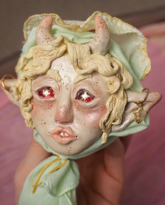
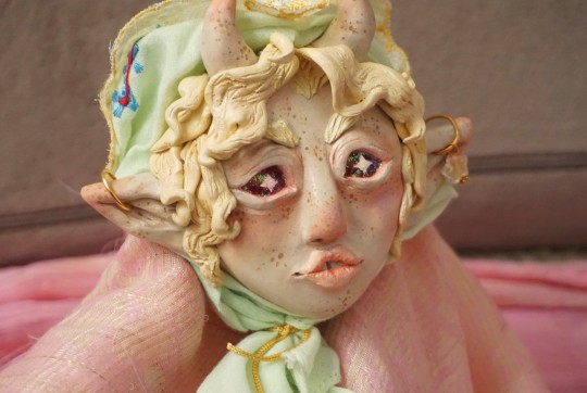
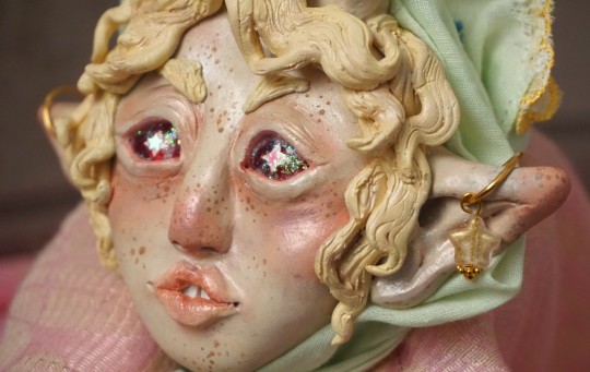
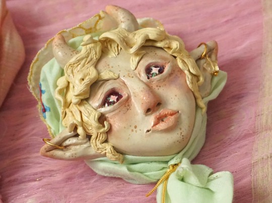
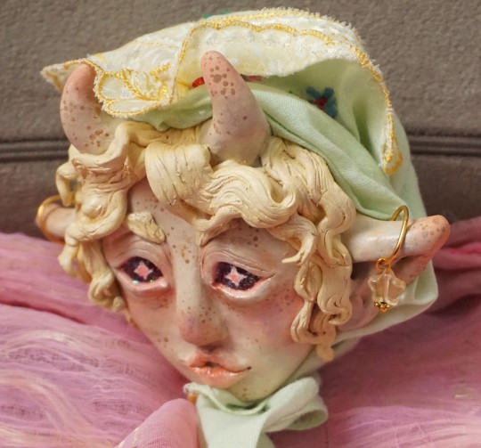
A new sculpture! Finally... I feel like I never sculpt anymore since I'm always sick or have some 500 other things going on or projects to finish, but I'm trying to schedule time to do it more often this year hopefully..! Just a generic fantasy creature as usual, but did try making the eyes a little more sparkly this time.. hrmm..
#sculpture#fantasy art#fantasy creature#art#elf#lol what are the tags I should use... I still never know.. EVIL social media.. hate the idea of tagging anything ever anyway. but alas..#I also would ideally like to start selling them again and open up custom commmissions and stuff again once I can hopefully get paypal#stuff sorted out. and find like.. a good way to do things.. etc.. I did still want to sell them through auction instead of agonizing#over setting prices being afraid they're either too high or too low. So being able to just be like. Here. this is $50. or more. or less.#negotiate. the worth is whatever you feel like it is so i personally dont have to make that decision. etc. lol... But etsy doesn't let you#do auctions or like pay what you want type stuff so.. then I was thinking ebay? but idk.. ANYWAY.. I want to set things#up so I can sell stuff again hopefully. I still haven't fully recovered from the costs of when I had to take my cat to the vet and put#them down last year and etc. So it'd be good to sell a few things. perhaps.. maychance... perhamble... so on and so forthe... ANYWAY#I was going for whiter more milky sort of hair that blends in closely with the skintone but after the paint dried it seems more yellowy kin#of. which is fine. But just not exacltly like my mind vision lol..#Also it's like... wow... someone with face spots and elf ears and a half open mouth with a gap tooth and wavy hair and kind of downturned#eyes... revolutionary... never been seen before... every sculpture I have ever made surely doesnt look licherally exactly like this... LOL#but maybe it's just a style. so what. People have their motifs lol.. Im just getting back into sculpting. I shall sameface in peace. huzzah#Just like the only thing I ever carve out of avocado pits anymore is eyes. Because that's just whats fun to do. I'm going to accumulate lik#25 similar avocado eyes and have nothing to do with them. I was thinking of stringing some together into a necklace of eyes or something li#like that but.. hrmm... ANYWAY.. Love to do the same things repetitively. :3c
121 notes
·
View notes
Last Seen Blogs
chaxan08
Chaxan

anydesk-keygen-2t
🏅 AnyDesk Crack With License Key Full Version Latest

nalabda
Nalabda

catlady-x4
Cat Lady Jaime
