#not a unique digital art issue!
Explore tagged Tumblr posts
Visit Tumblr Blog
Explore Tumblr blogs with no restrictions, modern design and the best experience.
Last Seen Tumblr Blogs


Fun Fact
BuzzFeed published a report claiming that Tumblr was utilized as a distribution channel for Russian agents to influence American voting habits during the 2016 presidential election in Feb 2018.
Text
the thing that i dont get about digital art / AI comparisons (saying theyre both "cheating" in the same way, which ive seen a few times from both pro-AI and anti-AI people) is that in AI the only input is like... the text. it doesnt just make things easier or faster, it completely removes your creative control over a piece and automates the entire process. it's like... typing your essay out on google docs (easier and faster than writing by hand, you have access to spell check and dont need to erase or scribble out words you want to remove, formatting is much easier, etc) vs just inputting a prompt into chatGPT. do you understand the comparison im making here? it's literally the exact same concept, except i've never seen someone say that typing your essay on a laptop is cheating because "it's easier which makes you lazy and not a REAL writer, you're the same as the people trying to pass of chatGPT as their own writing".
also, if we're going there... all of the "cheats" you can do with digital art are entirely possible in traditional art (minus stuff like animation which are absolute HELL to do traditionally, especially 3d animation, but that's besides the point). so i don't even get the art-purist "you-can't-call-yourself-a-true-artist" pretentious argument here. YES, traditional art takes longer and costs more to make (you can buy a tablet once for 200 dollars, and connect it to a laptop which most people already have (or just use your phone/tablet which is even cheaper), and then have that be your only expense for YEARS except for replacement pen nibs and cables. meanwhile, sketchbooks are expensive and you need to constantly buy them, colored pencils are expensive if you're serious about it because you need a lot of different colors, paintings are on another level when it comes to materials cost, etc). i genuinely respect traditional artists since that shit is tedious. HOWEVER... saying that digital art is "cheating" kind of reveals to me that you're just unaware of all the potential "cheats" in traditional art. yes, theres some skills you need to learn, like coloring evenly with colored pencils or alcohol markers, or learning brush techniques and blending, color mixing, color matching, taking good photos of your art if you are someone who wants to post on social media, but there are ALSO unique skills you need to learn in digital art, such as managing layer types, learning to disconnect your eyes / hand (if you don't have a screen tablet), optimizing the image for digital viewing, color choosing (WAY HARDER TO DO DIGITALLY THAN TRADITIONALLY). they're equivalent in this way.
however... layering? use a light box and separate your sketch and coloring / lineart layers. undo? use a light box. quickly change colors? plan ahead better. physically paint over part of the piece. want to make multiple colored versions of a piece? cut out a lino block and use different colored ink to make prints. scan the drawing, print out more and color over them. tracing? fucking put the piece of paper over your laptop screen and trace it (we were expected to do this for practice in my high school art classes). mirroring / "flipping the canvas"? hold drawing up to mirror. if youre drawing on paper, hold it up to the sun or use a light box and flip it. symmetry? you can buy tools for this in which you hold a physical mirror up to half of your drawing and trace the reflection. we also used these in art class. you can also use tracing paper for this- it's my preferred method for making symmetrical traditional art, and for redrawing parts of a sketch / full piece that i want to move around or replace. color picking? any method you use digitally you can also use traditionally. the only trouble is IMPLEMENTING said colors in a full piece... but you also have to do that digitally. the biggest hurdle in color picking for traditional art is just... not having the resources to create a certain color easily, but that's a "can't afford a lot of paints / colored pencils / markers" issue, not necessarily a skill issue. even photobashing reference images or rearranging a piece is possible traditionally if you like... cut the sketch out and rearrange it physically before tracing over it, or physically making a reference with the same method. it is not hard and i have done this traditionally before. you can also use tracing paper for this. line stabilization is the only thing i've seen that's actually unique to digital art, but you can mimic this in traditional art by just... weighing down your art tool or having to redo the lineart a few times with the light box method (time consuming, yes, but not necessarily skillful. it just takes longer if you're bad at it, but the SAME results are possible). different layer types? just do the "math" in your head and figure it out. ive literally mimicked multiply layers before without actually using a multiply layer just to see if i COULD, and the results were the same. the only fully 100% true comparison i've seen is that stuff like AI-generated coloring and shading applied to digital art are "cheating" but that's... not digital art at that point... you're just making an argument again AI specifically because they are separate... it's closer to someone recreating an AI image themselves, or editing an AI image to make it look more realistic, which are, again, separate topics. also you can literally shade and fix traditional art with AI too if you take good enough photos of your art so this isn't even really a good argument against digital art specifically, it's an AI issue.
the only argument i see that makes sense is that traditional art, digital art, CGI animation, and AI art are all their own mediums that all require different skill sets (though i'd argue that traditional art and digital art are much more similar to each other in what skills you need than any of them are to AI art, but whatever). which i honestly kind of agree with? or i would is AI art was more ethical and not used in really dumb ways. but i personally think the AI slop is ugly, and my main gripe with it is that people try to "trick" others into believing AI art is real art by refusing to label it, or even labeling it maliciously incorrectly by naming fake artists as a credit for the image. you can't really do this with digital art since it's... pretty obvious when someone is creating something digitally. you know exactly what you're getting.
i think its fine if you want to say that traditional art is better or that you respect it more, because you're allowed your own opinion (even if i think you should at least experience drawing digitally before making a snap judgment). but its not "cheating" and its certainly not comparable to AI
#ai art discourse#<- in case you want to mute. i have this term muted too bc im sick of it LOL#but i had to say something. the arguments are so silly#preaching 2 the choir but whatever#i can draw traditionally AND digitally. i just dont do traditional art rn bc i dont have the money or space#its easier sure but not 'cheating'#i also think the 'its like using chatgpt for a prompt then basing your essay off of it!' argument is dumb.#the equivalent for art is generating an AI image and then redrawing it. again this is something you can do traditionally AND digitally.#not a unique digital art issue!#again its the EXACT same thing as writing your essay in google docs vs physically writing it out with a pencil and paper.#this is a REALLY stupid argument all around
1 note
·
View note
Text

I feel bad for neglecting Hazel so much, I do have many thoughts about her.. and also a mermaid au that im probably not going to do anything with
#fop#fairly oddparents#fop a new wish#fairly oddparents a new wish#hazel wells#fop hazel#fop dev#dev dimmadome#art#digital art#doodles#I wish Hazels parents were more flawed tbh...#Like I get why they wanted to have them be good rep so that young people could know what a good family is supposed to look like#but it felt like every time there was an opportunity to have them do something genuinely flawed-#they would perfectly sidestep it before it even became a problem#I really enjoyed the first episode because it showed a hint of a very unique emotional issue Hazel had related to having a therapist mother#The idea that she has to be mature all the time#constantly living around therapy speak makes her feel like she isnt allowed room to breathe#Feeling unable to express her emotions without someone there giving advice that she isnt ready for yet#just small things!#She feels so pressured to be emotionally mature all the time BECAUSE she gets praised for it#maybe im projecting everyone always tell me I was so mature for my age...#But like I really really wanted to see that from her!!#And then after that episode it doesnt even come up again#The only other episode that features the moms job as a conflict is the one where she wants to spend more time with her#which is a fine conflict I guess but it still ends with her saying all the perfect things#I wanted Markus to be more of a genuine threat too. even if he didnt actually do anything having him be more looming would have been nice#I feel like they mostly forget hes a para scientist most of the time idk.#I just felt like his interactions could have been more unique#Maybe he will be in future seasons idk
607 notes
·
View notes
Text


Limerence.Rec
Digital magazine
Issue 1.
CHAPTER 1. PURPOSE
#Limerence.Rec#Limerence#digital magazine#digital#digital art#magazine#record label#issue 1#chapter 1#purpose#artists#business#what is#unique
0 notes
Text
Everyone is doing digital art now. That's great, that's wonderful,it's so much cheaper and more accessible and practical in so many ways to make art digitally.
I wish I could do digital art. It looks so good, but I can't. It doesn't work for me. I've been doing art my whole life and I'm good at it because of it's tactile elements, and digital doesn't have that.
Watercolour has a unique makeup to it. The ebb and flow of it, the reactions to wax and salt and air- it makes sense. It's like speaking a different dialect. I can manipulate watercolours because I can speak the language.
Acrylic is... similar, but different. Finicky. Like sculpting with clay instead of plastecene. It shifts differently, talks differently, moves differently, but I speak that language too.
Working with metal is more like working with wax. You need to be careful with the heat you expose it to, with how roughly you twist it, how you shave things off or stick things on, and it can warp or droop or shatter the same kind of way.
I don't get that from digital art. I can't feel if the paints are thick or oily or crunchy, powdery or thin or velvet-smooth. I can see it, yes, but I haven't been able to use digital mediums to create what I want, and it wasn't until I thought about the differences that I realized that the way I create is heavily dependant on the tactile and sensory experiences, and not so much on concious choices and visual input.
I feel like we're seeing less physical art, and it's mostly fine because it's expensive and environmentally not great and exposes the artist to a lot of toxic chemicals, but like. I wonder how many artists work like me and are running into the same issues.
(Sketching is like building a snowman. Carving is like chopping carrots. Wood is like fingernails. Fabric is like wood. I don't know what the fuck my computer is telling me, but working with my stylus feels like filling out my SAT's with finger paints and a stamp pad)
1K notes
·
View notes
Text
Also preserved in our archive
Y'all know I'm not one to save celebrity news without reason: There's some excellent analysis done in this article about air quality and airborne disease.
Macbeth: cancelled due to “illness” The eagerly anticipated production of Macbeth, starring David Tennant in the title role at the Harold Pinter Theatre, has cancelled four consecutive performances this week due to “illness within the company.” The latest cancellation, announced just two hours before curtain, left audience members disappointed, including those who had traveled internationally and rearranged work schedules.
Among affected ticket holders, some expressed frustration on social media about the late notice and lack of clarity. Twitter user @clairebobcat voiced a common sentiment:
"Ticket holders were notified at 5:45 this eve. Really short notice considering illness has been ongoing since Friday. All best wishes to the cast—illness can’t be helped, but very shoddy treatment of ticket holders. Travel money & Annual leave wasted."
The ongoing cancellations reflect broader challenges facing the theatre industry in the ongoing Covid-19 pandemic.
The arts still in crisis due to Covid A survey by Theatre Washington reported that while 58% of Washington, D.C. theatre patrons once attended performances six or more times per year, only 31% have done so since reopening. Almost half of patrons surveyed now attend just three times or fewer, and nearly 68% cited fear of Covid-19 exposure as a primary reason for staying away.
The UK is facing unprecedented rates of long-term illness due to long Covid, a condition marked by symptoms including post-exertional malaise, cognitive impairment, and cardiopulmonary dysfunction.
Public health data shows that over two million people in the UK are affected by long COVID, with more than 10% of Covid cases resulting in prolonged symptoms.
High-profile performers, including Alyssa Milano and Matt McGorry, have spoken publicly about their struggles with long Covid, shedding light on the profound and lasting impact of the illness.
Protect the Heart of the Arts In response to these issues, Protect the Heart of the Arts, an advocacy organisation for members of the performance community with long COVID or who are clinically vulnerable, has offered to donate a HEPA air purification system to the Harold Pinter Theatre, which is staging Macbeth.
Glenda from the group told the Canary:
"It’s unsustainable, unethical, and we can’t afford to accept it as occupational: our employers, unions, regulatory bodies and politicians have to address the ongoing SARS-CoV-2 pandemic head-on.
Beyond key vectors (hospitals, schools, prisons), creatives are uniquely vulnerable, especially within live formats, alongside venue staff and audiences; not to mention all within said categories who’ve been marginalised, nor the walk-back of digital programming."
The organisation argues that improved air quality could help reduce health risks for cast, crew, and audiences, potentially preventing further cancellations.
Covid isn’t over – as Macbeth inadvertently shows “We may not know the exact illness affecting the Macbeth cast, but we do know that Covid is a serious vascular disease requiring extended recovery times,” noted Charles Waltz, founder of Protect the Heart of the Arts:
"Reinfections weaken immunity to other pathogens, so without measures like air purification and adequate recovery time, we risk ongoing illness cycles that could impact health and stability across the industry. Clean air and flexible recovery policies are essential to protect the performance community’s long-term health."
#mask up#covid#pandemic#public health#wear a mask#covid 19#wear a respirator#still coviding#coronavirus#sars cov 2#stage play#stage management#theatre#covidー19#covid conscious#covid is airborne#covid pandemic#covid isn't over#covid19#covid news#clean air
123 notes
·
View notes
Text
The Emergence of NFTs: Transforming Digital Ownership and Creativity

Non-Fungible Tokens (NFTs) have revolutionized the way we think about digital ownership, art, and collectibles. By leveraging blockchain technology, NFTs provide a way to create, buy, sell, and own unique digital assets with verifiable provenance and scarcity. This article explores the world of NFTs, their impact on various industries, key benefits and challenges, and notable projects, including a brief mention of Sexy Meme Coin.
What Are NFTs?
NFTs, or Non-Fungible Tokens, are unique digital assets that represent ownership of a specific item or piece of content, such as art, music, videos, virtual real estate, and more. Unlike cryptocurrencies like Bitcoin or Ethereum, which are fungible and can be exchanged on a one-to-one basis, NFTs are indivisible and unique. Each NFT is recorded on a blockchain, ensuring transparency, security, and verifiability of ownership.
The Rise of NFTs
NFTs gained mainstream attention in 2021 when digital artist Beeple sold an NFT artwork for $69 million at Christie's auction house. This landmark event highlighted the potential of NFTs to transform the art world by providing artists with new revenue streams and collectors with verifiable digital ownership.
Since then, NFTs have exploded in popularity, with various industries exploring their potential applications. From gaming and music to real estate and fashion, NFTs are creating new opportunities for creators, businesses, and investors.
Key Benefits of NFTs
Digital Ownership: NFTs provide a way to establish true digital ownership of assets. Each NFT is unique and can be traced back to its original creator, ensuring authenticity and provenance. This is particularly valuable in the art and collectibles market, where forgery and fraud are significant concerns.
Monetization for Creators: NFTs enable creators to monetize their digital content directly. Artists, musicians, and other content creators can sell their work as NFTs, earning revenue without relying on intermediaries. Additionally, smart contracts can be programmed to provide creators with royalties each time their NFT is resold, ensuring ongoing income.
Interoperability: NFTs can be used across different platforms and ecosystems, allowing for interoperability in the digital world. For example, NFTs representing in-game items can be traded or used across multiple games and virtual worlds, enhancing their utility and value.
Scarcity and Collectibility: NFTs introduce scarcity into the digital realm by creating limited editions or one-of-a-kind items. This scarcity drives the collectibility of NFTs, similar to physical collectibles like rare coins or trading cards.
Challenges Facing NFTs
Environmental Impact: The creation and trading of NFTs, especially on energy-intensive blockchains like Ethereum, have raised concerns about their environmental impact. Efforts are being made to develop more sustainable blockchain solutions, such as Ethereum's transition to a proof-of-stake consensus mechanism.
Market Volatility: The NFT market is highly speculative and can be volatile. Prices for NFTs can fluctuate significantly based on trends, demand, and market sentiment. This volatility poses risks for both creators and investors.
Intellectual Property Issues: NFTs can raise complex intellectual property issues, particularly when it comes to verifying the rightful owner or creator of the digital content. Ensuring that NFTs are legally compliant and respect intellectual property rights is crucial.
Access and Inclusivity: The high costs associated with minting and purchasing NFTs can limit accessibility for some creators and collectors. Reducing these barriers is essential for fostering a more inclusive NFT ecosystem.
Notable NFT Projects
CryptoPunks: CryptoPunks are one of the earliest and most iconic NFT projects. Created by Larva Labs, CryptoPunks are 10,000 unique 24x24 pixel art characters that have become highly sought-after collectibles.
Bored Ape Yacht Club: Bored Ape Yacht Club (BAYC) is a popular NFT collection featuring 10,000 unique hand-drawn ape avatars. Owners of these NFTs gain access to exclusive events and benefits, creating a strong community around the project.
Decentraland: Decentraland is a virtual world where users can buy, sell, and develop virtual real estate as NFTs. This platform allows for the creation of virtual experiences, games, and social spaces, showcasing the potential of NFTs in the metaverse.
NBA Top Shot: NBA Top Shot is a platform that allows users to buy, sell, and trade officially licensed NBA collectible highlights. These video clips, known as "moments," are sold as NFTs and have become popular among sports fans and collectors.
Sexy Meme Coin (SXYM): Sexy Meme Coin integrates NFTs into its platform, offering a decentralized marketplace where users can buy, sell, and trade memes as NFTs. This unique approach combines humor and finance, adding a distinct flavor to the NFT landscape. Learn more about Sexy Meme Coin at Sexy Meme Coin.
The Future of NFTs
The future of NFTs is bright, with continuous innovation and expanding use cases. As technology advances and more industries explore the potential of NFTs, we can expect to see new applications and opportunities emerge. From virtual fashion and digital identities to decentralized finance (DeFi) and beyond, NFTs are poised to reshape various aspects of our digital lives.
Efforts to address environmental concerns, improve accessibility, and ensure legal compliance will be crucial for the sustainable growth of the NFT ecosystem. Collaboration between creators, platforms, and regulators will help build a more robust and inclusive market.
Conclusion
NFTs have ushered in a new era of digital ownership, creativity, and innovation. By providing verifiable ownership and provenance, NFTs are transforming industries ranging from art and entertainment to gaming and virtual real estate. While challenges remain, the potential benefits of NFTs and their ability to empower creators and engage communities make them a significant force in the digital economy.
For those interested in the playful and innovative side of the NFT market, Sexy Meme Coin offers a unique and entertaining platform. Visit Sexy Meme Coin to explore this exciting project and join the community.
253 notes
·
View notes
Text
📝ENG Translation: Elle Men Special: A Fashion Odyssey with Kris Guštin

Article written by Ajda Gregorc, published in the November/December 2024 ELLE Slovenia Magazine. Print and digital versions of the magazine are available for purchase.
Scans and English translation by @kurooscoffee, review by @weolucbasu and a member of JokerOutSubs, proofread by IG GBoleyn123.
Full article translation, scans, and Spotify link are under the cut 👇
🎧 Article available in audio form on Spotify.
Elle Men Special: A Fashion Odyssey with Kris Guštin
With Kris Guštin, the music author and guitarist of Joker Out, we escaped to another side of music, and with that, to his other passion. We talked about style and everything connected to it. There will also be no shortage of this in the band's third album, titled 'Souvenir Pop', which is released on the 15th of November—one week after the issue of Elle you’re holding now. How perfectly synchronised we are!
PHOTOS URŠA PREMIK, STYLING ALENKA BIRK
At Ljubljana’s Moderna Café, on a fresh but lovely autumn Tuesday, when everyone’s still at work or in school, he arrives in a dark green jacket with a checkered pattern, awesome trousers, and her necklace. This time, the menu is not serving music and life, but matcha and "all things fashion." I’m in a regular trench coat and a white T-shirt, but luckily he doesn’t judge people by their style—instead, the style might be what piques his interest to converse, if it's good, of course. Besides, he's the one being interviewed. So, let’s begin! AJDA GREGORC
Interviewer: When did you first discover your personal style or the field of fashion? Was it in childhood or a bit later?
Kris: I roughly divide my life into two periods: before I first held a guitar, and after. When I really got into playing and ventured into music, my world opened up in all areas. Discovering fashion definitely falls into this second period, so the post-high school era. To be completely honest, my style in high school wasn’t something I’m particularly proud of today. (laughs) My girlfriend and I still have a photo of me wearing cargo pants and a black sweater, which is a proof she truly loves me, since that look was far from the best choice. (laughs)
When did it evolve from just a aesthetic impression to self-expression?
My first contact with fashion as a form of art or expression was during our band's first music video or fashion shoot, when I realised that this is also something you need to consider as a musician. At first, it seemed to me like a fairly peripheral element, but as our career developed and we met new people who gave us more insight into this, I began to understand its significance, what I could personally gain from it, and what we as a band could gain. This quickly developed into standard practice. I was increasingly exposed to fashion; we had more and more costume rehearsals and stylings, and two years ago, we even got our first proper stylist. And then I really committed to it—at around nineteen or twenty. Before that, my philosophy was always to "just wear whatever I first find in the closet," but then I shifted to "I'll wear things that would make me stand out from others". But this process was a long one.
So, your style development with the band inspired your personal growth too? I’ve always wondered if a young person is compelled to mature in every area when so many 'big things' happen all at once, as they did for you.
Maybe you do "grow old" in terms of personality sooner. Yes, at first I wanted, and still want, to primarily express the difference or uniqueness that I feel inside myself through music, but then I discovered that this goes very much hand in hand with fashion, so I started looking for my expression there as well. Today, it's almost an equally important part of my day.
Which fashion ideas or directions attract you? You’ve probably encountered a lot of inspiration during your travels on tour, right?
Definitely, but speaking purely origin-wise, I think I’m just like any other rock musician—we draw from the rock aesthetic of the ’60s and ’70s, which was also very "in" when my fashion awareness was born. Back then, around 2016 to 2018, here were a lot of flamboyant shirts on the music scene, with a slight hippie influence, which was the starting point. Only later did I start getting interested in slightly more modern clothes. When I was younger, I found myself in street fashion, that sort of Eminem-esque, hip-hop vibe, so very baggy clothes, which I then began to reject when I made the shift toward the ’60s and a slightly psychedelic aesthetic. It makes perfect sense, as humans tend to jump between extremes. When I had worked through that style, I started discovering the aesthetics of the ’80s and late ’90s, which was also reflected in music at the time. The best example that comes to mind is Dua Lipa’s previous album, which was in the style of the “new ’80s,” and the fashion matched that as well. Today, the early 2000s style has come back, but I haven’t fully decided whether I like it or not. As a musician, I was, of course, initially inspired by other music groups. Arctic Monkeys were a big inspiration for us both musically and visually, as was the whole British rock scene, including bands like The Kooks and Oasis. That entire aesthetic has always been strongly present with us. I doubt there’s a single inspiration board at our shoots that doesn’t include a photo of one of those bands or, for instance, the Beatles. And that aesthetic has always been close to my heart, too.
Rockers have always been associated with more masculine fashion elements, while in recent years, many male musicians have been experimenting with more feminine style elements (for example, Harry Styles and Lenny Kravitz). David Bowie was already the one who back then started to blur these fashion boundaries. You, too, wear such pieces and dare to stand out with them.
It happened quite naturally, as the stylists we worked with always chose slightly more “unmanly” clothing for me. This doesn’t necessarily mean women’s clothing, but rather somewhat more androgynous pieces, which I quickly embraced. I found them interesting and appealing because there’s a lot of fresh expression in that style that I don’t find in traditional men’s clothing, though I don’t want to overdo it. I also started experimenting with them personally, choosing many more varied colours. For a while, I was very fond of pink, and lately, I’ve been playing around with orange. On the cover of the album 'Demoni', I wore an orange-pink sweater.
Are we, as an audience here, already mature enough for a musician to present his feminine side through fashion? Does that require courage?
It does, there will always be people who won’t understand you. But for me, when it comes to the stage or a shoot, I’ll wear anything, and if I feel good in it, I don’t worry about what someone thinks. When I walk around "in civilian clothes," however, especially in Ljubljana, I am still aware if I’m dressed somewhat "untraditionally." There’s a certain boundary that I still need to break within myself. On stage, it’s easier because it’s not necessarily a hundred percent my expression; I’m playing a certain character, but personally, sometimes I do need some courage to show up in a particular style. However, the awareness of being different is stronger in Ljubljana than in other parts of the Western world. For example, I never felt that way in London, but still, our capital isn’t the worst when it comes to this.
Speaking of influences, what about other artistic or cultural movements?
I love art deco, the aesthetics of the '20s and '30s, though it doesn’t influence my daily life. In terms of photography, Damon Baker’s black-and-white style is beautiful. The vintage camera aesthetic has recently won me over, which will also be reflected in our band. Musically, over the past year, I’ve been listening to old Italian chansons and older French music, chansons as well, so I’m clearly feeling very retro this year. (smile)
Will the third album visually stand out from the previous ones then?
Yes, it will be very different. In the last two, we used a lot of colours, but there won’t be as many in this one.
Style can be an excellent tool for expressing an artist's authenticity, but with increasing success, the artist can also become its slave; the line is thin. Do you ever feel the pressure of having to express your fashion style in your private life as well?
No, I’ve never felt like my style owns me; it’s always been the opposite. I’ve always felt like I want more, like I want to dress even better than the day before, especially when it comes to my music career. Perhaps style only hangs over my head a bit when I have no inspiration and would rather wear sweatpants on an ordinary, relaxed day. There’s nothing wrong with that, of course, but then I do think about what would happen if I ended up somewhere in the middle of the city dressed like that.
It seems that Joker Out has developed a distinct style despite outside influences.
Yes, today we are already very complete in our style. Others have definitely had an influence on us, and I think it’s great that each of them tried to express themselves through us – it was interesting to experience how Joker Out was seen by Ponorelli, and how Andraž Drobnič or Karlo Kirri did. Of course, there is a difference in this, but it also aligns with the development of our music and aesthetics, so all these influences are very welcome.
How much of your personal fashion identity is therefore reflected in Joker Out?
Maybe, as someone who is not an external observer, I can't answer that, but I can say that I was always one of the first to give feedback to the stylist when we were creating our outfits, approving moodboards, and so on. So, I have definitely shaped our style in a direction that suits me. On certain "blind stylings," when we just dressed up, I quickly threw something on myself and then helped look for pieces for the other band members.
What about this photoshoot, where Alenka Birk took over the styling? Did you let her take the lead with her tactics, or did you collaborate on fashion choices? How did the communication go?
I didn’t know Alenka, who, by the way, is an excellent stylist, before. She was recommended by Urša (the photographer, ed.). Later, she confided in me that she had also worked with my father. Alenka focuses on elegant men's fashion, which is a departure from this more fluid fashion; and this suited me because I had never really been photographed in a men's suit, jacket, and tie. I wanted to try something new. I hadn’t seen the outfits before the day of the photoshoot when we met in her small studio in the morning. There were nine of them in total, and we only swapped out a piece or two in at most three of the looks.
This is more of an exception than a rule in fashion photoshoots. Does that mean you felt good in them?
Yes. In some more so, obviously, but in others, you have to trust the people you're working with. When I first look in the mirror, I always keep in mind that if something isn't optimal, it doesn't mean it won’t work well on camera. Even if the pants are too short or creased, it's still worth photographing them, because the photo can be edited later, whereas on stage, it's a different story, and everything has to already be perfect in the mirror. Working with Alenka was very simple; we clicked really well, and I will definitely work with her again.
How linked are your confidence and the way you feel on stage with your styling?
Very connected. As a musician, you want to enjoy yourself as much as possible on stage, and the people who come to listen to you and pay for the ticket deserve to see you at your best, which means you have to feel good in every aspect.
You recently attended Ljubljana Fashion Week. Which of the local fashion designers do you like to follow?
As far as the Slovenian fashion scene is concerned, I’m still quite the beginner, so I only knew the designers we had worked with. This was my first time visiting the Fashion Week.
Which shows did you watch?
On the first day, all of them. I didn’t like everything, but what stuck in my mind was Sarivalenci¹ with their somewhat "country club", Lana Del Rey vibe, and golf moment. I also really enjoyed the Belgrade Fashion Week, as there was an obvious Balkan touch, which I would love to see more of in Slovenia.
¹Sarivalenci is a Slovene high fashion brand created by fashion designer Sari Valenci.
You are a fan of vintage clothes and second-hand shops. What do these pieces have for you that new ones don't?
Honestly, I don’t know if there’s an objective explanation why. I started getting into it because it was popular, and at the same time, it gives you the feeling of getting a more unique piece. At the same time, you're shopping sustainably and not contributing to the production of unnecessary new textiles on Earth, which is great, but I would be lying if I said that’s my main motivation. What I like the most is the experience of "flipping" through clothes, where each piece is different, like a treasure hunt, compared to regular stores where you "flip" through the same clothes in different sizes.
Did your mum, who comes from the Netherlands where people have been aware of this for many years, introduce you to this concept?
I wouldn’t say we talked much about it at home, but I literally lived it. This is probably true for Slovenians in general – almost all the clothes I had as a child were from older peers, or I would take something from my dad, too. When I was done with wearing the clothes, my brother would wear them too. Every piece of clothing that came into our house was passed around, which is a great practice, and it’s still like that today. My sister "stole" half of my sweaters, my mum sometimes takes something too, Maks borrows jackets from my dad, which I’ve also done myself. It's like we all share one big closet! (laughs)
So you have influenced each other’s style in your family, or rather, you still do so? Who has otherwise had the most influence on your style in the past, and who does today?
I don’t remember ever looking at my parents as role models in this regard, as I didn’t really think about it back then, but they definitely influenced me, at least subconsciously. When I see how my mom dresses today, I see parallels with my own style, so she probably did influence me, perhaps more than my dad. As for street style, which I mentioned at the beginning, it might have been inherited from my uncle, my aunt’s husband from the Netherlands, who wore loose sweaters and listened to hip hop. My mum also had an uncle from the Indonesian side of the family, whom I never met, but he was very eccentric. Some of his clothes made their way to us over the years, and when I looked at these pieces in the closet, I was fascinated by how they reflected his personality. Asian fashion became a bit closer to me because of this, and I might even explore it someday.
The heart necklace you wear all the time, even today, is from your girlfriend. Do you ever dress your girlfriend or does she dress you?
My girlfriend is very fashion-oriented and has played a big role in my fashion development. She has always encouraged me when I tried new clothes that, at the time, seemed more radical to me. In this way, she partially shaped me. We also really enjoy shopping together. She dresses me more often than I dress her, which means I ask her for opinion. There have also been times when we’ve dressed the same when it comes to basic pieces; we’ve never really styled each other, but there will probably be time for that in the future.
Where do you like to go for vintage pieces in Ljubljana? Did you find any gems while on tour across Europe?
Textile House Vintage Shop is, in my opinion, by far the best in Ljubljana. The next one is Humana on Stritarjeva street, where I find something every now and then. Abroad, we’ve visited many vintage shops in Dublin, Paris, and London. In the latter, I always go to Brick Lane, which is a street with vintage shops in the east side of central London, where the more hipster area starts. The downside is that it quickly becomes quite an expensive experience.
What kind of information can you deduce about a person based on what they’re wearing? Who, in your opinion, is truly well-dressed?
A person’s style is never a reason not to engage in conversation with them, but it is a very strong stimulator of my interest in that person. If I think someone is really well-dressed, I automatically assume they might think similarly to me and be interested in the same artistic, musical, or visual directions, so I’m more eager to talk to them. However, I’ve often met people who didn’t seem interestingly dressed, and later realised they were amazing people, even if they dressed completely casually.
Your audience expresses itself very differently in terms of fashion, as your parents also mentioned in a recent interview for Elle. How do you as a band perceive this?
Yes, what they meant was that it is no longer the case that you have to be "appropriately" dressed for a rock concert. When we observe the audience from the stage, I would say that the most typical thing for our time is that we are no longer genre-bound. Not just musically, but also in terms of fashion. 30 or 40 years ago, you would see people at a rock concert in leather jackets, black shoes, and jeans, and that was it. Today, you have flamboyant outfits with blue and green hair in one corner, gothic style in another, and of course, people in simple t-shirts and pants somewhere in the middle. And no one feels like they don’t belong; everyone sings our songs, and that’s really nice.
- ~ - ~ - ~ - ~ - ~ - ~ - ~ - ~ - ~ - ~
❗Please do not repost without credit, and if you quote, please link back to this post!


#joker out#jokeroutsubs#kris guštin#source: elle slovenia#Spotify#type: article#year: 2024#jo: kris solo#og language: slovenian#jos: podcast
82 notes
·
View notes
Text
Doodle Zine #1 is here!


I am so happy to share the finished version of this zine! Thank you to all the contributors who shared my vision of making fun, low stakes art and connecting with each other through something as small and simple as doodles :)
Doodle Zine! is a collaborative zine that was organized online by @ilovedthestars. It includes pages of doodles from 18 contributors, showcasing each of their unique styles of doodling.
You can download the zine, formatted for digital viewing or print, from here. Instructions for assembling the pamphlet structure of this zine are included in the print version.
You are welcome and encouraged to print as many copies of this zine as you like, give or trade them, share the digital files with others, etc.! You may not remove the contributors’ names or signatures and you may not sell copies of this zine.
If you're interested in contributing to potential future issues of the zine, follow this blog for updates!
94 notes
·
View notes
Text
tumblr ate my post, but unfortunately ornaments aren't going to arrive before christmas.
There may be a few people who could upgrade their shipping (we can talk about it on a case-by-case basis to see if it would be worth paying for!) but the majority estimate arrival after christmas
I'm glad I made sure the processing time showed there would be no guarantee, but I'm very sad it happened this way. The shop I'm partnering with is having massive tech issues (much of them due to inexperience with file handling and illustrator), and there's nothing I can do. I started the ornaments project in october, but apparently you need more time than that when working with physical objects!
Every year I get more ambitious, and make the project bigger and better. And I will start way earlier to make sure everyone gets their prizes by November.
Next year, I hope to run an indiegogo campaign in the summer, with prize tiers that will add fun new add-ons like a mini storybook about rudolph meeting the reindeer team, a making-of book (since I have been documenting this project since the first doodles in 2021, and posting them on my art discord) and more. Here's some Ideas for unlockable stretch goals:
Mini illustrated storybook that fits in the ornament box.
Zine-sized Making-Of booklet with drawings, photos, and design notes
Small name tags and instructions for how to play "the reindeer game" where you match names to the designs before flipping them over to see if you are right.
Acrylic charm keychains
Standees so they can be set up and played with like toys
Things you will be able to get for a pledge (not fully in order)
full-resolution digital images of all the deer so you can admire the details
PDFs of storybook and making-of booklet
A single sticker from my extras as a thank you
A nice set of reindeer days stickers
A nice set of reindeer days ornaments
A unique, custom drawing of your favorite deer
Customized message on the back of the sleigh ornament so you can wish someone special a merry christmas
Keychains, standees, etc
A reindeer designed for you, either a cool new one or an existing OC reindified (limited slots)
Merch of that reindeer
And I'll probably think of more by the time I launch.
Any suggestions and things you would want to see?
Thank you everyone for your patience and support. I'm having a fantastic time, despite the delays, and it just makes me want to keep creating and keep reaching for the sky
57 notes
·
View notes
Note
AITA for reporting another student for self plagiarism?
(Requisite finding emojis 🫢📸)
Some background: I’m working on a photography degree at my local community college, and like many other students in my department, I’m taking multiple courses for my major at the same time. Theres another student who’s take two of the same courses I am as well- a class on studio lighting and a class on photo technique. These two classes have different professors and different assignment, but each have large, complex final projects that are supposed to show what we’ve been working on over the semester. We submit our work in one through a shared file sharing link and our work for the other via the school’s digital web portal.
Here’s the issue- my classmate submitted THE EXACT SAME PHOTOS for the final in each class (right down to the editing!). She wasn’t caught in the moment because of the different methods of submitting, but I knew what she’d done the moment the professor pulled it up for critique. I was immediately stunned silent, and sent an email to the professor after class informing him of the plagiarism. The professor thanked me and said he “handle it”.
So, Am I the Asshole for reporting her? I know plagiarism- even self plagiarism- is taken VERY seriously, and that she could likely be expelled under our college’s policies. On the other hand, I’m pretty sure this isn’t the first time she’s done this either, as her first project for this class and second project for the other were the same too (at the time, I just assumed that they were taken from the same photoshoot, but it’s clear in retrospect that they were the same). The professors have mentioned off hand in the past that while they will accept work that was shot in the same photoshoot as another assignment, they want the photos and the art direction to be unique to each class.
What are these acronyms?
272 notes
·
View notes
Text
ENTRIES CLOSED, reblogs turned off, thank you everyone for entering and sharing your wonderful works!!
A compilation of every entry piece can be found here!
The winner is @mugbearerscorner and the information has been confirmed in DMs!!
Roll proof:
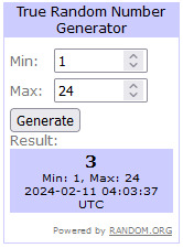
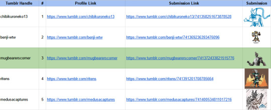
A link to the full spreadsheet of entries can be found here!
I'm so so grateful to all the people who participated in this event!! I'm so happy with how well it turned out and I'm so so thankful to be able to host it!!! Love you all!! :) :) :)
------------------------------------------------------------------------------
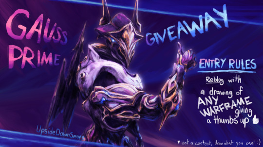
GAUSS PRIME ACCESS GIVEAWAY!
* Provided by Digital Extremes! Info about the prime access here.
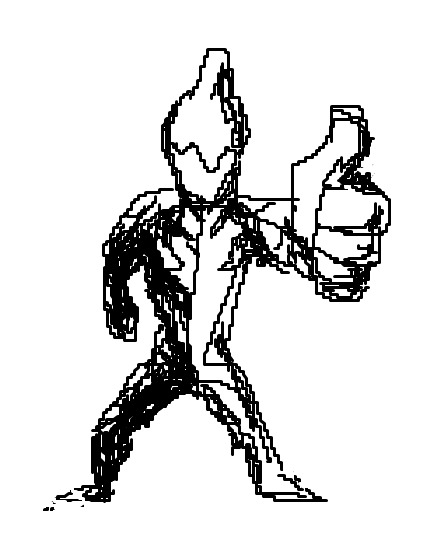
To enter, simply reblog with your art of ANY warframe giving a thumbs up!
Giveaway entries will close on FEBRUARY 10TH at 10:00pm CST
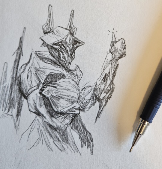
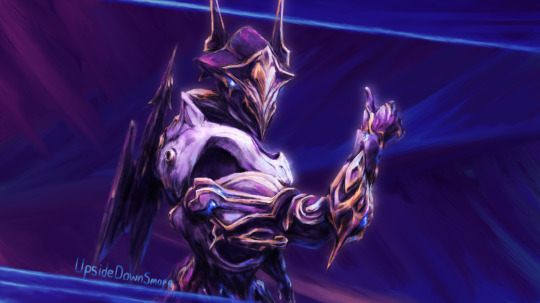
The post for the above drawing (with reference screenshot and wips) can be found here.
MORE INFO UNDER THE READ LINE, PLEASE READ IT IF YOU WANT TO ENTER
Notes:
This is not a contest! The winner will be decided entirely randomly, image quality will have no effect on chances of winning! Make whatever you can in any medium you want! (This can also include 3D mediums! The only thing I'm not including is unedited game screenshots/captura, though edited might be okay). Everyone can draw regardless of how good you think your own skills are!
Please submit your own drawing(s)!! Only one is necessary but you can make more if you want of course! Do not use any AI generation tools for your entry.
When reblogging it might be a good idea to enter some text either in the post or in the tags! It turns out reblogs with just an image and nothing else might not show up under the original post, which means I might miss your submission!
Only one entry per person, you will not get more entries for additional reblogs and/or drawings.
The goal of this is for the community to have a fun little gallery of warframe thumb ups in the reblogs, but again don't stress over how "good" your drawing is! As long as you have fun and submit something vaguely in line with the prompt you're good! (such as a wave instead of a thumbs up or an operator instead of a warframe, etc. Up to you how closely you want to follow the prompt!)
You DO NOT need to engage with me in any other way (likes, follows, etc.) to enter, just a reblog with a drawing loosely following the prompt!
This giveaway will only run here on Tumblr due to issues with bots and impersonation on Twitter. The issue of course is that the only way to submit images under a single post on Tumblr is through reblogs, but please know that I do not intend this to be a means of promotion. If people could submit images in the replies I would gladly take that option! If this post gets taken down I will look into other giveaway options.
As this is my first giveaway as a Warframe creator please let me know if I've made any mistakes!
Here are some example drawings that would all work, but of course whatever you want to make shouldn't be limited to this!
Inspired by @ritens, I will be assigning one unique number per individual and then throwing them into the random number generator on random.org. After the entries close and I roll the winner, I will update this post with the winner's name and a message saying that the giveaway is closed. Reblogs will also be turned off once the giveaway is closed, as I am only using reblogs as means of congregating drawing submissions under one post during the giveaway period.
Whoever's number get's chosen will be contacted via DMs here on Tumblr, so please make sure your DMs are open! I will be asking for your Warframe IGN and platform so DE can give send over your prize! If you have cross-save linked or merged then please tell me, though I will also be asking in DMs as well. If the winner doesn't respond within 48 hours or no longer wants the prime access pack, then I will roll a new winner with the same method but with the previous winner(s) number(s) taken out of the pool.
Topmost drawing without giveaway text:
Anyways good luck and most importantly have fun!!
#free wf pa#warframe#gauss prime#my art#warframe gauss prime#UpsideDownSmore's art#warframe fanart#gauss prime access#wf tag#wf#warframe gauss#can't believe i can do one of these now woah#still absolutely surreal#probably way too much effort for this lol#but it was good practice at least and i'm really happy with the result!#praying this works i've spent too long cobbling this together lol#UpsideDownSmore's free wf stuff
150 notes
·
View notes
Text
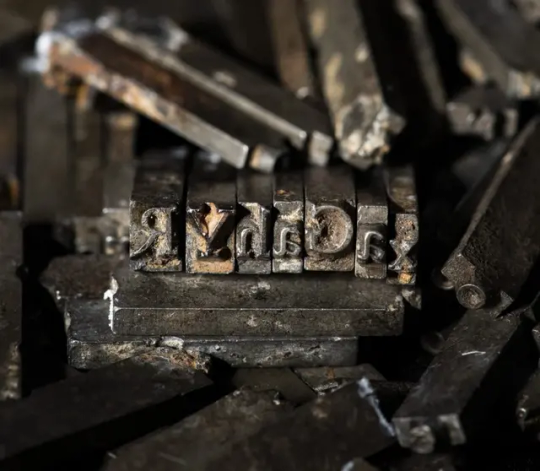
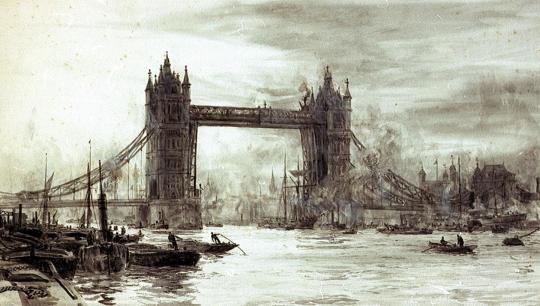
Remnants of a Legendary Typeface Have Been Rescued From the Thames River
Doves Type was thrown into the water a century ago, following a dispute between its creators.
The depths of the river Thames in London hold many unexpected stories, gleaned from the recovery of prehistoric tools, Roman pottery, medieval jewelry, and much more besides. Yet the tale of the lost (and since recovered) Doves typeface is surely one of the most peculiar.
A little over a century ago, the printer T.J. Cobden-Sanderson took it upon himself to surreptitiously dump every piece of this carefully honed metal letterpress type into the river. It was an act of retribution against his business partner, Emery Walker, whom he believed was attempting to swindle him.
The pair had conceived this idiosyncratic Arts and Crafts typeface when they founded the Doves Press in the London’s Hammersmith neighborhood, in 1900. They worked with draftsman Percy Tiffin and master punch-cutter Edward Prince to faithfully recall the Renaissance clarity of 15th-century Venetian fonts, designed by the revolutionary master typographer Nicolas Jensen.
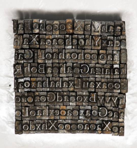
With its extra-wide capital letters, diamond shaped punctuation and unique off-kilter dots on the letter “i,” Doves Type became the press’s hallmark, surpassing fussier typographic attempts by their friend and sometime collaborator, William Morris.
The letterforms only existed as a unique 16pt edition, meaning that when Cobden-Sanderson decided to “bequeath” every single piece of molded lead to the Thames, he effectively destroyed any prospect of the typeface ever being printed again. That might well have been the case, were it not for several individuals and a particularly tenacious graphic designer.
Robert Green first became fascinated with Doves Type in the mid-2000s, scouring printed editions and online facsimiles, to try and faithfully redraw and digitize every line. In 2013, he released the first downloadable version on typespec, but remained dissatisfied. In October 2014, he decided to take to the river to see if he could find any of the original pieces.
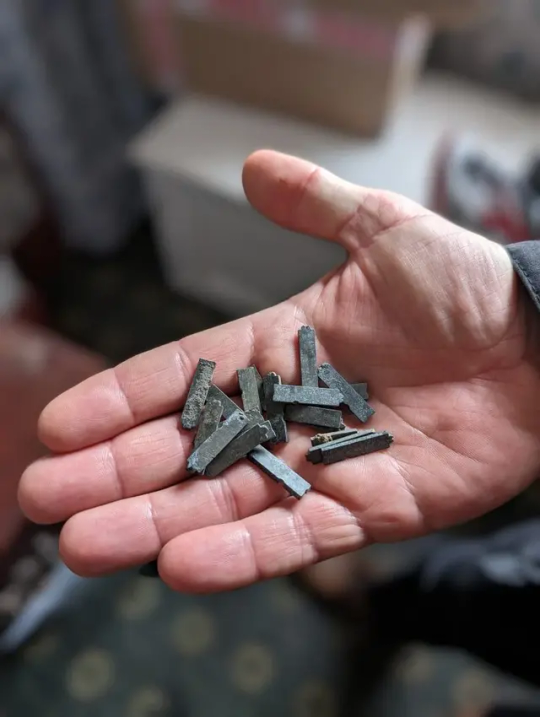
Using historical accounts and Cobden-Sanderson’s diaries, he pinpointed the exact spot where the printer had offloaded his wares, from a shadowy spot on Hammersmith bridge. “I’d only been down there 20 minutes and I found three pieces,” he said. “So, I got in touch with the Port of London Authority and they came down to search in a meticulous spiral.” The team of scuba divers used the rather low-tech tools of a bucket and a sieve to sift through the riverbed.
Green managed to recover a total of 151 sorts (the name for individual pieces of type) out of a possible 500,000. “It’s a tiny fraction, but when I was down by the river on my own, for one second it all felt very cosmic,” he said. “It was like Cobden-Sanderson had dropped the type from the bridge and straight into my hands. Time just collapsed.”
The finds have enabled him to further develop his digitized version and has also connected him with official mudlarks (people who search riverbanks for lost treasures, with special permits issued) who have uncovered even more of the type.
Jason Sandy, an architect, author and member of the Society of Thames Mudlarks, found 12 pieces, which he has donated to Emery Walker’s House at 7 Hammersmith Terrace. This private museum was once home to both business partners, and retains its stunning domestic Arts and Crafts interior.
Much like Green, Sandy was captivated by the Doves Type story, and mounted an exhibition at the house that displays hundreds of these salvaged pieces, including those discovered by Green, as well as mudlarks Lucasz Orlinski and Angus McArthur. The show was supplemented by a whole host of Sandy’s other finds, including jewelry and tools. An extant copy of the Doves English Bible is also on display.
“It is not that unusual to find pieces of type in the river,” Sandy said. “Particularly around Fleet Street, where newspaper typesetters would throw pieces in the water when they couldn’t be bothered to put them back in their cases. But this is a legendary story and we mudlarks love a good challenge.” The community is naturally secretive about exactly where and how things are found. For example, Orlinski has worked under the cover of night with a head torch, to search for treasures at his own mysterious spot on the riverbank.
For Sandy, the thrill comes from the discovery of both rare and everyday artifacts, which can lead to an entirely new line of inquiry: “The Thames is very democratic. It gives you a clear picture of what people have been wearing or using over thousands of years. And it’s not carefully curated by a museum. The river gives up these objects randomly, and you experience these amazing stories of ordinary Londoners. It creates a very tangible connection to the past. Every object leads you down a rabbit hole.”
By Holly Black.
#Remnants of a Legendary Typeface Have Been Rescued From the Thames River#Doves Type#printer#Society of Thames Mudlarks#mudlark#mudlarking#ancient#archeology#archeolgst#history#history news#long reads#long post
107 notes
·
View notes
Note
question! im considering doing dividers as gifts for my friends and I was wondering if you had any tips? is it a better idea to hand draw the designs to avoid any potential copyright issues or is using free to distribute clip resources okay?
I know how to draw and do edits just fine I’m just not sure what other graphic artists do in this regard
Hi anon!
Okay, so this is going to be a little long winded and maybe stuff you might know about the process, but I hope it’ll be helpful as a guide for others too maybe? Tips under the cut otherwise everyone’s gonna have to scroll through it.
1. Personally, I LOVE Canva because it has a library of pre-uploaded elements and its super easy to use. Like if I search stars hundreds of individual elements come up as results.
(I know some people also use Visme, which I don’t have any real experience with, but it’s an alternative with good reviews.)
As long as you are not claiming each individual element is your own creation, you’re in the clear. People making graphics like these almost always use premade elements and combine or edit them into a unique piece. That being said, if you claim that an individual element is your own, you’ll probably be called out. I don’t know how familiar you are with the community so forgive me if I sound condescending: the graphics/digital art community is a wild place when it comes to plagiarism but it’s good that artists look out for each other.
Anyway. Creators that upload designs/elements/templates to Canva are aware that they can be changed/edited. If you have Canva pro (which I recommend because you can do transparent PNGs so easily) some elements are only available via pro subscription and you’re compensating the creator for the use of the element and however you change it.
Basically, the divider/graphic is yours, but the individual elements are theirs. You don’t need to give credit because it’s like using stamps or stickers. For example: You wouldn’t typically use Lisa frank stickers on a coloring page and then credit Lisa frank in the corner of the paper. ⚠️I strongly urge you to stay away from AI art. Generators steal from artists to create what the user searches for!⚠️
2. Hand drawing can get a little tricky. You have to be careful with your dimensions and even file size sometimes. In my personal experience, if you’re new to this type of graphic art you should wait until you’re comfortable with it. It can get confusing. I’ve had MANY graphics come out a blurry, frustrating mess and I’m by no means the best divider maker/graphic artist on the planet.
An extra example: my Cute Coquette set vs my Dark Siren set. Technically, there’s nothing wrong with the coquette ones, but they look fuzzy/blurry. I made them when I was first starting out and I struggled with how to line up the right dimensions. I keep them up because as much as I don’t like how blurry they are, it shows my progress and I’m rather fond of them. It’s not even close to what I do now, like the Dark Sirens, which even zoomed out have a lot of detail but are clear and defined. 🤷🏻♀️


3. To avoid said blurring, I recommend using these canvas sizes:
Banners and headers: 1055px x 500px, I’ve also done 3000px x 500px.
Standard Size Dividers: 3000px x 240px
Thicker/Thinner Dividers: Basically you can go as thin or thick as you want as long as that first number is 3000px. I added a screenshot of ones I’ve used recently that might help.
I think if you’re using software like procreate, the canvas sizes are the same but you’ll have to go through some extra steps if you want to get it into canva or whatever graphic editing software you’re using.

4. Lastly and most importantly, just have fun. Play around with the settings and figure out what works best for you!! You of course can DM me with more questions, but I hope this at least helped a little bit.
🩵🌸
*Edited 2 hours after posting to add personal examples, and this little guide can now be found in my navigation post!*
64 notes
·
View notes
Text
DC & MARVEL are awful at publishing their own amazing stories...
Read some western comics for the first time in a while this year. I wanted to start reading more in general anyway so I added comics and manga to the list. HOOOOOOOOO GGGAAAD DAYUM some of this stuff is good! I wanted to start with DC's Absolute & Marvel's New Ultimate. I've read mostly DC but have never fully gotten into a series or mini series before. These new books were meant to be jumping on points for newcomers so I wanted to give it a try.
And I gotta say... these need more attention... By their own publishers, I mean.
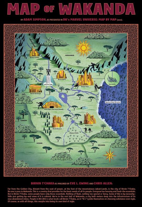
Even though I only really started in the last 3 months of the year, I get peoples frustrations with these being monthly releases and the fact that a lot these you HAVE to buy individually and not part of a magazine or some other form of collective release. At least until a volume release. On top of that these are NOT easy to find, not where I live, and not online either. You need a subscription service for the digital releases and you need to find a comic book shop to even buy it physical. These aren't cheap either! If I wanted to buy, say, a manga volume's worth of issues to try and catch up, its almost 5x that of a cheap physical manga volume. And the only place you're going to be getting a volume of some of these is at a book store, not a comic shop, just because there's way more bookstores generally. By the time those volumes have released there's no gaurantee the series that you like is even still running, because they havn't made it easy to even find these to read and it might've been cancelled due to low sales. So that leaves me with a problem... I either cave in and get a subscribtion or I pirate it. I'm poor af, of course I'm going to pirate it. MOST people will. Except they won't because barely anybody knows these comics even exist. There's little to NO marketing around any of these comics. Seriously, why aren't these in a magazine?! Why aren't these easily veiwable digitally? I don't want a subscription service just to look at a few books. I'm DONE with subscription services. Even if it's just a website where you pay to read online per series, or even throwing these into webtoon behind a paywall, it'll be infinitly better. At least that way people actually get to see the amazing work they're putting out there. And... yeah, the monthly wait on these is agonising. If the wait cannot be shortened then a weekly magazine is needed DESPERATELY, because there is NOTHING in the way of audience interaction for newcomers except a very limited fandom which might be gone in a few months just cause the series could be up and cancelled at the snap of their fingers. Their websites suck... Like, straight up, they suck. Nothing unique or stylised about them, not even a bit of background music or some flare, it's trailers for games, movies, and TV. Theres not even viewer guides for comics, bits of info on the world, or even those silly "who is the strongest/fastest/richest,etc" graphics like in old magazines. there's no fun. It's painful because the stuff thats out there is genuinly good. A lotta bad, certainly, but the recent stuff is thoroughly engaging. Another thing, the issue 1 crisis. If you don't know what this is, it's publishers resetting issues back to number 1 to bump up the price. It's disgusting. Especially when it makes it a NIGHTMARE to try and find the series you're looking for... and its same name as 8 other series only seperated by a date. THESE NEED TITLES! I was reading Ultimate Black Panther and Black Panther recently... Or rather, NEW Ultimate Black Panther: T'Challa vs. The Moon Knight, and Black Panther[2023]: A King Without A Crown. The naming alone causes frustrations when trying to navigate and find a story you might actually like. King Without A Crown is a title I just made up for the 2023 release. Its a great story, the art is some of the best I've seen in any comic. And the premise is very enganging, about T'Challa having been exiled from Wakanada, returned to watch over it as a secret protector and trying to reconnect with the people in places he believed he'd overlooked. To try and deepen his understanding as a king, and as protector of his country. It's Cyberpunk Crime Thriller Sci-Fi with a mix of central African mysticism. It even comes with an official map.
It got cancelled. Only lasted 10 issues... New Ultimate X-Men / Secret Society X Men is a shojo horror mystery set in japan inspired by major works of J-Horror... and it's FREAKIN' X-MEN Nobody talkin' about it. New Ultimate Spider-Man is about Peter, married to MJ, Father of 2, becoming Spider-Man after receiving word from the future that he was supposed be a hero and that it was taken from him, and Uncle Ben is alive in this... Nobody talkin' about it. New Ultimate Black Panther is kinda slow but it's about 2 warlords trying to infiltrate and take over wakanda who are posing as this world's versions of Konshu & Ra and leads to a greater conspiricy about Vibranium itself. Nobody talkin' about it. I LOVE the absolute series. I'm a DC fan, but these Marvel works also need more love, like... guys. Not to mention Spider-Man and Ult X-Men is fanfic and fanart GOLD! LIKE GET ON THIS SH!T NOW! There are other big issues i've got with western comics but I wanted to talk about it's accessibility. I love comics and manga a lot, it was what got me to start reading in the first place, and I want these cool stories to continue in a way that is like, actually enjoyable. I wanna talk about these with people, but there's no point if nobody is out there to enjoy it with. In the meantime, if you like these stories but can't afford them, make fanwork of it. Fiction, prose, poetry, art, music, silly comments, anything. Same goes for Manga and Indie works that you like. Don't let a company's incompetence stifle your ability to enjoy art that has ACTUAL passion behind it.
#DC#Marvel#new ultimate marvel#dc absolute universe#absolute superman#absolute batman#absolute wonder woman#black panther#wakanda forever#dc comics#batman#wonder woman#superman#x men#x men comics#western comics#comics#marvel ultimate#ultimate marvel#spiderman#fanart#fanfiction#fanwork#publishing#reading
25 notes
·
View notes
Text
Screen Tones (the actual material!)
If you've seen the little comics-esque dots in media (and in our logo), you've seen screen tones, also known as halftones! The halftone method was created as a way to print values - and they've developed a unique flavour in comics because of how they look. But how do we use them in the digital age? Krispy dives in with her tips:
Digital art can have a LOT of issues with consistency and sizing with halftones that creates odd, eye-straining patterns called moiré. There's technically no way to avoid this in all aspects- it comes with the territory of tones because of their nature, and the fact that folks use many different size screens to read and enjoy your comic. That said- they're are still many methods to help keep it looking fine and non obstructive:
Consistency is key.
There is no 'proper size' for the screen tones, because the art will change regardless of how its compressed and viewed. You can WORK in 600dpi, but if that is displayed on a screen with lower resolution, you will get moiré as a result. Your printer's settings will also dictate how the patterns come out. You can print with one company and get different results with another- it can be a big gamble, so proofs are essential! (Here's a great post going into all the print details) Moiré happens also when your patterns are NOT on the same 'frequency', meaning an overlap of different patterns can give you this janky effect:

This also shows you the many frequency and 'sizes' you can get with halftones. It can be a gamble depending on how it is sized. Sizing matters a lot!
We have set files of halftones that are a set size, and we place the image on top, and delete what we don't need. That way, the image stays the same size, and you're not dealing with it re-sizing.

Traditional halftones were meant for a single size, so they print consistently, but when scanned and shown on bigger displays than they were intended for, you can still run into problems. Avoid working so large with halftones if you don't want to waste time fixing them. But don't work too small either! 300dpi Sizing down is still easier than sizing up. Focus on what frequency would match the three sizes you plan on: working in, printing, and sharing. Again, consistency is key!
A couple of other techniques for screen tones you can also use that will give you the effect you want, but avoid most of the moiré:
Blurring: If you want to work in the halftone thresholds/brushes you have, and don't want to deal with the sizing issues, you can blur the halftone layer by a couple levels, making it a static image that still gives you texture, but isn't fighting your screen with dots and patterns.
Imitating the feel of halftones with other methods: With a few Photoshop filters and effects, you can transform flat grey areas into textured tone!
Go forth and tone!
57 notes
·
View notes
Note
What are some ideas you've wanted to draw/write but haven't?
Oh man. I've got so many. A handful of ideas include:
A semi-animated series titled "My Pal the Paladin" about a kidnapped princess and the final boss who join forces to track down the legendary hero who's failed to slay even a single mook months after the plot kicking off and yell at him for taking so long. It's based on my oldest original characters and has a lot of sentimental worth to me as a result. Idris, Pal, and Katherine are my babies. I've considered making it similar in production to Dingo Doodle's Fool's Gold series, but I haven't actually made it because I'm really nervous about it turning out poorly ^^; I'd love to post a pitch bible for it someday!
A gothic picture book tentatively titled "Cover the Mirrors" about a woman killing a monster that has haunted her since girlhood, and inheriting the curse that turned the monster from a normal man into his current twisted looks. It would end with the monster's appearance going from being seen as a Boogeyman figure that stalks kids who play outside after sundown while the original monster was around, to a vengeful beast that hunts people who prey on children once the woman inherits the curse. It would play with the idea of trauma giving you unique abilities to help those who have gone through similar terrors, while also warping you into something you can't recognize and find inherently repulsive. I haven't made it because I don't know how to render the painterly style I envision for it.
A mixed media visual novel titled "Cradlehead" about a woman who finds herself serving as the unwilling vessel for an eldritch entity that will destroy her mind when it finishes germinating within and exits her body. She has to escape the pocket dimension it trapped her in to develop within the optimal conditions in order to save herself. The visuals would incorporate clay, digital art, traditional art, 3D models, pixel art, and photography. The game would center around the woman's desperation as she tries to escape while her ability to perceive the new world around her decays more and more over time. I haven't made it because I doubt my artistic abilities to make something like I have in my head come to life.
An untitled magical girl webcomic about an unwilling magical girl with a giant bee familiar named Queenie and issues controlling her powers because of her insecurities. She feels bad about being a not very girly individual while surrounded by hyper-feminine young women who have a handle on their powers she could never dream of. It revolves around her character arc where she eventually stops worrying about meeting the arbitrary standards she imposes on herself to be "girly enough" and decides to just be herself, whoever that is, unlocking her true powers and entering her ultimate form during a climactic battle— taking on a design less like a queen holding a scepter like she'd been dreading, and more like a princely knight holding a stinger-like spear. Her rejection of others' expectations as well as her own helps the world-ending threat, a shapeshifting eldritch being that absorbs people into itself so it can become someone other than itself but is never satisfied with the new faces it obtains, to accept itself and stop trying to steal people's souls in order to find one that would make it love itself. I haven't made it because I worry if it would come across weirdly to the average viewer, as it deals with gender dysphoria as a subject in a very atypical manner.
#my two sides: unspeakable eldritch horror and cutesy goofy cartoons :>#sofie answers asks#stuff by sofie#(kinda. I'm talking about things I want to make at least!)
28 notes
·
View notes