#new story collection
Explore tagged Tumblr posts
Text
i completely forgot that i have the first entry to 'rules of conduct' ready to go, so i'll upload that tomorrow while i'm still working on part 3 of 'the final Lady Sharpe'
imma give y'all this tho…
now i say this is a 'collection' but really i have no ideas right now on where else to put this particular pair of blorbos so…if you have any mundane scenarios you'd want them to put a smutty spin to, feel free to send me an Ask and i'll put it into the writing queue 💖🫡
7 notes
·
View notes
Text


Showing off the babies
(I watched Ultraman Rising! It was good!)
Bonus:

From this

#godzilla#ultraman#godzilla x kong: the new empire#ultraman rising#godzilla minus one#netflix#kenji sato#emi ultraman#kong#suko#the bebes!#now my collection is complete#Finally#I have them all#the dads/big bro collection#also I watched Ultraman Rising#it was better than I expected!#loved the family bond and the story#Emi is a baby#she's a good baby#now what if I put her with Minus One....#hhhhhmmmmm#haha joking!#....#unless?#do not repost#my art
6K notes
·
View notes
Text
nypd chief: his writings show “suspect does seem to have some ill-will toward corporate america.”
#lmao???#that’s like most of america#I want that manifesto plastered everywhere#a collective boo to that mcdonalds employee who ratted him out#also the fact that this story is getting mkre coverage than uhc ever provided...#uhc#the claims adjuster#luigi mangione#us politics#uhc shooter#brian thompson#news#class warfare#capitalism
524 notes
·
View notes
Text
I've unintentionally become obsessed with Jiang Cheng MDZS. He's thrust into power at a young age, he hates his brother, he loves his brother, his family is dead, he was suffocated by the pressure they put on him, his dead/alive brother's core is literally sustaining him and saved him from living only half a life, he's agressive and brash and snarly, he loves dogs, he uses a whip as a weapon and everyone compares him to his mother, he's purple, he has no friends except his nephew who is a literal child who is also everyone else's nephew, a portion of the fandom crucifies him for obstructing the main couple. Truly no one is doing it like Jiang Cheng.
#if you put a tsundere most of the fandom hates in front of me#i have NO OPTION but to love them and gnaw on their story gently#i don't care what he did he's my baby in fact#i love his dynamics with everyone around him even though they all hate him or are ambivalent about him#jiang cheng#is he actually just my new Sakura Haruno in fact?#ahahaha maybe I'm just that predictable#flipping between going feral over JC and going feral over Bingqiu#i see an unloved MXTX character/ship and collect them into my heart
181 notes
·
View notes
Note
Hi! I’m delighted with your “itty bitties” au. It has a lot of details that very laconically come together to form a single complex beautiful mosaic. It makes me want to discover more and more pieces to fill in the empty space.
And you are making a great job answering so many questions a day! Don’t forget to have a rest!
Ok! Now to the questions. One block at a time.
How is it determined how much food a fairy is given? What effect does food have on a fairy besides preventing death from hunger and restoring strength?
Do Wanda and Cosmo receive any benefits since they work on organizing raw materials for food and also constantly have to grant their godchildren’s wishes?

WAAAA!! OMGGG BITTY TIMMY AAART AHEHHEHHE!!!!
Okay since the questions are big, I'm putting them under the Readmore! This is mostly worldbuilding ramblings for Itty Bitties haha!
Anything that's plot relevant WILL be brought up again btwww!! So if you skip this post you will not be missing anything!!
Bitties Series: [Start] > [Previous] > [Next]
>How is it determined how much food a fairy is given?
Fairies are given equal amounts across Fairyworld!! Food is a necessity for them, and since collecting the food is so difficult, they have a UBF system in place (Universal Basic Food). This UBF system is shared across all courts! It's the one thing everybody can agree on!!
There's also stores for food, but fairies rarely run out of their own UBF amount. Those stores are mostly for food enthusiasts, like bakers. Fairies can also eat out at restaurants, where they pride themselves on quality of taste in the foods.
Fairies can choose between prepackaged UBF plans, or raw UBF plans- depending on whether they like to cook their own food, or would rather just have it pre-made for them! Wanda loves cooking, so she's on the raw UBF program! But Timmy's on the prepackaged plan because he's very lazy haha.
>What effect does food have on a fairy besides preventing death from hunger and restoring strength?
Nothing much really! If anything, food is just something to keep a Fairy's lifespan going and keep them healthy. There's some connoisseurs who enjoy tasting or enhancing the flavors though.
Sometimes, there is food that is especially potent with a child's emotions. If consumed, those emotions are shared into the Fairy! For example, a Fairy that is extremely angry can consume a potent chocolate bar, and immediately feel the calmness that a child had once experienced.
These foods are usually out of reach for the Common Fairy though. A very small amount of potent food is shared in the UBF system, but the amount is uneven across the courts. It's a constant political debate for Fairies.
>Do Wanda and Cosmo receive any benefits since they work on organizing raw materials for food and also constantly have to grant their godchildren’s wishes?
Since Fairy Godparents use a lot of magic, they get double the amount of the UBF! They're allowed to pick the food they want, allowed as much potent food of their choosing, AND are the only Fairies allowed to eat core wishes.
Unlike Potent food, core food are highly valued as it's the pure desire a child would have. It's near impossible to retrieve, and is viewed as the ambrosia of food for Fairies. Although Fairy Godparents are only allowed to eat the core wish of their own godchild.
Cosmo and Wanda are in the process of eating Timmy's Core Wish, and many Fairies are very jealous of them because of it.
There's a lot of benefits that comes with being Godparents. That's why the training to get there is hellish, haha. Only the most toughened Fairy approved by Jorgen Vonstrangle can become a godparent!
#fairly oddparents#fop#fop a new wish#fop timmy turner#fop timmy#timmy turner#asks#itty bitties fop au#AUGUGUH IVE BEEN HOLDING ONTO THIS ONE FOR SO LONGGG#LOOK AT HIMMM#AJHEHEHEHEHEHE#ALSO YAYYYY YIIPIIEE RAMBLINGGSSS#does ANY of this have any relevance to the itty bitties story? not really not by that much! but its very fascinating and fun!!!#by the way. when a child's wish is harvested they DO lose those emotions#so a child who had anger when making a wish- once its fully collected that anger for that particular moment is gone#its another reason why jorgen's extremely picky with who becomes a godparent#you cannot just. take all that food out by force#you gotta have caution and care !!!!!!
203 notes
·
View notes
Text

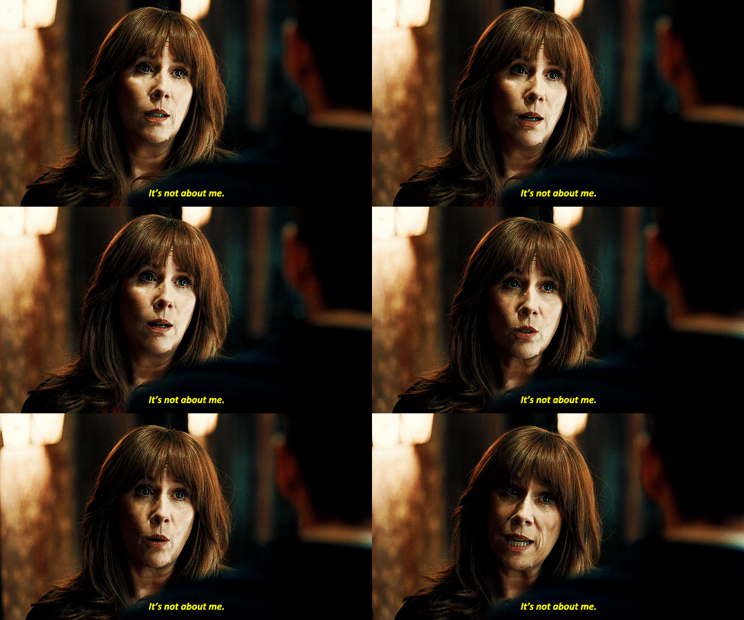

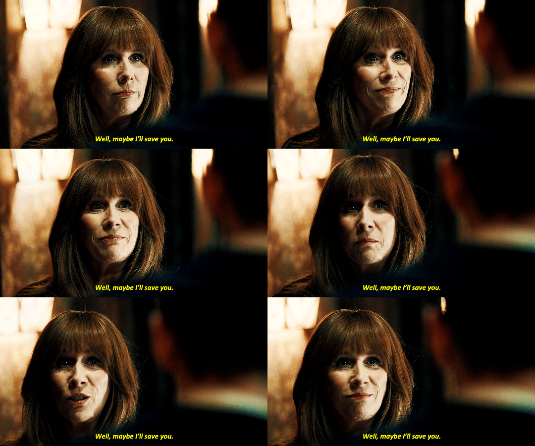
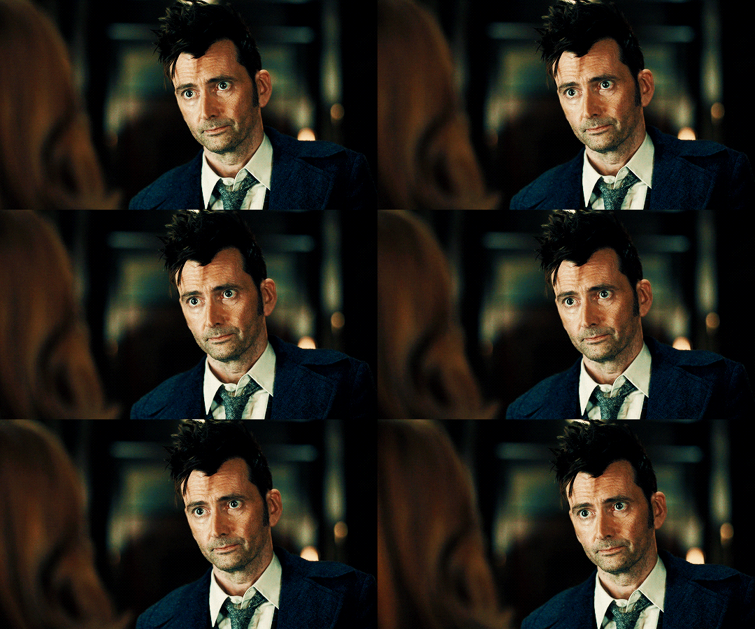
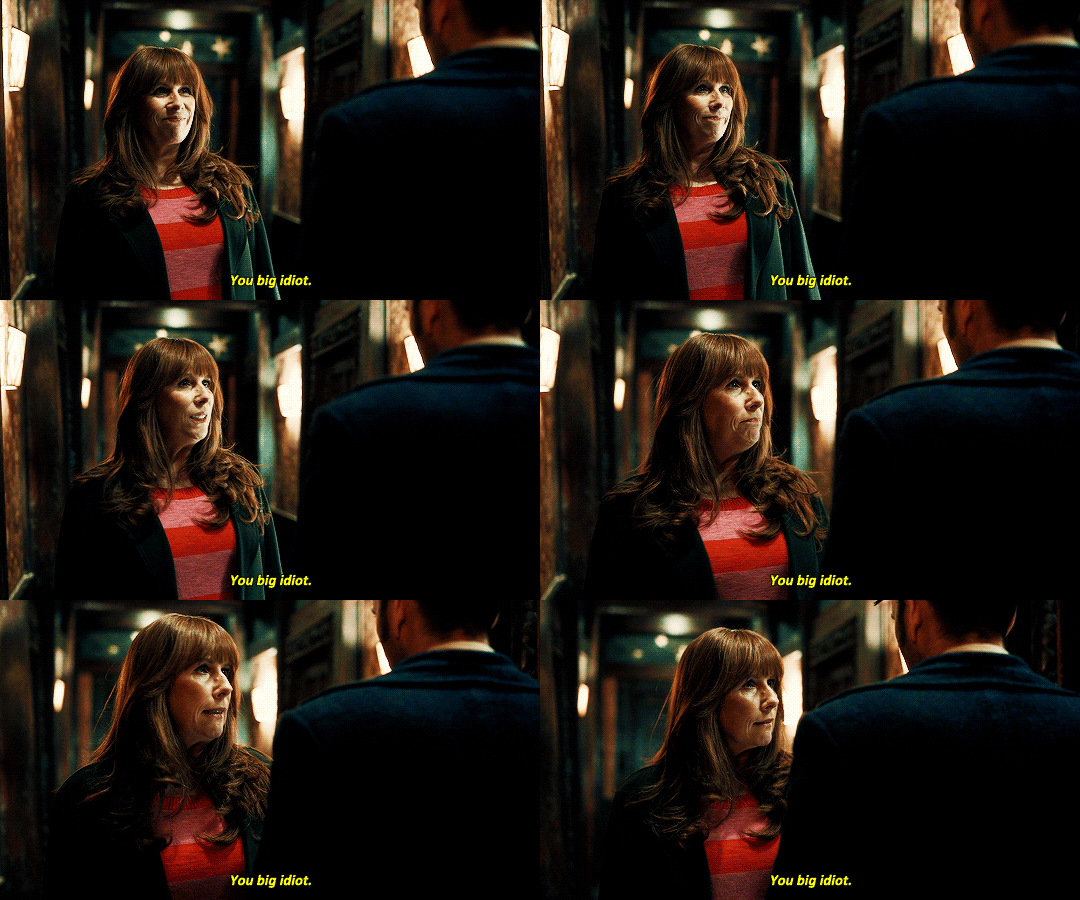

#mine#doctor who#dwedit#david tennant#catherine tate#i know we must have tons of gifsets of this scene posted already#but i just!!!!! love them so much!!!!!#😭😭😭😭#i have all the new episode novelisations ready to go on my kindle#and i am SO EXCITED to read them all!!!!!!!!#but first i'm reading a tenth doctor christmas story collection!!#and then i have a third doctor and jo story to get to as well#it's gonna be dw everything during my winter break lol
851 notes
·
View notes
Text
why Aurora's art is genius
It's break for me, and I've been meaning to sit down and read the Aurora webcomic (https://comicaurora.com/, @comicaurora on Tumblr) for quite a bit. So I did that over the last few days.
And… y'know. I can't actually say "I should've read this earlier," because otherwise I would've been up at 2:30-3am when I had responsibilities in the morning and I couldn't have properly enjoyed it, but. Holy shit guys THIS COMIC.
I intended to just do a generalized "hello this is all the things I love about this story," and I wrote a paragraph or two about art style. …and then another. And another. And I realized I needed to actually reference things so I would stop being too vague. I was reading the comic on my tablet or phone, because I wanted to stay curled up in my chair, but I type at a big monitor and so I saw more details… aaaaaand it turned into its own giant-ass post.
SO. Enjoy a few thousand words of me nerding out about this insanely cool art style and how fucking gorgeous this comic is? (There are screenshots, I promise it isn't just a wall of text.) In my defense, I just spent two semesters in graphic design classes focusing on the Adobe Suite, so… I get to be a nerd about pretty things…???
All positive feedback btw! No downers here. <3
---
I cannot emphasize enough how much I love the beautiful, simple stylistic method of drawing characters and figures. It is absolutely stunning and effortless and utterly graceful—it is so hard to capture the sheer beauty and fluidity of the human form in such a fashion. Even a simple outline of a character feels dynamic! It's gorgeous!
Though I do have a love-hate relationship with this, because my artistic side looks at that lovely simplicity, goes "I CAN DO THAT!" and then I sit down and go to the paper and realize that no, in fact, I cannot do that yet, because that simplicity is born of a hell of a lot of practice and understanding of bodies and actually is really hard to do. It's a very developed style that only looks simple because the artist knows what they're doing. The human body is hard to pull off, and this comic does so beautifully and makes it look effortless.
Also: line weight line weight line weight. It's especially important in simplified shapes and figures like this, and hoo boy is it used excellently. It's especially apparent the newer the pages get—I love watching that improvement over time—but with simpler figures and lines, you get nice light lines to emphasize both smaller details, like in the draping of clothing and the curls of hair—which, hello, yes—and thicker lines to emphasize bigger and more important details and silhouettes. It's the sort of thing that's essential to most illustrations, but I wanted to make a note of it because it's so vital to this art style.
THE USE OF LAYER BLENDING MODES OH MY GODS. (...uhhh, apologies to the people who don't know what that means, it's a digital art program thing? This article explains it for beginners.)
Bear with me, I just finished my second Photoshop course, I spent months and months working on projects with this shit so I see the genius use of Screen and/or its siblings (of which there are many—if I say "Screen" here, assume I mean the entire umbrella of Screen blending modes and possibly Overlay) and go nuts, but seriously it's so clever and also fucking gorgeous:
Firstly: the use of screened-on sound effect words over an action? A "CRACK" written over a branch and then put on Screen in glowy green so that it's subtle enough that it doesn't disrupt the visual flow, but still sticks out enough to make itself heard? Little "scritches" that are transparent where they're laid on without outlines to emphasize the sound without disrupting the underlying image? FUCK YES. I haven't seen this done literally anywhere else—granted, I haven't read a massive amount of comics, but I've read enough—and it is so clever and I adore it. Examples:


Secondly: The beautiful lighting effects. The curling leaves, all the magic, the various glowing eyes, the fog, the way it's all so vividly colored but doesn't burn your eyeballs out—a balance that's way harder to achieve than you'd think—and the soft glows around them, eeeee it's so pretty so pretty SO PRETTY. Not sure if some of these are Outer/Inner Glow/Shadow layer effects or if it's entirely hand-drawn, but major kudos either way; I can see the beautiful use of blending modes and I SALUTE YOUR GENIUS.
I keep looking at some of this stuff and go "is that a layer effect or is it done by hand?" Because you can make some similar things with the Satin layer effect in Photoshop (I don't know if other programs have this? I'm gonna have to find out since I won't have access to PS for much longer ;-;) that resembles some of the swirly inner bits on some of the lit effects, but I'm not sure if it is that or not. Or you could mask over textures? There's... many ways to do it.
If done by hand: oh my gods the patience, how. If done with layer effects: really clever work that knows how to stop said effects from looking wonky, because ugh those things get temperamental. If done with a layer of texture that's been masked over: very, very good masking work. No matter the method, pretty shimmers and swirly bits inside the bigger pretty swirls!
Next: The way color contrast is used! I will never be over the glowy green-on-black Primordial Life vibes when Alinua gets dropped into that… unconscious space?? with Life, for example, and the sharp contrast of vines and crack and branches and leaves against pitch black is just visually stunning. The way the roots sink into the ground and the three-dimensional sensation of it is particularly badass here:

Friggin. How does this imply depth like that. HOW. IT'S SO FREAKING COOL.
A huge point here is also color language and use! Everybody has their own particular shade, generally matching their eyes, magic, and personality, and I adore how this is used to make it clear who's talking or who's doing an action. That was especially apparent to me with Dainix and Falst in the caves—their colors are both fairly warm, but quite distinct, and I love how this clarifies who's doing what in panels with a lot of action from both of them. There is a particular bit that stuck out to me, so I dug up the panels (see this page and the following one https://comicaurora.com/aurora/1-20-30/):

(Gods it looks even prettier now that I put it against a plain background. Also, appreciation to Falst for managing a bridal-carry midair, damn.)
The way that their colors MERGE here! And the immense attention to detail in doing so—Dainix is higher up than Falst is in the first panel, so Dainix's orange fades into Falst's orange at the base. The next panel has gold up top and orange on bottom; we can't really tell in that panel where each of them are, but that's carried over to the next panel—
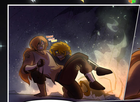
—where we now see that Falst's position is raised above Dainix's due to the way he's carrying him. (Points for continuity!) And, of course, we see the little "huffs" flowing from orange to yellow over their heads (where Dainix's head is higher than Falst's) to merge the sound of their breathing, which is absurdly clever because it emphasizes to the viewer how we hear two sets of huffing overlaying each other, not one. Absolutely brilliant.
(A few other notes of appreciation to that panel: beautiful glows around them, the sparks, the jagged silhouette of the spider legs, the lovely colors that have no right to make the area around a spider corpse that pretty, the excellent texturing on the cave walls plus perspective, the way Falst's movements imply Dainix's hefty weight, the natural posing of the characters, their on-point expressions that convey exactly how fuckin terrifying everything is right now, the slight glows to their eyes, and also they're just handsome boys <3)
Next up: Rain!!!! So well done! It's subtle enough that it never ever disrupts the impact of the focal point, but evident enough you can tell! And more importantly: THE MIST OFF THE CHARACTERS. Rain does this irl, it has that little vapor that comes off you and makes that little misty effect that plays with lighting, it's so cool-looking and here it's used to such pretty effect!
One of the panel captions says something about it blurring out all the injuries on the characters but like THAT AIN'T TOO BIG OF A PROBLEM when it gets across the environmental vibes, and also that'd be how it would look in real life too so like… outside viewer's angle is the same as the characters', mostly? my point is: that's the environment!!! that's the vibes, that's the feel! It gets it across and it does so in the most pretty way possible!
And another thing re: rain, the use of it to establish perspective, particularly in panels like this—

—where we can tell we're looking down at Tynan due to the perspective on the rain and where it's pointing. Excellent. (Also, kudos for looking down and emphasizing how Tynan's losing his advantage—lovely use of visual storytelling.)
Additionally, the misting here:
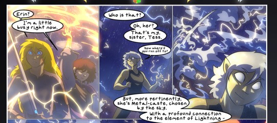
We see it most heavily in the leftmost panel, where it's quite foggy as you would expect in a rainstorm, especially in an environment with a lot of heat, but it's also lightly powdered on in the following two panels and tends to follow light sources, which makes complete sense given how light bounces off particles in the air.
A major point of strength in these too is a thorough understanding of lighting, like rim lighting, the various hues and shades, and an intricate understanding of how light bounces off surfaces even when they're in shadow (we'll see a faint glow in spots where characters are half in shadow, but that's how it would work in real life, because of how light bounces around).
Bringing some of these points together: the fluidity of the lines in magic, and the way simple glowing lines are used to emphasize motion and the magic itself, is deeply clever. I'm basically pulling at random from panels and there's definitely even better examples, but here's one (see this page https://comicaurora.com/aurora/1-16-33/):

First panel, listed in numbers because these build on each other:
The tension of the lines in Tess's magic here. This works on a couple levels: first, the way she's holding her fists, as if she's pulling a rope taut.
The way there's one primary line, emphasizing the rope feeling, accompanied by smaller ones.
The additional lines starbursting around her hands, to indicate the energy crackling in her hands and how she's doing a good bit more than just holding it. (That combined with the fists suggests some tension to the magic, too.) Also the variations in brightness, a feature you'll find in actual lightning. :D Additional kudos for how the lightning sparks and breaks off the metal of the sword.
A handful of miscellaneous notes on the second panel:
The reflection of the flames in Erin's typically dark blue eyes (which bears a remarkable resemblance to Dainix, incidentally—almost a thematic sort of parallel given Erin's using the same magic Dainix specializes in?)
The flowing of fabric in the wind and associated variation in the lineart
The way Erin's tattoos interact with the fire he's pulling to his hand
The way the rain overlays some of the fainter areas of fire (attention! to! detail! hell yeah!)
I could go on. I won't because this is a lot of writing already.
Third panel gets paragraphs, not bullets:
Erin's giant-ass "FWOOM" of fire there, and the way the outline of the word is puffy-edged and gradated to feel almost three-dimensional, plus once again using Screen or a variation on it so that the stars show up in the background. All this against that stunning plume of fire, which ripples and sparks so gorgeously, and the ending "om" of the onomatopoeia is emphasized incredibly brightly against that, adding to the punch of it and making the plume feel even brighter.
Also, once again, rain helping establish perspective, especially in how it's very angular in the left side of the panel and then slowly becomes more like a point to the right to indicate it's falling directly down on the viewer. Add in the bright, beautiful glow effects, fainter but no less important black lines beneath them to emphasize the sky and smoke and the like, and the stunningly beautiful lighting and gradated glows surrounding Erin plus the lightning jagging up at him from below, and you get one hell of an impactful panel right there. (And there is definitely more in there I could break down, this is just a lot already.)
And in general: The colors in this? Incredible. The blues and purples and oranges and golds compliment so well, and it's all so rich.
Like, seriously, just throughout the whole comic, the use of gradients, blending modes, color balance and hues, all the things, all the things, it makes for the most beautiful effects and glows and such a rich environment. There's a very distinct style to this comic in its simplified backgrounds (which I recognize are done partly because it's way easier and also backgrounds are so time-consuming dear gods but lemme say this) and vivid, smoothly drawn characters; the simplicity lets them come to the front and gives room for those beautiful, richly saturated focal points, letting the stylized designs of the magic and characters shine. The use of distinct silhouettes is insanely good. Honestly, complex backgrounds might run the risk of making everything too visually busy in this case. It's just, augh, so GORGEOUS.
Another bit, take a look at this page (https://comicaurora.com/aurora/1-15-28/):
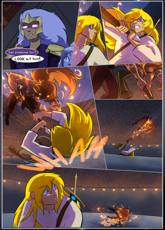
It's not quite as evident here as it is in the next page, but this one does some other fun things so I'm grabbing it. Points:
Once again, using different colors to represent different character actions. The "WHAM" of Kendal hitting the ground is caused by Dainix's force, so it's orange (and kudos for doubling the word over to add a shake effect). But we see blue layered underneath, which could be an environmental choice, but might also be because it's Kendal, whose color is blue.
And speaking off, take a look at the right-most panel on top, where Kendal grabs the spear: his motion is, again, illustrated in bright blue, versus the atmospheric screened-on orange lines that point toward him around the whole panel (I'm sure these have a name, I think they might be more of a manga thing though and the only experience I have in manga is reading a bit of Fullmetal Alchemist). Those lines emphasize the weight of the spear being shoved at him, and their color tells us Dainix is responsible for it.
One of my all-time favorite effects in this comic is the way cracks manifest across Dainix's body to represent when he starts to lose control; it is utterly gorgeous and wonderfully thematic. These are more evident in the page before and after this one, but you get a decent idea here. I love the way they glow softly, the way the fire juuuust flickers through at the start and then becomes more evident over time, and the cracks feel so realistic, like his skin is made of pottery. Additional points for how fire begins to creep into his hair.
A small detail that's generally consistent across the comic, but which I want to make note of here because you can see it pretty well: Kendal's eyes glow about the same as the jewel in his sword, mirroring his connection to said sword and calling back to how the jewel became Vash's eye temporarily and thus was once Kendal's eye. You can always see this connection (though there might be some spots where this also changes in a symbolic manner; I went through it quickly on the first time around, so I'll pay more attention when I inevitably reread this), where Kendal's always got that little shine of blue in his eyes the same as the jewel. It's a beautiful visual parallel that encourages the reader to subconsciously link them together, especially since the lines used to illustrate character movements typically mirror their eye color. It's an extension of Kendal.
Did I mention how ABSOLUTELY BEAUTIFUL the colors in this are?
Also, the mythological/legend-type scenes are illustrated in familiar style often used for that type of story, a simple and heavily symbolic two-dimensional cave-painting-like look. They are absolutely beautiful on many levels, employing simple, lovely gradients, slightly rougher and thicker lineart that is nonetheless smoothly beautiful, and working with clear silhouettes (a major strength of this art style, but also a strength in the comic overall). But in particular, I wanted to call attention to a particular thing (see this page https://comicaurora.com/aurora/1-12-4/):
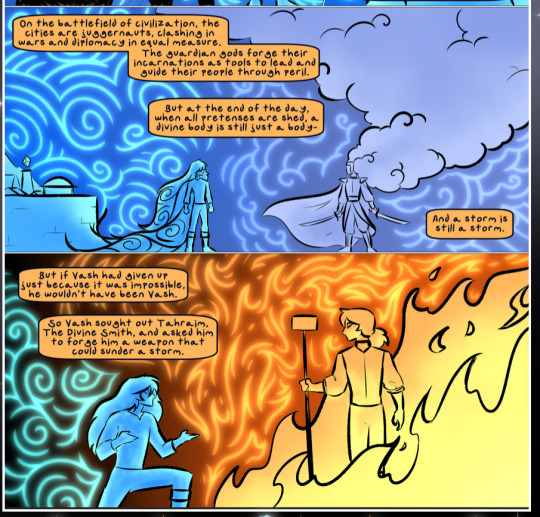
The flowing symbolic lineart surrounding each character. This is actually quite consistent across characters—see also Life's typical lines and how they curl:
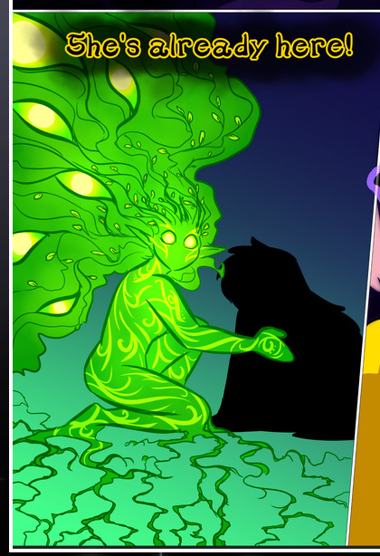
What's particularly interesting here is how these symbols are often similar, but not the same. Vash's lines are always smooth, clean curls, often playing off each other and echoing one another like ripples in a pond. You'd think they'd look too similar to Life's—but they don't. Life's curl like vines, and they remain connected; where one curve might echo another but exist entirely detached from each other in Vash's, Life's lines still remain wound together, because vines are continuous and don't float around. :P
Tahraim's are less continuous, often breaking up with significantly smaller bits and pieces floating around like—of course—sparks, and come to sharper points. These are also constants: we see the vines repeated over and over in Alinua's dreams of Life, and the echoing ripples of Vash are consistent wherever we encounter him. Kendal's dream of the ghost citizens of the city of Vash in the last few chapters is filled with these rippling, echoing patterns, to beautiful effect (https://comicaurora.com/aurora/1-20-14/):
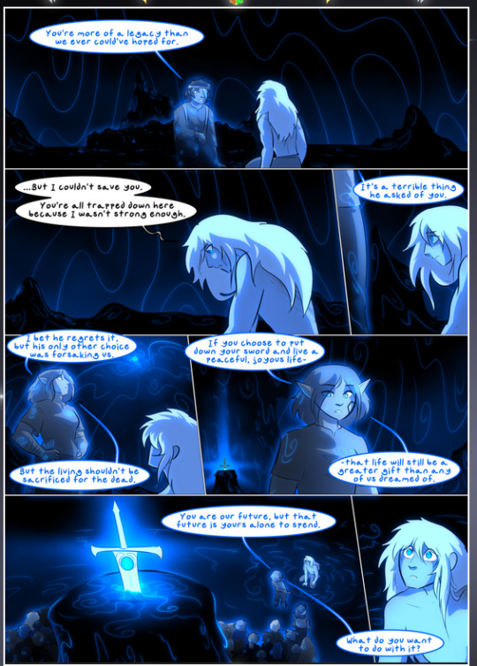
They ripple and spiral, often in long, sinuous curves, with smooth elegance. It reminds me a great deal of images of space and sine waves and the like. This establishes a definite feel to these different characters and their magic. And the thing is, that's not something that had to be done—the colors are good at emphasizing who's who. But it was done, and it adds a whole other dimension to the story. Whenever you're in a deity's domain, you know whose it is no matter the color.
Regarding that shape language, I wanted to make another note, too—Vash is sometimes described as chaotic and doing what he likes, which is interesting to me, because smooth, elegant curves and the color blue aren't generally associated with chaos. So while Vash might behave like that on the surface, I'm guessing he's got a lot more going on underneath; he's probably much more intentional in his actions than you'd think at a glance, and he is certainly quite caring with his city. The other thing is that this suits Kendal perfectly. He's a paragon character; he is kind, virtuous, and self-sacrificing, and often we see him aiming to calm others and keep them safe. Blue is such a good color for him. There is… probably more to this, but I'm not deep enough in yet to say.
And here's the thing: I'm only scratching the surface. There is so much more here I'm not covering (color palettes! outfits! character design! environment! the deities! so much more!) and a lot more I can't cover, because I don't have the experience; this is me as a hobbyist artist who happened to take a couple design classes because I wanted to. The art style to this comic is so clever and creative and beautiful, though, I just had to go off about it. <3
...brownie points for getting all the way down here? Have a cookie.
#aurora comic#aurora webcomic#comicaurora#art analysis#...I hope those are the right tags???#new fandom new tagging practices to learn ig#much thanks for something to read while I try to rest my wrists. carpal tunnel BAD. (ignore that I wrote this I've got braces ok it's fine)#anyway! I HAVE. MANY MORE THOUGHTS. ON THE STORY ITSELF. THIS LOVELY STORY#also a collection of reactions to a chunk of the comic before I hit the point where I was too busy reading to write anything down#idk how to format those tho#...yeet them into one post...???#eh I usually don't go off this much these days but this seems like a smaller tight-knit fandom so... might as well help build it?#and I have a little more time thanks to break so#oh yes also shoutout to my insanely awesome professor for teaching me all the technical stuff from this he is LOVELY#made an incredibly complex program into something comprehensible <3#synapse talks
785 notes
·
View notes
Text

hythades but they were little girls once
#ffxiv#hythades#hythlodaeus#emet selch#ff14#PRETRANSITION CHILDHOOD YURI HYTHADES#i think about the two brats blessed with aethersight line in the short stories near constantly#LIKE WERE THEY THAT YOUNG WHEN THEY MET AND BECAME FRIENDS#i also think about how they looked pre the transening bc it’s still an important stage#like u look before and then after and go: wow??//? hrt is sure amazing#hythlodaeus just slowly breaking the walls of gender and he goes ‘gender!!! (joyful)’ then there’s emet#he’s having gender criseses#good news emet! you don’t have to keep being a girl to still be a huge bitch!!#it’s like the chaos emeralds#collect them all#chaos control ur gender dad
79 notes
·
View notes
Text
Project Announcement - Net Keijiban Hyaku Monogatari Series

Yes, another horror anthology! I just had to pick this one up when I saw the first chapter, because Monkey Dream is one of my favorite Japanese creepypastas ever. Unlike the other anthologies I’m scanlating, this one features various artists and currently has two volumes. Definitely recommended for fans of Japanese urban legends and creepypastas.
Read the first chapter on Mangadex
#chilling internet stories: a horror comic anthology#net keijiban hyaku monogatari collection#horror manga#manga#horror#scanlation#new project
64 notes
·
View notes
Text

Last sonata before shooting the moon
#limbus company#my art#soul's art collection#fanart#catherine lcb#heathcliff lcb#heathcathy#cathycliff#I love the new Heathcliff ego of course i would do art#I didn't get it on my pulls#In other hand I love Il Pianto della Luna#such a good abno with a cool story#Sadly I heard that backer abnos won't come back to other games
85 notes
·
View notes
Text
Sirius Black is just average height
Remus Lupin is really tall
Sirius Black is slim
Remus Lupin is muscular
Sirius Black has delicate features
Remus Lupin has strong features
Sirius Black wears clothes that make him look bigger
Remus Lupin wears clothes that make him look softer
#sirius black#remus lupin#remus x sirius#remus loves sirius#sirius being sirius#sirius orion black#sirius x lupin#wolfstar#fan fic writing#writing blog#smut writing#new writing#writer stuff#ao3 writer#microfiction#wolfstar microfic#micropoetry#harry potter oneshot#harry potter short story#harry potter fanfiction#harry potter fandom#harry potter#fan fic update#fan fics#fanfictions#fan fiction#fanfics#mxm fanfic#mxm collection#my writing
57 notes
·
View notes
Text


Pandora just got her new Martini set🍸
Ladies and gentlemen - Martini by @bbygyal123 🗣️🍸
Inspiration by @marilynjeansims 🤍
#okay I love these screenies#this collection is *chefs kiss* 🤌🏻🤌🏻#the sims 4#the sims community#ts4cc maxis match#new simmer#new sims blog#cc finds#sims 4#ts4cc#my sims#cantos*#martini#the sims cc#the sims custom content#sims 4 cc#the sims story#the sims screenshots#sims 4 gameplay#sims 4 screenshots#sims 4 custom content#ts4 simmer#ts4 new simblr#ts4 cc build#ts4 cc female#ts4 simblr#ts4cc clothing#ts4 gameplay#ts4 maxis match#ts4 screenshots
78 notes
·
View notes
Text

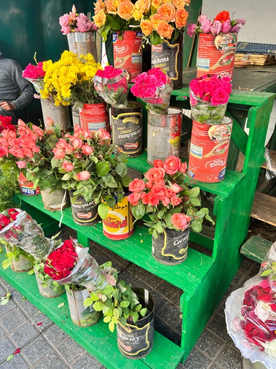


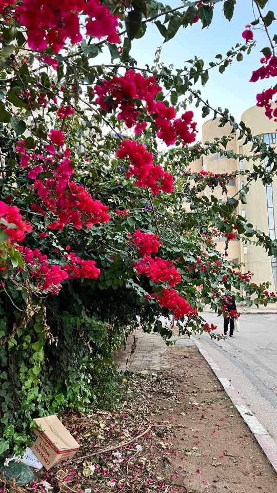

rabat / casa / ١٤٤٦
#went straight to the bookstore and asked the old 3amo to pick out books for me#he picked out a book by amin maalouf / hisham matar / and an Islamic poetry collection#and then we spent half an hour ranting about Arab politics 🤣#so many warm memories#i miss talking into the void on tumblr#Instagram feels too curated nowadays#anyway new life goal is to visit every Arab country one day ☝️#also the cats???#incredible fantastic amazing#I want to share so many of the beautiful encounters with strangers that happened this year#so many beautiful stories and lessons#but trying to figure out the best way to share them#love love love the Hadith about souls being like conscripted troops bc I’ve been so blown away by how quickly strangers become like family#subhanAllah#‘twas a tough year but so much growth vulnerability and warmth sprinkled in too alhamdullilah
34 notes
·
View notes
Text

my cd collection (I do plan on expanding it to diffrent artists like tally hall)
i like cds and i plan on getting more and expanding
the first cds i got were the us boxset
also my copy of the revolver deluxe 2 cd edition has the contrast much higher than it should be for some odd reason
#the beatles#paul mccartney#john lennon#george harrison#ringo starr#john paul george and ringo#music cds#cds#my collection#music#revolver (beatles album)#abby road#let it be#sgt peppers lonely hearts club band#magical mystery tour#yellow submarine#white album#now and then#beatles us albums#meet the beatles#the beatles secound album#a hard day's night (us album soundtrack)#something new (beatles album)#the beatles story#beatles '65#the early beatles#beatles VI#beatles 6#the beatles help (us)#rubber soul (us)
23 notes
·
View notes
Text

Books of 2024: THE AMBERGRIS TRILOGY by Jeff VanderMeer.
Up next! This series is how I'm bridging my current writing/revision project with the one on deck for my personal nano. They're both Weird Stories, but the one I'm working on now is Weird (genre), like VanderMeer, and the one I'm planning for November is going to be Weird (fungus), also like VanderMeer. I hope to get Driscoll vibes AND some New Book vibes out of this!
#books of 2024#book photo#book photography#jeff vandermeer#ambergris#city of saints and madmen#shriek: an afterword#finch#also these are deceptively small books#they look Slender but the shortest one is almost 400 pages lmfao#(the big one is not cumulatively numbered but IT is SEVEN HUNDRED AND FOUR PAGES!!!)#sir wtf#i suspect CITY will be vaguely ALWAYS COMING HOME#(weird to read and brainbendy and dense)#(since it's also lots of little pieces put together)#anyway i've been hanging onto this because vandermeer = driscoll vibes to me#and then i realized i wanted to do weird fungus for nano too so i'm like. ah. perfect. we'll use this for bridge material.#and then i have SO MANY HAUNTED HOUSE STORIES TO READ >:D#i am very fond of these covers#and they're a good size of paperback#i'm considering springing for the new southern reach paperbacks because i only have the collected hardback and that's not hand-friendly
45 notes
·
View notes
Text
fuck it, random lineup of characters from my new story. james ft his coworkers at the fix it bar (picrew)


james morrell (he/him) | rosita molina (she/her) rory lowe (they/she) | theo hart (he/him)
#rena.txt#important to the story (is not important): theo is not a blond man but WILLINGLY decided to become one. u can always see his dark roots#rory gets lovingly called rory LOVE + they are part of a rock band or smth like that#rosita is the unofficial boss when they all get a shift together (<the night shift crew) and in general tbh. she's tired. a lot.#and james...my beloved...well if you followed my previous posting he's our protagonist going through the horrors#i'm slowly collecting my thoughts i wish i could work with more intensity on this story but between the start of the new job and holidays#my brain feels like a pickle rn but anyways. yay <3#oc: james#oc: rory#oc: rosita#oc: theo
20 notes
·
View notes