#me trying to experiment with different way of painting digitally and figure it out
Explore tagged Tumblr posts
Photo
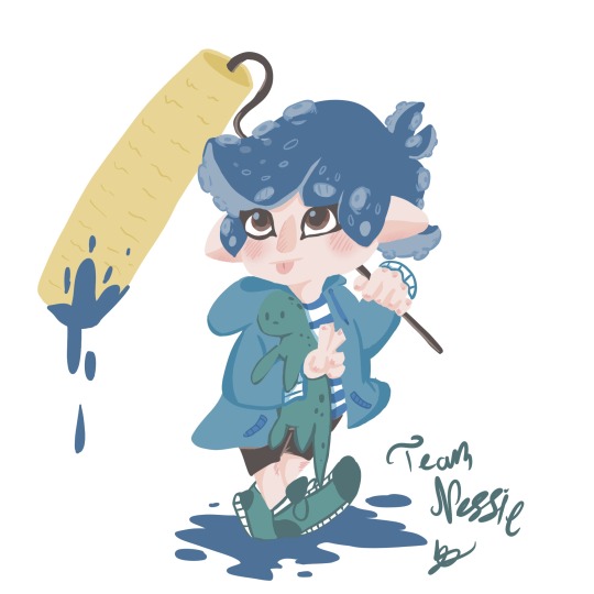
A quick rough digital doddle of my octoling sona, that I did in hour and half. I recently bought splatoon 3 a mouth ago and I been enjoying my first ever splatfest, I’m team Nessie because duh me British/ from the uk I’m kidding, my reason I just find Nessie a really cool myth and fascinating story behind the lake.
Also i’m not very good at the game, all do is take a roller and ink as much as can and get into the emery turf and try to ink as much as possible, plus the camera of this game is my emery still trying to figure how it works. >.<’
#splatfest#splatoon 3#splatoon#splatfest team nessie#octoling sona#digital art doddle#me trying to experiment with different way of painting digitally and figure it out#fan art#Seriously this camera sometimes betray me at the worst of times#don’t ask me just randomly got motivated to draw something digitally today and like hour and half crazy O.O
7 notes
·
View notes
Text
We Don't Gatekeep Art Resources | A Comprehensive List
Here's a list of some of the tools/sites I currently use or have used previously for works/studies. I'll separate it into Software/Utility, Reference, and 'Other' which will be just general things that could help you map out things for your experience with art. **[Free highlighted in pink, paid highlighted in green. Blue is variable/both. Prices Listed in USD]**
Software/Utility:
2D
Krita Painting app (PC) (my main digital art software on PC for 5+ yrs)
Clip Studio Paint [PC] [CSP 2.0+ allows for 3d modelling within the painting app and a lot of other cool features] [apparently allows up to 6 months free trial]
Procreate (12.99) [iPad/iPad Pro] (the GOAT)
Artstudio Pro [iPad/iPad Pro] (An alternative to Procreate if you enjoy the more traditional art app layout) -- I find this app handy when Procreate is lacking a feature I need, or vice versa. (you can easily transfer files between the two, but keep in mind Procreate's layer limit)
2D "Collaborative Painting/Drawing apps"
Magma Studio
Drawpile
Discord Whiteboard
Gartic Phone (Pretty decent for 2d animation practice, but has a hard limit on frames)
3D
Blender [3D Modelling, Sculpting + Layout] (PC)
Sculptris [PC] (it's an old unsupported version of Zbrush, but can help to get ideas out, and functions better than browser sculpting apps
Nomad Sculpt [iPad/iPad Pro] ($20) Works pretty well if you prefer a mobile setup, but it is a bit intense on the battery life and takes some getting used to
References + Study
Magic Poser [ PC and Mobile ] Has both free and paid versions, I've made do with just the lite version before
Artpose ($9.99) [Iphone + Steam]
Head Model Studio [IPhone] A 3D head, with both a basic blockout version for angles, and a paid version with more detail
Cubebrush [simply search "[keyword] pose reference pack"], they usually have good results + they frequently have sales!
Line of Action [Good for Gesture practice + daily sketching], also has other resources built in.
Quickposes Similar to Line of action, more geared toward anatomy
Drawabox | Perspective Fundamentals Improvement modules (Suggested by @taffingspy )
Sketchfab, this skull in particular is useful, but there is other models that can help you study anatomy as well.
Pinterest can be good, you just have to be careful, usually you're better off just finding reference pack if you have the money, sometimes certain creators have freebies as well
Artstation Marketplace can be decent [make sure to turn on the Aye-Eye filter so it doesn't feed you trash], a colleague of mine recommended this head model for practicing facial blocking, there is also this free version without lighting.
Local Art Museums [Unironically good for studying old "master work" if you're into that, or even just getting some inspiration]
Brushes + Other Useful software:
I personally have used both of these brush packs before making my own
(I actually don't know how to share my daily brush set because I frequently switch between Krita, Procreate, and ASP, but once I figure that out I'll be sure to do that lol)
Marc Brunet's Starter brush pack [Technically free but supporting him for this if you like it is ideal, there's some good brushes]
Dave Greco Brush Pack [$3]
Gumroad in general is a good place to find brushes and art resources. *Note; for Krita specifically, brush packs are a bit weird, so it may require you to find different packs, or import them in a particular way
PureRef [PC] - Reference Compiler/Moodboarding
VizRef ($3.99) [iPad] - Moodboarding/Reference Compiler
Artist Youtubers/Creators that helped me improve/guide me along as a self-taught artist from when I first started digital art to where I am today:
Proko
Marco Bucci
Sinix Design
Sycra
Hardy Fowler
Lighting Mentor
Winged Canvas
Moderndayjames
Swatches
Chommang_drawing
Marc Brunet (YTartschool)
+ Observing a lot of speedpaint art by people whose work I enjoy on social media/youtube, trying to dissect their processes
If you've gotten this far, first of all, congrats, you can read a lot, and second of all, thank you for reading and I hope this helps! I'll continue to come back and update this if I find any new resources in the future, or if my processes change :)
Much Love,
-Remidiy
#art#artwork#digital painting#painting#artists on tumblr#drawing#anime art#sketch#digital illustration#transfem#art tools#art resources#useful websites#small artist#illustration#digital art#artist on tumblr#procreate#my process#my art#krita#art tag#sharing is caring#learning#knowledge#useful stuff#links#reference
202 notes
·
View notes
Text
I've seen people doing an intro post so I suppose I should do the same right? I have no idea how to do this, I'm just winging it :3
INTRO POST TIME WOOO!!
[last updated: sat dec 7th at 7:18 PM 2024]
(I update this often, a reread of it every now and then would be greatly appreciated!)
Maybe every week/month depending on your time scale? ↑
Follow my other blog where I reblog a bunch of stuff and things for the full experience of my personality and interests! @eckos-reblogs :3
@everytime-i-reach-the-postlimit ←Exactly as the name entails
@nature-is-mystical ←is my other random blog that you can follow as well if you want.
that blog is just for reblogging nature stuff and posting nature stuff. (Occasionally rhymes come with it ig)
side blog for fanart!: @sonar-fanart-hall
I'm always working on making reference sheets for OCs ^^
Chill dude side blog: @cool-dudes-official
﹏﹏﹏﹏﹏﹏﹏﹏﹏﹏﹏﹏﹏﹏﹏﹏﹏﹏﹏﹏﹏﹏﹏﹏﹏
I will continue to edit this, probably for the rest of time to get it right since I'm a slight perfectionist lol
Hello! I've been an artist for around 5 to 6 years, and I still kinda suck at it! I do traditional art normally but I've been branching out to digital art as well. I mostly draw animals, anthropomorphic creatures, creatures in general, whatever beautifully ugly faces I can come up with, and sometimes human faces!
I classify as a furry but do not reblog a ton of furry stuff nor do I have a fursuit. I just like drawing and seeing anthropomorphic animals :3
Furries, Therians, anyone of lgbtq+ community (including ace people cuz apparently there's a debate about that), weirdos (but NOT in the gross way), and more are welcome on my blog! :3 ❤️ (you're kinda automatically welcome if you're kind anyway lol but whatevs :3)
Tags and stuff! To help you find stuff in my blog better through search :)
#Ecko draws -exactly as is obvious, it will be for when I make art, digital or traditional.
#Echo Rambles -For posts of mine that include mainly me talking about random stuff
#Echo rants - for when I rant. Similar to #Echo rambles but different..
#Echo answers - For when I answer asks!! :D
#The Clowder seeks - For when you guys ask me stuff!
#Mama Change - For when I mention my mom. (Her name is change..or it's more of a nickname but no one calls her by her actual name except for professional/job people like a dentist or something)
#Echo asks - For when I ask questions :3 lol
#Eckos moots <3 - for interactions with moots, obviously 🙄 (I love y'all sm)
#Ecko irl - me irl
My main Media for traditional art is, pens, pencil, gel pens, paint markers (posca) and normal markers! I hope to soon branch out to ink! (Maybe one day you'll get to see some watercolor stuff from me. It's not that good of watercolor art and I don't enjoy painting too much tbh)
Anatomy You say? Don't know her 😔
If you are interested, I do art requests! It's not guaranteed to be good or to be done quickly but I will try my very best every time. You can even request multiple times if you'd like! Like a ton of times! I really don't mind!
You can also request art of fandoms I'm not in but make sure to give me a good reference or the drawing will look off :3
Art requests open until further notice.
If there's something I don't mention here that you're wondering if I can draw or not, give me an ask in my inbox and I'll let you know! (Pls, I'm friendly I swear)
You can also dm me if you'd like but I'd prefer the askbox instead (´-﹏-`;)
I can't draw/don't want to draw: items, anatomy, bodies (unless you want the equivalent of a boxy stick figure), rendering, lighting, dragons (without a reference), romance/NSFW (no, just no.), hands, human legs (for the life of me 😭), +more
I can draw/like to draw: faces, animals (mostly cat related ones but you can request any animal and I'll at least try to draw it.), different hair styles (only with a reference), eye bags (I think they're pretty lol), dragons (only with a good reference), gore (not the best at it but I'll will try my best to make something nice and bloody for ya!), +more!

My name is Ecko and it's my preferred name but you can refer to me as Melleona (my OC) or by a nickname as well if you'd like! (just please ask me first if you want to use a nickname as I'm bad with setting boundaries.)
My pronouns are She/Her but feel free to refer to me as it/it's! :3
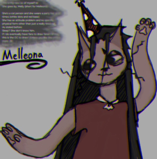
Speaking of which! This is my OC, Melleona:
She is 14 years old, she is introverted and blunt but also shy and insecure. She has anxiety, dealt with a bit of depression, and she's very casual as well as lazy (like me lol)
She's half Cat, she has greyish blue eyes (not visible in the drawing), slightly blueish black hair that's long enough to reach her ankles, she has a mushroom themed party hat, and some wicked whiskers!
If there's anything you'd like to ask me about her or ask her, go ahead and ask away! I love anons and normal asks! ❤️❤️❤️ (There is a slight filter on the drawing. I'll edit this later and put her color palette below ❤️)

I'm a minor! Mind your words, don't send me gross/weird asks or messages. (I've already had a few people message me asking for my age, a picture of me, and my sexuality. No, I will not be sharing my real appearance on here. my age? Minor, that's all you need to know. My sexuality? I don't know and you don't need to know either, respectfully ^^❤️)
IDC if I post something slightly suggestive or that says I know about 18+ themes. I posted it, not someone saying something to me of those themes. Sure, I understand the stuff but It really doesn't matter now does it? It just means I understand enough to know you shouldn't be saying that stuff to me. (Boundaries ✨)
------------------------------------------------------------
I do half-curse in posts from time to time. I do censor it a bit tho, like "f7ck" for example. Hope ya don't mind (;^ω^)
------------------------------------------------------------
I'd appreciate it if people reblogged my art!
I don't appreciate reposting it however.
Just in case you don't know what the difference between reposting rather than reblogging: it's when you (typically) take a screenshot of the art, and then repost it on either Tumblr or a different app rather than hitting the reblog button!
While this has never happened to me personally, I do feel like it's worth mentioning.
Oh, and, don't under a circumstance feed my art to AI. I can forgive reposting my art. I put out there for people to see not to get fame from it but under no circumstances EVER will I allow feeding my art to AI. It is not human. It does not make art.
AI artists don't exist unless it's used ONLY to assist with a process that is still mostly YOUR OWN SKILLS THAT YOU'VE CULTIVATED OVER TIME. AI is NOT art but it can HELP with art.
ミ●﹏☉ミ-ミ●﹏☉ミ-ミ●﹏☉ミ-ミ●﹏☉ミ-ミ●﹏☉ミ
don't dm asking me to commission from you. like said before, I don't have money bc I'm a minor + I don't like being pestered for me commission you. talk to me like a person, not an ATM.
If I want to commission someone, I will dm them and even then, I'm most likely to commission art from a friend to support them.

I support the lgbtq+ community! And I don't discriminate against race. I really shouldn't have to say this. (˘・_・˘)

I will respond to money asks with "!!" And that's it. I don't have money and even if I did I don't got any money to spare. I'm broke and struggling too. Not to mention, I'm a minor and can't just go out and get the stuff. I hope you understand and I wish you all the best!❤️❤️❤️

Some games and shows and stuff I like:
Shows and stuff: Rick and Morty, adventure time, lost in space, bsd (never watched it but I've seen enough of it on the Internet to know a bit about it. Very interesting :3), Some of the Life Minecraft series, httyd, doctor who, and more!
Games/fandoms: Yonder(Yonder Cloud Catcher Chronicles.), Minecraft, the Stanley parable, tiny bit of South Park, cotl, MLP(childish I know but I don't care. I love them), creepypasta, SCPs, Trevor Henderson's creatures (mostly cartoon cat), plants vs zombies, fran bow, little misfortune, and more!
Stuff and things (hobbies?): Art, apparently I make rhymes now too??, rollerblading, climbing, Hiking (iffy), sleeping, being annoying+lazy, doom scrolling, interacting with people, and more!
(I'm not really in any fandoms really..kinda like on the edge of being in each and every fandom I come across..)
General facts about me! Yippee!
I think eye bags and wrinkles are pretty (odd, I know lol), I live in a bus (not decked out like you see on social media though. We just live in a bus lol), I live with my ma (my dad is my step dad and he and my mom just broke up psooo ye), I blank out a lot and just stare at people for no reason (which freaks them out), I have greyish blue eyes (a long with some, I'm pretty sure permanent eye bags lol), I get energy right before nighttime mostly (and then it disappears as soon as it reaches around 11 pm to 12 am), My favorite color is maroon (and any type of blue along with orange and yellow and forest green..mostly just comfy vibe colors tbh but maroon is a fixed piece), my favorite animal is a cat (although I have a dog. Muffin doesn't count as a dog, she's practically human. Apart of the family.), and more!
(I'll update this as I go)

[I will block as I see fit]
Do not interact with my blog if: You're racist, you only or mostly have sexual themes on your own blog (I apologize but it makes me uncomfortable. Have some other interests and it might make me less uncomfortable ^^), if you in general just enjoy hating on people for no reason (I like to make my area a safe space for people) if you're a Zoophile (No explanation really needed but animals can't consent.) (more will be added later when I think of what to add)
Don't dm me unless you're a moot or you say your intentions within the first 1-3 messages. (moots that I've interacted with can send me a dm unprompted with stated intentions anytime they'd like. Special privileges ✨)
(Added a specific part of that bc a moot felt they were making me uncomfortable by having such themes on their blog. I didn't really realize at first but yes that does make slightly uncomfortable but I don't really care as long as you have other interests. If s3x is your only interest, it weirds me out to have those types of people interact with me. Just know you're all good moot, you're not the type of person I was aiming it at. There are other people that just don't think about anything else but $ex and relationships that creep me out and you are not one of them. ^^❤️)

Things about me, (random stuff): I am cringe from time to time, my fav colors are maroon and any kind of blue, orange is nice too though,
I appreciate any and all constructive criticism. IDC if it sounds rude and might hurt my feelings, TELL ME so I can help better myself and my blog! I'm dum and will most likely not notice I'm doing something weird or anything :P <3
•Send me asks! Wanna to hug one of my OCs, Want to slap the sh1t out of one of em, Want to introduce me to a new (or old) fandom I don't know of but you think I might be interested in, Want to say hi, Want to give a music suggestion, send an ask!
I LOVE interaction and if possible, I want to be busy with asks at all times so send a ton!

•Moots:
@theachskid @voidsweirdthoughts @burningbutter @rafrfr @rateater2000
@footlongdingledong @ender-the-insomniac @thistlebriar @rspoetry @virtualcroissantflapcolor
@jawdoesstuff @storythesilly @yourfavoritecuntist @chamber-of-voices @i-draw-things
@2oo7xddd @catsreblogging @silli-billy15 @totally-not-a-commie @khloethecatsworld
@1nd13gh0st @cur1os1tyk1lledme @nonbinaryriverclan @ilove-fanart-and-lore405 @hermitchild
@my-mom-named-me-duck @hermitchild
@williamsart12345 @lilytheaxoltollover @twobraincellsremaining @nn-the-doodle @emmajasonartz
@bugba-bugbee @railway323 @xho-the-scribble @asqadia-banthen @nasthesilly @ceaselessbackflips
@the-anxious-acrobat @justuravghazbin @callmekiyo24 @maybeyoullfindthissomeday
@sensehumor ♥️
+any future moots/one's I might have forgotten (I hope I wouldn't forget anyone 🥲)
If you don't like being tagged in tag games, let me know and I'll move your name over here cuz I copy paste the ones above for tagging in stuff: (nothing here yet!)
Moot side blogs: @thistlebriar-tags @my-dad-named-me-goose @mysterious-other-being @
Btw, moot/friend privileges: tagging me in whatever the heck you want, sending nonstop and possibly annoying asks, dming me and having a convo at random, +more! I love all y'all and am more than happy to interact ❤️

My art ↑
Yippee!! That's all for now folks! ❤️
I'll update this whole thing as I go, any questions, just send an ask and I'll update this with the answer as well as you know- replying in general lol :3
I seem incredibly childish in this intro post and my general posts but do know, I am over 12 years of age lmao 🤣
I'mma keep some notes here as well... mostly for tone stuffs cuz I can't remember these 😭
/lh = lighthearted
/j = joking
/hj = half joking
#intro post#pinned post#pinned intro#LONG post#echo rambles#i talk a LOT btw#like a TON#I'm a full time ranter#you might think i don't talk a lot but trust me#it's cuz I'm holding back#i think i qualify as an ask blog idk#art/ask blog?
115 notes
·
View notes
Text
Hi y'all, I just wanted to talk a little about the behind the scenes of what I've been up to, to give y'all a little transparency and to open myself up for any tips or input! 🙏 Thank you for your continued support and for taking the time to look at my art 🫶
First and foremost I wanted to give some transparency about my art capacity.
As og followers may remember, I started this blog when I was doing art full time. Eventually my living expenses grew and I had to go back to work. I find myself in a cycle of "I'll make more art soon, once I get a job!" And "I'll make more art soon, once I am done with this job!" I lost my most recent job suddenly, having had an extension waved over my head until the last day(October 7th). Now I'm excited to have more time for art, but I am also feeling a rush to get a new job ASAP as I've been living paycheck to paycheck. I dream of doing this work full time, I'm just scared it's not quite there yet and I worry that I come off as scammy or dishonest when I anticipate more stability around the corner.
Second, I've been struggling with the Patreon. It's taken me a while to come to terms with this, but from what I've seen Patreon is not intuitive at all from the creator end. It doesn't do a good job of organizing addresses, emails, showing who or who isn't subscribed to me, or organizing and displaying the work I put on there. I've been really shocked by this experience, since lots of big names use Patreon. It's been a great way to streamline support, but it's been unhelpful in every other regard. I would like to continue using it, but I will most likely post more wips or process videos there in the future.
Which brings me to my third point, zines. I love making zines so much, it feels personal and fulfilling and fun! However the Patreon issues make it harder to keep information in order about where to send zines, or even where to message folks about them. In addition to this, the post office has been a big barrier to me, oftentimes only being open at the same time as my dayjob. Making zines can take days, then sending them out is a whole other monster.
This work is so important to me. Drawing peoples fantasies, representing body types, creating work around sexuality and the human experience feels like what I'm meant to do. I've made comics since I was a kid. This is the dream to me. The friends I've been able to make through this work are so important to me, and the conversations have been invaluable. Not to mention fun! I wanna doodle, I wanna draw hot stuff, I wanna thirst over these dudes! I want to play!
But I also just want to be transparent about the barriers I'm working around to share that experience. I'm completely self taught, both in art AND in running shops, building websites, running 8 accounts, etc. I take a lot of time to learn the logistics of these things, and try to make them make sense for my relationship with y'all (I do not want to paywall my art!! I don't want to!!!). This year my desktop broke down (the main one I use for all paintings and digital art). I've paused my Etsy shops and my Patreon to try to catch up with things. Trying to learn to paint in a completely different program. Then lost my job with no savings.
At the end of the day I don't want anything to come between me sharing my art with you. I wish I could doodle a thing, take a picture, and post it here. No third party site, no shop, no subscription. Just sharing my art with you. I promise I'm trying to figure out how to stay as close to that as possible, and I want to thank y'all for sticking with me as I untangle all of that.
So, what can you expect in the near future?
I'm working on a couple of painting commissions right now, which you should be able to see in the next couple of days! I want to catch up on kinktober and get those posted as well. There's a comic commission in progress which I'm very eager to work on, and which I think y'all will be excited for! To ease the weight of the Patreon I think I may do less zines/polls there and more wips and process videos! If possible, I want to do more full colored work too.
Thank you again for enjoying my work, and if you have any input or tips my inbox is always open 🙏🫶💕
#long post#info#marco lore#i wish i had time to edit this and make it nice#i just wanted to be open with yall about how much work this takes and that im trying to make it more doable#i don't want to overpromise stuff with patreon or shops and if im late sending stuff i never ever want it to come off as intentional or mali#malicious or as a scam#im just trying very hard to like ...survive. financially. and then trying to make all the logistics of thos big machine work. and then keep#up with commissions and shops and printing and mailing#god i wish i had employees but jts just me#i hand draw everything and then post it here to the word press to the ig and crop and caption and tag#then to the Patreon if it makes sense to or to the tiktok back in the day#and the formatting is all different#and i get messages across all of these platforms and I'm trying to learn a new way of painting on the fly#on top of that im supposed to be running my two Etsy shops too which im not right now because..broadly gestures#my nervous system can only take losing a job so often. the rug was really pulled feom under me in this one. i thought id have more time#i don't want to sound like I'm whining and i don't want to give up on all of this#i want to be very very very clear that art is what i love and who i am and what i want to do#i want to be posting on the daily again#i just need to evaluate what that looks like everytime life changes#I'm seriously so grateful for those of y'all that have joined the Patreon or bought stuff from the shop i really don't mean to drop the ball#so many times#y'all have literally been the difference between me making rent or not and I'm so worried that i don't make enough art to give back to that#relationship#im trying my best#okay anyways im posting this
18 notes
·
View notes
Note
i wanna get better at art but dont know how to start ^^' whats a good way to get into studying anatomy and improving as an artist? tysm 💗 love your art soso much
more art converts 😼 yay!!
i think these asks were sent by different people but they're pretty related + a lot of my advice is the same! so i'll answer these together under the cut (it's so long oh gosh)
ok first of all i'm very flattered that people are asking me for art advice but i'm really not the most equipped person to ask TTOTT I've never been deliberately studious with my art so I feel bad offering advice when I've mostly gotten by with just drawing fanart and ocs a lot... my rate of improvement has therefore been slow, but I've still had an enjoyable learning experience so perhaps from that angle my input may help! i'll mainly refer you to external resources that have helped me
For anatomy + drawing humans:
1) I know I'm not diligent enough to sit down and study muscles, so instead I make it more enjoyable by drawing my favorite characters in a pose that targets the muscles I want to practice! (i default to drawing ppl naked because of this lol) This isn't the most efficient, but it serves as good motivation to get practice in. (honestly a lot of my general art advice has the undercurrent of becoming so obsessed with characters to drive your motivation to draw even when artblocked/ struggling with doubts!)
2) I want to refer you to Sinix's Anatomy playlist! Although Sinix focuses more on digital painting, he gives simplified anatomy breakdowns that include how muscles change shape under different movements/poses, which is crucial for natural human posing. the static anatomy diagrams from Google don't really help for that
3) What's just as important as anatomy is gestures! (especially important if you're used to drawing non-human objects I think!) Making figures look like they have flow to them will sell the "naturalness"(?) to your anatomy. If you have in person life drawing sessions accessible near you I'd recommend trying those out, or if you prefer trying it digitally there's this website!
This helps you not only get a sense of human proportions, but also natural posing! I'd limit the time taken to draw the poses from like 10 seconds to 1 minute(?) for quick gestures, and maybe 1 minute to 5mins(for now!! typically they go much longer) to study human proportions. I'd say don't spend a lot of time on them, repetition is more important!
4) I've also picked up on useful anatomy tidbits from artists online! Looking at how practiced/ professional artists stylize a body helps me focus on what the essential details are to convey a particular form (looking up "human muscles" and being hit with anatomy diagrams full of all the smallest details can be overwhelming! what do you even focus on?! so these educated simplifications really help me) Like Emilio Dekure's work! Look how simplified these figures are, and yet contain all the essential information to convey the sense of accurate form (even though it's highly exaggerated!)
(shamefully admits I've never studied from actual anatomy books so I can't recommend anything in that sense TTOTT)
For general improvement:
1) I highly recommend Sinix's Design Theory playlist and Paintover Pals! (+ his channel in general) You don't have to put them immediately into practice, but I think these are good fundamental lessons to just listen to and have them in the back of your mind to revisit another day. Plus these videos are just fun and very approachable! Design theory fundamentals are essential to creating appeal and directing a viewer's attention, and critiquing others' work/ seeing his suggestions are a good way to practice noticing areas of improvement+ solutions yourself!
2) If you prefer a more formal teaching resource, the Drawabox YouTube course covers all the basic fundamentals of drawing in short lessons. But honestly if I were starting out, this would be a little intimidating for me (and even now it still is! I haven't done all of them) But even if you don't watch them, the titles should give you an idea of the basic concepts that are valuable to pick up. I think it would be nice to keep in mind and revisit once in a while as you learn!
(One lesson I do encourage you to watch is the line control one! A confident continuous line conveys motion and flow much better compared to discontinuous frayed lines which I think is good to practice early by drawing from the wrist and shoulder)
3) As a universal piece of advice: Please please please use references! Use a reference for literally everything, observing is how we learn! You'll find that a lot of things you thought you knew what they looked like are inaccurate by memory alone. Also, trace! This is solely for your practice, tracing then freehanding has helped me grasp proportions when I was struggling! (of course don't post these online if you traced from art)
I've found that being able to compile references into easy to access boards has been very helpful in encouraging me to use references more. For PC, I think they use PureRef (free/pay what you want), and for iPad I use VizRef. VizRef is a one time purchase (which was definitely worth the $3.99 USD price imo)
4) On that note, try building up the habit to observe from media + real life and make purposeful comments about what you see! Like hey, when I bend my knee, the muscles/fat in my thighs and calves bulge outwards, I should draw that next time. Purposeful observation carries over to your overall visual library, and it's a little thing that adds up over time
5) For motivation, get into media you really enjoy, or make your own characters! The way I started art more seriously was by drawing fanart + OCs from anime that I liked ^^ For OCs it really encourages you to draw more because you're the primary creator of their art! Also you gotta see a lot of good art to make good art! Watching visually appealing media (like animation with appealing stylization/simplification) can passively help you learn just by observation.
ok wow I could go on but this is already a lot of information TTOTT my main aim for this reply is basically: don't let anything discourage you from learning to draw!! drawing is so fun and brings me a lot of joy ^^ practicing often will of course help you improve, and the way to incentivize that is by having fun with it! i hope this could help!💞
#my asks#art resources#trying to be concise n failing#i'm mainly worried that like. my art tips make me sound more skilled than my art actually is
66 notes
·
View notes
Text
A Tribute to Cho Gi Seok
Having used Cho Gi Seok in numerous presentations and assignments, I believe it is a crime not to have written a blog post about him. So here's my appreciation to my favorite photographer and muse:
Admiration at First Sight
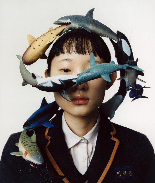
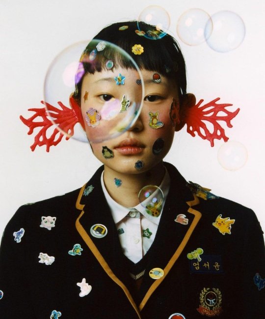
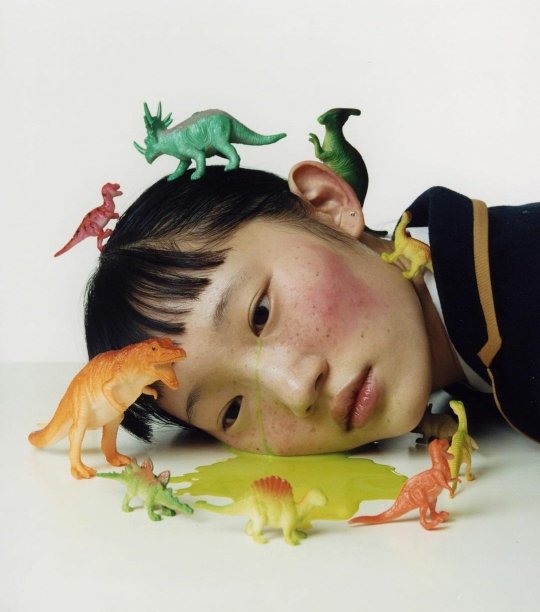
Nostalgia #2, Cho Gi Seok, 2020
While browsing Pinterest, I came across a photo of a girl in a school uniform. She was adorned with a series of small fish or shark figurines that seemed to flow over her head, across her face, and towards her shoulder. It was one of those photographs that gave me a "aha" moment as I stared at it for hours, amazed by the idea of combining a human figure with unconventional prop, unlike the typical table or still life objects seen in other photographs and paintings. I found myself wondering whether these fish were computer-generated, hand-drawn or crafted. Another intriguing aspect was how the girl was framed, with her face seemingly divided or "sliced" into two by the diagonal flow of the fish, revealing only one of her eyes and her mouth. Despite its simplicity, with a plain white background, the photo exuded a sense of movement and life. This was my initial encounter with Cho Gi Seok's work, and it sparked a deep sense of inspiration and admiration within me.
Cho Gi Seok: Biography
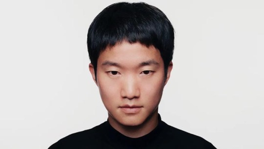
Cho Gi Seok, Photographer
"I think flowers are the easiest thing to find that anyone around us can think of as beautiful, It’s like taking a portrait for me. By transforming and recombining them, I try to express my own thoughts through them.”
Born in 1992, the South Korean photographer aspired to be an art director from a young age. Before pursuing photography, he had experience with graphic and set design, which he incorporates into his work and techniques. His photographs depict abstract themes, combining human figures with unusual props. He grew up in an internet generation, so he draws inspiration from technology and its advancements, which sets his work apart from the rest.
Gi Seok's Visual Archive: My Favorite Collections
The following are my interpretations of some of my favorite collections and photographs. These are not entirely accurate to the photographers' intentions, but rather my own.
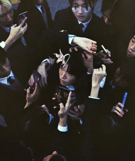
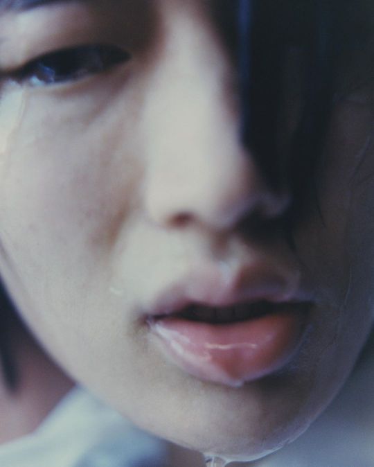
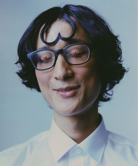
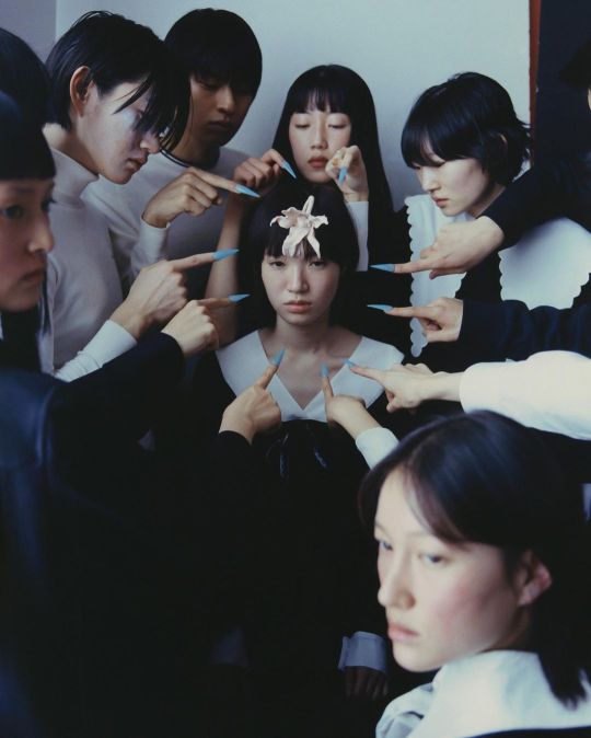
Not Alone, Cho Gi Seok, 2021
This collection of images portrays the sensation of feeling trapped or targeted by judgment or bullying during high school. The subject, positioned centrally, is accentuated by accusatory fingers or phones aimed at the subject. The close-ups and portrait-style shots echo the traditional yearbook photos, and the attire reminiscent of school uniforms adds to the overall theme. The flower prop serves as a symbol of innocence or vulnerability.
The title of the collection therefore imply a dark meaning, indicating that the subject is "not alone" but rather accompanied by dominating forces, accusations, and intimidation. It depicts the isolation experienced when one deviates from societal norms or stands out as different from others.
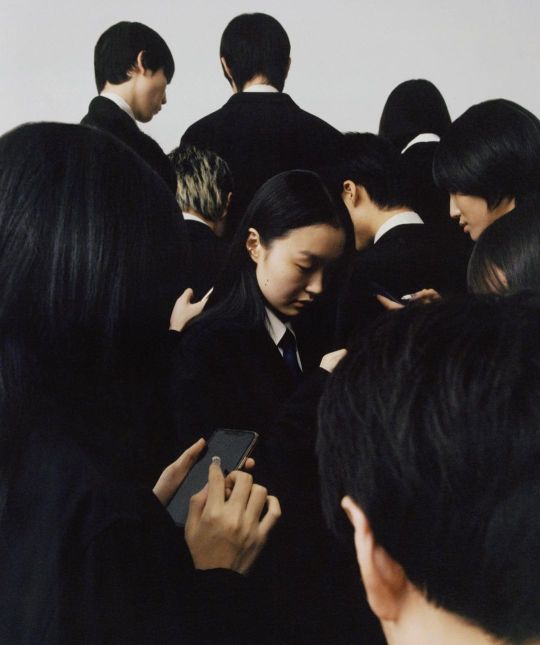
Alone, Cho Gi Seok, 2022
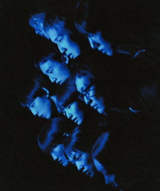
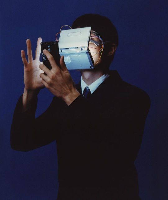
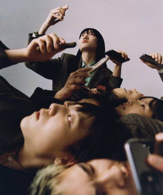
In contrast to the previous photographs titled "Not Alone", these photographs depict the relationship within a society. Cho utilizes technology as props to symbolize our connection to our phones or digital devices. Despite being closely positioned within the composition, each subject gazes in different directions, mirroring the way individuals search for cellular signals or internet. In instances where Cho omits props, he maintains consistency with his concept and theme through lighting techniques. For instance, in the second photograph, where the heads of the individuals are framed diagonally, a vibrant blue light illuminates them, resembling the glow of phone screens or theater displays that illuminates our faces.
These photographs not only convey their message visually but also capture the sensation of being without a smartphone in a sea of people who possess one.
Both of these collections, in my view, are not only semiotically rich but also visually engaging as photographs. Before I conclude my interpretation, I want to express my appreciation for my favorite collection:
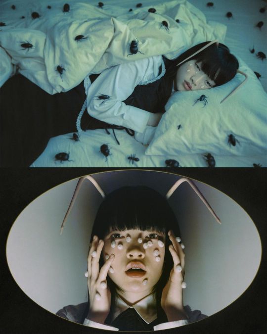
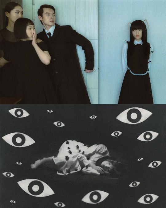
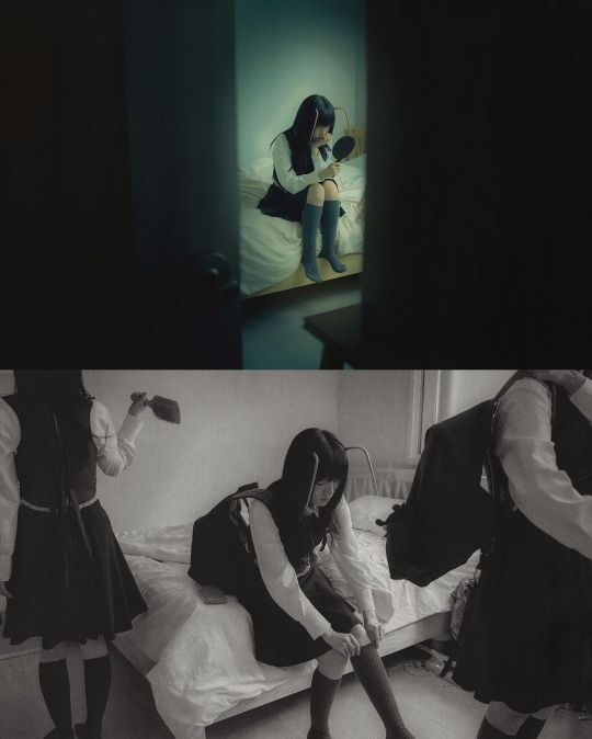
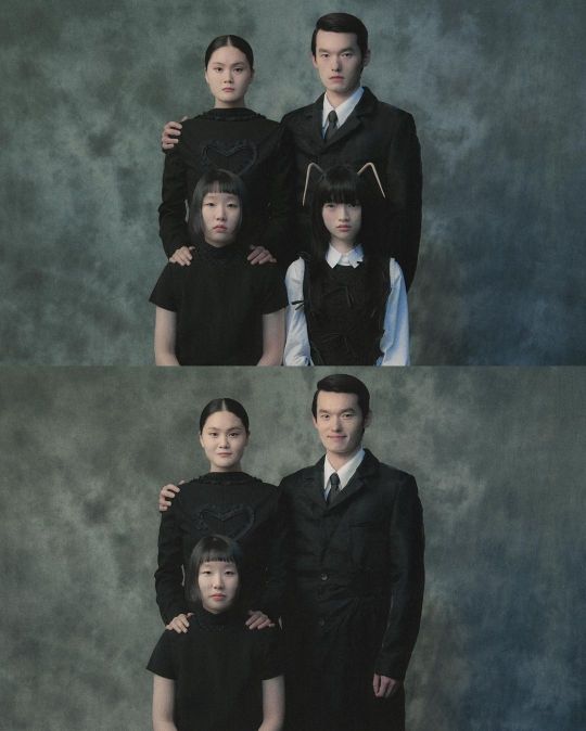
Different, Cho Gi Seok, 2023
These series of photographs hold a special place for me; I find myself revisiting them time and again on Cho's Instagram. The way Cho utilizes props, framing, composition, and colors never fails to captivate me and serves as a source of inspiration. Cho skillfully conveys the notion of being different, drawing parallels with Franz Kafka's depiction of dehumanization and alienation through the symbolism of the bug in "The Metamorphosis." This connection underscores the theme of feeling looked down upon and met with disgust. The muted grays and greens evoke feelings associated with anxiety or dysmorphia, further enhanced by the use of paper-cut eyes that portray the sense of being judged and scrutinized. I've added it to my to-do list to capture a series of photos resembling Cho's "Different" collection, using his ideas and techniques.
Final Thoughts:
Cho Gi Seok truly stands out in a sea of photographers by skillfully capturing complex emotions and exploring unconventional, abstract themes. His work contributes to building a valuable visual library for both amateurs and beginners. While his style may not resonate with everyone, there's much to learn and appreciate from his captivating images.
35 notes
·
View notes
Text
@elin-moon had inspired me that it's okay to also share unfinished art. Thank you for that! 👍
So I thought that maybe I can finally post that painting that my profile pic comes from (nah Im kidding it was a selfie all along, this is how I look like, I am Dracula incarnate who discovered Tumblr 😝), since I'm not sure if I'll manage to finish it in this century.
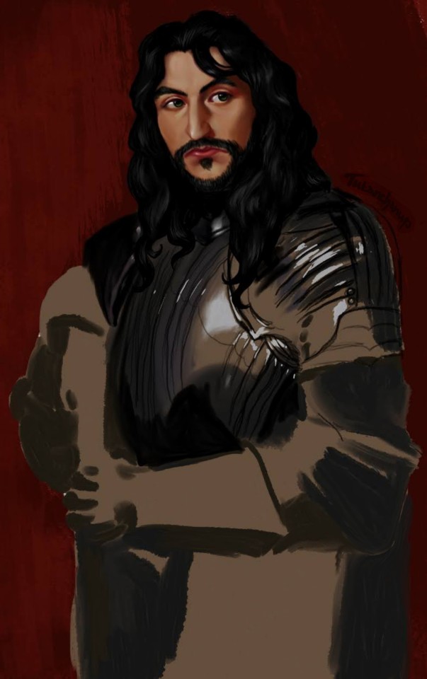
It's an unfinished piece. Actually the first one I've ever done on a digital tablet, so it's been an experiment from the start.
I tried to copy the style of Anthony Van Dyck's "Portrait of a Man in Armour with Red Scarf", merge it with a stock photo of a man in armour in different pose, and on top of it all attemp to paint Vlad's face how I imagined it.
It was quite a challenge, especially given that I had no reference for the face, and the lighting and colour saturation in Baroque paintings is very special, so that was a wild ride, trying to figure out how would this strange light work on a imaginary face! I'm still not sure if I'm satisfied with it or not 😅
Then later I got stuck on how to merge the two pictures of men in armour together, since I liked the lighting in Van Dyck's painting but wanted to use the pose for the arms from the other photo. I found out that maybe I'll have to just make up some parts of the armour and its lighting, and that's when I realised I don't really know how to paint armour and the way the light scatters there without any reference whatsoever, so I postponed the piece until I learn how to do that...
So in the meantime I have been training painting armour, and maybe one day, when I'll understand the physics of how the light scatters there, I'll be able to draw it without reference, just from memory, realistically... And when that day comes, I might return to this piece.
But don't worry, thanks to that I have done some realistic paintings of Vlad in armour which you can await later 😉 (I just love painting this man, so he's became my lab rat when it comes to learning new things to paint 😄) sorry Măria Ta 😅
Also the colour in the Baroque portraits is just crazy... The men regularly look like they're wearing lipstick, the colours are so bright 😅. But it was fun trying to do some other style than my usual one 😄. I'm not sure how well I did, but it was fun anyway 😆
Also this piece was almost lost, since the tablet broke down and I was left with only the image I had saved somewhere, but with no layers. Since it already went though such hardship, I decided to be merciful and maybe let it see the light of the world, even unfinished, because what good will it ever do lying in the depths of my drawer... 😄
Why did I try to paint Vlad, who lived in the 15th century, in the style from the 17th century? I dunno 😆 I just like drawing him, and I liked that Van Dyck's painting 😅.
Anyway, if you like it, enjoy, if you don't, then... don't enjoy? ¯\_(ツ)_/¯
Here's the Anthony Van Dyck's painting:
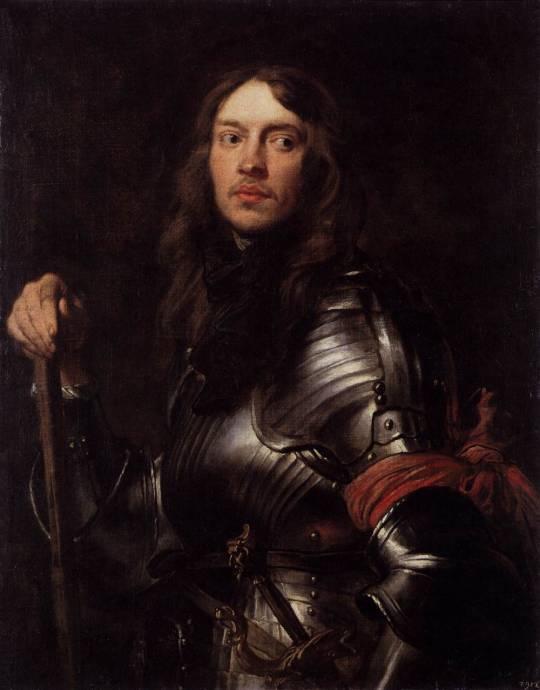
"Portrait of a Man in Armour with Red Scarf"
#will I ever be able to post a pic without a wall of text explaining each detail? who knows!#unfinished art#my artwork#art in progress#artists on tumblr#my art#vlad tepes#vlad the impaler#vlad voda#dracula#vlad țepeș#vlandom#baroque#vlad dracula#sorry dracula fandom if I spam you too much XD
14 notes
·
View notes
Text

I’ve been seeing this template going around, and I wanted to try for myself…it was just nearly all Crowley’s, except for May 😭😭😭 Gidel I love you, but my streak!! 💥💥 /lh
Looking at all of this made me feel really surprised…My first year of digital art! Thank you so much to everyone for your support and kind words on my works 😭💕💕💕💕🐦⬛ Crowley really is a muse…
(Ramble below🐦⬛)
I can see my awkwardness with trying to figure out different digital brushes in my first months- Im still a noob with all these digital settings 🤣 But I think that experimentation is good- my most recent piece was admittedly rather rushed. I think I could’ve pushed it more with brush textures and rendering. So I’d like to keep that in mind for the new year, since I feel slightly more comfortable with how digital drawing works.
This was a tumultuous year for my art 💦 Before starting digitally, I had some nerve issues that made traditional art became severely uncomfortable, even painful at times. But with digital art, I found there were settings that could make pen pressure more comfortable. Drawing on a screen was much more forgiving that what I could do traditionally, with lots more shortcuts too. After figuring out a lot more accommodations for myself, I can draw again! 😊
Most recently, I’ve been hard on myself for not feeling skilled enough in art. But to be honest with myself, I do very little study and experimentation- anything I learned has been accidental this entire year! 😅 Everyone I admire puts so much work and study into their craft- how embarrassing it is to forget that sometimes 🙈💕 So my goals are to be kinder to myself, and to put in actual study of color, poses, etc. I think it’s easy to be swept away by the incredible work of others. But when I made this summary, I thought about how a year back, I couldn’t even draw or even write traditionally for days or weeks at a time. In retrospect, I think I need to slow down and be more mindful 😆
I couldn’t exactly show it in the summary, but I am so proud of my accomplishments of finishing and published my first animatics! Three, so far! :0 It’s truly a dream come true in every way! 😊
I’m still trying to discover what sort of art I want to do. Recently, I’ve been taken with a painting-like style, but Im trying to figure out what direction I want with it…So my goals for the new year aren’t at all defined, since I want to discover things along the way naturally 😊 But here are some goals I have:
-Do color studies, study some fundamentals
-Participate in a zine(s?)
-“Huevember” (I don’t know what term to use Ahahxhf- but I want to try to experiment with differing colors for sketches or pieces, but not in a daily-challenge type of way. Color theory in general is a big goal this year)
-Be more kind and patient towards myself and draw what I love💥💥💥
-Try and take more breaks between artworks 💦

If you read this far, please take this borb for your journey ☺️ This has been a whole year of learning art- and Crowley’s design BABXHDH. I’m still not able to depict his handsomeness 💥💥💥 I need another year of training then (● ˃̶͈̀ロ˂̶͈́)੭ꠥ⁾⁾ 🐦⬛🐦⬛🐦⬛🐦⬛
9 notes
·
View notes
Text
Ramona in Creature's Of Sonaria (Roblox) :3
(I tried my very best to make Ramona with whatever I have, I don't have much in-game currency. @byn3s plz feel free to digitally wack me with Jared's prosthetic arms if you feel like I did something wrong XD)
Here they are! :3
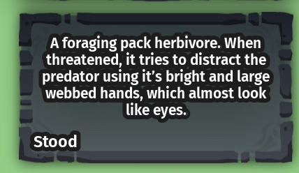
(warning here's me being a nerd about the game /again/ and why I chose this creature for Ramona)
Although, I don't think there's there's a Lore story about this species I can create one myself. (I would probably describe their creation was from experimentation and trial & error, each Nindyr was made differently with different amount of limbs and eye patterns on their bodies. And from years of evolution different DNA and genetics were introduced to make them more "perfect" for survival.)
Not only did I choose this creature for it's multiple limbs and "eyes", I felt like it would suit Ramona in a way since I believe this creature is fit to be portrayed as a pacifist (since if I remember correctly, Ramona doesn't use violence unless it's a last resort. For example, in one of the hmf videos when Ramona knocks Jared out, there is a possibility that if there was a different reality /where Jared still had his original personality and wasn't controlled by Mother/ there would've been a higher chance where Ramona would ask for the IT files, there's also another probability that if Jared was either "asleep" or absent Ramona would've been able to get the files without having to use violence. What I'm trying to say is that there would've been a high likelyhood that Ramona would've chose the pacifist route. /Also just wanna make myself clear, I'm not painting Ramona as a full blown pacifist. I'm aware that she has her own reasons why she knocked out Jared, hell I would've done the same thing out of panic if I didn't think of a different way or if it was a last resort/
But other than that, I genuinely thought the Nindyr species would be a good pick because they were inspired after genetic mutations and experiments, they are also pretty decent when it comes to PvP.
(y'all might be wondering "why are the eye patterns blue" I can't seem to figure out Ramona's eye color for some odd reason so I went with blue to represent the peace she had from her past before everything went downhill. As for the color and patterns, it would feel wrong if I just did solid color without adding depth to the patterns/ it was either gonna be this creature or Kriprik since it has traces of human DNA in it's genes, but I don't even know how I would be able to portray Ramona as that creature in particular)
#dftm ramona#ramona bynes#ramona hmf#i also find this species cool but I don't know if I did a good job :/
5 notes
·
View notes
Text
How to Be the Dream Version of Yourself: Step-by-Step Guide to Becoming That Girl
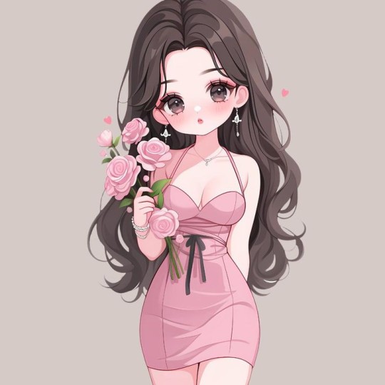
Hey there, beautiful! Let’s sit down, grab a cup of tea (or coffee, if that’s your thing), and have a heart-to-heart. You’ve probably dreamed about the best version of yourself—the girl who has it all together, radiates confidence, and seems to live effortlessly in harmony with her goals. Let me tell you a little secret: you already are her. You just need to uncover and refine her. Let’s walk through this journey step by step, as if I’m right here beside you.
Step 1: Define Your Dream Self
Before we start, let’s get clear. Who is this dream version of you?
Close your eyes and visualize. What does she look like? How does she speak, dress, and carry herself? What does her daily life involve?
Write it down. Grab a journal and paint a vivid picture of her. Be specific: What time does she wake up? How does she handle challenges? Who are the people in her life?
This is your blueprint. Remember, this isn’t about perfection; it’s about creating a version of you that feels aligned with your soul.
Step 2: Cleanse Your Space
You can’t step into your dream self in a cluttered environment. Start with a reset:
Declutter your physical space. Tidy your room, reorganize your wardrobe, and get rid of things that no longer serve you.
Cleanse your digital space. Unfollow accounts that don’t inspire you, organize your apps, and set boundaries for screen time.
Let go emotionally. Forgive yourself for past mistakes and let go of negative self-talk. A clean slate is a powerful thing.
Step 3: Build Healthy Habits
Your dream self didn’t wake up one day and magically have it all figured out. It’s all about those small, intentional steps:
Morning routine: Start your day with purpose. Hydrate, stretch, and set your intentions. Even five minutes of mindfulness can shift your mindset.
Nourish your body: Fuel yourself with wholesome meals that energize you. That doesn’t mean never eating chocolate again—it’s about balance, not restriction.
Move your body: Find an activity you love, whether it’s yoga, dancing, or a simple walk. Moving your body will make you feel strong and alive.
Night routine: Wind down in a way that feels luxurious to you—skincare, journaling, or reading a good book.
Step 4: Curate Your Style
Style is an outward expression of your inner self. You don’t need a designer wardrobe to feel like that girl.
Start small: Invest in a few quality basics that make you feel confident.
Experiment: Try different colors, textures, and silhouettes to discover what feels uniquely you.
Accessorize: A signature scent, simple jewelry, or a great pair of shoes can elevate any outfit.
Step 5: Master Your Mindset
Confidence is the secret sauce of your dream self. Here’s how to build it:
Affirmations: Speak kindly to yourself. Replace “I’m not good enough” with “I am capable of amazing things.”
Growth mindset: View challenges as opportunities to grow rather than obstacles.
Celebrate small wins: Every step forward counts, no matter how small.
Step 6: Align Your Goals with Your Values
Your dream self is driven by purpose. Spend time figuring out what truly matters to you:
Set clear goals: Break them into actionable steps. Instead of “I want to be healthy,” say, “I will go for a 20-minute walk every day.”
Stay consistent: Progress isn’t about being perfect; it’s about showing up, even on hard days.
Reassess regularly: Life changes, and so do your goals. Stay flexible.
Step 7: Surround Yourself with Inspiration
The people and things around you play a big role in your growth:
Find your tribe: Connect with people who uplift and inspire you.
Consume positivity: Read books, listen to podcasts, or watch videos that motivate you.
Create a vision board: Fill it with images and quotes that resonate with your dream life. Place it somewhere you’ll see every day.
Step 8: Embrace the Journey
Here’s the thing: becoming that girl is a journey, not a destination.
Be patient: Real change takes time.
Be kind to yourself: There will be setbacks, and that’s okay.
Enjoy the process: Celebrate who you’re becoming, not just who you want to be.
Final Words:
Your dream self isn’t a stranger; she’s you, just unlocked. Every choice you make, every habit you build, and every moment you cherish brings you closer to her. So, take a deep breath, trust the process, and start today.
Remember, you’re not alone in this. I’m cheering for you every step of the way. Now, go out there and shine like the star you are!
- luv from Elysia <3
@magneticelysia
#law of assumption#manifestation#affirm and persist#affirmyourlife#affirmations#it girl#personal development#personal growth#affirmdaily#artists on tumblr#success#growth#motivation#follow#self growth#self concept#self care#self love
4 notes
·
View notes
Note
hi tamelee!
I'm here to ask for a little bit of advice if that's okay (: about a month ago I bought a Wacom drawing pad so I could start experimenting with digital art. artists like you here on tumblr have really inspired me to start making art. but I feel kinda.. lost. I've been mostly drawing naruto manga caps and I'm getting better but I guess I don't know where to go from here. coloring and shading scares me lol. I'm using clip studio paint and it's just a little.. intimidating. I feel discouraged, like I won't be able to do it. how did you do it tamelee? did you watch a lot of tutorials, or did you experiment until you figured things out? any advice you'd have for a beginner artist I'd really appreciate.
thank you veryvery much for your time ^^
Hi Nonee! 🧡 Sure!
Oh I think that’s a very good place to start. As well as drawing subjects you like ^^! Hmm, tbh I’ve just experimented a lot, but I don’t think my way of having done things was the most efficient. You might want to follow tutorials step by step? You can try coloring only with flat colors until you feel a bit more confident with that as well as cell-shading (toon-shading/non-realistic, like in anime) instead of rendering further as that can all be confusing at first. I personally never truly understood shading until I studied cell-shading and made my art a lot more readable. A lot of Anime uses this;
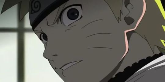
You see how there is a base color, a darker color for shadows and highlights? (Sometimes not even highlights.)
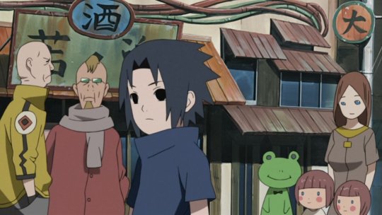
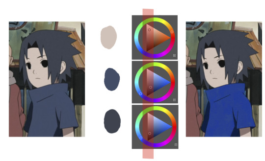
When you start to study it from existing work you’ll start to notice things like color always being in the same area of saturation and when you suddenly have a color that is way more saturated than the other it can look off. (See example.) But this is a guideline, not a rule. In your own art you can especially use saturation and brightness to help aid you to direct a viewer's focus and even tell a story.
I LOVE ‘How to train you dragon’ and ‘Kung Fu Panda’ for this because their coloring is so inspiring and if you truly want to learn from professionals... well those are the type of media to look for of course! I have an entire folder to inspire me just based on those.
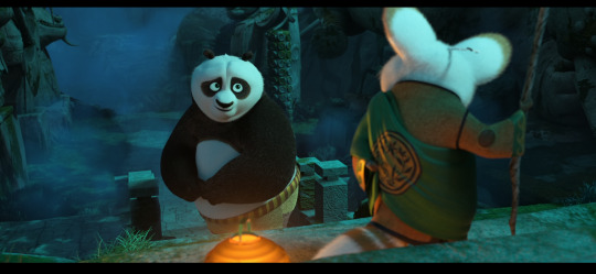
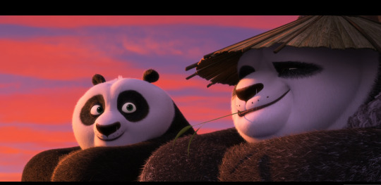
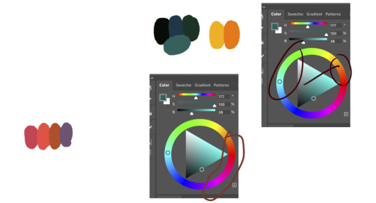
Do you see how calculated those color combo’s are?!?! Here you see both analogous and complementary schemes and it is actually through looking at the things I like that I learned it >< The orangey colors stand out and are bright which helps you to focus on that area whereas the complimentary scheme is used to bring characters together.
If drawing Manga-caps is something you love to do, then maybe for coloring you can study screen-caps from Anime or even other animated films. I’d recommend to take it step by step, though I haven’t really applied it myself, from the video’s I’ve seen and artists I’ve followed it is always advised to have an art-goal that you can work toward. Maybe you first want to focus on lineart and then laying down a base color where the colors are harmonious and next would be cell-shading maybe and then you can start adding another light-source etc- eventually you can decide to create more depth or practice with monochromatic coloring, maybe even greyscale to learn values. But right away that can all sound a bit intimidating doesn't it? Find things that you like and then maybe you can open them in your program and just study. Find a brush you like, put on some music or a show on the background and for a moment play around with it without needing to create a finished piece. This is also how I learned how things like adjustment layers work or what all the different kinds of tools do. I have to agree with you, CSP is intimidating for me as well >< so this is kinda how I approach it as there are so many add-ons and additions within it but I try to only learn what I need for that moment so I don't overwhelm myself. I definitely try to find video’s that can help me with creating Manga though! ^^ There are plenty! It'll get easier eventually, you'll learn the program and you start to recognize placements for shadows and you will get a feel for the coloring- no worries 💪 Learning something new will always stay intimidating, every time I open up a new document I feel it too. It's not easy at all, but you kinda have to allow yourself to experiment and even make mistakes because practice is never perfect. I have some beginner tips written here- I hope any of this is somewhat helpful 🌷🫶
16 notes
·
View notes
Note
I followed you before because your art was awesome. I follow still because it's still awesome.
Honestly love your use of shadows and sheen.
I'm glad you like my art! :>
I will now take this opportunity to describe why I think my art is good!
I learned most of the techniques from watching tutorial videos.
There's no tutorial that can, like, tell you how to accurately portray form with shading (which is partially why my art is so stylized), you just kind of have to feel out the shape of an object if you're not using references (which is part of why references are SO important)
but there are tutorials that can tell you the basics of shading (digitally, in this case)! this is the process I usually follow, with some variations depending on context- it uses a lot of terminology that I am assuming you know the meaning of, but if you don't, google is your friend
this is NOT a step by step tutorial to shading, I am just explaining the process that I follow in a manner similar to a tutorial
(long post warning)
Things to keep in mind before reading:
I do NOT use airbrush for shading unless explicitly stated. Airbrush makes ONLY soft shadows, where you usually want a mixture of soft AND hard shadows to create an interesting composition. I personally usually cel shade, which is ONLY hard shading.
This assumes you have basic things down like the position of your light source and how to shade, like, where exactly to put your shadows and what shapes to make them. If you're unsure, try to figure out the shape(s) you're trying to create (everything is made of shapes, break an object down into the most basic forms possible and go from there) or just, like, use a reference lol.
This isn't me telling you to always use this method- I vary the method a lot myself while using it, based on context, so please experiment with different layers and techniques to find what works best for you and your style!
If you're not confident in your line art, shading the piece is not going to make it look too much "better" than what you're seeing. Shading uses value to create volume and describe form, but if the form being described isn't quite right, it probably won't come out the way you want it to (I have learned this the hard way).
Seriously, use references. Multiple.
Use the magic wand tool to select the area around your lineart, then invert selected area and grow your selected area by 1 or 2 px. On a separate layer from your lineart, use the fill / paint bucket tool to fill the selected area with exactly 50% value grey.
This creates a base which you place underneath your line art, which is very useful, because you can then clip layers between it and your lineart directly to the base layer, making it impossible to color outside the lines
(but why don't you just use the fill tool to make a color layer?)
This can be a useful shortcut if you're in a rush, but the fill tool can often miss pixels or have unintended side effects if you forget to turn off anti-aliasing or something else. I also don't 100% understand how to properly use the fill tool sometimes, so avoid using it unless the context calls for it
use a multiply layer + greyscale value to convey shades that are darker than your base color
Even if you put a white that is, like, 90% value, a multiply layer will darken any layer underneath it very sharply. You can use this to put various greys and create volume with darker values. While it can be tempting to make an overlay layer or a soft light layer and put all of your shadows and highlights on it (I used to do that) you can get a greater range of value if you use separate layers for your lighter values and your darker values.
create an overlay layer to enhance darker shadows and begin forming lighter values
Overlay, being the cross between multiply and screen, is a perfect way to start exploring lighter colors in your piece without pushing the lever all the way to bright bright highlights while also making some parts of your shadows even darker
put a screen layer on top of the overlay layer to convey shades that are lighter than your base color and create white highlights
Screen can and will lighten your color to a very aggressive degree. I recommend using darker shades of grey in the 10-40% value range to convey "normal" lighting, and going over 50 up to 100 depending on how close you want the visible color to be to white.
create a soft light layer, set your color palette to 10% and 90% value "grey" and break out the airbrush, set the brush size so the cursor circle covers roughly 1/8th - 1/6th of the drawing
Using the airbrush on top of your other layers and also in a soft light layer is like a cheat code for rounding out your shading where your shading may be a little weaker in some places. As long as you don't overdo it, you can create a very convincing composition by combining the airbrush and soft light layer with your harder shading that has more value range.
use a normal layer to add marks of solid color on top of your drawing, like white lines reflecting on glasses or straight up 0% value black in some of the darkest parts of your drawing. this can also be useful for adding additional details and contour / cross contour lines that may be missing from your line art
This step is not always necessary. It is nice to add a little bit of final rendering, but it can be superfluous, especially if you were particularly thorough in your previous steps.
I also use it sometimes to add things like glasses that just appear as the frame without any rendering regarding the lenses.
---
Feel free to repeat any of these layers to get even darker or even lighter values, or add more definition or multiple light sources. Like I have said, the decision to do so is purely contextual, and may vary from piece to piece.
If you have any specific art questions, or any holes I may have left in my process, my ask inbox is always open :>
If you are a digital artist and you see any flaws / room for improvement please feel free to leave criticism on this post or anywhere else like my asks or DMs! I'm always looking to get better.
Thank you for reading my long ass post, or at least scrolling through it all the way.
Either way, have a gold star!
⭐
11 notes
·
View notes
Text
Me: I’ll try to be more active on tumblr
Also me: *disappears for 4 months*
Anyway, keeping up in social media has always been a challenge for me so, I1l give myself a break.
Ive been precticind quite a lot with oils recently. It was already something I wanted to do, but I was figuring out how to for a while.
the thing is, painting always scared me, when I was trying digital painting, It was always so overwhelming. I didn't really knew what to do, and I could do anything, there were no rules, no limitations and no easy process, at least not in my head.
But since I started oil painting, everything seems rigth, everything is starting to make sense. why the blocking, and why we aint the way we do, and how color works. Oh GOD! color is finally starting to make some sense to me!
I need paint, I need the need to mix it and pay attention to the saturation, and the pigments and the contrasts, I need to touch it, and to smell it and to feel the texture when it is dry. It is a whole different experience that the digital world can't provide. And a whole understandment that the digital can only replicate very poorly.
Recently I've realized how much of a megalomaniac I am and How my personal projects are always too complex for someone with no experience at anything and that's probably oneof the reasons it's so hard for me to finish anything. so I wanted to start this slowly. I wanted to paint one small object that I liked, so I picked Candles.
I also have bookbinding as a hobbie of mine, so I also bind a book just for studiyng painting. I used my very first painting of a candle I did during the pandemic when I was first trying out oils as a detail for the cover.
after that I started practicing painting just candles. Simple. with some notes to each just so I can orient myself
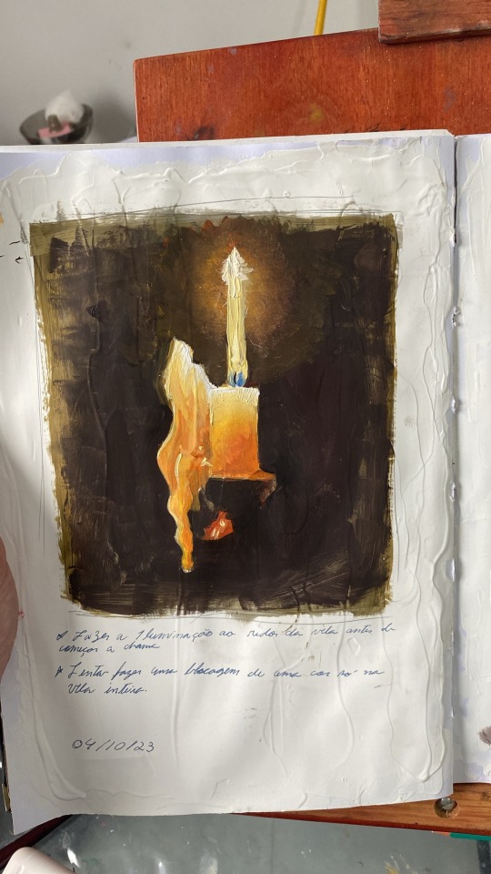
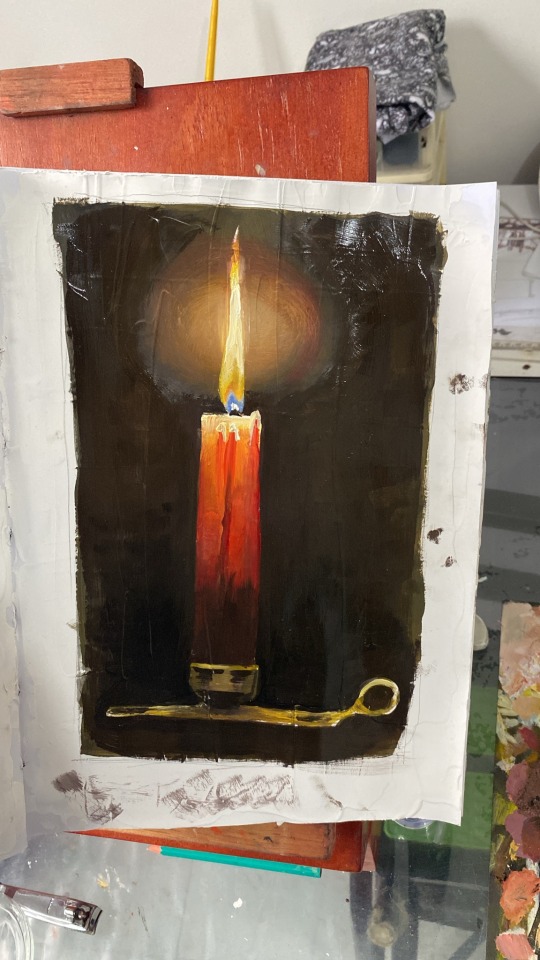
"paint the glowing around the candle before doing the flame"
"try blocking the whole candle in one color only"
but recently I got a commission from a friend, and I wanted to try and do it on oils. At first I tried doing it by observation alone. But I had many structural problems I should have solved in the drawing phase and the colours would not save it..
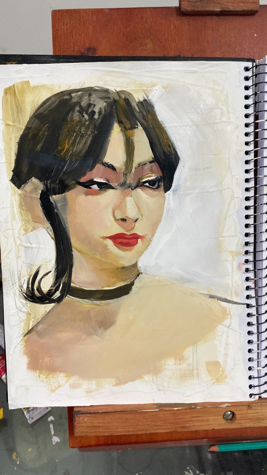
So I started over and decided to actually break the portrait apart and... you know... do things correctly...
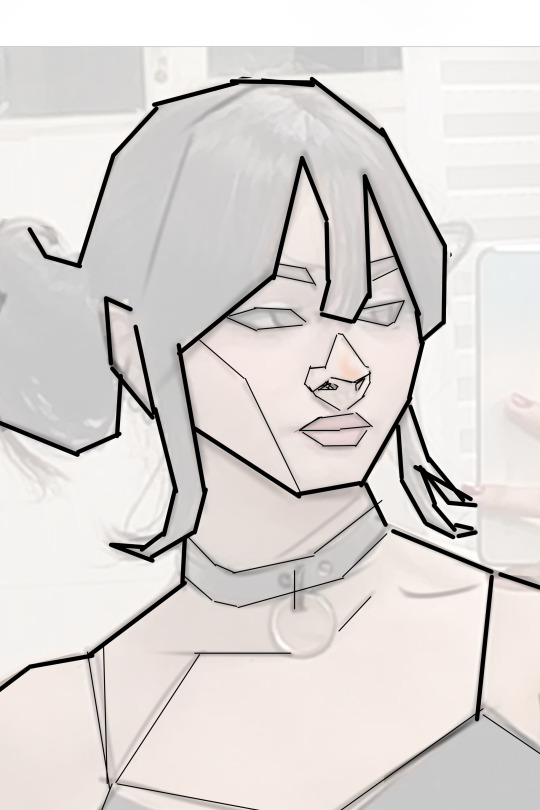
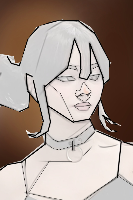
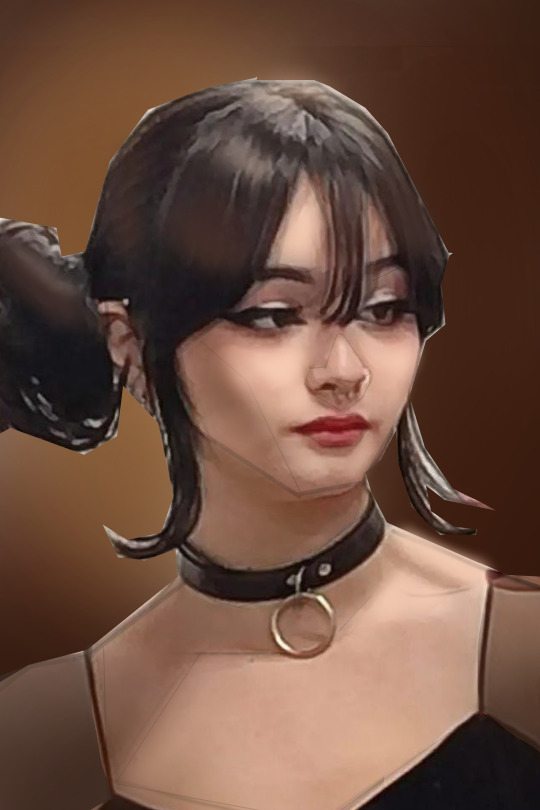
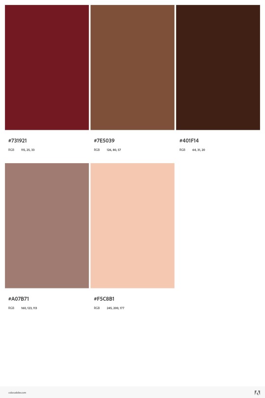
I separated her face in more simple shapes and tried working out on a composition that would work better. after some editing on ClipStudio, I used Adobe color wheel to produce a pallete, which I used to guide me
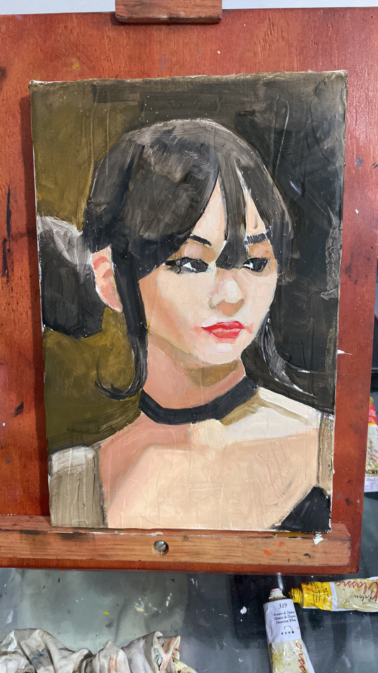
This is the result so far... Although this is still the "ugly stage" I'm already pretty happy with it.
I just wanted to share my experience with painting so far. I don't know if other artists can relate, but painting seems less scary now that it is physical. I can touch it and bend it and it is actually pretty fun!
5 notes
·
View notes
Text
Struggling with Art: Proadhog's POV
I'm not good with titles
I've been struggling with changing from traditional art to digital for a long time. First I tried with a screenless tablet, which was a terrible experience. Look, I'm a gamer, I have a good eye-hand coordination but dear god it was so bad.
Then I got one with a screen but it still wasn't really working for me. I just couldn't do what I imagined and I got demotivated. Sometimes I tried but failed again so I put it away, pouting. Watched countless videos, tips and tricks, tried some of them but still the results were far from expected.
Then I came across 2 yt channels, which I really recommend:
Jeremy from Light Ponderings and Sam from SamDoesArt
Jeremy awakened my interest in lighting and offered useful and fun excercises where I could start without pressure. (I've figured that my problem is expecting perfection every time I try something, but that is another story). Sam is hilarious with good advices, fun to watch.
So I started with a simple excercise: draw and egg. BUT. it wasn't really about to get the shape right, but to find the colors and the lights without cheating with the eyedropper tool. It is harder than you think! Well, it was for me at least. But it was fun! I was motivated again! And I did some more studies!
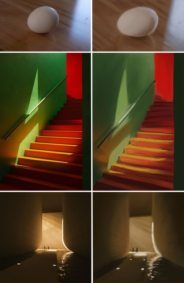
Yeah, the colors are muted, the edges aren't so crisp, but I did something and I enjoyed. And it looked far better than my previous tries.
Life got busy and I stopped. I still collected images for later use, but every time I scrolled through them I felt they are all too complex and challanging. I had to figure out something. "Draw what you love" is an advice I heard a lot, but e.g. drawing characters is a big big no for me (at least for now).
Then I came across Blade Runner 2049, for about the 100th time, but this time I looked at it differently. I loved it already (one of my fav, that's why the 100th time), but this time I saw the mastery behind lighting and cinematography, and I thought... that's what I want to draw.
It really gave the push I needed:
- I can rewatch again for screencaps
- I can/try to draw the screencaps
- I can listen to the soundtrack while doing it
I already have a lot of images to draw but I only rewatched 20 minutes maybe? Anyway, I wanted to start with really easy things, so I don't get overwhelmed, but...
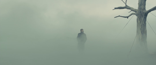
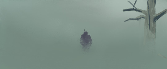
...way harder than expected. I suffered for an hour or so, I even cheated with the color of the tree (eyedropper) and I was still soooo far that I left it. BUT, this time, I had so much more to work with, the failure didn't hurt my soul that much.
Then these came:
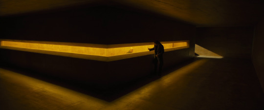
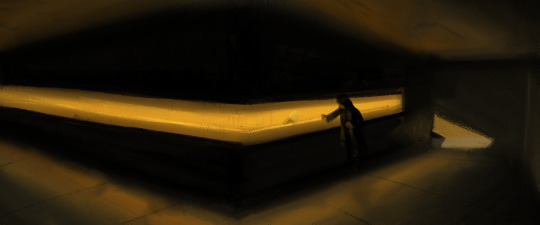
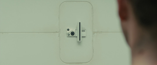
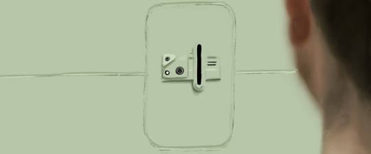
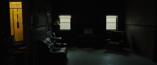
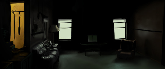
Now I see many problems with them, but I was quite happy when I finished each one. I started using hard edged brushes got a bit braver, but forgot to use sketches and it shows 😀 but the aesthetics are quite similar so it's a win for me!
Anyway, my post is about encouraging other begginers to keep working, even though it is hard sometimes and you feel you've failed with a piece. It is all about learning and having fun. Draw/paint what you really like, challange yourself but take baby steps, set achievable goals.
I don't have any technical advice other than check the yt channels above. And do sketches before you get lost in a piece :D
I wish your next piece of art to be fun and an improvement to your prevoius works! ❤️
4 notes
·
View notes
Photo

I can't sit around, watching you destroy yourself like that.
[ID: Digital painting of a distressed blue ghostly figure with a white screaming expression, a black bleeding hole in its chest, and three pairs of arms stylised as if moving together all frantically against a dark backdrop and on a grey floor. The entire scene is covered with dark greyish purple mushrooms surrounding the figure. One pair of hands of the figure is around the face in a expression of disbelief, one pair is around the chest as if slowly lowering the hands, and the last pair is at the floor surrounding and trying to help a bleeding white snake with a black tail and mushrooms growing out of it biting itself, with visible bite marks on the figure’s hands too. End ID.]
I had debated on showing this art for a while, one cuz I didn’t think it was very good, and two because of its personal nature with some old traumas and things that terrify me most.
I’ve known many loved ones throughout my life, mostly family, where I see them just... slowly destroy themselves, whether its through substance abuse or a full on breakdown as they do horrible things to everyone around them, isolating themselves and everyone around them more and more. When I see them slowly fall off the deep end, I so want to reach out, so want to help, but I can’t due to being a as equally unstable person myself and when they are very likely to hurt me in whatever nasty way, I probably wouldn’t have made a difference with how things generally just seem to rot anyway around me, but its such a horrible thing to experience. I don’t want to go into detail of specific incidents but there’s many examples of it happening in my life from when I was even a child.
This art reflects that.
#my art#vent art#digital art#krita#ghost#snake#trauma#mushrooms#rot#serpent#serpentine#body horror#blood#animal harm cw
8 notes
·
View notes
Text
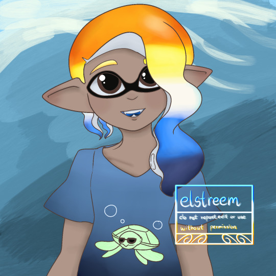
Aroace colors Inkling I made in Procreate for practice!
I've been trying to figure it out so I'm not making any good art to upload yet. This is the first thing I made that looks ok, and it's still pretty rough compared to what I usually do.
My experience working with an ipad below because wow that got long.
My dad got me an Ipad to replace my 2014 Samsung Galaxy because it's getting some battery issues but uh...I haven't used an Apple product in forever. It's been two weeks and using an ipad still feels like someone sawed off my hand and stapled it back on :') I think it's a combination of having to learn to use new hardware and software, but it's been so tough trying to make digital art on this thing.
I wish I could use Medibang since it's what I'm most used to, but for some reason the pen I'm using won't register pressure with Medibang, so I have to use Procreate. I changed the pressure settings to work with Procreate, but it's still weird and hardly works the way I want it to, so I'm not sure if it's something with the 3rd party pen I'm using, or something else. We did order a paperlike screen so hopefully that fixes some issues for me. I never had to use one for my Galaxy even though it had a glossy screen cover, but its stylus and the pen for Ipads have different tips and it's not easy using the pen to draw.
I had an easier time working with my wacom and CSP, but then again CSP and Medibang have similar layouts so it's not too difficult to adjust. Procreate is nice, but it's so different from what I'm used to that it feels like I'm arguing with someone just using its basic functions lol. I found the default brushes so difficult to use, too. My dumb monkey brain isn't flexible enough for this thing.
Kind of a rant, but it's just me complaining and it's a matter of my getting used to it. I did manage to make this, so hopefully I can consider Procreate as my next tool, But in the meantime, I still have my Galaxy and Medibang on it, so that's still where I'm mainly working. I reserve CSP for really big digital works or more complicated paintings since...it's a hassle setting up my pc and wacom tablet lol.
6 notes
·
View notes