#livery posted
Explore tagged Tumblr posts
Text
hi i really like trains if you have any train images you would like identified please send them my way :3
i also accept submissions and asks !
#trains#railway#yes i do love the railway series why do you ask#railway series#thomas and friends#the train whistles#i mean ANY train btw i will try my best to identify fictional trains too#nameplate added#livery posted
18 notes
·
View notes
Text


Hear me out
#trains#class 66#british railways#i just wanted to make a post showing my two favourite liveries of this class#then i realized lmao
101 notes
·
View notes
Text
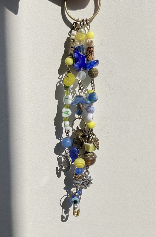
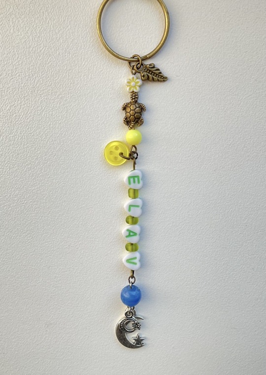
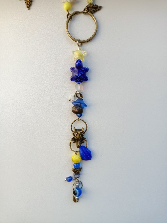
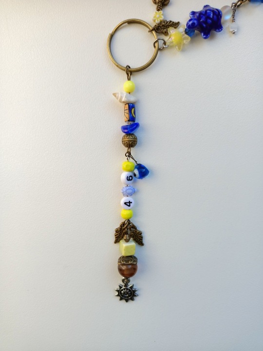
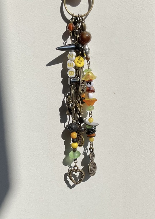
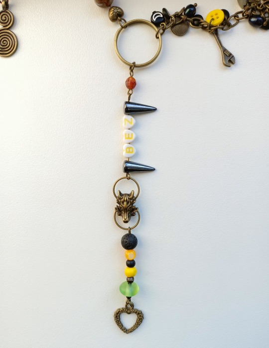
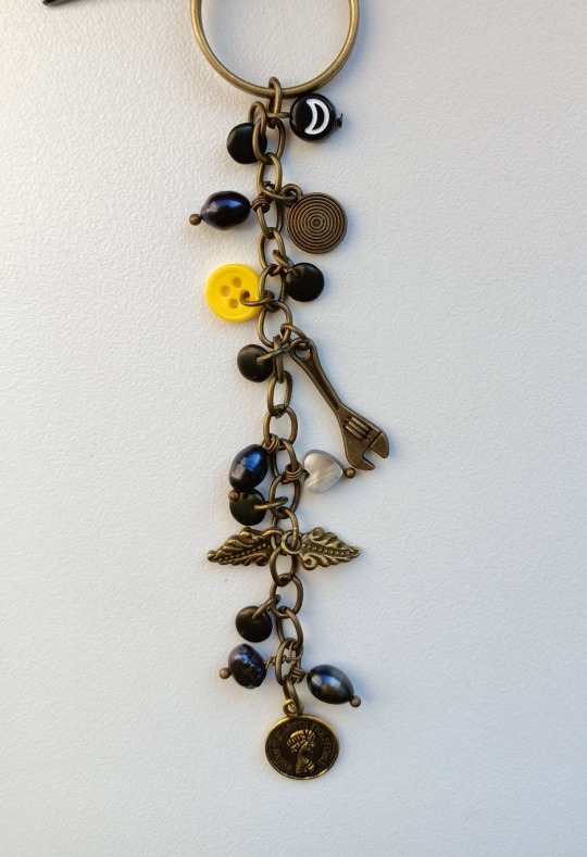
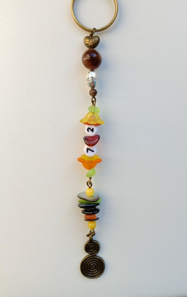
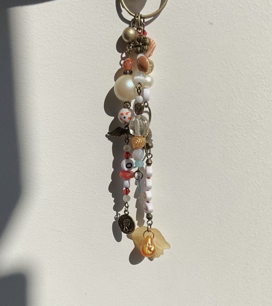
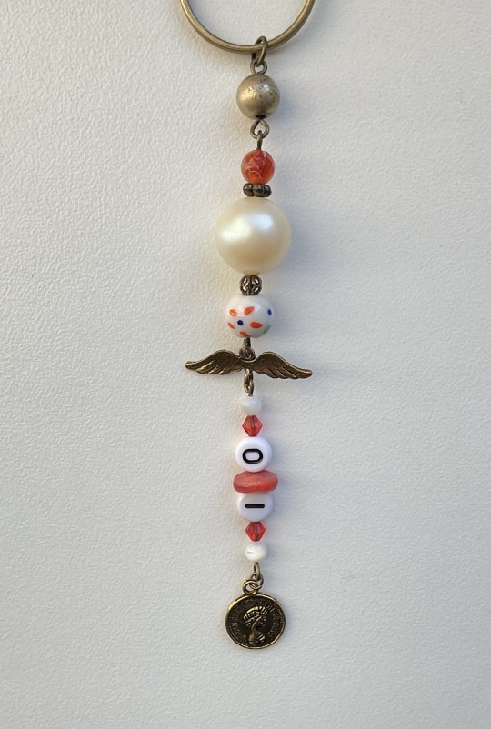
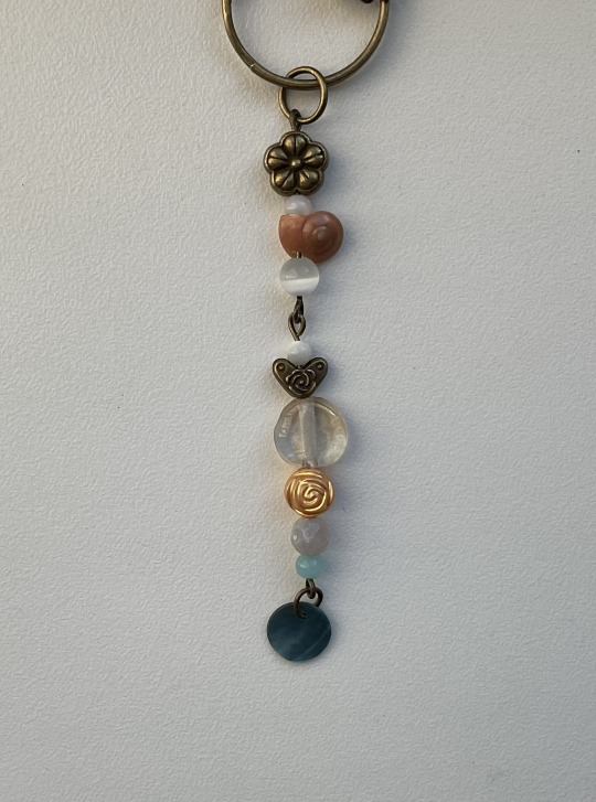
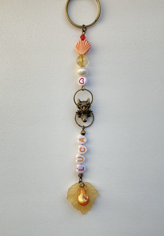
Vr46 academy keychains
Set of five charms that all match in different ways
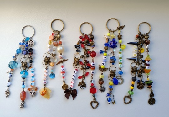
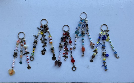
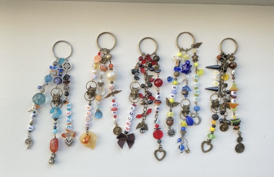
˚ ✦ . . ˚ . . ✦ ˚
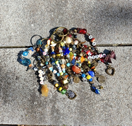
Open for detailed pictures of each one
✩₊˚.⋆☾⋆⁺₊✧ *ੈ✩‧₊˚
ִֶָ 𓂃˖˳·˖ ִֶָ ⋆★⋆ ִֶָ˖·˳˖𓂃 ִֶָ
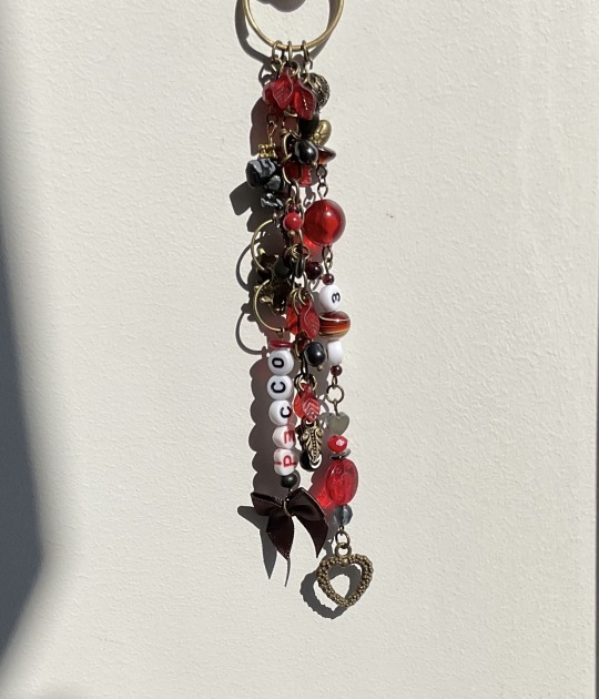
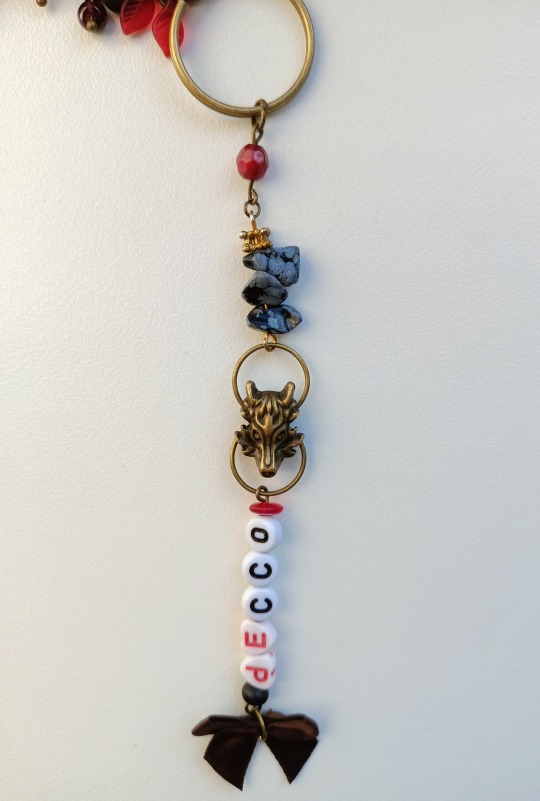
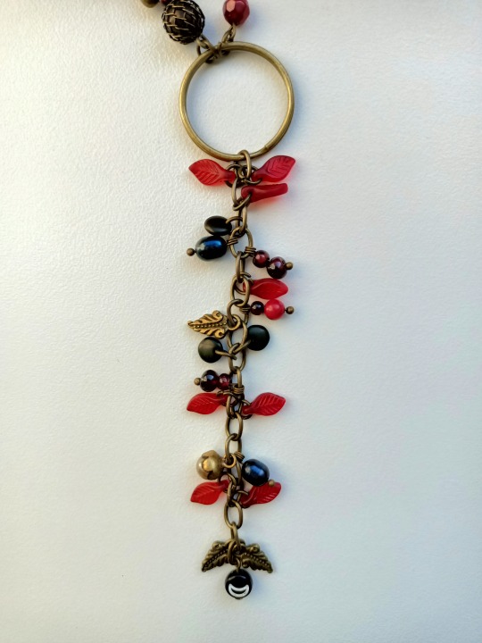
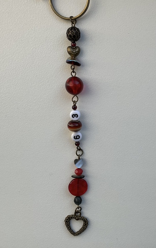
:・゚✧:・.☽˚。・゚✧:・.:
˖⁺‧₊˚⭒✮⭒˚₊‧⁺˖
. ݁₊ ✶. ݁ ˖ˎˊ˗
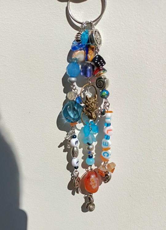
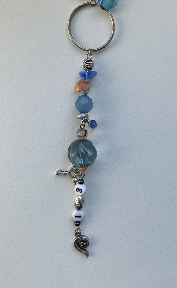
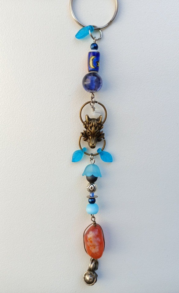
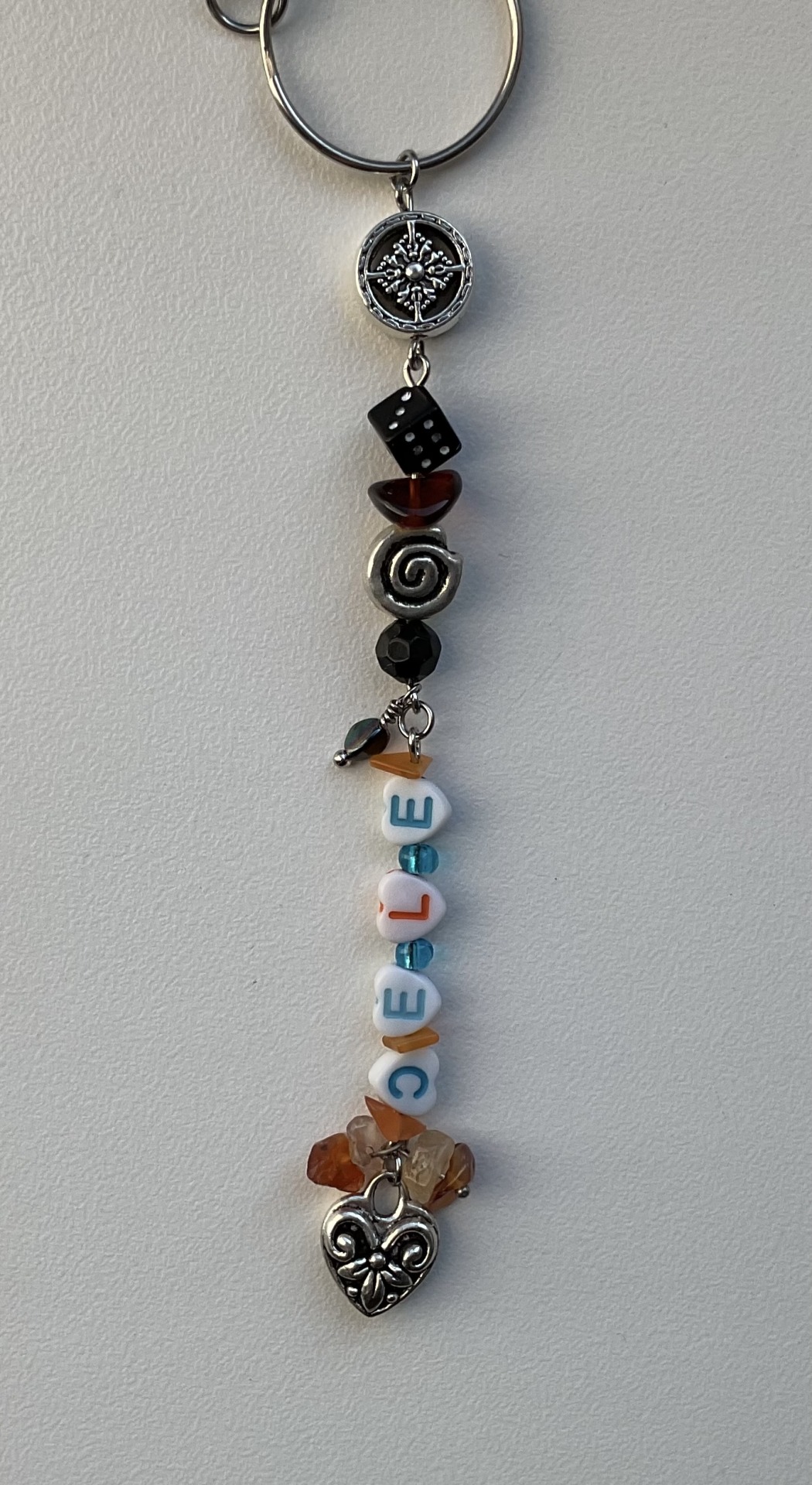
I ran out of tags so I'll say it here but i would greatly appreciate a reblog, especially if you share your thoughts on these pieces in tags (。•̀ᴗ-)✧
(Also i forgot that bez have matching part with luca so I didn’t add that to tags sorry
#motogp#marco bezzecchi#pecco bagnaia#valentino rossi#celestino vietti#luca marini#mb72#fb63#vr46#cv13#lm10#vr46 academy#okay so i fear tags won't be enough for me this time but I'll try tell everything anyway#firstly i used nicknames (should have used maro but didn't think at the time) for everyone because it brings more of a family feeling than#when i do initials and that's exactly what i wanted with them. on the same note the wolves#the wolves were tge first thing that started this idea because i wanted to make bez charm and picked one up and then it expanded very fast#because let's all face it - they are basically a wolf pack and it's extremely fitting. also after taking these pictures i found mettalic on#for cele. and it's a huge slay because i really don't like mismatching colours of metal#probably the only one that i did mismatch is vale but amazingly it looks pretty neat. i also put as many turtles as i physically could#also except for wolves he also has matching beads with cele and luca if you can spot them#while cele matches luca and bez#bez matches cele and pecco while pecco matches only bez. it was quite a challenge to find beads that would suit their different#colour schemes while looking organic in keychains#also for bez i used a wrench bc of his family and i think that's pretty neat detail#it was absolute mindfuck to find beads for five different keychains at the same time because of how different they all are but i tried#also put a lot of effort into not repeating myself as much as j could in structures so they all have their own personalities outside of set#also i love that “bez” part looks like fangs icl#if you see bead that stands out by colour from all others in keychain it's probably for their eye colour because i love to add that too#also used old bez livery because what we had this year was horrible#actually i made it some time ago just never had time to post
80 notes
·
View notes
Text

i haven't done much kaijin design before but i also wanted to have a go at doing a more monster-y genba (genbard?)
#boonboomger spoilers#umm i wanted to keep as much of the canon elements as i could so having the hair and the furry ears#but since it's bbger i wanted to add a couple of mechanical looking elements#even though hes not hashilien... car universe maybe#i had the like fox festival masks on my themeboard but i leaned into it more because it works well with how his hair is tied behind his hea#genba bureki#genbard de livery ii#bakuage sentai boonboomger#boomboom#post tag#art tag#i dont think he looks really like a sentai kaijin much but i dont hate it either. you get foxboy!#a bit of procurement for my white ass
139 notes
·
View notes
Text


"Planet Bureki was changed to serve as a Hashilien Shopping hub... And I was the only one who survived, fleeing to Earth. That's when I met Taiya."
#boonboomger spoilers#boonboomger#bakuage sentai boonboomger#super sentai#genba bureki#taiya hando#bun orange#genbard de livery ii#genbard de livery#bun red#userdramas#umbrella.gifs#tokuedit#please do not repost#umbrella.edits#umbrella.posts#subtitles added by me#translation: over-time#//long post#their meet cute...#genba bonding to the first earthling he sees#the way he strokes the front of the car while thinking about this makes me lose it like taiya really did something for him#i think an act of kindness after having to flee your home and not being able to resist helping means a lot in the moment#taiya allowed him to be soothed and calm down and didn't pressure for answers he just was genuinely kind to him
80 notes
·
View notes
Text
newsies is important because it teaches us that we don’t have to be treated as less just because we’re kids.
#Newsies#there I said it#livesies#this is specifically liveries to me but 92sies fans go ahead and take it ur way to#I’m not gonna be the asshole who censors the name of ur show like it’s a slur or a cuss word#I want us to be friends#I want us to all unite under a story we love#So 92sies fans i I hope you agree with my post#92sies
69 notes
·
View notes
Text


Max Verstappen at the 2021 Turkish Grand Prix
#⭐️#hey guys im gonna make you stare at these images forever. lol#happy cmt#hes so Blond in these goodbye#also the white livery and suits fucked. unbeatable#max verstappen#mv33#turkish gp#turkish gp 2021#capless max tuesday#f1#formula one#beth posts#2021 turkey suit
845 notes
·
View notes
Text
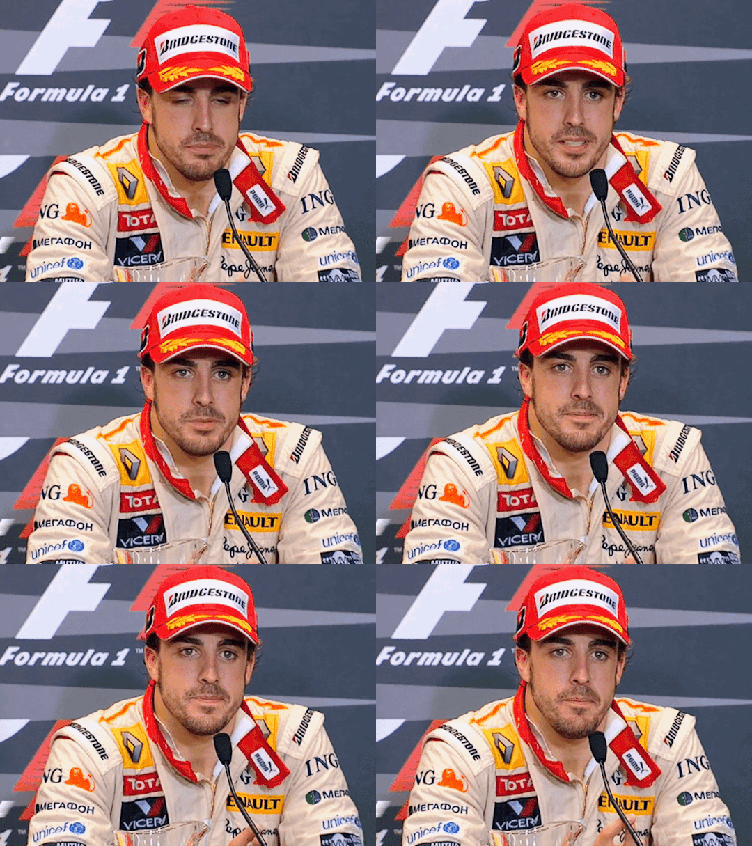


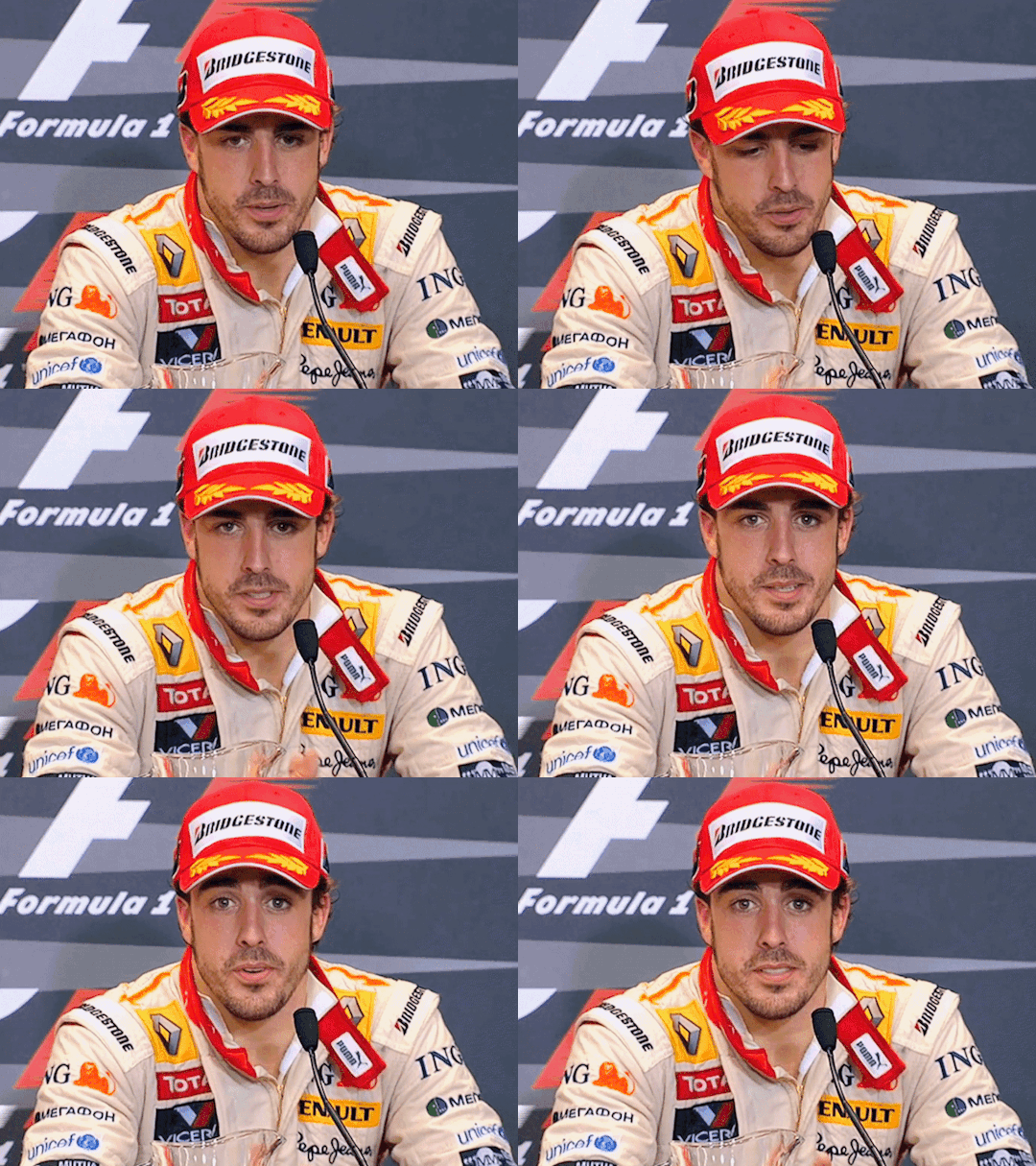
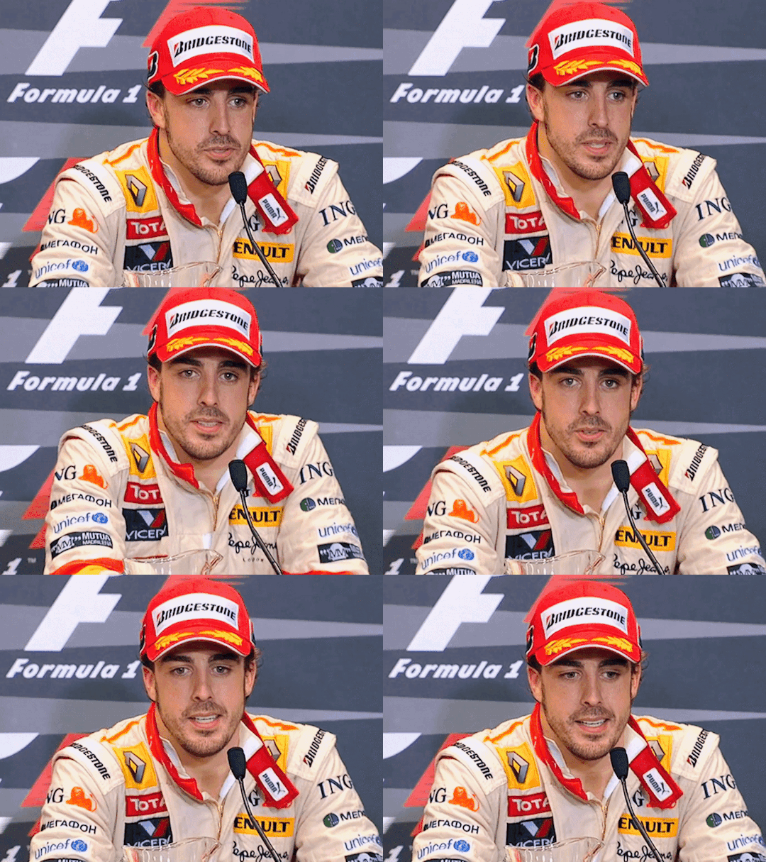

2009 Singapore Grand Prix - Fernando Alonso
#my eyes are just lazer focused on where his race suit is unzipped 🫠 he looks sooooo good in these#i wish theyd bring back this style of post race presser bcs my god imy heart skips a beat every time drivers make eye contact w the camera#i think the last race i watched where nando was on the podium was literally fucking canada 23#so i am very very please and happy and delighted to see him finally again#BUT I AM SHRIEKING AT THE FACT THAT HE DEDICATED HIS PODIUM TO FLAVIO AT HOME#FLAVIO WHO IS AT HOME BECAUSE HE WAS LITERALLY JUST PERMANENTLY BANNED FROM F1#AND HE DOES THIS PRACTICALLY ON THE ANNIVERSARY OF CRASHGATE WHICH WAS JUST PENALIZED A WK AGOO#NANNDDOOOOOOO WHY ARE YOU LIKE THIS???? MENACE BEHAVIOR!!!!!!!! WAR CRIMINAL!!!!!!!#not included here but he was late to the cooldown room even tho he was the first one to get to parc ferme#and i realized its because he went to get a coke hahaha#i guess thats his drink of choice when dehydrated bcs thats what he was drinking at malaysia 2005 when it was also humid/hot#also i prefer the blue/yellow renault livery obv but i think the yellow/orange one is underrated#renaults liveries and color palletes from this era imo are just very clean and nice looking and work very well together#fernando alonso#fa14#formula 1#f1#formula one#we do a little bit of f1#2009 singapore gp#season: 2009
362 notes
·
View notes
Text

Charles and his steering wheel
Livery unveiling | Miami | 1 May 2024
📸 Scuderia Ferrari
#couldn't find a higher res of this#but just had to post it#charles leclerc#miami gp 2024#miami blue livery unveiling
33 notes
·
View notes
Text
x
#penskes multiple liveries made me think of this video again#hot#graham rahal#indycar#barber 2024#don’t think i posted this at the time ??#i did talk about it
16 notes
·
View notes
Text
Livery Watch 2024: Special Editions
Breaking News: Local woman still isn't done yelling about car liveries.
idk how many one-off liveries the teams are going to do this year, but in any case I love McLaren's livery for Japan, so if there's any more across this season I'll be updating this post as they appear throughout the year!
McLaren - Japanese GP Vuse "Driven by Change" livery
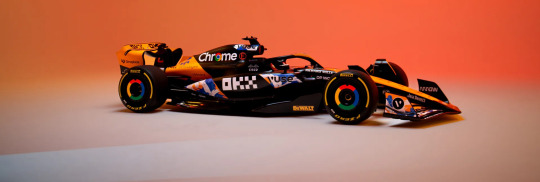
I LOVED this when the promo images dropped at the start of the week. The livery was designed by Japanese artist MILTZ and is inspired by Edomoji (a style of Japanese calligraphy), the design reminds me a lot of The Great Wave off Kanagawa but I'm pretty sure because they both have a wave motif.
I absolutely love the splashes of blue and white, I wish they were on the black portion of the car instead because the livery would look so much brighter, but I still love how it looks on the car regardless.
9/10
Ferrari - Miami GP Blue livery
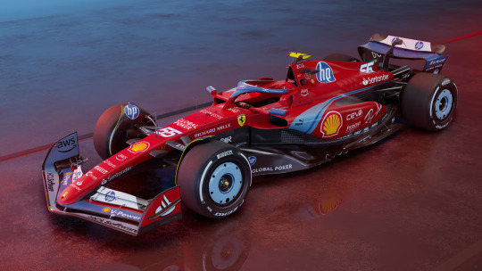
Adding list to the very long list of the ways that Ferrari have disappointed me, and ngl I'm so tempted to put it right at the top.
After all the hype Ferrari had been putting out on socials I was expecting the car to be all blue (which, is in recognition of the 70th anniversary of Ferrari selling cars in the USA) and instead we have... this.
Like, no one would have forgotten that Ferrari's are meant to be red just bc the car went all blue for one race, especially because the team kit and overalls are all-over blue for this week (I am extra mad bc the shades of blue that's on the car are so stunning and would definitely have stood out compared to the other blue livery cars).
Also don't get me started on the silly amount of HP logos on the car, if I was a tifosi I would be beyond embarrassed rn
2/10 and that's me being nice.
Racing Bulls - Miami GP livery
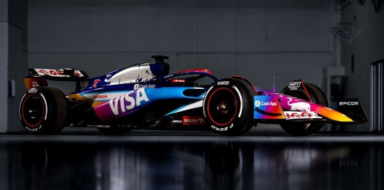
Ahhhh. That's better.
I LOVE the multi-colour gradient (even if it does slightly resemble the instagram logo). I would have loved to see it all over the car because the chrome silver bull would look so nice against it.
But apart from that it's so bright and fun and it's going to look fantastic on track this weekend. I'm not even mad that it's matte.
9/10
McLaren - Monaco GP Senna livery
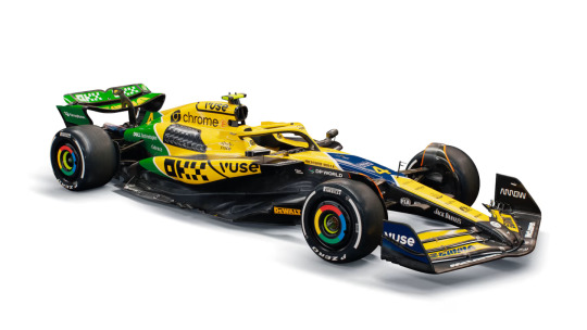
*shouting in the general direction of Maranello* You see this Ferrari? THAT'S how you do a special livery!
Yes, it's incredibly yellow (to the point it looks like a Benson & Hedges sponsored Jordan if you squint) but that's the whole point. (Also bonus points for the car pretty much being completely painted!!!)
As an ode to Ayrton Senna, it's pretty much spot on. For me the first thing that always sprang to mind when Senna is mentioned is his helmet design featuring the colours of the Brazilian flag. I also love the diagonal lines as a nod to the Marlboro McLaren livery.
Oh and did I forget to mention that IT'S NOT MATTE!!!
10/10
Red Bull - British GP "REBL CUSTMS - Stallion Red" livery
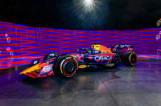
Like last season, we're getting three fan-designed RBR liveries this year in honour of the team's 20th anniversary and this is the first!
And god, I wish it was the main livery. The brushes of neon red are so bright and actually look interesting instead of the super corporate unchanged livery we've seen since 2016.
Usual 'I hate that it's matte complaints' but spart of that, it really looks great.
8/10
Williams - British GP livery
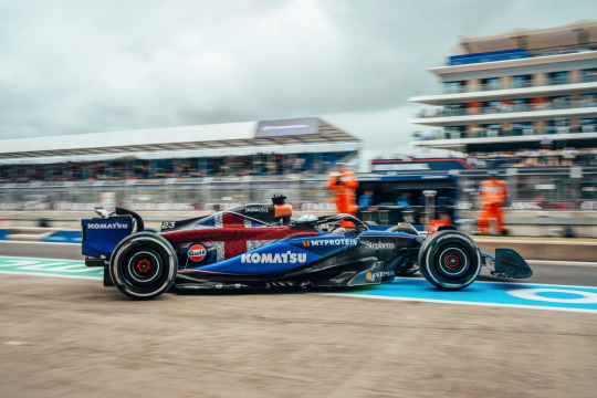
So in the design stakes, I definitely prefer last year's white accents design. However, on the sentimentality stakes (of which I will never be immune to), I love it so so much.
As it's been mentioned a lot in commentary already this week, the car features the names of all 1005 Williams team members - and founder Sir Frank Williams, which is just so so lovely.
6/10 for design, 10/10 for the sentiment behind it.
Alpine - Belgian GP "Deadpool & Wolverine" livery
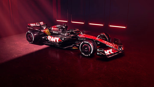
ngl friends I have spent the whole time since this dropped staring at this going 'hmm'.
I definitely don't hate it, I think I once again find all the exposed carbon very off-putting, but at least there is more paint on the car this time compared with their core blue and pink liveries. (And, tbf, given how Deadpool's colour scheme is red and black, it does make sense from that pov)
The concept behind this is very fun, I genuinely cannot remember the last time we had a full promotional livery for something (Aston Martin did run the James Bond logo on their cars when No Time to Die came out, but that was it).
I think it would have been nice if there was more yellow (as cool as the Wolverine claw marks are), but overall it's definitely very fun. I really want to see how it's going to look on track.
7.5/10
Mercedes - Singapore GP "Petronas 50th Anniversary" livery
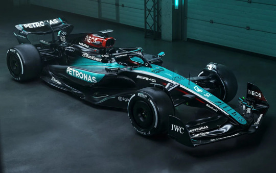
Not gonna lie, after the well documented events of the 2019 German Grand Prix, I honestly never thought we'd see Mercedes run a one-off livery ever again, so seeing this upon opening Instagram this morning was a nice surprise!
Might be worth saying that this livery is in honour of Petronas' 50th anniversary as a company (their title sponsorship with Mercedes only dates back to 2010), and the choice of debuting this livery at Singapore is that it's the race closest to Petronas' HQ in Malaysia.
(Powers that be pleeeeeeeeease bring back the Malaysian GP in Sepang!!!!!!!)
So, all that aside, I do very much like this livery. The Merc colour scheme of black, silver and teal is super iconic and works in pretty much any iteration. Design wise though I wish there had been a tiny bit of effort put in because they've literally just swapped round where the silver and teal is on their core livery.
I do think the car will stand out on track really well against the dark tarmac of the circuit, and the fact that from this picture at least the teal portion of the car looks glossy so it should look stunning under the floodlights at night.
8/10
Racing Bulls - Singapore GP "Hugo Boss Denim" livery
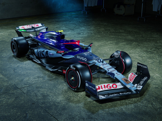
I want to get on board with this, I really really reaaaaaaaally do.
I just can't because they didn't properly commit to the bit and do the whole car in denim.
Unlike RBs Miami GP livery in which they got away with keeping the dark blue engine cover and halo because across the whole car the colour scheme still felt cohesive, on this livery (or, as we're all calling it, jivery) the saturated blue does not feel very put together with the rest of the denim. And I am a little bit mad about it bc if the denim had been all over the car I think it would have looked both amazing and really different on track. And for once, I don't mind the matte finish bc as we all know denim is not ultra-glossy - another reason why keeping the dark blue engine cover from the core livery just makes the whole thing look odd.
Love the concept, really not on board with the execution - 6/10 overall.
McLaren - Singapore GP "OKX Legend Reborn" livery
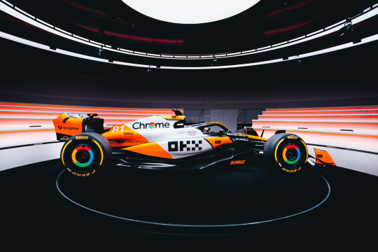
oh this FUCKS.
It's somewhat turned into a tradition of McLaren debuting a one-off livery in Singapore. In 2022 the sky blue accents on the core livery were swapped out for a stunning hot pink, and last year we had the mostly carbon stealth livery (you can find my thoughts on that in my Livery Watch 2023 tag).
And this year, as the name suggests, McLaren are running a livery inspired by the iconic Marlboro McLaren livery of the 1980s, with papaya orange in place of Marlboro red.
and to repeat myself, it FUCKS.
I love the stripe of white down the middle of the car, it really stands out compared to the slash of exposed carbon on the core livery and combined with the orange the car just looks so much brighter and is really going to stand out on track.
Is it a little bit Finding Nemo? Yes. Do I care? No.
For the tiny bit of exposed carbon it loses a point so - 9/10
Red Bull - Singapore GP "REBL CUSTUMS - Camo Bull" livery
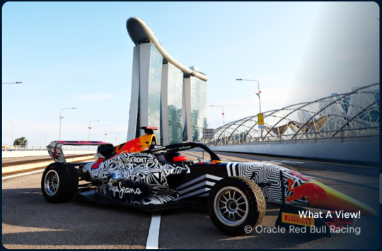
I will update if I find a better picture, the RBR website is silly.
The funny thing about updating this post as the year goes on instead of doing a reblog for each new livery is that all the various off-track (ie. Red Bull scrapping their two remaining fan designed liveries because the paint they were going to use made the car too heavy) happenings do get a bit lost within the passing of time.
But, as this is my house and I can do what I want on Livery Watch, I'm gonna yell about what would have been RBR's Singapore GP livery anyway, as it has thankfully been put onto Hamda Al Quibaisi's F1 Academy car (plus matching overalls!!!) for this weekend.
And as I said on a post earlier today (as I write this) I am mad that RBR chickened out bc this is SUCH a sexy livery. It pays tribute to the og Camo Bull livery from 2015 pre-season testing so well and it's just DIFFERENT and FUN and is gonna look SO good on the circuit and the pops of neon red are just stunning. I love it.
10/10. no notes.
Haas - United States GP livery
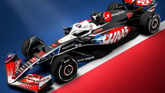
Not only are Haas going to be arriving at the Circuit of the Americas with Toyota Gazoo Racing logos on the car after the announcement of their new technical partnership with Toyota, they are also as seems to be turning into a tradition running a stars and stripes inspired livery for what is 'officially' the team's home race.
(I say officially as while the F1 calendar does have 3 US races, the race in Austin is the only one branded as the United States GP).
I do very much prefer this livery compared to the one they ran last year. The brighter, more saturated colours, work well against the predominantly black base, though I find the red driver numbers a bit hard to read as the white outline is a bit too thin. But I love the scattered star motif on the front wing and sidepods - I think it's very fun!
While I do get why the main emblem on the car is a hybrid of a lone star (bc Texas is the lone star state) and the head of an eagle (ca-caw, wtf is a kilometre) it does slightly give off 'concept art for an NFL team logo' vibes, and I think running with just the star motif would have gotten the same message across just as well.
(I will say though, I think the eagle art itself is pretty good! It just feels ever so slightly too much.)
7/10
Alpine - United States GP "Indiana Jones and the Great Circle" livery
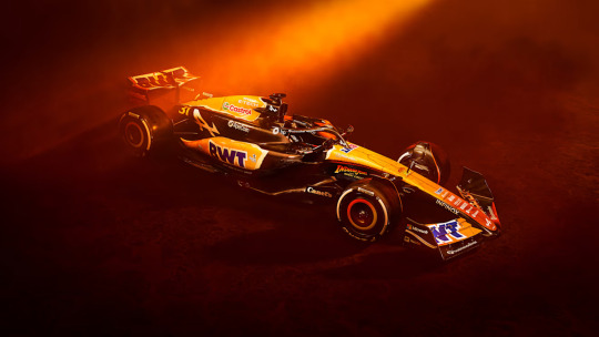
As the semi-official Livery Watch reporter for f1blr news, I do feel it's my journalistic duty to point out that Disney have not managed to pay Harrison Ford even more money to come back for another film, but that this livery is actually promotion for the upcoming video game of the same title.
My second thought upon seeing this livery (my first, like everyone else, was that it looks like a McLaren cosplay) was that I felt quite mad Alpine have painted more of the car for this one-off livery than they have done for their pink and blue core liveries, and I'm once again mad at the missed potential for what we could have had.
(My thoughts on the Alpine core livery can be found in my Livery Watch 2024 tag).
I did have to do some digging, and thanks to this video posted on Alpine's twitter feed and this post by one of Alpine's graphic designers, I am fairly confident in saying that the car is not in fact all over orange, and like the Indiana Jones logo is more of a yellow to orange ombré with a really cool looking treasure map motif on top.
I think the concept is fun (despite the promo images making the car look more orange than what it seemingly is) and it's been executed fairly well, but I may need to wait to see it in daylight before properly deciding if I like it or not.
7/10
McLaren - United States GP Chrome livery
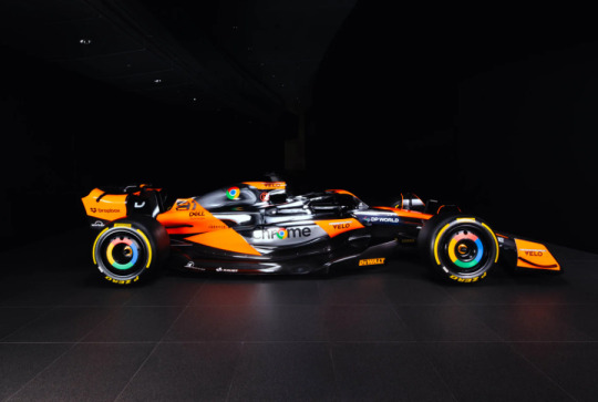
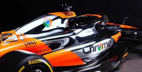
As first ran at the British GP last year, McLaren have once again brought back their chrome silver livery of the late-00s and 2010s, in partnership with one of their main sponsors Google.
And, before I go in detail, I want to show my initial reaction via the tags on a post of this livery I reblogged earlier today because I think it sums up my feelings very well.

I cannot begin to express how delighted I am that McLaren have given this livery a second attempt, because the first version they ran last year was quite a big miss.
This version feels so much more thought out in terms of where the chrome silver paint will actually go and what this livery and the original Vodafone McLaren chrome livery do well is having a really bright pop of colour against the silver so the car doesn't look too bland (unlike the team's 2014 chrome and black livery).
Honestly? This is yet another banger of a McLaren one-off livery. It's silver chrome done stunningly well. 10/10.
Williams - Mexico City GP & Sao Paulo GP altered Core livery
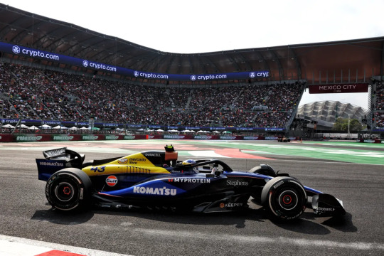
The delay in the latest addition to Livery Watch is partially due to life stuff, and also due to me contemplating whether or not it actually counted since it's a sponsor driven change as opposed to a "let's do this for funsies!" change. BUT we have seen sponsor driven liveries this year so I have finally decided that it counts, so onwards!
The addition of the Mercado Libre logo and yellow colour splash for the two Latin American races of the year is definitely fun (it stands out on the car from a mile away) and either intentionally or otherwise evokes the classic blue, white and yellow Williams liveries of the 80s and 90s.
Obviously there would have been a limitation on what shade of yellow they could put on the car, and I am somewhat bummed that it covers the original Frank Williams Racing logo, but a lot of what I love about the 2024 core livery remains.
Solid 6/10
Sauber - Las Vegas GP Flame livery
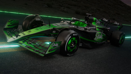
I want to like this. However, I don't think I do.
My favourite part of this livery is the nose cone, I think the white to neon green gradient is actually quite nice and had it been done all over the car would have looked very striking on track (especially in contrast to the exposed carbon areas of the car).
I'm just... really not a fan of the flame motif. It looks fine on the front end of the car, but on the engine cover where it's just a flat line before the rest of the flames just makes it look so harsh and for me anyway it's the first thing my eyes are drawn to because it look so slapped on and out of place.
5/10 (mainly for the nose cone)
Alpine - Las Vegas GP, Qatar GP & Abu Dhabi GP 'Al-Pink' livery
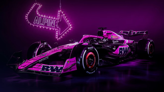
When I tell you that upon opening my instagram and saw this I literally threw my hands into the air as if I myself had just won a Grand Prix (please also refer to my all caps post from earlier as an additional first reaction that sums up my general feelings nicely).
oh BWT, I could literally kiss you on the mouth for this. I genuinely have never been happier for a sponsor requiring that a team run a specific livery for a set number of races per season. Pink Alpine they could NEVER make me hate you.
And I am so utterly thrilled and delighted to say that thanks to one of the Alpine livery/graphic designers confirming in this post, IT'S A GLOSSY PINK 😭🙌
Previous BWT-pink liveries have been a much softer pink, but I just love the brighter in your face almost Barbie pink. I think they've gone in this direction since all the races this livery will be ran at are night races, so the slightly darker and brighter pink will definitely stand out against the dark circuit under the floodlights.
Yes, there is sadly more exposed carbon than I would like. But I honestly don't care. IT'S A SHINY PINK F1 CAR!!!!!!
10/10
Racing Bulls - Las Vegas GP "Glitter" livery
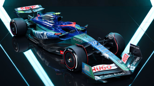
Gonna keep it short and sweet, and share my initial reaction to the livery via the medium of a screenshot of Discord DMs.


We could have had it all... truly. Racing Bulls were literally stood in front of an open goal and instead kicked the ball outside the stadium. My disappointment is beyond immeasurable rn.
3.5/10 - for the cohesive colour palette at least.
#Formula 1#Livery Watch#2024#Livery Watch 2024#(doing the one off liveries in their own post just to keep things tidy)
21 notes
·
View notes
Text


The John Player Special livery of the Renault-Lotus Team is considered by many to be one of the most legendary liveries in Motorsport history. Following the success of partnerships between Formula 1 teams and tobacco giants like Marlboro and Yardley, Lotus turned to the John Player Special cigarette brand and Autosport cartoonist Barry Foley for a new redesign of its gold leaf colors. John Player agreed, for as long as Lotus maintained at least one British driver on the team. The JPS livery ran throughout the 1970's and 80's until the end of 1986, when Renault chose to withdraw from F1 and Lotus turned to Honda for the company's engines. As part of the deal, Lotus dismissed Johnny Dumfries to sign Japanese driver Satoru Nakajima, which meant there was no more British representation within the team, at that point dominated by Senna, and effectively ended the team's ties with the John Player brand. Despite many attempts to bring back the iconic color scheme, including a 2011 fan design by the short lived Team Lotus and an even flimsier (and inexplicable) partnership between Haas and alleged energy drink brand Rich Energy in 2019, the elegance of the original black and gold car is yet to be replicated.
#lotus f1#john player special#f1 edit#kit posts#i got a few asks about the haas vf19#🫶🏽🫶🏽🫶🏽🫶🏽🫶🏽🫶🏽🫶🏽🫶🏽🫶🏽 in bed wid the wife thinking about her ((JPS lotus livery))
33 notes
·
View notes
Text


F1 admin seeing silly season happening after they've just finished making one of their "whole grid confirmed" graphics
#f1#formula 1#Like they'd just posted about the livery reveal dates and then Aston made the announcement jskfkg#Honestly I do feel bad for the social team
25 notes
·
View notes
Text
"As regards women whose monuments depict a livery collar, the traditional supposition which saw ladies as appendages of their husbands should be revised. It may be true that some women did have livery collars depicted on their memorials in right of their husbands, but there are examples of those who were probably awarded a collar for their own royal service [...] Elizabeth Donne, wife of Sir John Donne, is depicted along with her husband wearing a collar of suns and roses with a white lion pendant in Hans Memling’s Donne Triptych. As she was one of Queen Elizabeth Woodville’s gentlewomen, receiving a £10 annuity, it is likely that she received a collar in this capacity. The same can be said of Margaret, wife of Nicholas Gaynesford (d. 1498), whose brass at All Saints’, Carshalton (Surrey), survives. Although her husband has no collar, Margaret is depicted in a ‘choker’ collar of suns and roses. According to the tomb inscription, she served in the households of both Elizabeth Woodville and her daughter Elizabeth of York."
-Matthew Ward, "The Livery Collar in Late Medieval England and Wales: Politics, Identity and Affinity"
#medieval#gender tag#english history#my post#elizabeth donne#margaret Gaynesford#elizabeth woodville#elizabeth of york#Ward also includes Margaret Holland Duchess of Clarence in this as her tomb effigy in Canterbury Cathedral once had a metal livery collar#but tbh I don't understand how that applies the same way#Margaret was literally queen-in-waiting up till 1421 as the wife of Thomas of Clarence (heir to the throne until his death)#Her importance at court was not because of her royal service as much as her very prominent status and connection to royalty#- which was derived or at least massively strengthened by her second husband#(ie: she would have been entitled to a livery collar regardless of whatever activities/service she may or may not have done)#it's very different from the individual royal service of the other two and so I don't think it makes sense to group her with them#but I figured I should mention it in the tags#queue
14 notes
·
View notes
Text
no offense but having to read:
"if you took seb's character seriously and engaged with the text then you'd have to talk about how integral s*baciel is and people don't like doing it" as if it's some canon and unmoving truth that people just don't want to confront, freaking annoys me like what lol.
and this isn't me talking about antis or problematic content or anything
just 'oh you have to like it and take it into account otherwise you don't understand sebastian as a character nor the story'
or "if yana actually cared about o!ci*el and lizzy she'd draw them more together instead it's always seb and ciel she's clearly pushing for it, she doesn't care about lizzy at all" golly gee how surprising that she draws the two protagonists and the two most popular characters more often...
at least keep this shit out of the tags lmfao
#anyways i don't do ship discourse/bashing and shit nor do i intend to start to but reading this ticked me off fr#out of livery.#also seen posts about how if you don't see it as a love story you don't understand the entire point of the manga lmfao#most people are jaded to this stuff but i just came back into the fandom and i'm still in 'wtf' mode ig
17 notes
·
View notes
Text


Did some pride icons with my narrow Guage version of Nia who won the poll so have the separate ver of her in a combo of skr/irl livery.
#ttte#ttte nia#my art#my art <3#my art stuff#i had her connected to the poll but I decided to have her separately posted and cause I had her on my mind lately#Currently doing so many alt livery designs for her I might do a poll again soon so yeah I hc her as a sapphic/wlw ace :)#Kana’s her gf they’re on my mind lately Imma do Art on them and nia’s backstory involves hiding a certain lucky lamp and Mr zorro;)
22 notes
·
View notes