#leaning toward light
Explore tagged Tumblr posts
Visit Tumblr Blog
Explore Tumblr blogs with no restrictions, modern design and the best experience.
Last Seen Tumblr Blogs


Fun Fact
The total number of visits Tumblr.com received during January 2021 is 327 million.
Text

Rosemerry Wahtola Trommer, from "Three Sunflower Seeds," featured in Leaning toward Light
#rosemerry wahtola trommer#leaning toward light#poem#poetry#fragment#fragments#literature#lit#typography#typo#.ttf
811 notes
·
View notes
Text

Melissa Castrillon's illustrated book cover for poetry compilation Leaning Toward Light.
6 notes
·
View notes
Text

Who is this sassy lost child?
[First] Prev <–-> Next
#poorly drawn mdzs#mdzs#lan wangji#a-yuan#A-Yuan knows how to to utilise his big wet eyes to get treats. What a little legend.#The crowd comments about LWJ being 'daddy' and WWX being 'the mother' are a little too 'fan-service bait' for me.#So I am personally reimagining it as another layer of 'misinterpretation of a more complex situation' commentary.#I like how the different styles of interacting with children WWX an LWJ exhibit say so much about their own childhoods.#We - human beings in the real world - take two lessons from how we were parented: What we valued and what we wish we had.#LWJ leaning into indulgence is him pushing back against his own childhood of asceticism. It's something he didn't have - so he gives it.#WWX on the other hand has been *so* defined by his drive to indulge. And here he is the restrictor!#It takes a bit more to see what's going on here. The factors are not singular.#but to keep it in theme with LWJ; I'd propose it is partly his way of establishing structure when he did not have it as a child.#Both approches are a way of saying 'I didn't have this and I wish I did.'#With LWJ it's pretty obvious why...but WWX? What is at your core? What is your regret towards a lack of restriction?#Or...What benefit do you think it gives this child to learn the harsh lessons of going without?#Did it make you strong when you were a child? Do you think it is just the nature of the world and we all must learn it?#How we interact with children is such a fascinating topic to delve into our psychology and neuroses.#In a more light hearted turn of topic:#WWX confirmed to be 'person taking the car to the drive through to order one black coffee for himself' on the triangle spectrum.#LWJ is saying 'we have food at home' as he is opening his wallet ready to order for everyone.#(Technically this is comic 213 but yippee! We are in the 200's now! Thank you all so much for reading and cheering me on!)
2K notes
·
View notes
Text
I think 90% of my gripes with how modern anime looks comes down to flat color design/palettes.
Non-cohesive, washed-out color palettes can destroy lineart quality. I see this all the time when comparing an anime's lineart/layout to its colored/post-processed final product and it's heartbreaking. Compare this pre-color vs. final frame from Dungeon Meshi's OP.


So much sharpness and detail and weight gets washed out and flattened by 'meh' color design. I LOVE the flow and thickness and shadows in the fabrics on the left. The white against pastel really brings it out. Check out all the detail in their hair, the highlights in Rin's, the different hues to denote hair color, the blue tint in the clothes' shadows, and how all of that just gets... lost. It works, but it's not particularly good and does a disservice to the line-artist.
I'm using Dungeon Meshi as an example not because it's bad, I'm just especially disappointed because this is Studio Trigger we're talking about. The character animation is fantastic, but the color design is usually much more exciting. We're not seeing Trigger at their full potential, so I'm focusing on them.
Here's a very quick and messy color correct. Not meant to be taken seriously, just to provide comparison to see why colors can feel "washed out." Top is edit, bottom is original.
You can really see how desaturated and "white fluorescent lighting" the original color palettes are.
[Remember: the easiest way to make your colors more lively is to choose a warm or cool tint. From there, you can play around with bringing out complementary colors for a cohesive palette (I warmed Marcille's skintone and hair but made sure to bring out her deep blue clothes). Avoid using too many blend mode layers; hand-picking colors will really help you build your innate color sense and find a color style. Try using saturated colors in unexpected places! If you're coloring a night scene, try using deep blues or greens or magentas. You see these deep colors used all the time in older anime because they couldn't rely on a lightness scale to make colors darker, they had to use darker paints with specific hues. Don't overthink it, simpler is better!]
#not art#dungeon meshi#rant#i'm someone who can get obsessive over colors in my own art#will stare at the screen adjusting hues/saturation for hours#luckily i've gotten faster at color picking#but yeah modern anime's color design is saddening to me. the general trend leans towards white/grey desaturated palettes#simply because they're easier to pick digitally#this is not the colorists fault mind you. the anime industry's problems are also labor problems. artists are severely underpaid#and overworked. colorists literally aren't paid enough to do their best#there isn't a “creative drought” in the anime industry. this trend is widespread across studios purely BECAUSE it's not up to individuals#until work conditions improve anime will unfortunately continue to miss its fullest potential visually#don't even GET ME STARTED ON THE USE OF POST-PROCESSING FILTERS AND LIGHTING IN ANIME THOUGH#SOMEONE HOLD ME BACK. I HATE LENS FLARES I HATE GRADIENT SHADING I HATE CHROMATIC ABBERATION AND BLUR
2K notes
·
View notes
Text


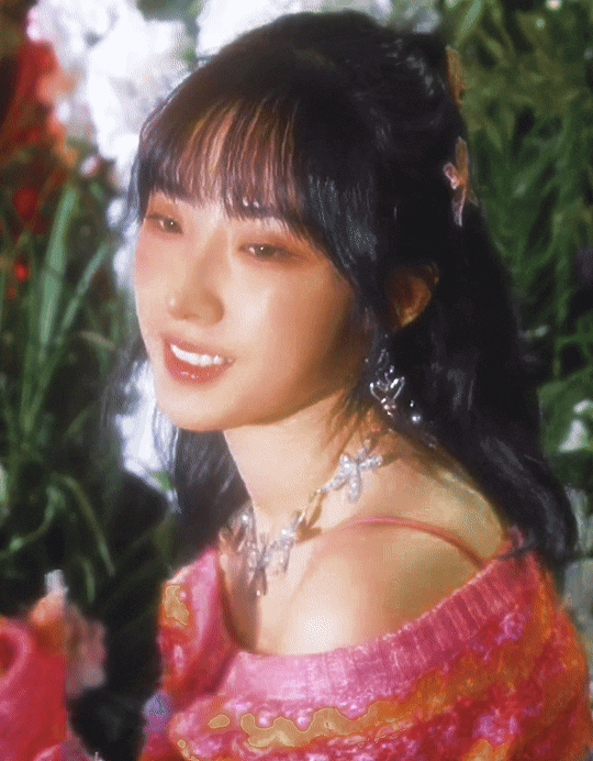
haseul 𖡼
'dall' photo behind film
#i think i mentioned this before buttt these gifs remind me of a perfume: shiseido ginza night.. its quite light and floral for a night#fragrance.. also its slightly unlike me since i usually dont like florals and lean towards musky/woody scents instead.. highly recommend!!#haseul#jo haseul#loona#artms#ggnet#idolady#usercherry#laublr#userfairy#ninqztual#userzaynab#userdahyun#ultkpopnetwork#userdoyeons#dazzlingidolsedit#kpopccc#femadolsedit#femaleidol#forvy#eritual#heyteo#usersunny#kpopggedit#usertheos#useranusia#caprisee#loonawork#artmsource
779 notes
·
View notes
Text
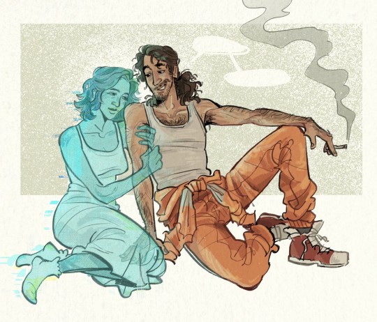
sweetheart, baby, darlin', and so on. 💞 (by @jamisonrivv)
#wolf 359#w359#doug eiffel#hera wolf 359#eiffera#art#this makes me sick it makes me ill#beautiful colors beautiful lines the way you draw hair and clothing amazes me. and the textures... the halftone look for hera is soo good#i love the pose i love their expressions i love how her light is reflecting off of him. leaning towards each other. so so sweet#these are perfect depictions of them. and especially eiffel there has never been a better style for eiffel specifically#cannot thank you enough!! <3#💙💙💙
663 notes
·
View notes
Text
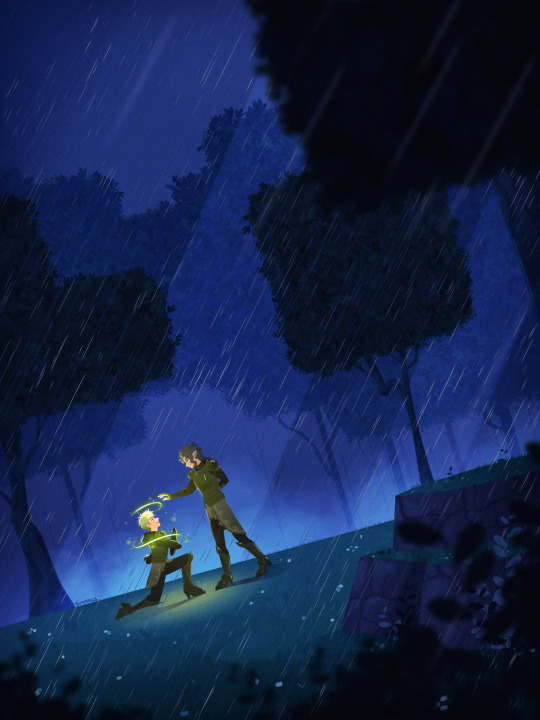
knighted
#MOMENTS THAT MAKE ME EMOTIONAL. BAUL CALLING HIM BY NAME NOT CALLING HIM HUMAN. WEAK AT THE KNEES#i think ill only have time to draw these two pieces before i leave for the holidays so i want them to be a set. i think its fun#talked abt it on twt but artistically its SO fun that book 7 has the 'good guys' w the colors of the night. greens and purples and darks#and the 'bad guys' of the humans strike their queen down with a brilliant yellow light. the light IS the darkness is conceptually yummy#trying to lean into color choices and intentional comps lately. lilias piece reading L>R feels like the angle pushes down on him#here sebek faces with the eye's movement so its more positive. like hes climbing towards his beautiful bright future. ouughj#never before in fandom have i wanted to so clearly break down my own art choices like a historian but diasom does smth to my brain#twst#twisted wonderland#sebek zigvolt#baul zigvolt#ch 7 spoilers#suntails
3K notes
·
View notes
Text
light yagami is definitely not neurotypical, imo. I can understand conflicting arguments as to what exactly he has or doesn't have, but my belief that he definitely has some things at least is non-negotiable to me
#like I can see both it both ways as to whether he is autistic or allistic although I generally lean towards the former myself#but even if it's the latter he is still definitely not neurotypical regardless#(fyi. this is me speaking as someone who has most of the brain stuff that I believe he may have lol)#light yagami#death note#i (ai)
91 notes
·
View notes
Text


"of all the corpses i have carried, yours is my favorite by far."
#ffxiv#shadowbringers spoilers#i should have a gpose tag#oc: eyrie kisne#im deeply emotional about eyrie and ardbert in shb and their connection#eyrie reconnecting w being a warrior. how it too battles with love like drk#something else about eyrie leaning against him. not relaxed but in a dead weight corpse way#head toward the sky. towards light and ardbert towards the ground. to dark#warrior of light and warrior of darkness#gulg and eulmore in the background for them both#ardbert being buried not far from eulmore. eyrie almost dying on gulg#we share a body. we share a grave#im nuts over the two of them#there's a lot of clipping but im ignoring it all
55 notes
·
View notes
Text
The cape wrapping was too much for me I have to leave
#silver sending stones#cr spoilers#cr 3 e 108#orym of the air ashari#dorian storm#he probably watched the loom and was like “this is what i signed up for. forever.”#dorym#i do not know how to feel#because this came at the end of such a harsh moment from orym?#he killed fearnes dad which will eat him alive for the rest of his life#he just yelled at everyone because theyre still not understanding that the gods leaving is not going to leave exandria as it was.#he is literally so spent.#hes so tired#and so guilty#(oh i have to update my list of things orym blames hinself for)#and as hes yelling. as hes pleading with his friends to see the calamity that will happen if the gods are gone.#he floats over to dorian.#arguably his biggest opposition#and when hes done. when hes tired himself out. he leans on dorian.#he leans on dorian probably with no expectations of reciprocation. he just. needs dorian in that moment.#and dorian. who has been fighting to get rid of the gods since they took opal and killed hia brother. who wants them gone more than anything#wraps orym in his cloak. a protective wing around him. a warm. same place for him to lean. to rest. even running his hands through his hair.#they have been fighting since dorian came back. theyve been on the opposite sides of each discussion. each argument. and yet#orym still finds comfort in dorian. and dorians still affectionate towards orym.#id like to believe they slept in the same bed that night. after weeks of... finding reasons not to.#theyre clean and newly dry and slightly cold and maybe Orym finds a bed and curls up alone because fearne isnt there. but she hasnt been#for a while. and he doesnt take up the whole bed. he cant. but he doesnt expect someone to join him.#and then when the lights are off and the crickets are chirping and the faint screaming of a new bush to lull him to sleep. his door opens.#he doesnt get up because he knows hes safe in the manor. despite how scary it is. hes fearnes friend and has a deal with nana.#so he doesnt move. he feels cool. soft skin on his back and arms wrapping around him. to protect him. to comfort him
45 notes
·
View notes
Text

Miqomarch Day Three - Gold
He dreams of gold, sometimes. He doesn't think he minds it, most of the time - but when he sleeps, gold is the color of failure, of loss.
#Miqo March#Miqomarch#FFXIV#FF14#M: Saqeh'ra#Shadowbringers#sasa's soul leans heavily towards light bc of their uneven split#so shadowbringers was rough for him#as you can imagine#sometimes he has nightmares about a “bad end” of shb
18 notes
·
View notes
Text

W. S. Merwin, from "Black Cherries," featured in Leaning toward Light
#w. s. merwin#leaning toward light#poem#poetry#fragment#fragments#literature#lit#typography#typo#.ttf#q
303 notes
·
View notes
Text
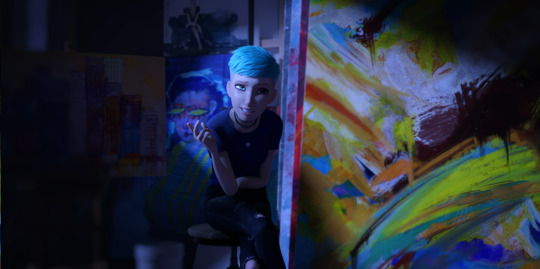
Once again, went to an episode to get a clip, Brooklynn was waiting for me randomly, and this time...wow. Just. Wow.
The colors and shadows in this image. My goodness. My everloving goodness.
#the visible colors being loud and angry#...also conveniently the side she was injured on...#while the other side (the “unharmed” side) is shrouded in darkness?#except for the halo of light around her head?#and the half of her face that's on the loud side is also in darkness?#the blue of her hair against the blue-black of the paintings behind her?#the most visible painting behind her having the eyes almost gouged out and stitched open with the style?#the smile on her face?#the hidden canvas behind the first one creating a sharp white dividing line that further contrasts both sides?#all the visible paintings behind brooklynn showing recognizable objects?#while the opposite and bright side is chaos?#this is her crossroads and she's leaning towards chaos#brooklynn#jurassic world: chaos theory#jwct#this is MAGNIFICENT
25 notes
·
View notes
Text
#sorry literally anything could happen and id just be like immediately finding a way to relate it to sonic. also i like making polls#i think the answer here really depends on what exactly you think triggers the change#well obviously its because dark gaia is more powerful at night but like is that because of the moon being out .#or is it because of the lack of sunlight from the sun Not being out. or is it both at the same time .#aynway i think its lack of sunlight so probably the first or second option. leaning more towards the second option though#because if the sun was only partially covered up it would still be light outside
68 notes
·
View notes
Text
For my literature course I’m taking the main book we’re supposed to dissect is Jane Eyre and for the LIFE of me I cant stop thinking about how well L and Light suit the dynamic of Jane and Mr Rochester. Defined by their different social standings and power dynamics yet is equalised by their intelligence, how that leads them to breaking the barriers that separate them. Jane insulting Mr Rochester through brutal honesty and Light insulting L because he doesnt fear him, you see it, its there. Mr Rochester and L both playing into it because they like that someone else is on their level and understand them on a fundemental level — someone they’re not bored talking to, someone they dont have to pretend with.
Other roles in the novel I can see being fulfilled wonderfully is BB being Bertha — both trying to constantly kill the person they’re intertwined with, be it marriage or trying to immulate them; very entertaining idea of L just shoving BB’s murderous ass in an attic in an attempt to ignore it like Mr Rochester did. Watari is OBVIOUSLY Mrs Fairfax I will hear nothing else. Adele would be Near, though I wonder how I could include Mello and Matt in an AU like that.
Maybe an idea to play with once I get my current draft published and my next idea written because I am HORRENDOUS at scheduling.
#Hopefully I get this death note draft published this weekend and the next one in the upcoming month#they make me severly ill can you tell I love literature?#I wonder how Light would be in a Jane Eyre au because they do have similarish qualities in certain areas#maybe his Helen can be Misa or Matsuda#I’m leaning towards Matsuda#maybe Misa can be similar to St John or just fill a similar narrative function#cains rambles#death note#Lawlight
19 notes
·
View notes
Note
(( Mod of this blog but for outfit themed what about cyberpunk?))

#my art#gotta make myself future-y by not using my eye covers#freaks people out that way and its fun lol#gotta have the neon lights for flair#those are my fav aesthetic to add to robots for no reason#sometimes they dont like it though cuz its flashy hahaha#[this one felt more like it ahould lean towards my style]#future pants = neon lights and weird way to button ypur pants hahahaha#cy#asks#dont smoke kids lol
27 notes
·
View notes