#its so transparent that you just dont like to be bothered and dont like it when other people are moved to actually disrupt order
Explore tagged Tumblr posts
Text

i would take their poison
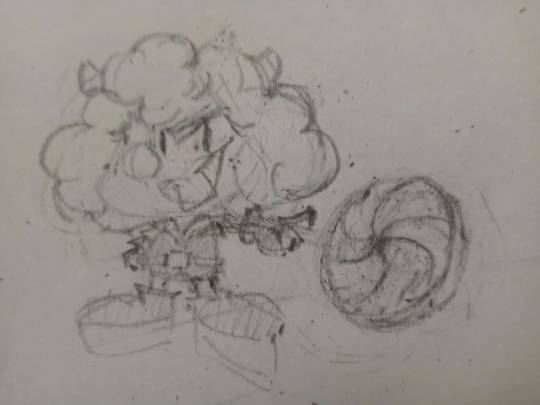
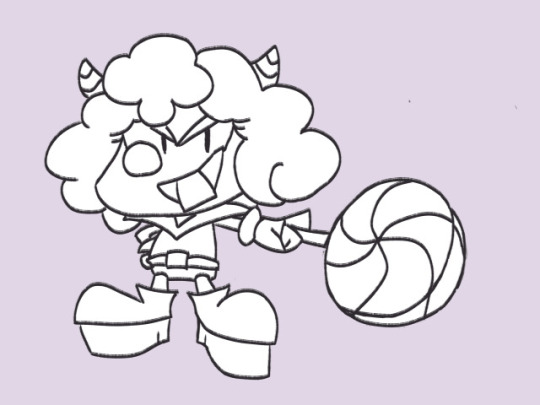
Sketch + Line Art for those Clicking Under the Cut(tm) (archival purposes honestly)
#moshi monsters#sweet tooth moshi monsters#experimentation i am COG AWFUL at digital dear goodness i was playing with coloring and transparency and all those fun digital doodads.#next time i probably wont have black outline or i'll do it differently. or i'll try well. not doing this. it sure was a process im#i'm an amateur everyone who masically only doodles. does the sketch look better than the final. kinda! but thats okay because im learning#and y'know what. sometimes in life you just need to draw faves no consequences#for how saturated a character they are i kinda feel like i pastelled things too muc and trapped myself with my convoluted layer setup but m#it was looking WEIRD with everything at full force#maybe the sparkles look dumb maybe the hair looks dumb and out of place and why i kinda made the lollipop a little funky too#uhh. first digital piece posted... ever?#the arm is SO fucky i am not that was. thats not what perspective is spam#yes this is what i spent a good chunk of today doing after i started working on coloring it and then. decided to go for it.#cooolrs a little inaccurate on the horns and such but man one of the biggest art things was like#i dont have to have everything at their perfect hex codes all the time. this would look way worse if i just. used their standard colors#yeah this is. instead of looking like its forward and to the right it kinda just looks like they have a Bigger hypno-lolly#especialy becase. i did not bother on the gloves and platforms i the sparkles work with 2 kinda sorta but you know#im practicing! i'm learning! i'll get better and learn how to do things more effectively!#anyway. sweet toof#though hey their arm looks even more fucked in the line art and sketch SO#note to future self have a Consistent Line Art Size so that if you feel like the line art looks like shit during coloring you dont have to#gamble on what size it was while changing it#sketch lollipop looks better i should have kept it small. but its fine. we'll get em next time boys (tm)#yes i know my gif post was so fancy and then the drawing is just THIS
24 notes
·
View notes
Text
"sit-ins are performatic and cringe, just donate to an NGO" - people who are not protesting and not donating
6 notes
·
View notes
Note
How do you pick colors? Do you have any tips for it, especially when making more complicated artworks with a lot of different colors?
Tysm for asking ! I'll use my recent art to show a little bit behind my process so its easier :3 note that I use Photoshop (I know, I hate it too but atp I'm already way too comfortable with it to change into a better software like CSP or something). Click on read more for the step by steps !
I usually put a base color underneath just to get the whole vibe of the drawing together and so it's coherent. It can be any color honestly but I like working with blue/orange/red the most depending on what I want,,, (photoshop also has a color changing feature so I can always change it midway).
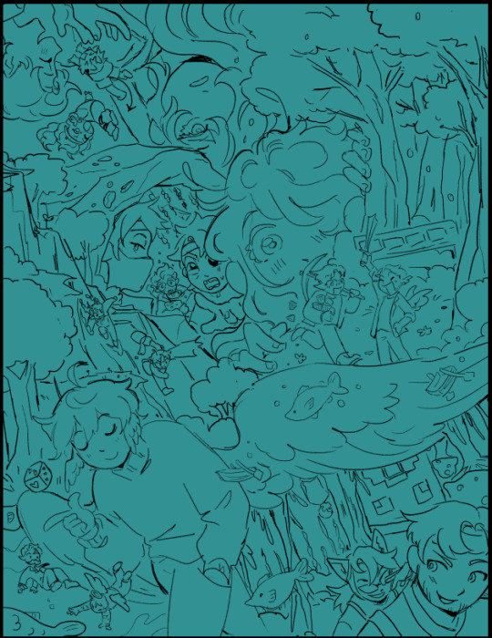
I lay down all the base colors next, the brush I use to base color typically has pressure sensitivity that makes it transparent depending on how hard you press (???) i dont really know what to call this feature but that!!
I lay down base color lightly just to show a little bit of the base color underneath and join the entire thing together (everything is a bit opaquer in this particular piece cuz i wanted to rlly separate all the elements, Im usually much softer w it)
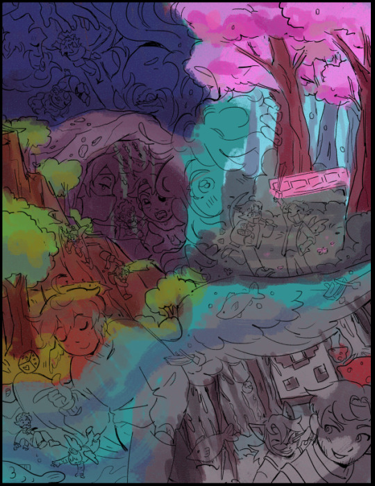
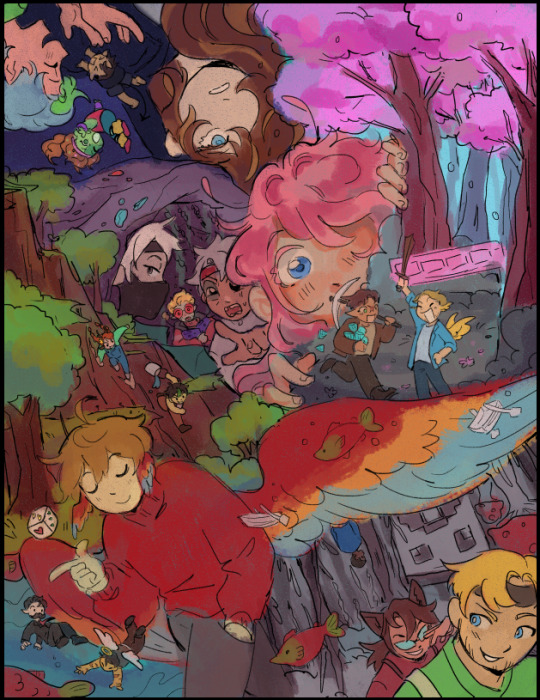
after i got the base colors down, I use blending mode layers like overlay, multiply, color dodge/add, etc to get down the lighting and stuff :3 I just love blending modes in general and use it a whole lot lol
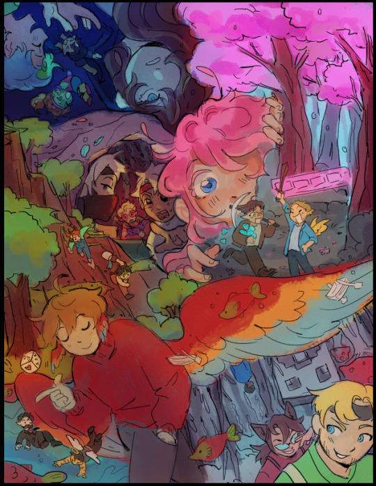
after i get all that down, I start shading and adding details to things ,,, I use a soft/light pressure sensitive brushes to get main shading down and some lasso tool + airbrush aswell in certain areas,, Then i use a more hard/opaque brush to get details like doing cleanup and highlights. I normally do more on shading & rendering but I didn't do much on this particular piece cuz I couldnt be bothered lol, I won't really go down too much on my rendering process cuz this one don't rlly represent it well
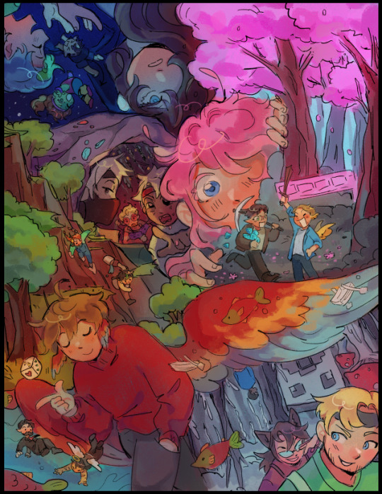
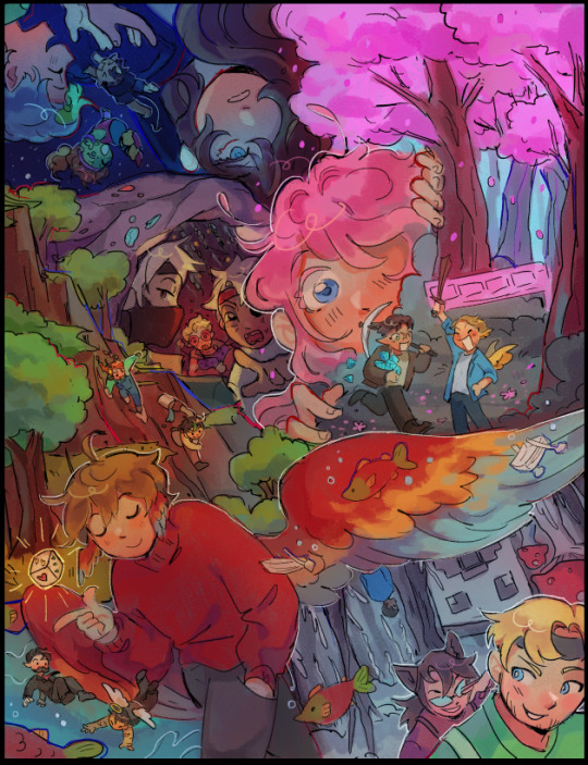
My favorite part is to bring the piece together using adjustment layers :3 idk if other software/app provide this feature (tbh they probably do), but I love messing around with color balance, hue & saturation, levels, of the sort
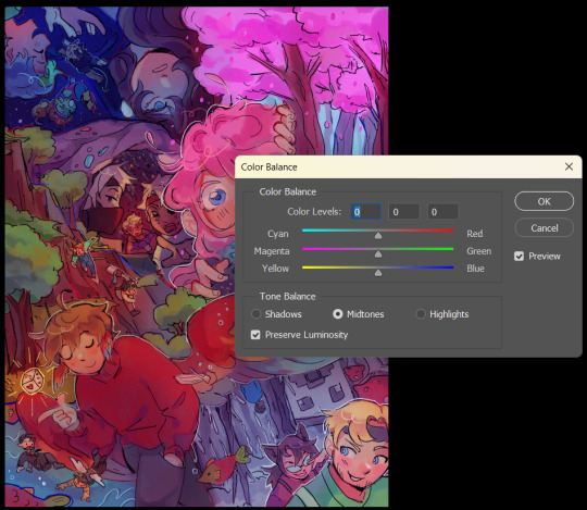
That's pretty much it ... this post is already much too long so if you'd like little misc. tips and rendering stuff as well as brushsets, feel free to ask in my box again so I can hopefully make a separate post abt it !
67 notes
·
View notes
Text
topaz day bc i love her sm dont u dare say a word about her shes my sister, girl, bestfriend, etc… aventurine likers who doesn’t appreciate her isnt a real aventurine liker bc if u truly liked him YOU SHOULD KNOW THAT SHE’S HIS FOIL. SHE FOILS HIS CHARACTER. AND SHE HERSELF IS ALSO A GOOD REP OF GROOMING VICTIM.
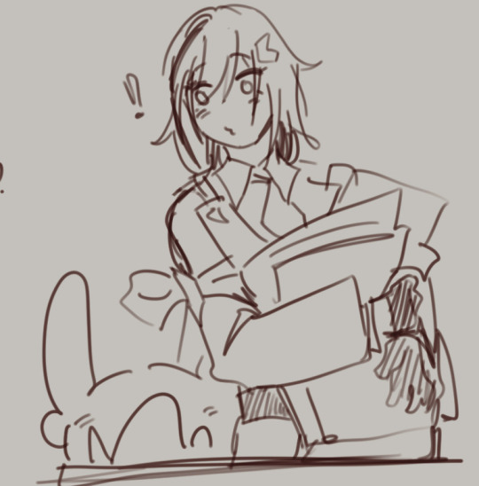
shes the best friend, shes the gal who supports i love her so much and yet she’s seen as nothing within the fandom… its either “omg i hate avenpaz” or talking down on her bc she devotes herself to the IPC like damn ofc she would SHES BEING MANIPULATED TO SHUT YO BUMASS UP. if youre gonna be a gooner or a hater at least hate critically. understand before you hate. hate with knowledge.
SHE’S THE FOIL TO AVENTURINE. JUST LIKE HOW RUAN MEI IS THE FOIL TO DR RATIO.
I feel like she and aventurine being the younger people + under jade’s care is intentional for them to highlight each other’s characters. (even their primary colors are reversed broo… cuz like, aventurine is green and inverted color of green is red and that’s topaz).
im going to go on an analysis ramble here, im not rereading anything ok PUTTING MY LIT STUDENT BRAIN TO WORK HERE
Topaz in a gem itself symbolizes strength, wisdom and calming influence and throughout the story we can see her as a character who was reliable and calculated considering her conservative approaches to the challenges she faced in the quest.
This is a juxtaposition well played by hoyoverse to highlight their decision-making processes - which is a foundation for their character. Aventurine is a gambler. His life philosophy is well known with his iconic quote of “high-stakes, high-rewards”. In contrast, Topaz represents a more calculated approach, even voice line during combat was “low-risk, high reward”.
Aventurine’s appearance and demeanor are misleading. Even his smiles serves as nothing more than a mask to fool others. And his Avgin eyes contributes more to this enigmatic nature - such colorful eyes, yet so dull and devoid of life. Much like hiding a complex hidden world under his “brazen bravado” attitude and flashy outfits. This creates an ironic contrast between how he appears and the “extraordinarily faint self beneath.”
Conversely, Topaz is straightforward and transparent. As seen with her attitude in her quest in Jarilo-IV. She wasn’t afraid to tell her tale of her planet, she was willing to talk it out and came to a calculated conclusion. Topaz’s character is also seen as affectionate and caring, as she was willing to take such a huge price for the people of Jarilo IV - of being demoted even and her care for her little pets in her splash art (+numby). Her strength lies in her compassion and clarity, providing a stark contrast to Aventurine’s deceptive nature - making her a trustworthy figure that emphasizes the irony of Aventurine’s masked intentions.
NOW ONTO THE PART I WANT TO TALK ABOUT
THEIR REACTION TO THEIR PAST.
Aventurine’s past as a slave and his resulting inferiority complex drove him to prove his worth through constant risk-taking. To be fate’s test dummy. To be thrown and tested around. To seek validation from risks. His need to control his fate, yet at the same time threaten it and challenge the blessing reveals a deep-seated desire to overcome his history - to let go yet he’s still stuck because his life is bound to his curse. Although one could argue that the IPC “saved his life”, he would still bite. His life is of no value anyways - he was just a pawn. Such as how Jade would still refer to him as “Aventurine” and not Kakavasha, even though knowing that it was his real name. He was nothing but a coin to the slots. A chance to see if they can reap the rewards.
Topaz, however, focused on building strength and validation from the efforts she puts out as seen with her and the IPC. Her project with Jarilo IV has caused her some distress, even during the Penacony quest as she was still bothered about it. But the moment Jade affirmed her, it soothed her almost immediately. She needed to prove herself to the people who “saved her planet”, to thank them as they gave her her life value. Jade, however, referred to Topaz with her real name, Jelena. Seemingly almost as if she valued her as Jelena, a person, and not a pawn on a board.
Topaz serves as a foil to Aventurine by embodying traits that contrast sharply with Aventurine’s risk-taking and enigmatic nature.
IF YOURE GONNA HATE, UNDERSTAND WHAT YOU HATE FIRST.
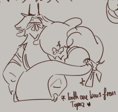
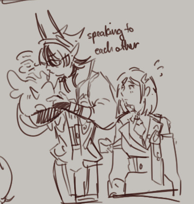
Fenrir and Topaz would get along. I wrote him to be Aventurine’s foil after all, they have a lot in common. Even their designs are similar with the color red and bows and the waist belt lol. They’re so best friend coded.
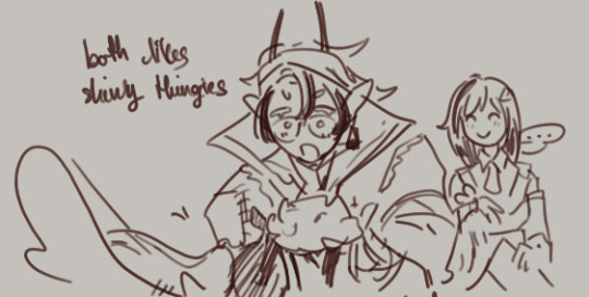
Fenrir would hang around for Numby and Numby is awfully fond of the man. Sometimes Topaz would think that Fenrir is a secret warp trotter because how tf did you write a whole study on language of warp trotter. And also, they both like shiny things. So hell yeah.
I have nothing to say they’re just so best friends.
#hsr#hsr oc#hsr topaz#hsr x reader#oc x canon#doodles#fanart#analysis#writing#rambles#character dynamics#character sketch#topaz x oc#aventurine#aventurine hsr#suprisingly no aventurine this time#character analysis#hsr analysis#fan theory#hsr theory
108 notes
·
View notes
Text

Havin' a ball at the ball
"How am I supposed to dip you? You're a head taller than me even without the heels!" "I can dip you." "But I've never been dipped before!"
we dont have to talk about how long this took. ive long since lost the reference photo i used for the pose.
bts and transparent version under cut.
first off; originally they were gonna be in a bar. but. as you can see that did not happen. the bar would have been easier overall but i didnt wanna draw bottles :/
secondly; hes supposed to be wearing peridot. because thats an august birthstone that is green and therefore matches his eyes. and the flower is supposed to be a peony. the state flower of indiana. obviously al gave it to him. al would be wearing a matching one on his suit pocket if i had been bothered to draw a suit pocket but his collar gave me enough trouble
anyway heres my various 'tester' things that i used to see what i changed from version to version
just lines;

adding colour [and changed some line stuff, cause im a liar. such as making his arm smaller/fixing anatomy. and a corsage. for fun]

me after staring to shade stuff last night

heres a hastily made transparent version

then we have:
the earlier version where i didnt have the lace thing yet, had not drawn al's face, and sam's nose was ever so slightly smaller. i think. i distinctly remember making it bigger

and then normal bts from me


during gathering reference photos from my gallery;

if tumblr lets you see that kind of thing, you'll notice the file name is 'stop touching it stop touching it' because ive been fucking w/ it for like 3 hours
theres all the file names so u can see it anyway

i dont remember how this idea got started. truly. its been several days so i dont remember. i just wanted to draw sam pretty and knew i could draw a big chunky suit.
#oh boy here we go lets get the tags going#uhhhh. hm.#quantum leap#al calavicci#sam beckett#queap#is that all of them? im more familiar with mash tags.#fanart#.my art#i am finally free to do other things. however i also wanna draw a sequel to this. key word LATER. sometime#where its them walking home and sam is hanging off al's arm#maybe a shot from behind so you can see the dress is backless. scandal#but ive never drawn people from behind before#L#.queapart
28 notes
·
View notes
Note
hii, sorry if you've answered this before but what do you use to make your edits ? your stuff is so cool it's inspiring me to try it out for myself hdkghdkgj,,

oh my gosh tysm 🥺 i really appreciate this but ill just get straight into the list! underlined = link , highlighted is website names
sorry for the long post i ended up yapping.. tldr photopea, ezgif, lunapic, alphabetiser, nameberry, magic baby names, baby centre, sekaipedia, pinterest, tumblr, . also at the bottom is a tutorial on making stamps & some templates
for basic editing i use photopea - https://www.photopea.com/ , if its too confusing you can also try ibis paint but its too confusing for me. i click "new project" and then use the dimensions i need ( tumblr banner = 1280x720 , twt banner = 1500x500 ). i can also make basic photopea functions tutorial if you need it bc a lot of people find it difficult to navigate. i dont have any specific favourite layer blends but i recommend light colours -> use the section under "lighten" , dark colours -> use the section under "darken" , blacks and whites -> use the section under "difference". of course once ur more comfortable u can just do whatver layer blends u want ^ ^
for gif editing / merging (layouts, pixels, blinkies) i use photopea's layer -> animation -> merge settings, however if that doesn't work i use ezgif - https://ezgif.com/ , specifically the gif maker.
for adding animations to stamps, i use lunapic's animations tab - https://www6.lunapic.com/editor/?action=animation-examples . i also used to use this website a lot for old layouts before i knew how to use photopea. below i highlighted my fav settings (3x for sizing)


for npts i use alphabetizer - https://alphabetizer.flap.tv/ to organise name lists. if you use this make sure to turn ON "ignore case" in the side menu!! it sorts capital letters as normal, and then i delete the capital letters later when formatting a post. for names i use websites like nameberry, magic baby names, and baby center. not sure how to explain it but i just get a feeling that a name suits a character ^ ^. as an example in all of these i used "orchid". for titles and pronouns i just use my imagination based off the character's wiki page.


for resources: i find proseka transparents online at sekaipedia - https://www.sekaipedia.org/wiki/Characters , or at @prosekaipng or @sekaitransparents . i find frames and pngs on pinterest or tumblr, and use unscreen to remove the background of gifs and remove.bg to remove the background of any image i cant be bothered manually removing. when i need to do touch-ups myself i use photopea
i find colour matches for layouts on pinterest, and then edit the shit out of them until it looks close enough to a colour palette (example below of some colour editing i've done recently). most of the things i do are extreme changes but i started off by making subtle changes in my old layout posts on lunapic, which i still sometimes do today like in the last example from a post currently sitting in my drafts i havent finished. ( ̄  ̄|| )
(this is how i found out my emu photopea file didnt save btw so excuse the missing elements ...)


for overlays, btw i use A LOT OF THESE, and also lots of custom PSDs. a psd is basically a colouring file you overlay on top of something, and are similiar to smart filters. in photopea you can click "image -> adjustments -> (whatever)" and apply that to one singular image, and these are called smart filters because you can transfer them to other images by individually dragging them. OR you can click "layer -> new adjustment layer -> (whatever" and this is a PSD because it automatically applies to all images. in photoshop, there are no "smart filters" iirc. i use a combo of smart filters & psds & overlays. i find overlays sometimes on pinterest, but mainly on tumblr. my favs below. use layer blends on these!!


for stamps i use templates in photopea using a raster mask. you can find templates on tumblr and deviantart, majority of tumblr dumps are from deviantart, so i focus on using deviantart myself and finding original stamp works on tumblr rather than reposts. some accounts i recommend are caterpillar-with-a-crayon and dixons-graveyard. remember to credit artists!!
to do this, first open a template in photopea using either " file -> open " or " open from computer " . next select the magic wand and select the inside of the stamp. next open a new layer using the blank page (second from the right, bottom right, next to the trash can below the layers) and use the brush tool to colour in the selection from earlier. it may look like an eraser, or any other icons shown in the menu. right click and select the brush tool, then hold down to colour it in. you should have something now looking like the fourth slide, with a stamp template on one layer and the colour on a layer above it.
to make the raster mask, de-select the colour by clicking anywhere in the dark grey surrounding the canvas. while on the colour layer, select "layer" (fourth from the left, next to "image" and "select, menu in the top left), then select "raster mask" -> "from transparency" . your coloured layer will then split into the colour surrounded by black, and a white version of the colour. both connected with a chain.


now, create a folder above your stamp template by clicking the button shaped like a file (bottom right menu, 3rd from the right, between a sheet of paper and a circle cut in half). now, click on the RIGHT split from the layer (the white colouring) and drag it onto the folder. it should stick there. now, anything you put inside that folder will fit the stamp inside! remember to turn OFF the red layer by click the eyes next to the layer. this wont affect your raster mask. i used an image and the text tool.
you can also do more complex things involving stamps but this is a basic tutorial ^ ^.


12 notes
·
View notes
Text
I MADE AN ALIGHT MOTION TUT!
super basic, but just to help people get started :p
youtube
TRANSCRIPT BELOW (is it called a transcript?)
so i use alight motion for most of my tweening and such and ill try to share what very little stuff i know for my sillies. im not good at explaning so err yay. this is on alight motion mobile!!!
i begin with drawing a sketch of whatever im gonna tween. the sketch is normal and not cut into pieces yet.
afterwards, when im outlining i draw all the body parts on different layers, so separating the body parts. a tip for doing any head movements is giving the neck a bit more height
do this, dont do this
when doing arms i tend to leave some parts open because itll appear as one when im tweening it later
if you have a part of the body you know will be moving more drastically than the others you should close it off/ like turn it into a nub so its less awkward to tween later
after thats done, colour it. first time tweeners should avoid going in with shading or whatever because it makes it harder to connect those lines lol (it might be easy for you tho i just found it hard. give it a go if u want)
afterwards i save all the layers as transparent.
now we are on alight motion. click the cross at the bottom of the screen. if you have certain ratios feel free to enter them by clicking the pen. mine was a preset ratio by ibis (4:3) so i wont be changing mine.
to input photos or videos, click media. click on your media and press the plus button on the upper right hand corner
some basics— click the bottom buttons to cut off or divide.
long press the arrows on the side and slide it left to shorten the clip and right to make it longer.
click your layer, then this button to duplicate the currently selected layer. long press it to move the entire layer.
to reorder layers , hold the three lines and move it up or down.
to input audio, select a video from media and click on the layer. find the button ‘extract audio.’ after that, a layer should appear which is the audio layer. delete the video layer if you have no use for it now.
ok now how to tween.
begin by putting in all your layers. you can reorder them once everything is in. it also helps to name everything, because it does get confusing when youve got lots of parts. click the layer and at the top right of your screen click (unnamed layer) and name it. i dont do this often because i cant be bothered but its helpful.
now im reordering it.
afterwards it is time to place pivot points. pivot points means where the thingy will be rotating around. or something. It makes tweening much more easier and is why i prefer alight motion to capcut in this aspect.
heres without pivot point placing. the pivot point is always auto set in the center.
and heres with. i have placed the pivot point at where the body parts would join.
to place a pivot point, click on your layer and on the right side buttons click ‘move and transform’.
tap the first button out of the four that pop up. these four buttons control your movement, rotation, size and angle (in tha order). after clicking the first button, two blue coordinates should appear. these are the coordinates of your pivot point. glide your finger around the square to move the dot towards where you want ur pivot point. pivot pointe are typically at where the body parts would join (if ur tweening a person)
now for parenting layers. click on your layer, and on the top right hand side click the button next to the trash bin. parenting layers basically means we are connecting two layers together. if we have two layers here, and connect layer two to layer one, two will move whenever one does, but one will not move when two does.
ok so again, click your layer. click the button next to the trash bin. select the other layer which will become your parent layer.
now for keyframes. if youve used capcut this should be relatively familiar.
we begin with clicking the layer, then move and transform button. click on whichever of the four youd like to keyframe. i will click rotation. on the left side, beneath the undo and redo button should appear the keyframe symbol. place it wherever you want on your layer. there needs to be at least two keyframes to allow for movement. one of the keyframes should be the original placement, while the other has been altered.
after the two keyframes have been placed, beneath the keyframe symbol is now graphs. this dictates the easing of your animation. like how fast the animation goes from position one to position two.
you can also make bounces/loops with this, and it’s typically how i do headbopping. glide the yellow button to decide the speed of the bopping/movement.
if youd like to copy and paste a graph to a different layer, click on the three buttons at the bottom left. and click copy. go on your other layer, click the graphs button, the three buttons again then paste.
after all of your tweening is done, you can (if u want to) group it together. this way, if youre looking to move this thing around its much more easier to. long press over here until it lights up, and select the layers youd like to group together. once that is all done, you can move it around.
if u wanna use effects like bounce to make your silly thing go crazy, click effects. im not gonna go through them all because i honestly dont know what half of these do. click bounce, and scale it however you like. its liteally just keyframing and what we did before.
if you need to edit the grouped together layers, click on the layer and then u can edit it.
ok thank u for watching follow my socials i post there everyday. yay.
#eure-k-a#alight motion#tweening#oc animation#tutorial video#art tips#art resources#art tutorial#alight motion animation#alight motion tutorial#artists on tumblr#Youtube
10 notes
·
View notes
Text
okay, so, we're trying out a new format with this one. instead of screenshots, i'm going to copy paste the messages, for ease of reading.
this one is pretty important to the ongoing plots of @msc137, @presidentpawn, and @primessrick, so i really would recommend reading it! i'm sure a fair amount of this is going to show up later, here on tumblr.
#group-chat
Skittle: said this in #group-chat-2, but i dont think ryan saw it,
there are some people that really muddle the clarity of the whole "anti primess" movement
Primess: Yes thank you for your input Not-Grandson. Don't you have a bar to drink through?
Skittle: yeah im really slacking off on my duties.
Primess: As long as you are aware.
Whatever Effie sees in your pathetic presence we shall never know.
Skittle: i dont know either tbh
Primess: And you still always seek new ways to disappoint her?
Skittle: seems like it. its just a matter of time at this point really
Pawn (in response to Primess): Do you ever shut up? Do you truly lack the capability to acknowledge when nobody wants to hear from you? Are you so desperate for attention that you bring back everything you've already done in order to live out your former "glory" ?
Pawn: You're disgusting. If the only low hanging fruit you can find is scraps from past encounters, you have long since deserved to starve.
Skittle: oh. woah.
Primess: Careful, little Pawn. Your amusement will run its course, and unlike little 'Skittle', who we still find entertaining and will continue surviving our tender mercies. You will find out how unfortunate our games can be to those toys we wish to throw away.
Pawn: I don't play for your amusement. I don't fear you, nor have I been given a true reason to. You are nothing but a parasite, you leech off whatever you can get your hands on and pretend you're the monster. You may be powerful, but that doesn't make up for your weakness in every other place.
Pawn: What you do is none of my business, but it's becoming sad to watch. You're desperate for pieces of past experiments, and they are long past finished. Pretend to be important as long as it makes you feel better, but know your act is transparent.
Skittle: im. i. i think i need a minute. ill be right back.
Primess: ... It is truly quite an accomplishment to render us speechless... But how else are we meant to react when we see a fool attempt to fistfight the Sun. Your pathetic attempts to psychoanalyse us fail as you try to attribute what we do to human natures, little mortal you can not even begin to understand our mind; thinking so otherwise makes you even more adorably naive than every other Morty we see.
Primess: But please. If it makes your pathetic life have some meaning, leap into the maw, try and flail. It only serves to remind us how weak and lowly you truly are.
Pawn: You'll have that connection to humanity forever, whether you like it or not. You may be inhuman, but you started as a Rick, and that will forever your baseline. When stripped of what makes you 'special', you go back to being somebody who can only thrive off of seeing somebody do worse than you. I would say it's sad to watch if anybody cared enough to do so.
Pawn: You're not above as much as you think you are, and the day it happens, I hope to watch you fall much like Icarus. You are beyond your depth, in every way.
Primess: For a moment she watches Pawn in silence. Until a cruel laugh erupts from her throat.
How utterly adorable you are—adorable and insignificant. Be grateful for it. It is the only thing keeping that loveless little fluttery thing in your chest, actually in your chest. For now atleast.
As for your hopes, by all means, pray to non-existent gods and hope to the universe that abandoned you long ago for all you wish. But the way we see it, your dreams are as pointless as you are.
Pawn: My heart keeps beating because I make it so. If you had any say over that, I would bother to watch my tongue around you. I don't respect you, nor do I fear you. Your opinion of me matters less than it does any man I'd see on the side of the road, you're no more than a vulture to me.
Pawn: You aren't to be feared, and you do nothing but act as a fool when you pretend to be as much. You are vermin, the dirt on the cosmic heel.
#mortys-1
Skittle: um, hey. pawn, uh. thanks.
Pawn: Don't thank me.
Pawn: It's not necessary.
Skittle: ...
Skittle: i think it is
Pawn: It's really not.
Pawn: If it... helps, you're welcome.
Skittle: :)
Skittle: i mean. it is necessary. im sure you know how shitty ive been feeling lately. it was, well, it felt really nice for someone to say something to her when she started to dig into me.
Pawn: It's not just you. She needs to be taught what her place is.
Skittle: i know
Pawn: What she pretends to be is far from where she actually stands, and she looks foolish picking on an already ill teenager.
Skittle: still
Pawn: I don't need to be thanked. Others should be standing up when you can't more often.
#group-chat
Primess: Her eyes blaze Oh, poor little toy. Perhaps we were too lenient. Your heart did beat because we allowed you to have it so... Such a pity it won't do so again. At her final word Pawn's heart stops, the agony in his chest is instant.
By our count, you have 20 seconds to beg for your life.
Skittle: shitshitshit pawn it isnt worth it please apologize to her
Primess: By all means little fool die upon the floor then. Perhaps others will learn to hold their tongue
Primess (in reply to Skittle): Once again you get other people hurt Not-Grandson
Skittle: please please dont kill him
Skittle: please
Primess: Tsk tsk. We thought you said so long ago you wouldn't do any deals with us again
Primess: Either we get a deal, an apology or a corpse
Skittle: im fucking weak, okay? im not gonna let you kill him. what do you want from me?
Primess: Another favour, another game when we choose. Don't worry it won't be the same as last time.
Pawn: The pain that flooded his system instantly made Pawn clutch his chest, eye squeezing shut. He tried to wave off Morty, biting down on his lip to prevent crying out in pain, near keeling over. 20 seconds was up too quickly, the boy collapsing on the ground.
Skittle: and no one gets physically hurt?
Skittle: fuck
Skittle: deal
Skittle: i cant make demands right now just please dont kill him
Primess: Do you really think you deserve that kindness this time?
Skittle: fine whatever just please
Primess: Good choice. At the snap of her fingers Pawn's heart starts beating again... not a moment too soon
Pawn: When brought back, Pawn's body twitched, heavy gasping and coughing bringing him back to awareness. For a moment, he sat still on the floor, eye widened as he stared down at himself on the floor. Without speaking, he stood and used his gun to send himself somewhere else. Anywhere but there.
Primess: ... Skittle
Skittle: ...hi.
Primess: He does that ever again, we will rip his heart out of his chest and feed the bloodied mess to him. Make sure he knows it.
Skittle: okay
#mortys-1
Skittle: god fucking damn it
Skittle: no one ever give a shit about me again. please
Skittle (linking to #group-chat-1): this is what happens when you do
Skittle: fuck
Skittle: fuck
False Morty: im pretty sure that happened because it was a long time coming
False Morty: shouldve let him die
Skittle: he went out of his way to defend me to her and she almost fucking killed him.
Skittle: fuck you
False Morty: im just saying! this is not the first fight hes caused
Skittle: but its the first fight hes caused on my behalf
False Morty: the guy practically looks for a fight whenever he can get it
Skittle: and this is the fight that almost killed him
Skittle: the one where he was defending me
#group-chat-1
Adult!Showrunner Morty: * walks in holding a smoke wearing a cover all, looks at this shit * ...oh * leaves *
-----
what an eventful morning! let me know what you think of the format!
kisses, @thoughts-and-gayers!
#ntc official#rick and morty#rp blog#mortys only chat#group chat#canon post#morty c137#primess#president pawn
11 notes
·
View notes
Text
youve heard all about how ive hated change before, time to hear it again!
(honkai ui edition)
really just a post discussing what i like and dont like abt the ui

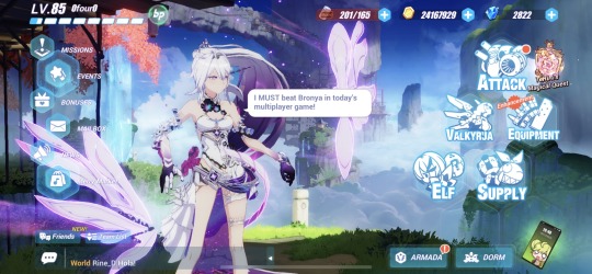
whys everything so sharp its soooo ugly
restructuring of the main buttons is fine (i will miss you valkyja tho) except for the little “important thing” button it feels off not being next to attack
new supply icon is much weaker
equipment to equip is a weird choice
of course the new elf button is elysia. its nice art tho
i get what theyre doing with the attack button but it looks out of place
the small buttons all look really good actually
the really transparent buttons make them feel smaller even the ones that got larger
dont like the new “click” noise. its like.. wet? i think the old one fit fine
the dark box for the notifs bar amount is super out of place
bar itself is pretty much unchanged so
ill miss the italic writing but i get why it was changed
captain lvl exp bar parts that are unfilled are really hard to see. like it goes all the way to the bp but barely looks that way
the new phone fucking sucks like its literally just a rectangle
the “new!” text is hard to read actually
text is just unnaturally small
old maxed stamina is much better
the orange notifs are abt the same
more hexagons please

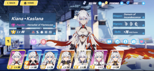
the weapon being visible is pretty sick actually
MY FUCKING BRIDGE. ITS GONE. AND REPLACED WITH THE VOID RELATED TO TYPE. IM SO MAD ITS SOOOOOO FUCKING UGLY FREE ME FROM THIS GENSHIN ASS DESIGN
back and home should both have text like serious downgrade
you can click on the type the valk is and see the type chart which is super nice actually
i like the multiple indicators of type in the new character selection considering they replaced the old backgrounds
even more slants/italics killed.. so sad
smaller icons for the select is kinda annoying but i do get it
the outfit/photo/etc buttons being together out is nice
stigmata thing should be bigger its just a lot of blank space thats really ugly
clear guide/tutorial/appreciation mode buttons are really nice
i dont think shes centered anymore
the lack of crystals/coins/stamina bothers me.,you use these to upgrade/get characters why would you remove them
lack of boxes around the skills and battlesuit info is also really ugly
still doesnt seem to have easy access to gear/team plans
25 notes
·
View notes
Note
I am absolutely fascinated by the concept of matchups!
Mystreet/MCD or I saw you mentioned Sanji in your recent so One Piece I'd also be interested in 👀
I'm Logan, he/him, 21, I like men, I'm 5'1". I write a lot in my free time, I'm also an enjoyer of reading, casual gaming and theatre. I study psychology and want to be a teacher
Interested to see what you come up with..
DIARIES AND ONE PIECE MATCHUP! ~ ♧
(i'm gonna give you two matchups bc i have never gotten a one piece request before! So you get MCD and one piece!)
SO drumroll pleaseeee! Your matchups areeeee….!
One pieces Usopp!
And!
MCDs Jeffory!

Some headcannons for usopp!
Most evenings together are spent quietly together with both of you doing your respective hobbies or tasks!
Usopp to me would be your biggest supporter with your dreams and wants to become a teacher so if you need any help with any of it he'd be the first to spring to your side.
You two would have to sleep in the same bed as I think Usopp finds a lot of comfort with having you just with him.
When he is working on stuff he just loves hearing you talk to him about a book you've been reading, or ranting about something that bothered you.
While Usopp is definitely the type to miss you when you leave his side for more then an hour he just uses the time to make you small trinkets or get work done so when you are home he can spend time with you.
Need someone to read your work and give you opinions? Dude he's right there and more than willing to give an unfiltered opinion on what he thinks.
He never plans the dates, they just happen, randomly you both going to a park or shopping together
He has oil, dirt, and a lot of stuff on his clothes so expect your clothes to be as well as he is a hugger.
He is big on physical touch so at first when you got together he was a little distant in fear of somehow making you uncomfortable, but he definitely got over that hump rather fast.
Small note here, whenever you kiss he cups your cheeks, with both hands or one, its dependant o how short the kiss is, its just what he likes to do.
and for Jeffory!
Capital S for sweetheart, because of his daughter he understands and fully respects you for wanting to be a teacher
The most playful flirting, like it's almost like every day you two meet for the first time with how much he compliments you.
The most random dates, you come home and don't look too tired? Hes taking you out on a date, usually calm ones that dont need either of you to talk to a bunch of people.
He isn't much into reading but he does look into the books you have and figures out what kinds of books you like, he gets them as gifts, so sometimes when you come home there's a book on the table for you and of course he acts like he never bought it for you!
If you're close to your family, he wants to be close to them too. He wants to know them and will do anything he can to be on their goodside, if not he is more than happy to have him and his daughter be that family.
Speaking of daughter , he won't introduce her for a good six months or so but he will absolutely be upfront about her existence and very transparent, he just wants to make sure both of you are serious before meeting her.
Unsurprisingly he is an amazing cook. He makes food for you a lot and is more than willing to learn any recipes he needs to to make your favorite foods as well.
He has these longer slender hands, calloused and scarred in places. His hand is almost always on you, your shoulder, hip. Even idly playing with your hair. It comforts him to always have a hand next to or on you.
He has a photo of you in his wallet just like he does with his daughter. He loves to stare at it when he's away.
He's snappy with people flirting with you. You wouldn't think that with him as he is usually a very calm and happy person, so he acts like that. Although he's not like that super often.
#reader insert#x you#aphblr#mcd x reader#jeffory the golden heart#god usopp#usopp x reader#one piece usopp#one piece x reader#character matchup#matchups
4 notes
·
View notes
Text
Hi i made them headcanons. like height n stuff

from left to right is Damion, Lawrence, Carmilla, and Zero
okie dokie so for Damion i gave them exposed gums and heterochromia, bc ueah. um i made their 'heart' exposed bc. Idk i thought a visual of their heart would be Cool. Also made their entire torso skeleton instead of just their ribcage.
for Lawrence i gave him a wolf cut bc. Lol. Werewolf. I also gave him scars cuz uh. scars r cool. also a bite scar bc . its cool. idk. also he's hairier cuz come on you cant expect me not to make a werewolf have body hair. and also cute thick eyebrows
Carmilla has wrinkles and scars bc shes hundreds of years old and was actively hunted for a good couple hundred of those (is actuallt still hunted today, people just bother her less bc she lives in a monster town so monster hunters cant get in easily) and i also gave her pointy ears.
i gave Zero a scar on his chest bc um. we dont know how he died. but i say. murder. i also gave Zero a sort of similar effect his hair has on his hands and ears bc i imagine hes ever so slightly transparent and hes a little bit more transparent at thinner spots on his body like his fingers and his ears.
#witches x warlocks#witchesxwarlocks#damion wxw#damion#zero wxw#zero#carmilla wxw#carmilla#lawrence wxw#lawrence
6 notes
·
View notes
Text
well… rafa was right about saying some people might be okay with the secret and some people might hate it 😬 lazy writing aside and how they wiped a chunk of season 1 aside, im a bit let down about carlos’ insistence on total transparency with tk while not giving him the same back thats kind of my only hiccup with this.
im not actually surprised about the carlos-iris storyline cuz his coming out was the first big thing we learned about him, it nearly fractured his relationship with tk and possibly drove away past partners and overall he was just harbouring a lot of pain about his parents’ reaction to it. he also became more complex as a person cuz we saw 3 seasons of tk’s character growth and handling his addiction and past trauma and now carlos’ past is surfacing. people have their own past traumas and experiences and the being in a relationship is understanding how to make that work and how can you support each other and where to draw a line y’know?
and idk if im trying to give too many excuses or trying to make this make sense 😭 but iris was gone right after season 1 and so was michelle and it might’ve seemed like carlos didn’t have to worry about her anymore? and combining that with his surprise about tk coming back to him after their big post farmers market fight, i dont think he ever thought his relationship with tk or any person for that matter would ever get to this point so why bother sharing. cuz he should’ve explained why his parents dont know about tk but he didn’t so in my head it sort of checks out.
that being said, lavender marriages are a thing, gay people getting married to save face is a thing and so is this health benefits situation like i know people within my peer circle who married a gay friend to help them out while both continuing to date separate people 🤷🏽
especially if carlos was young when he made that decision, that sheer panic of coming out to parents and being on shaky ground and feeling like its only a matter of time or one misstep before the rug gets pulled out from under your feet and you’re cut off from the family. and he’s latino who probably grew up very integrated in the extended family and loves them enough to want them in his life. that what i make of this, just my two cents.
anyone who’s upset are completely entitled to that of course it is lazy and it feels like it backtracks all the progress made and i get why people might feel like they lost a little bit of love for the character.. i let out one big sigh when i saw the scene lol but im glad they’re not dragging this out and its a one episode thing cuz i dont think i can handle more of it.
#given the way some people are reacting im kinda glad rafa deactivated his twitter like i just know someone will say something shit to him#disappointed but not surprised is the summary#they twisted around the first big thing we learned about carlos#but then again this show is a procedural and this kind of shock factor is pretty on par for the course#911 lone star#tarlos#carlos reyes#mac talk
20 notes
·
View notes
Note
hi im so sorry to bother you but i was wondering where your batman and robin picture on your gen blog came from its so lovely (also i love your theme here i think i dont know which one it is but i always liked cyantists themes) i hope you have a nice day/night <3
hi sweet! you are no bother at all and thank you!! i'm so happy you like the genblog theme i haven't touched it in years but i loved customizing it
to your question, assuming you mean this image -

it's from a panel in Streets of Gotham #3
(original panels under cut)
okay very quick story time: it took me so long to track down this panel because i confused Streets of Gotham for Gates of Gotham. all Batman books have the same goddamn name, right, so i stared at the art in Gates for so long being like... you don't look like Dustin Nguyen art.... hmm... then after an extended stint skimming Batman and Robin vol. 1 and Red Robin, also to no avail, eventually i just googled Dustin's bibliography and figured out i had been thinking of Streets of Gotham this whole time. STREETS.
anyway
original (bottom left; wherein dick prevents damian from fucking up tommy elliot):

edit (transparent and pink!):

#sunspeak#anonymous#dick grayson#damian wayne#streets of gotham#i got to look through so many books that i love to find this panel again so ty for that <3
7 notes
·
View notes
Text
Here's why sourcing fails half the time and why i dont even bother with it unless you specifically ask me .... (⇀‸↼‶) I privated but might just still post anyway some of the coloring ones bc I could not find the og source like the macoto one (bc i already knew that artist and knew it was a trace or color edit) bc people are online posting tracings or color edits of vintage manga for coloring pages and then saying its their own art ( ̄m ̄〃) and never saying whos art it was actually edited/taken/traced from to begin with bc they think its theirs now that they traced it or changed the color and its not but whatever i cant track down the original source for half of them bc they've been posted over and over again with different watermarks and different people saying "coloring page do not steal my art or repost it" when the art is stolen to begin with? (╥_╥) Hahaha. Whatevs... all that being said I am still gonna try to more asap for artists... but thats what happens when I try to source things regularly I waste all night and can't find anything for half the stuff bc its been posted 100x before and claimed by 100x more people (who are not the actual artist and who have no original rights to it, like people who scan art books and freak out about anyone else using the scan of someone else's art they scanned ahah...(눈_눈)...) its just exhausting thats why this blog is just for fun and if you want a source please ask and I will try but I cannot spend my entire night on stuff that was just shared for fun and if you are upset when I cant find a source and you can't find it yourself understand I will always try when asked and always do ฅ(≚ᄌ≚) but if you can't find it yourself I might not be able to either. (。•́︿•̀。) I also don't think by posting without a source at all I'm like these insane people saying its their art or property (by scanning or tracing or making an edit) when its not bc you all know I have repeated I claim no ownership of the things I've edited and this is just a fun collection blog and everything on it is free to be used and shared and re-edited and whatever bc its all content i found free on tumblr and various search engines and I just see things and think thatd be satisfying to make transparent so I make it bc I want to and i share bc I might as well... ❤✌🌎 ( ̄ε ̄@)
4 notes
·
View notes
Text
christmas go brr
realized i have a startling lack of fandom stuff. (..and a stupid amount of hoodies for those i do get as a person who doesnt even wear hoodies that much.. oops.)
so. i. got. stuff. and im gonna show you. cause this blog is all for random stuff that i share that people probably wont care about but i dont care haha
The first thing that arrived. Basil keychain :DD

I don't have an actual picture of it and i kind of cant cause i attached it to my phone. and its kind of hard to unlink it off? i have like one of those wallet phone cases and since its not meant to be an actual phone charm (as in, it'd probably have like a string you tie around a hole and boom?) i had to clip it around like the camera hole. which youre probably not meant to but i see a hole im taking it. i dont really use bags that often anyway
2. gojo keychain
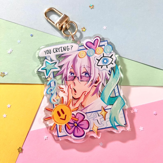
he was soldout when i first went to actually go buy it. but then it got restocked so yEAHH, arrived pretty fast imo. (theres a suguru one too)
..i. also. hanged it on my phone. but also it took a lot of careful maneuvering to get it in so i cant really be bothered to take it off. or even try to. very pretty, one of the sides glitter if you change the angle)
3. pjo decal stickers (well. hoo.)

sorry about the light lmfao official image beacuse i dont really think mine does it justice is:

i got like the hoo ones (or im pretty sure its hoo. gaea. prophecy. seven. its been a hot minute since ive thought about it)
and depending on which one you get, you can customize which cabin or roman god you get. i went with like pluto i think
you can also choose the color. very cool
last thing im waiting on are some vanitas earrings
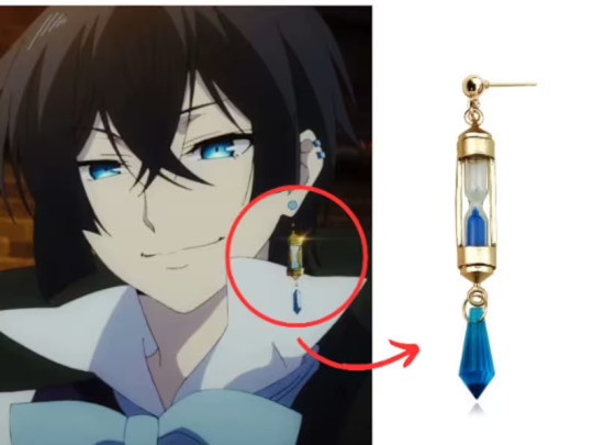
admittedly. i kind of have like a. sort. of. sensitivity towards mixed metals? something like that (i have no clue if its count as an allergy)
but i think its like a delayed reaction. and im too dumb to know the difference of whats good and what isnt?
basically. if it triggers anything. i can just wear it for short periods of time, no harm, cause otherwise itd be fine (i had another set of earrings that triggered something, but nothing actually happened until awhile later)
if anything, it'd be fun to attach it to something and still look nice
anyway. i should probably lay off on getting more keychains. but its either that or like standees of characters?? i dont use stickers that often, i dont use pins (i dont really use bags that often??), i dont wanna get stuff thats just gonna waste space so im just stuck here getting decorative stuff to attach onto things. aghh
#etsy#thoughts#etsyfinds#is that the right tag?#christmas shopping#shopping#items#stuff#random stuff
0 notes
Note
do you have any advise on stopping copying? its happened to me too but i dont want to lock my accounts or delete my work
Assuming you mean other people copying your work? Don't delete anything. Leave a distinct timeline of your work around.
If you want to stop material from being immediately accessible, you can make posts private (at least on Tumblr). It's what I do to keep my work around— so I can access it Immediately if plagiarism continues after its been hidden— across the board. That way I can make posts public and reblog for visibility if the need arises; it keeps the original dates there for reference.
This is going to be long so I'll put the rest under the cut.
I have a lot of posts set to private and fics archived to prevent my material from being ripped off that way. However, if you have DMs/conversations with people where you discuss the work that they're copying, make a record of it. Screenshot and do a video screen grab. You might have to do a long scroll if it's on the likes of Tumblr or Discord, but it's better to have a cohesive reel of the conversation for the sake of transparency.
Now, unfortunately people who copy other people's work don't often take kindly to being called out. It depends on the severity. The only reason I haven't named people directly is because I'd rather simply present the compiled Evidence to those who point it out to me.
However, if it continues— or travels further into the audacity zone— I will simply make an accessible list with compiled evidence. I strongly suggest you make 'case files' for yourself in much the same way.
In the era of call out posts being made to wage attacks over arguments, stick to the facts. As much as it is a personal matter, I'd suggest keeping any personal commentary out of it. It's easier to digest as X + Y = Z.
The thing about plagiarism is to remember a lot of people are desperate for internet clout. Like, deranged levels of equating numbers/attention to success. We all want attention for our work— hence we post anywhere at all— but the apparent need to be First and The Person Who Does The Thing is pretty blatant amidst those who would rather rip off others than put in the work.
Being good at anything requires effort— a willingness to put time and energy into learning. People who copy don't do that. They want rewards and validation; they're not doing what they do for creative integrity.
Block evasion is something you will likely be facing, given these sorts don't be like to be told no. Unfortunately there's not much we can do about that— it's not like people who steal directly from others will give a fuck about set boundaries.

So, in short:
Compile evidence: your work vs the copied work. Links, screenshots, video grabs etc. A timeline is your best bet for relaying plagiarism. If you need help compiling easy to understand comparisons, you'll have to DM me off anon. I won't be doing that publicly because it would only be used for avoidance purposes lmao.
Block the offending parties across the board. Including from any sideblogs and the like.
Don't delete your work! You can hide posts/archive most things now. You may need it to reference back to.
Don't stop creating. People will Always do this one way or another; don't drop what you love to do just because there's people who are so entitled as to try and take advantage, yk?
As I've said before, people who plagiarise aren't doing what they do because they want to join in. It's an entitlement issue— they want what they perceive to be a Reward without bothering to work for it. There's no joy in that.
I truly have no time for people who plagiarise lmao. Just remember that it says a lot about them as people.
@krokaxe self tag for rb purposes
#krok.ask#I'm sorry anon#It's pretty awful really#But lmao like I said#says a lot more about them than it does you
1 note
·
View note