#is fandom knitting a tag?
Explore tagged Tumblr posts
Visit Tumblr Blog
Explore Tumblr blogs with no restrictions, modern design and the best experience.
Last Seen Tumblr Blogs


Fun Fact
Users from the US are the majority of Tumblr visitors.
Text
Grishaverse knitting update
I FINISHED THE SIX OF CROWS BLANKET
Okay maybe ‘finished’ is a strong word; all the ends need weaving in (there are so many of them 😭) and I haven’t bought anything to back it with yet but I CAST IT OFF THIS EVENING I’m calling it finished I’m taking the win
The lighting in the photo really isn’t great but here she is in all her glory:
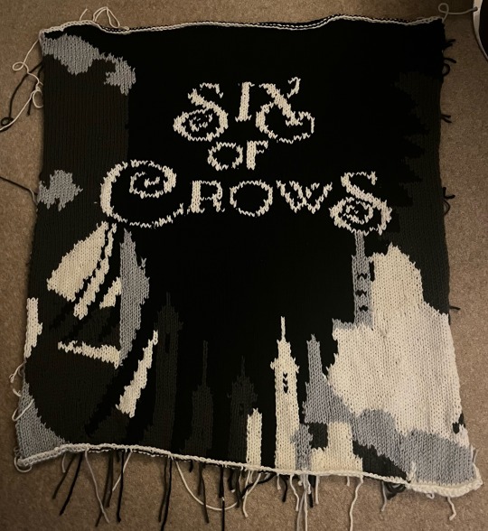
I’m so freaking happy with it
I know a few people asked about the pattern but I don’t have a written one as I just drew up a chart myself and went for it (my second fair isle project ever, and the first was a bauble. I was not ready for this but man I’m glad I just decided to jump I to the deep end because I am obsessed with the result), however I did put up a screenshot of the drawing I used to make my chart a little while ago and if anyone would like me to repost that with my grid superimposed over it and to explain how I did it and what size yarn and needles and everything I used then let me know and I will try to create an explanatory post
I AM SO EXCITED
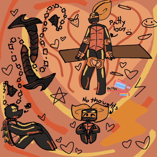
In other grishaverse knitting news: I haven’t worked on the Kefta in ages tbh but I think I have one sleeve to go before the embroidery I just hate sleeves lol so I’ve been procrastinating and also just generally busy to be fair, and also did I tell y’all I knitted Wylan’s toy crow? I can’t remember, but yeah in my collection of toy crows of the Crows I now have Jesper and Wylan and they sit on my shelf together looking so damn cute. Jesper has a lil hat that he wears at a fun angle and Wylan has lil goggles on his head and a bomb tucked under his wing hehe
#is fandom knitting a tag?#it should be#fandom knitting#grishaverse#six of crows#crooked kingdom#leigh bardugo#kaz brekker#inej ghafa#jesper fahey#wylan van eck#nina zenik#matthias helvar#kanej#helnik#wesper#the crows#save shadow and bone#save six of crows#six of crows spin off#renew shadow and bone#knitting#blanket#knitblr#hand knitted#knitters of tumblr#knitted blanket#grishaverse fandom#six of crows duology#six of crows blanket
349 notes
·
View notes
Text
why Aurora's art is genius
It's break for me, and I've been meaning to sit down and read the Aurora webcomic (https://comicaurora.com/, @comicaurora on Tumblr) for quite a bit. So I did that over the last few days.
And… y'know. I can't actually say "I should've read this earlier," because otherwise I would've been up at 2:30-3am when I had responsibilities in the morning and I couldn't have properly enjoyed it, but. Holy shit guys THIS COMIC.
I intended to just do a generalized "hello this is all the things I love about this story," and I wrote a paragraph or two about art style. …and then another. And another. And I realized I needed to actually reference things so I would stop being too vague. I was reading the comic on my tablet or phone, because I wanted to stay curled up in my chair, but I type at a big monitor and so I saw more details… aaaaaand it turned into its own giant-ass post.
SO. Enjoy a few thousand words of me nerding out about this insanely cool art style and how fucking gorgeous this comic is? (There are screenshots, I promise it isn't just a wall of text.) In my defense, I just spent two semesters in graphic design classes focusing on the Adobe Suite, so… I get to be a nerd about pretty things…???
All positive feedback btw! No downers here. <3
---
I cannot emphasize enough how much I love the beautiful, simple stylistic method of drawing characters and figures. It is absolutely stunning and effortless and utterly graceful—it is so hard to capture the sheer beauty and fluidity of the human form in such a fashion. Even a simple outline of a character feels dynamic! It's gorgeous!
Though I do have a love-hate relationship with this, because my artistic side looks at that lovely simplicity, goes "I CAN DO THAT!" and then I sit down and go to the paper and realize that no, in fact, I cannot do that yet, because that simplicity is born of a hell of a lot of practice and understanding of bodies and actually is really hard to do. It's a very developed style that only looks simple because the artist knows what they're doing. The human body is hard to pull off, and this comic does so beautifully and makes it look effortless.
Also: line weight line weight line weight. It's especially important in simplified shapes and figures like this, and hoo boy is it used excellently. It's especially apparent the newer the pages get—I love watching that improvement over time—but with simpler figures and lines, you get nice light lines to emphasize both smaller details, like in the draping of clothing and the curls of hair—which, hello, yes—and thicker lines to emphasize bigger and more important details and silhouettes. It's the sort of thing that's essential to most illustrations, but I wanted to make a note of it because it's so vital to this art style.
THE USE OF LAYER BLENDING MODES OH MY GODS. (...uhhh, apologies to the people who don't know what that means, it's a digital art program thing? This article explains it for beginners.)
Bear with me, I just finished my second Photoshop course, I spent months and months working on projects with this shit so I see the genius use of Screen and/or its siblings (of which there are many—if I say "Screen" here, assume I mean the entire umbrella of Screen blending modes and possibly Overlay) and go nuts, but seriously it's so clever and also fucking gorgeous:
Firstly: the use of screened-on sound effect words over an action? A "CRACK" written over a branch and then put on Screen in glowy green so that it's subtle enough that it doesn't disrupt the visual flow, but still sticks out enough to make itself heard? Little "scritches" that are transparent where they're laid on without outlines to emphasize the sound without disrupting the underlying image? FUCK YES. I haven't seen this done literally anywhere else—granted, I haven't read a massive amount of comics, but I've read enough—and it is so clever and I adore it. Examples:


Secondly: The beautiful lighting effects. The curling leaves, all the magic, the various glowing eyes, the fog, the way it's all so vividly colored but doesn't burn your eyeballs out—a balance that's way harder to achieve than you'd think—and the soft glows around them, eeeee it's so pretty so pretty SO PRETTY. Not sure if some of these are Outer/Inner Glow/Shadow layer effects or if it's entirely hand-drawn, but major kudos either way; I can see the beautiful use of blending modes and I SALUTE YOUR GENIUS.
I keep looking at some of this stuff and go "is that a layer effect or is it done by hand?" Because you can make some similar things with the Satin layer effect in Photoshop (I don't know if other programs have this? I'm gonna have to find out since I won't have access to PS for much longer ;-;) that resembles some of the swirly inner bits on some of the lit effects, but I'm not sure if it is that or not. Or you could mask over textures? There's... many ways to do it.
If done by hand: oh my gods the patience, how. If done with layer effects: really clever work that knows how to stop said effects from looking wonky, because ugh those things get temperamental. If done with a layer of texture that's been masked over: very, very good masking work. No matter the method, pretty shimmers and swirly bits inside the bigger pretty swirls!
Next: The way color contrast is used! I will never be over the glowy green-on-black Primordial Life vibes when Alinua gets dropped into that… unconscious space?? with Life, for example, and the sharp contrast of vines and crack and branches and leaves against pitch black is just visually stunning. The way the roots sink into the ground and the three-dimensional sensation of it is particularly badass here:

Friggin. How does this imply depth like that. HOW. IT'S SO FREAKING COOL.
A huge point here is also color language and use! Everybody has their own particular shade, generally matching their eyes, magic, and personality, and I adore how this is used to make it clear who's talking or who's doing an action. That was especially apparent to me with Dainix and Falst in the caves—their colors are both fairly warm, but quite distinct, and I love how this clarifies who's doing what in panels with a lot of action from both of them. There is a particular bit that stuck out to me, so I dug up the panels (see this page and the following one https://comicaurora.com/aurora/1-20-30/):

(Gods it looks even prettier now that I put it against a plain background. Also, appreciation to Falst for managing a bridal-carry midair, damn.)
The way that their colors MERGE here! And the immense attention to detail in doing so—Dainix is higher up than Falst is in the first panel, so Dainix's orange fades into Falst's orange at the base. The next panel has gold up top and orange on bottom; we can't really tell in that panel where each of them are, but that's carried over to the next panel—

—where we now see that Falst's position is raised above Dainix's due to the way he's carrying him. (Points for continuity!) And, of course, we see the little "huffs" flowing from orange to yellow over their heads (where Dainix's head is higher than Falst's) to merge the sound of their breathing, which is absurdly clever because it emphasizes to the viewer how we hear two sets of huffing overlaying each other, not one. Absolutely brilliant.
(A few other notes of appreciation to that panel: beautiful glows around them, the sparks, the jagged silhouette of the spider legs, the lovely colors that have no right to make the area around a spider corpse that pretty, the excellent texturing on the cave walls plus perspective, the way Falst's movements imply Dainix's hefty weight, the natural posing of the characters, their on-point expressions that convey exactly how fuckin terrifying everything is right now, the slight glows to their eyes, and also they're just handsome boys <3)
Next up: Rain!!!! So well done! It's subtle enough that it never ever disrupts the impact of the focal point, but evident enough you can tell! And more importantly: THE MIST OFF THE CHARACTERS. Rain does this irl, it has that little vapor that comes off you and makes that little misty effect that plays with lighting, it's so cool-looking and here it's used to such pretty effect!
One of the panel captions says something about it blurring out all the injuries on the characters but like THAT AIN'T TOO BIG OF A PROBLEM when it gets across the environmental vibes, and also that'd be how it would look in real life too so like… outside viewer's angle is the same as the characters', mostly? my point is: that's the environment!!! that's the vibes, that's the feel! It gets it across and it does so in the most pretty way possible!
And another thing re: rain, the use of it to establish perspective, particularly in panels like this—

—where we can tell we're looking��down at Tynan due to the perspective on the rain and where it's pointing. Excellent. (Also, kudos for looking down and emphasizing how Tynan's losing his advantage—lovely use of visual storytelling.)
Additionally, the misting here:

We see it most heavily in the leftmost panel, where it's quite foggy as you would expect in a rainstorm, especially in an environment with a lot of heat, but it's also lightly powdered on in the following two panels and tends to follow light sources, which makes complete sense given how light bounces off particles in the air.
A major point of strength in these too is a thorough understanding of lighting, like rim lighting, the various hues and shades, and an intricate understanding of how light bounces off surfaces even when they're in shadow (we'll see a faint glow in spots where characters are half in shadow, but that's how it would work in real life, because of how light bounces around).
Bringing some of these points together: the fluidity of the lines in magic, and the way simple glowing lines are used to emphasize motion and the magic itself, is deeply clever. I'm basically pulling at random from panels and there's definitely even better examples, but here's one (see this page https://comicaurora.com/aurora/1-16-33/):

First panel, listed in numbers because these build on each other:
The tension of the lines in Tess's magic here. This works on a couple levels: first, the way she's holding her fists, as if she's pulling a rope taut.
The way there's one primary line, emphasizing the rope feeling, accompanied by smaller ones.
The additional lines starbursting around her hands, to indicate the energy crackling in her hands and how she's doing a good bit more than just holding it. (That combined with the fists suggests some tension to the magic, too.) Also the variations in brightness, a feature you'll find in actual lightning. :D Additional kudos for how the lightning sparks and breaks off the metal of the sword.
A handful of miscellaneous notes on the second panel:
The reflection of the flames in Erin's typically dark blue eyes (which bears a remarkable resemblance to Dainix, incidentally—almost a thematic sort of parallel given Erin's using the same magic Dainix specializes in?)
The flowing of fabric in the wind and associated variation in the lineart
The way Erin's tattoos interact with the fire he's pulling to his hand
The way the rain overlays some of the fainter areas of fire (attention! to! detail! hell yeah!)
I could go on. I won't because this is a lot of writing already.
Third panel gets paragraphs, not bullets:
Erin's giant-ass "FWOOM" of fire there, and the way the outline of the word is puffy-edged and gradated to feel almost three-dimensional, plus once again using Screen or a variation on it so that the stars show up in the background. All this against that stunning plume of fire, which ripples and sparks so gorgeously, and the ending "om" of the onomatopoeia is emphasized incredibly brightly against that, adding to the punch of it and making the plume feel even brighter.
Also, once again, rain helping establish perspective, especially in how it's very angular in the left side of the panel and then slowly becomes more like a point to the right to indicate it's falling directly down on the viewer. Add in the bright, beautiful glow effects, fainter but no less important black lines beneath them to emphasize the sky and smoke and the like, and the stunningly beautiful lighting and gradated glows surrounding Erin plus the lightning jagging up at him from below, and you get one hell of an impactful panel right there. (And there is definitely more in there I could break down, this is just a lot already.)
And in general: The colors in this? Incredible. The blues and purples and oranges and golds compliment so well, and it's all so rich.
Like, seriously, just throughout the whole comic, the use of gradients, blending modes, color balance and hues, all the things, all the things, it makes for the most beautiful effects and glows and such a rich environment. There's a very distinct style to this comic in its simplified backgrounds (which I recognize are done partly because it's way easier and also backgrounds are so time-consuming dear gods but lemme say this) and vivid, smoothly drawn characters; the simplicity lets them come to the front and gives room for those beautiful, richly saturated focal points, letting the stylized designs of the magic and characters shine. The use of distinct silhouettes is insanely good. Honestly, complex backgrounds might run the risk of making everything too visually busy in this case. It's just, augh, so GORGEOUS.
Another bit, take a look at this page (https://comicaurora.com/aurora/1-15-28/):

It's not quite as evident here as it is in the next page, but this one does some other fun things so I'm grabbing it. Points:
Once again, using different colors to represent different character actions. The "WHAM" of Kendal hitting the ground is caused by Dainix's force, so it's orange (and kudos for doubling the word over to add a shake effect). But we see blue layered underneath, which could be an environmental choice, but might also be because it's Kendal, whose color is blue.
And speaking off, take a look at the right-most panel on top, where Kendal grabs the spear: his motion is, again, illustrated in bright blue, versus the atmospheric screened-on orange lines that point toward him around the whole panel (I'm sure these have a name, I think they might be more of a manga thing though and the only experience I have in manga is reading a bit of Fullmetal Alchemist). Those lines emphasize the weight of the spear being shoved at him, and their color tells us Dainix is responsible for it.
One of my all-time favorite effects in this comic is the way cracks manifest across Dainix's body to represent when he starts to lose control; it is utterly gorgeous and wonderfully thematic. These are more evident in the page before and after this one, but you get a decent idea here. I love the way they glow softly, the way the fire juuuust flickers through at the start and then becomes more evident over time, and the cracks feel so realistic, like his skin is made of pottery. Additional points for how fire begins to creep into his hair.
A small detail that's generally consistent across the comic, but which I want to make note of here because you can see it pretty well: Kendal's eyes glow about the same as the jewel in his sword, mirroring his connection to said sword and calling back to how the jewel became Vash's eye temporarily and thus was once Kendal's eye. You can always see this connection (though there might be some spots where this also changes in a symbolic manner; I went through it quickly on the first time around, so I'll pay more attention when I inevitably reread this), where Kendal's always got that little shine of blue in his eyes the same as the jewel. It's a beautiful visual parallel that encourages the reader to subconsciously link them together, especially since the lines used to illustrate character movements typically mirror their eye color. It's an extension of Kendal.
Did I mention how ABSOLUTELY BEAUTIFUL the colors in this are?
Also, the mythological/legend-type scenes are illustrated in familiar style often used for that type of story, a simple and heavily symbolic two-dimensional cave-painting-like look. They are absolutely beautiful on many levels, employing simple, lovely gradients, slightly rougher and thicker lineart that is nonetheless smoothly beautiful, and working with clear silhouettes (a major strength of this art style, but also a strength in the comic overall). But in particular, I wanted to call attention to a particular thing (see this page https://comicaurora.com/aurora/1-12-4/):

The flowing symbolic lineart surrounding each character. This is actually quite consistent across characters—see also Life's typical lines and how they curl:

What's particularly interesting here is how these symbols are often similar, but not the same. Vash's lines are always smooth, clean curls, often playing off each other and echoing one another like ripples in a pond. You'd think they'd look too similar to Life's—but they don't. Life's curl like vines, and they remain connected; where one curve might echo another but exist entirely detached from each other in Vash's, Life's lines still remain wound together, because vines are continuous and don't float around. :P
Tahraim's are less continuous, often breaking up with significantly smaller bits and pieces floating around like—of course—sparks, and come to sharper points. These are also constants: we see the vines repeated over and over in Alinua's dreams of Life, and the echoing ripples of Vash are consistent wherever we encounter him. Kendal's dream of the ghost citizens of the city of Vash in the last few chapters is filled with these rippling, echoing patterns, to beautiful effect (https://comicaurora.com/aurora/1-20-14/):

They ripple and spiral, often in long, sinuous curves, with smooth elegance. It reminds me a great deal of images of space and sine waves and the like. This establishes a definite feel to these different characters and their magic. And the thing is, that's not something that had to be done—the colors are good at emphasizing who's who. But it was done, and it adds a whole other dimension to the story. Whenever you're in a deity's domain, you know whose it is no matter the color.
Regarding that shape language, I wanted to make another note, too—Vash is sometimes described as chaotic and doing what he likes, which is interesting to me, because smooth, elegant curves and the color blue aren't generally associated with chaos. So while Vash might behave like that on the surface, I'm guessing he's got a lot more going on underneath; he's probably much more intentional in his actions than you'd think at a glance, and he is certainly quite caring with his city. The other thing is that this suits Kendal perfectly. He's a paragon character; he is kind, virtuous, and self-sacrificing, and often we see him aiming to calm others and keep them safe. Blue is such a good color for him. There is… probably more to this, but I'm not deep enough in yet to say.
And here's the thing: I'm only scratching the surface. There is so much more here I'm not covering (color palettes! outfits! character design! environment! the deities! so much more!) and a lot more I can't cover, because I don't have the experience; this is me as a hobbyist artist who happened to take a couple design classes because I wanted to. The art style to this comic is so clever and creative and beautiful, though, I just had to go off about it. <3
...brownie points for getting all the way down here? Have a cookie.
#aurora comic#aurora webcomic#comicaurora#art analysis#...I hope those are the right tags???#new fandom new tagging practices to learn ig#much thanks for something to read while I try to rest my wrists. carpal tunnel BAD. (ignore that I wrote this I've got braces ok it's fine)#anyway! I HAVE. MANY MORE THOUGHTS. ON THE STORY ITSELF. THIS LOVELY STORY#also a collection of reactions to a chunk of the comic before I hit the point where I was too busy reading to write anything down#idk how to format those tho#...yeet them into one post...???#eh I usually don't go off this much these days but this seems like a smaller tight-knit fandom so... might as well help build it?#and I have a little more time thanks to break so#oh yes also shoutout to my insanely awesome professor for teaching me all the technical stuff from this he is LOVELY#made an incredibly complex program into something comprehensible <3#synapse talks
806 notes
·
View notes
Text


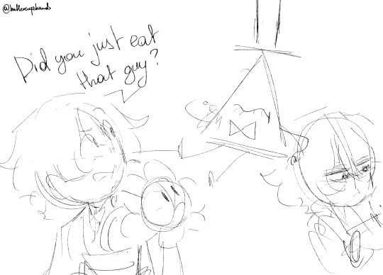


had this "what if I add this new one into the silly guys mix" and immediately got "someone will eat him"
and I wanted to sketch that, of course

I accidentally made that a color and line practice too
#fanart#my art#sketch#comic#comic sketch#shadow milk cookie#bill cipher#scaramouche#wanderer#flowey#shigaraki tomura#otto apocalypse#isat loop#crk#gravity falls#genshin impact#undertale#mha#honkai impact 3rd#isat#just like last big thing - this one gets full set of tags AND IT'S A LOT OF THEM JUST FOR THE FANDOMS AND CHARACTERS#anyway yay another silly guys comic so soon because this yeah#I blame isat ss discord for starting the chain of me looking through crk story and getting curious and NOW I have this little guy on a2#Luocha out there just laughing probably together with Sunday - both on e2 I think it's somehow a thing of those guys#sunday isn't on this list because he's a different kind of fave also I'll fall apart trying to draw so many guys from hoyo games#Otto just chilling knitting with Loop watching while other side is literally fighting *in a way* who knows maybe they will#they can't die there anyway#phew anyway this thing is like 80+ layers bc of the last thing but I liked sketching this#I need to give silly guys a tag....
68 notes
·
View notes
Text
#fandom#fanfic#ao3#ao3 community#creative writing#writeblr#writers on tumblr#artists on tumblr#art#crochet#knitting#knitters of tumblr#woodworking#art and craft#crafts#hobbies#love#tough love#self love#skitshow#absolute skitshow#funny#video#tiktok#meme#k!nk tag#k!nk content#friends#friendship
27 notes
·
View notes
Text
(Explanations of what each event is is under the cut along with some of my ramblings)
This is for the main thing. In the theoretical Discord I'm currently making I feel like a lot of things can be done as little mini events along the way if anyone would want to do that. That way, aside from whatever the main event is, we can still do other stuff throughout the year. A lot of this is just ideas I'm throwing out into the wild so to speak and to see what interests everyone.
I also kinda want there to be something laid back too because I know that fandom, the craft community, and the disabled community all intersect big time so yeah. Feel free to yell at me from the tags I want to see everyone's input/ideas!
A week long event: I feel like this is too quick because these things takes a lot of time, but in the theoretical Discord I'm currently making we can do little weekly prompts/challenges if it interests anybody.
Nanowrimo: This is a month long thing where everyone has a 50k novel to work on and you work on it everyday for a month. Similarly can be done with crafts/fiber arts/textiles where everyone picks a project and we each have a goal to meet each day
A select few months: Ex. June-August,
Gift exchange: Again another one of my theoretical ideas, might be difficult, sounds pretty fun, maybe could be used for a holiday event thing?
Draw/Write in your own style: This is when everyone creates someone off of the same prompt/image, but I'm this case it's probably be the same Base pattern.
Bang Event: Two or more people of different or the same mediums (a crocheter, a pattern maker, a knitter etc) pair up and make whatever based off of each other's work.
Round Robin/Telephone: For those who don't know, a Round Robin is when you pass along a fanfic from one person to another and you all start where the last person left off. Telephone is very similar but like in telephone only the first person who starts the project has and knows the pattern while everyone else doesn't. Again with this it may be hard and require a lot of planning but it's worth the mention.
Teams/Game type event: So teams event if when people are put into teams (team blue or team [specific fandom name]) and you just create as much as possible for whatever theme the group picks. Now Game type events (I actually haven't seen any of these in recent year) is when you do the same thing but each round everyone votes and gives points to each other and who ever has the most at the end wins.
Bingo: A bingo card filled usually with different prompts/challenges that can be customized or just picked at random
Masquerade/Guess The Maker: Everyone has a concealed Identity and everyone else has to guess who made what.
#fiber art#fiber arts#fandom crafts#supernatural#multifandom event#good omens#bbc merlin#knitting#crochet#multi fandom event#fandom event#im just gonna tag those three because i dont want to be annoying in the tags#the equivalent of my throwing spaghetti at the wall and trying to see what sticks#hopefully this doesn't flop 🫠#tumblr polls
28 notes
·
View notes
Text
i wanna post my skip to loafer art but i cant do it knowing ppl are gonna put it on tiktok and pinterest bc itd be like. bringing an invasive species ykwim
#my meds just kicked in so im feeling talkative but truly idk how to explain it#its like. with anything else id be more than happy to introduce it to ppl like monkie kid and mp100. witch hat maybe but its personal to me#but skip to loafer is special to me. and i feel bad for saying this bc other ppl do deserve to watch smth they will enjoy#hell the reason i got into it was bc my friend was kind enough to lend me her copy and i got hooked#its so ironic im saying this esp given how insecure i am abt depicting characters wrong. but i really dont want to look thru the tags#and see them on a 'can i copy your homework' tier list. or ppl getting mad abt why egashira mitsumi and shima cant just be a throuple#its just!! i wont stop you if thats how you like to engage with the show or how you interpret it bc ill just ignore it and leave u alone!!#and theres no objective wrong way of doing it!! and i know that interacting with the work is what forms a community after all!!#but keeping it tight knit is just easier for me bc nobody has to worry abt making each other laugh and we can enjoy it for what it is#fully aware im saying this as someone whos drawn monkie kid art with text post memes and owl house draw the squad templates#but at the same time i just. dont want to explain myself or give ppl reasons why shima and mitsumi are ace coded just bc it 'feels right'#fandom is a communal thing and it feels so hypocritical thinking this. too many conflictng thoughts that idk what to act on#yapping
43 notes
·
View notes
Text
thing is, i'm too much of a gossip to just put down a book i'm not vibing with. i'll continue reading a book/series that i actively hate just because i want to know the tea with a character and her neighbour's boyfriend's best friend. i am too susceptible to the latticework of plot and character to be trusted with my own spare time
#i could be learning to knit and yet#i'm reading and i hate it#not gonna tag any fandoms but y'all know the ones#yalit#lit#am reading#secret library
132 notes
·
View notes
Text
Small psa
I have had a lot of messages and asks from palestinian people. Im neurodivergent and I have a strong sense of what is right and thats is why I want to help by reblogging their asks and their posts. If you see me reblogging posts of palestinian people consider donating even 5$. They really need all the help.
Thanx
#vi thoughts#vi.txt#help palestine#free palestine 🇵🇸#queers for palestine#neurodivergent for palestine#from the river to the sea palestine will be free#random tags that more people would see this#queer#art#blog#knitting#swifties#fandom#us#politics#autism#adhd#very adhd
2 notes
·
View notes
Note
I have Tomodachi Life too, and I have me, my sister, The Movers, Nina and Gabby from Gabby's Dollhouse in the game! I just saw your post, so I just wanted to let you know! 🩵
Hii Heather! Yay that's awesome!! I love that Gabby is there too, she's really like their little sister now 🌟
I just started playing and I put in all the Mover miis. I'm hoping they be friends together before I add Nina's friends and other characters in there. Here's the miis I made of Nina and the Movers!

I think there is a cowboy hat in the game, so I hope to get that for Smitty. And some kind of cap for Dave too haha. Yeah there is a cap option in the Mii customization but I kinda want some of his front hair to stick out lol.
#thank you for the ask!#happinessismagicc#my ramblings#ask#i also have my sona gears & voicemail and the rest are my non-fandom ocs#gears & nina are sweethearts however nina's relationship level is 'completely in love' while gears is 'only just in love' or something lol#and i messed up nina's proposal. oops . partially on purpose but the thing is kinda hard too#i don't want them to be married ngl haha. not until i add peggy and nina can meet her first ....#also voicemail and dave are together and i didn't really expect that but it happened. so..!#i wanna add knit knots warehouse mouse flora claudia olivia peggy wayne idk what's the limit of miis hahah#well i'm rambling in the tags now#miivers
2 notes
·
View notes
Text
TMNT:Cyberspace
This took SO long to finish PLEASE don't flop i worked really hard on these. My last post abt my iteration already flopped :( the turtles are gay this time
also if u noticed they have scars now >:) mwahahaha can't wait to make the fanfic/comic once i do that, which I am totally not procrastinating
#save rottmnt#unpause rottmnt#TMNT: Cyberspace#my iteration#my tmnt iteration#my tmnt au#tmnt#rise of tmnt#rottmnt#save rise of the tmnt#art#rise of the tmnt#rottmnt fandom#ahhh i love my raph sm#she's actually so adorable#also my leo likes knitting cuz hes a bisexual#the trauma made them gay#/j#i put more effort into others than some#also they used to be experiments#you only get to know that bc u looked into tags#you beautiful person#I forgot to give their name things int he background besides leos#whoops#and woah their in rainbow order#oof these tags are long#ok bye#love you! <3
36 notes
·
View notes
Text
Just went through my bbc merlin tag and oh boy, nothing will make me feel more in my heart than doing that. It's a show with a lot of flaws, but that's ultimately its biggest strength. Every character is so wonderful and every single dynamic is so beautiful and tragic. If I could only recommend one show for people to watch for the rest of my life I think I would pick that one.
#i wanna say that bbc merlin deserves the same level of attention that spn gets on here#but this is one of the most thoughtful and pleasant fandoms i've been in and i just don't think it would be like that if the fandom was#that big#i think it's actually kind of the perfect size#because it's big enough to have a plethora of fan content but small enough to still feel like a tight knit community#and the fact that it's so old means that the only people left are the ones who are REALLY insane about it#this has been said before but the fact that the fandom here is as big as it is and so active that the tag always trends on the anniversary#of the finale is a testament to what a wonderful show it is#bbc merlin#shut up mal
6 notes
·
View notes
Text
Born to be boring forced to be really good at murder 😔
#I truly believe Sam was meant to be deeply deeply boring (affectionate)#she was meant for watching nature documentaries and knitting#alas 😔#horror tag#og fandom post tag
16 notes
·
View notes
Text
ngl it's a little terrifying seeing just how many people have started following me recently. i have to start making actually good posts now or something
#Rambles Into The Void#listen going from a pretty small fandom back into the depths of the kirby fandom is.#well it's a little whiplash-inducing#not in a BAD way necessarily but it's like#in a small fandom things are pretty tight-knit yknow. you get used to seeing even the relatively unknown people#even if it's just by looking through the main tags or seeing them in your notes#so having so many people suddenly pour in for something else is just like HUH? WHUH?#i hope y'all enjoy your stay here even if i'm a bit intimidated <3
4 notes
·
View notes
Text
I know the fandom mostly agrees that Jason is that one always unemployed sibling in the family, but let me offer you a slightly enhanced concept - unemployed sibling Jason, who is the busiest sibling in the family.
No one can get hold of him. Like, ever. And it is not like he is lying, he is genuinely always has something else to do! Something random and unexpected, and, honestly, all his family can think is: what the hell?
Bruce, frowning: Remind me again, why the dinner in the circle of the family today doesn't suit your... schedule?
Jason, shrugging: I have a book club evening in the nursing home. We are discussing Margaret Atwood's Penelopiad tonight. Can't miss it. Also, Jennet-
Alfred, confused: Who is Jennet?
Jason: One of the old ladies in the nursing home, duh... Anyway, yeah, Jennet is having a birthday. She would be hella mad if her favourite grandson missed it, you know?
Bruce: ...Jason, you are not her-
Jason: (leaves)
Dick: Hey, wanna join me for tomorrow morning's training?
Jason, sighs: Sounds nice, but I have classes tomorrow.
Dick, confused: Classes? Since when you are enrolled in college?
Jason: Oh, no. I am a substitute teacher in one of the school's around.
Dick: WHAT-
Damian, calling Jason in the middle of the day: Can you pick me up from school? Others are busy, there is an emergency in the town.
Jason: Damn, sorry, kid, but I am not in the country right now. By the way, do you want to talk with your mother?
Damian: ...What that supposed to mean? Where are you?
Jason: I was planning to visit All-Caste, but first decided to meet up with Talia. I am kinda in Egypt right now, anyway.
Damian: ...
Tim, already used to Jason's constant busy status, sighing: I bet you won't agree if I call you on the lunch tomorrow?
Jason: Uh, no. I have plans. But if you tag along with me, we can get lunch together later.
Tim, surprised: ...Okay. What do you have tomorrow? Knitting club? A shift in library?
Jason: Nah, graduation ceremony.
Tim: Right, you are a substitute teacher.
Jason: No, no. My graduation ceremony. I am getting my PHD in literature.
Tim: SINCE FUCKING WHEN-
#Tim: Jason maybe it is time to get a Google Calendar idk#Tim: ...and write us UPDATES ON WHAT YOU ARE UP TO WDYM YOU ARE GETTING PHD#Jason: well it is not like it is my first one lol#Bruce: ??????#Jason: dang forgot to mention that#jason todd#red hood#dcu comics#dc universe#dcu#batman#batfamily#bruce wayne#batfam#dick grayson#damian wayne#tim drake#alfred pennyworth
15K notes
·
View notes
Text
you can make fandom posts for a niche game, but Watch Out
#i was briefly really into a game that has a small but seemingly really close knit fandom here#and i posted for it a bit and got a few followers and a well performing post or two#and i dont dislike the game now. i think its still nice and fun. but the guilt that i dont post about it anymore haunts me#i think the logical solution is to post about it again. but the thoughts i have arent at all what everyone else posts like#like sorry i just enjoy having a boat and free reign to go wherever and dress up how i want. im sorry im not angsty about the actual plot#will you take 1 doodle of my little guy.#<- absolutely silly. why even show up to the fandom tag if i could just HAVE some magician with a boat in ANY other setting. hell i could#i could just write about him on my own. he could escape the fate of being player character oc#id have to rename him if thats the case but thats not a huge problem methinks#<- stream of consciousness style tags that i might delete later :3#my posts B)
0 notes
Text

Hello @skykashi I've been following your blog since 2019 ever since I got into naruto, and your blog always made me smile. but today this post made me sad, as an artist, as a fellow creator.
Please don't use AI art to generate an image an call it your own art. It's obvious to me as an artist that this face and hair was rendered using AI. The zoomed in brush strokes are very muddy, there's no cohesiveness at all. In fact, I'll go ahead and wager that the only part of this painting you did yourself was the flak jacket. I've seen your actual drawings, the ones you painted yourself, and they are lovely! They made me smile whenever I saw them!
But what you're doing is harming the real life artists and reducing all the hours of hard work we put in into creating art.
Using AI art and calling it human made art distorts the perception of non artists about what constitutes as human made art and as a result, the next time they see AI art, it becomes nearly impossible for them to flag it as one.

Realistic Gai for @depressedhatakekakashi thank you for the coffee 🥰
#If you really did this yourself I'd like you to post a Time-lapse video / speed paint / process video#And I'll retract all my words and apologise to you ❤️#I don't want the close knit naruto fandom on tumblr to be plagued with yet another wave of discourse#But lately I've seen the tags being flooded with so much of garbage AI art#That it's extremely annoying and disheartening as an artist
880 notes
·
View notes