#innovative photography techniques
Explore tagged Tumblr posts
Text
How Drones Are Changing the Face of Adventure Photography
The advent of drone technology has revolutionized many industries, but perhaps one of the most visually striking transformations has occurred in the realm of adventure photography. Drones are changing photography in fundamental ways, offering unprecedented perspectives that were once impossible or financially out of reach for most photographers. This article delves into how drones have become…

View On WordPress
#adventure narratives with drones#adventure photography transformation#aerial photography evolution#capturing natural beauty#cinematic drone videos#drone accessibility#drone photography ethics#drone regulations compliance#drone technology impact#drones in adventure photography#dynamic aerial imagery#environmental impact of drones#ethical drone use#exploring with drones#future of drone photography#innovative photography techniques#minimizing environmental footprint#nature&039;s majesty captured#perspectives from above#privacy considerations in drone photography#storytelling enhancement#sustainable photography practices#technological advancements in drones#unreachable locations photography
0 notes
Text
Daily Floral Delight: Origami Transformation of Daisies -- FOTD Jun 20
Check out my latest post for Cee’s FOTD – a patch of #daisies transformed into beautiful origami art using AI. Follow my journey of AI creativity! #AIArt #AIArtwork #AIArtCommunity
Hi all 👋 My latest post for Cee’s FOTD. With Cee recuperating, I’ll be posting flowers daily to give her a bit of floral delight (my version of a bouquet) 💐 Patch of daisies As with my latest Fan Of… post (see link 👇), I’m exploring some DALL-E AI preset styles for my edits. For today, I’ve done an origami transformation; I think these came out quite well. If you follow my blog, you know I’m…

View On WordPress
#AI Artwork#Artistic Inspiration#Creative Photography Techniques#DALL-E#Digital Artistry#Digital Image Transformation#Flowers#FOTD#Hot Mods Art#Innovative Photography#Jez Braithwaite#Nature#OpenAI#Photographic Creativity#Photos#Rugosa Rose#solarpunk#Visual Storytelling
3 notes
·
View notes
Text
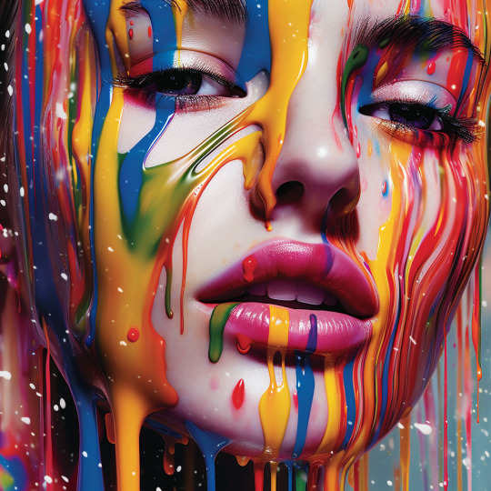
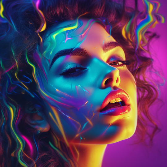
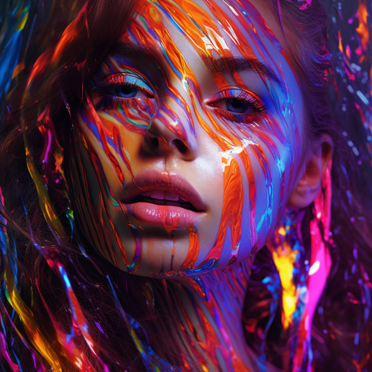
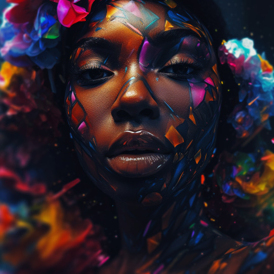
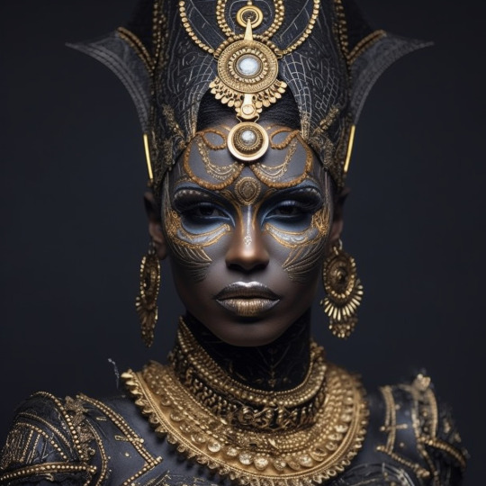
#In the midst of my creative journey#I find myself captivated by the artistry of headshots and the transformative power of artificial intelligence in photography. Each click of#revealing the true beauty and individuality of each subject. As I delve deeper into the world of headshot photography#I embrace the cutting-edge technology of AI to enhance and refine my craft.#With AI by my side#I embark on a new era of photography#where innovation meets human connection. Through my lens#I seek to create captivating headshots that go beyond mere portraits#using AI algorithms to bring out the best in every individual. The fusion of artistry and artificial intelligence opens doors to endless po#allowing me to craft images that truly resonate and evoke emotion.#Join me on this exhilarating journey as we explore the intersection of headshots#AI#and new photography techniques. Witness the transformation as pixels come to life#unveiling the unique stories and personalities that lie within. Together#let's embrace the ever-evolving world of photography and celebrate the boundless creativity that arises when human ingenuity meets the powe#Headshots#AIinPhotography#NewPhotographyFrontiers
3 notes
·
View notes
Text
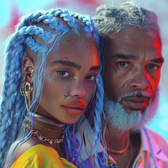
2024's Must-Have Reads: Discover the Latest in Physical Books – Updated Pricing!The Physical Books 2024!
Why These Books Are a Must-Have This Year: Our 2024 collection, featuring “STORM,” “The Vibrational Cure,” and “The Birth of a Genre,” is curated to provide not just reading material but immersive journeys. Whether you seek a transformative personal experience with “The Vibrational Cure,” an artistic and cultural exploration in “The Birth of a Genre,” or a creative coloring adventure in “STORM,”…
View On WordPress
#Art and Photography#Artistic Collaboration#creative empowerment#Creative Transformation#Cultural Commentary#Cultural Innovation#Inspirational Reads#Literary Art#Manifestation Techniques#Manifesting Dreams#Mindfulness Coloring#Music and Poetry#personal growth#Self-Improvement Books#Unique Coloring Books
0 notes
Text

Once upon a time in the bustling souks of Marrakech, there lived a talented young chef named Ahmed. Ahmed was known far and wide for his culinary prowess, particularly when it came to crafting the most mouthwatering Moroccan dishes.
One sunny afternoon, as Ahmed was browsing the vibrant market stalls for fresh ingredients, he stumbled upon a curious sight—a crate overflowing with the juiciest lemons he had ever seen. Inspired by this fortuitous find, Ahmed decided to create a new recipe that would showcase the bright and zesty flavors of these magnificent lemons.
Heading back to his kitchen, Ahmed set to work preparing his masterpiece—Moroccan Lemon Chicken Oven Roasted, or Djaj Mqualli as it was known in his homeland. He carefully seasoned the succulent chicken with a blend of aromatic spices, including cumin, paprika, and turmeric, before generously squeezing fresh lemon juice over the top.
As the chicken roasted in the oven, filling the air with tantalizing aromas, Ahmed couldn't help but hum a cheerful tune. Little did he know, his melodious singing had attracted the attention of a mischievous little genie who had been lurking nearby.
Intrigued by the delicious scent wafting from Ahmed's kitchen, the genie decided to pay him a visit. With a mischievous twinkle in his eye, the genie waved his magic wand and cast a spell over the chicken, infusing it with an extra dose of lemony goodness.
When Ahmed opened the oven to check on his creation, he was amazed to find that the chicken had transformed into the most delectable dish he had ever laid eyes on. Tender and juicy, with a tantalizing citrus flavor that danced on the taste buds, it was truly a feast fit for a sultan.
Word of Ahmed's extraordinary Moroccan Lemon Chicken Oven Roasted spread like wildfire throughout Marrakech, and soon people from far and wide were flocking to his restaurant to sample the magical dish for themselves. From that day forward, Ahmed's Djaj Mqualli became a beloved staple of Moroccan cuisine, cherished by all who had the pleasure of tasting it. And as for the mischievous little genie? Well, let's just say he was never far from Ahmed's kitchen, always eager to lend a hand—or a sprinkle of magic—whenever needed.
#1. Moroccan cuisine#2. Homemaking#3. Culinary journey#4. North African cooking#5. Traditional recipes#6. Innovative creations#7. Spice markets#8. Cultural heritage#9. Family traditions#10. Tagine#11. Harira soup#12. Moroccan pastries#13. Exotic flavors#14. Cooking techniques#15. Culinary exploration#16. Authentic dishes#17. Recipe collection#18. Food photography#19. Gastronomic adventure#20. Flavorful experiences
1 note
·
View note
Text
Mises à Jour du Micrologiciel et des Manuels d'Utilisation
Maximisez le Potentiel de Votre Appareil Photo : L’Essentiel des Mises à Jour du Micrologiciel et des Manuels d’Utilisation En tant que formateur en photographie, j’ai constaté avec surprise et régularité que de nombreux étudiants en photographie ne prennent pas le temps de lire le manuel de leur appareil photo ni de mettre à jour leur micrologiciel (firmware). Ces aspects, souvent négligés, sont…

View On WordPress
#Académie Photographe Gatineau#Appareil photo#Apprentissage de la photographie#Communautés de photographes#Compatibilité des équipements photographiques#Conseils techniques pour photographes#Entretien des objectifs#Équipement de studio et manuels#Études de cas en photographie#Évolution des techniques photographiques#firmware#Forums de photographie en ligne#Guides d&039;utilisation de flash#guides de l&039;appareil photo#Innovation en photographie#maintenance de l&039;appareil photo#Maintenance de l&039;équipement photographique#manuels d&039;utilisation#Mise à jour du firmware des accessoires#Mise à jour du micrologiciel#mises à jour de caméra#Mises à jour de l&039;objectif#optimisation de l&039;appareil photo#Optimisation des accessoires de photographie#Photographie#Ressources d&039;apprentissage en photographie#Sécurité des mises à jour de firmware#Techniques avancées de photographie#Techniques d&039;éclairage en studio#Témoignages de photographes
0 notes
Text

Photography in Turkey has a rich and storied history that spans more than a century, intertwining cultural heritage with technical innovation. The first cameras arrived in the Ottoman Empire in the mid-19th century, brought by European diplomats, traders, and travelers. One of the earliest known photographs of Istanbul dates back to 1843, taken by French photographer Joseph-Philibert Girault de Prangey. His daguerreotypes captured the splendor of Ottoman architecture, sparking local interest in the medium and laying the groundwork for photography in Turkey.
By the late 1800s, photography studios were established in Istanbul, often run by foreign photographers or members of Turkey's Armenian, Greek, and Jewish communities. The Abdullah Frères—an Armenian photography studio founded by the Abdullah brothers—became famous for their portraits of the Ottoman elite and the royal family. Their images documented the lives of sultans, officials, and foreign dignitaries, marking an era when photography became a respected art form in Ottoman society. The Abdullah Frères' work was prized not only for its artistic quality but also for its technical expertise, as they experimented with various methods and styles, often using hand-colored techniques to add depth and vibrancy to their portraits.
With the establishment of the Republic of Turkey in 1923, photography took on a new role as a means to capture and celebrate the nation's evolving identity. Mustafa Kemal Atatürk, the founder of modern Turkey, recognized photography’s power to promote cultural transformation and modernization. Photographs from this period show an emerging vision of Turkey, where Western-style clothing, industrial development, and women’s newfound roles in society were prominently featured. Photography served as a bridge between tradition and modernity, documenting the social reforms and aspirations of a young republic.
In the mid-20th century, Turkey saw the rise of influential Turkish photographers who brought a uniquely Turkish perspective to the medium. Ara Güler, often referred to as "The Eye of Istanbul," is perhaps the most renowned Turkish photographer of this era. Born in Istanbul in 1928, Güler’s black-and-white images of Istanbul’s streets, fishermen, and iconic landmarks captured the city’s soul during a period of rapid change. His work, rich in emotion and nuance, turned Istanbul into a universal symbol of nostalgia and resilience, earning him international acclaim. Güler's photographs went beyond mere documentation; they told stories, preserving the essence of Turkish culture at a time when modernity was transforming traditional ways of life.
Today, contemporary Turkish photographers like İlhan Maraşlı continue this legacy, blending artistry with an appreciation for Turkey’s natural and cultural landscapes. Maraşlı's work is celebrated for its simplicity and beauty, often focusing on the quiet, unadorned scenes of everyday life in Turkey. His images evoke a sense of tranquility and reverence for Turkey’s landscapes, villages, and people, embodying the philosophy that "simple is beautiful." This minimalist approach reflects a broader trend in modern photography, where moments of stillness and simplicity are valued as much as grandeur or drama.
In recent years, the digital revolution has further expanded the horizons of Turkish photography, making it accessible to new generations of artists. Social media platforms have allowed photographers to reach global audiences, showcasing Turkey’s rich heritage and diverse landscapes through vibrant imagery. As photography continues to evolve in Turkey, it remains a powerful means of expression and a testament to the country’s enduring creativity and cultural depth.
Historic Captured Eras
27 notes
·
View notes
Text


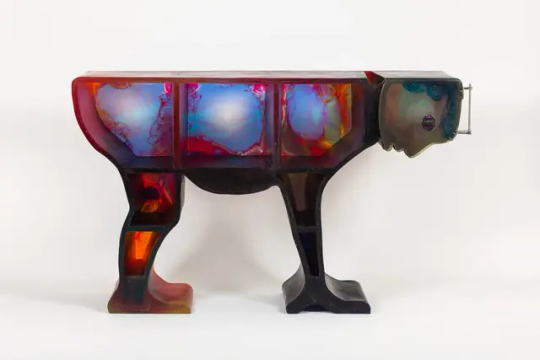

Gaetano Pesce (8 November 1939 – 3 April 2024)
Moving against the stream of rational, functional modernism in the 1960s and early 70s, Mr. Pesce experimented with materials and production methods to create furniture pieces imbued with political or religious meaning for brands from Cassina to B&B Italia.
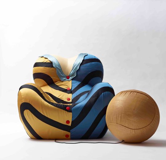
Many would go on to become icons of Italian design including the Up5 chair – an innovative vacuum-packed chair designed to resemble a female prisoner – which he designed for B&B Italia precursor C&B.
Pesce moved to New York in 1983 and began to move away from mass production to create "standardised series" in everyday materials like resin, adapting conventional production techniques to create varied and imperfect outcomes.
The result are pieces such as the 1884 Pratt chair, which toe the line between functional design and decorative art, helping to create a new category that would later become collectible design.
Mr. Pesce was born in the Italian city of La Spezia in November 1939, only two months after the start of world war two.
As was common at the time, he trained in both architecture and design, studying first at the University of Venice and later at the Venice Institute of Industrial Design.
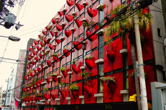
Among his architecture projects is the Organic Building in Osaka from 1993, with its plant-covered facade made of orange fiberglass that served as a precursor to today's vegetation-covered green walls.
But Mr. Pesce's most pioneering and well-known work happened in the world of design. In the late 1960s, he became one of the leaders of Italy's Radical Design movement, rejecting modernism's rigid focus on forms dictated by function.
Instead, Pesce focused on the idea that functional objects, much like art, could carry a deeper message.
One of the most famous examples is the controversial Up5 chair from 1969, which manufacturer B&B Italia describes as "the first product of Italian design with a political meaning".
Rest In Power !
"Up 5 & 6" Dressed Up Chair & Ottoman, 1969 – 2014, Polyurethane foam, fabric, Height: 40.5 in (102.87 cm)Width: 47 in (119.38 cm)Depth: 51 in (129.54 cm)Seat Height: 16 in (40.64 cm),
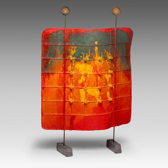
“Square Airport Lamp” (1986/1994). Photography by Elizabeth Carababas/The Future Perfect. Light sculpture consisting of a flexible rubber membrane studded with small light bulbs. Although made from a mold, no two lamps are alike, due to the imperfections that arise from the hand-mixing and pouring of colored urethane. H 92 - W 65 Cm,
"Feltri" Armchair for Cassina, 1980 -1989, Felt, Fabric, Resin, Width: 156 cm, Depth: 80 cm, Height: 129 cm, Seat height:42 cm, Courtesy: Oldera,
"Pratt Chair #7," 1984 2018 (purple), 2018, Transparent polyurethane, :93 x 53 x 53 cm. (36.6 x 20.9 x 20.9 in.),
"The Cabinet of The Tired Man," 2018, Photo: Courtesy of Salon 94 Design and Gaetano Pesce,
"Tramonto a New York" three-door screen, for Cassina, Made of coloured resin, hinges and feet in burnished brass, Width: 221, Height: 199,
"Organic" Building, Osaka, Japan, Completed in 1993 to embody the corporate ideal of Oguraya Yamamoto Co., Ltd,
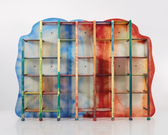
"La In-Portante" Modular Bookshelf from the "Abbraccio" Series, 2010. Comprising 57 adjustable polyurethane resin shelves. Produced by Le Fablier, Italy. Polyurethane resin, painted wood, lacquered metal, 86½ x 118¾ x 16⅞ in. (219.7 x 301.6 x 42.6 cm) Courtesy of Sotheby's,
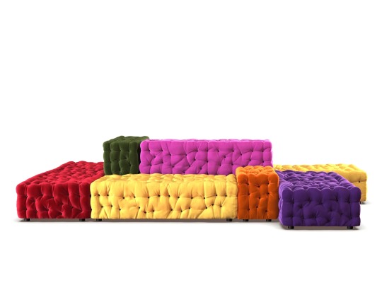
La Michetta Modular Sofa,Compostion of 8 by Meritalia, Structure in Lacquered Wood Seat with Elastic Belts, Flexible Polyurethane & Fiberfill Padding, Dimensions: W370 x D245cm,
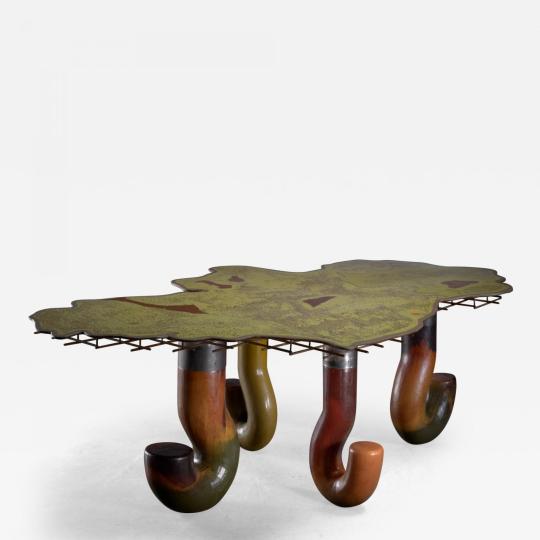
Unique 'Ireland' table, Made of polyurethane and metal. The table was made and exhibited in 1996 by Gallery Mourmans, Knokke-Zoute, Belgium. It was part of a series of 'EU tables', where all 15 member countries were represented as a table, in this case Ireland. The top of the table has the shape of the outlines of the country and it stands on legs in the shape of question marks. W.80.71 in;H.28.74 in;D.57.09 in; (W.205 cm;H.73 cm;D.145 cm), Courtesy: Incollect.
#art#design#sculpture#furniture#seat#chair#forms#cassina#B&B#polyurethane#incollect#ireland#modular#bookshelf#table#fiberglass#sofa#gaetano pesce#rip#rip gaetano pesce#screen#iconic#up5#UP6#political#pratt chair#feltri#tramonto#new york
61 notes
·
View notes
Text
Most of my photos were from 2012 to 2016. I have learned a lot since then. My photo restoration hobby has improved my image editing skills in general. And I was curious if I tried editing one of my photos from scratch if I could improve upon my original edit from years ago.
This is my friend Nicole.

( @nicolebelongs I hope you don't mind being my guinea pig for this.)
This is just a direct output of the original RAW file. RAW files are typically flat by nature so you have more latitude when processing and editing.
This is my original finished edit from 2016.

I actually made a pretty big lighting mistake when shooting this photo. A beauty dish can cause harsh reflections on makeup and so Nicole's forehead bounced all that light directly into my camera. I was still learning back then and didn't know anything about makeup. All that was required was angling the dish a few degrees up or down, which feels like a pretty silly mistake all these years later.
And here is my 2023 edit. I did not reference the 2016 image until after I finished.

The main priority was the glare on the forehead, but I think this is much more balanced overall as well. I also tried to fix the weird neck shadow and the lack of light in the eyes. I probably should have used a reflector originally, but thankfully Photoshop has a solution to almost any photography blunder. I removed some vellus hairs on the edge of the face, as that is not something you would notice in real life, but the camera and lights can exaggerate them. I'd also like to say I love the new remove tool. Getting rid of flyaway hairs was such a monotonous pain in the ass before and that thing just zaps them with a click.
I am also trying to learn new editing techniques I was never good at. There is a retouching technique called "dodging & burning" that I had trouble with back in the day. Mostly because finding advanced tutorials can be difficult. Much of the content on YouTube focuses on beginner techniques.
Dodging & burning was originally innovated by Ansel Adams back in the days of film. He would block portions of his negatives for a second or two so those areas would develop darker. Or he would let sections expose longer so they would be brighter. It was basically analog Photoshop. You can see a neat video of his darkroom here.
While Ansel mostly did landscapes, portrait photographers of the digital age utilize dodging & burning to help bring out dimension in the face. It's quite similar to makeup contouring, actually. It is very hard to perfectly light every nook and cranny on a face and many portrait lenses are slightly telephoto. Longer lenses compress faces to remove distortion, but you end up losing three-dimensionality as a tradeoff.
My first attempt dodging and burning did not go well but I played with this photo for a few hours trying many different approaches and I think I landed on something I like. But I have been staring at it for way too long, so it is hard for me to look at it objectively.

I do wish we could all look at this on the same display. Green is notoriously difficult to keep consistent from screen to screen.
In any case, there are a dozen subtle things I did with my upgraded knowledge that may not be noticeable individually, but I'm hoping it all adds up to a better finished result.
And I guess we'll see if there is a consensus regarding the dodging & burning. Either good, bad, or just... different.
89 notes
·
View notes
Text

The daguerreotype portrait of Charles Dickens, taken in about 1852 by the renowned photographer Antoine Claudet, captures the iconic author during a pivotal time in his literary career.
This early photographic technique, known for its sharp detail and reflective quality, provides a unique glimpse into Dickens's character. In the image, he is often depicted with a thoughtful expression, highlighting his introspective nature and the depth of his writing.
Claudet's studio was notable for its innovative approach to portrait photography, attracting prominent figures of the time. Dickens, already famous for works like "Oliver Twist" and "David Copperfield," used this opportunity to present himself to the public in a new medium, bridging literature and visual art.
The portrait not only serves as a historical document but also reflects the growing popularity of photography in the mid-19th century.
Today, this original daguerreotype is housed in the collection of the Library Company of Philadelphia, emphasizing its significance in American cultural history as well.
The image not only immortalizes Dickens's likeness but also symbolizes the enduring impact of his literary legacy, as well as the evolution of portraiture during this transformative period.
10 notes
·
View notes
Text
Great Masterwort: FOTD Dec 31 with Magical AI Artistry
Step into Jez's world where photography meets AI magic! 🌼✨ Explore our frosty days warmed by the sunny charm of Great Masterwort. See the transformation on our latest FOTD Dec 31 feature. #AIArtistry #PhotosByJez #aiartwork
Hi all 😃 My latest post for Cee’s FOTD. I am delving into my archives for warm, sunny shots during these frosty days. The Great Masterworts featured over the next couple of days are white (those last featured were pink); this led to a different feel for the images once enhanced. Any of you following my blog, will know I’m currently working on a project fusing my own photography with AI…

View On WordPress
#AI Artwork#Artistic Inspiration#Creative Photography Techniques#Digital Artistry#Digital Image Transformation#Flowers#FOTD#Hot Mods Art#Innovative Photography#Jez Braithwaite#Nature#OpenAI#Photographic Creativity#Photos#Summer#Visual Storytelling#warmth#Wildflowers
2 notes
·
View notes
Text

The Evolution of Bridal Makeup: From Traditions to Trends
Bridal makeup has always been an essential part of wedding preparations. Over the years, the way brides approach their big day has undergone significant transformation. From classic traditions rooted in culture to modern trends shaped by technology and social influence, bridal makeup is no longer just about looking good—it's about expression, emotion, and artistry.
In recent years, bridal makeup in places like Nagercoil and across India has seen tremendous innovation. Artists have started blending classic techniques with contemporary styles, customizing each bride's look based on personality, attire, and theme. For anyone searching for a professional who understands both tradition and trend, this curated list of top bridal makeup salons in Nagercoil is a perfect place to start.
A Cultural Canvas: The Origins of Bridal Makeup
Bridal makeup finds its roots in cultural identity. While styles and products vary by geography, the universal idea of enhancing the bride’s natural beauty has always been key. Traditionally, makeup signified more than adornment; it symbolized prosperity, purity, and marital bliss.
In early eras, natural pigments, oils, and herbal pastes were used. Ingredients like turmeric for skin glow, kohl for eyes, and sandalwood paste for calmness and fragrance were the norm. These practices were passed down through generations, becoming as integral to weddings as the ceremony itself.
Transitioning into Modern Times
As global beauty standards began influencing local practices, there was a noticeable shift. Western bridal trends like contouring, matte lipsticks, and airbrush foundations became more common. Salons upgraded their techniques, imported products, and adapted their offerings.
This evolution didn’t replace tradition—it refined it. Now, it's common to see brides wearing traditional attire with modern makeup aesthetics. The result? A stunning fusion that celebrates both heritage and individuality.
The Role of the Makeup Artist
A bride’s transformation goes far beyond brushes and palettes. Makeup artists today are more than just beauty professionals—they’re visionaries who interpret a bride’s dreams and turn them into reality. Their expertise lies not only in technique but also in personalization.
Makeup artists:
Help brides choose the right look for their facial structure and skin tone
Balance colors with outfits, jewelry, and overall wedding theme
Ensure the makeup is long-lasting, camera-ready, and comfortable
Top-tier artists also consider the emotional state of the bride—making sure the process is calming, enjoyable, and memorable. Their influence often extends beyond the makeup chair to the overall energy of the bridal preparation.
Types of Bridal Makeup and When to Use Them
Each bride has unique preferences and needs. Here are the most popular bridal makeup types used today:
1. HD Makeup
High-definition makeup ensures flawless results both in person and on camera. Ideal for day-long events where photography and videography are essential.
2. Airbrush Makeup
This technique uses air pressure to spray makeup, creating a light, even layer. It’s sweat-proof, smudge-proof, and excellent for humid climates.
3. Matte Finish Makeup
Perfect for brides who want a soft, non-shiny appearance. Best suited for indoor weddings and subtle aesthetics.
4. Dewy Finish Makeup
Offers a glowing, radiant look. Works well with outdoor or garden weddings and is ideal for evening functions.
5. Mineral Makeup
Free of harsh chemicals, this is great for brides with sensitive skin. It offers light coverage with a natural finish.
Color Theory in Bridal Makeup
Makeup is a form of art, and understanding color theory can make or break a look. Here's how professionals use it:
Contrasting Colors: Complement the eye color or wedding outfit for a balanced look. For example, green eye shadow can make brown eyes pop.
Monochromatic Palettes: Use similar shades for eyes, lips, and cheeks to create a cohesive, elegant appearance.
Warm vs. Cool Tones: Artists evaluate the bride’s undertones to decide if warmer peaches or cooler pinks would suit her better.
Colors not only enhance features but evoke emotions. Reds show power and love; pinks highlight playfulness; gold symbolizes tradition and luxury. Skilled makeup artists use this understanding to mirror the mood of the event and the bride's personality.
How Bridal Makeup Has Become a Statement
Modern brides aren’t afraid to speak through their style. Makeup today is a voice—whether it’s through bold lips, colorful eyeliners, or artistic eyeshadows. Social media platforms like Instagram and Pinterest have fueled this revolution, exposing brides to global trends.
There’s also more inclusivity now. Salons are embracing all skin tones and facial features, ensuring every bride feels seen and celebrated.
Grooming the Entire Experience
Bridal makeup is now part of an experience. Many salons offer packages that include:
Pre-wedding facials
Hair styling and extensions
Saree/dupatta draping
Eyebrow and nail care
These packages take the pressure off brides, making sure everything—from skin prep to the final touch-up—is handled by professionals.
Final Thoughts: Blending Tradition, Creativity, and Color
The journey of bridal makeup from cultural symbolism to artistic expression is nothing short of fascinating. It's no longer just a pre-wedding ritual; it's a way for brides to tell their story, express their identity, and shine in their own light.
And behind every glowing bride is a skilled artist, a thoughtful palette, and a touch of color magic.
For those stepping into this journey soon, you can explore the top bridal makeup salons in Nagercoil to find professionals who bring the perfect blend of heritage, trend, and talent to your big day.
#bridalmakeup#indianbride#weddingmakeup#makeupartist#bridalbeauty#weddinglooks#glammakeup#traditionalbridelook#bridegoals#weddingaesthetic#beautyblog#makeuplover#ethnicfashion#southindianbride#weddinginspo#bridalmakeuplook#makeuptrends2025#bridestyle#weddingvibes#bridalmua
5 notes
·
View notes
Text

Google "who invented Ombre' hair?" and the first names that comes up is Aaliyah & Tre' Major!
The origins of the ombré hair technique are unclear, but the word "ombrer" is French for "to shade". The earliest written record of the word in France is from 1671, and in England it dates back to 1661.
The ombré hair technique became popular in the early 2000s after singer Aaliyah had her hair dyed in a gradual fade from dark roots to lighter ends. Aaliyah's hairstylist, Tre Major, is credited with creating the innovative style.
Happy Birthday to Tre' Major today!!
Photography in this post from Jeff Dunas.
7 notes
·
View notes
Text
Yvette Heiser Texas: A Complete Guide to Mastering Phone Photography
In the world of photography, the evolution of smartphone technology has made it easier than ever for both amateurs and professionals to capture stunning images. One person who has embraced the power of mobile photography, particularly in the culinary realm, is Yvette Heiser Texas – All You Need to Know about Phone Photography, a Texas-based photographer known for her incredible phone-based food photography. Whether you’re an aspiring photographer or simply someone who loves taking food photos for social media, Yvette’s tips and techniques can help elevate your skills. In this complete guide, we’ll explore how to master phone photography through the lens of Yvette Heiser’s expertise, focusing specifically on the art of food photography in Texas.

The Rise of Phone Photography in Texas
Texas, with its vibrant food scene ranging from classic BBQ to innovative Tex-Mex and diverse fusion cuisine, provides the perfect backdrop for phone-based food photography. The state’s culinary offerings are diverse, and so too are the opportunities to experiment with phone photography. Yvette Heiser, a professional photographer from Texas, has been at the forefront of this shift, demonstrating that high-quality food photos don’t need expensive cameras or advanced technical skills—just a well-composed image captured with the right smartphone. Smartphone technology has improved dramatically over the past few years. With advanced lenses, computational photography features, and powerful editing apps, today's phones are equipped to produce professional-grade images. Key Techniques for Mastering Phone-Based Food Photography
If you're interested in mastering Yvette Heiser — Exploring Phone-Based Food Photography in Texas, food photography like Yvette Heiser, here are some key tips and tricks that will help you get started:
1. Lighting Is Everything
One of the most important elements of any good photograph is lighting. In food photography, natural light is often the best choice. Yvette Heiser is known for utilizing soft, diffused light to make her food photos appear vibrant and appetizing. Natural light highlights the textures and colors of the food, making it look fresher and more appealing. If you're shooting indoors, try positioning your food near a large window to take advantage of the available light. Avoid harsh direct sunlight, which can create unflattering shadows and overly bright spots. If you’re shooting outdoors, the golden hour—just before sunset or after sunrise—is the perfect time for soft, warm light.
2. Focus on Composition
Composition is key to creating a well-balanced image. Yvette Heiser emphasizes the importance of framing the shot to create visual interest. One popular technique she often uses is the "rule of thirds," which involves dividing the image into three equal parts both horizontally and vertically. The subject of your photo, whether it's a plate of food or a single dish, should be placed along these lines or at their intersections to create a more dynamic and visually appealing photo.In addition to the rule of thirds, consider experimenting with different angles. Top-down shots work well for dishes like bowls, flatbreads, and any spread-out foods, while close-up shots from a lower angle can highlight textures and layers in more three-dimensional dishes, like burgers or stacked tacos.
3. Editing Your Photos
After capturing your shot, the next step is editing. While Yvette Heiser’s raw photos are incredible on their own, editing is often necessary to make the final image stand out. Fortunately, there are a number of editing apps available for smartphones that can help enhance your photos, even without professional editing software.Apps like Snapseed, VSCO, and Lightroom allow you to fine-tune elements such as brightness, contrast, saturation, and sharpness. When editing food photos, it’s important to keep the colors vibrant and true to life while avoiding over-saturation or overly dramatic filters that can make the food look unnatural.
4. Pay Attention to Details
In food photography, the details matter. Whether it's a garnish, the drips of sauce, or the steam rising from a hot dish, small touches can make your photo feel more realistic and immersive. Yvette Heiser is a master at capturing these tiny details, which help to tell the story of the food.If you're photographing a dish, consider adding texture through props like cutlery, napkins, or even a wooden board. These props can add context and tell a story, making the photo more engaging. The angle and placement of these elements can also help highlight the food in an interesting and dynamic way.
5. Storytelling with Food
One of the key aspects of Yvette Heiser’s approach to phone-based food photography is storytelling. She doesn’t just take photos of food—she captures moments. Whether it’s a shot of a chef preparing a dish or a close-up of someone taking a bite of a delicious taco, Yvette’s images evoke a sense of connection between the viewer and the food.To incorporate storytelling into your own food photography, think about the emotion you want to convey. Are you showcasing a festive meal with friends or a quiet, intimate moment with a cup of coffee? Your composition, lighting, and props should all work together to communicate this narrative.
Conclusion
Mastering phone-based food photography, especially in a place like Texas, offers a chance to capture the essence of the state's culinary diversity and share it with the world. By following the tips shared by Yvette Heiser, you can create vibrant, mouth-watering photos that reflect your love for food and photography. Remember, phone photography is about creativity and experimentation. The more you practice, the better you’ll get at capturing those delicious moments. Whether you’re snapping photos for social media or simply documenting a meal, these techniques will help you elevate your food photography to new heights.
#camera#wedding#moments#pictures#childphotography#photographer#photographytips#yvette heiser#photography#events
7 notes
·
View notes
Text


The 70s and 80s Through Gil Rigoulet’s Lens
Beginning his career in 1975, he describes how “the wind of ‘68 was still blowing,” but he recognized that “old ways of doing things had to change.” This sense of upheaval and curiosity drove him to use his Nikon as a “passport to gain access to this world in transition.”
His early work captures the energy of the era, from the bustling streets of Naples to the stark contrasts of Chicago in 1988. He notes, “The street was the best window,” and his images reflect this intimate perspective, blending traditional and innovative techniques.
Over the years, Rigoulet has collaborated with major publications like Le Monde and showcased his work internationally. His unique ability to merge documentary with artistic expression remains a hallmark of his photography.
Special thanks to Gil for allowing me to share his photos with you.
All images © Gil Rigoulet @gil_rglt were selected from the following series: ‘My Eye on the 70s-80s’, ‘Naples 81’, ‘Chicago 88’, ‘England 70s-80s’, ‘Quebec 83’, and ‘France 70s-80s’.
8 notes
·
View notes
Text
Photography and Films Production House
Smokestudioz: Capturing Moments, Creating Memories
In a world where every moment is fleeting, Smokestudioz stands as a beacon of creativity and professionalism in the realms of photography and film production. Established with the vision of immortalizing memories, Smokestudioz has carved a niche in the industry by blending artistry with technology. The company offers a wide range of services, catering to both personal and professional needs, from event photography to full-scale film production.

A Vision Driven by Creativity
At Smokestudioz, the focus is on telling stories through visuals. Whether it's a wedding, corporate event, product launch, or a short film, the team at Smokestudioz ensures that every project is crafted with a unique touch. The photography team captures every emotion, every moment, and every detail with the utmost precision, while the film production crew brings those moments to life through expert direction, cinematography, and editing. Smokestudioz goes beyond simply taking pictures or shooting films—they create an experience that resonates long after the camera stops rolling.
Services That Speak Volumes
The services offered by Smokestudioz are as diverse as their clients. For weddings and personal events, they offer stunning photography that encapsulates the essence of each occasion. Every candid smile, every joyful tear, and every shared glance is carefully documented, creating timeless keepsakes for the couple and their families.
On the corporate side, Smokestudioz offers tailored solutions for businesses looking to make an impact. Whether it’s through promotional videos, product photography, or corporate films, their work helps brands convey their message powerfully and professionally. The team’s attention to detail ensures that each frame highlights the essence of the brand, helping businesses leave a lasting impression on their audience.
For film enthusiasts, Smokestudioz brings cinematic dreams to life. From scripting and storyboarding to shooting and post-production, the company specializes in full-scale film production. With state-of-the-art equipment and a talented team of filmmakers, Smokestudioz has the expertise to transform ideas into high-quality films that entertain, inspire, and educate.
A Commitment to Innovation
Smokestudioz continuously pushes the boundaries of creativity and technology. Their commitment to staying on top of the latest trends in photography and film production means they’re always experimenting with new techniques, tools, and technologies. From aerial drone shots to 4K resolution videos, the company incorporates cutting-edge methods to ensure each project exceeds client expectations.
The team’s passion for their craft is evident in every project they take on. They understand that every client is unique, and that’s why they take a personalized approach to every shoot, ensuring that the final product reflects the client’s vision, goals, and aspirations.
The Smokestudioz Experience
One of the key differentiators of Smokestudioz is their dedication to providing an exceptional experience from start to finish. The team works closely with clients to understand their needs, preferences, and desired outcomes, creating a collaborative environment that ensures a seamless process. Whether you’re working on a small personal shoot or a large-scale production, Smokestudioz’s attention to detail, professionalism, and creativity guarantees an unforgettable experience.
From the moment clients reach out to the final delivery of the project, Smokestudioz maintains open communication, ensuring that all expectations are met and exceeded. The company’s commitment to excellence is what has earned them a reputation as one of the leading photography and film production houses in the industry.
A Reputation Built on Trust
Smokestudioz has quickly established itself as a trusted name in the world of photography and film production. Their portfolio speaks for itself, showcasing a diverse range of projects and satisfied clients. Whether it's capturing the joy of a wedding day or producing a high-quality corporate video, Smokestudioz’s work consistently reflects their passion for storytelling and dedication to excellence.
Through their artistry, technical skill, and unwavering commitment to quality, Smokestudioz has earned the trust of individuals, businesses, and filmmakers alike. They are more than just a production company—they are partners in bringing stories to life, ensuring that every project they undertake is as memorable and impactful as the moments they capture.
For more information, visit our website or contact us on:
Website: https://www.smokestudioz.com/
E-mail: [email protected]
Contact us : +91-9910429029, +91- 9736303229
3 notes
·
View notes