#idk what's going on with the font sizes here
Explore tagged Tumblr posts
Text


pairing: robin buckley x fem!reader
summary: robin falls head over heels for the cool girl renting horror movies at family video. steve can’t believe her awkward shyness is actually landing her a date, but he’s happy for her nonetheless.
word count: idk kinda short lol under 1K
notes: just wanted to write a little blurb, then it turned into something else, so enjoy this short little meet cute with robin ♡
normal sized font below!

Robin really is that love at first sight kinda girl.
She’s the type of girl to be busy sorting tapes at family video, when you walk in, all pretty femininity and mysterious aura around you. And suddenly she doesn’t know what to do with herself. She doesn’t know where she is, why she’s there, hell, she probably wouldn’t be able to tell you her name if she asked.
She doesn’t stop staring at you, not when you enter and not when you walk over to the horror section to pick something out. Only when Steve nudges her in her side, she snaps out of it, looking more flustered than ever.
“Dude, can you not?”
“Sorry man, it just— looked like you were falling asleep with your eyes open! What’s with you anyways?”
Robin doesn’t respond, simply averting her eyes to the cash register and hoping Steve doesn’t pry any further.
Which would have worked, if you weren’t talking to her right now.
“I’m sorry, can I—“
“Yes! Yes, absolutely, you can…” Robin trails off, realising she hasn’t even let you finish your request. Her own eagerness embarrasses her to no end, her face heating up and her cheeks now closely resembling the colour of a tomato.
To her surprise, you giggle. You’re not awkward about it at all, which somehow makes her fall for you even harder.
“I was gonna ask what the latest time would be when I’d be able to return this.” you smile, and the blonde girl is certain it’s the most beautiful thing she’s ever seen.
“Oh! Yeah, totally, no problem! It’s uh— a great choice, by the way. I love friday the 13th, sooo good, all that horror stuff, a huge fan—“
“A week.” Steve interrupts her rambling.
“Huh?” Robin turns to her friend.
“To answer her question, since you’re too busy being head over heels over here.”
You chuckle again, and Robin genuinely thinks her head is going to explode. Not only is her best friend making fun of her in front of you, but you’re not even making her feel bad about it. It’s like you find it cute or something. How crazy is that?
“Cool, I’ll just uh,” you hold up the tape, “rent this one then.”
Robin rings you up, her hands moving faster than her mind, and she hopes you don’t notice the slight shakiness in them. It’s not every day the prettiest girl in the whole world shows up at her job, so she’s not exactly prepared.
“Thanks,” you take the tape from her along with the receipt, your fingers touching slightly when she slides them over. Now you’re the one who’s getting the butterflies.
“So, you said you were a fan of horror movies?”
Robin nods enthusiastically, while Steve has to bite his tongue to hold back from saying that that’s the biggest lie ever. Robin isn’t a coward, not at all, but she’s the worst at scary movies. She’s just saying all this to impress you. She doubts it’s working though.
“Well, I was gonna watch this alone, but…” you grab a pen off the counter and scribble down your number on the receipt. “If you feel like watching it together, give me a call…” you pause to read her name tag. “Robin.” You smile again. “Nice name.”
“T-Thanks! You uh, you too!”
“Thanks, even though I… Haven’t told you yet.” You write your name down next to the number. “Now you know.”
“Huh…” She reads it over, not being able to keep herself from smiling like she’s sunshine incarnate. “That is a really nice name though.”
You grin, grabbing the tape off the counter and stuffing it in your bag. “Well, Robin, I’m free this Friday, if you wanna take me up on the offer.” You start walking backwards and give her a quick wave. “See y’around.”
She waves back, although more hesitant. Frankly, she’s still processing the entire encounter, and the fact that you’re real. Someone as beautiful as you exists, talked to her, even gave her your number. She didn’t know a reality like that was possible.
“I can’t believe that worked.” Steve scoffs in disbelief, though he’s pretty stoked for Robin all in all. He wants his friend to find her special person as much as he does for himself.
“Yeah,” she stares as you walk off, “me too.”
The freckled girl groans loudly and drops her head into her hands. “Why the fuck did I say any of that? Why do I always just keep talking?”
“I don’t see the big deal Buckley,” her coworker leans against the counter, “you got your date, don’t you?”
“Yeah, but then what? Then what do I do? I might have been able to charm her with my awkward idiocy this time, but what if we watch the movie and she finds out I’m a huge wuss!” She gestures around wildly with her hands, earning a confused stare from one of the older customers.
“This is going to sound so stupid, and I can’t believe I’m saying this,” he runs his hand through his brown locks, “but just like, be yourself? She seems nice enough, I’m sure she won’t judge you for being a total scaredy cat.”
“Not helping, Harrington.” She gives him a defeated look.
“Sorry, you know what I mean.”
“But what if she does?”
“What?”
“What if she does judge me? I mean jesus Steve, I wouldn’t blame her! She’s like— way out of my coolness league! She’s practically doing charity work watching a movie with me.”
Steve scoffs. “Don’t sell yourself short, Buckley, you’re plenty cool. Besides, if she does judge you, then clearly she’s not worth it. But again, I think you’ll be fine.”
“Yeah,” she sighs, already picturing her holding onto you in fear of a completely fictional serial killer. “I guess you’re right.” She goes quiet for a moment, before she’s back to daydreaming about the whole scenario. The two of you on your couch, shoulders touching, maybe an arm around her, hands brushing when you reach for the popcorn, all that sappy stuff…
“Buckley?”
Maybe you’d find it cute that she gets scared. Maybe you’d wanna protect her. She gets that vibe from you, that you’d keep her safe from all the Freddy Kruegers and Jason Voorhees of the world.
“Robin!”
Steve snaps her out of her daydreaming, gesturing towards Keith who’s about to enter the store.
“You two organise those tapes like I asked you to?” Their manager isn’t even looking at them, struggling with putting away his car keys.
Robin swipes the tapes off the counter and stuffs them randomly into the two boxes. That’s a problem for later.
“Yup! All sorted! Good thing I love organising stuff!” She laughs awkwardly, and Steve is fighting for his life trying not to laugh.
She’s got bigger things to worry about right now. Like what to wear for her date with you. And what kind of snacks you like to eat with your movies. And how she’s going to explain that the scariest thing she can handle is Frankenweenie.

comments and reblogs are highly appreciated!
#robinmath#aster writes stranger things#robin buckley x y/n#robin buckley#robin buckley imagine#robin buckley x female reader#robin buckley stranger things#robin buckley x you#robin buckley x reader#robin buckley x fem!reader#robin buckley fic#robin buckley drabble#robin buckley blurb#platonic stobin#platonic!stobin#robin buckley fluff
853 notes
·
View notes
Text
My shifting hot takes idk, i’m just wanting to ramble.
Personally, I still get shifting videos come up on my Tiktok. And no matter how many times I try to correct people on there I still get people who won’t listen. So I’m just going to put it here instead.
Methods aren’t going to make you shift, go look back on every single method made. They are all the same in different fonts and sizes. Colours sometimes. If you actually look at the steps it’s usually focus on breathing, count then visualise. Just normally it will tell you what to visualise on.
I’ve made a post on this, but stop looking for other people online to solve your problems and answer personal shifting questions. Only you can solve and answer your questions. Another thing on that i’ve seen a lot is when people tell an opinion but can’t take shit back. If you’re going to speak your opinion expect that people won’t agree. Otherwise just be quiet.
Negative Mindsets are out!! if your going to keep commenting or telling yourself you aren’t going to shift. Then you aren’t. Change that mindset, remind yourself who you what reality you are in. Persist and Shift. If you actually put as much postive energy into your shifting journey you would’ve probably got somewhere by now. However you are too busy being negative.
Failed Methods isn’t a thing. Failed Shifting Attempts aren’t a thing.
Change your mindset to one of you have already shifted. Remind yourself who you are like I said. What does your chosen reality self look like, where do you live?
Shifting is a personal journey stop treating it like it isn’t.
Most Anti-Shifters want attention, stop giving it to them.
this is all I have at the moment, but i like to ramble so i’ll probably post more at one point (also take notice that most of these are repetive for a reason)
if there is spelling mistakes please ignore them, i’m dyslexic.
#reality shifting#shiftblr#shifting community#reality shifter#desired reality#shifting blog#shifting motivation#shifting realities#loassumption#venusshiftsx
62 notes
·
View notes
Text
Tiny Book? Tiny Book. Pt1.
Idk yall I just felt like writing a little how-to of how-I-do my tiny A9 books! So if you've ever been interested, I hope this will be helpful. This will be neither a beginner typesetting nor beginner bookbinding tutorial; as I go through my process I will only be showing my process and providing a few tips, assuming you already have the basics understood. We can worry about the rougher technical skills in another post.
Also keep in mind that this guide includes images of fic I've bound, and you're zooming into these fics at your own discretion. I am not responsible if you read something yucky. I know you have a lot of options out there but thank you for flying No-Name Publishing.
Tiny books part 2; Tiny books part 3
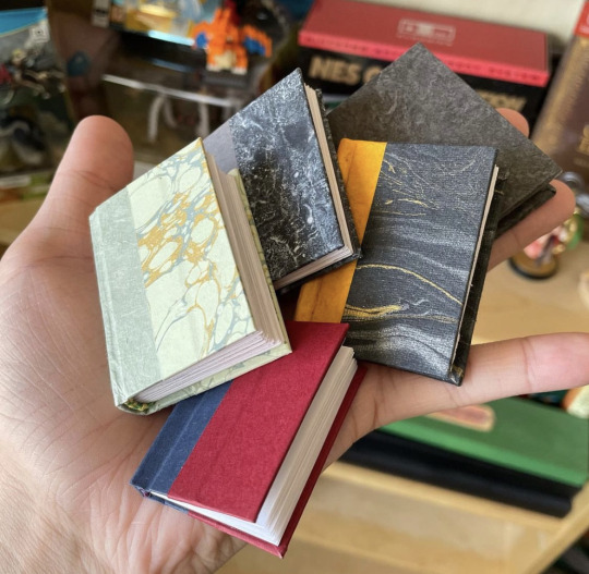

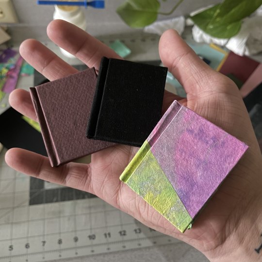
Just like with regular ficbinding, there are layers, and they are:
1 - Typesetting and Imposing 2 - Printing 3 - Cutting, Folding, and Sewing 4 - Gluing, Rounding/Backing, Endbands 5 - Building the Case and casing in 6 - BOOK
In this part we will be focusing on steps 1 and 2. Please feel free to skip to the area you're interested in most.
1 - Typesetting and Imposing
Okay, so this area has some nuances that you don't have to consider so closely with typesetting for more traditionally sized books. To me, these tiny books are not about readability, they are about novelty. As such, I do not prioritize readability. Instead, I try to achieve something that is closer to scale. That said, neither do I want these illegible. But we'll begin from the top.
You want to make a tiny book, but you're wondering, what would be an appropriate word count for a tiny book? Tiny books are the perfect medium for the ficlettes, the shorties, the one-shots. They are also perfect for the mid-sized, 10-15-20k fics, in my opinion. Here we can see,

On the left we have a fic that is exactly 12,771 words, typeset on a 1.5" x 2" (37 × 52 mm) document, with .3" margins, 6pt Garamond font, and 5pt line spacing. This book is only approaching 1/2" (13mm) wide, and only took 5 sheets of Letter paper to print. On the right we have a fic that is exactly 1,939 words, typeset to the same specifications. This book is only 4-5mm wide, and took only 1 sheet of Letter paper.
In my opinion this format of book begins getting unruly around the 300-page mark. However, making any combination of margins, fonts size, and line spacing will yield different page results for different word counts. For example:
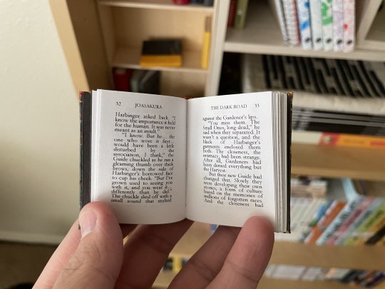
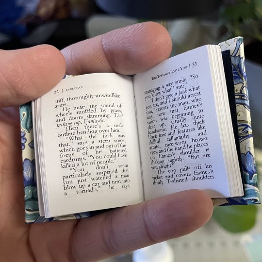
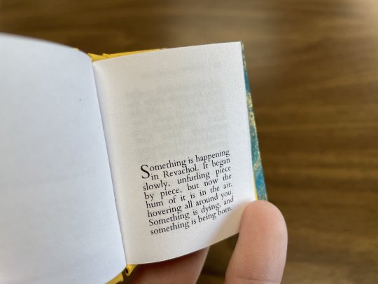
Like the above, in each of these examples I typeset in Garamond font @ 6pt size and 5pt line spacing. Typesetting on an A9 page, this is about as small as I felt comfortable sizing my font while still being legible. But notice the rivers between the words--the rivers of white space bisecting the lines, due to the Justified alignment battling the admittedly tiny work surface. At this scale, with the font at this size and alignment, those will be unavoidable. Over time I began disliking this in my own work, so I pursued a different method, which was typesetting on a quarter letter page (4.25" x 5.5" / 108mm x 140mm), and allowing my imposer to scale the PDF down.
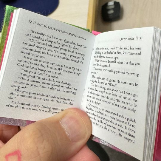
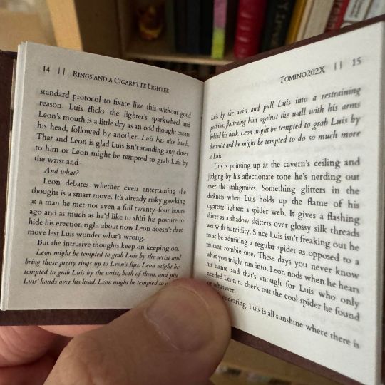
Have you ever seen anything sexier. THIS looks like a tiny book. Little to no rivers, still legible (hand-wobble), and preserves the novelty feel that I desire from a tiny book. This method of scaling down (specifically from quarter letter to A9) does change the final shape of the book, from A9 to A9-ish in this case. Specifically, from 1.5"X2" (37 × 52 mm) to 1.625"X2" (41.3mmX52mm). You're achieving something closer to a square shape, which is delightful to hold. All this to say, you have some freedom with word count, with font size, with page size. I've done as many pages as 376 and as few as 17. The fantastic thing about tiny books--their structure will not be load-bearing, meaning--the only thing stopping you are your tastes.
Quickly, some more examples of features in a regularly sized typeset and their tiny counterpart after the imposer has scaled them down. First, scaling half-letter down to A9, a little-over 4X shrinkage:
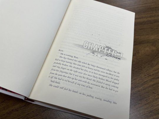
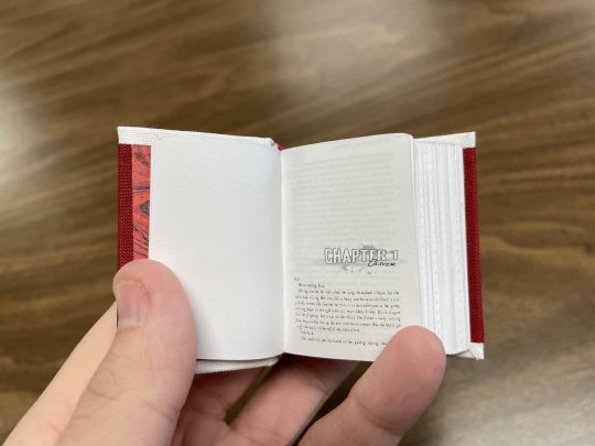
And from B6 to B9, smaller by 3x:

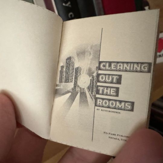
You notice the compression of every element, and too how entirely unparcable the text in the first example is, sometimes not horrible, sometimes very. Make your decisions dependent on your tastes!
You have decided on the fic you'd like to bind into a tiny book. I will be using my own fic as the typesetting example, and I will be using Word 365 for PC. I'm sure many of my pointers during this process might not apply 1-to-1 if you are using a different word processing software, but hopefully you can adapt the concepts to your program of your choosing.
Kay, next you will do your typesetting. Since this is not a typesetting guide I'm trusting that you have your preferred methods, but I will go through my key steps for setting up a tiny typeset:
First, for every typeset I delete each default Style, create mine own, and dictate the document size. For this example I will be doing my preferred quarter letter method, setting the custom page size to 4.25" wide and 5.5" tall, and .5" page margins all around (except Gutter; leave 0"). On the Multiple pages dropdown I will select Mirror margins (however, as all my margins are the same size, this is redundant, though may not be the case for you). My body text style will be Cardo font @ 11pt size and Exactly 15pt line spacing, with a .2" first line indent and Justified alignment.
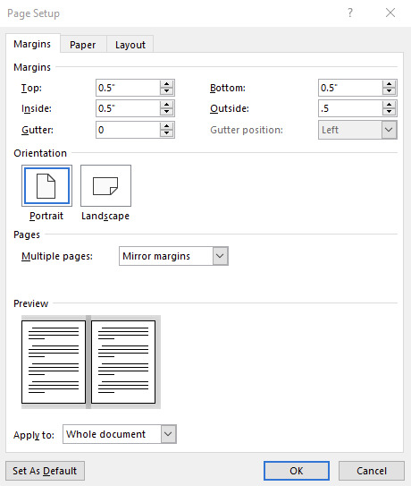
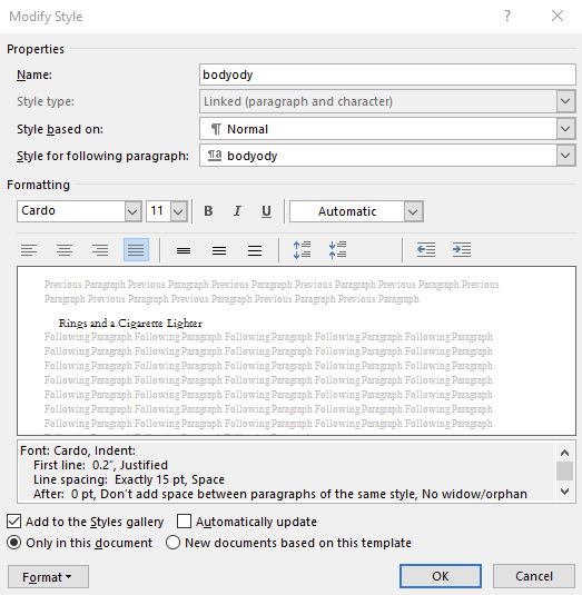

You can use whatever body font you like, I only encourage you to do many many test prints to refine your preferences. Your favorite font for half-letter books might not translate to tiny books. After ~30 tiny books I've found I like Cardo at this size and spacing. And if you're using A-paper sizes, consider doing quarter A4 instead of quarter letter, which is technically A6--4.1"X5.8", or 105mmX148mm. Follow your heart~~nyah 🐱♥
Now I will go to my fic and download the HTML file. I hugely prefer copying from the HTML file rather than the browser itself. It kind of standardizes any goofy formatting that might try to make its way over otherwise, while still preserving the italics and bolds, etc, and makes for an easier editing process. It was important I made my body Style in Word first, so that once I paste the text into my document that Style is automatically applied in one fell swoop (if not, you can change that in your Word settings. Advanced -> Cut, copy and paste -> Merge Formatting. It is a huge time saver.)
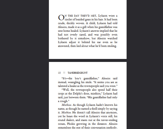
Now you've gone through your typesetting process, you have a liddle quarter letter Word document that you're happy with. Gets real close to you. Listen to me--listen, you're going to Export as PDF. Not Save As PDF. Not Print to PDF. Export. It's in--listen--it's in File, then Export, then Create PDF/XPS. You need to Export. Especially if you selected Bookfold instead of Mirror margins in your page settings because we need an unimposed PDF in order for this to work right and exporting to PDF is going to solve 99% of your pdf formatting woes with Word. Okay, I love you 👨❤️💋👨
Now, your EXPORTED pdf should look something like mine. Straight, unimposed.
Now what we're going to do is take this PDF back to my penthouse and freak it. Go to this link for the Renegade Bindery-created and -curated imposition tool. This has been will be is such an incredible FREE asset to you, maintained by a crew of intelligent, skilled Renegade Bindery members who understand the importance of community and accessibility. If you find someone hiding this link behind a paywall of any kind it is not with the creators' permission, so shame on them.
Anyway I will be assuming that you know what imposing your document means. If you've never used this site before, it's very straight forward, and here are my settings for making Tiny Books.
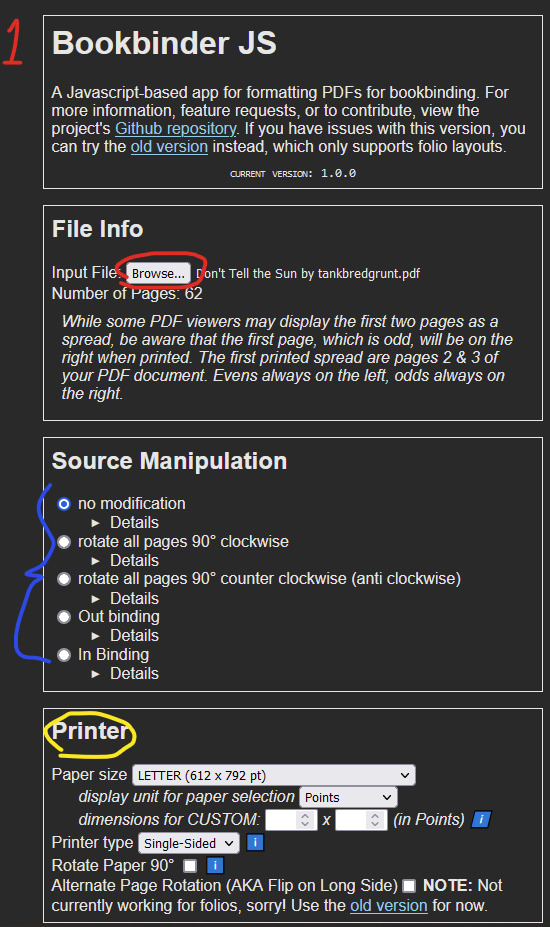
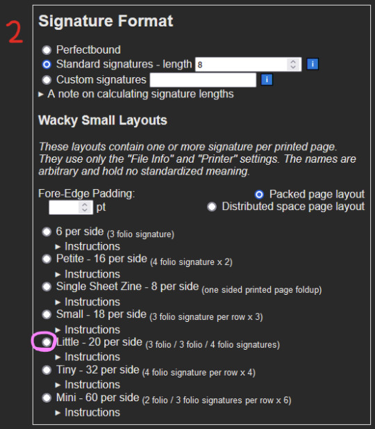
1 - Upload your unimposed exported pdf. 2 - ignore 3 - Select the paper size you will be printing on. This is not the FINAL size of the book, this is what paper you are printing on. These instructions are for Letter sized paper. Don't change any of the other settings right now, I will explain more about the Single-sided vs Duplex option in a bit. 4 - Skip aaalllll the way down to Signature Format. Under Wacky Small Layouts, click on the bubble next to Little. You'll notice there are a lot of options here. I encourage you to play with these settings later on as well, there are so many things you can make with this tool.
Once that's done, scroll down to the very bottom. You'll see the Signature Info area, telling you the results of your imposition. In the case of using the Little option we've selected, 1 sheet of our paper will make 40 book pages. 3-signature-sets of 3/3/4 folio configuration. That's a lot of pages per page.

Anyway for our document today it will cost us 2 sheets of Letter paper, and will make 6 signatures. Math says that's 80 pages. Now, you may be concerned because your typeset PDF is not formatted in a number equally divisible by 40. And why would it be. The imposer is doing that math for you in the background, organizing your pages regardless. In my case, my finished typeset is 62 pages, which means that from my second page, I will only be using my 3 folio segments, and discarding the 4 folio segment. This will make more sense later. Click the Generate button, and save the zipped folder wherever you want. Don't change the name of it.
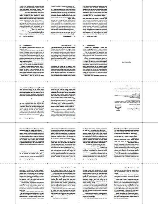
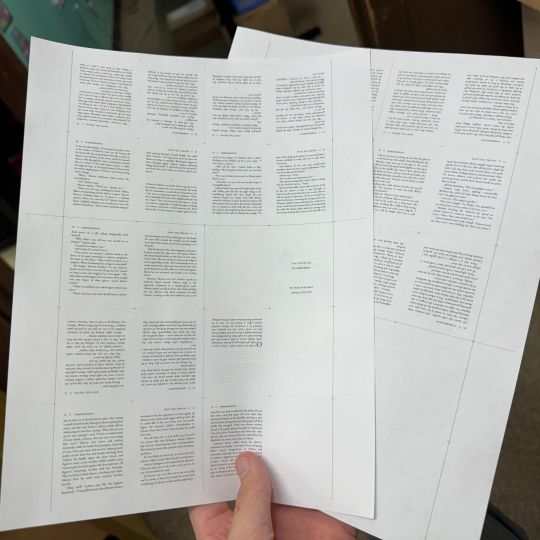
Unzip that baby, and inside you'll notice 2 files--(filename).pdf_little_packed_backs, and .pdf_little_packed_fronts. Appropriately named as one file contains one side of the sheet that will be printed, and the other file the other side.

And when you open them up, they will look like:
2 - Printing
We are manually duplexing this bad boy, because working at this scale amplifies and compounds every millimeter of difference. Manual duplexing will keep printer skew to a minimum, as the printer will not have to perform gymnastics in order to print on the reverse side of your page. Here are some examples:

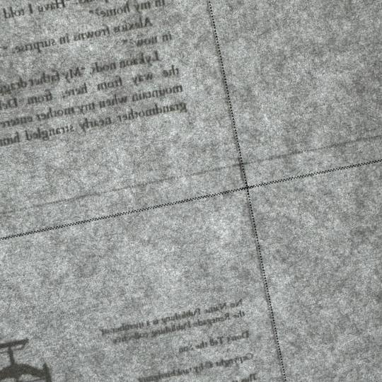
Two auto-duplexing examples of skew, one horizontal and one vertical, dependent on which direction my paper was loaded into the feeder. There is significant skew. Not a horrible issue on full-sized books but these will matter much more on our tiny books, the key issue being that we do not have much to work with in the margins department. Trimming 5-6-7mm of margins of your half-letter sized textblocks might not be much of an issue; however, here, in order to remove all the trim lines during the cutting process, you will be significantly impacting the margins of your tiny textblock.
Now here is an example of the skew from manual duplexing:
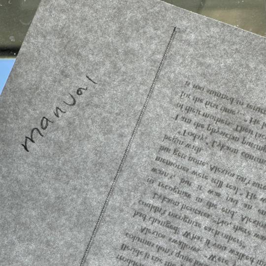
MUCH subtler. Your skew with manual duplexing will range from this--less than .5mm--to no skew at all, and you will have to cut off far less of each page to remove the trim lines, maintaining the consistency of appearance of your tiny, beautiful pages. This is why during step 3 of the imposing process we selected Single-sided (which is MANUAL duplexing), and not Duplex (which is AUTO duplexing) appropriately. This will result in you either getting two files for manual duplexing, or one auto duplexing file.
Your next consideration when it comes to printing your liddle book will be whether you want to use an inkjet printer or a laser printer. I've until recently only had a laser printer available to me. I can say after about 6 or 7 little books on an inkjet printer that I prefer the laser printing on tiny books. Here is an example of why:

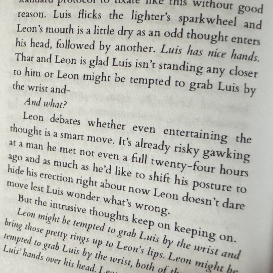
On the left you have a tiny book printed from an inkjet printer printed on the highest quality setting, and on the right is a tiny book printed from a laser printer. These were both printed at the same scaling, same font size, same line spacing, everything. The inkjet printer, printing at this scale, introduces pretty glaring feathering on the letters, whereas the laser printer is crisp as can be. I've said before that to me tiny books are more for novelty rather than readability, however I do still want to make out the word I'm looking at, you know what I mean? For this reason I prefer printing my tiny books from a laser printer. Use what you got though, you'll get a tiny book regardless. Make sure you're flipping on the short edge with these tiny books too, and double check to make sure your page numbers line up. And when you're done you got...
BOOK(-adjacent).
Continue on to part duex.
240 notes
·
View notes
Text
Hey hi hello!
I have some things to say about new merch and jo merch in general so this is gonna be a litrle longer post and actually I think I should cange my semiotics theme (which is already about jo) about how bad their merch design is.
First of all little disclaimer: this is all my humble opionion based on what I learned in my one year of being graphic design student and an artist and designer on the internet for last 4-5 years. Before going to uni I learned most of about art and graphic design stuff by reading books and watching tons of yt videos. Second of all this critic is just coming from place of love for this band because I see so mucb potential and they could do some amazing merch designs if they give it a chance and I am fully aware how expensive the touring is and why they had to cut the quality of merch products.
So far my favorite jo band merch designs are cds (that probably required some designer to make), condoms (because they are really funny, genius, nicely designed and unique merch that fit the vibe of the band and matches their songs as well) and the new tshirt from last merch drop (which design is made by one slovenian fanartist : link.
Main reason that made me want to speak up is seeing that this merch drop will only have 100 products (my friend said that could mean 20-ish shirts per size) which how big this fandom has gotten in last year is pretty really dam limited. For a limited product I am really disappointed and I hoped for more. For such a limited product that design is the most default design they could have gone for and I am so sorry for Damon because his work is goregous, amazing, breathtaking and I could talk about it for ages and how inspiring it is but this shirt design isn't serving.
If they wanted to do bare minimum of design with those 5 images here is some of my ideas (unfortunately I don't have time to visually show them to yall on a mock ups because of finals that I should be studying for instead of writing this so try to imagine what I am trying to say and demonstrate). First is just simple instead of white choose black shirt or even better a thisrt. If you want it to go a stepp further is using their name logo font (font name is Avaline btw if anyone wants to download and use it for their designs :))) and either put it how they did when they promoted the everybody's waiting or to write idk therapy sessions or anything related to the band or it can even be some inside joke.
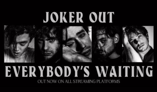
Something like this would make design just a bit more intersting but still bare minimum but amazing for regular merch. If they want to go a step further but want to keep the long sleeves (this idea was suggested by few people I talked too) they could put pictures vertically on the sleeves. I would find it a bit cooler if it is on the right sleeve out-side and then they put their band logo (the heart one) on the left side of the shirt where people's hearts normally are.
After exams I would definitely like to try to make some designs and just limit myself with this 5 pictures and play with typography and photoshoop to make something interesting.
Another I want to mentioned is how in my humble opinion if you are gonna sell limited edition either make it really pretty or good quality or really cursed and funny with inside jokes.
I think people (and me first) would eat tshirts (but also other merch designs) with some cursed designs or just texts that say "sparklative" or "slay pose" or "I feel SloveNACE" (this 3 were suggested by amazing people in tumblr discord server) or even let Jan photoshoop their faces on most random picture. This 5 guys with their gen z humour could make and do some hilarious merch like how amazing idea the condoms are.
Last thing I want to say is how many amazingly talented fans are. I mean even Damon was so shocked and moved by amount of talent and art made in this community. Furthermore I know (some of them as online friends and mutuals, others as just artists from same fandom) who are also either graphic design students or they work in art/graphic design/entertainment fields and some of them (including myself) would be so happy to even make few merch designs or art for them for freee or for a ticket for their show. Personally I would die from happiness if I get a chance to work with my favorite band that inspires me so much everyday to the point people at my uni think I am from Slovenia and know slovenian because of how much I include them in my uni work and how much fanart and designs I made because of them in last 6 months.
I just think there is so much potential guys might not be aware of (Idk honestly because who knows what is going on backstage in their lives). But yeah they could have even asked Damon to help them with composition of the pictures on that shirt or even hire Racik to make some pretty art or any fanartist honestly. Here is just few links of my favorite fanartists who also do a lot of graphic design related stuff (and also some of them sell their products on their own websites/redbubble/etsy/inprint/etc) :
Tia <3
Roxanne
Vic
jo.kam_ (previously mentioned her design)
Lemon
yelecx
Racik (ofc)
There is probably more but my brain for hell of it won't remember any names so feel free to add in the comments or tags more artists <3
I could probably go more in depth and give more ideas how to improve merch designs the cheapest and best way as possible but still trying to keep the quality good as it needs to be. I know there is still gonna be people fighting for this shirts and people are still gonna buy their merch but just it hurts my art/designer soul seeing this bad designs when there is so much potential and they have amazing fans and amazing crew and they work with so many talnted people and they themselves are so talented and their music inspired so many and so much.
Thanks everyone for coming to my TedTalk. <3
Actually now I am thinking and from just talking about jo work from design and semiotics perspective for that semiotics seminar I could just focus on their merch design and go more in detail about it and if yall want when it is done and I translate it in english I could share it here for people who want to read about it. Let me know I guess.
Also if someone is interested my art and design insta is lucia.without.j and my redbubble is lucia-without-j and my dms are always open if someone wants to chat or complain about anything art, design, joker out or any other fandom I am in related.
P. S. I am so sorry for any spelling mistakes and if what I said doesn't make sense. English isn't my first language.
#joker out#kris guštin#bojan cvjetićanin#jan peteh#nace jordan#jure maček#damon baker#new merch#graphic design#merch design#lucia is yapping again
70 notes
·
View notes
Text

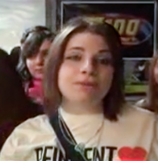
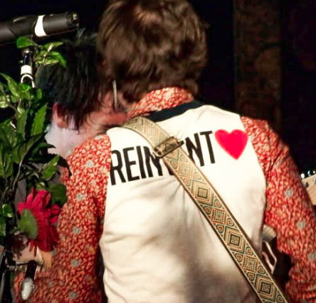
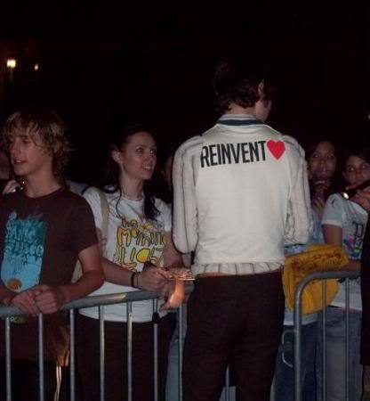
This off-white t-shirt that was for sale at some shows during the 2008 Honda Civic Tour was really popular and was usually the one you'd see people asking other fans to grab for them in late spring because their show sold out in their size. This is the shirt that was sewn into a vest for Ryan that season btw:
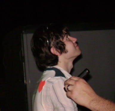
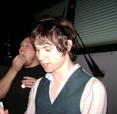
FBR added this shirt to their webstore in August 2008 and some sizes sold out quickly but then got restocked. I remember some people complaining that FBR's shirt was a slightly different color than the one on tour, but others said it was the same. Idk, it looked like the same general off-white color to me. The band's name was still on the back of the right sleeve:
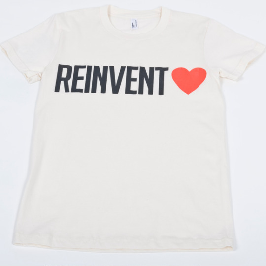
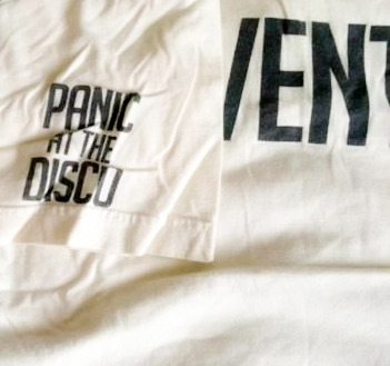
I liked this design because it was SO different from most t-shirt designs in this era (like in general, not just PATD) and was way more minimalist. A fan created some pngs that we could print out to iron on our own shirts, so I'll add them here if anyone wants them. They used the "Big Noodle Tilting" font and created their own heart:


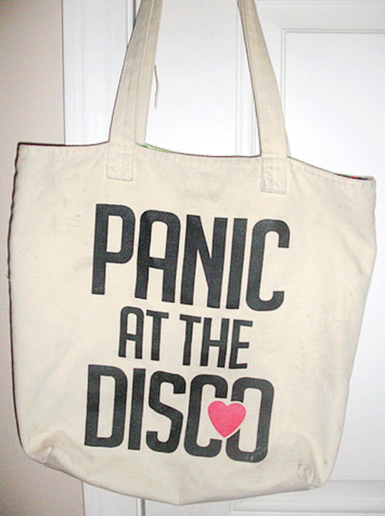
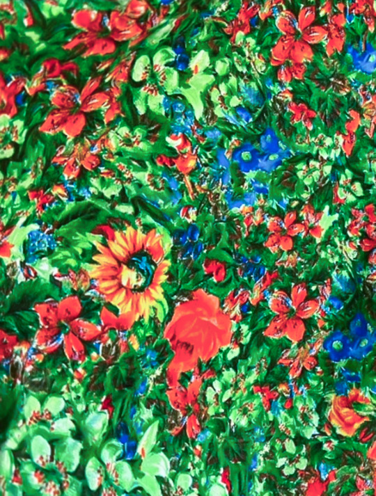
That fall Hot Topic also came out with an off-white tote that had the same large "reinvent love" design on one side. Then the design of the band name (from the t-shirt's sleeve) got a heart added and was enlarged to be the graphic on the other side of the tote. The inside of the bag was a floral pattern that reminded me of the striped hoodie's lining:
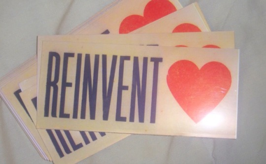
FBR clearly loved how successful this whole design was. The webstore included a bonus sticker in the order packages for P!ATD fans in fall 2008:
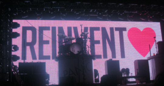
The Rock Band Live Tour shows in fall 2008 used the same type of graphic:
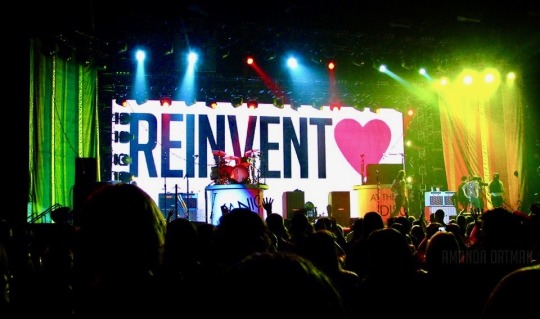
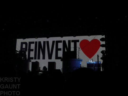
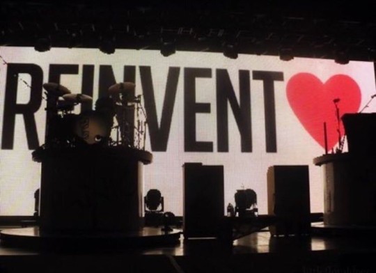
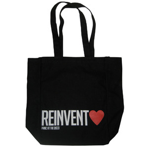
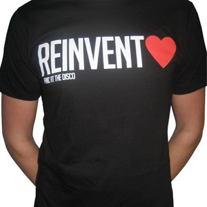
And the shows on that tour had a black tote & shirt for sale:
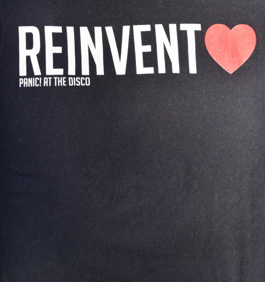
Spencer did an interview with Out.com this season that had this question:
The most popular items at your merch booth seem to be a t-shirt and bag that say “Reinvent Love,” which is such a strong, inclusive message. Tell me about how that became the band slogan. It started out as a lyric in “Mad as Rabbits.” It was the last song we were recording for the album, and as we figured out how to fit it into the end of the song, it took on some more anthem-style cheer. As we went on tour, me and Ryan [Ross, Panic’s guitarist] talked about making a “Reinvent Love” shirt. At first it was just going to be on the Fueled By Ramen web store, just a limited edition thing because it didn’t have our band name on the front, and we didn’t know how many people would want to wear that. It ended up being a lot more popular than we thought it would. We were ending all of the concerts with that song, so that was the last thing that people were hearing. We wouldn’t want to be a part of anything that wasn’t that kind of that message. If there’s going to be some saying associated with our band, that’s a pretty good one. It goes along with everything we want to represent and the way that we feel.
This bracelet was added to FBR's webstore in December 2008 (after the Pretty. Odd. era had basically ended & around the time that Live in Chicago was released):
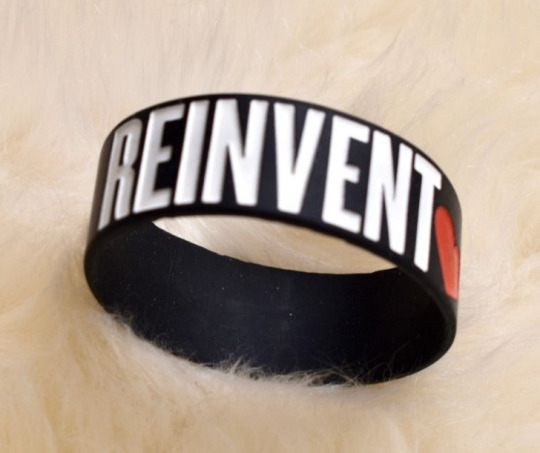
By the time this necklace got added to FBR's webstore in January 2009, a lot of fans were tired of this theme:
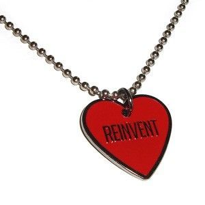
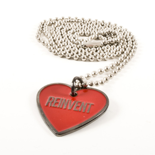
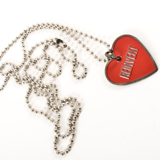
The necklace spawned more fan jokes about what was coming next at that point... my favorite was still the musical toaster:
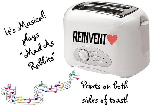
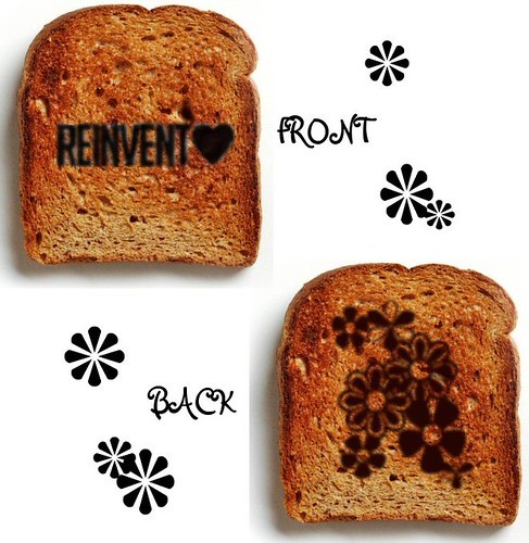
So in March 2009 FBR just added the black shirt & tote to their webstore (the ones that were sold at shows in fall 2008) and then let the phrase rest so they could soon move onto overusing the return of the exclamation mark. lol jk.
98 notes
·
View notes
Text
love me, touch me (be the first who ever did)
contains: size difference, short steve rogers (5'5/167), tall reader (6'2/187), call boy steve (🛐), inexperienced reader, hurt reader :((, reader fell first and steve fell harder, jacking off, wrong number oops, little awkward, lowkey innocent reader idk, sex pro steve
REMEMBER THIS IS ONLY PART 1 OF THIS STORY! I might write part 2, I'm not sure though..
this font --- italic is for stuff that happend in the past!
I read over it, but might be that there are still mistakes..
words : 2k
☆☆☆
You don’t like yourself very much, not hate, but also not love. Your looks had no problem pretty much, you were slightly muscular, had a good style, hell even looked good in a suit! Your hair was wavy, a grown out two block cut. Plus you don't wear spectacles, except for reading. The only thing that made you miserable in your dating life was,
you were really hopeless.
Which dude would be nervous and blush everytime over some small stuff! No wonder your presentations were so poorly done in your work life or the way you wouldn't refuse to take shots when asked. Even though you promised yourself you won't drink.
As soon as you got home from the drinking with your work colleagues, you stumbled when you tried to take your shoes off inside your house as soon as you locked the door. Face first you landed on the wooden floor, no more energy to atleast loosen up your tie or to even stand up.
Well, atleast you were good in one single thing in your miserable life,
drinking yourself full into oblivion.
Your eyes focused into blankspace. Thoughts flashed into your brain. Here you go again.
"I'm sorry, I'm.. so..", you sob out as you looked down on your knees. Arm on your sides as you don't even dare to look up once.
Silence for a while, the rejection surely floated in the air already. God how useless were you?
"You.. you can't do it?", the feminine voice spoke out loud enough for it to hit you straight through your brain and heart.
The woman left a sigh as she spoke up again "At this point, it makes sense. Whenever I want something, you are so kind and do it. It's like you are submissive. I wonder if you are just going along with what I say." tears were so close to spill, why you? "You always turn so red and flustered. You are shockingly unreliable."
'Don't cry, come on. Don't cry you hopeless shit.' Ever since your miserable first time, you are scared shitless of ever doing it again. Your looks might be great, but your body felt so.. big. This all happend right where she told you she loved you, too. Life sucks.
The constant imaginations of being less hopeless were so pleasing. Just why were you like this? Who the fuck did you insult in your past life that you turned out like this? The feeling of not being good for anything because of how hopeless you were, was utterly sickening.
'nineth floor.' the voice in the elevator said as the doors opened. Someone with black sneakers, grey joggers with a plain black t shirt on stepped out as he was talking on the phone. A leather jacket hugged them loosely while he looked at the door numbers. Eyes focused on the doors, as his mouth kept on talking.
"Uh yeah, if the guy from yesterday asks for me, just say I'm busy at the moment", he stated as he stood suddenly in front of a door. Turning towards it as he read the number under his breath 'one, two and seven.'
"Okay, I'm here. I will call you soon, bye!" the call ended with a click as steve brushed his hair back one more time, put the phone in the pocket. The door was luckily open, so he pressed down the handel and opened it.
Surely, he didn't except this view. You were laying down on the floor, face down, suit all wrinkled and hair kinda messy. The concerned face on Steve's face was mixed with huge confusion.
"Are you sleeping?" he asked as he ran up to you, slamming the door behind. He dropped on his knees and rubbed your back, "Dude, are you okay?"
The response were little sounds of whines leaving your mouth. The tears and alcohol made you not wanna be bothered and close your eyes tightly. You were somehow half asleep.
'Hah. Cute.' he thought to himself as he smirked and caressed your face with a hand. Your cheeks were burning and your body was hot as hell! Shocking for a time like winter.
"Get up, you will catch a cold if you sleep here on the floor, silly", he warned with a smile. You couldn't see that sweet smile as you were still not aware of the world around you with your eyes closed.
Not with a lot patience, he lifted you halfway up and leaned your back on the wall while you were still sitting. He took your backpack off and you finally twitched your eyes under his touch. He huffed when you still didn't wake up!
One shake on your shoulder made you open your eyes slightly, till they were halfway open. Unironically you looked around and looked back at the guy in front of you, "Where.. where am I?"
The cold hand hit your hot cheek again. Fuck, why did it felt so nice and safe. As if he would hold you between his arms forever. Your view was hazy as you saw a, of course blurry face approach you closer, and closer.
Now not only a cold feeling was on your burning cheeks, but also on your lips. A kiss was planted on your lips, your body felt like levitating right there. "Wakey wakey!" the adorable voice spoke again, and now everything was clear. Your eyes shot up open fully as you broke the kiss by gasping.
"Who.. Who are you?" you squeaked as you pushed yourself more onto the wall. The guy stared in confusion as he pouted slightly. He brushes his hair back and talks again "You literally booked me?"
Silence.
"I'm your call boy! My name is Steve rogers, just call me steve", he clarified with a big smile spreading ear to ear. His eyes were closed from the smile.
This all is so confusing right now. You don't remember this at all? You look to your side and see your phone laying. Did you really call him earlier?
"I'm s-sorry.. I do not remember..!" you confess as you tried to pull away more, but steve had a grip on your jaw as he kissed you once again "It's okay.." he nibbled on your neck, licking and swirling on it. Suddenly he grabbed your erection with the hand that holded your jaw earlier.
"Don't you want me to make you feel good?", he asked it so innocently, that it felt like it was normal to just say that! You blushed even more, stuttering mode was on. The tomatoes were sure jealous of your redness.
He grabbed it again and cood at how it twitched as it was painfully rubbinf against the fabric of your boxers and jeans. He was so weirdly focused on you.
"I'm sorry.." you apologize with your shakey voice. He looked up to you as he tilted his head. "Why are you apologizing? I infact like the way you got hard from me being myself."
You whimpered at the touch. He started unbuckling your jeans as you gripped his upper arms tightly. You were so nervous and shocked by the sudden moves you couldn't do anything except whine and hold yourself steady by his arms. He pulled your hardened cock out of your underwear and started jacking you off. You gasp as you stab your nails through his leather jacket.
"I can't! Im s-sorry..", you gasp it out as tears started prickling up in your eyes. The moves didn't stop, he kept on going while focusing on your face. 'He is so red.. It's cute' Steve thought to himself, now his eyes moved to your cock, as he realized you were close by your fast breathing, he started covering the tip with his thumb.
You let out a loud 'Ah!' sound as you tilt your head back and let out big breaths, your body was shaking from the Stimulation going on.
"You have a thing for pain, don't you?" Steve asked teasingly as his hand left it and moved to your thigh, just caressing it as he looked into your eyes.
You were still in a shocked space as you stuttered and stumbled over your lines. He had a weird suspicion in him. You were different from his other client's, you were way more inexperienced and easily flustered. Which he found totally adorable.
"Oh, darling. You deserve to feel even better than this", his hands brushed against your cheek again as he played with your bottom lip using his thumb.
Those words were so.. warm. Way warmer than his hands being so cold. It made you rethink about your ex girlfriend.
"You can't do it?"
That sentence filled up your brain, the voice didn't stop repeating it. It was getting louder, louder and louder. How can anyone be so calm about this? It started from there on. Pants were leaving your mouth, eyes turned red as the tears started to spill. One by one. They didn't stop, they kept on going.
Steve looked you up and down, he then realized you started to cry. Of course, he got scared that he did something wrong! He immediatly started wiping them away with his hand as he started asking why you were crying and if he did something wrong.
"No! No, you didn't do anything wrong. It's just that..", you took a deep breath as you spoke again "I'm so not used of someone being so nice to me, I always felt miserable. I'm just so hopeless, I was never good in sex. My girlfriend even got sick of it, I never know what to do while it. I get too overwhelmed."
You calmed down a little after you let that off your chest, it felt too good. Until a guilt hit you. Just now, you totally burdend yourself to a person you just met.
Instead Steve started hugging you tightly, "I understand, just because you suck in it doesn't mean I will leave. I will help you all the way through this."
You let yourself deep into the hug. He caressed your back a little before he snuggled into your neck and started saying something.
"What I find weird is, you struggle with sex, but wanted to bottom? You know I specialize in topping."
"B-bottom??"
"Yeah, bottom. It means when you receive it, the cock."
"..WHAT? First of all.. I didn't c-call you!"
Steve looked just as shocked as you this moment, he said he thought you just forgot because you were drunk. He quickly snatched his phone out as he looked through the adress.
"This is room 127 of southstar apartment right?" you nodded as he kept on looking, but it popped in his head as he looked at it in horror.
"Which Building is this..?"
"U-uh.. Building B."
"I'M SO SORRY!" he apologized dearly as he took your hand and squeezed it hard enough. His head was tilted down as he looked ashamed.
You quickly accepted his apology as you explained how you also thought you called him since you were pretty insecure.
"It was ... good anyway", you blushed as you looked up to the now standing steve. He smiled as he looked at the time, clearly needing to go to his client's house now.
"Sorry for today, I will take you out some time. We could talk about your sex problems then, huh."
"O-oh yeah uh.."
'He is so awkward, but it's cute.' steve thought to himself.
"After all I'm a sex pro!"
'Woah.. sex pro! This guy is insane' you got oddly fascinated by that as you just looked up to him and nodded.
You immediatly pulled your phone out to get his number, which you succesfully achieved. And meanwhile you knew his name, not like you didn't before, just on your phone now!
You waved goodbye as he left through your door to the elevator. You closed the door behind as you sighed and ruffled your hair.
He was so handsome.
"So cute", steve whispered to the air as he smiled at the number on his phone.
#bottom male reader#dom steve rogers#marking#mcu fandom#mcu fanfiction#mcu smut#smut#steve rogers#steve rogers x male reader#steve x y/n#blush blush#fluff#call boy service#confused#sub male reader#gayhot#gay couple#straight#fanfic#mcu x reader#male reader smut#x male reader#muscular#slight angst#2k words#pls be nice#pls like#pls share
211 notes
·
View notes
Note
sorry if this was has been asked b4 but how did you do your Raika Hojo pixels/blinkies? I wanna learn how to do ‘em :D

og post: https://www.tumblr.com/chichirid/767910269177528320/raika-hojo-pixels-and-blinkies-20x20-and-30x30
this is a tutorial on photopea, and its kind of vague so feel free to lmk if you need specific steps rather than a general process / if you dont understand anything :3

hiii so for the blinkies i used this dotted border, and this rectangle border i made (dont credit me, i traced it from blinkie cafe 😳)


i forgot which font i used.. sorry!! but i found a sampler online and typed "special for princess" and "raika hojo" then screenshotted it like the image below. then i removed the bg and was only left with the black text. then in photopea i selected the pixels of the layer so it only selected the text, and then i very carefully traced over the letters using the brush tool. (btw i colour-picked the colours from their logo image). i used the screen layer setting & a stroke setting of one pixel.
i just used a cursive font and tried to imitate a ribbon myself through colouring ><
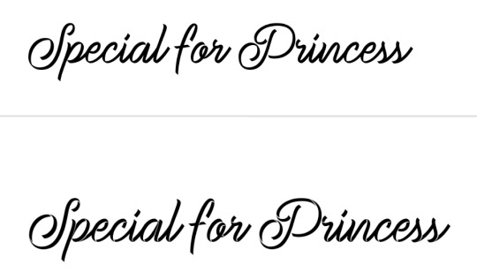
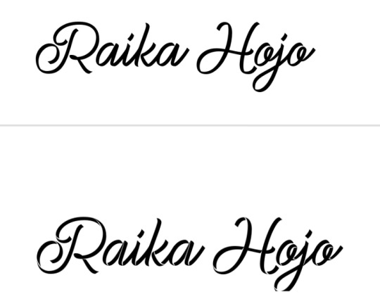

for the raika pngs i screenshotted some sprites then copied them in. idk how to use symmetry so i placed one png at one side of the blinkie, and found what X coordinate it was at. (ie 205px) and then subtracted that from my blinkie template's total X width (730px). then manually typed the X coordinate of the other png based off that formula (so to get a png symmetrical to an image at 205px, the X coordinate of the png would be 730 - 205px.)

for the flashing dots i made two frames:


then i combined these in ezgif "gif maker". the lower the delay time the faster the gif will go.
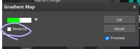
to make these two frames i used that earlier dotted border. essentially i used a gradient map on the dotted border's layer where the black was the red colour used and then the white. (like this image below as an example, both colours are set at 50% and 50% to get an even split). this makes one frame. to get the other i just clicked "reverse gradient".


to make the pixels, i saved some raika pngs using the enstars wiki, and then opened a new canvas in photopea with the dimensions of 30x30. (30 width, 30 height). then i opened the pngs and sized them how i wanted. important for this step: CLICK ENTER ON YOUR KEYBOARD ONCE FINISHED SIZING! this will make the pngs go blurry rather than pixelated, which will result in a more legible image when viewed from far away. its really up to you but i like making my images blurry. example:

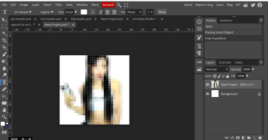
on the left i havent hit enter on my keyboard, on the right i have. save this basic png without the background layer
then just "ctrl + alt + t" again and either tilt the image, size it up, or use the arrow keys to move it sideways or up. save this moved image and once again i used ezgif gif maker to combine the two frames and make a pixel. oh also click "dont stack frames" when making the gif. here i moved the basic image 7 degrees to the left and used a delay of 30. hope this helped ^_^


4 notes
·
View notes
Text
HTML BASICS

hey goobers, let's learn some basics for rp.me HTML coding.
under the cut, we have:
-getting image URL -what are hex codes? -how to post a gif/image -how to add a background -how to bold, italic, underline, or highlight text -coloring text -centering text or right aligning text -line breaks -creating a link
*ignore my typos, i'm stupid **if you need any extra help w/ these, lmk on discord @feralgnat

getting image url:
i'm only adding this because it's important for other steps and i don't wanna assume y'all know how to get this.
to get a image url, typically you can right-click on any interwebz photo and click "copy image link/url."
you can also upload onto imgur or similar places and still copy the image url. some sites have specific copy zones for those urls, but i always just right click and copy. up to you.
make sure your url ends in .jpeg, .png, .gif and similar. i don't think .svg works for html coding but i am probably wrong and stupid.

hex codes:
we're gonna be using a lot of hex codes too so here's what they are!!!!
hex codes will have # and 6 characters after that represent any color you can think of. for a full list of hex code colors, go here and look around. copy and paste that number/letter code, including #, and use that in any codes that require hex codes.
black: #000000 white: #ffffff

posting gif/image:
whenever you're posting a gif or an image, you'll use the same code, which is:
<img src='IMAGE URL HERE'>
with this code, it will post the original size of the photo you're using. sometimes that's OK!!!!!! but a lot of the time, we are lazy and don't want to personally resize pictures. there is a solution!!!
back to our original code but with a new addition: <img src='IMAGE URL HERE' width=100> or <img src='IMAGE URL HERE' height=100>
this code will keep the aspect ratio the same, but will now make the picture 100 pixels in width (or height in the second code). you can TECHNICALLY add both width and height to your code, but you might fuck up the aspect ratio (you do you, tho). you can obviously edit the width/height number to whatever space you need to fit it in. you'll probably have to play with it and adjust it a lot, but that's life, baybee.

adding a background:
idk this code off of the top of my head, but here u go.
background image:
<style> body {background-image:url("URL HERE") background-attachment:fixed; background-repeat:repeat; background-position:top; }</style>
the url used should end in .jpeg, .png, .gif, or similar.
background color only:
<style> body {background-color:HEX CODE HERE; background-attachment:fixed; background-repeat:repeat; background-position:top; }</style>
(this code could prob be shorter but i'm not touching it. what if i fuck it up? we will DIE!!!!!!! more code is better than less code, imo)

bold, italic, underline, or highlight text:
bold: <b>text herehehehehrehherehhe </b> italic: <i> text heehrhehrhehhehehheh </i> underline: <u> text herehehrhehrheh </u> highlight: <mark> text herehehrhehr </mark>
there's a way to change the highlight color, too!!! add this code: <style> mark {background-color:ADD HEX CODE; color: black; } </style>
background color is the actual highlight color and the second color is your text color. typically we're gonna use black but you can also adjust that with another hex code if ur feeling fancy.
with all of these codes, do not forget to add the second code when you are done with transforming whatever text you're working with. those </> codes are your friends.

coloring text:
you're gonna need ur handy, dandy hex codes for this too.
before text you wanna color, use: <font color=HEX CODE HERE>TEXT WHEEE</font>
once again, don't forget that </font> or else everything after the code will be the color you chose. unless you want that.... it's your life.

centering text or right aligning text:
centering: <center> TEXT OR PIC CODE??? WHATEVER </center>
right align: <p align=right> TEXT OR PIC OR WHATEVER </p>
left align (default but here u go): <p align=left>TEXT WHEEEE</p>

line breaks:
many of you prob know this but JUST IN CASEEEEE
new line: <br> skip a line: <p>

creating a link:
<a href='LINK URL'>link name</a>
#rp.me#roleplayer.me#get crazy get stupid#html#resources#this post likes to not show up in the resources tag#why
29 notes
·
View notes
Text
It's been a few weeks since I had new books to share, but I finally got photos taken of the newest ones so today's the day. Here, have a book:
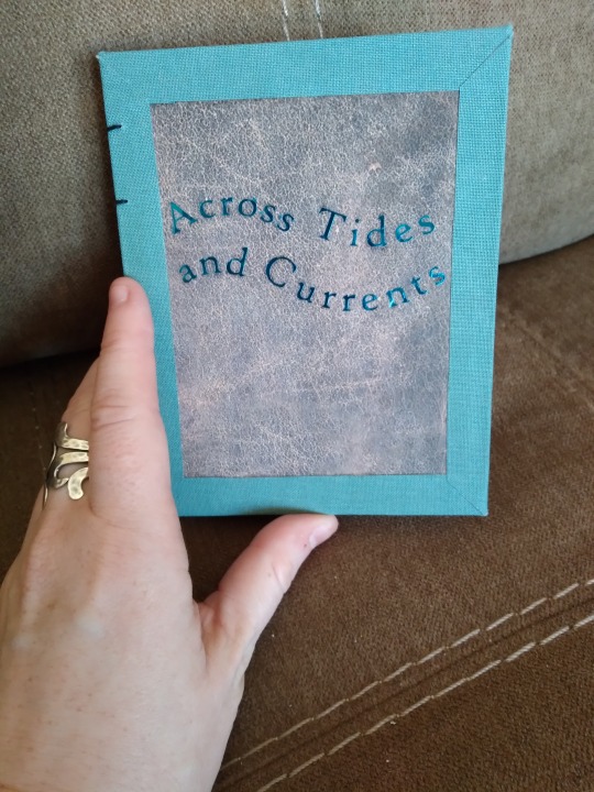
This is Across Tides and Currents, a Good Omens siren AU by Sodium_Azide and @doorwaytoparadise (hi. I hope I tagged you right). My favorite thing about this AU is that, at its heart, it's about learning to communicate with someone who is so different from you that you can't even physically speak each other's language, and yet you've still got so much common ground that you find a way. It's way lighter and more fun than that description makes it sound, though, so go read it if that's your thing.
The cover on this is Lineco book cloth, scrapbook paper printed to look like leather, and blue foil htv. The foil was actually a nightmare to do. The first time I applied it, it wouldn't stick no matter what I did, and the bits that did stick peeled off as soon as I touched them. I had to peel them up very carefully, cut a new image, and try again. Thankfully it worked the second time but I don't know that I'll be using the foil type again unless there's no other way to get the color I want. The non-foil metallic was so much easier to work with.
More book photos under the cut!
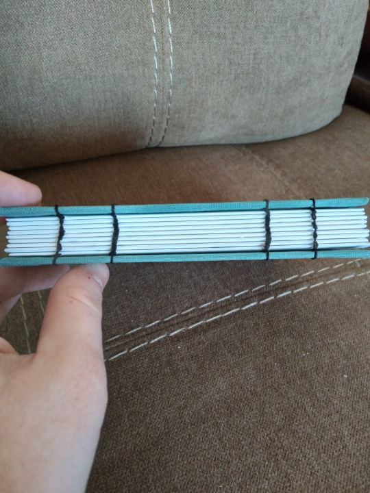
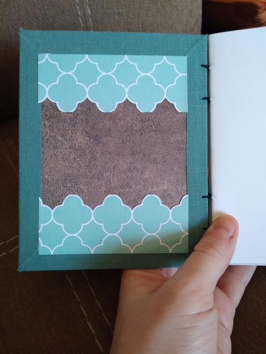
I went with a coptic bind for this one for a few reasons. The first was that I wanted to try one on a quarto-size book to see if I could. I also wanted to try the mitered corners thing I did when I bound Strange Moons, and see if I could have the same effect on the interior. (That bit didn't work out so well; the front is fine but I mismeasured the inside and the lines didn't match up, so I trimmed some pieces of cardstock to cover that up. I really like the layered look though, so that's fine. It's quirky.) The third reason is that not long before I decided to bind this one, the authors published a new chapter after two years of no updates. That's the best possible reason to have to change plans, and the glueless bind means that if they ever do that again I can just redo the stitching to add more pages. Win-win.
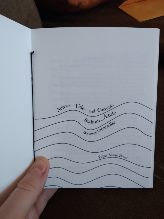
Getting whimsical with title pages here. This took way longer than I thought it would, probably because I don't like graphic design and I did it in Word where I do the rest of my typesetting. Usually what I do is grab an image and put text around it or on top of it and then just play with fonts and sizes, but this time I drew the lines and then made the text follow them. This is the first time I've used the word art feature since...probably 2009? I'd forgotten how. I have no doubt there are better ways to do this but if I'd had to learn a new program at that point I'd have quit. And I do think it was worth it--it's cute and fun and looks about how I imagined it.


Couple of photos of the inside. Sorry the first one's blurry, I had someone trying to get my attention when I took these. The section break image came from rawpixel, I just made it gray instead of black so it's more subtle. The fic has very nice illustrations that I specifically got the artist's permission to print and then I failed to get any photos of them when I did my little photo shoot. They look very nice, though. I swear.
The last image is something I've started including in my latest books. I'm calling them "A Note from the Bookbinder" and it's basically just me talking about why I chose that story, the experience of reading it for the first time, stuff that's going on in the fandom, stuff about the process like the new chapter coming out as I was preparing to print. It's kind of...like marginalia? Part of fanbinding is preservation and that's linked to archival work, and something I know archivists love is marginalia and diaries. I don't like writing in my books and I've never found any fun in journaling, but sometimes that kind of context is important so I'm trying to add it. Someday, decades from now, I may not remember all the details, so I'm trying to preserve them. IDK, this got philosophical on me. Go read about mermaids now. Promise it's a good time.
#bookbinding#fanbinding#snek makes books#good omens#fic rec#i wanted to do this as a mermay project#that did not happen#i finished it in october#happy mertober
47 notes
·
View notes
Note
graphic design IS my passion but graphic design hates me. but if you want something easy, heres a few short steps:
download images from pinterest.
go to canva, pick a tumlbr header pixel size
remove backgrounds from all images you chose
compile and edit as you wish
there are a lot of free fonts and images on canva too. though, i have canva pro
~29 nonnie mwahh
OH this is excellent advice actually thank you very much!!!! 29 nonnie to the rescue idk why I didn’t think of canva (probably because I’ve been avoiding it because I need to make a portfolio but uggghhh don’t wanna) but that’s very helpful!!!! thank you angel!
now to spend ages deciding what images I want/what I think my vibe is… what even is my vibe… something to ponder I suppose
2 notes
·
View notes
Note
hi kyle, please explain your process of making graphics! <3
hi anon! I definetely will, I'll walk you though how I get to a graphic like this:
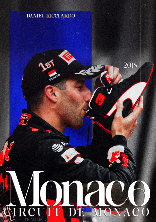
(warning, half of my process is just 'throw it at the wall, see what happens' so like, idk how easily explainable it is.)
first off, I get all my inspiration from pintrest, instagram graphics artist and random stuff I find. inspiration is everywhere and I always keep a notebook with me where I draw/write what I come up with.
all my photo's are from pinterest and google, I dont sell these, if you're going to please make sure the photo's you're using are free use.
all my fonts come from dafont.
the program I use is photoshop.
now, I'm going to break up my editing process into 7 parts.
inspo
images
editing
colouring
font
colour blocking
textures
hopefully it's clear enough
gather inspiration.
so I really like this and this edit I made before and they're pretty easy so I wanted to make a new one.
but normally if I wanna make an edit I scroll through my poster/edit inspo pintrest board which you can find here.
normally if I dont have such a clear way I want to go I'd make some sketches to see what works and how to get the idea out of my brain.
2. gather images.
I wanted to make a Danny one so its not to hard to find stuff as I have a specific search for this edit but I also have a growing archive of folders of drivers full of pictures ive found over time that I'd normally go through to find good stuff.
when you use google please remember to click on 'tools' and select 'size' and big otherwise you'll cry because of the bad quality
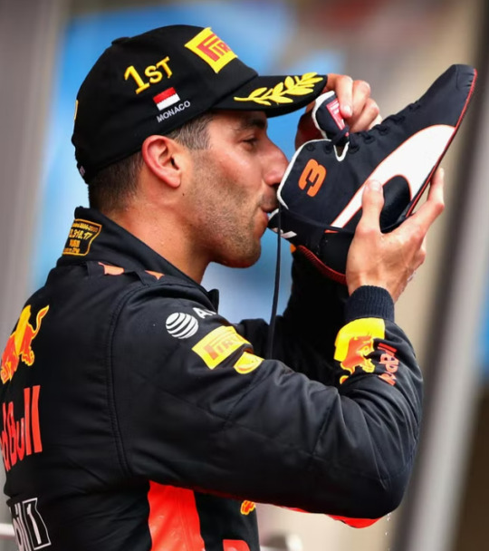
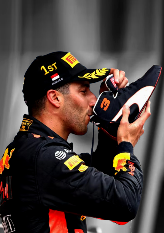
this is the picture I wanted to use for the danny edit.
I thought this would work well because it has depth and so will show the colour blocking well, it also has the flag and the shoe which is clearly recognizable.
3. trow it into photoshop baybee.
this is going to be hard to explain but I basically jsut fuck around. most of the time I kind of know what I want to do and the way I want to go but one of the first steps is always to raserize the layer.
I also make sure to copy the original picture for later so you have the same picture twice
I do this so i can be lazy and go to quick actions and remove the background because then, I get this.
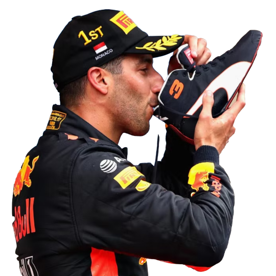
without basically any work. (it's almost never perfect so after I let photoshop do it's work I fix up the parts that need it.)
this is what your layers should look like fter.

that lil black and white thingy is really useful and if you select that and go over it w the erase tool it doesnt permenantly change anything.
next thing I do is smart sharpen to spice it up, here is the sharpening settings I use.
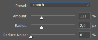
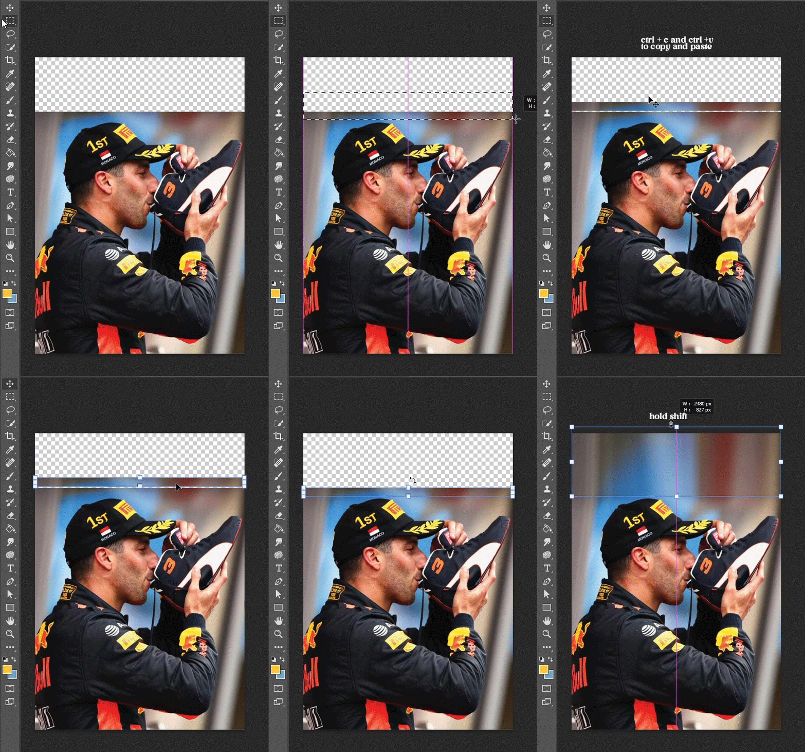
a small problem with this picture is that it's to small for an A4 size (which is what I'm making it on) so I need to extend the background a little. which I do in the laziest way.
I select the most of the top of the picture I can and copy paste + extend it out. like this:
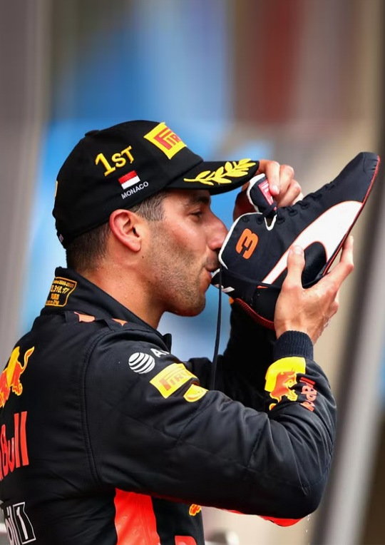
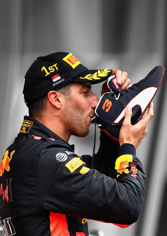
then, for this edit, I'm gonna add a black and white filter to the background so everything behind daniel is in black and white with an adjustment layer. I do this to keep the focus on our subject and remove any and all focus from the bg.
I also add a guassian blur to the bg to once again, keep the focus on daniel.
this is the before and after of that.
now, kinda boring right? yeaaah so now onto
4. colouring
first off CLIPPING MASK IS YOUR BESTIE!!!. if you right click on the adjustment layer and click on clipping mask it will ONLY grab the picture right below it, this way it wont affect everything else you've added to your edit.
anwyay. this is the fun part, and the only way I can explain it, is fuck around, see what you wanna do and what works.
I always add, levels, curves etc to just deepen the blacks and add some contrast. heres the before and after of that.

for this edit I kind of wanna focus on the contrast of blue and orange, kinda like the seb one but a lil different so what I'm gonna do is add hue/saturation and remove the yellow and blue from the picture.
you use this adjustment layer by grabbing the little hand and selecting the colour you want to change.
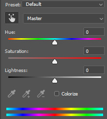
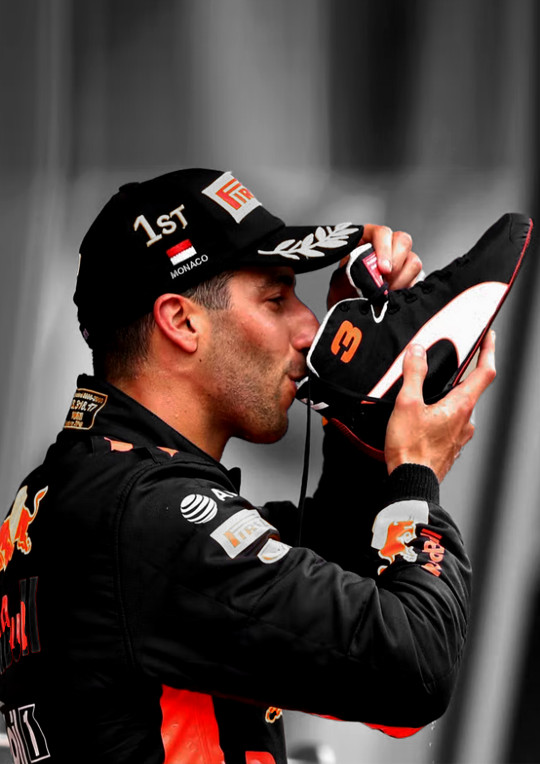
so I'm gonna play around and remove the blue and yellow from this picture. here's the before and after of that.

now I'm going to add selective colour, i wanna up to an extreme the reds in the suit. this is kinda hard as you'll obviously grab his skin with that too so I'm gonna use that black little mask on this too, it already exists when you add an adjustment layer
it's that little white box, if you select that and ue the erase tool you can basically remove that adjustment layer in places you want to, this is what it looks like on my layers and on the picture.

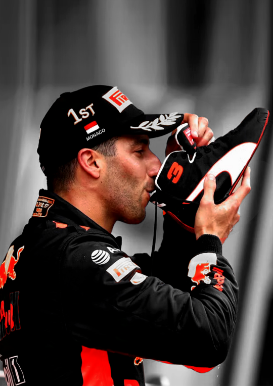
I want to upp the red even more then this so I'm gonna copy paste that layer two more times and THEN add a non erased selective colour and play around with the depth of the skintone until I'm happy with it.
now I'm almost happy with the colour, I want it to be a bit more blue so I'm gonna go to 'colour balance' and play around with that a little more.
this is the before and after of all that

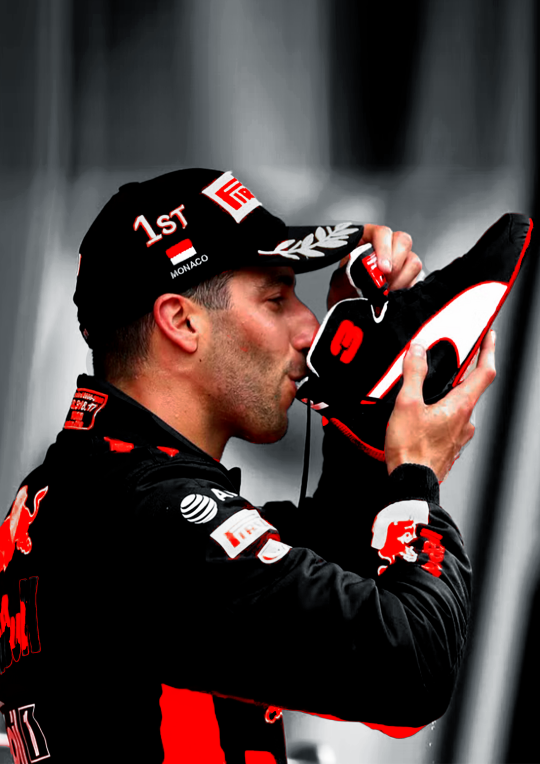
then I'm done with the colouring on the picture itself. I'm also gonna put all my adjustment layers into a folder to make my layers less busy
I'm also going to add noise to both the BG and front picture. it just gives a bit more texture and grain that I like
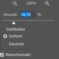
5. typography!
now the stressful part lol.
I know what I'm gonna add so that makes it easy. the name of the race, place and year. this is hard to explain, I know where I'm gonna put everything because off the other edits so it's just about finding a good font.
for this I'm not gonna fuck around with shapes and text layers and adjustments etc. if you want me to explain that please ask away that's just a whole other 5k worded essay.
I know what kinda font I wanna use at first already these choices have to do with a few things which is basically one questions I ask myself:
is there a vibe that already exists around the race and/or win and how do I translate that into the font? (is it fancy, cool, magical, incredible, bold etc etc)
here's an example of how a font can change the vibe
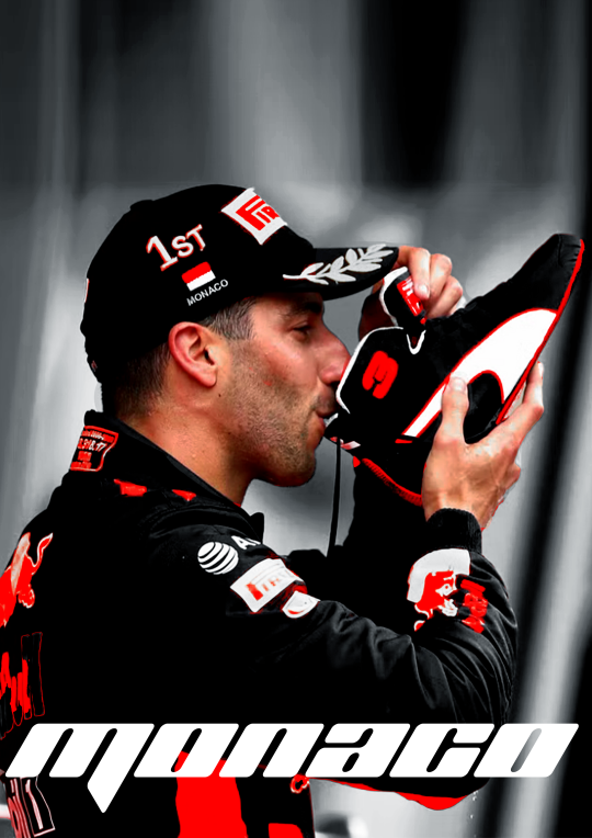
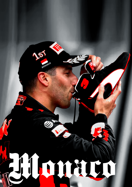
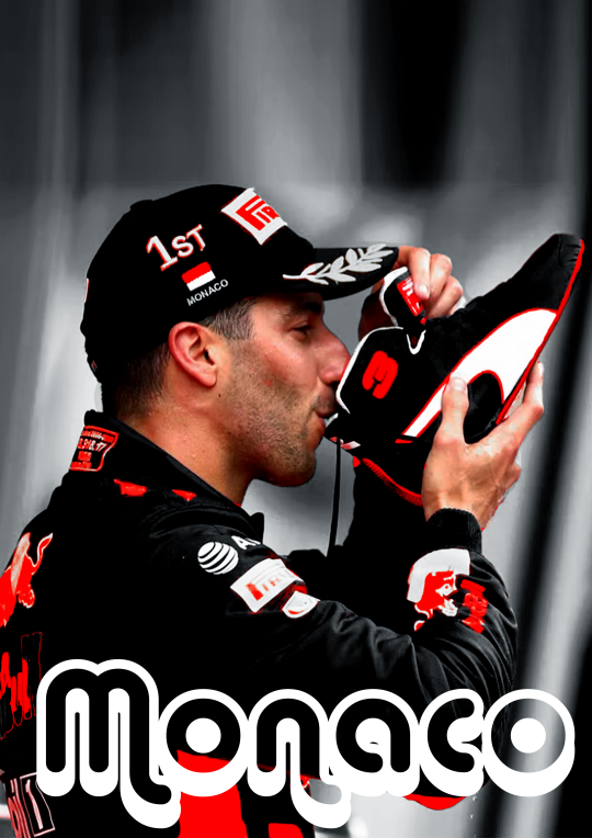
so the vibe I want to go with for this edit is fancy smansy n stuff so I'm thinking of flowly maybe 1930s vibes this is the font I ended up with
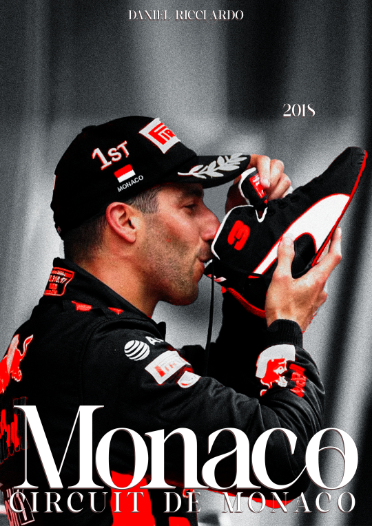
I'm still gonna move the place around but the idea if there.
(I change and play around with my text a lot so, again, ask if you want me to go deeper into this)
6. colour blocking
now for this edit I'm going to add a box of colour, I do this if I want to add a bit of an oomph and contrast to it, I like what I have now but I want to add some contrast to make the colour and him pop even more.
this is petty easy I'm basically just going to add a colour box behind him, I'm gonna do blue as well, thats the opposite of red on the colour wheel AND its the other colour red bull is associated with, also colour theory and all that etc.
I'm also going to add gaussian blur and noise to add some texture and use and overlay. heres the diff in with and without that to show the use of it.
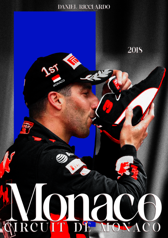
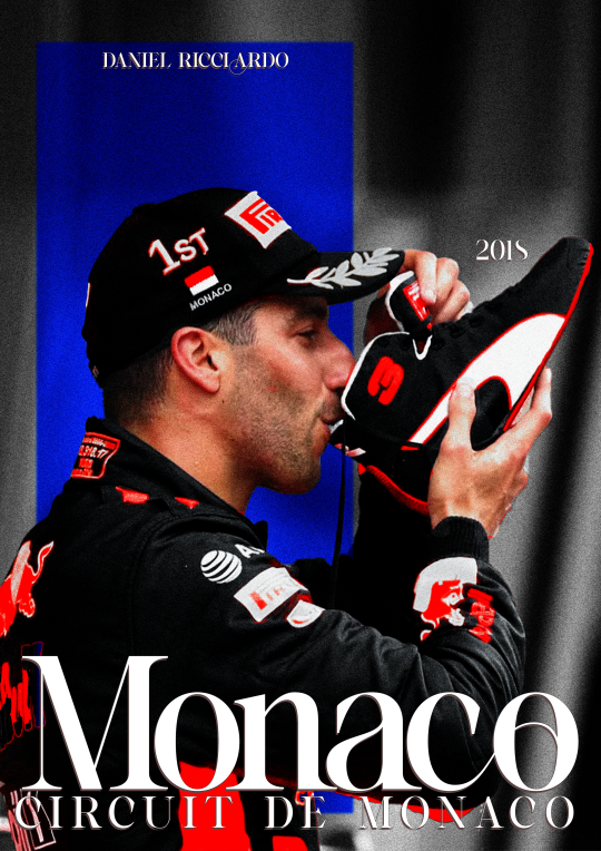
at this point I'm also going to move the text around (as you can see) to make it fit better with the added box
7. texture
the moment where it starts feeling like its finished.
for this edit I kinda want to add some photo texture and more grain. here are the textures I used:
I added these and put it on a screen overlay layer and added some adjustement layers to tweek the last few things.
you can find different textures on google, pinstrest and some awesome artists have texture packs you can pay for w just a few bucks. for these, again, if you're going to sell your work MAKE SURE ITS FREE FOR USE!!!
THATS it!
I add my watermark and maybe fix a few little things but thats all and then I'm done, I reccommend playing around and seeing what works for you.
enjoy and have fun <33
33 notes
·
View notes
Text
you know on the one hand. I think the projects on @addons that I work on are rather beautiful, that they're full of elegant solutions to interesting problems that I take pride in my contributions to, and I've obviously spent an objectively excessive amount of time on them. which are all things that contribute to them feeling rather substantial to me.
but on the other hand I do occasionally find myself explaining to someone who isn't an xkit user what I spent five hours working on on whatever day it is, and it's always like, well, you know, it does stuff like, uh, it can put an icon next to people's usernames when you follow each other? and, and such. and when I put it that way it sounds like the kind of thing one would code in an afternoon? you know?
(of course it's not actually hard to reconcile these things; I know that we spent the better part of an afternoon figuring out how to make those icons align flawlessly at any zoom and font size in both the post header and blog card modal, and another one making them have tooltips when you mouse over them and ensuring that the tooltips localize into your tumblr UI language. xkit rewritten is kind of like "okay but what if instead of making it like an afternoon hobby project you did it like it was made by the best web developers in the world." turns out that's not that hard when the project owner is in that category and the other dev will spend four hours per PR to kinda look like they are.
also I guess we do pull data out of react internals. that is a pretty significant thing that we do. like I understand where I'm coming from here but we very much do pull data out of react internals. go code that in an afternoon I dare you. disclaimer I can't take any credit for that bit; maybe I'd have figured it out in three years, idk—I don't think it'd have occurred to me to try, is the thing. anyway I did do a fair bit of hooking up to make it faster so that's a thing I guess.)
5 notes
·
View notes
Text
PROPAGANDA OF THE CENTURY
PROPAGANDA FOR @ocd-character-polls's COMPETITION!!!!!!!!!!!! VOTE SPY TF2!!!!!!!!!!!!!
JUST TO CLARIFY THIS IS ALL /J

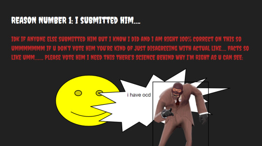


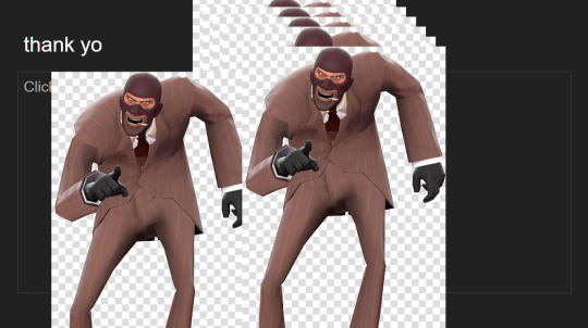
image ids under the cut and also in alt text:
[image id for 1st image: an image of the first slide. there is large, white, bold title text in the 'playfair display' font that reads "WHY YOU SHOULD VOTE SPY TF2 FOR BEST OCD CHARACTER". behind this text there is an image of the blu spy from team fortress 2. he is a-posing, and the image is stretched to look wider. below this is a bust image of blu spy, glowing and looking as if he is screaming angrily with whited-out glowing eyes. to the left is 4 images of the red spy, looking judgingly at the viewer. each image slightly overlaps the other and they trail downwards towards the bottom of the slide. each of the 4 images are surrounded with a somewhat-thick, black outline. /end id.]
[image id for 2nd image: an image of the 2nd slide. the header at the top is white and in creepster font, reading "REASON NUMBER 1: I SUBMITTED HIM...." the following paragraph is in red, smaller text in creepster font. it reads "IDK IF ANYONE ELSE SUBMITTED HIM BUT I KNOW I DID AND I AM RIGHT 100% CORRECT ON THIS SO UMMMMMMM IF U DON'T VOTE HIM YOU'RE KIND OF JUST DISAGREEING WITH ACTUAL LIKE....FACTS SO LIKE UMM....... PLEASE VOTE HIM I NEED THIS THERE'S SCIENC BEHIND WHY I'M RIGHT AS U CAN SEE:". underneath the paragraph is a large neon yellow smily face with a black outline around its head, eyes, and for it's smile. it's eyes are a slightly darker yellow. to the right of it is a large, spiky exclamation bubble with a black outline and white background. to the top left of the empty space within the bubble, it reads "i have ocd" in small, black, arial font text. overlapping the right side of the bubble is a png of the red spy from team fortress 2, looking, pointing, and laughing at the viewer. there thin, black, regtangular outline around the image's sides. /end id.]
[image id for 3rd image: an image the 3rd slide, with white text in arial font on a dark gray background. the header text slowly decreases in size as the sentence continues, and reads: "REASON 2: this isn't really a reason i just wanna talk about my ocd headcanon for him" the following paragraph begins with the word "SO" with a much bigger text size than the rest of the paragraph. the rest of the paragraph stays in one size and reads "basically i headcanon his ocd to mainly be contamination and moral [because he just like me fr]. i think he’s learned to cope with it a lot better since he’s started working with the other 8 mercs, though it had gotten worse before it got better. i think the other mercs helped him get the confidence and motivation he needed to be able to get through his intrusive thoughts and compulsions. i won’t go into what i think some of those would be here but i now have an idea to write a fic about that so i might maybe possibly". /end id.]
[image id for 4th image: an image of the 4th slide. the header is in the racing sans one font and is light blue, reading "REASON 3: BECAUSE I SAID SO AGAIN". below this, in smaller, arial font white text reads "please vote him i need this so bad". scattered around the slide is 4 images of the red spies and blu spy, either doing different idle poses or dancing. the images are various sizes and occasionally stretched to look longer or wider. /end id.]
[image id for 5th image: an image of the 5th slide. the header is in medium sized, white, arial font text which reads "thank yo". there are multiple copies of the same image of the red spy laughing, pointing, and looking at the viewer. there are white and light gray checkered squares behind him in each image. to the left of the overlapping ones, there is another copy of this image. all images are large and cover up most of the image. /end id.]
21 notes
·
View notes
Text
I got this in my inbox, and I think is a worth seeing argument:
It is about a previous post I made about Doflamingo and since it seems it´s causing some confusion, I want to add something (I´m gonna write my answer first, because it´s less confusing that way, and then let y´all read the collaboration I got after the Readmore section. IF WHOEVER SENT IT TO ME DOESN'T WANT IT HERE, TELL ME IN AN ASK AND I WILL DELETE THAT PART)
(*I wanna mention that this I am writing now is not an answer to the person who sent it to me, but something I wanted to add. I appreciated getting that perspective sent, and to that person, I'm gonna say, "Thank you." it was a good read)
As I mentioned in a reblog (which was in spanish) I may have explain myself badly, when I said they went through the same, I meant their shared experinces. Or maybe, I oversimplificted things. Yes, I do acknowledge the two Donquixote brothers grew up in different envioremnts, I am not ignoring how badly Doflamingo was affected, but the point of my original post (and here is where I think it´s the first miscommunication problem) was that I like how the show doesn´t justify him with his past. I like when villians are let to be so. Doflamingo is a twisted man with antisocial behaivor and that (in a work of fiction) it´s entrataining. I don´t want him to be justified, but I like him being explained. understood and justified is not the same thing, I should mention. Explaining a character gives it dept, but explanation is not always done so the audience can empathize, sometimes, it just does that explains.
The other thing is a matter of personal taste. I like doflamingo because I like entrataining villians, but I don´t empathize with him and I still cheered everythime the strawhats ruinned his plans.
Now the other issue with my orignal post, and form here on I will put the topic of the brothers aside and talk in general terms, also I will change the size of the font to indicate a mood switch because this may be controversial:
The decision to become kind does not depend on your past. It depends on you.
I stand by this.
BUT,before you all say anything,
No
I DO NOT THINK is as simple as “ah, get over it and be better to others!” I know it´s way more complicated, and I said it: it requires a lot of will. not to mention it´s painful, but it´s possible with help.
(Reminder that I am not talking about the Donquixote brothers here anymore, but genreall (and I will use you solely for the sake of simplicity):
Your hard past is not your fault. ok? if you suffered, what happened to you it´s not your fault. I wanna make that clear.
yet, there comes a moment when it becomes your responsability... by this I mean that using you past as a justification to hurt others is on you.
and I get not everybody get´s the chance to change. Not everybody will be helped, but know that if somebody is willing to help you, most of the work would be not in them,, but in you.
I am well aware there are real life examples of people that were never helped and that is, with no sense of irony, tragic and sad.
Sorry for that oversimplied rant there, I just wanted to make myself clear.
Now, from here on, is what I got in my inbox (read it if you will, I genually think is a point of viewworth of considering)
AGAIN, THIS ANSWER IS NOT DIRECTED TO THE PERSON WHO SENT ME THIS, BUT A CLARYFICATION OF WHAT i SAID AND A THOUGHT I HAD.
I am just sharing because it´s a point to consider. as the person who sent it said “it´s more complicated that that”
Thank you for keeping up with the mess of ideas and thoughts that is more brain, and now, this time for real, it´s the post I got sent:
Idk I think it’s more complicated than that. Those kids very much did not go through the same thing or have access to the same resources and that very much does impact their choices. Just the minor differences of one being the older protector to the younger drastically changes how they would experience and move through the world. Two years is a lot at that age and one was more aware more indoctrinated and needed more help and education to fix this.
With the story showing after they parted as children only Rosi received in any meaningful way while Doffy not only didn’t get any of that support but got negative enabling. If anything Law who was stated to be just like Doflamingo as a child shows that really more than being stopped or controlled the child needed to be rescued.
Sure now the character needs to be stopped but still it should be noted the first attempt didn’t work and ended with a death and the second one hasn’t really fixed any of the problems that created the situation nor corrected the man in question as another prison break could unleash him again. Doffy had issues but his brother was completely wrong in believing he was born evil and was never afraid or cried. We see evidence all throughout the flashbacks and present day that was never the real problem with the kid.
Rather it was the negative lessons he internalized that were promoted throughout his life by the people around him and that he later promoted and spread. For example Doffy wasnt born believing owning slaves was good he learned that from other adults and his parents never corrected this before they moved. So as a child he isn’t broken or twisted he is repeating the values taught to him and engaging in behavior he would have previously been praised for.
His negative reaction to the change is actually a common childhood reaction to drastic shifts in their environments and 180s in how they have previously been raised. You see these reactions all the time in real world deprogramming initiatives and kids from those do go on to change and live better lives. Doffy isn’t a god or monster he’s a normal human being. His actions are his own and have consequences that he must live with but they are also shaped by his environment. Not 100% one or the other but a toxic mixture of both.
#i can see why people understood I meant thet went through the same. I rarely proof read and I didn't explain myself#another character who wnet through hell is nico robin and I kinda wanted to mentioned her up there but it got to long#donquixote doflamingo#donquixote rosinante
5 notes
·
View notes
Note
hello :3 could you make a tutorial on your hyunjin day gfx please :3
oh wow! sure, i don't make gfx that don't have gifs much so my process is kind of a mess but i'll try to make it a bit understandable! lol
basic photoshop understanding is needed here, like knowing how to use layer masks & clipping mask the most, also how to cut the background of pictures!
we're making this!
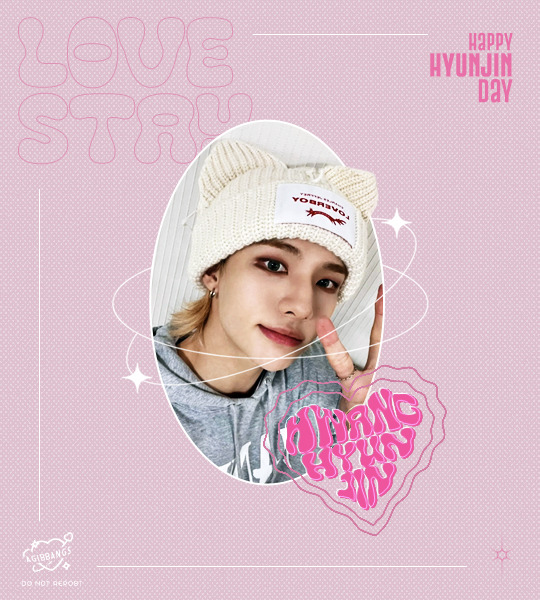
under the cut bc it's kind of image heavy, if something isn't clear pls let me know so i can explain better <3
I started on a blank canvas of 540x600px and colored the background with the shade of pink i wanted to work with, on top of that i added a half tone texture image i found online (i think from deviantart? or maybe another place idk) changed it's blending mode to lighten, adjusted the size and then reduced the opacity of that layer so it didn't look too much in my face. this is what we have so far (ignore the cyan lines, it's only a guide to center everything in the canvas)
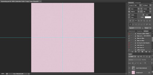
now i go to the left panel and click on the shapes tool and choose the ellipse one and draw an elipse in the canvas, the size of the ellipse depends on you tbh, i didn't make it too big bc i knew there was going to be a lot happening in my canvas and i needed the space to work so it's your choice how big you'll make it. once i made the ellipse, i made sure it was centered and proceeded to work on the picture i used
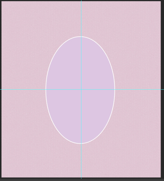
the settings my ellipse had

now the hyun pic! i opened it in another tab on photoshop, and with the pen tool i traced all of hyunjin's shape as if i was working on to erase the background (you can use the quick selection tool or the wand, i prefer the pen tool to erase backgrounds tbh) and then i went right click -> layer via copy (this is very important!) and when i had two layers (the original picture and the new layer of only hyunjin) i dragged them to my gfx canvas, and then resized it around the same height my ellipse was
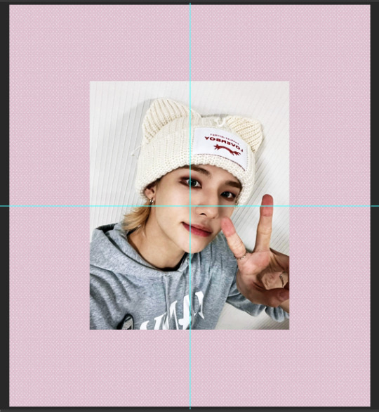
make sure the pictures are ON TOP of the ellipse!!! now select only the layer of the full picture and then right click -> create clipping mask and the full picture will be inside the ellipse
your layers panel should look like this

and your canvas like this
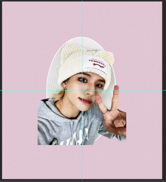
we're almost there! now we select the layer that only has hyunjin and we add a LAYER MASK to it, and with a black brush we paint the parts we want to erase
your layer should be something like this

and the canvas like this
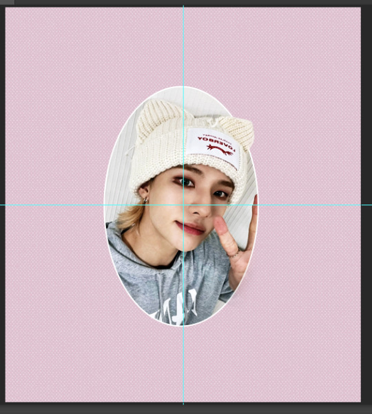
now i added some decorations, found the sparkly lines i used around the image on pinterest! they are called monoline frames and there's lots of them to pick tbh, the one i found had a white background so i just inverted the color of it and then changed the blending mode to screen so only the lines of the frames were visible and then erased anything i didn't want with a layer mask, it would have been easier to find just a transparent image but pinterest doesn't have those so i had to make do lol
the layer panel now looks like this for me

and the canvas
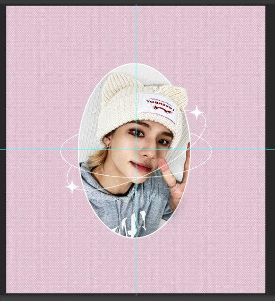
after this i worked on the typography! for the "love stay" i used the font called "Cleo Folk", i arranged it so on the layers panel it would be under the layer of the ellipse, then for the text that says happy hyunjin day i used the font "Gobold Extra 2". i added some lines using the line shape tool too
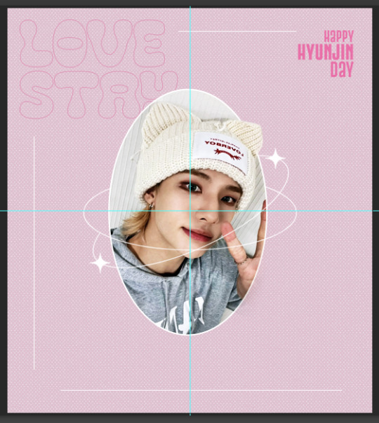
the heart shaped thing that says "hwang hyunjin" is a custom i made myself messing around and if you want to know how just let me know! but you can just use a warped text, it won't look like it's inside a heart but it'll still look pretty ! after that i added my watermark in the corner and saved it as png and all done! for the other image on the set the process was the exact same!
finished result!

i hope this helps? if i missed any detail please let me know!!
16 notes
·
View notes
Note
I’m sending this cause you said you were here in case someone wanted to talk idk if you meant inbox or not but something’s been on my mind and I don’t really have people to talk to so
a lot of people are living out of spite and I’m glad it’s working for them but that’s never really been my thing my home life is really dangerous and school life plus medical stuff that parents and teachers are actively making worse etc and pretty much all of my life and it always has been I was never going to give up even though I’m always on the line with my situation
I thought I like warmth and softness like the feeling when someone’s pet sits in your lap or when you eat a warm meal or sit in a warm bed like the feeling of safety and also like the emotional-ness? The happy peaceful feeling and I can’t be the only person who wants it there’s so many people in the world so somebody else has got to be like looking for it in friendship and whatever and that’s why I keep going
because I just feel like it I want to survive I’ve been going because I want to be friends with those people I want friends that are all sweet like that that’s always why I’ve kept going and some new asshole president isn’t going to change that for me I was already in serious danger I was already barely hanging on and I was already fighitng to keep going this little guy isn’t going to stop me even if this is what ends up getting me in the end it’s not going to make me stop trying or anything
and now the coolest thing is every now and then I’ll meet someone or a group whose just so warm and sweet and I get so attached to the concept of just that kind of person being everywhere in my life and I think I’ve really fallen in love with like warmth and softness and that safe feeling and I was right I was right about this whole thing that like some people crave this warm safety and I’m proud and happy hell I was already proud but now I’m even happier and prouder
I just kind of wanted to say it because a see a lot of people encouraging like live out of spite because you have to and yeah! If that’s all you’ve got then do it! But I just wanted to talk about why I’m living I made a guess when I was maybe six and I’ve been going off of it ever since and I proved myself right and I’m just so proud of myself and I’m happy I’m still working on everything but I’m still proud of this anyway I figured this out so young with every adult who was supposed to help working against me and lying to me (and still doing all that garbage) but I figured it all out anyway and I thought it’s just a matter of time and it is I either go out trying or I make it and I took that and ran with it no matter what happens I did a damn good job I was a smart kid and I knew something was wrong with what people were telling me I figured this out and kept going and I promised myself if anything else ever feels off about what I think I’m never ignoring it I’m going to work through it and unlearn whatever I have to and I did I’m proud of that to of course at the time I didn’t have the words to fully like know what was happening but god I was so committed to waiting and learning and I’m so proud of myself and I’m so happy I love myself now it’s such a nice feeling I did so good
Of course I'm here. My inbox is open to anyone and everyone, always. In fact I haven't announced it yet, but I suppose now is a good time for @yourcooluncletom . It's basically an additional inbox like @your-queer-dad (sorry for the notification!).
Anyway.
I might not be able to read all of that, mostly because of the font size, but yeah. You don't have to live out of spite, but you have to live. That's all we can ask.
Much love 🫂🫂🫂
0 notes