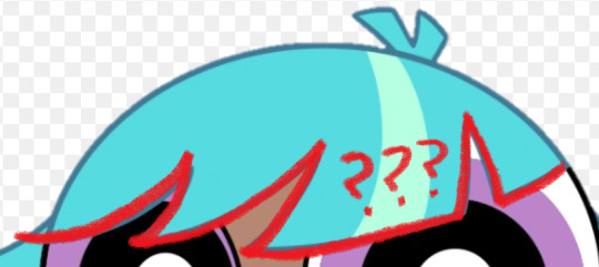
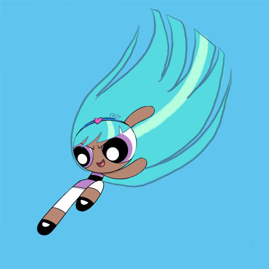
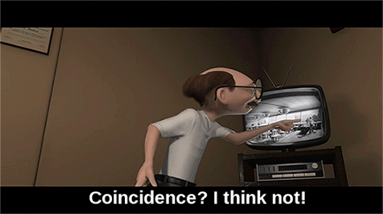
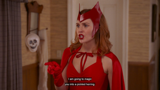
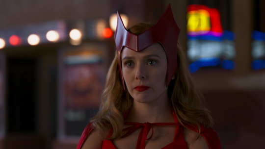
#idk it’s just an iconic silhouette so I’m like what’s this then
Explore tagged Tumblr posts
Visit Tumblr Blog
Explore Tumblr blogs with no restrictions, modern design and the best experience.
Last Seen Tumblr Blogs


Fun Fact
Tumblr Inc. has $15.1M in annual revenue.
Text
Just started watching season 2 of Interview With The Vampire and I think it’s really interesting how the opening European (?) landscape resembles the landscape of New Orleans


Literally no idea if it’s not a coincidence and I have no conclusions to draw about this but I thought I’d throw this out there in case someone else can
Something something they can’t really get away? Idk
#interview with the vampire#iwtv spoilers#iwtv s2#idk it’s just an iconic silhouette so I’m like what’s this then#probably cornplating 😔
7 notes
·
View notes
Text

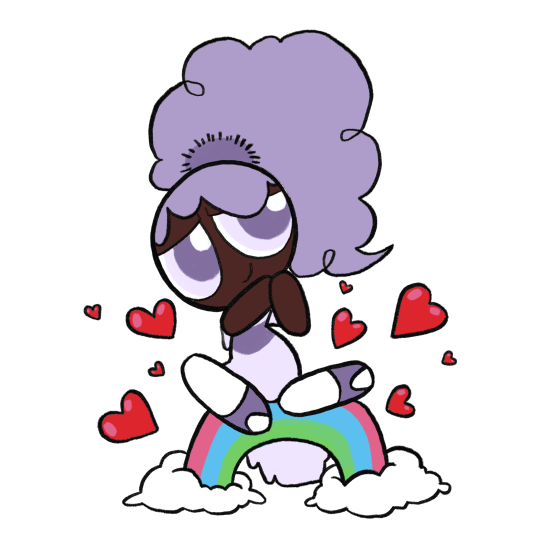
bliss redesign based off one I made in my teens
thought process + various other bits and bobs under the cut
I was 15 and annoyed by everything that moved when this character first came out, so in my own head I was very much making a Point with this redesign. Hence, I made very minimal changes. I wanted to work with what was already there and basically just make the existing design more thought-through. Little breakdown ahead (keeping in mind i myself am very much An Amateur who doesn’t know shit and am just ranting about my opinions and i also haven’t seen a single second of the 2016 reboot so i don’t know much about Bliss to begin with)
1. one of my Biggest pet peeves with Bliss is that the powerpuff girls each have bangs that are simple, memorable, and iconic while also being unique from each other and being reminiscent of irl little girls hairstyles. It’s very neat and clever and I like it a lot
and then Bliss has this confusing jumble of shapes that looks like it changes in style halfway across her forehead
i have absolutely no idea what the intent is here. My only guess is maybe it’s meant to look weird on purpose like she was trying to cut it herself or something (I suspect it’s something like that since she seems to have normal looking bangs as a little kid from what I can see) but it doesn’t really come off that way if that’s the case. It just looks like baby’s first PPG OC where you Understand that it’s meant to be hair and that it is made out of shapes but have 0 understanding of hairstyle or character design in general. Heck I might have put this exact hairline on a character in the past at the age of like 8
So in my redesign she’s got 5 even notches across her bangs, not thee most exciting change but it does the job I think. It is pretty reminiscent of Blossom but they look different enough from each other that I wasn’t too worried about it
2. low-hanging fruit time, Bliss’s hair color is horrible on the eyes. I’m bewildered at the decision to do this, especially since there is just so much of it, I struggle to think of how she could exist in any scene without hogging all the viewer’s attention constantly. That said, I understand they wanted her to have an unnatural hair color to really signal that she is a Fresh new Teen character from the late 2010’s, which is. Whatever, that’s fine, so she gets purple hair now. I kept the streak for the same reason, especially since she’s got a lot of hair, so no harm in a little extra interest in there.
I also learned recently that her hair glows sometimes? which i did Not know when first drawing her but well i think the darker color helps anyway. It adds some contrast for when she’s normal vs when she’s glowing and makes the latter appear more,, idk threatening or powerful or whatever the mood generally is when she’s doing that.
I did re-add that toothpaste blue to her eyelids though. I like to think it’s also the color of her lasers. It’s a cute color, just not as like 70% of this character’s palette
3. real talk I was drawing this from memory and didn’t mean to change the way her hair flares out from her head. realistically I think the original is fine, maybe just a little boring but fine, so that part of the redesign was an accident. Only thing is, it’s in the exact same position in every screenshot I’ve seen? It doesn’t seem to whip around when she’s flying or anything which looks weird and probably looks weirder in motion, especially since it takes up so much space onscreen. Idk it’s a strange decision, esp since the original show liked to use the ppg’s hair to emphasize their movement, so I’d just bring more movement into her hair. I mean if nothing else it’d make her look cooler.
very very rough little visual of what I mean
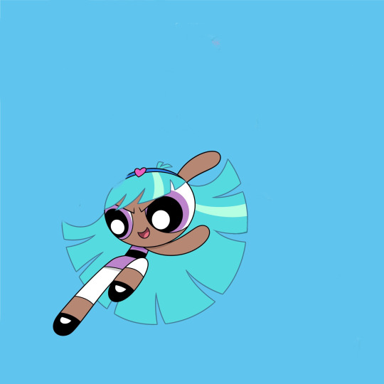
I also ended up making it shorter in my redesign—again, not really intentional, but I think it’s better that it eats up a little less of her silhouette
4. Her headband is largely the same, I didn’t hate the idea of her having an accessory, so I just toned down the colors. I’m not personally a fan of the powder blue and that pink heart is very bright and just doesn’t go with the rest of her (once again the color of her hair is doing it no favors). I also moved the heart over. Not necessarily needed I think, but I feel like it reads quicker as a headband and not a weird crown that way+introduces some asymmetry into her design that I think is nice.
5. my biggest gripe other than her bangs are her hips. I’m not against adding anatomy to this character design to make her read visually as older than the girls, but it’s so awkwardly done and distracting. I feel like it even interferes with her line of action more often than not (which is not helped by her unmoving hair).
Part of the issue is she still has the teeny tiny torso, just… with those square-ish hips slapped on, which makes her legs look all gangly and stretched out. I tried to balance out the proportions more in my redesign, as well as change the hips to a flared skirt. I think it helps differentiate her from the girls and still implies hips underneath, it just also functions as a less clunky transition from her torso to her legs.
Lengthening her torso also allows the stripe to look more like a belt above the skirt, which I think helps to sell her as “similar, but not the same” from the ppg
6. Her leggings(? Idk Im not a fashion person) aren’t a bad idea I think. like a more mature version of the girls’ stockings, but I think the white makes them look really distracting. It would help to make them a darker color I think, but since I wanted to keep them reminiscent of the girls’ socks I kept them white and just shortened them.
7. Not really sure what Bliss is wearing on her feet. I think they’re Mary Janes, but they’re drawn a bit different from the girls’ and I honestly think it’s too babyish a shoe for her to wear. I’m not sure what she’s actually wearing in my redesign either honestly, but the goal was just to make them look like the girls’ Mary Janes while clearly being something different.
8. Uh her signature color is something I’ve contemplated changing a lot but to be real I think it’s fine. I feel it was a very bad idea from a marketing standpoint because people were hype about Bunny and would obviously be mad they didn’t get her once the character actually dropped (and in the long-run she would just end up being overshadowed by the character everyone has already assigned that color to) but I’m personally not bugged by her being purple beyond that. If I were to draw them together though I think Bunny would have a more pinky shade of purple and Bliss leans more blue.
Loosely on the same topic, because of Bliss I’ve had a running headcanon that “only child” types of powerpuffs tend to come out purple. Kind of like how trios tend to have a red, blue, and green. It’s a fun little piece of fake lore to rotate around in my brain
Anyway with all that out of the way, here’s some redesigns I decided to have some fun with. Wasn’t being too precious about recognizability or simplicity or anything like that, but I did run out of steam partway through. There’s also one based off Whoopass Bell bc idk, why not

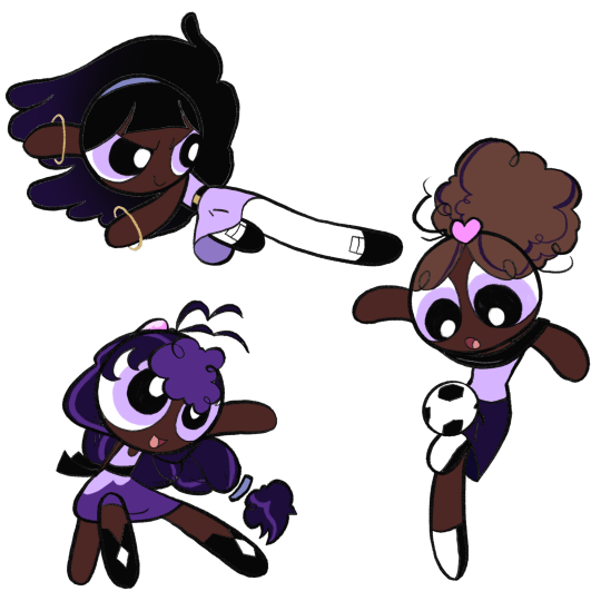
Finally, here’s some OCs I only ever drew once before out of a desire to give Bliss her own teen girl archetypes to form a team with. This is Bee and Beetle, who I’ll probably definitely forget about again immediately after posting this

#ppg Bliss#the powerpuff girls#my art#powerpuff oc#under the cut anyway#trying to do an interesting background#i got bit by a drawing bug and felt the strong need to finish this post today#i’ve been meaning to put together some art and a little ramble about bliss for a while#largely because idk if or when i’ll ever actually talk about her again#i also skimmed through this post once or twice so sorry if it’s incoherent#anyway this took a long ass time i need to take a nap or something
91 notes
·
View notes
Note
What are your opinions on Xever Montes’ Mutation to Fish face. I saw some people complaining about him being nerfed. Or complaining about him being a fish, excetra. One of the comments I came across said that they wish he had become something more agile, to fit his fighting style. And I thought occurred to me that it was technically an opportunity to bring in a 2012 version of Overdrive. but they probably didn’t do it because of TigerClaw.
I personally don’t really care about that. And my Tiger Claw is a Good guy. So I decided to utilize the idea of Xever becoming a Rise/Prodigy version of Overdrive

OOOHHH!! I love this idea! And your design looks so cool! Xever the Jaguar Man!! I gotta remember this one!
Oh, I’ve never heard of that criticism before. I actually didn’t think it to be much of a nerf, since, while yes he has to rely on robot legs to walk around and oxygenated water to keep him breathing, he makes a few references to being strong than before.
I think too with his venomous bite, he’s probably at least equal to his previous form. I do kind of wish he would at least try to use his bite more often, though I do understand the writer’s apprehensions to doing that as Raphael already got bit, so having more characters get bit might seem repetitive and loose it’s gravity. However, Xever perhaps at least trying would seem a little more believable, even if he doesn’t succeed again, but idk, just a personal opinion.
I do agree it would be very cool if Xever was a jaguar. Not exactly sure where he’d come into contact with one of those, but it would be cool to see. I do also agree that having a jaguar and a tiger villain on screen could become confusing.
There’s some what of a rule to designing characters that your characters should be iconic enough that you can tell who it is and tell them apart from the others purely by silhouettes. The turtles scrape this line very close, but with them being different heights and sizes and having different weapons, you can usually see the difference.
Perhaps if they made Xever something more like a cheetah or just a very thin jaguar, they could’ve gotten away with it, as Xever is very thin, and Tiger Claw is very broad, you’d still be able to recognize them as separate characters.
Again though, I don’t know, just some thoughts. I definitely like Xever more as a big cat, though I think I still like his fish design as well. I don’t know who Overdrive is(I’m guessing probably a IDW original?) kinda sounds like a transformer, lol 😂
Good question! :]
#tmnt#q&a#tmnt 2012#xever montes#tmnt xever#tmnt overdrive#ninja turtles#teenage mutant ninja turtles
42 notes
·
View notes
Text
The bands back together! And they’re old lol
Art Notes/Rants below ⬇️
⚠️Warning⚠️
it is very long, I got a lot to say apparently lol
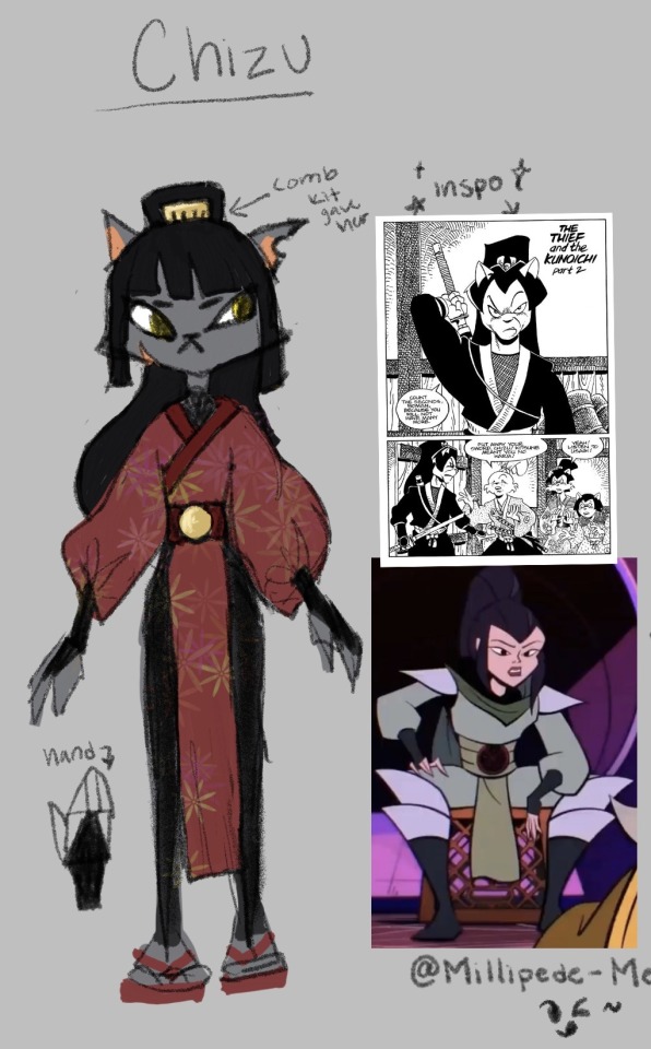
❗️They’re all aged up btw! In case you’re all wondering why i’m even redesigning them lol
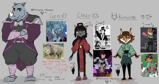
🐱Chizu Mini Rant: I hate Chizu’s design in the show. Not the clothing more so the body model. I hate that they made her the stereotypical curvy cat girl with a tiny hourglass waist and tiny hands and feet. Really weird proportions, Like we’re going back to the betty boop era but no one else in the show looks like this? (Also, No hate to people who are curvy btw love you) It just doesn’t feel like it belongs in the show. Maybe if she were shorter, it would work better? Idk Also she’s like the only one in a full skin tight suit (like I get animation, but they didn’t even bother giving her implied loose clothes or armor like the other ninjas? Maybe bc she was undercover? but then she should’ve been wearing something closer to the bg character models) It’s like they’re trying to make her sexy but like why?????? for why????
I really liked the concept art of Chizu. She’s got a more sharp/rigid and square silhouette but still some curves (w/o it being weird). She still has tiny hands but her head isn’t the size of a watermelon and her face isn’t super tiny, the proportions are good. She’s all power stanced up lol She looks mean and menacing, someone not to trust or mess with. It’s literally spot on. ✨chef kiss ✨ It’s also probably why they didn’t really go with it, they probably rounded her out to be more appealing for the reveal? or she was hard to animate cause she did have baggier pants idk. Who am I, but a rando with a hard boiled egg for brains.
Art Notes: I took a lot of inspiration from the comics and I did want to keep her iconic red so she was still recognizable & stand out from the neko ninja. I made her a regular black cat! (with the idea of black cats being less likely to be adopted & be strays) (;-;) (I know she was kidnapped but still!! The stray cat vibes!!!) I gave her a more lean and tall figure, kinda like the comics but also to play off of Kistune’s height and it give scrawny stray cat vibes . . . again lol. It’s also a body shape I don’t see a lot in physically strong female characters (or maybe I do and just don’t remember? Idk but she can definitely kick your ass & she’s not here for anybody’s bullshit lol) I gave her the iconic ponytail from the comics along with the comb Kitsune usually wears. I wanted to give her green eyes (bc black cat & red and green) but i just kept them yellow. Maybe i’ll go back and change them. Her outfit is mostly inspired from Karai (bc she’s a ninja from eons ago & the gang is a little more traditional) just (pretend cuz i’m lazy) with traditional Japanese patterns. Chizu definitely got kunais and stars up her sleeves, but bc she doesn’t have to be a ninja anymore, I imagine her more into wearing pretty dresses with patterns and cute things. Stuff she never got to wear/ enjoy as a kid, you know. The show really wants to push her to be a bad ass girl boss who hates everyone and everything and is too cool and edgy for games but idk. I like to think she left the ninja stuff behind her and started living her own life based on exploring things rather than just being the cool ninja with an edgy backstory. I think she uses ninjitsu as a means of self defense but doesn’t like being connected to it b/c of the kidnapping and stuff. (We also see how she doesn’t really care about the tradition of ninjitsu cause during the show, she has no fucking clue what to do with the neko ninja, she just wanted them to stop hurting people and wanted to free the babies lol) Usagi and Kitsune are the ones who indulge her childish side. She wears a lot of red but her favorite color is pink. Kitsune def hypes her up and goes feral when she wears pink.
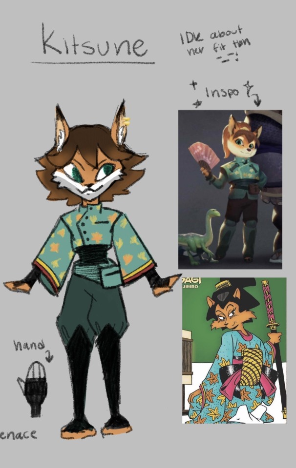
🦊 Kitsune Mini Rant: I hate Kitsune’s clothes in the show. Idk it just doesn’t look right on her. It’s got no shape it’s got no hiding spots for stolen goods. It’s not Kitsune. I like the concept art fit, it’s really cute. (She looks like a mini tank who will fuck you up in a cute way) but still #1 thing missing. Hiding spots for stolen goods!!! She needs some loose sleeves or flowy clothing like in the comics. (btw: I know it would be harder to animate in the show therefore I accept what they gave her but still!!!)
Art Notes: I’m not too sure about Kitsune’s fit tbh. I’m still workshopping it. She just needs something with loose sleeves! (Like she for sure is stealing shit and putting it up her sleeves, you can’t tell me i’m wrong/ it’s also where she could keep her fans!) I think i’m obsessed with her sleeves cause I imagine her gambling or playing a game of cards with a bunch of dangerous criminals and someone accuses her of cheating and she goes “What?! Me?! No, no. I’m just that good or maybe . . . you’re just that bad-” Then all the stolen cards fall out her sleeves and she just goes -fuck. and it turns into this picture vvv

ANYWAYS!!!! I gave her short hair bc idk, a girls gotta change it up sometime 💅 I actually liked her hair mimicking a fox tail but I feel like she would get bored of it and chop it all off one day. She's definitely the one who cuts and dye’s her hair at 1am then cries about it the next day. She’s got visibly longer ears and sharper face. Kitsune and Usagi wanted to get piercings together cause they’re besties and want to be edgy (she lowkey got it on her left ear to match Chizu) and so they did and Usagi’s Auntie was so PISSED lol. They got chewed out. Her hands and feet should be a little darker but i forgor. Also she’s got dark teal wrappings so it would be hard to tell anyways. I gave her the crop top with buttons from the concept art and the sleeves from the comic. They have the same maple leaf print from her comic too (i’m just lazy) and the cuffs are just lined to mimic the layers she had. She’s got her little pack, she’s also got some more smaller ones on the back (kinda like Leo). She also made a comment about not having money to buy herself shoes so . . . she’s got no shoes lol. It just wrappings under her shin guards. (no shoes just like Leo smh) It helps her be more sneaky tho >:)
Oh and they’re dating but i feel like that’s a given lol. I saw people shipping them at first and it literally went -> *sees ship* Oh they’re shipping the only two main female characters together again- yeah that’s greeeat- *Watches the show* oh. nvm I retract my sarcasm, they’re def gay for each other, thats nice. This is nice -w-
which is pretty funny, cause I think they don't like each other in the comics? (from what I saw in the singles panels I used as a reference at least) Chizu’s legit ready to kill Kitsune lol
Post Note: I totally forgot Chizu chose a bow and arrow as a weapon so now she’s just the stereotypical tall archer . . . i’m gonna go now ;-;
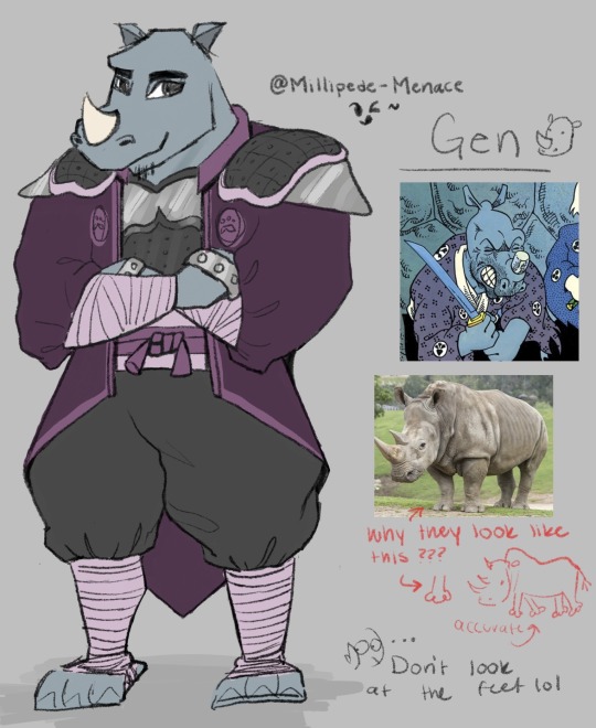
Gen Mini Rant: Holy Moly dudes, he was sooooo hard to draw ;-; I don't hate his design at all, actually it's one I like the most. I just don't like that there's not a lot of contrast on the 3D model and he kind just blends into a purple blob. (for me at least) I defiantly didn't do him justice but that's the best it's gonna get (from me that is.)
Art Notes: Don't look the feet . . . for any of them but mostly Gen lol. I don't really like the purple I chose but every color combo I did just looked bad idk. I can't do color, don't look at me man. Me and purple do not mix. He's still a bounty hunter so I wanted to keep his armor but I wanted him to have a long tail-coat/cape-ish jacket cause he would look cool as hell with one of those >:) (prob not practical but still) I wanted to add elbow and knee pads, but he's a rhino, he can take it. Also how can bad guys hurt him if he's too busy beating them up with his brass knuckles? He's still got his clubs but he likes clanging his fists together. lol His horn grew back! He's also got a goatee and everyone makes fun of him. The gang always threatens to shave it off in his sleep. I took more inspo from the show than the comic cause I don't really know Gen in the comics and what I did find was just miyamoto usagi but purple ;-; (clothes wise)
I wasn’t kidding, I had a lot to say, any survivors?
Feel free to suggest or critic my designs!! :0 Im not a design person and its mostly just for fun, but i looooove hearing people’s takes, especially hot takes >:) i like poking brains, its fun ^^
#samurai rabbit#usagi chronicles#samurai rabbit: the usagi chronicles#i am cringe but i am free#my art#no flirting with the lifeguard#lifeguard au#chizu#kitsune#murakami gennosuke#gen#rottmnt#at least I tried idk#rottmnt redesign#sketch
36 notes
·
View notes
Text
i think what i’m rly enjoying about my samurai champion “haven t watched this in over a decade” rewatch is seeing how much bodily diversity is in the show??
everyone has different face shapes, body proportions, skin tones, eye shapes, hair styles, and heights.
i’m kinda just used to anime where even when everyone doesn’t have the same face and they’re just different via eye/hair color and fashion accessories, they’re still relatively identical; it’s just a difference in boob size or maybe eye shape that rly makes someone different. people will have iconic hair styles or like idk maybe a facial mark that makes them stand out
but literally when background characters in samurai champloo will have different markers. high cheekbones or gaunt faces or round bellies or bulky arms.
it’s just… refreshing?
not saying it’s always perfectly executed and i think SC is very much Of Its Time (not an excuse) but idk… I think a lot of current animation struggles with actually giving bodies and faces their own definition and range
so they kinda just feel like characters made with like… an online dress up game where you’re just sticking features onto the same mannequins/silhouettes
2 notes
·
View notes
Text
Khushi’s Fashion Makeover
This is my attempt at giving Khushi a reimagined, 2022 makeover, as some of you were curious to see a alternative take.
Khushi was incredibly challenging, compared to Payal. Her fashion is less straightforward and more up to interpretation. Also, being the main character adds another layer of pressure! Idk if I’ll ever get a chance at working for AR but here’s what I came up with:
So I know this is either a hit or miss but I had 3 factors that I had to try and meet … 1. Colourfulness 2. Mobility/Comfort 3. Quirkiness
Khushi is a person who loves colours, she loves being bright and has a very playful personality. It’s also important to dress her in clothes that visually separate her from other characters as she is the main character…so I got all these outfits from brand called Indya, they do really fun, modern and quirky Indian clothes! I feel this brand was perfect for Khushi!
I tried to stay away from sarees because Khushi prefers dresses and churidaar, for mobility reasons ..she’s always running around, energetic, up to some shenanigan! Sanaya is a petite/ Gamine-like woman (a lot like Audrey Hepburn), so she looks the best in fitted silhouettes. I liked the idea of her in sleeveless dresses, just to give her a more youthful, flirty feel (this is her wardrobe post elopement - kidnapping period …so there’s a sexiness and modernisation to her dressing that didn’t exist previously). Also, I know those sets don’t have dupattas, but I would definitely add them …Khushi wouldn’t feel comfortable without one and I think they would make the outfits more elegant.
I chose some sarees too (not that Khushi needs any help in that department, she’s got amazing taste in sarees!)
But these sarees are for a mature, sexier Khushi who’s settled into her marriage and new lifestyle. So they’re very much on the glamorous, sparklier side (a call back to her ‘chamkili’ self!)
Now hair!
I actually love Khushi’s long dramatic hair, it’s very iconic and paired with ^^^ outfits, it would look amazing. I’m just not a fan of when it’s pinned from the sides, I feel it looks a bit dated. I much prefer it long, open and dramatic.

(Pic from Pinterest.)
Alternatively, the curtain bang style she sported in the serial Rangrasiya really highlighted her Gamine features (again, like Audrey Hepburn). I know she had a fringe in the later episodes of IPK but I feel it wasn’t styled as nicely as it was in RR.

(All images from Pinterest)
I think it would have paired nicely with the fitted, vibrant clothes.
I want to just add an alternative style too…as the above style is a bit unconventional! Khushi looks amazing in Jewelled tones so I could also see her wearing a collection of high-end Anarkalis and elegant suits.

I don’t know if I completely missed the mark with this one, I certainly won’t be getting that job at AR but again, this was really fun! 🥰
I’m curious to know how would have styled Khushi differently??
Honey!💗✨
44 notes
·
View notes
Text

Rose/Pigella Rose was done so dirty by the 3D and the colours in this show. They really did pick the ugliest pink to put her in, didn’t they?
I’m sure you’re wondering “why is a character named ROSE in blue?”, glad you asked. Colour is a pretty handy tool for visual storytelling, and I’ve been using it for these redesigns. Most notably with Adrien and Gabriel who are both in white. Pink is Marinette’s colour in this rewrite, with red representing Ladybug. So having Rose in pink would destroy that. So I put her in a baby blue instead with pink accents.
Her dress in canon is so ugly and unflattering, I had to change it. Nothing to salvage just burn it. She’s now a y2k picnic bitch.
And she runs an aesthetic bullet journal blog in her spare time, using all the cute stickers. She’s also trying to get funds to start an “akumatised therapy center”, where people who were traumatised by their akumatisation can enter a support group and heal together and hopefully not get akumatised again. Feels like a very Rose thing to do.
Oh man. Canon Pigella. Wow. Probably the best transformation sequence, best power and WORST DESIGN in the show. I think the designers struggled to make her “pig-like” without it looking weird. But the result was an ugly suit with an ugly skirt and a weird pink plastic thingie on the chest. If think if you showed a picture of Pigella to someone who doesn’t know Miraculous, they’d not make the pig connection. So I straight up gave her proper pig ears, and pigs often have brown patches and spots. So I removed the ugly bright pink and replaced it with soft pastels and browns. Problemo solved.
Idk if it’s copyrighted, but if I had it my way she’d be called Miss Piggy.

Alix!
Alix’s canon design isn’t awful, just a bit boring. And misleading. The snake arms kinda led you to believe that she might get the snake Miraculous, but I guess not. I’d still love to see a snake Alix at some point though.
So my revised Alix is a bit different from canon. She’s quite introverted and mostly keeps to herself, but accidentally becomes the mysterious cool girl. Oops amiright? (Quick reminder that in this rewrite the Miraculous were lost and spread out across Paris before the series began) Like Lila she found a Miraculous prior to the series beginning, and has been using it for a little while in secret. Not for evil obviously, just for normal daily stuff. I hate Time Travel in Miraculous, so instead Bunnix has different time powers. She can slow down, speed up and temporarily stop time. And she mostly uses this power to sleep in and then not be late for school. Normal stuff really. She’s also very observant and is quick to figure people out. Aka she doesn’t like Lila and can see through her bullshit.
So redesign wise I drew heavy inspiration from Billie Eyelashes. She’s short and stocky (can and will supplex you) and likes sports, so she wears sporty clothes (duh) but make it stylish. Like she picks her clothes because they’re appropriate for physical activities, but accidentally becomes a fashion icon in school. What a legend. I like her canon shorts and layered top, so I wanted to keep them in spirit.
And then Bunnix... Canon kinda forgot who Alix is and just slapped a boring skin tight suit on her and called it a day. So my main goal was to give her a more interesting silhouette. And she’s not older anymore, since there’s no time travel. To match her civilian self she’s in a casual cropped hoodie (yes the hoodie has holes for her bunny ears), a cool shaved haircut and god damn roller blades. Would that kinda mess with canon? I guess, but Alix needs her skates to GO FAST. She still has her umbrella, I just suck at drawing poses with weapons.
There ya go! I wonder who’s next?
#Miraculous Ladybug#Miraculous Ladybug Redesign#ml alix#alix kubdel#Alix kubdel redesign#Bunnix#Miraculous Ladybug Bunnix#Bunnix redesign#Miraculous Ladybug Bunnix Redesign#rose lavillant#rose lavillant redesign#miraculous ladybug rose#Pigella#Pigella Redesign#Miraculous Ladybug Pigella#Miraculous Ladybug Pigella redesign
387 notes
·
View notes
Text
Hello and welcome to “historically ever after” as named by the amazing @feline17ff you’re awesome and I love you. Where I like to talk about what I think is historical inspiration in ever after highs outfits.
Maddie being Victorian by default and also a nonbinary icon
Now let me just start by saying that the Victorian era is my favourite era (at least in terms of fashion anyway) and I am very excited to talk about it. You may or may not have noticed little things in my previous posts like referring to the era some dresses are from as “18th century” rather than mentioning a specific style or at least a narrower time frame, because the truth is I can barely tell those styles apart or if they just the same style with different names, let alone figure out which one that a specific dress most resembles (a reminder to take everything I say in these posts with a grain of salt). But get me talking about the Victorian era and I can tell you a bunch of random stuff and that’s what we’re here to do today.
So let’s talk about that title.
“Maddie being Victorian by default”

Alice in wonderland was written in 1865 and so obviously the characters in the illusions are wearing clothes that were worn in 1865 (aside from the Queen of Harts and I plan on talking about that at some point) and the the designs for these characters are actually very iconic. The Mad Hatter especially because his main feature is a top hat, a very Victorian thing to wear actually. Which means that Maddie ends up having a lot of Victorian inspiration in her outfits especially the 1860s which I LOVE because that is literally my favourite era COULD THIS DAY GET ANY BETTER?!!

Around the 1850s crinolines (otherwise known as hoop skirts) came into fashion, these were essentially big wire frames worn under the skirt that gave it volume as if they were wearing lots of petticoats but were far cheaper an easier to walk in. These were also worn by children however it the skirts only came down to above the ankles giving the children wearing them a sort of ‘mushroom shape’ as a book my gamma gave me describes it. This illustration from 1863 should show what I mean.

This is pretty similar to the silhouette of Maddie’s dress. Other characters do have a similar dress shape like Apple and Blondie so this might be irrelevant but my post my rules.
Layers were also common in dresses at the time but usually just in ball gowns rather than casual dress. these were usually the same fabric and patterns but this is Maddie we’re talking about of course it’s not gonna be.
Similarly with ribbons which were also common on ball gowns.
Which I was going to say something about that but then I remembered the ever after high isn’t exactly the biggest fan of “casual”.
And I don’t know if this is intentional or not (if it is then it’s absolute genius) but round oval shaped pendants not unlike the two on Maddies necklace were extremely common in Victorian necklaces but they were almost always hung like this;

However Maddies is hung sideways which is just so undeniably Maddie.

(Basically anything that would usually be considered “inaccurate” is just going to be seen as a design choice today)


Their hairstyles during thronecoming and legacy day are similar to formal hairstyles during the later half of the era, thronecoming especially.


Speaking of thronecoming I really, really want to talk about that.

So we still have those previously mentioned layers, and ribbons actually now I’m looking at it this dress really just looks like a fancier version of their regular dress.
There’s also a lot of flowers on their accessories which I see quite often in fashion illustrations from the time of ball gowns especially in the 1880s.
Their long white glove on their I think right hand (idk I’m dyslexic) I also see a lot in fashion illustrations of ball gowns.
But one thing that caught my attention were the veins on the sides of the bodice. Because it practically matches the pattern of the boning in Victorian corsets.

Which exited me more than it should because it proved to some extent that I wasn’t just looking to far into it.
Annoyingly we don’t really get any decent shots of Maddie in there thronecoming dress in the show so I didn’t get a great view of there skirt but from this image it looks a lot like it has the bell shaped skirt from the era.

And now for that second half of the title.
“and also a nonbinary icon”
I noticed wile I was first looking at the images of there different outfits I realised that Maddie is one of the only characters I have observed to be mixing traditionally masculine and feminine styles.

Just look at them rocking a jacket and the frilliest skirt I have ever seen. Also their wearing 18th century breeches here, feels like I can’t do one of these without coming across completely something random, but it further proves my point this time and it’s actually related to the main topic so it made it to the final post.
Every single one of their outfits has a top hat.
And obviously clothes have no gender, they’re just peaces of fabric BUT nonbinary Maddie. I rest my case your honour.
Part 0.5 Part 1 Part 3 Part 4
#i also wanted to do their hatastic tea party dress but this post is getting looong#maybe I’ll do a part two#Eah#ever after high#eah maddie#maddie hatter#fashion history#wooo got it finished#edited dew to my bad grammar#edited cause I found a better image
229 notes
·
View notes
Note
May I ask how you designed your scrungly Hyde? Did he come to you in a dream or was there a long complicated process? (Both are very understandable and valid lol) any particular traits you enjoy the most? 👀
God, I would love to make a chart and run through of my entire design for him because it goes back a lot… in short he is a pointer version of my Jekyll design but I don’t necessarily know where each piece is from. I can pinpoint a few (pulled from older male characters in feature films and later manipulated for either design) but likeee…. Idk. Especially with this new one. I have a concept for him-that I believe I’ve stated before- that the more “evil” he is the more shadow covers his body/face. I wanted him to always be a little (mildly) book accurate- then again I don’t really know what’s going on with him now? Is that his hair or is it shadow fur?? Who knows…
I remember in his earlier stages too: I thought it would be cool to give him horns or animal ears using his hair??So that’s part of the reason for that pointy fanned out design (it just got very toned down…) animalistic features also account for his eyes and fangs…NO ONE ASK WHY HES PURPLE/ BLUE… jk it’s to make him look pale and because while coloring I didn’t think anything looked good and then I realized blue looked decent and he’s just so grossly pale he comes off that way <3!
Top hat and coat are just for iconic or recognizable elements… and he’s thin with broad shoulders because that’s just how I interpreted him in the book…and when I’m lazy or feeling it I’ll draw him engulfed in a coat to big for him because I love the silhouette. Spiky hands because he’s evil…
I do know I’ve been looking for the exact origin of the shadow design because I found it strange that I couldn’t pinpoint it, and it came to me on a March afternoon. Tragic… however, other people seem to know where his design elements originate from better than me so please go off if you’d like??
Idk. I’ve started watching older CN cartoons this year and noticed he evokes lots of those vibes so for NOW I feel myself putting more of those in his design, though they still aren’t the origins… he looks a bit like aku from samurai Jack lol? Does anyone else see it help… I’ve never seen samurai Jack though- idk if my point is getting across but I guess my answer to your questions is: I just drew him like that cause I thought it was cool, and solved the issue of showing his face as a man who is unpleasant and indescribable.
P.S. he has sick side burns as of now and pointy ears which you cannot see…Faves of his design are his spiky hands and his figure HAA best to draw….
Sorry for rambling and thank you for the fun ass question!!!
19 notes
·
View notes
Text
Guide to my Style🍭🎀
Intro ♡
One thing about me is am the ultimate girly girl. Tomboy styles and insta baddie styles are cute but not me at all. I love lace, , frilly things, dresses, the color pink, rhinestones etc. Everything soft & girly I love!!! Now let’s start:
I love Pastel colors. But my signature color is Baby pink. And I love recreating or wearing fashions from the 70s 90s & Y2K. But recently I have been obsessed with nymphet fashions which is more remeniscent of the 50s.
As for motifs I love flowers (like daises but I hate floral print, it gives grandma vibes, ew.) I love hearts. Argyle print & plaid. (It’s very Cher Horowitz cute & preppy.) I love ruffle and frilly things & bows too.
My style icons are:
Cher Horowitz & Dionne Davenport from clueless (duh!)
Maddy Perez from euphoria season 1 (another duh)
Lolita from the 1997 film (I just like the fashion the contents of the film make me🤢)
Ashley banks
Chanel #1 and 2 in scream queens
Bratz dolls
Doja cat (sometimes)
Saweetie
& here are is a tik Tok I made that shows pictures of my style
♡ ♡ ♡ ♡ ♡ ♡ ♡ ♡ ♡ ♡ ♡ ♡ ♡ ♡ ♡ ♡ ♡ ♡
Hair ♡

I have been through a lot with my hair. When I was younger I permed it & a lot of my hair fell out so I wore braids & weaves for a really long time, to grow it back. Up until recently I have permed my hair again & have started wearing wigs.
I have never been a natural hair girl because my hair had fell out & it just wasn’t long enough to. Now of course my hair goes almost an inch to my shoulders. So as to my preference I love perm, ponytails & weave. It’s not that I want to be white or anything. It’s just that:
1. I get bored with braids. I do ponytail & buns etc. & once I run out of updos. I’m done with it.
And
2.I have never worn my hair natural. Idk how to take care of it. Idk how to style it. And idk what styles I would be able to do with my length. (But for the summer I wanna get clips ins and wear my natural hair out so well see how that works out)
So as for hairstyles. My signature would be two ponytails (long or short). And always swoop bangs and my baby hairs layed. And any hairstyle I wear has the swoop bangs & edges layed. Whether it’s one ponytail. Long or short and straight. If my hair is curled I usually just go for a middle part with my edges done. And if it is curled it’s body waves, or just curled on the ends. And the only hair colors I have done/would do are blonde and baby pink. Otherwise I like my hair black. I usually don’t like to wear my hair down unless it is body wave. I have always had a thing about hair in my face.
♡ ♡ ♡ ♡ ♡ ♡ ♡ ♡ ♡ ♡ ♡ ♡ ♡ ♡ ♡ ♡ ♡ ♡
Fashion ♡

My colors are white, baby blue, baby pink, lavender or pastel purple and black but I don’t really like black all that much but it is just an essential color.
I want to wear only skirts and dresses. But alas that is not possible for everyday (especially in NY winter.) So when I do wear pants I like them to be bell bottoms. Because I like the brats dolls silhouette. And the rest of my style goes along the lines of keeping that brats doll silhouette.
Essentials:
Bell bottoms
Graphic and/or plain baby tees/crop tops
Tennis skirts
Baby doll dress
Platform shoes
Matching sets
Tracksuits
Brands I shop at
Dollskill ( I buy second off Mercari & depop, because I don’t want to support them)
SHEIN
Amazon
AliExpress
Rainbow (it’s a store in NY some locations are better than others though)
Mandee (another store in NY)
♡ ♡ ♡ ♡ ♡ ♡ ♡ ♡ ♡ ♡ ♡ ♡ ♡ ♡ ♡ ♡ ♡ ♡
Nails ♡
For nails as much as I’d like to wear long ass nails. I simply cannot. I do a lot of sewing & art & I haven’t figured out how to do those things with long nails yet.
When my nails are long i love the decora type look. And I only like Patel colors. But really only wear baby pink & white. I like French nails (who doesn’t?) or just having them plain baby pink and short, same thing for my toes.
♡ ♡ ♡ ♡ ♡ ♡ ♡ ♡ ♡ ♡ ♡ ♡ ♡ ♡ ♡ ♡ ♡ ♡
Accessories ♡
Accessories are literally the key to a good outfit. They elevate the look so much. You could have the simplest outfit but if you accessorize it will look so put together!
I personally like y2k accessories
Hoop earrings
Little mini initial necklaces
Name plate necklace
90s hair clips
Butterfly clips
Belts (chain belts, black ones with the silver rings)
Knee high socks
Short ruffle socks ( I like to wear these with sneakers)
Statement jackets ( furs, leather, denim etc.)
37 notes
·
View notes
Text
You know
I was checking WtW for the first time in a while, and saw they had some info on upcoming Ghost Game episodes, both the titles for a few episodes and even some plot synopsis
So I took a quick looksie to see if there’s anything interesting in there
I am going fucking DIE
So I saw the title “Spiral Beach” for episode 40 and I was immidiately reminded of Uzumaki (lit. “spiral”). For those not familiar with it, it’s an aclaimed horror manga series by the great Junji Ito, about a small town by the ocean where strange things begin to happen surrounding spirals. If you enjoy some S-Rank body horror then I definitely reccomend reading it, if you’re easily given nightmares then stay away from it and Ito’s other works, I can say from experience, I read most of Uzumaki when I was like 13 and I’m still actually fucked up from it.
So when I saw the episode title and then read the synopsis for the episode... Yeah... Yeah... Episode 40 could be a Uzumaki parody/tribute.
So that’s concerning
(I mean this is a kids show, even if they do play tribute to Uzumaki they’re NOT gonna go super hard on the body horror, they can’t traumatize kids like that lmao)
BUT THAT’S NOT EVEN THE THING THAT MADE ME LOSE MY FUCKING SHIT
NO, IT’S THE TITLE FOR THE FOLLOWING EPISODE
THERE’S NO PLOT SYNOPSIS FOR EPISODE 41, JUST THE TITLE
“CLOWN”
Is this real
Is it finally happening
Are we gonna see Piemon (or Jokermon) in Digimon? We haven’t seen him animated since the end of fucking Adventure 22 years ago (aside from a few second cameo in tri. and stock footage flashbacks in Zero Two, and I guess GG’s opening but it’s the silhouette of his head)
I am going fucking die ARE WE GONNA SEE PIEMON
LIKE IT COULD BE A FAKE-OUT CONSIDDERING EP35 WAS CALLED WEREWOLF AND THERE WAS NO WEREWOLF IN THE EPISODE
BUT LIKE
I’m dying, I am absolutely fucking dying right now
You don’t understand how badly I’ve wanted to see my clown bastard in this series y’all, you don’t understand how often I’ve longingly gazed into the backgrounds in Tamers and Xros Wars and Frontier, looking at the massive crowds of Digimon, desperately wanting to see even just a glimpse of that asshole but there was always nothing
Y’all remember how excited I got during Psi’s run when we found out Etemon would fucking show up in there, and how I got excited about the possibilty Psi could maybe speedrun all the Adventure villians- but then they didn’t
And here we are
Ghost Game cave us a Psi-style recreation of Adventure’s Vamdemon
Ghost Game has had all the iconic Adventure villians in the opening since the begining (and then some)
I know, I remember, that Kakudou said he just used the Digimon he was most familiar with when making the opening, and that they weren’t a reflection of which Digimon would end up appearing in the series
But
But
Episode 40 of GG is called Spiral Beach
Episode 40 of Adventure was when the kids return to the DW, discovering the Dark Masters had transformed the DW into the Spiral Mountain
Episode 41 of GG is called Clown
It’s probably just a coincidence. I do not believe GG is going to speedrun a retelling of the Dark Masters arc, I don’t even think most of those Digimon end up appearing, and the “clown” could be a redherring (or reference to Jokermon, which could be more likely, IDK, do they want the first Ultimate level Digimon they introduce to be a clown? Actually I’m a few episodes behind IDK if they have shown Ultimates yet)
But what if it isn’t a coincidence
What if Toei is intentionally trolling me speficially? (A likely scenario)
Or what if it isn’t a coincidence
IDK I am absolutely losing my fucking marbles right now
I am so excited and I probably shouldn’t be (again, it could be some other non-clown Digimon), but I am, and. Like. Yeah
We sure aren’t gonna find out what’s up until at least the episode preview for 41, so like. August 28th. Gotta wait about 20 days. I’m in pain.
Part of me wishes I hadn’t looked at the episode titles because I have now spoiled myself, shame on me. But what’s done is done.
Gonna go watch the latest two episodes now I guess
3 notes
·
View notes
Note
just curious, what’s your favorite and least favorite character design? my least fav for sure has got to be female byleth for reasons i don’t want to get in to yep ok have a good day 😁
IOops this accidentally became a rant, sorry
Okay so, to preface this all, I’m not a character designer and I’m actually pretty bad at it, but my rule of thumb with really unappealing or fan-service outfits is whether or not it makes sense character-wise and how much it tells the player about the character. For example, I think we can all agree that there’s quite a bit of fan-service elements in Hilda’s design. Boob window. However, it’s not unrealistic to imagine Hilda picking out those clothes for herself. Her costume tells you almost everything you need to know about her character on a visual level. She’s confident, pretty, attention-grabbing, and high maintenance while the gloves and laced girdle give a nod to her Viking-maiden roots.
Taking it to female Byleth, I don’t think that her outfit works on either front. Her design is definitely my least favorite and it’s not helped by the fact that you have to look at her at all times. Whatever. The huge, solid mass of boobs, the buttoned bib, the big eyes, the feather hair, the bellybutton, the ripped tights, the booty shorts. She’s a merc out in life and death situations with an accessible, pale, tacky 2000′s “stab me” stomach cut out and a wedgie. Which could be excusable if, like Hilda, there was reason to believe that that her costume was character choice. But she doesn’t really have much character, and what there is gives the impression of a very stoic, dry, blunt person. I have no idea why they’d have gone that route when the sexual appeal of more “utilitarian” costuming (aka, form fitting armor that at least pretends to be functional) for characters like her is scientifically proven AND would say more about the singular personality trait she possesses. Okay, well, I know why they didn’t do that and I think it’s lame. This dysfunction of “character designer wanted a sexy girl but it’s kinda random and just shoved in the game without any thought” actually reminds me a lot of Xenoblade 2′s leading ladies, Hikari and Pyra. Although considering that their bad designs led to a lot of people hating the game for superficial reasons while accepting female Byleth’s design, I guess I’m just bitter. Jumping to a different comparison, then, look at 2B from Nier Automata. Her design is fine as hell which is kinda hypocritical of me considering that it's explicitly fan-service, but I think it also shows the most damning thing for female Byleth. Her whole look, despite having a dozen different element thrown in, is boring. Maybe it’s the colors (dressing her in all black and white would have been really interesting considering the colors of the three lords are so heavily emphasized as a part of their characters) or maybe it’s just the way the desperate elements come together. But, like I said, I'm not even slightly knowledgeable about character design and I know that despite Three Houses being mostly separate, they had to appeal to a larger aesthetic brand to which I have little experience with. And, ultimately, a lot of people find her cute or sexy which...To each their own, I suppose. I don’t pretend that fan-service doesn’t work on me (2B... Cloud’s arms in the remake... Seph's shirtless Smash skin...) but when it’s this obviously inserted in by the character designers rather than feeling organic in any way AND looks bad I'm just not super interested.
The other worst designs for me would be all four of the Ashen Wolves post timeskip. I don't think it's controversial to say that they didn't try with the clothes, even if I love their designs from the neck up (Yes, even Balthus. He looks like the type of guy that would let you sit on his shoulders at a rock concert so you could see the stage). While there are other designs I think are unappealing, those are for purely aesthetic reasons and so I can't maintain the opinion that they're actively bad or that I even truly dislike them.
As for favorite looks... I actually have a few so sorry you're getting all of them because despite the shit I'm talking, I actually really really love the character designs in Three Houses.
Ferdinand's post timeskip is one of my favorite designs, if not my favorite. The hair, the coat, the armor, the spurs, the colors. You know exactly who Ferdinand von Aegir is just by looking at him. He’s wealthy, handsome, confident in his appearance, a hero, a princely type character, his battle form is mounted combat which is traditionally aesthetically reserved for nobility and leaders... I love it. The only reason I cannot say he IS my favorite is because of the three Lords. But before them, my honorable mentions include post timeskip Hilda, Dorothea, Lorenz, Felix, and Hubert. Granted, I could make a case for why I like almost all of the student’s post timeskip looks.
For the Lords, I obviously have to start with colors because, weirdly enough, Persona didn’t invent primary colors but are actually used as shorthand. Blue is the color of honor, loyalty, sincerity, sadness, and depression. Something I’ve always found very interesting is that blue is very rarely found in nature. To me, that’s always made it seem more lonely which, at least in this case, is thematically relevant. People call Dimitri boring pre timeskip and while I won’t defend his hairstyle (okay, actually, I probably would because he tucks it behind his ears and idk why but that’s one of the cutest things ever) I really like how unassuming he is. Bland. He’s supposed to be the plain shortbread cookie to caramel deLite Claude and strawberry meringue Edelgard. It is not in his character to draw attention to himself or stand out. To me, he kinda looks like an old Barbie prince, like he should have been named Dominic. Also I love the blue eyes/blonde hair thing and his more angular features. It really helps to sell him as the fakeout chivalrous prince type. Post timeskip, Dimitri's black armor is amazing. I love the fact that it’s a lot more intricate up-close with the different little shell-like pieces and the fact that his boots are furry. I love the big cape and the black and white fur around his shoulders. It’s really cool how they used his costume to change the shape of his in-game model to match the bodily proportions of the character art. It’s easier to see when you change his costume into the DLC ones, but the fur and cape build up his shoulders and chest look more broad while keeping that tiny little waist. The choice to give Dimitri an eyepatch is probably my favorite thing about this design. It’s genuinely inspired. Such a simple detail yet it tells the player everything they need to know about adult Dimitri when they see him post timeskip, in one frame the player can begin to understand the extent of his loss over the past five years. The subtle shadow under his eye in the first few Azure Moon chapters and the messy long-ish hair really help to sell the feral prince aesthetic as well, as it’s from those small cues the player gets that he’s exhausted (in more ways than one) and doesn’t maintain himself. None of these things are intentional choices by Dimtiri, they’re the result of what his character has been through.
Yellow is an intense, energetic color. Mostly, people think of it as being warm and inviting, the color of the sun and positivity. That intensity can be overwhelming, though, too visually demanding when compared to its primary counterparts. Don’t stare at the sun too long. Buuuut, it’s okay to stare at Claude. Claude not wanting to wear tight pants in either of his costumes is not only a mood, it is iconic. Pre timeskip, the softer lines of his silhouette makes him look kinda slouchy, kinda lazy. Like he’s not too concerned with appearances. But those adorably messy curls, the little braid, the clearly tended eyebrows, and earring make it clear that he DOES care about appearances and is very aware of his allure. And that’s before he even starts winking. It is honestly so in character that as many people picked him first on the basis of being thirsty, that feels like an intentionally Claude thing even if it was inserted by the designers. The contrast of his complexion with his seagreen eyes is gorgeous and instantly adds a kind of mystery and intrigue to him considering the setting... but it’s sf funny that nobody looked at bronze god Claude among a sea of white faces and thought something was up. Post timeskip, they used the same trick like they did with Dimitri to change Claude’s in-game model to match his canon appearance. The way they designed his uniform makes him not look as twink-ish, like he’s actually muscular and imposing and has the strength he’d need to shoot a war bow with a 120lbs draw weight. Also like Dimitri, you can instantly tell what Claude’s been up to. Like, he was very pretty pre timeskip but when he shows up in the Goddess Tower after those five years in all that gold, he demands your attention. Like a gentleman general with the excessive aesthetic ideals of the Alliance and details to imply his heritage. The quilted pants are amazing from both an aesthetic and practical standpoint. He’s a mounted unit riding a creature with scales, of course he’d want something on his legs for protection. And the chinstrap. I love that so much, it definitely makes him look more adult. He’s got such a cute soft baby face, it’s fun imagining him experimenting with different styles during the five years to get the most desired physical reaction to him as a leader.
Frenchfries, meet forehead. No, actually, Edelgard’s design is really fantastic. Claude and Dimitri both have realistically colored eyes and hair and then there’s Edelgard. Dimitri shrugs off attention physically and Claude shirks it with a wink but Edelgard commands the players attention from the very start. Although I’m sure there’s a lot of things to associate with white hair and purple eyes, my first thought was Daenerys from Game of Thrones. Otherworldly beautiful by with an edge. Red, of course, is The power color. Strong emotions, love and hate. Red is also associated strongly with blood, which is very important to Edelgard’s plot. Granted, I think the red and black association is even more powerful than JUST red and red is the cheapest play to make in regards to displaying villainy (I mean, there are some pretty universally recognized associations with red and black and it led to people making some unfair comparisons between Edelgard and a famous dictator) but I think it was effective and well used and I genuinely enjoy its use in her case. Anyway, if I had a major complaint about her design it would be the weird ashy color of her hair whereas Lysithea’s hair is pure white. Which doesn’t even matter with the AMAZING hair horns. Ram horns can actually symbolize quite a few things, but their association with power and strength is pretty universal I think. They’re also used in demonic imagery. I love that THIS was her alternative to a crown. Edelgard views herself as a force of war and power before she thinks of herself as royalty. She also mentions that she isn’t super vain, but she loves to do her hair, so the hair being the most elaborate part of her look is entirely in-character. Edelgard’s ensemble is, like Claude, very militaristic. I love that they kept her in a dress that embraces femininity without showing skin as that wouldn’t really suit her Also, again, Edelgard demands your attention. She’s dressed all in bright bright red waving around a giant axe. She is a symbol as much as she is a combatant, someone to follow. I didn’t really mention their secondary lord costumes, but a girl in sexy armor is literally everything and I love that they had the balls to put their main sexy waifu girl in full body armor.
Okay I’m sorry I realize this was excessive and probably didn’t need explaining and I’m not sure I even articulated my thoughts properly but anyway I love their designs so here is the positivity I’ll put into the world.
#fe3h#ferdinand von aegir#claude von riegan#edelgard von hresvelg#dimitri alexandre blaiddyd#haha i htae byleths design this was all just to justify my abject disgust for the way she looks#nobody sent me anything about dimitri's dick so this is what i've been reduced to
111 notes
·
View notes
Note
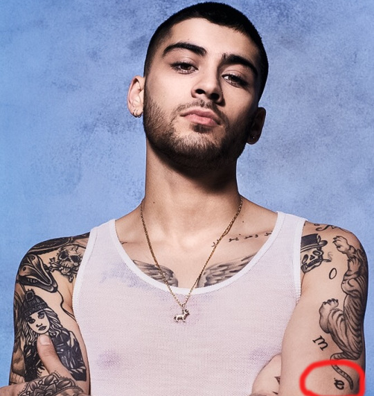
So I’m new to the Ziam fandom, I’m a strong larrie but I also couldn’t help to notice that there was something between Z*yn and L*am too. Could you tell me about the tiger tattoo? I keep hearing that its an iconic Ziam tattoo and I’m a little confused. Also, do you think Ziam is still together right now in 2020 and could you explain why? I hope this isn’t a bother.
hey nonnie, welcome to this side of the fandom! and please don’t worry, you are not a bother at all, and we are always happy to have new members! please accept this adorable gif of ziam waving hello as your welcoming gift into the ziam fandom lol! 😊🌈
now onto your question about the tiger tattoo...
hooo boy, nonnie
idk if you know what you’re asking because this is a BIG life-altering question.
BIG.
...are you ready for this?
are you ready to die? are you ready to have your soul ascend from your body up to the gay ziam heavens for all eternity?
i mean it’s pretty nice up here and all but you may just wanna get your affairs in order before you continue, cause once you discover all the ways zayn javadd malik has professed his undying and eternal love for liam james payne all over his goddamn body there is no coming back.
are you absolutely sure you’re ready?
ok, here we go!
so. once upon a time way back in october 2013 zayn debuted a new tattoo of a tiger on his arm. at the time it seemed like just another tattoo in a quickly growing long list of (random) tattoos, and went by relatively untalked about among fandom (at least afaik) for a couple of years. but THEN, in early 2016 zayn followed that tattoo up with the addition of the full title of his m.o.m. album spelled out around the tiger...
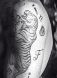
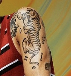
seems normal, right?
first off, notice how the tiger’s tail is shaped suspiciously like an L?
well, that’s not all that’s gay i mean odd or interesting about this tattoo lol...some have also noticed that the muscles of the tiger’s back quite remarkably appear to resemble the muscles of a certain boy whose name also starts with L
(and no i’m not talking about louis lol)
but here’s where shit really gets real because guess what? you may have noticed that the letters of the ‘mine’ part are kind of shuffled in an odd/not really consecutive order to spell out the word mine in a way that’s clearly or easily readable...that’s because zayn’s extra ass arranged it specifically so that only the i, e, and m, are all directly around the L-shaped tiger tail, while the n is just off to the side like a lonely forgotten reject
by now you might be saying to yourself okay, well that’s not really all that significant to liam, and the L could just be a coincidence/not really mean anything, couldn’t it?
wrong again!
because once more, zayn ‘i live to be as extra as humanly possible about my love for liam james payne because i don’t know any other way to live’ malik made sure to put a little tail/extra line on the side of the letter ‘e’ to make it interchangeable with an upside down letter ‘a.’
now again you might be thinking i don’t know if that’s really intentional or all that meaningful. but look closely.
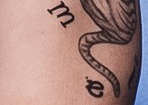
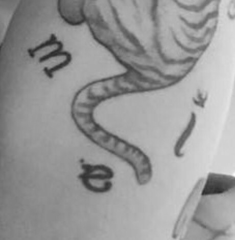

there is clearly an additional connected piece on that e that cannot be explained away or mistaken for just a weird blot of ink. it’s not just an error on the part of the tattoo artist (if it was i’m sure zayn would have had it fixed by now given that he’s had that tat for over 4 years at this point) and there’s also no letter ‘a’ in ‘mind of mine.’
so why is it there? and why does it just so happen to be right next to the i, the m, and the L-shaped tiger tail. why did zayn choose to arrange the letters of the word ‘mine’ in such a weird order instead of a more normal/easier to read format like the rest of the album title? and why did he choose put those exact letters all near each other? because it’s intentional. and because it’s meant to have a very particular double meaning.
if he was going for just a random order he could’ve put those letters anywhere. but he didn’t. and more than that he went out of his way to make sure that that additional piece on the e was added and distinct so that it could very clearly double as an (unnecessary) a.
there’s no way you can argue that all of those things are just coincidence or that the random letter ‘a’ means absolutely nothing lol. that tattoo was clearly meant as both an homage to the album and to liam (who the album is largely believed to be about lol). and the fact that the muscles seem to match quite closely to liam’s is a nice added bonus that just helps confirm that imo. (plus there’s also the lovely little tidbit of knowledge that the tattoo is positioned in such a way that whenever zayn wears short-sleeve shirts the ‘Liam’ part is the only part clearly on display 😏😏😏)
BUT GUESS WHAT??
THAT IS NOT EVEN WHERE ZAYN’S TATTOO DEDICATIONS ENDDDD
never mind that he already had all of us ziams sobbing ourselves to death and morphing into withered soulless husks over this tattoo after he debuted the full thing in 2016, but there’s so! many! more!
boy’s body is literally a giant ass open love letter to liam and i am NOT OKAY. (have i mentioned i hate these extra ass romantic saps with every fiber of my being? no? well i do. and you’re about to find out all the reasons why)
reason #1 - all. the. goddamn. mandala. tattoos. (there are multiple but i’m only linking to this post featuring/talking about the main one, i.e. the very first one he got cause that’s the one that kills me the most but if you wanna see the others peep my ziam tattoos tag or my zayn’s tattoos tag)
reason #2 - love & marriage poem tattoo (read all the posts in this tag starting from the bottom first for full context)
reason #3 - red wolf & bat wings chest tattoo
reason #4 - wolf leg tattoo (more background details here too)
reason #5 - liam’s silhouette leg tattoo
reason #6 - smoking lips hand tattoo (which literally matches the album art for liam’s debut single exactly and was debuted on zayn’s hand months before the single’s release - scroll down to the part where you can see the red lip pics)
reason #7 - the snake tattoo (aka the snake habitat tattoo)
reason #8 - motherfuckin 25!! idk what it means but it clearly means SOMETHING important to the both of them and it still drives me insane to this day and probably will to my dying breath 🤬
bonus - it’s not a tattoo but: zayn’s nose piercing. which along with the mandala wrist tat is literally a desi bride declaration of marriage; fun fact - tan france, a gay married british-pakistani tv personality who is part of the queer eye crew also has a mandala tat on his left hand that some have speculated may also be to symbolize his dedication to his husband)
anyway there are more tattoos of zayn’s that seem to also be related to liam (though more loosely imo) but this post is already beyonddd long enough so i figured it’s best to just stick to the main ones/most obvious ones here lol
(side note: liam also has tattoos that are clearly dedicated to zayn/his and zayn’s relationship as well, but that’s for another post and also if my recall is correct i think zayn might actually have more?? well that we know of anyway lol)
(side note 2.0: one other thing that adds to the theory of the m.o.m. tiger tattoo being a dedication to liam/liam’s name, besides the obvious lettering thing described above, is that zayn is known to have a thing for tattooing the names of his closest loved ones on his body. the only person in his immediate family whose name he doesn’t appear to have tattooed on him is trisha’s and i’d be willing to bet that’s either because she specifically asked him not to, or he does have one but it’s just in a very hidden place. but we know that he has his father’s name, grandfather’s name, and all of his sister’s names tattooed on him so when you combine that with the weird lettering of the m.o.m. tiger tat and the fact that the album was very likely about liam/closely followed the story of the beginning of his relationship with liam, it becomes even less plausible imo that that tattoo is meant to be about anything else but liam. ain’t science grand?)
(side note 3.0: zayn’s whole left arm/left sleeve of tats seems to be specifically reserved for tattoos dedicated to liam and/or related/connected to liam’s own tattoos, and there’s a couple of good posts here - x, x, x, x - that go through some of the more specific parallels between their tattoos and how certain ones seem to mirror or directly pair with each other’s)
ok i promise that’s it for the side notes lol!
lastly, to your final question, i do believe that they are still together currently, especially considering this most recent soft outing/confirmation from one of zayn’s songwriters (who is also not the first to do that either btw lol) but that is not the only reason - see my post here for some of the biggest reasons why i believe ziam remains real and strong :)
#asks#anons#ziam#ziam tattoos#zayn's tattoos#ziam declarations of love#ziam is real#ziam remains real#obvious husbands are obvious#ziam masterposts#mine#this post took me over half the goddamn day wtf#i hate my inconsistent ass tags#why am i like this
221 notes
·
View notes
Text
I’ve been finding the iconography (and abstract representation of things) a bit recently
Like, think about just how hard it is to represent something like a D&D class without being able to show or describe it at all. But then we have things like these:

which, I think seeing how simple a lot of these are makes it even cooler. Like, not only do all of these images above convey roughly what each class is, they also do so without color as a silhouette like wtf???
In a way, and I’m totally not an expert on design or art theory btw this is just an observation of mine from being interested in this stuff, adding more detail just makes it harder to understand, for example:

I can immediately recognize about half of these, but even with prior knowledge of typical icons of the D&D classes and knowledge of what these are based on, it still takes me a second or two to really figure some of these out. Monk, Bard, Druid/Ranger seem obvious, but which one is fighter vs. Paladin? Which is Sorcerer? WTF is the bottom left one?
So... rough guess but I would assume that there might be something going on here similar to blivand design where to create a meaningful icon you have to limit elements of the design and simplify things as much as possible?
Idk, but still seems very cool.
181 notes
·
View notes
Note
What are your top 5 favourite and least favourite character designs?
Hmmm good question!
TOP 5 FAVOURITE CHARACTER DESIGNS:
L Lawliet- simple and striking and iconic, very recognizable silhouette and body language and defining features

Light Yagami- the best nerdy male femme fatale, love his khakis and his suggestive black widow turtleneck and his extremely round hair and pretty evil eyes

Mello- iconic fashion and iconic bobcut, probably my favourite thing about him is his look

Ryuk- I never would think to design a grim reaper to look kinda like a Frankenstein punk/goth. But it's the best, and he's really recognizable and fun to look at all the time

Misa Amane- her fashion sense is also superb, and I could pick her out easily as a silhouette just by the low pigtails on her head

5 LEAST FAVOURITE CHARACTER DESIGNS:
Near- I love his face and his hair but his outfit has never done much for me tbh, particularly when the anime changed his pants to blue. I kinda just wish he mixed it up sometimes or maybe wore a hoodie instead or somethin'? I think L never changing his clothes also loses a little iconic-ness when Near doesn't ever change his either or whatever. And Near seems like someone who might at least change up the patterns on his pjs a lot or something along those lines. I like that his look is evolving a bit now as he ages in the one-shots, anyway

Halle- I like her, but her choppy haircut is a bit odd, and there's just not a lot else that stands out about her design to me, I guess?

Takahashi- the guy in the Yotsuba group with long blond hair and earrings and a moustache, idk I just don't really like looking at him pfft

Mido- aka sad librarian Light Yotsuba member that I always just want to give a haircut

Gelus- I'm so glad the Shinigami didn't all look like ragdoll Tim Burton rip-offs, I would not have enjoyed that aesthetic very much

61 notes
·
View notes
Text
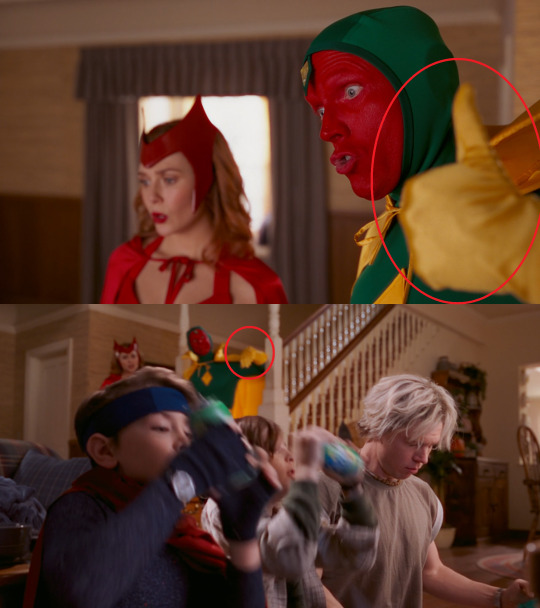
WandaVision episode 6
FIRST OFF
Whenever I go back to pause things for clues, and find exactly what I’m looking for, I don’t feel justified, I feel that much more insane:
It’s really hard to make out, but I had an alright look at it on my folks’ QLED, and it’s definitely a flying saucer doing an alien abduction on what looks to be a person inside an old CRT TV (with some kind of robot head/boombox on top???) There are secret aliens in this show, you guys, the facts don’t lie.
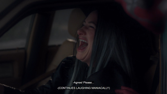
HmmmMMMM I wonder if Agnes is as innocent as she looks:
Also, I didn’t see that she was wearing the brooch in this ep, and I was majorly disappointed in that.
Two things here:
No, that’s not a twins joke.
Another Moonmen Confirmed
I know green is his color or whatever, but that hat is literally 10 years ahead of its time
Also, I took the playing-DDR-at-home scenario at face value, and only on the first rewatch did I realize it was a very pointed turn-of-the-century reference. I am an Old.
There’s a good, subtle Rule of Threes in this ep. The Setup:
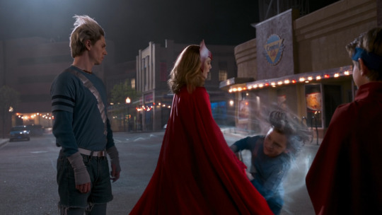
The Sokovian Halloween flashback works on so many levels. It’s so funny:
The fact that they went trick-or-treating at all
The “speaking Sokovian”
The treat being a fish
They have to share the fish
The concept that this event gave them an infectious disease
“You probably suppressed a lot of the trauma” -- it’s a good sitcom joke but. the trauma is the joke. The joke IS THE TRAUMA!!!
Elizabeth Olson is a dream with all her wonderful faces she has this ep.
Vision’s unsettling passive-aggression-sitcom-cooperation whiplash is WOW, consider me unsettled!!!!!! “Be. Good.” UGH.
(Just noticed one here, but there are a number of continuity errors in this episode, enough to be distracting later on, and is this a deliberate choice? Please let it be deliberate. I didn’t watch a whole lot of Malcolm in the Middle, is it known for its continuity errors?
)
“It’s their first Halloween.” LOLOLOL they are TEN YEARS OLD and this is their FIRST halloween I LOVE IT
DOUBLE RED HERRING CONFIRRRRRRRRMED!!!!!!!!!!!!!!!!!!!!!
Agent Jimmy Woo accidentally identifying himself as the sassy best friend added 20 years to my life.
Found. FOUND. Not “created,” “manifested,” “willed into being using my insane witch powers.” Third Party Confirmed.
I like that it’s the 90s and we can swear on TV now. “Hell” “kick-ass” “damn it” “fu---dge”
I think the most biting part of Vision finding the whacked out folks is that the soundtrack just kind of ... ignores that anything’s wrong. Yeah, it’s kinda-spooky Halloween music, but it’s still 100% in-world kinda-spooky-sitcom-Halloween-episode music.
OKAY LET’S TALK ABOUT THE AD:
As a 90s child, let me tell you, this is a blisteringly accurate representation of children’s marketing from the period. The shark is wearing sunglasses AND he has a surfboard!!! And he’s selling you yogurt of all things!!!!! This is the supreme distillation of what being a child in the 90s was like.
How disappointed I am that they went with crab instead of lobster.
Heard it through the grapevine that this is a representative of Wanda’s imprisonment on the Raft. That happened in Civil War, right? So the next ad is The Snap? We’re running out of iconic decades, too. so, hold on, new thought.
90s: Civil War
00s: Infinity War
10s?????: Endgame???? or?????????
??: Whatever happened between Endgame and WandaVision, given that the ads are stepping forward through Wanda’s IRL life events!!
I don’t want to know how many episodes are planned/announced, but I don’t know what to expect from the format after they run out of decades from which to draw. Maybe there are only one or possibly two “sitcom” episodes left. Maybe after that it just breaks down and they can pick and choose from the worlds/styles we’ve already established. That’d be p neat. A very unique kind of chaos.
god she’s so cute
Okay, somebody explain to me Pietro. I honestly walked away from last week thinking he was just some townsperson chump, but then I was reminded that this is the Quicksilver actor from all those X-Mans movies I never watched, soooo people are saying Multiverse Confirmed? But, if this is X-Mans’ Pietro, then why did he die the same as MCU Pietro? Or is he literally MCU!Pietro’s corpse, given that he looked all dead same as when she saw Vision’s corpse? If MCU!Pietro, then why different face???
????????????????
Also I found him highly suspicious, what with all the questions he was asking. But the only sort of person who would truly want to know the answers to those questions would be someone who already had them ... so I think he was just asking on behalf of the audience, and the delivery was all wonked out.
Rule of Threes - The Reference:
Ok, real talk, whenever computers/networks/data/encryption/servers/mainframes et al come up in mainstream media, I just look away. I don’t need the kind of psychic damage that comes with such egregious mishandling of the topic.
That being said, does Hayward having eyes through the barrier mean that he could possibly be involved in getting it set up? Because look. If Hayward-after-Hayward’s-Villianous-Ends is one antagonizing force, then is there really room for the Third Party (Confirmed) antagonizing force that’s lurking in the negative space silhouette of the Inciting Incident? With Wanda as the Red Herring antagonizing force, that’s just. There’s just too many villains, alright? We gotta start merging these plotlines.
(then again, when I just said “eyes” I realize probably understanding the true nature of his new secret “CATARACT” project will clear a lot of things up. I’ll wait for enlightenment)
Agnes’ license plate in this episode is 0A1-B2C, which I think is a reference to the way reality is getting pared down to bare bones at the edge of town. Note that this is not the same license plate number as seen last ep.
ALSO, I drove home behind a NJ plate just an hour ago, and was staring at it for a long time, trying to fit it into the puzzle before A) realizing that this was Real Life and not part of the show and B) WTF is a NJ plate doing in front of me in California. In any case, I can confirm that NJ plates do not appear to have this number-letter repeating format.
So let’s talk Agnes.
Demonstrated knowledge of the situation in ways others haven’t (”There’s the star of the show” “kids, you can’t control ‘em”)
Shows up when needed most (explained as being Wanda’s doing, but is it)
When Wanda was having her babies, though, who was trustworthy enough to be summoned? Was it Agnes?
Wanted to babysit REAL BAD
Was in the opening credits framed possessively with the twins
Doesn’t appear to have an IRL identity according to Jimmy’s crime board
Keeps talking about her husband but we’ve never seen him. Highly unlikely that he’s real
Was the one to find Sparky “dead” - internet thinks she was lying to Wanda about how or possibly if he was dead (I’m trying not to read the theories, so idk exactly what the angle is there)
In an episode where everyone is wearing their original comic outfits, Agnes is dressed as (and laughs like!) a witch
She name-drops Wanda as the one controlling everyone; Norm (or the guy playing Norm) only said “she” and “her” -- meaning Agnes?
Naughty
So we’re 99% sure Agnes is Agatha Harkness, right? I never read no comics, so I’m taking the internet’s word for it, but from what I can tell, I think we must be right. If that’s the case, then I’m thinking it’s not impossible for her to be pulling some strings around here (giving Wanda a justification for her “that wasn’t me” doorbell ring, for example, and pulling a double red herring on the fact that she shows up whenever the narrative Wanda her nefarious scheme calls for it).
To devil’s advocate myself, though, we also have Monica’s word that it was Wanda in her mind, lessening the impact of Agnes falsely confirming what Norm only implied. Also she’d have to be acting for Vision’s sake (and ours) and, if so, then what did Vision’s brain-touch really do, and how did she know he’d find her there, and what did she intend as the result of that interaction etc etc.
If Wanda’s (or Wanda + Third Party Confirmed (Agnes??)’s) powers aren’t enough to sustain the simulation of life on the edges of town, how much worse is it going to be now that there is even more area to try to control???
I don’t know if this is strictly an intended read, but the idea of Halloween as a fun, scares-for-entertainment’s sake type holiday, the rounding off the edges of concepts like “skeletons and ghosts are what people are after they die, let’s decorate the town with them and have a good time” kind of is a haunting parallel to the nature of Wanda (et al) covering up the horrible truth of the situation with this happy-go-lucky sitcom glamour.
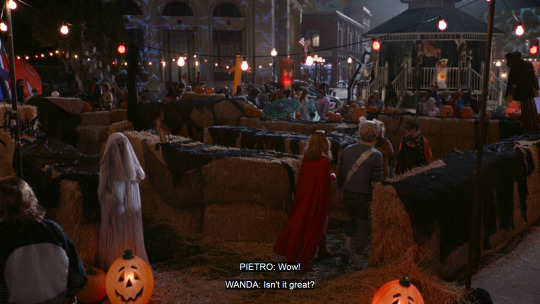
How much does one hate seeing Vision giving his life for the greater good (the greater good) for the second time? In other news, I think I’m seeing some specifically Mind Stone type energy-colors coming off of him, and very little Wanda type energy-colors. Third Party Confirmed.
Also, I was thinking from last week that perhaps Hayward’s Villainous Ends included capturing the reanimated Vision to be one of those Sentient Weapons his organization is all about, but I Do Not Think his reaction to seeing that sought-after prize disintegrate in front of his eyes really matches up with that theory. Again, will be patiently waiting for Jimmy to check his email to see what CATARACT is all about!
Rule of Threes - The Payoff:
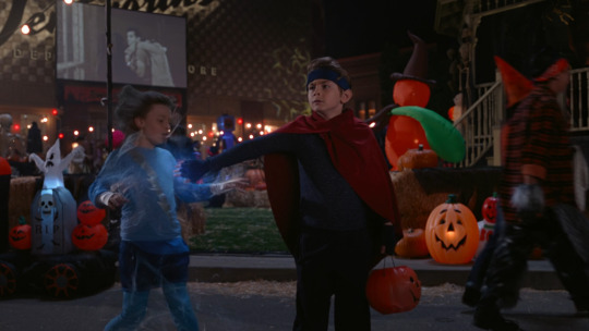
Also, anyone ID the movie playing in the background?
Ok, final thought. I watched this about four times today, and on the big-ass TV at my parents’ house finally paused and got up close to see what that white shape is in the reflection. Thought it might be a skull, but, it’s worse.
These caps do not contain enough data to verify my claim, but I PROMISE YOU it’s a TV
A square old thing with a round screen and antenna on top.
I SWEAR to you, when I looked into the TV, into Wanda’s eyes, only to see the reflection of a TV, of her looking at me looking at her I had a visceral fear reaction. Like. LEGIT nauseous skin crawl.
(All the other episodes have ended with our POV as the fourth wall, from the general (or exact!!!) position their household TV is known to be.)
This is my favorite show Of All Time.
9 notes
·
View notes