#idk if i learned anything but
Explore tagged Tumblr posts
Visit Tumblr Blog
Explore Tumblr blogs with no restrictions, modern design and the best experience.
Last Seen Tumblr Blogs


Fun Fact
After the announcement of the deal with Yahoo!, there were 170K signatures of unhappy Tumblr users petitioning to prevent the sale in 2013.
Text


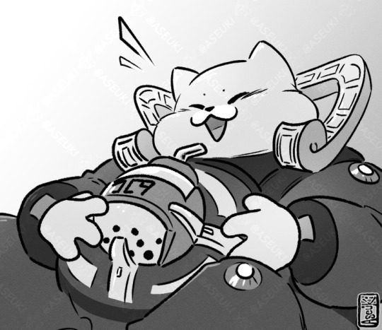
study... 🫡
#it was hard...#idk if i learned anything but#i like how the anime-fied face turned out :)#that part at least was fun#my art#i want to get better at clothing folds tho#and i dont think i had any epiphany on how to draw them better from this#but i prob just need to study more
63 notes
·
View notes
Text


Peepaw Starlo struggles. Autism 2 autism communication struggles.
#undertale yellow#uty#uty au#lucky clover au#frisk ut#starlo uty#ceroba uty#martlet uty#dalv uty#feisty four uty#the cowboy hat draws#FALLS OVER. THIS TOOK OVER A MONTH.#Mostly because of being busy IRL but also because I decided on a new rendering method#Aaaand it was ten times as time consuming and I don't like the end result at all. LMAO. You live and learn I suppose#I hope this is comprehensible um. I think a lot about Starlo being so used to understanding Clover easily and being one of their favorites#And going to Frisk and 1. not really understanding how they communicate and 2. feeling like he isn't their favorite LOL#Idk how well that reads but! Peepaw Starlo musings#Starlo tries his best and doesn't always get it right but he's in a better place now#I know Clover's absence feels very strange here but I just couldn't find a place to put them oops.#Drawing this made me realize I really gotta practice my backgrounds. Hough. Definitely in the new year!#Also I haven't played poker in years so anything that's wrong? Uh monster poker is different. Yup. Thumbs up emoji
435 notes
·
View notes
Text
"some of these forcemasc posts are just gentle pushing and not sexual forcing enough." well some of you are too scared to even go into the men's section of target for cargo shorts. i may as well grope you while i tell you to stop being a pussy bitch and do it
#forcemasc#force masc#forced masculinization#boyposting#i have a kink for public groping okay#also like sorry to say this but. Literally nobody will care if you are in the men's section buying shorts#it is not the type of stigma as seeing a 'guy' in the women's section#stop being a bitch and try wearing something thatll make u happy idk#some oc u wouldnt be able to hanfle it#if theres anything ive learned from anons i getbits that some of you are scared of reality#and me too tbh
915 notes
·
View notes
Text

crusty evolution redraw. in theory.
#xmen#xmen evolution#erik lehnsherr#magneto#quicksilver#pietro maximoff#snap sketches#i stopped liking this past the lineart stage but i told myself id try to finish whatever i start to at least try and learn somethin#did i learn anything ? thats for me to reflect on. for now tho ramble time 😌#its painful to draw erik with short hair but sometimes you gotta get outta the usual !! <- never doing this again#ive been ahead of my schedule with stuff i have to draw so ive simply decided todaay will be My Day for personal doodles#idk why ive decided my first evo fanart should be the one where erik and pietro leave behind wanda but ok !!!!! freak#i have a long hair ver but i didnt color it. i was just greedy .. not greedy enough tho evidently#anyways i have like. idk what four episodes of evolution left ?? depressing this show's great ...#i didnt nkow theyd have a david ep ... a pleasant surprise but now im emo ...#OH WELL lets see what else i doodle tonight#this week's going to be annoying but i think i say that every week LMAO and look at that i get through them anyway#we'll be fine and chill team .. ok bye bye
462 notes
·
View notes
Text
I know damn well I misunderstood the assignment but we roll, I'll understand it some day
It's killer and dust btw. If you couldn't tell. Which you probably couldn't.. forgor to say but shhh 🤫 Killers having a convo with himself..
..I kinda wanna change my url but idk to what
#I got this compliment once and I was like :3 bc I like compliments. then 4 days later I recognise the name and pfp on#on a tumblr I rlly rlly like bc they're super cool make super cool art and has super cool ideas and I'm just like woah they complement me s#so I search my notifications to find which post they complimented me on and I find out. they're following me. ummm IJWEHFOIWJ#i just can't get over this bc they're literally so cool what#anyways#I got two whole documents of canon dust things and one ao3 of canon things about killer#so I'm learning a way to do justice to the creators image while still putting my own twist on it bc I love fanon and that's how I grew up#I'm literally so passionate about fanon. specifically Gacha fanon bc it's literally so fun and no one else know that#like. literally everyone just like had terrible experience apparently idk how I didn't experience that#am I the only one who knows these characters still had lore Ben though unrelated to anything canon at all#anyways I'm rambling too much whoops#sans au#utmv#undertale au#sanscest#if u want#killer sans#dust sans#kist#if u want...#LOVE affair#teaching myself to use this tag too but eh#did you know Horror is more likely to be a part of the bad Sanses than Dust#Jesus fuck I rambled these tags to hell
354 notes
·
View notes
Text
kimia’s “the wnba is better than the nba” was already a presentation i was on board with. and then she added “because they’re all dating” and i was sold even harder. iconic
#idk anything about sports but i do feel like im learning#dropout#dropout tv#dropout.tv#smartypants#kimia behpoornia
525 notes
·
View notes
Text
His gorgeous beefcake charm and funny tactical boba holster have captivated me
#nine sols#nine sols kuafu#doodles#aseukiart#kuafu nine sols I love youuuuuuu I hope nothing bad happens to you ever#Known him for only 30 seconds but have already been sold on his endearing attitude#<-only just started playing so doesn't know anything#Everyone has Very Good Shapes in this its been a while where I've played smthn that made me want to draw the characters designs this quickl#maybe someday I'll draw Yi too who know#looks at him#shakes him#Somethings wrong with him I Know it idk What I can't wait to find out#No Spoilers btw I'll Learn when I Learn#anyways this was a nice break trundling back to my holiday art hole#<-should have started a month ago and yet here we are
307 notes
·
View notes
Text

HAPPY NEW YEARRRRRRRRRRR 🤸♀️🤸♀️🤸♀️🎊🤸♀️🤸♀️🎉🎉🎉🎊🎉🎉🎊🎉🎉🤸♀️🎊🎊🎉🤸♀️🤸♀️🎉🎉🎊
#still not 2025 in my timezome but i wanted to doodle this anywww#not 2 b sappy or anything but 2024 was wild and a lot of shit happened but ill try to remember it fondly even if it was in hindsight#a p horrible year personally#a lot of Ls taken o(–( but idk i made new friends met new people got more moots who i love dearly and cherish#manifesting a lot of things for 2025 but im keeping my expectations low bc i alr learned my lesson 💀#BUT HAPPPY NEW YEARRRRRRRRRRR 🎊🎊🎉🤸♀️🤸♀️🎊🎊🎊🎉🤸♀️#froodles
270 notes
·
View notes
Text
One of my first digital pieces (2010) versus one of my recent ones (2024)
We all start somewhere!
#picked these cause they're in a similar pose lol. i mean not at all. but sort of... more than my other art at least...#oh fuck im so tired im saving this to drafts and coming back later#my anxiety meds wipe me the fuck out so im trying not to take them in the day#and they're like legit borderline a sleeping med for me. i take one and in 30 mins im OUT.#so I'm. i mean i was already only taking 1-2 in the day and then 2-3 at night#anyways it makes me sad when people say they dont have an artistic bone in their body#and especially when they say they could never draw like me :(#dont put yourself down to lift me up! i don't want my art to be used for you to be mean to yourself!!!#lots of experiences of people comparing themselves to me and being mean to themself...#feels bad. it's okay if you're slow it's okay to be learning it's okay!!!#I'm me and you're you and we're here to learn from each other. i just wanna hang out..#y'know what I'm just gonna post without saying anything i WILL forget I made a draft#i have so many things i intend to post and then forget#it's a wonder I post anything#i only do it when i get bored. and run out of stuff to scroll through#like whelp. guess if i want a post I have to make one myself.#also the second one is really good idc that it's a study i still drew it#art growth#this was in 2010 btw#i started highschool in 2011#I've grown a lot and you can too.#also I've never really been one to dislike my old art. like idk I was trying... if it's bad I just won't look at it whatever#like i wouldn't be mean to someone else who made that so i don't get a free pass to be mean just cause it's to me#man my thoughts are bungled. okay sleep time#if my phone made typos you didn't see it
232 notes
·
View notes
Text
I HATE tiktok and the Internet in general rn for the obsession with "oh this person's smellyyy" "Brother it STINKS over here" "BOO ��🧼🧽🚿" and stuff like that. I wish I could put into words how demeaning and patronising that whole idea is and people implying anyone they don't like doesn't wash.
For one there's something grating about being insulted in a manner like we're in nursery again. But also WHY is that the go to insult. Why do you associate these things? Especially to those you deem "chronically online". Like I don't want to sound pathetic but it feels so nasty to me.
is it extreme to say this feels tied to ableism? And classism too?
#“take a shower” me sitting here with depression and no will to even move rn. That doesnt make me feel worse or anything#dry to wet change is also evil. and i get decision paralysis a lot and just struggle to motivate myself to do basic human tasks#and thats just me#what about the people with physical disabilities that struggle to find the energy and strength to do these things#And also like environmental factors too?#like kids can be unhygienic cause they arent being cared for and learning properly#people with learning disabilities and neurodiversity too may struggle with not being taught properly as its a “basic thing everyone knows”#people are homeless karen.#people cant afford to wash regularly#people grow up or are forced to live in unhygienic places and surrounded by smokers and alcoholics#people who are smokers and alcoholics and generally people with addiction can smell#people with health issues that cause them to sweat more#Like the list goes on#but idk maybe I'm just sensitive#anti anti#profiction#proship#neurodivergent#cringe culture#ableism#classism
268 notes
·
View notes
Text
why Aurora's art is genius
It's break for me, and I've been meaning to sit down and read the Aurora webcomic (https://comicaurora.com/, @comicaurora on Tumblr) for quite a bit. So I did that over the last few days.
And… y'know. I can't actually say "I should've read this earlier," because otherwise I would've been up at 2:30-3am when I had responsibilities in the morning and I couldn't have properly enjoyed it, but. Holy shit guys THIS COMIC.
I intended to just do a generalized "hello this is all the things I love about this story," and I wrote a paragraph or two about art style. …and then another. And another. And I realized I needed to actually reference things so I would stop being too vague. I was reading the comic on my tablet or phone, because I wanted to stay curled up in my chair, but I type at a big monitor and so I saw more details… aaaaaand it turned into its own giant-ass post.
SO. Enjoy a few thousand words of me nerding out about this insanely cool art style and how fucking gorgeous this comic is? (There are screenshots, I promise it isn't just a wall of text.) In my defense, I just spent two semesters in graphic design classes focusing on the Adobe Suite, so… I get to be a nerd about pretty things…???
All positive feedback btw! No downers here. <3
---
I cannot emphasize enough how much I love the beautiful, simple stylistic method of drawing characters and figures. It is absolutely stunning and effortless and utterly graceful—it is so hard to capture the sheer beauty and fluidity of the human form in such a fashion. Even a simple outline of a character feels dynamic! It's gorgeous!
Though I do have a love-hate relationship with this, because my artistic side looks at that lovely simplicity, goes "I CAN DO THAT!" and then I sit down and go to the paper and realize that no, in fact, I cannot do that yet, because that simplicity is born of a hell of a lot of practice and understanding of bodies and actually is really hard to do. It's a very developed style that only looks simple because the artist knows what they're doing. The human body is hard to pull off, and this comic does so beautifully and makes it look effortless.
Also: line weight line weight line weight. It's especially important in simplified shapes and figures like this, and hoo boy is it used excellently. It's especially apparent the newer the pages get—I love watching that improvement over time—but with simpler figures and lines, you get nice light lines to emphasize both smaller details, like in the draping of clothing and the curls of hair—which, hello, yes—and thicker lines to emphasize bigger and more important details and silhouettes. It's the sort of thing that's essential to most illustrations, but I wanted to make a note of it because it's so vital to this art style.
THE USE OF LAYER BLENDING MODES OH MY GODS. (...uhhh, apologies to the people who don't know what that means, it's a digital art program thing? This article explains it for beginners.)
Bear with me, I just finished my second Photoshop course, I spent months and months working on projects with this shit so I see the genius use of Screen and/or its siblings (of which there are many—if I say "Screen" here, assume I mean the entire umbrella of Screen blending modes and possibly Overlay) and go nuts, but seriously it's so clever and also fucking gorgeous:
Firstly: the use of screened-on sound effect words over an action? A "CRACK" written over a branch and then put on Screen in glowy green so that it's subtle enough that it doesn't disrupt the visual flow, but still sticks out enough to make itself heard? Little "scritches" that are transparent where they're laid on without outlines to emphasize the sound without disrupting the underlying image? FUCK YES. I haven't seen this done literally anywhere else—granted, I haven't read a massive amount of comics, but I've read enough—and it is so clever and I adore it. Examples:


Secondly: The beautiful lighting effects. The curling leaves, all the magic, the various glowing eyes, the fog, the way it's all so vividly colored but doesn't burn your eyeballs out—a balance that's way harder to achieve than you'd think—and the soft glows around them, eeeee it's so pretty so pretty SO PRETTY. Not sure if some of these are Outer/Inner Glow/Shadow layer effects or if it's entirely hand-drawn, but major kudos either way; I can see the beautiful use of blending modes and I SALUTE YOUR GENIUS.
I keep looking at some of this stuff and go "is that a layer effect or is it done by hand?" Because you can make some similar things with the Satin layer effect in Photoshop (I don't know if other programs have this? I'm gonna have to find out since I won't have access to PS for much longer ;-;) that resembles some of the swirly inner bits on some of the lit effects, but I'm not sure if it is that or not. Or you could mask over textures? There's... many ways to do it.
If done by hand: oh my gods the patience, how. If done with layer effects: really clever work that knows how to stop said effects from looking wonky, because ugh those things get temperamental. If done with a layer of texture that's been masked over: very, very good masking work. No matter the method, pretty shimmers and swirly bits inside the bigger pretty swirls!
Next: The way color contrast is used! I will never be over the glowy green-on-black Primordial Life vibes when Alinua gets dropped into that… unconscious space?? with Life, for example, and the sharp contrast of vines and crack and branches and leaves against pitch black is just visually stunning. The way the roots sink into the ground and the three-dimensional sensation of it is particularly badass here:

Friggin. How does this imply depth like that. HOW. IT'S SO FREAKING COOL.
A huge point here is also color language and use! Everybody has their own particular shade, generally matching their eyes, magic, and personality, and I adore how this is used to make it clear who's talking or who's doing an action. That was especially apparent to me with Dainix and Falst in the caves—their colors are both fairly warm, but quite distinct, and I love how this clarifies who's doing what in panels with a lot of action from both of them. There is a particular bit that stuck out to me, so I dug up the panels (see this page and the following one https://comicaurora.com/aurora/1-20-30/):

(Gods it looks even prettier now that I put it against a plain background. Also, appreciation to Falst for managing a bridal-carry midair, damn.)
The way that their colors MERGE here! And the immense attention to detail in doing so—Dainix is higher up than Falst is in the first panel, so Dainix's orange fades into Falst's orange at the base. The next panel has gold up top and orange on bottom; we can't really tell in that panel where each of them are, but that's carried over to the next panel—

—where we now see that Falst's position is raised above Dainix's due to the way he's carrying him. (Points for continuity!) And, of course, we see the little "huffs" flowing from orange to yellow over their heads (where Dainix's head is higher than Falst's) to merge the sound of their breathing, which is absurdly clever because it emphasizes to the viewer how we hear two sets of huffing overlaying each other, not one. Absolutely brilliant.
(A few other notes of appreciation to that panel: beautiful glows around them, the sparks, the jagged silhouette of the spider legs, the lovely colors that have no right to make the area around a spider corpse that pretty, the excellent texturing on the cave walls plus perspective, the way Falst's movements imply Dainix's hefty weight, the natural posing of the characters, their on-point expressions that convey exactly how fuckin terrifying everything is right now, the slight glows to their eyes, and also they're just handsome boys <3)
Next up: Rain!!!! So well done! It's subtle enough that it never ever disrupts the impact of the focal point, but evident enough you can tell! And more importantly: THE MIST OFF THE CHARACTERS. Rain does this irl, it has that little vapor that comes off you and makes that little misty effect that plays with lighting, it's so cool-looking and here it's used to such pretty effect!
One of the panel captions says something about it blurring out all the injuries on the characters but like THAT AIN'T TOO BIG OF A PROBLEM when it gets across the environmental vibes, and also that'd be how it would look in real life too so like… outside viewer's angle is the same as the characters', mostly? my point is: that's the environment!!! that's the vibes, that's the feel! It gets it across and it does so in the most pretty way possible!
And another thing re: rain, the use of it to establish perspective, particularly in panels like this—

—where we can tell we're looking down at Tynan due to the perspective on the rain and where it's pointing. Excellent. (Also, kudos for looking down and emphasizing how Tynan's losing his advantage—lovely use of visual storytelling.)
Additionally, the misting here:

We see it most heavily in the leftmost panel, where it's quite foggy as you would expect in a rainstorm, especially in an environment with a lot of heat, but it's also lightly powdered on in the following two panels and tends to follow light sources, which makes complete sense given how light bounces off particles in the air.
A major point of strength in these too is a thorough understanding of lighting, like rim lighting, the various hues and shades, and an intricate understanding of how light bounces off surfaces even when they're in shadow (we'll see a faint glow in spots where characters are half in shadow, but that's how it would work in real life, because of how light bounces around).
Bringing some of these points together: the fluidity of the lines in magic, and the way simple glowing lines are used to emphasize motion and the magic itself, is deeply clever. I'm basically pulling at random from panels and there's definitely even better examples, but here's one (see this page https://comicaurora.com/aurora/1-16-33/):

First panel, listed in numbers because these build on each other:
The tension of the lines in Tess's magic here. This works on a couple levels: first, the way she's holding her fists, as if she's pulling a rope taut.
The way there's one primary line, emphasizing the rope feeling, accompanied by smaller ones.
The additional lines starbursting around her hands, to indicate the energy crackling in her hands and how she's doing a good bit more than just holding it. (That combined with the fists suggests some tension to the magic, too.) Also the variations in brightness, a feature you'll find in actual lightning. :D Additional kudos for how the lightning sparks and breaks off the metal of the sword.
A handful of miscellaneous notes on the second panel:
The reflection of the flames in Erin's typically dark blue eyes (which bears a remarkable resemblance to Dainix, incidentally—almost a thematic sort of parallel given Erin's using the same magic Dainix specializes in?)
The flowing of fabric in the wind and associated variation in the lineart
The way Erin's tattoos interact with the fire he's pulling to his hand
The way the rain overlays some of the fainter areas of fire (attention! to! detail! hell yeah!)
I could go on. I won't because this is a lot of writing already.
Third panel gets paragraphs, not bullets:
Erin's giant-ass "FWOOM" of fire there, and the way the outline of the word is puffy-edged and gradated to feel almost three-dimensional, plus once again using Screen or a variation on it so that the stars show up in the background. All this against that stunning plume of fire, which ripples and sparks so gorgeously, and the ending "om" of the onomatopoeia is emphasized incredibly brightly against that, adding to the punch of it and making the plume feel even brighter.
Also, once again, rain helping establish perspective, especially in how it's very angular in the left side of the panel and then slowly becomes more like a point to the right to indicate it's falling directly down on the viewer. Add in the bright, beautiful glow effects, fainter but no less important black lines beneath them to emphasize the sky and smoke and the like, and the stunningly beautiful lighting and gradated glows surrounding Erin plus the lightning jagging up at him from below, and you get one hell of an impactful panel right there. (And there is definitely more in there I could break down, this is just a lot already.)
And in general: The colors in this? Incredible. The blues and purples and oranges and golds compliment so well, and it's all so rich.
Like, seriously, just throughout the whole comic, the use of gradients, blending modes, color balance and hues, all the things, all the things, it makes for the most beautiful effects and glows and such a rich environment. There's a very distinct style to this comic in its simplified backgrounds (which I recognize are done partly because it's way easier and also backgrounds are so time-consuming dear gods but lemme say this) and vivid, smoothly drawn characters; the simplicity lets them come to the front and gives room for those beautiful, richly saturated focal points, letting the stylized designs of the magic and characters shine. The use of distinct silhouettes is insanely good. Honestly, complex backgrounds might run the risk of making everything too visually busy in this case. It's just, augh, so GORGEOUS.
Another bit, take a look at this page (https://comicaurora.com/aurora/1-15-28/):

It's not quite as evident here as it is in the next page, but this one does some other fun things so I'm grabbing it. Points:
Once again, using different colors to represent different character actions. The "WHAM" of Kendal hitting the ground is caused by Dainix's force, so it's orange (and kudos for doubling the word over to add a shake effect). But we see blue layered underneath, which could be an environmental choice, but might also be because it's Kendal, whose color is blue.
And speaking off, take a look at the right-most panel on top, where Kendal grabs the spear: his motion is, again, illustrated in bright blue, versus the atmospheric screened-on orange lines that point toward him around the whole panel (I'm sure these have a name, I think they might be more of a manga thing though and the only experience I have in manga is reading a bit of Fullmetal Alchemist). Those lines emphasize the weight of the spear being shoved at him, and their color tells us Dainix is responsible for it.
One of my all-time favorite effects in this comic is the way cracks manifest across Dainix's body to represent when he starts to lose control; it is utterly gorgeous and wonderfully thematic. These are more evident in the page before and after this one, but you get a decent idea here. I love the way they glow softly, the way the fire juuuust flickers through at the start and then becomes more evident over time, and the cracks feel so realistic, like his skin is made of pottery. Additional points for how fire begins to creep into his hair.
A small detail that's generally consistent across the comic, but which I want to make note of here because you can see it pretty well: Kendal's eyes glow about the same as the jewel in his sword, mirroring his connection to said sword and calling back to how the jewel became Vash's eye temporarily and thus was once Kendal's eye. You can always see this connection (though there might be some spots where this also changes in a symbolic manner; I went through it quickly on the first time around, so I'll pay more attention when I inevitably reread this), where Kendal's always got that little shine of blue in his eyes the same as the jewel. It's a beautiful visual parallel that encourages the reader to subconsciously link them together, especially since the lines used to illustrate character movements typically mirror their eye color. It's an extension of Kendal.
Did I mention how ABSOLUTELY BEAUTIFUL the colors in this are?
Also, the mythological/legend-type scenes are illustrated in familiar style often used for that type of story, a simple and heavily symbolic two-dimensional cave-painting-like look. They are absolutely beautiful on many levels, employing simple, lovely gradients, slightly rougher and thicker lineart that is nonetheless smoothly beautiful, and working with clear silhouettes (a major strength of this art style, but also a strength in the comic overall). But in particular, I wanted to call attention to a particular thing (see this page https://comicaurora.com/aurora/1-12-4/):

The flowing symbolic lineart surrounding each character. This is actually quite consistent across characters—see also Life's typical lines and how they curl:

What's particularly interesting here is how these symbols are often similar, but not the same. Vash's lines are always smooth, clean curls, often playing off each other and echoing one another like ripples in a pond. You'd think they'd look too similar to Life's—but they don't. Life's curl like vines, and they remain connected; where one curve might echo another but exist entirely detached from each other in Vash's, Life's lines still remain wound together, because vines are continuous and don't float around. :P
Tahraim's are less continuous, often breaking up with significantly smaller bits and pieces floating around like—of course—sparks, and come to sharper points. These are also constants: we see the vines repeated over and over in Alinua's dreams of Life, and the echoing ripples of Vash are consistent wherever we encounter him. Kendal's dream of the ghost citizens of the city of Vash in the last few chapters is filled with these rippling, echoing patterns, to beautiful effect (https://comicaurora.com/aurora/1-20-14/):

They ripple and spiral, often in long, sinuous curves, with smooth elegance. It reminds me a great deal of images of space and sine waves and the like. This establishes a definite feel to these different characters and their magic. And the thing is, that's not something that had to be done—the colors are good at emphasizing who's who. But it was done, and it adds a whole other dimension to the story. Whenever you're in a deity's domain, you know whose it is no matter the color.
Regarding that shape language, I wanted to make another note, too—Vash is sometimes described as chaotic and doing what he likes, which is interesting to me, because smooth, elegant curves and the color blue aren't generally associated with chaos. So while Vash might behave like that on the surface, I'm guessing he's got a lot more going on underneath; he's probably much more intentional in his actions than you'd think at a glance, and he is certainly quite caring with his city. The other thing is that this suits Kendal perfectly. He's a paragon character; he is kind, virtuous, and self-sacrificing, and often we see him aiming to calm others and keep them safe. Blue is such a good color for him. There is… probably more to this, but I'm not deep enough in yet to say.
And here's the thing: I'm only scratching the surface. There is so much more here I'm not covering (color palettes! outfits! character design! environment! the deities! so much more!) and a lot more I can't cover, because I don't have the experience; this is me as a hobbyist artist who happened to take a couple design classes because I wanted to. The art style to this comic is so clever and creative and beautiful, though, I just had to go off about it. <3
...brownie points for getting all the way down here? Have a cookie.
#aurora comic#aurora webcomic#comicaurora#art analysis#...I hope those are the right tags???#new fandom new tagging practices to learn ig#much thanks for something to read while I try to rest my wrists. carpal tunnel BAD. (ignore that I wrote this I've got braces ok it's fine)#anyway! I HAVE. MANY MORE THOUGHTS. ON THE STORY ITSELF. THIS LOVELY STORY#also a collection of reactions to a chunk of the comic before I hit the point where I was too busy reading to write anything down#idk how to format those tho#...yeet them into one post...???#eh I usually don't go off this much these days but this seems like a smaller tight-knit fandom so... might as well help build it?#and I have a little more time thanks to break so#oh yes also shoutout to my insanely awesome professor for teaching me all the technical stuff from this he is LOVELY#made an incredibly complex program into something comprehensible <3#synapse talks
785 notes
·
View notes
Text
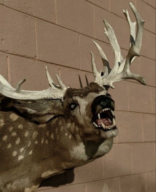
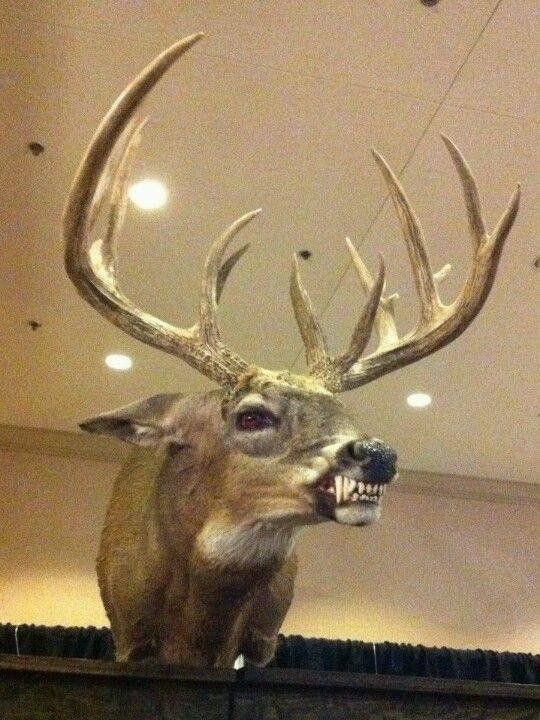
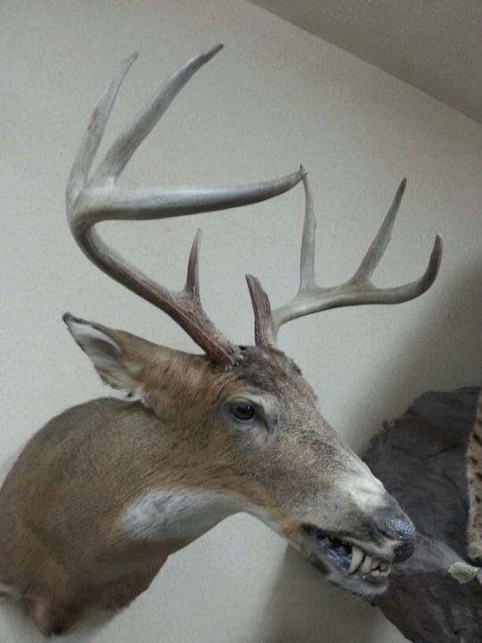
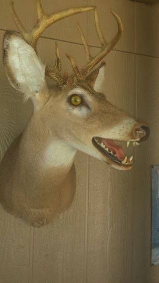
I fuckin’ love meshed together taxidermy like this.
Kinda wish I did something like this with the first deer mount I got from my first buck kill. Woulda been waaay cooler.
#I especially love the first one#so cool#imagine bagging a deer and coyote and just goin to a taxidermist and be like#‘i wanna combine these two into one mount :)’#idk as a taxidermist i’d see that as a fun challenge#I considered and still wanna be a taxidermist#i just really wish i had someone to teach me it vs learning from youtube or something#i wanna learn more than just step by step#wanna get that experience and life stories too y’know?#also i dunno if i should put any like content warning tags so lemme know if i should tag it anything specific#so that the people who don’t wanna see this stuff can avoid it in the future#taxidermy#taxidermy deer#deer taxidermy#deer mount#gator bellows
878 notes
·
View notes
Text


the realization that a 03 leosagi child could be a dragon-bunny hybrid hit me like a derailed freight train a few days ago
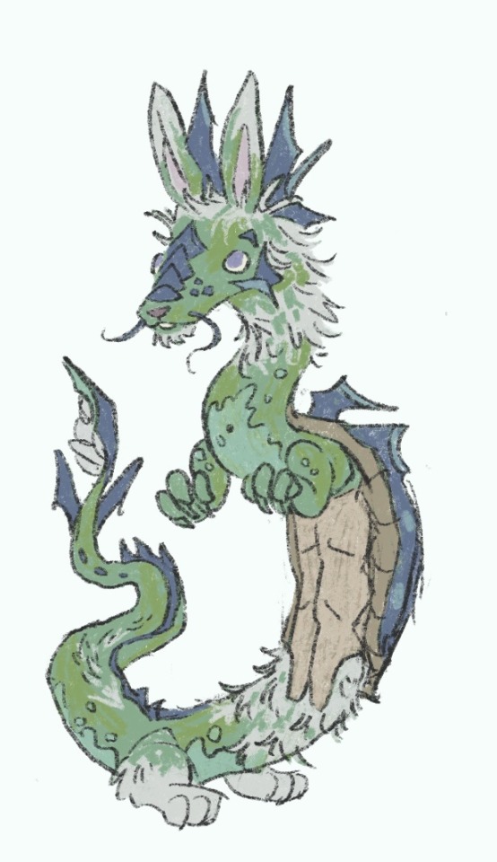

i do not know her name or anything else all i know is that her fam is as surprised and awed by her as i am
also that mikey needs a refresher on how biology works

#my art#tmnt#03 tmnt#tmnt leonardo#miyamoto usagi#tmnt leosagi#katanashipping#i love these dumb sword gays sm#here have a child#tmnt michelangelo#tmnt donatello#tmnt raphael#leo lays eggs every like idk 6mo to a year or so after hitting adulthood but no one ever thought any of them would or could be fertile#but don likes to study them sometimes cos yanno#theyre all living medical and biological mysteries#so any oportunity to learn anything at all is worth examining#and just this once#genetics leaned dragon rather than turtle#and while rabbit + turtle = nothing (cos reptiles and mammals)#dragons meanwhile are enough to make all known laws of logic and biology take a quick hike#so rabbit + dragon =?????#i dont intend to actually do anything with this idea i just wanted to draw what a rabbit dragon turtle might look like#also i have no idea how she stands or walks#not that she wouldnt be able to i just have no clue what itd look like#well when shes small shes prolly like the ferrets in the idw comic#but when shes grown???? idk man#does she slither? does she float? does her arms and legs start being like reasonably proportioned?..#who knows!! u decide!!!#shed be such a cute and clumsy toddler tho#(maaay have watched too many @/leafystreet shorts abt his baby geckos. his lil 'hi! welcome to the world!' as they hatch fucking gets me ok
774 notes
·
View notes
Text
i had a vision last night

grim and jamil body swap what shenanigans will ensue i wonder

#idk 🧍#jamil in grim’s body trying to convince everyone that they swapped bodies#grim in jamil’s body denying all of it and (mostly) everyone believes him#hehe such good potential for x yuu ships#if grim doesnt like the boy yuu likes#or if the boy likes yuu#grim will try to sabotage it while he’s in their body#the one in grim's body learns things about yuu while yuu believes they're still talking to grim#[—✦-#-✧ my art#twst art#twst#twisted wonderland#jamil viper#twst grim#bodyswaptwst#-✦—]#i love how i introduce a lot of concepts and just.#barely doing anything with them despite wanting to 😭#sorry if this has already been thought of before tho 😭
346 notes
·
View notes
Text

Gay people cant be mad at echuther no more they gotta be doin somthn weird like ts 💀🙏
(Aka my redesigns bein zesty but i had no idea wt to do wit Chloe)
(TUMBLR FKN RUINED THE QUALITY. TAP 4 BETTER QUALITY OMFG 😭)
(Might delete, i hate this drawing alot ☹️)
#i hate chloe and her iconic blue hair ☹️#descendants 4#descendants#descendants rise of red#rise of red#descendants ror#descendants red#redesign#descendants chloe#chloe x red#red x chloe#glassheart#charminghearts#redcharming#glassrose#girl we got an entire collection wit dese ship names 😭🙏#art#fanart#artists on tumblr#digital art#descendants art#descendants fandom#descendants fanart#listen. her blue hair was too iconic it makes my eyes bleed. TOO MUCH BLUE. TOO MUCH RED. I HAD TO DIE IT DOWN A BIT!!#anyways im not a professional designer idk anything abt designing soo feedback??#edit: i dont like what i made nor designed so may or may not delete depending on attraction. im still learning how 2 draw them 😭
207 notes
·
View notes
Text
i think one of my biggest pet peeves is when you're trying to explain or delve deeper into a topic that's *a bit* more complex or challenging with someone and they immediately cut you off and resort to making jokes about their head hurting or dumbing it down to a cartoonish level for,,, comedic effect i guess
#like damn are you really not going to entertain me just a little bit?#you're not even willing to let me explain it#and it's not always difficult topics it's like people are not curious about anything anymore :(#dont we all have an inherent thrist for knowledge? i honestly can't think of anything more rewarding than learning#(as long as the speaker is not condescending arrogant in his approach)#and i also think it's a disservice to the person joking about them being dense or not understanding#it's an unpleasant situation overall because if they claim they're dumb that makes you the pretentious one#which of course you did not want ahh idk i just wish we could focus more on a topic and less on our personhood if that makes sense#del later 100% sorry i got upset(
125 notes
·
View notes