#id below read more
Explore tagged Tumblr posts
Visit Tumblr Blog
Explore Tumblr blogs with no restrictions, modern design and the best experience.
Last Seen Tumblr Blogs


Fun Fact
1,644 Tumblr posts in 1 second.
Text
as a bi person, the bisexual flag brings me infinite joy and always puts a smile on my face, however as a person who has a Passion for Graphic Design, that undersaturated shade of purple infuriates me when it's used digitally
like, on an actual flag - which was its original purpose - it looks great!

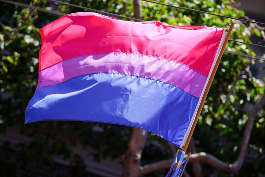
those look fine! lovely, even! with the semi-transparent fabric, the way it catches the sunlight, it looks beautiful!
but now look at how it looks digitally

the pink and blue are so vibrant compared to the sad, lonely lavender!
and let's look at this statement from Michael Page, the creator of the bi flag:

(sidenote: he created this flag in 1998, so if his takes on bisexuality is different from yours, it's okay to notice that! a lot has changed since the 90s when it comes to lived experiences and the way we describe them. but, it's also important to respect his thoughts about this and the way he presented them, even if today, we'd probably not say that bi people "blend unnoticeably into both the gay/lesbian and straight communities.")
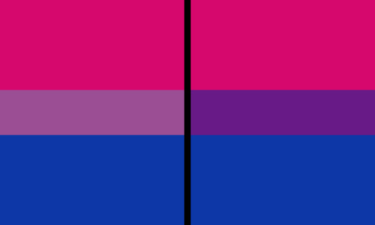
so in pantone colors, the pink is 226 C, the blue is 286 C, and the purple of the flag is 258 C.
but...here's the deal
Michael talks here about how the key to understanding the symbolism is to know that the purple blends into both the pink and blue. and on a physical flag, I think you can see that!
but digitally, it absolutely does not blend. it clashes badly, and looks oddly separate from the other two colors.
which got me wondering...what purple do you get if you actually blend 226 C and 286 C?
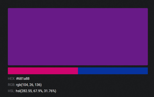
oh! oh, my god.

look at that! look at how nicely it fits between those colors!
look at it next to the original color scheme! look at how much more vibrant the purple is!
and friends. this is just blending through rgb! you get even more purple variations when you use other color spaces!
let's compare all of them:


(top: original, lab. middle: lrgb, lch. bottom: rgb, hsl)
look at all of the different purple options you can get just by combining these two colors!
if you want almost too-vibrant saturation, you can go hsl, if you want something more relaxed that's closer to the original, you can go lab or lrgb. and if you want to split the difference, lch is bright and violet, while rgb is there with its saturated but darker purple.
anyway, I guess I don't really have a point here? this isn't so much an informational post as it is Me Getting Weird About Colors, but I think it is a useful lesson about how colors look very different on screens compared to how they look on objects in real life.
and sometimes, I think it's okay to compensate for that.
out of all of these, this is my favorite bi flag:

it's the one where the colors were blended in lab color space. for me, the lighter, softer purple is close enough to the original bi flag purple, while also feeling like a smoother blend of the blue and pink
but that's just me! and it might not even look the same to you, since every screen is different, because technology is a nightmare!
anyway, thank you for coming with me on this colorful journey! I will now retreat back to inkscape and make pained sounds about inkstitch gradients until something tangible pulls me back into reality
#bi#bisexual#bisexuality#bi flag#bisexual flag#sbs rambles#graphic design is my passion#id in alt text#but#the ids are probably deeply unhelpful for the different variations of flags#in the alt text of the six flags all grouped together#I just put what method the purples were blended with#and then tried to describe them more in the paragraph below#but this is an inherently visual post#so if you're reading it with a screen reader I am sorry :(
19K notes
·
View notes
Text

some Harvey's from my sketchbook including a teeny tiny panel redraw

#these are inspired by the current two face solo (on the left)#the caped crusader (top right)#batman comic that the redraw is from is below the read more#included the full page bc its great#harvey dent#two face#two-face#dc fanart#dc#dc comics#batman comics#harvey dent fanart#harvey dent dc#dc two face#jaybin#dc robin#panel redraw#crow-eyed-art#traditional art#traditional drawing#id in alt text
25 notes
·
View notes
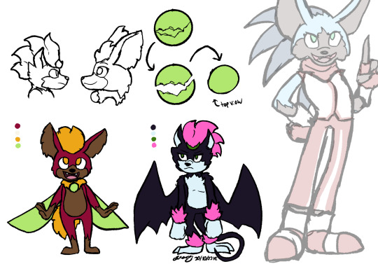
Text
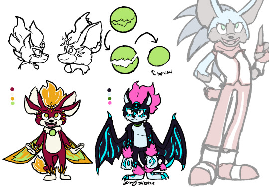
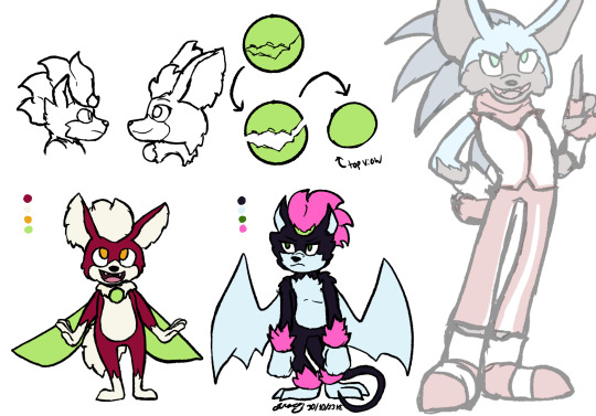
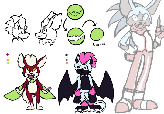
[Image ID:
A digital drawing of a redesigned Chip from Sonic Unleashed and Pretzel, an OC based on Dark Gaia. A semi-transparent image of a redesigned Sonic is set to the side for scale, showing both Chip and Pretzel as barely reaching his hip.
Chip is a short, chubby creature, somewhat resembling an anthropomorphic dog. He is primarily red, with creamy white on his muzzle, inside his ears, on his underbelly, and on his paws and tail. He is very fluffy, especially on his ears and tail. He has a fluffy white crest on top of his head. His eyes are small (for a Sonic character), with perfectly round pupils, like a bird's. He has a ruff of white fur around his neck, with a round green bauble hanging from it like a necklace. He has slender, insect-like wings that are the same color of green.
Pretzel has a similar build to Chip, though she is slightly taller and ganglier, with especially long arms. She looks more like a cat, with a shorter muzzle and small pointed ears. She has a long, thin tail, curled into an almost pretzel-like shape. She is primarily dark purple, with pale blue inside her ears, on her muzzle, on her underbelly, and on her paws. She has bat wings, the same dark purple as the rest of her. She also has fluffy pink tufts on top of her head, on her wrists, and on her ankle. On her forehead is a crescent shaped broken piece of the same orb Chip has on his chest, though Pretzel's piece is a much darker green, matching her eyes.
Sketches on the top of the page show what Chip and Pretzel's heads look like from the side. An additional drawing shows a round green orb with cracks, then the same orb split into two uneven pieces. One side, seen from above, matches Chip's orb. The other, a slim crescent piece, matches the one on Pretzel's forehead, albeit a lighter color.
The second image is the same drawing as before, but now there are additional details on Chip and Pretzel's designs.
Chip has gained an additional pair of ears, and his tail is longer, with a fluffy gold-and-white tip. The tuft on his head is bigger, golden and flame-shaped. has a golden sun emblem floating above his forehead. Similar golden shapes float around his eyes, wrists, and ankles. His pupils now have light green at their center where previously they were pure gold. His green wings are now edged in gold.
Pretzel now has a third eye on her forehead, pure black with a glowing blue pupil and glowing blue crescent shapes framing it. The fragment on her forehead has shifted down to her neck, matching Whip's orb. Her head tuft, like Whip's has become bigger and more flame-like. Her wings have more clearly defined arms, as well as dragon-like claws at their tips. Glowing blue markings surround her eyes and dot her cheeks, lower limbs, and paws, as well as streaking the undersides of her wings.
/end ID]
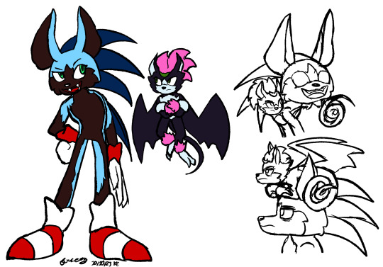
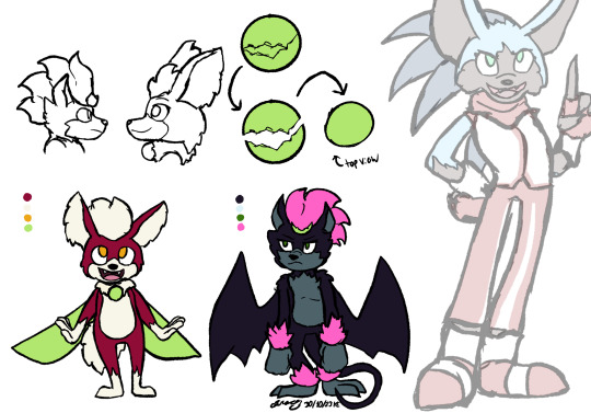
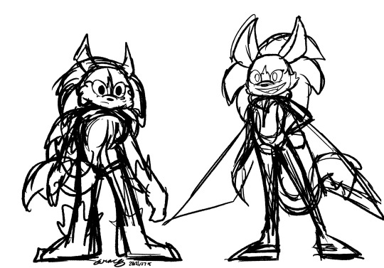
[Image ID: A digital drawing of a redesigned Sonic the Hedgehog and Pretzel, the OC from the previous two images.
The redesigned Sonic has a pointier muzzle, larger ears, and long, slender quills clearly defined from his fur. Said fur is light blue, while his quills are a darker shade. He has dark brown fur inside his ears, as a "mask" on his face, on his underbelly, and on the outsides of his legs and arms. He wears white gloves with red cuffs in addition to his classic shoes, which have had the cuffs unrolled to look more like boots.
In the colored drawing on the left, Sonic stands with one hand on his hip, looking at Pretzel with a cheeky grin. Pretzel flies beside him at eye level, arms folded and expression unimpressed.
Two additional black-and-white sketches are on the right side of the page. In the top one Sonic grins proudly, while Pretzel, slung across his shoulders, glares at him with annoyance. In the bottom one Pretzel is lying on top of Sonic's head. They are both looking the same direction with equally tired, unimpressed expressions. /end ID]
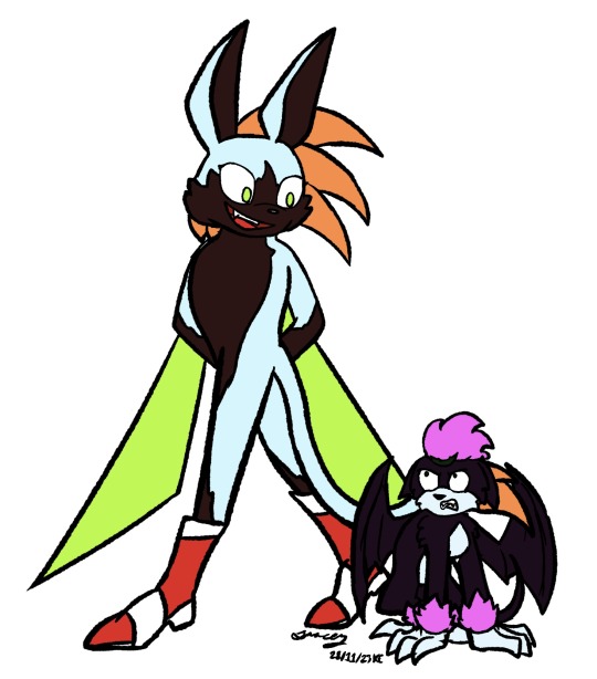
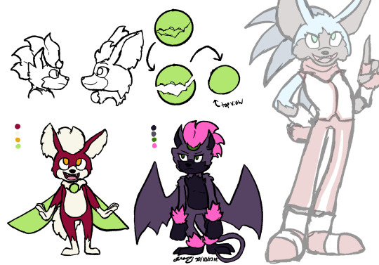
[Image ID:
A digital drawing of Pretzel, the OC described previously, and Sonic the Hedgecat, a new form of Sonic similar to the Werehog.
As the Hedgecat, Sonic's already light blue fur has become paler, almost white. His green eyes have become more yellow-tinted, and his quills have turned orange. His body as a whole is slimmer and lankier, and his ears are taller and pointier. His shoes have become heeled boots. He has green wings on his back, like Chip's, and a long, lion-like tail with an orange tuft on its tip.
The hedgecat walks with his hands folded behind his back and wings hanging like a cape. He looks down at Pretzel with a grin that shows his fangs, his eyes bright and devoid of pupils. Pretzel is hunched over, barely reaching to his knees, with her wings raised around her protectively. She looks up at him with anger and fear, ears back and fangs showing. /end ID]
of course I gotta redesign my girl Pretzel too. I've been mentally rotating a Sonic Leashed rewrite in comic form for a while now, but I keep telling myself to wait till the series is finished, then start rewriting.
that said, I have been thinking about doing a comic mock-up of some kind as a sort of test run for these redesigns... we'll see. regular Sonic and Pretzel I'm pretty solid on, but the scene I've got in mind involves the hedgecat, which still needs some work for the new design. we're getting there.
bonus sketches and additional Pretzel and Whip color palettes I was considering below

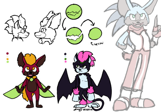
[Image ID: The same drawing as the very first two images, with Pretzel and Whip, but with different palettes for them both. The first gives Pretzel a darker grey muzzle and underbelly. The second makes her a lighter purple, with darker purple on her muzzle and underbelly. The third leaves Pretzel unchanged from the original version, but gives Whip a dark brown muzzle and underbelly, as well as making the tuft of fur on his head and his tail yellow. The fourth is the same as the third, but with a lighter shade of brown for Whip's markings. /end ID]
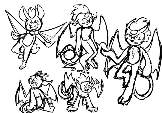
[Image ID: several black-and-white sketches of Pretzel in different poses. There is one sketch of Whip in the top left with his wings and arms spread, one leg bent, and a bright smile on his face. To the right of this drawing is one of Pretzel standing awkwardly, looking to the side with a disturbed expression. To the right of this is a larger drawing of Pretzel, flying with one leg curled beneath her and one hand raised as she looks up with an annoyed expression. To the left of this is a sketch of Pretzel on all fours, wings raised as she hisses like a cat. Finally, in the bottom left corner is a sketch of Pretzel sitting like a cat, head tilted to the side and a mistrustful expression on her face. /end ID]
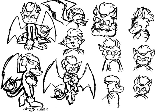
[Image ID: several black-and-white digital sketches of Pretzel in various poses and expressions. In the top left she sits like a cat, glaring upwards. Below that she stands on two legs, arms folded, one leg kicked back, glaring at something behind her. To the right of this is a drawing of her flying, arms folded as she rolls her eyes.
Near the middle is a sketch of just Pretzel's head and shoulders as she looks upwards with an expression of shock. Top center is a drawing of her head and shoulders in profile, a snarl twisting her muzzle. Next to it is a drawing of her resting her chin on her arm, smiling mischievously as she sticks out a snake-like tongue. In the top right is another drawing of Pretzel in profile, glaring. Below that is a drawing of her looking concerned; next to that, one of her looking to the side; below that, another profile shot, and next to that, her glancing to the side. /end ID]
[Image ID: a digital black-and-white sketch of Pretzel and Whip, both flying in the air. Pretzel is on the left, arms folded and legs bent under her as she looks up with a skeptical frown. On the right, Whip has his arms extended, one leg bent under him as he beams up at the sky. Pretzel's irises are large and pure black, while Whip's are small and have no pupils. /end ID]
[Image ID: a digital drawing of Sonic in his werehog form on the left and his hedgecat form on the right. The werehog has large, pure black irises, like Pretzel. He looks perturbed. The hedgecat's quills bush out like a lion's mane, and wings like Whip's hang from his back like a cape. His irises are pupil-less, like Whip's, and he grins broadly. /end ID]
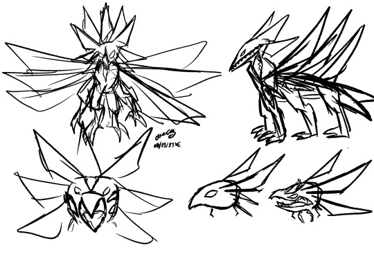
[Image ID: several rough black-and-white sketches of a monstrous form of Light Gaia. The first, in the top left, gives it a bird-like head with a multitude of pointed ears, pointed wings, and bird-like legs. In the top left it retains the bird-like head, but now has a more quadrapedal body, with three pairs of legs and three corresponding pairs of wings. Its fanged mouth runs further up its beak than should be natural, stretching even past its eyes. In the bottom left is a drawing of Light Gaia with its beak parted and additional openings on its cheeks. Finally, the bottom right shows two images of Light Gaia's head in profile. The first shows a smooth, almost statuesque bird head with elegant pointed ears. In the second image, its head has been split by its fanged mouth, with additional mouths on its forehead and neck. /end ID]
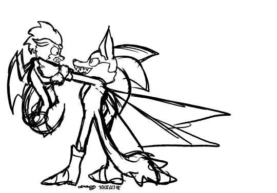
[Image ID: a black-and-white digital sketch of Sonic in his hedgecat form. He holds Pretzel up by her throat, looking up at her with a fanged grin as she scowls down at him. His eyes have no pupils. /end ID]
hmmm... might revisit that last one...
#my art#sth#digital art#sonic the hedgehog#sonic au#sonic the character#gaia au#sonic gaia au#procreate#procreate art#2023 art#redesign#character redesign#sonic redesign#pretzel the dark gaia#dark gaia#sonic oc#my ocs#chip the light gaia#technically he's called whip in this au but yknow#has id#image described#image id#yeah i'm thinking about a light gaia redesign too#wanna make it more eldritch and horrifying...#unfortunately my monster design + rendering skills can't quite match the vision in my head#rip#june 2024 update: added the ids as plain text. wrote up ids for the images below the read more.
11 notes
·
View notes
Note

annamary
ANNAMARY
[id: a screenshot of a tweet. the text reads "malewife this, malewife that, enough! i want girlhusband']
#image id for the text below the read more!#spntoxicfemslash#spn femslash#mar1n3tt3#anna milton#mary winchester#anna milton/mary winchester
4 notes
·
View notes
Photo
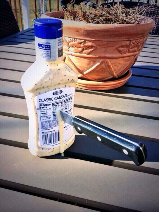
[ID: A photo of a bottle of Kraft Classic Caesar salad dressing on a table, with a kitchen knife stabbed straight through the back, leaking dressing down the blade. End ID.]
#Please copy and paste into the original post for accessability#no credit needed! It should just stay in plain text like it is now#without being put in italics bold or color#and go directly below the image#and above the caption#Image descriptions are for the visually impaired and blind#the way subtitles are for the deaf and hard of hearing#a plain text image description in the body of the post itself#is more accessible than just ALT text.#The image description should not go under a read more as that is inaccessible#and if you change your URL or delete the original post#everything under the read-more will be lost forever#it's never too late to add the ID!#:)
2M notes
·
View notes
Text
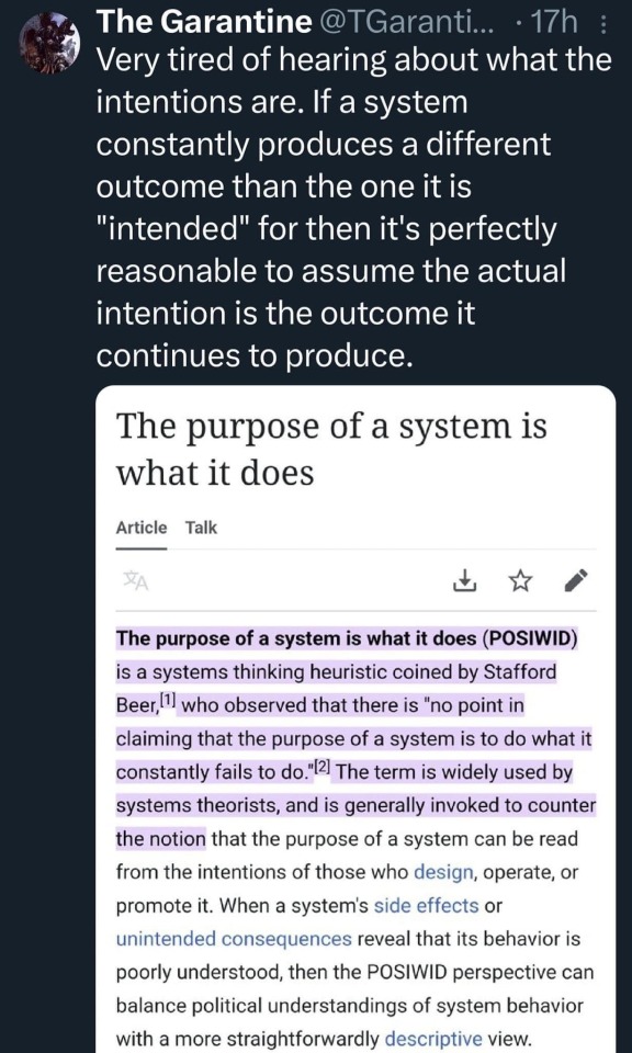
this is so on the nose
just adding (since it seems to have stirred some people up) that obviously this is not an absolute - it just points to how some oppressive systems (for example) rely on bad faith to cover for their systems doing what they're really intended to do by claiming that they're still in progress - but there are plenty of other less bad faith examples too that are more to do with poorly thought out or poorly implemented plans
[ID: post by The Garantine quoting the start of a wikipedia article
Very tired of hearing about what the intentions are. If a system constantly produces a different outcome than the one it is "intended" for then it's perfectly reasonable to assume the actual intention is the outcome it continues to produce.
beginning of quoted article below reads as follows:
The purpose of a system is what it does
The purpose of a system is what it does (POSIWID) is a systems thinking heuristic coined by Stafford Beer, who observed that there is "no point in claiming that the purpose of a system is to do what it constantly fails to do." The term is widely used by systems theorists, and is generally invoked to counter the notion that the purpose of a system can be read from the intentions of those who design, operate, or promote it. When a system's side effects or unintended consequences reveal that its behavior is poorly understood, then the POSIWID perspective can balance political understandings of system behavior with a more straightforwardly descriptive view.
ID ends]
39K notes
·
View notes
Text
Free Manual Wheelchair Reference Models

ID: A banner with grey 3D models of 5 kinds of manual wheelchairs in a line in front of the disability pride flag and text that reads "Manual Wheelchair References" /End ID
For disability pride month, I decided to release a pack of 3D manual wheelchair models.
The pack includes 5 wheelchairs:
2 Active urban-style chairs (one of which includes a smart drive)
1 off-road active chair
1 children's wheelchair
and 1 standard "hospital" wheelchair).
All the wheelchairs are based off either wheelchairs I or friends of mine have used
Downloadable here!
or on the Clip Studio Paint Asset Store (ID 2097442) (there's been an issue with the CSP version, but the models in the download folder can be imported into clip studio paint until I can fix it)
More info about the download contents below:
The first download link includes the original .Blend file with all 5 chairs, as well as individual .obj or .fbx files the chairs (All but 1 have an .obj file, as they're only meshes. The chair with the smart drive is rigged, which is why it has an .Fbx file instead so it will retain that information) as well as a "read me" file that explains in more depth what kind of disability/character/lifestyle each chair is made for (These are just what I had in mind when I designed them, they are usable by other characters who don't fit the suggestions for the most part!) I wanted to include the Read Me contents in the CSP Asset Store listing, but CS said it was too long lol.
Also, as the title says, these files are free to use! While it's not mandatory, I would appreciate credit if you use them (or even just a tag so I can see the cool art you make with them!!)
I actually made these ages ago, the original plan was to use them in a series of posts then release the pack, but I never got around to making the series and so they've just been sitting here. I took a day off from art fight attacks to clean them all up and get them ready to post. If you experience any issues, let me know and I'll try to fix it up.
I had a couple more that were supposed to be in the pack including a sports (basketball/Tennis) wheelchair and some different styles of wheelchair, but I think the files corrupted so once I fix (or remake) them, I'll probably make a second pack.
If you have any issues, please let me know!
#Writing Disability With Cy Cyborg#Disability in art#wheelchair#wheelchair user#disability#disabled#disability representation#mobility aids#drawing disability#drawing wheelchairs#art reference#art resources#Resources#manual wheelchair#art stuff#disabled artist#3d#3d model#blender#disability awareness#disabilities#disability in media
11K notes
·
View notes
Text

[ID: A screenshot that had been edit to be titled in large text, "This screenshot is from 2020". The screenshot shows a news burst from AP Seattle reading, "Breaking: Greyhound says it will stop letting Border Patrol agents conduct routine immigration checks on its buses.". Then a user named corpse / thefurrow replies, "Witnesses said a bus driver told an ICE agent to 'gargle [his] balls' when the latter requested to enter the bus". Below the screenshot, more added text reads, "Warn people who reblog it thinking it just happened yesterday in 2025. Reposting old news without context is a form of misinformation. We all need to work together to stop it, no matter how 'harmless' it may seem.". End ID.]
You might think it's harmless to repost old news like this without the relevant context, but it's not. This is painting a corporation in a positive light, when they may no longer hold that stance.
There is no safe form of misinformation. This reposted news might be about a bus driver swearing at an ICE agent, but next time it could be about a mass shooting, or a wildfire or earthquake, or oil spill.
All misinformation is harmful. Everyone needs to be wary. If a screenshotted post does not have timestamps or a link to a news source, ask yourself why. Google a quote from it to see what shows up.
And if there is actual important information that needs to be spread, include image descriptions. Tumblr has been known to censor important posts in the past by removing pictures. Make sure the information can survive the original photo being deleted.
#abolish ice#chinga la migra#resistance#solidarity#Trump#misinformation correction#Resist#copied the tags from the original repost#from a very suspicious and likely bot account
3K notes
·
View notes
Text
i nerfed this post bc of the stupid addition but you can reblog the new version here
going to start saying people "obviously aren't in a romantic relationship, they have something deeper and more intimate going on" to confuse and upset alloromantics
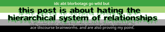
(ID: a banner with an aro pride flag in the background, with small text above and below large text dripping in green goo reading, "this post is about hating the hierarchical system of relationships". the top text reads "idc abt blorbotags go wild but" and the bottom text reads "& if you're mad about it you've probably been poisoned by ace discourse brainworms. and are also proving my point." end ID)
6K notes
·
View notes
Text

eSIMS are still being requested / gazaesims.com
As of 8 AM 1/22. Nomad and Holafly are most needed to be sent to [email protected]
Instructions for purchasing and sending an eSim can be found here (this zine is featured on the site and can be downloaded to hand out/distribute/etc)
More instructions summarized by gothhabiba can be found on this post as well

(posted by @Mirna_elhelbawi via twitter)
[Image 1: To the left is a list of instructions. The title reads, "Buy an E-sim!!" Under the title, the list goes, "1. Nomad and Holafly most needed (guide linked) 2. Send QR code screenshot to [email protected] (direct email linked) 3. All GB amounts are helpful - the more the better!!" To the right is an artistic design of a Palestinian flag, a dove carrying an olive branch with the words Free Palestine on it's wings and the motif of a keffiyeh.
Image 2: The image contains text that has "Let's Keep Gaza Connected" as a title. Underneath, it reads "Nomad (regional Middle East) Use promotional code NOMADCNG for discount". Below this is written, "Holafly (Israel) and (Egypt) Use promotional code HOLACNG for discount". At the bottom of the image, the message "Send QR code screenshot to: [email protected]" is written.]
id provided by mysteriousbeetle !
6K notes
·
View notes
Text
Please forgive how horrifically this was recorded (the screen reader mutes itself in recordings, which made it entirely useless for this post, which required a second camera) but I wanted to show people what alt text Actually Does for screen readers because I think a lot more people would take the time to add it if they knew why.
This is how the default screen reader function built into my phone "reads" an image, one without alt text and one with.
(I can't add alt text description to videos, it seems, which feels a little ironic given the post.)
When the first image, without alt text, is selected by a screen reader, it just reads out "photo".
When the second image, with alt text, is selected, it reads out the alt text - in this case, "A blurry picture of a gray tabby cat sitting on a white carpeted floor.".
Being able to use alt text is far easier on screen readers because the image is a larger object to select - descriptions in plain text below an image are still helpful, but require enough vision to accurately select, and enough vision to know they're an image description to begin with.
So please, when possible, add alt text to photos, art, and screenshots you're uploading! A lot of phones can copy text from images now, which is how I add image IDs to other people's text heavy posts - there's really no reason to post a bunch of text heavy screencaps and not at least copy and paste the text into the alt text, and it makes a huge difference for accessibility.
Thank you! ^w^
#patch me through to palaven command#accessibility#videos#also i accidentally played the video while typing and it wouldn't stop playing#so ive heard this audio about five hundred times
3K notes
·
View notes
Photo
[ID: Digital art showing two arms tenderly clasping pinkies. One arm is in the colors of the trans pride flag: blue, pink, white, pink, and blue. The other is in the colors of a lesbian pride flag: Dark red, red, pale pink, white, purple, dark purple, and dark red-purple. End ID.]
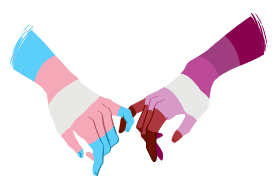
lesbians love and support our trans sisters 💖💖
*edit 12/20/19: this post is made by a trans-inclusive nonbinary dyke to show that trans women are an important and well loved part of the lesbian community. this is not about “afab solidarity” or solidarity between trans men and lesbians or any other transphobic bs, as many terfs have tried to claim on this post. this is just a cute positive post for trans lesbians. this is also not a truscum/transmed friendly post. there is no transphobic gatekeeping welcome here.
**edit 5/22/22: this was literally made before the orange and pink lesbian flag was even created. check the timestamp it was posted before saying anything about the flag choice. it wasn’t me “choosing” to use the pink flag, it was that the pink flag was the mainstream lesbian flag in use at the time this art was created
#you are encouraged to copy and paste the ID into the original post for accessibility#no credit needed though it should remain above a read-more and not be put into#tiny colored italicized or other hard to read text in order to remain accessible.#Not everyone who needs an ID uses a screenreader.#Image descriptions are for the blind and visually impaired the way subtitles are for the deaf and hard of hearing#please copy the whole ID into the original post directly below the image.#adding it to the original post and then reblogging that or#asking people to reblog the updated version is better#for accessibility than just reblogging this version#thank you.#art
267K notes
·
View notes
Text

okie miku!! or more specifically texoma miku bc I have no clue what happens up near the panhandle </3 she's chahta also. more like hatsune maka
[image description: a page of drawings of a oklahoma-themed design for hatsune miku, where she is darker-skinned, wears beaded earrings, and has visible tan lines. on the right is a full-body drawing of her wearing a university of oklahoma shirt and boots, where she is carrying a braum's bag and shake with a thought bubble reading "damn texas drivers". on the left are a drawing of her in an okc thunder shirt, where she is holding a beer in one hand and doing a downwards longhorns gesture with the other. below that is a scene of miku sleeping in a lawn chair in a field with a tornado occurring in the distance. end id]
#literally i have never been more north than okc so i do not know if you guys are any different#anyways. miku#she only listens to country music#doc talks#my art#hatsune miku#vocaloid#regional miku#oklahoma
1K notes
·
View notes
Text

"What is to come"
(image id is both in the alt text and below the read more- I put it under one because it's incredibly long)
And so there we have it, the 200+ followers artpiece that I have been working on for several days, if I had to guess I'd say it took 25 or so hours over eleven days. Honestly it's so surreal to me that I'm here with over 200 followers (260 as of typing this- yes, I procrastinated on this), especially when I only hit 100 followers in February. It's genuinely really nice to know that people are actually interested in my art (before anyone brings up spam bots- I know there are a few of them amongst my followers but I've checked most of them and I am 100% confident that over 200 of them are real). I don't really have much else to say really- I'm just grateful to have the support. Thanks y'all :).
[Image id: a large, lineless digital drawing of several dinosaurs. It is nighttime. At the bottom of the piece, a lone Eoraptor lunensis is walking across the floodplains- both the ground and the Eoraptor are just silhouettes, the early dinosaur has been given protofeathers. The full moon is shining, it's size is exaggerated for artistic affect. Behind the moon, the heads of sixteen different dinosaurs can be seen (listed left to right, bottom to top) Row 1- Thecodontosaurus antiquus (small sauropodomorph with light brown protofeathers, near-white undersides, straight stripes that are moderately darker than the base colour and vibrant green eyes), Coelophysis bauri (small early theropod with a long and narrow skull, its protofeathers are golden and black. A soft orange stripe runs across the back of its head, it has warm brown eyes. Row 2- Plateosaurus trossingensis (long-necked sauropodomorph, it has reddish-brown scales, light undersides, triangular stripes running down it's spine that get bigger the further down they get and pale yellow eyes), Heterodontosaurus tuckii (small ornithopod with a hooked grey beak. It has spiky green feathers, a lighter chest and a darker stripe running along its head and back, there are three small spots on its face, two behind the eye and one infront of it, it's eyes are bright yellow). Row 3- Megalosaurus bucklandii (medium-sized theropod with warm brown feathers, lighter undersides, dark spots and bright yellow eyes, there are several scars on its face), Brachiosaurus altithorax (greenish-grey true sauropod with lighter undersides, a dark pink patch on its throat, dark desaturated brown eyes and a few small scars on its neck), Archaeopteryx (early toothed bird with a black head, white neck and bright yellow eyes). Row 4- Hylaeosaurus armatus (pale brown ankylosaur with lighter undersides and vibrant green eyes), Velociraptor mongoliensis (dromaeosaur with light brown feathers, a lighter chest, a black stripe near its eye and light green eyes), Sinosauropteryx prima (small compsognathid theropod with ginger protofeathers, an off white mask and undersides and pale yellow eyes), Iguanodon bernissartensis (large greenish-grey ornithopod with a slightly darker back, pale undersides, a grey beak, and yellow eyes). Row 5- Matuku otagoense (heron with medium grey feathers and a small crest. A red stripe runs from just behind its nostrils to about a third of the way down its neck. Its undersides are white, its beak is grey and its eyes are brown), Triceratops prorsus (three-horned ceratopsian with grey-brown scales, lighter undersides, two triangular stripes between it's brow and nasal horns, reddish-orange diamond-like stripes on its frill, a hooked grey beak and golden eyes. Its brow horns curve forward at the base. Row 6- North Island brown kiwi (plump brown bird with a long pale beak, whiskers and black eyes, its nostrils are at the tip of its bill, and unlike the other dinosaurs in the sky part of its body below the neck is visible), male house sparrow (small redish-brown and grey bird with a black bib below it's bill), it has brown eyes and a dark grey bill. Row 7- rock dove (grey bird with iridescent green feathers scattered across its neck, a dark grey beak, and warm brown eyes). end id]
#art#my art#digital art#paleoart#dinosaurs#birds#eoraptor#thecodontosaurus#coelophysis#plateosaurus#megalosaurus#brachiosaurus#archaeopteryx#hylaeosaurus#velociraptor#sinosauropteryx#iguanodon#matuku#triceratops#north island brown kiwi#house sparrow#rock dove
3K notes
·
View notes
Text


Fun fact! This was the real tipping point that made Edgeworth run away after AA1, they just couldn't show it on screen because they didn't have the rights to Chappell Roan's music <3
(A spiritual successor to my "Hot to Go" joke from this post. Image description under the cut below)
[Image ID: a four page black and white comic of characters from ace attorney.
The Judge stands solemnly at his podium holding a gavel "Mr. Miles Edgeworth, you are on trial for the murder of blah blah blah..."
A cheerful Maya Fey leans over to Miles Edgeworth, who is staring straight ahead and looking very concerned
Maya: "Psst! Mr. Edgeworth! If you win your trial, can I show you Chappell Roan?
Miles: "What the hell, sure." Internally he thinks "Oh God I am going to jail"
A box saying "later" in the top corner of the next panel marks the passage of time.
The Judge smiles as he says "I declare you... Not Guilty!"
We see a full body shot of Maya dancing excitedly while Miles looks on, emotionless
Maya: YIPPEE omg you're going to LOVE this
Miles internally thinks "oh no, the consequences of my actions.
We see Miles standing in between Phoenix Wright and Maya looking apprehensive. Maya beams in excitement, while Nick puts a reassuring hand on Miles' shoulder
Miles: Alright, so what is this exactly?
Nick: She's a pop musician Maya really likes
Maya: You promised you'd let me show you, and it's legally binding because you said it in a court room!
Miles: That is not how the law works Ms. Fey
Maya: Shh just listen!
We see a panel of Miles' pensive face concentrating as he listens to "Hot to Go". He thinks to himself "hm".
Another panel zoomed in more. His pensive expression has grown more tense/confused as he listens to "Red Wine Supernova". he again thinks to himself "Hm" in a larger thought bubble.
We zoom out again to see Nick, Miles, and Maya standing together again. Miles stares forward blankly, eyebrows raised. Maya excitedly leans in.
Maya: Ok, that's her whole discography. So! What did you think?
Nick looks at him, waiting for his response
We get a panel of Miles, looking bewildered. He starts to speak "I..."
We cut again to see the three of them standing together.
Miles: I... don't think I like women?
Miles looks shocked and confused. Nick is bent over laughing, using a hand on Miles's shoulder to support himself. Maya looks outraged and appalled!
Maya: MR. EDGEWORTH! Just because you don' like her musi it doesn't give you an excuse to be sexist!
We see a panel of Miles looking stressed and confused. He leans his head on one of his hands, which messes up his hair, showing how he isn't his normal put together self.
Miles: I should rephrase that. What I mean is, Ms. Roan is clearly VERY assured in her feelings towards women. I was... unaware that anyone felt that strongly. I thought we all viewed these things with a vague sense of distaste and unease but collectively ignored it. Like how we do with climate change.
We zoom out again to see the three of them. Miles stands in the middle looking deeply uncomfortable and lost in thought, vibrating with unease. Nick and Maya exchange deeply concerned glances across from him.
With lingering unease, Miles begins to walk away.
Miles: Well, I should be going then. Goodnight.
Nick hesitantly raises a finger to point out an inaccuracy in that statement
Nick: It's four in the afternoon-
he gets interrupted by Miles who repeats firmly: I said Goodnight
Nick looks in the direction Miles walked off in.
Nick: ...He'll be ok, right?
Maya reassures him: Of cours Nick! I mean, what's the worst that can happen?
Jump cut to a closeup of Nick's hand holding Miles' letter which reads Miles Edgeworth chooses death in all caps. Then, below in smaller font, it says Also femininomenon was really good, thanks.
We see a panel of Nick glaring wordlessly at Maya as he holds the letter in his hand. Maya leans against the wall and looks away, whistling, trying to look innocent to avoid blame.
As a bonus, we also have a page that takes place a year later. Miles and Nick stand talking. Miles looks calmer now, and Nick smiles encouragingly.
Miles: In my time in Europe, I've been examining myself and my approach to law. Ultimately, the most important focus must be justice. We owe it to ourselves and to the people we serve
Nick: Wow, that's really inspiring Edgeworth. And, uh, hows the... the other thing going?
We get a zoomed in panel of Miles glaring menacingly at a suddenly nervous Nick
Jumping out again, Miles turns his back to Nick as he continues to talk
Miles: So as I was saying, justice is truly so important...
Nick nervously rubs the back of his neck wearing an awkward expression as he sweats nervously. He thinks to himself internally "Ooookay then, clearly still working through some things there"
/.End ID]
#Miles can handle horrifying truths about the death of his father and the nature of his guardian#but he draws the line at questioning his sexuality!#also. serious moment for a second#I think we focus a lot on moments of queer discovery stemming from attraction to the same sex#like that being the moment of panicked “oh no I'm different”. Which makes sense and is valid!#But I think it's also compelling to explore the opposite but similar twist in your gut that is:#oh my god I don't feel anything in this situation where others do. oh no something something is wrong with me#and this is something that gay and lesbian people have in common with ace and aro people!#I feel such tenderness and kinship to everyone who has been in that situation#and it's why i will never understand why aspec folks are pitted against gay or lesbian representation#we are drawn to the same characters bc we had such similar experiences and isn't that lovely that we can find solace in media?#so NO FIGHTING. We should all be BEST FRIENDS. my brothers in arms. I'd die for you.#all that is to SAY: I personally read edgeworth as asexual and like demiromantic/gay.#but YOU can read him as just gay in this comic if you want <3#Also. i just thought it would be funny if it took a lesbian to make him realize he didn't like women#I think he would have no clue how to react to chappell roan. Same vibe as giving a victorian orphan a baja blast and a crunchwrap supreme#ok sorry shutting up now#ace attorney#ace attorney comic#ace attorney trilogy#gyakuten saiban#phoenix wright#naruhodo ryuichi#miles edgeworth#mitsurugi reiji#maya fey#ayasato mayoi#my art
724 notes
·
View notes
Text
[ID: Two images, both showing a long checklist with multiple sections.
The top reads:
Self-Care Assessment.
The following worksheet for assessing self-care is not exhaustive, merely suggestive. Feel free to add areas of self-care that are relevant for you and rate yourself on how often and how well you are taking care of yourself these days. When you are finished, look for patterns in your responses. Are you more active in some areas of self-care? Do you tend to ignore others? Are there items on this list that hadn't even occurred to you? Listen to your internal responses and dialogue about self-care, and take note of anything you would like to prioritize moving forward."
This is followed by a key of ratings to give yourself for each checkbox:
"Rate the following areas according to how well you think you are doing…
3= I do this well (e.g., frequently) 2= I do this OK (e.g., occasionally) 1= I barely or rarely do this 0= I never do this ?[question mark]=This never occured to me"
The checklist follows.
Physical Self-Care: Eat regularly (Breakfast, lunch, and dinner) Get regular medical care for prevention Get medical care when needed Take time off when sick Wear clothes I like Do some fun physical activity Think positive thoughts about my body Exercise Eat healthily Get massages Take vacations Get enough sleep Do some fun artistic activity Other
Psychological Self-Sare: Take day trips or mini-vacations Have my own personal psychotherapy Make time away from technology/internet Read something unrelated to work Notice my thoughts, beliefs, attitudes, feelings Engage my intelligence in a new way or area Do something at which I am not an expert Make time for self-reflection Write in a journal Attend to minimizing life stress Be curious Say no to extra responsibilities Be okay leaving work at work Other
Emotional Self-Care Spend time with people whose company I enjoy Stay in contact with important people in my life Re-read favorite books, re-view favorite movies Identify and seek out comforting activities/places Express my outage in social action or discussion Love myself Allow myself to cry Give myself affirmation/praise Find things that make me laugh Other
Spiritual Self-Care Make time for reflection Find a spiritual connection or community Be aware of non-material aspects of life Try at times not to be in charge or the expert Identify what is meaningful to me Seek out reenergizing or nourishing experiences Contribute to causes in which I believe Read or listen to something inspirational Spend time in nature Be open to inspiration Cherish my optimism and hope Be open to knowing Meditate Find time for prayer or praise Have experiences of awe Other
Relationship Self-Care Shedule regular dates with my partner Call, check on, or see my relatives Share a fear, hope, or secret with someone I trust Stay in contact with faraway friends Make time for personal correspondance Allow others to do things for me Make time to be with friends Ask for help when I need it Communicate with my family Enlarge my social circle Spend time with animals Other
Workplace or Professional Self-Care Take time to chat with coworkers Identify projects/tasks that are exciting Balance my load so that nothing is "way too much" Arrange work space to be comfortable Get regular supervision or consultation Negotiate/advocate for my needs Make quiet time to work Take a break during the day Set limits with my boss/peers Have a peer support group Identify rewarding tasks Other
Overall Balance Strive for balance within my work-life and work day Strive for balance among my family, friends, and relationships Strive for balance between play and rest Strive for balance between work/service and personal time Strive for balance in looking forward and aknowledging the moment
Areas of Self-Care that are Relevant to You Other Other Other".
Smaller print at the bottom of the page reads:
"Adapted from Saakvitne, Pearlman, & Staff of TSI/CAAP (1996). Transforming the Pain: A Workbook on Vicarious Traumatization. Norton. Adapted by Lisa D. Butler, PhD."
End ID.]
You can download and fill out this form here:
"https://archive.org/details/self-care-assessment-for-people-to-download"
i know we're all sick of self-care being a marketing tactic now, but i don't think a lot of us have any other concept of self-care beyond what companies have tried to sell us, so i thought i'd share my favorite self-care hand out


brought to you by how mad i just got at a Target ad
#described images#you are encouraged to copy and paste the ID into the original post for accessibility#no credit needed though it should remain above a read-more and not be put into#tiny colored italicized or other hard to read text in order to remain accessible.#Not everyone who needs an ID uses a screenreader.#Image descriptions are for the blind and visually impaired the way subtitles are for the deaf and hard of hearing#please copy the whole ID into the original post directly below the image.#adding it to the original post and then reblogging that or#asking people to reblog the updated version is better#for accessibility than just reblogging this version#thank you.
176K notes
·
View notes