#i tried out gradient maps for the first time for this
Explore tagged Tumblr posts
Text
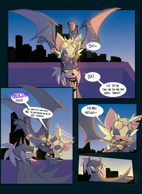
Dc au- two bats on a roof
(Rouge finds the whole ‘batman’ thing hilarious btw)
#She came to snitch on Shadow cuz she heard he’s after a chaos emerald and wants to use knuckles as a distraction so she can nab it💕#i tried out gradient maps for the first time for this#art#drawing#sonic the hedgehog#sonic#sth#doodles#sonic fandom#sonic fanart#digital art#sonic the hedgehog fanart#rouge sth#rouge the bat fanart#rouge fanart#rouge sonic#rouge the bat#sth knuckles#knuckles#knuckles fanart#knuckles the echidna#sonic au#sth au#sth art#digital aritst#sth fanart#sonadow harlivy au#knuxouge#knuckles x rouge
2K notes
·
View notes
Text

Poseidon illustration inspired by Epic :]
+ closeups under the cut


#Tried out gradient mapping for the first time which was cool#I listened to Ruthlessness a Lot while working on this lol#It’s a lot more green than I initially planned but Oh Well#epic brainrot#epic fanart#epic the musical#epic#my art#digital art#digital illustration#poseidon#greek mythology#mythology inspired#epic the ocean saga#ruthlessness
58 notes
·
View notes
Text
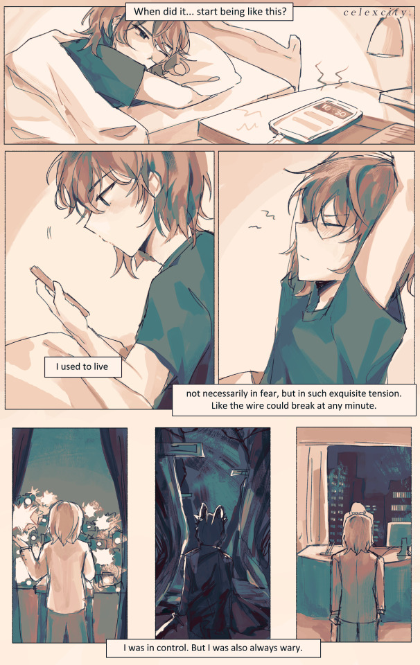
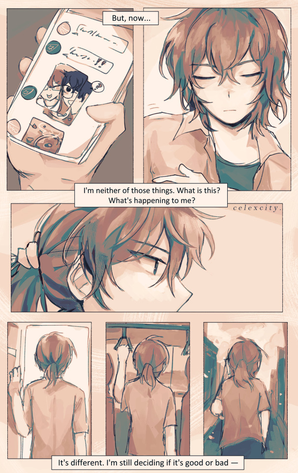
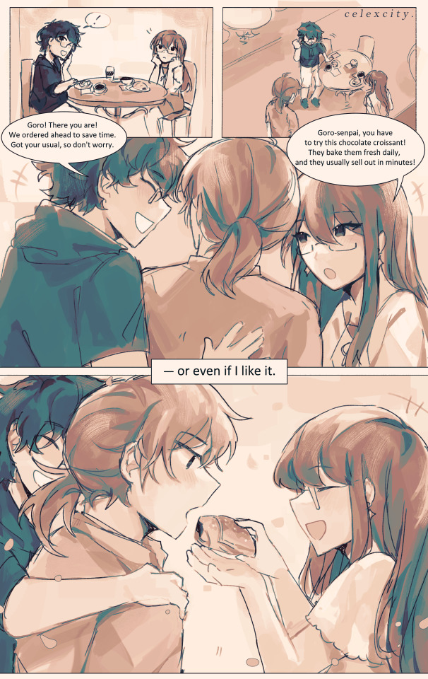
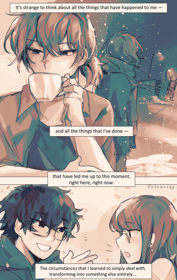
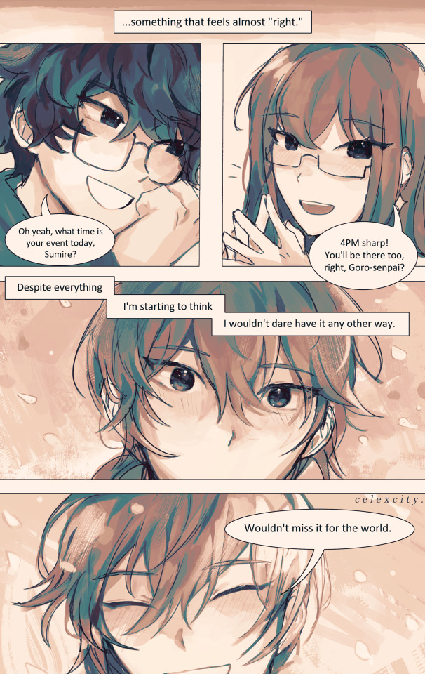
present day
if every day will be like this from now on, i'll look forward to every single one.
ok. Sits down. help meeee i tried using csp's comic tools for once (and also gradient maps + coloring w monochrome) to save time bUT I ENDED UP SPENDING THE USUAL AMT ANYWAY SO. . erm. WELL IT WAS FUN ANYWAYS
hiiiiiiiii i wrote this script 4 months ago nd finally did it (had this on the backburner for 20 million yrs bc i wanted to get out other angst bullshit first)
the parallels of goro's back (x3) on the first 2 pgs are kinda not 1:1 as i'd like but REGARDLESS i still like them. goro, who had utmost control over his life, running it like a machine, regardless of how he feels or if he's tired or if he wants to give up.......he was in control. knowing, of course, that his life is on the line at every waking moment, but since he was always on edge, always alert, he was still in control.
but now, surviving the long winter and coming out to the other side, he's lost that control AND that edge. now what is he left with? what is there left?
very speficially in the 2nd page.... i think its so <3 YAY <3 that goro, now, doesn't feel the need to take such spic-and-span clean-cut care of his appearance.., guy who rolls out of bed and throws on a shirt to go hangout w akira and sumire. he decides to tie up his hair and forgoes his gloves... feels more "comfortable" to change his apperance, to let down his guard a little. <- was the rough symbolism JKDSHKFS
sumire getting the choco croissant but letting goro have the first bite YEAHHHH WHATEVER
4th page symbolism is also rough i didnt think abt it too hard LMAO. 3rdsem goro watching his detective prince self leave. he knows acutely well that chapter of his life is over - whether he survives the long winter or dies in it. all that he knew - even though it was miserable and awful and frustrating and dangerous - is gone.
and now there's just this: the present day. whatever that means.
i think something important to me abt royal trio is just the idea of Learning To Just Exist: no need for a "purpose" or a "calling" or some overarching "goal". they just learn to exist.
and of course none of them really have a benchmark for "wow i like this i want to live like this" so they just roll with the punches, as they always have, but yknow. finally getting to live their honest student life as they always deserved
edit: and most importantly for goro, i think, is learning to cut himself some slack. "despite everything" he says, despite all the shit he's endured AND all the shit he's done, he feels like this is "right." whatever that means, he's ready to take it day by day to figure it out. AND THATS THE WHOLE THING Punches wall really hard
edit: I ALSO FORGOT. i think the sentiment of "being waited for" for goro means a lot. since he had to do everything by himself, fight for himself, decide everything for himself frm such a young age, the idea of akira and sumire waiting for him, inviting him out simply for him to be there -> is really meaningful to him, more than they could know.
edit AGAIN: also goro sleeping in means a lot to me. i imagine that guy has pretty terrible insomnia. ALSO HE HAS A BEDFRAME! i like the thought of his apartment being so /r/malelivingspaces throughout the game. he doesn’t deserve a bedframe. BUT HE HAS ONE NOW!
goros expressions in the last page gve me a hard time. sparkly....
also im SO freaking sorry if his voice isnt too well-written... i had a crisis over the wording while draiwng htis so much DSKHASKDASJK AND THE PANELING AND WHATEVERRR IDEK WHAT IM DOINGGG but it was fun!!!! exploratory..... regardless i will keep workign to do him and royaltrio justice. THUMBSUP EMOJI.
#4am again no problem. chokes#goro akechi#sumire yoshizawa#akira kurusu#persona 5 royal#royal trio#shuakesumi#cele draws#long winter#<- technically but its also good w canonverse#cele comics
516 notes
·
View notes
Text
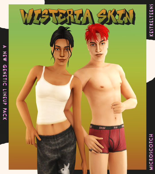
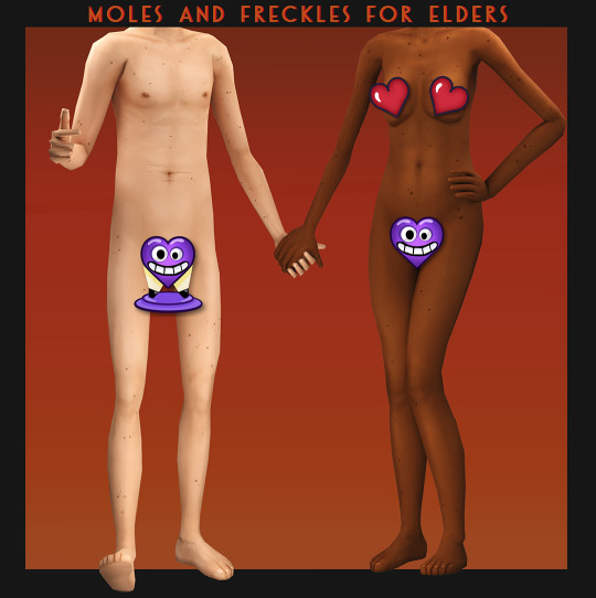



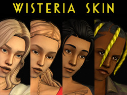
WISTERIA SKIN + PUPA EYES: A COMPLETE SET OF GENETICS
BOI that was an undertaking! but finally, and with lots of assistance from the wonderful @kestrelteens, this skin is completed. and it turned into an entire set of cohesive genetics, too! more info under the cut ⤵
essentially this is a mix of woohoo on the beach (aka ios those darn skins slightly edited) and various other components taken from @obscurus-sims, @lamatisse and @buglaur, (such as collarbones and ears), and some moles/freckles for the elder bodies i snuck from @episims, and @sixfootsims tongue + teeth texture. lips are a nod to maxis and a blend of so much stuff that i dont even remember it.😅 also tried to eliminate the smeared lipstick texture under the feet, and p much blended every seam i could find.
here's a swatch of the full range, which is more undertone rather than gradient based:

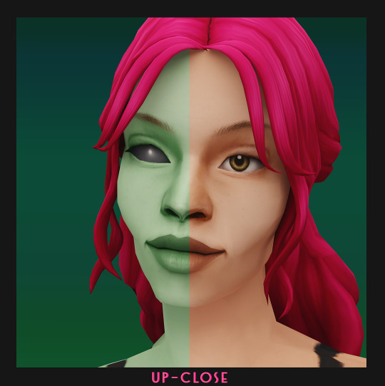
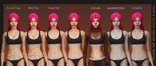
yay, first time doing supernaturals! 🌙 it was a lot of fun doing eye textures for them, here's the swatch:

NOTE: the zombie and vampire default come with an overlay mod! and the werewolf skins are correlated! please check out the hyperlinked instructions given by the respective creator ‼
also, i highly recommend downloading shasta's genie hair fix!
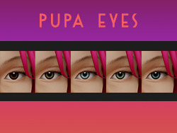
the eyes - squeas pupa eyes to be exact! come in 17 colors.

SO here are the downloads:
pupa eyes 👁 - custom / gen&town / defaults
wisteria skin 💗 - custom / gen&town / defaults / supernaturals / pngs for recolors + add ons :)
edit 01/08/25: showerproof add-on here
NOTE: these eyes are meant to go with the alien skin. 👽
dec 3rd update: EM chubby morph for shadowrealm has been fixed, feel free to redownload the non default version you're using!
for the database:
credit 🥰: serabiet, squea, obscurus, buglaur, themeasureofasim, sixfootsims, epi the phenomenal mod maker (and correlated werewolf skin maker!), withlovefromsimstown (plantsim textures), deedee(vamp cracks), platinumaspiration for more vamp cracks, veronavillequiltingbee (vamp overlay base), magical-girl-sandbox(bigfoot base), tvickiesims, lordcrumps, lamare & teaaddictyt for playtesting & feedback 💗
~~~~~~~~~~~~~~updates~~~~~~~~~~~~~~~
dec 3rd-- EM chubby morph for shadowrealm has been fixed, feel free to redownload the non default version you're using!
january 13th-- i noticed that the s3 range for females is a little too highlighted in the chest area, to the point that clothing where the skin texture mapping is just off the *tiniest* bit makes it clip with the neck, which also applies to a lot of ea meshes. i have toned down the shine and blended the neck down further for this range so that it looks better with differently mapped clothes :)
please redownload the natural defaults and/or non defaults. make sure to keep a backup of the previous version in case you end up not liking the changes ive made to this range!
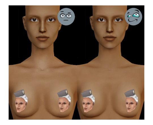
july 1st-- oh, ~fun fact~ seems like the genetic values werent saved correctly as simpe takes note of the digit separation convention of your own localization (as in, if , or . is used in your region) SO if ure using the gen/town version of this skin, redownload that one, please!
#ts2cc#s2cc#sims 2 cc#sims 2 download#ts2 download#moncc#dl:eyes#dl:genetics#🍊#yes ofc the name is a desperate housewives reference
2K notes
·
View notes
Note
I NEED TO SEE MORE SWAP JASMINE !!!
Oh she is such a cutie-pie!
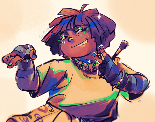
a bit of rant under da cut!
She wanted to become friends with Haze in first grade, but girl tried to seem "cool & mysterious" and also the attitude "Im the most mature out of yall" didnt really helped that. Plus, Hazel is a fan of scary stuff, flies on the drones above everyone`s heads and has a resting mad face, so their contact was kinda limited. Later tho, after Devs arrival into the city(due to his dads business biggering), Hazel managed to become friends with her eventually. For a short period of time, but still that`s kinda counts!

She probly sad that she won`t have the opportunity to hang with Haze more, and see her room, at least yet. But she is determined to become friends again after the "memory-erase". She kinda thought Haze AT LEAST hated her, but they have many small things in common!
Does Jasmine trying to incorporate some tunes in her music that she heard from the Fairy World or Cosma family after the 1s finale? YES.
Winkle now is her make-up test subject now btw

she is fun to draw, even if i don`t do Jass much, i love doing gradient-map stuff on her, it kinda fits her character???(not sure how it makes sence for anyone but me ...yea)
#slow but determined to answer the asks as soon as possible! ...the week is hella hard on meeeeee-#swap au#the fairly oddparents#fairly oddparents#fairly oddparents a new wish#fairly odd parents#fop fanart#fop art#fop a new wish#fopanw#fop anw#digital drawing#fop#a new wish#jasmine tran#the fairy oddparents a new wish#fop jasmine tran#fop jasmine#hazel wells fanart#hazel antoinette wells#fop hazel wells#fop hazel#my art#hazel wells
109 notes
·
View notes
Text

after 30 hours we’re done!!!
I love little pootis so much, a fantastic series. If you haven’t seen it yet I really recommend it!! I bought one of the plushies for my little siblings for Christmas hehe.
I’ve been wanted to make some fanart for it for a while, but I wanted it to be special! Since it means too much to me and my family :3 so I tried my hand at digital painting again! Here’s my process:

First I started out with the sketch and putting in the values, (that image is the scene I was referencing.) and since I have absolutely no idea how perspective works I just guessed and went “eh good enough.” I also used my radical composition skills to give the whole thing some life! (Golden ratio my beloved.) I should have gotten some reference images, first mistake, but I was way too excited lol.

Then I duplicated the layer and started painting over my sketch using some painting and blending brushes. Unfortunately I forgot to capture any in-betweens of this process so it makes it a little hard to explain. But once I got my values down and my painting rendered to point I wanted it to be, we started coloring!

And oh god! This is why the painting took 30 hours! This was my first time painting using this method, so I was so not ready for the coloring part. I’m in a love-hate relationship with gradient maps so the coloring was mostly done with blending modes, I think I used the linear light mode?
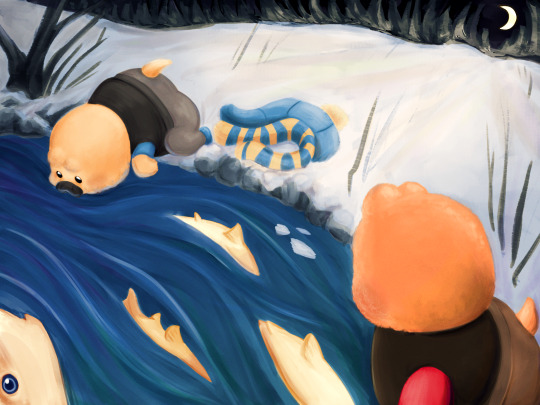
After watching a stupid amount of videos by Marc Brunet I finally got it! Used just one overlay layer and adjusted my colors and values as needed for this one. Used a couple gradients and other techniques to get the snow and the water looking how I wanted, and we’re almost done!
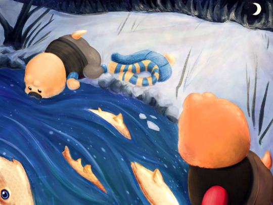
My favorite step! Adding a bunch of textures and sparkly stuff! It’s not for everyone but I really like it. And congratulations we finished our first painting yippee! Thanks for reading :3
little pootis by @quazies
#tf2#lil pootis#digital painting#tf2 fanart#creative process#daffys drawings#WOOOOO LETS GO BABEY LITTLE POOTIS FANART#also just gotta say I love Blootis so much he is just like me!!#Can’t wait to see what he does next. Love that guy. Oh and pootis too I guess
600 notes
·
View notes
Text
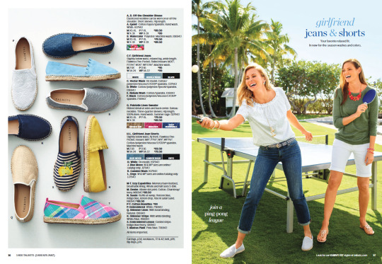
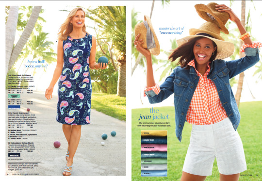
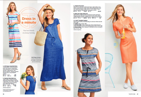
So, I've been thinking of how it could be interesting to see the inspo i used for my Spring collection. A lot of it comes from Talbots catalogues. Spring came from their 2019 June and May editions.
First one is the cover, the poses for the cover as well as several of the other poses inside the catalogue, were made by the ever so talented @someone-elsa! Thank you so much again!


Next is the pedal pusher pants. Not very similar, in fact, not similar at all. But it was merely the idea of pedal pusher pants. I pieced together at least two different diffuse maps as well as a nice texture i got from fuzzimo that i edited a bit.


After that we have the espadrilles. I even tried to recreate the overhead shot of deco versions of the shoes haha. Don't ask me if i still have the deco, i don't. I may have accidentally deleted it. It wasn't made for public consumption anyway, only for preview. I do still have the XCF for it however, if anyone is interested in that. Canvas and wicker textures came from brusheezy and sims 3 respectively.

Next up is the bermuda shorts. Technically the inspo isn't bermuda shorts but, the mesh i used is called bermuda so, that's how that came to be. I looked all over for a pattern that might look somewhat like the inspo but, ultimately failed. Which is fine! I opted for a texture called Elegant grid from transparenttextures. I made some various embossing and overlay editing to it and got this elevated layering look. I think it came out neat.

Now comes the mock-neck. I made the mock neck neck myself. I just, selected the neck edges and scaled a little and nudged and unwrapped and uv mapped it somewhere else lol. The button area was a major struggle. I had to find a button texture that looked similar enough, i tried many versions. It's mapped separately from the actual shoulder, too, so the edges are 'crisp'. Inside the XCF i shared, you can find a version to recolor it the opposite way, dark base with light stripes. THAT took ages, finding the best overlay modes and combinations of layers. But i did it! You're welcome!


Here we have the skirt. This was a fairly simple item yet, it took some time to blend textures and copy and paste and gradient mask and noise and such, to get this look. I'm not even exaggerating when i say i had to re-make it AT LEast 5 times, on both masculine and feminine models. The diffuse maps are different since the masculine skirt sits lower than the feminine diffuse map. Both textures also needed to look like it came from the same roll of fabric, so i had to re-do it several times if i made a mistake. But the result i think is great!


Last but not least is the dress. I'm excluding the jumpsuit since it's identical but, Pants. I made the marble texture myself. Came out quite nice, right? The XCF for these also include an option to hide the bow, should you want to recolor without the bow. But, if you do that, you need a normal map without a bow. Fear not, i got you. In the download for the XCFs, I've included a folder called Extras, with just that, extra normal maps for both the dress and jumpsuit, without the bow! You can also recolor it without the marble if you want. The normal map i made for the collection is a solid one so you don't need a different normal map for those.

And yeah, that's it!
31 notes
·
View notes
Text
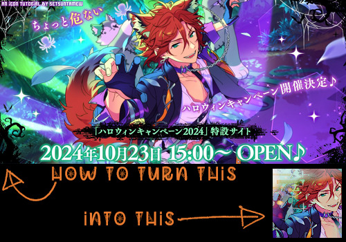
Welcome back to "Icon Making With Killian: An Intro to the 'Lost' Art of LiveJournal Icons"
aka, you didn't think I was one and done, right?
This tutorial was written in Photoshop 2020, but you can probably recreate it in as far back as CS2-ish (since I still use the same sort of techniques I've been using since then, lmao). It also assumes basic understanding of the software, though I've tried to be as clear as possible throughout.
I was possessed with a need to both make an icon of Madara's new event card and then write a tutorial, so let's all be proud that I busted it out before Halloween 💪
I started with the bloomed art of Madara from The Howling Forest★Lupine Halloween event (image from the Halloween 2024 campaign announcement, because the event hasn't started yet).
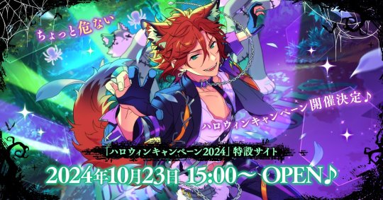
Since there's a lot of extra text & etc on this, I knew I'd be cropping it pretty close. I started with a blank 100x100 canvas, pasted the original image in, and then resized + rotated it until I liked the composition/crop.

First up, I wanted to get some cobwebs in here (for Halloween!), but didn't want them to overwhelm the whole icon. I used a texture from lookslikerain, set to Lighten, and rotated it a bit before erasing anything covering his face.

Next, I used another texture from lookslikerain and set it to Darken. There's a lot of green in the images for this event and I wanna pull some of that back into the icon, since it most got cropped out.

Time for light textures!!! I used a bunch in this icon~ I started with one from lookslikerain (can you tell I love their resources?), rotated it, and set the layer to Lighten, before deciding that it was too harsh. I used a small, soft brush set to 30% Opacity to erase most of the texture from his face, as well as softening the edges of the light.

The next few light textures are kinda subtle, but overall add to the icon. I'd say sometimes less is more, but I'm a maximalist at heart XD For the next few steps, just assume that the light textures were rotated/resized/moved/etc as I saw fit. I used yet another texture from lookslikerain, set to Lighten, and tucked in the bottom right corner.

This light texture from Sanami276 is also set to Screen. I moved it around to get just a bit of orange in the top left corner- gotta keep those Halloween colors in there!! :D

I wanted some more depth/texture in the upper left corner, so I decided to use part of a texture from Sanami276.

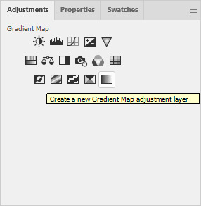
However, it's way to harsh to just throw in there like that...at least not for my purposes. I decided to invert the colors and recolor the black parts orange. My go-to method is with a Gradient Map adjustment layer. The easiest place to find it is in the Adjustments window.
I then used these colors for the gradient itself: #e7b676 at 0% and #ececec at 100%.
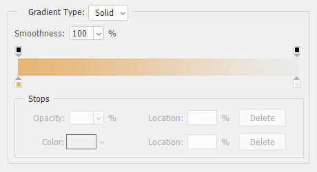
And it left the texture looking appropriately orange! I then pasted it into the actual icon, moved it so the rectangles were in the upper left corner, and set the layer to Darken.

Now for more light textures!! I used a couple from ianthinae, set them to Lighten, and went to town. I cut them up, moved them around, rotated them...just about anything to make them fit where I wanted. I love playing with light textures in general, and I find that even when I use similar ones a lot, they can look very different depending on how they're place.

Finally, I used part of a large grunge-y texture that I've unfortunately lost the source to D: I inverted it and set the layer to Multiply, before moving it around a bunch until I found a spot that looked good.
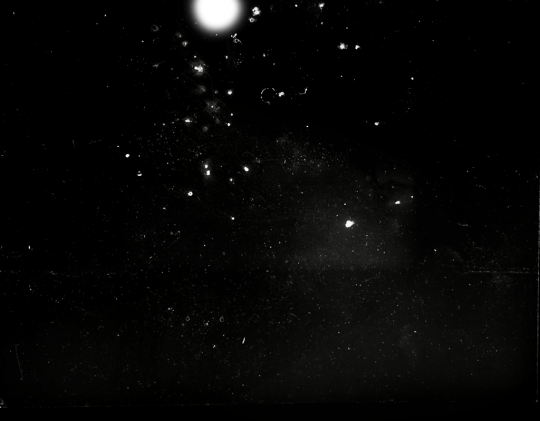
And with that, it's done! You've now got some new skills to make icons with~
If you have any questions, please feel free to ask, and I'll answer as best I can- as long as it's not about making icons in other software D: I only know Photoshop (and Paint Shop Pro, but I don't think anyone uses that anymore). If there are any other icons of mine you're interested in seeing tutorials for - or even just specific techniques! - just lemme know. I love helping :D
Also, I'm happy to share where I get icon resources from. I have a whole post dedicated to that on my DW graphics journal, though tbh that's the best place to talk to me about making graphics in general. But I will absolutely answer asks/replies/etc about icons here on tumblr, don't worry!!!!
#livejournal#icons#tutorials#graphics#icon tutorial#graphic tutorial#photoshop#LJ icons#100x100#100x100 icons#tutorial#reference#halloween#madara mikejima#enstars#ensemble stars
11 notes
·
View notes
Text
Today is the day I unleash my Mr. Bonzo fanart upon this webbed site.
This post is relatively safe up until the cut.

Is the *tips fedora* meme over a decade old? Yes. Do I care? No, absolutely not.
~
Now this is where I recommend "getting off" this post to anyone bothered by graphic depictions of body horror, blood, violence, or Mr. Bonzo (monster, not mascot like above).
I know the first image is silly, but I cannot stress enough how serious I am when I say:
Proceed at your own risk.
Now that you have chosen to continue, I have arranged the images in order of least to most vile and disturbing (though that might be slightly subjective on my part).
Remember that you can click off this post at any time.
Final warning: split tongue Bonzo.
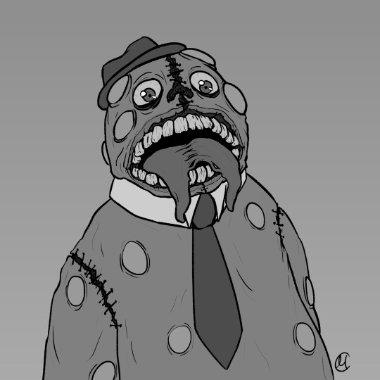
I tried channeling Julia Drawfee with the lineart a little bit. Didn't feel like shading that one, so it's a bit flat.
Where did I lose my colours? Plot twist: the first image in this post is actually the last I've made, so technically I gained the colours. I wanted it to have more of a cheery vibe, unlike the ones under the cut, which I wanted to be kinda dreary and I feel like adding too much colour can mess that up.
Alright, I'll address the tongue. Remember how his head splits in tmagp 12? Yeah, it's a nod to that and also I asked myself "how do I make his design worse than it already is?" and that's the only answer I could come up with. I debated adding stitches connesting the two halves of the tongue but couldn't figure out how, so you're welcome. It will be present in all the upcoming drawings as well.
~
The next one is bloody, but it's not that much worse than the previous one overall.
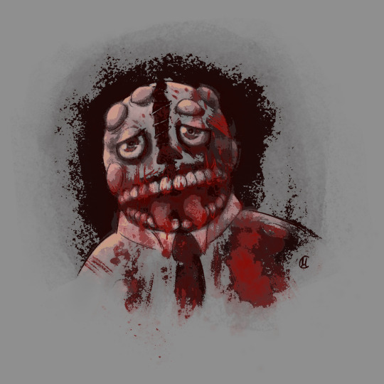
I was playing with filters after I was done with this piece, because I felt like it lacked something, but didn't know what. Really liked this one, I think it's some sort of a gradient map. It pixelised the image and adjusted the colours a bit, it also really made the blood pop out, though it covered up some of the details.
Why did he lose his hat? It's stupid and hard to draw.
You may have noticed the artstyle change a little, the previous images having neat lineart and little to no shading. That's because I am using different tools, sketchy and soft brushes, that allow me to experiment with lighting and textures more (plus the aforementioned filter altering the image even further).
~
Alright, I feel like this last image deserves a separate warning. It references episode 12 (spoiler ahead), specifically the moment before the bartender loses a hand, though it's not entirely accurate. It's rendered in more detail than any of the previous images, so keep that in mind before scrolling down.
Basically it's pov: Bonzo licks your hand.
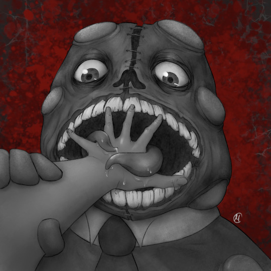
I feel like I could've made his tongue bigger in this one, it seems kinda small compared to his mouth. I really like how the skin on his face ended up looking. It took a lot of work.
The spit makes it look weirdly sexual, doesn't it? Listen, that was not my intention, but I'm not erasing it. I set out to make the worst thing I could and, though not without cost, I have achieved it.
I tried splattering Bonzo in blood, but it wasn't really working for me and it covered up a lot of the detail I liked, so I just put it in the background.
The human hand is drawn from reference, which I found by googling "hand reaching out away from the viewer". And let me tell you: google is shit at looking for drawing references, but I figured it was just going to be a sketch to explore an idea, so I didn't bother trying to get a better one. And then I fixated on it for a couple hours, you know, like a normal person.
I literally (and I mean no exaggeration) dusted off my drawing tablet after a few months of no use to spend the entire weekend, after tmagp 12 came out, glued to the screen making those images, except for the b'onzo one, which I made this evening.
Just to clarify: I drew all of those by myself. No filthy AI image generation is allowed in this house. I am capable of committing far greater sins than an artificial intelligence ever will.
The only thing left here is to extend my sincere congratulations/condolences to whoever got this far. It's up to you to either think you're brave or realise that you're foolish for doing so, but be comforted by the fact that at least you didn't make this post, which I cannot say for myself.
#this might be my worst post yet#i was so preoccupied with whether or not i could i didn't stop to think if i should (make bonzo worse)#do i regret it?#no#here's the sewage stew i promised/threatened you with a few weeks ago#the magnus protocol#tmagp#tmagp shitpost#long post#fanart#tmagp fanart#bonzo#mr bonzo#content warning#body horror#blood#violence#get bonzed#posts that would send me straight to a psychiatric ward were anyone i know irl to find out i made
14 notes
·
View notes
Note
if you have the time/energy to elaborate, what's your process like for coloring stuff you ink traditionally? i've figured out a few different methods over the years, but i generally stick to fully digital or traditional for a piece, so i'm curious to see how you do it! :0
This is such a fun question for me because I get to both ramble about my art process and have an excuse to throw some colors on this Breloom I drew ages ago.
I use Clip Studio Paint and an Ipad for my digital stuff so I'll be referring to the processes on that but I'm sure there is a work around for other programs as well :^)
I scan my traditional art at 400dpi because it's always easier to work bigger with digital stuff and resize it smaller then the other way around :^)

So here's our raw scan, which already looks very decent but when I want to color something I like for everything to be much cleaner/sharper/more contrast-y and to get rid of the noise from the paper texture lmao. A well lit photo will also do the job because that's what I did for many years before getting my scanner but tbh if you're a traditional -> digital artist like myself a scanner is like a best friend you can buy HAHA
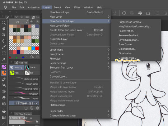
First things first, I apply a Gradient Map Layer > New Correction Layer > Gradient Map
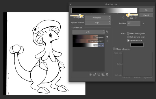
Clip has a really nice black and white map preinstalled but I made myself a custom map just by pushing the black and white a little closer, it completely clears up all the noise and makes everything really crisp! Make sure you check on your lines when adjusting things because super fine feather lines can sometimes be lost if you make the contrast too high. Extra tip! If you want to make Graphite Pencil or Ball Point Pen really nice looking as well, just add a dark grey point in the gradient map closer to the black then middle...works perfectly :^)!!
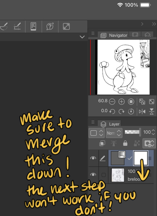
This is the point I look for stray pixels, cat hairs, ect and make sure to erase any surrounding doodles or sketches I don't want included.

GOD DAMN Those lines are CRISP-Y!!!
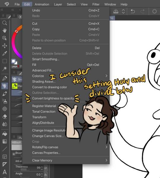
Next up we're going to want to go Edit > Convert brightness to opacity
Tbh If I didn't have this method idk what I would do with myself.... I've tried the whole "Lineart on top layer set to multiply" Method and ...ehh....
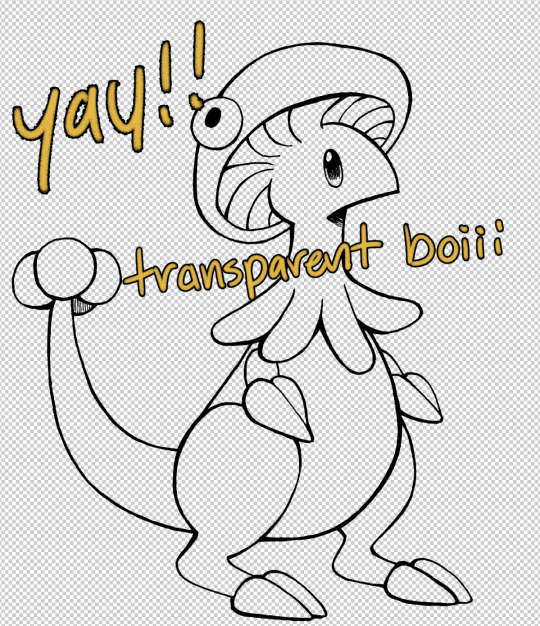
Now that I have a nice transparent line art I'll stick a new white layer down below it because the checker pattern hurts my eyes LOL
I'm going to add a read more here since this post is getting lengthy haha
I'm going to quickly go over the style I use for MTE! It has been refined to be quicker and easier to do since you know...I have a week time limit per page ... 😭 I have a completely different way I do colors for other things I want to spend more time on but I might explain that one in the future...I'm running out of steam tonight LOL

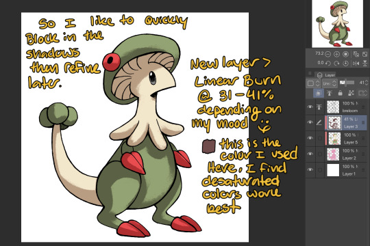
I use this really awesome brush pack that has a pencil like texture and I love it to bits...here's a link to it if your interested!
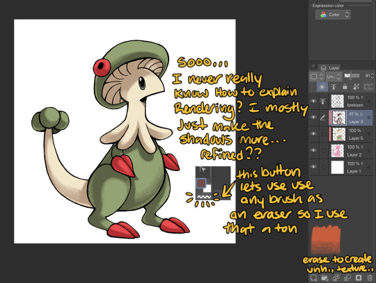
At this point I might add some overlay layers or play around with an airbrush but I think this guys done for now :^) I tend to stay away from highlights with my shading for MTE..My biggest goal is to make sure everything is clear and readable! That being said I break my own rules all the time for special panels that need the extra 'oomf!'

Slap a lazy square background and yay!! He's done!
Hope this was interesting aaaa Thank you again for the ask!!
#art#traditional art#digital art#digital colors#breloom#pokemon#ask#tutorial#art process#coloring tutorial
9 notes
·
View notes
Text
Wanted to try out hard shading so naturally I gave Devï a wolf cut
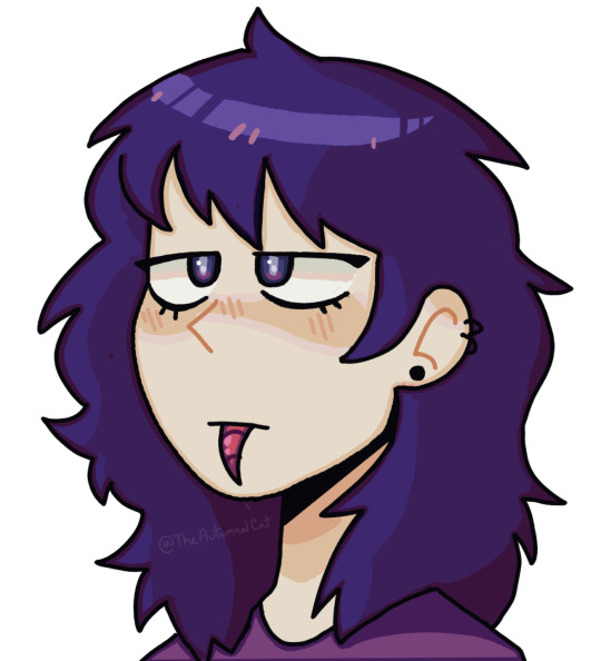
I also tried gradient mapping on his hair for the first time. I do… not understand how it works…
24 notes
·
View notes
Note
the way you color things makes me want to commit crimes. any coloring tips for a baby digital artist who doesn’t know how to do the computer things good?
AUGH apologies for taking so long, i was in the middle of writing this answer and the whole thing was deleted as soon as i switched to another tab on my phone, and then the draft didn't save the second time i tried to write it. jfc at least i had it written out in my notes app the second time. anyway, thank you thank you thank you!! this was very nice to recieve, i love getting asks ❤️
i'm not versed in the arts of drawing on a computer, either, so i can't give tips in regards to specific programs (said in chronic procreate user voice) but i can certainly give universal advice keep in mind that i'm not professionally taught in the slightest so i lack much of the vocabulary to describe my methods, and remember that my word is not law!
in case of confusion, everything has been explained. i've added a cut because it got needlessly long. i've also added visual guides for certain tips, and image descriptions for each one
to be honest, much of what i do when picking colors is done with the help of gradient maps (more on that later) but when choosing my base colors i follow these rules:
1. you don't have to cell shade with purple + multiply and an add layer. that's the voice of lavendertowne attempting to take control of your body. stamp it out. (/j i love her)
2. bright, vivid colors!
3. instead of shifting just the brightness and saturation when picking colors to shade, shift the hue, too! in the first image, we can see that the circle is dull and boring. in comparison, the second image pops!
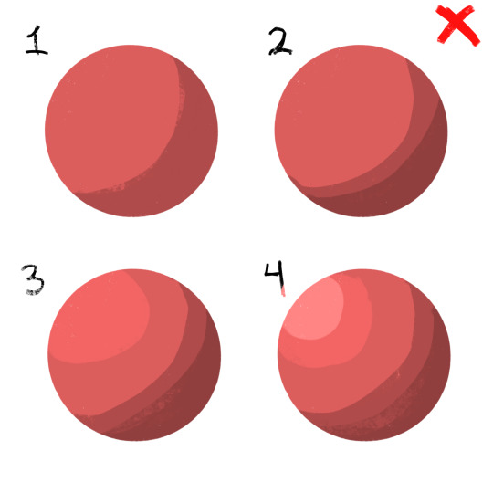
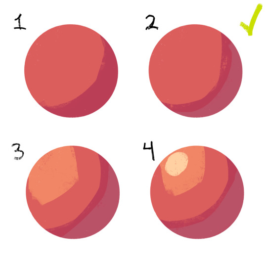
4. so, how does this work?
without getting too much into color theory--because while i've studied it before, i don't trust myself to articulate it properly without making a fool of myself--it's all about how colors interact with each other. for example, a beige circle looks lighter when surrounded by a dark background rather than just plain white.
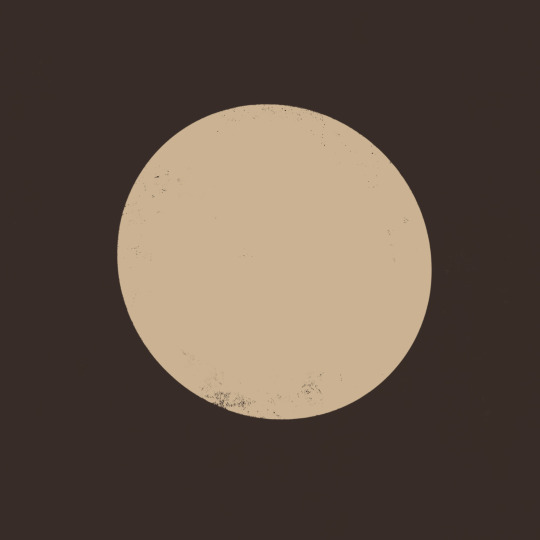
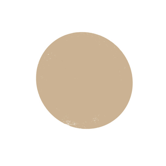
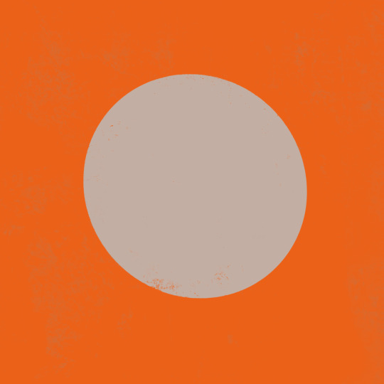
in the same vein, surrounding greys/desaturated colors with warm colors makes them look blue, and vice versa.

5. blue/grey shadows and warm lighting!! or the other way around. actually, you can use any color for shadows and lighting, depending on your light source. is it sunny outside, or are they beneath white light?
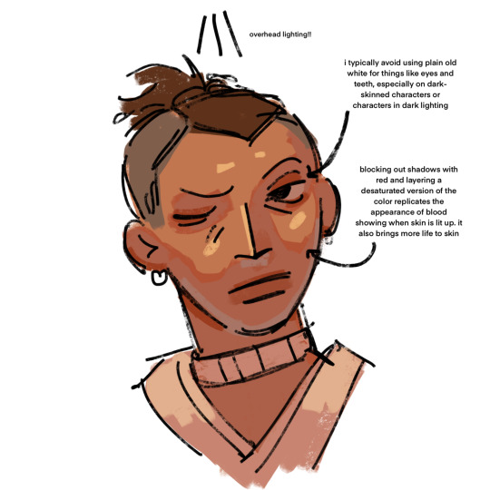
6. for color picking, i reccomend avoiding using the wheel, instead opting for the rgb sliders or the hue saturation brightness sliders if you're dumb like me. this allows for precision in the colors you pick, and accuracy when putting together color palettes.
7. and, finally, the actual computer stuff: gradient maps! i looove gradient maps.
as far as i'm aware, procreate and krita have the gradient map tool. ibispaint does not. i am not sure if firealpaca does.
i usually use gradient maps to make my coloring more cohesive, rather than just slapping them on a monochrome drawing (which is also a totally viable method for coloring, but you'll be less precise, as gmaps only recognize values). when using gradient maps, i prefer to duplicate my completed artwork, lower the opacity of the duplicate on top of it (usually between 25 and 50%, depending on how strong i want the effect to be), and use gradient maps on the duplicate.
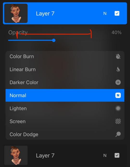
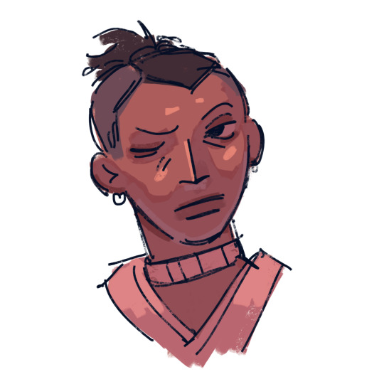
this makes my colors all nice and pretty!
11. if you use krita, it can be hard to find the right colors to use for your gradient maps. never fear! i'm here to give you the default templates from procreate, as well as a couple of the ones i've made.
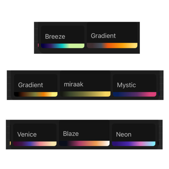
if you have any more questions, or you want me to get further into a specific topic, feel free to send me another ask
13 notes
·
View notes
Note
HI I AM COMING TO BEG U FOR HELP HOW DO YOU MAP OH MASTER OF ART
HELLO HI I AM HERE TO AID U MY BROTHER IN ARMS!!!
this got very long and i tried to cover things that helped me when first getting into hand drawing maps, but if there's any other places where you're struggling let me know!!!! ive got a lot in my brain im just going from broad to narrow here :)
BIG SCALE:
great ways to make continents that look like continents include
- peeling an orange or equivalent citrus messily and laying out the pieces of peel, and copying those shapes pros: realistic coastlines that would fit together like in real life, if you get into the nitty gritty these can also serve as tectonic plate templates. cons: messy. might not have oranges on hand. can be hard to scale up and transfer to digital - getting some paper and pouring a bunch of doodads of some kind on it, then clumping them in vaguely the shapes you want and tracing the coastlines. things i have used in the past include dry macaroni, beans, dice, and paper stars. pros: potentially less messy than oranges, more control over the shapes, scales up easily cons: coastlines will be less realistic tectonically if that's a concern (for both of those i usually then take a picture of what i get and start editing in my drawing program of choice from there)
other strats to try: taking a grungy brush in your drawing program of choice, making it Huge, and scribbling a few clumps, then on another layer going in and tracing around the edges to make the coastlines. using a map from real life and cutting chunks out and rearranging/copying/warping them to make a collage you can trace for coastlines. etc
SLIGHTLY SMALLER SCALE:
country borders were, until quite recently, determined mainly by geographical obstacles like mountain ranges, rivers, canyons, oceans, etc that are very hard to cross. also borders will be highly disputed when it comes to warring states or eras without, like, satellites and bureaucracy and such!! making them fuzzy or jagged or having areas where both colors mix or stretches of land where no one knows where either country ends is in fact very fun and cool and sexy
mountains usually are chains, and so are islands. i like to make big curves across the world map where i think it would be cool to put mountains, and when those curves extend into oceans i like to put island chains on those as well. if you choose to do whole ass tectonics with your orange then do those on plate borders
biomes can get really specific in their placement if you want to be hyper-realistic, or you can put them wherever you like. personally i like a little realism a little "fantasy world can have whatever you want in it". deserts are usually on one side of mountains, and on the other is really lush. the higher the mountains the larger the areas and more extreme the difference between the two. outside of that case, youll usually get forest > grassland > desert in a gradient. also remember there are multiple kinds of everything
HOW TO DRAW THESE THINGS
good ways to draw rivers include: tracing blood vessels from photos where you can see someone's veins through the skin, dead trees or lightning, or cracks in stone. theyre all fractals and how detailed you want to get is up to you. BUT they always flow downhill and eventually meet the ocean (the ultimate downhill), usually starting in the mountains. also those fractals all go kinda reverse of what you might think; the ends feed into the main river, not the other way around. i used to mess that up a lot
PROTIP: canyons and the like are almost always old riverbeds. use the same method as you do making rivers, just widen the brush, maybe draw a border around the shape instead of just a line
mountains: personally i prefer using premade brushes for mountains just because the one (1) time i did them by hand it took me like four hours for one mountain chain. this video has some tips on different mountain styles if any of those look good to you, otherwise there are about a bajillion videos like that out there!!
biomes in general: just a little texture is usually plenty! doing some bushy edges on deciduous forests, pointy bush edges on pine forests, a few little grass lines and sand dunes, etc etc is usually plenty to get the point across :)
SMALLER SCALE
roads are personally the bane of my existence. i try to treat them like rivers just a little straighter, depending on what time period you're emulating you might go curvier. also they dont care about maintaining width or what direction the fractal goes in humans just put those shits wherever they walk a lot. in contrast railroads are usually pretty straight, simply because trains are built different than cars or wagons or people
cities are almost always on a source of freshwater and a valuable resource that draws people for work in the early days. also they'll have like 10-20x the landmass of the city itself in farms around them, less if theyre on the coast and have access to lots of seafood, more if theyre more landlocked. those farms can be farther away if theyre more industrialized and can transport the food en masse easily. you also dont have to draw the farms just kinda mention them in the story if relevant
towns can be on smaller rivers, lakes, or even just by natural springs. you wont find permanent settlements in places where water isnt accessible (unless you have magic to fix that which is always a cool detail)
EVEN SMALLER SCALE
city maps i have 0 advice on other than roads get thinner the fewer people travel on them, industry will be on a very different side of town than the rich people for smell and noise reasons, and especially when emulating pre-car times, think about how far you would feasibly walk in a day. if you want characters to be able to know pretty much the whole city that they live in, it's gotta be reasonable for them to walk to the farthest edge of their knowledge and back home (or to an inn) in a reasonable timeframe, if they have a home. also big cities tend to have colleges, trade schools, and a bajillion and one jobs that need doing. magic cities might need mages to maintain infrastructure, non-magical cities need people who light the streetlamps when it gets dark, waste disposal is Hugely Important, etc etc etc
it can sound boring at first but coming up with the odd maintenance jobs people have to do in cities can be a really fun creative exercise, and it might inform how the city is laid out, too!!
IN CONCLUSION
think of the world in layers. landmasses + oceans -> biomes and geographical landmarks -> countries and borders -> settlements -> districts. i literally have those on different layers in clip studio so i can futz with them more easily.
also realism is not the be-all-end-all of this. there's lots of room for symbolism and environmental storytelling in maps, as ive ranted about in the past, and stuff doesn't have to make absolute sense in the real world to work well for your world. breaking the rules is like, art 201 and it applies to ever part of the art in question <3
i hope this helped!!!! again pls let me know if you have any more questions i love helping out :D
#a&a#adv#talking with: ren#i still have to do a bunch of maps for the ehlverse a;ldkfj#ive done emarye the maelands and sieril. i think deltierin has been sitting half-done in my map folder for uhhh a year#and i still need to do the isles of gord and kard#and also because i love torturing myself. i have ocean floor maps to make as well#GOD AND I MIGHT HAVE TO DO A MAP FOR THE LOST WAIT#SHIT I HADNT EVEN THOUGHT OF THAT
8 notes
·
View notes
Text
Nolantan
Chapter 4 The Dragons
“Get out and don’t come back!”
Jnoque (Jin-no-k) is broken out of his thoughts by a giant green paw in his face baping him on the nose “ Jnoque you’ve been staring again!” Said a green and brown dragon with a flower on her ear “ Oh sorry Dponá.” She ruffled his white hair which was in a small bun he giggled
Jnoque used to be a human but stumbled upon the wrong cave touched the wrong magical object and cursed him to be half-dragon. Now he's got sharp gray ears, purple dragon eyes, and a dragon tooth.
" This is our first patrol of our borders Jnoque" She flaps her two sets of wings excitedly.
Jnoque smiles and he hops on her back and Dponá struts around trying to be like a guard.
After a while, they hear footsteps and hide behind a bolder.
Aurora, Dyani, and Slor stop running, panting.
" That was a close one.." Dyani says tiredly.
Slor looks at Aurora's star clip " How did your clip do that??" Aurora takes it off and holds it " I don't know it hasn't done that before.."
" Where did you get it?"
" My... mom gave it to me...." she puts it back on.
Dyani looks at his map " We should be close." Aurora sweating takes it and uses it to fan herself " Yeah I can feel it too you'd think 'cause of how high we are it would be more cool up here."
Watching them Jnoque and Dponá don’t notice that her tail is sticking out.
But Aurora does “ Hey who’s there!” Dponá quickly tries to hide better.
Then, she quickly finds herself at their line of site.
“Um hi..” she says waving nervously as Jnoque facepalms.
"Wait you are a dragon!" Dyani happily points out.
" Who are you and why are you in the dragon clan territory??" Jnoque asks.
Slor looks at him trying to figure out where she’s seen him.
“ We need help from the dragons.” Aurora exclaims
“ We’re not supposed to let anyone in..” “It’s really important!”
Then a big purple and yellow dragon comes.
“ What’s the problem here?” He sees the group “A human and both Fawns together??” “ Iquén ( I-qwen) they say that they need our help,” Jnoque says looking up at him.
Iquén sees Aurora’s star clip and perks up “How do you?-“ he gestures for them to follow.
Confused they do.
Back in the artic, Iceal is gathering his thoughts after what had happened.
Walking through the snow Aurora stumbled upon the chef's hut now normally she tried to avoid this place as much as possible she hated the chef of the Winter Fawn Iceal but this time she heard voices inside and decided to eavesdrop.
"So you say this weapon will get me what I want?.."
"Yes but since The Frostbite has been sealed away for so long it will take a long time to regain strength.."
"That's fine I am patient I can still freeze the world."
Aurora peaks in and sees Iceal with this sharp sword with a black-and-white gradient and blue glow. Next to him was what looked like a spirit he was all icy and floating.
The second she looked at him her star clip glowed and the spirit locked eyes with her.
"It seems we have a little eavesdropper!~" Iceal grabs Aurora " You..you've always been a troublemaker!"
Aurora struggles and shakes as Iceal points the sword at her she can feel the cold aura of it and it is too much for her even with her crystal.
"It would be rude to not introduce myself I am Glacius Frostbane spirit of The Frostbite. You are in luck child to see us reshape this world--" he stops when he sees the star on her head " The Solar Crest…" The star creates a black shield that pushes Iceal and Glacius back.
Aurora confused and scared runs for the forest.
" We need to go after her now!" Glacius urges Iceal " She has a piece of the only thing that could stop us!"
Since then Iceal has sent a big group to get Aurora.
Usually, Iceal hates being bossed around but since The Frostbite will help him expand territory and freeze the world over he can deal with it for now.
“ So what must I do to get this thing to full power?” Above him is Glacius “ It absorbs the cold around it. So it will get a little warm around here but once it's at full power that cold is yours to command.
Iceal smirks as he practices swinging the sword around and ends up poking a small snow puff.
It makes a squeak and turns to ice.
Jnoque and Dponá walk along with the group." So what's your name? I'm Jnoque and that's Dponá and that's Iquén." Dyani smiles " I'm Dyani and that's Aurora and Slor." Jnoque looks at Slor and tries to avoid looking at her.
They get to a bunch of huts surrounding a lake of lava and lots of dragons around who stare at them. “Woah that’s a big lava pool!” Dyani amazed.
“ We are at the top of the volcano. We dragons keep it inactive." Dponá explains.
They go to the biggest hut where there's an orange and brown dragon talking to an older lilac dragon ones he sees them he snarls at them.
"Iquén! why have you brought outsiders here?!"
" Commander Gmńeon (Gim-eon) Elder Zomkì forgive the intrusion but this is important." “ Um Mr dragon do you know what the Emberstar is?” Dyani politely asks.
All the dragons in the room except Dponá and Jnoque were shocked
“ I haven’t heard that name in centuries..” Zomkì replied.
“ So you know what it is?”
She nods “ I was there when it was created. But it was broken up and scattered into 8 pieces… the only reason you would need it is if the world was in danger..”
“ My Chief has come across The Frostbite!”
“ Impossible!” Gmńeon yells “ That has been sealed away for two thousand years!”
Iquén speaks “ The Winter Fawn has the Solar Crest.”
Zomkì looks at her “ Tell us exactly what happened.."
Aurora looks at her confused but tells them everything that happened at Iceal's hut.
" That star in your hair is a very powerful artifact."
Slor butts in " I'm confused just what is the Emberstar?"
They all sit for storytime.
" When The Frostbite was created by someone named Glacius it caused a giant ice age and no one was safe no one knows why or how he made it but anyone struck with the sword would freeze from the inside out."
" Zomkì is the only dragon still alive to witness it."
" I remember feeling cold that I've never wished to feel again.." she shutters.
" The Emberstar was made to combat The Frostbite eight brave souls called The Emberstar Guardians created a spell to turn their bodies into the eight pieces of the Emberstar and with their combined might they were able to seal The Frostbite and Glacius into the deep artic where no one could find it."
“The eight pieces the Phoenix Feather, Flameheart Shard, Inferno Edge, Blaze Stone, Solar Crest, Ember Cloak, Volcanic Core, and Pyre Crystal were scattered across the land and their spirits going into a deep sleep inside the parts.” “ Who were the people?” Jnoque asks.
“Emberion Torrent the archer and Phoenix feather, Cinderis Emberlight the healer and Flameheart Shard, Lavara Flareborn the unpredictable and Inferno Edge, Scoria Blaze the strength and the Blaze Stone, Solaris Ash the strategist and the Solar Crest, Pyros Ignitia the mage and the Ember Cloak, Emberis Pyra the warrior and the Pyre Crystal, and Ignis Flare the leader and Volcanic Core.”
Everyone takes time to process all that information.
Aurora takes off the star- Solar Crest and holds it.
" How do we even know that they are telling the truth Zomkì? They could be lying to use The Emberstar for bad." Gmńeon warns.
"The spell they used stated that if any of the pieces feel the presence of The Frostbite they will start to active, waking up the spirits."
" It has been doing weird things since I ran from home.."
" Solaris must be subconsciously protecting you."
Dyani speaks up taking out his map. “ Do you know where the other pieces are?”
“Not anymore I did help in hiding them but it’s been 2 thousand years they might not be where I originally put them. But I did keep the Volcanic Core with me." She leaves to go get it.
Gmńeon huffs fire " I still don't see why we have to help them! Even if The Frostbite is really back it's probably weak now! "
" Commander Gmńeon we should still be careful it could still turn all of us into ice." Iquén rebutted.
" How come me and Jnoque didn't know about this?" Dponá asks.
" 'Cause you are too young and he's not a true dragon!" Gmńeon snapped.
Slor finally says something. " I know where I recognize you from you were that kid who got chased out of the village a few years ago yes?.."
Jnoque doesn't say anything and just nods being reminded of sad memories. Dponá lays her head on his lap, and he smiles " I was adopted by Iquén I've been living here ever since."
Gmńeon huffs " You still haven't proven yourself to me yet if I didn't respect Zomkì so much you'd be out of here boy!"
Jnoque just sighs.
" So how are you half dragon?"
Jnoque stays quiet when a dragon comes running in.
" Commander we are under attack!"
Next
#nolantan#fantasy#fantasy world#fawns#my story#original story#summer fawns#winter fawns#humans#dragons#spirits#aurora#dyani#slor#jnoque#dponá#gmńeon#zomkì#iquén#iceal#glacius#tw fire#tw freezing#tw death
6 notes
·
View notes
Text
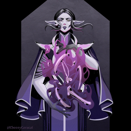
After I established the flat colors, it didn't take too long to paint the shadows, mainly because I had a confidence boost. I still had trouble with the background though - ideally I would have painted something similar to the Hades maps, but I had no idea what kind of environment I should use and why. In this case a top down view of the character would have been nice too with the protag talking to Alicia, sooo...
Nah, it seemed to much work for an already difficult style challenge, so I just decided to add a textured bg with black frame around it. I was thinking about adding some shapes in the frame to make it a bit more interesting, but once I tried, it was pretty distracting and it felt messy as well. The character is already detailed enough, and I wanted the focus to stay on my menacing child.
During the coloring, another issue arose - the bones between her hands made a lot of visual noise. The shapes were extremely confusing with her torso that also has a ton of parts, and on top of that there was the magic blob too. At first it felt overwhelming and I didn't know how to approach the problem. I didn't want to hide everything behind the effect, making it too plain, but if I made it too transparent, it became unreadable. Dealing with the right color was also an issue because of the different tones on the clothes, but gradient came to the rescue. With the right opacity and right colors in the gradient, my problem was solved. After that I adjusted the shades of the bones to somewhat reflect they are affected by the magic.
I'm extremely happy how this one turned out. Probably this is the best one about my necromancer so far, and I really wanted to draw her more after this experiment. I won't say I succeeded, because... Well, I have a ton of other sketches, waiting for me, but at least she's got some love this time :D
#hadesgame#stylechallenge#digitalart#originalcharacter#speedpaint#digitalartist#illustration#artwork#characterart#timelapse#necromancer#elf#fantasycharacter#characterartwork#characterartist#oc#ocdrawing#artchallenge#artistoninsta#artistofinsta#instaart#digitalillustration
2 notes
·
View notes
Text

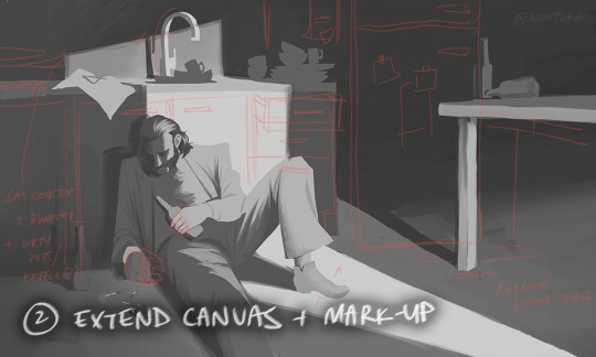


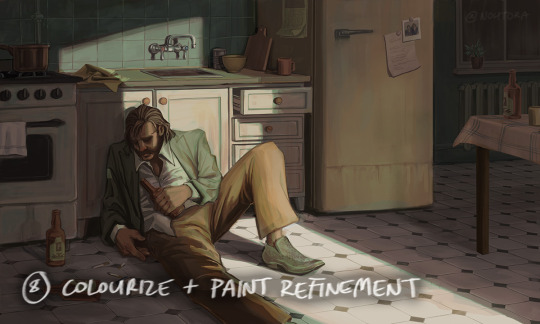

process stages & comments below
( original painting )
process: i did 70% of this (up to img #6) on my samsung tablet, on my train commutes, battling motion sickness & neck pain lmao
drawing on my tablet is still a lot harder & feels more restrictive for me bc i'm limited by unfamiliar software (still learning CSP) and lack of keyboard shortcuts (my digital art workflow for years). i also struggle with starting / continuing artworks on my tablet unless i've already planned / sketched most of the composition on my PC. likely because 90% of the time when i'm drawing on the tablet, it's on the train. hard to get in the zone as it turns out lol
this is the first full painting i've started and made substantial progress on purely with my samsung tab, so i'm happy it's starting to feel a bit more natural.
also first time i've tried doing a funky gradient map as a colour base. then applied colour on top with multiply blending mode. 10/10 would use fun gradient maps again - helped me introduce more colour variation bc i feel like my colours are usually quite flat by comparison
given the nature of the fucking bumpy melbourne trains & my broken commutes, i can still only do so much rendering on my tablet. the more refined painting will probably always happen using photoshop on my PC bc that's where i feel i have the most control
i tried not to overwork / overpaint it too much as i often tend to do, and kept the brush strokes rough and loose as much as possible. made sure my brush wasn't set smaller than a certain size so i wasn't tempted to go into fine detail. you can see i didn't refine harry's form/clothes much beyond img #4 because i didn't want to lose the soft/loose quality of the clothing folds. pretty damn proud of that shoe though. but then i posted it before i realised i forgot to paint in his fucking tie lmaoooo
but yeah, i got my tablet as a secondary drawing device to help me draw more often so i'm gonna keep trying to get the hang of it !!
composition/concept: the pose was referenced from this shot of arthur in peaky blinders and i had a vision of HDB slumped over in his kitchen like this

the composition was built around that, and i had the idea of framing it him in shadow and having a strip of light from a doorway illuminating his body. evidence of his drinking and smoking are kept in the shadows.
the original idea was to have a silhouette of someone standing in the doorway (likely jean finding him), but it didn't work with the overall balance & i felt like it interrupted the shape of the light too much / wasn't very legible at that angle. kitchen design was inspired by soviet & post-soviet era style kitchens.
*** feel free to send in an ask if you actually want me to explain how i did things in more detail. these are mostly thoughts for my personal reference
#disco elysium#harry du bois#art process#nohtora art#nohtora wip#sorry my notes aren't comphrensive/intelligible - it's more for me to remember & not a tutorial#always welcome to ask further though <3
60 notes
·
View notes