#i love your blocky shapes
Explore tagged Tumblr posts
Text
WAGGHHHHHH IM SEEING THIS LATE BUT!!! OMG!!!!!
It's a fun game of hide and seek!

(No lighting)

She's gotta get that mail delivered in a timely manner she doesn't have time for this :/
Wretched circus au made by the talented @bananafire11!
Original post office pomni explanation
Note: I'd like to feature as many tadc au's with post office pomni as i can, so if you'd like yours featured, hit me up!
#oh the lighting??!?!?!!!!#i love your blocky shapes#like its such a big part of your style and i adore it#THE SCENERY OMG#SO GOOD#circus but still off puttinf#AND HOW COULD I NOT COMPLIMENT THE BIG GUY HIMSELF#HEHEHEEE WRETCHED JAX LOOKS SOOOO FUN IN YOUR STYLE!!!!!#you say you cant draw horror but he still looks plenty horrific to me!#again the lighting..... i love how you shade#and office pomni my beloved i am so sorry#I BELIEVE IN YOU!!!!!!!#she looks so done with life#“why am i here” look on her face#TYSMMMMM FOR FEATURING MY AU IN YOURS!!!!!!#i feel so honored#the amazing digital circus#the wretched digital circus au#the wretched digital circus#wretched!jax#pomni#tadc au#tadc
310 notes
·
View notes
Note
OH MY WORD I LOVE YOU ART
*screams in gargoyle*
You are now one of my favorite artists!
I just absolutely adore they way you draw each character! Their curves, clothing, and overall design! Especially donnie, lol
:D that means a lot to me! I like sharp shapes and making em triangular-ee lol. Thank you!!!

6 notes
·
View notes
Note
i just need to take a second to gush about how much i love durge drow and astarion, they feel so fleshed out and perfectly written together in their fucked up wretched ways. They really inspire me to write more for my own tavs, hopefully one day ill be able to say im as happy with my own work as i get when seeing yours. I have to ask though, do you have any tips on drawing head shapes and faces? or maybe about wrinkles? i find i really struggle with that stuff when drawing and i adore how expressive and grungey all your art looks!
First of all thank you so much, I love hearing what people think of the two of them together 😭
Honestly you've hit on something that's quite near and dear to my heart, I love developing and figuring how to draw and stylize different faces to get the most unique, interesting looking results - everything about the details is highly rewarding to me. What does x type of nose look like from this angle? In this style? How can this eyeshape best translate to my art? How different does a face look when its making this expression? What does that MOUTH DO? etc etc.
In fact you kind of inspired me to put a little tutorial/guide together the last hour lmao and what a blessing it is that the two current subjects of this blog serve as great models here, being that their faces are basically polar opposites!
When it comes to heads, you've probably heard it a dozen times before that you want to think of them in terms of geometry and facets; my process to drawing them is pretty conventional so I won't spend too much time on it, but it goes something like this:
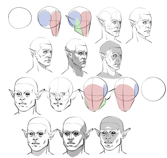
Obviously I don't do every single one of these steps most of the time, which is just something that comes from practice/developing muscle memory, but it is helpful to start off this way for two main reasons:
By making these guide lines and splitting a head into pieces like this, you'll have an easier time seeing and understanding it as a multidimensional object, and in turn, facilitate It for you when you venture out into doing wacky angles and lighting.
Making different headshapes starts HERE. notice how Astarion's "face" slate is narrower and longer, how my durge's jaw pieces sit lower on the head, how all of the same pieces came together in the same way but we ended up with one real pointy elf and a real brick of a drow - making characters look different successfully begins very early in the sketching process.
The next thing you want to do branches out into every day life: start noticing yours and other people's facial features. How does an upturned nose look from a high angle? How does the size of someone's cheekbones affect what they look like when they smile? How about when the light hits them a certain way? Does someone's lip shape changes when they pout? When they laugh? How does a person's hairline change the shape of their face? You do NOT need to creepily sketch every stranger you see on the bus, but get into the habit of actually noticing what people look like when you talk to them - when you look at pictures, when you watch movies - make a mental list of interesting ways mouths, noses, and eyes can come together in a variety of different proportions to make completely distinct looking mugs, and how they change depending on how you are looking at them.
Light and shadow play a HUGE role in how faces look, too, basically as crucial as actual bone structure does. As you see up there I tried to rough out how natural, head on, and underhead light would look on these two very different looking guys, and while we can see definite patterns, there are small differences that come to be because of the sizes and shapes of their features.
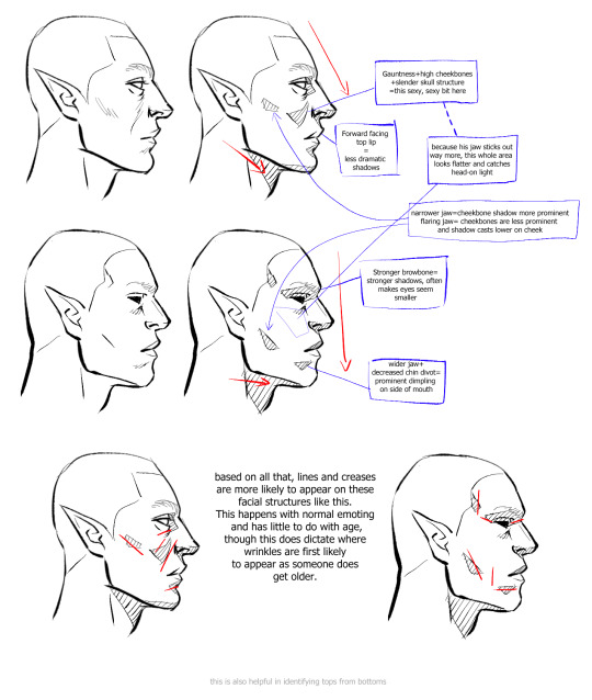
Here is a very, very basic look at how some of these features come to look the way they do, how they interact with one another, and how they compare between a blocky, rather conventionally "masculine" head and one that's much softer and slimmer.
Note please that it is not one or two characteristics that give a chaarcter their "look"; you can reduce a face to eyes, mouth, and nose through stylization and still have them be recognizable, but if you want to do more than that, you have to consider the whole package! Chin, cheeks, brows, direction of the jaw, slope and size of the forehead, depth of eyes, ridge of the nose, etc - I know this is probably far more than you bargained for, but if you start making note of a FEW of these things now and slowly add on, this will eventually become second nature to you.
Similarly, understanding how these characteristics come together will help you with rendering light and shadow in a realistic way, and predicting what their facial expressions may look like - if no two people are alike, neither are their smiles. :)
Lastly, remember that I'm no expert - I have developed my own methods and semiotics and yours may look slightly (or vastly) different, and that's fine! I hope only that by sharing this it has given you a base to work off of.
Anyways, I HOPE this has been helpful and not just the unsolicited ramblings of a face pervert.
833 notes
·
View notes
Note
l
Helloooo! I love how you draw your Maxwells and Wilsons!!! I would like to ask, what's ur general guide to drawing them? (In terms of face features, face shape, hair etc) Have a nice day!!
Hi anon :) Thank you so much! Im glad you like how I've drawn these two! That's a good question actually!
I have a few things in mind while drawing them so I'll do my best to explain them. I'll also include the full sketch pages and timelapse of me breaking down how I draw them.
This is about to get REALLY lengthy
WILSON
I simply his nose to scalene triangle (slightly pointed down). I think he'd most likely have an aquiline nose. I tend to just draw it in one stroke tho so sometimes his nose looks a bit different but the idea is there.


Wilson's face is like an upside down teardrop to me so the lower part of his face is narrower (?).

Hair is sectioned into 3 main parts. Top, Middle, Bottom. I keep them in their "general area" with some part overlapping into the other section's area. If that makes any sense SHDSHD
Widow's peak hairline and temple peak (correct me if I'm wrong- English isn't my first language)


Tired eyes. Lines under the eyes? The shape vary a lot when I draw, so it really depends on how stylized you wanna be or if you wanna go for something more realistic.

MAXWELL
Hooked nose. Simplified into a slanted rectangle shape (?)

Wrinkles! Give him wrinkles near his nose and corner of his lips! Also forehead!

Eyebrows miiight be steep arched?? idk I just do whatever this is vvv

Lips consist of "M" part at the top and a trapezoid shape for the bottom.


He got that receding hairline rizz
Shape of the hair follows head. I like to simplify it into a blocky shape.

SKETCH PAGES


Im not sure how comprehensible this is but I appreciate your curiosity!
My thought process literally boils down to "How fast can I make this?" So I am not the most consistent with how I draw a lot of things.
AGAIN!! This is how I do it and everyone is going to have a different interpretation of the characters and how they are drawn. Just have fun with it :D
#dst#dst fanart#maxwell dst#maxwell carter#wilson dst#wilson p higgsbury#doodle#art process#ask#anon#ask vinny#art tutorial#long post
398 notes
·
View notes
Note
Hii I saw your bertie and jeeves portraits and I was wondering how you made your colors not look "blocky" or patchy even if you layer/use opaque paint? I guess, how do you know what transition colors to use? Sorry, I'm self taught and still learning! Thanks in advance and I love your art 💕
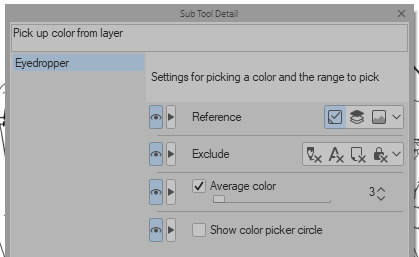
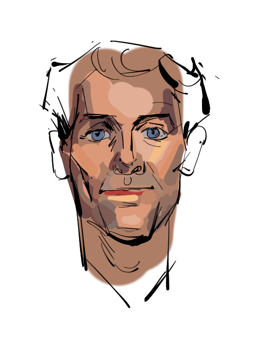
Ah You're lucky i actually have the progress shots of one of those heads. The only real thing i do is have "Average colour" selected on my colour picker tool so after i lay down all the rough blocks i can just select between them and start to create the faux gradient

you can also see how i still add colours throughout the process like the red to bertie's cheek but after a point it just becomes refinement. i try not to use small brushes to shape the gradients until im close to the end which is where most of the "blending" happens.
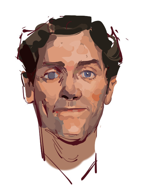
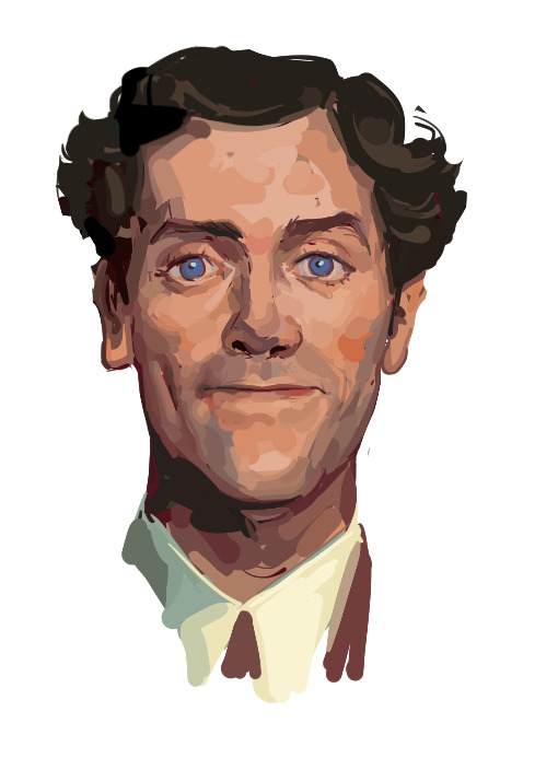
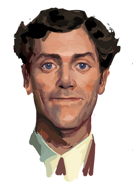
2K notes
·
View notes
Note
Any tips or guides on how you draw such wonderful mechanical/toy-like characters? It feels robust but not overwhelming, love it.
Thank you! So a lot of it is just knowing how to slap the joints on a normal humanoid body. If you research stuff like figma action figures and real life robots, you'll quickly build up a mental library of mechanical joints that correspond to different body parts. Many things that apply to robots apply to toys and things, though it always depends.

Once you have this library built up, you can kinda just do Whatever. Answered a similar ask a long while back that goes into more detail as well.
Some robots are much more detailed than this though, and the main inspirations I have for Normal Robots in particular are from Portal 2, particularly in Atlas and P-Body; the trick they use is having all the mechanical bits (usually pistons) being colored black and dark-grays, with the shells and casings being white or some other contrasting color.

This is an excellent way of having your cake and getting to eat it as well, because the colored casing draws your eye, and you get rewarded with taking in all the finer mechanical bits without getting distracted by them first.
This main principle is what I use for Kaita, who has mechanical parts, but often shows more subtly in her neck and torso/abdomen.

If you just quickly glanced at this closeup of Kaita from this older bit of art I did here, you'd probably not completely realize she's a robot, but seeing the strange geometric shapes etched into those areas might clue you in. To reiterate: while robots like Kaita are more complicated than toys, they share a good deal of mechanisms for stuff like rotating the arms, turning wrists, etc.
It's also just kinda a character design thing in general, is using strong shape language and going for something... toyetic. Which sounds redundant, but you'd quickly understand what I mean when you look at something like, say, Fortnite characters, or the designs to Ben10 aliens. They're not toys, but they all kinda have that Look to em, and they look like that not just because they do in fact have merchandise, but because that kinda blocky look is really readable, and excellent for action scenes and poses. Just that blocky shape language and strong color-schemes can do a lot of heavy lifting on even the simplest designs.
My main inspirations are Sonic and TF2, which I feel is weirdly obvious when you look at someone like Victor if you look at the blockiness of his body and the way I stick to a limited color palette. As-is he wouldn't fit in either universe visually, but you can kinda see how the design principles bleed into how he looks now.
348 notes
·
View notes
Text

HI. HELLO. Here is my Valentine’s Day contribution. POTTERYINSTRUCTOR!HARRY!! POTTERY MAN! WOOO. Basically almost 7K of clay sexualization and sexually charged fluff (ish). Enjoy! :D
CONTENT/WARNINGS: ridiculous sexualization of clay (I think I’ve managed to fetishize clay in this one??? OOPS), overly suggestive usage of pottery terms, a red-hot, hands-on tutorial for wheel throwing, and embarassingly long descriptions of Harry’s fingers coated in wet clay.
WC: 6.6K
slip: small bits of dry clay mixed with water to create a thick, creamy consistency

Clay is innately erotic.
Wheel throwing is, arguably, the most pornographic art form, its only competing opponent being, maybe, literal body-painting. And that latter one still falls as a close second. Close, but second.
Y/N decides that when she wanders into a little ceramics shop tucked away in a busy plaza downtown. There’s no method to her exploration, but the broad glass windows are adorned with dripping, colorful graffiti and its innards call to her. GLAZED, reads the large sign over the awning in blocky, white lettering, stippled with un-glowing light bulbs that she’s sure light alive in the night.
It’s a cute shop.
Upon entrance, the young woman discovers tables, as if set up for arts and crafts, crackling, clay covered wheels with shorter stools, and long, tall rows of shelving brimmed with colorless sculptures lining the walls. Despite its packed interior, the studio seems empty of people and quiet besides the soft notes of RÜFÜS DU SOL leaking from the overhead speakers. She roams beside the line of wheels over to a shelf by the door, admiring the myriad of statues there, some obviously crafted with expertise and elegant artistry, and others lopsided efforts that probably deserve a pitied gold star for effort.
Her eyes are caught on an unpainted little ashtray that’s got a crooked sort of bee in the center when her gaze breaks away to the sound of footsteps. Maybe the shop isn’t as abandoned as she’d previously believed — a man appears from behind a row of white shelving stacked with more unfinished pottery.
He’s a pretty man, that much she can decide from the downturned slope of his nose and his distracted lash line, focused on twisting the navy rag in his left hand over the tip of his right index finger. A dark baseball cap shrouds his hair, but little brunette tufts sneak out in curled bunches around his ears. That’s where Y/N finds a fun, little red-tinted pearl dangling from one lobe. He’s tatted in patchwork art — a mermaid with its tits out peeks at her from his forearm, soaked over and shining. She assumes he must have just been rinsing clay from that forearm, from his hands, no longer visible over his skin. However, streaks of dried gray stain over his white tee in crackling lines, like an old lamination on a well-loved t-shirt that’s been cycled through the washer one too many times. When he pulls the rag away, she discovers a shade of bright red that’s been painted over his nails.
Almost as if he can sense her presence without looking, his sneakers pause on the tile and he steals a peer up. Yes, he’s quite a pretty man, even when his features shape something caught off guard.
“Hello.”
His voice is rich — this smooth, bass-deep sort of sound driving a foreign lilt, and Y/N thinks that if it weren’t for his lengthy fingers and his cherry polished nails, if it weren’t for his handsomely sculpted face, if it weren’t for his seemingly innate effortless demeanor and style, that voice alone could make her fold.
“Hello,” she returns, aware that a nervous note plucks at her cadence, unlike his own casual greeting. I promise I’m not shoplifting clay pots in silence, she nearly tells him.
Thank fuck for the ability to physically bite your tongue.
“What can I help you with?” the man asks, sauntering forward a bit. It’s probably sort of a polite manner to say what the fuck are you doing here, and the longer the young woman stands in the middle of the empty shop the more out of place she feels, almost like this a private, little haven and she shouldn’t be in here right now.
The song shifts into its choral bass drop of electric keys. That fills the void of the silence as she swallows and fixes a little smile onto her face, fingers tightening over the strap of her tote.
“Oh, I’m just looking.”
The man purses his mouth and walks over to the counter, where the register is littered with paperwork and an eclectic collection of faux plants. He sets the rag down beside a floppy one with its green tendrils dangling over the edge.
“See anything you like?” his hand pinches over his nose, like he’s scratching an itch, before he sniffs and pivots to apparently decrease their proximity, “We’ve got loads — you can make something yourself, or,” another step, and Y/N’s eye bounce from his shorts to his tattooed knees to the hems of his white socks. “…If you know sculpting isn’t your craft, we’ve got ready-to-paint-one's on that shelf there.”
Her gaze follows the direction of his finger, where pasty ceramic bunnies, and angels, and cars line the shelving in multiples.
“I think—“ the young woman’s tongue peeks out to swipe over her mouth, words growing drier the longer she captures his stare. She focuses back on a lopsided rendition of strawberry, its leaves cradling over as a disconnected lid and its stem a crooked handle. “I like these. They’ve got so much character.”
She blinks back over to him and watches a soft smile shape over the cushiony pink of his mouth.
It only takes a moment — one where her sight draws back to the strawberry jar for a smidge of a second, before he’s so close that she can smell his cologne, spiced and clean. She ogles his arm, his hand, the way he reaches out between them to cull the piece, mildly appalled by the way he palms the sculpture and dwarfs it in his easy grasp. It’s such a casual maneuver, made almost as if he’s not fondling over something it’d take anyone else two hands to hold. Y/N imagines the dimpled form of clay coated over to match the color of his nails.
“They do, don’t they? I like this one, too. S’a little …ugly, but, s’in, like, a…” the man’s features twist into something silly and pinched, and the young woman rolls her lips into her mouth to avoid exposing her amusement at the brutal candor. His words catch in his throat and bubble as a short laugh, “I dunno. It’s art.”
He sets it back onto the shelf with a light clink, and turns to face her, posturing against a post in the shelving where the tiers have a break. An exhale becomes paired with his nonchalant lean, arms crossing over his pecs, and Y/N tries intensely not to stare like a hawk at the muscle there.
“I’m afraid people are coming back for these, though. This row came out of the kiln…” forest green skids to the assortment and then bounds up to the ceiling like he’s in thought, before he casts his gaze back onto her, “…yesterday. And there’s a month-and-a-half window for someone to come back and glaze before we toss or sell them to be painted.”
He’s chewing gum. Y/N realizes it when she admires the soft stubble coating his jaw, his cheeks — that’s when she notices the work of his jawline over the minty piece. He tips his head. “Did you want to try sculpting something?”
The edges of her lips break bashfully. “I don’t know if I’d be any good at it.”
One corner of the man’s mouth curls up lopsidedly, and the beginnings of a dimple nudge into place. He blinks and chews a little slower, “Have you ever worked with clay before?”
Her delayed, little no is met with the lopsided beam growing even. He nudges with his chin, deliciously bulging arms still tucked over his chest, his playfully raised eyebrows like a wordless notion of have more faith in yourself, “Then you may just be the next Magdalene Odundo. We’ll make a pro sculptor out of you, yet.”
Magdalene Odundo. Somehow, the name isn’t familiar, but simultaneously, somehow, it feels like a compliment.
Y/N inhales as his digits shift over his tri’s. “Okay.”
“Okay,” plush pink shapes a handsome smile, bordering bright white teeth in straight lines. The man tips his head towards the curved berry vase, and then looks back at her, “Did you want to do something like this? All these over here were made on the wheel.”
Y/N muzzles telling him that she’s no inkling of an idea how someone can morph a lump of clay into a vase, nevermind on a big, spinning platform that moves faster than her eyes can keep up with. The man seems to pick up on the hesitation in her silence.
“S’easy, I promise. I’ll show you how to throw.”
Show her. Okay. At least she’s not going to head into vase-sculpting or wheel-throwing or …whatever he’d called it blindly, fumbling over a block of clay on a twirling tray like a slapstick skit personified. At least it means she’s going to stay in his presence. After a moment of thought, though, (and the way she notes that his eyes make unwavering, relaxed contact with her face the entirety of the silent pause), Y/N decides she’s not sure whether that last bit is actually a good thing, considering she’s probably milliseconds away from, like, bracing a hand onto a the shelf to match his level of coolness, or something. And then subsequently sending ceramic pots spilling and shattering over the tile.
She blinks. Her shoulders rise on her nervous inhale, and he makes one of those playful faces, like he’s waiting for her to agree. The young woman’s eyes wander to the line of chairs pressed to its counterparts of wheels.
“I don’t wanna, like, trouble you—“
“You’re not. S’my job,” he tells her, crimson fingertips drumming. She catches sight of his fabric-clad pectorals flexing when he leans forward a little to tack on, “…And to be honest, it’d give me something to do besides fucking around with clay, which is what I’ve been doing for the last hour.”
Her mouth purses and then settles. “Okay.”
“Okay,” he says again, and then winds around through a row of little tables that resemble the set up of an art classroom, like the kind she’d have in school. She’s ashamed that her gaze wanders down the back of his arm to ogle the rest of his ink.
“You can have a seat at one of those wheels,” he tosses over his shoulder as he heads, she assumes, to wind back around the same shelf he’d surfaced from behind, “Just give me a mo’, and I’ll be right back with some clay.”
It takes Y/N a moment — mostly because she admires the view of his stature from behind as he migrates to a back hallway, irises roaming down the projection of muscles in his back showcased through his tee. They skim down his legs, down the backs of his knees, rest on toned calves. He’s gone far too quickly for her viewing pleasure. The young woman takes another glance at the uneven strawberry-esque vase, and then she pivots to step around the crowded assortment of wheels to crouch into one of those little roll-y stools, feet crossing and uncrossing in the cramped space.
He’s a sexy man, Y/N decides. That’s the word she’d been looking for all along, although pretty would match the descriptors of his long lashes and his pouty pink mouth. He’s sexy, though, in his baseball cap and his little six-inch-inseam shorts (which show off the sculpt of his tanned thighs and the ink over his kneecaps). He’s sexy when he comes out from the back over to her wheel, a gunmetal gray ball of clay cradled in his palm like it’s not the size of two of her own. He’s sexy in the green eye contact he makes when he settles into a stool similar to her own, right across, when his thighs splay because he doesn’t have enough room to sit otherwise, when he rests his elbows over his knees and stretches one arm out to pass off the clay. That’s when their digits brush, because it’s sort of unavoidable. He manages to make eye contact through that, too. Sexy.
“Okay. Clay,” the chilled ball the man hands off weighs her hand down, and Y/N’s gaze flickers up to meet his own when he instructs, “Toss it onto the wheel. Aim for the center.”
The young woman pauses like she’s calculating her aim, gearing up without visibly gearing up, and a little smile tugs at the instructor’s mouth as he waits. The clay lands with a thud onto the plate.
“Great,” he tells her, monitoring the centering, and then jade bounces back up to her face as he coaxes, “Smack for good luck.”
Y/N curbs the corners of her mouth out of mirth, hesitating for a moment before her palm lands over the smooth, gray lump in a halfhearted pat. She blinks up, hoping for assurance. The handsome man’s mouth purses like he’s restraining a grin.
“Harder,” he encourages after a second, the corners of his muted raspberry mouth seeping up a smidge, more openly, “S’not gonna cry. You can go a little harder than that.”
The young woman rolls her lips into her mouth, raises her hand, and follows his request, molding it flatter under the solid thud of her palm. Evidently, it’s a better attempt, because she earns a, “Very good,” in response from him.
She casts her gaze up to find him dipping his hands into the pot of murky water beside the wheel before a fist knocks lightly at the pedal-resembling lever on the opposite side, sending the wheel into a speeding twirl. And to add to her list of shame, the liquid that coats his fingers — that’s.
Yeah.
Y/N swallows and watches those wet hands cup over the clay, partly mesmerized by the way he coaxes the priorly deformed lump into a symmetrical cylinder, stroking up from the base up and back down, and partly mesmerized by the way the cherry polish becomes daubed with slicked clay.
“I’m just gonna get it nice and easy for you, and then you can get to the fun bits,” the man tells her as if he isn’t currently awakening some deep, deviously sexual desires in her by fondling clay. Jade flickers up. “M’Harry, by the way.”
“Y/N,” the young woman tells him in response, unsure whether to focus on his searing eye contact or the gentle press of his hands over … oddly erotic artistry in motion.
Harry unwittingly makes the decision for her by breaking the eye contact and glancing down at his work.
“Y/N,” he says, as if testing the taste of her name on his tongue.
Y/N takes a breath, smoothing her hands down her thighs.
“Y/N,” his strawberry mouth parts a tad for a soft breath in, honey smooth cadence glazed in concentration as he presses a flat palm over the top of the clay, keeping his other hand cupped over the length.
She watches the cylinder mold under his grip into something shorter, and then back up. She watches the way his arms flex, anchored to his body as he presses with the heels of his palms to sculpt.
“This is called coning. Makes the clay centered so your grip stays nice and even when it spins. Otherwise, s’gonna wobble, and you’ll feel it when you’re trying to work with it.”
Sure enough, after a few moments, when the man takes his clay-sullied palms away, what’d priorly been a lopsided hunk twirling over the platform stands symmetrically, shining post his wet grip. When he balls his hand into a fist and punches over the lever a handful of times, the plate slows to a stop. He blows out a breath and the music shifts to the next track in the background.
“Take your bracelet off for me.”
The comment is made totally innocuously. Its purpose is solely to preserve the condition of her jewelry — she knows that when his eyes go to meet hers again and he mentions, “Otherwise, it could get covered with clay, or break. Wouldn’t wanna ruin such a pretty piece.”
But it’s the way he says it, right? Two little words, so easy off his tongue. So nonchalant, so purely intended with no ulterior motive. For me. For me, for me, for me.
It’s shameful — she’s ashamed. She’s no better than a man, Y/N decides, as she peers to the silver bangle with the sliver of warmth slithering through her chest and snaking to her tummy. She’s no better than a man, objectifying this poor, effortlessly sexy ceramics instructor and his casual commentary on a Wednesday. She swallows.
“Right. Thanks— thank you,” the young woman tells him, her tone garbled with nervous enthusiasm as the fingers of her opposite hand wriggle under the clasp to pop the piece off.
She’s still feeling dubious about the morality of her thoughts once she’s slipped the bracelet into her tote by her feet and sat back up.
“Alright,” Harry starts again, elbows braced to his sturdy thighs, “We’re gonna go over what this little thing over here does, because it’s good to know. It sets your speed. We’ve got options—“
Y/N watches the way his arm stretches, she eyes the tail of the mermaid, the lines of scales etched into his skin. His eyes meet her own again.
“…Fast,” Harry knocks over the lever again with the butt of a vertical fist, a couple more nudges rocketing the wheel into a motion that dissolves priorly visible remnants of clay rings into fast-moving swirls with no decipherable borders.
Another few nudges has the wheel skidding to a full-stop, and then stuttering back up into a spin when he taps over the pad once more.
“…Slow,” Harry fixes his gaze back onto her face and watches the curious concentration there. The man sits back up a tad, elbows bracing over his splayed thighs and fingers crooked and lax, coated with slippery wetness and clay. “Find what feels good for you. S’different for everyone.”
Despite the way the directions are made so innocently, so obviously stated as a tutorial that’s not intended to be taken as something suggestive, Y/N finds a heat teeming over her cheekbones.
“But, I recommend—“ her teeth lodge into the inside of her cheek with subtlety as the instructor hunches a little again, just a tad, to rap over the lever in a pair. The wheel speeds. “—Sticking to something around this.”
The pace of the wheel settles into an easy spin — something that’s still too quick for her eyes to keep up with, but apparently not the fastest setting, judging by the higher speeds he’d displayed moments prior.
“Alright. Here’s where you come in with your undiscovered ceramic talents,” the instructor tells her, the edges of his mouth so obviously restrained, like he’s amused with his own playful banter. His eyes glinting softly under the buttery light cast by the overhanging lanterns,”M’gonna show you how to drill, but you’ll need to get your hands wet first.”
Harry sits back, elbows still braced to his thighs, hands now coated with slippery clay as he waits for the young woman to douse her own into the bucket. The liquid greets her palms with a welcome chill, and when she lightly cups over the cylinder, it slips under her hands with ease. The man clears his throat, and their digits graze again when he touches over her fingers to guide her grasp. Y/N tries not to focus on the way his hands make her own look as if they belong to a child.
“You’re gonna take your thumbs—” Harry coaxes, all concentrated seriousness now, and the pad of his own brushes against the knuckle of her left, “—and press over the top, here. Right in the middle, just like that.”
He takes his hands away and the clay rolls under her fingertips, a divot forming from the pressure of her thumbs.
“Good. Now what you’ve done is you’ve indicated where you’re going to make the opening. And to do that—“ his hands return, unintentionally persuading her own to fall away and sort of hover stagnantly mid-air, in sullied awe, as he dips the tip of his index into the cleft they’d created together.
As if hungry for the finger, the clay parts to swallow the pad of the digit. It broadens its starving mouth, and Harry steadies the spread with his thumb, his pointer delving against the inside of the deepening wall. His opposite hand cups over the body as he molds the opening wider.
Anyways, what Y/N manages to learn from the impressive showcase, before Harry steals a glance to make sure she’s been observing (which she has, very focused, actually), is that clay-working is a dirty, dirty, lustrous art form. Especially under his fingertips. This is all very educational stuff. Perhaps the most impressive step of his tutorial, thus far, is the way that, in mere moments, he cups and strokes and caresses over the clay, drawing the opening tighter. It shrinks until it disappears, and when he smooths his hands over the rounded edges a few more times, the vessel that’s left is an entirely clean slate. Almost as if she hadn’t just spent the last few seconds ogling a weirdly pornographic display of a clay cavern opening in response to the touch of his long finger. This was a horrible mistake, Y/N thinks pitifully — she’s getting aroused by clay working. If there was ever a blaring red indicator that she needed to get laid, this is it.
“I want you to try now,” Harry directs, totally nonchalant. This is just a casual Wednesday for him, Y/N realizes. He casually fingers clay with his sexy, long fingers, and thinks nothing of it. Maybe she’s just a horribly wound-up pervert.
Still sort of stunned, she reaches out and cups over the cylinder, clumsily positioning her thumbs in a replication of the manner he’d shown her, aiming for the center and driving a divot into the top.
“Mm. That’s good. Keep your elbows closer to your body,” he prompts, eyes flickering from her posture to her hands. “Like this.”
Following his body language, Y/N mimics, ducking a tad and tucking her arms to her torso. After a few moments, she lifts her thumbs to find a centered indent, one that’s similar to the one they’d created together.
“Lovely. Now,” the chair makes a little rolling sound over the tile as Harry shifts forward, clay-slicked hands (warm, despite their cool coating) cradling over her own to position, “You’re gonna cup here, and then take this finger and push here. Yep. Jus’ like that.”
The instructor takes his grip away and encourages, “If you need more water, get your hands wet. You can tell you need it if there’s friction — you want it a little wet.”
She wants it a little wet. Y/N decides, as she dunks her hands into the bucket and returns to the clay, she in fact does not want anything wet right now. This is the last place she wants something wet. Her thoughts are disturbed by the way he grasps her at her hands again and repositions — twisted by the slippery feel of his own wet fingers. The clay over his palms has begun to dry now, morphing lighter and crackling, but the tips of his digits are still soaked and darker in shade. She’s awed when the cylinder gives under her touch, the same way it had for him to encompass her finger. It’s like magic, sort of. Very slippery, wet, weirdly erotically undertone-d magic.
“There you go,” Harry tells her, baritone soft, “You’re a pro.” Then, after a moment, “You can go a little harder. Don’t be shy. Open it up.”
She’s not blushing. She’s not blushing, because that would be silly. She presses harder, and the opening widens until it gapes.
“How long have you worked here?” the young woman asks, naturally trying to change the subject from wet and hard things. Hopefully in an organic enough manner that doesn’t imply how affected she is by said wet and hard things.
“I bought this place a few years ago,” Harry responds after a second, tone concentrating as he reaffixes the firmness of her grasp (she tries not to verbally apologize, glancing up), “…Both units. It was a smoke shop before, I think.”
“Oh!” her hands stutter again in surprise, “Are you the owner?”
He fixes them again, brows pinched, and when he glances up, his brow bone is smooth and there’s a soft smile playing over his mouth. “Indeed I am.”
“It’s …beautiful in here,” Y/N tells him, gaze walloping from shelf to shelf for a moment, lantern lined ceilings to vine-coated crown molding, trusting that his hands will keep her own grounded to the piece.
“Thanks. It’s a little crowded, but if you manage to get lost among the …phallic statues and the clay bongs,” he cocks his head, blatantly bridling a simper as he shrugs. At the response of her snort, jade flickers up and the plush of his mouth curls more obviously, “…You’ll find your way out of the maze soon enough.”
As the walls of the clay grow thinner, the instructor takes his grip away, swiping at his forehead with the back of his hand. “Alright. What are we going for here? A mug? A vase? A bong masquerading as a vase?”
Y/N takes the lack of his touch as an indication to lighten her own. She purses her lips thoughtfully. “A vase.”
“A vase,” the instructor parrots, voice low, and then he hunches back over and cups the clay. The young woman returns her hands to meet his own. “I can work with that. We’re gonna build it up. You’re gonna squeeze and lift. Right—“
If his fingers keep brushing hers for the duration of the next …half hour? Hour? (How long does throwing take?), Y/N decides she’ll simply combust. His hands cup lightly over her own, two digits pressed to hers, and hers pinned to the inner wall of the clay in sin.
“—Here. That’s it. You can be a little aggressive. We’ve gotta get it tall.”
Y/N swallows.
“You said you own both units?” she ponders aloud, “Is there …more?”
“My place,” Harry tells her nonchalantly, as if it’s the most casual, normal, every day thing to live over a ceramics studio, “S’just over on the next floor.”
“That’s—“ she realizes her grasp has lightened again, the integrity of the structure mostly only crawling up under the pressure of his own (steady, firm) grip over hers, “…so cool. To have, like, a whole studio right under you.”
“Mm. I think right now…” Harry cranes his neck to peer up at the ceiling, “We’re under my kitchen.”
A little breath of mirth tumbles from her when he grins and tacks on, “I think this is way cooler, though.”
This is The Turning Point.
And if it was a scene title in a play, Y/N thinks it would be capitalized to denote the importance. It’s important, because somewhere along the trail of her perversions, as Harry had guided her hands into the innards of the clay — fittingly describing it as the body — when he’d pressed his hands against her own to widen its base, when he’d shown her the sponge, things had clicked. It had clicked because she realized she wasn’t fucking crazy. Because Harry then said this thing — this one little thing that would have launched her into a frenzied, internal mess of dubious morality on the basis of her perversions—
But then it clicked.
“Careful with the amount of water you’re using now, yeah?” he’d told her, maneuvering her grip over the sponge as they’d smoothed over the lip together, “S’all about balance. …If you go too hard, you’ll make a wet mess.”
Y/N had glanced up. That’s when she’d noticed the way the instructor gnawed into his cheek, almost immediately, almost as if he was amused by some sort of devious inside joke. And then his blocky front teeth had dug lightly into the plush of his pink bottom lip. It was nearly unnoticeable — but she had noticed. Clay was innately erotic, and he was doing it on purpose. It was one, or the other, or both.
For a little while from there, they work in blatantly charged silence. It’s a very short while, all things considered, and she’s willing to clam up altogether and daydream about his digits for the duration of the lesson, but the tone of his next words nearly gives her whiplash.
“So what are you doing on this lovely Valentine’s day?” Harry breaks the silence, once again, his tone so even and nonchalant that Y/N can’t begin to fathom where his composure comes from.
The young woman clears her throat, “Oh. Y’know. Trying my hand at ceramics. The yuzh.”
Jade doesn’t immediately jolt up when he ponders aloud, “Dinner plans?”
“Not any on the calendar …that I’m aware of.”
His touch doesn’t lighten, but he does glance up, mouth all (apparently) disbelieving mirth, “You’re telling me you’re not being wined and dined tonight?”
Feigning offense, the young woman sets her mouth into a line and nudges with her chin in a nod, joking, “Thank you for the reminder.”
Harry laughs softly, one of those little breaths expelled through his nostrils, and he looks back down to the vase-in-progress, gentle grin undeniable. Y/N matches his amusement, faux indignation crackling.
“You’re too pretty not to have a Valentine,” the instructor tells her, then, decibel low, almost like it was meant to be under his breath but also entirely not, and all Y/N can do is sit there with instant heat seeping to her face. Because that’s flirting. That’s definitely flirting. Her sexy ceramics instructor is helping her craft a vase out of clay on a wheel with his sexy hands, and he’s openly flirting.
Y/N stuffs down how initially stunned she is to chew into her bottom lip and volley, “I bet you say that to every girl that comes in here.”
Harry shrugs. It’s still almost an enraging level of cucumber-cool and composed.
“Just the pretty ones.” He tacks on, after a moment, “And only on Valentine’s day. Don’t think that line would fit well on a random Wednesday.”
Y/N snorts. She’s still basking in the pleasant warmth of the flattery when the man peers up and tells her, “I do accept tips, by the way, so. Feel free to leave a tip for the friendly service.”
“I will—“ she snorts, restraining her open amusement at the way his brows crinkle in concentration as he helps her grip, “—definitely do that.”
“Sick,” his tongue peeks out to swipe over his lips, disappearing back into his mouth as quick as the pink had showcased. Jade flits up, the corners of his mouth curled up in a little pause of silence, almost he wants to make it crystal clear he does not actually want a tip for hitting on her.
Anyways, this is all a flustered mess. All of it. Y/N, the pot she’s sure will grow off-center and wobble under her shaky grip, all of it.
“What about you?” the young woman takes a deep breath, hoping some sort of breathing exercise will help slow the buzzy flutter of her heartbeat, “Any wining and dining? For Valentine’s day?”
“Not on the calendar,” Harry responds, sliding her own words back to her, his gaze still honed on the work ahead of them, now impressively morphed from a lumpy, shapeless ball into the beginnings of a vase, “As for how I’m spending my Valentine’s day, I did just show this one pretty girl how to shape and smooth. And now, …m’gonna show her how to shape some more.”
Y/N bats her lashes, and then she observes the work of his clay caked fingers, the way they curl and press over the vase in different points of the body, some motions widening the rim and some drawing it more narrow. He bids their tutorial a pause shortly after, explaining, “I’m gonna give you some creative freedom now. Figure out what shape you like.”
Despite the slight disappointment budding at the close of their conversation, for now, the daunting task of unsupervised throwing is what probably surfaces on her face, more. The instructor catches it when he rolls back in the stool and stands, ogling her for a moment, mirthy mouth caving up in a way that suggests she must look like a deer in headlights.
“It’s intimidating, but I believe in you. I’ll just be in the back for a sec, give me a shout if you need me.”
Y/N shifts her legs, pressing her thighs together when he adds, “Play around with it.”
All in all, they manage to end the wheel session with (Y/N thinks, impressively) only a couple of hiccups, both being opportunities presented with unsupervised sculpting. When she’d played around with it (his words) a little too much and had coaxed a priorly even shape into something lopsided and petrifying, it’d swung around on the wheel, each turn quickening its slow but sure collapse. She’d called out for the instructor with a frantic note to his name. Of course, both times, Harry had come out from the back and patiently squeezed over the clay, hands and forearms jolting and flexing deliciously as he’d encouraged it back into something centered (yet another opportunity to stare at slick clay glazing over his fingers all over again), reassuring her that it was normal to struggle, especially with her first time.
Y/N wonders if he’s constantly full of innuendos, or whether a ceramics studio is just innately an opportunity for double entendres.
She tries not to make it too obvious when she stands on wobbling legs, when she brushes past him and catches soft notes of his cologne, clean and musky. When he directs her to the bathroom where she rinses clay from her hands into one of those artsy, utility sinks. When she sits at one of the tables, waiting for him to bring the vase over to her, torched and ready for additions, when he gives her another colorless lump. She tries not to make it obvious when she ogles more of his arms, the peek of his nipples through the white, clay-stained fabric of his tee shamelessly. She fears it’s utterly obvious how affected he’s made her, though, when she blinks up at his face, when he shows her what the different little tools in the cup do for sculpting. Y/N doesn’t even look away from him at the introduction of the first tool. She thinks that’s the one that must cross-hatch, driving little lines into the clay.
“This is called slip,” Harry explains, dipping the tips of his index and middle fingers into the cup near the brushes with no hesitation. The consistency over his fingers, when he pulls them out, is like a wetter, creamier, sloppier variation of the same clay she’d worked with.
Christ.
“You put it over the lines you’ve carved to make more clay stick,” the instructor expands.
Y/N swallows when he smears the consistency coating his fingers onto the lines he’d drawn, his gaze bouncing from his touch to her face.
“Like, if you wanted to add a handle to a mug, you’d use this method. Or, alternatively,” the young woman focuses on the way the pads of the digits rub over the lines. They fade away. “It’s like an eraser. Careful with erasing, though. …Wet mess.”
The latter is tacked on as a reminder, and it wonderfully reminds her of the heat coiling in the pit of her tummy. Wonderfully. She swallows again.
“You can probably use that brush to apply the slip, though, if you don’t want to get your hands dirty again.”
Flowers. She sculpts flowers with a searing heat between her thighs, because his added little comment of, “I don’t mind,” as he glances to the slip still glazing his fingers, implying that he doesn’t mind to get his hands dirty, does that to her. Y/N sculpts flowers and they settle into a comfortable sort of silence. It’s one where the only sounds are the soft music playing over the speakers and the occasional noise of pages turning from behind the counter as he leans over it and works through some kind of paperwork. She draws lines into the vase, and brushes on the slip, and presses creased flowers to decorate the bulbous body, concentration etching her features.
She doesn’t notice when she goes over the hours of operation, and Harry doesn’t disturb her, doesn’t tell her that the shop’s been closed for nearly half an hour by the time she peers up and declares, “I’m done.”
“You’re done,” the man repeats and sets the paperwork down, making his way over to the table where she’d set up, “Let’s have a look.”
Y/N sits back admiring her artistry. All things considered, it’s sort of an ugly vase. Despite this, a sense of accomplishment buds in her chest as she stares at her creation.
“I like it,” Harry tells her, nodding like he’s proud of a promising protégé, “It’s quite sweet.”
“Thank you. What now?”
“Now—“ the instructor props one hand onto the countertop and the other against his hip, “You wash your hands, you take a picture, and you come back in three weeks to sand it and glaze it.”
Simple. It’s a simple set of instructions. Y/N brushes crackling, dried clay off of her fingertips against the cloth laid over the table, instinctively reaching for her purse.
She blinks up at him expectantly, “How much?”
Dimples wink awake with his soft simper, and he shifts his stance before he asserts, “Don’t worry about it.”
The young woman’s features shape into something crinkled, something bemused and unwilling of a discount. She shakes her head and glances back down to the tote, “No, I have to pay you. What about your tip?”
Harry crosses his arms over his chest, pecs flexing with the motion. Flexing, flexing, flexing, when will his muscles stop rippling? He sighs, cushiony mouth still smiling, “I think I’ll live. My tip was that I’ve helped you discover a hidden talent—“
Y/N snorts, eyeing the sloppy attachments to the shapely base, fingers still tucked over her wallet.
“—It’d defeat the satisfaction and all the pride I’ve got now,” the man declares, shrugging.
The unconvinced look she gives him coaxes him into a good-natured roll of his eyes, and Harry tuts before he compromises, raising his eyebrows, “But if you must tip me, you can tip me when you come back in three weeks, yeah?”
Begrudged, the young woman takes her hand from the edges of her wallet. “Fine. Okay.”
“Okay. Three weeks,” the man reminds her, a little smile playing over the plush of his mouth.
The world of ceramics is oddly pornographic, Y/N decides. But maybe clay isn’t innately erotic. Maybe it’s the way the man’s fingertips mold its shape, the way his digits look soaked in slip, the way his hands cradle over it as a wheel spins under his ducked stature. Maybe it’s the way his jade irises flit to her face when he makes an educational comment that’s obviously suggestive, Maybe it doesn’t have to do with clay, at all. Maybe it’s Harry.
Maybe it’s the way he tells her, “If I were you, I wouldn’t miss it. Glazing is my favorite part.”
#harry styles#harry styles smut#(ish)? there’s a lot of innuendos in this one#harry styles dirty one shot#harry styles writing#harry styles one shots#harry styles fluff#harry styles one shot#harry styles fanfic#harry styles x y/n#harry styles x you#harry styles x reader#harry styles fanfiction#harry styles valentine’s day fic#valentine’s day fic
767 notes
·
View notes
Note
your rendering is so good how do you do it
Thanks, I love your rendering too!! Gonna try and make a tutorial ^^
To start off, I'm on Clip Studio Paint and these are the brushes I use! First two for rendering characters (round brushes) and the other two for mostly backgrounds (square brushes)


I used to do lineart, but it takes too long >:( now I just make a sketch and sorta clean it up!

Next I fill it in with a gray color. For simpler pieces I just put in the flat colors, but for more paint-y pieces I do grayscale -> color! I'll be doing that here :)
Also, I make 3 clipped layers on top of the gray - two are multiply, and the top one is screen. On the first multiply, I do a soft gradient using an airbrush
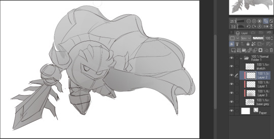
On the next multiply layer, I fill everything in with either a cool-ish or warm-ish gray, depending on the mood ^^
I also determine a light source, and use the lasso tool on the screen layer to block out where (I think) the light hits! Tbh I just do wherever feels right lmao, but I recommend having a reference! I like doing it in triangle patterns
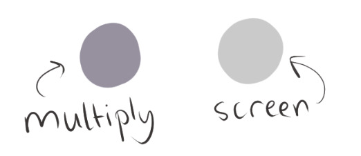
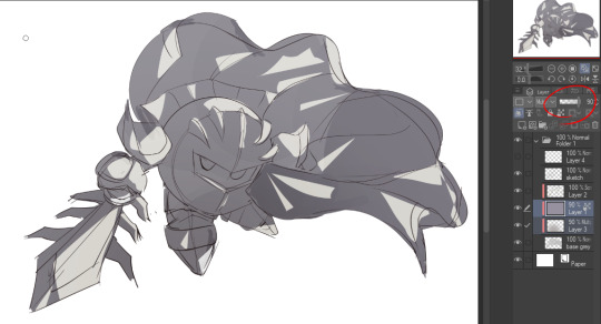
Then adjust the opacity of each layer to whatever feels right, and merge everything (I don't merge the sketch/lineart yet, I do it before adding colors in!)
Now... rendering. Some tips I have are color pick (greys) off of the canvas and use them to paint! Clean up the sketch more, erase edges, but I save details (like Galaxia's red gem, his eyes, etc.) for the end, or during coloring.
After I'm sorta happy with it, I merge the sketch layer, then duplicate it, and add a gradient map! I did this sunset-y one but changed the hue to yellow-ish, then lowered the layer's opacity ^^
Play around with the hue-saturation-luminosity setting!
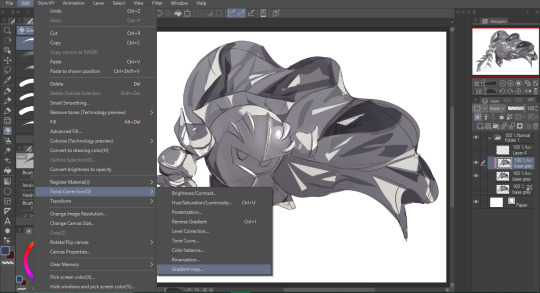
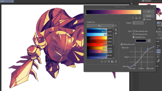

Now go crazy with blending modes! Multiply, overlay, color, glow/color dodge, etc. Feel free to layer them up on top of each other too, and this is to add the character/piece's actual colors in. For example, I used a white-blueish overlay layer for his mask and glove, blue for his cape, blah blah
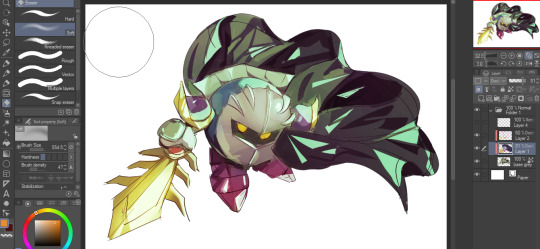
Now I clean the sketch up/refine it more. Also, to "harmonize" the color palette, you can add a colored gradient on top. Then set it to multiply, and add overlay/glow dodge layers with any colors you see fit! I like using teal and light/warm orange! Here is an example of a colored gradient:
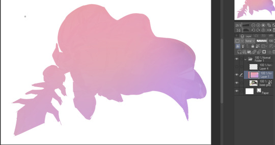
Another tip is to add saturated colors on the edges of both lighting and darker shadows, before blending it:

Also I usually add in a light blue/grey in shadowy areas, and lower the opacity for reflective light:

Also! You can lasso + use an airbush with a light blue to block out parts of the background (his cape here, for example). It helps with more depth!
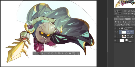
Finally, I like adding sparkles on low opacity :3 And gaussian blur to certain areas! I'm using radial blur on this piece though ^^

For the background, I like doing blocky shapes!! I use my square brush on 90% ish opacity, to color pick different hues from the piece. For lighting I use a glow dodge layer, here's a mini timelapse as well as the finished art!
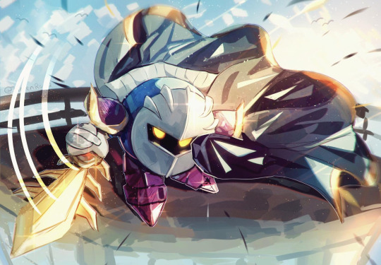
At the very end, play around with the hue/saturation and contrast tools to change the colors :)
#iiii hope this helped??#first time making a tutorial sorry!!#art tutorial#kirby meta knight#meta knight fanart#meta knight#nintendo kirby#kirby nintendo#kirby fanart#kirby series
560 notes
·
View notes
Note
Hi hi! Love the way you draw hands, do you have any tips? :3

This is my thought process behind the hands I draw. I like keeping them kind of messy cause it keeps a organic/fluid look and I think thats charming for characters who are mainly built on sharp edges and blocky shapes. just have fun with it and add your details after you have your basic shapes. I'm realizing it's alot harder to explain when I'm not already drawing them on a character.
374 notes
·
View notes
Note
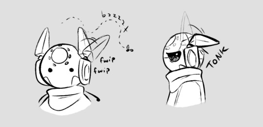
I loveee how you draw iterator antennae,, please tell how do you design them?? Personally for me one of the hardest parts of designing iterators
Also - Love you art! Have a good day/night :)
Tysm <3
This one's tough, I don't really think too hard about how I design antennae. I just go with whatever looks right and fits the character lol but I'll try to talk about it anyways.
Moon and Pebbles are based off their in-game appearances. They have changes between depictions though so there's some wiggle room. Pebbles' is based off his sprite and Moon's off of one of her art pieces. (Her dull blue color is pulled from her sprite.) This seems to be popular in fan depictions too.
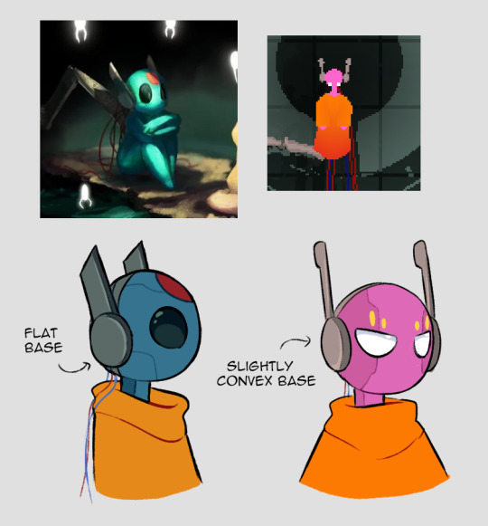
Sig and Suns are also based off official depictions. Sig I took some more liberties with - he really should have rounder, more protruding headphone bases. But I wanted some variety in headphone bases and he kind of just... ended up with a geometric shape theme to match his diamond mark. This is their only official image, so I just shrugged and gave them some broad small antennae that would be hidden at the back from this front angle, because I wanted to. (Bald Sig is valid but I like what I did hah)
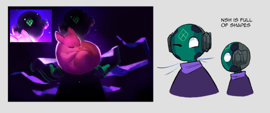
Suns is a mix between the in-game art and the concept art by (I'm never sure what name to use here, but the art listed on the wiki is by-) Minkimaro. Mine's gotten more blocky/volumetric antennae over time, and every time I draw them their collar gets bigger. It's an addiction. They have to be comfy.

Wind and Innocence both have more unique antenna, and multiple segments. I wanted to balance them out with the others design-wise, but I wanted them to be distinct from each other too. So Wind gets these wide fan antenna and Innocence get triple thin antenna on joints.
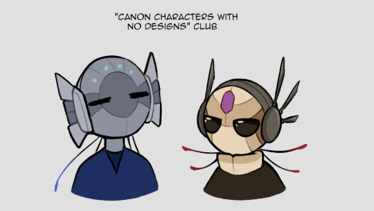
And here's some OCs for variety.
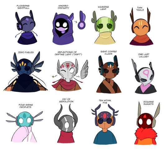
I guess here's some stuff to chew on-
Shape, width, size of the base headphone parts
Shape, width, size of the antennae
How many antennae? Are the antennae all the same size/shape?
Embellishments (such as the extra details on Flicker's)
Does the design suit the character's look? If they can emote with the antennae, how does that fit their personality?
If it matters to you, how do your antenna work, mechanically speaking? If they can move, do they have ranges? For example - Suns' antennae have great horizontal range, but they can't fold them down past their headphone bases.
#sure this one can go in the main tag. why not#look at my ocs boy#rain world#rw spoilers#dp spoilers#flickerdoodles#art#text#ask#anon#group pic#long post#i guess?
419 notes
·
View notes
Note
I love how you do your blakout inking... Is there any tip to doing it right or do you just go in on instinct? I know having a good idea of shadow placements is important but I also struggle with how I shape my shadows and I end up being too conservative with how much black the drawing has yk
The easy answer to this is... intensity!
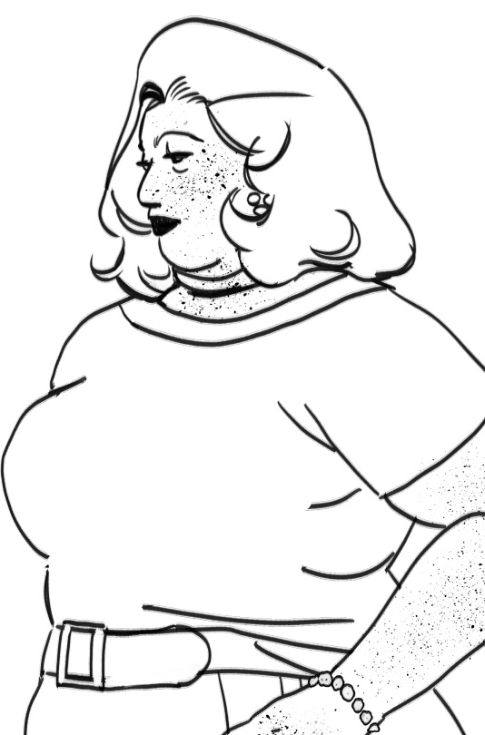
Let's start, everybody say "hi Selin!" She's going to be our muse today!
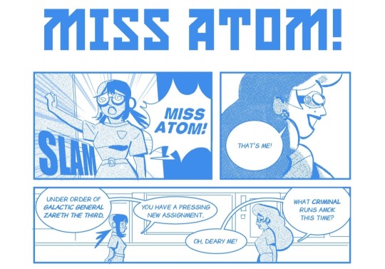
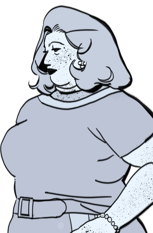
First I'm going to go over how I tackle flat light. This is the style of inking I used when I was drawing Miss Atom if you noticed!
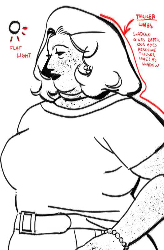
Flat lighting is perfect if you want your colors to shine, perhaps even when the background is incredibly detailed as well. This one is easy, just apply thicker line onto the part of the body that doesn't see light. You can choose to shadow certain details like the inner side of the hair.
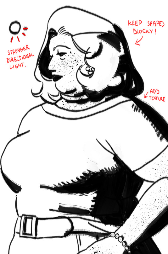
Now just sort of expand on it. Try to keep it blocky. The trick is to balance the light and the shadows. The trick is to keep in mind where the light is coming from. This type of lighting gives you more depth, you can now see how her body curves and how hey hair flows. You're getting more details here.

Keeping it simple helps your eye focus on the details and what is being lighten.
If you want dramatic lighting, the key is to crank up the shadows by a 100. And still keep in mind where the light is coming from, and keep it simple.

As you can see, you don't need to highlight every detail. That's the best part about moody and dramatic lighting. It's extremely useful in serious scenes, if the tone or your work is dark, like Noir.
And there you have it!
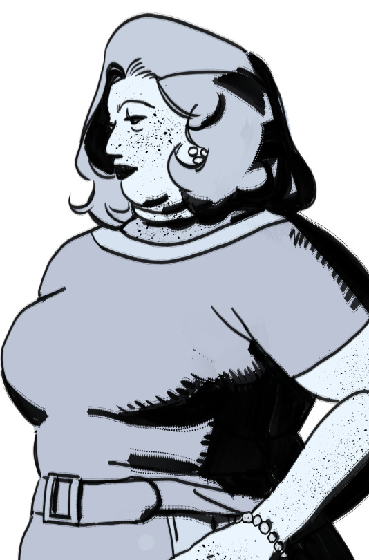
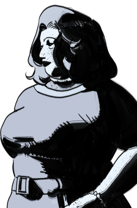
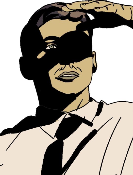
Just have fun with composition and shadows! Keep in mind, as long as it looks good, it doesn't really matter if it's not realistic. Shadow and light are tools for composition.
162 notes
·
View notes
Text
GUMMI !!!!!
This was originally supposed to just be a sketch, but obviously, that didn't happen.....

Alien gummi by the amazing @snowthedemonfox
#ooo dreamurr he looks stunnin!!#you def are getting a hang of the gummy look#i love how u drew the snouts. all the blocky shapes are so fitting for this guy#they are all so goofy /pos#also the pose perfectly shows all the heads#this is for being able to guess all the funnybunny aus#<- [prev tag] my bragging rights are the real prize /j#snow youre never safe. ur never living that down /silly#dreamurr's art‼️#not my art!!!!!#tadc#gummigoo#the amazing digital circus#tadc au#tadc alien au#tadc fanart
95 notes
·
View notes
Note
Just wanted to ask, please forgive me if you've already answred this, what program do you use? Your art fucks HARD and like. I was looking at your art of the two moths over the city they die in and I was hit with the wave of "oh that looks really fucking fun actually." Like i know my art program can't do some of those effects and like, I'd love to try fucking about with them.
hi there, thank you! all my art is done in procreate and paint tool sai
because you mentioned that drawing in particular i thought it would be fun to break it down and show ppl what exactly went into each part of it so check this out
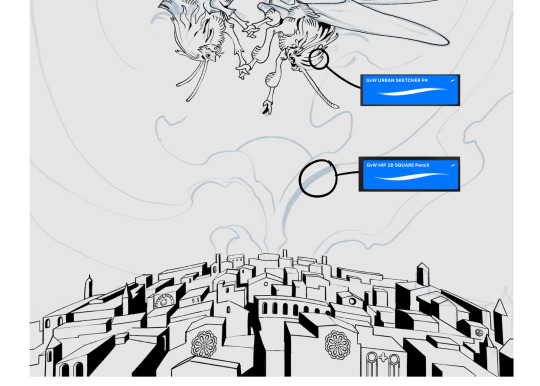
sketch & lineart - the brushes come from georgbrush.club and the urban sketcher is my most commonly used lineart brush, it has a nice irregular shape. the square brush is nice for big blocky sketches.
the cityscape was REALLY hard but basically I got a photo of the skyline of florence, traced some basic building shapes, then bullshitted the rest using the vertical symmetry/mirror tool to cut down on the amount of work (so i only had to sketch one half of the city). then for lineart I turned off vertical symmetry, turned on the two-point perspective tool, and got this:
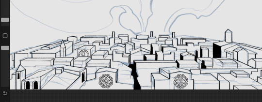
the rose windows were made using the radial symmetry tool.
I didn't like it being so flat, so I used the liquify tool to make a kind of fish-eye effect (limited success tbh). I liked how it looked but the buildings in front needed something to cover them up to make the liquification less obvious...
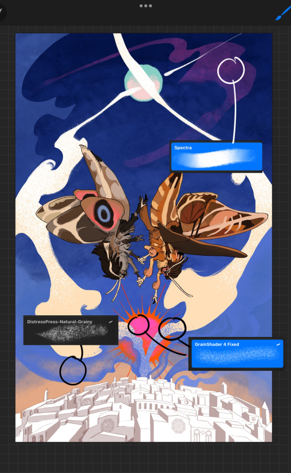
first pass colours. I felt they were very washed out, aside from the sun which i loved. I use the spectra brush (default procreate) for skyscapes a lot, I love the texture. Although the clouds were filled in using the lasso selection tool, I softened the edges using the square pencil again and added texture using true grit sampler grainy brushes. The translucency effect comes from my setting the brush as an eraser. The sun rays come from the radial symmetry tool.
Blocking in the moths' colours was done with the urban sketcher again.
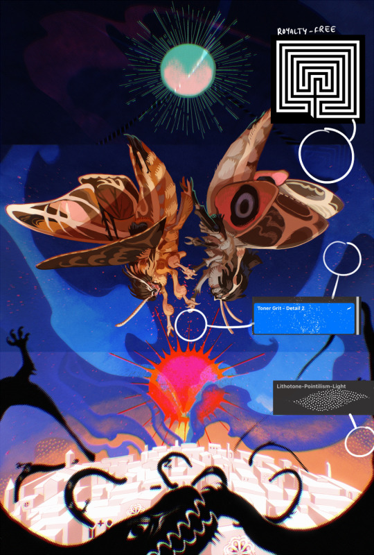
Something people may not have noticed is the labyrinth hidden in the sky! yeah I had a bunch of versions where it was more obvious but I found that it clashed a bit and was too busy, so I made it subtle. But yes. I searched for "royalty free labyrinth" and picked one.
The toner grit brush is one you've seen before if you've looked at any art on tumblr lately (this is such a popular brush) and it's from the true grit fast grit set. The pointillism brush is from the true grit free sampler pack, like my grain brushes.
I added shadows to the moths, increased saturation overall, and changed the clouds to a translucent blue (you can even see in the sun where I forgot to block in the sun itself because the clouds over it used to be opaque lol). Moon rays were drawn using the radial symmetry tool but this time with rotational symmetry off. I also moved the moon down closer to the moths because I felt that it was a bit far away, and this served to visually divide the drawing into three equal parts, so I chose to lean into that and divide the sky colours too, to show passing time, or an endless moment - morning, evening, night, etc.
And then the oroborous, I tried a few different effects on it because I wanted it to be very clearly separate from the main scene - I settled on a dot matrix newsprint texture, using procreate's onboard tool, and some heavy chromatic aberration. This is because the oroborous isn't real, it's purely symbolic and the moths' demise started when they became photographers so I liked the print media aspect there as well. The story itself is about grief without closure, cyclical violence, and sunk cost fallacy, while everyone explores an endless labyrinth, so an oroborous fits I think
what makes art fun to me is thinking up ways I can tell a story using just a single image. and sure a lot of it will be lost to an audience who isn't familiar with the characters or backstory but i want to leave enough in there that even complete strangers to my work will be able to construct a narrative about what's happening here, rather than it just being a cool image. that's my goal.
Finally I exported it to sai on my pc to give it a once-over. this is really important because the retina display on an ipad is oversaturated on purpose, to make everything look amazing and vibrant. but what this means is that on other screens, your work might look washed out. it's especially bad at displaying yellows! so i look at it in sai on my pc and i make minor adjustments, in this case I actually added another multiply layer on the moths and an overlay on their non-shadowed parts to increase the contrast there.
finally if you've read this far, I played a little trick with the caption of the drawing. yeah, THEY die... but only one of those moths is a theythem pronoun haver... the other has to survive. he isn't given a choice in the matter.
#fr you will never catch me trying to mystify my process i will explain literally everything#brushes
466 notes
·
View notes
Note
your art to me,,, is like those jelly fruit slices. So yummy,,, im eating every time you’re on my dash. So scrumptious,,, thank you for sharing your art!


HEEHEE I love these things... I def like. Strong blocky shapes + Bright colors + Kinda grainy textures so.. I think this is fitting
126 notes
·
View notes
Text

a midnight love w/ iwaizumi | wc: 302 m.list
"where are you?" a quiet voice carries through the large hedges, the maze of foliage making up a significant portion of the garden's landscape.
holding back a laugh, you tap against one of them, letting the ruffle of branches alert his gaze. rolling his eyes, iwaizumi carries through the gardens, hot on your trail. his broken-in shoes moving carefully against the rocky ground. "you have to be getting back soon, preferably before your father discovers-"
"discovers what?" you pop out from behind a sculpted hedge, the blocky shape altered to one of multiple spheres, "that i'm on a stroll with my dutiful guard?"
holding a scowl, iwaizumi shakes his head, arms crossing in front of his chest. "that you've evaded your on-duty protection to 'frolic' in the gardens with what your father would consider below thee. you know that," his voice softens, hands reaching for yours.
feeling the callouses on his palms, you look at him, eyes narrowing, "i don't care what he thinks, not when it comes to you, hajime."
"well, maybe you should. maybe i'm not right for you, not right to lead this kingdom," he grimaces, still holding onto your hands with an intensity that could only match your father's, but with a gentle touch that only he could exhibit.
carrying one of his hands with yours, you caress his cheek, feeling the slight stubble he prefers to grow. shaking your head slowly, you bring your lips to the corner of his mouth, giving him a short kiss. just close enough that he can still taste the familiar scent of you. "enough. i do have the power to send you to the dungeon for a night,” you smile, knowing you could never bring yourself to do such a thing.
“alright, my liege, your word is my command.”
gen. taglist (open): @eggyrocks @causenessus @applepi25 @softpia @bakery-anon
#haikyuu#haikyuu x reader#hq#haikyuu fic#haikyuu fanfic#hq x reader#hq fanfic#iwaizumi hajime x reader#hajime iwaizumi#hq iwaizumi#haikyuu iwaizumi#iwaizumi x reader#iwaizumi hajime#☆ fics
67 notes
·
View notes
Text
Hi Thank you for coming to my TED Talk about how I dont like the Grid Method for drawing
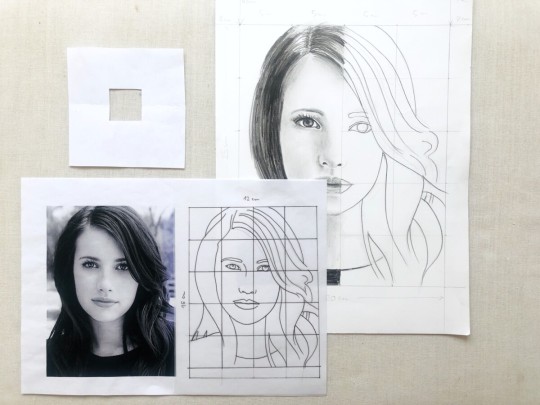
I think most people in their life have seen the grid method for copying a piece of art - if you haven’t seen it you can probably at least get an idea of it pretty quick. The grid method for art requires you to break a piece into a series of equal squares, and then transfer those squares onto a blank piece of paper divided into the equal squares of the same ratio. Conceptually this idea is very sound - rather than biting off the entire picture, you focus on each section. Theoretically, if you can make square A1 look like square A”1, and so on and so forth, you should finish with an identical drawing to your picture. I, personally, have a strong distaste for this method. It teaches bad habits - especially to younger and newer artists. (If you are a big fan of this method please read all of my rant first or at least scroll to the end where I will reiterate some of the perceived positives of the method)
The best way to discuss this is to start with a general idea of how we go about drawing something - especially something from a reference! I will try not to riddle this rant with disclaimers, but not everyone will draw using the same or similar methods, but this is the way that I was taught and when discussing with other artists they usually follow similar ideas: When you draw you go from big to little - from general to specific. Getting too specific too early is detrimental. This is an art rant, so let’s chat about this with some pictures.

Here I have a picture of a square and a circle. Next to it I have my blank piece of paper, and I want to draw it EXACTLY THE SAME on the paper. To do this - whether consciously or not - I will start taking mental ‘measurements’ of various aspects of this composition. How far are these objects from the edges? How much space do they take up? And I will compare these objects to each other - which object is bigger? Where do they connect - is their point of contact halfway up the square or a quarter ways up the square? In the previous questions I am specifically focused on circle in relationship to the square, so it’s worth noting that if my square isn’t placed correctly then everything else will be placed incorrectly as well. Early on in a piece you want to keep lines light, ready to be changed if need be. One of my professors used to say that you wanted to avoid falling in love and getting married to a line as long as possible, because once you fall in love with your lines you will be reluctant to change them.

Here I have a square and a circle - although maybe these have a little more details going on in them than our previous square and circle. Now maybe this is overwhelming, but remember we want to start from general and then get specific - our process for drawing this should look much the same as our previous painting! Starting with the outline and general shape! This brooch technically isn’t a circle - it’s scalloped on the edges - but before we put that information in we want to make sure we have the placement of it correctly both on the paper and in reference to our other elements - the square. When we feel confident in those elements, we can start SLOWLY adding the other information. A lot of art is about training the eye - we’re looking between the picture and our drawing, trying to see visually what the difference is and correct it.

Naturally, the more complicated the piece the more complicated this process becomes. If we, for instance, have a person, thats’ a lot more to deal with. We once again want to work outside first. My professor was very big on outlines and shadows first and details slowly after that - so I would likely want to work on the external form, and some lines, and then work in blocky shadows, and fine-tune it from there. Once again let’s ask ourselves what will happen if we just start with the eye - and we spend HOURS drawing the perfect eye - only to realize that it isn’t in the right place in reference to everything else. We’d either have to erase that eye and all our work, rework the entire rest of the drawing, or leave it to look offputting and wrong. When you start art you can get preoccupied with features, when in reality they should be one of the last elements you definitively put in.

There’s one last part about this that is relevant to my dislike for the grid method, and it’s the idea that when we’re looking at a piece we find commonalities along lines to help guide our art. For instance here we can see that one eye lies horizontally on the same plane and the back of the dogs head matches with a place on the coat - these can help guide us in making sure things are looking right! The grids may help us to see these things, but not necessarily.
Okay, back to the grid method. As I’ve stated earlier the grid method can be used well and the principles behind it are good - our neat squares provide an easier visual way to do the exact same stuff we were doing earlier - how far is the object from the edges and from each other etc etc. However these squares actually can encourage the artist to focus too closely - again either a square at a time or a feature at a time. In addition they narrow the focus of the artist away from the whole - instead of seeing how everything lays on the entire page, you focus on how things are lying in that specific tiny box. Art is usually a dance of in and out - close and far. Taking a step back. The grid method discourages this.
I say this again aware that many people are extremely successful using this method - young auteurs who draw a giant portrait hyperrealistic. Leyendecker would use a grid to make his smaller drawings bigger (although I would argue he first had an understanding of the previous methods for the intiial drawing, and used the grid more for enlargement of the previous piece). People do this method and do it well… just more people learn bad habits from it that they have to fight against to progress.

The last thing I want to say is about how the flaw, always, with the grid method is that it has to be something that you can place a grid on - you become confined to the paper and ruler. While the earlier method was taught to be through still life drawings, measuring with a stick, it was clear that this eye training and method was versatile, and could be used for anything you placed in front of me, the grid method becomes a shackle. And I know I know I know, but other artists have found ways around such a block - the perspective frame for painting has been used by many artists over the years, including Vincent Van Gogh - places somewhere to make the process of copying the real world easier - but why let yourself be confined willingly? If you are a big grid believer I would beseech you to AT LEAST try and expand your studies in addition to the grid formula - a healthy diet of many different kind of studies and practices and eye trainings is what we do to hopefully, one day, be able to put the designs in our head down onto paper accurately.
Additionally, using the grid method provides no room for your to be using your instincts to help. I’ve been reading through ot3’s personal philosophy of composition and I found the line in the introductions where they discuss the idea of following your instincts very important. Part of my philosophy firmly believes that people understand art ephemerally without the need of words first, and overtime the act of art is becoming more aware of the words and phrases of certain concepts, so that we gain the ability to use and manipulate them purposefully.
Anyway there ya go! Let me know your thoughts!
67 notes
·
View notes