#i love that’s it’s all fandom stuff
Explore tagged Tumblr posts
Text


A bunch of doodles of THIS SPOOKY PHANTOM DESIGN!! So very inspired from the fic You wouldn’t like me alive, by @ectoplasmranch
I love the idea of a lightning core too!?!? IT MAKES SENSE AND ITS SO COOL!!
#danny phantom#danny fenton#danny phantom fanart#danny phantom fanfiction#ghost core#dp lightning core au#art#drawing#my art#digital art#sketch#cartoons#this fic is so so good#it scratches my brain#in a good way#it’s so spooky and ominous and I LOVE IT#I haven’t been in the fandom in so long#and there’s all this cool new STUFF
1K notes
·
View notes
Text
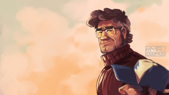
villain and violent; infant and innocent
#gravity falls#stanford pines#dipper pines#ford pines#erm erm!!!!!#cringe!!!! family pride and love cringe!!!!!#i got carried away in a magma w mason last night and then i just kinda ran w it#took it over to procreate and finished it up#anyway it was fun (⁀ᗢ⁀)#i think it's ugly now that i'm looking at it this morning but#who gives a fuck i had fun MAKING IT!!!!!#alright thanks byeeeeee#oh wait#thanks for all the love and support on my recent stuff#very much did not expect to be so welcomed by the gravity falls fandom 💀💀#but it is very much appreciated!#okay bye for REAL now#mods art#mods draws#my art#gravity falls fanart
1K notes
·
View notes
Text
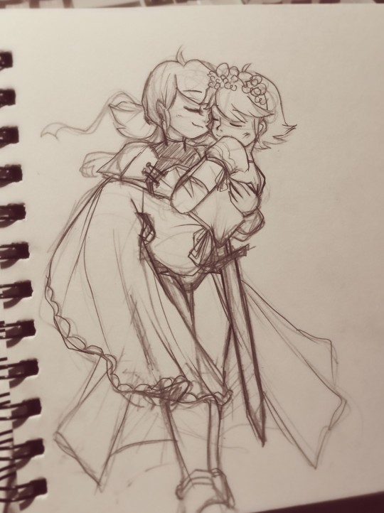
"You're safe now, my darling" The knight rescued her precious princess from the evil Gabriel Agreste
=>>Reference that inspired this piece. :3 =>>Contact me through these socials if you like! <3
#miraculous ladybug#my stuff#sketch#miraculous fanart#marinette dupain cheng#adrien agreste#adrinette#if I've known this would be blown up I could have added more lines into it but yeah... my bad huhu#adrienette#fairytale au#pencil art#art#oh my god guys this is the fastest note increasing I've ever gotten 😳#thank you all for the notes I really appreciate it 🥺😭✨😢#oh dear I just woke up and almost fainted seeing the note numbers lol#dang should have taken a little bit more time to polish it a little but still HUWWWAHH THANK YOU ALL#OH MY GOD FANDOM FIGURES LIKED THIS TOO!!??? MY HONOR AAAJAKQKQNDBDJD#btw I've always wanted to treat my future partner like this because “Love the right person and you will become their princess”
3K notes
·
View notes
Text
You know what, I don't care what anyone says, this is the funniest line and scene to me in Dragons: Race to the Edge;
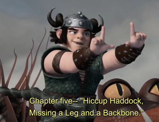
Just something about him picking fun of his lack of leg and inability to say no to Astrid's ideas for the price of one line is hilarious to me.
#also out of curiosity#what are some other good jokes in this series according to all the people who see this post?#again#I'm curious#also imo snotlout is the funniest character#and best character besides hiccup#random fandom stuff#how to train your dragon#how to train your dragon: race to the edge#race to the edge#httyd rtte#rtte#hyttd rtte snotlout#httyd snotlout#rtte snotlout#snotlout jorgenson#snotlout snotlout oi oi oi#omg that is a tag#I'm dying#i love it#lol
705 notes
·
View notes
Text
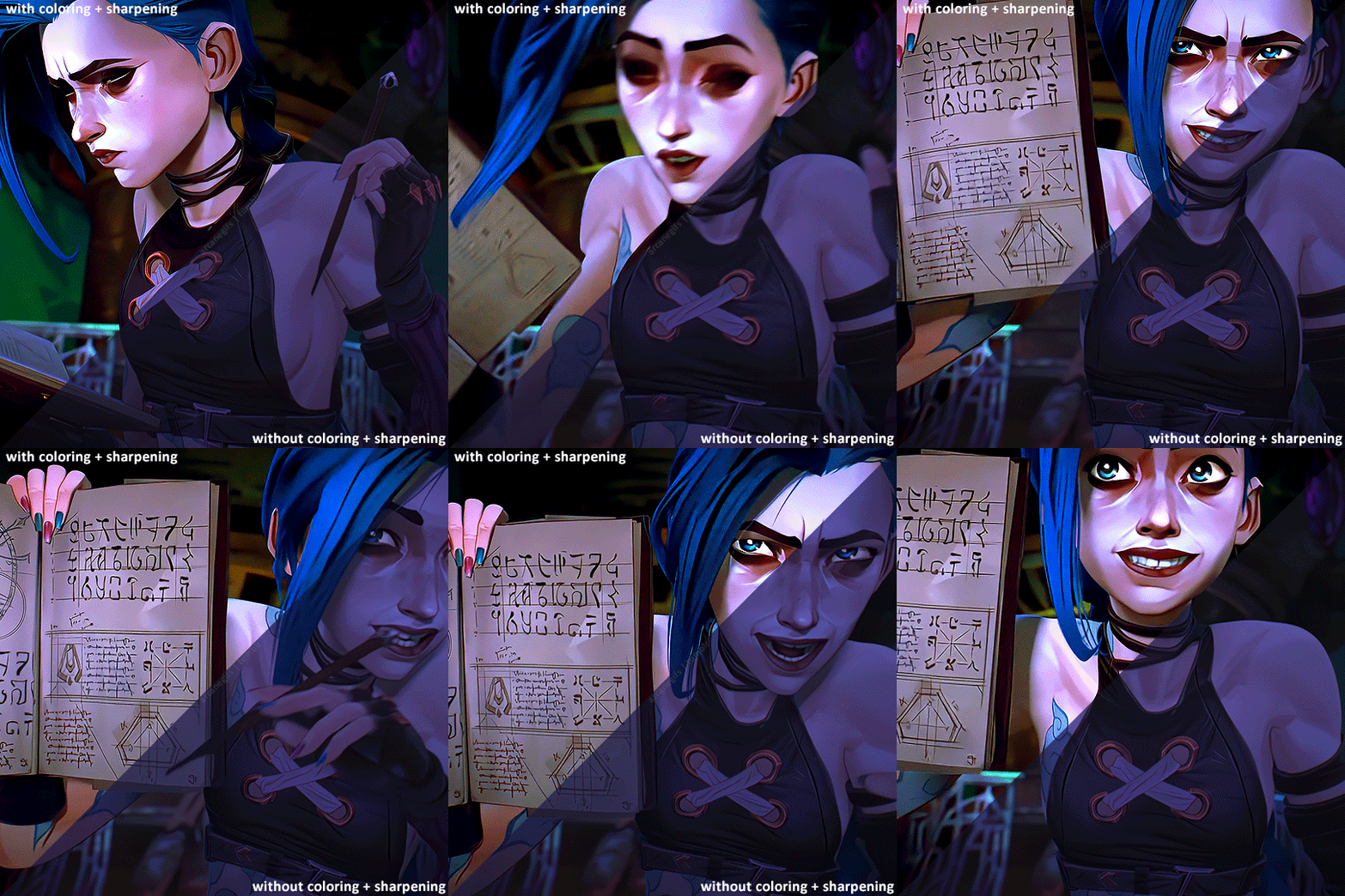
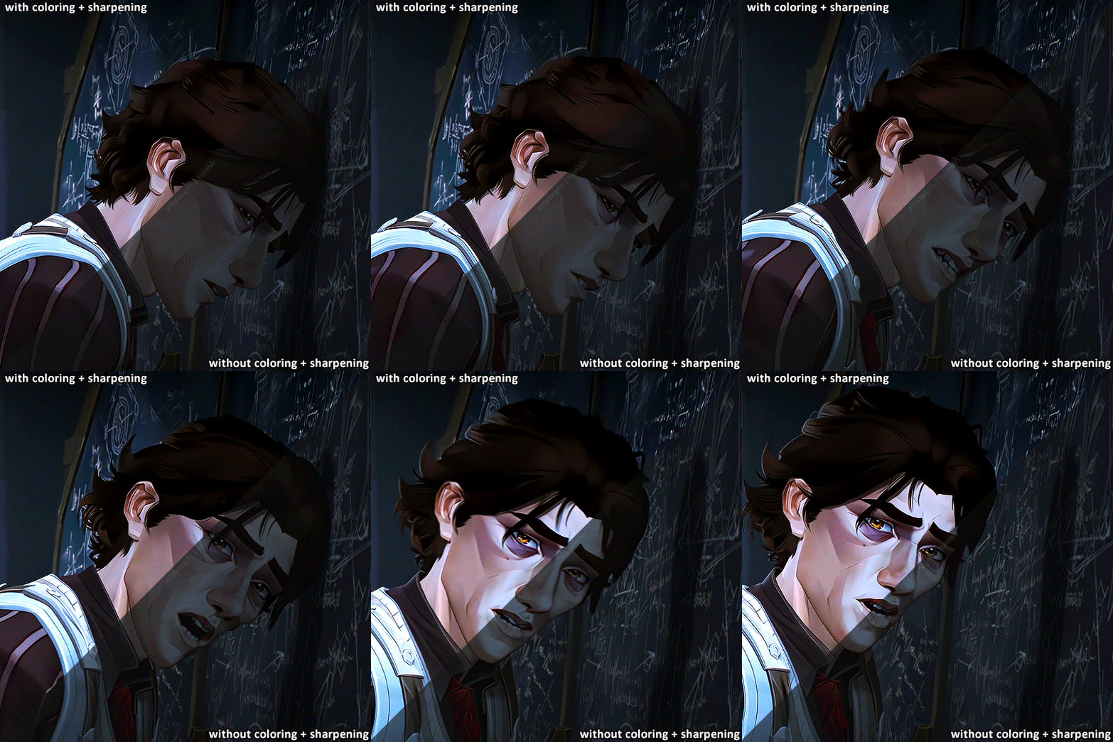
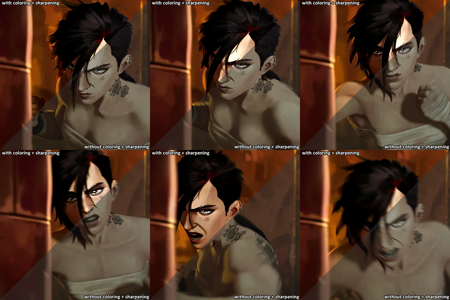
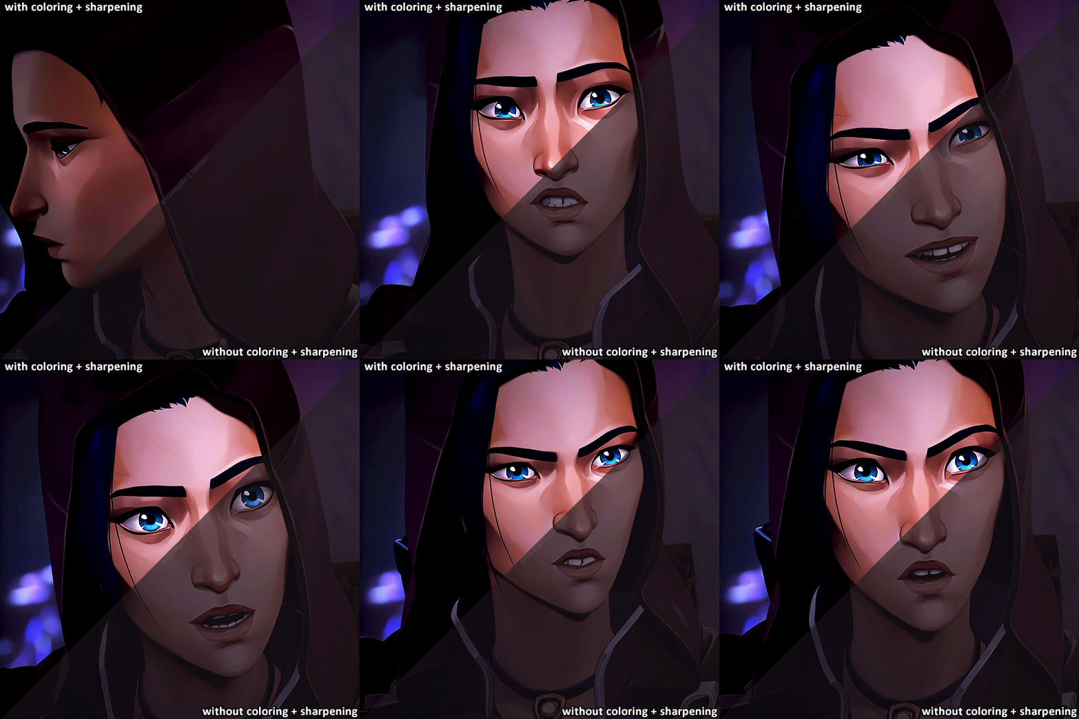
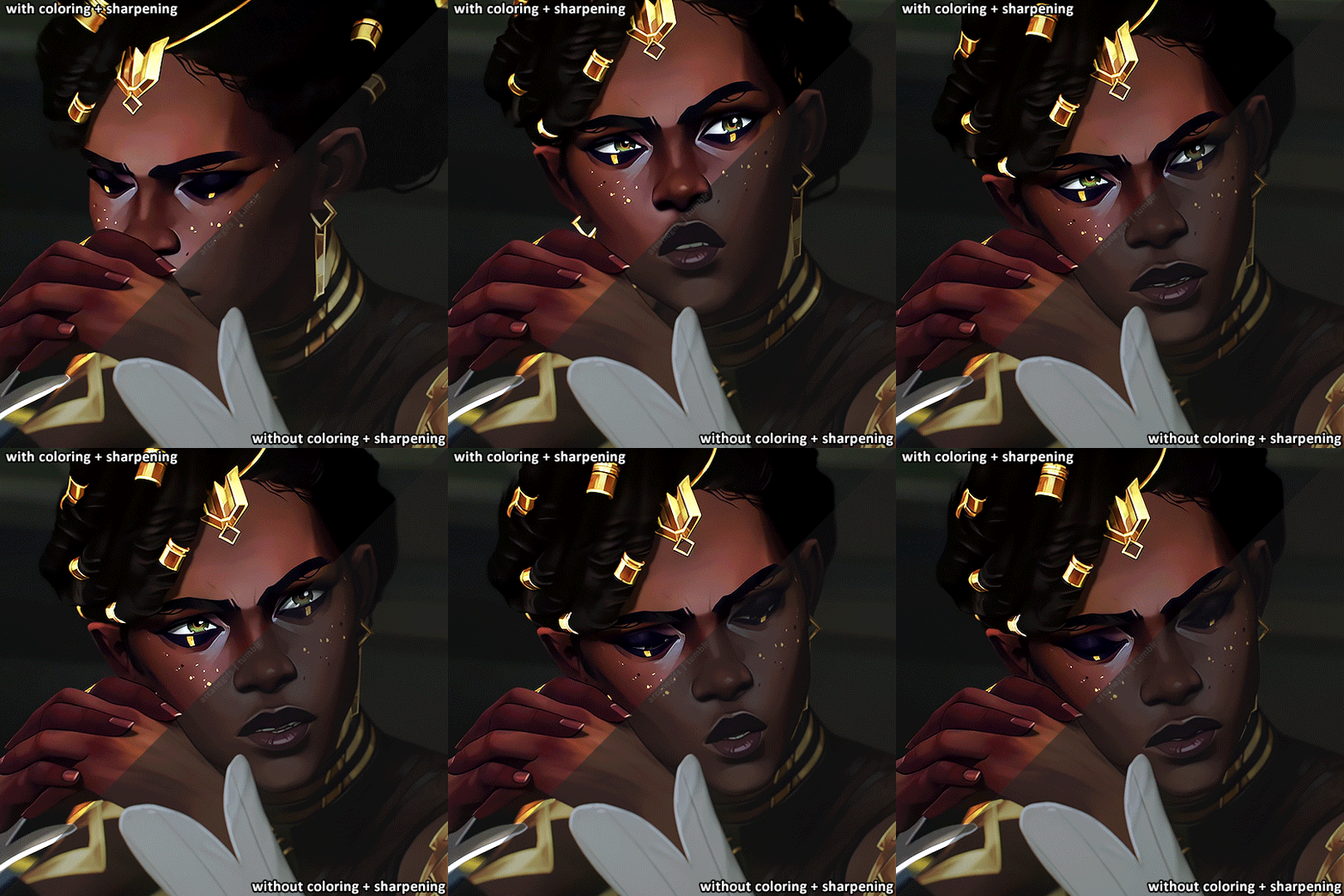
Here's more comparisons of Arcane Gifs before and after I color and sharpen em!
#arcane#arcaneedit#caitlyn kiramman#vi#viktor#caitlyn#jinx#mel medarda#mel#gifmaking#arcane season 2 spoilers#IM HELLA BORED I WANT NEW CONTENT ALREADY#do i think gifmakers color grade better than the people behind the show? nah. the show itself and gifs serve different purposes#theyre two entirely different things ngl#its just fun seeing before and afters of gif/edit coloring lol#i used to have a more stylized coloring filter on arcane but later in ive transitioned into something that’s a bit more in tune with#the original colors of the show#ngl im pretty mediocre when it comes to coloring lmao i cant do complex stuff like the other edit makers here#arcane and many shows in general are so dark lmao its always tough to color em#send some love to your local fandom gifmakers theyre all still hella disrespected for what they do lmao#also if ur not a fan of the coloring and sharpening then buzz off i dont wanna hear your opinion lmao go make gifs yourself :D#personal tag
928 notes
·
View notes
Text
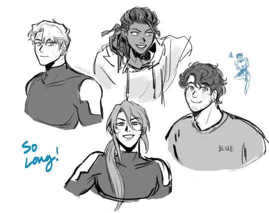
Felt a bit nostalgic watching RT shut down…Here are the og faves again for old times sake 💙
#rvb#agent washington#agent Carolina#lavernius tucker#michael j caboose#epsilon#my art rvb#ahhh a lot of feelings…of course I stepped away from rt as a company a long time ago#but RvB is special to me!! it was my first fandom experience ever#and the community here on tumblr specifically was so instrumental to me growing up#I really could not have asked for a better community of artists and writers to grow up in. I know it sounds like platitudes when I say#that everyone was super nice and talented but REALLY. People were so kind to me and somehow I became well known despite#my art and writing and me in general still being immature and hashtag cringe#I found my creative legs and#people would respond to my stuff with walls and walls of support in the tags and we would do exchanges and events every year#I made my first lyric comic and it’s still doing extremely well on YouTube even today!! my dad who passed away recently always loved it#and my favorite RvB writer came out of hibernation to write me a bunch of text wall asks about it#I’ve never had another fandom experience quite like RvB#I still keep in touch with many of my friends from that time period even though we’ve all moved on the other things#these guys will always always have a place in my heart#so long reds and blues….
1K notes
·
View notes
Text

jealous! viktor x reader (headcanons + tiny scenarios)
summary: viktor sees you talking with a friend and get jealous.
content warning: idk if it counts as a cw but jealousy?? also, i made with s1 viktor in mind!
author notes: heyyy, so sorry this one is little, im still trying to find motivation after the end of the series but i think it turned out cute! thank u for the request and hope u like it!! :)

» it was a common sight to see you walking up and down piltover’s academy, working or just chilling on lunch breaks, but every time viktor would approach you, you were already with someone. sometimes an unknown person, other times with a friend, laughing and joking, touching them in such a sweet way, side by side in the aisles.
» he looked at you both, blood boiling and shaky hands. if you looked at him, it was possible to see his lips forming a thin line, brows furrowing, his left eye almost twitching. oh, he was jealous.
» he felt angry at himself to feel like this, he didn't mean to be jealous at all, but he wanted to steal you away, just for a second, and be the one by your side, be the one you smiled to, the one you’ve been touching so sweetly.
» he wanted to reach for you, to interrupt your silly conversation about whatever you two have been talking about, he wanted to share his new discoveries with you, he wanted to be in their place so bad.
» but he couldn't complain, not when you waved a goodbye at your friend, and turned your body, recognizing viktor, eyes lighting up immediately, smiling from ear to ear.
“viktor!”, you shouted, voice echoing in the aisle while you walked to him, “i’ve been looking for you all day. you wouldn't believe what happened!”
he looked at you, expression softening, eyes shining, mimicking yours, his thin lips now turning into a little smile, “yeah? tell me."
» soon all the jealousy melted away, now, he is the one walking by your side.
#—swe writes#league of legends x reader#lol x reader#viktor x reader#arcane x reader#i should thank my friend this time bcs they helped me on this one#i didn't like how it turned out and was erasing and rewriting and easing and#but if my friend says its good then its good#thank u friend#so sorry if some of you guys read my tags and all my post have the same thing#< “thank u friend” and stuff like this. but they really help me out all the time#this is why i always thank them#they aint even part of the fandom! i just rant about arcane to them all the time#love my friend dearly <3#anyways!! sorry if this one is tiny. my motivation is almost zero these days#school stuff has been hard but its fine! at least i can write sometimes :)
371 notes
·
View notes
Text

some things were meant to stay dead
This man is full of trauma and we love to see that
Soleil from GiTM by @venomous-qwille
#little thingy#fnaf daycare attendant#fnaf dca#dca fandom#fnaf sun#sundrop#soleil#ghost in the machine#ghost in the machine Soleil#gitm soleil#gitm#i love him and all the psychological stuff about him#there's so many small detaiols i'm missing out on because I read gitm only twice#I'll eventually fix it bcs goddamn am I not normal about this universe
573 notes
·
View notes
Text
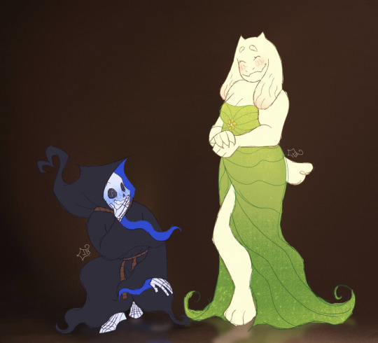
saw this stupid asa stock image and IMMEDIATELY thought of these two lovebirds

also lowkey how are they so underrated when they're canon. im thirsting for more content of reapertale soriel please you guys or ill explode
reapertale belongs to @renrink
#utmv#undertale#undertale au#utmv fanart#inkblott#sans undertale#toriel undertale#sans x toriel#reapertale#reaper sans#life toriel#reapertale soriel#soriel#i will never understand why the fandom poured all of it's love and attention to afterdeath#it makes me wanna cry im ngl#reapertale soriel is so sweet to me#i love afterdeath but i really want more rt soriel#id even take more lifeafterdeath stuff#i just want yall to include my gorgeous gal please#:-(
573 notes
·
View notes
Text
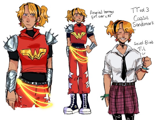
Cassie Sandsmark they could never make me hate you. Even if they’re trying. Really hard
Also idk if Greta and Cassie were technically roommates at Saint Elias’s but who else would it be. They’re buddies. Bonds forged in Yj are unbreakable unfortunately
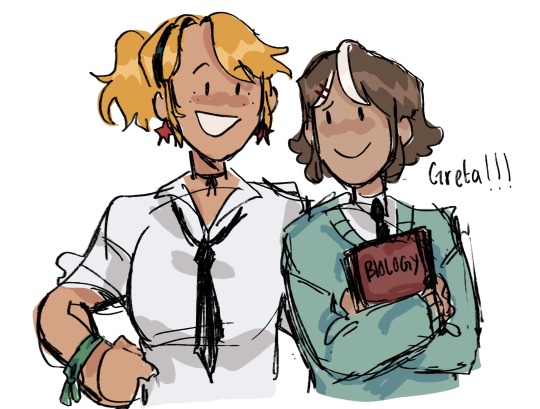
#art#cassie sandsmark#wonder girl#greta hayes#dc comics#I do like some of the concepts. the execution was um. not great#but I can rip the cool shit from it and ignore the rest like you wouldn’t believe babygirl#I do like the idea that she got a new all red suit to honor Donna. I do not like the suit they gave her but still#fun idea#I love the idea of Greta and Cassie being roomies tho#cuz obviously cissie and traya are roommates. and who else would offer to room with a superhero#alos greta doodle! I don’t have a ghost design down for her but her alive self is easier#yea I gave her a white streak cuz of her resurrection . no don’t ask me what fandom I was a part of in 2021#the friendship bracelets are for the Yj boys btw. green for rob red for impulse and blue for kon#she’s got other stuff for the girls (Anita cissie and Greta) but I haven’t decided yet#THE HEADBAND IS FROM CISSIE THO. the communal headband#all the girls (and also bart) have used it#they just pass it around
875 notes
·
View notes
Text


haha heyy its been a while 😭😭 sorry for the lack of activity here,,, school has been kicking my butt + i've gotten SUPER hyperfixated on disco elysium,,,, BUT THE MOMENT I SAW THE ORIGINAL I KNEW I HAD TO DRAW SAM AS THIS RAHSBBFBDN i seriously need to catch up on the recent audios 😭😭😭 ANYWAY enjoy :)
vvvvv ORIGINAL BELOW vvvvv


shhhhghhshhshhsh youre telling me this ISNT sam??? like????
#redactedverse#redacted sam#redacted audio#sam collins#redacted asmr#my art#god seriously my disco elysium hyperfixation has gotten so bad#its a seriously good game you guys#i love harry and kim and jean and judit and RAHDHHDBF#i was hesitant on posting more stuff on here cuz ive gotten traction for my redacted stuff so#i feel like if i post more art people would expect more redacted stuff from me which im not as hyperfixated on anymore 😭#but then i realised i shouldnt think that way#THIS IS MY BLOG#YOU CANNOT COME INTO MY HOME AND ASK ME TO CHANGE THE COLOUR OF MY CARPETS#so ALL IN ALL THANK YOU SO MUCH FOR ALL OF YOUR SUPPORT!!!#I HOPE YOU DONT MIND IF I START POSTING FANART OF OTHER FANDOMS!!!#anyway SAM COLLINS THE MAN THAT YOU AREE AHDNDNGNNDF#im still not over you.
636 notes
·
View notes
Text

I was always the #1 ivor fan
#my stuff#fanarts#minecraft story mode#mcsm#ivor#update 9.15.24: I did not expect this post to get this many notes lol. we can all love Ivor together#last time when i posted something mcsm related... i think the fandom was deserted or i just wasnt looking in the right places#probably was the latter because i was like 12 or 13 and stupid
345 notes
·
View notes
Text
I haven’t drawn a human in 8339849 years
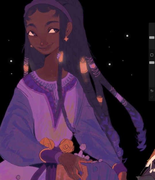
#disney wish#the movie kinda eeeeeeeeeeeeehhhhhhhhhhhhh ;;;;;;#BUT#I read the concept book#that movie concept has me#starboy could’ve been this generations Jack Frost frfr#like#HHHHSHDHDGGGGGGGERRRRRGRGGRGRGRGGRRGR#one of those we could’ve had it all moments#and if you wanna see it you gotta do it yourself#I love fandoms that welcome so many aus of stuff#have one of many#art#piggy oinks#doodle#myart#artwork#illustration#my art
857 notes
·
View notes
Note
Can we have some drawn out affection scenes?? If not that's fine! Also thanks for all of the info you have given us so far! I hope you get plenty of rest and comfy things. :>

i will be drawing more of this
#ill get more stuff sketched when i have better ideas but you can have a few of the affection ideas i had in my last ask for now#also yw !!! i love this au i love talking about it. all questions continue to be ask-able :3#xanbox#xanchats#food for thought au#fnaf#fnaf sb#fnaf security breach#security breach#fnaf moon#moon fnaf#fnaf sun#sun fnaf#dca sun#sun dca#dca moon#moon dca#dca y/n#dca fandom#dca au#dca x reader
182 notes
·
View notes
Text
Why I think Shiguang can be canonically read as romantic
(I will only be using the donghua for reference, so no Studio Lan retweeting those fanarts (lmao) nor those especially gay manhwa panels (lmao x2) nor even the songs ("chase you to the end of the world, just to say your name once more" my beloved).
It's important to start off by saying that I'm aware Director Li said they ended up not making Lu Guang a girl because they didn't want romance to be seen as a must in Shiguang's relationship by the audience (and because he feels that "bros can have a good heart-to-heart connection with each other"). In my opinion that was a great move since it allows more freedom with how they write them than they'd have otherwise. I also think viewing Shiguang as queerplatonic is a great read too and it doesn't diminish their love for each other nor the importance of their relationship at all.
With that said, despite Director Li's words, there's been things that had me going 🤨 as someone who likes to adhere to canon relationships and read into the writer's intentions, so I wanted to share why I personally see them as romantic.
EPISODE 2
We've all seen this coming, right? Most obvious parallel ever, and in the second episode no less. We all know the similarities between both relationships, so I will just touch on those I consider the most important ones.
Lin Zhen and Yu Xia have gone to college together, and since then decided to start a business of their own - named after a mix of their names. They've been shown as being really close and having no romantic relationships. Lin Zhen also says that Yu Xia's happiness is her own, and then it's shown to us that she's gone through years of unhappiness just for Yu Xia. I believe you can replace their names with Lu Guang's and Cheng Xiaoshi's in your head without me writing all this again. And I'm not even going to get into the most obvious parallels like the special noodle recipe for each pair.
I think it's safe to say that Lin Zhen and Yu Xia are implied to be romantic. From that "one noodle" scene, to the close shot of Lin Zhen grabbing her hand, etc.
Now, I want to get into a writer's point of view and pose two questions:
1. What's the purpose of this episode, when even those which seem episodic connect to the overarching plot of season 1 (even the missing kid's case, as it leads to the involvement with the police)?
2. If we answer the previous question with the conclusion that it's meant to show us the nature/development of Cheng Xiaoshi's and Lu Guang's relationship, what does that say about it?
"Partner" in Link Click
Continuing with episode 2, what really got me thinking about the romantic intentions in their writing was the constant mention of marriage and anything in relation to it.
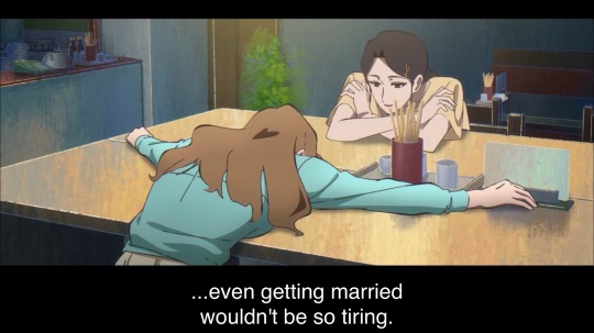
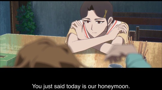
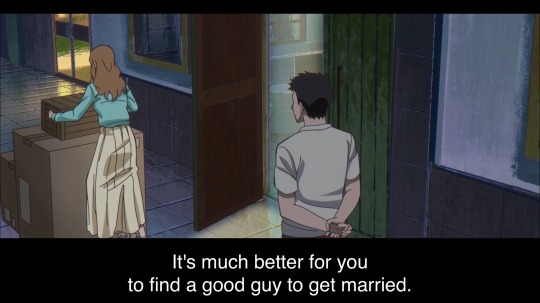
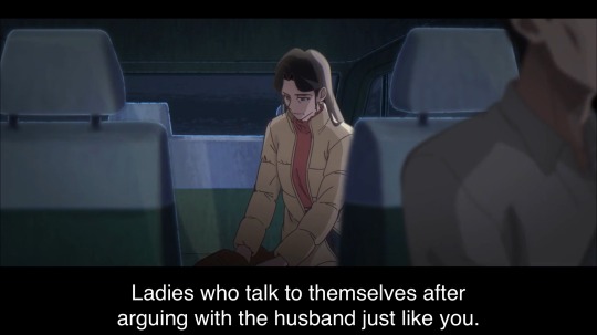
(may I remind everyone that the driver's comment was said when Cheng Xiaoshi was complaining about Lu Guang lmao)
They're telling us through "show don't tell" (for example, when Lin Zhen kept on eating the noodle despite knowing they'd kiss) and, also, connotations. They are presented to us as business partners, but then the entire episode goes on to tell us that there's more to them by tying their relationship to things percived as romantic. So what they want to really tell us is that beyond simple business partners, they're life-long partners.
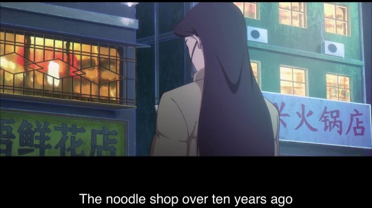
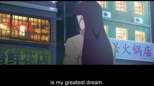
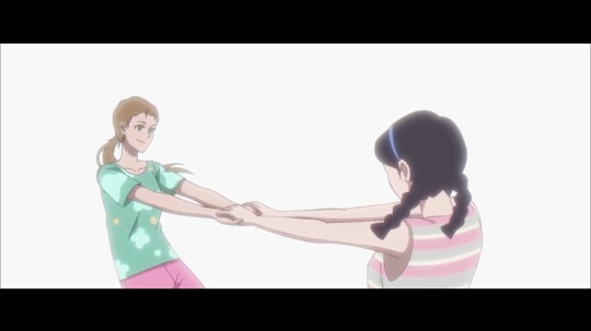
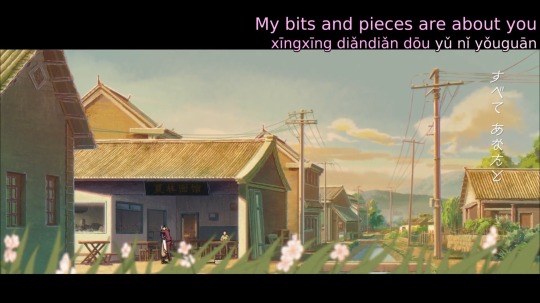
And then, after establishing this kind of connotation to the word partner, Cheng Xiaoshi says this to Lu Guang in the next episode:
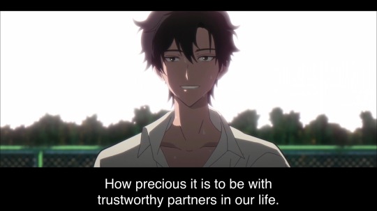
This doesn't stop at them. While it's the most obvious example, I think partnership in Link Click is intended to be seen as romantic, or at the very least dancing somewhere close to it. Let's go even further and take a look at our fully canon, heterosexual relationships and see briefly how their story is written:
1. Dong Yi and Xu Shanshan: both of them chose the comfort of each other's presence over moving on with their respective futures. Dong Yi had so much faith in their relationship and their love that he couldn't choose a life/future that didn't have Xu Shanshan - choosing to not go back to his family home nor go to that interview, and instead waiting for Xu Shanshan to define their relationship.
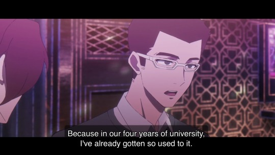
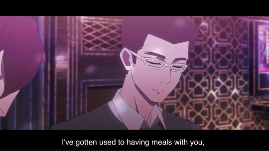
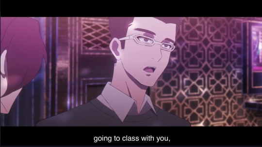
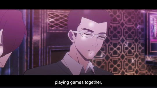
2. Liu Siwen and Ouyang: Siwen spent his entire life training with the purpose of getting his father-in-law's respect and marry Ouyang, going every year over and over to fight him. His perseverance and his undying love for her allowed Siwen to do the (seemingly) impossible.

3. Chen Bin and his wife: they're a tragedy. His wife understood Chen Bin the best, enduring feeling lonely because she loved him and wanted a future with him. But their relationship was cut short, so they promised each other to be together in a future life to make up for the time they wouldn't be in this one.
With this + the pictures I attached, it seems like Link Click has set this theme of "love is a life with you" for its romantic relationships, a partner that will fight to stay because they can't see a future that doesn't have their beloved. Going back to episode two, this applies even to the noodle ladies. When Yu Xia remembered what actually matters to her, she went back home - to the start, to her hometown. And, most importantly, to Lin Zhen.
So why is Shiguang romantic? Why aren't they queerplatonic, or just best friends, or bros or whatever else? Because besides what I said at the start of the previous paragraph, Shiguang's relationship mirrors a lot of the romantic ones. Each story and author writes romance and other kinds of relationships differently, portraying them in the way they perceive "this is what this kind of love is like". And beyond life-long partners, I think that the key elements of romantic relationships in Link Click are the ones I highlighted in bold above in the 3 canon relationships part - which Shiguang shares, too.
(I didn't mention this before with the het couples, but I find it a little amusing that season 2 happened because a man wanted to go to the past and get his wife back (still fuck you Qian Jin) and then we find out Lu Guang did go back to the past and got his boyfriend partner back lmao).
"Friend" vs "Partner"
So where is the boundary between platonic and romantic? What marks the difference between a (best) friend and a partner?
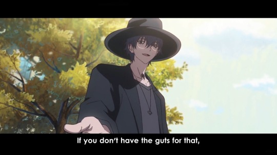
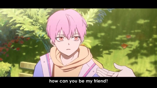
There is, for example, Liu Xiao and Li Tianchen's relationship. They aren't shown to have any kind of romantic undertones and there's even the very real possibility of manipulation on Liu Xiao's side. They're also never labeled as nor call each other partners, but instead Li Tianchen says he "met a new friend" and Liu Xiao says he's "going to meet an old friend" years later. So we could say for now that they have a somewhat close relationship (we see Li Tianchen go against Qian Jin to give the phone to Liu Xiao), but never cross that "friend" label.
We can even bring Qiao Ling and the boys' relationship. She's never labeled as a partner despite taking part in the side job and, more importantly, being super close to both of them. She is very important and a cherished friend to Shiguang, so why not call her partner too? I think it's intentional. Since she's been given a familial role already (calling Cheng Xiaoshi her brother when talking to Li Tianxi), she can't fill a partner role. I wonder why? because it's supposed to be a synonym for a romantic relationship. who said that.
So even best friends (Qiao Ling, arguably what Liu Xiao is to Li Tianchen) don't enter this close space that is being a partner. It's different, it's beyond platonic. Or at least that's what they've been showing us for the past two seasons.
I could go soo much more into this honestly, because I do think the little hints thrown here (the music videos) and there (tiny seemingly inconsequential details) are worth to be looked at too, but I wanted to get into the core reason that makes me go "woah so they're In Love fr". I hope I expressed myself well ^^
tldr; the series shows us a divide between having a (best) friend and a partner, giving "partners" romantic connotations.
#again!! all this is why i personally think they lean more on romantic than platonic#i think seeing shiguang as queerplatonic is a valid read too#they just write love (in general) very beautifully in this show so i wanted to put my two cents#also while writing this i realized i could yap more about s1ep2 beyond the romance stuff. i love it a lot#also!! i'm aware the word partner in general has romantic connotations sdfjhgk but link click makes it so that it's Just. romantic ykwim#ALSO sorry to yap here but sorry if anything i said has alreaady been said before 😓 i've been a bit out of the fandom#anyways. shiguang <3#link click#shiguang
198 notes
·
View notes
Text
*A portal appears in the Cocytus Hall kitchen and Barbatos steps through it.*
Barbatos: Time for another surprise inspection…
*MC and Solomon are sitting at the kitchen table eating dinner in matching pajamas with their matching tableware and little matching hair clips in*
Barbatos:….am I interrupting something?
Solomon:*Grinning* No, not at all!
MC:*Looking at Barbatos and shrugging* It makes, Solomon happy.
#this is literally all I can think of everytime Barbatos says he’s going to do surprise inspections at Cocytus hall bsjsjsj#Solomon and his love for matching everything with mc#ro’s dumb stuff tag!#obey me!#obey me#om!#obmswd#obey me nightbringer#obey me solomon x mc#obey me solomon#obey me barbatos#obey me mc#obey me crack#obey me shenanigans#obey me shitpost#obey me fandom#om! solomon#om! barbatos#om! mc#om! crack#obmswd solomon#obmswd barbatos#obmswd mc
2K notes
·
View notes