#i kinda redesigned them a little bit but some stayed the same
Explore tagged Tumblr posts
Text
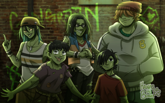
✖— WE'RE THE GANGREEN GANG! —✖
#i kinda redesigned them a little bit but some stayed the same#namely grubber because i have zero clue what to do with him tbh lolol#also arturo / snake are fine the way they are so i only made a couple tweaks to them#genderfluid snake/ivy ftw#i kept ace's 80s vest but tbh i dont really like the orange + blue on him#maybe i'll fix that at some point idk#anyways. here they are lolol#ppg#the powerpuff girls#gangreen gang#ace copular#snake#big billy#lil arturo#grubber#digital art
121 notes
·
View notes
Text
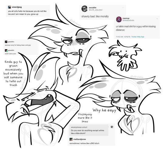
Surprise! I am going to rant about my own redesign and art! I think this is me mentally preparing for the helluva boss episode next week and praying to god it’s actually good. I’ve also been nursing a bit of a hangover today so forgive me if my wording is a bit more jumbled than usual
Im a big fan of my Angel Dust redesign, but in the general aspect of my art, a lot of my poses are a bit flat. That can be from either posing issues on my end, trouble with facial features, or just some secret third thing, but I think so far Ive been enjoying drawing much more cartoonishly as of recent. That vox canon & headcanon drawing was super super fun to do even though it was supposed to be vivzies style, but I used to have a style with more sharp angles and pointy curves that I honestly kind of miss, I also miss playing with cartoonish proportions!!
My art style may end up changing eventually, but my main pieces will stay in my usual style and my more doodle-y ones will probably be in a more cartoony style like the ones above. While theyre definitely closer to canon and meant to be inspired as such, the difference is that I can draw diverse body types in said artstyle! I also cant lie, Angel’s chest fluff is one of my absolute favourite things to draw and it’s so easy in this style…
About my redesigns though! This is mostly about Angel, but I’m gonna slap this here from DMs with a friend: “Im so pleased with this genuinely im so happy he has his little pedipalps, theyre technically also still his fangs but now he can move them and stuff and :33 typically for male spiders the pedipalps are a reproductive organ but that isnt the case for angel or many other arachnid or insect sinners id say so I think personally most of them have developed pedipalps for primarily other reasons like fangs in Angels case or maybe something similar to cat whiskers for other people”
In my original angel dust redesigns I just couldn’t find a way to draw his fangs in a way that made me happy because I want to keeo the same energy in his face as the original. Big clunky fangs that stick out just didn’t work for him and while they made him look like a spider, he lost that sort of angel-ness that I need when drawing him so I instead looks to the pedipalp aspect of spiders to move them off of his mouth and more onto his cheeks. It’s a very small change but it improved the design in my eyes significantly and just really made me a lot happier. I wont be updating his redesign post as of right now and maybe never will, but if I do yknow why now!
I just really really like drawing this guy a bit rubbery, hes supposed to be fluffy so like he should move kinda soft in a way? I dunno how to explain it rn, its 2 AM at the time of writing this so im gonna lay the hell down now!
#hazbin hotel#hazbin critical#hazbin hotel criticism#hazbin hotel critical#angel dust#hazbin angel dust#hazbin angel#anti vivziepop#angel dust hazbin#angel dust hazbin hotel#angel dust redesign#hazbin redesign#hazbin hotel redesign#my art#will add alt text later
136 notes
·
View notes
Text
I loved Dragons Rising Season 3 Part 1 but I do have some issues. In this post is my main issue at the moment.
SPOILERS KINDA, NOTHING BIG THO!
Where is MiniPix Seven?! I expected her to be with her mother but she isn’t there and Zane and Pixal aren’t even worried?! Pixal watched the other MiniPix die yet when learning that she awoke from the Nindroid equivalent of a coma she doesn’t ask where her daughter is or looks for her? Not even a single mention of her! Maybe she is in her own miniature pod somewhere possibly in the monastery that Pixal was in. Some of my friends have also theorized that the directors forgot about her or because a lot of people disliked Crystalized they retconned her out. I hope not, I liked Crystalized but that’s not the point, I also am fond of MiniPix Seven. She is adorable and I love the idea of Pixal, Zane, and MiniPix Seven being a little family. So I suggest we beg for her to return and maybe get an equivalent to the Sonic Movie redesigns and have them change their minds and bring her back. But for now enjoy a bit of fanfic writing on my idea of Zane and Pixal looking for their daughter.
Zane held Pixal in his arms as he flew to the monastery that her pod was found in. He landed in the courtyard and gently but swiftly let her down. Not long after the ninja celebrated the defeat of Thunderfang, Zane and Pixal had let Lloyd know of their plans and left the moment he gave the nindroids permission to go. They had already thoroughly checked the site of the train crash for any sign of MiniPix Seven but found nothing. As Pixal ran through the entrance, Zane ducked under the doorway to follow her. “MiniPix Seven? Are you here? Can you hear me?” He asked, trying to remain calm but dread still could be heard from his voice.
Pixal turned to her husband. “Zane my love she likely cannot hear us.” She said in a dire tone, yet also still in that sweet voice that Zane adored. “You and I were both found deactivated in pods so most likely the same is true for our daughter.” Our daughter, Zane thought, yes our daughter, although the MiniPix were made to be assistants for Pixal, she, just like her father with her, had grown to love them like a parent loves their children. After the tragic death of the rest of the MiniPix, Zane had watched as Pixal made upgrade after upgrade to MiniPix Seven, wanting to make her stronger, harder to kill. She wasn’t allowed to grieve when it happened, the world needed the ninja and Samurai X, so Pixal had to be strong. Zane remembered the night when Pixal finally felt as though she was able to grieve. They were staying with Cyrus Borg in Borg Tower while plans for the new Monastery of Spinjitzu were being made. Pixal had practically thrown herself onto him as she sobbed into his chest. Zane held her, comforting the woman he loved. Zane was built to protect those who cannot protect themselves, Pixal was built to assist. Zane protected as the Titanium Ninja and Pixal assisted the ninja as Samurai X, they were partners yes, but they were also lovers. And then, when Pixal sobbed about feeling like she failed her children, he held her, rubbing her back and rocking her, like she does for him when he has panic attacks, when the room fills slowly with frost as he loses control of his emotions and powers, when he saw the blood of the countless people he had killed as the Ice Emperor, Pixal was able to make it all go away, she knew his mind after all. Yes, Pixal was made to assist, but at that moment she needed his assistance just like sometimes he needed her protection. As time passed, Pixal grief began to fade, but never disappeared. She had become extremely protective of MiniPix Seven, yelling at her own teammates whenever they did something that Pixal deemed to dangerous around her little one. And of course as Pixal’s boyfriend, Zane was a part of MiniPix Seven’s life. The little droid had quickly warmed up to Zane, playing with him, sharing a room with him and Pixal, and even accompanied them often. She wasn’t his child, but she was Pixal’s, and that was enough for Zane to love her as his own.
“Right yes, of course. My emotions must have clouded my logic parameters.” Zane replied as he remembered the day MiniPix Seven accidentally called him her father. At the time, besides him, Pixal, Nya, and Jay, the team was still slowly learning what her beeps and chirps meant, but Zane heard it clearly. Zane knew he wanted to marry Pixal, so if Pixal’s daughter saw him as her dad then he’d be her dad.
“She’s not anywhere up here!” Pixal cried out as she and Zane rushed to the elevator down to the hangar bay. Zane reached out, his claw wrapped around Pixal’s hand. He felt her thumb rubbing against his claw and he felt her titanium wedding ring, his own ring was on a necklace that he was wearing as this new body did not allow him to wear it normally, this new body also didn’t allow them to have intercourse, a bonding activity which both he Pixal enjoyed very much. Thankfully this body was only temporary until Pixal could repair the vast damage that was inflicted on his normal one. He looked at the markings on his ring, Zane and Pixal in their line of work needed repairs and replacements often, and instead of tossing scraps of his and Pixal’s skin or well the metal that protects their endoskeletons and wires that they called skin was repurposed into their wedding rings, his ring was made of Pixal’s scraps and her ring was made of his scraps. It was gruesome to many but to them it was a way to keep each other close. His thoughts were interrupted by the elevator doors opening and the two rushed out, looking desperately for their lost child. They noticed boxes that were likely a result of Rampton and his freebooters planing to make a second looting trip. They sat down and looked in every box until Zane heard his wife gasp.
“Pixal my love, what is it?” Zane looked up at her, seeing a small pod in her hands. He immediately grabbed Pixal by the waist and pulled her to sit with him on his thigh as he sat crisscross applesauce. Pixal activated the pod and as it opened, Zane and Pixal cried tears of relief as they saw MiniPix Seven. The little droid buzzed to life and soon the pod was discarded as Zane and Pixal held her. “Oh my little one, me and your mother were so worried about you!”
MiniPix Seven took a moment to take in Zane’s new form but she almost immediately recognized her father as well as her mother. She chirped happily. “Mama! Papa!” She said with her little chirps, gibberish to many, but music to her parents’s ears.
“Oh my sweet baby!” Pixal cried. “I thought I lost you! I can’t take the thought losing another child!” Pixal felt Zane hold her tighter. For her it was a few days not knowing where MiniPix Seven was, for Zane it was years not knowing where his wife and daughter were. Regardless, the three of them were finally together again. As she leaned against her husband she noticed his ring and smiled, they were married, not legally, as nindroids they weren’t legally people either. But they loved each other and they loved their daughter, and years with the rest of the ninja had taught them that love is what truly makes a family. Not the law, not biology, just love and only love, and that’s all that mattered to them.
#ninjago#lego ninjago#ninjago pixal#pixal ninjago#pixal borg#ninjago lego#pixal my beloved#zane julien#ninjago zane#zane ninjago#minipix seven#minipix ninjago#minipix 7#ninjago minipix#minipix#minipix and mama pix#ninjago pixal borg#zane x pixal#pixal x zane#justice for pixal#pixal is the best#pixal supremacy#ninjago zane julien#zane borg#zane is one lucky bastard#Zane is a family man#zane master of ice#lego you cowards give us a nindroid wedding#a mated pair of nindroids#nindroid family
13 notes
·
View notes
Note
Hewwo! You wanted mlp rw asks I hope you don't mind me putting a buncha stuff in one ask here hehe
- Ramble about CMCs maybe! How do they get their cutie marks? What's changed from canon? Do you have ideas for Diamond Tiara and Silver Spoon? Do they ever attend Twilight's school maybe?
- Is Owlowiscious around? Are you keeping all the pets in general? Do you plan to redesign them at all, or are they staying pretty much the same?
- Curious to hear more about the Student Six, at least what you've figured out so far!
- I believe you've said before that the school is kinda just Twilight's thing here and I'd like to hear more about the other mane six's jobs :0 some of them are a bit obvious I guess but I always found it kinda funny that Pinkie's got so many potentials like. She briefly did some babysitting, she often bakes, she's mainly a party planner, etc. But anyway yeah like what are their jobs how're their businesses doing lol and just any notes on that that you might maybe have. Also Starlight I guess like does she have a job?
- Got anything you haven't said yet about the changelings? I know you love them, just kinda wondering if there's any details you've thought of that you've yet to share! Or maybe some little Sunrax headcanons
- Any more worldbuilding notes? More on the magic system in general, or on different locations or species or..? Just uh anything relating more to the world overall
Just stuff from the top of my head I guess. Feel free to ramble as much or as little as you want :3
SMO MANY,,,
1: honestly not many ideas for changes bc I enjoy them as is in canon! I do like them getting their marks simultaneously so I think the episode would moreso have them individually show their talents off in ways/as they help Diamond and the other students, and it would cumulate at the end w them getting their marks! I can have my cake and eat it too they can have matching And individual marks at the same time :3 for more specific stuff uhhh no scoots parents stuff here they just live w their aunts I think their parents would be a soos gravity falls dad situation like they send letters talking about their missions and all as a excuse. As for diamond and silver!! DT I’ve not rlly thought on BUT silver I’m combining with twist, so she used to be apple blooms friend, got her mark, and suddenly DT stopped bullying her and basically friend adopted her now that she was part of the cm havers (her spoon CM/name initially was a baking thing but DT saw it and assumed it was a decorative/fine china kind of thing and SS wasn’t bothered to correct her bc hey she’s being nice to me now)
2: keeping all the pets yes!! I loveee them sm I never thought to redesign them but i definitely will now eeee I love animalsssss grahhhhhh
3: current student six (or well 7) line up!! Yona (goat), Sandbar (Kelpie), Gallus and Gabby (siblings, griffin), Smolder (dragon), Ocellus (flutter pony (changeling/pony hybrid)), and Screwball (Qilin (draconiquus/pony hybrid)(same species as kirin in mythology it’s just a different name/the Chinese interp of the animal so it fills same role as a dragon/horse combo but I don’t step on the mlp kirins toes and shows that disc isn’t a regular dragon ofc)) only change was just changing some species so they’re all non ponies plus got rid of silver stream only because im just. Not a fan of the hypogriffs I don’t even have a reasoning I just have never been a fan of them <\3 plus sandbar is already water themed in name/design so like? Why not just use him? Plus dropping one member have me two slots open for wiggle room (hence gabby and screwy :3)
4: aj has the farm ofc, rainbow is a wonder bolt, rarity has the boutique, flutters in canon has her sanctuary but I can see her opening like a home run vet? Animals coming to her and or ponies w their pets coming to get help, also off topic but idk if I ever mentioned it but my flutters lives in the everyfree! I’d like to think post redemp disc protects her/the domain from the more dangerous animals and in turn protecting ponies coming through to her vet services n all. Pinkie by this point in timeline I can see probably having the knot tied with twi so like you said I can see her with a lot of jobs! I like to think she part times at the bakery as well as her party planning but I think her party planning is more a commission/appointment type schedule vs her bakery helping is more consistent/general, plus her baby sitting was more to me I think just her way of helping the cakes bc they had to run to store vs in this timeskip w their school the cake twins are probably adults or at the least late teens by now (bc the student 7 are teens yeah but like prettyyyyy young teen age range id think, the ship kid duo of ocellus and screwball id think ocellus would be older vs screwy being younger BUT screwball doesn’t have to exactly go on perfect timeline logic bc i hc she was magic made by discord rather than naturally born, so maybe disc proofed her up at a bit older age like 1 year old or so rather than just conjuring up a actual infant LOL yk?) all of that to say pinkies baby sitting isn’t really on the table anymore bc it to me was more just for the cakes (who are basically her second parents so ofc she’d wanna help them) as for starlight I do really like her being a guidance counselor I think that’s very fun!! I’ll probably be keeping that (though another part of me likes the idea of her and trixie going off on their own little B plot missions like in the initial plans for her before the writers changed it up)
5: I’ve honestly shared everything I think ? As for a sunrax hc: they loooveeee getting to infodump to eachother it’s peak yapper ans listener dynamic but it depends on the day who is who. Something something geeks in love lemon demon idk
6: I’m trying to think of stuff but nothings coming to mind atm😭 maybe I’ll come back w a reblog when I’m hit with something to say but for now uhhh that’s all lols
8 notes
·
View notes
Text
Clownling dump ahoy! I sent all these as asks on @circus-clangen ‘s blog so that’s why I never posted them anywhere else until now

This og post that started it all, these were the beta designs for the Clownlings. Ropestripe’s design has remained the most consistent with his og verison
Clowndad doodles and how the Clownlings cane to be

OG DESCRIPTION:
Clownwish had a very brief fling with some random molly for a few weeks, it was never meant to be serious. But miss molly wasn't pleased to find herself pregnant and, as soon as they were born, immediately tracked down Clownwish and foisted these kits into his paws. She only said, "They're yours. Take them" before sauntering away, never to be seen again. Clownwish couldn't even refuse because it all happened to so fast.
And then he sat there on the outskirts of the circus, alone in the cold, dark silence with tiny little kittens in his paws, no more than a couple days old. He never thought he'd become a father, it was all so sudden. And he didn't even know what to do with kits, it was just him, his dad, and Tigertoe for so long, he has no idea what kit will be like.
He really, really considered leaving them outside to die, pretending that this never happened at all. They were young, it was cold out, they were probably hungry, he didn't even have to do anything to them. He could literally just leave them in the grass and either they would die or one of the humans would find them. Either way the problem was taken care of, easy peasy!
But... he supposed they were kinda cute, and Tigertoe was expecting anyways, so he could easily foist them onto her and they'd be out of his hair. Easy!
After some explaining, Ringstar was surprised but reluctantly allowed his kits to join. Tigertoe seemed surprised too, although more out of a "how did any molly find you attractive" kind of way, but she obviously won't turn away kits, especially with her own litter so near.
For the first few days Clownwish was hesitant around the kits, and wasn't really sure what to do. Both Tigertoe and Trapeezetangle insisted on him coming to visit them since he IS their father, so he reluctantly hung around the nursery for a while. It stayed like this for the first week, until Tigertoe insisted he hold them for a little bit so she could get some rest. They were napping so it wasn't hard to move them
Clownwish still wasn't sure what he was supposed to be doing, although he was curious since he'd never seen real kits before. They were... warm, and smelled like milk, and so, so fragile. They were barely the size of his paw, just one move and they'd be dead.
They were so soft too, so round and... cute, yes, they were cute, especially when one of them yawned and made the cutest little squeak, and oh his nose is so small and pink, like a button-
And it was that moment where Clownwish fully gave into the cute baby syndrome and became a dad
Clown as a dad isn't perfect, obviously. It's clear who his favorites are (coughcoughRopestripeandDovetrickcoughcough), he tends to let the kiddos wail on each other and doesn't really punish them, and he tends to put them in dangerous situations, like showing them the lion's den or letting them paint with deathberries. But he's also laid-back, fun-loving, involved, and is very proud of his kits, except Stiltstripe because the universe hates them. Overall, considering the model for fatherhood skill he had, he didn't do THAT bad of a job
The updated ref sheets that came with the above doodles. These designs have mostly stayed the same, except for Stiltleg who got a redesign

More low-effort doodles

And finally Stiltleg’s redesign! I upgraded them from a standard emo to a theatre kid emo oooooo

4 notes
·
View notes
Text
Okay so. Self-indulgent HTTYD fanfic idea!!! (+ General stuff about main AU
Can't get this out of my head so I'm putting this out there even though I'm not sure I'll ever write a single chapter for this lol
To start off - I imagine this story would feature almost exclusively OCs and have basically nothing to do with canon characters until possibly waaaaay later into the story or like, a sequel if I got that far. It also would take place in my version of the HTTYD universe/my main AU, so certain major events happened differently or never happened at all, various minor details may be changed or ignored entirely, a couple of dragon species may be redesigned if they appear at all, etc..
Really what I'm trying to say is this fic wouldn't be something very many people would be interested in and I'm totally okay with that lol.
Anyway, with that out of the way let's get into what it would actually be about:
After what was supposed to be an easy job goes horribly wrong, a young dragon trapper has an experience that challenges her beliefs and causes her to question if she really wants to continue in her parent's footsteps.
(She stares at the beast. At first glance, it is so very different. But is it truly that different after all?)
As you probably guessed from that simple summary or whatever you'd call it, the fic would be about a young dragon trapper/hunter questioning what she's been taught all her life about dragons after one saves her, and the friendship that slowly forms between her and that dragon. (And yes I imagine the dragon is a Northern Night Fury* because this would be written by me, were you expecting anything different lmaoo)
I realize it could perhaps be a bit too similar to HTTYD 1.....what can I say, it's my favorite movie and I really love it and its themes - but really I do feel like the story/characters I'm imagining are different enough to not have it feel like a cheap knockoff.
But anyway! A couple of details and things I've come up with so far because I have more than just the main idea(s):
- The fic would begin a little after the events of HTTYD 2 - which I imagine HTTYD 2 happened mostly the same as in canon, but I'm seriously debating having Hiccup be the chief/stay the chief in my main AU. Not to go off on a bit of an unrelated tangent but honestly, I'm one of the people that thinks he's just not that well suited for the role. And like yeah, I get the whole parallel - Hiccup becomes the leader of the humans of Berk like how Toothless becomes the leader of the dragons of Berk - but I'm just saying even some of the people who worked on the film thought Astrid should be chief lol
- Anyway so I imagine the young dragon trapper's parents (and their parent's crew) are skilled and pretty well respected dragon trappers/hunters that worked for/supplied dragons to Drago in the past, but since his defeat they've been kinda struggling to find a new employer(s) and have had to travel to unfamiliar areas to find unprotected wild dragons.
- That's how the young dragon trapper ends up in the situation™. She's out helping a small group of older and more experienced trappers with what sounded like an easy job, but due to them getting a bit too cocky on an unfamiliar island they end up getting ambushed by a powerful and territorial dragon. It goes about as well as you would expect it would and our young dragon trapper is certain she's about to die just like the others until! The chonk swoops in and scares off the other dragon!
- Existential crisis time because she just got saved by a dragon.
Other things:
- By "young" I mean around 19-20 or so and not like, a literal child - I imagine the chonk is also around the same age lol
- Also in my AU, while some dragon species are more comparable to parrots/cetaceans/etc., most species could be considered sapient in a human sort of way even if they don't necessarily have literal human-level intelligence in all areas. There's even a couple of species, such as Furies, that I imagine have actual human-level intelligence - they just don't act like humans since they're giant reptiles/reptile-like creatures and don't process the world in the exact same way as humans do and have evolved to have different instincts, etc.
- Soooo because of that I think the idea of occasionally having a chapter from the POV of the chonk would be fun. Even if it's only a chapter or two I could explore the idea of why she decided to save the human (could be really interesting I think, especially if the chonk knew/understood she was a dragon trapper/hunter and chose to save her anyway).
This is really long and I've been working on this post for hours and um yeah. Enjoy I guess?
(*Northern Night Furies are a fan species made by me, basically they're big chonky seal inspired Furies that live in very cold environments. They're usually very friendly and curious creatures.)
#nf01 talks#nf01 writes#nf01 httyd au#nf01 ocs#nf01 fan species#northern night furies#httyd#httyd oc
18 notes
·
View notes
Text
Help me ahhh i can't stop thinking about what I'd do if i were in charge of a reboot of 6teen
For starters it would be more serialized, the original already had some of that and i don't wanna it to be so serialized you can't watch episodes out of order but we have streaming now so why not just have more mentions of previous episodes or foreshadowing future episodes
I'm mainly just thinking about Jonesy and how i could to not be the most hateable character, but i still want him to be a bit of a jerk to be honest but dear Lord I'm gonna give him a little chill pill like maybe he shouldn't be a literal criminal in multiple episodes, i wanna keep him being a selfish dick but maybe instead of flirting with literally all the women it's mostly just with his friends i kinda like the idea of him being demisexual idk i just like it, i also gave him more necklaces, mostly they mean nothing and he'd be happy letting another wear them, but one of his necklaces is his cremation necklace and is just really uncomfortable with the idea of others wearing it
i made jude trans, again i don't remember why i hc it but it's fun, so my design for him shows his binder under his tank top, i feel it would be mentioned but not a lot outside of a joke or two, i give him the more girly hands the women are given as a way to hint it and maybe older photos could show him with long hair or a dress. I also gave him a scarf which one thing i did add was maybe he'd like crochet/knitting and made the scarf himself (i also like to think nikki carries an opossum around that Jude made) he rollerstates everywhere even when he bumps into everything! I don't know what to headcanon his family like, they almost seem neglectful in the series as they're usually mentioned leaving jude alone at the house i feel but does that mean they're bad
Jen i feel she'd roughly stay the same, but maybe she'd be complaining a bit more about shit, i imagine she puts up with her job and school and stuff she hates because she knows it'll help her get what she wants but she doesn't care for it in private. Her parents are divorced like the original but i feel her dad isn't really explained in the original because jen remembers him as a good dad and some lines may reference him having died (omg what if he died by suicide, no I'm sorry not today) but it's never said that he's dead explicitly so it would make me wonder why in the original jen only lives with her mom, did he flee the area, was jen an unreliable narrator and he truly did something awful that warranted him not having custody, did her parents both choose to let Jen's mom have full custody for some reason? I don't know but in my version i like the idea of it being mention that she has to move between the houses (wait would she even have too, i know 16 is a bigger deal in Canada so would that give her the right to decide to not live with one of them?) but in my version of the show jens parents would have split costody of her and that would be mentioned
Nikki is a bit more nerdy i feel i made her, i like the idea of Chinese being her home language, and maybe she can also speak other languages outside of English and Chinese, i feel she'd speak Quebec French, Spanish and ASL to varying degrees of proficiency i could see her maybe considering being an interpreter as a career, she'd still be into protesting the same stuff she has before, she now has a half shaven head, one thing i don't necessarily care for with redesigns is just making her really emo but she's not really that in the original i mean sure it's alt but i don't see it as really emo. I feel like her and Wyatt talk about anime a lot. I feel she'd be fairly distant from her friends at the beginning of the series, like she's there with them they've known her most of their lives but it's not like she opens up to them about things and might seem unemphatic to them but overtime she tries to care about them and open up more maybe starting with them saying they're bi, which one is just like "wait you hadn't told us this before?"
Wyatt is also just nerdier, he draws, he sucks at it but he does draw, he obviously in a band, and so is jude, he just gets to do everything wyatt gets really obsessed with things he likes and will be upset if you don't like them, he also wears his headphones almost all the time, usually they're no music on though, i feel the music his band makes is just stuff that stimulates the ears it's just "hehe brain go brrrr" he's really into written art as well like fanfiction and poetry, i feel it would also be mentioned he takes care of younger siblings a lot as it's mentioned he's part of a big family in the series, i see him on the younger end of the family but still, idk maybe he could also have nieces and nephews
Caitlin also is into art, i feel she'd really be into the idea of fashion design but doesn't know how to make/modify clothing, she is the best drawer of the group, you can still very easily tell she's an only child, i liked the headcanon of her being homeschooled before joining the same school as the rest of the group, you could make an argument the first episode could imply it by saying "she didn't start until grade 10" but that also could mean she just went somewhere else, but i do think it would be fun if she didn't stop being friends with trisha despit being a bitch and the others keep trying to tell her to not hang with her but she "sees the good in her" i think it would be interesting to see it play out
I feel their parents would be mentioned more in the series, they might not show up but they are teenagers/young adults living under their parents roof so i feel it would make sense for it to be brought up more, like maybe the mention of a curfew or them complaining about something they're parents are doing or complain about rules they don't understand
It would be kinda cool to have a moment where both jen and jonesy bitch about their home lives and maybe complain that the marriage shouldn't even happen
Well that's it, i could probably say more but my brain has been satisfied
9 notes
·
View notes
Text
Chapter: AXL Development Documents, Axl's MMZ Redesign
Make sure to look at the picture descriptions for each of these! They contain more information about the designs and I put them in like this to make the blog post less bloated than it already is.
Fun fact, I did redesign Axl into a MMZ character one and a half years prior to that "life-changing" Halloween art. I didn't know anything about the series yet aside from some basic concepts and I didn't understand its style much yet, but I still wanted to go an do that.
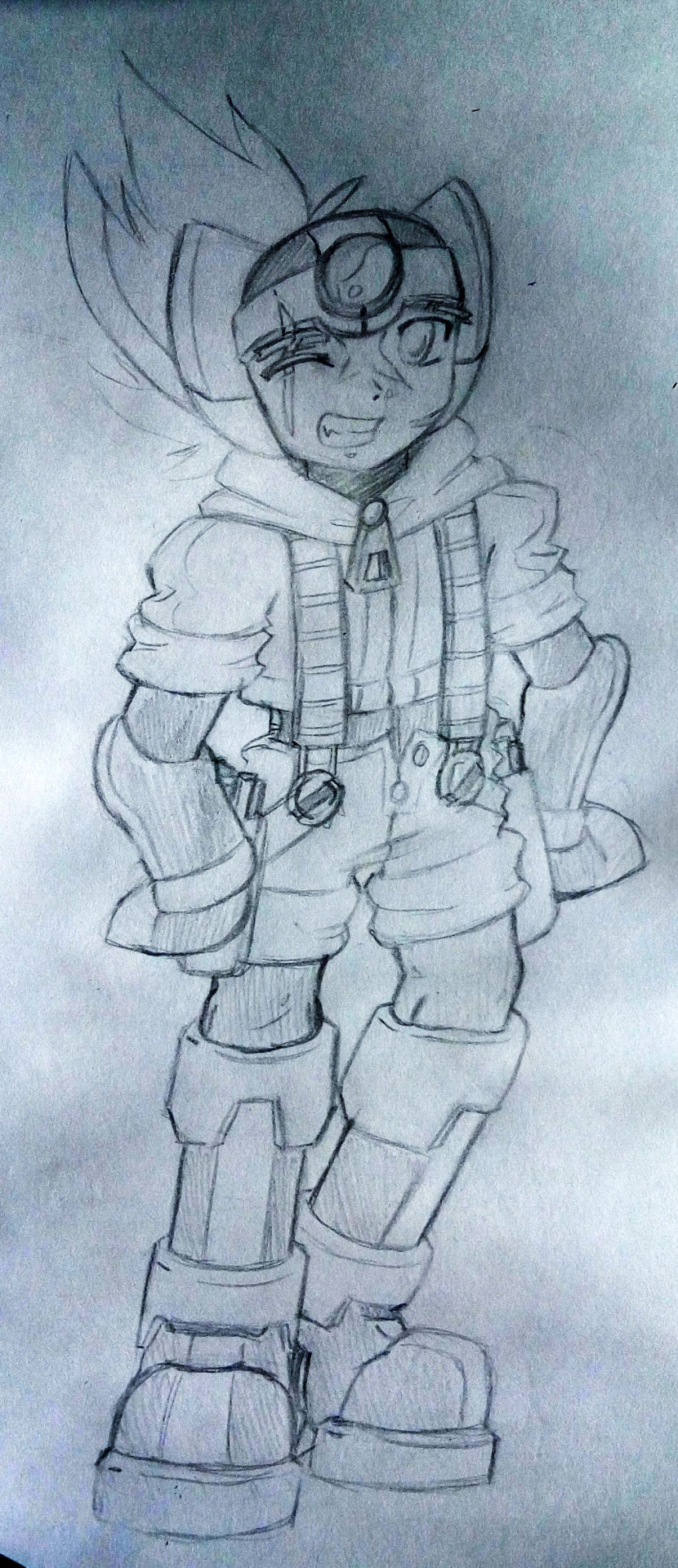
Well, you can certainly say I tried. His character was also altered, with him becoming a pacifistic hermit that lives with a real dog in a forest (it doesn't make much sense but 14 year-old me thought differently at the time). However, you can probably see some design quirks already that ultimately got used again in his look for Chapter: AXL, a scar over the right eye and shorts with suspenders in particular. There's actually a reason for this choice of clothing though since I did see something like this in his original MMX design, and I thought it could make the design more "fresh" while staying true to what was before (even if it does look a little goofy).
Then, a year and almost a half later, I came up with the idea of making a MMZ Halloween Axl drawing as a follow-up to the MMX Halloween Axl one I did a year prior (I will probably post it on Halloween this year on my random blog). This resulted in me coming up with a redesign for Axl, starting from a clean slate.
Something curious that I've noticed while looking into the design of Zero here was that... his silhouette was mostly the same. Despite the entire body overcoming changes, you could still recognize that it was Zero thanks to the hair and the shape of the helmet, mimicking what came before through the silhouette itself. That also was the design philosophy that Keiji Inafune persued and the only advice he gave to the designing team when they were trying to design Axl for X7, and that's... a really great tip to character design/redesign as a whole.
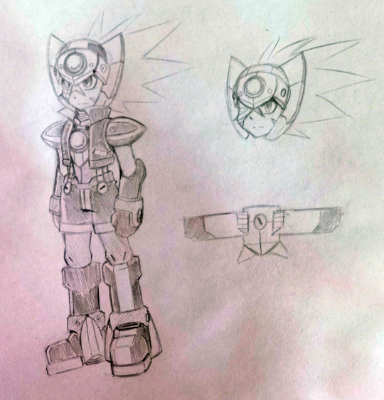
I was trying to follow the 'memorable silhouette' tip while remaking Axl for MMZ universe, but unfortunately I wasn't able to change his helmet much without losing the silhouette so I left it mostly as-is. Some parts of his armor do look strange (like boots for example) or too similar to what came before (the shoulderpads), the wings pack (or whatever it's called) looks really different and blocky, and the jets on his feet are a bit weird too, but I still think I did a good job reimagining this design, to the point of not changing it much in the next revisions.
I was trying to make Axl look sharper and more mature than before. I gave him a serious look, a few new scars (one on the left cheek as a reference to Grey and another over the right side of the face as a reference to Red), a blind right eye and a jacket with high collar (that doesn't close all the way because of the chest crystal). Shorts on suspenders still remained, though... which still kinda makes sense because he was supposed to still be young here, plus they help greatly with retaining the same "silhouette" as before. In addition, they actually have a functionality - Axl keeps his scythe folded behind the back and suspenders keep them safely in one place.
Oh, and yeah, this time Axl was supposed to become a grim reaper much like Red. I saw this as fitting, like he was following his old friend's footsteps, and eventually I realized it would be a great melee/middle-range weapon for him.
However, once I decided to make a full-blown game concept out of "What if Axl was in MMZ?", I chose to redesign him, to make him more in-line with the official designs (You can judge how close I came to that as I am still not sure if I am good at imitating them).


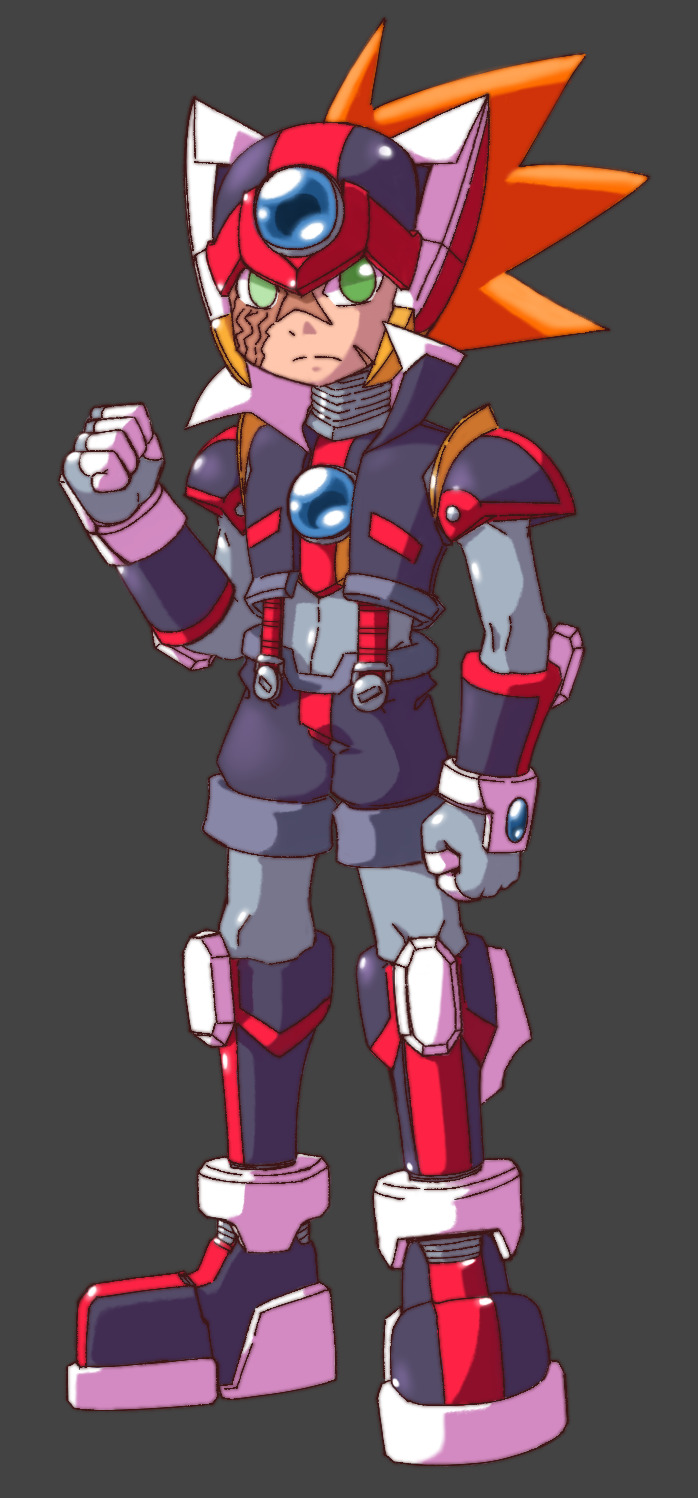
For the longest time, I thought that I perfected his design, but eventually as I started to fool around with the sprite arting, I realized that it was difficult for me to translate all of his details into a sprite while dealing with color and size limitations (which resulted in me never finishing that sprite too *chuckle*). I ended up going around all of the characters I had and giving them redesigns if needed, removing the unnessesary details (or adding on new stuff for some that needed them to fit in better). Axl was one of them... a-a-a-and I never remade his character art. Fortunately, I still have the promo art I did a few months ago and he had that design here.
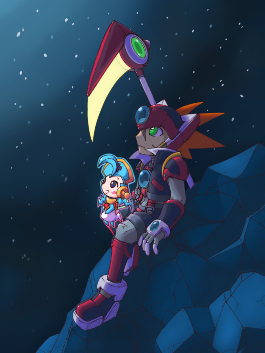
And actually, there was one more redesign in July I did for the visual novel adaptation of Chapter: AXL (which I decided to put on hiatus for now because doing all that alone would stagnate the main project badly). It just removed the scar on his left cheek. I just thought that it wasn't necessary for now (maybe he will get it back during the story, who knows).
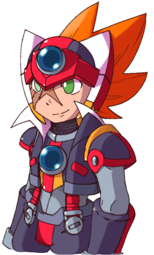
#fanfic#fanproject#megamanzero#mmz#megaman#megamanfanproject#rockman#megamanaxl#mmaxl#axl#ChAZ#Chapter: AXL
18 notes
·
View notes
Text
Horror does have a place in Doom
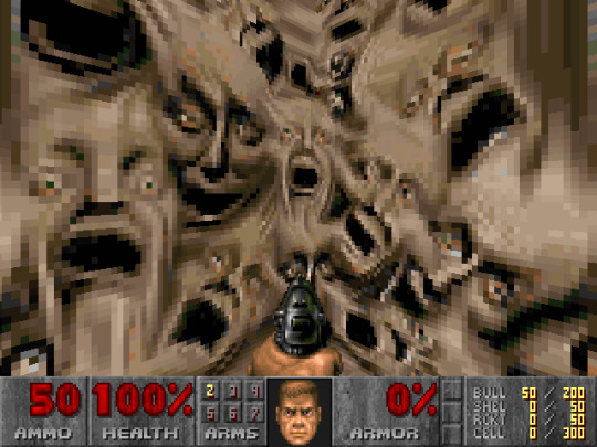
(Mainly felt like making this post after a video by thebeansprout13, even if this comes out later because it was in my drafts for a while)
This is a very talked about, overplayed topic on Doom and it tends to repeat, sometimes because certain opinions/observations are more popular than others.
I think horror is an element in Doom and there's a lot of ways to talk about this, both in favor and against or even somewhere in the middle.
The 90's games
We all know about Doom Bible's canned ideas of the characters and story but even then, Doom is clearly inspired by Aliens, Evil Dead, DnD and so on.
But maybe this mix of inspirations (And the weird presentation of the games) means there's different things to pick apart.
If Doom was a movie, it could have been a B-movie with a goofy, campy nature and still have some eerie atmosphere or gross practical effects.
At first we have:
Some dark, suspense based music tracks.
Darker areas meant to show off lightning and "slow" moments.
Probably the default movement speed and the history behind "ALWAYS_RUN".
Doomguy being hurt in the box art and ingame status bar.
The Arch-vile's intended design of an eerie HR Giger inspired alien.
Textures like the flesh walls with metal pipes, twisted faces and some hanged corpses people thought were based on a real pic of Mussolini (But it's actually GI Joe figures).
But then there's:
The fast gameplay and combat that can happen.
Cartoony designs and assets.
The metal music (And other tracks like those that sound kinda like jazz).
The campy writing style in the manuals and intermission screens.
The presentation of Daisy's death.
Some of Doomguy's faces.
The name "BFG" and how some assets were made like using toys to make the guns.
Maybe whenever a level was clearly gimmicky and "gamey" or experimental.
The ridiculously low-tech aesthetic with blue carpet floors and maybe how Phobos' sky doesn't look like Phobos.
So it seems Doom always had a mix of elements and that's why people even argue over this, though i also see benefits of Doom being a "blank canvas" when it comes to its staying power.
Doom 64 was the more horror focused classic game with its take on Hell and some demon designs (But still not showing Doomguy's bloodied mugshot or some assets of classic Hell).
Even its theme song was barely metal (And i think John Romero really liked the PS1 port).
And D64 is also seen as "the real Doom 3" though this is a bit of a topic i mentioned in a different post.
Doom 3
A "reboot" of the series and a new entry in a time after the series was dormant (And mostly carried by fan mods).
D3 pushes things to a specific direction that John Carmack thought it was natural.
Some fans think the same, others thing it's opposite to what they expect out of Doom, some even accept it as a new thing.
D3 is much more story focused, with a bunch of cutscenes, background/lore, characters and most if it isn't goofy.
Demons are redesigned and some barely resemble their original versions (Might be because they looked "goofy" even if we have fanart that knows how to make them eerie; Meanwhile, D3's Arch-vile didn't capture the original design that much).
New demons represent a new art style that makes them "more serious and scary" or at least surreal.
The UAC stuff is still low-tech but in a more detailed, "professional" way.
Gameplay is slower, with a focus on reloading and the lantern.
Darkness focus and horror etc.
More serious tone, with little music.
D3 marine never smiles and looks worried most of the time.
Besides UAC and Hell, there's the Martians as a way to "extend" the universe but they're still mostly mysterious and not shown a lot.
The premise of a UAC marine having to fight demons after the UAC unleashing Hell is technically there, but it's also differently done from the original games (At least/specially if you look into the "lore" in the old manuals).
This game divided some fans, though a prespective i like to hear more is one that likes the idea but not so much the execution and i also always bring up how unfair it is that later versions (BFG edition and others) tend to have new problems or cut content for no reason, while not fixing certain flaws.
Because you'll still find some older fans thinking Doom was supposed to have some form of tension or horror, compared to those that prefer the fast action side of things.
Oddly enough, Hell in the series always had potential to be weird but D3, the game with the most experimental demon designs, didn't really took advantage of those elements.
At least D3 has some mods that fix some people's issues with the game, whether or not it leads to them respect the game more.
If you ask me: Doom 3's horror isn't just the dark corridors or slow "doomed" marine, but it's the crazy designs like the Bruiser having a screen on its mouth or the Revenant having transparent skin.
And i think D3 has its fair share of goofyness like the Turkey minigame (And the others in RoE that later versions deleted for no reasons) or that one fat zombie going "mmmm boy" that farts.
Doom 2016 and Eternal
D2016 is like an extreme opposite to D3: You are the horror and gameplay is more focused on movement and projectile avoiding that there's barely hitscan enemies besides the Possessed Security and maybe the Hellrazer.
Besides the arena focused combat, there's the Glory Kills, alt fires, upgrades, Mick Gordon's music, the character of the Doomslayer and so on.
But bits of D3's style are still present, speciall Mars and Hell a bit since Doom technically wasn't always "Mars" (Otherwise, more people would bring up the classic Phobos aesthetic and specific textures but even Hell still doesn't carry certain elements back).
(In fact, when D2016 was revealed, people complained about the lack of color and even said the demons looked "MOBA-ish")
The Hellknight is clearly inspired by its D3 design but one major difference is being eyeless instead of the weird eyes (Or are they sockets?) it had in D3.
Most demons have a rather "focused" aesthetic of chitin armored creatures and even lore explaining how they work or even how the UAC was involved in some being created/modified (Which may or may not affect the appeal of Hell being a weird dimension of evil that Doomguy has to put up with).
It's also somewhat known that D2016 was influenced by outside factors for Doom: The Doom comic ("Rip and tear") is obvious but there's probably other theories like anything to do with Death Battle or internet copypastas/webcomics joking about Doomguy (And i guess Brutal Doom but there's still arguements about it).
Doomslayer being a killing machine that scares demons is like an inverse to the "doomed" D3 marine: Putting classic Doomguy in the middle since he's both a strong action hero but still gets hurt (Even his portrayal in the 90's comic is like this).
The existence of D2016 is also a result of Doom 4 being cancelled: A game that was so deviated from Doom, it didn't even feel like a D3 sequel (And maybe it wasn't).
In a way, D2016's appeal relies on some bits of fanservice and at least getting basic ideas that people associate with Doom, which contrasts D3 not relying on "outside factors" but also chosing specific parts of the series while also executing them in a way that i'm not sure if it was ideal for D3 itself.
Then there's Doom Eternal, which builds up from 2016 in a lot of ways (And in was that people either like or hate it but it's still a very beloved and popular title).
The aesthetic is more colorfull and brings back some classic designs (Not entirely as they're put inside the new aesthetic), there's the concept of the "Doom universe", lots of new mechanics and a lot more to like (But also things that divided some fans).
Eternal's "videogamey" pickups were technically based on how some people thought pickups in D2016 overlapped with the environment, even if people liked how items in D2016 "existed in the setting" (Because even in classic Doom, you didn't have those kinds of pickups).
There's a lot of debates about Eternal's lore and aesthetic that leads to comparisons to 2016 but i'm thinking on making a post dedicated to that (Specially with some prespectives, opinions and stuff that most people don't consider).
Regardless, Eternal has clearly different media influences compared to the originals and feels like a different genre.
Basically, if classic Doom is a "campy B-movie", Eternal is a "saturday morning cartoon with gore" (And D3 is a serious sci-fi horror movie, i guess).
(And let's not forget: Different people are behind these games, in a series where people already interpret them in their own ways)
Sometimes, i think Doom is like the Planet of the Apes movie series:
D3 is closer to the original premise but 2016/Eternal are seem to be the more liked iteration of the series.
(Meanwhile, we have Mighty Doom as the most cartoony Doom game but in a cute way while the RPG Doom's had a different cartoonyness and sense of humor and a rather serious intro comic)
"Horror" in Doom to fans (And what else)
If you look at some pieces of fanart (Or even fan redesigns) and some mods, there's definitely an appeal of Doom being more horror focused and tense, even without affecting certain designs or the personality.
It's why one could not only defend D3 but even think that D3's issue isn't being different but rather doing a flawed job at its own direction.
Because 2016/Eternal also have their own differences from the original games but they seem to mostly nail their own direction.
I even see "horror" complement the "power fantasy" concept of modern Doom: Making Hell weirder and stranger, which makes Doomguy/Slayer feel even stronger.
Because "horror" as a concept can mean a lot: Not just dark corridors or walking slow, but it can lead to really interesting designs that make Hell feel threatning and weirdly creative.
After all, if it's possible to make a game out of "fans want a Doomguy that is more powerfull and the gameplay is fast", i don't see why we couldn't have one that is "fans want a tense, bone chilling experience and the demons look scary but still cool", even if you see those cool fan redesigns as better than what we got in D3.
(I like to believe that different types of Doom can coexist)
Even D3 haters may find or cherrypick some parts of the game they like (Which also makes me think it's another good reason why MetaDoom is a really cool mod).
I believe it should be possible to make a game that has elements of both "paths" represented, even if it means like a level with disturbing environments and then you find a goofy collectable toy in a secret.
I also said this before but i kinda get D3 hate coming from older fans but not people who got into the series at 2016 and after, because you technically "skipped" the "dark age" that some fans went through.
How hated D3 really is depends on which opinions or mindset overcome the others, because fanbases and hobbies almost tend to have an "anglicized canon" that is rather pushed by some specific people.
Anyway, i tried to add as much i could in this post but i'd like if someone like a Youtuber or older fan were to analyze this and even add more to this or correct potential flaws.
It's a topic that could be more explored, because even people that argue "Doom was always X" overlook elements that support their claims.
Other links to check, i guess.
How i think a good D3 re-release could be.
Doom 3 power ups and Doom 3 enemy roster rant.
"Doom 3 alternatives" for some picky fans.
The D2RPG intro comic.
Bunch of stuff related to Quake and Wolfenstein.
"Remastering" the 90's Doom games.
How a Doom movie or show could be good.
I mean, there's more on this blog but these could be good enough.
#doom 3#doom 2016#doom eternal#demon#doomguy#hell#classic doom#doom#opinions#id software#long post#horror
84 notes
·
View notes
Note
Is there a explanation for the lack of tattoos on Kingsley?
No I don't think there's one officially yet! It's something I've been seeing a lot of interesting posts on lately though, and it makes me very curious 👀 He definitely still has them in episode 141, so I don't think it's something that got retconned. It could've just been kinda forgotten since it's been so long, like the little Balleater and Nein Heroez mixup.
But I also think it's a possibility that King is hiding the tattoos while still trying to work out his identity. I've seen a bunch of other posts point out that it's very noticeable Kingsley isn't showing any skin; he's got a high collar coat, long sleeves, gloves--you can't see the tattoos even if they are still there. (Except for the feathers on his face I suppose, though I'd also buy that that's either something he'd cover with makeup or even just a minor detail left out in the art.)
This also isn't out of character for Mollymauk himself. In fact, if he was reconsidering what tattoos he wanted to show off and what to cover up, it sounds very in line with his Moonweaver worship. The same goes for his little comment on reinventing the coat, that it's still a work in progress, but it's getting there. "I feel a bit underdressed."
He's adding to it, customizing it, redesigning it. Like his original patchwork coat, lovingly hand-embroidered and intricately detailed. (And I think it means something, that this one is still red. A red coat like the one worn by the beautiful woman he kept dreaming about--who sounds an awful lot like the Moonweaver herself--)
For reference, here's what Molly has to say about Moonweaver oracle decks in the tarot card booklet:
"Each deck of Moon Oracle cards are different, as each deck evolves with the owner. When a card is weathered or simply no longer speaks to you, replace it with a new card of your own design. Something personal and true. Trust yourself; what is true for you will ring true for others. Some choose to change a card each Lunar cycle. Some decks magically destroy a card when it is replaced with a new one--such decadence!"
"Each card holds two balanced thoughts. They can be opposing thoughts, complementary, or different states of the same thought. Meaning may sometimes overlap between cards, but that's hardly the point. A deck with a point of view is far more useful than a false sense of worldliness. And if you find a card is too close in meaning to another, simply cast it off for a new idea."
Molly himself admits it's common practice to hold onto the cards that really resonate with you, and then discard and redraw the rest. Sometimes replacing cards as often as every month. And it's a philosophy Sehanine's followers embrace wholeheartedly. Again, these are Mollymauk's own beliefs.
While the thought of King not wanting to keep some of his old tattoos certainly hurts, I can at least take comfort in the fact that, for Molly, a core part of his religion is changing and reinventing your sense of self. The Moonweaver encourages exploring your identity, continually growing and changing, starting anew whenever you wish.
And I don't think it's necessarily supposed to be a destruction of the past so much as allowing yourself a sense of...fluidity. Staying in the moment and donning a new mask each day like the ever shifting phases of the moon. He might just be keeping the tattoos covered up for now while he decides what he wants to keep or add, still discovering who he is in this world.
It's also worth noting that Molly originally got those tattoos to try and hide the Eyes. He might want something a little different now that they're gone, just so he's never reminded of those empty spaces where the Somnovum once branded him.
#critical role spoilers#mighty nein reunited#kingsley tealeaf#mollymauk tealeaf#I don't know how accurate any of this is but i just love king molly so much and this is very moonweavery of him honestly
70 notes
·
View notes
Note
What would you change about Believix design wise?I think I remember someone said to make it superhero themed
Jdjejd
Hey, hi, hello
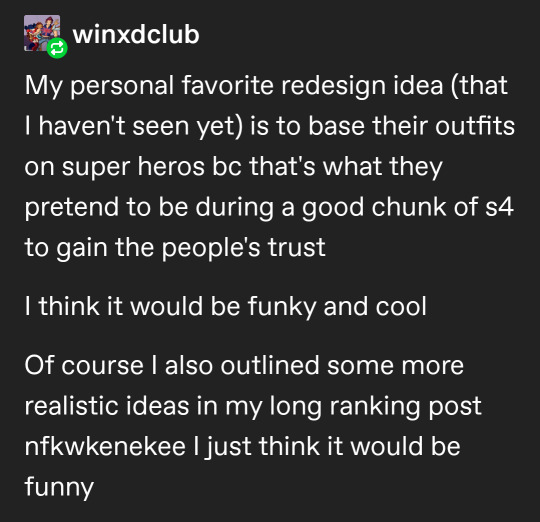
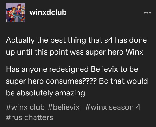
That was me 💗
Which was base on this part of s4


I wrote some realistic ideas of a redesign in this post
But the general idea would just be to mix the normal street wear Believix designs with something like this!
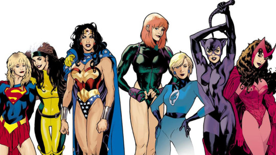
Tecna would properly do the full bodysuit and face mask bc duh, while Stella would be more wonder woman
I feel like Believix is bad in concept? Like the whole thing is just having people believe in magic, which makes them stronger against the people who can absorb Enchantix level spells because reasons
Hmmm Believix being a transformation that increases physical strength so they can just fucking punch the Wizards would be a fun away to get around the absorption problem, fit the super hero theme, and not condesne Enchantix
Obviously the Believix wings would stay and they'd still be fairy like, just with some comics book inspired changes to their outfit...
Musa but her outfit is slightly inspired by Harleen because I'm very normal about both of these fictional characters and do not have a Harley Quinn Funko pop. THE PIGTAILS—
I don't think that would look too odd on the girls? And it would match the earth thing? It would take some of the tropes of super hero costume and make them 🧚♀️✨ fairy ✨🧚♀️, and super hero costume already kinda look like a less sparkly magic Winx so I don't think it would be a huge stretch
I just???
Tecna brings up becoming superheros to the earth people to increase their Believix powers, and starts talking all about comic books and I thought it would be fun to incorporate that! Especially because once you notice that Aisha/Musa and Stella/Bloom's outfits share most of the same elements it slowly will drive you crazy... Or is that just me?
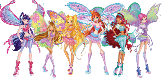
Musa is already rocking the superman pants!!! Fnnsndnsdn, it's perfect/j
The only ones this design wouldn't vibe with as well is Flora and Bloom
Bloom I can't see liking comic books all that much (she's a die hard classic fantasy nerd) so her outfit would be very similar to the one she has now, and Flora's general vibes don't match up with super heros all that well so she probably wouldn't bother leaning into the idea all that much
Plus it's an excuse to give Stella something like her shorts back bc I miss them
Here's some doodles I made while waiting on food

I drew these before having to run out the house, and ran out of space on the page. That's why they look shitty
Aisha's Believix top is literally already perfect. Just like pull it down to be a jump suit, maybe with a skirt like her Lovix


Just imagine it's a full shirt like in this doodle I made before I remembered her Lovix, and cursed myself as I realized in the middle of outlining
God I have no clue for Flora....
Ummm maybe Posion Ivy meets supergirl?????
Don't even ask about Roxy I do not know, not even a little bit
All I have is boy wonder robin bc I think it would be funny
Musa, Tecna, and Aisha are gonna have more masc transformers with outfits that are more practical; while Stella, Bloom, and Flora are going to have more femme transformations that say practicality whomst
These are all ideas off the top of my head
If you cannot tell I'm not super into comic books, so gjsjdje trying my best
The important part is that Tecna should be visiblely having fun with the outfits—
28 notes
·
View notes
Note
koba!!!
lying on the floor. im so normal about him im so normal about him im so-
- My identity hc for them
tbh! i go back and forth on whether i view him as gay or bi. so. hm. uhh canonically likes guys, and i don’t really have any consistent thoughts past that! + canonically a trans guy. my boy fits the “can’t go out without wearing 4+ layers” stereotype… rip.
- Thoughts on their home life/family
hmm. what’s something we won’t cover in canon- OH. so, he has two older sisters, and his maternal grandparents had three kids- two girls, and a boy, with the boy being the oldest (koba mom (yuriko) is their youngest child). so koba and his siblings are a mirror reflection of their mom and her siblings. also, her mom has a very dear friend she’s been close with for forever, and is also close with his wife now. koba considers their children to be his cousins- this is why he has some french knowledge, they live in france! has one cousin who he especially likes, a lass a few years older than him.
- How i feel about their canonical writing/handling
i feeeel… like he can feel a bit one note/flat? but.. i think completing his ftes will show a sort of depth to him that comes through in the main game, if you know it’s there. (also some of his feeling flat does come from me boyfailing in the past when it comes to writing. so.)
- The one thing i’d want to make canon about them
hm. less so something i want to make canon, moreso… something i hope people pick up on? my boy is constantly trying so hard to protect his peace. the only reason he comes across as okay as he does is because maeda only sees him at breakfast and dinner, and maeda is kinda a dunce, so he hasn’t noticed that kobashikawa is connnstantly self soothing. again. maeda is our protag and oh how that limits things. but- OH. holiday event, the start of harus arc. the way he tries to console himself, but then just distracts himself until things go away? yeaaah.
- My number one favorite ship for them
….so. you see i should say otohiko. i should. they’re iconic they’re the moment i do genuinely really love them. but i’ve had such bad kobamae brainrot…
- …Now everyone else i ship with them
kisaragi! cuz kobas huge on building planes, and kisa is a inventor. i think they’d have fun working together!! parallel play :]. also koba has a fwend he knew for like.. a year? in elementary school. who also attends hopes peak! that year of school was Really Rough on koba, so he kinda. just isn’t as eager to reconnect? bc of poor associations. but fwend is… maybe he doesn’t quite understand, but he’s trying! and he has a very good heart. so i don’t really ship them but sometimes i see stuff that makes me go “oh… it’s them 🥺” so. ya know!!
- The thing i will NEVER ship
no “enemies to lovers” with him and higa don’t even try to slide that shit by. that’s a bigot x the person he hate crimed. (i do think while koba wouldn’t ever be *friends* with higa, they could be acquaintances. he wants an apology he 100% wants an apology he’s not going to stop giving higa hell (in non despair) until he gets an apology. but yeah i just. i don’t think they’re compatible i don’t think they’d mesh well and i just. why would u do koba like that ?
- a dynamic/relationship i wish was explored more (in canon, or in fandom)
not to say iranami again. but they were besties in the first iterations of beta so it’s a fun little throwback for me!! i also think abt him and tsu in non despair a lot. i think they kinda… tend to run in different circles a lot? but they occasionally seek out each other specifically. cuz they’re friends!! they just don’t really have the same friend group. overall i think koba is p popular/well liked! so like… should chat more abt him and everyone
- thoughts on their design (appearance-wise)
mmm.. i’m actually redesigning his fit rn but i think his general color palette is a vibe!! it’s been consistent since betas inception and has stayed the same. i kinda tend to give up on his fit cuz it never works with me,, but surely this time it will all work out for me… yes…..
- A music-related thought- a song that reminds me of them, or what their music taste is, etc
uhhhhh. like or like like - miniature tigers. specifically the chorus/“do you like or like like me? juuuuust sayyyy youu do…” gives me him vibes. i think he tends to make people go 👀 at him so if he was ever uncertain if someone liked him back he wouldn’t really be able to deal with it well? like or like like works because the phrase is a more light hearted/less serious way of seeing if someone feels the same, but it’s also like… again that line is accurate to what koba would want- for that person to just say they like him (tho, while that’s what he’d want to ask of them, if they actually just said yes bc he asked. he’d be v upset)
the king - conan gray, is similarly kobashikawa trying to Cope if the one time he wants someone, it doesn’t come easy to him. this song is one i have down for both him and otori lol. the only exception - paramore, is also very much so a them song. theres probably other songs i associate with him that i’m forgetting about but he’s being spoiled rn compared to the other kids. so.
5 notes
·
View notes
Photo


Hey, Remember scrapperton’s war general body from episode eleven in season one? Yeah, Me too. ..I get what they were going for but what if i.. Gave it some touch ups? Bit of a redesign, Perhaps? I present to you.. The war body redesign! I really liked the idea of this, So i figured i’d draw my take on it. I kept the same weapon, Obviously, But i gave him the same blue coat, With the little buttons and badges included. I gave him a long, Regal velvet cape to kinda reference the disguise, But also to go with the sort of elegance of what i was going for. Also, The funny shoulder pads stay i’m sorry i couldn’t leave them out- Also the body shape. ROUND. WHY IS IT SO ROUND? I HAVE.. NO ISSUE WITH ROUND CHARACTERS BUT WHY IS HE A SPHERE? The hat is great but the hair was an odd choice? i dunno it’s just weird to me lmao- (Unless he somehow had blonde hair when he was human?? Though from what we see of him i doubt it.) Also, I like the feather. i have no idea why i like it so much. Anyhow, Enough rambling, I just wanted to draw scrapperton in a cool war body that didn’t make him look like a bowling ball KSDJAK-
14 notes
·
View notes
Text
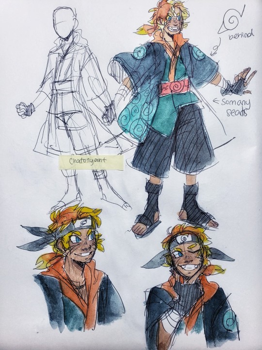
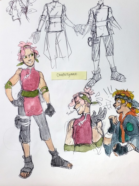
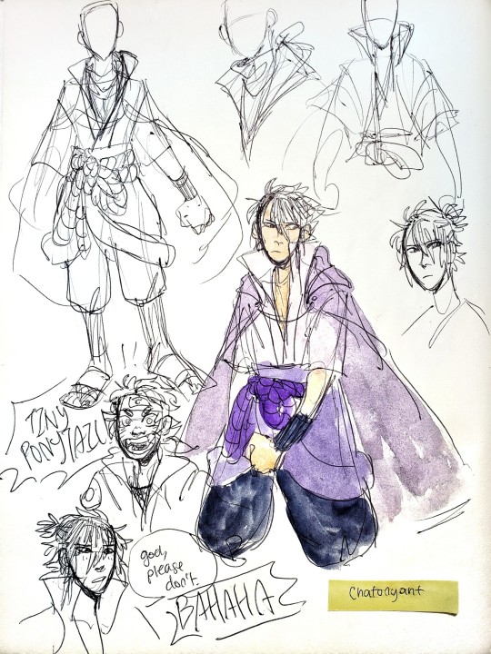
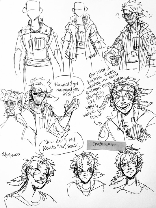
Some hella messy doodles for the shippuden designs! Excuse the every changing details because I am never truly happy with final designs dear lord-
I’ve got design notes! Long wall of words belooowww
Starting with Naruto once again!
his clothes are based off of several unfinished ideas I had of Uzushio and how their proficiency with seals would allow them to be more flamboyant or lighter in their gear. The magic of storage and protective seals!
there are seals embroidered into the inner lining and occasionally the exterior, acting as both armor and pack. Uzushio always seemed like a rather bright place, connected to the sea, so I made the robes generally blue themed but also darker as they are still shinobi in the end and bright colors are harder to hide.
I added a hood because Naruto just,,,, he has modern streetwear vibes. He’d love hoodies
The whole Uzushio inspired ensemble is cause I was thinking that in this au he finds the opportunity to find and visit the island itself. Probably during the time skip, considering it’s hard to really place the discovery of a long lost village within the six-month period between graduation and the chunnin exams
At first I wanted to give him like a mesh crop top to show his seal but then it kinda didn’t have that traditional vibe that I wanted, so I added the kimono top and a red obi with symbols that kinda symbolize the seal (because Naruto connects with Kurama much earlier in this AU)
The headband was honestly ridiculously tricky to place because i was trying to draw this longer hair without making it poof weirdly at the top. Plus I wanted to keep the headband where it was cause,,, cause i was thinking when he goes into tailed beast mode the ribbons flare up to look like Kurama’s ears :”DDD peek design amiright-
his hair. is longer. because i love long hair Naruto to bits and it makes him look like his parents ;;; both of them
the gloves. I have no excuse. They just Look Cool
Sakura:
I gave her an undercut
she deserves it
I didn’t mention this in the other redesign post but she has dimples (though i’m really bad at drawing them
that one scene where she tied up her hair in the Kazekage Rescue Arc was so fucking beautiful I couldn’t resist throwing it in here lmaoooo
i can’t draw it right but imagine the ponytail kinda flowering out like a sakura blossom
I took a lot of different things I liked about the older!Sakura designs and smooshed them in one with my own twist
like sleeveless qipao
Belt from pre-timeskip period stays, except now with an extra medical supply bag
longer pants cause they look nice
Sasuke:
honestly I like his normal shippuden design a lot so i kept most of it
I added a cape though, cause he does travel around a bit
and as i was drawing him the collar reverted to a similar shape to his kid clothes
fun fact
the reason that his outfit remains largely the same is because
Sasuke does leave
the action itself doesn’t change, but the circumstances and the ensuing effects do. quite a bit, actually.
and no it does not take the entirety of shippuden to get him back
because he is not a revenge obsessed angry kid here
the biggest reason for all this change is cause I want to change Orochimaru cause i wanna make him live purely because I love mitsuki so fucking much
also i gave him a little half ponytail cause i wanted to give him longer hair but then realized that idk how to draw that and make it look good sO new style boyos
Kakashi? what are you doing here?:
I wanted to change up Kakashi’s look as well because it’s actually really fun to design these outfits no matter difficult it may be bUT it was difficult because I just... can’t see him without a vest.
Not that i can’t see him without wearing a vest, because i have and it’s good and I like it, but i can’t see him going into battle or on missions without one.
I’ve got this headcannon that the vest is lowkey like a security blanket and it’s this grounding weight whenever he’s in this adrenaline filled situation where he may suffer many varieties of consequences if he’s not careful. It has his tools and it’s his armor. Replacing it with a robe feels like robbing him of something he’s always had and is always used to
SO
he keeps a vest
i modified it a bit to make it more right hand sided (i may headcannon Kakashi to be ambidextrous but there’s no denying he uses his right hand more) and the collar to be a bit thinner
Kakashi is like, made for biker fashion. like leather or denim jackets on motorbikes. So I gave him a haori that emulates that look
Naruto came back, saw that Kakashi didn’t change at ALL and took it as a personal offense and dragged him around to get new threads because “Kakashi-sensei, we all upgraded our closet, you should too!”
kind of a sad headcannon that Kakashi didn’t quite let himself enjoy things that wouldn’t benefit him as a ninja and therefore just stuck to his normal outfit of ninja clothes and jonin vest. Icha Icha was the one exception and he picked it up because he had no idea what to do once he was out of ANBU (i would like to back this hc up by pointing to Boruto where Kakashi no longer really holds himself to this rigid ideal of a ninja and lets loose and has fun with Gai and Mirai)
ANYWAYS
he actually likes the stuff Naruto finds for him, though he has no idea where the boy is actually finding all this shit
some misc info about the outfits:
Naruto began learning sealing after the Wave Arc, and he took to it like a fish to water. (i have uzushio spirit hc that I will tell at a later time)
a rare nugget of information he found about uzushio seals was that they were often stitched into the clothing itself
so Naruto went wild with this
he learned sealing while practicing normal embroidery on the side and as he went on his 2-3 year trip with Jiraiya he learned more and just got better and better
He added the seal to his own haori himself and actually made one for Kakashi too. Kakashi just didn’t see him whip the gift haori from one of the stitched sealing scrolls
embroidering takes a really long time and matching it with sealing? oof, hard work. So he actually only got two done and is in process of Sakura’s next. Now that he’s back in the village, he can talk to her about certain things she would want/need considering Naruto isn’t sure what a medic-nin requires.
he made additional gifts for everyone in team seven (even sasuke, even if he doesn’t know what will happen) and hopefully as time passes little trinkets will start to appear
i just really like the idea of naruto being a really craftsy person. He just keeps making small trinkets except these trinkets have sEALING POWER cause he’s very chaotic with his experiments like that
#naruto#naruto shippuden#uzumaki naruto#haruno sakura#uchiha sasuke#hatake kakashi#team 7#naruto fanart#au#nart au#alp art#doodles#was trying to figure out in what order i should post my thoughts but bOY i have no idea how#so ill just post as ideas come#hopefully that doesnt get too confusing#JESUS THIS WAS ONE OF MY FIRST DRAFTS AND I STILL HAVENT POSTED IT OOPS
738 notes
·
View notes
Photo


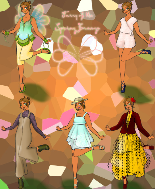
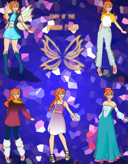

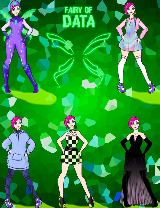
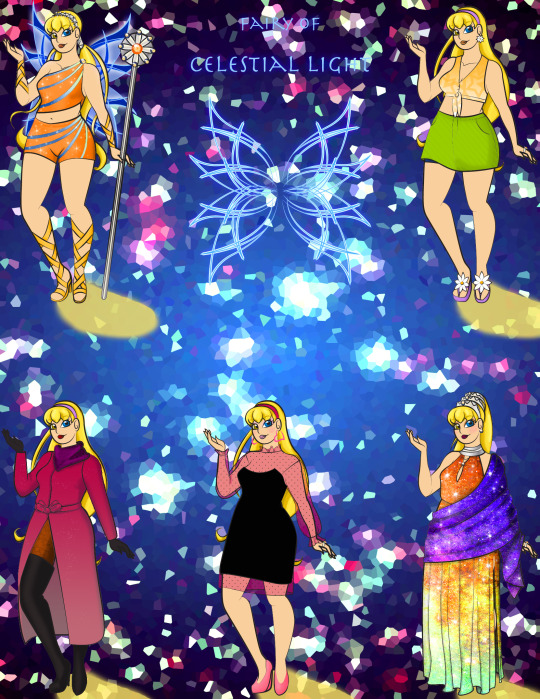
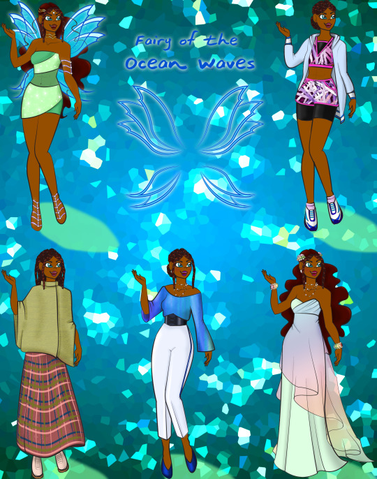
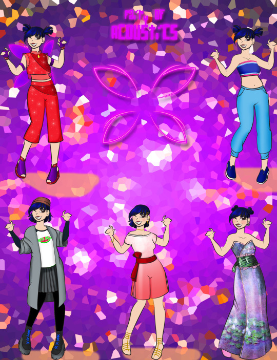
I haven’t thought about winx since like 2002, but the netflix adaption pissed me off enough to do my own redesigns out of pure spite.
Short story is that I looked through the wiki galleries, picked out my favorite outfits, and threw them in a blender. Long story under the cut bc I am unable to not write a paragraph of explanations I guess.
So disclaimer, back in the elementary schoolyard arguments of w.i.t.c.h vs winx my bff was firmly team w.i.t.c.h., so i pretended not to like winx and also don’t remember much about it, so i did a real quick scan on the fan wiki to remember things. Soooo some things are probably off the mark? idk. Daphne not included bc didn’t she die? I think she did? Like in a meaningful/sacrificial way to save Bloom? Felt like her being alive again makes the whole thing less dramatic. Maybe I’ll do her in the future? Trix first tho.
Flora: Nature to Plant Life, bc “nature” is kinda broad. Her fairy form is mostly her initial winx with some enchantrix elements. Her wings are a basic butterfly shape. Also I’m taking plus-size Flora from netflix’s incapable hands. I wanted her wardrobe to be simple, girly, and boho.
Miele: Don’t think she has an official “Fairy of” title, and wanted it to relate to plants but not be about plants. Kept the six round wings from one of her designs, idk which, but i think it’s her first? Also included her bc she was important to Flora’s growth, and it’s nice to see siblings in media I think. Changed her hair and skin color to look more like she is related to Flora. Kinda like the idea of her being a hot-head. Her wardrobe is mostly Flora’s hand-me-downs.
Bloom: Fairy form is her initial winx with elements from the bloomix form, which I think is one of the only forms to feel even a little bit draconic. I did want to lean into the fairy element more than the dragon element, but still. Her wing shape is basically the same as her first ones, just more of it. Also I put little embers in them. Kept those iconic pants. Overall, she has a sporty wardrobe, the outlier being her princess dress, which is basically a recolored version of her royal mom’s dress. I feel like she plays soccer or something. Also, I think it’d be fun for her to be super stoked about finding out about secret magic powers instead of her being really timid about it at first.
Roxy: Animals to Beasts, bc that sounds cooler. Cut her hair bc more short hair plz. Also as a kid, I didn’t see Roxy in any episodes, so when I first saw pics of her I thought that she was Bloom. Does she only have the one fairy form? Seems like a waste to do that. Anyway, I swapped out the pink for yellow and purple and extended the lower garment. Let these girls have varied hemlines, I’m begging you. I liked her asymmetrical motif, but not the look really, so I tried to keep that with the skirt placement and strap colors. Her stripes are shaped like claw marks, you know, for the beasts. Her wings are meant to look more angelic/birdlike. I made her a little more casual punk in her wardrobe bc the chain on her pants demanded it. Also, she has a t-shirt from her dad’s juice bar, bc she works there.
Tecna: Technology to Data bc I think it sounds better. Caveman tools are technology, Tecna. Are you the Fairy of the First Wheel?? Her fairy form is basically a detailed version of her first form and pilot episode form. I used the shape of her enchantrix wings, to keep a more classic fairy look. The gem on her suit and her heels are made from nondescript ~glowing science magic~ that is normally cyan in movies. Her wardrobe is e-girl, and bc she doesn’t have a lot of hair to play with I made her an earring and colorful lipstick girl.
Stella: Shining Sun to Celestial Light, bc her dad is king sun and mom is queen moon, and also isn’t her parent’s marriage like a super important thing for her? So she kinda got both. I played with the idea of a Shining Sun and Mystic Moon form, but that was too much work, so I opted for the two eye colors instead. Also the Ring/Staff of Solaria should have stayed in the series longer. Her fairy outfit is basically the same, but her hair accessories are gold/silver and bejeweled. Made no sense to me that not all of the canonical princesses got crowns. Just Bloom, the secret princess. She gets some streaks of dawn colors on her orange, and her boots/gauntlets are more ribbon-like and lighter in color. Her wings are the most complex shape. Her wardrobe is basically the same as in the show, I think, especially the warmer look. Her princess look is inspired by the hairstyle that Stella wore in the infamous beauty contest episode. Also she has three crowns. Queen.
Aisha: Her outfit is basically the same as her canonical first outfit, but I gave her Musa’s see-through midriff. The wrap-around ribbon never made sense to me, so that had to go. I wanted to show off her stomach, bc I gave her some abs, but the outfit looked wrong without something there, so thanks Musa. Aisha also gets a crown that is shaped like waves. Her wings are similar to Bloom’s: kind of the same just more of them. In fairy and princess form, Aisha’s hair is mostly natural, with some twists. In casual attire, her hair is all twists. I wanted her to be a runner/swimmer, so her warmer outfit is gym clothes, but I gave her a softer/more feminine look for the colder weather.
Musa: Music to Acoustics bc it sounds cooler I guess. I took the headphones of the first look off bc they looked more like earmuffs to me. I kept the red pallet of the first form bc there need to be more red magical girls, but I still used purple elements from her later designs. Mostly bc I like red and purple. I kept the see-through elements of her first form, but bc I changed the silhouette so much it ended up as more than just the midriff. Her wings are very simple, like in her first form, but they’re not as skinny. How she flew with those tiny wings, I’ll never know. Musa read as the team’s tomboy to me, so I tried keeping a more loose and simple shape in all of her clothes. Her formal dress has a Monet print, bc I felt that it was feminine, but not overly girly
#winx#winx club#winx flora#winx miele#winx bloom#winx roxy#winx tecna#winx stella#winx aisha#winx layla#winx musa#my art
43 notes
·
View notes
Text
Loki x female!artist!reader
Word count: 1 281
Summary: you were going through a difficult time and your boyfriend wants to make you feel better.
Warnings: adult themes (nothing too explicit), little bit of sadness
A/N: i felt kinda depressed lately, so I wrote something to cheer myself up. This might have some grammar mistakes or typos, so please try to ignore them. Enjoy :)
Loki admired you. From the way you looked to the way your magnifficent mind worked. It never ceased to amaze him how creative a human's mind can truly be. He has seen all those paintings in art galleries, and witnessed all those adventures written in books, hidden in the deepest parts of library. He has seen architecture that took his breath away. He never really thought something so asgardian could be seen here on midgard too. He must admit, some of the midgardian pieces were too shoddy for his liking. He even despisedcertain parts of midgardian culture and art. Probably because he missed his home too much, a place where he grew up surrounded with those beauties. He never made even the faintest effort to understand midgardian art. Until he met you.
You showed him different kinds of art. You even taught him few things. He never stopped admiring you, even after several years of living together. He never got tired of you and your talent.
On one night, after a very difficult day, you were lying in bed covered by the smoothest sheets to ever exist. You were safely cuddled against Loki, sleeping soundly, getting your deserved rest. But Loki wasn't sleeping, no. He was thinking. Thinking of a way to make you smile again. It has been a long time, since he saw you smile, truly smile. Not faking smile to make him feel better. He saw you, fighting whatever got into your way throughout the day, everyday. It tired you, drained you of your power. And yet, you still smiled at him (even if it was fake smile). You never brought up your own problems, istead you listened to his, and that made Loki feel two things: selfishness and love. Selfishness, because he should've insisted on listening to your problems too and love, because it just showed what a caring person you can be. Even in your darkest times. He loved you for it even more, if that could be possible.
As careful as he could he untangled himself from your warm embrace, got up from bed and went on a dangerous mission of searching for your sketch-book. You always had one filled with doodles, paintings, drawings or designes.
When he found the said book, he started browsing through it, page by page, looking for something you started working on a while ago. And he found it. 'Tomorrow will be one happy day for my darling' Loki thought with a small smile blooming on his face.
-
As soon as you regained consciousness, you wanted to go back to your dreamland. Away from your struggles. From mean people, from every day stress, from your anxiety, from EVRYONE. Well, maybe not everyone. Not from your boyfriend. You started blindly looking for his body in your king-sized bed, but to no avail. Maybe he got up sooner than you? But whenever he did, he stayed in bed watching after you. And then teasing the living hell out of you, for snoring so laud it woke him up. He never meant it in the bad way, you always tickled him for revenge. And tickling turned into make-out session and that to love making. You loved those times, that's why you groaned upon descovering he left the bed.
You slowly sat up and looked around your bedroom. Not too big, but not too small either, pretty cosy looking. You dragged yourself to your wardrobe to put something on yourself, you couldn't just walk around your house naked now, could you? 'I'm sure Loki wouldn't mind' you thought after picking one of his green t-shirts. He rarely wore something from Earth and if he did it was just his all black suit. You occasionly gave him sweatpants, few hoodies and t-shirts, so you could steal-ehm borrow them like a normal girlfriend would.
With nothing but his t-shirt and fluffy socks on you made your way downstairs. Soft bubbling of water and sound of cutting was coming from kitchen.
Loki didn't cook often, but when he did... Let's just say you were always full afterwards.
You rounded the corner and plopped down on sofa. Damn, that was a lot of stairs. Snuggling with pillows you tried to spot your god, but he was nowhere to be seen. How about a quick nap before breakfast? It's saturday afterall, the lazy day.
"Oh, you already woke up. How did you sleep my sweet?" asked the velvety voice you loved so much.
You turned around, ready to hug him to death, but you halted when you saw his clothes.
"What, the living hell, are, you, WEARING?" you didn't mean to scream that last lart, you really didn't, but seeing this too early in the morning would startle anyone.
"You do not like it? One of your own creations?" aked Loki with that smug smile on his damned lips.
He was wearing your redesign of his asgardian battle armour. It was more leather than metal, Loki's signature green, black and gold. Looked more badass too with horned golden headpiece instead of the whole helmet with slightly shorter horns. You thought he didn't notice, but how couldn't he, when he just loved every little thing you make?
Maybe you were quiet for way too long, cause Loki started anxiously picking on his palms, never a good sign.
"I love it Lo, I just... I never expected you to do something like this. You never cared about my designs before, " that send hurt straight to his heart. You always asked him about his projects, his interests. He has never done something similair. Out of respect, he thought. To give you space. Now he blames himself for the dissapointed way you said those words.
"Darling, of course I care about everything you draw. May it be a mindless doodle or a piece of art. I've seen the joy drawing brings to your life. Your eyes are so bright whenever you make art, and lately that light has faded. I wanted to make you smile again, to see the playful twinkle in your eyes I fell in love with. I figured this was the way, but... Maybe I shouldn't have gone through your book. "
He reached up, ready to change your design into his usual attire, when you cought his hand. Loki wanted to say something when you cut him off with a sweet kiss. He closed his eyes, one hand cupping your cheek, the other snaking around your waist pulling you closer.
You pulled away first, breathing heavily. Your head spinned. It always does when you kiss the love of your life.
"I love you Loki. Thank you for making me feel better. But next time don't go through my sketch book, what if I designed something for you and you'll spoil your surprise?" you asked with a smirk on your lips.
"I love you too darling. And don't worry. As long as you smile, I won't. By the way, did you really design something for me, except what I'm wearing?" he gave you the same smirk, giving you eskimo kiss.
"Hmmmm, you'll have to wait and see" you murmured against his lips.
"You minx, you know I'm not a patient man."
"I know, I know. What about we eat breakfast and then I can give you different kind of surprise?" your lips barely brushed his ear, sending shivers down his spine.
"I love the way you think, darling. Now go sit by the table, the sooner I finish the breakfast, the sooner we'll get to your surprise."
'What a pleasant way to start a morning' was the last thing you thought when Loki parted himself from your embrace.
#loki#loki x reader#loki imagine#young loki#loki odison x reader#loki laufeyson#loki fanfiction#loki fluff
99 notes
·
View notes