#i just like the creative designs okay and don't think they need to be put down or policed for what they are
Explore tagged Tumblr posts
Text
My precure color opinions because why not. Don't read if you think you'll be upset reading different opinions, i just wanna put this out there haha😭:
Summer is white, let her be white (this is the one i'm the most passionate about). I didn't even KNOW there was a debate on this until this year, what in the world. None of that rainbow or pink nonsense. I don't even know why she would be classified as rainbow officially. Especially when the color they TRY to force her into is pink (for example saying today's color is pink before the outro). I heard she was created to be white but i don't know the source of that so that might be wrong
i agree with Finale being golden, she gets to be golden as a treat <3. She is not purple, y'all are just mean, compare her to actual purple cures. A golden theme really suits her in my opinion, it's beautiful and elegant like her. There should be more golden cures that have some some golden accents imo :D
Parfait is green to me with rainbow sub-color, i KNOW it makes no sense and she is just a rainbow cure, but that's what she is in my brain somehow acejcdksvd
Cosmo is blue with rainbow sub-color, but SHOULD have been rainbow. Maybe with blue sub-color bc it Does with the team arrangement (also should have had her cat form in cure form but that's beside the point). I heard they WANTED to make her rainbow but weren't allowed?! Unsure about that too though
i haven't seen hugtto yet but ma cherie literally looks so pink acejcdjd. You're red? Whatever you say, girl, you can be anything you wanna be, who am i to tell you otherwise <3
Milky as green is fine, but i see why people want turquoise to just be its own category. I think her color shouldn't look different though, she looks great
similair for Lillian, except that i've seen some people giving her a wonderful light green and she would look gorgeous!
Nyammy can be a blue cure if she wants <3. Especially next to Lillian, it's obvious how white is their base color and they define themselves via the accents. But also she is literally the whitest cure ever made, let alone the whitest blue cure wcejev
Felice is fine as green cure and she's beautiful
there should be more pink non-leaders like Butterfly
bring back black as cure color. Also brown and grey would be gorgeous <3
i actually prefer when cures look kinda colorful and they AREN'T monotone. The main color is really more about the vibe in my opinion, like with Finale and Nyammy haha!
This is all light-hearted, just thought it would be fun to post these bc everyone has Some precure color opinions xD! 🙌 It's so funny how color discourse is such a serious topic in precure fandom CSJDVEK
If anyone wants to share their own opinions, you can tell but please only if it's in good faith 🙏
#precure#pretty cure#pretty cure!#the only ones i'm gonna seriously defend of these are summer and finale#and maybe felice bc idk why people complain about her#he literallylooks like a flower it's beautiful leave her alone 😭🙌#don't let your desire for green cures hate on her lovely multicolored design 😔#*she. about felice#it's just that i don't like the way people are so strict about it.#like ohh she has more than two colors in design so she must be rainbow#or maybe she just has a. good design. but is still color coded as white bc it's the main color of her outfit#I FEEL LIKE THE COLORS AND DESIGNS SHOULD BE EMBRACED AND NOT POLICED SO STRONGLY#i'm also so biased sbout the summer thing bc i heard they specifically didn't want to make a pink cure and wanted a white one instead#which might be wrong but i hope not haha#and the reason i'll defend finale as golden is because i think it's a really cool idea to have a special accent as the 'main' color!#and i think she deserves that and again it's okay to have a design with multiple colors#ANYWAY THE REST IS JUST SILLY SORRY 😭#i just like the creative designs okay and don't think they need to be put down or policed for what they are#like summer just has normal accent colors. she doesn't even have enough colors to be rainbow#in fact the only colors she has that are in a rainbow are yellow and blue so do you see what i'm saying
10 notes
·
View notes
Text
Get the Angles Right!
chapter 3.
pairing:
Johnnie Guilbert x Fem!Reader.
warnings:
none

"Well, good morning, Johnnie." You locked your apartment door. "How was the meeting?"
"long and really fucking boring, obviously." he smiled at you. "How'd you sleep?"
you pressed the button on the elevator. "I couldn't. my mind was flooded with ideas for you. it was crazy. I filled up a third of my notebook."
"I can't tell if that's a good or a bad thing." Johnnie laughed.
"I think it's good. who need sleep, anyway?" You smirked, shooting him a wink before stepping out of the elevator. "The first place I wanna show you is right up the street."
"Okay," he hummed as he walked next to you. "Despite all of the nasty shit, New York is really pretty."
"Yeah," you agreed. "I like the aesthetic of it all. it makes me feel more professional, like I'm in a movie. it's good motivation, sometimes."
"I'll have to come back and visit again."
in all honesty, you had forgotten he didn't live here in the first place. your heart ached. you looked away from him as you recollected yourself. "Yeah, you should." You shot him a fake smile and turned your head back towards the path.
you paused before speaking again. "My dream is to open my own store, some day." You looked at the vacant building across the street. "I mean, I'd make less singled out designs. some shit that anyone can walk in and buy, you know?"
he followed your gaze to the building across the street. "What would you name it?"
"probably something a lot cooler than L/n Designs, but you know. I may be creative with fabrics, but not with names." You sighed and laughed at yourself. "Maybe my boring name is why my clothes don't catch people's attention."
he shrugged. "I mean, I don't know jack shit about fashion or the fashion industry, but I'm sure it just takes time like everything else."
"You're right. It does." You took a step closer to him. "You're pretty fashionable for someone who apparently knows nothing about it."
"I kind of just throw together whatever is in my closet." he laughed. "I've been dressing like this since middle school, y/n."
"Me too! I mean, whenever I go out I'm dressed up but 90% of the clothes I wear are pajamas." You pointed towards the shop coming up. "This is it."
"Wait, what even is it? you never told me where we're going." Johnnie squinted in an attempt to read the sign.
"Wow, you put a lot of trust into me. it's a record store. not one of those big corporate shits that only sell today's top pop record vinyls, but you'll see." You cut yourself off, not wanting to spoil it.
he opened the door for you. you thanked him and walked in. "The quote unquote emo section is my favorite. whenever I actually want to buy a record, I always find one of my favorite albums. I'm not sure if everything in this section is actually emo, but, yeah."
you flicked through the selection, finding the 'Three Cheers for Sweet Revenge' album that comes with a red record.
"Oh, shit." Johnnie mumbled as you pulled it out of the selection.
"i know! I'd blast this shit whenever I was younger. to be fair, I still do." you laughed. "I'll have to come back and snag this one in my free time. I don't want to carry it around all day."
Johnnie began looking through the next part of that section. "damn, I really fucking underestimated this place." he pulled out the album 'Pretty. Odd.' by Panic! at the Disco. it was just a normal, black record.
"I love panic! I've never seen pretty odd here before." he handed it to you, and you flipped it towards the back.
he looked at you with a soft smile. he admired your excited facial expression. "yeah, me too." he said softly.
you looked back at him. the eye contact lasted what felt like hours, and it was electric. you shook your head softly. "Uh, yeah. they also have shit like vintage concert posters and tee shirts. of course, they're all expensive as fuck so I've never gone out of my way to get them. they're cool to look at, though."
Johnnie followed you to the back of the store. his eyes were wide as he looked over the countless posters that were hanging on the wall, each one overlapping another. "how does someone even get all of this shit?"
"I don't know, donations or people sell them, I guess." you shrugged.
the twi of you walked around towards the alternative pop section. you and Johnnie reached at the same time. your hand fell on top of his. you hesitated before pulling it away. "God, how many times are we going to do that?" You joked.
he shrugged, his face red. "it's whatever, I don't really mind."
you tried to hide your smile. "Me, either." You flipped through the first few. "Look, melanie martinez. do you know her?" You asked, handing him the 'Cry Baby' album with a baby pink and blue record.
"I've heard of her, yeah. I've never really listened to her, though." he looked at the back. "these song names are sick as fuck, though."
"you should check her out," you mention, putting the record back in its place.
you two left the store. "There's this small cafe across the street. if you're interested, we can stop and get coffee or something. it's on me this time, by the way."
"Yeah, let's go." he smiled
you pressed the button for the crosswalk. the light changed, signaling you to go. you began to step forward before Johnnie grabbed your arm and pulled you back. you watched in shock as a car whipped past you.
"fuck, don't scare me like that, y/n. i can't have you getting hit by a car right in fucking front of me." his hand stayed rested on your arm.
you turned around to look at him. "im sorry. maybe I should pay more attention." You laughed nervously.
"Don't worry about it, just glad you're okay." his hand slid down your arm and gripped your hand. he shook it gently before dropping it.
you carefully crossed the street with Johnnie glued to your side.
whenever you reached the cafe, he held the door open for you. "Thank you. apparently, this place is family owned and shit. it's really good, I go here all the time. I usually get a mocha frappuccino and a croissant. what do you want?"
he walked up to stand beside you and scanned over the menu. "Hot chocolate?"
you hummed, "I've never had it here before. Do you want a croissant, too?"
he nodded. "Yeah, sure."
you instructed him to go pick a seat, and you would order. he walked off, and you walked up to the counter.
"Hi! what can I get started for you?" The woman had a cheerful smile. she was older, probably in her late 50s.
"Can I get two croissants, a hot chocolate, and a mocha frap? both medium, please." You smiled back as you pulled out your card.
"Yes, ma'am. your total is on the screen, swipe whenever you're ready."
you paid the bill. she took your name for the order, and you went back to sit with Johnnie.
"everyone seems really fucking nice here." he mentioned. he looked away from the window to make eye contact with you.
you shrugged. "more or less. it depends where you go. that's why I have my signature spots." You smiled and sat at the seat across from him. "Is everyone a dick in LA or something?"
he shrugged. "People don't really interact with each other, to be honest. but not everyone is like that. it just feels like it's rare to find someone who is actually nice."
"Maybe you're just looking at it the wrong way. everyone is nice in their own way of showing it, or at least that's what my mother used to tell me." you explained. "I always try to see the good in people."
his bright blue eyes were excentuated by the sun. "that's actually a really fucking good way to look at it. damn, I never thought about that."
you shrugged. the woman called your name, and you went to go grab your order. it was on a small tray, which made it easier to carry everything.
you passed Johnnie his hot chocolate and croissant, then took your own. he took a sip of his hot chocolate. the taste made him raise his eyebrows. "this is actually really good. wanna try?"
"yeah, wanna try mine?"
you traded drink and took a sip of eachothers. the hot chocolate was really good.
#fanfiction#fanfic#johnnie guilbert#jake and johnnie#johnnie guilbert x reader#johnnie guilbert x you#jake webber#hearts4golbach#johnnie guilbert smut#emo fashion#fashion designer#fashion#alternative#new york#new york city
93 notes
·
View notes
Text
Kreme Filled
Yan Candy Person + G.N Candy Witch Reader
Summary: Blurb in which Witch Reader teaches a friend a bit about their anatomy and said friend teaches them about theirs. Said friend almost happens to be made of fried douth
(Tags: Light/Candy body horror, slightly suggestive, fingering but not in the way that you think, no use of y/n - reader is referred to as Sweets)
-
"Whoa!- I didn't know you had a hole here too. I learn something new about you everyday, Sweets!-"
Living with folks made out of pastries and sweets for so long, it's surprising how easy it was to forget their various attributes and lack there of every now and then. Showered by so much love and acceptance in the community, it almost came as a shock the first few time to remember those caring hearts were made of sugar and syrup instead of the same blood and tissue as your own. Often times you recalled only these features by the spillage of their syrupy fluids, but frequent instances across that further separated your human skin from their sweet, doughy flesh.
Kreme was one of the sweetest souls you've met by far both in personality and taste. A local pastry with a hair that reminded you of freshly made donuts and coincidentally made of the same dough. Piped with passion for design and clinging to your side, Kreme visited your bakery daily for different pigments of frosting to decorate their clothing and self with whenever creativity struck which was hourly for them. On the plus side you had a few bracelets and rings too delicate for you to wear, but made them happy when displayed around your kitchen and home.
While piping the frosting need for a new batch of sprinkles on a tray, Kreme had grown bored by lax amount of attention on them and so they decided to pull a little prank to lighten the mood. They slathered their hands in powered sugar, snuck up behind you as concentration lowered your guard, raised your shirt under the guise of a friendly hug, and brought their powder covered hand down on your sides. Rubbing the powder into your skin, Kreme noticed something as their palms ran over your stomach. A hole almost like the one in their torso only much smaller and refused to open no matter how their fingers pried. They tried again, but stopped upon hearing you cry out in discomfort.
"Ow! Kreme, that hurts - cut it out."
Kreme immediately drops their hands, staring at you like a deer in headlights as you face them. "Oh! I'm really sorry, Sweets - it's just that your hole is so tiny I was trying to make it bigger for you." The fiend slaps their hands over their mouth. "I'm sorry - are they supposed to be that small for your kind? Please don't tell me I seriously hurt you."
You gently pull their hands from their face, wiping yours of its confusion in attempts to soothe their rising fears. "I'm okay, Kreme, really. But, what do you mean by... hole?"
Kreme lifts your shirt and points at your stomach. "This one! Never seen anything like it before."
You follow their finger, gears clicking as you look just above your waist. "Oh.... ohhhh that hole. Well, when people like me are... created, we're attached by a cord to our makes that gives us nutrients till we come out and that "hole" is where we were attached at."
Kreme touches your skin, eyes growing wider with every word. "That's so cool! I love learning more about you, Sweets. Human stuff was so boring when the others told me about them, but when it's about you I wanna listen all day... Wanna see mine?"
"Your what?"
Kreme laughs. "My hole, silly. It goes all the way through and I can put so many things in it. Frosting, jam, sprinkles. I love sprinkles - especially the ones you make me. Anyway, wanna see it?"
"Um...."
Not waiting for a reply, Kreme rolls up their tee and proudly presents the centimeters wide hole in the center of their chest. Crouching on your knees, you could see straight through it, and in at the softer wall of dough that made up their inners. By guessing, you estimated you could fit around three fingers in the hole with no problem. You try to shake the thought, but it keeps crawling back to mind.
"It really is a hole..." You reach out to examine the crater - having enough restrain to before your hand meets their skin.
"Yea!.. Stick your fingers in it."
You stumble on your feet and words - caught off guard by their sudden shift in tone. "What?"
Kreme smiles, directing one of your hands towards the entrace of their hole. "I want you - to put your fingers inside me. I can tell that you're thinking about it~"
Urged by their guiding hand and pleading eyes, you extend your index finger and slowly begin to insert it into their hole. The texture is akin to mashed cake as you imagined, but it's slightly more moist than pictured. Tearing an earlier theory you add another finger and push them both deeper, the walls of pastry around them contracting as Kreme whimpers - squirming, and even whining out as you pull back.
"Am I hurting you?"
Kreme shakes their head, grip alarming firm for someone of their kind. "No... no, no - it's just that whenever anyone else tries to touch my hole it's always a bit uncomfortable, but if it's Sweets.... If it's you, I'm okay with anything. Please keep going."
You didn't want to hurt them, but your curiosity had been peaked.
"Lemme know if any part of this bothers you and we'll stop, okay?"
Kreme nods as if they understand, but is too transfixed on your fingers as you add yet another and shove them all inside of them to utter more than desperate cries. Cold air kisses your fingertips as they fall out the back entry of their hole before being sucked back in. There's a little wiggling room, but not enough where you can't attempt to put in another digit. Kreme, noting your hesitant and dying to feel more of you looking around.
"Oh, oh - check out this fun trick I can do." Reaching over to the table, Kreme nabs the - tilting their head back as they swallow the frosting. Your fingers rooted in the tightness of their midsection run slick with cream as it slides down their throat, pouring out over your hand and onto the floor - spilling onto your apron and legs. Working as a lubricant, you successfully fit all fingers of your dominant hand in side of the pastry and out through the other side as their legs buckle, nearly giving out as they hover over you. You stand to help them upright and due to the building ache in your legs from your position. Kreme throws their arms over your shoulder, pushing with every pull and shaking as your hand stretches their hole wider. It'd close back to normal later on, but for now they revelled at the thought of having a permanent marker of your affliction on them. Tearing them up from the inside and leaving them starving for your attention whenever you close your doors for the evening. It too much. If only they could have one thing to be left with until the next day. One little thing to keep them going until the sun rose tomorrow.
"Sweets... Ah... deeper... I wanna feel you... always..."
As with all good things, their pleasure comes to an end to soon. You slide your hand out of their torso, allowing them to fall slack in your arms as they collect themselves. You subconsciously lick at the frosting coating your hand still in autopilot from closing shifts at your bakery, which in turn adds to their lightheadedness. You play coy to the kiss they sneak to your cheek as they stand on their own, gazing bashfully at the floor.
"Sweets?...."
"Yeah?.."
"I sorta lied when I said I never paid attention to things about humans... I know about various parts of their bodies and some of the urges... your kind gets... We really aren't so different if we really think about it."
You pause mid wipping your hands on your apron. "What are you getting at?"
"I'm saying the next time we do this I want your cream inside me instead. I don't want anything else than to feel you inside me - forever. It's the only thing that can make me truly happy. I never want to leave you so please don't leave me.
Kreme kisses your cheek again as they grab at the strings of your apron. "Just give it some thought. For now, I'll be taking this since I got it all dirty. Love you bunches, Sweets - bye!"
Loosening the tight knot, Kreme tears off your apron and waves it as their flag of triumph as they flee out the back door of the kitchen - leaving you alone to clean everything up.
#yandere imagines#yandere headcanons#yandere x you#yandere blurb#yandere insert#yandere x reader#yandere scenarios#yandere oc#yandere candy#witch reader#Sweets witch
318 notes
·
View notes
Text
Overblot design ratings starting at the bottom
DISCLAIMER: everything is ranked higher than Leona cause his toes
7) Score: 6.5/10
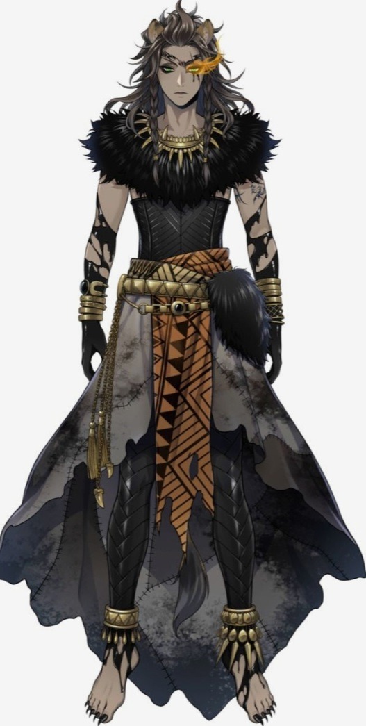
I think this is self explanatory-put shoes one, cause 1: ew, dirty floor may step on a nail and 2: you got long nails, if you stub a toe, the nail will break or be pushed back into toe and it will hurt, though I will say I like the "tights" or ink covering the legs and ankle bangles. The stitched rags are a cool idea but compared to other designs, it doesn't exude fear or an aura of power. I like the upper half though, it suits you and I like how the fur across the shoulders represents Scar's mane. The hair and makeup is nice, but the makeup is lacking compared to others.
6) Score: 6.8/10
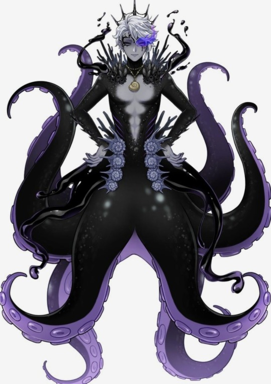
The makeup is amazing, love the addition of the crown->that plus the shell necklace are a lovely representation of Ursula. I was surprised and happy to see this ob transformation but it's kinda just a darker version of Azul's merform to me so lacking a bit of creativity, still like it though
5) Score: 7/10
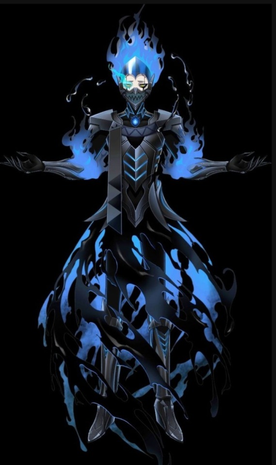
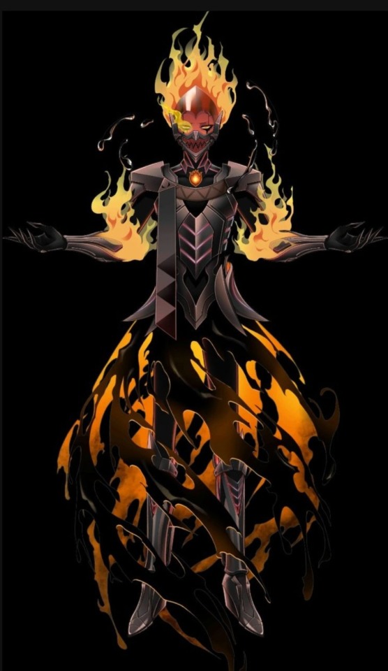
Admittedly this design is very plain compared to even the two before him, but it gains bonus points for changing flame color based on emotion like Hades' hair, the hair here is also styled just like Hades' so if we think about it, someone could have literally blowed his hair out during the battle like happened to Hades, plus I like the mask, similar to the masks that light up when you talk which is fitting for Idia's chatacter
4) Score: 8.3/10
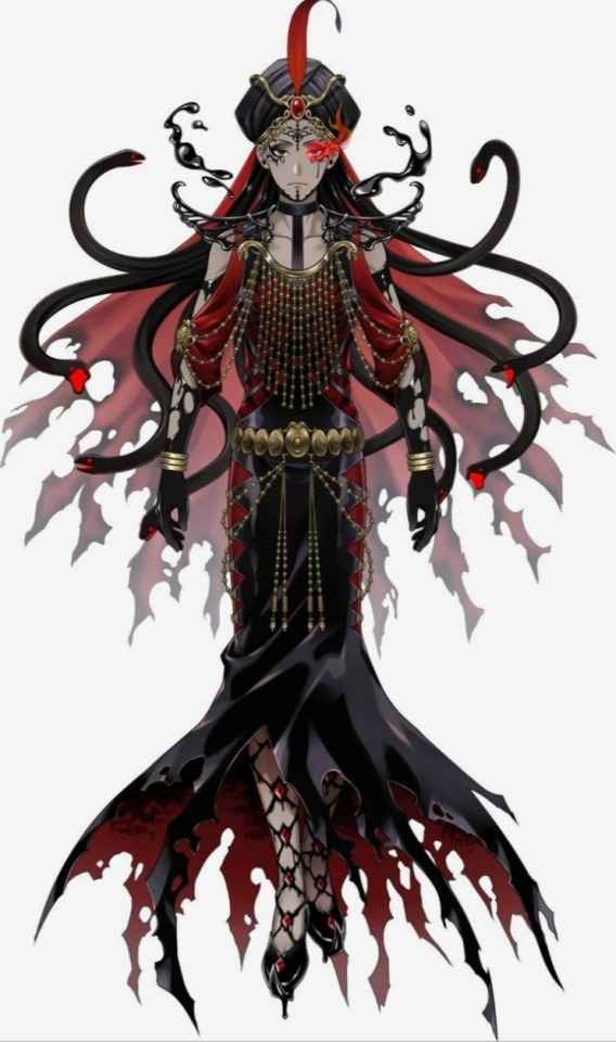
Shoes are freaking amazing, the snatched waist, the tight fitting ... uh skirt, dress (?), the dangly jewelry, amazing, love baggy-Jammi but Jamil needs to wear more slick clothes like this, black and blood red suit him, makeup is great, inky chin pubes are ehh, turban is a bit over the top but it represents Jafar when he first gets his power which is fitting and the medusa hair is also representative of Jafar's transformation and looking at Jafar's dialogue we now know that deep down Jamil loves puns which is great. Will say that although each character gets a skin tone alteration when the ob, I found Jamil's most apparent and he kinda just looks ashy, but still a great design
3) Score: 9.3/10
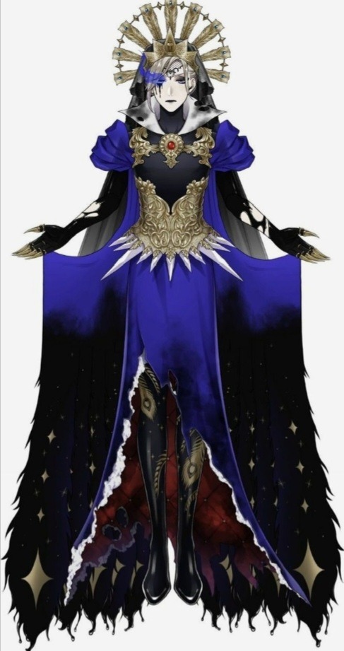
So when I first saw this, I hated his crown, sun, peacock headdress thing but seeing it more and more, it's kind of fitting, Vil is the only one who could rock something so "extra" (I mean that in a nice way, idk the right word for it), and if it represents a peacock it matches with the feathers on his legs, and I guess the claws do too. Honestly, I think this design was more inspired by the Evil Queen in Snow-white and the Huntsman (I may be wrong on that, don't quote me) but again, it is very fitting for Vil as a character. The subtle hints of red are nice, love the crown and the puffed sleeves and the dark veil. All of it is very grandiose and regal very queen, very Vil, but the dirty collar peaking out (and kinda the sleeve style) reminds me of Snow White which can be fitting for both the Queen and Vil because they both hate the one people praise but are always overshadowed by them, no matter what they do people will remember and connect them to the one they hate, even if they had succeeded in getting rid of them. The corset's okay, just shows that the rose has thornes, makeup's okay looks like his dorm crown and makeups nice but not much else
2) Score: 9.8/10

He is adorable. Should I be scared, yeah probably, but he looks like an edgy cupcake I love it. Has one of the best makeup designs, love that the crown stays but just becomes more deadly, love the choker, love the spiked collar, love the high boots, his heart is displayed for all to see, double belts are always a safe bet, the painted roses represent the queen how things went wrong, the thorny vines wrap around him showing how sharp his words can bite, and the cards hanging from him, dyed in black like him are a lovely addition to the ensemble because it represents how even when gone mad, the Queen's soldiers dutifully followed her orders and came to her defense which, if Ace hadn't done anything, would be exactly the case for all the Heartslabyul students when Riddle overblotted
1) Score: 10/10

I mean, come on now, look at him. I love the minty skin tone here its representative of Maleficent and really suits him. The cape shifting from purple to thorny green flames is also representative of Maleficent at the end of the film which I love, the crossing cage on his chest and under his skirt reminds me of the gates/windows/doors patterns of the time Sleeping Beauty is based in and we know he love architecture so points there, the style of the shoes/tights also look like the style if the time a little dorky but cute. He wears bangles and ink runs up his shoulders but I think it's interesting his arms and hands are mostly uncovered which is uncommon in almost all of the ob forms. The design of his corset is nice, don't really get the point of the belt tied in front but hey if it come down to it, grab and throw him over your should then sprint away, he'll be thrown off for a second but greatly angered afterward but hey distraction. The hair brushed back really seems to make him look more royal than he normally does which is nice and we can see his scales which are perfectly enhanced by the makeup outlining them. Now, I do like the green glowing between the plates of his tail but seeing the same pattern going on in his horns throws me off since I think I got too used to seeing his normal horns, his horns do look longer here but I'm not entirely sure that's true or if its just an optical illusion cause of the colors. Overall, the true extent of his strength and power are showcased clearly in this form which I think is great, and I see his cape is still dragging on the floor despite his height and the fact that he's floating so I need to see him walk down the stairs and swish his cape around like Mother Gothel
And that's it, what ranking would you give these Overblot forms? Which one would you wear?
#twisted wonderland#twst#twst rambles#design rating#character design#twst overblot#riddle rosehearts#leona kingscholar#azul ashengrotto#jamil viper#vil schoenheit#idia shroud#malleus draconia
107 notes
·
View notes
Text
Yandere Rise Donatello Designer "Catch Stitch" AU
okay, hear me out.
let me give context for this concept idea first (you could skip the next paragraph if you don't care, i'm just weird, i promise i start discussing the concept right after this next paragraph trust me)
i am a huge fan of this one designer in new york, bella pietro, her work is amazing. i was able to attend her bridal line debut fashion show in person this past sunday and got to speak with her very briefly. she's very lovely, relatable, super down to earth, and humble. she is also one of the influences for my own jewellery line, but this isn't the point i'm making, i'm going insanely off topic. i thought about what it would be like being a clothes designer in nyc.
donatello is the founder and ceo (at least, that's canonically what i'm led to believe) of Genius Built Technologies. it's also canon he designs Genius Built Apparel. i initially had this idea and shared it on discord a while back based around donnie being a member of a discord server with other designers. these designers usually joined said server for creativity, support, sharing each others' work, and giving critiques when wanted.
imagine you, an up-and-coming designer, join this server to gain more reach. while donnie was bored looking at others' designs and critiquing them harshly when asked to, he admired your work and advocated for you so that you could gain more popularity. the two of you accepted each other's friend requests and started talking in dms. he admired your work and thought it was cute how you were slowly rising in the industry, but you needed the right connections to actually get things going. you started getting seamstresses and a manager, but that took your time away from donnie.
donnie might have found out you lived in new york, that was when he suggested a meet-up for a collaboration. he was excited when you said yes, and a GB Apparel x For You line was in the works for when the two of you started discussing potential pieces. your crew got a little upset when you put all your attention on the collaborative project, especially your manager, and they thought it was a bad idea. you thought about listening to them and backing away to work on the collab line in the future. donnie... didn't really like that.
he loved spending time with you, as hard as it was for him to admit it. he adored the way you drew your designs, the face you made when you focused and shrimped over your tablet to get the details just right. he told you to adjust your posture, and you did it with a stretch, you ran your fingers through your hair he so badly wanted to run his fingers through instead. donnie hated the thought of having that taken away from him. once you told him you wanted to file away the collaborative project for another time, he managed to manipulate and gaslight convince you into believing your manager has the wrong idea, because his own brand was well known and high quality.
you hesitantly agreed with him and your crew began getting a distaste for you when you arrived late to meetings, made decisions with poor judgement, and delayed your own projects in favour of working with donatello instead. what you didn't know is that donnie anonymously emailed them all to quit their jobs with you because you were practically not working with them anymore. your crew moved on to work with other local designers. you didn't think much of it, you were aware people in this business would come and go, they would find other people to work for and it's no big deal, because you could sew your designs yourself.
besides, donatello had been a big help, he lent you his sewing machines that literally sewed by themselves. your own fall line had been presented on a runway at a moderately sized venue, a team curated by donatello organised it as if he were your manager. everyone on the server the two of you met on barely showed their support at first, until you got incoming praises and compliments from everyone after donatello's worship of you was sent in the runway channel. you were unaware to the fact that donatello threatened everyone with their careers if they didn't support you.
everyone seemed beginning to dislike you, your fans acknowledged that it didn't seem to be you at fault because your head was still held up high, staying positive and thanking anyone who bothered to take a look at your collection. donatello was working behind the scenes to isolate you as much as possible. he didn't want anyone taking you away from him because you were his precious fashion genius, your ideas complement his. that's why GB Apparel x For You is going to rock the fashion world, he had thought, deep in his delusions of spending more time with you. one look at you and it had his heart beating out of his chest.
your workspace in his apartment was a mess, fabrics everywhere, sketchbooks and a couple tablets (courtesy of Genius Built Technologies) with plenty of space for designs and you sat on the floor with your hair a mess and new glasses (those were courtesy from donatello himself) on your face after staring at the screens for so long. the softshell simply watched you work, enamoured and savouring the way you find his apartment more comfortable to work in because yours is already so cluttered.
donatello was so proud to see the results of your collaboration, he kissed the top of your head and held you close. you've had affectionate friends before, but you had only intimately known donnie for a few months. sure, he was one of the turtles that saved new york years ago, not to mention his brand even climbed up the ranks for a place in paris fashion week alongside balenciaga and valentino... so you knew him... but you didn't ask for this. you used to have more friends, lovely colleagues. whatever happened to that ?
of course, once the collab line debuted in the spring you went back to work, you designed a men's fall line you thought would grab people's attention. it certainly snatched donatello's, when he called you frequently and realised you were parting from him to work on your own, it pissed him off. he wanted to know what you were hiding. you hesitantly let him in on a day when you were being interviewed by april for press, dressed up for photography and not for him. you're only for him, no one should see you except when you're beside him. he lashed out at you in front of april, upset that you weren't telling him your plans since the GB Apparel x For You collaboration, and april took notes of the drama. not for press purposes at all, but to tell his brothers.
you didn't see donatello for a while after that, to which you were glad. you felt a weight finally slipped off your shoulders as you rebuilt your community. people didn't know that donatello was the one at fault for your darkest moments. you rebuilt your community over the course of a year, making new connections and finally making it into new york fashion week all by your own efforts, not by donatello's.
it was when he showed up at your door everything went downhill again. he pushed his way back into your life, asking for a spring GB Apparel x For You line even though he already started on his own designs, incorporating style that you would add due to how well he already knew you. over the year he had been gone, he watched how you grew and connected with other people in the soho fashion scene. the thought made his skin crawl. it irked him to know you were out and about, perhaps having dinner with your new manager, or spending hours at a time with your new seamstresses after you threw out the sewing machines he so lovingly gifted to you.
all he wanted was to share his world with you, have you live in lavish luxury like you deserve. you said no. you already had ideas for your spring line which would be presented in london along with new york, you didn't have time to collaborate with him. donnie threw another tantrum in your apartment, this time feeling a lot more destructive. he threw your decorations everywhere, then held up some of your supplies to set them on fire. it scared you into submission, telling him yes, putting off your own projects to move into his apartment and get to working with him on the next collab line.
things were different this time. donatello was a lot more clingy, literally working alongside you as the two of you designed the thirty-piece collection, he made gentle suggestions and leaned in close, added and subtracted things on what you already drew. the two of you had ordered takeout sometimes and he would be the only one allowed to receive the food. you felt trapped. there was nothing you could do about it, just accept your fate.
you disappeared off the tabloids, no one knew where you went, not even april. donnie kept you away for his eyes only, wrapping his arms around you at every chance he got, nuzzling into your neck from behind as you tried to break through the parental locks donatello placed on your tablets. that won't work, darling, he said, a smirk on his face you could feel against your skin. it made you sick, your stomach churning at the thought that you might stay in your captor's arms forever.
#rottmnt#rise of the tmnt#rottmnt writing#rise donatello#rise donnie x reader#rise donatello x reader#donnie x reader#donatello x reader#rottmnt x reader#yandere rise donnie#yandere donnie#no beta we die like gram gram#angst#dark content#jules' thoughts
101 notes
·
View notes
Text
Ceroba feels sick.
Axis is a simple thing. There's little creativity to him; a box of a head, antenna that automatically swivel to catch radiowaves, a single wheel upon which to roll, a heavy gear welded to his right side, and arms powered by thick smog. He's grey and pink and a stained off-white, he's stiff and monotone and-
Ceroba feels sick.
She can see him in his creations.
A bitch of an AI because he never much liked the feeling of being alone, without some living creature that would feel - that would talk to him.
His voice, changed and distorted to become the words that Axis uses.
The way that he'd weld metal together, the bits that he'd use bolts for, the care in the glass and the crudeness in the wheels.
Axis rolls off, Chujin's distorted voice muttering to himself, wondering where his targets went.
Ceroba can't help but watch him, eyes sharp, searching.
The gear on his side is welded on with little thought to making it pretty or smooth.
An old memory comes to mind -
"I completely forgot to think about the weight distribution of this new one," Chujin says as he washes his dish.
Ceroba absently dries her own. "What are you going to do about it?"
"Shifting it all just enough to balance out isn't worth it," Chujin says, thoughtful. "I might just add something to even the weight of the right side- it's the left that's heavier, see."
Ceroba puts her dish away. "I think this will be the one, Chujin." She offers him a smile.
He smiles back. "You say that every time."
It's a shit job - the final touches were always hastily added because of time constraints or just his need to move on to something new.
It's him.
Again.
Ceroba steps out of the locker, careful. At the sound, the child moves too.
Axis is a simple fucking thing.
There's little creativity to him (a box of a head, automatic antennas, a single wheel, a heavy gear, thick smog), and Ceroba feels sick, and Ceroba knows that Chujins before and before and before would have more fun with the design. He wouldn't be grey and pink and off-white, he'd have colour. He wouldn't be so stiff, he wouldn't be so monotone, he'd be more and have more and he'd make Ceroba feel so much worse because he'd be everything that reminds her of Chujin.
Grief grips her in the form of a robot that doesn't recognize her and doesn't recognize who she was to him. Grips her in the form of his bolts and seams. Grips her in the form of his distorted fucking voice.
The trash robot is cute. She likes making it.
There's a bow and Ceroba knows exactly why it's here and exactly who it belonged to. She feels her stomach turn and her jaw clench and she smiles and adjusts it on the shitty scrap metal creation anyway.
Axis is so. Fucking. Simple.
And Ceroba feels so. Fucking. Sick.
He sees their shitty little trash can creation and hearts glow behind the glass of his eyes.
(Of course, even when he's working on something important, on something he needs to get approved, he'd add something like this. Of course, in this antithesis of everything that Chujin loved to do with his machines, wrapped in the ghost of Chujin's way of creating, the soul of it is still so purely him.)
"The shimmer," Axis says, with emphasis. "The complexion..."
There's a beat of silence as Ceroba waits, a memory needling at the back of her mind.
"The..." Axis stops for a half second - just long enough for Ceroba to realize what this reminds her of - and then finishes: "CURVES!"
Kanako makes a gagging noise from the doorway.
"Ewwww..." she whines.
Ceroba turns and sticks out her tongue at her daughter.
Chujin laughs. "Kanako, please. Look, your mother is so wonderful, I just have to kiss her."
"Noooo!!" Kanako wails. "You don't!! Gross!!"
"Her shimmer, her-" he pauses, unsure. "Complexion?"
Ceroba makes an unsure noise. Not his best.
"Her curves-"
Kanako runs up and shoves him, making him laugh and put his hands up to block her.
Ceroba reacts the same as she did then- "Okay! That's enough!"
She places her hands over the child's head, some sort of disconnect between past and present making her pause at the lack of ears perking up under her palms. "C-Clover, let's-" She looks up at the robot.
It's still Chujin's.
"Let's wrap this up."
Clover's soul forces itself back into their body and Ceroba walks up to Axis as he giggles about his newfound love.
There's no similarity to her daughter when she places her hands on either side of Axis' face, but she remembers Kanako's friends coming over, remembers being part of little school-girl's gossip sessions, remembers a situation something like this one.
"Do you wanna know a secret?" Ceroba whispers.
"Yes I would like to know a secret," Axis says loudly.
"They told me that they like you, but will only go out with you if it's casual," Ceroba says, glancing sideways at the trashcan, as though it'll hear her. "Get to know them a little bit, you know?" Advice that once worked on second graders but wouldn't here runs through her head, until she lands on, "Ask what their name is or something."
"Okay," Axis says.
Ceroba stands and takes a step back. "Alright," she says. "Give it a shot!"
"Hello my name is Axis, what is your name?"
Ceroba frowns. Perhaps she hadn't thought this bit through- Their creation can't exactly respond.
Axis waits for a minute, and then starts laughing, a noise so similar to Chujin over the phone that Ceroba jolts.
"You're so funny; want to get married?" Axis asks, and Ceroba is shaken out of her feelings by the absurdity of the sentence.
"Hey! Remember what we talked about?"
Axis turns to her. "They said yes."
Ceroba pauses. "..What?"
"I'm honestly just as surprised as you are," Axis says. "This rocks."
"...Right." A hand comes to tug at her sleeve, and she turns to look at Clover. "Well. Clover and I have to go now."
"Go where?" Axis asks, and he sounds nervous.
"Go where?" Kanako asks.
"Hotland. Just a business trip," Ceroba explains. It feels like a lie.
"Oh," Axis says. "I wish you luck, then. I must recharge, which will set me back to my factory settings, but- [hatted human] and [tall lady] added to [Authorized] list." Axis does a little nod. "There. Now I will not attempt apprehension next time we meet."
Ceroba smiles. "Thank you, Axis."
Axis does a little nod at her again, picks up his fiancé (?) and begins to roll off. Halfway down the walkway, he stops and turns around.
"Oh. One more thing."
Ceroba blinks. "Hm?"
"You said your husband was my creator?"
Her heart drops.
"Would you tell him that I miss him?"
Her eyes burn.
"He was always very kind to me."
"I-" She sucks a breath in, her whole body tense. "Yeah," she says, her voice coming out lighter than she feels. "I'll tell him."
"Thank you," Axis says. "Goodbye."
Axis is a simple thing.
He turns back around, fiancé in his hands, and believes her without a second thought. The gear is still welded to his side. His voice is still something like Chujin's. The smoke pumps from where his shoulders would be, the screws are spaced out with perfect precision, the lights of his eyes still flicker with hearts.
Axis is a simple, simple thing. Who misses Chujin just as much as he is him.
Ceroba feels sick.
69 notes
·
View notes
Text
The Chief Justice and the Worst Painter in Fontaine Chapter 3: The Chief Justice, the Painter, and the Otters
summary: It was supposed to be your time to relax and get in touch with your (extremely) buried creative side…but then your boss showed up. Masterpost here
Chapter 1 || Chapter 2 || Chapter 3 (Bonus Scenes) || Chapter 4
The week seemed to pass by at a crawl. You found yourself looking at the clock frequently and tapping your feet. You got scolded more than once for being distracted. When Sedene delivered Neuvillette's note to you that Friday, you surprised even yourself with how eagerly you took it from her.
However, confusion replaced excitement when you read the note.
We will be going underwater tomorrow.
Some of your coworkers dived in their spare time, but you yourself had never done it. You could barely even swim. What did Neuvillette mean by this?
Except for the meeting spot, there was no other information. Not even instructions to bring spare clothes.
Maybe this is a euphemism for killing me after I shouted at him, you thought half-jokingly.
By now, you knew that Neuvillette wouldn't do such a thing. But, just in case, you wrote a note for your roommate and put it in your drawer.
You went to the designated location the next day. Your stomach was filled with butterflies, and your arms were filled with your painting supplies. Come to think of it, how were you even going to paint underwater?
Neuvillette was already there, as always. He was wearing his usual clothes. There were no diving suits or anything that could be remotely used for diving in sight.
"Hello, Monsieur Neuvillette," you greeted him like normal. "Are we not going diving today?"
"We are indeed going to go underwater today, but not by diving."
"Going underwater...but not diving?" you repeated, confused.
Neuvillette saw the confusion on your face, and a small wrinkle appeared between his brows. "I'm sorry, I can't explain it in any more detail than that. But I assure you that it will be completely safe. Although, you are free to decline if you wish. I won't mind."
I don't know why, but I feel like he would mind if I refused, you thought, and happened to glance up at the sky. It was a brilliant blue before, but now you could see white clouds slowly drifting across it.
You pondered. Going underwater without any aids seemed like a surefire way to die, but you were going to be with Neuvillette.
It was funny. You still didn't know anything more about him that you hadn't already known before you two started spending time together. And yet, you instinctively knew that you would never be harmed as long as you were with him.
And besides, going around Fontaine had awakened the spirit of exploration within you. You weren't about to quit your job and become an adventurer anytime soon, but the chance to see the underwater world for the first time...you couldn't let that get away from you.
You nodded eagerly and stepped closer to him. "Yes, I would love to go underwater! Although, I'm really not a strong swimmer, so I'm afraid you'll have to look after me a lot."
Perhaps it was the shadows of the (rapidly receding) clouds playing tricks on your eyes, but you could have sworn that Neuvillette's lips curved into a smile. "I'm perfectly fine with that. And there's no need to worry, you won't be required to swim."
Not required to swim? Just how were you getting underwater? As if he read your mind, Neuvillette said, "Please allow me to carry you in my arms."
"Okay?" Did you just hear him right?
He seemed to take that as agreement and lifted you into his arms easily. He must be stronger than he looked. You nearly dropped your things. His face was suddenly very close to yours, and you had the urge to bury your face in your hands. An attractive person looking at you so closely was not good for your health.
"I-um-I...what...um...sir..." you babbled like an idiot. Never in your wildest dreams did you imagine that you would be held in the Chief Justice's arms.
"My apologies, I startled you. But don't worry, it won't be for long," Neuvillette informed you. Wow, his pupils really are slitted, your brain thought idly, as though to prevent itself from spontaneously combusting by distracting itself from the current situation.
He slowly stepped forward into the water. "I hate to make more requests of you, but could I have you close your eyes? It will make this a bit easier for both of us."
How would I closing my eyes make it easier for him, you wondered, but obliged. You didn't think you could handle staring at his face so closely for any longer.
Neuvillette walked forward a few more steps. Before long, you felt coldness surround your feet, then your calves, and slowly rise upwards to your waist. Your clothes didn't feel wet, strangely enough.
As the water came up to your chest, and soon, your neck, you held your breath. You did trust Neuvillette, but anyone would feel a little bit of panic at the prospect of going underwater, right?
You feel the water caressing your cheeks, then rubbing against your temples, before covering the top of your head. You were underwater now. Though you couldn't see anything with your eyes closed, you could sense that it wasn't completely dark.
The two of you were going somewhere. You hoped it was close by because you weren't sure how long you could hold your breath for. You could feel the cool currents of water rushing past you, though they weren't as bone-chilling as you expected. You were moving pretty fast--was Neuvillette swimming? Somehow, you just couldn't imagine the elegant Chief Justice doing something like that. Maybe that was why he asked you to close your eyes? Probably not.
Your head was starting to hurt. You needed to take a breath. Bracing yourself to breathe in water, you exhaled--and nearly gasped in surprise. You were breathing normally like you were on land. What was going on? You didn't dare open your mouth to speak, though.
Eventually, Neuvillette slowed down. It seemed that he had reached his destination. There was a brief resistance like he was pushing through something, and then you were inside some sort of building.
"You can open your eyes now," he said, and gently let you down. You slowly opened your eyes, and your breath caught. He had taken you inside a round, gazebo-like building. At first, you thought it had full-length windows on all sides, but when you looked closer, you saw that the "glass" was wavering like water. The inside of the building was perfectly dry and tastefully furnished with bookshelves, a rug, and tables. There was even a gramophone.
"This is an observatory built by researchers," Neuvillette explained. "It's currently unused by anyone, so I thought that it would be a perfect place for you to paint."
"It really is..." you said, and then suddenly realized something. "It's incredible."
The outside was even more fantastical than what you've seen in pictures. The surroundings were cast in a dreamy blue light. Fish swam through kelp and coral formations like birds flitting between the branches of a tree. The white sand at the bottom glittered in the sunlight that filtered down. It was like you were on land, but everything was more...magical. Even the crates and pottery scattered around and half-buried in the sand looked like precious treasure chests.
You were so distracted by your surroundings that you belatedly realized that your clothing and things were completely dry. You were also able to breathe normally earlier. Was this Neuvillette's doing?
"Um, Monsieur Neuvillette, were you the one who kept me dry on the way here?"
"Ah," Neuvillette looked awkward all of a sudden. His gaze wandered around slightly. "Well, as the Chief Justice of Fontaine, having such powers is a necessary part of my job. And I made a promise to you that I have every intention of keeping."
He nodded, like that was supposed to be convincing. It wasn't.
How? You wondered, but decided not to press him on it. Everyone in Fontaine knew that the Chief Justice was hundreds of years old. There were many theories about who or what he was, but someone as long-lived as him would most likely have some kind of power. You were just a lowly desk worker without even a Vision, so there was no real reason for you to know his true identity or anything.
Still, the fact that an ancient, powerful being like him would spend his time on you, even using his powers to help you with something as trivial as your hobbies...you felt something warm and indescribable well up inside your chest.
He did so much for you out of the kindness of his heart. You wanted to repay him with what little you had. An idea was forming in your head.
You set up your easel and paints and got to work. All of the paintings you painted until now were neatly stored away in your apartment, never seeing the light of day again, but this one will be special.

Though it was cool in that underwater observatory, your forehead was damp with sweat from concentration. You could picture the underwater scenery perfectly in your head, but it wasn't quite transferring onto the canvas in the way you hoped. It was so frustrating that you felt like crying, but you couldn't stop.
You discovered something new about yourself--you enjoyed the challenge. Perhaps it was honed from having to meet your superiors' exacting standards over and over again. (Wasn't this supposed to be my relaxation time away from work, a part of your brain wondered).
As you painted, you could feel Neuvillette pacing around, throwing glances at you frequently. It was strange, he was usually so still as you painted. Perhaps being underwater made him restless. You felt bad that you couldn't divide your concentration well enough to talk with him as you worked. He must be feeling bored.
That realization hit you surprisingly hard. You'd felt similar feelings before, but there was something deeper to it this time. More than a subordinate worrying about disappointing their boss. What was it?
You decided not to probe those feelings any further. It felt like you were crossing a line.
You finally put on the finishing touches and stepped back. Now you needed to wait about half an hour for it to dry. Feeling shy about showing it to Neuvillette before it was ready, you found a blanket on one of the couches and threw it over your painting.
Neuvillette saw what you did. His brow furrowed in confusion. "May I ask you why you covered your painting? Forgive my forwardness, but I was quite looking forward to seeing it."
"I want to wait until it dries before showing it to you," you put on your best, most innocent smile despite the butterflies in your stomach. Neuvillette's eyes widened slightly and he took a few steps back. Was your smile that horrible?
Electing to ignore that bruise to your ego, you changed the topic. "Monsieur Neuvillette, I would really love to see the underwater world more. Could you please accompany me outside? I-If it's okay with you, of course."
You wanted to kick yourself for being so presumptuous, but that was the first thing that came to mind.
"Yes, of course. Please, give me your hand." That was fast.
You obeyed, and he pulled you towards the watery film that served as the entrance of this observatory. When you went outside, you felt the coolness and pressure of the water on you, but you could still breathe. Your legs were dangling below you. Maybe this was what flying felt like.
"You can talk as well, as long as you're with me," Neuvillette told you. He looked majestic even--maybe especially--in the water. You had to look away for the sake of your heart.
Your gaze landed on a group of adorable otters. They were swimming together on their backs, holding shells in their little paws. They occasionally flipped the shells up into the air and caught them, twitching their noses as they did so. They were the most adorable creatures you had ever seen in your life.
"Oh Archons, they're so cute!" you squealed, then practically dragged Neuvillette over to them with you. The otters didn't startle when you approached them. In fact, one of the otters even came up to you, its tiny face peering into yours and its paws brought together. Your noses were practically touching. You really wished you brought a camera with you.
"Look, sir!" you turned to Neuvillette excitedly and was caught off guard by the smile on his face. When he realized you were looking at him, he cleared his throat. "Yes, they are indeed lively and adorable creatures."
Something suddenly occurred to you just then. Neuvillette's white hair and the otter's long white fur, the shared blue streaks, even the fact that they were both wearing (figuratively in the otter's case) the same shades of blue...could it be possible?
A vivid image of Neuvillette swimming around leisurely on his back, his nose twitching happily, holding his cane in his hands and flipping it in the air, appeared in your mind.
Oh no, you could feel your lips curve up into a smile. Giggles threatened to spill out from you at any moment. You had to hold them in, but it was so hard, especially when both Neuvillette and the otter were looking at you with the same confused expressions.
Unable to endure it anymore, you reflexively pulled yourself from Neuvillette--and immediately started choking as water flooded your lungs. Thankfully, Neuvillette got to you before you could become a permanent part of the sea. At least your giggles had disappeared.
After repeatedly assuring Neuvillette that you were fine and both apologizing profusely to each other, you had a fun time exploring the fascinating things that lay beneath the surface--with Neuvillette's hand firmly around your arm, naturally. You liked the silky feeling of the seaweed beneath your hands and the plump Blubberbeasts lying on their backs.
Before long, you two returned to the observatory. Even in the water, you could feel your hands getting sweaty as you approached the gray building. This was a whole new level of anxiety from before. Maybe it was because you were giving your painting to Neuvillette this time.
Well, you've learned from experience that there was no point in putting things like these off. If he doesn't accept it, maybe I can beg him to let me stay here forever, you thought, half-jokingly.
You walked over to your painting and uncovered it. It was all dry now. It didn't look as good as you hoped, but it was finished and there was nothing you could do now.
"Here, Monsieur Neuvillette, please take a look at my painting."
Neuvillette stepped up next to you and gazed at your painting in silence. That was normal, except for the fact that the silence stretched on unusually long. You could hear your heartbeat in your ears.
"...Did you paint a dragon here?" Neuvillette said at last, pointing at the blue, wavy lines in the center of your painting.
"Yes...?" you said. Oh no, is it so ugly that he can't even recognize what it is?
"Why?"
"Why...?" The clipped, blunt tone of your voice made you panic. You shouldn't have done this after all. "Well...because dragons are...cool...and amazing...and stuff, like you. I mean, my favorite story when I was little was the story of the hydro dragon, and now that I'm underwater, I thought that it'd be cool to imagine the dragon swimming in the sea. So I wanted to put that in this painting. Which I am giving to you, sir. As a gift."
Your explanation sounded lame even in your ears, even though it was the truth. And come to think of it, did the hydro dragon even swim? The tales you knew only spoke about it being able to make it rain.
"You're giving me your painting as a gift?" Neuvillette repeated.
"Um...you don't have to accept it if you don't want it..." You were seriously considering jumping out of one of those watery walls right now.
"Perish the thought. I shall frame it and put it in my office."
"Huh!?"
"I think it's your finest work yet. You captured the essence of what it is like being underwater perfectly."
"Really? Oh, uh, please don't put it in your office, sir. It's embarrassing..."
"Embarrassing? Not at all. It deserves to be displayed for all the citizens of Fontaine to see."
Now you felt like jumping out into the water for a different reason.
"No, no, please don't do that...it's just my way of saying thank you for everything you've done for me. You encouraged me, brought me to all sorts of wonderful places, even here...and yet I've never done anything for you."
Neuvillette turned to look at you then. There was alarm in his eyes. "A thank you gift? Does that mean our trips together are ending?"
"What, no!" you exclaimed. "I just wanted to thank you in some way, for being a good friend. I'm not rich or powerful or anything, so this is all I can give you."
Silence hung in the air. You said it. You said the f-word. But you didn't regret it. Even if it was one-sided, that was who he was to you. You looked straight into his eyes, almost daring him to say something.
He leaned forward until his face was right next to your ear. Your breath caught.
"I wouldn't trade your gift for any amount of gold or jewels."
Neither of you said anything more on the trip back to the surface.
156 notes
·
View notes
Note

Okay, it bothered me that the ASPD bunny was so weirdly contrasting to the other plushies, and I could totally see how the plush was offensive…
…So I decided to take a crack at redesigning, more for fun and to cheer you up. However, I do not have ASPD, but I did try to take information about the disorder and use that. Feel free to DM me or delete this if it offends you or I did a bad. 😅
The one thing I kept was the large ears and pose. I just drew over the picture. Here was my thought process.
For starters, I used the colors off the ASPD flag: dark purple, a darker pink, and a gray. I also added black and light pink. Black “gloves” and “boots” with pink X’s to show an aversion to touch. Pink bunny mask with a smile to represent emotion masking. I added the ASPD upside down scale from the flag to the ears since that’s the most common symbol I’ve seen for it. I gave the face a sort of tired/neutral/done with everything expression and got rid of the gaping mouth of the previous plush and gave it the mouth of sone of the other plushies. Finally, I added a scary face on the stomach before putting an X over it to signify that those with ASPD are not evil and they’re just existing.
I hope you like it. I tried my best with the info I had. 😅 I apologize if this is offensive, I really tried to be respectful.
I think this is a really creative approach to redesigning it! I've been considering how I would redesign it as someone with ASPD, since you sent an ask about that earlier as well, and I'll get back to that later.
I think this is probably about as good as it gets for someone who doesn't have experience with the disorder, and is just trying to bring positive representation, so I applaud your efforts.
If I were to give advice for your design, I'd say that the face in the middle is a bit redundant, after all the people buying this plush with the disorder don't need to be told that they aren't inherently evil, and it can still potentially rub the wrong way if it's there to remind other people we aren't evil. It should just be common sense that we're just normal people like everyone else, and we don't need a visual reminder of that.
You could potentially swap out the stomach with a scale symbol instead, that would make the ears look less cluttered as well, and considering it would have to be embroidered it would give something textured to run fingers over instead of in a more fagile place like the ears, since the fabric used in that area would most likely be thinner and a most silky texture, that way there's no texture incongruencies.
The touch aversion gloves are cute, but touch aversion isn't necessarily a symptom of ASPD. That's going to be determined more on personal experiences, rather than the disorder.
20 notes
·
View notes
Text
My Reimaginings for the HB/HH Rings + Hellborns
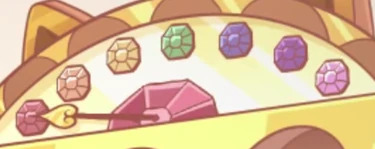
My ideas for a redesign of the setting and its inhabitants to have it make a little more sense! I'll put all this under the cut so it won't be too long on the dashboard:
Okay! So, I've noticed QUITE a few slight discrepancies between some of the rings. I wanted to share how I would do it, based on some critiques I've seen. This is in no way anything negative, I just want to share how I would do it. With that in mind, know that I tend to be a bit blunt with my criticism but know that it's out of me thinking that it would be the obvious option, personally, and not out of any rudeness.
The Flaws
I want you to know that I in no way know anything about demonology, but I do know a bit about Dante's Divine Comedy and the emotions associated with colors. I'm going to go down the list in the show's order, one by one, and then give my versions at the end.
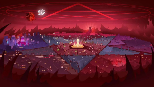
First is the Pride Ring, where the main cast of both shows reside. Now, I want to point this out: why are ALL of the sinners only confined to this ring? That doesn't even make sense from a biblical retelling perspective. Didn't the entire journey through Inferno show that there were sinners on every level of Hell?
Anyway, first off, I really don't see this as the Pride Ring. I expected this to be the Wrath Ring, which is what I thought until I saw the actual Wrath Ring. There's this thing called "color psychology", which is the study of how colors influence emotions or give clues to the atmosphere of someplace. Historically, purple has always meant royalty and wealth, since it was the most expensive color to dye your clothes in. I think that would be a more fitting color for the Pride Ring. As for the design, It's cool, but doesn't say Pride. It says New York, which I think would be the opposite of Pride.
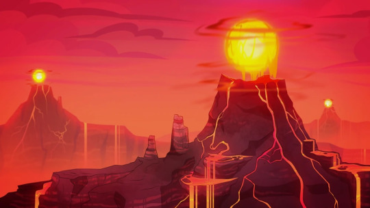
Next is the Wrath Ring, which looks great. I have no actual criticism of the ring's design itself since it fits really well. I like the volcanic elements and the fiery sunset sky, and the fact that it's where many hell beasts/animals reside makes sense. Also, it is mainly rural and has fire-related weather (flaming tornadoes) which also makes sense. I have no fixes for this. Good work!

The Gluttony Ring is the same way. I appreciate the fact that the sky has hexagonal shapes in it (not shown above) and that it's mainly plant life since the actual Beelzebub is an insect, and most people associate insects with being outside. There are a few things I'd change, like pushing the plant aspects a bit and having the buildings look more like various insect nests, not just beehives, maybe a few dens or plant-inspired buildings (I really like how Zootopia's world is built because it was made with the builders in mind: animals. Since they use organic structures in real life for their homes, they made some buildings have a curvature that fit their "ancestor" instincts, it even extended to their cars at one point. I highly recommend reading The Art of Zootopia to see their creative process with a bit more polished language).
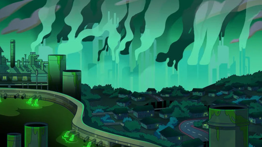
Okay, why did they make the Greed Ring green?? Everyone knows that green is the universal color of Envy, so why is it here? I get that making it green works much better than any other color, and I agree, it does look better, and it's the same color of money, but I have an alternate idea. Make the Greed Ring yellow.
This might not sound like a good choice, but here's my reasoning. I love that the Greed Ring is a polluted, overly industrial cityscape, that fits amazingly. But if you look at real-life smog-filled cities, what color are they?

Yellow. Or at least a dirty, dark yellow-brown. So what I'm saying is that you don't even need to make it a bright yellow, making it a dark yellow-brown would really show how filthy the Greed Ring is. Also yellow is the color of gold so it also makes sense symbolically.
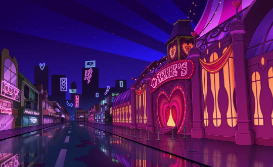
I have my gripes with the Lust Ring. Why is it dark blue?? The color symbolism was right there, pink and red are the most associated colors with lust!
However, I do like the fact that it's always night in the Lust Ring, it's very symbolic of the "nightlife" aspect of the emotion. I just don't know why they chose a normal sky color over something else.
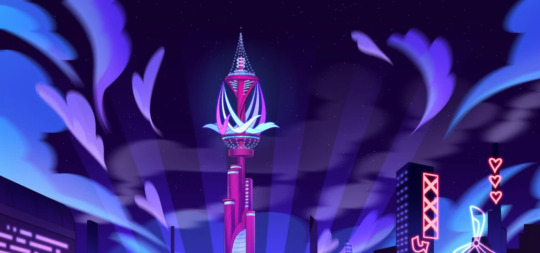
I am a sucker for good color combinations, but I don't really think making the night sky dark blue made sense. It doesn't even have to be a drastic change, just shift the night sky's color to the warmer side a bit. If the ring does have a day and night cycle, and I'm just stupid, make the day go from hot pink to light pink from top to bottom, then have the night sky go from red/magenta to hot pink, with white stars (or just make the sky a lighter version of those two options). It would look mega pretty!!
The Envy Ring is one we haven't seen yet, but I wonder what we'll get since we already used up our green card with the Greed Ring. Someone I was talking about this with said that since the Envy Ring is ruled over by Leviathan, the ring will be ocean-themed and blue, like the ocean. I like that idea since sea blue is, in fact, a real color (and I also think that those 2 twins from the Mammon episode are from there, because of the way they acted and since they are fish-themed), and the theme fits. But the problem is. Sea green is a real color too.
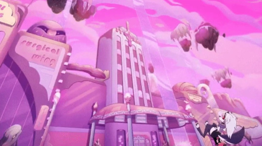
Wait, this was the Sloth Ring?? I assumed this was part of the Lust Ring because of the colors, and because I was holding onto some hope of the color psychology making sense!
But. I LOVE this ring. The more pastel color of the ring actually relaxed my eyes a bit, which I think was the intention. I love the floating islands and the waterfalls, it all gives off a very relaxing atmosphere. My only design change would be to change the sky to a color like baby blue since blue as a color is actually scientifically proven to reduce feelings of stress and anger.
My Rendition
Now that we have all that out of the way, here's my version of how I would've done things.
I would match the colors of the rings to their corresponding color. I would arrange them in the way that they are in the show, but we'd risk that cool rainbow gem order up top. But if we want to arrange them in rainbow order, they'd be inaccurate to the order of the rings in Inferno (I think??), so you can choose which order you'd like, I'm just doing this for myself. Also I realize that they aren't really based on the nine levels of Hell, but the 7 Deadly Sins, which is fine by me, I find that making more sense.
Red = Wrath (an obvious choice, since red signifies strength, danger, and actually stimulates energy in real life)
Orange = Gluttony (it just makes more sense than yellow, plus if we're assuming the bee motif, it's the actual color of refined honey)
Yellow = Greed (color of gold and matches the smoggy city it's depicted as)
Green = Envy (another obvious choice, plus since Leviathan rules over this ring, it would match the ocean aesthetic as sea green)
Baby Blue = Sloth (soft blues actually cause a relaxed response in the brain)
Purple = Pride (color of royalty, also associated with arrogance and wealth)
Pink/Hot Pink = Lust (OBVIOUS CHOICE)
The Hellborns
Now my headcanons on what the overall citizens of each ring would be. I actually have an idea for slight species dimorphism for all the imps in each ring but I'll have to design that another day. I want my rainbow imps dammit
The Wrath Ring would have the highest imp concentration, with any other demon species being the lowest here. Imps who are born here are red in color, about the same shades of red that we see in all imps in-show.
The inhabitants of the Gluttony Ring should be bug/insect demons since the ruler of the ring is literally an insect. Imps born here are shades of orange.
The Greed Ring would have those shark demons seen in Exes & Oohs, but someone I was chatting with said it would make more sense for all the aquatic demons to be in the Envy Ring, so I don't know. Imps here are born in shades of yellow.
The Envy Ring would have mainly fish/aquatic-themed demons. Imps born here are shades of green.
The Sloth Ring should make the demons there have more themes of ungulates or ruminant animals like goats, sheep, and pigs because Baphomet is not a demon species. Imps born here are shades of blue.
The Pride Ring is where demon royalty mainly resides. Imps are rarely born here and if they are, they're usually born into servitude. Imps born in this ring are purple.
The Lust Ring is where incubi and succubi live (like Verosika). Imps born here are shades of pink.
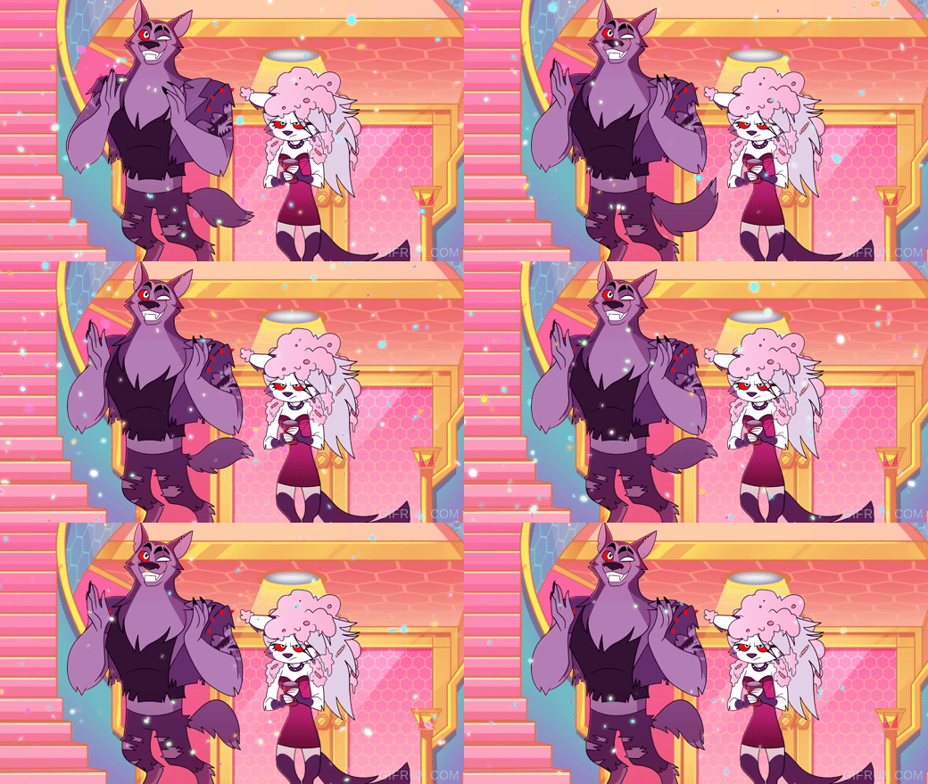
For Hellhounds, I think they should be found in all rings rather than mainly in the Gluttony Ring. Even though the reason that's where they are is because Cerberus apparently guards this ring is very clever, it doesn't make that much sense. I also think they should all be grayscale and have their eyes correspond to the color of which ring they were born in (I love achromatic color schemes with one bright color to add color to it).
Anyway, those are my thoughts! I hope you enjoyed this interpretation of mine!
#redesign rants#hazbin hotel#helluva boss#hazbin critique#helluva boss critique#hazbin critcal#helluva boss critical#I'm not really ''in the fandom'' enough to call myself this but I've watched the shows#long post
75 notes
·
View notes
Text
some more detailed thoughts about Venom: The Last Dance
spoilers ahead
Two theories about why we didn't get Toxin from Pat Mulligan even though it was teased at the end of Let There Be Carnage:
First, more likely, the writers just didn't see a way to write Toxin into the script and needed a way out of the corner they painted themselves into.
OR, they wanted to leave one more symbiote "out in the wild" since the others all ended up contained at Roswell, perhaps for use as a future villain, plot, or cameo somewhere. So they split up Toxin and Mulligan without confirming that Toxin died somehow, so they can use him again
(it's also possible that the actor's contract ran out, so they needed to kill off Mulligan in some way but didn't want to get rid of Toxin entirely)
On that note. Green is FUCKING COOL and I love the way they take shape. The serpentine, almost underwater way that they move is beautiful, and really brings us something unique compared to the other, more strictly-humanoid symbiotes we've seen. Wish we could've seen some more long-term things from them
I do love all the other symbiotes they brought in, and how we see both comic symbiotes like Lasher and Agony and a few new ones like Green and Twin
I've seen people theorizing that the tan-colored symbiote is Phage, but it's really not?? That one was like a symbiote-Sandman almost, it was tan with big clublike fists, while Phage is bright orange and has spurs along its back and shoulders. It's okay for it to be a new symbiote, guys. Not everything has to be one-to-one from the comics, especially if they're all gonna get wood-chipped in the end
LOVE that we got Agony, and I especially liked the tie-in with the lightning strike and her reaching out to Sadie like she did her brother
Lasher was probably my favorite of the additional symbiotes, I wish they didn't get wood-chipped. I'm glad Sadie survived but I would've liked to see a more long-term bond from them
The xenophages' design is badass, I love the way they move and the CGI rendering is absolutely amazing. They are VERY cool!
Was not as much a fan of how much they obliterated the new symbiotes, I know that's the point and that they're meant as symbiote hunters but it hurt my soul to see so many new and interesting characters just mutilated over the course of ten minutes. The big fight scene was so cool but I wish more of those characters could come back again rather than being killed off so suddenly
I do think Venom will come back. I know everyone's going to say that, but they set up the "viral shedding" way at the beginning and put it in one of those containment tubes... and then Teddy grabbed the tubes
(plus, even if Teddy ONLY grabbed the Agony tube, we do see the cracked-open tube with the cockroach during the post-credits scene. my theory is that the new Venom will bond with the cockroach, scuttle himself along to the bar guy and bond with him, then get his ass to New York somehow)
now for some non-symbiote related thoughts lol
LOVED the opening scene. I think it's going to be a divisive one because of how much verbal exposition there is, but to me it feels like those first two pages of a comic book before the title splash, where we get those full pages with the yellow exposition boxes to outline the story.
The fight scenes were super fucking cool across the board. Again, very comic book. They're using the symbiotes in a lot of new and inventive ways - the first fight that's mostly tendrils, the river fight where Venom jumps from a fish to a frog to Eddie, all of the new symbiotes we see and how they mesh together to hold off the xenophage. It feels like they give us something new with each Venom movie, and that's something I really appreciate. It's not all scratch-and-bite, there's a lot of creativity there!
I don't know if the casting director did this intentionally, but they've definitely blocked out the theories that Venom and TASM exist in the same universe - either that, or Curt Connors and Martin Moon are just freakishly identical in this universe (both played by Rhys Ivans), which I suppose is a possibility
All in all, very curious to see if they decide to go anywhere else with these movies, give us more of Agony and Knull and see if Venom will in fact come back, or if they'll really just leave things here for now. Either way, I respect it. I think they've set up a lot of neat things with this one and would be intrigued by more, but I also definitely respect the decision to leave things here instead of dragging out the series past its dues.
15 notes
·
View notes
Text
My pet peeves of being an average Hazbin Hotel fan:
•The hatedom: The hate and negativity towards the show and Viv honestly gets under my skin. Like it's totally fine if you simply dislike it and let people enjoy things that are not your cup of tea, but if you seriously HATE this show and the creators other work with a BURNING passion, I suggest that you don't interact with my blog or maybe even block the tags and stuff. Like, if you despise Viv, just ignore her stuff and move on with your day.
•Redesigns: Redesigning/reimagining characters can be a great thing for putting your own twist in them. Also for character design practice, expressing creativity, and for having fun. However, it can also be used out of pure hate, saying they "FIXED" them, or saying that their art is "BETTER" than Viv's which bothers me a little. Saying "OMG THIS LOOKS SOOOO MUCH BETTER THAN THE ORIGINAL" "I REALLY PREFER THIS DESIGN THAN VIV'S. SHE LITERALLY CAN'T DO CHARACTER DESIGN FOR SHIT!" "LOOKS SO MUCH BETTER OMGGG!"🙄Like, you can still critique the designs of the characters while being respectful and constructive, that's fine. I have a few critiques myself actually.
•Vivziepop: Vivzie is one of my favorite artists. Her art really inspired me so much ngl. But I'm very aware that she's flawed and not perfect. I hate when people dig up all of her controversies just to make her a villain and make her look bad. I really don't. She also responded to criticisms from antis on Twitter. In my opinion, I don't think she should've replied to them. It could be draining and also unhealthy for her mental health. I'm honestly worried for her. Maybe she should hire a social media manager or something idk. I very much care about her well-being. And some even don't support her because of her controversies.
I know you can like a show, but not the creator. I like Viv. I only support her dreams and achievements for making awesome cartoons, but maybe not her as a person. I hope she can improve and do better so she wouldn't receive any more hate.
•Guilt: Every time I see so much bashing and negativity towards Hazbin or Helluva, I would end up dwelling on it, feeling extremely guilty, ashamed, embarrassed for being a little fan. It can be very draining for me and a risk for my mental health if I constantly dwell and soak up their negative opinions. And I hate that feeling. It makes me question why I shouldn't enjoy the things I love. And it hurts.
So yeah..I don't normally post things like this, but I just needed to get that out of my system. Don't worry, I'm okay.❤️😊
#vent#vivziepop#hazbin hotel#helluva boss#um yeah#i just needed to get this out#like i said#I'm fine lol#personal
21 notes
·
View notes
Text
Round 1 Side A - Pair 1
CAMPAIGN
Luka Couffaine/Marinette Dupain-Cheng
-They‘re just so good for each other. Luka is such a calming presence in Marinette‘s chaotic life and helps her relax when she feels anxious and unsure of herself, always willing to be there for her and offer a helping hand during tough times. Marinette has a deep appreciation not only for Luka‘s ability to play music but also hear heart songs, as if she understood immediately what he meant after listening to him play for the first time. They feed off each other‘s creative energy and are just generally so wholesome together. I could talk about them forever, they make me so happy!!
-Luka is the best boy, and deserves love from the girl he adores
-I just woke up and am too lazy to think of words for my favorite couple so here's some gifs as propaganda
Gif de gifs-misc

Gif de bizarrelovesquare
Gif de notasiren21
Gif de ouiladybug
Gif de kochengnoir
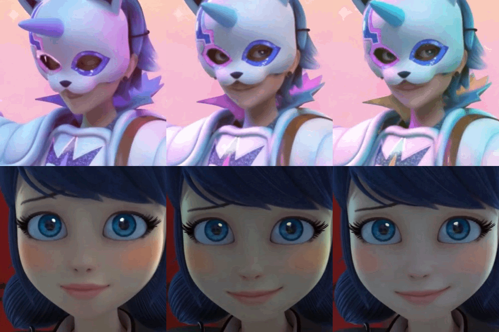
Gif de jeldraximo14
Gif de notasiren21
Luka Couffaine/Sabrina Raincomprix
-Listen, Sabrina needs someone who treats her well, she needs someone who considers her an equal and someone to show her what real love is like. And I truly and honestly think that she would try her best to understand and appreciate Luka but who he really is (if she can see the good in Chloe she is capable of seeing a God when she meets one)
-Vote lukabrina people. We cant lose this!
-This is just unfair we need to help our girl out!
I'll start!
Item Number One: Viperhound Is S Tier
This is the fucking duo right here, this is endlessly clever and positive tag team action, this is a pair who will NOT fail the mission alright?
They are designed so interestingly parallel and then put right next to each other in this sweeping shot of the new miraculous squad???
Like, am I supposed to not assume something about it??
Item Number Two: opposites contrast
Orange and Blue, extremely Sun and Moon energy, but I don't think that would make this ship sail smoothly. See, Luka likes being a moon. He is happy to support and enjoys being someone's shining beacon in the endless dark of night, and no one needs that kind of anchor to hold onto more than Sabrina right now. Sabrina cut ties with her best and only friend and while we see her hanging out with other classmates just fine, we don't really know how she is with being actual friends with people. I don't think anyone has tries to reach out to her since evillustrator and we saw in that episode how she approaches new potential connections. Overwhelmingly cheerful and warm and oppressively clingy, like a ray of sunlight that won't leave your eyesight on the hottest day of the year. She means well but, boy, she can be a lot. And more importantly, she needs to be the one helping because, what kind of friend is she if she isn't? Who is she if she's not doing everything for everybody else? It would, amusingly and annoyingly and endearingly, put her into conflict with Luka, who is similarly always pushing his own problems aside to help people with theirs. This would lead them into a loving rivalry of "take care of yourself" "no u" that goes both ways, a back and forth that ends with them reluctantly letting the other help them. And after so many years as someone's shadow, Sabrina deserves to have someone in her orbit, someone she shines a light on when he needs to be seen.
Item Number Three: YOU HAD YOUR CHANCE
Look I'm SORRY okay, but I have to say this even tho I also think their ship got done dirty by the show, I still think they wouldn't have lasted. I think Marinette and Luka being "too easy" is exactly their problem, as even if they didn't have everything else to worry about Marinette needs complexity or she starts to lose her mind overthinking things and goes looking for it. The simple nature of her relationship with Luka is what 13 year old Marinette needed, the Marinette who wasn't Ladybug yet, who hadn't stood up to Chloe and maybe even just had her heart broken in a mean prank. It makes sense she'd fall in love with and gravitate towards this living embodiment of all the comfort and security she wished she had, she had desperately needed at that time. But that's just it, she needed it then. And now she can rely on herself a lot better, she has a whole support system to fall back on, and what she needs from a romantic partner is something else. But Sabrina? She's done horrible things in the name of her friendship with Chloe and even enjoyed some of them, but had finally hit her limit of how much abuse she can both dish out and take herself. Sabrina can definitely recognize that Luka is a good person, but more importantly Luka would have to actually try to sympathize with a person, rather than just immedietely like them. Lest we forget, Sabrina is the one who locked Juleka in the bathroom on picture day. Chloe told her to but Sabrina physically did it. Being confronted with someone who hurt his sister but is, herself, hurting, and is determined to help everyone but herself will be a lot of conflicting emotions for Luka, and Sabrina would need to get used to being the center of someone else's attention in a way not entirely dissimilar to how Chloe was for her, although significantly less codependent.
What makes Lukabrina interesting isn't that they're perfect for each other or that it's immedietly easy.
It's awkward and messy and they clash, they push each other out of their comfort zones and find a new one to settle in together.
It isn't instant or love at first sight, but by resolving their issues with each other through communication, honesty and trust, they are able to become a happy and wholesome couple.
Don't fucking tell me the odds lol, I know they're probably not winning but they deserve a fighting chance. So please feel free to add your own Lukabrina Viperhound propaganda!
TAG:
Luka/Marinette - @mikoriin
Luka - Twitter @Karma_sensei_
@lukacouffaineappreciation
#luka couffaine#miraculous ladybug#viperion#miraculous tales of ladybug and chat noir#ship tournament#tournament poll#tumblr polls#tumblr tournament#fandom polls#polls#luka x marinette#lukanette#luka x sabrina#sabrina raincomprix#marinette dupain cheng#mlb marinette#mlb sabrina
70 notes
·
View notes
Note
Right, so I watched the first episode of ION cause of the constant discussion of it on this blog, and... it's pretty neat!! I like it so far, and look forward to watching more episodes of it. While watching I kept in mind all of the complaints said here and yeah, I can certainly see why so many people are off-put by the show.
The artstyle is definitely... different. It takes some getting used to, and I suppose some aren't able to tolerate it at all. The way I think about it, I just see it as how solely the ION characters look. Like, objects within/from that universe have much more detailed/human-like faces, it's normal there. Now, if someone were to apply those faces to any other object show I would Absolutely Hate it. But within ION? It's fine!! That's how they're supposed to look, and their designs fit their personalities in my opinion. (Honestly I was expecting worse, thought it would be go-animate levels of uncanniness ahah).
Also, Cracklin's character is what I suppose some would call "weird". Really, he reminds me of a typical young anime character swooning and obsessing over a teacher/mentor figure. I do see why some people would call that annoying or creepy, but I'm personally indifferent to it. Chief doesn't seem incredibly bothered by it and the two of them seem to have a forgotten history that might be influencing some of Cracklin's behavior towards him.
Thinking about the entire debate on people's distaste or praisal for this show is a bit complicated, but I'd summarize it by comparing it to the parts of an animated MAP. Like yeah, people really like when different parts flow and mesh together (PPT2, YAG, OLO) and sometimes are amazed by really flashy or skilled parts that stand out (ONE, TNM, MO) but there's often one or two artists with particularly striking styles that... just aren't as popular. They're not the normal status quo and don't quite match the interests of all the viewers. And there's nothing wrong with any of that, really. Some people don't find some artstyles as appealing as others, and would rather stick to what they're most familiar with or change it little. Some artists want to explore outside the usual medium, and incorporate their own styles or experiment with something completely new. Both of those are okay!! It's good to have creativity in a community, and it's fine to only stick with the parts you enjoy most. The two sides of this discussion are equally valid, and there's no need to get upset at one another over them, yeah?
Anyhow, I'm excited to see how the story develops and what exactly happened at that power plant, the beginning bits of the plot are already very intriguing. The backgrounds are superb by the way, they add so much to the vibe of the scenes. I also quite like the animation too, it's not constant frame-by-frame movement but it isn't a simple slideshow either, there's lots of varied expressions/poses and tweening. Overall, I think this show has lots of great things about it and really does add a unique flavor to the OSC as a whole!!
.
44 notes
·
View notes
Text
I'm continuing on to the next LotR audio commentary. This one is with the design team, and there's a lot more people talking in this one! Including:
Grant Major (production designer), Ngila Dickson (costume designer), Richard Taylor (Weta Workshop creative supervisor), Alan Lee (conceptual designer), John Howe (conceptual designer), Dan Hennah (supervising art director/set decorator), Chris Hennah (art department manager), and Tania Rodger (Weta Workshop manager)
So here are some highlights of things that are new to me (after avidly watching all the BTS documentaries multiple times over the years) from FotR:
The guy who made the One Ring originally didn't want to do it because he didn't like fantasy, but then his sons badgered him until he agreed to do it - kind of a similar story to Viggo Mortensen, I think. He ended up contracting cancer and dying during the production of the first movie.
Alan Lee storyboarded a potential sequence for showing how Bilbo got the Ring. They would show Gollum grabbing a fish, taking off the Ring while he ate, and then it would roll away until Bilbo found it.
Some of Ngila Dickson's phrases and diction are pinging really loudly in my sense of deja vu - like, I remember hearing those exact phrases before. But I even went and watched the costume design portion of the Appendices, and none of it was a repeat. Have I actually heard this commentary before and then forgot all about it? @_@
The guy (the primary guy? I can't imagine it was only one person) they put writing on all the scrolls and things worked in a bank and had a hobby doing calligraphy. They hired him to do just a few things at first, putting writing on some props, but then it got to the point where he actually had to quit his job at the bank and start working full-time for LotR, and then continued to do stuff for merchandise for New Line. I do wonder what he did once the movies were all made and over with....
I always forget how they had to have two scales of everything. Not just stuff like Gandalf's staff or the sets, but they had to have two scales of all the props like cups and books and things. They even had to have two different sizes of horses, depending on the scene!
Lawrence Makoare, who played Lurtz, would have to start getting into makeup at 10 p.m. the night before he had a scene, so that he would be ready at 8 a.m. the next day @_@
Most of the horses used in the movies were Andalusian horses imported from Australia.
When they would film outside in nature, like in the forest where they shot on-location scenes for Rivendell, they would have to remove the native plants that were there, keep them in a greenhouse, plant whatever plants and other things they needed for the movie, then take them out again and put the original plants back. This would actually leave the area better than the way they found it, because they would remove weeds and things like that.
John Howe commented on how difficult it is to do hair in something like this that's meant to be kind of "historical," even though it's fantasy. Hairstyle is one of the things that is quickly outdated, so if you do it wrong, it can be jarring to watch the movie in later decades. He said, "I wonder how it will look 20 years from now." It's twenty years later, John. It looks every bit as good as it did in 2001 :')
Okay, I feel like this had to have been in the BTS documentary, but I don't remember it. For the moment where Bilbo goes Gollum-esque for a second when Frodo puts the Ring away, they morphed between his face and a puppet they made of Ian Holm looking deranged. Ian Holm was thrilled with the puppet and had several photos taken of himself with it, and then when it was time for him to leave New Zealand, they made a bronze version of the puppet and gave it to him as a memento! XD
For the shots of the Fellowship bursting out of the snow after the avalanche, they went to the Mt. Hart ski field, which was closed because of a blizzard. They were allowed to go out on the ski field, make snow caves, and film the actors bursting out into the open. The Hobbits wore Ugg boots over their hobbit feet in the snow when their feet wouldn't be in the shot XD Apparently, Richard Taylor actually asked Peter Jackson if there could be a scene of the Hobbits wrapping their feet in bandages or something, just so the actors could protect their feet a bit more in harsh terrain like that, but PJ said no, because the Hobbits' feet would be tough enough to be able to withstand all of that. Poor guys! x.x
Huh. I always assumed that they made the effect of ithildin by putting little glowing lights on the doors of Moria, or else maybe added it in post. But actually, they put some kind of reflective material on the design, and then shone a light from behind the camera, so it would reflect on the design and make it look like it was glowing! I feel like, if this movie were made today, they would totally have just done it with CG, but this makes it so much more realistic. Also, they had to paint the doors, but obviously couldn't paint over the reflective material, so they put plasticine over the design, then painted it, then took the doors to the site. They were still taking the plasticine off the doors when the whole crew and the actors turned up and started rehearsing the scene! So apparently, if you look hard enough, you can actually see a few small parts of the design on the door that are missing, because they accidentally left some of the plasticine on!
Okay, we all know about the crazy amount of attention to detail in these movies, but this story just takes the cake. In the room with Balin's tomb, there's all this Khuzdul writing on the walls. Someone wrote out all the text and had their in-house translator translate it into Dwarvish runes that they then carved into the walls. During one of the days they were shooting the cave troll battle, they had invited a Tolkien language scholar to visit the set, and he stormed out in an outrage, saying that someone had written something like "Joe was here" on the walls, which was disrespectful to Tolkien's legacy, etc. etc. Horrified to hear this, the art department got their translator to go over the set with a fine-tooth comb, trying to find the "graffiti" this guy had seen, because they'd already filmed a lot of shots of this scene, and they knew that there would be fans who would freeze-frame the scene and translate what's written on the walls. But they couldn't find it anywhere! So eventually they cornered the Tolkien scholar and asked him where he'd seen it, and it turned out that it was just some guy on the crew who'd told him that. Apparently, the Tolkien scholar was so uptight and serious about everything, this guy was just poking fun at him, and it snowballed from there. So they ended up wasting a lot of time looking for a mistake that wasn't even there, because that's how dedicated everyone was to getting every detail of this movie right.
The Moria orcs were originally designed to have pale, almost translucent skin (inspired by an axolotl! O.O), but when they saw footage of it on the first day, they realized the contrast with all the darkness in Moria was too much, and it made the orcs look like they were glowing, so they had to make them darker.
The eyes of the Moria orcs were enlarged after the fact, so when they made the prosthetics, they had to make the eyeholes extra big so the eyes would look like they fit after they were enlarged.
Originally, there was an idea that the Balrog would burst out from a wall somewhere while they're trying to jump across the gap in the stairs, and just generally make that scene even more tense and exciting, but then they realized that to do so would basically eat up half their budget, so they decided to do it the way it is in the final version XD
The boats' design was based on a leaf of a lemon tree. If you drop a lemon leaf in the water, it will look like a tiny version of the Elven boats! 8D
Ohhhh, so the scene where the Fellowship gets attacked by Orcs along the way down the Anduin was going to be a sequence at Sarn Gebir, where there are dangerous rapids, so the Fellowship has to land on the shore and carry their boats past. But then Orcs attack, there's a whole action scene, and they have to hurry back onto the water and navigate the rapids. But they never shot it, because right after they'd built the set and got all ready, they were hit with a lot of rain and flooding, and the water level in the lake where they were filming rose five meters and completely washed away the set. So that whole sequence got permanently canceled.
While working on Amon Hen, Alan Lee fell off the stone seat (kind of like Frodo!) and broke his wrist. Thankfully, it was his left wrist, so he could keep drawing.
The Uruk-Hai's hair was horsehair that they had to import because they needed it in such large quantities. In the location where they shot the battle at Amon Hen, the ground was covered with prickly bracken of some kind, so every time an Uruk fell on the ground and then got up for the next take, they would have to carefully pluck all the bits of bracken out of their hair @_@
The fletching on the Uruk arrows is supposed to be, not feathers, but Warg hair O.O
Okay, I knew they made a silicone dummy of Boromir for when his body goes over the falls, but they only had four days to make it?! :O
In the final scene, where Frodo and Sam are looking out over Mordor, what Sean and Elijah were actually looking at was a ski resort with cabins and a ski lift. "The one place in all Middle-Earth we don't want to see," indeed! XD
#lord of the rings#lotr#behind the scenes#gotta say it's MUCH harder to keep track of who's talking when there's so many people @_@#some of them have very distinct voices like richard taylor or john howe#but some of the kiwi accents just kind of blurred everything together and i couldn't tell who was who ^^'
32 notes
·
View notes
Text
hi! ♡ this is neve ( she/her ) and i've brought to you blush boutique's owner, nam yeonji. since she's been in ansong for twenty five years, you best believe she has done a lot of things since then! feel free to read her about and memories here. more ( like, a lot more ) details on her can also be found under the cut. and before i forget, drop a like on this post if you're up for some plotting! ( ps. i'm so happy to be here and please do expect me to be very annoying in your ims soon! )
ansong
tried dropping all of her items down at the building's lost and found. sure, she had that familiarity in her heart but what the hell would she do with a children's make-up kit? bffr.
she spent ten whole years studying at ansong university, majoring in fashion design, creative writing, then visual arts. still likes painting and reading to this day. (her subconscious was probably pushing her to do so because she barely graduated high school in her waking life.)
about fifteen years ago, she opened blush boutique and the rest is history. thanks to it, she was able to unlock her first core memory too. (her first collection was inspired by the color palette of the aforementioned children's make-up kit.)
purposefully moved to floor #09 unit #09 to try and figure out what her "nine" notecard means. (spoiler alert: nothing good.)
for now, the only thing she remembers of her past is that she was very close to her grandmother.
personality
looks like a bitch, sounds like a bitch, is a bitch. i was originally going to make her less complicated but where's the fun in that!
success has always been the most important thing to her and it's no different now; take a look at her degrees or her boutique. pushes herself hard and pushes others even harder.
the beautiful thing about her is that no matter how cold or intimidating she may be, she mostly just doesn't know how to interact with people. she doesn't necessarily want to be rude, but she also doesn't care enough to apologize and try harder when she fucks up... so, you know. she sucks but not that much.
on the bright side, she's nice to party with! just don't work at blush or get too close to her and you will be fine! i think.
in my head, she has the same energy as that one annoying coworker who comments on everything you do and spreads gossip for fun. i support women's rights and wrongs.
another slightly concerning thing she does is people-watching. doesn't try to be subtle about it either. if you think she's judging you, she most likely is.
but she's not all bad! (please don't give up on her pleaseplaeasepelapselease)
very creative. puts a lot of thought and effort into everything. extremely loyal, both to her craft and to those she loves. doesn't lie or pretend; always very straightforward about her intentions. if you're her friend, you will never feel unappreciated! you will be showered in gifts and that's a threat. just don't expect words of affirmation from her because she doesn't have the slightest idea how to do that.
connection ideas
any antagonistic plots, obviously! she called your outfit ugly, stole your cat, hit on your boyfriend/girlfriend at a bar, etc.
rivals. maybe another business owner who gets on her nerves.
that one unlikely friend who is all "i can fix her" and it grosses her out.
if you need a low maintenance friend, you have found her! your muse could ghost her for years and she wouldn't even notice.
anyone who is into art in general! if you nerd out with her, you might see a better side of her, just saying!
let's give her another weird ex! she can't remember the one from her waking life so it's okay. <3
or anything else you want. i'm all ears!
and now, onto the part you're probably curious about!
trigger warnings: brief mentions of abuse (child, domestic, and alcohol), depression, suicidal ideation, and murder.
life and death
let me set the scene: late 70s, jeju city. baby yeonji's parents, living their best life thanks to grandma yeonji, so much so that they even named their only child after her. thing is, her grandmother was one of the most successful actresses of her time, which allowed the family to live luxuriously.
naturally, this privilege also came with its own set of expectations. her grandmother and mother were both adamant that yeonji goes down the acting route herself.
(this was mostly to make up for the fact that her mother never succeeded as an actress. passing down generational trauma, the tragedy of being a daughter, etcetera. you know how it goes.)
so yeonji became a child actress, constantly missing school just to keep up with her work. by her early 20s, she started to win awards of her own. acted in a lot of romance k-dramas, which she absolutely hated.
her then boyfriend (who is unnamed for plot purposes but also because i hate his ass) proposed to her at an award ceremony (way to make it about yourself, buddy) and the two got married soon after.
long story short, their relationship turned really abusive and yeonji started drinking. she would also frequently call suicide hotlines as she felt like she had lost control over her life. (or that she never had any to begin with.)
just a minute before the clock struck midnight on new years' eve in '99, yeonji had an argument with her husband and was pushed off a balcony. (not so fun fact: the nine notecard refers to the year and the number of floors she fell down.)
currently thinking about how both her grandmother and mother outlived her but.. that is a heartache for another day..
if you read this far, have this lore accurate yeonji depiction:
8 notes
·
View notes
Text
Prison Architect has offputting aesthetics to me. This includes Prison Architect 2.
I know, I know, everyone has issues these days. Developers can't just make a game and not have people talk about structural social issues and oppression, yadda yadda. And I know the devs working on Prison Architect were explicitly thinking about how people might react or judge them over the game.
I think it is extremely exhausting for people who want to explore game design spaces to have to put a lot of effort into avoiding being framed as insensitive and problematic. We've reached such levels of this that for some people Minecraft is fundamentally dislikable because it instantiates a colonialist fantasy and makes people think this is okay, normal and unremarkable. I really don't agree with that take.
That being said, that doesn't mean that I don't feel disappointed by Prison Architect's aesthetics. The games look very generic! It's as if it's signaling that prisons are just like any other thing. We have Theme Park, Theme Hospital and now we have Theme Prison. Which in fact is the opposite of what the creative director, Chris Delay said was their intent!
Chris Delay, creative director at developer Introversion Software, told me that it deliberately picked the darkest part of prison life for the first chapter of the game. “It would be very easy to think of it as building a hotel or something,” he said. “Right from the very start, we knew we had to let the player know that this was a different experience, he has to think differently about it.”
(Also very funny last name for anyone in game development)
The aesthetics suggest the idea that the game has a neutral take on prisons. I am sure the developers didn't mean to say anything about anything. The game is trying to be inoffensive. But then you can also read the description of the game on Steam:
Only the world's most ruthless Warden can contain the world's most ruthless inmates.
Uh oh, sisters! This doesn't sound very focus on rehabilitation!
And well, there's a sort of good reason for that. The concept of prisons in game design will whispers into the ear of any mildly creative designer... inverted tower defense... Well, not necessarily tower defense specifically, but you know! Rather than building up your fort to keep people out, you do it to keep people in! It's interesting! For your inverted defense design to be validated, you need rowdy inmates.
---
Oh, jumping to a different thread in this topic. Prison Architect has you executing people the state tells you need to die. Of course I don't need to phrase it like that. Of course, the context of this is a western republic, so it's one of the less bad than if you're doing it in the context of Nazi Germany, but hmm... I just don't think the neutral aesthetics of the game combine well with me executing people.
Worth noting that you do have to research death row as a technology, it's not just thrust upon you.
Interestingly enough, if you execute death row inmates that were actually innocent, you will get fined. Do it three times and it's an instant game over. The moment you execute someone, you know if they were innocent. Which sounds a bit funny. All of it sounds a bit funny, because it's such an garbled idea of how the justice and penal system could work. I don't think this misinforms anyone, but does make the in-game prison appear (artificially?) more just. Ultimately, as far as I can tell, it's just a gameplay mechanic to force you to keep death row inmates around for longer, which provides a challenge.
---
And you know what, going back to the Steam description -- I do feel moderately motivated about the idea of containing some bad sons of bitches. By adding any amount of fantasy into the setting, you can have that, the fantasy that you're sure these people need to be here and stay here. But Prison Architect occupies this... diffuse position. The inmates are analogues for modern real world inmates, with all of their nuance. But they also look like very abstracted human beings and are mechanically simple. It's just kind of a straight forward game overall. The real world theme of Prison Architect implies nuance, but its mechanics don't really model that nuance.
Prison Architect's game design direction, at least in some sense, prefers that inmates be a problem that needs to be suppressed violently. And that's fine! This is the mechanical direction that I want the game to explore. I just think that if you make Gulag Simulator it should not have the aesthetics of Sims 2. Prison Architect is doing something like that but much less egregious.
And to be clear, I don't know that I care much about how this is problematic. Rather it's just that it feels... a bit spiritually impoverishing? There is the absence of something, a void. It's just kinda boring! Man, sorry to whoever had to draw all that shit, you did an OK job, okay? I just complain a lot on the internet.
We should strive for a balance between treating the medium very seriously and "it's just a video game".
---
But yeah there's so many other ways this could have been themed. And I understand why it was themed this way, it has the widest appeal, or rather the narrow anti-appeal. A lot of other takes would alienate more people. Boring them is a less bad outcome. And the current aesthetics are pretty flexible, you can project on them.
Anyway, here's a bunch of alternative themes that visited my mind:
Butcher Bay: You play as a corporation in the business of containing, exploiting and/or rehabilitating inmates through your private prisons. The theme dispenses with any pretense that you are benevolent. You're trying to find ways to maximize long-term profit. Maybe that's putting your prisoners through a program that gives them a useful skill and you a cut of their earnings once they get out, maybe it's something more violent. Of course, you get to set up big monitors that flash demotivational messages! Hey, I'm sure the other corporations are much worse?
Maxsec Dungeon Keeper: It's Dungeon Keeper, but instead of keeping heroes out, you keep heroes in. Bonus points if you brainwash and corrupt them to join your side! How evil! But is it actually unethical if they're having more fun now?
Bleeding Hearts Penitentiary: Your focus is to ensure good social outcomes for your inmates. Society might be crapsack, but your institution is the Mother Teresa of prisons -- well, minus the deeply objectionable parts of Mother Teresa. The prisoners are rendered in a high detail way, borderline fantasy, but still somewhat grounded. It could even look like everyone is out of a dating VN. You really want your roguish purple-haired murderer to repent and do well in life! Your relationship to the inmates is both that of antagonism but also they borderline feel like your own unruly RPG characters.
Supervillain Supermax: You don't need supervillains per se, they could just be your average level 12 D&D character. Ultimately they're very dangerous, they're superpowered and they've caused a lot of trouble and now you need to contain them. Better make sure you have a fallback for when the pyrokinetic's suppression collar malfuctions!
Moonscorch Reality Failure: OK, this one is kind of cheating, very tenuous relationship with the prison system. Everyone in your facility isn't there because they've done something wrong, but rather it's about what they are. They all look like normal people and at least most of the time, they are. But unfortunately, each and every one of them is also a potential reality breach that under certain conditions will trigger and cause them to morph into monsters, warping reality around them into a nightmarish landscape, which may or may not relate to their individual neurosis. Suffice to say, this is very bad. These poor fuckers can't even die anymore! Your job is to contain them and make their life be somehow tolerable. Your job is especially to avoid cascade triggers and do very good damage control. You may set the psychiatric-care-allegory dial anywhere from 0 to 10. Personally, I was just thinking 0, since I didn't consider that until finishing writing this paragraph. But other values could also be really interesting.
#anpost#prison architect#politics#game design#vidya#don't take this too seriously#man this is too long
10 notes
·
View notes