#i hope my post helps a little
Explore tagged Tumblr posts
Note
I want to play LADS, but the game seems intimidating and confusing. One moment their cats next moment they are fighting monsters in the ads. Do you have any tips on how to play the game? I want to be prepared. thx :)
The game can be intimidating when you're starting out, since you will be going through an introductory tutorial stage for the first week.
The cat event is temporary and will be ending this week! We get new events and themed storyline every few weeks.
Monster fighting is part of the storyline and also an interactive feature in the game. In the game, there are different areas to fight "wanderers" that will reward you with resources and game accessories/clothing items.
When starting out, I would be mindful of what you level up if you're gonna be a battle-focused player (still important for other players too, since you will also need to clear battle stages to advance in the story). Ideally, focus on 5★ cards first and then 4★ secondary, if you have no choice.
Try to build a good team for each love interest (unless you strictly just want to focus on one, that's ok, too!).
With team building, you will be required to have 2 solar cards and 4 lunar cards. Before battles, the game will also recommend what type of cards to have at what level.
If you're gonna be a F2P player, hoard your red gems for new banners. They are scarce and hard to come by, and you will want them if you want to snag some new 5★ cards.
If you can afford to spare a little money for the game, get the Aurum pass

You will get daily extra gem and stamina with it, your stamina cap increases, and you can also reclaim missed daily free stamina at any time within the day before it resets.
Also, clear your stamina daily if you're not gonna be logging in for the next 8+ hours! Get items to level up, gold, crystals, whatever you have to do, just clear your stamina down to under 10 if possible, so it can continuously replenish as you go about your day.
There is no correct way to play the game! Have fun with whatever you like. You don't even have to focus on the battle system if that's not your jam.
Other features in the game: card game, claw machine game, photobooths, temporary mini games during events. You also get phone/video calls, text messages, and social media posts with the love interests.
Of course the tumblr community is also ready to answer questions and help out in any way you need! So don't be afraid to reach out with questions.
#x — 💌#anonymous#love and deepspace#i hope my post helps a little#there's just a lot of information and i don't want to scare you anon#😭#feel free to keep asking questions and i'll do my best to answer them 🫡
17 notes
·
View notes
Text

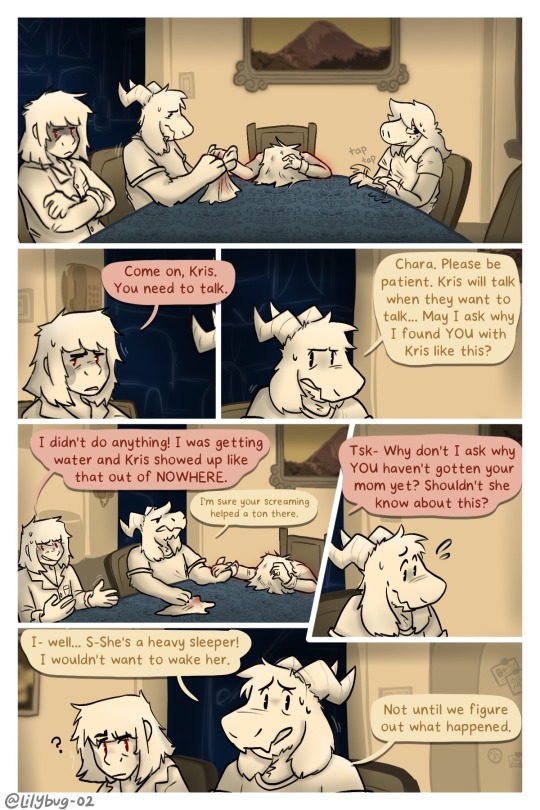
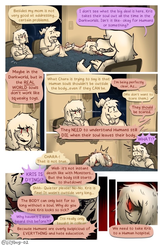
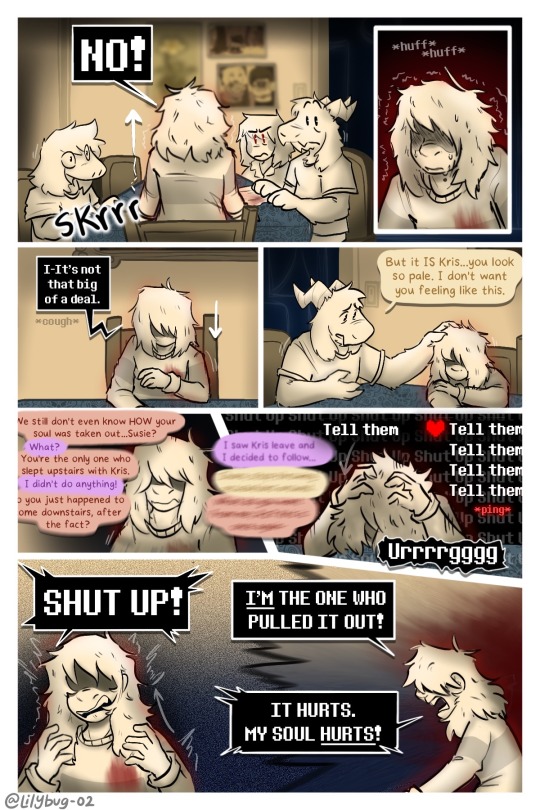
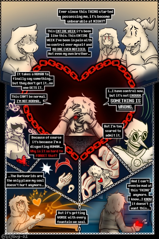
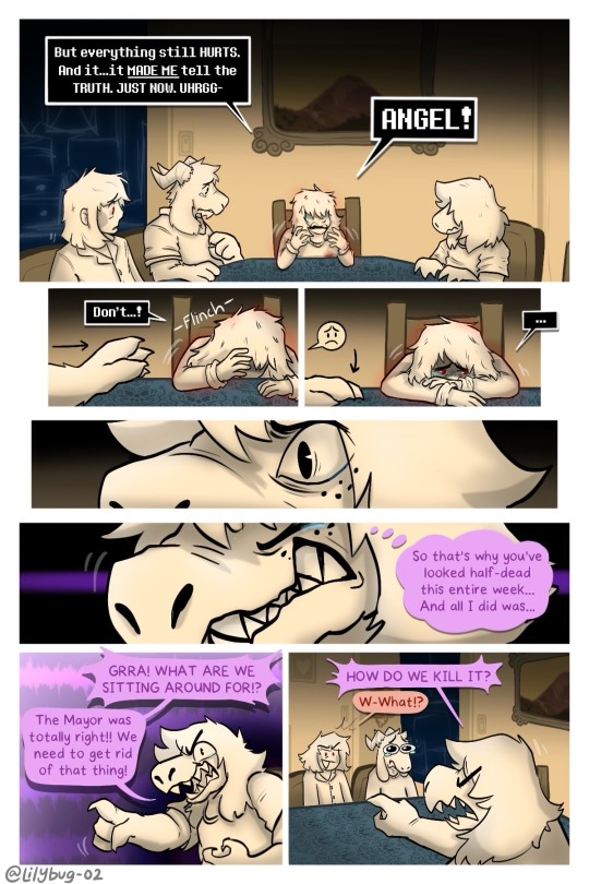
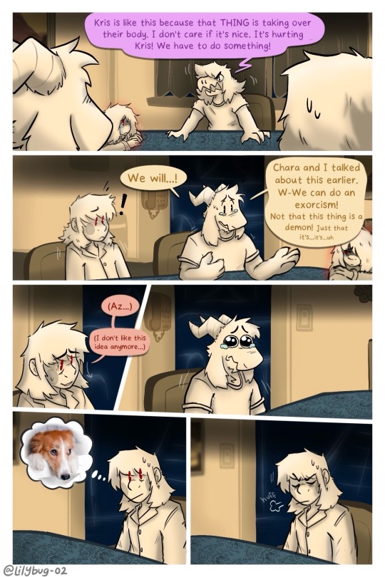
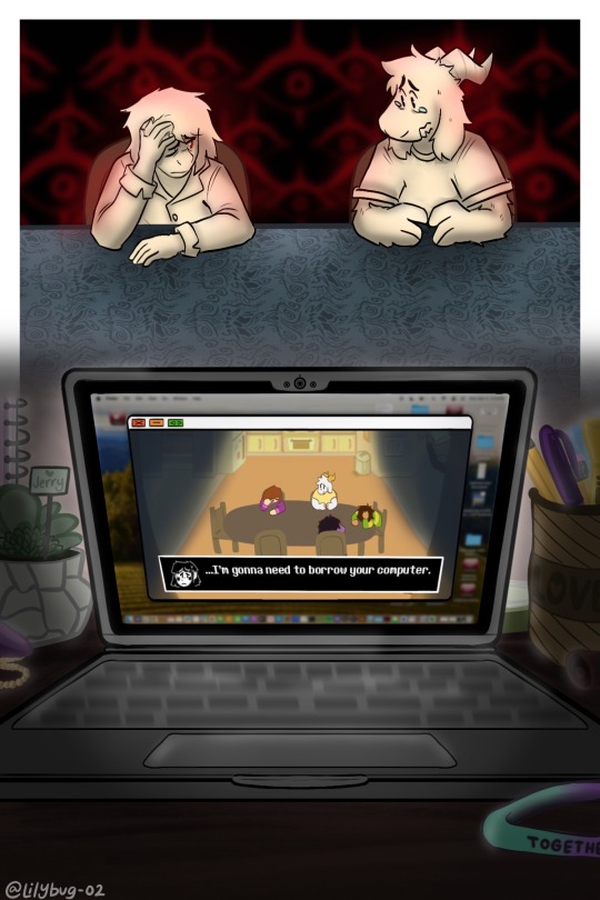
Pain is a great motivator…
Part 26 || First || Previous || Next
—Full Series—
Meanwhile Toriel:
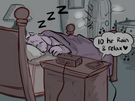
(Loud noises don't wake her up usually.)
Artist note: I’m so proud of this :))) I know it’s a lot of dialogue and reading, but dialogue is grueling work for me. I’m glad with the art and for the amount of pages I made in such a relatively short time span -w- page 5 was super fun to work on. A lot of blood, sweat, and hours here... :) The backgrounds were a big bore tbh, but I finished them! Yippie!
#CHARA WTF DO YOU MEAN “COMPUTER”????#lol i hope you guys dont hate me for what im doing in the next update.#IS THAT A MAC OS???#Yes......owo''#Kris and the Gang are LITTLE now. I've pixelated them and turned them into little game characters!#FINALLY!!#I never thought I would be going so far in the story to explain WHY Kris pulls out their SOUL and opens Darkfountains even when they killed#Berdly in Chapter 2. Pain can make people do horrible things.#Uhhhhhhhhh anyways. :3 I hope you liked it! I made this post a little too long for my liking and didnt get it out when i wanted too-#but thats okay! As long as people enjoy it :)#bread#art#deltarune chara timeline#deltarune chara timeline comic#seriously though#long post#man am I glad I switched over to the limited color palet! It helps me feel alot more relaxed uwu#This is....way over 16 hours of work q-q#chara#asriel#susie#kris#asriel dreemurr#kris dreemurr#kris deltarune#susie deltarune#deltarune#comic#my art
4K notes
·
View notes
Text
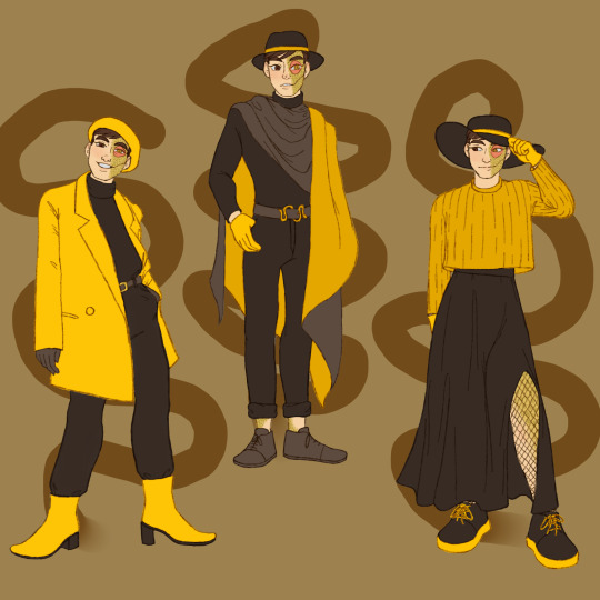

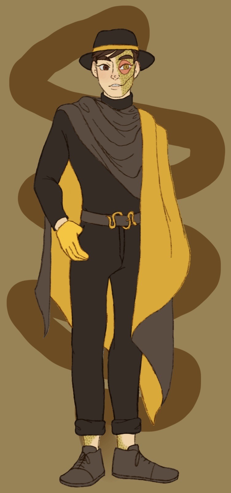
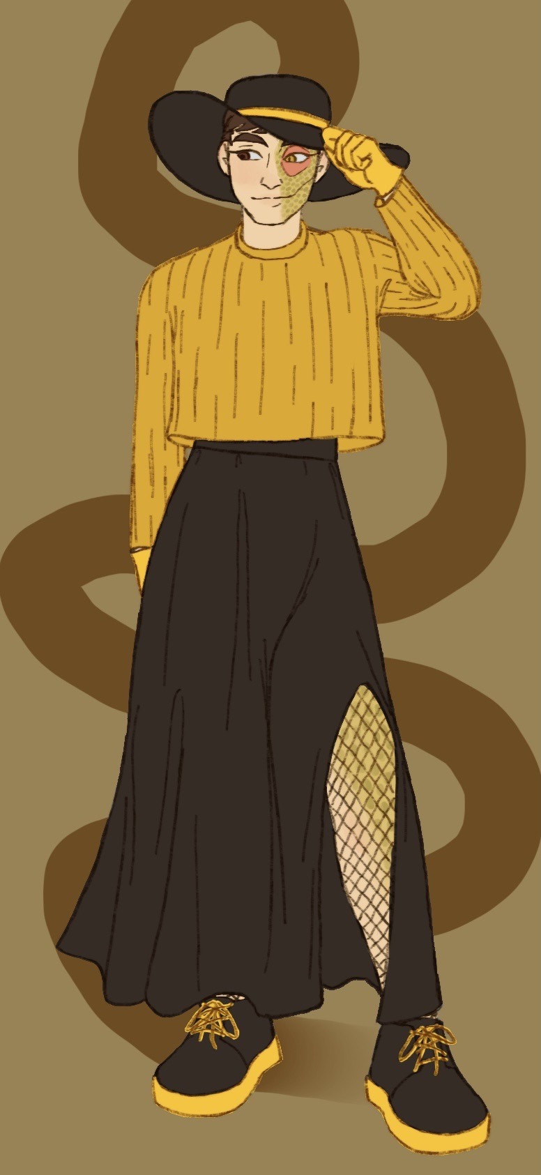
What do you mean I’m a bit late for Janus’ big day? Of course not, how could you say such a thing! I definitely didn’t forget all about it in my absence and only get reminded in the incorrect quotes video live chat; that’s not like me at all ;]
Anyways I decided to dress our sassy snake in some different outfits I think he’d like. He seems like the type to get all dolled up on his birthday and it goes with Thomas posting pics in outfits inspired by the sides on their appreciation days!
@thatsthat24
#sanders sides#janus sanders#ts janus#thomas sanders#sanders sides fanart#my hoard#I’ve returned!#the newest asides came out and I remembered how much I love it#so I’m hyperfixated again and I’ve not now peace since#it is nice to actually finish something again tho#I’ve been pretty busy working lately and now I’m starting to pack to move into my first apartment!#so not much time to really sit down and draw#and when I do have time I can’t get the motivation to actually draw anything#I want to get better about posting stuff on here#(even though it feels like I’m just dreaming into the void a lot)#even just silly little things or rough sketches I’ll never finish#I hope it’ll help me continue to draw and make things again#I forgot how nice it is#anyways if you’ve read this far thanks#have a cookie :] 🍪
2K notes
·
View notes
Text
"WEEZER BLUE!!! 💙💙💙"
Just a normal weezer meme, there is nothing wrong.

#Classes made me stressed so I impulsively drew this LMAOAOAOAOAO#No these designs arent final i just wanted to draw something#early post cuz I'm very hyper and I need to get this energy out of my system#WHY AM I SO FUCKING HYPER HELP MEEEEEEE WAHHHHHHHHHHH#(silently hoping someone would notice the little details and hints i put in here hhhhhh)#Decaying Deputy AU#undertale yellow#undertale yellow fanart#undertale yellow au#undertale yellow starlo#undertale yellow martlet#undertale yellow dalv#undertale yellow ceroba#uty#uty fanart#uty au#uty starlo#uty martlet#uty dalv#uty ceroba#starlo#martlet#dalv#ceroba#ceroba ketsukane#LM art#artists on tumblr
597 notes
·
View notes
Text
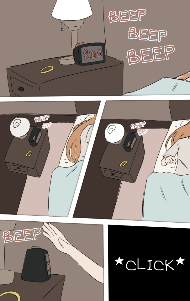
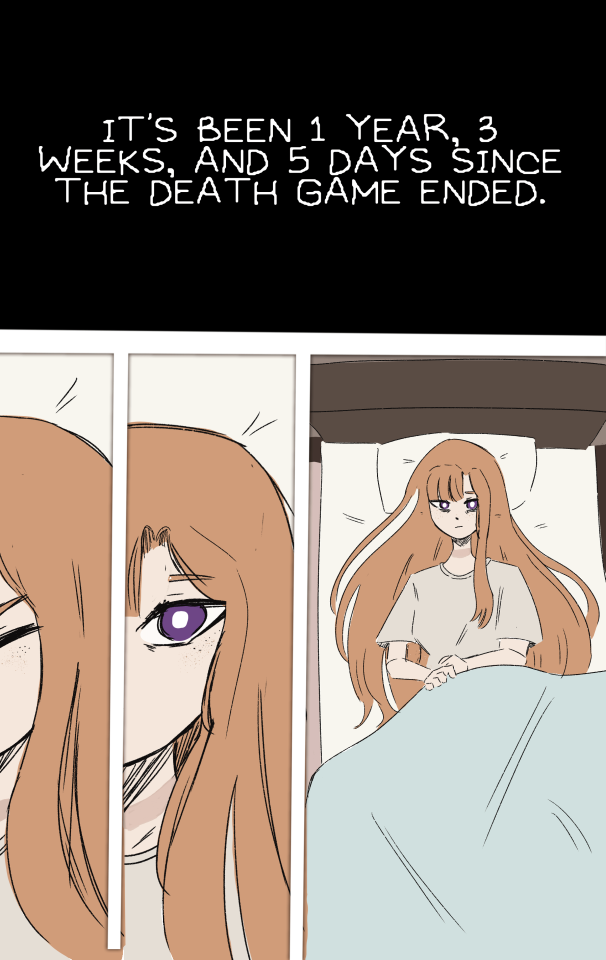
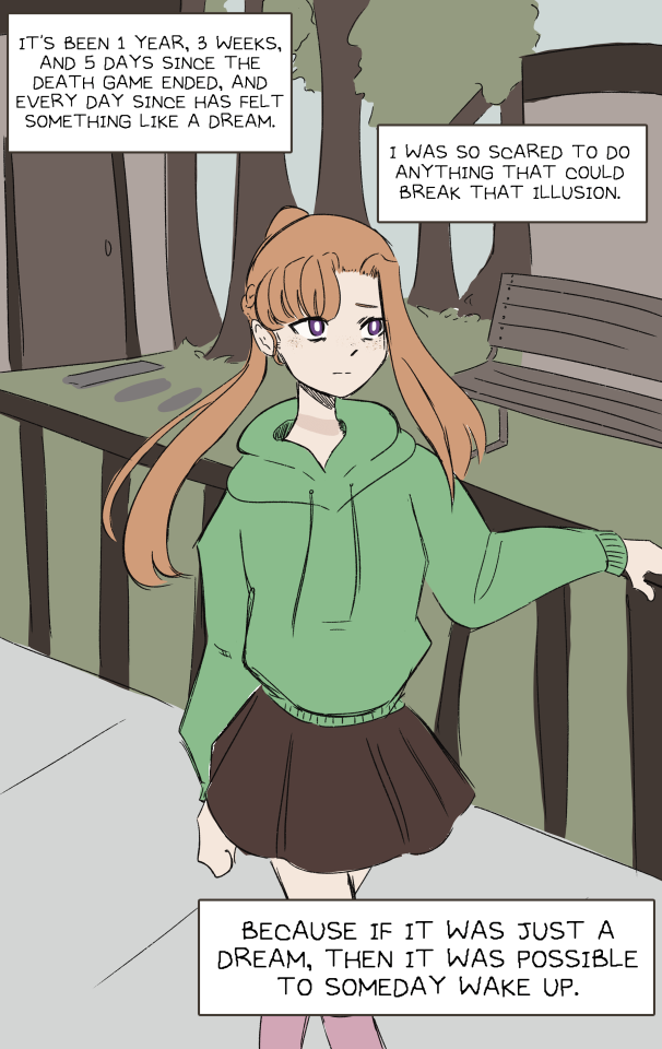
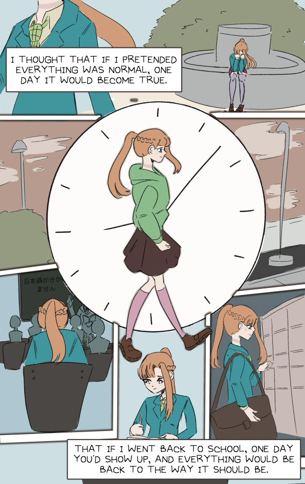
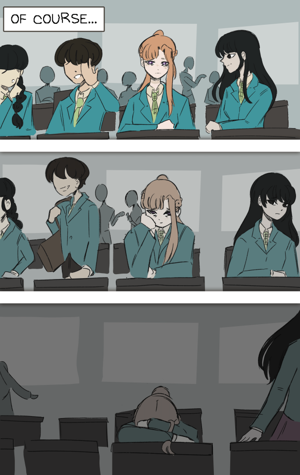
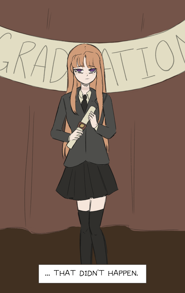
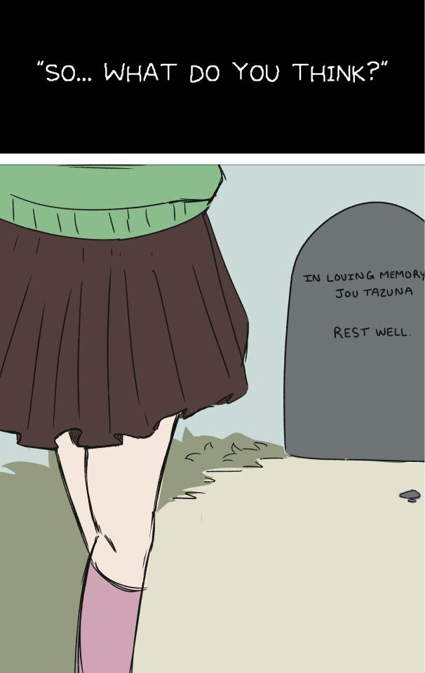
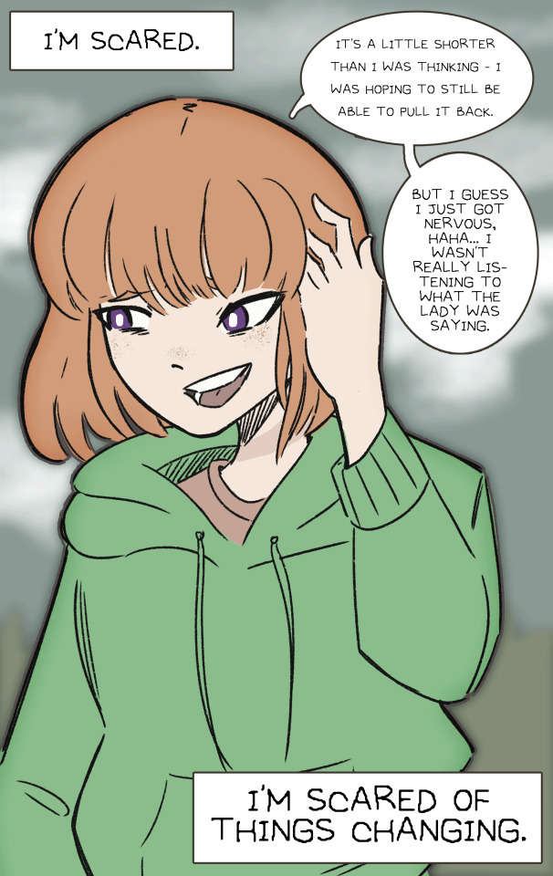
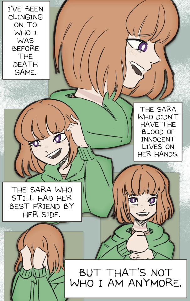
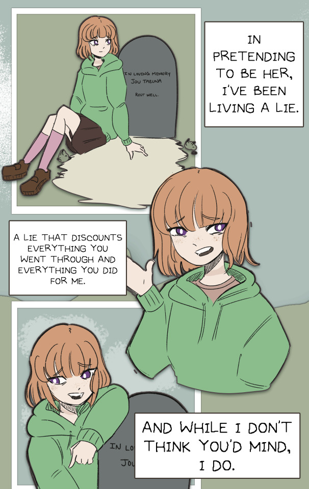
Moving Forward. (Spoilers for YTTD up through 3-1b)
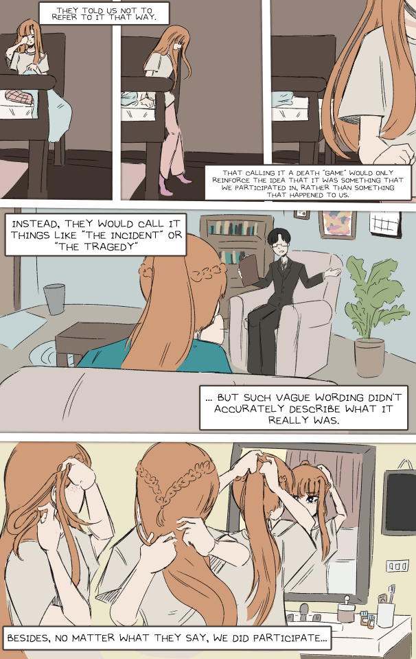
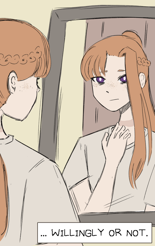
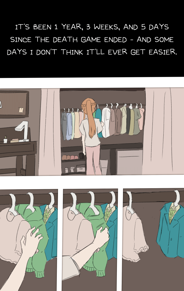
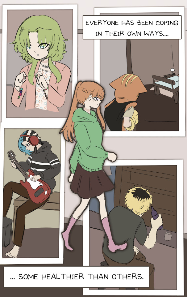
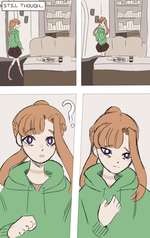
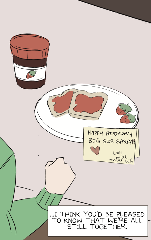
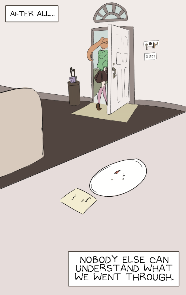
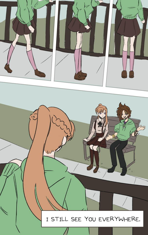
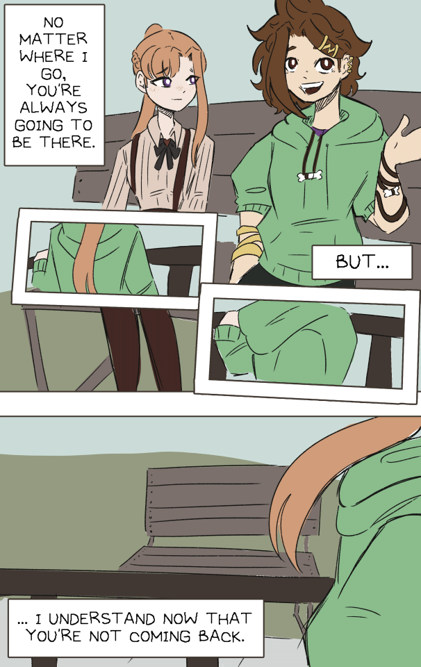
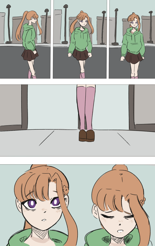
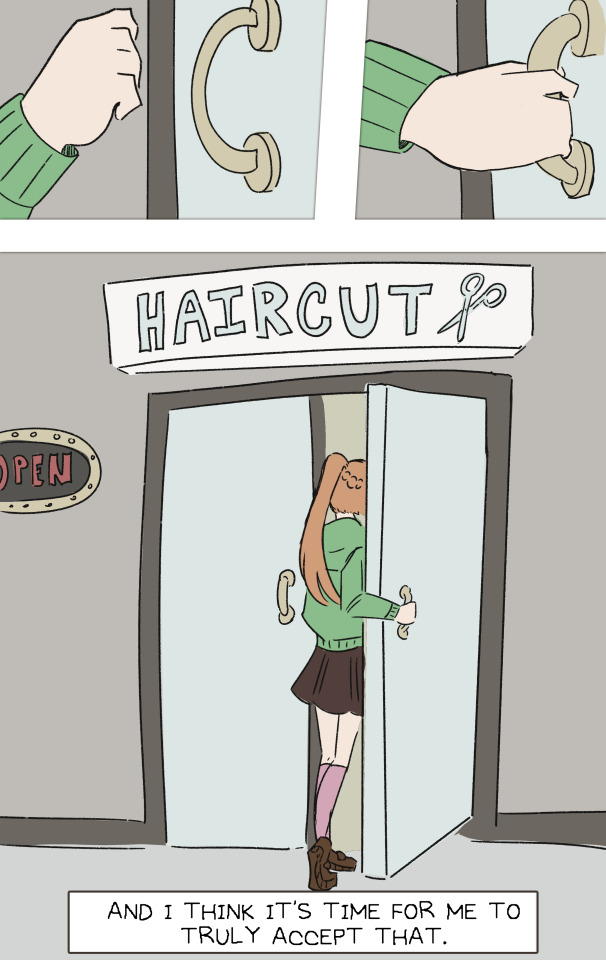
#your turn to die#yttd#yttd fanart#sara chidouin#joe tazuna#happy birthday sara#post-death game au#set in the Kanna/Alice lives route because that's personally my favorite#there are so many little hcs in this#sara will forever have freckles in my art#alice dyed his hair to match reko#also he's trying to get back into music for her#whether that's healthy or unhealthy is yet to be determined#Keiji is not doing so hot#angst#your turn to die fanart#ryoko isn't being mean i promise she just doesn't know how to help#yes sara is wearing joe's jacket#joesara >>>#I'm like 20 minutes late but I hope you enjoy regardless#god this took so long#I ran out of time to shade it I'm sorry </33#I hope you enjoy anyways!!#or don't#sorry for the angst on your birthday sara you deserve so much better
529 notes
·
View notes
Text
Transmasc Summer 🐋🐚 Sims4 CC Masterpost

Top surgery - RFF Phalloplasty - Hysterectomy
───── ⋆ 𓇼°˖🌊 ───── INFO ───── 🌊˖°𓇼⋆─────
I've wanted phalloplasty scars in the sims4 for eons now as a few of my OCs (pictured above) have had bottom surgery, but no one had made any yet, so I decided to make my own.
I ended up going all out and also making a set of hysterectomy and top surgery scars to match the style of my phalloplasty scars.
This is my first ever cc!! So if anyone has tips or tricks or really useful tutorials pls send them over I'm very fresh to all this.
I've tried to make them all be Maxis Match and Base Game accessible!
Pose Used in the header image 🐚࣪ 𓈒
───── 🌊˖°𓇼⋆─────
Top Surgery Scars
Base game Compatible
Masculine Frame Only
Teen - Elder
21 swatches ( 7 top surgery types ((Double Incision, Inverted T, Keyhole, Periareola, Fishmouth, Lollipop)) with 3 transparencies each )
Can be found in the scar category ( front torso + right arm )
Free + No ads download

───── 🌊˖°𓇼⋆─────
Hysterectomy Scars
Base game Compatible
Both Frames
Teen - Elder
21 swatches ( 7 hysterectomy types ((5 laparoscopic + 2 open surgery)) with 3 transparencies each)
Can be found in the scar category ( fem frame in front torso + masc frame in left arm )
Free + No ads download

───── 🌊˖°𓇼⋆─────
RFF Phalloplasty Scars
Base game Compatible
Both Frames
Young adult - Elder
6 swatches ( left and right arm with 3 transparencies each )
Can be found in the scar category ( front torso + back torso )
Free + No ads download

───── ⋆ 𓇼°˖🌊 ───── DO NOT───── 🌊˖°𓇼⋆─────
Reupload (To here or any other sites, reblogging is welcomed though!!)
Put behind a paywall
Steal/claim the cc as yours
#my sims 4 cc#trans#trans sims#transmasc#trans ftm#sims4#sims4cc#sims 4 cc#ts4#ts4cc#sims 4 custom content#sims 4 trans cc#s4mm#sims 4 maxis match cc#maxis match#sims 4 download#sims 4 phallo#sims 4 phalloplasty#sims 4 top surgery#sims 4 hysterectomy#sims 4 scar cc#sims 4 scars#I wanted to make a few different options (ALT + Abdominal)#but I wasn't able to find enough references to draw something I felt was good enough to post#so I had to stick with only making RFF#that said#I'm really happy with how everything turned out :D#One of the laparoscopic hysto scar types is a replica of my hysto scar placement which makes me really happy#making my simsona that little bit more accurate to me is a really nice feeling#I hope this cc helps other simmers get to experience this feeling too !!
355 notes
·
View notes
Text

help me hold onto you | T | 8/13
f1driver!max and streamer!charles
The man—Charles, Max assumes—sounds French. He loves that. He should be used to a French accent, he was forced to converse with Pierre often enough, but it sounds different coming from Charles. More melodic. Almost similar to someone he used to know once. “And that made me think,” Charles says, voice bellowing from Max’s speakers. “That it was stupid that we didn't have carrots before. Like, come on, it's a farming game.” Max has no fucking idea what the hell he is on about.
or: Max is lonely and finds Charles streaming on Twitch.
based on this prompt sent to @f1prompts
#eeeee I'm rlly excited about this!!!#the prompt lived rent free in my head since the moment i saw it so i Had To#hope i can do it justice just a little :)#also for context: the songs i would add to a playlist for this fic are the archer by taylor n satellite by harry#like i said in the authors note: currently anticipating 10 chapters and one every week or so. maybe be sooner may be longer#I'm excited to get it written and posted tho so we'll see!! hence the no beta too lmao my gf said she would but i wanna post it Now#alims writes#f1 rpf#f1 rpf fic#f1 fanfiction#f1 fic#formula 1 rpf#formula 1 fanfiction#lestappen#lestappen fic#lestappen fanfic#lestappen rpf#1633#3316#fic: help me hold onto you
447 notes
·
View notes
Text
why Aurora's art is genius
It's break for me, and I've been meaning to sit down and read the Aurora webcomic (https://comicaurora.com/, @comicaurora on Tumblr) for quite a bit. So I did that over the last few days.
And… y'know. I can't actually say "I should've read this earlier," because otherwise I would've been up at 2:30-3am when I had responsibilities in the morning and I couldn't have properly enjoyed it, but. Holy shit guys THIS COMIC.
I intended to just do a generalized "hello this is all the things I love about this story," and I wrote a paragraph or two about art style. …and then another. And another. And I realized I needed to actually reference things so I would stop being too vague. I was reading the comic on my tablet or phone, because I wanted to stay curled up in my chair, but I type at a big monitor and so I saw more details… aaaaaand it turned into its own giant-ass post.
SO. Enjoy a few thousand words of me nerding out about this insanely cool art style and how fucking gorgeous this comic is? (There are screenshots, I promise it isn't just a wall of text.) In my defense, I just spent two semesters in graphic design classes focusing on the Adobe Suite, so… I get to be a nerd about pretty things…???
All positive feedback btw! No downers here. <3
---
I cannot emphasize enough how much I love the beautiful, simple stylistic method of drawing characters and figures. It is absolutely stunning and effortless and utterly graceful—it is so hard to capture the sheer beauty and fluidity of the human form in such a fashion. Even a simple outline of a character feels dynamic! It's gorgeous!
Though I do have a love-hate relationship with this, because my artistic side looks at that lovely simplicity, goes "I CAN DO THAT!" and then I sit down and go to the paper and realize that no, in fact, I cannot do that yet, because that simplicity is born of a hell of a lot of practice and understanding of bodies and actually is really hard to do. It's a very developed style that only looks simple because the artist knows what they're doing. The human body is hard to pull off, and this comic does so beautifully and makes it look effortless.
Also: line weight line weight line weight. It's especially important in simplified shapes and figures like this, and hoo boy is it used excellently. It's especially apparent the newer the pages get—I love watching that improvement over time—but with simpler figures and lines, you get nice light lines to emphasize both smaller details, like in the draping of clothing and the curls of hair—which, hello, yes—and thicker lines to emphasize bigger and more important details and silhouettes. It's the sort of thing that's essential to most illustrations, but I wanted to make a note of it because it's so vital to this art style.
THE USE OF LAYER BLENDING MODES OH MY GODS. (...uhhh, apologies to the people who don't know what that means, it's a digital art program thing? This article explains it for beginners.)
Bear with me, I just finished my second Photoshop course, I spent months and months working on projects with this shit so I see the genius use of Screen and/or its siblings (of which there are many—if I say "Screen" here, assume I mean the entire umbrella of Screen blending modes and possibly Overlay) and go nuts, but seriously it's so clever and also fucking gorgeous:
Firstly: the use of screened-on sound effect words over an action? A "CRACK" written over a branch and then put on Screen in glowy green so that it's subtle enough that it doesn't disrupt the visual flow, but still sticks out enough to make itself heard? Little "scritches" that are transparent where they're laid on without outlines to emphasize the sound without disrupting the underlying image? FUCK YES. I haven't seen this done literally anywhere else—granted, I haven't read a massive amount of comics, but I've read enough—and it is so clever and I adore it. Examples:


Secondly: The beautiful lighting effects. The curling leaves, all the magic, the various glowing eyes, the fog, the way it's all so vividly colored but doesn't burn your eyeballs out—a balance that's way harder to achieve than you'd think—and the soft glows around them, eeeee it's so pretty so pretty SO PRETTY. Not sure if some of these are Outer/Inner Glow/Shadow layer effects or if it's entirely hand-drawn, but major kudos either way; I can see the beautiful use of blending modes and I SALUTE YOUR GENIUS.
I keep looking at some of this stuff and go "is that a layer effect or is it done by hand?" Because you can make some similar things with the Satin layer effect in Photoshop (I don't know if other programs have this? I'm gonna have to find out since I won't have access to PS for much longer ;-;) that resembles some of the swirly inner bits on some of the lit effects, but I'm not sure if it is that or not. Or you could mask over textures? There's... many ways to do it.
If done by hand: oh my gods the patience, how. If done with layer effects: really clever work that knows how to stop said effects from looking wonky, because ugh those things get temperamental. If done with a layer of texture that's been masked over: very, very good masking work. No matter the method, pretty shimmers and swirly bits inside the bigger pretty swirls!
Next: The way color contrast is used! I will never be over the glowy green-on-black Primordial Life vibes when Alinua gets dropped into that… unconscious space?? with Life, for example, and the sharp contrast of vines and crack and branches and leaves against pitch black is just visually stunning. The way the roots sink into the ground and the three-dimensional sensation of it is particularly badass here:

Friggin. How does this imply depth like that. HOW. IT'S SO FREAKING COOL.
A huge point here is also color language and use! Everybody has their own particular shade, generally matching their eyes, magic, and personality, and I adore how this is used to make it clear who's talking or who's doing an action. That was especially apparent to me with Dainix and Falst in the caves—their colors are both fairly warm, but quite distinct, and I love how this clarifies who's doing what in panels with a lot of action from both of them. There is a particular bit that stuck out to me, so I dug up the panels (see this page and the following one https://comicaurora.com/aurora/1-20-30/):

(Gods it looks even prettier now that I put it against a plain background. Also, appreciation to Falst for managing a bridal-carry midair, damn.)
The way that their colors MERGE here! And the immense attention to detail in doing so—Dainix is higher up than Falst is in the first panel, so Dainix's orange fades into Falst's orange at the base. The next panel has gold up top and orange on bottom; we can't really tell in that panel where each of them are, but that's carried over to the next panel—
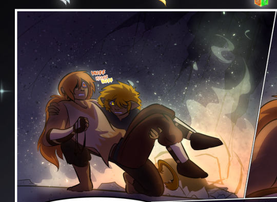
—where we now see that Falst's position is raised above Dainix's due to the way he's carrying him. (Points for continuity!) And, of course, we see the little "huffs" flowing from orange to yellow over their heads (where Dainix's head is higher than Falst's) to merge the sound of their breathing, which is absurdly clever because it emphasizes to the viewer how we hear two sets of huffing overlaying each other, not one. Absolutely brilliant.
(A few other notes of appreciation to that panel: beautiful glows around them, the sparks, the jagged silhouette of the spider legs, the lovely colors that have no right to make the area around a spider corpse that pretty, the excellent texturing on the cave walls plus perspective, the way Falst's movements imply Dainix's hefty weight, the natural posing of the characters, their on-point expressions that convey exactly how fuckin terrifying everything is right now, the slight glows to their eyes, and also they're just handsome boys <3)
Next up: Rain!!!! So well done! It's subtle enough that it never ever disrupts the impact of the focal point, but evident enough you can tell! And more importantly: THE MIST OFF THE CHARACTERS. Rain does this irl, it has that little vapor that comes off you and makes that little misty effect that plays with lighting, it's so cool-looking and here it's used to such pretty effect!
One of the panel captions says something about it blurring out all the injuries on the characters but like THAT AIN'T TOO BIG OF A PROBLEM when it gets across the environmental vibes, and also that'd be how it would look in real life too so like… outside viewer's angle is the same as the characters', mostly? my point is: that's the environment!!! that's the vibes, that's the feel! It gets it across and it does so in the most pretty way possible!
And another thing re: rain, the use of it to establish perspective, particularly in panels like this—

—where we can tell we're looking down at Tynan due to the perspective on the rain and where it's pointing. Excellent. (Also, kudos for looking down and emphasizing how Tynan's losing his advantage—lovely use of visual storytelling.)
Additionally, the misting here:
We see it most heavily in the leftmost panel, where it's quite foggy as you would expect in a rainstorm, especially in an environment with a lot of heat, but it's also lightly powdered on in the following two panels and tends to follow light sources, which makes complete sense given how light bounces off particles in the air.
A major point of strength in these too is a thorough understanding of lighting, like rim lighting, the various hues and shades, and an intricate understanding of how light bounces off surfaces even when they're in shadow (we'll see a faint glow in spots where characters are half in shadow, but that's how it would work in real life, because of how light bounces around).
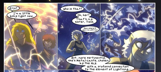
Bringing some of these points together: the fluidity of the lines in magic, and the way simple glowing lines are used to emphasize motion and the magic itself, is deeply clever. I'm basically pulling at random from panels and there's definitely even better examples, but here's one (see this page https://comicaurora.com/aurora/1-16-33/):

First panel, listed in numbers because these build on each other:
The tension of the lines in Tess's magic here. This works on a couple levels: first, the way she's holding her fists, as if she's pulling a rope taut.
The way there's one primary line, emphasizing the rope feeling, accompanied by smaller ones.
The additional lines starbursting around her hands, to indicate the energy crackling in her hands and how she's doing a good bit more than just holding it. (That combined with the fists suggests some tension to the magic, too.) Also the variations in brightness, a feature you'll find in actual lightning. :D Additional kudos for how the lightning sparks and breaks off the metal of the sword.
A handful of miscellaneous notes on the second panel:
The reflection of the flames in Erin's typically dark blue eyes (which bears a remarkable resemblance to Dainix, incidentally—almost a thematic sort of parallel given Erin's using the same magic Dainix specializes in?)
The flowing of fabric in the wind and associated variation in the lineart
The way Erin's tattoos interact with the fire he's pulling to his hand
The way the rain overlays some of the fainter areas of fire (attention! to! detail! hell yeah!)
I could go on. I won't because this is a lot of writing already.
Third panel gets paragraphs, not bullets:
Erin's giant-ass "FWOOM" of fire there, and the way the outline of the word is puffy-edged and gradated to feel almost three-dimensional, plus once again using Screen or a variation on it so that the stars show up in the background. All this against that stunning plume of fire, which ripples and sparks so gorgeously, and the ending "om" of the onomatopoeia is emphasized incredibly brightly against that, adding to the punch of it and making the plume feel even brighter.
Also, once again, rain helping establish perspective, especially in how it's very angular in the left side of the panel and then slowly becomes more like a point to the right to indicate it's falling directly down on the viewer. Add in the bright, beautiful glow effects, fainter but no less important black lines beneath them to emphasize the sky and smoke and the like, and the stunningly beautiful lighting and gradated glows surrounding Erin plus the lightning jagging up at him from below, and you get one hell of an impactful panel right there. (And there is definitely more in there I could break down, this is just a lot already.)
And in general: The colors in this? Incredible. The blues and purples and oranges and golds compliment so well, and it's all so rich.
Like, seriously, just throughout the whole comic, the use of gradients, blending modes, color balance and hues, all the things, all the things, it makes for the most beautiful effects and glows and such a rich environment. There's a very distinct style to this comic in its simplified backgrounds (which I recognize are done partly because it's way easier and also backgrounds are so time-consuming dear gods but lemme say this) and vivid, smoothly drawn characters; the simplicity lets them come to the front and gives room for those beautiful, richly saturated focal points, letting the stylized designs of the magic and characters shine. The use of distinct silhouettes is insanely good. Honestly, complex backgrounds might run the risk of making everything too visually busy in this case. It's just, augh, so GORGEOUS.
Another bit, take a look at this page (https://comicaurora.com/aurora/1-15-28/):
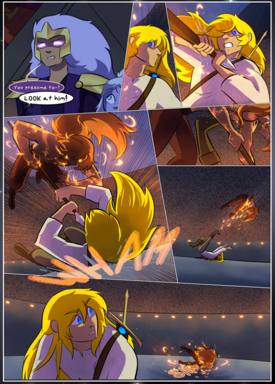
It's not quite as evident here as it is in the next page, but this one does some other fun things so I'm grabbing it. Points:
Once again, using different colors to represent different character actions. The "WHAM" of Kendal hitting the ground is caused by Dainix's force, so it's orange (and kudos for doubling the word over to add a shake effect). But we see blue layered underneath, which could be an environmental choice, but might also be because it's Kendal, whose color is blue.
And speaking off, take a look at the right-most panel on top, where Kendal grabs the spear: his motion is, again, illustrated in bright blue, versus the atmospheric screened-on orange lines that point toward him around the whole panel (I'm sure these have a name, I think they might be more of a manga thing though and the only experience I have in manga is reading a bit of Fullmetal Alchemist). Those lines emphasize the weight of the spear being shoved at him, and their color tells us Dainix is responsible for it.
One of my all-time favorite effects in this comic is the way cracks manifest across Dainix's body to represent when he starts to lose control; it is utterly gorgeous and wonderfully thematic. These are more evident in the page before and after this one, but you get a decent idea here. I love the way they glow softly, the way the fire juuuust flickers through at the start and then becomes more evident over time, and the cracks feel so realistic, like his skin is made of pottery. Additional points for how fire begins to creep into his hair.
A small detail that's generally consistent across the comic, but which I want to make note of here because you can see it pretty well: Kendal's eyes glow about the same as the jewel in his sword, mirroring his connection to said sword and calling back to how the jewel became Vash's eye temporarily and thus was once Kendal's eye. You can always see this connection (though there might be some spots where this also changes in a symbolic manner; I went through it quickly on the first time around, so I'll pay more attention when I inevitably reread this), where Kendal's always got that little shine of blue in his eyes the same as the jewel. It's a beautiful visual parallel that encourages the reader to subconsciously link them together, especially since the lines used to illustrate character movements typically mirror their eye color. It's an extension of Kendal.
Did I mention how ABSOLUTELY BEAUTIFUL the colors in this are?
Also, the mythological/legend-type scenes are illustrated in familiar style often used for that type of story, a simple and heavily symbolic two-dimensional cave-painting-like look. They are absolutely beautiful on many levels, employing simple, lovely gradients, slightly rougher and thicker lineart that is nonetheless smoothly beautiful, and working with clear silhouettes (a major strength of this art style, but also a strength in the comic overall). But in particular, I wanted to call attention to a particular thing (see this page https://comicaurora.com/aurora/1-12-4/):
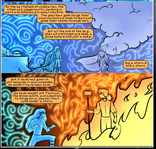
The flowing symbolic lineart surrounding each character. This is actually quite consistent across characters—see also Life's typical lines and how they curl:
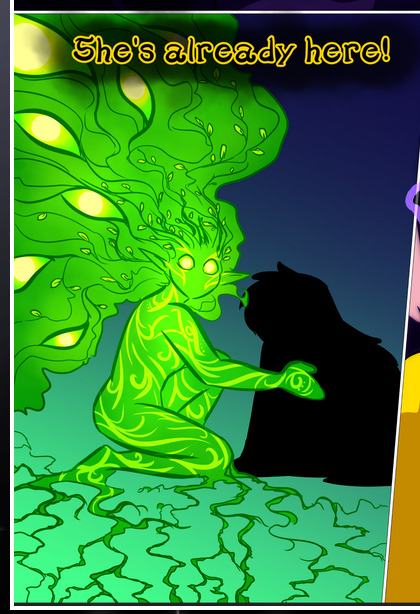
What's particularly interesting here is how these symbols are often similar, but not the same. Vash's lines are always smooth, clean curls, often playing off each other and echoing one another like ripples in a pond. You'd think they'd look too similar to Life's—but they don't. Life's curl like vines, and they remain connected; where one curve might echo another but exist entirely detached from each other in Vash's, Life's lines still remain wound together, because vines are continuous and don't float around. :P
Tahraim's are less continuous, often breaking up with significantly smaller bits and pieces floating around like—of course—sparks, and come to sharper points. These are also constants: we see the vines repeated over and over in Alinua's dreams of Life, and the echoing ripples of Vash are consistent wherever we encounter him. Kendal's dream of the ghost citizens of the city of Vash in the last few chapters is filled with these rippling, echoing patterns, to beautiful effect (https://comicaurora.com/aurora/1-20-14/):
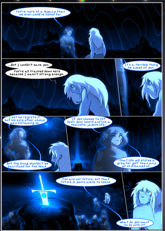
They ripple and spiral, often in long, sinuous curves, with smooth elegance. It reminds me a great deal of images of space and sine waves and the like. This establishes a definite feel to these different characters and their magic. And the thing is, that's not something that had to be done—the colors are good at emphasizing who's who. But it was done, and it adds a whole other dimension to the story. Whenever you're in a deity's domain, you know whose it is no matter the color.
Regarding that shape language, I wanted to make another note, too—Vash is sometimes described as chaotic and doing what he likes, which is interesting to me, because smooth, elegant curves and the color blue aren't generally associated with chaos. So while Vash might behave like that on the surface, I'm guessing he's got a lot more going on underneath; he's probably much more intentional in his actions than you'd think at a glance, and he is certainly quite caring with his city. The other thing is that this suits Kendal perfectly. He's a paragon character; he is kind, virtuous, and self-sacrificing, and often we see him aiming to calm others and keep them safe. Blue is such a good color for him. There is… probably more to this, but I'm not deep enough in yet to say.
And here's the thing: I'm only scratching the surface. There is so much more here I'm not covering (color palettes! outfits! character design! environment! the deities! so much more!) and a lot more I can't cover, because I don't have the experience; this is me as a hobbyist artist who happened to take a couple design classes because I wanted to. The art style to this comic is so clever and creative and beautiful, though, I just had to go off about it. <3
...brownie points for getting all the way down here? Have a cookie.
#aurora comic#aurora webcomic#comicaurora#art analysis#...I hope those are the right tags???#new fandom new tagging practices to learn ig#much thanks for something to read while I try to rest my wrists. carpal tunnel BAD. (ignore that I wrote this I've got braces ok it's fine)#anyway! I HAVE. MANY MORE THOUGHTS. ON THE STORY ITSELF. THIS LOVELY STORY#also a collection of reactions to a chunk of the comic before I hit the point where I was too busy reading to write anything down#idk how to format those tho#...yeet them into one post...???#eh I usually don't go off this much these days but this seems like a smaller tight-knit fandom so... might as well help build it?#and I have a little more time thanks to break so#oh yes also shoutout to my insanely awesome professor for teaching me all the technical stuff from this he is LOVELY#made an incredibly complex program into something comprehensible <3#synapse talks
779 notes
·
View notes
Text
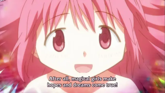
Madoka is the promise you won't turn from a child, full of hopes and dreams and the wish to save the world, into a bitter adult who just wants to hurt others and ruin people's lives
Madoka promised to be there for you to remind you of the person you wanted to be and to stop you from becoming what you sought to destroy
Madoka made that promise and became the very embodiment of it
#Moon posting#Feeling emotional about Madoka Magica all out of the blue and I'm making it your problem#IDK I saw a video in my YT reccs ranking Doremi toys and I really enjoyed it (sadly can't remember who it was)#So I went to check what other content the person had made and they had recently-ish done a blind reaction to Madoka#Didn't watch the whole thing just The Good Shit at like double speed (it was completely uncut and I wasn't in the mood for a full rewatch)#And god. The way the fucking ending to this series still makes me fucking sob like a baby EVEN WHEN WATCHING AT DOUBLE SPEED#I dunno what to tell you I really like that series. Like I just do. Madoka is Good Actually#IDK I feel like everyone has a lot of Opinions about the series and all I can say is that y'all are wrong and don't understand it#MADOKA ISN'T ABOUT BEING EDGY GRIMDARK TORTURE PORN!!! IT'S ABOUT HOPE!! AND DREAMS!! AND NOT GIVING UP!!#Y'all remember that post about how sometimes if you need to imagine Naruto encouraging you to help you get out of bed and brush your teeth#Then you imagine that dattebayo#And that is literally what Madoka is.#Except instead of self-care Madoka is there to stop you from being a toxic little dickweed and be nice to others#Sometimes you need to stop and ask: Would Madoka do that? Would Madoka say that? Would she be proud of me right now?#Don't ask me why I'm posting this it is 5 am I should be in bed man
184 notes
·
View notes
Text
Even when you have a hard day just remember, Bucktommy "has anyone ever told you you're a vision in a cone?" will always be there. Tommy Kinard looked at his adorable boyfriend with a silly party hat on and thought Evan, you're beautiful, you're stunning, you're ravishing, you're a sight for sore eyes. I could never get tired of looking at you. I cherish you. There's nowhere I'd rather be than behind this couch at your side. And he was so real for that.
#needed to remind myself of this and infuse some joy into this wretched anniversary#at least it's almost over and tomorrow will be easier but man ever since 2018 my bday has inspired nothing so much as the belief that#Michael from The Good Place was right when he said birth is a curse and existence is prison like I'm always so depressed on this day#it's hard to look on the bright side when all I can think of is losing my boy 🥹 family tries to make me celebrate but I just want to mourn#what's that quote about grief being love persevering. I love you so much little mister I still think of you every day#it's just hard on this particular day because I still remember it all so clearly and it haunts me#a sweet Bucktommy crumb can be a nice distraction for a time though. Just like Unknown(nth) was when Hozier dropped it out of nowhere in '22#my kitty was called Oliver too not after OS but it is a nice connection that his work can cheer me a bit#ough. idk if anyone will see these tags but just in case I'll tag#pet death#animal death#to hopefully filter it out for anyone sorry to be all sad on my Bucktommy post I couldn't help it thinking of my boy all day needed to vent#and oh this needs actual tags#Bucktommy#911 spoilers#I hope I did those warning tags right idk if I should say “cw” or “tw” with them
115 notes
·
View notes
Text

Dewi needed Hornets help OKAY.
Bug Fact: The Planthopper insect can accelerate from 0 to 12 miles per hour in less than a millisecond. Video/Pictures Below
First || Prev // Next
Masterpost
The Planthopper essentially vanishes from view.

They are also an extremely diverse set of insects morphologically!

Interested in learning more? True Facts About Leafhoppers and Friends <- very humorous and educational video :D PG-13
#Hornet though she was helping a higher being! She didn't know it was a grub higher being of all things >:(#I like to think the bug laughs are like little chirps. It's just cute that way#Zote talks to anyone who will listen. Elder Bug is in this margin#Lets hope Dewi can come back#posting this at the hour of 11pm. no regrets#dewi's adventures in hollow knight#hollow knight#hollow knight au#hollow knight comic#hollow knight hornet#hk ghost#hollow knight quirrel#dewi#hollow knight hollow#my art
2K notes
·
View notes
Text
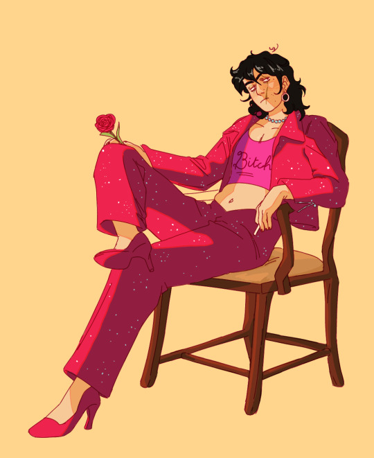
C!Q + vylette's fit from Jawbreaker
(aka an idea I've had for every conceivable holiday for months and decidedly couldn't put out on an appropriate date)
#i feel a little off posting this during such a time of distress but my own misery wont help others so I'm doing it anyway#also hi!!! I've been offline a lot but after much stress and a week being mildly mistreated at the hospital i finally know what's wrong!!#PM/SSc overlap syndrome you can look it up. they caught it early tho so none of my connective tissue is damaged#nor do i have any major systemic effects so yay. im taking meds for it and im praying for the best#anyway enough of my life hi folks this is the first thing ive drawn in MONTHS sry im rusty#sidenote in light of the tumblr panic never hesitate talking to me about anything I'd love it im just socially anxious#anyway i love yall hope yall enjoy <3 I'll leave yall now xoxo#my art#dsmp fanart#cquackity#fennec.art
438 notes
·
View notes
Note
Charles representation enjoyed here again! I’ve not read much of the comics bc I can’t afford them but I just rewatched FC and I was wondering if Charles being paralyzed is the same in the comics (Erik doing it)? Do they often include that part of his story?
hello my inquisitive friend :] !!!! im more than happy to give some more info bout the origins charles' disability in the comics- to the best of my abilities that is !
while they don't include an origin for his paralysis in EVERY story/run, as far as i know there are three major ways charles loses his mobility (though like yourself, i havent read many of the comics so far, so i could be missing a few. this is the part where i invite readers to submit additional info if im leaving any out)
the very first manner of charles losing his legs was relayed to us in the original X-Men run of the 60's in issue #20
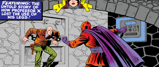

(X-Men #20: "I, Lucifer!")
before magneto was regarded as charles' main adversary there was the extraterrestrial lucifer (who sported the same color scheme, ironically. it wasnt as though lucifer came before magneto so it was definitely A Choice..) who charles would have a semi-reoccurring feud with for a bit early on in the series. during their first encounter, charles would corner lucifer in his lair only to have a stone slab dropped on him, disabling his legs indefinitely
the second manner in which charles loses his mobility- and the time where erik is the most involved and is most deliberate- comes from. Our Favorite Universe in 2001: The Ultimate Universe
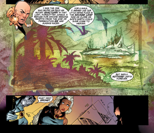
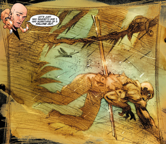
(Ultimate X-Men #1: "The Tomorrow People")
as is typically how charles x magneto team-up arcs go, while charles and erik worked together for some time it wasn't very long before erik wanted to pursue more Dramatic Measures for mutantkind. and As This Story Goes, amidst trying to escape the savage lands sanctuary he and erik built, erik drove a metal spike through charles' spine, leading to his disability in this verse
lastly, we have the House of M- or more specifically its prequel miniseries, Civil War: House of M- verse in 2008:
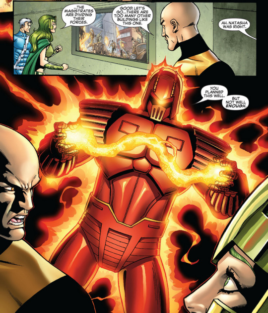
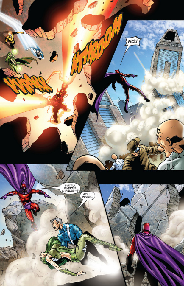
(Civil War: House of M #2: "Revolution")
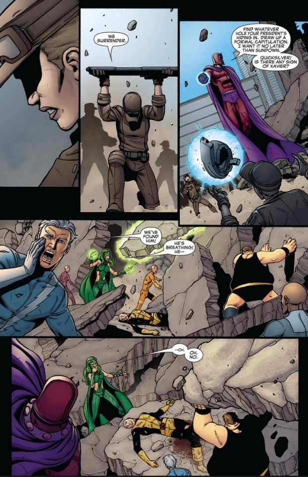
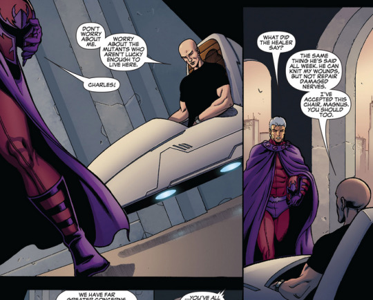
(Civil War: House of M #3: "Reign")
similar to Ultimate and the movies, this is another timeline where charles and erik team up. this time however, charles is more willing to follow erik's ideas after seeing the horrors of genosha upon reading the mind of a mutant who escaped the island, and the two seek to liberate the other mutants left behind. unfortunately, during their mission, a sentinel collapses the building charles and co. are infiltrating, leading to the loss of his legs
hope you had fun reading- i had fun typing up everything and looking back at these issues :] !
#long post#x-men#x-men comics#cherik#snap chats#also! its very easy to find these issues online for free. thats what ive been doing LMAOO#i still have to read ultimate and house of m in full so i have very little idea of the plots beyond these issues#again i only really buy issues if i really like the story or if i happen upon it in the wild and it piques my interest enough for me to tak#buuuut yeah as far as i know here's how charles loses his legs. in various timelines#bruh what makes me pissed about ultimate is that art of charles getting spiked is actually so fuckin well drawn#horrifying but its drawn so well it makes me mad#as far as i know they dont address the origin of his disability in any of the cartoons#not that i can remember of 92 and i havent finished evolution#we'll just have to see 😩#its kind of insane with the classic timeline cause not even like three/four issues later#charles builds some kind of device that lets him walk using his Psionic Energy or something#granted its not permanent and does need to recharge and he doesnt use it often but still. wild#anyway ! hope this helps :]
73 notes
·
View notes
Text
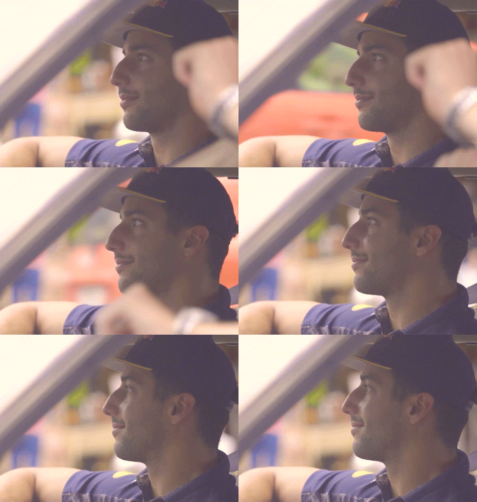
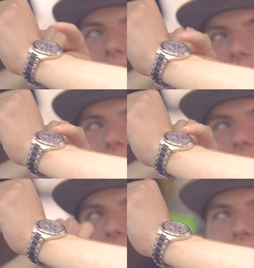


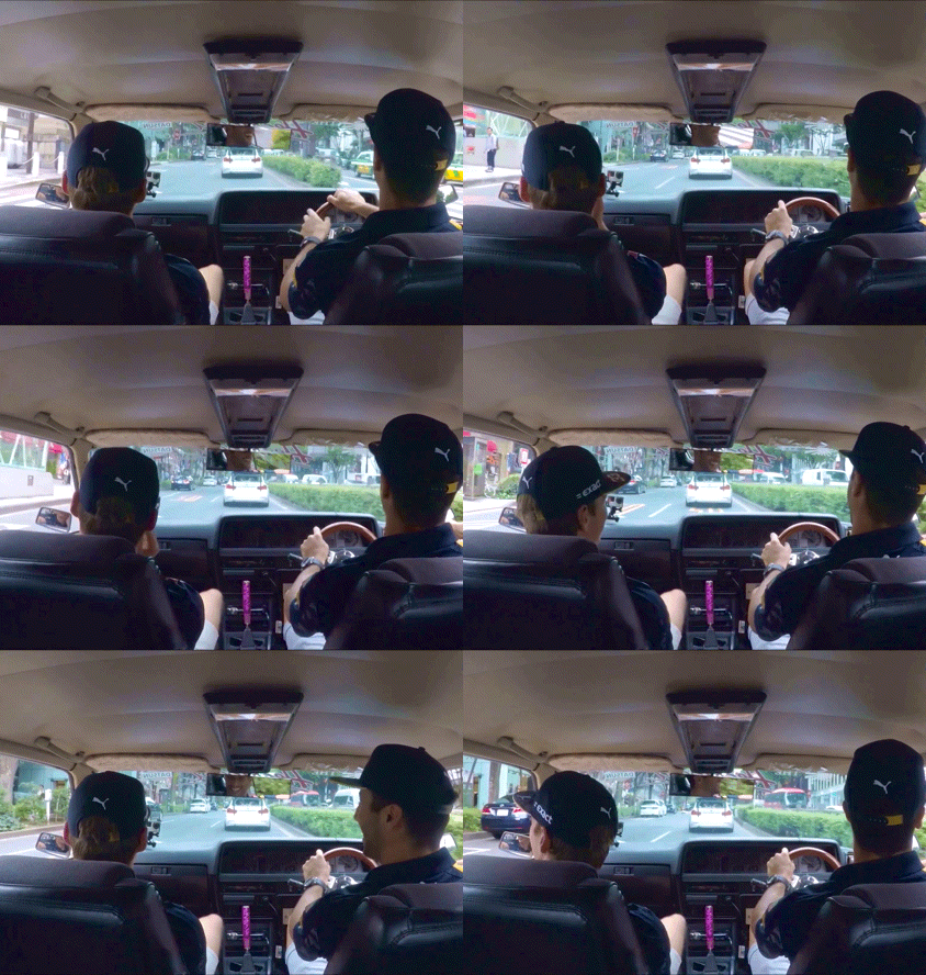
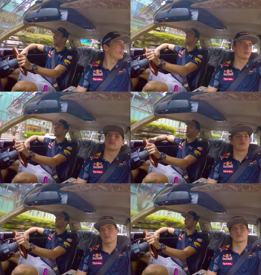
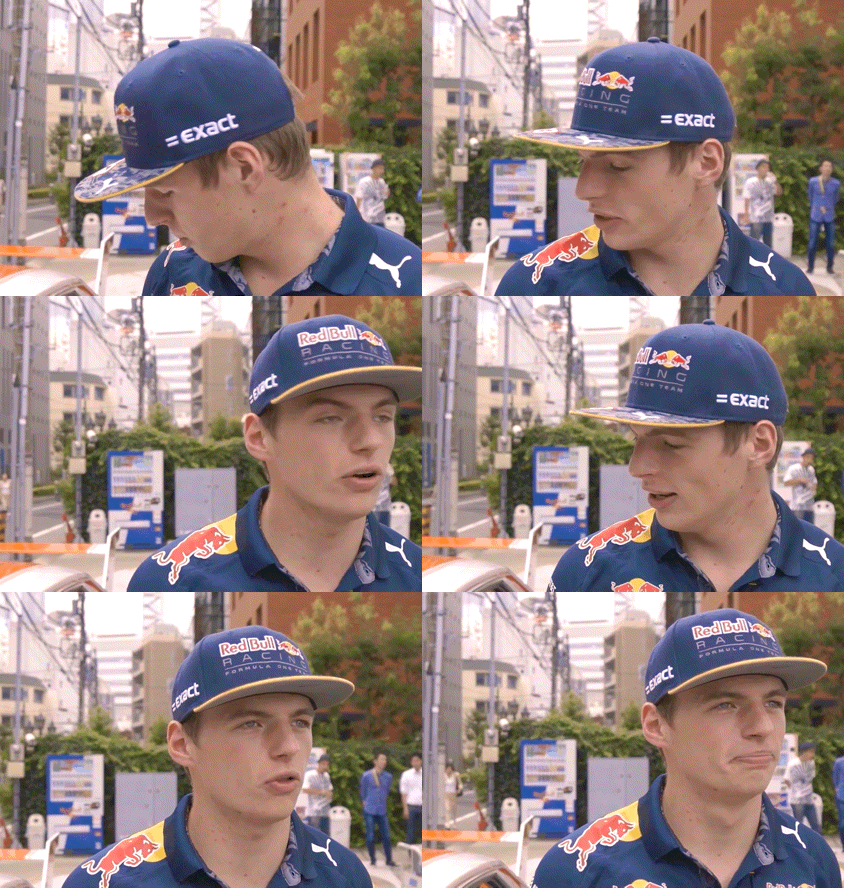
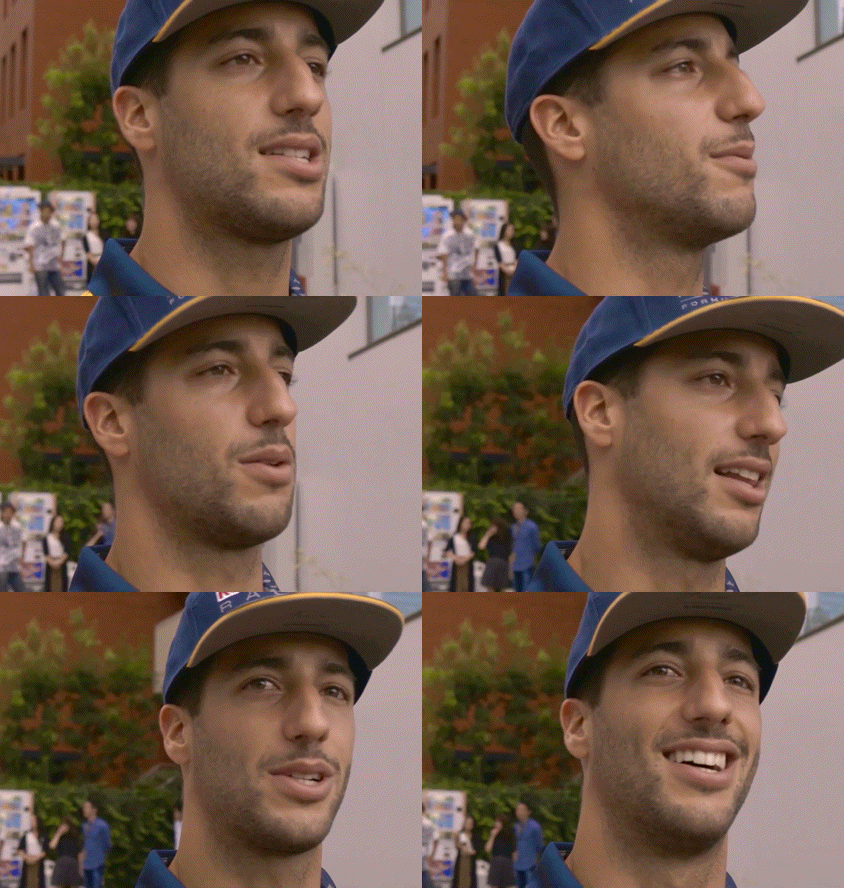
Daniel Ricciardo and Max Verstappen in Tokyo ahead of the 2016 Japanese GP | x
#max verstappen#daniel ricciardo#autumn posts#filing under things that are just new to me#escaping the dread for a moment with making some little gifs#thinking of everyone today#I've been numb with dread but I've been thinking of that Justin Mc Elroy quote like I'll keep doing good and no one can vote on that#I'll keep helping and supporting my friends and community and taking care of myself too#and one of those ways will be momentary escapes here in F1blr#I won't ramble too much but I'm just so heartbroken and dissapointed ... I had such hope#but we'll keep going and keep being strong ❤️ or I keep telling myself that!!#I gotta get back to the office#but sending everyone lots of energy and good thoughts and thank you for this space to get away and feel better for a little moment#have a restful day night and morning ahead 🏙️🌃🌆#be back soon!!#mentally will be at Daniel singing in the car and Max vibing along with him#maxiel hours in my heart only always
109 notes
·
View notes
Text


(UPDATED) COMMISSIONS ARE OPEN!
Hi hello hi! Commissions are open! if you are interested here is a google form below with all the info at hand about my commissions and workflow! If you have any questions my DMS are open to answer and talk it out, thank you so much, reblogs are extremely appreciated to spread the word as I would like this to be my main post for commissions from now on!
Busts sketches(colored/BW):20$ Fullbody sketches(colored/BW): 30$ Busts cleaned Lines(colored):30$
Fullbody cleaned Lines(colored):40$ Full Rendered illustrations:80-86$ (price range may change depending on complexity)
-an extra character counts as another illustration and will be a fee of the price doubled of what you have chosen.
-There is an allowance of 3 revisions after the line art is complete,
after that if you want changes, it will be a fee of 5+dollars for any additional changes after the line art has been considered approved.
-simple backgrounds are allowed for the Cleaned Flat commissions if the client so desires.
-sketch commissions may be shaded in black and white or simple flat colors (no rendering). lineart commissions can be with or without colors if so desired.
-Illustration pieces are large entirely intricate rendered scene artworks with very detailed backgrounds and character.
-tips are optional and greatly appreciated!
#I hope this is easier or better!;;#I really like to have an easier way to do this I always get worried I might forget a client with how much I do aahhh there’s only so much m#fucked up little ocd memory can do PF#BUT YEAH A I hOPE THIS IS OK#commissions open#commission work#art commissions#art#my art#art comms#art comms open#please reblog! Likes don’t really help this kind of post PF…#smoki rambles#BTW for any current clients you don’t have to fill this. Since I’m already working on your things it’s okay! But for anyone else#id prefer you fill this from now on!
230 notes
·
View notes
Note
i dont know if you are still doing these but!! id love a kiss on the hip for kandrew :) <3
Kevin Day is not a virgin. He understands sex and most of its mechanics. He's slept with a few people in his life, he's also sampled plenty of porn genres.
But none of that compares to this. To having Andrew's full and complete attention. To having Andrew on his back in his bedroom in Columbia. He's not quite sure how they ended up here. Of course, he understands the logistics of getting to Columbia from Palmetto State.
He knows the route they always take, he knows the right exit, he knows how to find Nicky's house.
How he got to this point he's not sure.
All he knows is Andrew and Neil were planning to come here this weekend for a bit of alone time. Just the two of them, no one else to bother them. That's what Kevin thought at least. Until Neil knocked his shoulder into Kevin's side at practice earlier and told him to pack a bag. When Kevin asked why, Neil merely shrugged. "Andrew said to."
Andrew said to. So Kevin did.
Kevin always does what Andrew says. That's how the three of them happened. Six months ago Andrew told Kevin that Neil wanted to kiss him, Kevin kissed him. Andrew watched them make out then announced that he wanted to kiss Kevin, Kevin kissed him.
And now here they all are, spread across Andrew's bed. Neil is sitting cross-legged against the headboard, wearing only his boxers and a tank top. Kevin has been stripped down to his shorts. And Andrew is fully clothed, except for the jacket he shed upon coming into the house, with his head on Neil's thigh. Kevin is hovering over Andrew, not touching him anywhere below the waist. Never touching him below the waist. Never touching him anywhere Andrew doesn't want him to.
"What am I doing now?" Kevin finally asks. Andrew had pulled Kevin over top of him like this a couple minutes ago and Kevin's been sort of frozen since. Because he's not a virgin, but Andrew makes him feel like one. A pair of hazel eyes stares up at him, seemingly bored. The flush on Andrew's cheeks is the only thing that gives him away.
"Whatever you want."
"That's not how it works—"
"It is now. You've graduated, Day. Touch me," Andrew commands. Kevin's hands twitch against the mattress, but he doesn't move them. Not yet.
"Where?"
"Anywhere." Andrew says, the want in his voice making Kevin's breathing catch. It takes a moment for him to process the word. And when he does, he throws himself off the bed. Andrew just stares after him. "Where are you going?"
Kevin sputters and puts his hands in the air. "You can't just change the rules on me like this."
"What rules?" Neil asks.
"The—" Kevin can't believe the question. "Oh, goddamn it, Neil. You know exactly what I'm talking about! I can't go from nothing to something to everything. Not like this. You have to tell me, Andrew. I don't know what—"
"I just told you what." Andrew says, sitting up a bit to look at him. "Anywhere, anything."
Kevin shakes his head. "No."
"No?"
"I don't want to fuck this up."
"You can't fuck it up."
"But—"
"No buts," Andrew interrupts. Kevin's gaze flicks from Andrew's to Neil's, back and forth. Andrew sighs. "Get the fuck over here, Kevin."
Kevin always does what Andrew says.
He moves to settle back over Andrew, propped up on his hands and knees. Andrew reaches for him and grabs the back of Kevin's neck, pulling him down into a kiss. Kevin gasps against his mouth and hears Neil make an appreciative sound, a little hum of a noise, above them. Suddenly there's a hand pushing into Kevin's hair and he knows it's Neil's. Kevin opens his eyes and looks up to meet Neil's eyes. The idiot smiles down at them and Andrew's eyes are closed, his mouth is hot, and... Kevin groans when Andrew fucks his tongue into his mouth.
Kevin moves to slip one hand under Andrew's head and lowers himself onto him, making Andrew exhale against his mouth. They're both half hard, Kevin ruts his hips against Andrew. An experiment that gets a grunt and a nip to his bottom lip.
"Good?" Kevin asks after pulling away a bit.
"Yes. Keep going."
"I want to take your shirt off." Kevin admits. Andrew's expression barely changes, but it does.
"Then do it." Andrew challenges, letting go of Kevin's neck. It takes both of them but Kevin gets the shirt off and drops it beside them. After thinking about it for half a second, he lightly skims a hand up Andrew's side making him shiver. He thinks it's a good sign, but then Neil's leaning in close to his head.
"Firmer, Kev." He whispers.
A hint. A clue from someone who's got years of experience on him. Kevin grabs it and a handful of Andrew's chest, taking Andrew by surprise.
"Really? Groping me, Day?"
"You said anything, didn't you?" Kevin squeezes Andrew's chest and thumbs at his nipple until it's peaked. Then he dips his head back down to press kisses to Andrew's neck. He knows Andrew likes that. It's safe, familiar, good for both of them. Andrew turns his head to the side, likely so he can look at Neil, but Kevin nips his pulse point and Andrew hisses a breath before grabbing him by the nape again and pulling him up like a mother cat does a kitten.
"Do you want me to stop?"
Andrew blinks at him like he's slow. "No. I want you to get on with it."
"You said anything I wanted." Kevin reminds him. "Or are you taking it back?"
"I'm not taking it back."
"Then let me take my time. Want to make you feel good." Kevin returns to Andrew's neck and Andrew's nails scrape against his back. Kevin assumes in appreciation. He nibbles at Andrew's throat until the goalie's breathing is labored, then finally comes up for air. "Can I bite you?"
There's a little spark in Andrew's eyes. Kevin wants to turn it into flame. After a moment, Andrew says 'yes, anything, do you understand the meaning of the word?' and Kevin shuts him up with teeth in the side of Andrew's neck. He sucks a mark there, one that'll bloom purple pedals, then does it again. Again.
He hears a sharp inhale to the side and glances over to see Neil palm himself through his underwear. Andrew tilts his head back to look at Neil and rolls his eyes.
"How am I not surprised your neck fetish extends to just watching."
At this point in their relationship, or whatever the fuck this is, Kevin thinks Neil has an Andrew fetish. He doesn't say so.
"Keep going." Neil tells him, almost as affected as Andrew. Kevin obliges, kissing and sucking his way down until he's nearing the waistband of Andrew's jeans. He stops there and raises his head to find Andrew glaring at him.
"Neil," Andrew says. "I think we need to get him an English tutor."
That makes Neil laugh and Kevin rolls his eyes, pinches the inside of Neil's thigh. "You can't fault me for wanting to be sure."
"I can and I will. Keep going or get out."
"Alright then. Instead of asking I'll just tell you. I'm going to take your pants off and then I'm going to blow your mind." Kevin decides, suddenly confident despite only giving a few blowjobs in his life. His decree has Andrew's brows raising.
"That so?"
"Yes." Kevin says firmly, making Neil's lips quirk. He eyes Neil for a moment. "Questions, comments, concerns?"
"None. Go." Neil tells him. So Kevin does. He scoots back and makes quick work of Andrew's remaining clothes, save his armbands. He's never seen what lies beneath them and he doesn't want to, because he has a theory and he doesn't want to test it.
Once Andrew's laid almost bare beneath him, Kevin stares. For a lot longer than he'll ever admit. Finally he dips his head and is thrown off course when he notices a freckle he'd never seen before. He detours past Andrew's cock and presses his lips to his hipbone instead. It's a barely-there thing, just a peck. But it makes Neil inhale sharply.
Kevin looks up at him. "What?"
Andrew's eyes flick up to Neil's, then he rolls them. "He's sentimental."
Kevin isn't sure what that means and it must be obvious from the look on his face. Andrew just shakes his head. "This is not a Q&A, get back to what you were doing."
#neil's also there sorry anon... i can't help it. i'm gay. and kevin needs a little guidance okay#also sorry for cutting it before the Good part but i think this is fine : )#LOLLLLLLLLLLLL this is an old ask anon i hope you somehow see this anyway<333#(ask dated march 3)#kandreil#kandrew#answered#ask games#my writing#long post
66 notes
·
View notes