#i hope it was comprehensive and helpful
Explore tagged Tumblr posts
Note
Hi! I’m starting to learn French and one thing that’s both cool and weird to me is how everything is gendered in a way (referring to someone/whose saying the statement/etc.) and I was wondering how that relates to people who identity as non-binary or gender fluid in France? Are there equivalents to they/them pronouns or neo pronouns in French?
I do plan on doing my own research about this but I figured since I love your blog and you’re really open about different cultural lgbtq+ communities I’d try here first!
That's an awesome question... with a complicated answer lmao. So buckle up and bear with me !
Basically, you can't be non-binary in French. The community found ways to do it but it's not mainstream. Most of the time, they're going to get misgendered or will have to misgender themselves to get understood.
Some things I'm going to list here are not proper French. Actually, they can even be forbidden in some circumstances, according to the law (the use of inclusive language, and more specifically le point médian, was made illegal in schools in 2021 for ex) or simply because your company etc forbids it. So use this wisely, there is a time and place for inclusive language in France.
That said, things have greatly developed over the last two decades. Which was partly because of the queer community and mainly because of feminists, who are tired of the way French erases women. More and more people are using inclusive language, at least in some circumstances and circles (for ex, i wrote my master's thesis in inclusive language and it was accepted bc i was in a leftist faculty). And inclusive language is debated as a serious issue now, which is saying something.
So, how do you use inclusive language in practice?
There are different ways, as it's informal and mostly new. People are still testing new things and trying out various methods. You can stick to one or alternate or mix them up.
Pronouns
Officially, there isn't a gender neutral pronoun. We don't have an equivalent to they. You're either talking about a man or a woman. If it's both, you use masculine pronouns ("masculine trumps feminine" rule). Same thing if you don't know the gender of the person ("masculin générique").
The most common neopronoun is "iel" (plural : iels), which is obviously a contraction of the masculine pronoun "il" and its feminine equivalent "elle". It works for nb folks or to avoid talking about someone's gender or to refer to a group of men and women. So it's equally used by the queer community and feminists.
I'm pretty sure other neopronouns exist but I can't think of any at the top of my head.
Choosing the right words
Sometimes, inclusive language is just about learning to use alternatives.
Instead of using gendered words, you can choose to use gender-neutral words or words "épicènes", aka words which are identical in their feminine and masculine form. For ex, instead of "homme politique" or "femme politique", you can use "personnalité politique". Personnalité is a feminine word but it's actually gender-neutral as you can use it for women and men alike. "Élève" (student) is épicène, as a female student and a male student are both referred to as "élève". Although épicène words as a gender-neutral option only work in their plural form, as you have to choose either a feminine or masculine article for the singular ("les élèves" is inclusive but it can only be "un" or "une" élève).
As good as this method is, it can be quite limitating. Your vocabulary will be drastically reduced and it can be quite hard to master that kind of speech so you can reach the point where you don't have to think everything over for ages before you open your mouth.
With oral French, you can take it a step further by choosing words that sound the same even if they have a different spelling. Ex, friend is "ami" or "amie" but it's pronounced the same way so if you say it out loud, people can't know how you're gendering it (as long as there isn't a gendered article/word with it ofc).
It avoids misgendering people but the downside is that, as masculine is considered neutral in French, people will often think : no gender specified = masculine. Not even because they're sexist or whatever, it's just so ingrained in our brains that it's a knee-jerk reaction.
That's also why most feminists often prefer to use explicitly feminine words when talking about women. For ex, they prefer the word "autrice" to "auteure" (female writer) because the second one sounds the same as its masculine version "auteur". And as previously mentionned, out loud, people will assume by default you're talking about a man. It's a big debate though, lots of women prefer words that sound masculine - going as far as refusing to use feminine words at all! Which sounds cool and gender-bending as fuck but in reality comes from feminine words traditionally seen as less legitimate and serious. Even today, if you look up the word empress "impératrice" in a French dictionary, the first definition that comes up is "wife of an emperor". "Woman ruling a country" comes second. Using a masculine title to refer to women can also be a way to mock them and show they're not welcome (a french deputy got fined in 2014 because he called the female president of the national assembly "Madame le président" and refused to use the feminine title "Madame la présidente").
Recently the tendency and official guidelines have been to feminize words, so I'd say go with that by default, but respect other people's choice if they specify how they want to be called.
Anyway I'm getting off-track but what I meant was that in French, if you avoid talking about gender, you're automatically erasing women (and nb people). So if you want to include everyone, you need to make it obvious.
Inclusivity as a statement
The most common way to make women and men equally visible is the "point médian" rule, which you can also use to refer to non-binary people as it avoids picking a specific gender.
Basically, it means pasting together the masculine and feminine forms of a word and using dots/middle dots/hyphens/parentheses/capital letters to create an inclusive word. For ex, instead of saying acteur (♂️) or actrice (♀️) for actor, you'll write "acteur.ice". For the plural form, there are two schools of thought : either you separate the feminine and masculine form AND the suffix used to signify the plural, or you don't. Aka, "acteur.ice.s" or "acteur.ices". Personally I prefer the second option because less dots makes it easier to read and faster to write, but it's an individual choice, both work.
There are two major downsides to this method : it only works in writing + it isn't doable for every word, as feminine and masculine words can be quite different and pasting them together that way would be unintelligible. Ex, "copain" and "copine" (friend or boyfriend/girlfriend depending on the context) would give something like "cop.ain.ine"...
You can work around that by choosing alternative words (as previously stated!). And it's still a pretty good method, especially as it works for any type of word (adjectives etc). Some people argue that it's hard to read and ugly but personally I think it's just a matter of habit (although it does pose a problem for people using screen readers). Be aware that it is the most controversial version of inclusive writing, as it's the furthest structure from how languages typically work.
If you don't like dots or want an alternative for oral speech, you can also straight up create new words that sound both feminine and masculine, making them gender-neutral. To use the previous example, "copain" and "copine" become "copaine".
Obviously, this only works if it's obvious which words they're based on. I think it's a great way to make French more inclusive but I'd advise against using it with uninitiated people as it would probably confuse them more than anything. This method is still quite niche.
An inclusive, yet binary language
As you've probably figured out, inclusive language remains quite binary in the way we approach it. It's more about making things both masculine and feminine than transcending gender and creating gender-neutral alternatives. Probably because inclusive language was more often a will to stop women from being erased rather than a non-binary friendly gesture.
Which means, there are also some rules that were created to avoid the "masculine trumps feminine rule" but don't allow room for non-binarity at all. I'll still explain them because they're interesting and you might encounter them at some point.
The proximity rule ("règle de proximité") is one of these. It existed in Ancient Greek and Latin but was dropped in Modern French in favor of the masculine trumps feminine rule. Basically, you gender things according to what's closest in the sentence instead of systematically using masculine words to gender a mixed group. For ex, instead of saying "Les hommes et les femmes sont beaux" you say "Les hommes et les femmes sont belles", as the subject "femmes" is closer to the adjective "beau/belle" than "hommes".
Another method is to systematically use both masculine and feminine words (which I personally find excruciating to write and read). Meaning, instead of writing "Les étudiants mangent à la cantine" (students eat at the cafeteria), you'll write "Les étudiantes et les étudiants mangent à la cantine".
This is mainly for the subject of the sentence : adjectives and such are gendered according to the masculine trumps feminine rule. The point is to explicitly include women, not to make the sentence unintelligible or gender-neutral.
When following this method, you also have to pay attention to whether you put the feminine subject first or the masculine. The rule is to follow alphabetical order. For ex, in "l'égalité entre les femmes et les hommes", "femmes" comes first because F comes before H. But in "Les auteurs et les autrices de roman", "auteurs" comes first because E comes before R. Etc.
This method is common as it's the only inclusive language you can get away with, given that it's a valid way of speaking French. It's even mandatory in some situations now, like in job descriptions for the french administration, in the spirit of gender equality.
So, how do I gender a non-binary person?
In short, you can use the pronoun iel + avoid gendered words and/or use the point médian and/or make up new words.
But keep in mind that if you're not talking to someone familiar with these rules, you'll have some explaining to do. And looots of people are still very anti inclusive language, because they're sexist and/or transphobic, ignorant, language purists, etc. A few years ago it was the thing to be angry about for conservatives and anti-feminists so it's still very controversial. But if you're in a trans inclusive queer space or talking with intersectionnal leftists, go for it !
I hope I covered everything (fellow french, don't hesitate to comment!) and didn't put you to sleep lmao. If you want to see some examples, you can look it up on Wikipedia or check #bagaitte on tumblr (it's the french queer tag) 😉
#it's a slow but steady effort!#the fact that it was accepted by my uni teachers shows how far we've come already#a decade ago it would have probably been dismissed#i don't even know if i was aware this existed a decade ago#😅#anyway THANK YOU for this ask#i hope it was comprehensive and helpful#ask#language inclusif#écriture inclusive#inclusive language#upthebaguette#bagaitte#french#languages
1K notes
·
View notes
Text
"Nothing good ever comes out when I start hoping... but maybe just a little bit."

[Thank you to @.unfinished-projects-galore , @.ai-kan1 and @.stestylius-arts for the assets! Thank you as well to @jovieinramshackle for giving me the inspo to finally start on this, and to @crystallizsch , @angelwishess and @twstgo whose oc intros I took inspo for the layout 🫶]
An outlier from the school, due to his situation he was home-schooled for the majority of his first year. They have decided to accompany the Ramshackle prefect in their daily endeavors, serving as a guide and as a companion in the worn-down dorm.
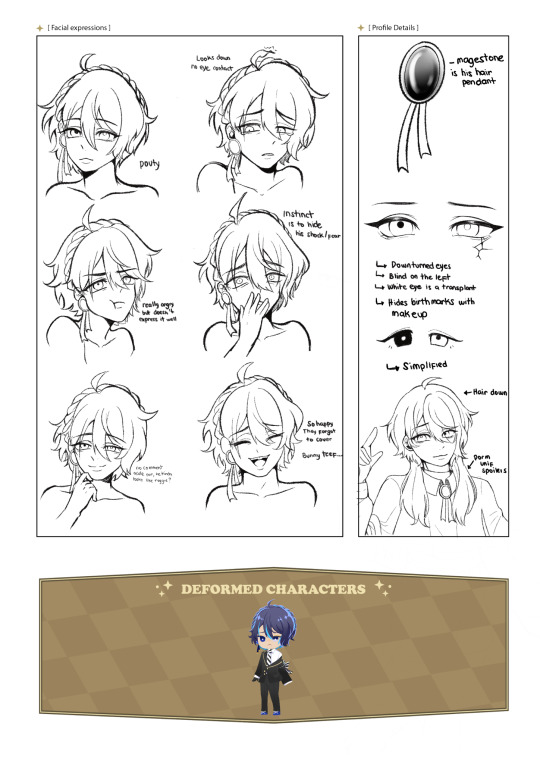
BASIC INFO.
NAME: Oswald "Oz" Damarys BIRTHNAME: ???? ??????? ALIAS: Oz, Ozzie, Flashlight Fish (Floyd), Monsieur Porcelaine (Rook) Shortie-senpai (Yuudai) AGE: 17 BIRTHDATE: August 26 HEIGHT: 154 cm SPECIES: Half-human half beastmen GENDER: Demi-boy (Uses they/he and masc titles) ORIENTATION: Demisexual ALIGNMENT: Lawful Neutral MBTI: ISFP Voice claim: Here! (Stc)
LIKES: Stargazy pie, Seafood in general, Acrobatics, Crochet, Art in general, Reading, Fairytales, Music boxes, Classical Music, Card games, Mystery books, Sightseeing, DISLIKES:Wishmaking, Shooting stars, Crowded places, Performing, Being observed, People touching his birthmark, His "Luck", Basketballs
Unique Magic Your Next Line is! [ Flash Forward ] — "An indisputable future is what I see... Your Next Line is!" Oswald is able to take a peek into someone's future as long as they keep contact with his pearly white eye. It can be anything from 5 seconds from now or a day later - This visions manifests like rolls of film - Lately It appears his unique magic is going haywire, showing him visions without the need of eye contact. (They aren't pleasant visions)
TRAITS + Easy-going; Flexible; Warm; Appreciative = Tolerant; Perceptive; Witty; Impartial - Overworker; Indecisive; Reliant; Worrisome
BRIEF OVERVIEW (STC)
Oz is a man of many tricks; he was raised to entertain the audience, which is why he is great at lightening up the mood of the room. The many tricks he can do reminds others of a puppy trained on how to play dead, or shake hands. Despite that, Oz actually struggles in actually expressing the his true feelings— used to being the brunt of many jokes growing up, he believes that he is simply a puppet used for the entertainment of others. He sees himself as a hollow doll with no real personality, only meant for display. He is confused about who his truly is, used to what others want to see and not what he wants to show. Slowly, he is realizing that he is merely human, and that he should live for his own sake. (Old info from my notes)
TIDBITS
Random Facts - Part-beastmen, specifically a rabbit beastmen but he lacks actual features aside for his tail that was cauterized off when he was younger - He doesn't look the part but he also likes getting into shenanigans, sometimes instigating Yuu and Adeuce with the pranks they do (No one really believes the trio when they say it was Oz's idea) - He's double jointed which is helpful with his Acrobatic hobby. - Love language is gift giving, and has a tendency to make crochets for other people. They're typically things that remind them of the other. - Has a lot of birthmarks on his face, but he started to cover them with foundation after Floyd made fun of it. - Has a terrible sense of direction so he gets lost easily, but he'd like to travel around the world someday. - He has terrible luck, and while he doesn't believe in superstitions he began to be wary about them. Doesn't want to get knocked out unconscious by a basketball whenever he passes by the gym. - Doesn't really mind being called Oswald, but he associated that to whenever he'd get scolded... so Oz is his more go to nickname.
TYPING QUIRK: - His friend got him into using Kaomojis, he likes the ones with bunny ears. - Likes sending voice messages to get his point across. - Usually types in sentence cases, (although when he isn't feeling well he types in lower cases) SPEAKING QUIRK: - Uses a lot of onomatopoeia to describe unknown things. - Speaks firmly when he feels strong emotions. - Sometimes bites his tongue when he rambles, or not focused. BEHAVIOURAL QUIRKS: - Nose has a tendency to twitch when he’s interested, or irritated. - He also unconsciously thumps his foot when he’s annoyed.
RELATIONSHIPS (WIP)

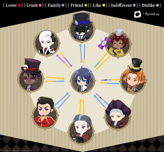
(Might put a brief overview on their more notable relationships in the future!) Note: - Main Oc x Canon is with Jamil (ignore that pink on silver and jade) - Divus is his foster parent
PNGS BELOW:
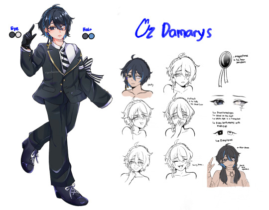

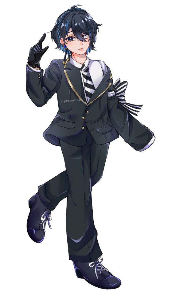
p∀ƎH ⅄W NI פNIH┴ƎWOS SI ƎɹƎH┴
#twst oc#twst#twisted wonderland#twst oc intro#oz damarys#taters doodles#taters kid#someday i'll drop his dorm uniform#l...long overdue still under construction ngl#been doublechecking the grammar all day help#i hope this is somewhat comprehensive hshs#yeah his unique magic is a jojo’s reference 😭#gonna try and make a more detailed infosheet for his hair#cause even i get confused
338 notes
·
View notes
Note
Hello so I really like your art style and the way you draw the transformers. And I was wondering if I could ask how did you learn how to draw them?
And do you have any tips for beginners?
Also read the fic btw and it’s genuinely one of the best things I’ve read. So keep up the good work and take breaks when you need too.
There're definitely ppl who can explain it better than me, like @bloominglegumes in this post here , but I here's a bit about how I approach it!


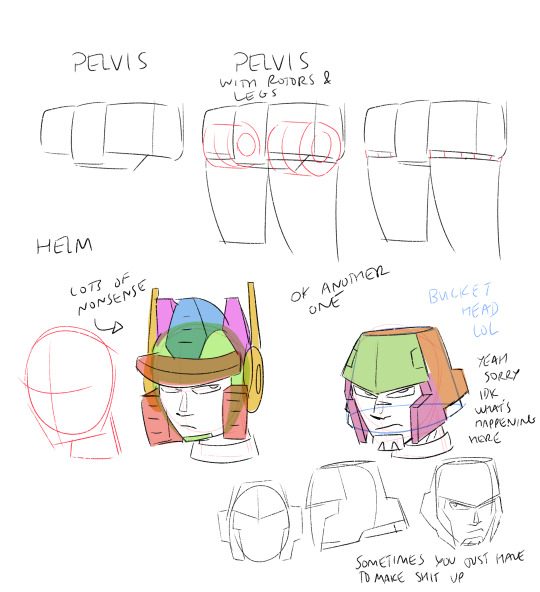


That's basically how I visualize it. It also helps to have reference when you're first starting out. Transformers are wacky to draw cause u need knowledge of organic and inorganic shapes and how they mesh. Personally I try not to let my guys look too stiff. I try to keep lines curved, even if they look straight on first inspection. Technically not realistic since they're made of metal, but it just looks better.
#Hope that helps!#Maybe not the most comprehensive but that's just how I do it#There are definitely also more resources out there#best advice tho is practice and have fun lol#transformers#drawing#tutorial#kinda
222 notes
·
View notes
Text
why Aurora's art is genius
It's break for me, and I've been meaning to sit down and read the Aurora webcomic (https://comicaurora.com/, @comicaurora on Tumblr) for quite a bit. So I did that over the last few days.
And… y'know. I can't actually say "I should've read this earlier," because otherwise I would've been up at 2:30-3am when I had responsibilities in the morning and I couldn't have properly enjoyed it, but. Holy shit guys THIS COMIC.
I intended to just do a generalized "hello this is all the things I love about this story," and I wrote a paragraph or two about art style. …and then another. And another. And I realized I needed to actually reference things so I would stop being too vague. I was reading the comic on my tablet or phone, because I wanted to stay curled up in my chair, but I type at a big monitor and so I saw more details… aaaaaand it turned into its own giant-ass post.
SO. Enjoy a few thousand words of me nerding out about this insanely cool art style and how fucking gorgeous this comic is? (There are screenshots, I promise it isn't just a wall of text.) In my defense, I just spent two semesters in graphic design classes focusing on the Adobe Suite, so… I get to be a nerd about pretty things…???
All positive feedback btw! No downers here. <3
---
I cannot emphasize enough how much I love the beautiful, simple stylistic method of drawing characters and figures. It is absolutely stunning and effortless and utterly graceful—it is so hard to capture the sheer beauty and fluidity of the human form in such a fashion. Even a simple outline of a character feels dynamic! It's gorgeous!
Though I do have a love-hate relationship with this, because my artistic side looks at that lovely simplicity, goes "I CAN DO THAT!" and then I sit down and go to the paper and realize that no, in fact, I cannot do that yet, because that simplicity is born of a hell of a lot of practice and understanding of bodies and actually is really hard to do. It's a very developed style that only looks simple because the artist knows what they're doing. The human body is hard to pull off, and this comic does so beautifully and makes it look effortless.
Also: line weight line weight line weight. It's especially important in simplified shapes and figures like this, and hoo boy is it used excellently. It's especially apparent the newer the pages get—I love watching that improvement over time—but with simpler figures and lines, you get nice light lines to emphasize both smaller details, like in the draping of clothing and the curls of hair—which, hello, yes—and thicker lines to emphasize bigger and more important details and silhouettes. It's the sort of thing that's essential to most illustrations, but I wanted to make a note of it because it's so vital to this art style.
THE USE OF LAYER BLENDING MODES OH MY GODS. (...uhhh, apologies to the people who don't know what that means, it's a digital art program thing? This article explains it for beginners.)
Bear with me, I just finished my second Photoshop course, I spent months and months working on projects with this shit so I see the genius use of Screen and/or its siblings (of which there are many—if I say "Screen" here, assume I mean the entire umbrella of Screen blending modes and possibly Overlay) and go nuts, but seriously it's so clever and also fucking gorgeous:
Firstly: the use of screened-on sound effect words over an action? A "CRACK" written over a branch and then put on Screen in glowy green so that it's subtle enough that it doesn't disrupt the visual flow, but still sticks out enough to make itself heard? Little "scritches" that are transparent where they're laid on without outlines to emphasize the sound without disrupting the underlying image? FUCK YES. I haven't seen this done literally anywhere else—granted, I haven't read a massive amount of comics, but I've read enough—and it is so clever and I adore it. Examples:


Secondly: The beautiful lighting effects. The curling leaves, all the magic, the various glowing eyes, the fog, the way it's all so vividly colored but doesn't burn your eyeballs out—a balance that's way harder to achieve than you'd think—and the soft glows around them, eeeee it's so pretty so pretty SO PRETTY. Not sure if some of these are Outer/Inner Glow/Shadow layer effects or if it's entirely hand-drawn, but major kudos either way; I can see the beautiful use of blending modes and I SALUTE YOUR GENIUS.
I keep looking at some of this stuff and go "is that a layer effect or is it done by hand?" Because you can make some similar things with the Satin layer effect in Photoshop (I don't know if other programs have this? I'm gonna have to find out since I won't have access to PS for much longer ;-;) that resembles some of the swirly inner bits on some of the lit effects, but I'm not sure if it is that or not. Or you could mask over textures? There's... many ways to do it.
If done by hand: oh my gods the patience, how. If done with layer effects: really clever work that knows how to stop said effects from looking wonky, because ugh those things get temperamental. If done with a layer of texture that's been masked over: very, very good masking work. No matter the method, pretty shimmers and swirly bits inside the bigger pretty swirls!
Next: The way color contrast is used! I will never be over the glowy green-on-black Primordial Life vibes when Alinua gets dropped into that… unconscious space?? with Life, for example, and the sharp contrast of vines and crack and branches and leaves against pitch black is just visually stunning. The way the roots sink into the ground and the three-dimensional sensation of it is particularly badass here:

Friggin. How does this imply depth like that. HOW. IT'S SO FREAKING COOL.
A huge point here is also color language and use! Everybody has their own particular shade, generally matching their eyes, magic, and personality, and I adore how this is used to make it clear who's talking or who's doing an action. That was especially apparent to me with Dainix and Falst in the caves—their colors are both fairly warm, but quite distinct, and I love how this clarifies who's doing what in panels with a lot of action from both of them. There is a particular bit that stuck out to me, so I dug up the panels (see this page and the following one https://comicaurora.com/aurora/1-20-30/):

(Gods it looks even prettier now that I put it against a plain background. Also, appreciation to Falst for managing a bridal-carry midair, damn.)
The way that their colors MERGE here! And the immense attention to detail in doing so—Dainix is higher up than Falst is in the first panel, so Dainix's orange fades into Falst's orange at the base. The next panel has gold up top and orange on bottom; we can't really tell in that panel where each of them are, but that's carried over to the next panel—
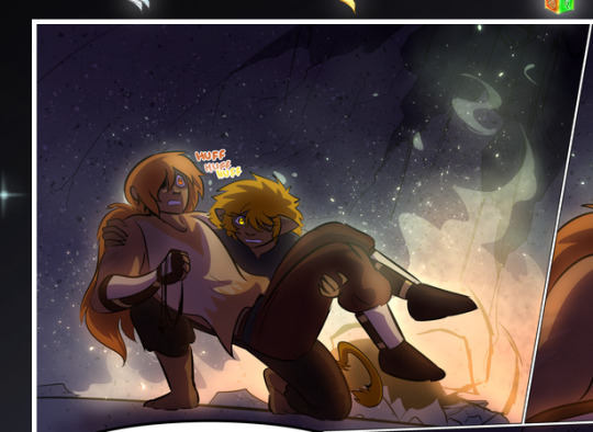
—where we now see that Falst's position is raised above Dainix's due to the way he's carrying him. (Points for continuity!) And, of course, we see the little "huffs" flowing from orange to yellow over their heads (where Dainix's head is higher than Falst's) to merge the sound of their breathing, which is absurdly clever because it emphasizes to the viewer how we hear two sets of huffing overlaying each other, not one. Absolutely brilliant.
(A few other notes of appreciation to that panel: beautiful glows around them, the sparks, the jagged silhouette of the spider legs, the lovely colors that have no right to make the area around a spider corpse that pretty, the excellent texturing on the cave walls plus perspective, the way Falst's movements imply Dainix's hefty weight, the natural posing of the characters, their on-point expressions that convey exactly how fuckin terrifying everything is right now, the slight glows to their eyes, and also they're just handsome boys <3)
Next up: Rain!!!! So well done! It's subtle enough that it never ever disrupts the impact of the focal point, but evident enough you can tell! And more importantly: THE MIST OFF THE CHARACTERS. Rain does this irl, it has that little vapor that comes off you and makes that little misty effect that plays with lighting, it's so cool-looking and here it's used to such pretty effect!
One of the panel captions says something about it blurring out all the injuries on the characters but like THAT AIN'T TOO BIG OF A PROBLEM when it gets across the environmental vibes, and also that'd be how it would look in real life too so like… outside viewer's angle is the same as the characters', mostly? my point is: that's the environment!!! that's the vibes, that's the feel! It gets it across and it does so in the most pretty way possible!
And another thing re: rain, the use of it to establish perspective, particularly in panels like this—

—where we can tell we're looking down at Tynan due to the perspective on the rain and where it's pointing. Excellent. (Also, kudos for looking down and emphasizing how Tynan's losing his advantage—lovely use of visual storytelling.)
Additionally, the misting here:
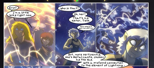
We see it most heavily in the leftmost panel, where it's quite foggy as you would expect in a rainstorm, especially in an environment with a lot of heat, but it's also lightly powdered on in the following two panels and tends to follow light sources, which makes complete sense given how light bounces off particles in the air.
A major point of strength in these too is a thorough understanding of lighting, like rim lighting, the various hues and shades, and an intricate understanding of how light bounces off surfaces even when they're in shadow (we'll see a faint glow in spots where characters are half in shadow, but that's how it would work in real life, because of how light bounces around).
Bringing some of these points together: the fluidity of the lines in magic, and the way simple glowing lines are used to emphasize motion and the magic itself, is deeply clever. I'm basically pulling at random from panels and there's definitely even better examples, but here's one (see this page https://comicaurora.com/aurora/1-16-33/):

First panel, listed in numbers because these build on each other:
The tension of the lines in Tess's magic here. This works on a couple levels: first, the way she's holding her fists, as if she's pulling a rope taut.
The way there's one primary line, emphasizing the rope feeling, accompanied by smaller ones.
The additional lines starbursting around her hands, to indicate the energy crackling in her hands and how she's doing a good bit more than just holding it. (That combined with the fists suggests some tension to the magic, too.) Also the variations in brightness, a feature you'll find in actual lightning. :D Additional kudos for how the lightning sparks and breaks off the metal of the sword.
A handful of miscellaneous notes on the second panel:
The reflection of the flames in Erin's typically dark blue eyes (which bears a remarkable resemblance to Dainix, incidentally—almost a thematic sort of parallel given Erin's using the same magic Dainix specializes in?)
The flowing of fabric in the wind and associated variation in the lineart
The way Erin's tattoos interact with the fire he's pulling to his hand
The way the rain overlays some of the fainter areas of fire (attention! to! detail! hell yeah!)
I could go on. I won't because this is a lot of writing already.
Third panel gets paragraphs, not bullets:
Erin's giant-ass "FWOOM" of fire there, and the way the outline of the word is puffy-edged and gradated to feel almost three-dimensional, plus once again using Screen or a variation on it so that the stars show up in the background. All this against that stunning plume of fire, which ripples and sparks so gorgeously, and the ending "om" of the onomatopoeia is emphasized incredibly brightly against that, adding to the punch of it and making the plume feel even brighter.
Also, once again, rain helping establish perspective, especially in how it's very angular in the left side of the panel and then slowly becomes more like a point to the right to indicate it's falling directly down on the viewer. Add in the bright, beautiful glow effects, fainter but no less important black lines beneath them to emphasize the sky and smoke and the like, and the stunningly beautiful lighting and gradated glows surrounding Erin plus the lightning jagging up at him from below, and you get one hell of an impactful panel right there. (And there is definitely more in there I could break down, this is just a lot already.)
And in general: The colors in this? Incredible. The blues and purples and oranges and golds compliment so well, and it's all so rich.
Like, seriously, just throughout the whole comic, the use of gradients, blending modes, color balance and hues, all the things, all the things, it makes for the most beautiful effects and glows and such a rich environment. There's a very distinct style to this comic in its simplified backgrounds (which I recognize are done partly because it's way easier and also backgrounds are so time-consuming dear gods but lemme say this) and vivid, smoothly drawn characters; the simplicity lets them come to the front and gives room for those beautiful, richly saturated focal points, letting the stylized designs of the magic and characters shine. The use of distinct silhouettes is insanely good. Honestly, complex backgrounds might run the risk of making everything too visually busy in this case. It's just, augh, so GORGEOUS.
Another bit, take a look at this page (https://comicaurora.com/aurora/1-15-28/):
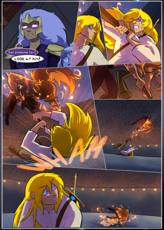
It's not quite as evident here as it is in the next page, but this one does some other fun things so I'm grabbing it. Points:
Once again, using different colors to represent different character actions. The "WHAM" of Kendal hitting the ground is caused by Dainix's force, so it's orange (and kudos for doubling the word over to add a shake effect). But we see blue layered underneath, which could be an environmental choice, but might also be because it's Kendal, whose color is blue.
And speaking off, take a look at the right-most panel on top, where Kendal grabs the spear: his motion is, again, illustrated in bright blue, versus the atmospheric screened-on orange lines that point toward him around the whole panel (I'm sure these have a name, I think they might be more of a manga thing though and the only experience I have in manga is reading a bit of Fullmetal Alchemist). Those lines emphasize the weight of the spear being shoved at him, and their color tells us Dainix is responsible for it.
One of my all-time favorite effects in this comic is the way cracks manifest across Dainix's body to represent when he starts to lose control; it is utterly gorgeous and wonderfully thematic. These are more evident in the page before and after this one, but you get a decent idea here. I love the way they glow softly, the way the fire juuuust flickers through at the start and then becomes more evident over time, and the cracks feel so realistic, like his skin is made of pottery. Additional points for how fire begins to creep into his hair.
A small detail that's generally consistent across the comic, but which I want to make note of here because you can see it pretty well: Kendal's eyes glow about the same as the jewel in his sword, mirroring his connection to said sword and calling back to how the jewel became Vash's eye temporarily and thus was once Kendal's eye. You can always see this connection (though there might be some spots where this also changes in a symbolic manner; I went through it quickly on the first time around, so I'll pay more attention when I inevitably reread this), where Kendal's always got that little shine of blue in his eyes the same as the jewel. It's a beautiful visual parallel that encourages the reader to subconsciously link them together, especially since the lines used to illustrate character movements typically mirror their eye color. It's an extension of Kendal.
Did I mention how ABSOLUTELY BEAUTIFUL the colors in this are?
Also, the mythological/legend-type scenes are illustrated in familiar style often used for that type of story, a simple and heavily symbolic two-dimensional cave-painting-like look. They are absolutely beautiful on many levels, employing simple, lovely gradients, slightly rougher and thicker lineart that is nonetheless smoothly beautiful, and working with clear silhouettes (a major strength of this art style, but also a strength in the comic overall). But in particular, I wanted to call attention to a particular thing (see this page https://comicaurora.com/aurora/1-12-4/):
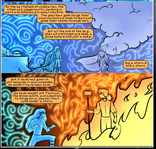
The flowing symbolic lineart surrounding each character. This is actually quite consistent across characters—see also Life's typical lines and how they curl:
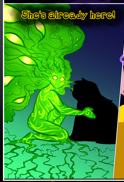
What's particularly interesting here is how these symbols are often similar, but not the same. Vash's lines are always smooth, clean curls, often playing off each other and echoing one another like ripples in a pond. You'd think they'd look too similar to Life's—but they don't. Life's curl like vines, and they remain connected; where one curve might echo another but exist entirely detached from each other in Vash's, Life's lines still remain wound together, because vines are continuous and don't float around. :P
Tahraim's are less continuous, often breaking up with significantly smaller bits and pieces floating around like—of course—sparks, and come to sharper points. These are also constants: we see the vines repeated over and over in Alinua's dreams of Life, and the echoing ripples of Vash are consistent wherever we encounter him. Kendal's dream of the ghost citizens of the city of Vash in the last few chapters is filled with these rippling, echoing patterns, to beautiful effect (https://comicaurora.com/aurora/1-20-14/):
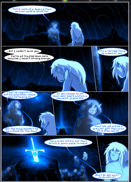
They ripple and spiral, often in long, sinuous curves, with smooth elegance. It reminds me a great deal of images of space and sine waves and the like. This establishes a definite feel to these different characters and their magic. And the thing is, that's not something that had to be done—the colors are good at emphasizing who's who. But it was done, and it adds a whole other dimension to the story. Whenever you're in a deity's domain, you know whose it is no matter the color.
Regarding that shape language, I wanted to make another note, too—Vash is sometimes described as chaotic and doing what he likes, which is interesting to me, because smooth, elegant curves and the color blue aren't generally associated with chaos. So while Vash might behave like that on the surface, I'm guessing he's got a lot more going on underneath; he's probably much more intentional in his actions than you'd think at a glance, and he is certainly quite caring with his city. The other thing is that this suits Kendal perfectly. He's a paragon character; he is kind, virtuous, and self-sacrificing, and often we see him aiming to calm others and keep them safe. Blue is such a good color for him. There is… probably more to this, but I'm not deep enough in yet to say.
And here's the thing: I'm only scratching the surface. There is so much more here I'm not covering (color palettes! outfits! character design! environment! the deities! so much more!) and a lot more I can't cover, because I don't have the experience; this is me as a hobbyist artist who happened to take a couple design classes because I wanted to. The art style to this comic is so clever and creative and beautiful, though, I just had to go off about it. <3
...brownie points for getting all the way down here? Have a cookie.
#aurora comic#aurora webcomic#comicaurora#art analysis#...I hope those are the right tags???#new fandom new tagging practices to learn ig#much thanks for something to read while I try to rest my wrists. carpal tunnel BAD. (ignore that I wrote this I've got braces ok it's fine)#anyway! I HAVE. MANY MORE THOUGHTS. ON THE STORY ITSELF. THIS LOVELY STORY#also a collection of reactions to a chunk of the comic before I hit the point where I was too busy reading to write anything down#idk how to format those tho#...yeet them into one post...???#eh I usually don't go off this much these days but this seems like a smaller tight-knit fandom so... might as well help build it?#and I have a little more time thanks to break so#oh yes also shoutout to my insanely awesome professor for teaching me all the technical stuff from this he is LOVELY#made an incredibly complex program into something comprehensible <3#synapse talks
798 notes
·
View notes
Text
Hello! Here's an update on all of Arknights' currently accessible auxiliary material as of May 2024! There's plenty to check out, so I hope this is helpful for some!
Animation
Arknights Prelude To Dawn (S1) and Perish in Frost (S2): [Crunchyroll]
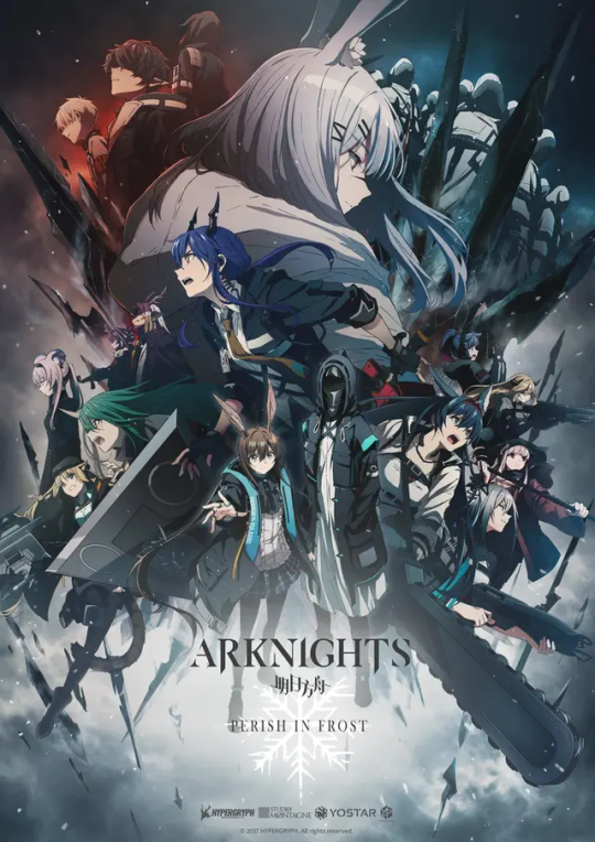
An adaptation of the main story, up through Chapter 0 to Chapter 6! It's much more fast-paced than the in-game story, so I wouldn't use it to replace actually reading it, but it's very cool to see some of these scenes in full animation. Season 3, Arknights: Rise from Ember, has been announced! Lee's Detective Agency: [Youtube]
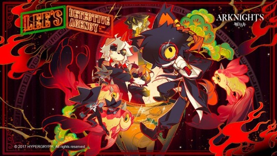
A mini-series animated in a chibi style with a comedic tone. Focused on the adventures of the Kuroblood-illustrated Lee's Detective Agency! Distributed by Crunchyroll globally, but entirely free to watch.
Closure's Secret Files: [Youtube]
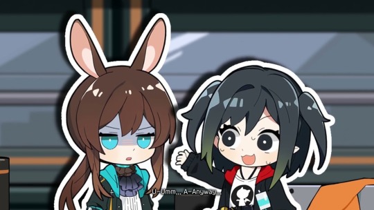
A cut-out styled series of shorts hosted by Closure which outlines a lot of the game's basic mechanics!
Holy Knight Light: [Youtube]
A short OVA focusing around Penguin Logistics delivering a package, celebrating Arknights' first anniversary. Officially posted to Youtube!
Kay's Daily Doodles: [Youtube]
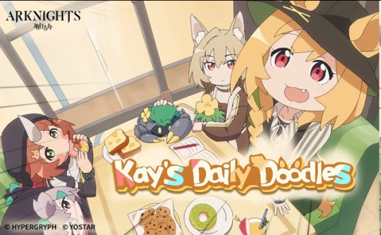
Another free, comedic Youtube mini-series, posted to the offical Arknights Youtube account and focused around Ceobe! Here's some additional animations! Each event usually also has a 15 second 2D animated preview of the event, but there's so many of those that I can't list them all. Anniversary Event 3D Animations: Zwillingstürme im Herbst So Long, Adele Lone Trail Where Vernal Winds Will Never Blow Il Siracusano Ideal City Stultifera Navis Invitation To Wine Near Light Dossoles Holiday Under Tides Bonus 3D Animated Shorts: Legend of Chongyue Arknights Special - IL Siracusano Lo Scontro Youtube Shorts: Ch'en and Lin's Watermelon Splitting Game Part 1 Ch'en and Lin's Watermelon Splitting Game Part 2 Amiya's Siracusan Food Guide Part 1 Amiya's Siracusano Food Guide Part 2 Amiya's Special Gift Doctor's Gifts in Return 1 Doctor's Gifts in Return 2
Comics, Manga, Manhua
Officially Translated:
Rhodes Island's Records of Originium: Rhine Lab: [Offical Source]
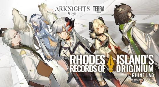
A canon manhua centered around the circumstances that lead to Silence falling out with Saria and joining Rhodes Island with Ifrit, as well as Ifrit's attempt to save a dying infected stowaway on the landship. Essential reading for understanding the Rhine Lab storyline and characters - read it right after Mansfield for when it was chronologically released! One of the characters, Darya, is mentioned in both Ifrit's module and briefly in Lone Trail.
Rhodes Island's Records of Originium: Blacksteel: [Official Source]
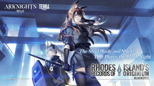
A short story focusing on the lives of the Blacksteel operators aboard the landship. While it often gets overshadowed by the Rhine Lab manga which is bigger in scope, this is a great read especially if you're interested in Franka or Liskarm.
Rhodes Kitchen -TIDBITS-: [Official Source]
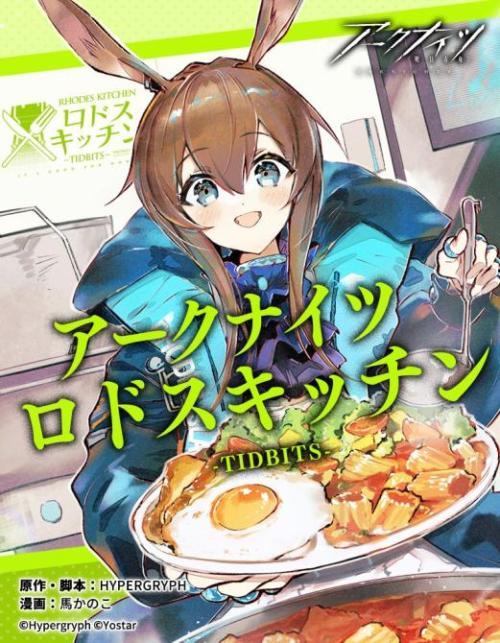
An anthology story related to the cuisine that's important to a variety of operators. While it might seem unassuming, the art is gorgeous and it's really well-written! The Blacksteel, Rhine Lab, and Rhodes Kitchen manga have all been sold in physical copies, if you're interested in having them in print!
Prelude Suite: Cadenza Virtuosa: [Official Source]
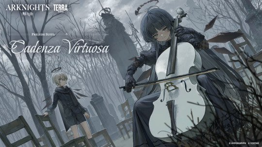
An epilogue to Hortus De Escapismo focusing on Arturia's background, with the second chapter serving as a prelude for Zwillingstrume im Herbst! An excellent read to get better insight into Arturia's character.
Angelina: Sketches of this Messenger's Journey: [Official Source]
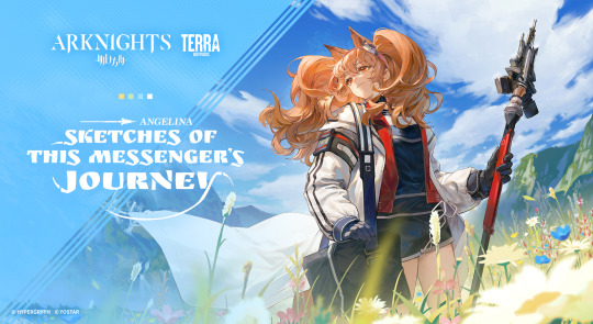
A more comedically focused manwha, centered on the adventures of Angelina travelling across Terra as a Messenger! Currently updating, with recent chapters focusing on Sami and Siesta!
Unofficially Translated
The Dagger's Inheritors: [Youtube]
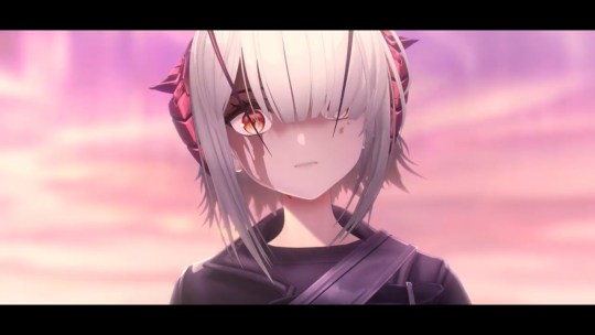
A 15-minute short 3D animated film about W's past and relationship with Theresa, released for the 5th Arknights anniversary. Arknights Comic Anthology: [Mangadex]
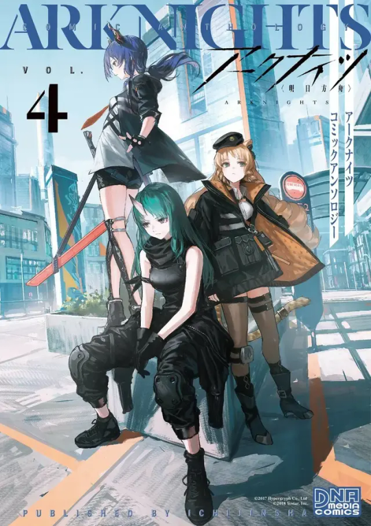
As the title says, a series of non-canon anthology stories regarding the cast of Rhodes' Island! Some of the chapters on Mangadex for the later volumes of the Comic Anthology specifically have been machine translated, but the same is not true for the other manga shared here. Chapters are hit-and-miss, but the whole series is generally a fun read! See the original post for specific chapter suggestions.
123 Rhodes Island: [Mangadex]

A series of non-canon gag comics for the CN server, usually updated when new operators or events release!
Arknights: Operators!: [Mangadex]
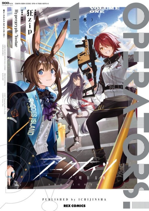
A compilation of shortform manga posted on the official ArknightsJP twitter account! Thank you to @sleepywoodscans for their work on personally translating these!
Arknights: A1 Operations Preparation Detachment: [Mangadex]
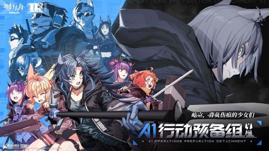
Part of the Terra Historicus website and not yet officially translated, focusing on Fang, Kroos and Beagle before they join Rhodes Island, and a catastrophe striking the Columbian city of Tkaronto. Thank you to @pooce-art for their translation work!
Other:
Arknights Ambience Synesthesia: [Youtube]

A series of concerts (4 so far), focused around Arknights' music! A live performance has been done every year, with skins released in-game for the concert's theme & 3D animations produced featuring the skin's cast in 2022, 2023, and 2024.
Monster Siren Records: [Spotify] [Official Website]

Arknights' official (and-in-universe) record label publishing game OSTs, themes for almost every 6 star operator that releases, and occasional bonus songs.
Arknights: Endfield: [Twitter]
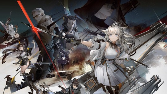
An upcoming 3D action gacha game from Hypergryph, set in the far future of Arknights' universe on another planet. Currently in closed beta testing for both EN and CN servers!
UNOFFICIAL:
Some fandom-developed tools that might be of use to you are: The Arknights Terra Wiki. While it is a very accurate source for in-game data, take the explanation of in-game story and some specific claims with a grain of salt. The FANDOM version of this wiki is currently no longer mantained and subject to vandalism! Given you can translate or read Chinese, PRTS.wiki is the current best resource for game assets!
As well, the Arknights Story Reader can help you catch up on stuff you don't want to or can't read in game! Jacob Moreau on Youtube provides voiceover readings of many in-game stories as well.
Finally, Aceship's Toolbox provides access to a variety of tools, including a levelling calculator, a calculator to ensure the best recruitments, and all the CGs, backgrounds and character sprites that are available in-game as of So Long, Adele (as far as I'm aware, the sprite/cg gallery is no longer being updated.)
Conclusion:
Thank you for reading! I hope this provided some new information to you or is an easy reference source in the future. Some things, such as merch (i.e. board games) or the official lore book have not been included due to not being accessible or translated for EN players. I'm happy to continue to provide more information like this to make the art surrounding this series more accessible! If you have any questions, feel free to send me an ask.
#arknights#i thought about just editing the original post but i felt like an update was in order! hope this is helpful to some people as the first one#was#:D#if there's anything i missed#let me know! and i'll edit it in#not as comprehensive but a little more concise than the previous version
368 notes
·
View notes
Text
i’m not super comfortable reblogging this directly from a non-omo blog (just don’t wanna show up in anybody’s notes who wants to stay away from kinkblr/omoblr) but everyone here, please check out this post i found on water intoxication! water intoxication isn’t the only thing to keep in mind when making sure you’re doing omo safely, but it’s definitely part of it, and it’s always good to be informed about what you’re getting up to
#i know some folks are unsure/nervous about playing safely wrt this specifically so when i saw such a comprehensive post i just had to share#i hope some of y’all find it helpful! ^^#omorashi
63 notes
·
View notes
Text
HUMAN PERRY AU BACKSTORY
I've been having a lot of thoughts lately about Human Perry headcanons as I read a bunch of fic and rewatch phineas and ferb. You know you're hitting the nail on the head when scenes from a fic you might never write dog your every waking step and haunts your dreams so, I thought putting it on paper will help.
A lot of fics like to suggest that Perry's full name is Peregrine, which is understandable, but ever since I've rewatched 2D and found out their first name for him was actually Bartholomew my life was never the same. So Perry's actual name is Bartholomew. But nobody actually calls him that least of all himself.
FAMILY RELATIONS
-I really like winding headcanons that Perry is Ferb's biological mom's BROTHER, which honestly makes so much sense as to why both he and Ferb have green hair. Here are some add-ons that may get depressing;
Ferb's mom was Eve, or Evelyn. Her codename was E, for Echidna...because egg-laying mammals native to Australia. They were both orphans, and attached to the hip. They were each other's partner in crime.
-They were scouted for OWCA one day, bc the agency liked picking up kids with potential as young as possible. So Perry and Eve were trained for the agency since the start (which is why Perry is such a good agent at what seems to be a young age)
MY HEADCANONS FOR OWCA
-Owca is a largely independent authoritarian enterprise with branches all over the world. They aren't the only ones, obviously.
-OWCA also prefers training agents as early as they could. Sometimes that entails scouting talent. Sometimes that means taking in kids of employed agents. Either way, this means OWCA has elementary and high schools that are more akin to militant training camps. It's not cruel. The kids are well cared for and well fed, but OWCA prioritized competency, obedience and discipline.
On every level of OWCA recruitment, training and employment, there is a fedora, and band to mark whichever level you are on the totem pole.
1) Middle school kids are given a bandless fedora.
2) High school kids (soon to be graduates) are given a white band
3) Fresh graduates, training into full employment, are Yellow Bands. Here you start being assigned to full branches, and trained by field work professionals. Think OWCA Files.
4) It's fairly easy to graduate from Yellow Band into a Purple Band. Purple Bands are largely refereed to as Junior Agents, but that's not quite accurate. Purple Bands are the highest reporting authority in any division that ISN'T FIELD WORK. The OWCA Tech, Clerks, RnD and Science Divisions all have Purple Bands to signify they are fully employed, or Superior Officer. Pinky has a Purple Band.
5) It's VERY DIFFICULT to graduate from a Purple Band to a Black Band, not least because there IS NO PREDETERMINED TEST. Black Band agents are Superior Agents, only one level below Division General. There's no telling what could turn you from a Purple to a Black, because the agent has to prove unwavering obedience and faith to the agency in dire circumstances. It's saying "I am willing to do anything for the Greater Good." Often it entails a death of some sort. OWCA often says Black is the band soaked in blood. Black Band agents have licenses to kill. It's why Black Band Agents are few and precious far in between.
6) After a black band, and you live long enough to retire, you can choose a bunch of things. Most agents choose to become Division Generals or Branch Managers: think Major Monogram. They're basically glorified "Guy in the Chair". Some agents choose to become educators, in which case they are given White Fedoras. White fedoras arent exclusive to black bands though; there are plenty purple band white fedoras. In fact most educators are purple band white fedoras.
-Perry's Black Band Event was Eve's death
-At the time of Eve's death, she had already been married to Lawrence. Ferb was barely a year old, maybe 10 months old?
-Lawrence was told it was a car accident: drunk driver. Truthfully it was a mission gone wrong, involving an underground child trafficking ring, and she stayed behind to give them all the chance to escape. She didn't have the chance to escape when security explosives around the building detonated, and she got caught in the crossfire. Perry had to leave her behind.
-This is why Perry refused to get a partner btw, aka his Lone Wolf tendencies come from.
-In the aftermath, OWCA agents approached the family to give them their condolences, and offer to take Ferb into the fold. For the first time since Eve's death, Perry practically lost it. He didn't hurt anyone, he's much too professional, but he knew Eve didn't want Ferb to get wrapped up in OWCA, and for good fucking reason. Due to their training, neither he nor Eve had much of a childhood, and he refused to subject Ferb to the same kind of life experience.
OWCA was NOT happy. Things were tetchy for a while, at least until Perry was approached by Major Monogram. Francis had a wife, and a son, and he understood where Perry was coming from. He suggested taking a permanent residence in Danville, which was his branch division. It was more stability than Perry ever had working in England, where he and Eve was originally stationed, and it was easy enough to come up with a work-related story to convince Lawrence, who was more than ready enough to leave the house where he and Eve originally lived.
-It was after moving did Lawrence meet and fall in love with Linda.
Edit; I've decided to change Ferb's bio mom's name bc I found something that fits better to me :) She's Eve now
End Backstory.
#the ending is a bit abrupt but i hope the post was comprehensible#so he did basically help raise Ferb until they moved to the states#and he meets Heinz yadda yadda yadda#I like the flavour of angst in his backstory#and why he enjoys the peace that comes with stability in Danville even despite all the chaos#bc then OWCA doesn't really bother him since he has his hands full actually#I also like giving depth and dimension to Francis#instead of making him just like. This bad guy#Because he didnt want Monty to be a part of OWCA either#perryshmirtz#perry the platypus#human perry au
198 notes
·
View notes
Text
Masterlist of KoH-related Novels
Below you'll find a list of every novel I know of that is set in the same period as Ridley Scott's Kingdom of Heaven (2005), covers at least some of the same events and features some or all of the historical figures that also appear in the film. The list will be updated occasionally as I work my way through. Enjoy!
✷ English-language novels & novels available in translation
1879: Lady Sibyl's Choice (Emily Sarah Holt) -> thoughts
1937: The Leper King (Zofia Kossak, originally published in Polish) -> thoughts
1954: Knight Crusader (Ronald Welch)
1965: The Wandering Unicorn (Manuel Mujica Lainez, originally published in Spanish) -> thoughts
1969: The Knights of Dark Renown (Graham Shelby) -> thoughts
1989: Alamut (Judith Tarr)
1991: The Dagger and the Cross (Judith Tarr)
1992: Pagan's Crusade (Catherine Jinks)
1996: Jerusalem (Cecelia Holland) -> thoughts
1998: The Book of Saladin (Tariq Ali)
1998 - 2000: Arn the Knight Templar series (Jan Guillou, originally published in Swedish)
The Road to Jerusalem (1998)
The Knight Templar (1999)
The Kingdom at the End of the Road (2000)
2004: Crusader King (Susan Peek)
2006: Sand Daughter (Sarah Bryant)
2007: The Leper Crown (George Morgan)
2009 - 2021: The Magdalen Cycle series (Scott R. Rezer)
#1: The Leper King (2009)
#2: The Pawns of Sion (2015)
#3: The Gambit Queen (2021)
2011: The King's Witch (Cecelia Holland)
2011 - 2013: Saladin trilogy (Jack Hight)
Eagle (2011)
Kingdom (2012)
Holy War (2013)
2011 - 2023: The Last King of Legends series (Serafia Cross)
#1: The Kingmakers (2011)
#2: In the Face of Trials (2012)
#3: The Sovereign Gambit (2015)
#4: The King's Last Deeds (2023)
2012 - 2017: Outremer Chronicles series (Peter Tolladay)
#1: The Templar's Apprentice (2012)
#2: The Harsh Mistress (2014)
#3: The Thorn in the Crown (2016)
2014 - 2016: Balian d'Ibelin series (Helena P. Schrader) -> thoughts
#1: Knight of Jerusalem (2014)
#2: Defender of Jerusalem (2015)
#3: Envoy of Jerusalem (2016)
2018: Templar Silks (Elizabeth Chadwick)
2018 - 2020: The Brotherhood series (K. M. Ashman)
#1: Templar Steel (2018)
#2: Templar Stone (2019)
#3: Templar Blood (2020)
2018 - 2023: Watchers of Outremer series (Suzannah Rowntree)
#2: The Lady of Kingdoms (2019)
#5: The House of Mourning (2023)
2020: The Leper King (Peter Busby)
2020: The Land Beyond the Sea (Sharon Kay Penman) -> thoughts
✷ Non-English novels not available in translation:
1959: L'Étoile de Pourpre (Serge Dalens & Pierre Joubert, French comic)
1999 - 2017: Die Templerin series (Wolfgang & Rebecca Hohlbein, German)
#3: Die Rückkehr der Templerin (2004)
#4: Das Wasser des Lebens (2008)
#5: Das Testament Gottes (2011)
#6: Das Band des Schicksals (2017)
2002: Thibaut ou la Croix Perdue (Juliette Benzoni, French)
2007: Las Lanzas de Jerusalén (Georges Bordonove, Spanish)
2019: Die Assassinin (Alexandra Cavelius, German)
✷ Tangentially related:
1946: mentions of KoH characters in The World is not Enough (Zoé Oldenbourg)
1997: Queen of Swords (Judith Tarr), about Baldwin's grandmother Melisende
#kingdom of heaven 2005#historical fiction#baldwin iv#balian of ibelin#raymond iii of tripoli#sibylla of jerusalem#guy de lusignan#salah ad din yusuf ibn ayyub#reynald of chatillon#crusades#since i often get asks asking for book recs i thought i'd try to compile a more comprehensive list than the ones i posted some time ago#fair warning though#i haven't read the majority of these so i cannot speak to whether they're any good#a lot of the ones i've read are actually pretty hilariously bad#but in case anyone's looking for something to scratch the itch#i hope this helps
53 notes
·
View notes
Text

shitty ref for iterator lemi, name is still wip
#meble nie patrz bo spoilery#i cant decide on her name#i was thinking something with “holy verses” or “divine mantras” but it feels too religious#i tried to come up with names alluding to her backstory and came up with “trusts in us” “hope in desolation” and “pieces of fractured trust#but these seem too edgy#“teachings of significance” doesnt sound like comprehensible english#i might make a poll about this idk#if anyone wants to help me choose a name go ahead#rain world#my art#oc lemigla#iterator oc
24 notes
·
View notes
Text
:D

#i have lore ideas#i will wait until they're comprehensible to say something#rain world#rw iterator#i'm really proud of this actually. also i hope i did the pronouns right is it he/her is it him/she help????#i'm overthinking. anyways
97 notes
·
View notes
Note
yo im curious how did u learn anatomy. scratch that, how did you learn to draw in general. everyone's always saying "watch anatomy vids" idk man i don't know what videos

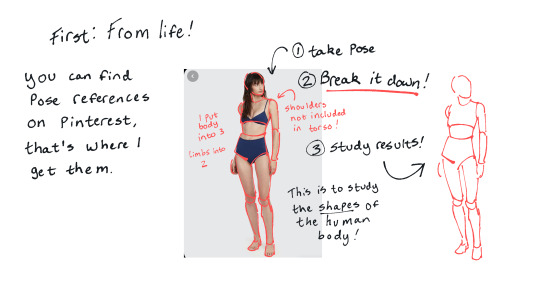
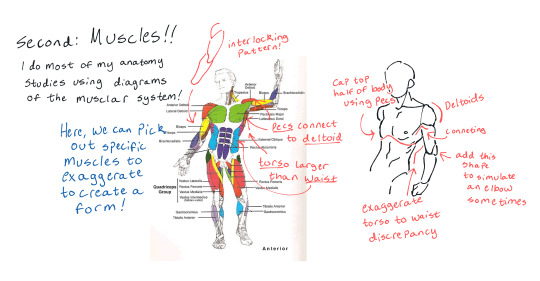
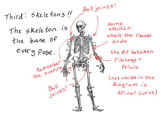


ofc there's things like anatomy videos and even full textbooks on the topic; I usually end up on pinterest finding my references, though.
this post is a link to a free anatomy book that I often study.
I don't have any anatomy videos to link you to because I hate video tutorials.
#hailey teaches#hailey answers#I hope this helps anon!!!#I hope it isn't a 'my perspective is too advanced to stoop down and teach newer artists' thing.#this is by no means a comprehensive tutorial!! there's a lot of other things too this is just my basics!!#hailey's drawing again#putting it under art tag to be easier to find
108 notes
·
View notes
Text
UNLOCKED SCORCHING SUN (sunburst fever) DANTE ! (Spoilers? Here is a short summary of my reactions):
-eiden i live for the cheesy things you say when you wanna bone someone. ehehehehe when the corny roleplay actually works too well🎶🎵
-oh um 😳 eiden getting himself off bygrinding against Dante's leg ahaha💦💦 ok uhhh 💦💦💦💦💦💦💦💦
- THE CONFUSED SPUTTERING WHEN EIDEN GETS SUDDENLY BLUE BALLED🤣🤣
-oh shir dante lore drop
-oh SGIT DAnte is working even harder than i thought just to make an equal society like,, dude,, that is sO MUCH to take on YOU ARE ONLY A BABY. BUT YOU TRY TO FIX CENTURIES OF INJUSTICE 😭
-aawwww...... gentle.....🥹
-DAMMIT EIDEN STOP BRATTING FOR 60SECONDS AAHHHHHAJAJAhaha oihh ahhhh
-dante is like the Grinch he doesn't know what the dokidoki in his chest is (.it's his heart) but. He'll get it one day
- they're cute 😭 and funny 😭😭 and eiden's "why do *i* have to go" is so... PETULANT i love them they're bickering idiots 🥳
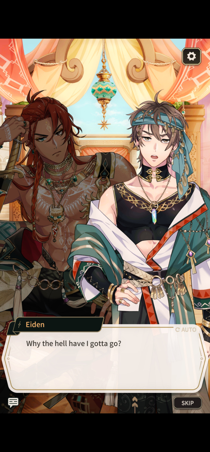
ah, correction*: why "THE HELL HAVE" i gotta go. to be fair, that is a mild reaction to dante suddenly cockblocking him from himself(?). yeah. selfish lover moment deserves at MINIMUM that amount of sass 🤣
#danei#you know i wondered what the official ship name is for them because dantei was my instinctive thought#but i guess that could be mixed up with someone just trying to type Dante and they made a typo#i guess danei in that case is more PURPOSEFUL. like YES i had to STOP before typing out dante's full name#i was used to seeing eiden all... understanding and gentle and sweet with yaku#that his dante dynamic knocked me slightly askew (positive)#i love being reminded of eiden's range... bc all his clan members are such different individuals......#of course he caters to them differently... so powerful and adaptable#i really just wanna swaddle dante and put him in a restful burrito like srsly that guy needs a break#a break where things will not fall apart without him and everything is fine and he learns to rely on others#honestly i don't know how he's not MORE pissed off all the time. if i had to deal with what he deals with daily...#murder spree. or catatonic learned helplessness. there will be no in-between#anyway i hope these two figure more things out together and help each other be stupid without consequence :)#i want them pushing and shoving each other in the fields like schoolkids and yelling the blandest insult comebacks at each other#too bad neither of them can use the “YOUR MOM” finishing blow#or maybe it's funnier... if they both learn to use “YOUR MOM” with perfect timing#that's when their relationship will be in their final form. strong and evolved. beyond mortal comprehension#nu carnival dante#enei
30 notes
·
View notes
Note
I've been writing my own sci-fi universe on and off after new Trek disappointed me, and has continued to disappoint me. If I had to sum it up it would be Star Trek but more overtly communist and also military sci-fi. I've mainly been inspired by things I've read/played/watched, which has mainly been made by white or western creators, so I wanted to ask if you had any recommendations for sci-fi made by POC creators to broaden my horizons.
omg of course!!! (with the caveat that unfortunately non-Western scifi specifically is a bit of a blindspot for me, so most of these will be Western authors of colour)
Babel-17 by Samuel R. Delany
Dawn by Octavia E. Butler
Binti by Nnedi Okorafor (& i recommend reading the complete trilogy - imo it works best read together as one whole)
The Space Between Worlds by Micaiah Johnson
Stories of Your Life and Others by Ted Chiang
New Suns: Original Speculative Fiction by People of Color ed. by Nisi Shawl
How Long 'til Black Future Month? by N.K. Jemisin
I'm Waiting for You and Other Stories by Kim Bo-Young
And 2 that i personally haven't read yet but i think NEED to be mentioned, especially if we're talking space stories:
Ninefox Gambit by Yoon Ha Lee (also military scifi!)
An Unkindness of Ghosts by Rivers Solomon
also, short story anthologies!!! if you're looking for new authors or want to explore works from a specific culture/place, they're a great way to do that. here's a couple from my own reading list for this year:
Palestine + 100: Stories from a Century after the Nakba
Africa Risen: A New Era of Speculative Fiction
Readymade Bodhisattva: The Kaya Anthology of South Korean Science Fiction
Sinopticon: A Celebration of Chinese Science Fiction
& finally, i don't really watch a lot of tv/movies, but i do wanna wholeheartedly recommend:
Everything Everywhere All At Once
Janelle Monáe's Dirty Computer (free on youtube and an absolutely top tier example of afrofuturism)
Nope
They Cloned Tyrone
#this got WAY longer than i intended and it's still far from comprehensive#but. bolding the ones that i consider the BIGGEST must-reads/watches <3#if u wanna do some more exploring on ur own in terms of non-western sf:#i've noticed there's quite a lot of translated Chinese and South Korean SF in particular#or you could look up africanfuturism (which is a separate thing from afrofuturism!) and works that use that label#also: the tv adaptation of 3 Body Problem (aka probably the most iconic piece of Chinese scifi) is coming out in a couple weeks#so that might be worth keeping an eye out for! it's netflix though so idk how good/faithful it'll be 😐#i hope this is helpful and not too much info!
43 notes
·
View notes
Note
your theme is so precious!!!!! i simply have to know how you do these gifs and come up with themes because i am obsessed!
omg thanku 🤭 😚 tbh i get a lot of theme inspo from pinterest like esp kpop, taylor swift and sabrina carpenter prints (abs. obsessed with the vintage/retro prints going around for sabrina) and i often follow a lot of designers on behance who throw out freebies for photoshop esp for text and textures!! i've absolutely loved this style lately (but tbh i swing a lot between header/theme ideas a lot) 🫡

also i love colour palette generators for theme ideas! esp to inspire a general vibe for the story (like what emotion invoked by the story is linked to what colour if that makes sense?)

as for gifs! i was lucky to get an in depth tutorial from the incredible @sugurugetos (honestly one of my fave gifmakers on this site and soo sweet ��) and she taught me how to get 4k footage from jjk files and make it 60fps <3 i use mpv to screencap, and photoshop to make my gifs as hd as possible and in that: i use camera raw to colour and tweak them, as well as filter gallery grain to add some sharpness in them and cover up some noise/dither! (i'm happy to explain this more!)
i also get a lot of design inspo from deviantart! there are incredible mockups and widget type of designs on there that i like to recreate/add to my gifs <3

#i hope this is helpful and i'm more than happy to give a more comprehensive answer anytime!#— answered !#— mara <3#— daphhelp !#jjk x reader#jujutsu kaisen x reader#<- in case it helps anyone else/exposure <3
19 notes
·
View notes
Note
Hihi! I'm the anon from the MN talk sprite ask I'd love to hear about your sprite genius science haha :-D
Ps to say that I'm a huge fan of your work just in general
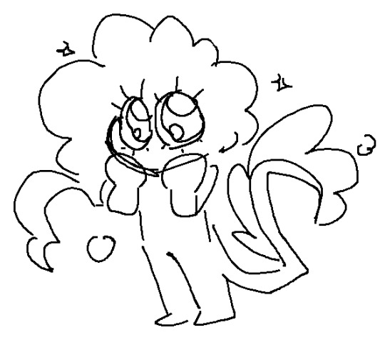
first of all THANK U SO MUCH WAAH....... im so glad you like our stuff TvT !!
second !! ill hop to the sprite explanation right here! i'll put it under the cut bc it might get long eheh
and a note: im using csp but this should work with any program! i previously used ibis for my talksprites before remaking them ^^
for my example subject, i'll be using ace! they'll be my best example since theyve gotten more use so far!

quick notes about the background; i always export my canvas as transparent to give the image that they're just a Part of the post/environment. the nametags and gradients are optional, but i feel the gradients help fill dead space and add a bit more to it- the nametags help in emulating the feel of video game dialog too (i dont tend to have the patience to actually make pokemon textboxes because i have to do it manually, so putting this over post text is my next best option.. makes it easier for chattier people, and gives screen reader accessibility as well!)
ANYWAYS, now for the actual Building of the Sprite!

where i usually start is with a base sketch of their neutral expression. i have two for All of the modern/updated talksprites, because i had initially wanted to put them at an angle to add a bit more flavor to them.. ultimately though, i stuck with the symmetrical style for my personal quality of life. i find it easier to work with and add to- i just have to be very meticulous about getting the proportions right is the main thing ^^'
now, from the sketch is the natural next step of Lining shit! and heres where the method of madness starts, because a big part of this entire thing is...

this . im so sorry about this image.
if you look at the layers, you'll see the general order of operations! basically i try to look at it as different Pieces, or Assets. its like a paper doll that you're assembling- the pieces that go behind need to go all the way in the back, then you build up. the back of someone's hair goes behind everything, then their body. then their clothes, then head, face, face accessories, bangs, and finally cartoony emotes on the very top if that's your style.
generally, i try to set my layers up for maximum customization- mixing and matching it the key for making my talksprites as versatile as possible. so stuff like having a base body that you can add changes of clothes too, using clipping layers to add shadows that would go over everything, that kinda thing.
but overall, having layer stacks worked out like this is the MOST important part, imo, for doing these talksprites. when it all comes together, the result is a clean basis for mixing and matching however you might need for both expressions and appearance. i keep everything in folders of Lineart, Shading, and Color as well, just in case i need to revisit or add to something premade later.
speaking of adding- this also allows for you to easily make any future assets for changing appearance and expression! i personally do it case-by-case, as i can't ever anticipate every expression or article of clothing i'd Ever Need. when something new is needed, i'll just make the new thing, and then it's just another piece to have in the mix! it's pretty nice! :D
tip: god remember to name your layers/folders. i used to Not and it made finding the pieces i need so hard. doing this method will result in a LOT of layers. be nice to yourself and name things accordingly!

now focusing in on the most important part of an expressive talksprite, heres the face, and the best way ive found to stack the layers so far. within all of these layers are the pieces of expressions that can make countless matches if you add enough to them. fun!


now the Eyes. the eyes . the eyebrows and mouth are pretty straightforward you just Draw and Color them and boom theyre done. but i want to draw special attention to the Eyes because figuring out how to do these were probably the thing i struggled with the MOST. its a system thats a bit more in depth than just. Doing it. here's what we got though.

the optimal stack for maximum eye expression that ive found? do lines and the coloring for those lines. SEPARATELY.
the idea is to make irises fully round so you can move them around or have wide eyed expressions without any weird cutoff in parts you failed to draw (looking at my old sprites. sighs). but to avoid having to delete or erase anything, the iris folder needs to clip onto the eye whites folder so you dont get stuff like

this . yeah.
and another thing i had to learn the hard way is that if your character has stuff like eyebags or makeup, and this is the reason my "lineart layer" has folders, if that if you put that stuff on the white layer, the irises will sit over THAT as well as the whites, resulting in some annoying little things.

see: ace's eyebags in the whites layer, VS ace's eyebags in the lines layer.
ofc this is unnecessary if you dont add that kind of detail to your own characters- in that case, the lines layers can be as simple as just being lines!
with all that, the eyes more than anything are layers i recommend having properly named. you'll need to have the right whites with the right lines, so being able to find the two pieces with the same names is important! else you could get fun bits like this:

i dont think eyes are supposed to do that.
and generally, that's the most important parts of making these that i'd say! i have a few more tips, but theyre mostly little things that are moreso optional that i'll rattle off real quick-
for shading, i just use solid black shading with a lower opacity (i know, booooo). it's the quickest and easiest way to ensure they're both consistent, and covering everything in the same way. tbh i dont every see shading as necessary for these- but it adds just that bit more of depth and extra visual appeal to it imo
a general rule i use for characters with facial hair, which is Several in missing numbers; beards go with the head base, mustaches should be redrawn with every mouth. when someone with a mustache or stubble is talking, its usually gonna be moving and contorting with the shape of the mouth:


having it be static can range from a little off, to just Weird with more extreme expressions. but thats mostly because my style leans more realistic- if you've got a more toony style, i dont think having a mouth overlapping a mustache a little will be too bad!
this is just because i put a lot of detail into stuff and is SUPER optional, but one thing i do is have two different head bases for whether a mouth is open or closed. the jaw is opening is gonna result in the chin going a bit farther down, as opposed to it being closed! all i did to make it was take the original head base, grab the jaw area, and lower it a few pixels, then filled in the gaps. work smarter not harder
when moving the irises around, i prefer to duplicate the base layer. usually to get things to look right, you'll need to move the irises independently, so its good to just have the original stay as it is because getting it back EXACTLY how it was might be difficult. plus, you can keep the moved ones for reuse later! ^-^
if your art program allows for a universal symmetry ruler, awesome! make sure you know exactly where to put it later to add to your character! and if you use a program like clip studio (like me) where the ruler only applies to one layer; at least for csp, i can put it on a folder and it applies to everything inside that folder, so i just put all the assets in one Big folder and put the ruler there. i dont know every art program, but hopefully that still helps??
if your character has strands of hair that rests in front of their shoulders like ace's wisps or leafs big old strands, draw them as a part of the bangs or put them in the same folder so they properly sit atop everything else!
ace doesnt have any hands yet, but those would go at the very top of the layer stack. heres our lovely assistant for an example!

and for now, thats all i can really think of!
these talksprites aren't ideal for a lot of bodily motion, but for stuff like that, i figure thats where hand-drawn pieces come in. generally, i have these setup to make work on updates a bit easier, as it takes me a while to draw entire original pieces (and i struggle to focus. this is in fact why the blog suddenly went quiet again), but i still want my posts to have that visual flair to them! doing an entire visual of a character from the ground up is a fair bit more work than just. drawing a symmetrical mouth onto a guy, so i've found this whole mix-n-match type of talksprite thing a godsend ^^
anyways !! i hope i explained that well enough- good luck with ur endeavors, and i hope i get to see it!! :O
and please feel free to shoot any other questions my way if you need anything else!! im always happy to explain and help :D
and as a blog teaser for whoever gets all the way down here, a little something for your time... ive hired these three trainers to stare at you


#mn diary#hoping this is comprehensible TuT thank u again anon ur so sweeet auhjndkfdklssnkksldjn#i hope this helps anyone who sees it n wants to try!#hell did something similar for green but exported his assets into some picrew-adjacent site for his own ease of use#so thats also a thing but idk how that works.. i like my methodical madness lol
9 notes
·
View notes
Text
Really sad omori headcanon I have (small spoilers) (Basil thing)
So, it’s never said which side of the family basils grandmother was on, but in my head she was basils maternal grandmother (as in his mom’s mom) and while this was something I just arbitrarily decided one day and didn’t give a lot of thought to…. Thinking of it now I can’t help but imagine that towards the end of her life Basils grandmother began to mistake Basil for her daughter,
And Basil wouldn’t correct her, wouldn’t tell her how she was mistaken and he was not his mother, he would let her believe that her daughter was there for her, that she had not abandoned them both … because not only did Basils parents leave him in the darkest days of his life, but they left Basils grandmother in the dying days of hers
Basils mother left her son to take her place, to let his hair grow out more then usual, to let his grandmother call him “daughter” when her real daughter had left them both behind :(
(We may not know much about Basils family but where there is potential I will FIND the angst and I will share it with everyone I can to make you all sad too)
#I hope this is comprehensible#it’s horribly tragic but also kind of sweet …#its Basils way of helping the women who raised him feel better towards the end of her life#whoever basils parents are I hate them so much#like not only are you gonna abandon your extremely young son in the care of his grandmother and never visit#but your gonna abandon her too and not show up to her deathbed???#Polly said she’d only met them ONCE and she’s been in the mix for TWO YEARS#so either they only showed up ONCE IN TWO YEARS or they DIDNT VISIT AT ALL AND SHES JUST TALKING ABOUT WHEN THEY HIRED HER#what the FUCK basils parents ???#basil omori#omori basil#omori headcanons
22 notes
·
View notes