#i got.... too many of those
Explore tagged Tumblr posts
Note
How much have you spent on w101? Because BROOO I'm embarrassed of how many crowns I've bought 😭😭😭
Listen my brother you are NOT alone 😭😭😭😭 my wizard hyperfixation has cost me well into the hundreds. I haven't been counting so I don't know the numbers specifically but I literally wasted all my allowances and birthday money on Wizard101 when I was younger and everyday I want to kick myself in the ass for it
#i could have used that money for OTHER THINGS. LIKE OTHER GAMES /j#i remember how many crowns i spent on the hydra pack bc the hydra mount was my dream. (shudders)#i always bought the 13 thousand crown pack and that was like 20 dollars? which was my allowance back then#and sometimes i saved up to get the next crown tier which i forgot was like maybe 50 dollars? i did this for months#i wasted so much fucking monry on the hydra ALONE#and then there was the baba yaga house mount....... which i still never got#and who can forget the gamestop wizard bundles??? the ones that cost like 30 dollars each????????????????#i got.... too many of those#and then my dumb fucking dummy dumbass would basically just recycle the items from the bundles i didnt want-#so THAT was basically an even MORE colossal waste of money#this is why im broke today. this is why.#also contributed to me not playing w101 anymore its too expensive LOL#you cant do shit without membership and basically everything new costs crowns so#this isnt like a new thing to say but being a f2p in wizard101 sucks ass#ANYWAYS. yeah i sold my firstborn for wizard101 /j#wizard101#w101#wiz101#asks#bubba609
8 notes
·
View notes
Text
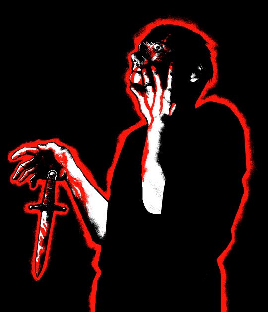
drop the dagger and lather the blood on your hands
#yeah the Photo got me too. because of the Gravitas#kinda scary to post this... there are so many good drawings based on that picture. here i am with my meager little idea#mcr#my chem#my chemical romance#gerard way#tbp#the black parade#art#fanart#ms paint#the sharpest lives#wwwy#wwwyf#wwwy24#wwwy 2024#<- which of those is the right tag? fuck if i know
1K notes
·
View notes
Text

find another role, carry on the show
#EDIT IT DIDNT SAVE MY TAGS. hey so this post got a thousand notes huh. interesting. surely nothing will change#i'll leave all the old tags. for my thought process. and its kinda funny#take a bow stupid idiot (throws a tomato at them)#in stars and time#isat#siffrin#siffrin no middle names no last name ദ്ദി ˉ͈̀꒳ˉ͈́ )✧#... or is it. Smiles#i'd like to draw mira for her birthday but um (hasnt open artfight website in a few days) im scared.#also i have NICE ASKS TO ANSWER.... But im scared. give me a minute#Uawaaaaagh i drew this bc i was trying to animate a little bit but it just . Didnt look good. im not good ag 2d animation#tch. ill keep trying cause there ar e way too many songs that and now about isat because i have brain worms. i need amvs.#IM SCARED TO POST THINGS THAT ARE SPOILERY BECAUSE I WANT MY FRIENDS TO PLAY ISAT. BUT.#isat spoilers#in stars and time spoilers#sasasap#sasasa:p#WHAT IS THE PROLOGUES TAG.#tshirt that says 'i <3 killing the image in the mirror and taking its place' on the fromt#and a list of megan thee stallions tour dates on the back. お金稼ぐ俺らはスター#Im kind of tempted to edit this to be the versiom with the eyes. or maybe twt can have that. or. well#all of my friends are on twt (trombone slide sfx) so maybe thats where i should worry about spoilers.#ill see if i want to slap an eyepatch on them in the morning#Im one of those people who was like idgaf about twohats (lets it simmer for a week) Oh my god. Oh my god. Ohmy god#EDIT. i swapped it out for the Eyes version it should be fine as long as its tagged formspoilers right...#ill post eyepatch vers on twt partly bc spoilers but also ppl over there can be .. annoying ..... ....#i fear i would get 800 You Forgot The Eyepatch replies. PLEASE JUST SEE MY VISION.#[BANGING MY HANDS ON THE GLASS] HIS HAND. LIKE IN THE PROLOGUE. WHEN THEYE. HANDS. HELD[EXPLOSION
2K notes
·
View notes
Text
Apparently much-needed reminder that reposting artists' art (by saving the images or screenshotting them and reuploading them yourself) on other platforms without the artists' expressed permission and without credit is theft and an insult to their passion and craft. You are profiting (in views, in attention, in feedback) from someone else's work and ideas, who do not get that feedback for sharing their creation.
If you are an art reposter, you are a thief and I have no respect for you.

#learn basic internet etiquette i am begging but also holding a knife. yes i'm mad. more about others than myself.#do you know how many artists i have seen leave social media because their art started being reposted all over?#tip: way too fucking many#i've had many people tell me about people reposting my art on tiktok#no one ever asked to repost my art on tiktok. ever. they just save super fried bad crunchy jpegs of my art and repost them#they get 20k likes and don't even bother naming me#also a reason i started signing my name more legibly and why my blog web address is always there but apparently no one can even read that#a few people got an ok for translations on other platforms though#i'm going to be annoying with this post and reblog it a few times to try to catch the people who apparently need to be told#tiny skk adventures#nawy's comics#nawy's doodles#apparently those are reposters' favourites so here look at this
5K notes
·
View notes
Text


when when the first day of Hanukkah is on Christmas ough ough ough
#IF I GOT SOME SHIT WRONG !!!!!’ I APOLOGIZE IM JUST A GUY WHO KNOWS NOTHING#ough charlie dowd and his never ending identity crisis#Alssoooo those latkes will not make it through until dinner they will be GONE#also I had too many doodles I needed to make two holiday posts OOPS#artists on tumblr#malevolent#malevolent fanart#malevolent podcast#oscar malevolent#noel malevolent#charlie dowd#john malevolent#john doe#arthur lester#holy ghosts
1K notes
·
View notes
Text
anyone else have multiple traumatic memories associated specifically with holidays/family vacations? because that is a topic I never see discussed in all the So You Had A Shitty Childhood, Now What? self-help books i've been reading. but for me, it was a significant thing. and the more i think about it the more it seems like this would be an (unfortunately) common experience. would be grateful to hear if this matches other peoples' experiences...
#not a shitpost#serious post#ask to tag#tw trauma#cptsd#c-ptsd#and if so we should TALK about it#because it means there are a whole group of survivors out there whose mental health regularly worsens during holidays#like i know i am most certainly not the only person who feels an undefined Dread hanging over christmas/my birthday/july 4 etc#bc too many shitty things happened during those times and now my brain is hypervigilant bc traditionally these are the Danger Times#and this seems like it would be particularly common for survivors of abusive/dysfunctional households (aka most people with c-ptsd)#because holidays/vacations typically mean 1) the whole family is together/being forced to interact#2) and undergoing external stressors e.g. travel/relatives aka 'outsiders' visiting/routines & coping mechanisms being interrupted etc#3) there is social pressure for this to be a Fun Family Bonding Experience which only highlights the cracks in the foundation#and exposes the common Everything Is Fine/We Are A Happy Family lie#4) the cognitive dissonance of feeling tired/anxious/stressed/afraid during a time when you are 'supposed' to be Making Good Memories#and then everyone is angry/tired/anxious/triggered and things boil over and something or someone goes Very Wrong#weird that i'm posting this in october when halloween is...sort of the ONLY holiday i have only good and happy feelings towards#i got lucky there#also i have positive feelings towards Labor Day but that's for socialist reasons
4K notes
·
View notes
Text
When neither of you have a condom but he promises to pull out, swears he can do it and tries so fucking hard to be a man of his word— and he is. Clinging to that final piece of resolve as he fights the allure of your warm, wet cunt. Moving his hips back as he begins to pull his slick-soaked cock from your ruined hole, ready to fist himself and spill his cum all over you.
But you make every ounce of his resolve crumble all around him when you tighten your thighs around his hips, lock your ankles behind his back, giving him no choice but to drain his balls and fill you with everything he’s got to give.
#those ‘I don’t have a condom’ tropes are literally becoming my fave thing now#idk if it’s cliche or specific or whatever#but there’s something so hot about character being like ‘I don’t have a condom’ and trusting them enough to pull out#but when you finally feel them inside you the last thing you want is for them to pull out#and they’re FULLY aware of the implications and that you could get pregnant but neither of you care #tw:breeding#trigger:breeding#tw:dubcon#trigger:dubcon#I’ve got too many husbands to be specific now#but just know I was fully thinking of Togame
1K notes
·
View notes
Text
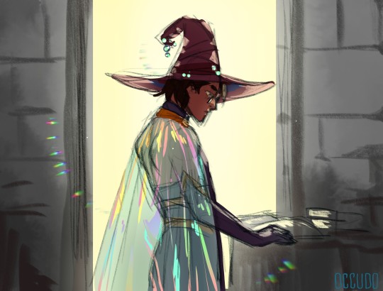

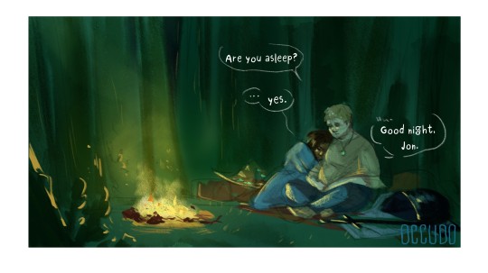
More Magus Sketches
#occudo's art#tma fanart#jonathan sims#martin blackwood#the magus archives au#witch!jon#knight!martin#i really want to do 2 or 3 more comics with them#but I write all the scenes so long#and those end up even longer as comics#sigh#we got a too many ideas too little energy over here
2K notes
·
View notes
Text
this just in: danny fenton is just as much of a mask as Brucie Wayne? - another danyal al ghul au
Turns out, being placed in a civilian family who have no knowledge of your background is actually detrimental to the health and development of a child assassin due to lack of proper support! Surrounded by strangers in a foreign city, Danyal Al Ghul does as assassins do best. He hides. Espionage is one of many teachings one learns in the League, and it only takes half a day for Danyal to construct a new persona to hide behind: Daniel Fenton.
By the time dinner rolls around, Danyal al Ghul is safely and securely tucked behind the face of Danny Fenton; brand new adoptive child of the Fenton family who came from overseas. A shy, quiet little boy with a thick accent and curly hair, with brown skin and blue eyes, and an avid interest in the stars. The best fictions are always cobbled together in a little bit of truth, it's some of the only truth he ever lets through. He apologizes in a meek voice for his behavior early, he didn't mean to be rude, and he watches the three of them eat it up with coos.
Lies roll like silk against his lips, he struggles to meet their eyes and offers them his weakest, shyest smile. It's too easy. It's easy to go from there.
Danny Fenton, adoptive son, shy and awkward and unconfident but friendly. Who struggles in his classes and isn't the brightest, but tries his hardest. He makes bad jokes and has a quick tongue and a sarcastic mouth. He wants to be an astronaut. He's got the best aim in school, and is a terrifying dodgeball player. He's one of the least athletic kids in his grade.
It's like playing two truths and a lie, but there's only one truth, and the rest are lies. It's easy to pretend when he knows it's insincere.
Danyal Al Ghul, grandson to the Demon Head. Deadly, trained assassin. Has spilled blood, has had blood spilt from. Environmentalist, animal activist. He loves the stars. He owns a calligraphy set. A sharp tongue, an even sharper blade. He's clever, quick-witted, he would be top of his grade if he tried harder. He purposely doesn't.
He misses his family. He misses his mother, and he misses his brother. Mother visits a few times a year, so few times that he can count it on both hands. He cherishes every visit, as brief as they are. It helps remind him who he is.
Sam and Tucker are Danny's best friends. They've never met Danyal, but Danyal's met them.
It becomes routine to become Danny Fenton. As familiar and as easy as pulling on a shirt in the morning. Danyal wakes up and is always first to the bathroom in the mornings; stares at himself in the mirror until he can finally see Danny staring back at him. At night, he locks his door and sheds the mask.
Dying throws a wrench in his mask; splits a crack straight through the porcelain. He's able to smooth it over with sandpaper and liquid gold, but it's a little hard keeping his ghost form under wraps. It instinctively wants to shift to show his true self. Danyal can't have that, he's spent four years as Danny Fenton, he'll spend another four as him as well. Even if the feeling of the hazmat suit in his ghost form feels restrictive, like a too-small shirt suctioned to his skin that needs to be peeled off.
He'll live. Er-- well, you know what he means. It's frustrating however, trying to keep his Danny Fenton mask up even as Phantom - fighting in the air is something he needs to get used to, and the sudden propping of powers throws him off. But he is nothing if not adaptive, and he hates that he needs to slow his own skills down in order to keep pretenses up in front of Sam and Tucker.
The first time Danyal summons a sword when he's alone, is one of the few times Danyal gets to grin instead of Danny. He's fighting Skulker, and from an invisible hilt he draws a katana from thin air. It startles them both. Skulker takes a step back at the smile that spreads across his face.
They're both silent as Danyal examines his new sword.
"Do you know what people like me do to people like you, poacher?" Danyal finally asks him, the accent he began to hide a few months in slipping through. He drops all pretense, dragging the flat end of the blade slow and appreciatively against his palm. It's a good make, and when he cuts it through the air, it slices through like butter. He looks up at Skulker with a smile; "are you ready to find out?"
When Sam and Tucker ask about why Skulker seems so skittish around Danny now, Danny shrugs at them and says with a playful smile; "I don't know, I guess I kicked his butt too hard after our last fight." and he watches as Sam rolls her eyes exasperatedly, and Tucker snickers with his own joke.
By the time he reunites with Damian before their 15th birthday, Danyal is buried beneath so many layers of Danny Fenton that his brother will need a shovel to dig him out. He's not sure what he'll find.
#dpxdc#danny fenton is not the ghost king#dp x dc#dpxdc crossover#dp x dc crossover#danyal al ghul au#danyal al ghul#dpxdc prompt#dpxdc au#dc x dp crossover#dp crossover#demon twins au#so turns out putting an assassin child in a normal family does not actually fix the child. it may just make them worse. had this thought#today and had to extrapolate. i have a whole ass post in my drafts explaining my idea for this lmao. my thought was basically:#'damian would be the better off twin because he'd have actual proper support compared to danny bc the bats know damian's background and +#+ as a result can actually address the league's teachings properly and help him dismantle the lessons that have been ingrained in him +#+ as compared to danny who would be with a random family - regardless of affiliation - who would only be able to help with surface level +#stuff if danny even ever lets them see that. danny would need to dismantle his own mindset on his own if he even thinks he has to.'#jazz is not a reliable or licensed therapist. that is a child. she's not even implied to be a good one. psychoanalyzing people doesn't make#you a good therapist. it just means you can psychoanalzye people. and therapy only works on those who think they need it. danny would not#think he'd need it and any attempts from jazz to psychoanalyze him would just result in him shutting her out and doubling down on his belie#tldr: starry made another au exploring the psychological effects of growing up in the league and he calls it:#'whose the more adjusted twin? Damian or Danny? Lmao Damian ofc. Danny got screwed over'#rip to damian you have your work cut out for you trying to peel back all of your brother's protective layers. that's an iceberg waiting to#be explored. o7 to you champ your brother got the short end of the stick. danny has so many things to unlearn that i didn't go into here#its an actual demon twins au too! would ya look at that.
1K notes
·
View notes
Text

Remember: The burning sensation is part of the process.
#Mouthwashing#blood#body horror#Emphasizing here that this is in reference to a media and character and not a cry for help on my end.#Mouthwashing is one of those games that tickles my brain and checks all the boxes for my niche interests -#-but it wasn't something that got the silly comic part in my cortex firing up. My analysis brain is eating well though!#What said...It is impossible for me to see this scene and not say out loud: “Me in the middle of my work day".#While there is a lot more going on with curly I personally resonated a lot with his struggles with burnout.#Burnout feels like mouthwash to me. That you keep rinsing out your mouth trying to get rid of the rotting smell#but it's just surface level solutions. The real cure requires something far more significant to actually make a difference.#The job 'is hard' and 'everyone struggles'. It's part of the process right? You're tired? Anxious? Depressed? Us too! Chin up!#Actually I resonated with a lot of things within Curly (this is a curly positive space - he's not perfect. He's just human).#One thing being his desire to see the good in people and believe in their potential.#Because here's the thing. Some people truly do just need someone in their corner who stands by them so they can grow and improve.#And some people will take advantage of your kindness. You focus so much on their humanity while you stop being a person to them.#The horrifically toxic relationship persists because Curly tries to see the bigger picture and believes in the good within.#Anyone who has lived through constantly trying to reframe the hurt as something else knows-#-just how many excuses your brain will make to avoid cognitive dissonance. It's human psychology.#Jimmy sucks so bad. But we the audience have the privilege of not having years of baggage associating him in our minds as 'friend'.
437 notes
·
View notes
Note
For Requestober
Papyrus and Sans cozily hugging each other in soft clothes😭😭😭
(well this is literally first time I did this hope didn't do anything wrong)

Day 10 - Sleepy snoozey skeletons
#My art#Requestober#UT#Handplates#Papyrus#Sans#You did everything just fine!! Thank you for the req!! <3#How can I resist skeleton snuggles ah the cutes the sweet lads#You didn't specify Handplates but I went ahead and slapped one on there for funsies haha#Unusual for Papyrus to be out of his gloves! Maybe in that transitional period or just too sleepy and forgot haha#Those sillies in Gaster's old clothes - fashion icon that skeleton#I mean Sans is fairly normal-looking - he's always comfy!! Gotta be ready to nap on the spot#Every once in a while I still think back to when I first got into Undertale and there was this one fanart of Sans#In a very lovely loose and low-shouldered shirt <3 It's just a pretty image I carry around with me and sometimes emulate even now#A scoop neck on a skeleton shows off so many bones! Shoulders and scapulae and spine or ribs/clavicles ahh#Papyrus on the other hand is forging fashion hehe <3#Similar basketball shorts? Could be!#The posing was quite fun ah ♪ One leg over the other or one foot over the other#Almost mirrored! Not completely entangled but also very close!#Sans especially looks really cozy ahh <3 I love when he cat-snuggles into Papyrus' chest/under his chin#Protected-protective right over his Soul <3#As long as they're together they're fine ♥
428 notes
·
View notes
Text


its MY cowboy year and I choose the character to turn into a cowboy >insert orville peck lyrics<
[now there's a greedling cowboy]
#fma#fullmetal alchemist#edward elric#fmab#fullmetal alchemist brotherhood#art#my art#i was gonna draw al too but i got tired :(#and i have many things i want to draw so i wanted to finish this so i could get to those#cowboy tag
4K notes
·
View notes
Text

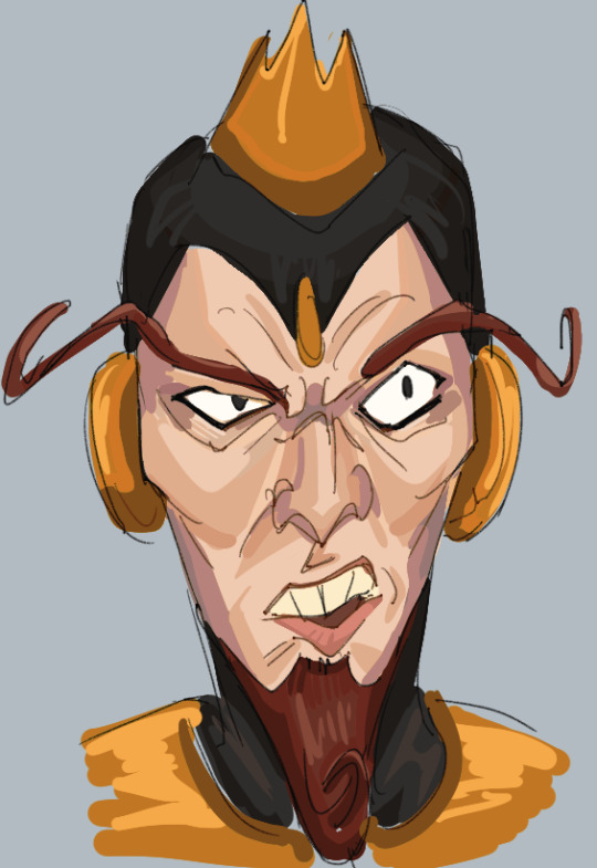


4h lecture every day
#vbros#venture bros#the venture brothers#pete white#the monarch#malcom fitzcarraldo#hank venture#triana orpheus#billy quizboy#billy whalen#henchman 21#gary fischer#dean venture#admin draws#fanart#phewwww too many tags i put off posting this for too long#ive got no will to draw rn january is brutal#ive just been watching gmm and sleeping and desperately trying to catch up on my studies#and losing my mind but thats seasonal depression i guess#took some nice walks. nice pictures. too bad i cant risk doxxing myself so youll never see them#but here have more doodles..first time drawing 21 and billy and triana#so thats one new years resolution down#they were all way easier to sraw than i thought. with a reference open on my phone under my desk in class#tried to make triana a more even mix btween orpheus and tatyana. pretty happy with results considering its. a trad drawing#i usually fuck those up#anways watxhed wwdits going to bed snzzzzz
161 notes
·
View notes
Text
universal healthcare is not broken and anyone trying to convince you it is is delusional and a dckrider for big health insurance. yes there are wait times but waiting for care is Not the same as being denied care.
in america your physician prescribes care and an insurer can still cuck you out of it because someone across the continent who has never met you can say: doesn’t seem medically necessary. Leaving you to handle a bill that is wildly inflated by the same insurers that just denied you.
let me drill it through your head you can pay thousands a year in premiums and still end up sick and financially burdened for years by One incident. no insurance company is Avoiding going broke by denying claims. theyre doing it to profit off your misfortune and your illness. Because healthcare fundamentally does not cost the amount that they claim it to be.
#delete later#out of pocket rant#i hate these god awful takes on universal health care#and i hate this oh he killed a father#how many fathers do you think uhc let die be real with me#oh 8 billion is only 6% profit margin#bitch it could be 2 percent it could be a negative loss#this is me saying oh i resold a shoe for $60 after buying it for $50 when i also made it for 80 cents#i have been denied things like chest xrays and lung exams#i btw have had a chronic cough for 4+ years#in canada i got this done on the same fking day and results back within a month#there are indeed horror stories and on both sides of know ppl who died due to delayed diagnosis#and ppl who died bc they didnt even want the diagnosis it would have cost them too much#but robbing someone of the choice in my opinion is the worse of the two#putting someone in an impossible position like that is evil#this country love god so much better start praying u stay healthy bc thats the most important thing#also like those horror stories of wait times in the er#im gonna be real if u have severe stomach pain are actively bleeding heart attack or stroke#you will be seen asap#yes if unfortunately everyone around u that day decided to have a stroke or heart attack ur appendicitis will be punted down the line#this is a resource issue NOT a cost issue#this is a they also cut funding to nursing school and limited the number of ppl who can pursue medical degrees issue#not a we dont have privatized health care issue#bc ultimately u need a doctor to see u#not someones sister who is taking stabs at it#and every doctor is bound by the concept of time???#u still have to wait in america ur Charged for it also#and yall it doesn’t even have to be a Big incident#ur local urgent care might just be closed after 8pm and at 9pm u need stitches#or have severe stomach pains and just want it checked
165 notes
·
View notes
Text
i feel like tumblr NEEDS to know about Dr. Ally Louks, and the term "Olfactory Ethics"
(long post incoming)
storytime/timeline:
on november 27, 2024, an excited English Literature PhD recipient posted a picture of herself with her thesis, titled:
"Olfactory Ethics: The Politics of Smell in Modern and Contemporary Prose"

as you can see (on the bottom row, above), the tweet has been viewed over 119 MILLION times, and has received over 250k likes. unfortunately, within days (most of the replies dating december 1st), she had garnered what seems like every possible insecure man with a twitter account to post their vitriol and rage concerning the fact that a woman is clearly more well-researched than them. regardless, she tanked it ALL with kindness and with a smile:

AND I MEAN VITRIOL (queen of making boundaries clear):

(inserting reading break for the timeline's space's sake):
here's her abstract:

and in case the abstract wasn't clear, she has since (date: december 16th) taken the time to re-summarize her thesis for the layman (yes that is a link! click it! 3min read!)

she has repeatedly shown just the perfect amount of kindness and understanding for those who are simply Not Comprehending (mostly december 1st):

(the chatGPT hate in the next one is my favorite:)

has upheld an incredibly high moral standard of how she interacts with the situation (december 2nd):

ONE OF MY FAVORITE THINGS: regardless of this crap, she made it clear that as a professor, her FIRST priority at the end of the semester would be taking care of them (december 3rd)
(CAN SHE GET MORE BASEDDDDDDDDDD)

she stays both 1) educating the masses, and 2) engaging with pop culture as much as a normal person would (december 9th-17th):


she also supports a free palestine (WHO IS SURPRISED. NOT ME.) ((december 15th))

here's the BEST FREAKING THING ABOUT THIS. since this all has happened, RANDOM TWITTER USERS, UNKNOWINGLY, have REPEATEDLY proven her thesis to be true,
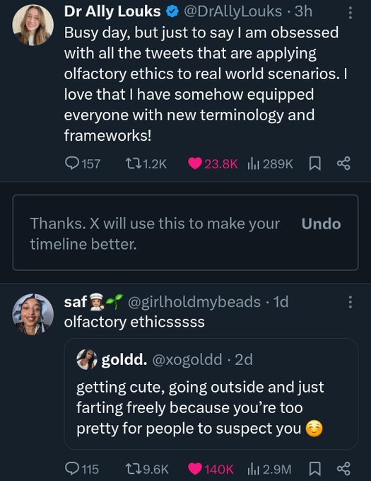
again,

and again,
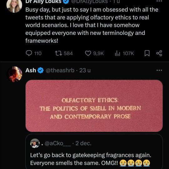
AND AGAIN.

EVEN CARDI B DO YOU HEAR MEEEEEEEE

COMBATING MISOGYNOIR WITH HER OWN BARE HANDSSSSS

oh she knows she's mother

here's some more she never saw/commented on (INCLUDING SOME FROM TODAY. IT IS STILL GOING ON. EVERY SINGLE DAY LIKE CLOCKWORK SOMEONE POSTS SOMETHING THAT PROVES HER POINTS ABOUT OLFACTORY ETHICS):


THE WICKED MOVIE REFERENCE HELLO

apparently, OTHER academics are mad at her for being so famous and influential, but she stays unbothered (december 16th, and TODAY, december 19th):

and she's partially getting her post-doc on how people's sense of smell has been altered (december 1st):

and the best part is!
all of these screenshots i've collected are only a SAMPLE, illustrating dr. louks' indomitably kind and ethical character.
anyway. i want ALL of y'all to start saying, out loud, "olfactory ethics", or even better, "dr. louks was RIGHT" (something something women's names are erased something) every time you see something that plays into her thesis. never let her influence die. THINK THROUGH what you're REALLY saying when you comment on the smell of something, or how your perception has been shaped by society. USE THIS PHOTO IF YOU HAVE TO:

follow her on twitter (@DrAllyLouks) or bluesky (idk her handle, if someone tells me i'll edit it in)
AND SAY HER NAME!! DR. ALLY LOUKS
#tl;dr - ONE WOMAN'S PHD THESIS HAS CHANGED TWITTER DISCOURSE FOR THE BETTER; EVEN CLOCKING A CARDI B TWEET BEFORE SHE TWEETED ITTTTTTTTT#she fielded the worst online vitriol imaginable with poise#she dumbed down her thesis so that the average dumbass on the internet could comprehend it (if they actually put in the effort to)#she HATES chatgpt and trump and israel's genocidal occupation of gaza and racists and bigots and everything evil#she engages with memes about herself and others in a normally humorous way#(people shipping her with luigi mangione laksdjflskjdflaskdjfa TWITTER IS SO FUNNYYYYY)#she shot from a nobody into LEGENDARY academic status with one simple tweet#SHE'S A TEACHER. LIKE.#AND THE BEST PART IS SHE'S LITERALLY ALWAYS RIGHTTTTTTT#most stannable woman of 2024 i'm not joking#btw cambridge and many other organizations have publicly made it known that they will protect her and also just think she's rad and stuff#DR. ALLY LOUKS 🗣🗣🗣#OLFACTORY ETHICS 🗣🗣🗣#guys one of those screenshots contains a quoted tweet that is now DELETED bc the guy got too scared ab his public predator status. I WONNNN#twitter discourse#the politics of smell in modern and contemporary prose#being shipped with luigi mangione must be an experience btw
137 notes
·
View notes
Text
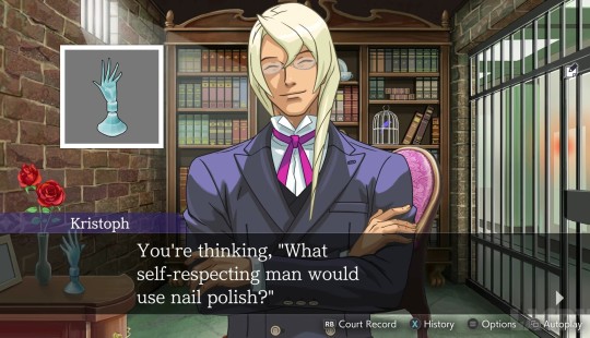
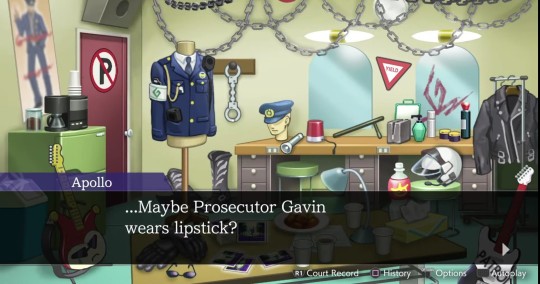
not enough discussion about the gavins' complicated relationship with feminine-coded/beauty products, i don't think.
#for klavier because it's not as direct it's about how we never see him actually wearing lipstick? even though apollo literally attends#a concert of his which is where you'd most expect him to wear makeup. but apparently he just doesnt. or at least not in public#klavier gavin#kristoph gavin#i feel like there are several ways you can read into it. the misogyny/toxic masculinity one is really obvious clearly with kristoph's#singling out of men specifically and klavier's (probably accidental?) condescending manner of calling women 'fraulein' plus his general#mildly patronising attitude towards many of the women in the game (also probably unintentional)#(i think he's trying to be charming and it's coming off wrong to some of them. like ema. and me.)#but i feel like there's also maybe an element of... inherent perfecfionism to it? like both of these products are conventionally beautifyin#products and kristoph while he is open to showing people he uses nail polish specifically chooses one that's clear and missable unless you#see him apply it. he also feels the need to justify his use of it and specifically spell it out as something he chooses to do rather than#needs to do even though duh. that should be obvious.#idk there's just something about his seeming need to take control of that narrative that i find interesting. his need to spin it into a#'there's nothing wrong with my nails but I had the foresight to see that even the smallest parts of my appearance should be kept immaculate#and it's a choice i'm making to refine an already adequate part of my personage /not/ to cover some unsightly defect.' the need to emphasis#that specifically is so. hm. and with klavier i could see it being a case of him liking makeup liking the pops of colour yet being unwillin#to admit to it because he's afraid that other people might see it as him being dissatisfied with his own appearance regardless of if he is#or isn't. or even just perceiving colourful makeup as being unseemly because it's so overt and unnatural.#like i can see this as them both viewing 'real' beauty to be that which is inherent to a person and seemingly effortless#thus somehow negating the beauty which one achieves through cosmetics or other external means.#and if you want to use external means to achieve beauty or neatness or whatever then your only valid options are those which blend into you#natural state. like clear nail polish. or really awful spray tan.#i feel like klavier's less confined by these ideas (if they hold merit at all) considering he actually owns coloured lipstick and he wears#jewellery (admittedly quite 'masculine' jewellery no gems or pearls or anything like that but jewellery nonetheless) but i think it just#makes it more interesting that he doesnt seem quite able to cross the line anyway. like it's that ingrained into his system.#anyway that's all i've got. you guys should tell me what you think too#annotations
260 notes
·
View notes