#i also colored in the original doodles because i wanted to <3< /div>
Explore tagged Tumblr posts
Text
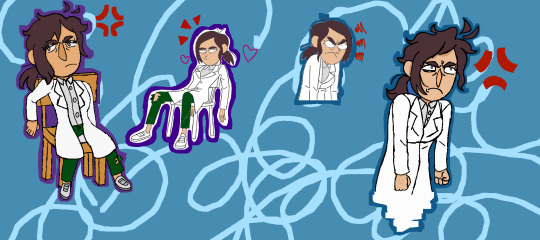
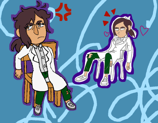
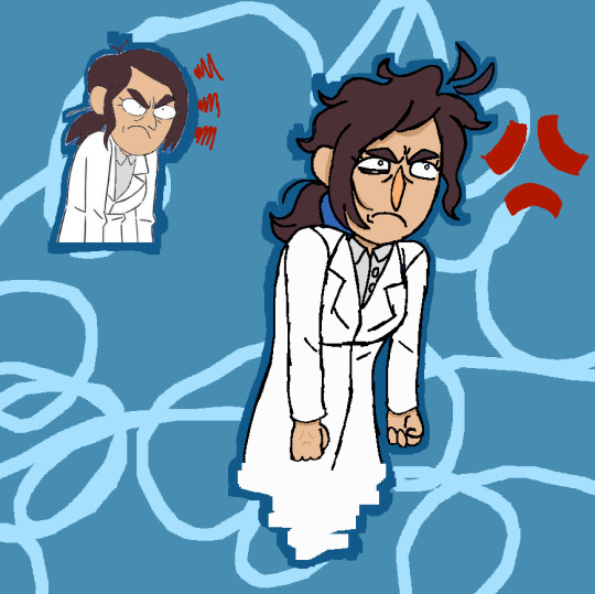
i love reagan's design sheet so MUCH (from here [tumblr] and here [artstation])
#the bagel draws#fanart#inside job#inside job netflix#inside job fanart#reagan ridley#i also colored in the original doodles because i wanted to <3#thank u mx mary for... her...#in the wise words of brett hand: i love how weird she is :]c#definitely need to redraw her design sheet doodles again sometime it's so fun to do :]#also unrelated but i was listening to tgwdlm during this and the mccarter theatre rtc and WOW does ocean have range#also ricky and constance 💥💥💥 gay people (a supposed m/f couple)#jane was AWESOME and i loved how the actress played her#what was i saying. i unno#on that note i want to hopefully draw the rtc characters sometime lawl. take a break from drawing JUST reagan for a bit
17 notes
·
View notes
Text


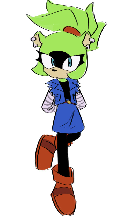


doodle dump!!!!! theres a lot of stuff in here, ranging back abouuuut a month and a half! putting explanations for all of these under the cut <3
1 - sort of a color study of a Forces screenshot cuz i thought the lighting was cool, but also its for a friends rewrite of the game!
2 - idk, i just wanted to draw hipster sonic from Boom except with modern sonic :P
3 - a silly concept for Prime! i have a headcanon that, after Sonic left the shatterverse, it sorta "reset" and repaired itself, and because of that it gained back the people it lost when it was originally shattered, aka Sonic and Shadow were brought into those timelines! the guy i drew here is named Breeze and hes from New Yoke -- Nine calls him Breezy :)
4 - a sorta-redraw of a screenshot from Boom. i just wanted to draw the bros hugging <3
5, 6, 7 - redraws of panels im particularly fond of from Scrapnik Island!
8 - ive been watching Sonic X and i absolutely fell in love with that little guy Bokkun so! i made a redesign of him if he was canon <3
9 - Surge in Android 18's outfit!
10 - triple s hand ideas <3 might make more of em with other characters
11, 12 - concepts of what i think Silver and Blaze looked like when they were kids!
13 - unfinished idea of what Silver's room would look like
14 - a Sonic OVA screenshot redraw
15 - ideas for modern Mighty and Ray! theyve got matching bows hehe <3
16 - Chris Thorndyke redesign, specifically with idw in mind! i have some more concepts of him with a special wispon for crimson wisps. oh, and his wisps name is Ava!
17 - ive seen people draw Terios and Feels together, but Feels transitioned to Mika!!!! anyways, i just think those two could be a cute duo, sorta with a quiet older brother and peppy younger sister vibe hehe
if anyone has any questions about any of these, feel free to shoot me an ask!!
#twip draws#oh boy#sonic#sonic the hedgehog#sth#tails the fox#miles tails prower#knuckles the echidna#scrapnik island#bokkun#bokkun sonic x#silver the hedgehog#shadow the hedgehog#blaze the cat#surge the tenrec#classic sonic#classic tails#mighty the armadillo#ray the flying squirrel#mighty and ray#chris thorndyke#sonic x#terios the hedgehog#cyber singer mika#crimson wisp#long post
299 notes
·
View notes
Text
ERROR!INK (ASYNC SANS)

ok so, finally came with a full idea of this character:D an error version of ink. i'll be listing some facts and clarifications about him to prevent any kind of confusion, just under the cut!
i wanted to write his entire backstory on here but it ended up being a little too much longer than i expected so maybe i'll make a comic about it- or no (wheheh). but basically everything started when he also tore his soul but appeared in the anti-void instead of a normal void that would eventually become his doodle sphere
now, his design choices
he's wearing the first ever clothes he used in His Story comic

his eyes colors were chosen thanks to their inverts, those specific magenta and blue are the opposites of green and yellow, the first colors he experienced in his original story
the marks on his body are white to represent the meaning of the few white garments in his original design: "The white layer underneath says how he attempts to hide who he is, but his emptiness sometimes shines through."
his "tattoos" are no longer illegible when he turns into an error, they become common binary codes (the font used for these is Note This, ink's official font)
the red (magenta) eye is on the right side to somehow symbolize the blood his "scar" would cause
there is no yellow on his clothes to show how secretive he is, as he constantly hides half his face in his scarf
personality traits and extra facts!
as said before he is someone incredibly reserved, mostly because while being in his 5 senses he is afraid of his self without his doses of paints and tries to not attract attention
nonetheless, he likes being around people, he would probably travel across universes to hang out hidden in crowded places
the "specific situations" mentioned on the first part of the sheet refer, for the most part, to self-defense. but there may be other situations where he simply creates stuff that people ask for from time to time
compared to his original counterpart, he will take much longer to drain as he'll rarely use his powers
if he talks for too much time he'll glitch for an instant and forget everything he was saying. that is one of the reason he doesn't enjoy talking so much
when he's in the doodle sphere he often has momentary traumatic hallucinations, so he tries to leave that place as quickly as possible
these previously mentioned hallucinations also happen in panic situations or as a sign that the ingested paints are no longer effective
okie dokie i think that's all for now<3 if anything comes to my mind later or anytime i'll try to post it or smth! hope you like it🫶
ink sans by @/comyet
#AAAH i spent like 2 hours on this#i wrote a whole bible (not rlly lols) of his backstory but backed down from the attempt#it would've been a very long post#i'm hungry it's 5am#btw looking for references i found out that this was an already existing concept :s#but like it's far away from what i ended up creating so no probs? igg i hope#i wanted go give it my own spice anyways#undertale#undertale au#utmv#ink sans#error ink sans#async sans#fluffy art#fluffy ink
233 notes
·
View notes
Text


i had so much fun drawing this guy it's unreal. please observe siffrin from @protectorcraft's fic a bell chimes somewhere!! what a dude. what a lad. what a weirdo (positive)
some more details under the cut! (spoilers for isat and the fic under the cut as well!)
i imagine that since siffrin's creachur form has something to do with wish craft, it wasn't too far-fetched to say that his eye would be colored too, especially given how the sky kid focused on it. however since this isn't his wish to stay with his family, i thought it would be nice to make it a different color... something representing the universe........ Sky Blue It Is
it helps that i am also obsessed with shades of sky blue AND the line from the fic that the sky kid said that it had "everything" in its eyes
i didn't illustrate it, but i think it would be extra cool if creachur siff's eye color changed as per time of day. just because. he's like the eye color version of that one 'do you love the color of the sky' post
i like to imagine that siffrin still has a strange Light in his eyes even when in his human disguise. can't remember if the fic mentions it or not but he has a sky blue highlight in those eyes now in my design. because i can :3
speaking of human disguise, i like to think that even with his transformation he's still not that subtle. mirabelle picks up immediately that he's weird but also that he's friendly and VERY good at survival, and so isn't too bothered by his... quirks. this might end up being canon to the fic honestly but i just wanted to trot out my two cents regardless while i'm here
i'm hoping i managed to communicate some of that off-putting nature in his face! especially his eyes. they're almost unnaturally gray aside from that strange highlight
i originally wanted to make his eyes even weirder but then i thought that being Too Weird would kind of defeat the point, and the point of this is that siffrin kind of has to pass as a normal human which means no glowing pupils, unfortunately. i can totally Give Him Pupils though. gotta get that subtle horror/ creepiness in :3
he gets glowing pupils / tapetum lucidum in the dark though. or when he's angry (see top left). as a treat
didn't draw his in between state (between human and dragon) but i imagine it looks kinda fucked up ! his horn and ears grow, his tail gets longer, teeth get sharper, his whole face sort of. Distorts. in a distinctly uncanny valley way. the blue highlight starts bleeding into his eyes (and his pupils start transforming from round to slit to star-shaped)
continuing, this in-between form in my head is sorta like the dragonkin soldiers from elden ring, just in terms of 'this is a weird hybrid of human and dragon and it just Doesn't Work'. like human, cool, dragon, cool, in between? fucked
siffrin is INSANELY floofy. even with the fact that he hasn't bathed in ages and his floof is all matted and tangled from lack of care he's still crazy soft. i think his fur also has similar insulating properties to his cloak so he never overheats or gets too cold. always the Perfect Temperature
if i were more confident in my skills (and which way this fic is going to end up going) i would have drawn a big hero 6 style moment where everyone is just lying with their face buried in siffrin's fur, like how everyone lays on warm marshmellow baymax.
i originally meant for siffrin to be more cursed and body-horror-y, and then i was looking at the fic descriptions for him (as of chapter 7, so there may be more detail later that i didn't get to see as of writing this) and was like 'wait... he kind of looks like the dragons from BOTW doesn't he' and then the inherent majesty kind of. just. Happened.
i like the fact that he looks kind of majestic though! i think it's a good representation of siffrin's terrible body image issues in this fic where honestly he looks awesome but he just doesn't realize it because, hello negative self-worth
didn't color the last doodles of human siff at the top left. apologies. i got sleeby
in another life mirabelle rides his dragon form into battle and it is exactly as awesome as it looks like it would be
kind of shoehorned my own oc into here as well but i SWEAR aleph is so absurdly similar to this design it's actually kind of hilarious. if i had a nickel for the number of space dragon designs i've made i'd have two, which isn't a lot but
and the full page of doodles! just cause

#isat#in stars and time#isat siffrin#isat fanart#in stars and time fanart#in stars and time siffrin#siffrin#isat spoilers#kind of only for the readmore though#a bell chimes somewhere#dasner art
153 notes
·
View notes
Text


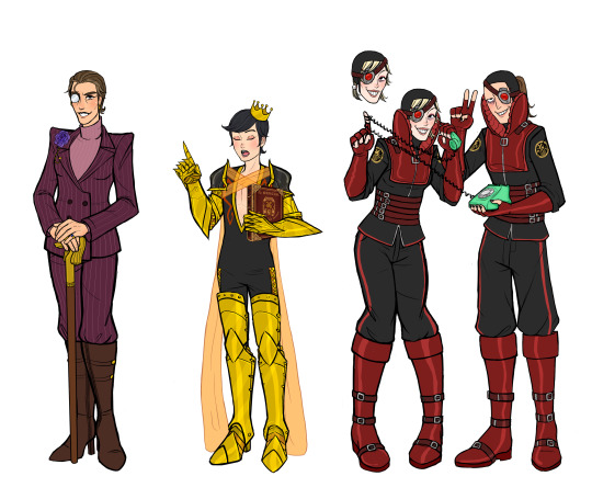

My second batch of venture bros genderbends are finally done! :D [first set here]
PLEASE LOOK UNDER THE CUT!!! I made all these nice drawings and doodles of them and I want people to see them without this post being super long! :') [My thoughts on the designs and doodles will be under the cut as well]


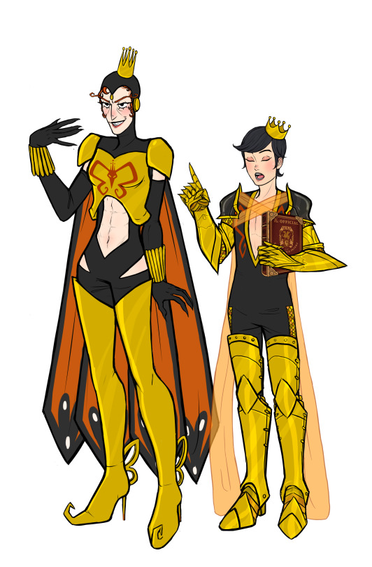

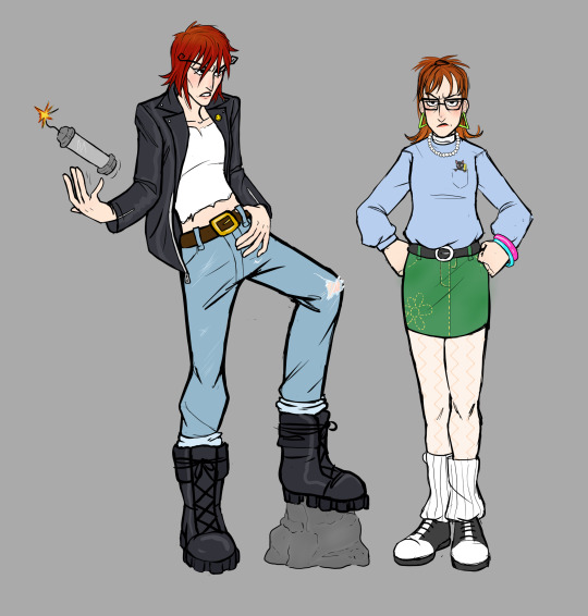
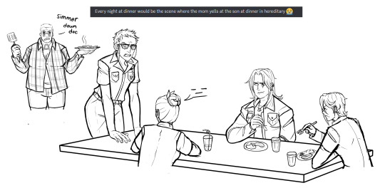
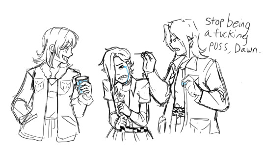
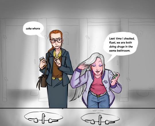
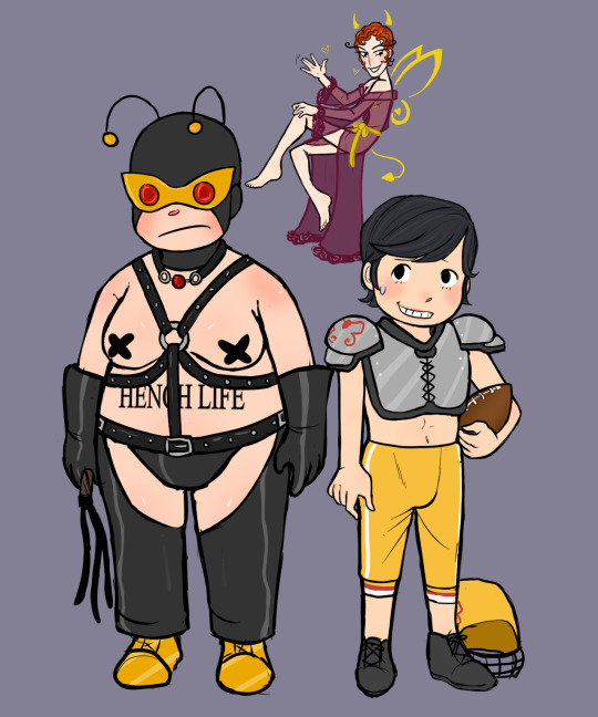
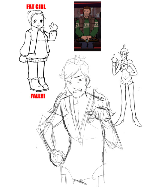
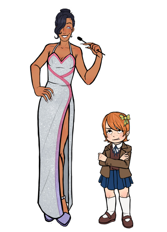

Okay NOW I'm going talk about my thought process on some of these:
Baby Rusty: I love the baby Rusty, the frilly socks and sleeves were a must. I actually drew her with the original set of genderbends but I turned off her layer and forgot about her 💀
Jonas Jr: not much to say about her, I tried to make her like Rosie the Riveter. Her little bandana has the Venture logo on it :)
Jonas Sr: I wanted her to be a hot bitch, her outfit is maybe a little scandalous for the time era they were in but I think it fits, canon Jonas is a whore. I think everybody would want her and that every celebrity, politician, and anybody with any power would chase after her so badly.
Blue Morpho: I made her so incredibly slay. I fucking love her outfit, I found the inspo for the outfit on Pinterest but I changed it up a bit. Also her gun has the bayonetta butterfly wings on it as a charm because I HAD TO.
Colonel Gentleman: Not a lot to say, I wanted to give her like horse riding esque boots and I gave her a purple flower cause she likes the ladies. I know generally WLW flowers are Violets and Lavender but I wanted to draw a rose so, Purple rose compromise <3
Dr.Boyfriend 2: With my last round Dr.Boyfriend was the only one people had complaints with. I think people wished he was more Masculine and I agree but if I switched up the design too much it wouldn't look like Dr.Girlfriend. I hope giving him armor and making him look like a knight helped him look more masc. I made the sheer wings cross over his chest to make it look like it was holding up the shoulder armor. Also his guild book is insanely high quality because I was procrastinating drawing his armor.
Goofy and Goober (Watch and Ward): I think they ended up really cute, I tried to make their hair colors close to Doc and Jacksons since I heard they are supposed to be like their "main" self inserts. With Ward I had a really specific idea for her hair, I kept thinking about this haircut from my sims and had to do it. It might be hard to see but her ponytail holders have skull charms on them. I also purposely gave them both some sort of ponytail hairstyle so they would match but be slightly different :) (They are absolutely prank calling or trolling their clients on that phone btw)
Shoreleave: OH MY GOD I LOVE SHORELEAVE. I kept turning her folder back on just to keep looking at her when I was drawing the other characters. She is so captivating to me, she looks so soft and human. I want to take a bite out of her thigh. My biggest inspo for her was Cammy from Street Fighter, I felt like her dressing a bit skimpy works for her since canon Shoreleave kinda does. The girls out for the girls.
Alchemist: I love her design so much too. I wanted her to look like some kind of nun or priestess. She looks like if a Zelda fire temple was a person. I kinda gave her like a weird little hime cut under the hood. Also I put the Triad logo on all three of their designs (+ Triana).
Jefferson: Had a lot of fun with her, I didnt change her design much from canon though so there's not much to say. I did give her more flared pants though. Drawing her hair was a really fun change of pace, I very rarely get to draw textured hair.
College Rusty and Monarch Drawing: I love this one, Monarch turned out so hot dude. You can tell what character I like more LMFAO. I made rusty very obnoxious 80s while keeping the colors of the original college rusty outfit. Monarch kind of looks like postal dude but its fine because shes slay.
Hereditary Venture Family Dinner Drawing: This was one of the first drawings I started but the second to last one I finished. I wanted to draw the family doing something together but I think I really truly just wanted to draw Dermott again. 😭 Nobody has said anything if they noticed but I did give hatred the shirt from these edits. (I believe the one on the left is from reddit and the one on the right is by SquashFold on Twitter)

Dermott piercing Dean's ears drawing: Even though its messy its in the top 3 favorites I did, It was also the last one I did. I just love the idea of Dermott giving goth Dean at home ear piercings. At first I didn't know if I wanted to make Dermott giving her piercings at the mall where she works or at home but the mall idea was too much work for a last minute sketch. Dermott is so mean older sister who shoplifts and works at the mall.
Drug bathroom drawing: Another one of my favorites, its based off a specific deleted scene from Invisible Hand of Fate where Pete and Rusty talk at the bar but Pete comes out of the bathroom sniffling at the start. I love the way I drew Pete pushing the hair out of her face and both of their expressions.
Bdsm 21 drawing: Okay first of all, The little devil Monarch was so cute I was screaming, crying, and throwing up while drawing her. I fucking love her, shes the smallest part of the image but my favorite. I also am quite fond of the bdsm 21.
Quizgirls Pete and Billy: I tried looking up Vanna White dresses to base Pete's outfit off of but I couldn't find one that Pete would actually wear so I just had to make shit up. Billy's design is really basic but the bow in her hair is actually from one of my rejected main Billy genderbends.
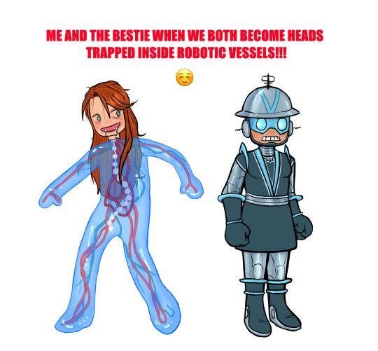
Me and The Bestie: I put a lot of effort into this one for no reason. Literally the moment I saw Jonas in the problem machine I thought he should be made of like blue slime. When I was working on this I kept thinking about Momopatchi's Hatsune Microbe drawing so this Jonas was definitely inspired by that. I gave Jonas makeup because she was having a party movie night on gargantua and I felt like she would still have makeup on thats like completely fucked up and deteriorating on her face after many many years. Vendata's outfit was partially based on Marguerite Chapman's from Flight to Mars, never seen it but I was looking up old sci-fi movie costumes to work with and I thought it would look good :)
#venture bros#the venture bros#my art#rusty venture#jonas venture sr#blue morpho#jefferson twilight#alchemist venture bros#colonel gentleman#shoreleave#jonas venture jr#dr.gf#dr. girlfriend#dr mrs the monarch#watch and ward#watch and ward venture bros#the monarch#henchman 21#gary fischer#pete white venture bros#pete white#billy quizboy#dr girlfriend#vbros#billy whalen#vendata#dermott venture bros#dermott fictel#genderbend#genderswap
455 notes
·
View notes
Note
Cabi! Big fan Joffrey here!
I wanted to ask, every time I see your art not only am I stunned by the quality, but also by the sheer uniqueness in style and character design. I've never seen a lamb designed quite like yours, it's so perfectly yours. What went into the inspiration behind the characters design, especially facially? Did you try and mimick a real lamb, or was there a more fantasy-element that you veered toward?
I can't specifically put my finger on it, but it gives me vague Warframe vibes. It's such a beautifully odd design and I can't get enough.
Love your work, love everything you do, can't wait to see what's next!
Hope you're well, stay safe, take care!
First of all, your ask is one of the biggest compliments I ever had in my life, I will keep it forever. You're an absolute chad! Second of all, those are very interesting questions, and I will be very happy to answer to them!
It started more or less with this drawing I made *look at the date* 2 years ago apparently. Way before I even thought of an AU- I didn't had much in mind, beside doing something that looked cool tbh.
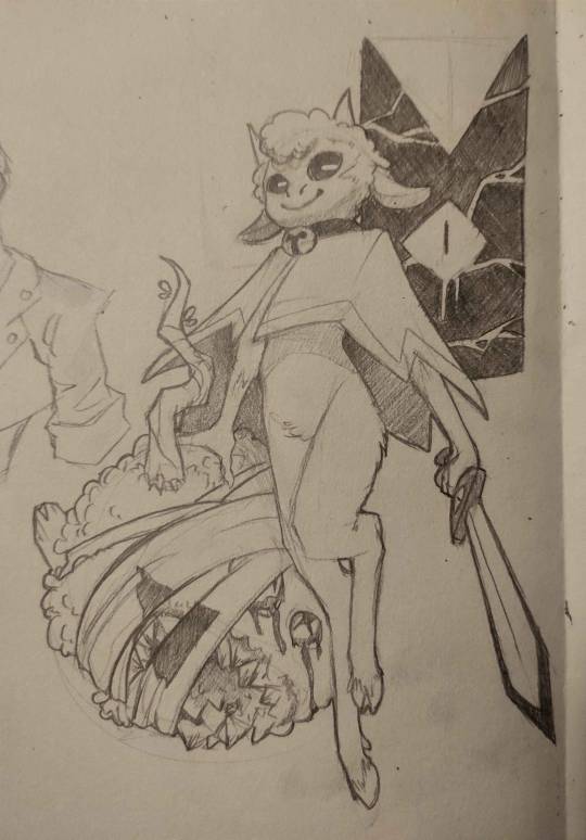
I was very happy with the flow of it, and how it came out. And when I drew the Lamb again, I would try to nail THIS design.
The thing is, with time, I had a really big problem: Lamb looked way too young when I thought of them more as an adult. I had too much of the original game design guiding me, making a Lamb that was too cute and childlike for what I wanted. (And also, the head did not go well with the rest of the body holy shi-)

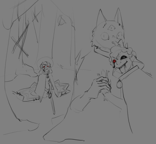
Came those drawings! I was happier with the look, Lamb was older! And I found the colored design quit nice! (I used a sheep picture as reference, but I don't think I used it well, compared to now. I used the reference for details, when I should have gone for overall shape first.) I still wanted something simpler to draw tho. The colored design was nice for an illustration, a one time gig, but I got pretty annoyed pretty fast at trying to nail the face every time. And from those attempt, you get the sketches on the right. (I also wanted to get away from other artiste's interpretation of Lamb, and at the time of those drawing, I didn't felt like I was away enough)
From those previous sketches, the idea for THaB started to emerge. I also still had problem with Lamb's design. Especially the hair. I was inspired by black hair, which is usually not a problem, but I was never happy with how it looked on Lamb specifically. I can draw black hair, I can draw black characters, but this mother-fucker would never feel satisfying to draw or finish 👀
And one day, as THaB was solidifying in my mind, I made a series of sketches that I posted! And one of them was the most important in Lamb's final design. This lil guy! (this design didn't came out of nowhere tho, Lamb was evolving into this as I kept trying. But I wont show those sketches, because those are spoilers =3)
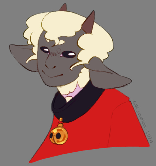
And soon after, I made a comic that was supposed to only be a one shot, just a POV of Lamb and there reaction to Nari' telling them to die for him. But you know, things got out of hand lol
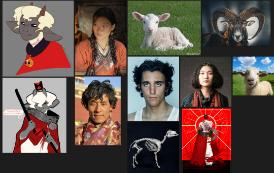
As I continued the comic and doodles on the side, I finally made myself a reference board, with real life images that were close to the vibe of this head drawing. (And I cannot stress enough how those references solidified Lamb's design as a whole. Draw with references, it is life changing. The more reference you get, the more your visual library will get diverse, and the more interesting detail and shape you will add to your art in general.) (I'd also add this: understand what you are drawing, make research and stay curious for every bit of info on everything. You never know when these nuggets of knowledge will help you as you create)
As I kept drawing the Lamb, they evolved! Things changed, slowly, like the shape of the nose, the shape of the eyes, how the hair flowed. You see those change at the face, but also on the body! As the idea of THaB's Lamb got clearer, the design got more specific. (I also got better at drawing! This comic make me draw way more often then before, and it shows)

Something before I finish: the other Cult of the Lamb character's design are way more inspired by their animals, when Lamb is more in the human spectrum. I thought of changing Lamb at some point, to make it fair/coherent, but I loved the design too much to change it again. This AU is something I do for fun, and even if it would have been more logical to change them... I don't want to-
As for the vague Warframe vibes: I play the game! And I found the character design absolutely stunning. So I am definitely influenced by the game without knowing it lol
Thank you very much, again, for your kind words! I also wish you the best, and see you next post =D
TL;DR: Lamb design, at first, wasn't inspired by much, beside the game and my style at the time. But as I retried to make them, added more intent, they got more refined. What really nailed the idea was to have real life references on the side.
#cabi ask#long post#cotl lamb#this took a lot of time to write holy shit#but it made me take a look at older drawing and made me realise how much I got better in 2 years#so it was worth it#and again Thank you Thank you Thank you Thank you
64 notes
·
View notes
Text
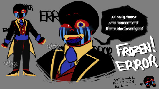
WE FINALLY HAVE THE LONG AWAITED FROZEN ERROR!!!!
his suit was a bitch to design. mostly because i wanted to keep most of his original color palette.
As usual we have some doodles to accompany our ref sheet! (Under cut)
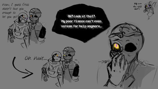
These are all drawings that deal after Error reveals that he is not a good man nor fiance </3
Some things bout Frozen!Error:
he still has his five tongues (Dream was very.... intrigued? by them when he saw them the first time)
Error has for sure Geno and Fresh as his brother (They are not being shown in the au. or at the very least aren't being PLANNED to be shown in the au. cause I ain't designing them. i don't feel like it.....)
Idk if he is keeping his glitches??? I put them on him just cause i thought he looked better with them. but i don't think the errors makes sense in universe. but also it's error. yknow? and there's plenty of monsters and humans in the Frozen universe so maybe it could be like a disease or something. (Maybe like what Mama CQ!Error has? like an actual disease that causes glitches? I think that was Mama CQ error that had that)
Error still doesn't like touch which he makes very clear to Dream when he asks Dream for a dance (they work around it so they can have their little dance <3)
Error was originally planning on marrying Nightmare and just living on like normal, but as the king of the kingdom. However, when he found Dream he realized Dream would be a better option. (Nightmare became known for his antisocial behavior and refusal to let anyone, even his own brother into his room. and like, work smarter not harder y'know 😎)
#undertale au#sans aus#undertale aus#sans au#my art#frozen!au#dreamtale frozen au#frozen au#frozen!error#frozen!dream#frozen!ink#dream sans#dream!sans#ink!sans#ink sans#error!sans#error sans#he's kinda a bitch to draw. but i love him.#i think it's just cause i'm tired though#went to bed at 4 am last night and it's 2 AM rn#Update. i did not post this at 2 AM. I realized I forgot to draw something so i had to fix it
609 notes
·
View notes
Text
The Darkest Hour - Styracosaurs in a Wildfire Paleoart Process Breakdown
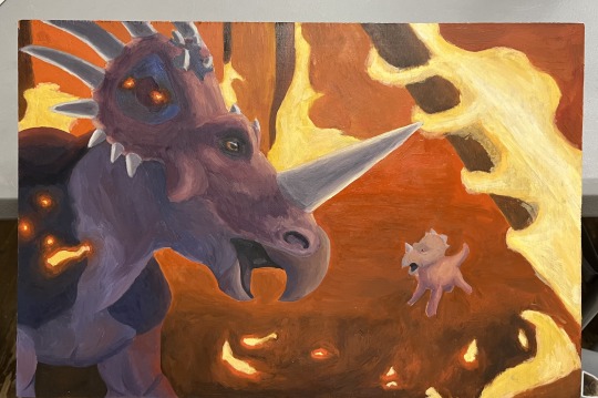
It’s been a long time since I’ve shared my art on this account (at some point years ago I just forgot to), but I thought that this might be a great opportunity to start posting my art again! This is my first attempt at paleoart, and I think it’s worthy of sharing. It’s for my showcase at my art school, so there were time restraints that stopped me from adding elements that I would’ve liked, but ultimately I’m quite satisfied with it.
For any budding paleoartist (or anybody really) who’d like to see my process, I put it all below the read more! @a-dinosaur-a-day (hope you don’t mind me @/ing you, i originally meant for this post to be an ask but it got too long haha)
I started off knowing that I wanted to depict some kind of ornithischian for a number of reasons. Two of the biggest reasons were that 1) I simply like them more than theropods and sauropods and 2) My senior showcase is all about showing animals in ways that the viewer hasn’t seen them before, and most people don’t really think about ornithischians except for if they’re being preyed on by a theropod.
I then narrowed my choices further by looking at different formations and what species they have. I looked up what formations parasaurolophus was in (since it’s one of my fav dinosaurs and I was thinking of making it my subject) and I saw the dinosaur park formation. Looking at the different species found there and the type of environment they lived in, I knew this formation was going to be my choice.
I couldn’t narrow it down to one species yet, so I decided to think of some scenarios ornithischians might find themselves in first. I thought, “Oooh, what about some dinosaurs escaping from a wildfire?”, since the storyline could easily be conveyed, the lighting would be interesting, and I could get creative with the composition (flames and burning debris can create arcs to guide the viewer’s eye).
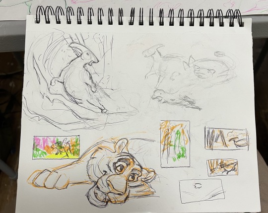
I did some very quick simple thumbnails and sketches to get the feeling and flow of the lines. I saw some paleoart by Marzio Mereggia and I remembered one of his parasaurolophus pieces that I really liked. I also looked at the composition of the fire scene from Spirit: Stallion of the Cimarron for inspiration. (the tiger doodle had nothing to do with it, i just wanted to draw a tiger) The shapes and silhouettes of these species weren’t really clicking for me, so I looked back on the list and saw styracosaurus. I looked at some paleoart and realized that the silhouette and shapes of their frill and horns could really draw the viewer’s attention.
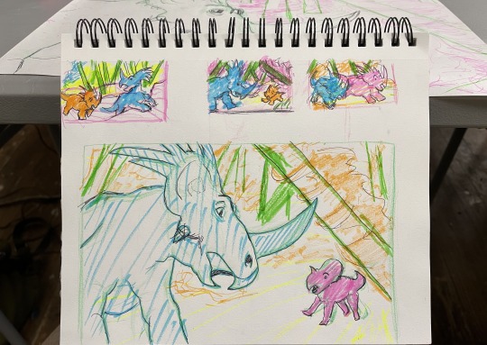
So, I drew the top thumbnails and showed them to my teacher. He liked all of them, but especially liked the middle one, so I drew a larger version of it, making sure to elevate the best parts and communicate the story. I like to use highlighters when thumb-nailing because it helps me break down the background, middleground, and foreground while also giving attention to the focal points. I was satisfied with this layout, so I drew an even larger version of it that would be the same size as the piece of wood I would be painting on.
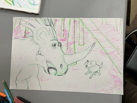
I wanted to add more dimension so I changed the placement a bit. I don’t have much to say on this one, except for the final project has less background detail because each piece in our showcase has to be finished within a certain amount of time, this is also why the adult styracosaurus doesn’t have scale detail. I would’ve liked to add it, but I have to be realistic with my time.
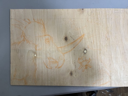
I then drew the sketch on the piece of wood, and then my teacher cut the excess wood off.
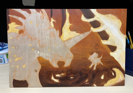
Painted the background and also changed the shape of the face horn to be more accurate. I believe that styracosaurus’ horns changed with age and each individual’s grew in their own slightly different way. I do regret not pushing the dark ground colors further back.
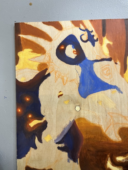
Started trying to figure out the colors in class here.
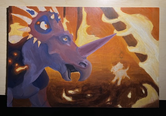
Did this all the next day, took about 6-7 hours. 3 during class and the rest in my dorm. I changed/added to the rest of the face colors later, but the beak stays the same. I still really like the way I painted the beak.
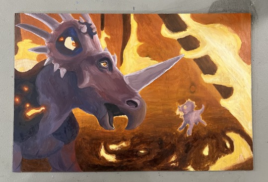
This was after 3 more hours of class time. I changed the face horn color and made the frill horns match it. I also started focusing more on highlights and shadows. This is the last photo I took during the process.

With the final version, you can see that I warmed up the highlights to match the fire and I dulled them out too (adding yellow to purple desaturates it). I also went over the background again, making the colors more vivid and adding a glow to the fire. Ngl I do regret not adding that glow to the fire on the trees, but oh well. Live and learn ig.
#styracosaurus#paleoart#cretaceous#late cretaceous#ceratopsian#ornithischians#dinosaur#dinosaur art#mesozoic#palaeoblr#paleoblr#paleontology#prehistoric animals#zoology#animal art#traditional art#oil painting#oil on wood#artists on tumblr#paleoartist#palaeoart#art process#artist#small artist#art on tumblr#illustration
36 notes
·
View notes
Text
Asha's Animal Side Kick
Now presenting...
the one...
the only...
BONSAI !!!!!!!!!

It was either between a possum, ferret, or a great eared nightjar/type of bird, but either way, I had to go with the possum.

I liked the light brown possum a lot personally since I thought it was really cute yk??
It was also based off of this possum:
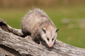
OKOK, you may be wondering why I changed Valentino, or Bonsai into a possum.
There are 2 reasons:
Numero Uno:
VALENTINO IS FUCKING UGLY
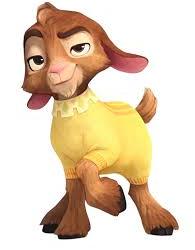
I think my friend @sewerpalette said it best here:

Nothing can convince me otherwise. His design is just SO ugly to look at. It is not pleasing.
And it doesn't help that I wanna punch his stupid fucking face like it is so punch-able
OKAY SURE, the concept versions of Valentino is cute...but ever but I didn't like how I drew goats in my style. It could be just that I'm not good at drawing them, but I also didn't like my color pallet I did for him, which was a lot like what Bonsai has color pallet wise, and it fitted Bonsai more than Valentino.
Numero Dos:
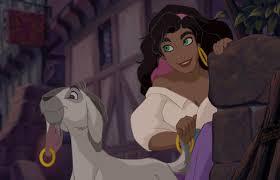
ESMERALDA HAS A GOAT SIDE KICK.
OR BETTER YET, WE HAVE ALREADY SEEN IT.
It is basically a repeat of what we have already seen, which I didn't like.
Just because you aged down a goat does not make it ORIGINAL.
Its okay to have Asha have a pet goat in the other rewrites though I don't MIND AT ALL. ITS YOUR AU U DO WHAT EVER, IM JUST MAINLY TALKING ABOUT MY ICK WITH THE MAIN FILM. IT JUST REMINDS ME OF SOMETHING ELSE.
What I'm trying to say is that Valentino feels like a refrence to Huntch Back of Notre Dom, which this movie has a thing with adding stuck out refrences instead of making it subtle. I mean I know it was a 100 year aniversary, just make it more subtle though so people can rewatch it and find refrences they didn't notice first time watching.
Anyways....
Some fun Facts about Bonsai:
Bonsai is actually a little dwarf, and the runt of his family. Asha adopted him when she found out Amaya told Charo (Charo is a lynx btw) to get rid of them all since she thought they were rats (even though they are fucking HUGE) (PLUS IT IS TO EMPATHESE ON THE FACT THAT THEY ARE MISTAKEN FOR RODENTS WHEN THEY AREN'T, THEY ARE APART OF THE MARSUPIALS FAMILY AND THEY GET RID OF RODENTS/EAT THEM)😭
(I might actually make him slightly bigger than how I drew Bonsai, but who knows yk?)
So Asha took the responsibility of taking care of the little Possum, since she didn't want the possum to grow up alone, and so that she can have some company.
IT TOOK A LONG WHILE for Bonsai to warm up and trust Asha, but in the end, he saw her good nature and swore to protect Asha like how Asha protected him from getting eaten from Charo. Which is why he dislikes Star Boy A LOT (mainly because he doesn't trust how this creature can literally transform into anything and doesn't want him to end up being something like Charo 😭)
He is just a little guy that wants to make sure his friend doesn't get hurt by a celestial force.
This is basically how I imagine how they both would meet:

(Just wait till he finds out Asha likes him. He is going to be so judgemental)
To get this part out of the way, if I end up having Bonsai speak, it would sound like a child, since I DREADED when the goat started...TALKING LIKE A GROWN ASS MAN LIKE NO PLEASE NO. And it would be more adorable yk?? :3
Lastly, here is the first doodle I did of him.

(JUST IMAGINE HIM TALKING LIKE A CRAZY 7 YEAR OLD LIKE THAT WOULD BE SO FUNNY)
@oh-shtars @annymation @signed-sapphire @chillwildwave @spectator-zee @uva124 @rascalentertainments @tumblingdownthefoxden
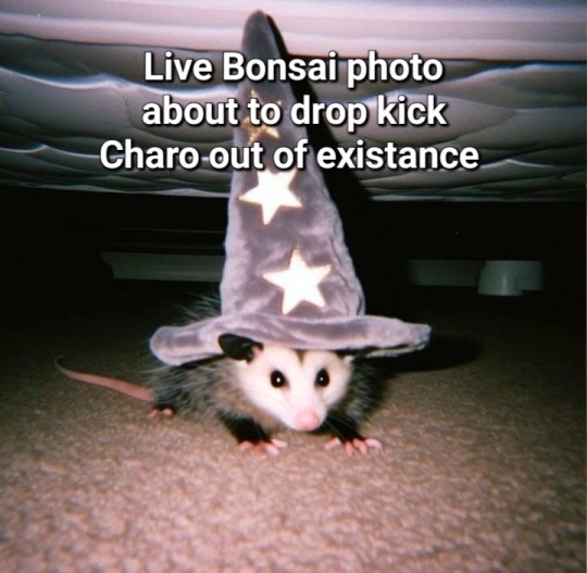
I might also go with a different color pallet for Bonsai but idk yet
#bonsai is my heart and soul#bonsai is my pookie bear#bonsai needs more screentime#bonsai would totally drop kick star boy in self defense#bonsai would be so memable#bonsai is so cute#I never knew I needed a possum like possums are now my life source#disney wish#wish 2023#art#art tag#artwork#artists on tumblr#animal art#animal sidekick#wish asha#princess asha#the kingdom of roses and thorns
39 notes
·
View notes
Note
i loved seeing your character sheets for yuu and hayeli, especially hayeli’s!! it’s clear that a lot of thought went into them and i think his on/off mode is such an interesting concept (also a pomefiore student with blemishes?? yes please!!)
i’d be super curious what your creation process looked like, i.e if where there concepts you scrapped or how you went about choosing a name for them (it’s just a topic i love talking and hearing about but of course you don’t have to get into it if you don’t want to :])
not me also having ideas for an oc with mirror magic, but based on the mirror from the snow queen instead
First I'm so glad you like my characters! It seems Hayeli's bad skin is very popular and I love it! Give me more teenagers with bad skin and not making a huge deal out of it please!
As for my process... dear, that'll be a long post.
General process
Ok so my general character creation process starts with two ways:
1. I have a role to fill in a story that can't be fulfilled by a pre-existing character
2. I have a vibe and I need to turn it into a character
From those needs and/or wants, I'll go through several steps:
1. Age: surprisingly deciding on a character's age first unlocks at least half of its mental and physical design. Is it an adult who already has its shit together or a teen in the middle of a crisis?
2. Vague personality: is the character going to be introvert or extrovert? Shy or outgoing. Proud or self depreciating. Bubbly or quiet. Easy to anger or chill. It doesn't need to be its full personality yet, just guidelines.
3. Race: for fantasy and realism. A character's skin color and cultural background will shape how they view the world a lot!
4. Gender and sexual orientation: i usually decide on the gender based on how many characters I already have of each gender, or whether I want a character to be traditionally feminine/masculine or the total opposite of what's expected. Obviously the gender will affect the design, but the orientation will also affect how the character reacts to others.
5. Assets & weaknesses: for fantasy, it'd be their powers and their shortcomings, for action it'll be their strengths and the things they haven't mastered yet, for romance it'll be their best personality trait and their worst.
Once I have that base guideline, I can start working on a chara design. Age and race help with the body, personality and strengths/weaknesses help with how they dress and present themselves. (An outgoing person will have an easier time dressing in original ways while a shy person would be more traditional for example.)
Once I have a design, I draw shitty little doodles and meme redraws until I have a better sense of their personality. Slices of life and comedy and angst are great way for me to get to know my character. For writers, it'd be writing random scenes to test the characters' reactions.
Then, I double down on the strengths and weaknesses. Make them stand out. Make sure they are coherent to the characters. Make sure the weaknesses are as important as the strength. (For example, I have a character who has super speed. Arguably one of the most cheated powers in existence. I counterbalanced it by giving him poor stamina. In theory he is all powerful. In practice, not so much.)
Lastly, I chose a name. Sometimes it's just about how the name sounds. Sometimes I'm looking for names to mean something. If your character is POC, think about whether they'd have a common name or a name from their own culture. Both are valid but you need to think about it! (For example, I have two maohi characters in the same story. One is called Fray (common name), the other is called Tanemahuta (maohi name) because they and their families have different relationships with their own culture.)
Yuu
Well, that's a strange one since Yuu already does exist in the game, but it's a blank slate, a place holder. Let's make them something worth remembering, shall we.
First, I went with their gender. Most of my placeholders characters end up nonbinary because that's what I am and also I can't be bothered to role-playing gender when playing a simple game.
Then I went with a vibe and a bullet list of things I wanted to keep from the game and things I wanted to add.
To keep:
1. Not very proactive
2. Not very talkative
To add:
1. Raccoon
2. Clever/cunning
3. Physically rather weak
From there I made a design that gave "raccoon vibes". Semi long disheveled hair, lazy eyes, lazy dress up.
Now, what was important was to make up for their weakness: they don't have magic. The world around them is harsh and they get threatened by characters having breakdowns every two months. What is there strength? For Yuu, I wanted them to be clever and cunning. Have them actually outsmart our dear schemers. That's Yuu's one and only strength, they're a schemer themself. They see others as cards that make up their hands the same way Leona sees others as chess pieces. Once you have those big pieces from earlier plus the survival instinct, you get a character that is easy to handle. They don't talk much, keep everything to themselves, manipulate others from the shadows to defend themself.
But. Let's give them one more weakness, shall we? It's funnier that way. Let's make them yearn for connection. They are a teen who got kidnapped from their family. Let's give them a big family. But they are rather independent too, so let's find a way to remove the parents from the picture to explain why they are already able to fend for themself. Now make them yearn for real friendship. Make it obvious their manipulation comes from defensiveness. Have them slip up when they interact with people they genuinely end up caring about.
And there you have Yuu.
Hayeli
Now, for Hayeli, I started out with a vibe. He's actually pretty old, comes from before the game was even released when there were only countdown arts and some vague informations about the game. As I said in his description, he's based on the Evil Queen's mirror. I didn't know at the time there were already plenty of mirrors in the game haha
Contrary to my usual process, I started with his powers first. His Signature Spell had to be something about mirrors. The easy way out would be to have him shape-shifting. There are plenty of angst and fun opportunities from shape-shifting. But that was too simple, I didn't like it. Instead I went with the capacity to copy others' magic. In game there was already Azul being able to steal others' magic through a high requirement spell, so I went with this kind of power. High requirement high reward. I don't like for my characters to be overpowered and I wanted Hayeli to just be average in magic, so I doubled down on the requirements to make his magic near useless.
Then I went on to his gimmick. He still didn't have a personality or body at the time, I really went full mirror first. Hayeli is a mirror. He copies others' magic. What if I double down and make him copy everything as a by-product of his Signature Spell? Ok, now, since I still don't like overpowered characters, how do I make it ruin his life?
And so we come to the problem of his personality: he doesn't have one. He's a blank slate. A mirror. He reproduces others' behaviors and mannerisms and personalities and he has no control over it. He has no idea who he is himself. The angst creates itself.
Once there, it was easy process for the rest. Make him a body. Average size since he's just a copy of others. Pomefiore attitude and presentation since he's in Pomefiore. I like curly hair and there aren't enough of them in Twisted Wonderland so I went with that, but they couldn't be long since Yuu already has semi long curly hair.
I still needed one way to recognize him. Make him pop amongst the other characters. What makes Hayeli physically Hayeli?
1. Moles. So many moles.
2. Bad skin. He's in Pomefiore? Do the contrary of what's expected there. Give him a malleable standard face and add bad skin to it.
3. Strange eyes. He's a mirror who can reproduce everything he sees. His eyes are important. Make them pale like mirrors, make his pupils white to reflect others, make the shape a bit blurry as if the mirror isn't perfect.
And there you have Hayeli's body!
Oh. A name? Google translate, please tell me how to say mirror in different languages please. Mirror in Armenian is "Hayeli", I like the sound of it. Sold. So Hayeli shall be Armenian irl, that'd probably be on the frontiers of the Scalding Sands (thanks a friend for helping me with that part), so maybe I should make his skin darker. Besides, dark skins in a dorm that values beauty is also not the first idea people get. Sold!
(Somewhere during the process, I actually had an objective with Hayeli. "Make him represent Teenagehood itself". Teenagehood is a particularly difficult period, teenagers try to become their own person independently from their parents. They copy each other and all the people they look up to to find what suits them best, but they also hate not being able to tell who they are as a person. Hayeli represents that struggle, and that's also why I gave him a heavy bout of acne and red cheeks and baby fat but a lean body. Teenagehood isn't pretty, and it shouldn't be. Hayeli is awkward, his body is morphing a lot, he has no idea who he is or who he wants to become, he copies others without realizing. But he also has a lot of fun. He cheats at tests, he bothers his classmates and dormmates, he has fun with makeup, he tries a lot of new things. While Yuu was meant to represent survival, Hayeli is meant to represent teenagehood, for better and for worse.)
There you have all of Hayeli's creation process.
TLDR: Mostly I just... don't go with the very first thought I get. Do you know that Pixar or maybe Disney process where they give up on the first dozen ideas they get because it's too "normal" and easy to guess? It has its flaws but I think it's not that bad. I go with the contrary of what's expected (dark bad skin for a dorm that represents beauty) or I push the concept further if I can (copying magic instead of shapeshifting). And most importantly, I give my characters flaws and weaknesses. That's the most important part of the creation to me. What can I give him that'll make him struggle? The scenario writes itself as soon as you give your characters challenges to overcome within themselves.
#for names I either go to baby names websites or i look up actual words#only look up actual words for fantasy or scifi settings tho#for more realistic settings baby name websites where you can check meanings are better#twisted wonderland#twst#twst oc#twst yuu#analysis#ask me anything#character creation#chara design#character design#twst Hayeli
41 notes
·
View notes
Text

My MENU SQUAD DESIGNS! 🍊📄🌮🥒
(based on a previous post)
Featuring design notes and assets for each character!
(a tiny bit of a scar mention warning?)


OJ! 🍊
White, glass-shaped glasses! It should be said that the color is taken from Paper’s color palette. This is also because his eyesight gradually deteriorates from stress.
Orange slice and a yellow necktie, just because he wants to look cool.
Bending straw with their colors (orange, white, yellow and green in that order!) Notice how the orange parts are never beside the yellow ones. Because Taco was more distant to him than the others back then? Yeah. 🥹
A few bubbles here and there.


Paper! 📄
Has TWO outline colors! His outlines turn completely red when Looseleaf (Evil Paper) fronts. His fold also unfolds, resembling a singular horn.
Also has glasses, but they’re mainly reading glasses. He just likes wearing them.
Scribbled-on bowtie! He mainly did it to match with OJ’s necktie, which is really cute to think of.
A few doodles with their colors! (Pickle has stars, Taco has sparkles, OJ has hearts <3)
Has loops on the punch holes, also with the others’ colors. (The yellow one is a bit deformed compared to the others, but it’s still intact.)


Pickle! 🥒
Bluetooth headphones, which he sometimes uses to drown out his worries with music. Also uses them for video games and such.
Stiches in the middle, from the scars he got from Inanimate Smackdown.
The scar on his right eye gradually grew before they reunited with Taco (post-movie headcanon), but now it stopped growing.
Orange and white rectangles on the left side of the headphones, while there’s yellow triangles on the right. The same side as the scar.


Taco! 🌮
Amongst everyone, her design resembles canon the most. The only difference is that there are now tiny buttons with the others’ colors. The green button is in the middle.
Realistically, post-movie wise, her dent shouldn’t be here. But I kept it anyway because it’s just that iconic.
She used to have more worn-out toppings during her time in hiding, but again, after she got regenerated, they were back to their normal state.
Other notes (minor spoilers)
Originally, I’d add ❌ scars on OJ and Pickle, but with II17, I don’t know how that would work anymore 😅
I would’ve added a few more details on them such as tiny cracks / tears on OJ and Paper, but I don’t think it would be noticeable much.
I might make an asset specifically for Looseleaf? No promises, though.
Thank you for listening to my design rambles <33 Reblogs are appreciated AND encouraged! 🍉🍋
P.S. IT’S MY BIRTHDAY IN 5 DAYS!! YIPPEE!! 🎉🎉
#inanimate insanity#inanimate insanity fanart#ii menu squad#ii oj#oj ii#ii paper#paper ii#ii pickle#pickle ii#ii taco#taco ii#ii17#< minor spoilers
33 notes
·
View notes
Text
AUGUST/SEPTEMBER UPDATE
Heya everybody! We’re back for a double episode of, “The Monthly Jayce Myles Comics Updates”! The reason why August wasn’t fulfilled like normal was due to college and how busy I immediately got when entering in, which is what I figured would happen so I’m not too surprised with it to be honest. I took some time in order for me to make a fulfilling update instead of doing a rushed one to pump out yk? We’re now gonna get to the updates and bonus content I’m gonna show.
Buckle your seat belts, close your eyes and take your hands off the wheel cuz this is gonna be a ride~
THE COMIC
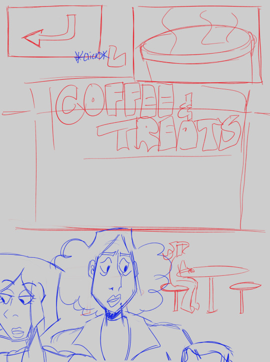
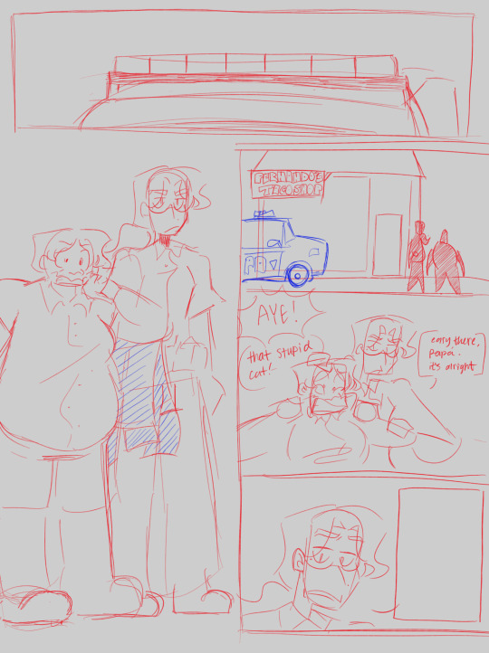
(OFFICIAL W.I.P: PAGES 28 & 31)
The comic’s gotten slower due to college, however, I really needed a break from it in general so I could prioritize my personal life and also refresh myself on drawing what I want to instead of rushing my age physically and turn 78 years old when I haven’t even reached 20 yet. Nothing much to say but showing the w.i.ps because of the slower progress, it’s getting there though. We got to 30 pages! Which means that the first section is sketched out (calculated to be approximately a fourth of the full chapter done, it could go lower or higher in the numbers depending on what I want/vision). I’m hella proud for getting 30 of them pages done honestly. A huge accomplishment for doing this story for a long while.
Ya’ll don’t really know, but I am indeed changing things here and there about the story where I’m shifting small details, doing redesigns, and reboots with other small things overall. I would be honest and say that’s where I’m progressing the most and not the debut chapter, I’m able to have a clearer vision of the story in my head and on paper when doing future chapters yk? I won’t go into details about redesigns or those details being changed since they’re hella spoilerish and a bit unnecessary considering that the JMC hasn’t even debuted yet. Ya’ll will get those details later when the comic functions and I will reveal more in future updates!
Also, last month Jae, no you haven’t drawn the turtles yet. However, we’re close to their debut for the chapter so keep strong! You’re doing great! :3
BONUS CONTENT: Jayce Myles Over The Years
Many of you know that Jayce Myles, whose name is in the title of the series, is our protagonist for this ROTTMNT comic! She’s my OC that I’ve had when going through my senior year of high school. We’re gonna be getting into a deep dive with her as a character and how their designs came to be during the process!
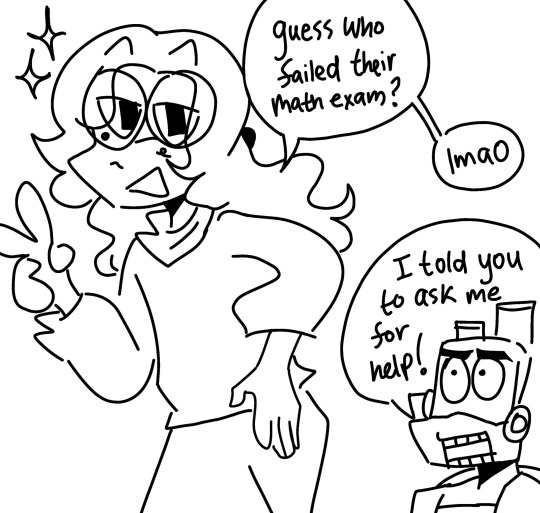
This is the first ever drawing of Jayce that I’ve done, the day I made it is so vivid in my head because I was going through it… I was in my Pre Calculus class and I had failed another test after multiple attempts through the school year. My initial idea was to cry (which I did) but then I just started doodling on my phone and I created this drawing, then from there it was history. This was in 2022, not too long ago. I became a Rise fan a couple weeks after the movie came out (which I didn’t know at the time, it was a pure coincidence) and I wanted to create a Rise OC for a while. So that day in Pre-Calc, I was able to take advantage of my mathematical suffering and create my magnum opus (exaggerated). She didn't have a name at the time so it was actually a stand in for me. Jayce got their full name until a couple days later.
EVOLUTION OF JAYCE MYLES
(October 2022- February 2024)
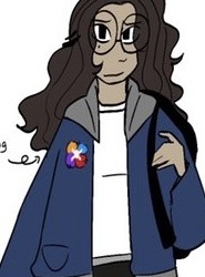
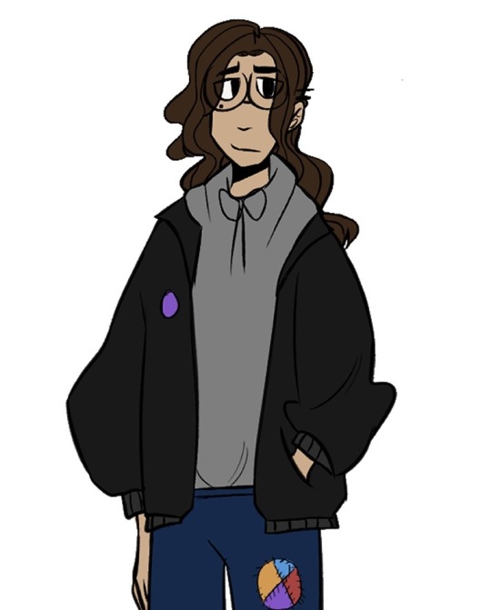
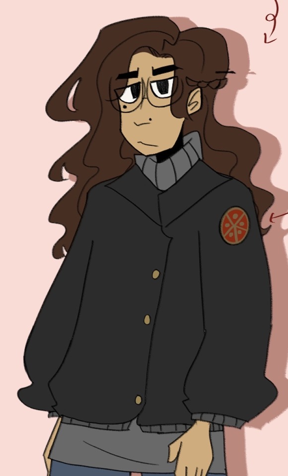
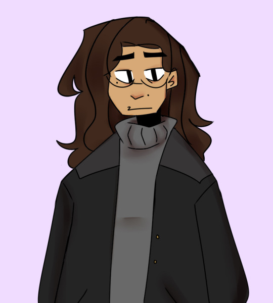
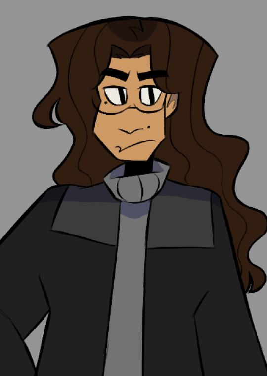
As you all can see, Jayce did indeed have lots of designs and ideas being sketched out while I created her as my official Rise OC. I had ideas for them to have an androgynous look from the start based off of my own self! I knew they were gonna have a Rise comic, but there were ideas for them to originally come from the 2012 TMNT universe with their "serious demeanor". It was quite interesting but there isn't much media of those ideas since they were cut a bit early on.
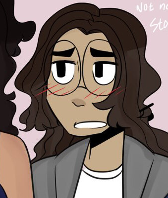
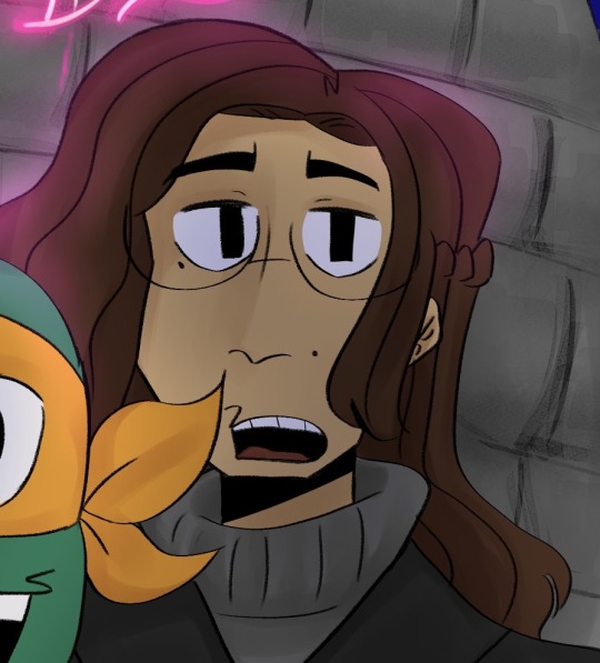
(Older Renders of Jayce from 2022)
Their signature color looked like it was gonna be this denim blue for quite a while but then I scrapped it cuz I thought it wasn't showing their personality like how I want it to. There was also another scrapped concept where Jayce's demeanor would be more monotone and "soft" (as in a blank slate, which doesn't give her a true personality). It was cut because it made me think that I wasn't giving her the best potential as the protagonist then I should've been giving them. Jayce was more introverted and quiet, but now they're much more expressive and full of personality. Ya'll will see in a more better light when the comic debuts, I'm not holding back with Jayce's personality anymore.
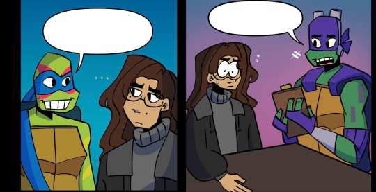
("Issue 1: Graffiti" Panels from page 1. The only page that was completed until the plot got scrapped.)
There were lots of pitches and concepts for the JMC over the years too, where lots of storyboards got drafted and one of the first of those drafts got their first page completed. However, I'm pulled a Richard Williams and kept being like "No, I don't like this" and kept going back to the drawing board. I like to look back on these old drafts especially after seeing the older interactions and how different they're gonna be in the official comics. I for sure was learning over 2023 and 2024...
Now finally, we're gonna touch on the last thing for this update~
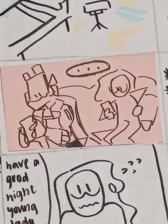
JMC'S FINALIZED PILOT (ADDITIONAL CHARACTER)
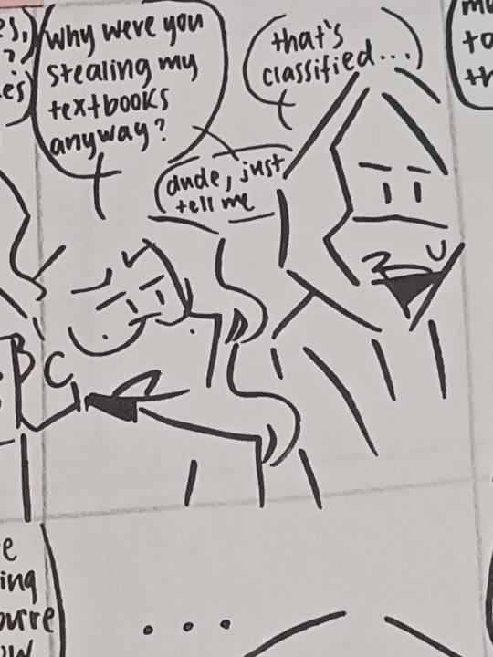
We are going to talk just a teeny bit about the debut chapter but I'm able to become vague without spoiling too much since lots of the older pitches were scrapped. But yes, this was when I came up with the idea, "What if Jayce had a job?"
That's where the idea of Jayce working at a deli joint came from. Where she would have to get a 9-5 and possibly fired, it was pretty funny when doing the drafts since I never knew how a real deli worked and my dumbass just used my mom's experience at Denny's as referenced (she walked out and quit after almost a year).
Thus, our pilot was born.
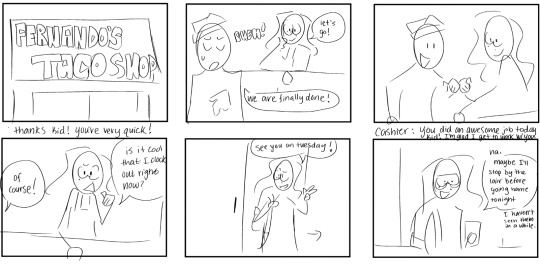
You can go read a non canon comic I did that touched on this concept when it was fresh in development right here! [Jayce and Mikey Phone Call] & [Splinter/Randall and Jayce Interaction]
The shop itself was based off of a friend's film back in junior year. He made a FNAF parody called, "Five Nights At Fernando's" and it was such a stupid assignment but that gave me the idea of making use of the dumbass "Fernando's Shop" and make it a reality. So then Fernando's Taco Shop was created and we had the shop Jayce worked at. We already talked a bit about Archie and his deal in the first JMC Monthly Update and I can't say anymore due to spoilers but he was also involved of the creation of the pilot.
The older pitches had a cashier or a manager be like some NPC ahh character that never was gonna be brought up ever again but something in me thought it would be a cute idea to create an actual character for this manager that wasn't a stupid bossy ass hoe. It was very sweet in the drafts so I thought I could create more with that concept in mind.
Introducing: Rogelio Andazola!
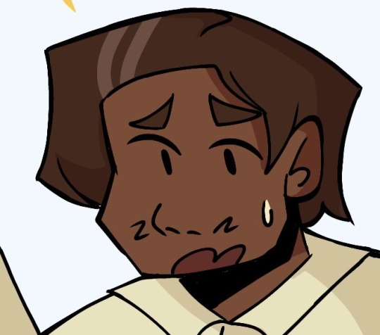
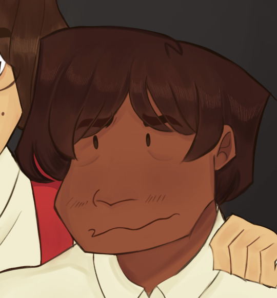
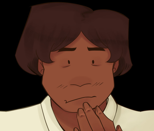
(Rogelio Andazola Evolution: 2022-2023 | Still Not Showing The Finalized.)
His design is one that is the most consistent when compared to the rest of the roster, I guess that I hit the nail with his because I couldn't imagine him any different. There are only minor changes like his gray strands disappearing (bro reverse aged) and his facial expressions are much more expressive after I played around during the soft reboot. Once again (and as annoying as it is), you will all see where I'm coming from when the debut chapter releases! Rogelio as a character has also altered his personality, he's based off of my grandpa, can't wait to show you how that comes into play in the story!
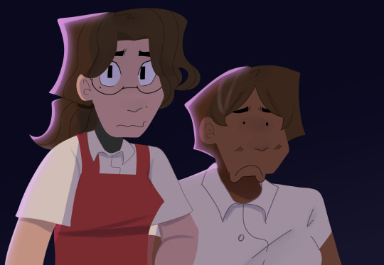
Thank you all so much for sticking around for this very heavy update! I worked way too much for the photos to be sent on here and dug up lots of my old art in order for this to become a reality! It was actually insane that I kept lots of it instead of making it turn into lost media, I'm happy I got to show lots of it instead of having to make it the fuck up by memory (which I wouldn't have done in the first place and is an exaggeration). The comic is slaying in the runway and I'm working on it here and there at my own pace. Maybe next time I can finally show ya'll the turtles in the next W.I.P in the comic section. Have an amazing day/night everyone and we're on the way to victory!
#rottmnt#rottmnt oc#rise of the teenage mutant ninja turtles#rise of the tmnt#tmnt oc#rottmnt comic#rottmnt donnie#rottmnt leo#rottmnt mikey#rottmnt raph#oc x canon#jmc update#jmc related#rottmnt au#tmnt 2018#rottmnt fandom#rise tmnt#comic update#monthly update
26 notes
·
View notes
Text
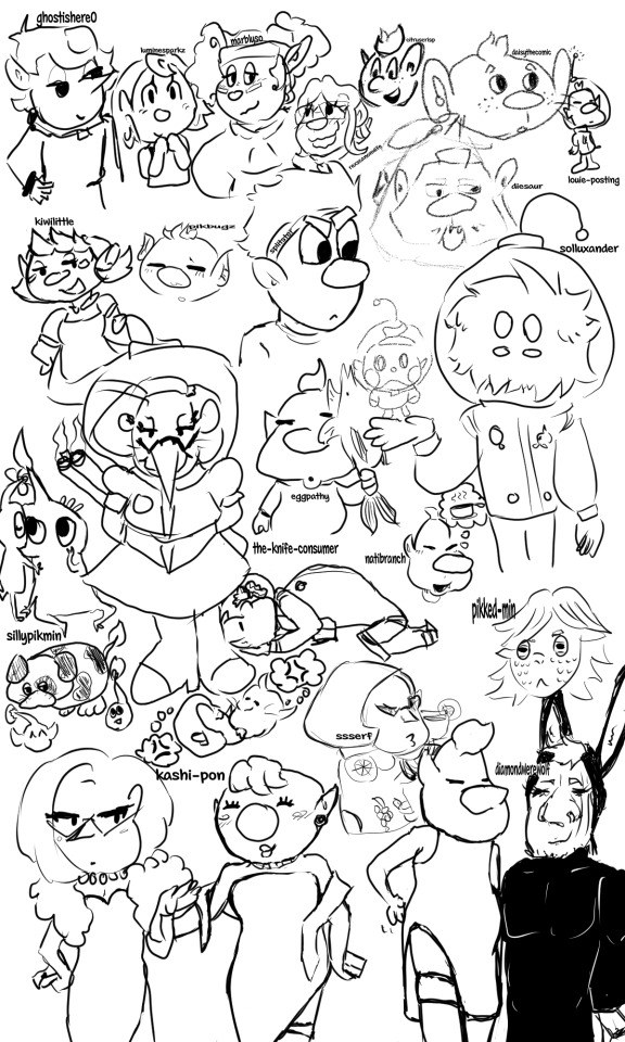
Art practice by trying some other artist's styles that I'm a huge fan of!
From Top Left to Bottom Right:
@ghostishere0 - the original reason I started this doodle, as I wanted to draw a "shepherd lovers squad" and their OC (who I don't know the name of F) was the perfect fit for it.
@luminesparkz - the best interpretation of Pom pikmin. If I were Mr. Nitendo, I would make them the official comic creator along with the manga comics.
@marblyso - If I was a little more unhinged and made a shrine to Erma Shepherd, it would be mostly marblyso's art of her, it's my absolute favorite Erma depiction <3
@rexscanonwife - another OC that I don't know the name of, but she makes such a cute pair with Shepherd and has such cute art that why not, let Shepherd have multiple canon wives at this point.
@citruscrisp - I think this is secretly Alph in an alternate universe where he makes comics about himself, because citrus has Alph's character SPOT ON, and also loves to put that boy in a situation (which I am happy for, I enjoy seeing that boy in a situation)
@daisythecomic - oooaaaaaaaaaa they look like little mice people they look so soft and sweet I love them so muuuuuuuuuccchhhhhhhhh
@louie-posting - I can't not include actual Louie Pikmin on this list.
@kiwilittle - the soft, the sweet, the one who makes the best family style art, really making me wish I was an inch tall so I could go to holidays with the olimar family, also their wife design is so cute that if Olimar didn't already get it I would shoot my shot for her m a a m
@pikbugz - really nails the soft aesthetic that makes pikmin such a calming series, and their coloring style is so soft and good that it gives me the ratatouille nostalgia flashback moment.
@splitster - more than just the wraith au guy, they are the one who makes incredible and funny comics; I've seen so many fics with the rescue corps where I can pick up that yes, this trait came from a splitster comic, and that's a GOOD thing. Made me actually LIKE Dingo, the nerve.
@diesaur - I can't do diesaur's incredible, unique art justice, they are amazing at using geometrics and have the best charlie (his little teefs...)
@solluxander - Cars, one of my favorite pikmin Ocs I've ever seen! Collin deserves a slightly unhinged sentient fluffball boyfriend, and I always love seeing the new ways Cars will interact with him.
@sillypikmin - all hail the best pikposter, who I'm still convinced is an actual leafling living on actual pnf-404, literally every time I have a bad day I look at drawings of Moss and feel better.
@eggpathy - thank goodness they came back to give us old man yaoi. I keep their drawing of olimar kissing the pikmin good night on my phone and look at it before I go to sleep and so far I have yet to have a single nightmare.
@the-knife-consumer - the only person I trust with Louittany, toxic yuri my beloved, I just adore their beasty brittany design so so much, I wish I could have a small brittany to live in my house...
anyway they have the best headcanons for our beloved blorbo hamster people
@natibranch - there's a voice line of Louie going "wa-ha!" in this really cute sing-song voice and every time I see any art by natibranch I hear that sound in my head as a little burst of serotonin, they just nail that exact feeling so so well.
@pikked-min - Another of my favorite Pikmin OCs, Yuva! A really interesting and unique character concept with a lot of thought put into the worldbuilding, followed by a strong unusual personality that had me looking at the pikmin world through a new perspective entirely. Please, someone, give them some sunglasses. Read the fic it's so good
@ssserf - artistic and deep while still somehow looking like official nintendo tm art, genuinely the best at the pikmin proportions, how could I resist trying my hand at the classic amazing beautiful Brittany Fruit Sweater moment, literally SO iconic
@kashi-pon - while I was working on the part of this that was just kashi's various highlife dresses there was a part of me that wanted to dedicate the rest of the space to paying homage to the joke comic of Louie lifting his skirt to show Olimar that he's wearing shorts, except this dress....well......
@diamondwerewolf - the reason we got louie in a little bunny outfit anyway, and thus why we got kashi's dress version. you single-handedly turned Louie into a tumblr sexyman, how could you
81 notes
·
View notes
Text

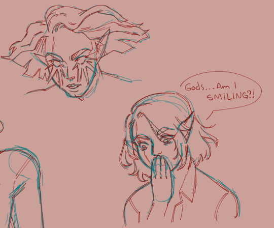

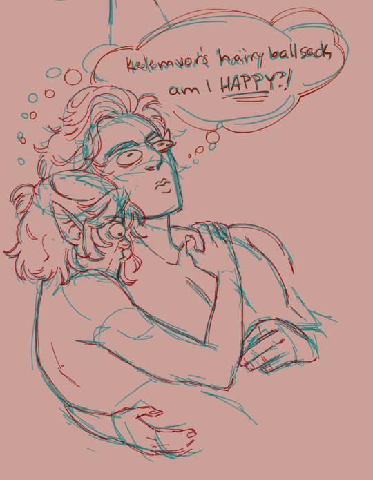
Tiny doodles of Pidge (my Tav) from act 1 and early act 2. Her hair changed for each act so it’s easy to tell where they are in their journey by how disheveled she looks.
Pidge is a wild magic sorcerer with an affinity for soul magic. She can see the color of others souls (I don’t consider this game breaking, but also it’s my brain baby so idc if that’s possible in the 5e rule set) there are some supplemental fan spells and materials for adding soul magic and flavor and there’s the soul knife subclass rogue which I think was a Critical Roll addition? Ugh, look at me spreading misinformation on the internet.
OC lore below the cut.
Content warning: abusive relationship discussion (parent and child), implied sexual and physical abuse.
Anyway, Pidge grew up Rapunzel like with a very controlling and narcissistic “mother knows best” mom. The only reason her mother even had a child was to be a “spare” body for when her mother succumbed to a fatal illness (and to help her mother transfer souls into soul coins and gems to be bartered in the 9 hells. Lots of devil’s work)
Pidge’s mother is controlling to the extent that Pidge was not allowed to learn anything about her wild magic and spent much of her life warded to keep her from accessing the weave. “For her own safety,” of course. The only magic she was allowed and praised for learning was soul magic, and this was to help her mother with her research into immortality and with business ventures.
Pidge was also used as “entertainment” for her mother’s important guests. Basically anything that her mother could get from Pidge, she would try to use to her benefit.
About 3-5months before the beginning of the game, Pidge escaped and crafted an amulet to protect her body and soul from being hijacked by her mother.
She is the only member of the bg3 origin crew who did not lose skills when she was infected by the tadpole. She didn’t really have skills to begin with. Much to Gale’s dismay, she learns basically on the fly and does a lot of “firebolt first, ask questions later.” To her, practical experience is much more important than book learning. Really she has adhd and can’t rote memorize for the life of her.
She identifies with Karlach early on as they both have had dealings with the hells, although Pidge is just beginning to understand the ramifications of her mother’s hellish business of soul coin forging.
Pidge is also very afraid in act 1 of Gale finding her out as she was told to keep her soul magic affinity secret by her mother. In truth the stigma for soul magic is not so bad, but it was a manipulation technique to keep Pidge from explaining to any magic practitioners what they were working on and how her mother planned to use the research to steal Pidge’s body.
Her mother is still hunting her down, so Pidge needs a permanent solution or soul barrier to keep herself from her mother “living vicariously” through her.
Bodily autonomy is stupid important to her. She rejects the Emperor the moment he tells her to “embrace her ilithid potential” for fear of losing herself. She is self conscious to the extreme and keeps notes on her newfound companions likes and dislikes so she can keep them happy. She had a legitimate panic attack when both Gale and Astarion wanted the necromancy of Thay because, according to her calculations, they would disapprove if the other was the recipient.
She fell for Astarion after rather disliking him for a good ten day or two. He won her over by being actually reliable in scrapes and being really funny. She can’t remember the last time anyone made her laugh, so she loves the feeling. They are the two smooth brained members of the group. Similar brain cell count.
This ended up being a lot longer than I thought it would be. If you made it to the end, then you will have made it to the end! *salutes in Barcus Wroot*
#my art#art#sketches#doodles#fanart#bg3#illustration#wip#dungeons and dragons#pidge#bg3 tav#Tav#astarion#astarion x tav#bg3 astarion#dumb stuff#baldurs gate 3#video game#OC lore#no one asked for this#and yet I have provided#cw: abuse#cw: implied abuse
55 notes
·
View notes
Text
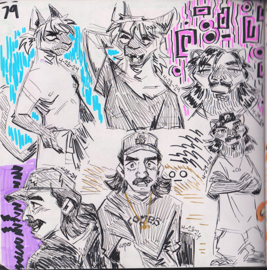
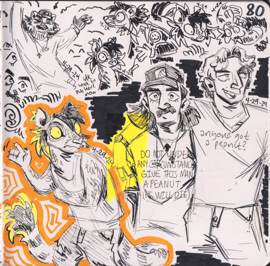
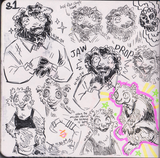
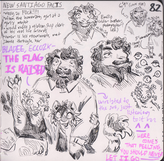
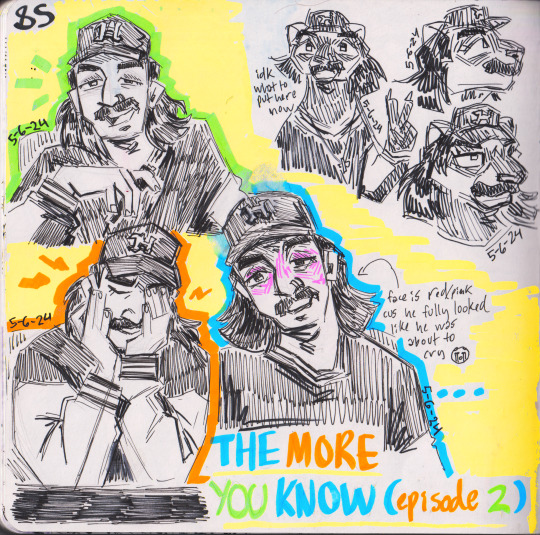
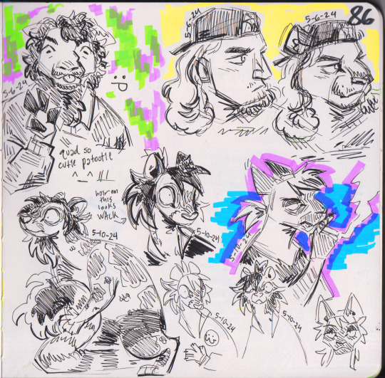
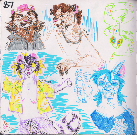
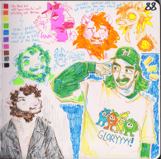
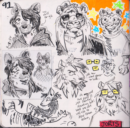
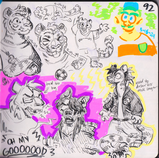
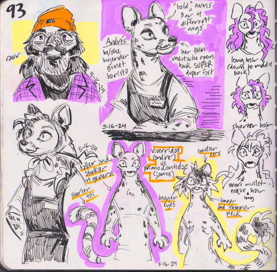
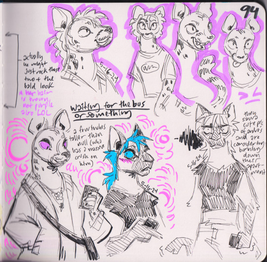
sketchbook dump :3 ive been drawing in here a maniacal amount
descriptions and such below
1-2: practicing drawing null with more catlike anatomy + smaller boobs, two hivemind requests, and then random doodles of ferret riley and jamie
3-4: trying to make santiago's character a little more interesting... he is kinda kabru dungeonmeshi core now. loves knowing about and getting into people's business. i also need to finish this post i was making about jamie and co's families but you can see his older brother (who is much shorter than him) in the corner
5: hivemind request i did for saturn :3 it's up by itself on my blog somewhere
6: usually when i'm drawing at a coffee shop ill try to do 2 pages so after i finished the aforementioned request i put down some furry bullshit. god i love graydon's long hair era so much
7-8: i got colored pens!!! specifically a 10 pack of tombow fudenosukes. like the pic says i will probably keep using black pens mostly but the option is nice to have. i am very proud of that riley in the GLORYYY! shirt
9-10: revamping furry ocs i made... 6 whole years ago jesus christ. i want to wait until i redraw a 2019 piece of them before i make a whole post about them, but the tiger with sunglasses is a fashion designer and the hyena, lion, and tiger cub are his kids. he also has a hyena husband but i didn't draw him here
11-12: NEW OC! this is andres she is a spotted genet that works at a cafe in the university library. i had been meaning to make a spotted genet oc, and i originally drew him months ago and forgot, but i decided to revisit her because 1) there is a beautiful bigender barista at the coffee shop i draw at so this is a shoutout to her and 2) i wanted to make a bald character who is also a heartthrob so i could feel better about going bald eventually LOL. also ferret riley is there i guess
#hivemind tv#quadeca#hmfcu#my art#sketchbook#fanart#2024#my ocs#dorian furryverse#jamie and co#null#jamie#santiago#omar#johnny#argyle#andre#the zakharovs#igor#zia#spencer#kenny#<- these are the guys in 9 and 10
42 notes
·
View notes
Text
Finally for the first time tryin to draw this man
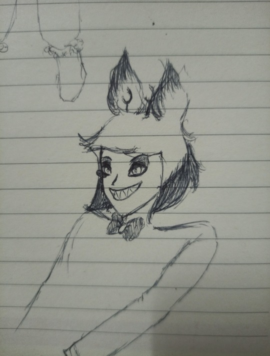
Just a lil doodle while in class.
Also had the sudden inspo bc of a lil thingy(AU? Would it still be considered AU if i dont plan to expand?). Ik Angel!Alastor AUs are a thing, at least i think so, so i decided to try it out a lil bit.
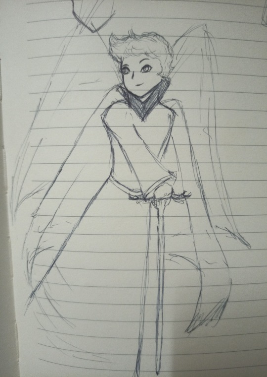
So tadaaa, Angelic Alastor. I cannot draw wings to save my life, so bear with me. I based the eye shapes and over all facial expressions on how i drew the first Alastor doodle, except its a teeny bit less sharp with less bolder lines. I shaped his hair somewhat the same for the top part, except a bit slicked back with a more windswept look. I imagine his hair would be white with red tips, with an overall white, and red color scheme, with a black collar standing out. He'd have the same red eyess, tho with whites surrounding it.
I gave him two wings, to maybe signify that he is above most angels, though below those such as the Seraphims and Archangels, at least in rank. I was a bit conflicted what to make his cane like(yea ofc im giving him a cane im not a monster). Originally i wanted to copy what his lil antlers looked like, as to be a simple staff, but ended up with that wider antler design. Idk.
Angelic Alastor wouldn't really be much different than Demon Alastor, except for the fact that he's better at hiding it all, at least he wants to. He's quite powerful amongst other angels, moreso than seraphims despite being of lower rank. Similarly to how he can melt in the shadows, as an angel, he can dissolve into the light. Haven't really cemented what exact type of angel he is, though i'd imagine he's still a bit of a recluse, preferring to go off alone to do as he wishes.
Angelic Alastor is every bit as mischievous as his demonic counterpart. He lives for the entertainment, and his humor's quite biting for a being of light. He's sharp and charming and witty, and quite rebellious as well. He's curious about different possibilities, and has never quite felt like he belonged among his "perfect" angelic peers. He knows he's imperfect, and that all those ideas would be considered blasphemous. So he remains quiet, under the radar even with his strength; all to escape the possibility of being persecuted.
Its what draws him to the Morningstar. Lucifer, the powerful archangel with a heart of gold and a mind filled with wonder. (Also to anyone who's seen my blog, yes ofc im inserting radioapple im weak) Despite their gap in rank, Lucifer never treated him any differently, and Alastor found himself treating the shorter angel as an equal. Their friendship was a bit odd perhaps for the others, considering how they'd often greet each other with playful jabs and teasing remarks, all quite informal and rather unruly. He was drawn to Lucifer's ideas, as was Luci to him, both relishing in the fact that they weren't alone, despite being different.
Lucifer had always been the louder dreamer. Though Alastor often agreed with his ideas, and sometimes egged him on, Al knew the risks and knew when to pull back. He was cautious where Lucifer took risks.
And y'all already know its Radioapple but what if we add Lilith to the mix-
Like imagine, Lucifer coming back to Alastor and gushing about the first woman, the taller man amused at his friend's lovesick expressions. Imagine him being acquainted with Lilith, and charmed as well by passion and hopes for change. He's weak for dreamers okay-
Like imagine him helping the two hide their relationship, being the most cautious of the 3. Imagine his heartbreak when the two gets sent to hell. Imagine Lilith and Lucifer holding him, stopping him from falling with them, because he cant do this without them please-
This may have gotten away from me a bit
Anyway, there's also a teeny doodle of biblically accurate Angelic Alastor(idk ehat to call them, but those forms Sera and Em have when they go 👁👁👁👁)

Idk if i'll ever do anytjing with this. I have a whole fic playing in my head but its very long with a whole lot of plot and idk if im strong enough-
#Angelic Alastor AU#hazbin hotel#alastor#lucifer#lucifer morningstar#lucifer magne#lilith morningstar#lilith magne#hazbin hotel lilith#hazbin hotel alastor#hazbin hotel art#art#my art#bloopnik art#alastor the radio demon#radio demon#radioapple#appleradio#radio apple#apple radio#radioapplith#lucifer x Lilith#Alastor x Lucifer x Lilith#hazbin#doodles#fic ideas#Hell's strongest throuple#poly#traditional art#bloopnik writing
44 notes
·
View notes