#having fun with designs and symbols lol
Explore tagged Tumblr posts
Text


Symbols for the different worlds/universes that I have stories in!
That's the Rifts, Kosmyldar, Mossïl, the Otherworlds, Mithaedrir, Sanjian, Daítana, and Dimere
[also available as stickers here if you're into that]
#having fun with designs and symbols lol#worlds#worldbuilding#rifters#kosmyldar#mossïl#the otherworlds#mithaedrir#sanjian#daítana#dimere#scribe does something
8 notes
·
View notes
Photo


Bowtie Charm! Inspired by @zarla-s‘ super cute rendition hehe 💕 (Patreon)

Bonus collar breakdowns:

Changes depending on the doodle!
#Doodles#Villainsona#Just Desserts#And a couple other sonas! Haha#Very yays and thank yous again for the trade ♥ She's so cute hehe#She doesn't normally wear a bowtie but her collar can look a lot like it at times!#I decided to go all in to see just how she Would look with a bowtie and the answer is cute! I for one am shocked#My bowties tend to be quite poofy huh always very rounded - Charm's collar tapers kinda almond shaped#I'm still not entirely sure how the double-tapered look works.... It's scalloped >.> That's what I always say lol#Really she probably would and should have the Mandarin collar - possibly more scalloping >:3c - I just go outside the margins a lot haha#I've drawn her once or twice with the butterfly collar tho! Where her collar dips down into her spiderweb pattern at the top of her shirt!#It's a really cute shape ahhh it works best with my lineless stuff but even here I think it turned out nice! :D Cute! Pretty!#Butterfly in a spiderweb........wings something something much to think about#Butterfly were 100% my gateway into finding bugs and eventually spiders cool so there you go symbolism-wise lol#Still remember being too excited to sleep as a littley on the promise of going to a butterfly house the next day hehe <3 Love 'em!#Fullbody as well - the larger dot in the middle of her kneepad in Zarla's looks like a donut to me so I had to try that out too!#Smol's actually been talking about making a donut/eclaire-themed JD Resident lately I can't steal her thunder hehe ♪ Oh just this once#Donut kneepads probably would offer a good bit of support that cookie kneepads don't huh :0 Less pressure right on the kneecap#All the cutes! Though I did keep her double-scalloped thigh-high shoes I can't help it they're my favourite haha#And ending off with the other two Bowtie Sonas! Hall of Mirrors definitely deserves that moniker she was introduced with that as a feature#And their cane but pfsh details - the important part is the bowtie! And they have that!#Will's is just to break up his design a bit haha - I think Erase has the same style of bowtie now that I think of it??#White on white tucked into the jacket... Hm!#Always love a trio or duo or however ♪ The fun the fun ♫
6 notes
·
View notes
Note
hmmm sineater au for thanced :D
Send me an AU and I'll tell you what my muse would be like in that AU | ✿
He was fine. Even as he grew ill, it was fine.
That was what he had told them in life-- insisted, really. The guilt was eating at him from the inside out, but he was fine. There were bigger things to be worried about, after all.
No, he wasn't practically burning himself alive, the boiling presence of something more churning his guts each and every time he uttered the words: It's fine; I understand. There was more at stake than facing his own mortality, let alone all the ugliness that remained within.
As the days went by, it grew increasingly harder to turn the other cheek to the inner turmoils of the body and mind. There was the same repeating phrase that weighed at his shoulders more, and more, each time it crossed: I wish I had done more; I wish I could have done things differently. I wish, I wish, I wish.
Wishes didn't come true; Guilt ate at his heart, mind, and soul.
The transformation was sudden, but at the very least, his companions knew the signs of it when it was about to start.
Eyes were a flood of light, dripping like molten gold down his face in streams of tears to be forever branded on a marble-like visage. Three wings sprouted from his back as if bursting from a fleshy cocoon: Two on his left, and one on his right. A third eye grew from his forehead, impassive gaze blinding with light shining through it, whilst the two he already had glazed over in stone, forever doomed to shed those molten tears. Weapons were ripped from his very ribs, a mournful scream leaving his lips for one last time as bone shaped itself into a pair of deadly blades hovering at either side of him, his Gunblade morphing within his hold to be a third.
And as fast as it had happened... it had stopped. Gone was the broken man clinging to a past he couldn't go back and change, and there instead stood a mock statue of his memory, reflecting the ache and mourning once held inside.
Thancred: the Forgiven Guilt.
#AU | SIN EATER 🌸 Thancred Waters#//Aka the: What if Thancred didn't get over everything and accept but pretended to be alright but got Down With The Sickness™️ so then#'Oops called out for it in the WORST possible way imaginable have fun with THAT!' I also went with the symbolic number of 333...#'It is time to forgive yourself for past mistakes and move on with joy and happiness' is what it means in Angel numbers c: so...#I really wanted to incorporate a set of 3 3's in his design dghfjks This was the best I could think of for this AU c':#One day I'll draw this... one day... until then-- Thank you for sending this in!! It got me to think!//#🌸。*゚+. QUEUE#tw body horror#tw death mention#Sorta??? I mean technically becoming a sin eater-- you die LOL so ye if anyone needs any other tags let me know~#vierandancer
3 notes
·
View notes
Text


Nahida redesign! Breakdown below
So I adore Nahida as character, but especially as a southasian I always wished she would have more cultural motifs in her design. I really wanted to see something that could be realistically in the game, that adds to the original, while retaining the few great details hyv put in her design so I thought why not do it myself!
I based her dress on the lehenga instead of having the basic dress, as it's closest to her silhouette (missed opportunity!!!!!!). Its traditional wear, yet not as ancient as the saree which i thought fits nahidas youthfulness. Tbh I just split the dress in 2 lol, as i love her patterns


These prominently feature the bodhi leaf, which in buddhism symbolizes enlightenment and wisdom. So it was important for me to not alter those elements, and I changed almost nothing else on the dress.

What I did change are the sleeve things (?) To an actual dupatta, which is a type of long scarf. Put even more bodhi symbols there. Sorry for bad pic


Additionally I added a maang tikka (head jewelry) and earrings. I kept her bangle and the ghanta bell (used in hindu rituals) on the back as these are the other cultural elements she has.
The Mehndi design is a Lotus to reference one of her inspirations: Anahita, persian goddess of wisdom and flowing waters and where Nahida's name comes from. She is also inspired by hindu goddesses like Saraswati (also goddess of wisdom and more), Aranyani (forest goddess) , a forest fairy from the buddhist Kusanali Jataka tale, and likely even more.
And for the last detail: I gave her anklets, in reference to Aranyani/Rukkhadevata.

One of Rukkhadevatas title was Queen Aranyani, and the actual real goddess is said to have worn anklets with bells that were heard in the forest. Tho I removed the bells, since Rukkhadevata is dead and forgotten now, and so you can't hear her anymore. :')
Bc of it's purpose it's not the flashiest design, but I had so much fun researching, learning so many new things and trying to incorporate them back to Nahidas design! If someone educated has more to add or something I can correct I'd love to hear :)
4K notes
·
View notes
Text
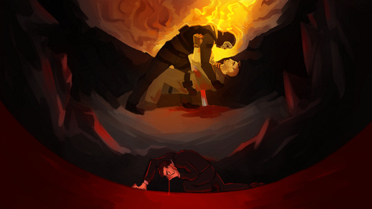
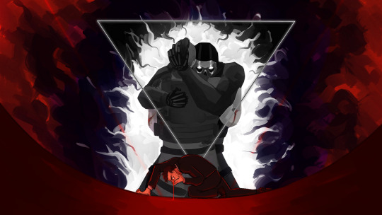
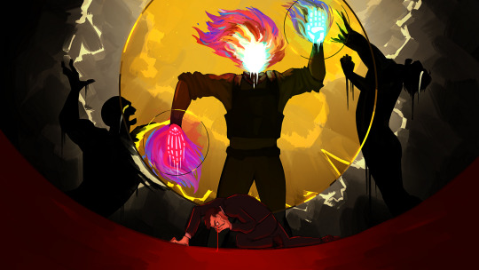
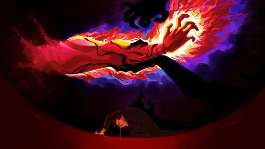
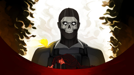
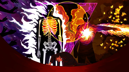
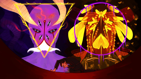
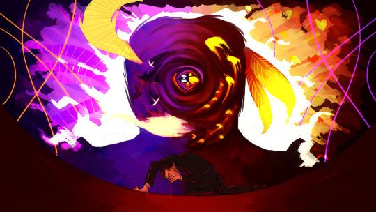
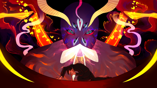
The frames of the video from the comic in the previous post. I experimented a lot with this, it was really fun to work with this chunky brush I found. Also the first time I draw the Reaper of Destruction as it was before Lumity!
More comments under the cut+a frame I ended up scrapping!
I'll go by order of appearance, because it's basically a chronological retelling of the events of part 1.
So the first frame is the least fancy because it was the first and I didn't nail down a style for this yet lol. It shows Ghost and Soap's first true meeting, in chapter 1, where Ghost helps Soap when he gets impaled by a rebar.
The second frame jumps to chapter 8, when Ghost first put Soap in Limbo. The triangle around them was a later addition, taken from the next frame. I love this scene, it's so fun to see it drawn out now :)
The third frame was the most important one to nail the style. I painted a whole frame, only to come back to it the next day and restart from almost 0.
This is the original third frame
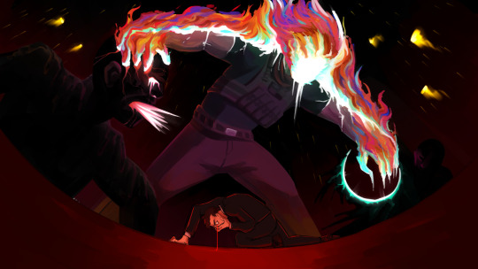
They both show the same event - chapter 21, the second time Soap is thrown into Limbo. The difference is, one shows a more literal image of what happened, and the other is more symbolic.
And by now I think you know how much I love symbolism lol
What also bothered me with the scraped painting is that the composition isn't central, and the entire pose, while more dynamic, isn't fitting the mural feel the rest has.
There's an even earlier version of the scrapped painting, with Soap's face, but nowhere else there are faces in these series, so I went wild with it and covered it with flames. He had them behind him already, as the description of this scene in the fic says Soap had a helo of fire behind him.
(also hated how Limbo's victims looked in the scrapped version like... ew lol)
There wasn't a real reason to add the circles around Soap. I just wanted to lean more heavily into the mural style. But I took that circle motif to the end, after that, and added it to Ghost as well, hence the triangle.
Soap has one skeletal hand, and one palm. That one is on purpose, to show he's hanging in between life and death.
The fourth frame is pretty self-explanatory, it shows the part in chapter 21 where Soap gets the dark marks on his forearm. If the colors look weird in that one, it's because I messed with them so much I couldn't tell if they look good anymore on not
The fifth frame shows another favorite moment of mine, the moment Ghost gets his marks, the white tear tracks, when he finally notices Soap fighting in the void.
The sixth frame is my favorite of the bunch. Soap and Ghost, the triangle and circle combined. The moment they killed Graves, Ghost in full control of his subjects, Soap with his sword of white fire and army of burning moths. They look so scary in this one I love them
The seventh frame shows Void and Destruction. Void was straight forward, I've drawn it a few times before, but I had to make a more detailed design for Destruction, and I only had the very first sketches I made for Revenant AU to go off of, as well as Lumity's design. Idk why I designed Lumity before Destruction, but that's how it is. I wanted Destruction melting, like it can't handle its own heat.
The eighth frame is of Void and Destruction combining. In the fic they had in-between states, it didn't look like this, but for the sake of the video I thought it'd be nicer to have a clear frame of them combining.
The ninth and last frame is of our beloved Lumity. Their design is a little more detailed than the drawing I made a while back. This frame is also the only one that interacts with the foreground, aka Makarov. I think he was jump-scared, don't know how much that comes across.
Damn I had a lot to write. Well, when given the opportunity to ramble...
#call of duty modern warfare 2#cod mw2#cod ghost#cod soap#john soap mactavish#simon ghost riley#call of duty modern warfare#revenant au#cod fanart#...fanart of my own au for the most part but oh well#ty for reading whoever did <3
203 notes
·
View notes
Text
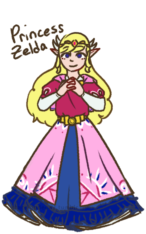

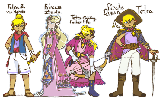
Toon Zelda redesigns! I've never been fond of the Toon Zelda design, and these girls deserve some individuality. Design notes and rambles below the cut :D
(time to turn the proper grammar off i aint capitalizing all this. warning: i am verbose)
first up, tmc zelda!
shes the one most like toon zelda, since i felt like the vibes fit the *most* (though not a lot). also, with her place on the timeline, i could justify a lot of bits, like the wings and the cape
the cape! obvs it comes from the toon zelda base design, but also it involves skyloftian fashion! i take the timeline as a challenge, and i once saw a take somewhere that the skyloftians all wear their family crests (most often birds lol) on their person. zelda here (and link too) do just that, wearing their family crests on little caplets. on the back is, of course the royal crest
i went very cutesy princess for her. tmc has such a *whimsical* vibe that i feel is very. muted? by the fact its stuck with the toon style. so i wanted to put in that vibe here. also her sprites make it look like her skirt is super poofy, so how could i not?
curly hair: i wanted something interesting, and most zeldas have straight hair. so! adds to the cuteness
i didnt draw it so well but she (and link) both have very sleepy expressions. zelda especially just has a sleepy expression in her sprite, its quite adorable.
shes not as decked out as other princesses, cuz i see tmc taking place before the royal family really starts to get *royal* as we see it. shes still of course got a tiara and some embroidery tho.
Tetra! her base design isnt all that changed from the original. her name is a fun hc of mine tho. i think "von Hyrule" sounds better as a surname than just "hyrule". shes not zelda, but shes still a descendant.
(WW) princess z (as i call her)
I went more oot zelda vibes for her, since she would be closer, temporally, to oot. i also went very warm, since ive never seen the flood as a *warm* endeavor.
shes got the shoulder danglies, as most zeldas have shoulder armor of some kind. the danglies instead of actual armor are supposed to kind of evoke a royal sea captain kind of vibe.
shes ghostly, with a fish-eyed stare. shes been dead and gone for a long time. shes also a bit taller and a few years older than tetra (as of ww). shes just some spectre the king saw in tetra, not at all a close match
tetra, being smaller than princess z, doesnt fit into the clothes. the dress is too big for her (as is in canon gd that skirt is WAY too long for her), the coat is baggy. the role of a princess *literally* does not fit her.
the ribbons! theyre my replacement for the wings, and they represent the wind in the game! since its represented by white lines, the ribbons are a perfect symbolic match. (also, a note, tetras hair is shorter and coarser than princess z's)
i mostly bullshitted the blue panel but the vague idea i gave it was 'a hope for the triforce to give good fortunes to the people' (pictured as dots, mostly behind her arms)
Pirate Queen Tetra
ph! about a year has passed, and tetra has really grown into her own! as well as literally grown!
shes still tetra, pirate and captain, but shes incorporated that royal heritage into her identity: quite literally! she made piecemeal of the original outfit (what was left of it anyway after the fight), and added bits and pieces to her new life.
she also takes full advantage of said heritage to call herself pirate queen. its great for branding. whos gonna say she CANT go by pirate queen?
the seagull feather is from Aryll. only crew member tetra wears a trinket from (who can say no to that ball of sunshine! certainly not tetra)
not many notes. yall can see whats there. (also she still wears her hair in a bun, its just in a low bun (you can almost see it) when she wears her hat)
st zelda!
first note is: shes not a princess! shes an heiress of the company tetra had made and left behind. hence her title of Lady zelda. ("new hyrule" rly just like-- the ending of ww was *literally* that hyrule is dead and thats okay. how did they miss that :sob emoji:) also calling her Lady Zelda fits with the train vibes
shes in a 1880s style bustle dress because 1) i am OBSESSED with bustle dresses. i love them. so much. 2) the more historical vibe works really well with trains! also a lot of the other outfits in the game have late victorian vibes, so shes certainly not out of place.
her hat (and gloves): any proper lady has a hat on when going about town, however, when she gets body snatched, she pulled out her hatpin to use (ineffectively) as a weapon (she IS tetras great-great-granddaughter), causing her to lose her hat *and* hairdo.
shes still got the hatpin in her ghost form, too. she uses it to threaten people for funsies
Ribbons! on the topic of hairdo, her ribbons! visually tying her to tetras design, the ribbons here instead take on the image of train tracks, with her pin (on the left side) evoking a train engine. the pin also makes her look rich and girly. when her hair comes undone, this makes the ribbons all loose, like how the train tracks disappear in game. (the hat also kinda connects her to tetra)
thanks for reading :D i hope you liked reading this as much as i liked typing it
#loz#legend of zelda#princess zelda#tetra#wind waker#minish cap#spirit tracks#phantom hourglass#zelda#zelda fanart#the legend of zelda#ww tetra#ww zelda#st zelda#minish cap zelda#the wind waker#loz ww#starship art#ive got more designs down the mental pipeline#these ones just came first cuz i dislike toon zeldas design
445 notes
·
View notes
Text


hiiii i really like this post-canon concept so heres my rendition of niko!
i made a few changes to the design based on my personal tastes. first off, nikos 13, and as a former 13 year old, if your life sucks at that time (and based on the au, nikos life does suck. on account of the increasingly dangerous games), you Will become not just anxious but actively spiteful and distrustful, hence the expression and posture. i also gave them a proper Pokemon Bag bc every pokemon game has The Bag as inventory, and i wanted it to look really well made, so i put stitching around the edges. i even made fake gym badges! because it was stated to be a pokemon fangame in your other post, i added light and sound, the most popular fake types, and i made regular gyms into dual-type ones. i also tore up the scarf and clothes a lot bc i figure between pokemon and a jrpg there would be a LOT of difficult to dodge attacks, so much so that one half of the scarf is chopped wayyy shorter than the other. and i moved the amber to the bag, partially bc itd make a great button, partially bc you wouldnt be able to see it by their chest.
i think niko and the player have a strained relationship, bc while the player always has the Intent to keep niko safe, that doesnt make them good at it. and, from nikos perspective, the player would likely be the one dragging them into these adventures by opening the games like they did oneshot.

Had an AU concept where Niko's journey through the World Machine is the first of many adventures, and slowly building up to something bigger. About once or twice a year, Niko gets sent on an interdimensional adventure and comes back changed from their journey. Some of their journeys are fun, some of them are traumatic, some are a mix of both. They also write books about their adventures, partially because The Author inspired them to write and their adventures make good stories and partially because it's a way of expressing themselves and processing their trauma. Their first book, about the events of Oneshot and Solstice, is called My Burden Is Light (it's named after the title song) -hence the name of this AU.
#a couple of my favorite details are the feather (which bc its in their hat both works as a joke and also an allusion to the glen bird ppl)#and the badges. i had fun with the badges.#also my note abt the tears is true lol. i didnt draw them to symbolize anything specific i just like drawing niko using square shapes.#however. they Could symbolize thimgs :)#my art#*gives niko my favorite vague fantasy low heeled lace up boots* NOW theyre ready for adventure :]#i debated on whether to attach the amber to their bag as a button or to their hat with a small ribbon awhile#i picked bag bc i didnt have Other ideas for the button and then i realized. hehe. feather in their cap#this drawing was really fun bc i did the sketch and then for the lineart i started with the Outline and made that especially thick#and i got to fuck around with tearing clothing and fun details in a way i dont Usually get to#i also actually like the hat in this one! which is a rarity for me! i hate drawing nikos hat so much!#i made it more bucket-hat than i usually do bc i wanted the brim more ovee their eyes than usual. for the Distrust#i did not in fact put the brim lower than usual. it is what it is.#love to design characters i will never draw again. its so fun to me
5 notes
·
View notes
Text
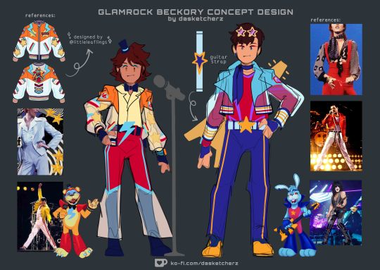
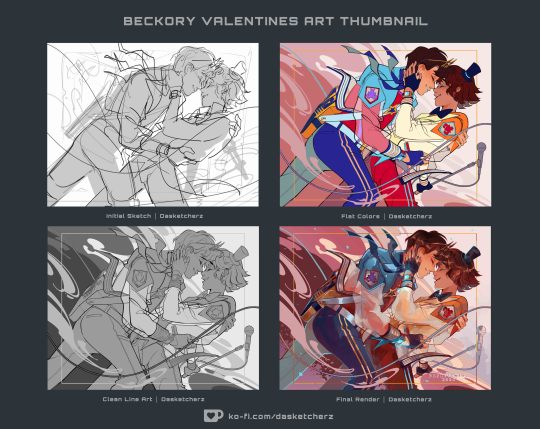
thought i'd share my thought process for this fun lil piece / outfit in full display that i whipped out for beckory on valentines cuz i really had a lotta fun making it <3
OKAY first off, big thanks to @leaky-heart for helpin me gather some really cool outfit refs and for lending me resources where I can find a ref for bonnie's guitar in a 3d space. Thank you bestie, yar a life saver <3
Second, @/littleleaflings' jacket—goated af, will never stop gushin bout it aaaaAAA <3
Okay so looking at freddy & bonnie's designs—i am in love with how their dominant and accent colors are opposite of each other like a yin and yang situation. So i absolutely tried to incorporate that when rearranging the palette unto beckory's outfit
Fronnie's colors arent the only contrasting elements about them. Aside from their earrings, even their symbols are a pair—i love how freddy's is a lighting bolt but he is also associated with stars on the side cuz of his branding. While bonnie's is a star but he also has lightning bolts on the side (the purple accent in his fit) to match freddy
And to sprinkle a bit of beckory flair, i put stripe lines across their pants (if you look back on my ref sheet for the squad, the three amigos all have stripes somewhere in their fits, i purposely designed that to be their thing) just to also unify the patterns from their top
i gave tony a scarf to match greg's bow tie accessory. Its a combo homage to bonnie's headband and bunny ears in a way (cuz the ribbons on its ends look like droopy rabbit ears) i gave them gloves to compensate being unable to add punk bracelets on em cuz it would be too much for the overall look (same logic applies to the star shades, its to match with the top hat)
Also this was such a pure coincidence but i also realized beckory wears their fazwatches in the same placement as fronnie wears their earrings on. That actually makes me very happy, i think its a really cool coincidence
And as yall can see, Greg's jacket initially had stars on his sleeves (like it does in the ref), but i decided against putting it in the final cuz im startin to think it might look cluttered and hard to read from afar and tbh, I really liked how the translucent sleeves turned out... I didnt want the star pattern to cover it up lol
And thats pretty much it, thank you coming to my ted talk!! <3
if youre interested to see more of my art process compilation like this you can check over on my ko-fi page, you can support me by buying me a latte cuz I am planning to post more exclusive stuff like this over there in the future so I hope yall look forward to that! I deeply appreciate yall and thank you so much in advance!!
#daske art#fnaf#beckory#gregtony#GTY46#fnaf gregory#tony becker#five nights at freddy's#fnaf sb#fnaf security breach#fnaf GGY#five nights at freddy's security breach#detective rabbit#fnaf tales from the pizzaplex#five nights at freddy's tales from the pizzaplex
567 notes
·
View notes
Text
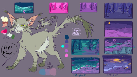


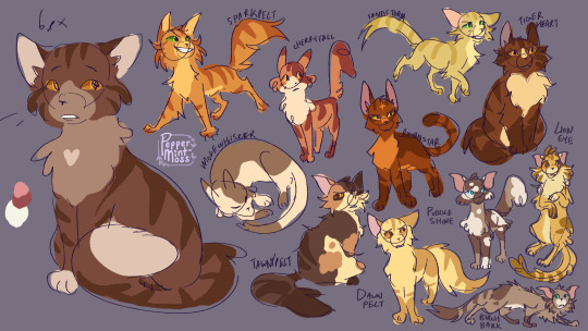

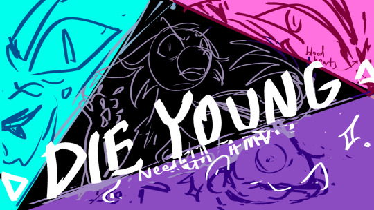
Got a donation on my ko-fi that got us to reach TWO behind the scenes stretch goals!! thank u thank u!!
These are all the characters' 'base' colours! For each blue/pink/purple scene I'd put the corresponding blue/pink/purple colour (seen at the bottom of the first image) at 100% Soft Light over them (with a clipping mask) to tint them appropriately C:
I made sooo many character designs for this amv haha; usually different/side characters don't show up as much in my amvs that I honestly just make them up on the spot lol. But this time a lot of side characters appeared multiple times so I actually designed them out beforehand (and I started to have fun drawin lil guys hehe)
Oh yea forgor: the lil note beside Darktail's eye; I originally wanted the lake to be blue to match the symbolic colour of Needle's like despair n stuff, But through the course of making the amv I realized I wanted the lake she drowns in to be purple because she's doing it for Violetpaw!! So in the amv the water ended up being blue for just a moment when Dark pushes her underwater, then back to its purple :')
And the second BTS is the sketches for the thumbnail! I started in my sketchbook to brainstorm n then moved it over to digital (that digital sketch needle has like one paw raised but then i was like. That looks weird lol)
commission info || ko-fi (tip jar; for every $8 in donations I share a BTS!)
#warrior cats#wc#warriors#needletail#violetshine#darktail#alderheart#avos#a vision of shadows#ko-fi#bts#die young needletail amv#Uh oh time to tag all those characters:#Rain#Onestar#Smoke#(sort of for those two?? they're just sketches I made them just to figure out how Darktail might look with those two as parents)#nettle#flame#raven#mistcloud#beenose#sleekwhisker#berryheart#yarrowleaf#juniperclaw#zelda#loki#twigbranch#test
258 notes
·
View notes
Text
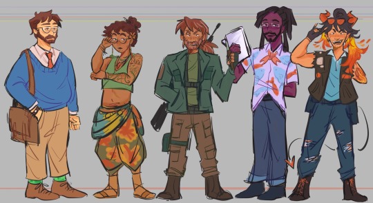
raahhhh guh. another lineup, s2 kiddads. i love them so much they're rotating in my mind like a rotisserie chicken. god.
design notes for them under the cut if ur interested!
Grant
blue sweater bc blue is symbolic of titanic ep (something borrowed, something blue)
his tie color is the same color as Darryl's hat in my design
Wears Frank's watch that Darryl gave him, even if it's broken he doesn't take it off.
Green creeper socks because it's a Must. He wouldn't be Grant without them.
Sparrow
curly hair he got from mercedes' genes. he grew out his hair like lark
has a pink flower tucked in his hair like my henry's design
his jewelry and clothes are mostly borrowed from mercedes, he got really into crystals and other things like that growing up and got closer to his druid roots.
earrings are a feather and an oak leaf maybe i dunno i'll figure it out later lol
tattoos! there's supposed to be a bird outline there and other plant/nature related stuff on his arm. I'll draw it out better in the future mayhaps.
colors are brighter, more lifelike cuz he's closer to nature and all that jazz.
Lark
his hair has strands of white hair because of stress/trauma/Everything going on
hair is messier, unkempt because he cares less about appearances and doesn't have time anyways.
darker forest colors, less in tune with nature than sparrow.
his pants are the same color as my Henry's shorts :0) i needed a connection somewhere to his parents, and it just had to be henry.
Terry Jr.
purple shirt because his color is purple to me
fish motifs!! everywhere! i hc that when he and ron get closer bonding thru fishing they'd get each other fun fish printed shirts or something. This was Ron's gift to Terry. The colors of the fish are color picked from my Ron's design.
Fish tail tie and the shirt is also split like a fish tail maybe.
he's the tallest of the kiddads forever and always
Nicky
he wears glenn's sunglasses on his head
he grew out his hair long like morgan's because it's like the one thing he still really has of her. has her hair type and he takes very good care of his hair.
still has the ripped leather jacket from his time as nick and various patches of bands he likes (didn't want to draw them out yet.)
blue shirt because of his time as nicholas/reminder of jodie. blue holster belt and pants are also blue for jodie association
#dndads#dungeons and daddies#dungeons and daddies fanart#dndads fanart#dndads season 2#grant wilson#sparrow oak#lark oak#terry jr#nicky foster#kiddads#i love them all so dearly#i have so many thoughts and more things i wanna incorporate in their designs later on#nicky is my fave tho i'm so biased#ehehe i will draw more of them sometime
647 notes
·
View notes
Text

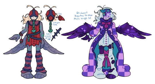
FINALLY FINISHED MY QPHIL 3.0 DESIGN HOORAY (cant wait to. redesign it again in like 3 months.) (CHECK UNDER THE CUT FOR MY SILLY DESIGN NOTES!!)
I think I said this before but i so. SO BADLY wanted him to have a sleep theme since I always loved how his presence on the island was kinda up in the air. Is it a dream? Is it not? When he goes between the island and hardcore is that change really happening? Who knows.
The idea of making his usual outfit more like a housecoat was super appealing to me, so I opted for this open housecoat look with really heavy frills which were super fun to figure out, and I knew from pretty early on that I wanted to give him a quilt pattern SOMEWHERE on his design, so I thought the inside of the coat would do nicely for a sorta "default state". It also meant I could attribute meaning to the symbols and colours I used. wink nudge.
He has a more subtle angel theme, like with the mobile on his walking stick being a halo with the wing placement further emphasizing this, as well as just his generally lighter colour scheme. When I say sleep was his theme I almost more-so imagine it as like. The feeling of waking up in the morning where you're mostly refreshed but still a LITTLE drowsy. Lots of very spring-y, morning colours.
Just some other quick notes, I always really liked the mod in the server where you could have the crows perch on your shoulder and follow cuz of the lantern, so I thought it'd be fun if I made it so brian just straight up WAS the lantern. So I made him look like one of those wall outlet nightlights!! The backpack being kinda cat shaped was COMPLETELY unintentional but a very welcome result. Missa backpack is real.
As for the alternate outfits, I have a bolas one, as well as an ender king one since I deemed those two the most important. For the ender king I weirdly don't have many notes, like it's fairly straightforward (Save for the elephant in the room but now I'm gonna keep my secrets on why that's a thing). The Quilt design is supposed to be a lighter, easier-on-the-eyes version of the no texture pattern, and I imagine that all the goop and gunk on Phil is hidden under the coat. I imagine it'd look fairly similar to canon so just like. imagine it for now. Might draw it one day. MAYBE. There's some tiny additional colour symbolism but I'll hold my tongue on that and let you guys draw your own conclusions there. I WILL say, however, that instead of his theme being sleep, his theme is "nightmare" (and also kinda sleepwalking since both fit).
The Bolas design was SUPER fun to work with. For starters I wanted the three designs to be in three different states. One with the coat, one with the coat reversed, and one without the coat entirely. Since I wanted to do the checker pattern thing with the possession design, having the sleeveless bolas design worked really well for the shape I landed on, even if it wasn't conventional. and SPEAKING of non-conventional design choices, I decided to go against the usual plague doctor + gas mask fusion design. Which might be controversial... But god. The moment I thought of his mask being a falconry hood, the idea just wouldn't leave my mind. Because of this, the full mask is kinda separated into two parts. The eye mask which kinda also mirrors his usual sleep mask, and the gas mask itself (I kept it in a beak shape since it'd feel odd if i made it any other shape for phil, lol). When designing the whole thing I kept thinking about more apocalypse setting clothing. Like mad max. Or the one gag from that one spongebob movie. Lots of leather. And of course, to match the other sleep themes, the Bolas outfit's theme is "fever dream", although its a bit more subtle. It's easily the weirdest design, The pops of green were simultaneously in reference to the friendship emerald... As well as... Well, the green chain right below the chain on the sickness themed design was probably the most tasteful way I could've chosen to get across vomit without it being too on the nose. (also sidenote, I had a few friends compare bolas phil to... a fly. Which wasn't intentional but it's kinda funny that the guy designed after fever dreams looks a little bit like a bug.) Ok thats it for design commentary I'm gonna go to bedge nyow.
#syd spiels qsmp#my art#qsmp#syd's art#q!philza#philza#qsmp ender king#im so sleepy guys i gotta be up early tomorrow
184 notes
·
View notes
Text
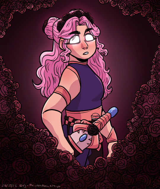

When the game ends, she'll be waiting for you in the garden full of Wither Roses.
Felt like doodling Lizzie after - ahem - Secret Life 6. I don't draw her often, but she's very fun to draw. (Also I gave her a big fancy sword with a rosebush inspired hilt for the purposes of this drawing and cuz I've been giving all my SL designs fancy swords and I can't say I don't enjoy drawing pretty women with big fancy swords every now and again). Also black roses here cuz 1, I love drawing roses, 2, black roses are a symbol of death / mourning in real life and 3, it also kind of fits with minecraft cuz I know you have to die to a wither to drop the wither rose but it makes sense to me ok lol.
Anyways. Have good day. Enjoy this doddle. :D
#secret life smp#secret life smp fanart#secret life spoilers#ldshadowlady#ldshadowlady fanart#lizzie ldshadowlady
576 notes
·
View notes
Text
Ok so for the last couple days ive been ill in the head about The Black Parade as mcr's alter ego/characters and i wanted to share some thoughts i had so far :3

It doesnt align with the canon lore that we have (i didnt really use it for reference at least) so it can be viewed as some sort of an au
I dont know if im gonna give them new names that just sound similar to the names of mcr themselves, so for now i will be referring to them by the names of the band members
So far I've been thinking about the typical "chosen by fate" scenario, where the characters lives lead them through a path for a specific cause
So
Post WW2 England
5 kids under their own circumstances witness a big parade (I will be doing some research and see if it could be some kind of victory celebration parade? It's just that I'm not sure if England had those. Not that I'm aiming for historical accuracy atp it's simple curiosity)
The kids get heavily impacted by that event and carry on (ha) that memory throughout their life
Now to the specifics of the characters cus by God they all gave me a headache
Heads up: they're all british orphans lol
Frank and Bob are students/residents in a Christian orphan school, and later on in life are priests in the town church
The reason why is that they both have badges on their uniform with crosses that could be associated with christianity
(I couldn't find any info about what exactly certain design details could be referencing, so ig it's up to interpretation)


The military theme in Gerard and Mikey's costumes will be explored on later (Mikey's medal could be either The Victoria Cross or The Distinguished Flying Cross, and the symbol on Gerard's shoulder is most likely the Order Of The Garter star)
And I couldn't figure out what to do w Ray, because I'm not sure if his uniform design details reference anything specific 🤷🏾🤷🏾🤷🏾

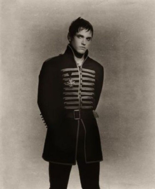

Now, Gerard and Mikey lost their father to war, and their mother passed away when they were both very young
And after that they ended up in the same orphanage as Ray, befriending him and finding out about their shared passion for music
This doodle was made abt that specifically <3

Later on in early adulthood they decide to start a cabaret band, in which Frank and Bob both join them later, deciding to leave their priest lives behind (partially because iirc both of them kinda fanboyed their way into the band irl lol)
After receiving little recognition, the band decides to take a train to America, to try their luck there. With a lot of hope and determination
That, sadly, doesn't last for long, for the train crushes with no survivors on board
The group crawls out of the collapsed train in their no longer physical forms. Yet, even after their death, they still have a desire to move forward. And that desire, though thoughtlessly, forces them to go forward. The souls of all the other people who lost their lives to the train accident follow them, through the landscape that no longer feels like earth
They then reach the end
Walking in one by one people disappear, finding their own peace and meeting their own finish line
After it's done, The Black Parade now have officially made themselves into what they're supposed to be. Gaining a new purpose and a new sort of life
I got too poetic for my own good here I fear .. anyway
Their job now is to lead the lost and the forgotten to the afterlife
They could be referred to as some kind of a grim reaper, I guess
I'm still thinking about adding more to the story, and maybe I will change some things, but so far this is all I can share really !! I hope if you've read this far you found this entertaining .. this is all for the satisfaction of my urges so I might or might not have too much fun w it in the future :3

The story was mainly inspired by this specific post from Gerard himself, because i liked the concept a lot ..
Also
She's gonna be here as a separate character too probably...... Cus I'm self indulgent and I love the ideas bubbling in my brain

#my art#asmo goes blahblahblah#my chemical romance#mcr#the black parade#tbp#im really .. thinking about them .....#i dont konw if im gonna end up making this into a big thing but i really want to#do i have anything else to shaaare ..?#the characters are younger than mcr were when tbp was released#their hair still grows out. this is not really a fun fact its more of a note to self#i like the idea of them all having long hair just because they cant interact with scissors#i wanna make like ?? i dont know if theres a name for it#but like a fanfic in image format ? you know ??#now that i think about it its just illustrated books#well.#anyway#the secretary will be playing a role that will change tbp drastically#at least thats what i have in my head as of now#ok i yapped enough. sorry#excited about themmm
120 notes
·
View notes
Note
What im hearing is:
Little crow feet outside my window bcs im feeding them- that’s besides the point!
Is there magic??? His shovel looks magic and they look magic
And do give me every detail you are thinking of for the series even if its in the distant future or not that relevant but you want to share
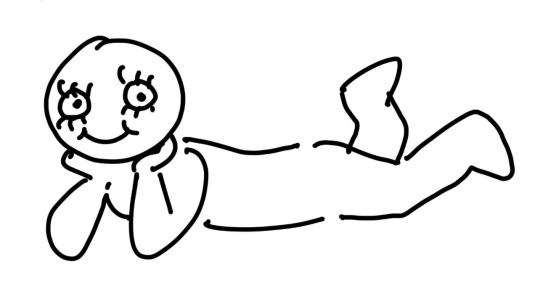
Crows!! Cute!! Also sorry i didnt get to this sooner my laptop BROKE (still broken but usable) and my mom and i have been looking for someone to fix it. Ive been drawing with it sparingly to be careful.
YES there is magic. Of course im still working on this storywise but im getting characters designs n whatnot done right now. Dynamics n stuff. BUT i do have some refs i made before my laptop broke.
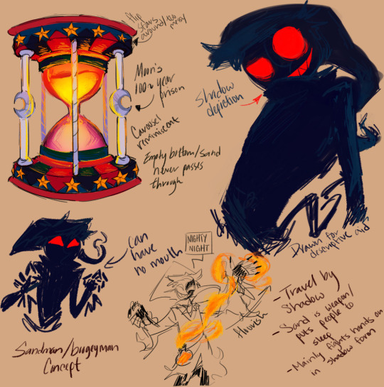
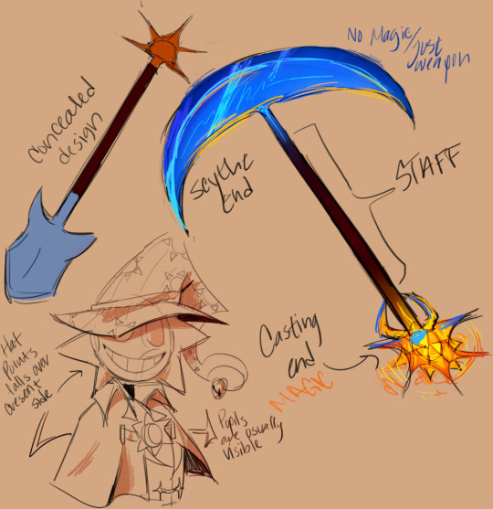
I like to draw out certain stuff so that it helps with descriptions in the future; i have the worst memory so it helps to be able to do so. (More beneath cut)
Im so excited for moon's shadow form. Oh my god. Its probably my favorite thing right now.
Fun thing about it is that in this form he can touch you but you cant touch him. Something something you can be cast in shadow but you cant take it off yk? He's still light sensitive like this though, so if the area hes in isn't dark enough or he's hit with anything too bright he just reverts back. At that point he'd just have to rely on normal hand to hand stuff and his sand lol. The shadow form is just better for sneaking and speed. Really, he's some amalgamative idea of the sandman and boogieman. I thought it fit well with his whole "naptime attendant gone wrong" thing.
Sun's design, however, is more like if you mixed a cowboy, wizard, and gravedigger together. I made it a while ago on a whim with no intention behind it but then i ended up thinking "ykw would be so awesome".
The hat dips to cover the crescent side of his face (not intentional on his part) to symbolize his resentment towards moon and how he basically damned him to an hourglass. His eyes are easier to see bc of this which could seem more trusting (eyes are the window to the soul or whatever), but the thing is thats not normal for him (as we know) so it's meant to make him look suspicious and looming to 4th wall viewers. There's also the fact that i just thought it was cool too.
He also doesn't get a second form. Moon's sneaky and weird so i thought it would fit to give him some freaky thing iykwim. Sun, however, is a pretty "in your face" kinda guy, so his look and fight style is more extravagant and boisterous. Lots of swinging amd yelling and boom bang zap! Despite the showiness he's actually a longer range fighter. Mainly because unlike moon, thousands of years ago, he wasn't often one to get violent with his hands. His weapon is just obnoxiously large too though.
They are still one animatronic and their transformation is still triggered by light. Instead of an AI chip though (which is still in there but long dead), they live through the work of a soul. They're still physically inorganic but as far as spiritually they're as close as they're gonna get to being human. Their life and functionailty is derived from the magic itself, not the machinery. Like if for some reason they lost all their magic they'd just drop dead from a battery life long since drained.
The hourglass has a carousel-like design to it purely as reference to moon's level in Help Wanted 2.
Sorry for rambling so much but this is what i've got for you so far! I have a general idea for the plot but im tryna to make it more than what it is rn, so i dont wanna share too much of that just yet in case i change or completely toss away an idea.
#fnaf daycare attendant#fnaf sun#fnaf security breach#sundrop#fnaf moon#moondrop#binary resurgence: round 2 au#binary resurgence#my asks#mikas stuff#dca x reader#dca x y/n#sun x reader#moon x reader
441 notes
·
View notes
Note
I dmand EVERY picture of CJ you had drew!! Pretty please
Considering I'm super disorganized about my art and don't post everything I draw (sometimes it stays just in my server or among friends, or I just don't show anyone because it's unfinished/I'm unsatisfied), I'll have to find a lot of stuff that I've forgotten about.
Actually, I can just show some stuff that I *haven't* posted! (Everything else I ever have should be here.) Some of this stuff is Krow before I added the white hair because I didn't have that idea until around April.

^ Appropriately titled "Krow Smug Bitch". Everyone has fun with the cowboy AUs so why can't I?

^ He got nervous about seeing Usagi/Yukito I suppose

^ This one is interesting. Originally it was supposed to be just Krow as a magical boy, but then it turned into a bit of a mythology AU. He's the son of Yatagarasu the Three-Legged Crow from Shinto myth. Wasn't quite sure about everything... this was probably the result of watching too much Kamichama Karin as a kid lol

^ For fans of Transformers - TFP Optimus Prime with good ol' canon CJ! I feel like they would get along. Something about that red-and-blue leader drew him in I guess.
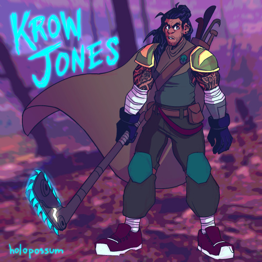
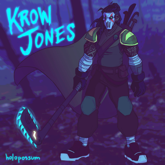
^ This was actually my first pass at an older version design of Krow. This was a complete piece too, but I was unsatisfied within a week or two. You can still see that I kept some things, notably the piercings, beard, and the idea of tattoos, as well as the Leo-inspired shoulder pads. The tattoo designs changed and so did the armor color, but it was an interesting first try at the older design.

^ A second attempt and older Krow, I was getting closer. (Still love the fashion on this though.)

^ The point I realized that I can't draw this man thin and have to start drawing him beefier and more filled out more consistently because it would be a crime against god or something. Was still finalizing his tattoos at this point and playing around with the idea of white hair. Considered the idea of the Hamato crest tattoo near his heart before nixing it because it's too cheesy and the Hamato tattoo is something a lot of people do for older/future character designs.

^ Ninpo weapon design for Older Krow! Yes he has a cyan scythe (really more of a kusarigama since it has a chain and weight at the end). Yes it's cool as fuck. No you can't touch it.
He's basically a reaper and it plays into his whole aesthetic as a crow, which symbolizes an omen of death. Crows are also often seen with scythe and scarecrow imagery because they're related to harvests.
I don't know why I never posted this, it *looks* finished... I think there was something off about the anatomy and I intended to fix it and then forgot and ugh. But anyway! There you go.

^ A height chart for younger Krow and Yukito that I never quite finished. But it's interesting to see them to the actual scale that I imagine them to be - Krow is 5'6", and Yukito's height is reversed since he's 6'5". Since both are around 19 when they meet, they're at their full adult heights here. Long live your short king!

^ Older Krow with lightning gloves. Which doesn't make sense actually because his gloves are electrical insulators to keep himself from getting zapped from one of his attacks. But who cares about that! It's cool!

^ Scythe sketch. Just trying to get a feel for the vibe of how he wields one. His cape/cloak plus the scythe probably gives opportunity for some really cool directional flow to occur.

^ Something I doodled just the other day. Old Krow but more cartoony and goofy. Love this silly guy!
I'm sure there's many more that I've missed, probably lots of half-finished sketches and doodles, but this is a lot of what I've found.
#this is a lot more than i thought it was!#snipersiniora#rottmnt#rise of the teenage mutant ninja turtles#rottmnt casey jr#rise casey jr#casey jones jr#casey jr#krow jones#holopossums#holopossum answers#long post forgib#super secret 2024 cj/krow art stash
58 notes
·
View notes
Text

I’ve been working on redesigning an older Bendy oc; for now, here’s some headshot doodles that I made last night to get the idea down.
-
Here’s some basic ideas I had while working on this:
- Iblis is roughly based on the Ink Demon. It has an older form for BATIM which I want to tweak a bit as i’ve gotten slightly better at character design. Initially Iblis was created by Sammy Lawrence (inspired by a theory that he was deceived by Ink Bendy), thus the rope embedded in its head, and the white candle wax. This may be updated depending on the lore. Iblis was created in 2019 as part of the “candle light challenge” that was hosted on the BATIM Amino, and it became an oc after.
- Iblis used to have many candle wicks in its mouth cavity that could be lit at will, creating a glow. This has been removed in this redesign for a bright light that emanates from its throat which both resembles the light at the end of the “death tunnel”, and fire light which can be exhaled from the throat (just a concept for now). Iblis’ mouth was formerly just a void cavern, but now has a visible skull as I thought it looked creepier (lol).
- Iblis can (and does) consume corrupted ink creatures, while notably being more passive toward the “pure” or “perfect” ones. It does this by simply swallowing bodies like a snake, as it has no teeth. (Please do NOT make fetishized vore art of my oc!!!). The many detached voices that it speaks through is believed to belong to the souls of those that it consumes. It’s yet unknown if Iblis is a harvester of these souls, or just absorbs the voices as part of its being, as it can speak willfully and respond to discussion.
- the idea to give Iblis wings was inspired by Inkfell from Pillar Chase 2
- Iblis is referred to by it/its pronouns but it’s dominant voice is feminine (I may refer to Iblis with She/her pronouns in a silly way. It is okay if you fumble them or use any pronouns, i’m not too serious about it, but Iblis is a sexless being)
- Iblis is a symbol of hope for the people in the cycle, a metaphorical “light in the darkness”. The candles on its body work in the same manner as “smudging”. Iblis is said to “purify” any place within the studio that it wanders through by “cleansing away the demon’s affliction”. It is a mobile incense burner, and the smoke emitted from its body is said to have a sweet smell.
- this is more of a silly / fun fact: Iblis loves handpan music and Woodsoup ASMR as it evokes a sense of calm and clears the mind
#bendy and the ink machine#bendy and the dark revival#bendy oc#batim oc#batdr oc#digital art#doodle#my art#artist on tumblr#APAANart
68 notes
·
View notes