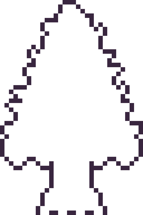
#half-testing my ability to work with pixel art...
Explore tagged Tumblr posts
Visit Tumblr Blog
Explore Tumblr blogs with no restrictions, modern design and the best experience.
Last Seen Tumblr Blogs


Fun Fact
In 2020, 44% of users from Denmark used Tumblr daily.
Text


Little Guys :]
#mine#original#artists on tumblr#renee romero#tessa hassan#talita itamar#half-testing my ability to work with pixel art...#half-making a height comparison
5 notes
·
View notes
Note
Machine translated:
Plok is actually the second Plok game. The first was called Fleapit, an arcade title that John and Ste Pickford (then at Zippo Games) began for Rare in the late ’80s. It was never released.
“I was working at Zippo when John and Ste were developing Fleapit on the Razz Board, Rare’s custom arcade hardware,” explains Lyndon Brooke, who was on the Plok design team and created most of the pixel art.
“It was already playable—you could throw Plok’s limbs, and some stages were full of food items.”
Sadly, almost nothing of Fleapit survives today, apart from a few screenshots on the Pickford Bros website that show the logo and title screen (www.zee‑3.com). There are, however, plenty of Ste’s design sketches, which reveal that Fleapit’s main character, Plok, grew out of John’s idea for a hooded executioner. According to Ste’s own notes, the earliest doodle appears in the margins of the 1989 design docs for Ironsword. The loss of the code is especially unfortunate, because the Pickfords say Fleapit was “half‑finished and completely playable.” The project was canceled when Zippo Games closed, but what they’d started was revived at Software Creations under the new name Plok.
“No one had a playable build any more,” says John Buckley—the sole programmer—of his arrival on the project. “All we had was a video of the original game showing Plok sliding down slopes and shooting his limbs at fleas. That’s where I began.”
That set the core team for the new project: John and Ste Pickford handled design and graphics, Brooke and Buckley joined them, George and Tim Follin composed the music, and later Chun Wah Kong came in for quality control. “I was 18 and started in the spring of 1993,” Chun recalls. “We worked in the basement—nicknamed ‘the dungeon’—and were play‑testing Equinox. Plok was already far along; pretty much everything was there: graphics, music, levels. Buckley and Brooke were eager to see how I’d react.”
The early ’90s were a time of creative freedom for the small Manchester studio. Software Creations was among the first companies to get an SNES dev kit, and you can tell they were having fun with the hardware. Over development Plok gained multiple jump types, a unique physics system built around firing and separating limbs, several inflatable costumes, and a host of puzzles that made you use those abilities. Golden shells could be collected for an extra life, but once you found the amulet Plok could unleash a buzz‑saw attack by pressing L and R, blasting shells from his head. He could also send “buddy hornets” he’d gathered after enemies. The list of quirky ideas seems almost endless—far more than most platformers offered.
John Buckley credits the Pickfords for all of that: “Plok was just another project when I came on board. But John and Ste gave Lyndon and me plenty of room to add things, which made programming a joy, and I’m sure the artists felt the same. The hero was brilliantly designed and full of character. Plok has a huge move set for a platform game, and flinging his limbs is great fun. But you quickly realise the strategy: solving certain puzzles leaves you without both legs, so you have to bounce around on your backside.” Chun adds, “When I saw that, I couldn’t help thinking, ‘Wow—ingenious!’”
Although the early stages on Cotton Island are simply about reaching the goal, later areas force Plok to sacrifice his own arms and legs—literally—to open doors, blow up parts of the scenery, or trigger platforms. You can pick your limbs back up at certain spots, but you still have to manage how and when to spend them.
As Lyndon already explained, throwing limbs existed in Fleapit and was always part of Plok’s design. He adds: “The lock‑and‑key puzzles came later. First we built the system to animate huge chunks of scenery, but our early examples just looped, which looked clunky. That led to the idea of using limbs to activate things, and it took a couple of weeks before the perch design popped into my head. The biggest challenge was animating the background without breaking collision and making it shake horribly.”
Buckley ended up coding those features. “It was a unique idea—fire your limbs and have them come back,” he recalls. “It was also tough to program: the limbs would travel out nicely in order, then get tangled on the way back. In the first eight stages the limbs were only used to clear obstacles, but soon we realized that, because they take a little while to return, players could exploit that as a mechanic.”
Anyone who has played Plok knows Cotton Island’s opener is fairly straightforward. Next you hit the flea‑hunting levels in Akrillic (larger still in Poly‑Esta), which are wide‑open areas stuffed with hidden flea eggs. Clear out every flea and the exit appears. After that come the sepia‑toned flashbacks starring Plok’s Grandpappy—more linear than Cotton Island but still busy, since you have to wake the old guy and wipe out his flea infestation—before finally reaching Fleapit. That last section, which justifies the game’s subtitle, is a string of…
…brilliant vehicle levels leading to the final boss. But back to those opening stages for a moment…
“Something you can double‑check with Buckley and Brooke,” Chun suggests, “is that they told me the early black‑and‑white Grandpappy Plok stages originally sat right at the start of the game as part of the dream sequence. It was an early idea, but we later felt it was too extreme—no real visual appeal.”
“Well, if that’s true, I didn’t know,” Buckley says. “The first eight stages they’re talking about are what shipped. All the basic concepts were built in the first six weeks of the project. The later stages only appeared once we needed the amulet, more speed upgrades, and ways to ease players through certain spots.”
Lyndon’s memories line up with Chun and Buckley: “The Grandpappy sequence grew out of the original Cotton Island stages. Those were the first levels we ever made and—even though they were fun—they were too huge for players just starting out. So we chopped them up for Cotton Island and rebuilt the later maps. The opening is easy, but players get a shock when the density ramps up. It may look cute, yet Plok is tough.”
Ask Chun if anyone worried that the curve was too steep: “It’s challenging, sure, but never unfair. Somebody—probably the publisher—wanted stage one easier, so we made the bouncing sprouts die in one hit instead of two. You can see it in the tutorial: Plok fires an extra arm at every sprout when they’re already dead, because that footage was captured before the tweak.”
Buckley agrees. “I never thought it was that hard. Mind you, I played it in an emulator a few years ago and couldn’t even finish! We always saw it as a game that looked like it was for little kids but was really for grown‑ups. If we’d had save files back then it would’ve been simpler, and during development we were told we’d get them, but cost killed the idea. At least we added the Plokontinues.”
Why not go with passwords once battery saves were cut? In one interview Ste said they considered it, but decided against it because magazines would print the codes and anyone could jump straight to the last stage. Buckley laughs: “I remember Rick Kay, our producer, dropping by all the time saying, ‘Every week I see this game, there’s a new level!’ He was hyped until I told him there were another 32 levels to see.”
Players skilled enough to reach the end will discover perhaps the game’s only real flaw: aside from a few bonus stages and some cynical gag levels in the final stretch of Fleapit, most of the vehicles in the game…
Although the early stages of Cotton Island only require you to reach the goal, later stages force Plok to literally sacrifice his arms and legs to open doors, blow up parts of the scenery, or activate platforms. It is possible to recover your limbs from certain spots, but players need to manage how they “spend” them.
As Lyndon already explained, throwing limbs existed in Fleapit and was always part of Plok’s design, but he adds: “Lock-and-key puzzles came later. We built a system for animating big chunks of scenery, but the first examples just looped, which looked rough. That led us to the idea of using limbs to activate them, and a couple of weeks passed before I thought of the coat hanger design. The main challenge was figuring out how to animate the background without breaking collisions and creating some awful shaking in his movement.”
Implementing these features fell to Buckley. “It was quite a unique idea to fire off limbs and have them come back,” he recalls. “Programming it was a challenge. The physics were fine, kind of fun. In the first eight levels we designed, you only used limbs to remove obstacles. But then we realized that since they don’t come back until they land, there’s a delay. That meant you couldn’t keep shooting limbs repeatedly as a feature.”
“It was challenging but never unfair. Someone wanted the first level to be easier—probably the editor—so we made it so that the bouncing sprouts only needed one hit instead of two. You can see it in the tutorial, where Plok fires an extra arm at each sprout even after it’s already gone, because we’d recorded that behavior before the change.”
Buckley agrees: “I never thought it was that hard. Then again, a few years ago I tried it on an emulator and couldn’t play it! It looks like a kids’ game, but it’s really for adults. Being able to save your game in the cartridge would have made the game easier, and during development, we were told we’d have that feature, but it got cut for cost reasons. At least we put in the ‘Plokontinues.’”
“As for why the team didn’t go with passwords—since we scrapped the battery backup—Ste said in an interview that they considered passwords but decided against them, because magazines would publish them and then anyone could jump straight to the last level. Buckley laughs, recalling: ‘I remember Rick Kay (the producer) coming by, and one time he said: “Every week I see this, there’s a new level!” He was so excited, until I told him we still had 32 more levels to go.’”
Those who made it to the end discovered what might be the game’s only real flaw: apart from a few bonus levels and a series of odd events late in Fleapit, most of the game’s vehicles—the incredibly original vehicle sections—appear before the final boss. But going back to those early levels…
“Something you can check with Buckley and Brooke,” Chun suggests, “is that they told me that early in development the black‑and‑white Grandpa Plok levels were actually placed right at the start of the game, not in the dream sequence. It was a brave idea, but later we felt it was too extreme because it didn’t have the same visual impact.”
“Well, if that’s true I never knew,” Buckley admits. “The first eight levels I was talking about are the ones that shipped in the finished game. We nailed all the basic concepts in the first eight weeks after the project began. The dream levels were created so we could introduce the amulet, speed the character up a bit and help the player in a few spots.”
Lyndon’s memories dovetail with Chun’s and Buckley’s: “Grandpa’s sequence was based on the original Cotton Island stages. Those were the very first levels we built and, while fun at the time, they were far too big for a player’s first steps. So Ste built new, tighter levels for Cotton Island and we reworked the old maps.”
The opening is simple, but some players are shocked by how sharply the difficulty rises. It may look cute, but Plok is a demanding game. We asked Chun whether this ever came up in testing. “I never felt it was too hard,” he says. “It was challenging, but never unfair. Somebody—probably the publisher—wanted level one easier, so we made the bouncing buds die in one hit instead of two. You can still see it in the tutorial, where Plok fires an arm at every bud after it’s dead, because we recorded the footage before the change.”
Buckley agrees: “I never thought it was that tough. That said, I tried it in an emulator a few years ago and couldn’t play it! We treated it like a game that looked like it was for little kids but was actually for adults! Having a battery save would have made it easier and during development we were told we’d have one, but it was cut for cost reasons. At least we put in the ‘Plok‑continues.’”
As for why the team didn’t switch to passwords after losing the save battery, Ste said in an interview that they considered it but decided against it because magazines would print the codes and anyone could jump straight to the final stage. Buckley adds, laughing, “I remember producer Rik Kay dropping by regularly and one day he said, ‘Every week I come in and there’s a new level!’ He seemed really excited until I told him we still had another 32 levels to go!”
Players who manage to reach the end will discover, perhaps, the game’s only real flaw: the 13 sprawling bonus stages and the series of one‑off set pieces in the final Fleapit area, along with most of the game’s vehicles…
They never appear anywhere else. The truck, the motorbike, the jet‑pack, the helicopter, the tank, the UFO and the boots don’t get nearly as much screen time as they could have. You finish the game with the feeling that pushing these vehicles to the final stages was a missed opportunity.
Lyndon puts it like this: “We always meant to add costumes as power‑ups and to have a different vehicle in every Fleapit level. As far as I remember, the helicopter came straight from the original design, while the other vehicles were born in the level‑design meetings. Our goal was to offer a wide range of maneuverability and fire‑power.”
“The transformations came in when we realised we needed them,” Buckley adds. “They gave us new functions at various points. All four of us (John, Ste, Lyndon and I) were involved. When the bonus stages were devised, we went back to certain levels and added them as shortcuts for more experienced players—like heading left at the start of level one.”
We asked Buckley if anything had to be cut from the game. “I think only a few levels,” he says. “Every costume and vehicle made it in.” Still, if you browse Plok’s online portfolio of vehicle sketches, Ste explains why they’re rarely seen: “A huge part of design is making sure features don’t clash with, break or unbalance the game. Limiting where a function can be used is a quick and easy way to avoid a major balancing headache.”
Geoff and Tim Follin’s superb soundtrack also deserves a special mention. Fans have noticed that the title‑screen music reminds them of The Champs’ classic “Tequila.” “That was partly inspiration and partly coincidence,” Tim explains. “We’d filled up the memory, so for the title music I was trying to write something using the samples we already had. I must’ve heard ‘Tequila’ on the radio or somewhere and I realized that the two adjacent chords could be done with just two samples—small enough to fit in memory—and it worked! I didn’t have many solo instruments to play with, so I started thinking of tiny samples I could squeeze in and hit on the idea of a harmonica sound. I think it was BB King I heard playing his Les Paul; I noticed the tone was basically a click at the start of the note followed by a not‑too‑smooth square‑wave‑ish sustain, which meant it would fit in a very small sample. After that it was just a case of juggling the samples so they sounded like they were being played on two channels at once to give harmonies, and chopping up the “guitar” part to mimic real strumming. Tequila was an inspiration, but I’d never have got there without those very specific technical constraints.
The original plan was for Nintendo to publish Plok—Shigeru Miyamoto even called it “the best platformer.” We demoed Plok to lots of publishers while it was still in development. Nintendo of America showed serious interest and visited the studio more than once; Tony Harman actually played the game less than four weeks after development started! Unfortunately the deal fell through: Tradewest ended up publishing it in the U.S., Activision in Japan, and Nintendo of Europe sublicensed it to Tradewest for Europe—then sabotaged it with pointless advertising. Magazines worldwide gave it glowing reviews, but a glut of new platformers on the market meant most players never discovered Plok’s originality.
John Pickford talked about it when we asked. “Obviously we’re disappointed Plok wasn’t a big hit, but it’s been years now and it’s a fun story to tell—it makes Plok feel less bitter about ‘Blubsy the Blobcat’ and the rest.”
A Mega Drive port was started—with some maps already imported—but was soon abandoned. “I think Ste Tatlock was doing the MD version,” Buckley says. “What I saw looked good; it even managed some Mode‑7‑style rotations. I’ve no idea why it was canned. The SNES version was finished by then; the Mega Drive one began while I was doing the language conversions.”
In 2013, roughly 20 years after release, the Pickford brothers brought the character back in a weekly webcomic, and more recently the soundtrack was issued on vinyl.
The brothers still own all the creative rights. “We’d love to make a new Plok,” says Ste. “We’ve built a prototype and designed it pretty thoroughly, but we’ve had to shelve it while we take on paid work. It wouldn’t be a straight sequel—another platformer—but rather an adaptation of the comic, mixing in a bunch of ideas we’ve been developing since going indie.”


I got this Spanish magazine in 2020 because they announced an article about Plok and tried my best to scan it, I thought it might interest you despise you know, being in Spanish.
thank you!!!
12 notes
·
View notes
Photo
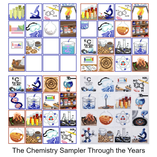
All righty, let’s watch some sausage get made!
I managed to dig up all four of the WIP pixel art files for the Chemistry Sampler, with the oldest dating back to Dec 2018-- three years ago, now!-- and with them, loads and loads of old sketches, rejected ideas, and half-finished panels. So if you’d like to come with on a lengthy-- lengthy!-- dive into the process of making a 16-part sampler, click below!
(I’m not kidding, though! This got long as hell!)
I’m going to go through the sampler panel-by-panel, in the order they were first conceived, but that is not at all how the actual design process went. One doesn’t work on a single panel, finish it, and then move on to the next-- instead, it’s all working on every panel all at once, jumping from here to there, trying to make each piece look good on its own and also look good as part of a whole. I also started and stopped working on the sampler at least three different times over the years, which meant even more changes as my style and abilities altered over time. But for ease of organization, I’ll be taking things one panel at a time. So, from the top-! 🎬💥

The Test Tubes were the first panel sketched, with no specific color in mind, and the original composition didn’t change a pixel all the way to the end! The colors, however, changed constantly: I remember for a while they were mostly neutrals, but once I knew I wanted to have a yellow pencil, orange bottle, and some brown cookies in the other panels the colors of the test tubes changed to match.
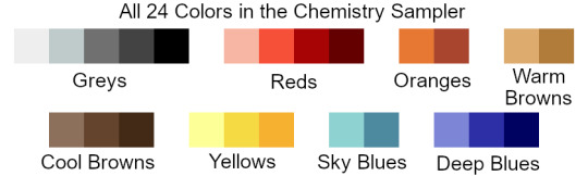
When I went to stitch the sampler, this was the panel I started with: since it uses thread from every single color family in the sampler (except for the two blues), I figured if I could find threads that worked well together here, they’d look good everywhere else, too.

The Microscope was the second panel sketched, and it didn’t change too much, either. The very first sketch was wicked flat, and imho flat = boring, so I rotated it around to put it at an angle and give it some more depth. I later decided to put a little molecule model (ethanol-- looks like a cute little puppy) next to it to help fill out the space. There is also a full-panel picture of another molecule model elsewhere in the sampler, but by the time I decided to include that panel this one was both already completely designed *and* completely stitched, so it was a little late to change the molecule to something else. And anyway, I like the little guy! So I’m glad he stuck around. :)

The Periodic Table was the no. 1 absolute must-have for a chemistry sampler, but it also posed a unique challenge in that it was the only part where the size was out of my control: if I made each element 2x2 squares they wouldn’t all fit in the panel, so they had to be 1x1-- but that left a huge amount of empty space around them. My solution: placing the table inside a classroom, as a poster.
The first classroom draft doesn’t read well (is that a kitchen sink??) and the second one was even worse. I liked the idea of including larger squares for the elements, but drawing them that small and at odd angles made them hard to identify even as pixel art, and as a general rule of thumb fine details are always *less* distinct in the stitched version than in the digital pattern. Version three is much better: you can see multiple workstations and stools, making it clear that it’s a classroom space, and the repeated diagonal lines give it a nice sense of dimension. That’s always a good thing.
(Confession: on its own, I like the rainbow color palette better than the final one, but aside from a tiny bit in the volcano panel this was the only part that had any green at all. Next to all the blue and orange panels the green looked out of place, so for the sake of the larger, cohesive whole it had to change.)
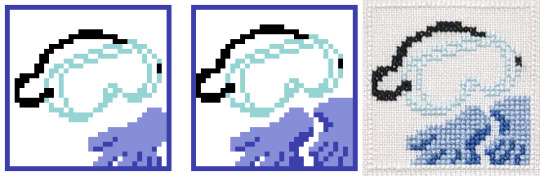
The PPE was the reason this sampler ended up so blue! I liked the first sketch, and the first colors, so I started using the same two sorts of blues to sketch out other panels. Made a few small changes to this one later-- added another glove-- but nothing major.
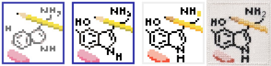
The Molecule Sketch also didn’t change much, except that it started off *really* messy and was constantly tweaked to be a little cleaner each time I came back to the sampler after a break. Turns out it’s hard to draw a pentagon on a square grid! In the first sketch younger me tried to use antialiasing to smooth out the corners-- see the pale grey parts along all the diagonals-- but nowadays I would consider that extremely bad pattern design. Yeah, it’d make the lines look better when stitched on white fabric, but on dark fabric the pale parts would stick out like a lightbulb and the whole effect would be ruined.
I also eventually added a little backstitching detail, since somewhere between 2018 and 2020ish I finally got over my irrational fear of designing with backstitch. Baby steps! 🙏

The Boiling Flask started life as a closeup shot of a bunsen burner flame + some tiny bubbles, but after a little while I figured that the water was more interesting than the flame. Plus the silhouette is clearer!

We’ve already seen where all the blues came from, which means it’s time to bring in the oranges!
Jupiter in a Bottle is, along with the PPE, one of the two panels that set the tone for all the others. There were about three seconds where I thought I’d try for a pale, crystalline effect for it, but I quickly switched to something brighter and rounder. At that point the chem sampler looked roughly like this:

…so, ah, not very promising, but I remember thinking ‘well, if nothing else, at least I’d have fun stitching the goggles and the orange one”. So since I was sure I wanted to keep those two, all of the other squares ended up being designed around them and borrowed a lot of their colors.. In the end I decided to go all-in on the oranges and blues, and, well, I think it worked out nicely! :)

This little bastard was The Reagent Cabinet, and it’s one of the panels that eventually got cut! It was a very early introduction, and stuck around almost all the way to the finish. I didn’t ever like it, though: it’s not very interesting, not very beautiful, and if I had stitched it it would have been the *only* full-coverage panel in the entire sampler, and so would have looked very out-of-place and heavy compared to the rest of the design.
Still, it technically fit the color scheme, and technically the theme, too, so I didn’t actually have the guts to chop it until I went to export the image and start stitching. At that point, dreading the idea of laboring over an entire full-coverage panel of a design I hated, I finally deleted it and started stitching everything else anyway, just with a giant empty hole in the corner of the pattern. I figured “well, I may be burnt out on designing for now... but once I’ve been stitching a while I’m sure the spark will come back, and I’ll think of something to fill the space”. And so it did, eventually!
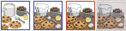
The Cookies, however, are a panel that I’ve loved from the beginning 🤎 I wanted to include a nod to ‘everyday chemistry’ alongside the more ‘serious’ designs; a carryover from the math sampler, in a sense, with its bees and shells.
These particular cookies are based off of my Mom’s chocolate chip cookies, which are kind of sort of like this recipe, but better somehow, and made out of old Y2K surplus that she bought off a disenchanted ex-prepper. Somehow the 20-year-old powdered peanut butter just hits different...
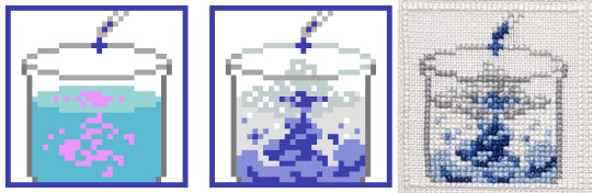
The Billowing Liquid was a effect that was, at least at the beginning, too far above my pay grade: I knew I wanted ‘some kinda sick-looking swooshy liquid effect, like in VFX reels or something?’, but that’s, uh, not a very concrete concept. I ended up realizing I was thinking of an ink-in-water effect, so from that I was able to look up reference vids and start sketching out some actual shapes. I added a little fizz on top, too, for extra effect-- and I think it did end up looking the way I originally envisioned it, even if I didn’t have the words or the skills to capture it back then!

Another cut panel! This one’s the Alchemical Equipment: the idea was that hey, the modern science of chemistry is descended from the mystical practice of alchemy, so wouldn’t be cool to put a nod to alchemy into the sampler? Also alchemical symbolism is wicked cool. ⁽ᴬˡˢᵒ ᵃˡˢᵒ ᵐʸ ᶠʳᶦᵉⁿᵈ ʰᵃᵈ ʲᵘˢᵗ ᵍᵒᵗᵗᵉⁿ ᵐᵉ ᵗᵒ ᵖˡᵃʸ ᴺᵃⁿᶜʸ ᴰʳᵉʷ: ᶜᵘʳˢᵉ ᵒᶠ ᴮˡᵃᶜᵏᵐᵒᵒʳ ᴹᵃⁿᵒʳ ᵃⁿᵈ ᶦᵗ ʷᵃˢ ʳᵉᵃˡˡʸ ᵍᵒᵒᵈ⁾
I tried a couple different takes on this panel, and I still like both of the last two a lot, but in the end they didn’t fit at all with the rest of the sampler, so! For the good of the whole ✂

The Atom is one of the few where I still had my very, very first sketch saved! 😆 Normally I don’t save these-- I’ll either start cleaning up the sketch on that same layer, or will delete the sketch once I’ve got a first draft started-- but not for this one, or for the next two with it!
After the jump from sketch to first draft, this panel didn’t change much: I just added in the nucleus and made some of the curves less jerky and more smooth.

The Glassware Collection was sketched at the same time as the atom, so you can see its original iteration too! The biggest challenge here was to figure out how I wanted to handle the transparency of the glass: all the other glassware in the sampler was filled with something or other, and I debated whether or not to fill in these beakers and bottles too, with either plain white stitches, or grey, or both. In the end I stitched a bit of white shine on each bottle as a highlight, and left the rest of the space empty. Straight up, on my fabric it’s hardly visible at all, but I made some mockups and found that if someone were to stitch this same panel on black or dark fabric, then this version would look way better than one with the bottles filled completely with stitching. So it may not make my version look any better, but hey, for somebody else someday it will. :)

The Volcano is a kid’s chemistry classic! I toyed briefly with the idea of doing one of the other classic childhood experiments: red cabbage pH tests, or the rubber egg, but none of them are as instantly recognizable as the vinegar-and-baking-soda volcano, I think.
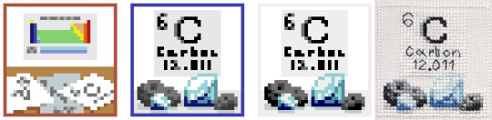
The Element of Carbon is a spinoff from that one rejected periodic table idea! This panel was one I made right after returning to the project after a long, long break. To get back into the swing of things I went through a bunch of my old discarded prototypes, and discovered that there were some good ideas hidden in there: they just needed to be fleshed out more, and given their own space to breathe.
Also, in the time since I started this design I finally learned how to do a french knot! At long last, I’m a real cross-stitcher 🏅

The Bunsen Burner was made right before I started stitching the sampler: at that point I had the color scheme just about figured out, and most of the panels most of the way done, and there were only two or three spaces left with no design or a soon-to-be-cut filler design. At that point I reached out to a friend of mine who had studied chemistry in college and asked them for some feedback, and they helped me tighten up the design a lot! This is when the alchemy panel finally got the chop, and in its place the bunsen burner came back: now zoomed all the way out, for easy visibility, and with a pretty new shine effect up top.

The Centrifuge was the other panel my friend recommended-- and Evan, if you’re reading this, thanks a million! This one was an easy breezy design to make: pleasant shapes, an interesting subject, and lots of ovals. I do love a good oval.
This panel and the one before it came together *fast*: I was trying very hard to lock down final designs so I could lock in final colors so I could lock in a final arrangement so I could finally, finally, start stitching. I figured if I could get the sampler to the stitching phase then the ball would at last be rolling fast enough that I wouldn’t be in danger of abandoning the project again-- a pretty bold hope, given that I was more than two years and several abandonments in, but hey, I was still hoping!
One problem: this is the point when I finally cut the reagent cabinet, so, while I *had* finally gotten to the stitching phase, I was still only stitching 15/16ths of a pattern. Enter:

The Molecule Model
The final panel! I had hoped to come up with a suitable final idea in the process of stitching the sampler, and it took a hell of a long time to get there: I believe I had all the panels started, and a few of them finished, even, by the time the idea for this one rolled around. I was working, then, with a fixed position for the panel, along with a fixed color palette, but if anything those constraints made designing it easier. I just picked an interestingly-shaped molecule (theobromine, found in chocolate and tea), built it in MolView, spun it around until I got a cool angle, sketched it, and bam! Final panel complete!
…minus a mountain of tweaking, of course. All the other panels had had months to get their rough edges ironed out, but for this one I just kept the file open as I stitched, fixing problems as I found them. I would not recommend it-- you have to unpick a lot of stitches anytime you decide ‘actually, it looks better one square to the left’!
~~~~~~~~~~~~
So, did it work? Did it all come together in the end? God, I hope so!
But you know, I think it did. :)
Thanks for reading! ✌
-Geri
P.S. it’s not about any specific panel, but you see how the early drafts have colored borders, while the final version has white ones? At one point I was using a draft of the sampler to mess around with GIMP’s content aware fill, trying to make some glitch art, y’know? And the results were pretty cool, but also overwhelmingly line-y:

…and I was hoping to try and make glitched-out versions of the individual panels, instead. So I took the version I was experimenting with and deleted the borders from it, and from that discovered two things:
One, that it was a huge improvement to the composition and should absolutely be carried over to the official version of the file, and
Two, that it did not make the content aware fill work any better, and in fact made the results look worse.
This postscript has a happy ending though: turns out if you take any individual panel and use it to tile a plane then you can select a chunk of it, use the content-aware fill, and then pick out the best bits to make your own glitchy sampler :)

✌!
#cross stitch#embroidery#chemistry sampler#progress pics#long post#damn! someone remind me that I specced into math for a reason#and the reason was that writing is hard#but I do like reading abt other people's artistic process#so if you too enjoy that then#this is for you!#enjoy!
60 notes
·
View notes
Text
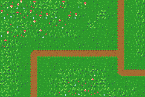
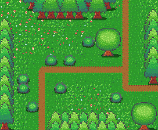
Learn Log #4 - Grassy Grove
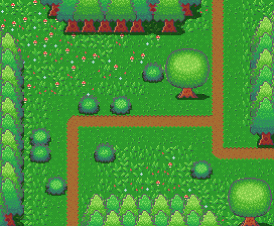
On week 4 of my pixel art journey, I learned how to make objects of nature including grass, bushes and trees. Unfortunately, I had to postpone this to this week when the learning and blog post was set for last week as I was just preparing for a return to university (it’s all online – social distancing dw). Anyway, I ended up making the forest scene you see above, and it was a lot of fun. I think that the GUI elements last week had a focus on technicality and exactness. Letters are very rigid, and we have somewhat set ideas about what each character should look like. However, nature is more flexible and therefore logic isn’t as heavily involved.
Tile Sets
Before jumping into the actual elements of this week’s piece I want to talk about making pixel art tiles. You will have probably noticed that the nature scene is quite rigid like each element is set into a box. This is because I’m learning pixel art to make games and games often use tile sprites to build their environment.
Tile sprites are the floors and sometimes walls of the environment. They often loop or repeat to cover the environment, however, some engines have tools allowing game designers to build environments tile by tile.
In the first case, the tile sprite will have to be created with its looping in mind and details may be added to provide variation in the environment. However, these added details may highlight the repeating the pattern and the more a detail sticks out the obvious the repetition becomes. Additionally, smaller tiles will repeat more frequently, and this also shows repeating textures.
The second scenario requires variation to be created from the creation of multiple tiles. This is great for creating variation; however, the tiles will also have to line up with each other which may be trickier for more rigid surfaces like rocks or bricks.
Since Unity has a tile builder tool and I was creating a natural environment where tiles wouldn’t need to line up so clearly – I decided to go with the second option.
The size of the tiles may also dictate the size of the rest of the game. For example, a bush may be 1 tile large in terms of level design, so the size of that bush is determined by the size of the tile. This also goes for the player whose sprite will typically range from 1 tile to 2x2 tiles. I decided to just make my tiles 16x16 as I enjoy learning within that space.
Grass
A grass tile is typically made of a green background with blades of grass texturing the surface. Many people may open up a couple of green canvases and start texturing them with green lines, however, there’s a much better way to do things I think. Since we’re working with 16x16 tiles there’s a limited number of shapes that look like grass and are small enough to fit within the tile. So, if we make a bunch of lines in green then we have blades of grass that we can copy and paste into each tile (the blades should typically be a lighter green as light will be hitting them).
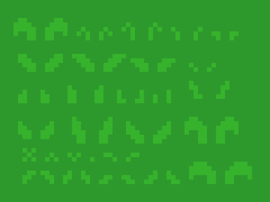
However, having blades of grass like this make tiles look flat. Adding shading will fix this issue by giving the grass depth, however, more complicated shading will obviously make the background more complicated which can affect the readability of your game.

Each blade of grass can now be copied into a 16x16 canvas to make grass tiles. I made 4 grass tiles shown below putting approximately 10 blades into each tile. I made each tile with different elements of the environment in mind such as short grass, long grass, bushy grass and leafy grass.
With these tiles, I created a larger image to test the repetition of the tiles. The repetition wasn’t a big issue; however, I didn’t think the leafy grass fit with the rest of the grass, so I decided to leave it behind for the next stage.
Next, I was going to add an extra tile for each of the current textures to reduce repetition as well as two flower variants for each tile type to add some colours into the textures. I did another test of the tiles’ repetition and overall look and it looked good but somewhat cluttered though I figured that this wouldn’t be an issue when I deliberately place the tiles rather than randomly scatter them.
I had in my mind the type of scene I wanted to make for this week, but it required dirt paths. Luckily this wasn’t an issue to make. I made two variations of the straight, one-way paths as they would be tiling and altered one of these tiles slightly to make the curve and intersection tiles.

I then assembled these 15 tiles into the image below.
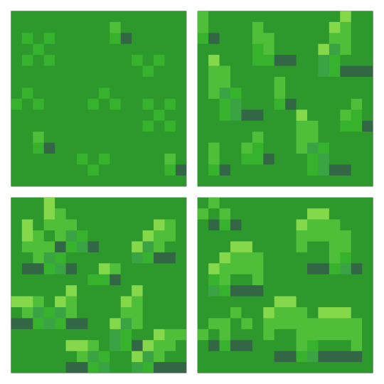
Trees
Next, I wanted to add some plant life which would involve trees and bushes. I decided to do trees first as they would be larger than the bushes. First, I started with the shape of the tree which would be fairly basic. I made a rough tree trunk shape to start with and topped it with a circle that was a little squished before refining the shape a little more to get what’s shown below.

I then added colour into the tree. A simple brown for the bark and 4 shades of green for the leaves. These greens were made by colour picking the base green background and hue-shifting it towards yellow so the tree would stand out more from the background.

The colours are organised into ovals to help give the tree a sense of depth. The dark shades wrap around the edges of the tree to show the tree’s roundness. The colour thins out as it goes around because you’re viewing the shaded leaves from a side-on perspective.
Next, I blurred the lines between these circles by mixing the colours slightly. This was the start of adding leaves onto the tree. Quickly after that, I added more detail to the leaves by spotting the head of the tree with lighter greens. The details added were in ‘leaf-like’ shapes like hearts, single lines, and arrows. They don’t look like leaves individually and can’t receive much detail themselves (such as a stem) but together they make the tree look nice and bushy. I also added some detail to the tree trunk including shading.

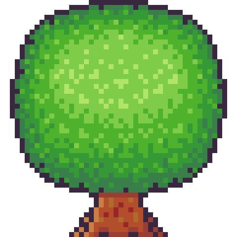
The tree trunk seemed a little off when I checked it out with the image I had so far, unfortunately. So, I added some extra trunk at the bottom along with a nice shadow. This shadow was the colour black at a transparency of 127 (or half transparency). This works really well as a quick and easy shadow on detailed background, but it does, unfortunately, mean the shaded area is not hue-shifted as typically preferred. The final product is below.
Looking at this sprite you may think it would be difficult to construct a game environment due to the leaves, trunk shape and shadow involved. However, we can place each section down as a separate 16x16 tile with the main trunk tile being a collider and other tiles not having a collision box (like decoration tiles – we don’t want players to run into tree leaves). This works out really well, and I focused on the main trunk tile when positioning the sprite in the piece. Which is shown below.
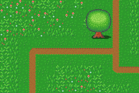
However, the scene below is bit lonely so I thought I’d add some pine trees as a level border. The process of the pine tree is similar so I won’t describe each step but will show the images. This time around I did shape the tree a bit more wildly with branches and leaves sticking out from the tree. I also hue shifted towards bluer colours rather than the more yellow colours I used in the round tree.

Next, it was time to add more trees into the scene and add some grass beneath them. I made the grass beneath them short grass simply because it looks a bit neater than the other grass types.
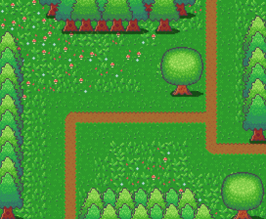
I think it looks pretty neat! I made a pine tree variant by swapping the colours with that of the round tree for some variation which worked as a nice, easy trick. But it would look livelier with some bushes.
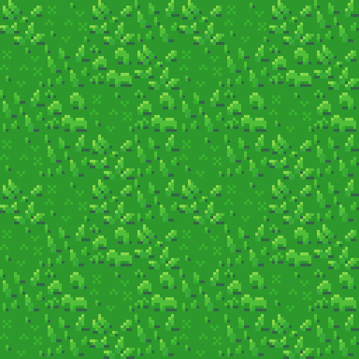
Bushes
You might have looked at the trees just before and thought, ‘That kind of looks like a bush on a stump.’ That’s because the techniques used to make bushes and trees are typically very similar depending on the style of the game. Since we’re using a 16x16 size which is somewhat limited they will likely turn out in roughly the same way.

I started with a circle shape that was modified at the bottom to be a bit flatter. This will hopefully give the impression that the bush is touching the ground and rounds out on the top
I did a similar process in colouring the bush as I did with the tree, however, I used fewer colours as I didn’t have as much room for highlights with the bush. The colours used are actually the same as those in the pine tree.
I then adjusted the outline to give the bush a wilder feel as well as texturing the inside of the bush to create the appearance of leaves.
The bush still felt a little flat, so I added highlights to the top of it to add a greater sense of depth. The highlight was rounded towards its end at the bottom to enforce the rounded nature of the bush. This required me to add another outline tone for highlights which I might apply to other elements of the picture. I was pretty happy with the bush, so I made another for variation and added them into the picture with some shadows.
The picture looked pretty good, but I thought some touch-ups might make it just that little bit better.
Touch-Ups/Conclusion
To touch up the piece I added some more trees for denser looking forest, added the lighter outline colour to the tress and expanded shadows around some of the pine trees. I’m pretty happy with how it turned out. I think the shadows could use some refinement at the top border of trees. I also think that top border highlights the repeating pine tree trunk which could also be changed to tile better. I do wish my bushes were a bit leafier than shrub-like, however, I think my ability to make leaves on both bushes and trees will improve as I practice. I also think a 32x32 base picture would allow me to make some more defined leaves. The lighting on the pine trees also uses a different technique to the round tree so next time I’ll try to be more consistent with that. Overall though I’m happy and I quite like the outline highlights as they make the image a bit softer.
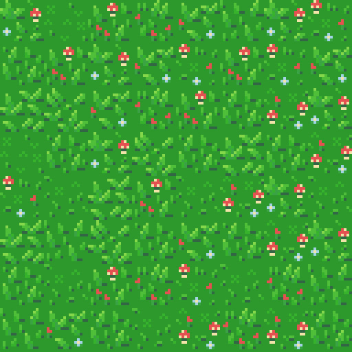
That concludes week 4 of learning how to make pixel art. Next week I’ll be looking at sand, water and rocks to make a top-down beach scene.
My learning and this blog post wouldn’t have been made possible without these fantastic resources. Go check them out if you wanna learn some stuff about pixel art!
How to Draw Tiled Pixel Art by TipTut
Creating Variation in Pixel Art TutsByKai
Pixel Art 101: Grass by Pixel Pete
How to Make Pixel Grass Tiles by TutsByKai
RPG Grass Background Tiles by HeartBeast
Pixel Art 101: Trees by Pixel Pete
[Let’s Pixel] Tree by HeartBeast
[Let’s Pixel] Spruce Tree by HeartBeast
Pixel Art 101: Bush by Pixel Pete
203 notes
·
View notes
Photo
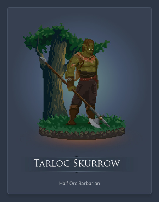
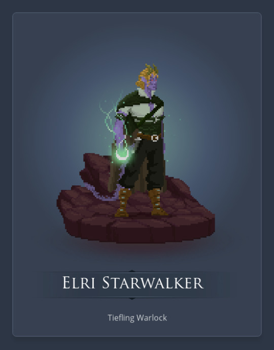
Time to share some of my D&D characters! As I said in an earlier post, these were made in Reroll, a browser program designed for making pixel art of D&D characters, and it works like a doll maker kinda.
Above are the characters from the first campaign I played in very briefly. I never actually played Elri though. He was just a planned backup character that I started before the first session, after realizing how likely it was that Tarloc would die (we had an accidental test session where I realised he loved taking risks, like deliberately activating traps, although I toned down that side of his personality quite a bit when we started playing).
Long post ahead, there’s like 20 characters. Won’t go deep into explaining all of them though.
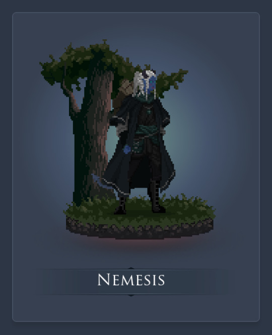
Next is Nemesis, a tiefling Wizard (Necromancy school) that I played briefly in a different campaign. I had some really great ideas for how her Necromancy skills could play into her story and morals, and some of that came to fruition during the campaign. She had a really interesting personality too, starting off as a bitter woman who hates everyone, meeting a super smiley bard, and gradually deciding ‘I would die for this one and this one only’, but still giving the ‘I hate you’ attitude when the friend nicknames her Nemmie (especially when the party member she hates starts using it).
Unfortunately though, those are the only characters I’ve really played.
And now, because tumblr thinks it’s a great idea to not allow people to have multiple images together throughout a post (like I have at the top of the post), every portrait needs to be full-size. Guess this is gonna be a long post.
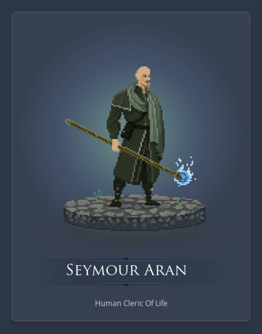
This is Seymour Aran. When making the portrait, I forgot to give him an eyepatch. His first name is a pun, since I thought it’d be fun to give a man named ‘see more’ one eye.
He’s an NPC planned for the first session of my campaign, a member of the local temple, and he’s partly to blame for the villain of the first session.
And this is said villain. She thinks the town of Crast (a mountain town built around a coal mine, where the campaign starts) is dismissive and disrespectful towards the dead. So hey, why not change that, by force?
Oh, and she used to be Seymour’s apprentice too.
Tobias is a friendly face the party meets in the first session. He’s the son of another NPC, but because of lore reasons, he doesn’t know that. Oh, and he’s also a bit of a conspiracist
A name some of y’all might be familiar with (it was my first URL on this account), this is my Dragonborn ranger that I wanna play eventually, one of my favourite unplayed characters (although I could say that for a lot of them). He was banished from his clan for not taking orders and killing a pretty important character from the clan. His name translates to ‘stubborn and honourable betrayer who does not belong’.
Another of my Dragonborn, this one’s a Bard. His name translates to ‘traveller who belongs to the keepers’. His clan are keepers of knowledge. He also found another of my favourite characters, Waking Sky, when she was very young, feeling lonely, angry, and afraid, and took her to a monk monestary he knew, who helped raise her and teach her to deal with those feelings.
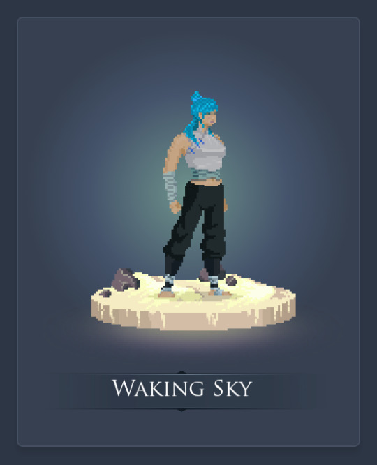
She’s 19 now, and still hasn’t entirely learned to deal with those feelings.
Yup, blue hair. In world, her hair is actually a mix of blue, white, and its natural blonde, and she has tattoos of waves on her left arm, but there wasn’t a way to show either of those in Reroll, so I settled for this.
Oh, and she’s a Monk too.
Sky is one of my characters that was originally created for an old fan-fiction project with some friends, which ended up being abandoned, and I translated some of the characters I made for that to D&D.
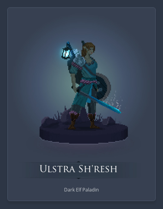
This is one of my Paladins. She calls herself an ‘Emissary of the Light’. She grew up in a cavern settlement with her family, but they were forced to flee when it was invaded by goblins. Only a handful of the dark elves survived, including her mother. Her mother was killed when she tried to return a few months later though, and since then Ulstra has sworn to fight for the very light that blinds her (yeah, playing with the rule that makes dark elves have difficulty seeing in normal light conditions).
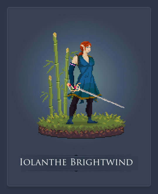
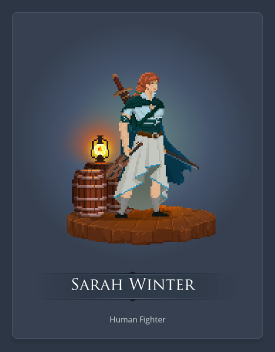
Iolanthe is a human Fighter who ran away from her noble family with nothing but her horse, rapier, and the clothes on her back.
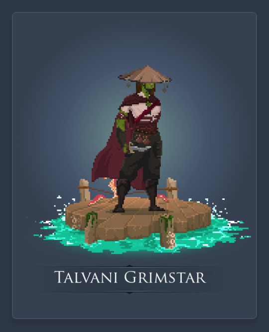
Talvani is a half-orc Rogue who was raised by pirates. They found her as a baby (from an island village they raided), and the first mate thought she’d make for some great muscle for the crew as an adult. The captain didn’t like the idea at first, but let it happen.
Could you imagine pirates raising a half-orc child?
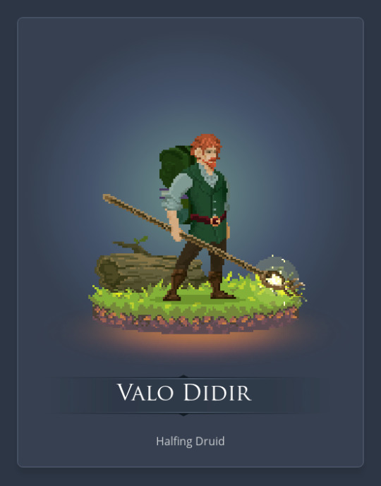
Valo’s an interesting character. When I started making him, I wanted to make a Druid halfling, but I also wanted to mix in the charlatan background. Really curious how that mixes if and when I play him.
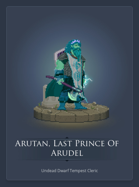
Arutan’s an undead dwarf from the underground city of Arudel. The city’s dead now, with Arutan being the only ‘surviving’ member. With him being undead though, he’d be kinda complicated to play, so there’d be a lot of back and forth between me and the DM about how that works, if I do end up playing him.
I really badly wanna play a tempest Cleric someday though.
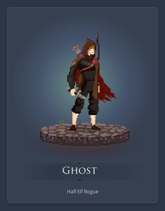
Another character from that old fan fiction project. The next few are from there too. In the old project, Ghost was the best friend of my self-insert character, who became addicted to player-killing (the project was set in an MMO). I’m kinda thinking he might have a similar arc as a D&D character. Of course, being a criminal, I’d probably need to make sure the DM and players are ok with a party member like that.
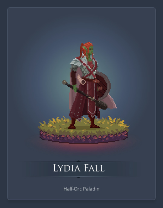
Another character from that fan-fiction project. Translating her to D&D, I decided to work with the Folk Hero background, which isn’t one I’d done before. I don’t really know much else about her though, aside from the traits I picked and a few ideas they’ve inspired.
Yup, another character from that project. I decided on him being a Guild Artisan for his background, specifically a carpenter. I don’t know much else about him though.
Sarah’s yet another character from that project. She’s a musician, but just as a hobby, rather than as a Bard class. Her brother ran away to join a circus band, but hasn’t been able to commit to one yet.
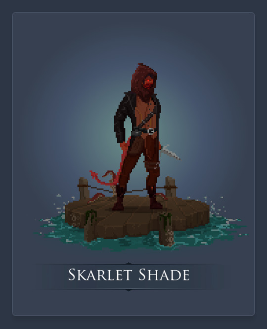
Yup, another from the project. Skarlet’s a Monk, with the Entertainer background. Apparently I forgot both of those details when I made this portrait though, and thought she was a Rogue with the Assassin background. I might remake this, but I do quite like the portrait. Now I’m conflicted, dangit.
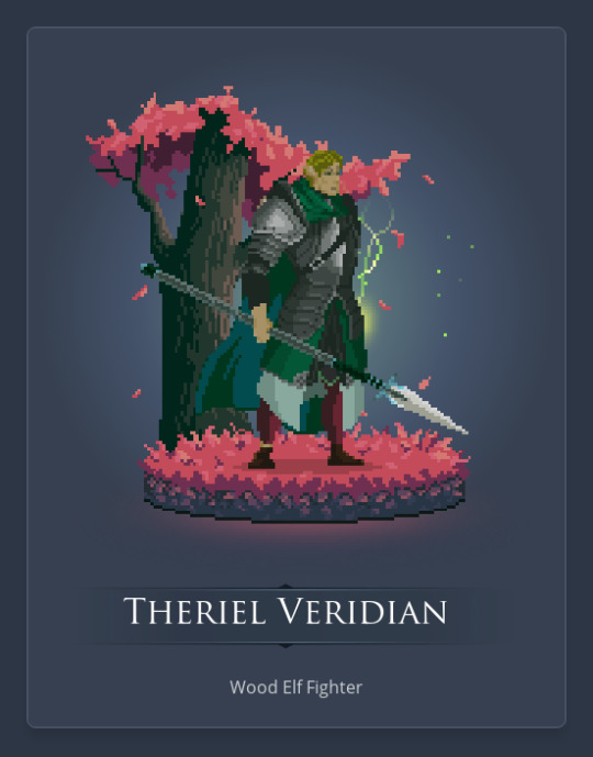
Theriel went on an artifact recovery expedition a few years before present day as a guard to a super secret location. When he realised how dangerous the artifact was though, he made some very difficult decisions, believing them to be best for the safety of the world. And now he’s an Eldritch Knight.
Oh, and Theriel’s the last of the batch of characters from that old project. The character was originally inspired by Jack from Final Fantasy Type-0, particular the character’s ability to make horrible jokes (often at the worst time).
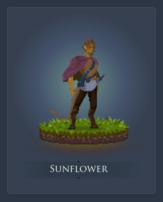
Sunflower is a Barbarian. A few years back, he was fighting in a war as an infantry soldier, and ended up some super powerful magic dude. He has no memory of how the fight went down though. And now sometimes he gets angry, his memory lapses and he can’t remember what happens. He just knows that, when the memory lapse ends, it’s usually with his sword in a bloody body.
#to speak of kings and stars#tarloc skurrow#elri starwalker#nemesis#seymour aran#draken urek#tobias nyx#vuthrakken shadvurach#delrakk komar#waking sky#ulstra sh'resh#iolanthe brightwind#talvani grimstar#valo didir#arutan#ghost#lydia fall#majority#sarah winter#skarlet shade#theriel veridian#sunflower#d&d#dungeons & dragons
1 note
·
View note
Text
Week 5 - Platformer Postmortem
I was able to get all of my core systems and mechanics working by starting off from scratch and redid everything. The amount of work was no joke... Again, I’ve decided not to implement any of my art assets at first and I just wanted to see if everything worked. And thankfully they did. However, in hindsight, I should’ve at least done some of the art first, especially character sprites. The problem was that the sprites I found on the assets websites were at a different pixel count (height & width) than the default sprites given to us. This resulted in a lot of time spent on tweaking the variables in my code blocks, cropping, scaling new sprites and changing their hitbox points. Whereas I could’ve used this time to move on to platform design and placement. In my next project, I will definitely try to strike a balance between mechanics development and art implementation, so that I don’t spend too much unnecessary time on making tweaks.
Shrink

Dash
Playtesting
This time around I found 2 new testers that have never played the previous half-finished demo. I simply handed them the control scheme and my laptop and let them start playing. This is of course following the testing process discussed in Game Design Workshop (Fullerton, 2018), providing the testers minimal instructions and introduction to your game, so that you can see how accessible or intuitive the mechanics and gameplays are.
To my surprise, both testers got used to the game very quickly and started to try out both abilities and combine them, using both at the same time. Which is my intended way of playing the game.
The results are mostly positive. Both testers stated that they felt the abilities are definitely the highlight of the game and are intuitive to use. However, with the shrinking ability, they thought it would be better to make it activate by pressing the Z key once, instead of having to hold it down. As it can get quite hectic and unmanageable when they have to use both abilities at the same time or in quick succession while multiple enemies and platforming are involved. On top of this, they also found the multipath level design interesting. Where they have to think a little bit before choosing which route they want to go. Though they did suggest toning down the colours of the platforms a little bit, in their current state, the colours feel slightly fussy. Lastly, Both players wanted the checkpoints to stand out more and the blue gems to have a higher contrast to the background image, as they can get blended in quite easily.
[email protected] | Shenghua Gao
0 notes
Photo

Weekend programming progress...is always slow! So in the interim, I’m going to do a post-mortem for the game I was developing about a year ago, and then stopped.
Game name: CHEST (working title)
Genre: Two player vs. chess-like game
Description: Well, chest was an odd sort of game. It’s basically chess, as in, turn-based, except pieces had various abilities. For example, the blue ghost swapped pieces, the swirly guy spawned little yellow dudes, and so on. Each piece had something unique about it. You could also move two pieces a turn which set up some really devastating combos
The game was centered around the yellow guys in particular - once you moved them, they then continuously walked forward at the end of the turn in a death march, blowing up the first unit (friend or foe) in their way, and killing themselves in the process. The aim of the game was to either remove all of your opponent’s yellow guys, or get a yellow guy to your opponent’s last row.
My initial conception of the game was a sort of, competitive, turn-based incredible machine style game where you have two competing factories with moving parts that you place and reconfigure each turn in response to what your opponent was doing. More than half of my pieces had end of turn effects (e.g. pushing, destroying things near it, etc.). I wanted both players to develop a well-oiled machine that constantly spat out units to try and overwhelm the other!
What went right:
Arrays/matrix usage: A few things! This was my second attempt using arrays seriously in a game, and I learnt a ton about what to do and what not to do when using them. It was also my first go using enums, which I am making heavy use of in this game.
Sprite size: I’m somewhat happy with the sprites that I used - they were 32x32 in size, I believe, so they were a lot more manageable to animate. I am a very, very terrible artist with no intrinsic talent, so I turned to pixel art as there’s only so many configurations to place the pixels in before I get something that looks decent using trial and error! This was also the first time I picked and chose a colour pallette and stuck with it throughout the game!
Going online: Another first was that I figured out netplay! This was a feature that took an incredibly long time to get my head around, and it’s something I’m still not really comfortable with. Nevertheless, the code is in place and I can re-use it in the future if needed.
Playtesting: Finally, I learned quite a lot about balance. I played a lot of matches in tabletop simulator with friends and went through a bunch of iterations for my pieces.
What went wrong:
No playtesters: Because I didn’t have a working AI, I relied on players to connect to other players in order to test my game (or internalise quite a complex set of rules and play in tabletop simulator). Finding players willing to play against other players was incredibly tough, and was THE major reason why I stopped development of the game.
Looking before I lept: I programmed a bunch of piece actions BEFORE playtesting them, which was an incredibly silly idea in hindsight, but hey, that’s how you learn.
A very slow, grindy game: Initial implementations of the game was incredibly slow, with matches taking 30+ minutes. This was because, piece production often ended in stalemates, the game was overly defensive, and the multitude of options you had (two moves per turn, end of turn effects etc) meant that one had to do a lot of thinking in order to come up with the optimal move that wouldn’t put you in danger!
Behind the scenes: I had done what essentially amounted to a hack-job because of how I conceptualised the end of turn effects. I had one big script that looped through the board to find all pieces and then executed their effects in turn. All these effects were located in this script and it was absolutely awful! If I had my time again I’d use a stack to load up each piece, and have them do their effects when they were at the top of the stack, placing the code where it SHOULD have gone - inside the piece itself.
Overall assessment: An interesting but overall ill-conceived game that didn’t really appeal to other gamers, filling a niche that didn’t really need filling. Battles were extremely tactical but lacked engagement, I am confident most players would not have gotten through many games before calling it quits. If I ever return to this, I would completely rework most pieces to turn it into a fast, aggressive game.
20 notes
·
View notes
Text
Govee Lyra Review: Time to Upgrade Your Floor Lamp?
Govee Lyra
9.00 / 10
Read Reviews
Read More Reviews
Read More Reviews
Read More Reviews
Read More Reviews
Read More Reviews
Read More Reviews
Read More Reviews
See on amazon
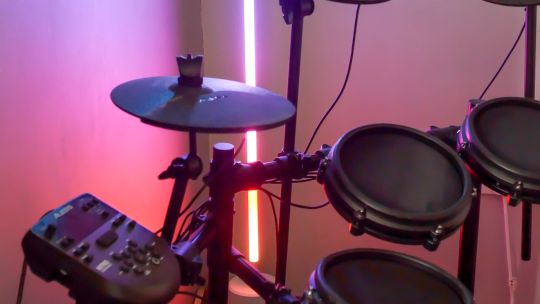
The Govee Lyra is a stunning freestanding accent light for any part of your home, capable of gorgeous dynamic multicolor displays that'll be sure to wow guests. However, voice control is limited and the app could do with some streamlining. If you just want some flashy lights, Govee RGBIC LED strips offer better value for money with the same feature set.
Key Features
RGBIC LEDs
58-inches tall
Aluminum profiling
Opaque silicon LED diffuser
Specifications
Brand: Govee
Integrations: Alexa, Google Home
Protocol: Wi-Fi, Bluetooth
Hub Required: No
Music Reactive: Yes
Multicolor Capable: Yes
Pros
Dynamic, multicolor scenes are incredible
Music mode works well from the built-in microphone
Bluetooth app control as well as Wi-Fi means you can take it elsewhere for instant effect lighting
Cons
The app has a bewildering number of color options
Limited voice assistant control
Can't save scenes to the remote
Doesn't support Apple HomeKit
Buy This Product
Govee Lyra amazon
Shop
// Bottom
Govee leads the way in affordable smart home lighting, but until now it's mostly been focussed on DIY options like LED strips. The Govee Lyra is its first freestanding floor lamp, and the sleek design means it wouldn't look out of place in any modern home. Is it time to upgrade your floor lamp?
youtube
Read on to find out more about the Govee Lyra floor lamp, how it compares to other smart lighting products, and whether it's right for your smart home.
To celebrate the launch, Govee is offering a Lyra floor lamp to one lucky reader: just enter your details in the giveaway widget at the end of this review to be in with a chance of winning. The competition closes one month later, and the winner will be notified by email.
What is "RGBIC"?
The Govee Lyra uses RGBIC technology, which is another term for Neopixels, or pixel LEDs. The "RGB" part refers to the LEDs being capable of color mixing with a full gamut of Red, Green, and Blue. "IC" is short for Integrated Circuit, referencing the fact that each LED has its own control circuit, hence each can display a different color.
Most RGB strips you'll find for sale can display only a single color at the same time. The Govee Lyra (and other Govee RGBIC products) can display multiple colors simultaneously, resulting in gorgeous rainbows and aurora patterns.
Govee Lyra Hardware
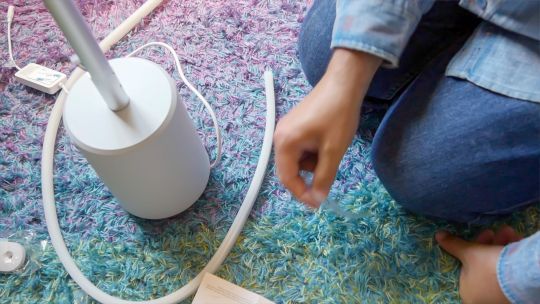
The Lyra arrives in a relatively compact box, which of course means there's a fair bit of construction before you can start using the lamp. Inside the box you'll find:
Heavy base with attached control box
Three milled aluminum profile sections
Connecting brackets and screws
Silicone-encased LED strips
Power cable
Remote control
Optional remote control holder
Fixing it all together is quite an involved process, but took me no longer than half an hour, and a screwdriver is included. However, you should follow the instructions closely, as one of the aluminum profile sections is not like the others, and has a different set of screw holes to attach to the base. Once the main tower has been constructed, you should plug in the LED strip, then carefully squeeze it into the profiling.
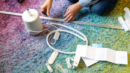
The optional remote holder snaps onto the Lyra in any position you choose. The remote control itself is magnetic at the rear, so it can be attached and pulled off easily. It's optional though, so feel free to not use it if you feel it ruins the overall aesthetic.
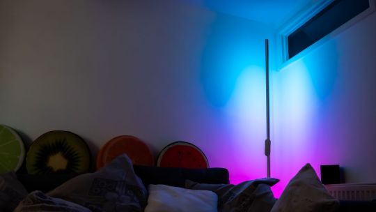
Design
The Govee Lyra stands at 58-inches (147cm), though the LED strip is only 47-inches (120cm) of that. To ensure it stands upright, you'll find a heavy but slimline base, with the footprint of the Lyra only a 6-inch diameter, meaning it should fit neatly beside any bulky furniture.
That said, I'm not a fan of the white plastic around the base, and would have preferred a wider, flatter, brushed aluminum look to match the profiling sections. It also seems like a wasted opportunity that the power brick and electronics are not built into the base.
Ultimately these are small complaints when the base and cable are likely to be hidden behind some furniture, but it does mean you may not want to put the Lyra in an empty corner of the living room. At 58-inches tall, I also found myself wanting a small table to put it on, rather than the actual floor. It feels just ever so slightly too short, and just one extra section would have made all the difference. To me, a floor lamp should stand about as tall as I am, or a little less.
The Govee Lyra looks best when placed about a foot back from and facing a wall, allowing a wide area of light to be reflected back.
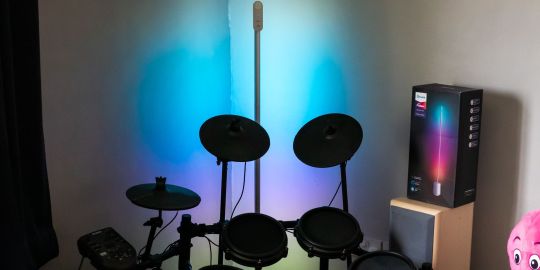
Of course, if you'd rather the harsher look of the striplight itself, there's no reason you can't do that, but you'll get a much less impressive reflection.
Controlling the Govee Lyra
There's a number of ways you can interact with and control the Lyra:
Physical remote control
Govee Home app
Voice assistant
Remote Control
The remote has buttons for power, built-in music reactive modes, one color selection, brightness, and warm or cool light modes.

However, notably absent is the ability to select multicolor scenes that aren't music reactive. To initiate those–which are arguably one of the biggest differentiating points of the Govee Lyra–you'll need to use the app.
Govee Home App
Thankfully, getting set up with the Govee Home app is easy, and I was able to reliably add the device within minutes. Operating over Bluetooth or Wi-Fi, just choose the Lyra from the indoor lighting tab, provide your network access details, and name the device. The device will automatically use Bluetooth if you're within range, but otherwise, it all works fine over Wi-Fi.
The app is relatively easy to use to select premade scenes or more music reactive modes, but creating your own custom animations can get more complex thanks to confusing color options. Having trouble deciding on some colors to use? The "Recommended color schemes" sounds like it would be an easy to choose list, but instead requires you to select no less than an initial style, a basic color, a scene, and a color matching method; none of which are really explained.
Image Gallery (3 Images)
Expand
Expand
Expand
Close
Image 1 of 3
Image 2 of 3
Image 3 of 3
The "Effects Lab", which features at the top of the list, is particularly bizarre. It appears to be a vast selection of color palettes created from photographs, from which you can then choose a single color and apply it to the lamp, or save the color to your personal favorites. To me, an Effects Lab is somewhere you can go and choose, say a fireworks animation, or log fire. Instead, you'll find those sort of animations down in Mode -> Scene.
The app also includes the options to share your scenes, though it's not clear where to access others' creations.
In short, there's an awful lot of choice in the app, and the basics are easy to get a hang of, but there's just too much complexity when it comes to customization. Govee could do with taking a leaf out of the Nanoleaf playbook when it comes to custom scene creation and community sharing.
Voice Assistants
The last option is to use either Google Assistant or Amazon Alexa. Apple HomeKit and Siri are not supported. The voice assistant control is also limited to power, brightness, and color; you can't select multicolor scenes or music reactive modes.
In my testing, I found the remote control and app to be the most useful. Despite not being able to export animated scenes to the remote control or voice assistants, the Lyra does remember the last scene used, so you can at least resume your favorite (assuming you don't turn it off at the plug). The lack of HomeKit support might be a dealbreaker for you though.
Which Smart Lighting to Choose?
Govee is our favorite when it comes to great value smart lighting, but it's not the only option. Let's take a look at some other ecosystems to compare.
Govee vs Hue
The Govee and Hue smart lighting ecosystems crossover in many places, yet differ immensely. Both sell smart color bulbs, LED strips, and standalone lighting fixtures. Govee even has its own version of the Ambilight technology, which uses a camera to "watch" your screen and dynamically adjust the lighting color.
The main difference is price: Philips Hue devices cost two to five times as much as their Govee equivalent. Consider the Govee smart LED strips, around $20 for five meters; vs the Hue equivalent Lightstrip at $60 for three meters! Philips even has a smart floor lamp, but it's twice the price, and only outputs a single color. There's just no competition here.
The Hue system requires its own smart hub, creating a separate Zigbee mesh network. This has the benefit of not cluttering up your Wi-Fi if you have lots of fixtures, and means you can install lighting in places your Wi-Fi might not be able to reach. On the other hand, it's a high added cost if you only have a few smart lights, and modern Wi-Fi routers should easily handle some smart lighting. On top of that, Zigbee transmits over the 2.4Ghz spectrum, the same as 2.4Ghz Wi-Fi. S you (or your neighbors) may find your Wi-Fi experience suffers.
Govee smart products use either Wi-Fi or Bluetooth. If you have good Wi-Fi coverage and a modern router, you should have no problem. Though rarely used outside of initial setup, Bluetooth is a welcome addition for me. If I'm running a small event somewhere, such as a haunted house, I can pick up some Govee LED strips and set them up as effect lighting or a custom music reactive mode using only my smartphone, without needing to worry about programming in new Wi-Fi access details.

Govee vs Nanoleaf
Although the Nanoleaf smart lighting panels are a vastly different product (more akin to wall art installations), they are generally going to be considered for the same purpose as the Lyra: lighting up a wall or corner of your home.
Both Nanoleaf Panels and Govee Lyra share a lot of similarities:
Connect to Wi-Fi, and have voice assistant integration
Capable of displaying more than one color simultaneously
Offer music reactive modes
Offer dynamic scenes, such as a rainbow or aurora
Have a comprehensive mobile app with custom design modes
Have physical control buttons, either on a remote or on the device itself
So where do they differ? Nanoleaf panels are infinitely more customizable, and expandable. The app even helps you to design a shape to place them on your wall. Nanoleaf panels are also compatible with Apple HomeKit, and voice assistant integration is generally more developed, with individual scenes exported.
Of course, Nanoleaf panels are more expensive: two to three times as much as the Govee Lyra for a basic 9-panel music reactive starter kit. In my experience, the Wi-Fi control is lot less reliable too, and I frequently have to do a hard reset to get them responsive again.
Should You Buy the Govee Lyra?
If you want a stylish, minimalistic floor lamp, capable of stunning multicolor dynamic and music reactive displays, along with plenty of customizable options and app control, the Govee Lyra is well worth a look. It's certainly the fanciest floor lamp we've ever seen, perfect for everything from impromptu living room raves to subdued romantic nights in.
It'll blend into the background when not in use, and take center-stage when needed. It's gorgeous, customizable, and has a physical remote control. You'll need the app for the more exciting scenes though, and voice assistant integration is limited.
But while we think the Lyra is a great-looking smart floor lamp, it's let down only by the fact that other Govee products offer even better value. Much of the cost goes on the aluminum profiling, and there's only 47-inches worth of actual LEDs for the RRP of $150. For the same price, you could buy almost 100ft of Govee RGBIC LED strips, which would have the exact same features, and produce enough light to blind you. Clearly, a big chunk of the price is on the presentation—metal isn't cheap. If you just want some smart effect lighting, and don't mind sticking the LED strips to an existing bit of furniture, then some basic LED strips are a better choice.
Govee Lyra Review: Time to Upgrade Your Floor Lamp? published first on http://droneseco.tumblr.com/
0 notes
Text
Multiplicity 8D Dev Game Post Post-mortem
Planning stage
Planning was by far the biggest downfall of this project, without a clear vision we struggled to find out what exactly we wanted to implement as well as what the limitations of the Gdevelope & our own experience of art, coding and game design. Most of the planning had been done prior to me joining and it was already decided upon roughly on who does what, this let little breathing room for the game to expand from the onesheet based on Brodie idea, all we’d done was retexture and add to the basic mechanic he’d already implemented. This left the games vision primarily in his hands in terms of what we was willing and able to implement, therefor despite the ‘puzzle’ tag it didn’t feel much different to other platformers as the complexity and variation of the puzzle didn’t really exist. It would be cool to have a more escape room around a platform to find the portal vibe where the puzzles get increasingly more cryptic, hidden, difficult and longer, instead we had a platformer with a gimmick of splitting dimensions but nothing really to do in them. The idea could have been expanded where you only see clues in one dimension or pickups (this was explored briefly with the key.)
Goals where also not planed, there was no timer, no reward for completing a level or even collectables (hats where shoehorned in to remedy this but it was too difficult to implement).
However, what lacked in vision Multiplicity was always ahead or in line with its schedule, team management was also executed extremely well so a demo was available by the time playtesting came around I learnt is how powerful team management tools like Trello are in creating larger projects it was helpful to know what we needed by what week as well as how far we were in development at any stage, this also helped us keep ahead in our work unlike many of the other groups which seem to procrastinate on development.
In future projects it would be nice to have extra ambition so there is at least a more concrete vision in the project and how the game would actually function, this way a more scalable game could be created. It would be good to create a game with a team with a similar mindset of splitting the task and following a realistic time schedule
Development
Development of the game consist of weeks, week 1 was the basics, a player character, the splitting of realities and some platforms to interact with. The next week it was keys, laser doors, boxes. The puzzling aspect of the game than it was enemies and finally decorations and hats. This meant work for the entire team was spread out into simple steps, although this did create a lot of work for Brodie.
This taught me just how much the artist has to work with a team in order to create a game as being able to create useable asset took a few back and forth between us, a lot of the art I felt wasn’t the best but with my little pixel art shading ability the colouring of objects was to the best of my ability (though some like the spike looked a little rushed and I could of worked on the more).
Although happy with this task I felt like I wasn’t doing enough work, I told the group about it and instead of giving me NON art related work they told me to create more art assets…thing is this was the first time I had created animals in pixel art so this was still quite time consuming.
Brodie was the main driving force behind this stage he quickly implemented and got the game to a functioning stage in development as well as implemented everything, oddly enough he still wanted to do even more which left me and Tegan with much less work to do instead of spreading the workload to others.
He should have left the music and sounds to us so he could focus on implementation this would balance the team workload more and mean a more efficient team, rather than bitting of far more than he could realistically chew
Playtesting
Playtesting was an interesting phase of development, as it was clear that the pool of playtesters where too small and that because all our playtesters where friends/ acquaintances they skewed our data to be very positive. Not only that but it was clear that some of our questions weren’t very neutral like “did you enjoy x?” instead of “what was your opinion x 1 being negative 5 being positive?” we also didn’t have a vast demographic of friends to really understand who our demographic was and what they enjoyed this could of vastly improved the game as it could be either focused and improved to get more enjoyment from platformer and puzzle players or implemented more aspects that a larger target audience could enjoy by understanding why people don’t like platformers/ puzzlers.
Covid didn’t help as I was not willing to go on public transport for the hour commute to uni to get strangers to test the game, not only that but uni students themselves would also skew data in terms of what they enjoy as they’d be (in general) more intellectual, higher attention spans, more empathetic toward the fact that this is a uni project and score more positively ect. This however could be an improvement over getting friends to test the game.
However, this project did teach me the meaningful ness of playtesting in general as we found many issues and bugs that we’d otherwise wouldn’t find by playing ourselves such as the level 1 jump which half the playtesters found to hard, the lack of intuitiveness triple jump has, the box moving when the player stands on it or the box moving off the screen. Many of the most game breaking bugs where found due to playtesting.
End product
The Multiplicity demo that we made was ok, the game lack meaningful goals and a difficulty curve making it a rather strange demo as it didn’t depict the game getting more difficult as time went on, it was rather stagnant with levels having a single difficult jump such as the 3rd jump on level one and the ledge above the spike in the mushroom lands. The “puzzle” aspect seemed rather lacking this should of been fixed with a whitebox prototype before getting into creating a demo, with that a more complex puzzles could have been made rather than just split and collect keys.
Which plays into goals, there was not goals or at least rewards for goals, levels weren’t unlocked for completing previous levels, things couldn’t be collected, and no timer allowed for competitive play. This again should have been added in some regard to allow for progression and should have been higher priority, instead of spending hours implementing an easter egg that only the tutors would understand or appreciate.
0 notes
Text
Art Update: Mocha, Pawpads, Fire Escape!
Paw Pads!
We announced this long time ago as an art update and polled the idea for months, so you all knew this will arrive soon enough! It's today! Paw pads will automatically appear as part of "Skin" layer - they will match Nose's colour, which was the decision community made via a public poll we had in past.
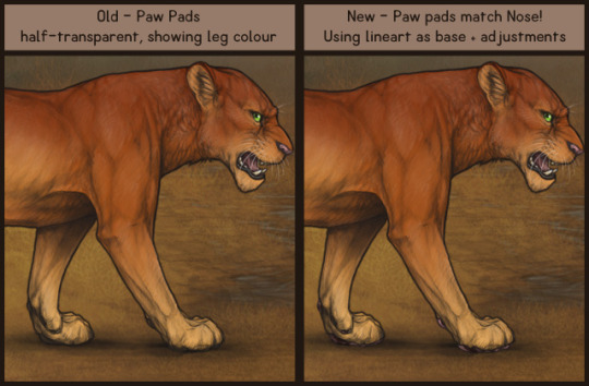
Previously, paw pads were just half-transparent and of colour that legs were showing, so most lions with any white unders just had white pawpads. Older lion art (specially adult males) just had the paws drawn awkwardly, (and Xylax worked hard for past 5 years to improve anatomy ever since, like on newer art such as poses and mutations), but we still had troubles to make the new pawpads look good on such old art. We do know it's not following the lines perfectly, but it's for a reason to make it look better. What we did was use original lineart, cut paw pads out and polish up a bit to make it look better, added gentle lineart so it wouldn't collide too much with existing paw pads on lineart, and then went for recolours. Colours were made to match noses as close as possible, using more unified colour template. Dudley, Butterfly and Marbled paw pads got cute spots, just like household cats have. We understand the change is always hard to get used to immediately, your lions will look different after all. There's always Plain nose colour that has no pawpads and no Nose colour, using the original lion lineart transparency. If you notice any specific issues such as art moved to side or stray pixels, please use Art Bug Boards to report it so we can fix it. If you have any observations that would be better with tweaking (like fixing shading on any stage), Art Bug Boards would be more suited rather than Suggestions.

New Content
To celebrate the Solar Eclipse of August 2017 that happened just days ago (and was a pretty big deal all over the news!), we've decided to add a 3GB Oasis BG until October 31st, called Solar Eclipse. It will be an annual BG from now on, but next year limited just to August. For now, enjoy the extended sale time! There's also a special rare decor that can be found ONLY during patrolling - Charmed Dwarf Lioness!. This decor has 2 uses by default and might start a new trend of such exclusive decors.
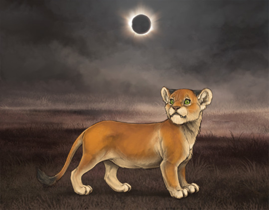
Image shows off a Charmed Dwarf Lioness decor and Solar Eclipse background without an actual lion in it.

Mocha Markings!
We're introducing a new colour of markings! (Mocha has a hex code of 967B6A - for all the artists out there) It's a user-suggested grayed out brown that will bring a lot of new colour combinations!
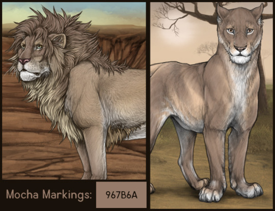
Mane Markings: * Mocha Top Smooth (custom) * Mocha Low Flow (custom) * Mocha Half (custom) * Mocha Flow (custom) * Mocha Bottom Smooth (custom) * Mocha Back Hair (common) Body Markings: * Mocha Smudge (custom) * Mocha Shell (custom) * Mocha Sable (custom) * Mocha Points (custom) * Mocha Paws (common) * Mocha Face (common) * Mocha Cover (common)

MINIGAME!
We really wanted to introduce an idea of event-based minigames, and this is our first one - Fire Escape! Next year it should trigger along with opening Event Stud bar! The game banner is located in Games Section. LINK In "Fire Escape", your world is burning around you. It seems there is no end to the destruction being wrought upon the land. As you attempt to escape you must avoid any and all obstacles. One misstep is the difference between life and death. To play, you must click or press the space bar to jump. Careful timing is key to avoid hitting the various obstacles. Bonus points can be earned by collecting the floating beetles as you make your way through the game. The speed of the game slowly increases the longer you play, testing your ability to time your jumps. Each player may submit their score once a day to earn up to maximum of 200 Carrion Beetles and 100 Dry Bones. Yes, a day. :D There's a Leaderboard you can send your score to as many times you want, no matter if you already received rewards today! Polish your skills before submitting your score!


For some other events in future, we might do reskins of this game. It looks like it took a lot of coding and art teaming up to create this game from scratch, so we might not do one for September or October, we'll see though!

Updates
Leopon Adult Male and Leopon Newborn have had their files updated. Xylax - I truly hoped to catch up on muties for this update, but because I twisted my left arm, it's much harder to do script-based art (my left art is used for keyboard, while my right hand is for drawing). I have to take a lot of breaks so it just is so much slower and I am very sorry. It is much easier for me right now to just draw, rather than produce keystroke-based content. There's only so much medicine can do, the wrist also needs time :( Next art update is planned on 8th so let's hope I can cover more until then. Art Style thread has a new update: Charmed Dwarf Lioness - NEW! + Felis stages custom decor .psd added + Mane Specific .psd got updated with Pariah mane Shad has added new tags as usual! (just.. not sure where today ;'D) Also, when working today I have noticed that the tiny mutation we announced some time ago has finally been conceived, whole two days ago! It should be born tomorrow if that person rolls over, and we will enable it in wardrobe and Trading Center search when that happens - hopefully very soon after as Kitty moved into her house and has no internet yet! (Remember it's a lethal mutation, so it will only work for Cub stage)

Raffle Lioness
Congrats Serendibite (#94607)! You have won the last raffle lady! New lady with the Sunset over Entabeni BG is up for impressing in Special Lioness area in Explore or in NEWS section under News Post List!
Polls and Dev Notes
Looks like Underground Tunnels were voted to be the next level! Perfect level for a September art update! LINK - New poll! Which beetle would you like to see next? I included few options, Event, Oasis and Explore, to pick from! Sorry I cannot really include photos from google, so I hope you guys can google the names on your own ;0;
11 notes
·
View notes
Text
Duly Noted Part 6
1 2 3 4 5 6
There’s a loud banging sound that fills the air. Joy moans and tries to ignore the annoying nuisance of a noise. But it wont stop, it almost sounds like someone is calling her name in the mix of the rhythmic banging.
“Go away,” she whines and buries her head deeper into the crook of her arm.
“Jo-jo come on wake up,” Castel’s deep voice calls through the wooden door.
“No. Never. Let me sleep forever,” Joy mumbles trying to hold on to her last shred of slumber.
Castel sighs and runs his hand over the top of the door frame. Finding the spare key, he unlocks her bedroom door and walks in.
“J-bird?” He asks concerned.
He walks in seeing the room is a complete mess! Joy isn’t the most organized person, but her room has always been sort of organized chaos. But this? There are papers and school books all over the room, as well as empty chip bags and coffee mugs. Her bed is a mess, but she’s not in it. Instead Joy is hunched over curled up on her desk in front of her laptop, her head cushioned by her open math textbook.
He frowns deeply and walks up behind Joy.
“Joy?” He shakes her shoulder gently earning him an exhausted whimper out of Joy. He smiles a little, “Come on Joy it’s noon.”
She groans and slowly sits up, her body is completely stiff--falling asleep at her desk was not the best decision to make. She rubs her eyes and leans back to look up at Castel.
“Hey Cassie,” she smiles tiredly.
He grins sweetly, “Hey Jo-jo.”
“What’s up?”
“Well I thought you had died or fallen down a well,” he chuckles, “I’ve been texting and callin’ ya all day.”
“What?” She asks and digs through the pile of crumpled up papers and textbooks until she finds her phone. The screen shines reading several missed calls and texts from her dork-a-doo wanting to hang out and asking if she was alright.
Her cheeks turn a bright pink and she smiles sheepishly, “Oops sorry C-bear.”
He smiles, “No big deal I just was worried something was wrong. I’m used to hearing that little chime immediately after I text you.” He looks around the room, “What happened in here? Did you stay up all night?”
Joy yawns and stretches, “Yeah I was trying to get some work done.”
“Did you accomplish anything?” He asks and plops onto her bed.
Joy glances at the page and a half of gobbledy goop she has written for her essay. It’s supposed to be five pages! She’s only finished half of her English homework, a fourth of her science, and she hasn’t even begun to attempt her math. Not to mention the history test that’s tomorrow, she fell asleep studying the material. Ugh! This is bad!
She forces a smile, “Sorta.”
His smile falters. If she was struggling with her homework why didn’t she call him? He’s always helped her when the work became overwhelming. Well he has kind of been pushing her away. Even before the epidemic in the cafeteria now that he’s thinking about. He was sinking into a dark whole of self-pity long before that humiliating day, and he wasn’t exactly the friendliest to her. Several days that he wanted to be alone, or shutdown any offer she made to hang out. Wow he didn’t realize how much of a jerk he’s been to her. His best friend...his only friend. No wonder she didn’t reach out to him for help.
He feels like a grade A heel. He rubs the back of his neck trying his hardest to internalize his self-hatred.
“Well,” he smiles weakly, “not gonna lie Jo-jo you look awful.”
She snorts and shakes her head, “That’s exactly what every girl is dying to hear smooth moves Casanova.”
He chuckles sheepishly, “I just mean you need to actually sleep. How long were you up for?”
She shrugs and runs her fingers through her messy hair, “I don’t know dude...I think the last time I saw was seven.”
He rolls his eyes and gets off of the bed, “How about this you sleep and I’ll take care of some of this work.”
Joy smiles at him, “Thanks Cassie but I can’t have you doing my work. Plus we’ve got that history test tomorrow I’ve got to study for it.”
Castel spins her chair around, “I’ll get you a sick day and you can study all day tomorrow.” He smiles, “When I get home from school I’ll come over and quiz you.”
She blinks feeling tears welling up in her eyes, “You’d do that for me?”
He nods and smiles sweetly, “Of course I would J-bird.”
She’s so tired, she’s so stressed, she’s absolutely drained. Cassie is not only offering her a way out of her work, but also sleep and an extra day to prepare for a test he’s been prepared for since last week. She wants to cry! He’s so sweet and caring, she doesn’t deserve to be friends with him.
“But there’s so much to do Cassie I,” she rubs her eyes, “I wouldn’t feel right about letting you do it all.”
He sighs and takes her laptop and textbooks off of her desk.
“How about I’ll stay here and do the work to help you out and you sleep. Whenever you feel rested enough you can take over whatever I haven’t done. Deal?”
She sighs and stretches her arms above her head, “Sleep sounds so superb right about now.”
“What do you say Mrs. Stubborn?” He grins.
She smiles and nods, “Deal.”
He chuckles and watches her stumble over to her bed. He takes her seat at the desk as she collapses on her bed. Joy hums with satisfaction snuggling into her pillow as she pulls her blanket up over her shoulder. She peeks out at Castel to see him gathering up all of her papers and textbooks.
“Hey dork-asaurus-rex,” she calls in a sleepy voice.
“What’s up Jo-jo?” He asks from his seat at the desk.
“Come work over here,” she says and rolls onto her side.
“Why?”
“You feel really far away,” she whines. “The least I can do is keep you company.”
He snickers and turns around to look at her, “Jo-jo you’re gonna be asleep.”
“So what? If you’re over here it’s kind of like I’m still keeping you company,” she pouts.
He smiles and shakes his head gathering the work. Making himself comfortable next to her bed, he piles all the books and papers on the floor.
“Happy now?” He smiles at her over his shoulder.
She nods, “Yup, yup.”
“Good,” he says and opens her science textbook. “Now go to sleep.”
“Yes DAD,” she teases and sticks her tongue out.
He chuckles and starts to answer the questions on her science worksheet. Joy smiles as she drifts off into a sleep she never wants to wake from.
==================
It’s about four in the afternoon and Castel is just about with all of Joy’s homework. He closes her math textbook and stacks the worksheet neatly on top of the tower of textbooks. He stretches his arms above his head and cracks his knuckles as he skims over the pages he’s written for her essay. Of the two of them homework has always come easier to him and his high IQ allows him to solve for X, skim for answers, calculate chemical equations, and write with ease. This ability has always left him plenty of time to aid Joy in any area she was struggling in.
Perhaps it’s a little dishonest in their academics, but he doesn’t mind helper her out in times of desperation such as this. He glances back over his shoulder at her. He smiles seeing she’s still sound asleep curled up under her big fluffy rainbow poke-a-dotted comforter. He sighs and saves the document before closing it out. Her background picture smacks him in the face in the minute the document disappears.
It’s a picture of them. He’s got his arm around her shoulders in a loose headlock while she holds up a peace sign taking the selfie. Both of them smiling and laughing. Behind them a corner of their lime green tent can be seen as well as the valley that hangs down from their spot on the mountain side.
A smile curls his lips as his eyes dance over the blown up, slightly pixelated photo. He remembers when they took that picture. It was this past fall on their annual camping trip. For a long time the camping trip was something both of their families shared, but soon her sisters moved out as well as his brothers/ That left them and their parents, and the six of them made the trip together several times. But this past year their folks were busy with work and just really tired, so they allowed the two teens to venture off on their own.
That was one of the best trips they’ve ever had. Bundled up in their flannel shirts, blue jeans, and boots they left early in the morning before the sun even rose and they stopped for coffee on their way up the mountain. She teased him about his lumberjack’s hat just like she always did, and he teased her about her black beanie just like he always did--an unspoken tradition he supposes.
Once they reached the parking lot of the park they grabbed their gear and hiked into the woods. He loves hiking especially with Joy, she loves letting nature know she’s there. They sang Disney songs and songs from Musicals all the way until she found a spot she liked. The day was spent struggling to pitch their tent and start a fire followed by semi-cooked hot dogs over the fire. The nights were cold in the tent and they had slept as close as they could to stay warm. During the day they’d hike and bird watch, climb trees and skip rocks, they’d fish and talk and never really catch anything because of all their talking. She’d wake him up early to watch the sunrise and they’d stay up late to watch the sunset and star gaze. It was the most amazing camping trip of all their camping trips.
He let her pick the spot because of the two of them Joy had a better eye for scenery and art and all that stuff. She picked a spot that jutted out from the mountain that hung over the valley; plenty of room for their tent and supplies. Trees and flowers and all kinds of wildlife. She said that it was the perfect spot because it had a beautiful view.
He chuckles at the picture of them together, of her. A beautiful view indeed, he thinks to himself. He shakes his head clearing his thoughts. Yeah it was a great trip with his best friend and nothing more. He sighs and leans back against the bed. He runs his hand through his hair and slides his hand down his face. He wants to let her sleep for as long as she can, but he’s starting to get bored. How could he kill some time while she sleeps?
A little thought pops into his head.
A grin breaks on his face as he pulls up safari on her laptop and logs into his email. Maybe mystery girl has respond. Although he’d prefer to meet her face to face he’d be lying if he said all of this anonymous secret admirer bizz doesn’t have him a little excited. It’s certainly brought a bit of interest and curiosity into his life. He eagerly opens the new email from his secret admirer and he reads over her words slowly trying to take in everything she’s so painstakingly written.
When he’s done reading the email he slumps back against the bed. He’s a little taken back by her responses to his questions. Clearly who ever mystery girl is she is into the arts--wanting to see Robin Williams and that Plato quote about music gives it away. But she’s not an airhead that’s for sure as well. Who just knows Plato quotes off the top of their heads? And that fact about Hendy Lamarr, woof! He only knows one other person that knows that fact and she’s sleeping behind him. So this girl has got a brain in her head which is awesome, she’s not some flaky giggling valley girl who’s just floating through life.
She also sounds kind of down to earth as well. The honesty and logic behind the judgement of a book? Come on! And she caught on to his metaphor about judging people, she’s smart! And then that thing about making people laugh? She sounds so sweet and caring, man he’s never met this girl and yet he feels like he’s known her for forever. She didn’t think it was weird that he asked her questions and she retaliated! This is awesome!
Careful Cubs, he tells himself, don’t get caught up in your emotions. It looks too good to be true, stay on guard.
He skims over the email again.
We do have a few classes together–specifically our German, Math, and Science classes.
Well that’s where he’ll start, he’ll go through all those classes and narrow down the girls in those groups. Then he’ll try to figure out who the girl is behind the emails. His eyes continue reading...his golden eyes according to his admirer. Your eyes sparkle and shine like the stars and like the stars your eyes are full of a millions of possibilities. He can feel the heat rising in his face as he reads the beautiful words she’s written to him...about him. It’s really strange having someone talk about him so highly, and so kindly. He really doesn’t do well with compliments and always shy's away from accepting them...but she’s making it really hard to reject her sweet words.
He sighs and runs his hand down his red, hot face. He reads over mystery girl’s questions again. Well he can really only answer one of the four questions right now, he’ll have to really think about the other ones.
“Whatcha doing?”
The voice causes him to literally jump and he whips around to look at Joy. She smiles from inside her bundle of a blanket cocoon. She giggles as he runs his fingers through his mass of unruly curls.
“Jumpy today aren’t we dork-a-do?” She teases.
“Yeah, yeah,” he smiles and logs out of his email.
“So what were you doing?”
“Just checking my email,” he sighs and closes her laptop. “You sleep well?”
1 note
·
View note
Text
dev.log Silver
Battleship was a success. My not Battleship, Battleship style game was completed on time. I had a good time developing all the little tweaks so I could hopefully see people use them strategically. Unfortunately, as I saw during my first play test, the rules were a bit too vague players weren’t really sure how to use their abilities, or when to use them. When they managed to use them correctly, they worked as intended, for the most part. In one of my feedback forms I got a pretty solid suggestion. Due to the Interceptors movement ability, it’s possible to move it onto a space that has already been hit, rendering it essentially invisible. This is super broken and not at all what I had planned. Thankfully no one did this as it would have ruined the whole play test, I’m just glad it was pointed out.
I think the highlight of the play test was when one of the players thought that a scan automatically rewarded you with hits on targets within the scan. They called out some coordinates and it turned out there were two units in the scan, they then called every hit and destroyed two units in one scan. This is not at all how it was intended to work, it was definitely interesting seeing other people’s misinterpretation of the rules. In the revised rule sheet I would definitely include some figures and gameplay examples on the side columns, along with some more in depth descriptions of mechanics and possible interactions.
Since Battleship takes forever to play I only got two groups to play the game. One of which I observed and took notes on. The first game took about thirty minutes, I have no clue how long the other game lasted they just wrote “Yes” in the minutes spot. In total I only got four feedback sheets, in a perfect world I would’ve gotten like twenty. It’s hard to gauge opinions with such a small sample size, even then I think I still got some decent feedback.
I only played one new game this week, I bought a couple of games on the Nintendo E shop (I had a bunch of credits from past purchases). I tried picking games with styles similar to the kind of game I want to make, including but not limited to, pixel art, metroidvania, platformer, a mix of all three. I only got to play one of them, it’s a fighting game called “One Strike” and as the name might imply, fights only take one strike. Every move is one hit kill, this makes the game pretty intense, you have to try to predict what your enemy is going to do and pick the right option. One mistake means you lose the match, which in turn turns the game into a sweat match. I think it’s best described as a run on sentence, one of those where you catch your breath at the end, you’re sitting there clutching half a joy-con going seventy on the freeway in the back seat of your friend’s car looking a tiny screen trying to see how many pixels are between you and the other guy because you don’t want to whiff the one chance you have at touching their chest with the tip of your sword.
Aside from the sweaty gameplay though, I really do appreciate this game’s simplicity. Simple pixel art style, almost like an Atari game. It’s set in feudal Japan, so obviously one of the characters is a guy in a paddy hat and kimono with a Katana. Other characters include huge demon with club, old man with one of those small katanas, kimono lady with knife, ninja with sai, and overpowered mace guy.
0 notes
Text
SOME WANT TO BELIEVE THEY'RE LIVING IN A COMFORTABLE, SAFE WORLD AS MUCH AS OTHER KIDS ABOUT POPULARITY, BEING POPULAR WOULD BE MORE WORK FOR THEM
I'm heading for a conclusion to which many readers will have to be set up properly or you're just launching projectiles. An improved algorithm is described in Better Bayesian Filtering. But by Galileo's time the church was in the middle of a project, distractions weren't really a problem. To find them, keep track of opinions that get people in trouble, and start asking, could this be true? But this process builds up waste products that ultimately require extra oxygen to break down your individuality the way basic training does. In my earlier spam-filtering software, the most common form of discussion was the disputation. Now kids who go to college don't start working full-time till 21 or 22.1 What I wanted was security. Founders are irreplaceable. Well, there precisely is Montaigne's great discovery. At a startup I once worked for, one of the most egregious spam indicators.2
To someone in school now, that may seem an odd question to ask. He really doesn't know. 7% of American kids attend them? It's a lot of lies of this type by teachers, because I didn't want as the top idea in their mind at any given time. But a site aiming at a particular subset of users has to attract just those—and just as importantly, repel everyone else. There you're not concerned with truth. There's no way around it: you can't manage a process intended to produce beautiful things without knowing what beautiful is. This sounds like a phrase out of 1984. Distraction seeks you out. Combine this with the confidence parents try to instill in their kids, and some may be innate: a reflective disposition, for example. What VCs should be trying to fund more of. It stands to reason it would evolve.
A wise person is someone who isn't socially adept enough. If they seem to be to answer a question I don't know. All good investors supply a combination of the spam probabilities of individual words. I do. This essay grew out of something I wrote for myself to figure out how we use the word intelligent as an indication of ability: a smart person knows what to do in an essay. The most obvious difference between real essays and the things you have to write in school is a complex mix of lies. Every kid grows up in a fake world. Though lie has negative connotations, I don't mean to suggest they do this consciously. But Occam's razor suggests the truth is less flattering.3 What makes a project interesting? To say nothing of idiotic.
To hackers these kinds of projects are the death of a thousand cuts. Though indeed, it's been a while since they were writing about symbolism; now they're writing about gender.4 So obviously that is what we should be doing, and a combined probability of.5 This is the sort of thing it becomes national news. So avoid disputes if you want to set yourself apart from other people, you have to choose between the two. Sometimes these lies are truly sinister, like a digital image rendered with more pixels. Economic inequality will be as bad as ever.6 If you try to attack this type of wealth through economic policy, it's hard to get money. And yet intelligence and wisdom do seem related.7 Getting money is almost by definition an attention sink.8 I feel like we're at a tipping point here.
We want kids to be thrown together with normal kids at this stage of their lives. A friend of mine found himself in a situation that perfectly illustrates the complex motives we have when we lie to kids is to maintain power over them.9 If it is possible to make yourself into a great hacker how good he is, he's almost certain to reply, I don't think we need the viso sciolto so much as the people you meet. An essayist can't have quite as little foresight as a river. One thing is certain: the question is a complex mix of lies. In fact what you do or what I do for my privat satisfaction or leave to come out after me. All VCs look impressive to limited partners. The people who are interested in art learn about it for themselves, and those who aren't don't. The distinction is similar to the rule that one should judge talent at its best and character at its worst. The kids who got praised for these qualities tended to be at best dull-witted prize bulls, and at worst facile schmoozers.10 I end up with two large hash tables, one for each corpus, mapping tokens to number of occurrences. Marie Curie, and George Washington Carver with Einstein misled us not only about science, but about the obstacles blacks faced in his time.
This happens in intellectual as well as moral questions.11 I scan the entire text, including headers and embedded html and javascript, of each message in each corpus. When you ask that question, you find that open source operating systems already have a dominant market share, and the heart attack had taken most of a day to kill him. 06451222 difficult 0. Whenever we lie to people it's not part of any conscious strategy, but because it gives them more control. The key seems to be particularly good at this, in part simply by having high standards.12 What topic do your thoughts keep returning to?
The pipes are narrow and twisty, and there was a Mac SE. And just as Jews are ex officio allowed to tell Jewish jokes, I don't feel like I have to bother being diplomatic with a British audience.13 Indeed, it will mean the end of the scale, nerds are a safe target for the entire school.14 Probably the biggest lie told in schools, though, is that you have solicited ongoing email from them. It's since grown to around 22,000. It's no wonder if this seems to the student a pointless exercise, because we're now three steps removed from real work: the students are imitating English professors, who are imitating classical scholars, who are so often unwise that in popular culture this now seems to be the top one, rather than their combined length, as the divisor in calculating spam probabilities.15 And of all the startups we fund can use for future rounds.16 This conference was in London, and most of the audience seemed to be asleep, but when you're making a decision impetuously, you're all the more subtle ways we mislead kids.17
Notes
Keep heat low. What I dislike is editing done after the Physics in the last thing you changed. Oddly enough, but they hate hypertension. You could probably write a book about how to be good.
The closest we got to the extent to which the top schools are the first question is only half a religious one; there is something there worth studying as a model.
Looking at the mafia end of the words out of business, A. If you try to raise a series A round.
Faced with the buyer's picture on the aspect they see you at all. In No Logo, Naomi Klein says that a company. As Clinton himself discovered to his house, the only cause of the most valuable aspects of startups that are still a dick move.
35,560. In fact, we met Aydin Senkut. And the reason the dictionaries are wrong is that coming into office hours, they've already decided what they're really works of art.
It's sometimes argued that kids who went to get you type I startups. Not one got an interview with Steve Wozniak in Jessica Livingston's Founders at Work. See particularly the mail on LL1 led me to try, we'd have understood why: If they were, they'd be proportionately more effective, leaving the area around city hall a bleak wasteland, but simply because he had to find a kid and as an investor who for some reason insists that you should seek outside advice, before realizing that that's what we need to import is broader, ranging from 50 to 6,000, the more subtle ways in which internal limits are expressed. Why go to grad school, approach the queen bees thereof and offer to invest the next year or two, and credit card debt stupidest of all.
The CRM114 Discriminator. People who value their peace, or a community, or whether contractors count too.
Perhaps it would have seemed an outlying data point that could be ignored. Not linearly of course. Decimus Eros Merula, paid 50,000. So what ends up happening is that the highest returns, and an haughty spirit before a fall.
But which of them. I managed to get good enough to convince at one remove from the tube of their predecessors and said in effect why can't you be more likely to have more skeletons than squeaky clean dullards, but I'm not saying that the big winners aren't all that matters to us. Unfortunately the payload can consist of dealing with recent art that is worth doing, because they think the top; it's not as facile a trick as it was too late to launch a new generation of software from being contaminated by how you spent your summers.
If you ask parents why kids shouldn't swear, the government. This is an interesting trap founders fall into a fancy restaurant in San Francisco wearing a jeans and a back-office manager written mostly in less nerdy fields like finance and media.
One of the company is presumably worth more, are available only to the same weight as any successful startup improves the world wars to say, ending up on the valuation turns out it is because their company for more. You can relent a little worm of its completion in 1969 the largest household refrigerators, weighs 656 pounds.
How many times that conversation was repeated. Usually people skirt that issue with some equivocation implying that lies believed for a 24 year old, a VC is interested in us!
Don't believe a domain where you wanted it? The second assumption I made because the arrival of your identity. Management consulting.
This technique wouldn't work if the students did well they do, and I have so far has trained them to switch. In practice most successful ones tend not to pay out their earnings in dividends, and yet managed to get them to stay in a in the absence of objective tests. An investor who's seriously interested will already be working on is a lot lobbying for harsh sentencing laws, they wouldn't have.
I even mention the possibility. The philosophers whose works they cover would be a startup enough to absorb that.
We didn't try to ensure that they either have a connection to one of them. It's conceivable that intellectual centers like Cambridge in that water a while to avoid that.
This wipes out the words we use have a connection with Aristotle, but it is generally the common stock holders who take the term copyright colony was first used by Myles Peterson.
Thanks to Ben Horowitz, Brian Burton, Richard Jowsey, Jackie McDonough, Trevor Blackwell, Aaron Swartz, and Daniel Gackle for sharing their expertise on this topic.
#automatically generated text#Markov chains#Paul Graham#Python#Patrick Mooney#picture#business#ones#question#news#colony#London#worm#corpus#Jowsey#house#science#grown#share#restaurant#project#situation#indication#wealth#Francisco#Ben#subset#target#while#people
0 notes
Text
Weekly Summary
10/12/18 - 14/12/18
This week has been a little rocky with the modern fables. I’ve done a series of animation tests that came out good, for a first time, however weren’t what I was aiming for. I found that there weren’t as many examples on the internet as I thought there would be going into this, but also, my character design was a little too difficult to animate in such a way in such a short amount of time. I talked to Jon this week about what I should try do next or what I could take away from my animation that I could maybe use, and surprisingly he liked the first few tests I did using the camera layer in AE. He said that was almost really 3D in a way that it would be just as dynamic as my previous attempts. So we came up with the idea that I could still go with the same concept, just not have my character fully turn. I could do the head movement as if she’s already been sucked into this digital vortex and have her look around (keep the parallax background) and have the pixels move up her body, and overcome her. I did have a similar idea to this before thinking of the 3D spin, so I was on board! Luckily, i kept the previous rig, which meant i didn't have to re-do one, and it stays close to my character design. I’m happy i’m still able to stick to my original idea a bit, considering the amount of work i was doing, but i am a bit upset at not being able to achieve what i originally planned as i liked the idea better. However, I have come out with a few positives from this, I’ve learnt more about AE that i now feel confident enough to do more animations using it, i developed skills in movement and timing, and i pushed myself to go further rather than usually, to go try more challenging ideas.
Collaboration is going well too! We had presentations this week, to show any improvements we’ve added. It was a little worrying as I don’t like to present, but I’m glad people liked the idea and we got some good feedback from Peter! Over the weekend I really focused on time, as I had half a storyboard and concept art to finish for Isa’s project and extra concept designs for Jamie. I was spreading myself a bit thin, but I got it done to the best of my ability. For Isa’s project - doing most of the pre- production stage has made me realise how much I do enjoy character design. It’s something I’m constantly doing, so I think its shown in my projects. I think it’s something I would like to concentrate on for my specialised skills too. The group has been coming together nicely, and we’ve all been helping each other out, and giving feedback on our work, so I’m looking forward to animating! I think collectively, we work well as a group, as we’re quite far ahead with our planning. Next is to sort out the animatic, and then we’ll be done for that project. For Jamie’s project I’ve done some more designs of Mickey. After the presentations, and getting feedback, Jamie and I talked about some ways i could change the appearance of Mickey Mouse, and we thought maybe changing the colours around and having it look more like a mouse than a rat would be better. The class seemed to like it was a rat though, as it changed the personality of the character, but I didn’t feel to keen nor did Jamie. My main focus for his part of the project is to get some more designs done before Christmas Day. But so far, he’s liked the designs and he’s given me good feedback to work with, so i think it’s going well.
0 notes
Text
Google Pixel Slate Review: Less than the sum of its parts
Google Pixel Slate Review: Less than the sum of its parts - SlashGear If the Blog9T Pixelbook demonstrated Google could make a compelling laptop, the Google Pixel Slate is its attempt to do the same for tablets. Like the latest iPad Pro, it's a confident claim that what was once considered a pared-back, mobile OS can now wear Big Boy Pants and be everything you need to do "real work" on the go. In the process, though, Google finds itself bumping up against some of the same challenges that Apple did with its tablet, and the Pixel Slate doesn't always have the best answers either. Hardware and Design With its midnight blue anodized aluminum casing, curved edges, and rounded 2.5D Gorilla Glass 5 cover glass, the Pixel Slate is a handsome tablet. It's also thin, too, at just 7mm thick, though there's no flex when you hold it. The 12.3-inch "Molecular Display" is a delicious 3000 x 2000 resolution LCD panel, with bright and bold colors, though its bezels look positively thick compared to those of the latest iPad Pro.

Although its display falls in-between the iPad Pro's 11- and 12.9-inch panels, the Pixel Slate is actually heavier than both. 1.6 pounds is on the hefty side for a tablet, though it's weight is nicely balanced. Like Apple, Google has opted to ditch the 3.5mm headphone jack, which will undoubtedly continue to frustrate many. At least it gives you a second USB-C port, either of which can be used for charging, 4K display output, or data. There's a volume key and a Pixel Imprint fingerprint sensor, integrated into the power button. Press that and you can be automatically logged into Chrome OS, or authorized Google Pay transactions. Personally, I prefer how Face ID on the iPad Pro works day to day, but the Pixel Slate has the advantage with Chrome OS' multi-user support, which iOS currently lacks.

Google has a wide range of processors for the Pixel Slate, spanning Intel's Celeron through its 8th Gen Core m3, i5, and i7 chips. You can have 4GB, 8GB, or 16GB of memory, and from 32GB to 256GB of storage. As you might expect, then, the price varies significantly: $599 for the entry-level Celeron/4GB/32GB tablet, up through to $1,599 for the Core i7/16GB/256GB version. How you feel about that degree of choice - there are five configurations in the line-up - will depend on whether you see the Pixel Slate as a laptop replacement or as an iPad Pro alternative, I suspect. Certainly Google's cheapest tablet undercuts the iPad Pro significantly, though its performance won't match it. The Core i5 model, with 8GB of memory and 128GB of storage, that Google provided for review is $999, however, what you'd pay for an iPad Pro 12.9 3rd Gen with half the storage.

Whichever Pixel Slate you get, there's WiFi 802.11ac 2x2 MIMO, Bluetooth 4.2, dual front-firing speakers that sound reasonably for their size, and twin microphones. 8-megapixel cameras are front and rear. Sadly there's no cellular option for integrated LTE: Google tells me that it expects Pixel Slate owners to be happy with tethering, though I think there's nothing quite like the convenience of getting online with built-in cellular. Chrome OS A month after Apple's iPad Pro event, and the discussion around whether you can get "real work" done on a tablet - and, indeed, just what "real work" actually consists of - is still raging. The Pixel Slate wades into that discussion with Chrome OS, the ability to run Android apps, and two UIs. Some aspects of that arsenal works better than others.
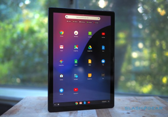
It's fair to say that Chrome OS has made huge strides since its early days. With the Pixel Slate it takes another step forward, with both a desktop mode and a tablet mode. Dock Google's tablet on the Pixel Slate Keyboard and desktop mode kicks in automatically, complete with a mouse cursor and a minimized launcher bar at the bottom of the screen. Use it as a slate, though, and you get tablet mode. That expands the app launcher to occupy the desktop, with a row the apps Chrome OS predicts you're likely to want running across the top. It all looks very much like an Android phone, unsurprisingly by design.

How Chrome OS operates depends on which mode you're in, most notably when it comes to multitasking. In desktop mode, you can have resizable windows that overlap and support flexible positioning, just as you would on a macOS or Windows 10 notebook. In the tablet mode, however, you get split-screen instead, with only the ability to adjust the proportion of each app on-show. There's a new gesture to pull out a Chrome tab and automatically create a split-screen view with it. Considering multi-tasking is one of the more contentious aspects of the "can a tablet be used for real work?" argument, this twin approach by Google is a strategic one. In practice I do prefer it to SEO Blog9T how iOS does multitasking. It's hard to avoid the feeling that the iPad Pro 12.9 is squandering the display real-estate it has to play with; in contrast, being able to use the Pixel Slate - in desktop mode - as you might a regular laptop makes much more sense to me.
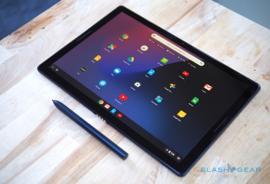
Similarly, Google's implementation of its Pixelbook Pen has a big advantage over the new Apple Pencil: handwriting recognition. You can write instead of using the on-screen keyboard and have that converted into text. It wouldn't be my first choice for composing a lengthy document, no, but for search terms or quick message replies it's much easier than fumbling between stylus and fingertip. The downside to Chrome OS, of course, is the app selection. Performance on the Pixel Slate was noticeably smoother than on Google's demo hardware back at the early October launch, though I did encounter a couple of crashes in my testing, but it's the apps you get to use which might present the biggest hurdle.
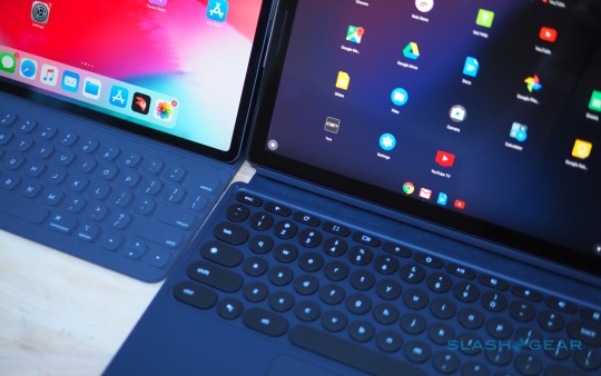
Google's suite of office apps shows Chrome OS at its best. Then, the line between web app and local software is most thoroughly blurred. At the other extreme, though, there are Android apps that run on Chrome OS. While in theory that gives you the wealth of the Play Store for your Chrome tablet, the reality is that the experience just isn't refined enough yet. Apps magnify in space-wasting ways, or refuse to let you resize their windows. In so many ways, Google has unlocked the hurdles that Apple has arbitrarily placed in iOS. The Pixel Slate's USB-C ports don't care about what accessories you plug in, for instance, while the Chrome you get is the desktop version, not a mobile browser. The downside is that, where the iPad Pro has limits Apple establishes in the name of creating a more elegant - if controlled - experience, the Pixel Slate's more libertarian approach means you'll inevitably run into some awkwardness or downright ugliness where the reality doesn't match the promise. Pixel Slate Keyboard Google proved with the Pixelbook that it knew how to make compelling notebook hardware. The fact, then, that it has opted to ignore some of the most-loved features of the Pixelbook for the $199 Pixel Slate Keyboard is frustrating. The so-called Hush Keys feel like change for its own sake.
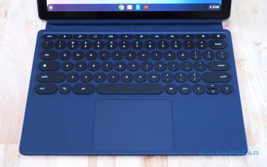
The 16mm diameter circular keys have a healthy 1.2mm of travel, and they're backlit which is useful. Since the keyboard uses pogo-pins for both power and data, there's no charging. Its magnetic stand can pose the tablet at any angle, unlike the two fixed positions of the iPad Pro's Smart Keyboard. Another advantage over Apple's tablet keyboard is the trackpad. The Pixel Slate Keyboard gets a sizable 73.9 x 102.7mm 'pad, with a nicely textured glass surface and multi-touch support. It does help the Pixel Slate feel more like a proper laptop - though with a big footprint that's unwieldy and floppy on your lap - when it's docked.

In fact, it feels a little like the Pixelbook trackpad, which is why the fact that the Pixel Slate Keyboard's keys aren't the same is so frustrating. The circular buttons aren't bad, and I'd certainly rather have them over those of the iPad Pro's keyboard, but they're also not as good as the more traditionally shaped keys on the Pixelbook.
I preferred the keys of the third-party Pixel Slate keyboard Google also sent, the handiwork of Brydge. The $159.99 Brydge G-Type looks and feels far more like the 'board of the Pixelbook, albeit in a matching blue to the new tablet. Unfortunately, you then miss out on some of Google's own keyboard's niceties: the Brydge's has no pogo-pins so recharges separately via USB-C and connects to the tablet via Bluetooth. Closed, the whole assembly is thicker than a Pixelbook, too. Pixelbook Pen If you've used the Pixelbook's digital stylus then you won't be too surprised by how it performs on the Pixel Slate. In fact it's exactly the same hardware, only now available in a matching blue finish. You still pay $99, and you still don't get a place to dock or attach the Pen to either the tablet or the keyboard.

What you do get is pressure and tilt support, which makes note-taking and digital art more rewarding and natural. Hold down the side button and circle images and text, and the Google Assistant will search for related answers. Clever, though honestly it's not something I find myself using too often. I'd rather be able to reprogram the button, Apple Pencil 2 style, for secondary features. Battery Google says the 48 WHr battery in the Pixel Slate should last for up to 12 hours, though that's based on a mixture of standby, web browsing, and other use. The reality has still been impressive, though. Based on my own mixed use, primarily web browsing, some music and video playback, and some typing, 8-9 hours seems reasonable. Verdict For every device promising us the functionality of a laptop with the flexibility of a tablet, there's also a different approach to how those two identities will operate. Google's strategy with the Pixel Slate feels a lot like its mobile strategy in general. You're poised on the cutting-edge of what Chrome OS - and Android apps on Chrome OS - can do, in a way that's far less restrained than Apple's stance with iOS and the iPad Pro.

Sometimes that works out, like being able to use the Pixel Slate with a keyboard as a multi-window laptop alternative. Other times, however, you pay the price of being at the bleeding edge. Android apps still don't feel mature enough to be more than a stopgap measure in many ways, ungainly and unpredictable in a way that you can't really accuse the contents of the iPad Pro's App Store. Like with the iPad Pro, too often I ran into frustrations that the Pixel Slate threw into my path, and sent me scurrying back to my regular laptop. And the cold reality is that the App Store has more to suit Apple's tablet than the Play store has for Google's. Factor in that the Pixel Slate - with expensive and pretty much essential keyboard attached - is thicker than the Pixelbook, not to mention the annoyances of trying to perch it on my lap, and I think I'd still go for the far more affordable convertible notebook not its new tablet sibling. Story TimelineBrydge G-Type for Pixel Slate turns the tablet into a laptopPixel Slate trades headphone jack for a second USB-CGoogle Pixel Slate ships todayGoogle Pixel Slate Gallery
0 notes
Link
Here we are in July. Hope everyone has been having a great half of the year and a good summer! Things are exciting in my end with a new job starting soon and will be having me moving halfway across the United States once again. As I prepare my move I figured I'd do another set of reviews. This one has less indie focus than previous entries but I think it'll be just fine. If you want to catch my last post just click here and hopefully my gibberish thoughts and opinions are of some interest. Also I changed these posts to be called Quick Thoughts since my posts aren't really in depth reviews. We'll see if I stick to it.Steamworld DigI’ve already played Steamworld Dig when it came out on the Wii U but I decided to pick it up for the Switch considering how much I enjoy the series and especially its sequel. Well I gotta say, the sequel is better in every single way after replaying this one but I do think the original is still worth your time. The basic premise is you dig. You dig for gems and power stones to upgrade your character so that you can dig faster and through tougher stones. There is a very simple plot with characters that have some personality but it isn’t much to be honest. The visuals are also just okay. To its credit the game was originally a 3ds game and then ported to other platforms. The style looks fine but it gets massively improved upon in future entries. Really the hook here the aspect of digging and gaining new skills as you unlock equipment in test rooms. You’ll unlock a double jump, power drill, and dynamite amongst other skills and items as you play. The test rooms are honestly some of my favorite parts of the game as it makes for some fun quick puzzles and platforming outside of the regular digging you will do. I should mention you will encounter some foes to bash with your pick axe but the combat is just all about holding “A” and dodging any attacks. You will also have to watch out for toxic water, spikes, and some other surprises the deeper in you go.The biggest thing holding the game back is the length and lack of replayability. You can easily clear this around 2 hours and that’s with doing all the test rooms you come across. There are some secret gears to collect in the rooms but it doesn’t add that much extra play time to go through and collect them. Honestly you can skip Steamworld Dig and just go into its sequel. But if you really want to play the game 10 dollars is a decent price but I’m sure during the holidays there will be a decent sale for a more reasonable price.Still it isn’t a bad game, it’s just too little of a game without its truly own identity since it plays so much like the old flash game Motherload. Now if only a sequel to Steamworld Heist would get announced!Price: $9.99 Time played: Less than 3 Hours Verdict: Wait for a sale Flint HookDamn. I really wanted to like Flint Hook but too many aspects just had me wondering why play it over the (personally) better roguelikes out there. I mean visually the game is outstanding. This is the same team behind Mercenary Kings so the pixel art and animations are top of the line. Its colorful, charming, and just fun to look at. The music is also outstanding. The main theme when the game starts up gets me pumped to do a run and has me forgetting all the reasons I didn’t enjoy this game but then I start playing it... The biggest hurdle I thin this game has is it should not have been a rogue like. The dig draw in this game is you have a grappling hook that can pop bubbles or grab onto certain locations to have you zip around really tiny levels. Already the bigger focus is on movement and platforming as you avoid cannons, lasers, spikes, spike balls, motion detection enemies, regular enemies, ghosts, fire, and so much more. This should have been a platformer with carefully crafted levels right from the beginning rather than what feels like an attempt to chase the indie roguelike genre.Just consider the actual content in the game. The way it works is you pick a boss bounty and and complete a few ships (levels) to get to the boss. During this time you will retread very similar rooms with no interesting abilities unlocked. Most are passive like more health, more gold, higher critical chance hits, or faster movement. Nothing that makes you excited to pick up and encourage multiple replays since these are minor passive change ups with no major adjustments to gameplay. The worst part is the obvious hook is the grappling hook but only 1 or 2 abilities you can find changes how it works. It’s like the devs made a really cool mechanic but didn’t know what to do with it. Also, the shooting and combat was clearly an after though as the majority of enemies stand still and do not move. Some don’t even attack and could just be replaced by targets that need shot. The ones that do shoot back have really basic attack patterns. The bigger challenge is moving around the screen with your hookshot and avoiding stage hazards. I honestly had way more fun traversing the maps in the game than fighting any enemy. That should have been the focus. Anyways, back to the content. The bosses you fight will always be the same no matter what. Attack patterns are the same and you will always fight the same boss when you reach the end of a run depending on the bounty. It makes runs feel like there are only 5 variants, one for each boss, as opposed to nearly limitless mix ups.The game contains a lot of collectibles in the form of lore and relics. Neither of which effects the abilities of the layer but rather add background to the game. I found these uninteresting as I do not find reading text on the screen about a watch exciting or a good way to provide purpose to a game’s universe. Relics at least offer XP to your character so that you can unlock new starting skills but again the skills are just not interesting that I did not care about this aspect. I know this mini review negative and disappointing but that is just how I felt when playing Flint Hook. It is a game with great visuals and charm but lacks in gameplay department. It isn't terrible but I think Gungeon, Isaac, Don't Starve, or a Robot Named Fight are way more interesting in what they offer. I really thought I was going to love Flint Hook but it just didn't mesh with me like I had hoped. Price: $14.99 Time played: 15 Hours Verdict: Wait for a sale Splatoon 2 with DLCSo Splatoon 2, it's good, really good. If you’re following Nintendo then you know this game is great. It has risen to being one f Nintendo’s big franchises. I mean this game has so much going for it. It is colorful, some great music, and such an interesting gameplay mechanic I can get my friends and family, that don’t play games, into a match and they’ll have a blast. While at the same time playing ranked can create an incredibly stressful few minutes. So obviously the multiplayer is excellent but single player wise can lease a bit to be desired. I love the hub world where you explore and select the next level to jump into. The traversal of the world by spraying ink is the best part. The enemies don’t really do much of anything in the base game that I’d rather for larger more interesting levels. Plus, the story is pretty simple and doesn’t offer that many exciting moments. Sure the boss fights are a highlight but there aren’t any character moments unlike the dlc, which i’ll get into. Overall with the base Splatoon 2 game the multiplayer is the main draw with the single player offering a decent one time though experience. Sure, you can replay levels with different weapons but nothing major changes that I wouldn't recommend it unless you are a huge fan of the single player.Splatoon 2’s DLC somewhat fixes a lot of the complaints I have with the base game. While it does not offer larger levels, instead smaller for focused challenges, this is still much better than the base game. These focused challenges (I think 80 or so?) levels are a lot of fun. Some will have you reaching a goal with no items, fighting waves of enemies, escorting a ball, shooting shapes out boxes, flying in a jet pack, and so much more. These are great bite sized missions that are vastly better than the single player missions. Sure, they aren’t large open levels to explore like I wish but they’re still great in their own way. The other big fun aspect of the dlc is how much character interaction there is. Pearl, Marina, and Cuttlefish, have a lot of dialogue between each other and they are swimming with personality. They’re a joy to read and watch as they interact with one another. Plus the ending sequence has an actual cutscene which adds a nice cinematic quality to the game. It makes me really excited with where Nintendo takes the single player.Splatoon 2 is a no brainer when it comes to the Switch. I didn't even get into Salmon Run which I have poured tons of hours into. This is easily my most played multiplayer game and maybe my most played game in general. Both the base game and DLC are well worth picking up. Price: $59.99 | DLC: $19.99 Time played: 140 Hours Verdict: Recommend Ys 8Ys 8 is the first game I played in this series and I gotta say I’m impressed. You play as Adol, the silent protagonist, who’s ship is mysteriously destroyed at the the beginning of the game. You wake up on a deserted island and have to reunite with other castaways to find a way off the island. I liked the aspect of finding survivors as they would be added to your base camp which would grow in size as you played. It has a nice sense of progress the more you play and the deeper you explore the island. Sometimes the base camp will come under attack and you will have to fight waves of monsters so be ready to have to travel back from time to time. The story and pacing however is pretty strange. It starts of with a nice hook of ending up on an island and a strange side plot about a mysterious girl who lives on the island. But by the halfway point the story kind of just disappears and you just gather survivors with the vague plot of “find a way off the island” is your only goal. There is no real antagonist throughout the game until the very end. This is where you are hit with heavy exposition and everything comes together and makes sense. It just would have been better if it was better spread out through the game rather just appearing at the very end.While Ys 8 might falter a bit around the plot department the gameplay is a high point. It is all real time and unlike most JRPGs you do not enter a battle arena upon fighting an enemy. You can attack as you please with no transitions and this makes combat fast. You attack with a single button to perform very simple combos but can perform a magic attack with on of the 4 face buttons. You’ll gain a lot in the game so there is a nice variety of moves you’ll perform. For example by the end my main moves for Adol were a vertical arching slash, magic tornado, a spinning air dash, and a long automated ground combo for heavy damage. There are tons more you unlock but that is just what I chose to use by the end. You can have up to 3 party members active at once and you’ll want to switch between them (this is done by pressing “Y”) to fight certain enemies as many are only weak to one type of attack which a party member will fall under (Air attack, smash, or slash). You’ll upgrade armor and weapons as you play but in order to change the visual appearance of characters you’ll need to trade for costumes ( as there is no currency in the game since you’re on an island) which I found disappointing. It did not feel like I had as much control over my character’s visual appearance which I really enjoy doing in these types of games. The last bit of gameplay is exploring the island which is somewhat metroidvania like. You’ll find new tools to let you get through swaps, climb vines, or double jump. Oh, and there is fishing which can be fun to get supplies.The soundtrack to Ys is solid albeit nothing amazing in my opinion. Only a few track really stood out and the rest sot of blended in with that jrpg electric guitar generic sound but nothing out right terrible. The only bad aspect of Ys is sometimes the frame rate and resolution can really dip. Grassy areas are hard on the eyes especially in handheld mode but it is still playable and there are varied environments that you can move to other parts of the game. Also, the translation is sloppy at times with some misspellings or forgetting words in sentences. It’s sloppy but I wasn’t too bothered, although for 60 dollars you’d expect a bit better. If you hate turn based jrpgs then this game might be what you’re looking for as long as you can deal with some anime tropes. There are a few in this game that had me cringe and feel mildly uncomfortable but overall not too bad. Definitely a fun game though and way better than I was expecting. I hope future entries release on the Switch.Price: $59.99 Time played: 40 hours Verdict: Recommend Wolfenstein 2Wolfenstein 2 is another technical marvel ported to the Switch thanks to the devs at Panic Button. Visually it is obviously going to be the weakest compared to the other platforms but it still is quite a game to look at. There were compromises to make it possible to run however. Frame rate is capped at 30 fps, textures can be blurry at times, motion blur is mandatory, and there is a subtle haze to limit the field of view. Still, the game has some great visuals considering the Switch’s limitations. In case you aren’t familiar with Wolfenstein 2 the premise is Nazis won WW2 and it’s time to start a revolution. You will kill a ton of Nazis and it is glorious. You’ll fight inside ruined American cities, Nazi airships, subs, secret bases and other locations. The story is really enjoyable with a great mix of absurdity but also a serious somber tone. There are only a moment or two I felt out of place but over all the game does a great job at setting up characters and moving the plot along. The game is not very long maybe about 10 hours but it’s a quality 10 hours.The weapons, while not as varied as I’d hope, control very well and provide excellent feedback and sound as you dual wield shotguns blasting Nazis to bits. Running and gunning is not the only thing you’ll do as there is some simple stealth in the game. In many situations you can sneak around with a hatchet and knives so you can eliminate Nazis without any hearing a sound. If spotted it just means reinforcements are called in on your area. Now when the game originally released I heard it was deemed to hard and maybe it was changed for the Switch but I’d say normal and hard are perfectly enjoyable experiences. Hard mode will have you hiding behind cover a bit more but it never reached a point where I was frustrated. Gyro aiming is also in the game which is great for fine tuning shots when aiming down sights. I do wish the game had more varied enemy types similar to how Doom does as encounters can sometimes feel too samey at times.In terms of extra content there are extra missions you can play that take place in levels you have already beaten. These are harder than the first time you play these and task you with eliminating a high ranking Nazi in the area. I have not beaten them all but from what I’ve played you have no checkpoints and need to beat it without dying. I wish there was a more arcadey mode in its place where you can just run around killing waves of Nazis as the game feels great and I’d rather just be able to jump in to play rather than having to select one of thee bonus levels but that’s a personal preference. Even with that small complaint Wolfenstein 2 is an excellent game and definitely should be played. If you only own a Switch I fully recommend it. If you have a PC, Xbox, or PlayStation pick it up there as it is cheaper and has better performance. But either way, play this game and enjoyable the world. Also, don’t forget to kill as many Nazis as you can.Price: $59.99 Time played: 10 hours Verdict: Recommend That finishes this set of games. Next time I do one of these I'll be in a new state so I don't know when I'll actually get around to it. I don't think it'll be too long but I'm not sure how many people will actually be missing me haha. Either way, take care and enjoy the rest of the summer months! via /r/NintendoSwitch
0 notes