#for instance the pixellated stuff
Explore tagged Tumblr posts
Note
Congrats but also when are you actually going to do the giveaway from way back when (think it was for 400 followers?)
Or did i miss the announcement of winners??
You did not miss it! I have the first half produced sitting at home and I need to design the rest (+ I need a remake of an item cause it came out pixellated af). It's all fun and games until you're busy with life and you're the one who has to draw the things AND you're not an expert at drawing so drawing something decent takes long xD
I've been pondering if I should make a tiny video when everything's ready or display progress pictures in between steps at the risk of kinda killing the pleasure of discovering the things all at once. It's not anything massive like official zines and stuff but it was significant enough to me that I felt it warranted me asking the question to myself :') If you want, I can show you some stuff.
#for instance the pixellated stuff#one of the designs came out so good on the product but jesus is it crusty so I asked for a remake#but I wouldn't mind showing this as it's fucken failed
4 notes
·
View notes
Text
NOTE: THIS ITEM IS CURRENTLY IN PREORDER. IT WILL SHIP IN JUNE-JULY 2023. We will be printing based on preorder size, so grab one now if you want one!
More than 40 trans writers and artists have joined forces to explore the deeper meanings of the Fast & Furious franchise (and also gender). There's really no way to know why this exists, but it does, and you can own it! Suitable for F&F fans and newcomers alike. Contributions include:
- A new short story by Manhunt author Gretchen Felker-Martin - A demolition derby driver’s perspective on 2 Fast 2 Furious’s derby scene - An essay contemplating the queer symbolism of Cipher’s bowl cut - The scoop on the franchise’s only canonically nonbinary character - Instructions for an F&F-themed tabletop roleplaying game - A contemplation of which Taylor Swift album represents each F&F character - Plus: Bingo cards! Comics! Haiku! And, of course, hot gay erotica…
2 Trans 2 Furious is edited by Tuck Woodstock & Niko Stratis, with cover art by Mattie Lubchansky and zine design by Shay Mirk.
~
This zine is 8.5" x 5.5" and perfect-bound like a real book — fancy! Interior pages are black & white. We're guessing this baby is like 100 pages long but we'll get back to you on that.
Currently only shipping to the United States, sorry! We're hoping to at least expand to Canada soon, and also plan to add a PDF ebook option, so keep an eye out!
(that "the scoop on the franchise's only canonically nonbinary character" is the page i contributed about our one & only beloved akd-acted cam stone!! plus also if you're interested in preordering a fancy printed copy of a zine about fast & furious, which you don't have to even know about or like, with all trans contributors. including me)
#and i don't even hardly know about it or like it. proof positive#cam stone#i even looked up typical pixel to dpi ratios so my art would be high res enough for printing. Canvas Big & my laptop hated it lol....#but indeed there's three cam pics including an effort at a kind of pinup adjacent Ooh Cam Stone one lol. carefully placed torque wrenches#anyone look up f&f posting on this site....there's gotta be; right. this whole zine is an ode to that. well here goes a few tags:#fast & furious#f&f#2 fast 2 furious#gets a special shoutout. inspiring us all well beyond [even seeing any f&f related stuff. tfatf....#also would be one less contributer if not scholar nothingunrealistic.tumblr.com; also the source of my knowing abt cam stone in general;#being the one to know of this project & go ''perfect cam stone opportunity'' like it Really is isn't it#and thus; against all odds but also appropriately; Racing to actually create a page abt them to spread the good news#in that there was like a month & a half's heads up but i still exponentially did most of the actual execution days before the deadline#ran into some technical difficulties in the final hours lol but then seized a Post Submission Editing Opportunity to amend that w/more time#and to go ''i wrote it as fast & furious: crossroads which is what many sources format it as But official materials write it like#fast & furious crossroads without the colon & it's nbd but i would prefer to change it =('' getting a yeah no prob lol....#fixed up some very minor visual errors & changed one instance of word ordering so that it had some more Prosody imo. didn't mention that lo#plus going ''yeah there can/should be an editor's note to emphasize This Is Really Real Not An OC b/c that's clearer And funnier''#fast & furious extended universe really has a nonbinary character & if they're for real abt this finale Trilogy call akd up please....#let's get that cam & vienna cameo it's fast(tm) easy & free (it's not free....might not even be easy but it's more than worth it)#fast & furious crossroads#anyone looking That up has gotta get in on this#pdf / virtual option tba as mentioned....but physical copy rules too. i forget if i sent them my mailing address but i think i did lol#the ideal of being Gifted one like yeah i Will take this around with me then thank you#truly the most formal publishing my Work has ever seen. besides ''online'' or ''once i did a painting that i think was on the wapo site''#and a very appropriate way to achieve that....but fr what's great is So Many More Ppl Can Now Learn Cam Stone Exists#we've got The Scoop as attested babey!!! 🍨#and in turn we owe it all to akd everyone say thank you akd for acting that pwns & a je ne sais quoi to boot#which; in turn; thank you kompenso; thank you will roland's pwning acting/je ne sais quoi; thank you michael greif What Works understander.#i have remembered that pixels are implicit in the term ''dpi''....but it's a wash on clarity yet funnier to leave it as i wrote it
11 notes
·
View notes
Text

ms paint. you know her. u used her age 8 to make loads of rainbow ovals all over the canvas and then scramble it with selection tool. now u will know her true powers with my handyrandy tips under the readmore. some will be pretty basic and others are very special.
this post has 8 cool trix to learn for you. enjoy and i may do another in the future if i remember/learn more stuff
some of it might be common knowledge. but its got some deep cuts. all tips have gifs to show process easily.
🙂 enjoy and i hope this encourages you to fuck around in mspaint more
soundtrack for this post (loop it while you learn for advanced learning experience)
TIP 1) the right click trick
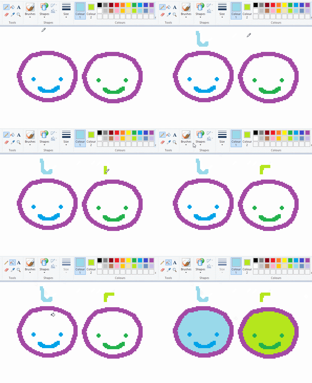
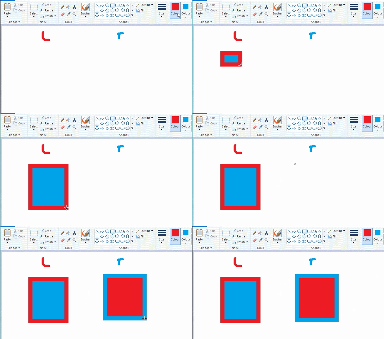
left and right mouse click correspond to col1 and col2 respectively, which u can see in the top bar. this applies to all brushes and the fill tool like above. when using shapes col2 will be the fill colour (if you have solid fill selected). right clicking with shape maker will reverse the colours use on the shape.
TIP 2) right click eraser
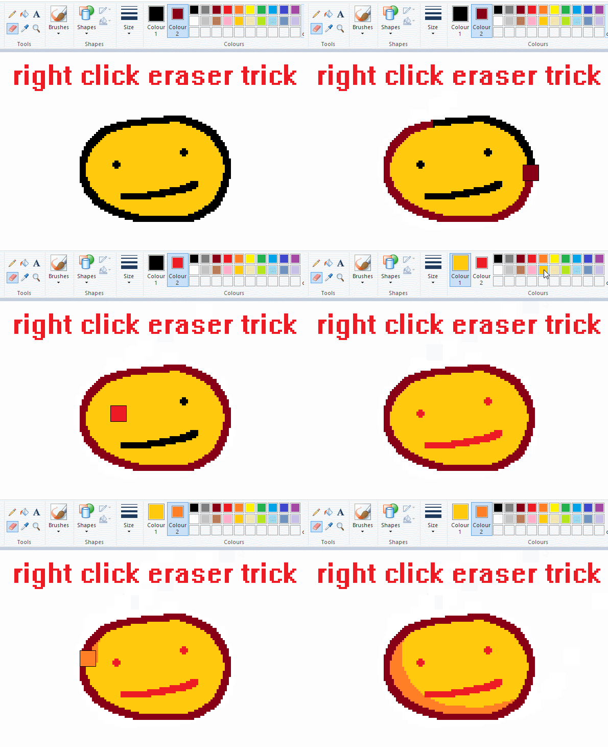
this one is extremely helpful for lineart or add shading. the eraser always uses col2. so your eraser can technically be any colour. but here's where you get powers: right clicking with eraser will only erase onto col1, with col2.
TIP 3) transparent selection change a guy destination
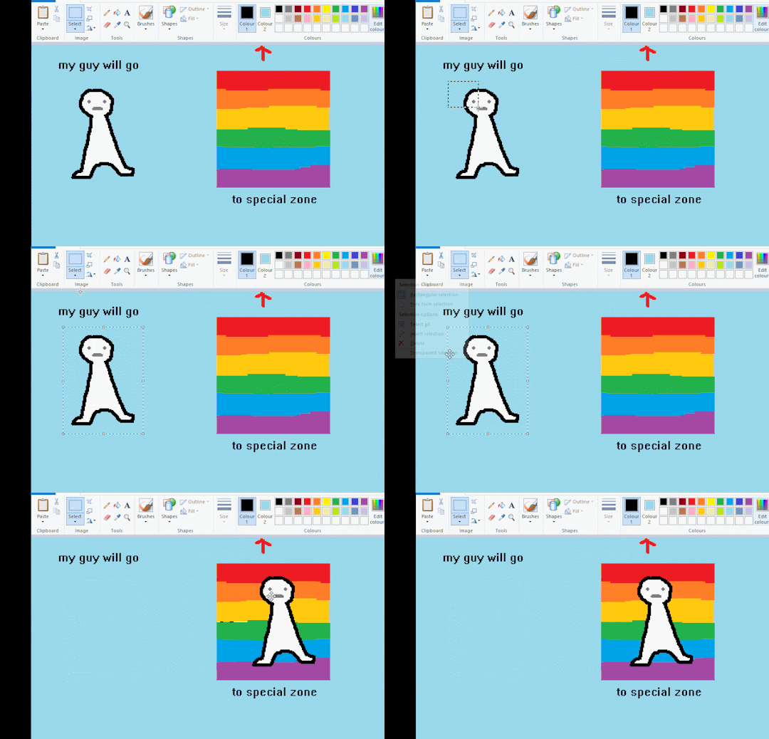
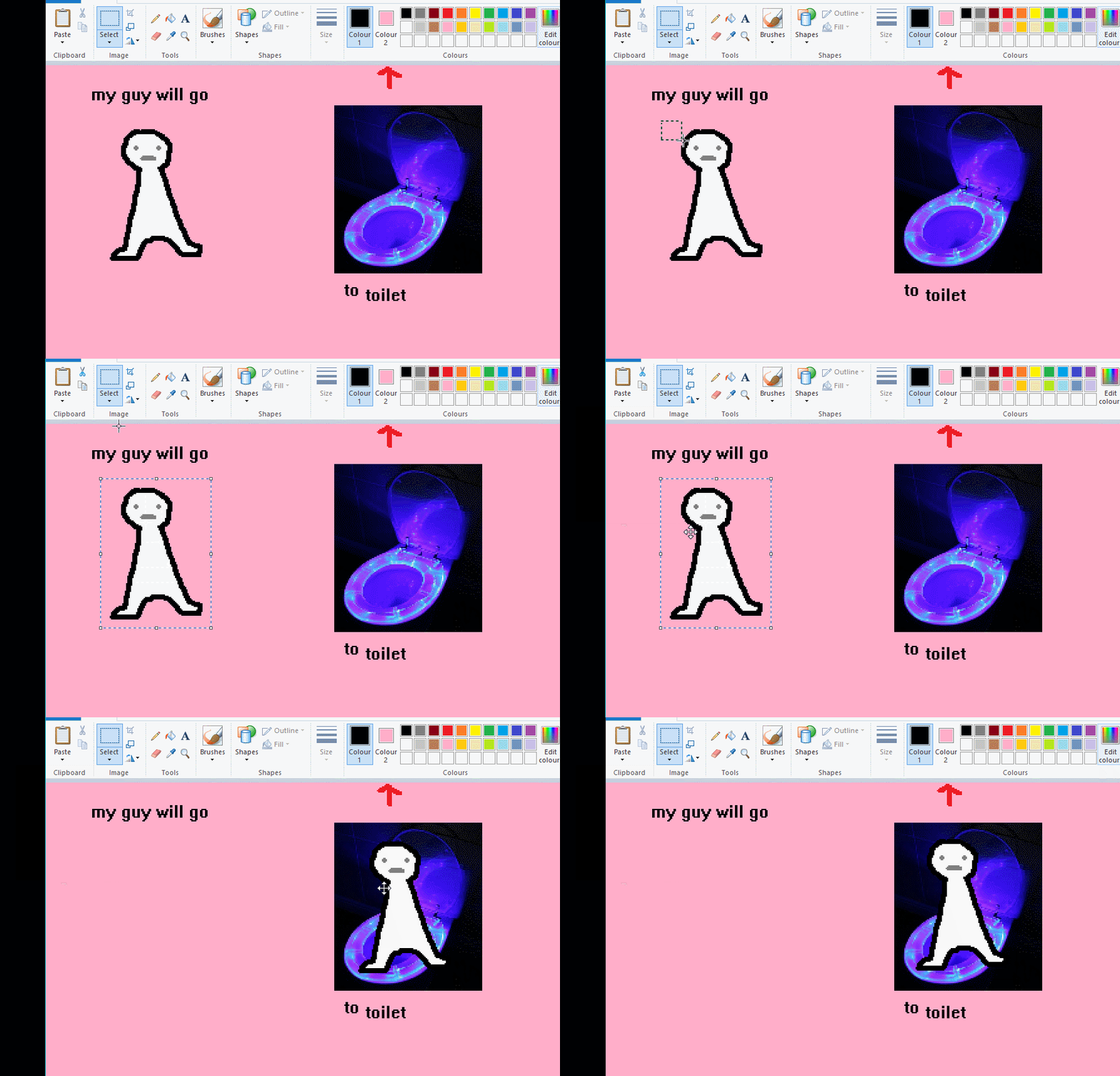
the beloved transparent selection tool works based on what is selected as col2. so long as you have the correct colour as col2 you can make any image transparent and put it on top of anything else. and yes this works with photo bg as you can see.
TIP 4) the gradience
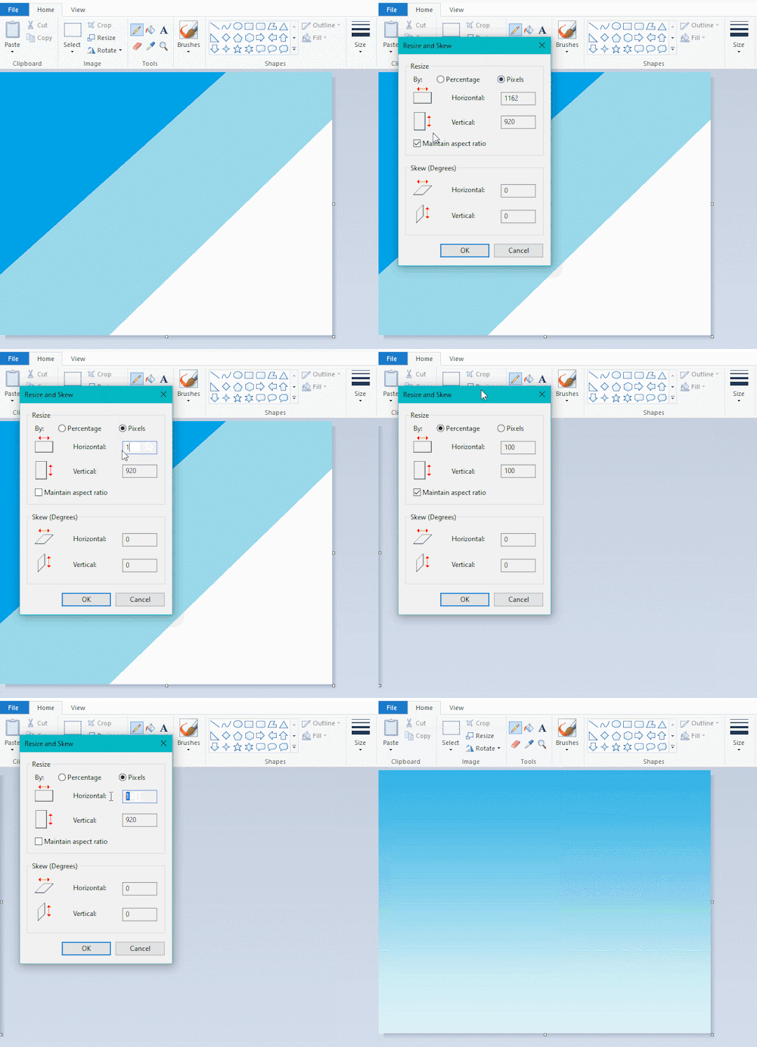
this one is a little more complex. you want to start off with any canvas size, and make as many diagonal coloured bands as you want. (protip: holding down shift makes a perfectly diagonal line with line tool)
then you need to resize the canvas to a width of 1px (make sure you resize by pixels, and do not maintain aspect ratio). then resize again back to its original width (or a different width i cant stop you). you will have your lovely gradience.
TIP 5) superimposter

so. you got a cool gradient and wanna put a guy on it. heres what i do:
i open a 2nd mspaint with same canvas size and draw whatever i want on there. i then pick a completely unrelated colour to my entire piece, and set that as the bg. you could use white, pink, geen, whatever you want as long as it doesnt appear somewhere else in ur drawing. copy the guy.
go back to your gradient tab. ensure that col2 is set as that bg colour you picked (lilac for me). have "transparent selection" enabled. paste your guy in. cue fanfare
TIP 6) advanced superimposter
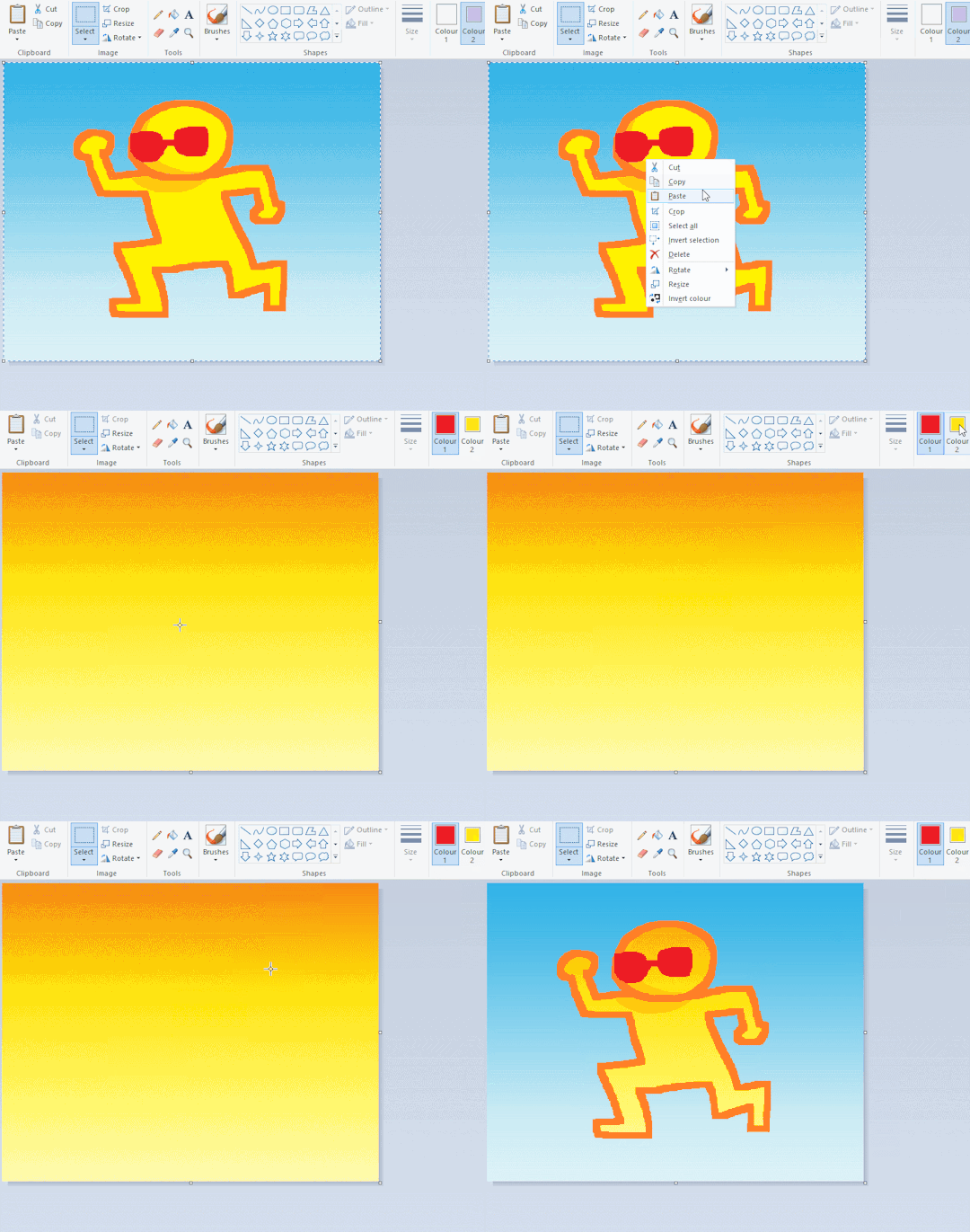
the great thing about this method is u can put multiple gradients in multiple areas of the image. this is where it gets all japanese printmaking type of shit. ukiyo-esque
all you need to do is make another canvas with a new gradient, ensure col2 is set as the colour you want to replace, then paste your original piece onto the new gradient. now my guy has a soft fade. you can do this as much as you want. (you could even make a canvas with a texture or photo and paste your drawing onto there)
TIP 7) "sketch layer"
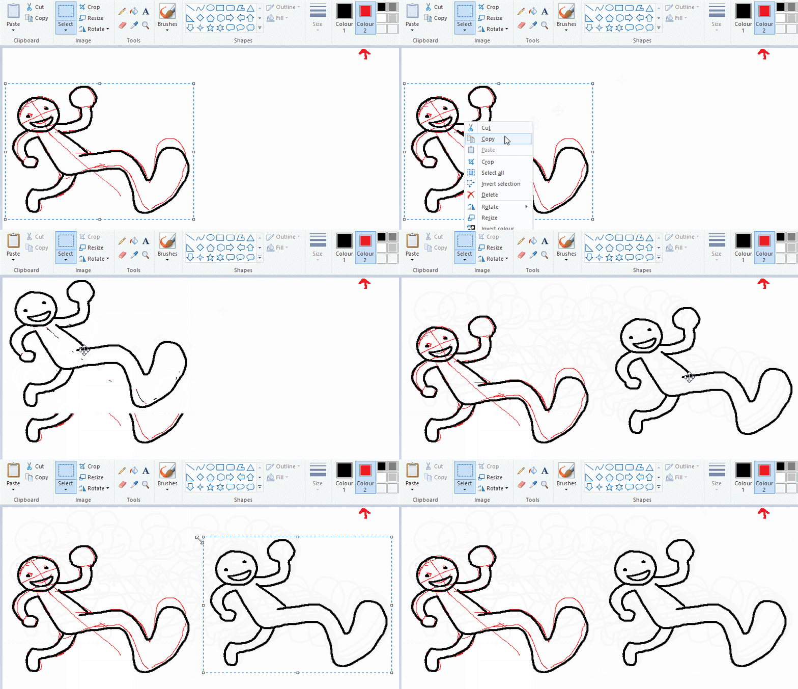
so as you now know, col2 is what is removed when you click "transparent selection". which means you can also remove any instance of a colour from ur drawing. which means you can have a unique colour for sketch layer and remove it from the drawing later. i admittedly dont do this but it is a great trick to have.
now combine this with lowering your dpi for smoother lines. may seem obvious but it helps. its like a free stabiliser whenever u want.
TIP 8) rainbow art
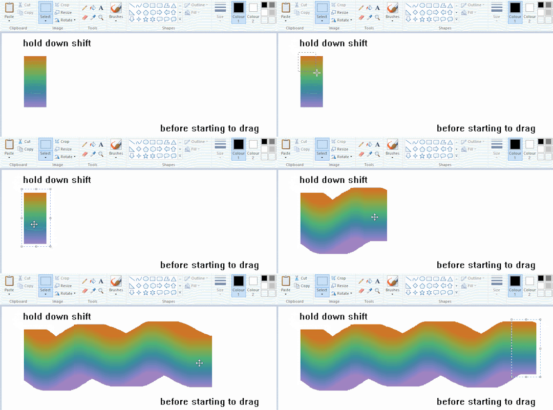
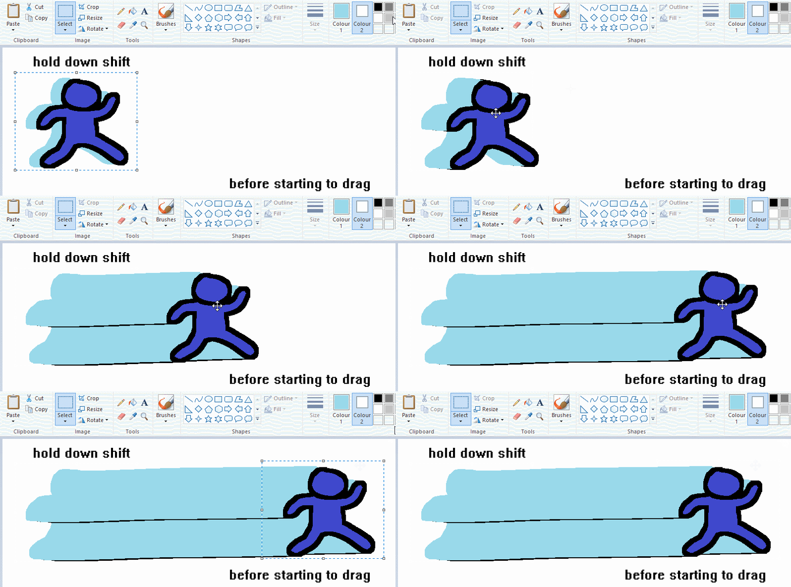
now this is where you can get dizzee rascal "bonkers". check out my small and shitty rainbow trick. you can select anything and hold down shift, then drag with left mouse, to turn that selection into its own brush. i even did it with a guy. and you can of course do this with a photo as well.
🙂well that it for now. hope you liked it thanks for reading now back to your regularly scheduled tgcg programming
2K notes
·
View notes
Text

some wigglypaint fanart of something i found while looking through old geocities gifs recently. it's called a millennium bug, created by someone who went by "oges". a little bit about where i found it and a link to the original below.
i've been looking through a ton of old internet stuff recently, trying to track down the origin of this silly little gif:

(still no luck there, earliest instance of it i can find is a deactivated tumblr blog)
while looking i was linked to gifcities, an internet archive project trying to preserve pretty much every gif on geocities. i don't remember what i searched, but when i saw the bug i was instantly enamored. it's such a cute little design, and i thought what the creator wrote about them was really heartwarming and sweet.

so of course i had to adopt my own and take care of it!! here's the original, they came in a bunch of colors but only the pink one was archived. i cleaned it up a bit and got rid of a bunch of extra white pixels, so if you want your own feel free to save it ^_^. i think it'd be nice to carry on their legacy a little bit...

and of course, here's the link to the original page if you're curious (warning for flashing lights if you go to their home page)

23 notes
·
View notes
Text


Style Exploration has been going really well mostly just been sketching and I think I got a general look down! I was gonna line and color this short comic, though I think I made all the sketch layers a bit too rough ngl.
So rambling a bit about finding my own style! So I've been getting inspired mainly by Daria,MTV Downtown, Welcome to Eltingville's pilot. Course I don't want to simply emulate a style just find stuff I like, and sorta mash em together, shift stuff around.


For instance turns out I really love angular looks, plus dot eyes similar to Jerry and Pete's from wtoe.
I'm mostly saying this just to give my take if you ever feel a bit of artistic block or wanna switch stuff up look at media, and figure out what parts you enjoy and parts ya don't.
I do also to an extent feel bad that I'm focusing less on pixel art as of late, however I feel it'll only help me get better down the line. So whenever I go "Oh I wanna do some pixel shit" I can bring newfound skills and techniques over.


Btw here's some loose sketches I did of jade alongside some layers hidden.
is it obvious I like polos?
25 notes
·
View notes
Text
mega thread of every drawing of tion i have ever made
will update as i draw more which means the most recent stuff is at the bottom 🔥

the first ever image of him,,,blegh . i forgot his shoulder things

same doodle from before

tion’s first ever full ref now with his scarf

gf asked me to draw him eating a burger

iz-style ref . i forgot that irkens only had 2 hands

INACCURATE tion. he shouldn’t have his scarf yet since he just landed


scribbles of him from school

gif of him in a storm

whiteboardfox thing from irken empire rest in peace

him + a sona i made for my gf

tion’s destroyed sir unit

him and his sir

him and his big ass forehead (probably missed some between this and the last one)

tion in the advertisement for invaderplaza .first sighting of his apron and the point where his eye colors flipped around

death pose .without his pak

wawa tion

this really ugly animated gif i made during the invaderplaza pixel fad

bigly tion! first instance of me trying to skew away from the iz style (actually 2nd but the first one is lost)

disturbed tion


tion no and tion yes

trying to fix the colors on him

his human design + arachs human design

trying to draw him emoting

scribble for a discussion in invaderplaza

trying to figure him out

tion as gwimbly

iz-style ish ref 2! most recent at time of writing
23 notes
·
View notes
Text
Welcome
Hello, I'm Neptune, and welcome to my blog! I have snacks and drinks if ya like! Also yes, my home is in the multiversal ventilation system! Anyways, I hope you have a wonderfully lovely time here!Bye Bye!!!! :]
( Caution! When entering this blog, you may turn into a type of rodent or bug of your choosing. However, when exiting you are returned back to normal! )
Redesign Ref Sheet
( Temporary till I make the actual ref sheet )

Here are other blogs I have
Mafia sona~
TADC Reboot Au~
DeeDee!Neptune~
Moon!Neptune~
Tags to Find Content
#ask ~ will be for asks in general
#TADC AU ~ ♧coming soon, concepts are here♧
#art ~ is for my art!
#Neptunes Sillies ~ when I'm being a silly little blob with my moots
#Milk the Cat mention ~ when my dumb but cute child is mentioned or seen
MOOTS/COOL PEOPLE
#void axolotl ~ @/moshieee
#glitchy boi ~ @/glitchyk
#lord cringe ~ @/creatorcringe
#raccoon jester ~ @/rabid-mercenary16
#amazing ace ~ @/unfunnyaceartist
#chaotic ace ~ @/chaos-ace
#pix bix ~ @/bixell-pixell
#tired toon ~ @/vexation-816
#void boi ~ @/voidmin
#nerdy panda ~ @/ner5y
#lil lilith ~ @/lilithloves-you
#fabulous fox ~ @/yunfox00
#eeeeeeeeeuffiee ~ @/euffiee
#creepy hand ~ @/acreepylittleguy
#appearing oni ~ @/onimusha095
#wonderful wasabi ~ @/thisiswasabis
#firey banana ~ @/bananafire11
#buggy bunny ~ @/bugtherabbit
Acquaintances/Cool People
#sassy fridge ~ @/dia-smthidk
#scary ark ~ @/ark-fork
More may come. . . . :]
RULES
If you are going to ask something and/or request something, etc. here are my rules:
No NSFW (suggestive and/or implied is fine)
I'm 17, DON'T BE A CREEP
No extreme gore, scenes, fetishes, or extremely complex character designs
No stealing, tracing, use for illegal stuff, or selling my art at ALL
No reposting or using my art for tik tok or other social media's without my permission (pfp's are okay as long as you credit)
No homophobia, transphobia, racism, body shaming, proshipping, p3d○$, etc. on this page
I am a multishipper for multiple fandoms, for instance in TADC: I can feel like shipping Zooble × Gangle and then next I feel like shipping Zooble × Ragatha
For the love of the gods, please stop with the spam, fraud, or scam accounts in the ask box. PLEASE
Please respect these rules!
(These rules are subject to change)
#ask box open#ask-blog#send asks#ask#Neptune Sillies#Milk the Cat mention#nonbinary#art#artwork#artists on tumblr#art on tumblr#artist of tumblr#small artist#void axolotl#nerdy panda#void boi#glitchy boi#sassy fridge#raccoon jester#wonderful wasabi#tired toon#appearing oni#creepy hand#fabulous fox#pix bix#chaotic ace#amazing ace#lord cringe#eeeeeeeeeuffiee#scary ark
32 notes
·
View notes
Text
Naegamigiri/Naegirigami/Tonaegiri/ LIGHT BLATHER
Headcanon time! Let's go! These are ones that I don't have as much blabbering energy on but I still wanted to mention! Some might end up becoming bigger though if something clicks.
Makoto is that type of guy who looks at cooking content or just food content and get's hungry. He can't help it! They may be pixels but they look freaking delicious! Kyoko and Byakuya like to tease him about it, but they can be a tad susceptible too. It's mostly a situation when their guard's are down and they're already planning on getting something to eat soon. It's a rarity that either of them cave to the content though.
They've done some midnight movie nights some times. The plots and stories are always mystery flicks in which they tear into the plots. Kyoko always figures out who the killer is as well as Byakuya. Makoto does too though it can take him some time on some occasions due to it being late and the guy not being as nocturnal as the other two. On better movies, Byakuya's had slight arguments with Kyoko on how "That can't be!" He is always wrong when he has these debates with her and Kyoko teases him on never learning his lesson.
Kyoko and Makoto cuddle together. Sometimes, when Byakuya's feeling needy, he just stands in the background with some coffee, shaking his head. He also gives a similar response when they kiss but it's more of "If you keep kissing like that, I'm leaving this relationship." It's all a joke though. Byakuya's too attached and they all know it.
Kyoko only wears snap back style caps when she steals them from Makoto. Not that she wears them like, at all, but she'd only wear one if she snatched it from Makoto's junk.
The three take turns cooking. There is no designated cook as they all vary heavily with their cooking prowess. Sometimes two of them cook together or the three of them all pitch in. For instance, Kyoko is rather good chopping fruits and vegetables though does not trust herself boiling shit. Thus, Makoto is the one who boils water for pasta or makes sauces with the heir. Also, in regards to Kyoko cutting the food, she's usually fine though she sometimes needs some help due to the friction of pushing her hands sometimes being uncomfortable. She'd usually push through, but, because of Makoto and Byakuya, she's been treating herself with a bit more care. Speaking of Byakuya, he's got great wrist strength and is the guy that opens most of the jars and can whip some cream like a mad man. He can sometimes overdo it though which is why Makoto's his replacement. Not a good replacement but Kyoko's usually busy by that stage and her wrist strength isn't the best unfortunately. Her gloves also make it a bit hard to do that kind of stuff and the pressure of opening things with her hands sucks.
Makoto has tried to get Kyoko and Byakuya to do the pocky thing with him, but it was such a failure. Kyoko doesn't like pocky and Byakuya finds the idea of eating something then kissing to be kinda gross. Like, he will never get why people find the spaghetti scene from The Lady and the Tramp romantic or appealing in any capacity.
Kyoko and Byakuya nudge each other via kicks to get the other's attention or to just tease sometimes. Can be when they're standing or at a table. It's just kicks too, not an elbow or anything. It is a thing they specifically do like a secret language.
Makoto likes leaving silly little love notes around their living quarters. He usually does this when he knows he won't be home, has somewhere to go, or is going to be busy. He sometimes does this whenever though. As for the notes, they vary if they're on sticky notes or note cards. Most of them are positive affirmations though they can sometimes be hyper specific to one of them. Usually, if Kyoko sees one for Byakuya, she just smirks and goes on her way. When Byakuya sees one for Kyoko, he either leaves it there too, or he plants it closer, or just shoves it on her desk or in her face without saying anything before turning a heel all cockily.
Kyoko owns a good amount of cork boards that she sometimes lets Byakuya borrow when he's on a big rant on something and wants to visually show Makoto stuff. Makoto is a bit of a visual learner after all.
#danganronpa#danganronpa makoto#makoto naegi#danganronpa kyoko#kyoko kirigiri#danganronpa byakuya#byakuya togami#naegamigiri#naegirigami#tonaegiri#the naegamigiri rambles#these three <3#i dunno when i'll run out of stuff#i can't stop gushing!!
14 notes
·
View notes
Note
I'm the anon with the demanding fans. Yeah :') I've kind of had to abandon my content blog because I'm unemployed and trying to get a new job, and despite me sharing this, people don't understand and have been making me feel so uncomfortable with wanting me to make new content with a snap of my fingers. I haven't gotten many ko fi donations and most have been from people I personally know since I'm in debt from an emergency surgery I needed months ago. Yet, I had to close dms and turn off anon since people do not understand my mental health has been so bad lately. Sorry for venting. I do like making content, I just don't like how demanding "fans" are and how you can be open with things that are going on with your life then you'll get 10+ messages of "shut up and make more stuff" to top it off.
NAH TELL ME EVERYTHING GIVE ALL THE DETAILS!! Some people think we're just printers that can spit out new stuff in a few seconds... And they wonder why creators stop making content in their fandom THIS IS THE REASON WHY, TOXIC FANS RUINING THE SPACE. I've seen so many instances where this happens and it always shocks me how crazy people can be over pixels?? I hope you're doing well and don't worry about those idiots, put your health first!!
13 notes
·
View notes
Note
Hi! I've wanted to try out your shader mod, because the possibilities. 😍 Unfortunately after putting the file into my downloads nearly everything (except for walls and terrains) started flashing pink. I've looked for conflicts with SiMidge, but it found none. I'm wondering what went wrong. Maybe my computer is too weak for shaders greatness? Do you have any hints? Thanks for your amazing work!
Hey! Thank you for reporting the issue.
Do you use any other shader mods? Stuff like SkyFix, Better Nightlife, etc. I'm not sure SiMidge considers shader resources (MATSHAD), Midge's post doesn't mention them.
From a cursory search, it might be incompatible with ld_BrightCASFix as they both alter the StandardMaterial's definition file. If that's the case, I can merge them + other incompatible shader mods.
For posterity, my mod modifies the following MATSHAD resources:
"StandardMaterial", internal name "standard", instance "0xFFC2C417", high instance "0x7AA57810". (It lists the shader's parameters.)
"PixelShader2Rendering", internal name "ps2assemblypixelprocessing", instance "0xFFCB0E32", high instance "0x46BA93B1". (It contains most of the shader's pixel-rendering instructions.)
10 notes
·
View notes
Text
Otis IGCS DoF Tutorial for BG3
Today we're going to go over how to utilize Otis_Inf's IGCS DoF generator for BG3, available over on his Patreon along with his excellent camera tools suite (and many other suites for many other games, it's worth the sub imo.) While the camera tools themselves are pretty self explanatory if you look through the hotkeys, the DoF generator might be a little more confusing if you're not already familiar with how these types of filters work.
In case you find configuring the settings for this DoF generator a bit daunting, I put together this little toot to show you the options and what exactly they do. We're going to take a base frame and then show the steps for configuring and the differences between some of the settings. Let's start with our base shot:
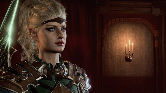
Pardon the coloring/contrast, I had the Reshade set up for different lighting so it's a bit stark here, but that's not the focus of this tutorial.
Now let's take a look at the DoF session options and what they do:
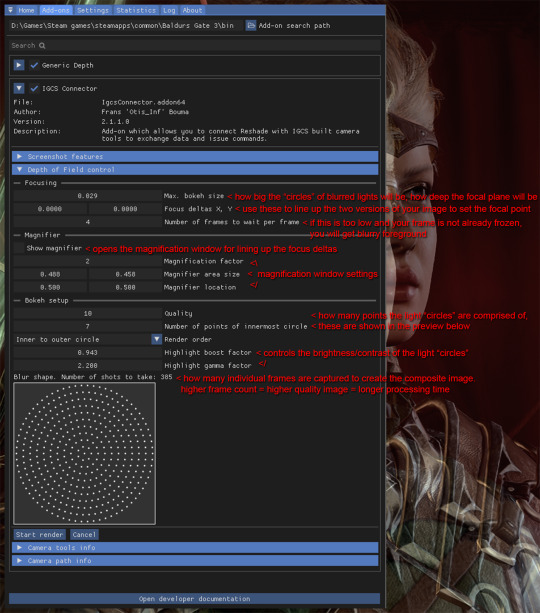
Detailed breakdown of the options & process below the cut:
So the first thing you're going to do is set your bokeh size, as how far the deltas are from each other will change based on this size. When I say, "light circles", I'm referring to this effect:
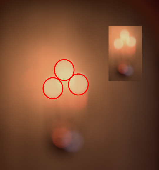
Changing bokeh size will change how big these circles get, basically making the image appear more or less blurry in the distance. It also in effect changes how wide or narrow your focal depth is. I usually go for somewhere between .2-.4, but you can play around with it to find the setting you like. Just be aware that if you change it you will have to realign the focus deltas so try to do this first in your process so you don't have to realign over and over.
Next, on to focus deltas. WTF am I even talking about? Well, the way this generator works is it captures frames between multiple different angles and combines them to generate the field depth. When you first start the DoF session, you are going to see two versions of your image overlapped and offset from each other, each one from the opposite "end" of the angles the generator will be using, like this:
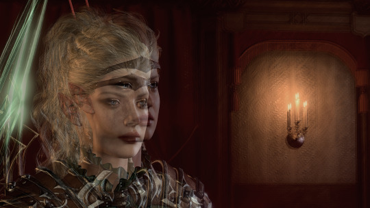
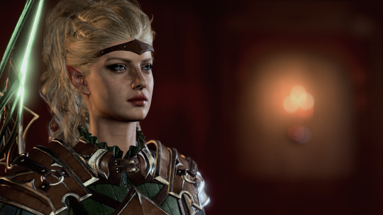
Aligning the focus deltas to match up with each other is how you pick where your image is focused. In most cases you will be using a character's eyes as your focal point, but you can make it anywhere, whatever spot you align the focus deltas on is what will be in focus. Here's the generated image with the focus on the character:
And here with the focus on the candle holder in the background:
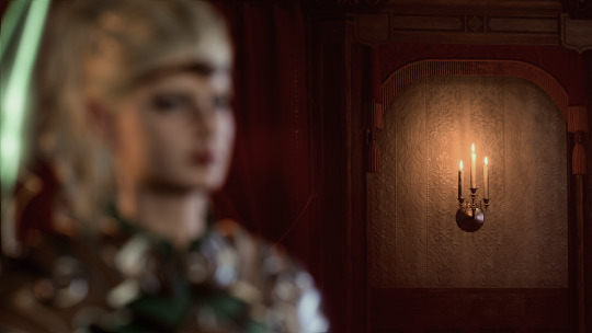
As you can see, wherever you align the focal deltas is where the camera will be focused.
Now let's take a look at the magnifier tool:
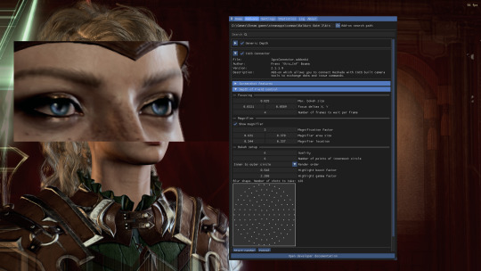
This is basically just a zoom-in window so you can align the focus deltas more precisely. You can change its size and position to get it to where you're trying to adjust the focus. Move and resize it however you need so the point you want to focus on is in the window. Then move the focus delta values around until both versions of your focal point are aligned with each other. Now your image will focus on what you've chosen as the focal point.
Now, one thing with focus deltas is that if your focal "point" is spread across more than a single focal depth, you may need to "split the difference". For instance, due to the 3/4ths angle, the eyes here are at slightly different depths, so if you look at the edge of the face in the magnifier window you will see some slight pixel overlapping instead of it being lined up perfectly. Usually in the generated image this isn't noticeable, but you can exaggerate it using large bokeh size and focusing on a single point instead of splitting the difference if you want to get a super narrow DoF, where, for instance, only one side of the face is fully in focus.
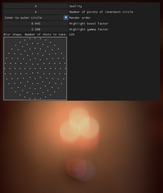
So you've aligned your deltas. Now what does the rest of this stuff do? The rest of the settings affect the "light circles" created by the bokeh effect. This generator creates them by rendering tiny points of light in a circular formation. The first two settings affect how many points are in each circle. Let's take a look at how they compare when using lower quality settings vs higher:
Low quality:
vs high quality:
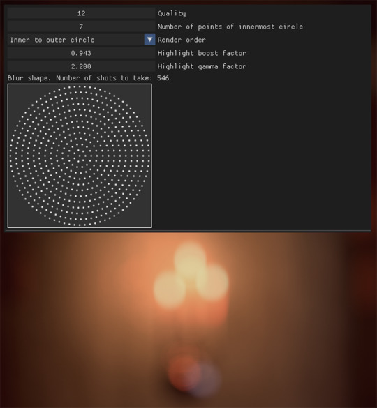
As you can see, in the lower quality image the "points" are clearly visible. However, higher quality settings take significantly longer to process as they utilize many more individual frames than lower quality. You can mess with these to find a balance of speed vs. quality that you prefer. Render order just changes the order the points are generated in, but I haven't found changing this to make too much of a difference.
Last two settings affect the brightness/contrast of the "light circles". Here are some examples of the same lights with different settings:

Not a huge difference, but I find that a sharper, more pronounced bokeh will give the image more of a "cinematic" feel since it's such a distinct effect caused by the way real cameras work.
Finally, let's go back to the setting I skipped over- the "Frames per frame" setting. If you are freezing the image with the camera tools beforehand, you will probably not need to mess with this setting. If you are taking screenshots without freezing the game, however, you may need to increase this setting slightly, otherwise the generator may not compensate for, say, your character shifting slightly during their idle animation, and the foreground will come out just as blurry as the background.
That's pretty much it. Hopefully this helps!
49 notes
·
View notes
Text
There's a lot of reasons I hate AI art in general, to be clear. But one of the bigger reasons I hate AI art when I see it is always feeling like an asshole whenever discerning all the tells it's AI art lately.
Like I grew up in an environment where sporking the shit out of people's creations was some weird norm, and being hyper critical over stuff drawn by people getting into art was super trendy. I hated that so much, and still hate it now.
And I'm just sitting here, going through what's new, seeing for instance a bunch of cute-at-first Sailor Moon art, then looking closer and having that 'wait a minute...' feeling creep in, and then that's another person blocked and my mood slightly ruining a bit more cuz it turns out yeah, it's probably AI art.
But there's always that gross feeling of dissecting art in general all 'Those lines are drawn weird, the proportions don't make sense, that should have foundation that isn't actually there' etc etc that gives me flashbacks to those earlier times, and I hate having that uncertainty of 'are these obvious AI mistakes, or am I being really shitty about them not drawing details the way I like/not drawing in a way I would've/etc?' since there's always a very real chance I could be horribly wrong, and it isn't helped AI art had gotten a bit more broader lately on how it presents itself (the art in question that inspired this post were both pixel art styled, no I'm not going to directly link where or who).
I just really hate AI so much...
3 notes
·
View notes
Text
Higurashi When They Cry Hou Ch. 8 Matsuribayashi pt. 8
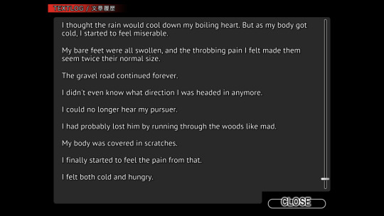
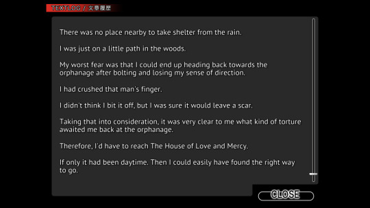
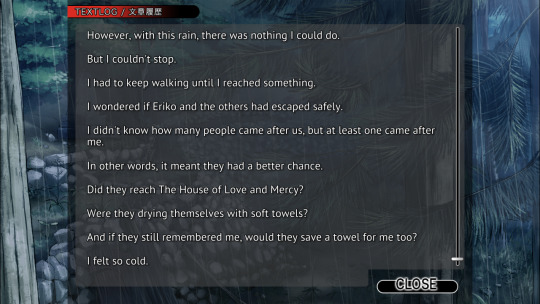
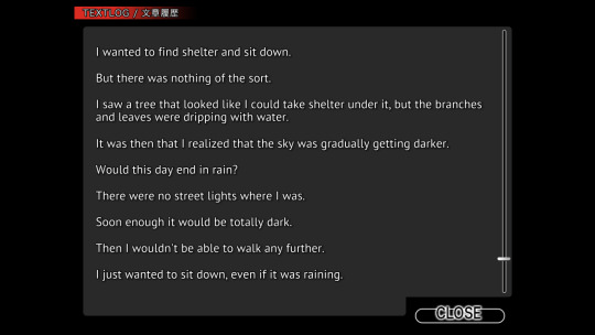
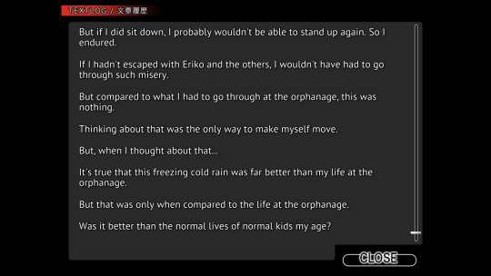
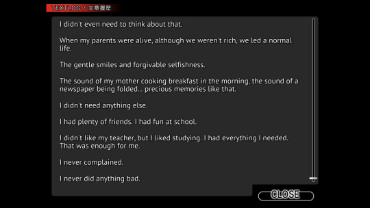
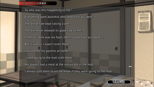
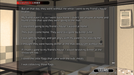

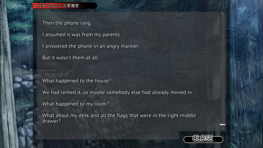
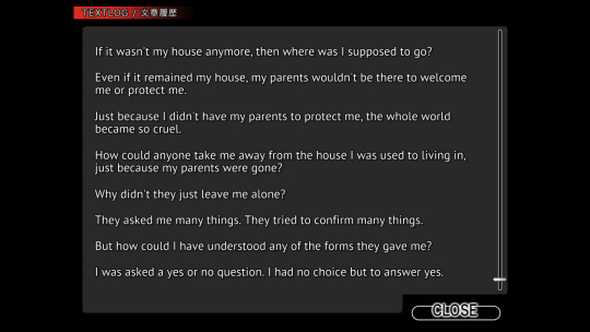

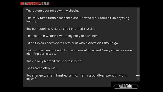
Now, whether or not this sways your heart towards sympathy in the forthcoming events is really something to mull over. Can suffering tragedy at such a young age justify the eventual atrocities one winds up committing in their adulthood? That really depends on you, and your outlook on morality I suppose. Just as a random example, can having an abusive childhood excuse you from ordering the deaths of two thousand or so people?
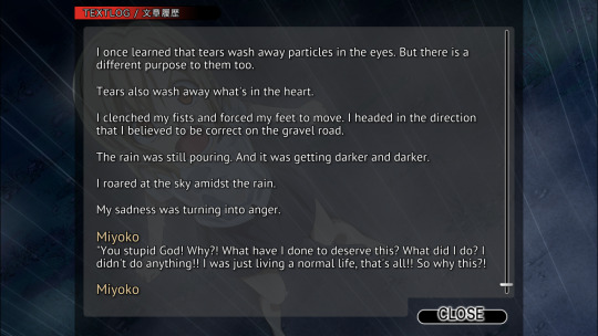
Probably a smart thing to be doing when you’re not a hundred percent sure if you’re still being hunted for escaping the abuse factory.
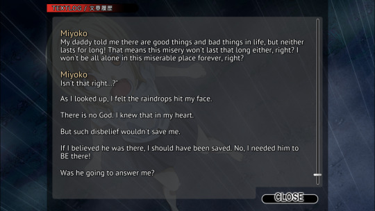
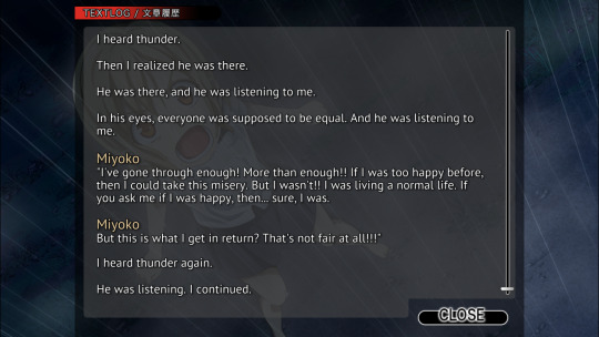
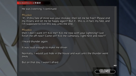
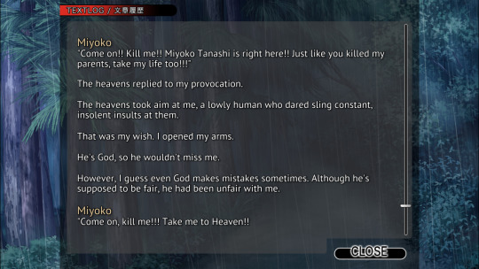
Nothing to really do with anything, but how much do you suppose something like the console ports of Higurashi cost to make? Couple million, maybe ten at most (translate into whatever yen amount is appropriate, I used USD)? Obviously you have to pay your voice actors, and the artists for the new art, but it probably isn’t something that breaks the bank right? I know that it’s not exactly a precise tool to use, but according to steamcharts the highest player count for one of these games tops out at around 350 people. Again, not a precise tool because these have probably been available elsewhere for years prior to their steam release (for instance I play them on GOG, except for Hou+ which didn’t release on GOG for reasons I don’t know).
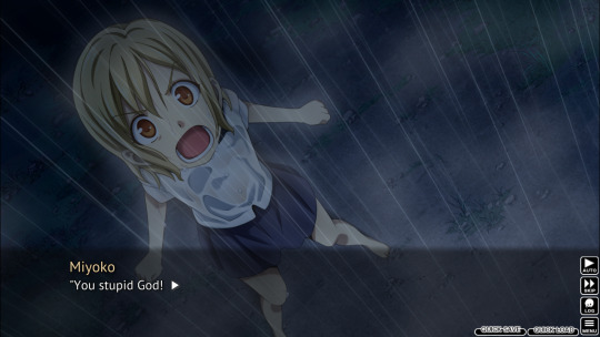
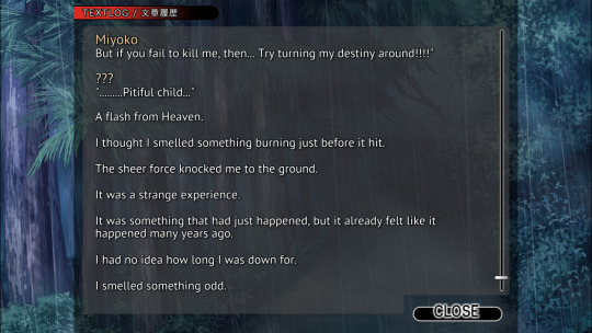
The reason I bring it up is because despite all the new art for some of the scenes, and characters and so on, I can’t help but love when it goes with a relatively low tech option and just zooms in on a characters face. Like the scene where Miyoko is yelling at God in a thunderstorm above. It just pixelates it a bit, and I find that kind of endearing that despite throwing more money at these higher-end ports it still has these small rinkydink workarounds.
Also, and I know I say this a lot, they haven’t quite said who the mysterious voice Miyoko heard was that day. Perhaps they’ll say who it was later on in the chapter, part of me wants to assume it is some aspect of Hanyuu. Even though that doesn’t make a bit of sense considering this scene occurs far away from Hinamizawa.
Another thing I thought about doing just because it amuses me is I’m considering plopping Miyoko’s head onto Arnold Schwarzenegger’s body from Predator.
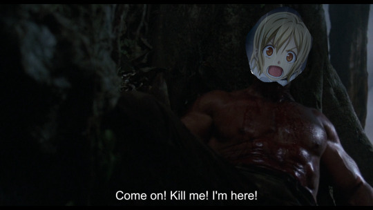
Yeah, that’s the stuff right there. (The most annoying part is finding pictures for my little shitposts that are actually decent quality, and not 320x200, incidentally I had to get the screenshot myself from a copy of Predator I owned). I don’t know why you people put up with my medium effort sillies.
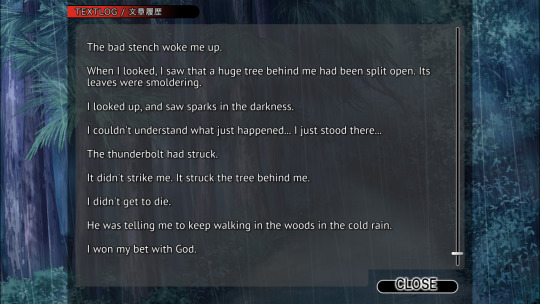
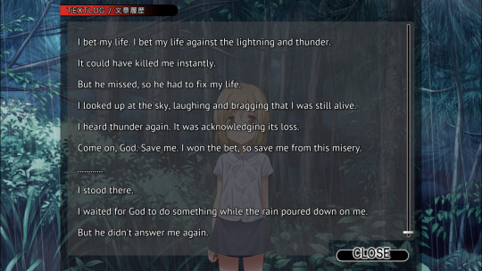
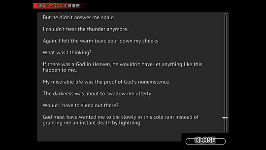
God’s not done with you yet Miyoko. Although it is remarkable you didn’t get blasted with a bunch of splinters when he struck the tree with lightning. Also, not to keep the plot from moving along, a burning tree does provide some warmth you know? Probably not where you should hide since the people from the orphanage would probably check around the remains of the tree, but you know, temporary solutions.
Also, just a fun amusing fact, when the lightning strike happened here it caused the game to crash. It was pretty funny timing all things considered.
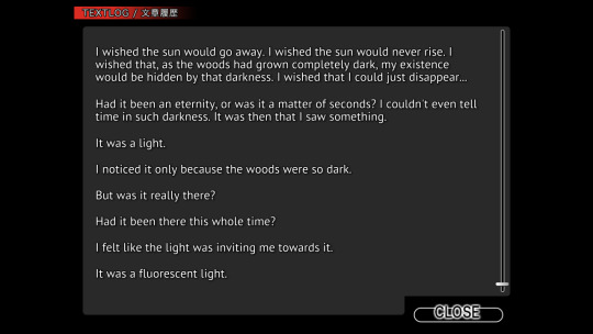
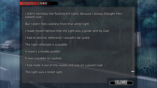
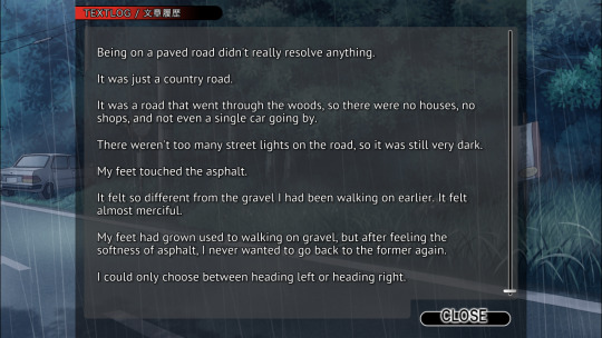
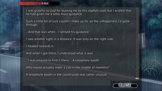
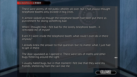
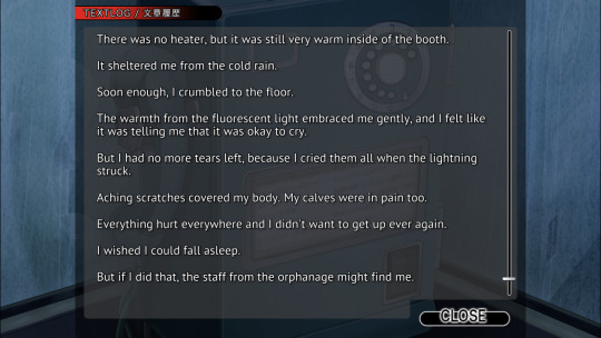
Not to yell at the fictional child, but maybe you should count your blessings kid. You’re out of the rain for the moment, you don’t have to sit in the rain and catch pneumonia. I like the phrase of “it looked like this phone booth had been put there as punishment for doing something bad.” It’s a very amusing line, and it definitely strikes me as the sort of thought a kid would have despite their recent difficulties.
2 notes
·
View notes
Note
I've been feeling discouraged about my art recently. Could you possibly give me some tips?
Ok I wanna preface this by saying I am by no means a professional or even "good" artist, BUT I shall try!
These are all tips by a digital artist so I can't help much when it comes to other forms
This got long so under the cut, 20 ART TIPS TIME LETS GOOO
1.Try to draw most days, or at least once a week. The more often the better BUT I don't mean like hardcore, a complex drawing every single day (recipe for burnout right there). I mean like even just 30 seconds of SOMETHING. You can draw shapes, maybe fill a page with circles. There are programs u can find online that give you like a min to sketch something and challenge yourself in a really short time frame. Guess what?? When you draw often you're building those neural pathways (I think) and the more you do it the easier it'll get
2. Don't obsess over making stuff look perfect on the first draft... or at all. I recommend making a "draft" layer or 2... or 3 over the initial sketch. The more you go over it and change stuff, the better it'll be. Also, If you spend hours on it and still hate it?? Who cares! You put in the work and now you have an idea out on paper that you can go over some time in the future and improve if you chose to.
3. DON'T DELETE STUFF!!! Unless it's literally just mindless scribbles, save everything you draw. Like I said, you can go over it again and improve it someday. You can also look back at it in like a year and compare your art to see where you've improved! I deleted all my old art from beyond like a year ago and regret it so much. Don't berate yourself for the stuff you need to work on, be proud of what improvements you've still made
USE REFERENCES!!!!!!! Please just do it, I know it's annoying but I promise it helps so so much
4. Invest drawing tablet, preferably one with buttons that you can map to undo, sketch, fill and such. This will make drawing sooooo much easier (and faster). My quality of art has improved just from drawing the same thing and redoing it like 20 times at a time, and it takes way less time when I can just click a button to do that. It might seem daunting at first but it quickly becomes instinctual. This is the one I got and I'm quite happy with it! It's got good sensitivity, a pen you don't have to replace batteries for or even recharge, and it's mid-range so not wayy too expensive. However, if you're just starting out, I'd recommend this (I got the corded version but I assume it's about the same) since it's small, cheap and you can focus on just learning basics like improving lines n such.
5. Use a bigger canvas size. I started out with 1000x1000, and that's still fine for smaller stuff and doodles, for better quality I recommend bigger sizes. If it's too small it'll look all weird and pixel-y
6. THERE ARE LITERALLY SO MANY FORMS OF ART, maybe the one you're trying just isn't something you vibe with! There's mosaics, digital, traditional (and all the many sub-categories of that), sculpture, photography, etc. All are equally valid and you will improve in your craft if you choose something that 1. you enjoy, 2. are consistent with it!
7. SEGEMENT OUT THE LIMBS drawing DCA stuff for over a year has helped me improve on anatomy sooo much literally just because it forced me to think of each part of a limb in terms of segments, shapes- for instance, instead of an upper arm, I think of a tube which connects to a circle that allows it to rotate and another tube... followed by a weird shape for a hand that connects 5 smaller tubes, whiCH ARE THEN SEPERATED IN TO 3 TUBES EACH. Yes it sounds confusing but breaking it down like that instead of just trying to figure things out helped an absolute shitton
8. Have some kinda hobby that makes you draw frequently. For instance I have a discord sona I draw a new pfp for every month or so. It's a simple design and since the pfp won't show many flaws I can pump out lots of art for it in a small timeframe and I find it relaxing. I've actually improved a shitton just drawing pfps This is one of my first pfps from maybe 2 yrs ago compared with one of my most recent ones
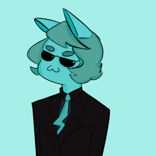
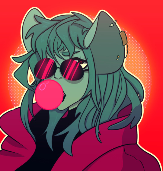
(yes I'm a bit of a furry deal with it) It's cute, there's nothing wrong at all with it! However, you can see how things have changed.
See how the lines are a lot more even, less jagged? The proportions of the shoulders are much wider, the ears aren't just popping out of the hair, the shading makes a bit more sense and isn't just thrown around at random. There's also a broader range of color, with a few bright highlights to catch the eye, colored shading I think as well. The former is just like 3 simple colors. These are all things I learned from drawing pfps consistently.
9. CONSISTENCY IS KEY!! And FUN, if you have fun drawing it'll be a lot easier to do frequently
10. Whether it's drawing pfps, blorbos or landscapes, find something that brings you joy and it'll be MUCH easier to stick to. Draw, draw a lot, do not worry about "good" art and "bad" art cause there's literally no such thing. Compare what you draw now with what you do in like a year or two from now and I promise, if you're consistent, use references and are patient, you WILL amaze yourself with how much you improve.
11. Challenge yourself! Join secret santas (assuming you know you can complete it within the allotted timeframe), draw your friends' sona/ocs (if they're cool with it), do palette challenges, do monthly stuff like drawtober or whatever it's called (BUT I don't recommend doing something every single day for a month cause again, gonna cause mega burnout)
12. Draw when the inspiration comes, it will move your hand. These days I make much better quality art that I'm proud of when I just let inspiration flow through me instead of begrudgingly making myself draw. You shouldn't be forcing yourself!! If you are, you probably are burned out by either drawing too much, feeling a lack of confidence or some other stuff going on irl. Inspiration comes naturally, and when it doesn't it's prolly your mind trying to communicate that something's up. If resting a week or two doesn't help, take a deeper look at your life and see if the artblock is a symptom of something else (for me it's most often depression).
13. At the same time, sometimes you just need to start. Kinda on the previous point of lacking confidence, often we scare ourselves out of even trying. It might feel insurmountable. Nah, try. If all you can do is a wobbly, vague sketch?? You got the idea out!! Start drawing fuckin eyeballs or something, just start. Sometimes the hardest part is just facing a blank canvas and putting a couple lines on it
14. Not all brushes are equal. Some just make drawing easier- at least for me. I dunno the science behind it but when I use my sketch brush (it's got a similar look to pencil) rather than my lineart brush it makes drawings just... look better. Also using thicker lines in general helps. Why?? NO CLUE, maybe thinner ones just show flaws easier or intersect better or something.
15. Music or some other distraction can help, idk why. Some days I like to have a movie/show/podcast going in the background for a mild distraction that keeps me slightly stimulated on other stuff even as I draw- maybe it increases brain activity or??? No idea. Sometimes just listening to music. Sometimes I need total silence. Do what works for you! Give lots of different stuff a try, you may love drawing while listening to a podcast in the background
16. Take breaks!! The pomodoro method works with art as well. Every 25 mins or so, take a 5 min break. Get up, stretch, get some water, maybe watch a yt vid. Call ur friend and tell them you love and cherish them. Then get back to it and you will feel oh so refreshed. After maybe 3 rounds take a 15 min or longer break and then repeat if you still feel like it
17. SLEEP IS INCREDIBLY FUCKING IMPORTANT you will see a deep decline in the quality of your art when you're tired, plus you just feel like shit and art is about feeling good and expressing yourself. Sleep is important, even tho yes I stay up too late drawing most nights, I do my absolute best to get at least 7 hours of sleep every night, as should you!!
18. DO NOT BE SCARED OF STICK FIGURES AND MESSY SKETCHES, they're actually the best way to start bc 1. it's a quick way to get an idea out before you forget it 2. the finished piece will actually look a lot more fluid since you weren't spending all that time obsessing over making the first draft look perfect- which often just makes it look stiff. You can do a whole lot with stick figures. Focus on that good ol' line of action.
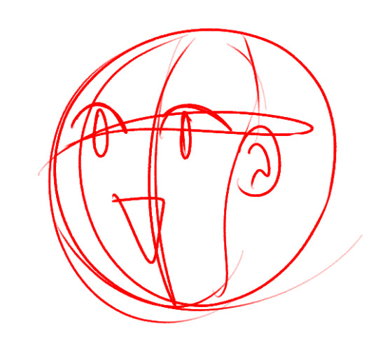
19. Random but when drawing the face, I like to first make a circle and then like a "mask" over it for the actual face. For me it just makes sense. Then two lines, one up/down and one left, right, it'll make it easier to align the eyes and ears. In general, the ears usually go where the "mask" begins and just below the left/right line
20. Finally surround yourself with people who encourage you. I grew up in an environment where people would gawk at stuff my sibling drew and ignore me bc they were ~naturally talented~ and it made me not want to draw at all.
Well guess what?? Now that I spend time with people who encourage me and genuinely care about my interest in art I've improved a lot bc I have the motivation, the joy of showing ppl who care about me new pieces. If people in your life aren't encouraging you, or gods forbid insulting your art (excluding constructive criticism that you've explicitly asked for) then TOSS EM OVERBOARD THE BOAT OF LIFE and find people who will treat you with the love and respect you deserve
P.S
This isn't a tip, just a recommendation: Chicory, a colorful tale. It's a game where u play as a cute lil dog who gets a magical paintbrush that lets you color the world. The only issue? You have no ~talent~. My gods, this game struck a cord with me.
Feeling like you don't have any talents that come naturally to you. Being overlooked even when you try your best. Feeling like a complete joke when you try to pick up the brush (or in this case stylus) because there are so many "real" artists and you're not one of them.
Also the things people say and how they can affect you even when not intentional. Damn. It's just a beautiful game. It's made by the same people who made Wandersong, another absolute banger game with a character who is seen as a joke and I cannot recommend them enough.
bonus tip bc why the fuck not: OVERLAYS!!!!!!! In clip paint studio you have all these layer options, I can never memorize what they all do so I just make like an ombre color layer over my base colors and try all of them to see what looks cool
#Answer tag#Metaltea Talks#ref#art tips#long post#*gives anon a thousand tiny cartoon hearts in a bottle*
9 notes
·
View notes
Text
We need a genuine fucking discussion of how low resolution displays are an incredibly important part of handheld gaming that is not aknowledged as much as it should be.
Yes im going to be pedantic for a second like everyone in a CRT display discourse
With all my time taking a look at games on the PSP, DS, 3DS, GBA, NeoGeo pocket... It sorta sinked in how important the display's resolution is when it comes to 2D assets

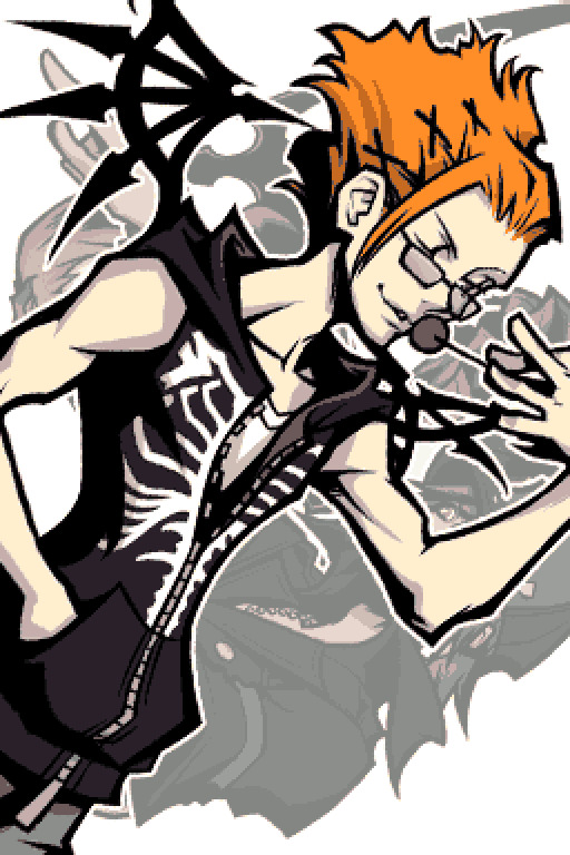
I like taking this frame of the twewy opening as a good example of what I mean
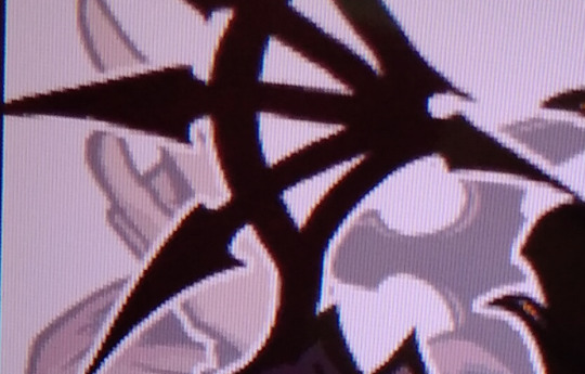
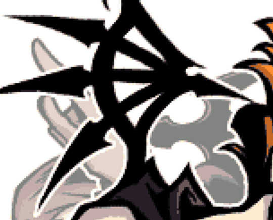
The way the low res displays handle kariya is sharp. it takes advantage of every grey pixel to create a sort of gradient which ultimately adds to the picture
you can still see some of the imperfections like that one stray pixel


but it ultimately achieves better results.
Lines are way smoother.

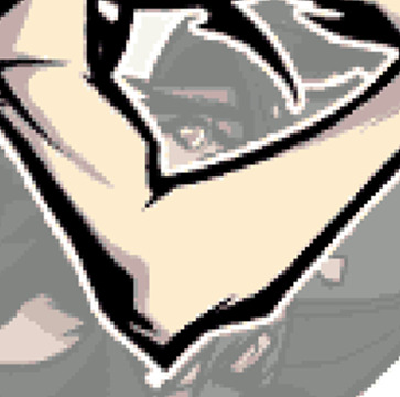
Similar cases can be seen on the PSP, 3DS, GBA, GBC and even the wonderswan (Rhyme Rider Kerorikan comes to mind)
The better image isnt limited to the DS mind you, as long as you can run the game on its original resolution, you can achieve similar, if not better, results on your current monitor
The quality of modern day displays is waaay better than the DSi's too... but
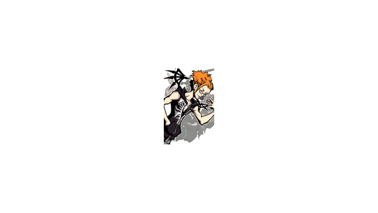
its a bit small. just a bit.
This is the same kariya screencap scaled to the DS's original resolution 256x384 (each screen is 156x192) on a 1920x1080 canvas
Kariya is really sharp! but yknow... what sort of madman is going to even play the game like this.
Most 2D elements in DS and GBA games look great which is a darn shame most people dont get to experience that.
Games like Golden Sun and Yddra Union look fantastic on their respective displays.
Even 3D games can look better in certain instances
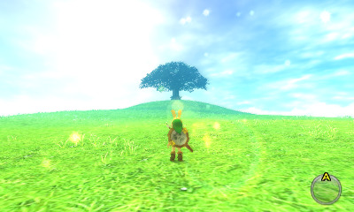
Let's use Majora's Mask 3D as an example. Despite running at 240p, it presents a beautiful picture on the 3DS! A bit of anti aliasing was put into that release.
When looking at it at the right resolution, you can trully see how amazing it looks.
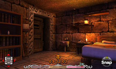
but I will admit that most of the time this is the exception to the rule and those pixels can be so fucking sharp you could cut bread with them... Persona Q comes to mind as an example...
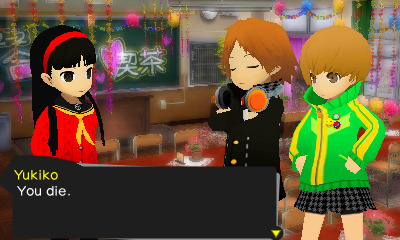

I get why people say old handheld games look bad, most people who emulate these games scale them up to their monitor's resolution which leads to every 2D asset appearing incredibly compressed and blown out and the 3D can be overly sharp.
It has caused a similar problem to the CRT TV Pixel discourse where theres a solid chunk of people that never experienced how the games were originally intended to look like and end up criticising the visuals because of a problem thats not even a fault of the game.
I am not mad about scaling pixels mind you. Its normal to do so and im not demonising people who run games like this
Hell, I do it too when running stuff on my PC. Its good and in certain instances it can be quite nice to see low res games so sharply
Heavily stylised games still shine when running them like this! Mario & Luigi is one of my favorite examples of such!


Even when 2D assets are overly blown out and 3D models are too sharp... I quite enjoy how sharp it can look


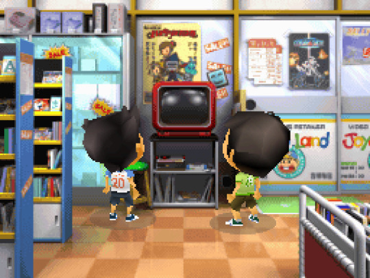
Im not saying that scaled pixels are bad, that is not the point of this post
This post is about me being mad at people calling DS/3DS games low res and bad looking because they are looking at a 240p image on their 1080p monitor.
You're making a critique of a fucking thing brought by running/viewing the software in a environment it was never meant to be viewed in.
I fucking hate that. get real.
2 notes
·
View notes
Text
Trying to figure out the logic in MCSM for my... own personal fun
Part 2(surprisingly)
About age(last time I did death)(they kinda connect in a way. Or not- but I'm still adding the link to the first one)
So if I say they don't die of old age(the proof being the old order of the stone, the old builders and.. the admins?) But if we say they do age just don't die of it, then we need to think of something to make.. sense of it?
Like for instance Harper's hair wasn't always white. In the photo where she first created PAMA it's brown. But we don't actually know when that picture was taken. It actually could have been a few months or just a couple of years ago, not decades, and Harper's hair changed color due to.. stress? Or she dyed it
Or the fact that the characters in the game itself mention age related stuff
So it means that they could age. Just really slowly or in different ways than we do. I mean- sure the concept of time exists, but do you really think time in there works the same way as it works for us? I mean- the original minecraft game is already different. It goes 72× faster than our time. But if we watch the games time... there's a lot of skips and just flashes so it's hard to determine. But anyways, because of the time being different, maybe aging also works differently. And it takes a long time for them to age. Even if it's been a year for us and a year for them to, in that world they don't count is as people's age going up a year. Instead, maybe it's kind of like how we divide human stages of life, they only make sense of age by different stages of ones lifespan not by years. If.. that makes any sense
So between same age stages they're just all... the same age or similar. The more smaller details of age is seen by how they are viewed or if they've been there much longer than the rest
Or hey! Who knows! It could be magic for gods sake! I mean- they're technically blocks! Pixels! Maybe they have some.. tingles that.. determine how old a person is (I'm sorry. I think I'm tired)(I just woke up)
Okay- that was crazy, but it did give me an idea.
The pixels. Maybe the pixels determine they're age(this still makes no sense)
So yeah- I guess my guess would be.. they don't have exact ages.. but have like.. people be divided into giant age groups? And those age groups can get bigger if some group of people happens to live e so long the people add a new age group
Or maybe! They just have the concept of age. But they kind of.. feel like this guy is younger than me... and just go with it and never bring it up or acknowledge it much.
The characters just kinda blurt things out sometimes and not understand what they just said and everyone that was in the room just freezes
3 notes
·
View notes