#for fucks sake ANYWAYS
Explore tagged Tumblr posts
Text
Has this been done already?! Sorry, sorry, I just got so excited on account of the fact that I JUST GOT POLLS!
#THIRD TIMES A CHARM#I definitely did NOT mess up twice#for fucks sake ANYWAYS#POLLS!#lockwood and co#lockwood & co#l&co#lockwood and co show#lockwood and co netflix#lockwood and co series#lockwoodandco#l&co. netflix#l&co netflix#lockwood & co.#polls#my polls#jessiejames polls#jessiejames talks#i swear if i messed it up for a third time i'm gunna gouge my own eyes out just like Danny
25 notes
·
View notes
Text
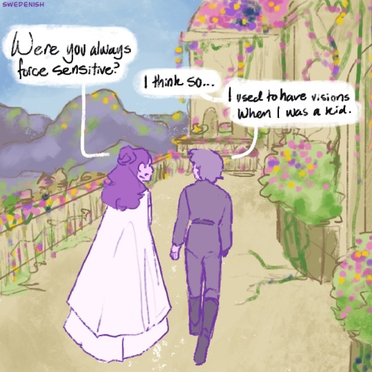
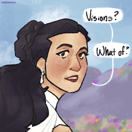

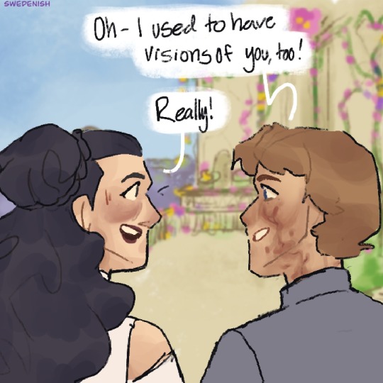
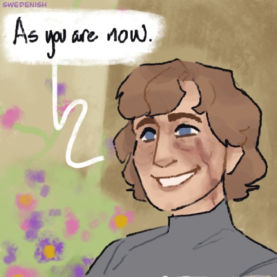
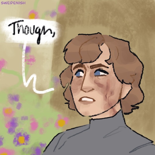

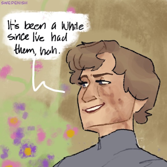
I take your “I don’t remember my mother” and give you “Luke thought Leia and Padmé visions were the same person”
#cus if I found out I had a secret brunette twin with great style#I would immediately assume all visions I had of brunette women with style I had were her!!#I dislike how I wrote leia in this but uh#it is what it is 😭#anyways this is gonna be context for an evil evil comic I intend on making…#will I go through with it? I hope the fuck so#for my sake more than yours… you’re gonna hate me for it..#art#fanart#digital art#fan art#my art#star wars#star wars fanart#comic#Star Wars comic#padme amidala#leia organa#luke sykwalker#post RotJ#RotJ
5K notes
·
View notes
Text
So y'all have seen the Williams F1 Logo before, yeah?
well get ready, becaues I am about to ruin your day!
where does one even begin with this. i am sorry in advance. -just a poor learning graphic design student, who simply tried to enjoy their saturday evening
The Logo
For anyone that doesn't know, here's the Williams F1 Logo. Entirely unedited, copied straight from Wikipedia:

Now like many fans, I actually quite enjoy this logo. I like the modern, sharp edges of it and it's simple yet intriguiging design. It's memorable, while also easily recognizable as a W. I also really enjoy the colour choice (this, however, is entirely a personal preference.)
(entire rant under the cut. please keep reading this took years off my life span.)
How did we even get here?
Let's start at the beginning. How did we even get here? Well I, a poor poor learning graphic designer, was watching this lovely video from Mr. V's Garage about bad F1 Logo's over the past 35 or so seasons. Very interesting, I can only recommend it (but you don't need to watch the video to understand this post)!
Now, to cleanse the palette at the end of the video, Mr. V included a top 10 GOOD logos from this time span, it was very kind of him.
On P4 of this "Good List," Mr. V placed the current Williams F1 Logo, as pictured above. At first I vaguely agreed with this, believing that he probably simply hadn't noticed one of the things that's been bothering me about that Logo since the first time I saw it up close.
The first sign of Trouble
So, what is this mystery issue, you might ask?
It's simple really. You don't necessarily notice it at a first glance, but something about that logo seems off. Taking a second longer, you may notice it yourself.
No, I mean it, take a minute and go look at the logo. It looks wonky as hell, doesn't it?
Well I can tell you the first thing that I personally noticed. The arms of the W aren't in line with the bottom half, see:

(Graphic by @girlrussell who was so kind to let me use it, as it is way prettier than the one I made)
It's a crooked W. There is no good explanation for this. The rest of the font is perfectly fine, geometrical shapes.

Anyway, the good person that I am I went to point this out to my partner ( @leftneb ) who proceeded to inform me that he, infact, was not aware about this and was, quote, "never going to unsee that."
Now, the good FRIEND that I am, I, of course, proceeded to rush into our broader F1 friendgroup to make them suffer for eternity.
What's the logical next step to take? Of course, fix the logo in Adobe Photoshop, you know, as a joke.
(Disclaimer at this point, I am not necessarily the biggest fan of Williams Management Team. I enjoy ALL their drivers this season. I do NOT enjoy James Vowels. Be warned.)(Also I am aware that he probably did not have an influence on the logo)
Trying to fix it. Oh god, I was so innocent back then
Trying to fix the logo in Photoshop is the worst mistake I could've made. THE worst path to take. I could've just giggled about making my friends suffer (which I succeeded in, by the way) and moved on. Instead I ruined a perfectly good Saturday evening, and for what? I don't know anymore.
Anyway, how was I gonna go about fixing the logo in the simplest way possible? Simplest way I could come up with: slap the thing in Photoshop and put two, mirrored boxes at each side to make the sides line up. Small issue, how do I make the thing actually even? Fix: line them up at the intersecting point with the bottom tips of the W.
Here's the result:

Hey, anyone care to explain to me why in THE LORDS NAME the arms are different sized? I mean, surely they weren't before. Surely, certainly, I must've messed up.
I double, I tripple checked. I made sure everything was lined up and made sense. But no.
It just couldn't be. Something was uneven in this logo, something even deeper. Something I could not have predicted when first taking a closer look. It was at this point I realized I had messed up. What rabbit hole had I stumbled across? Certainly, it couldn't get much worse.
And that's when I noticed.

(pictured above; my genuine reaction)
There's MORE? (oh god, the top isn't lined up)

I couldn't believe my eyes. This is the PINNACLE of the sport, and THIS was the logo of one of the competing teams? I mean, yeah, we have a Visa Cash App RB or a Kick Sauber or even a MoneyGram Haas which are all terrible logos, but at least they're CLEAN. (this has not been checked. If anyone wishes to ruin a nice Saturday evening, feel free to check them and tell me how wrong I was in the previous statement!)
But you can see that there is no end in sight for this post. I'm sure you're as scared as I was at this point. By now we were sitting in VC, discussing the horribleness of this logo. I had long informed my irl's about this, who take said design classes with me. And it was one of them who pointed out the next thing that had been bothering me, but I had not been able to put a finger on up to this point.
thE DISTANCE, HOW DID THEY FUCK IT?

I'm afraid I have to confirm your fears.
Yes, those lines are the same length. According to Photoshop, they're on the same level as well, so no flunking with angles.
The gaps of the arms to the main W are not the same. They're differently sized gaps.
It was clear to us, this logo is inherintely flawed. They're subtle issues, but once you pay attention you start to notice things. It all looks slightly wonky and off centre. And eventually, you get paranoid, and start comparing other angles and sizes. And you will keep finding things. This has ruined my life.
HOOOOOW

Honestly, I don't even know what to say. Yes, yes sadly those lines, too, are the same length. Just copied over from one side to the other and layed over on the same height. I admit, they're not layed over perfectly. I was honestly holding back tears at this point. But the point still stands, you can clearly see a difference in width.
Honestly, the only way I can explain it is that at some point there was a mess up of distance or proportions and whoever was designing the logo couldn't pin it down and tried to restore the visual balance by making manual adjustments. And in all honesty? They kinda did a good job, if that's what's happened. I mean, you notice the crookedness of the arms, and then maybe the difference in height, but the rest you probably will not notice if you don't spend too much time staring at it. (like some of us) And even those issues clearly aren't noticeable to the vast majority, considering I had to go point it out to a group chat for my friends at least to notice.
what the fuck is THAT?
Now, the thing about doing this investigative work of prooving a team you dislike is worse in more aspects than you previously thought, is that you do a lot of zooming in. And zooming in means you might notice bits that yours eyes simply overlooked before, because they were too small.

Here you can witness the top of the middle point, that, for whatever reason, really wants to touch the top border of the Logo. I'm relatively certain that's the highest few pixel in the entire graphic, considering earlier chapter "There's MORE?" I have no idea why it looks like that or why they thought it was necessary for it to not end in a clean point.

I just actually have no idea how to even describe what is going on on the top of the left arm. That left hand side, again, touches the side and is therefore the most-left-pixel in the graphic. I, once again, have no idea the purpose of this. However the RIGHT hand side also makes no sense, as it is the most prominent corner in the whole logo. There's pointed corners, and rounded OF corners, but nothing that is trying to form it's own colony in a distant land that hopefully isn't this god awful logo. I hope that blob gets away. I really do. You go king.
i'm loosing my mind
Anyway, the only reason I could come UP with those weird "reachy-outy-bits" was to establish the dimensions of the logo? But if that was the case, I don't understand why they managed to keep all the other potentially border touching corners clean?


Like, look. Those are clean, sharp corners with some clearance off the borders. I have no clue why they managed it here but not with the others.
guys. please.
Backtrackig a little bit, going back to the positioning of the arms.

Do I need to mention that those lines are both the same length and the same (mirrored) angle? I really hope I don't, because I don't think I could be making this shit up. Like, once you roughly know what you need to look for it just kinda becomes easy to find.
As said before, I genuinely do think that most of these issues happened in a chain-reaction. For example, the distances between the main part and the W wouldn't be as noticeable (and they do get noticeable once you start looking at it) if the angle wasn't fucked. And guess what, there's more fucked angles here! Which ALSO influence this specific area of the logo!
this is just embarrasing for you.

something something same line copied over and mirrored etc etc
It's not as visible but the angles defintely don't line up here as well. As mentioned before, these issues for the most part all influence each other. It doesn't really excuse the issues, in my opinion as a designer, because a big company like this shouldn't have these sort of issues in their logo.
So let's review;
to sum it up,

i cannot even BEGIN to explain to you how big of a fucking JOKE this FUCKING logo is. because, i thought to myself, to round the post out, hey, why not show ALL the issues i pointed out in one picture? that would round it out quite nicely, wouldn't it?
Yeah well, this logo sent STRAIGHT FROM HELL just could NOT let me rest. I had only done the lines visualizing the crooked arms in PAINT up until this point, i.e. I had only pulled both up individually. To make a nice "rounding out" picture I still had to add them into PHOTOSHOP. so i did. i pulled up the line. i mirrored the line.
THE ANGLE IS FUCKING DIFFERENT
none. and i mean NONE of my friends had noticed this before. i need you to understand that we looked at this thing with FIVE pair of eyes, and NONE of us noticed that until i thought to myself "Oh I still need to add these specific lines to have ALL the issues I pointed out in my SILLY TUMBLR POST in ONE image" and i get THAT FUCKING SURPRISE
I was PLANNING to round the post out with a statement on how obviously this isn't a serious post. Here, I even had it all written out already because I accidentally started writing it in the last paragraph:
Of course, this is nitpicking, and it's not that serious. I'm aware of that. AS MENTIONED most of these would not be noticeable if we hadn't gone specifically looking for them.
yeah, well, fuck that. i just spent two hours seething about this logo. i'm ending the post on this instead.

#i am ENRAGED#i managed to actually calm down about it#yk. just typing away#and then i just try to ROUND OUT THE POST#for fucks sake#anyway i know i'm posting this at an hourrendous hour#if you read all the way. reblog? maybe#pretty please#williams f1#williams formula 1#williams racing#formula 1#f1#also apologies for any spelling mistakes i do NOT have the nerve to go back and proofread this
936 notes
·
View notes
Text
Why did I only today realized that Nikolai is wearing a jumpsuit under his jacket

2 months of staring at this man and drawing him almost everyday and for what
#cod#cod nikolai#I'm legally fucking blind#“oh his pants and shirt have the same color how weird” NEKRO FOR FUCK'S SAKE#anyway you know what this means#more work for John to get in his pants#I'm hitting my head against a wall#nekro yapping
312 notes
·
View notes
Text
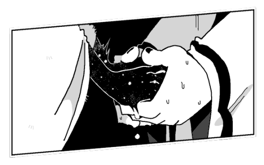
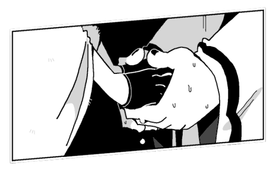
somebody's probably done this before but,,, i made an edit
original below vvv
#2024#isat#isat spoilers#sasasaap spoilers#isaloop#isat loop#isat isabeau#sasasaap isabeau#sprite edit#you can interpret it as either timeline isabeau tbh i see them as the same person tho so doesnt matter to me#it's only loop that's different#included the og just for comparison's sake#start again: a prologue#in stars and time#I FORGOT TO MAKE LOOP'S FOREARMS SKELETAL FUCK HOW DID I FORGET#ugh i guess canon loop is fine 🙄#i need to make more edits anyway so loop is wearing different clothes than the cloak so i'll do that too#anyway hope everybody's having a lovely day#love you xoxo mwah mwah byebyyyyyye~
221 notes
·
View notes
Text
Nico and Percy's dynamic through the series is eternally funny to me, because it's just. like.
Percy's having a constant mental struggle between his fatal flaw of loyalty with a promise he made to Bianca to protect Nico, versus his Big 3 kid desire to maim other Big 3 kids / Poseidon descendant urge to totally maim Nico specifically. He hates Nico so so much. He thinks Nico's annoying and weird at best, and creepy/sketchy when he's older. The only positive thoughts Percy has towards Nico are "He's Bianca's brother and Bianca was my friend and I owe her/He's Hazel's brother and Hazel is my friend and would kill me if I was mean to him," "He's a powerful asset and useful ally (if questionable)," and "He's kinda pathetic and I feel maybe a little bad about it." Percy has multiple occasions throughout the series where he strongly considers - and on one occasionally actually goes through with - throttling Nico.
Meanwhile, Nico is following around Percy like a lost puppy. He explicitly can never bring himself to even dislike anything about Percy no matter how hard he tries. He has a whole bit in BoO where he's mentally going "UGH he's so stupid BUT IT'S ENDEARING HOW DARE HE." He's totally smitten. He's making deals with his dad for Percy. He's making convoluted plans to help Percy stand a chance against Kronos. During the entirety of BoTL it's like he's playing tsundere - "I'm helping NOT PERCY SPECIFICALLY with this quest! Me helping Percy would be SILLY because I DEFINITELY HATE HIM." Then he proceeds to show up to Percy's birthday party to basically ask him on a weird date and spend the entire next book scrambling around trying to help him or protect him or impress him. And Percy could not give less of a shit.
Just. That dynamic is so funny to me. Percy is the founder of the Nico Protection Club in that he's the one they're all protecting Nico from and meanwhile Nico is throwing himself at Percy to the point where the literal god of gay love calls him out on it.
#pjo#percy jackson#nico di angelo#Percy shows up at CJ and squints at Nico like ''hm. why do i feel like i hate you? like i just wanna punch you in the face?''#and Nico just immediately goes ''huh no idea anyways i have to go-'' and jumps into Tartarus#but not before he gives Hazel essentially a detailed explanation of ''this is Percy i cant say much but please dont let him die <3''#and Nico's whole Tartarus trip was basically a whole ''im doing this so no one else has to''#only for Percy and Annabeth to fall in like one book later and Nico proceeds to spend the next book internally screaming about it#and then Cupid calls him out on it and the next book#Nico's just like ''at this point im hoping i keel over within the next week just so i can force this dumb crush to chill the fuck out''#Nico staring pointedly at Will: ''For my own sake i need to form another crush RIGHT NOW so i can finally get over Percy.''#''this has been so bad for my health''#Nico's crush on Percy is just too funny to me. horrible pick my guy. terrible job. love that for you. he could not be less interested.#Percy LITERALLY TRIES TO KILL NICO and ditch him in the underworld and Nico is somehow STILL like ''but i love him''#Percy basically chokes him. beats up his dad. tells him ''go get smited by your dad for me.'' and ditches him.#and Nico's opinions/crush on him DO NOT CHANGE#though also Nico's reaction to Percy beating up his dad + skeletons is SO funny. his jaw is on the floor. he's flustered about it.#he just witnessed Percy be incredibly hot and proceeded to go ''yea i'll do anything for this man. collect reinforcements of 3 gods? sure''#nico you absolute DISASTER with HORRIBLE TASTE. you can do better. raise your standards.#which tbh is funnier when you factor in sun and the star. Nico just wont stop crushing on guys who dislike him and everything he stands for
1K notes
·
View notes
Text

horror movie twins/gansey's magicians/etc
#the raven cycle#trc#pynch#adam parrish#ronan lynch#jun23#actual art#fanart#digital#showed roomie my bluesey last month and she was like wow i'm surprised u drew them first and not pynch!#and i had to be like. well u see thinking abt pynch makes my heart feel flayed open like a fish so bluesey was easier#anyway tho heres: them !#i looooooove when they start going off together to do fucked up magic shit. and how they each get to know the other's powers better than#the rest of the gangsey. like. united in the willingness to commit crimes against god and man for gansey's sake 🙏#&how they work so well as a team once they have that knowledge of each other?? adam scrying from the front seat while ronan drives?? romanc
3K notes
·
View notes
Text
Genuinely Williams switching Logan out for Franco feels personal and petty. I haven’t been following f2 super closely this year but from what I’ve seen Franco is just.. fine? I mean, he’s good, but he’s not Kimi or Paul. To replace Logan at this point would only make sense if they swapped him for someone with loads more experience, someone more likely to score points. At this point they’re swapping him for someone who’s probably gonna have his same level of performance, if not worse. It just feels almost petty? It’s like a weirdly personal move and it just makes me think about all of the reports of JV’s alleged mistreatment and silent treatment towards Logan.
#I don’t know!!! it just feels weird!!#like… franco is probably gonna be just as bad bc it’s his FIRST TIME#I’m glad Logan’s out purely bc the environment seemed so toxic#but wow#wild move#it just doesn’t make sense to me#anyway#FUCK James vowles#I hope franco does well for his sake#this just feels bad#but#i really really hope Franco does well bc I do like him from what I’ve seen.#f1#formula 1#f1blr#formula one#williams what the fuck#williams formula 1#williams racing#williams f1#james vowles#ls2#logan sargeant
267 notes
·
View notes
Text
i think it’s such a testament to just how good hugh looked in days of future past that we don’t acknowledge how 70s!logan would’ve looked closer to this:


#as if there’s much difference anyway#i know the appeal to 70s!logan is cause hugh looked a little older lmao (real)#but like. for the sake of canon. he would look just like (or even younger than) X1 logan#we fuck with all logan’s here#wolverine#logan howlett#hugh jackman#xmen 2000#xmen days of future past#the wolverine#days of future past#xmen#xmen movies
241 notes
·
View notes
Text
finally posting this since 44 is out

I have a broken humor that breaks when someone says a singular, partly random word without prompting. what can I say
#I’m toric renderer of shitposts#seriously I took an all nighter for arthur to say ‘England’#forrr fucks sake anyways 44 is such a banger episode christ#malevolent 44 spoilers#malevolent vague#I guess#this also became a meme format on the discord so like if you want to meme this. go ahead#malevolent fanart#malevolent podcast#malevolent shitpost
237 notes
·
View notes
Text
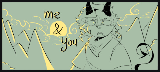
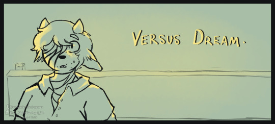
collab redraw with me and @xxthunderthedragonxx !!
#lore.... guys this is bestie lore youre seeing rn . we redrew these scenes like YEARS ago back in the insane dsmp phase we both had#thunder did tommy tohugh and i did tubbo . . . so we switched places now . .. this is literal history in the making .#inspired because of the tommy n jack stream that went on like last month i think? god i msis dsmp . i lvoe oyu dsmp. FUCK you dream#anyways tag ramble over . uhh idk about sad-ist problematic stuff or whatever this is just pure nostalgia sake .#dsmp fanart#tubbo fanart#tommyinnit fanart#dream smp fanart#silly.doodles#thunder <3#yes it took me a month to finish my part. i have great have time management skills#dream smp#dsmp
97 notes
·
View notes
Text
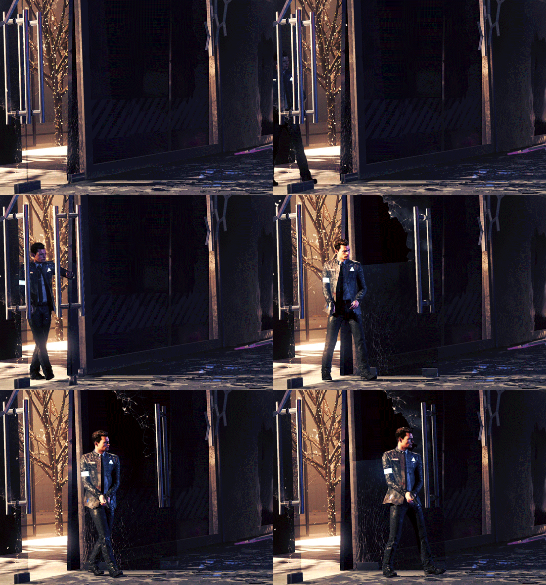
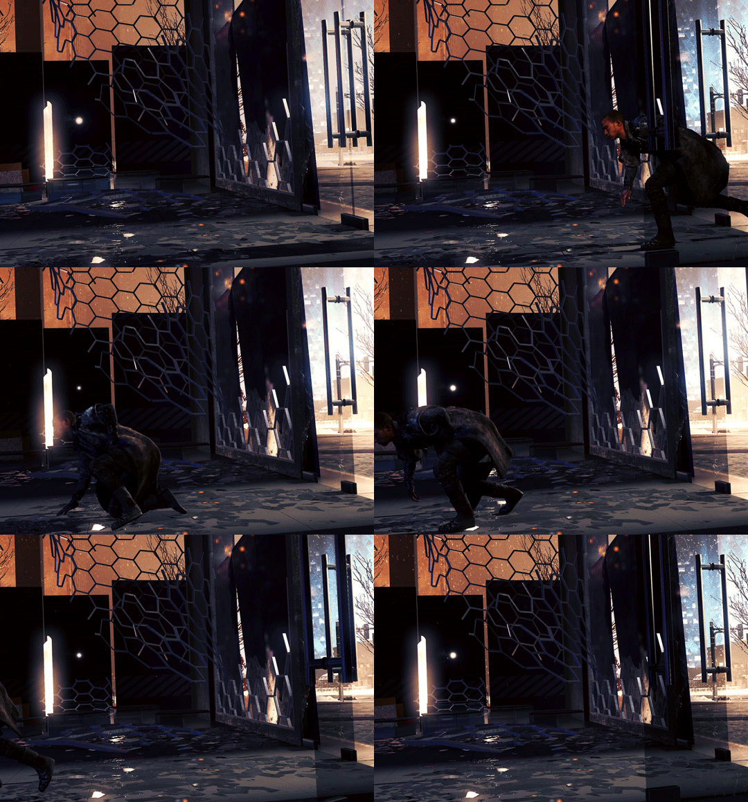
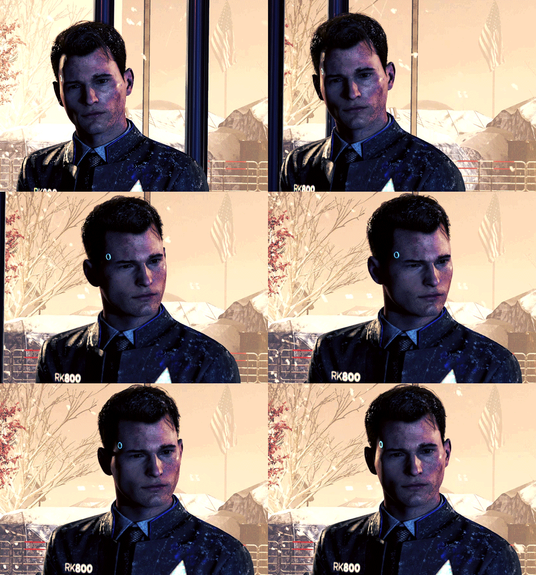
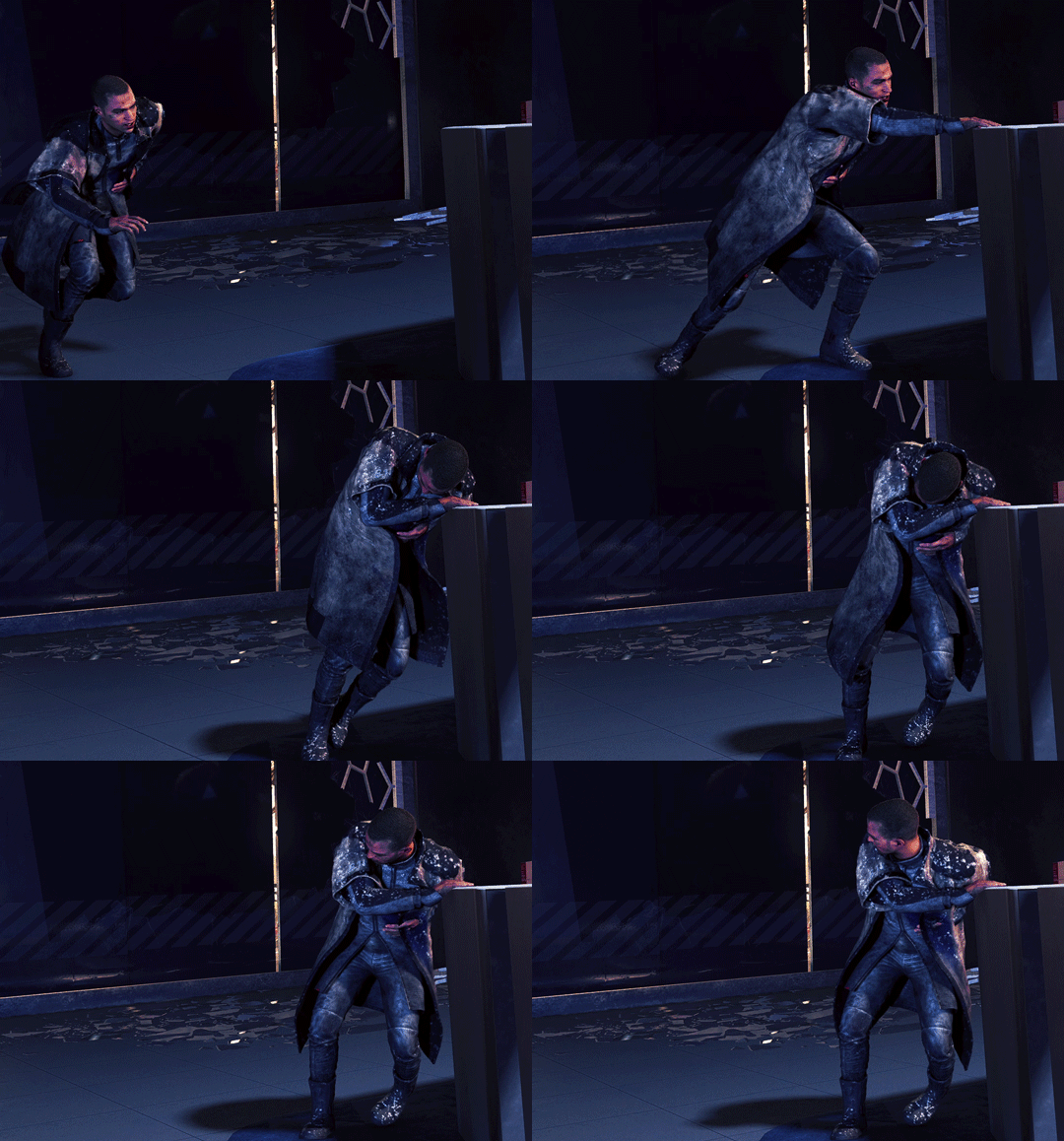
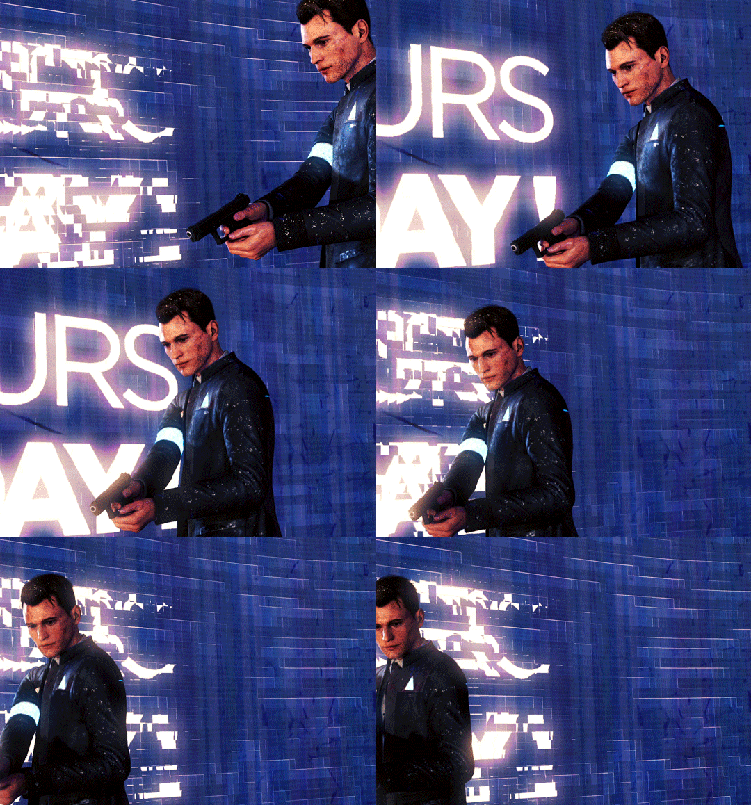
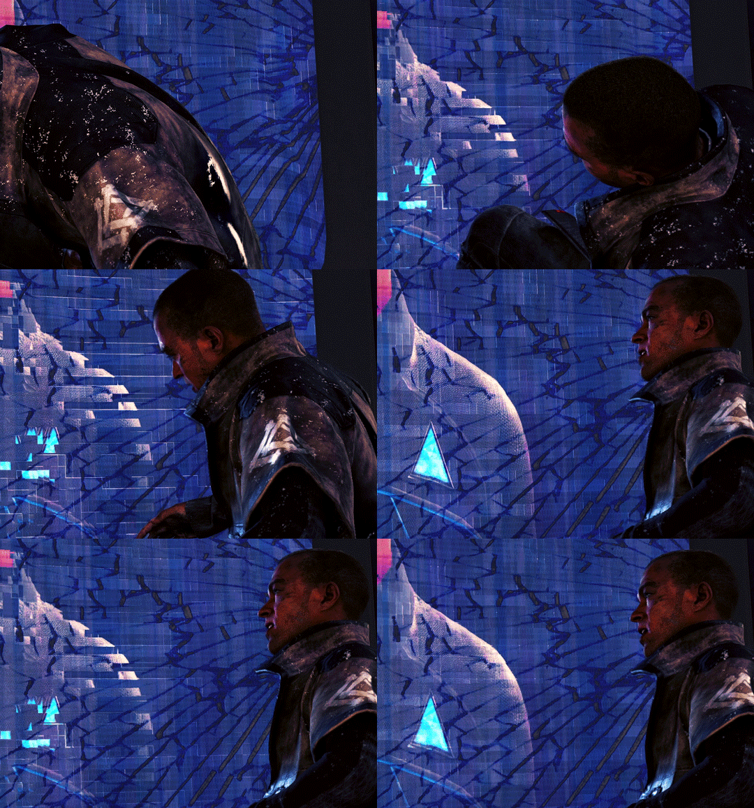
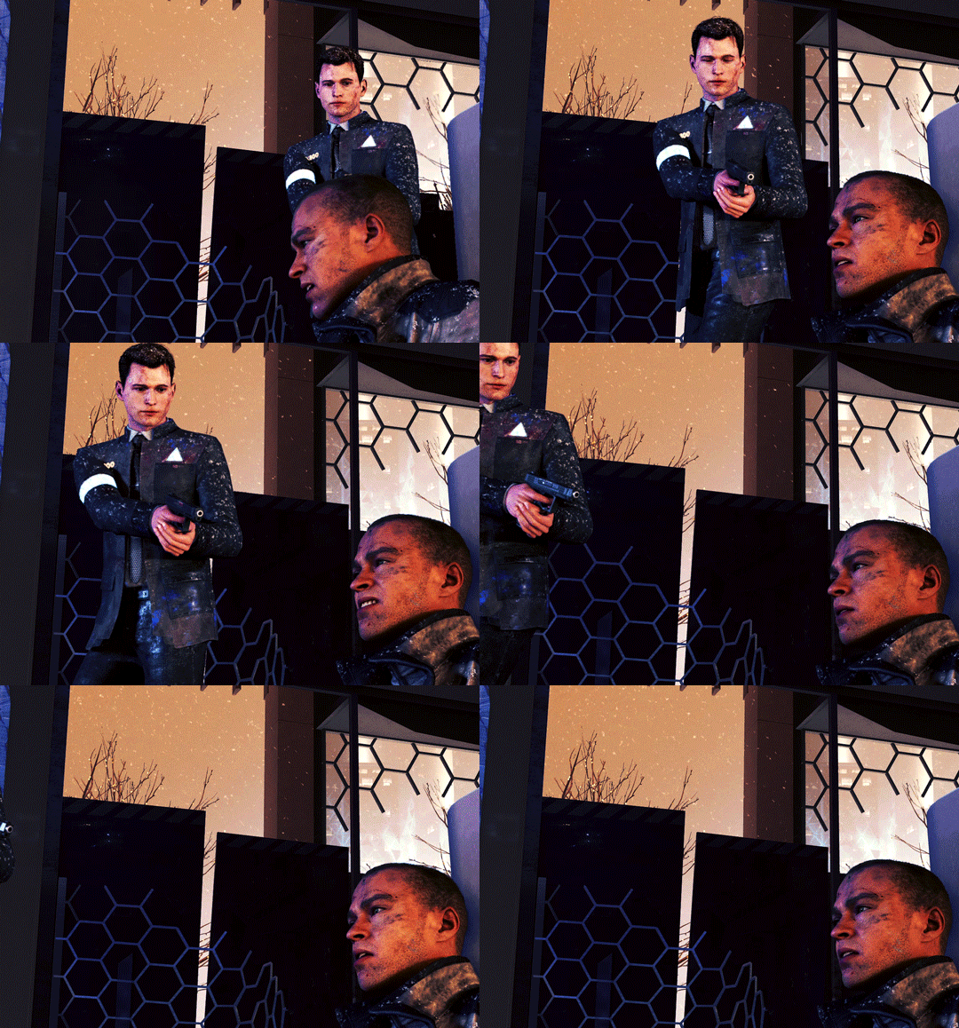
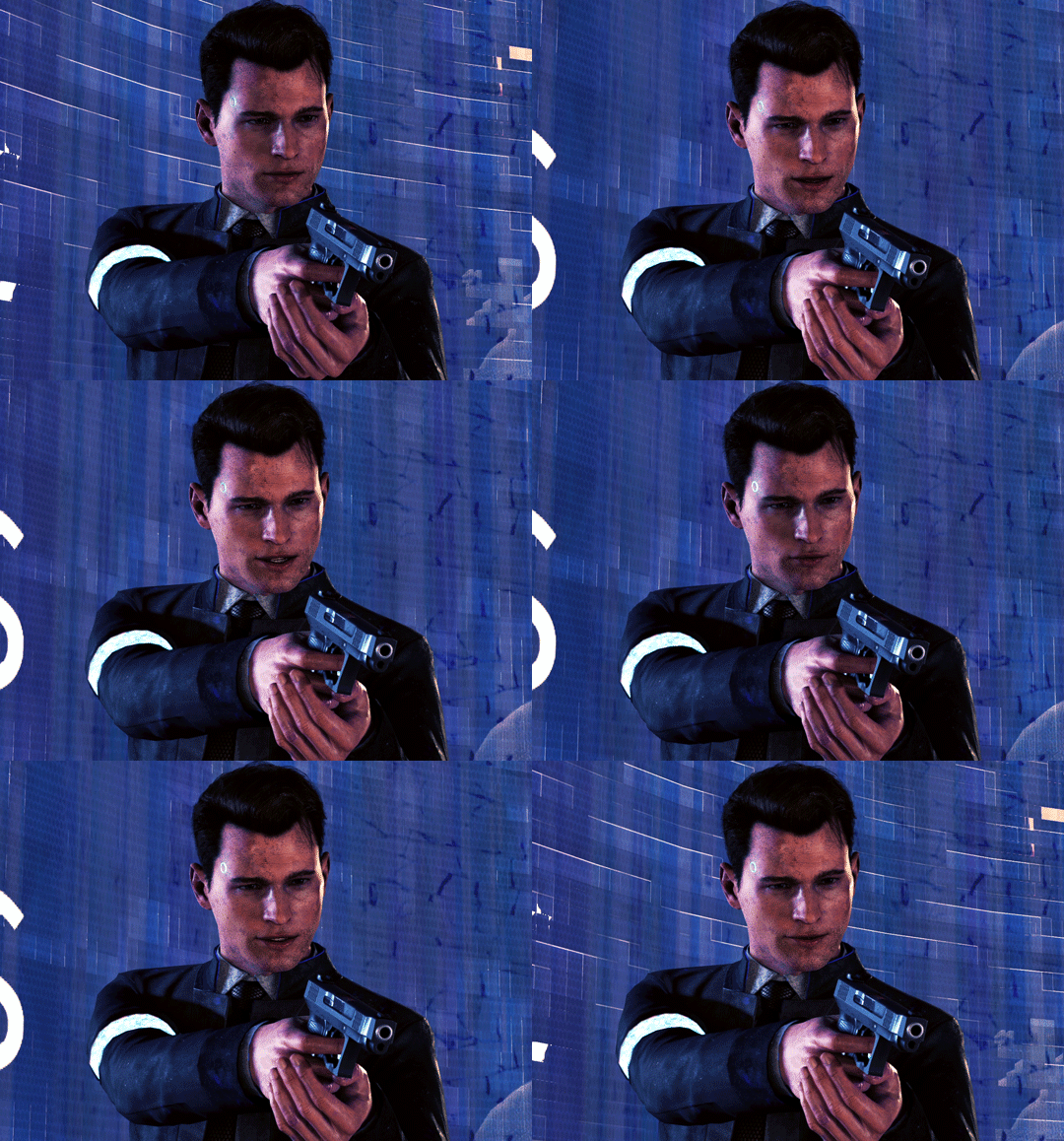
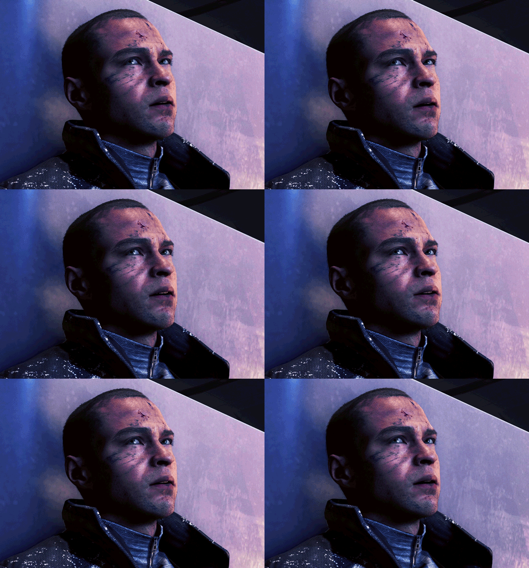
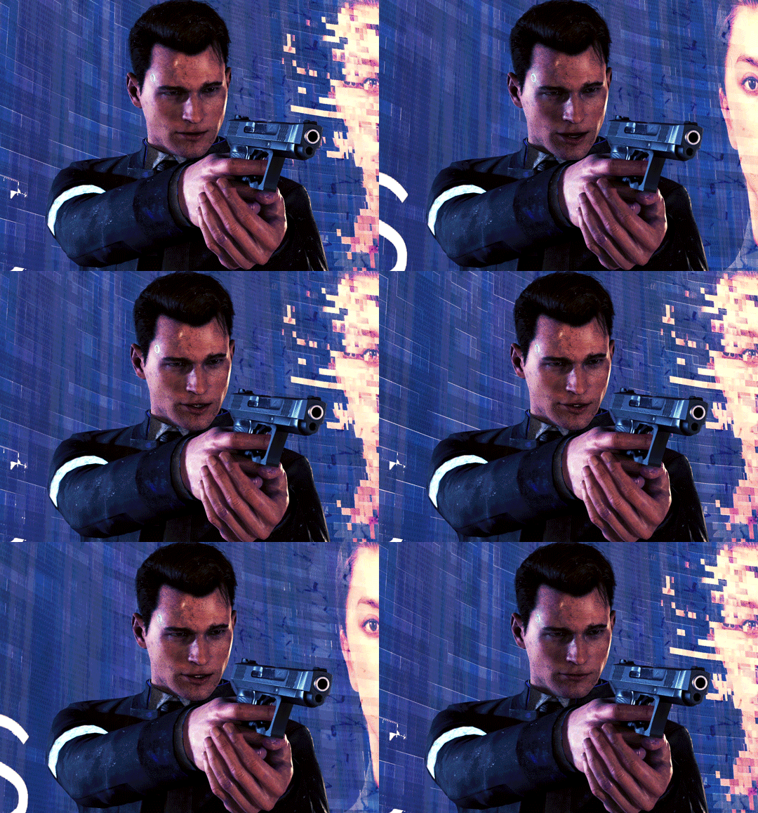
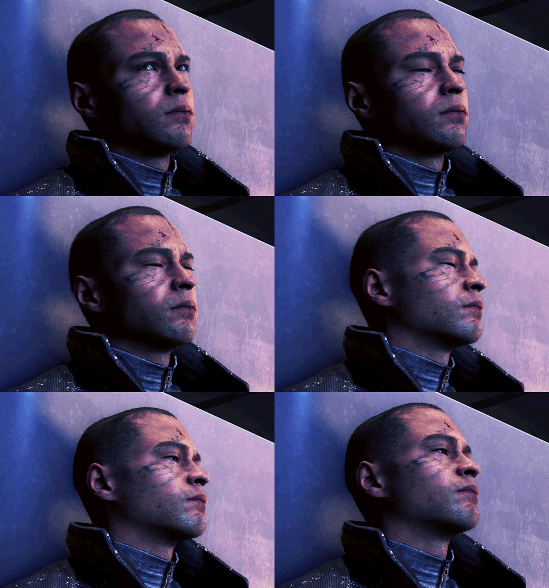
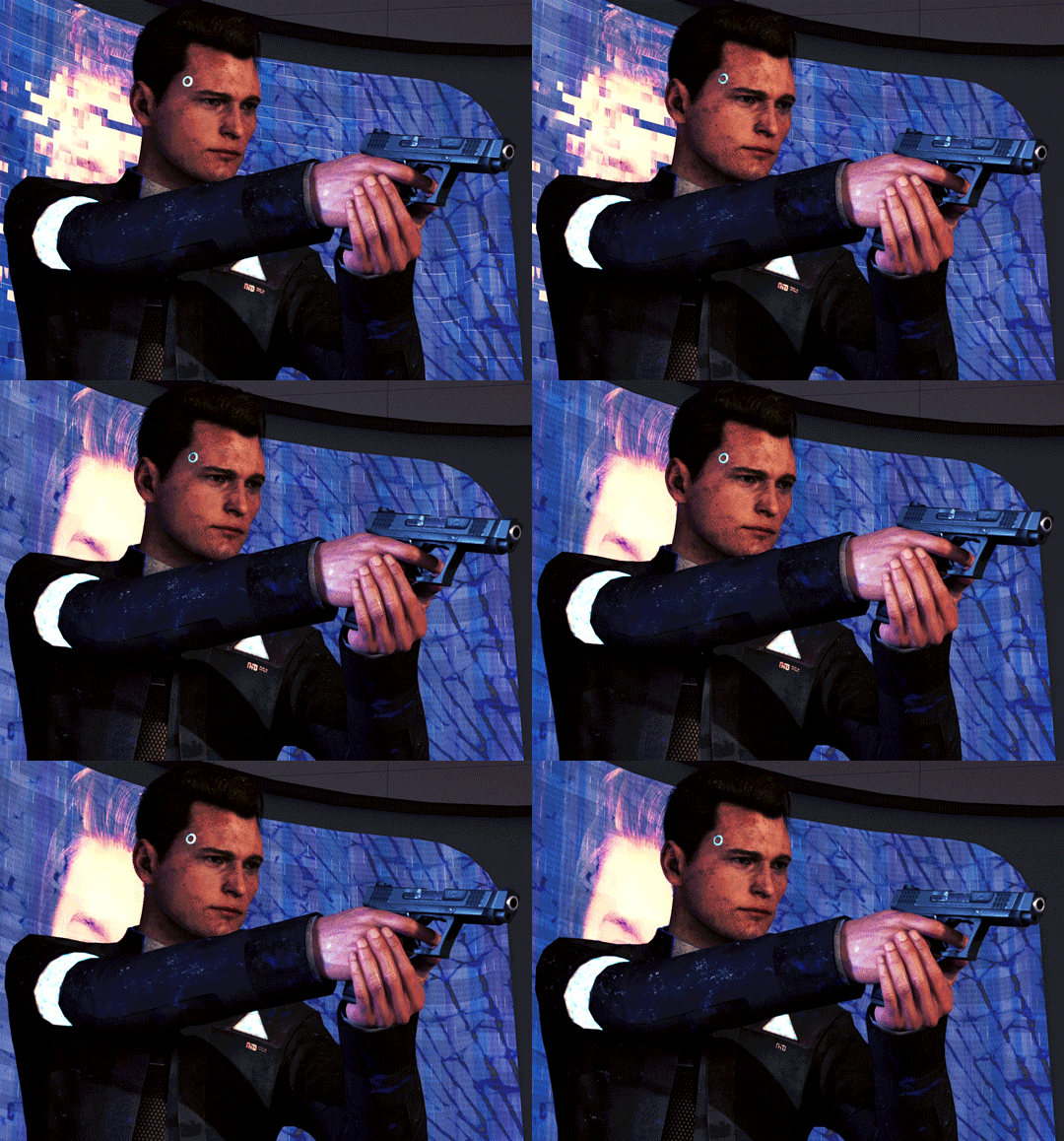
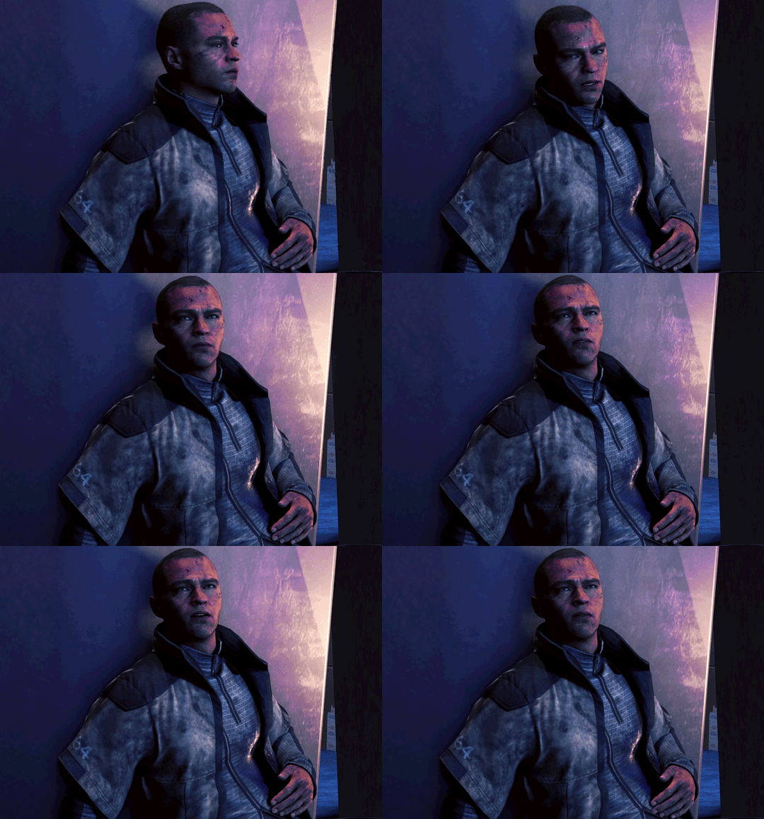

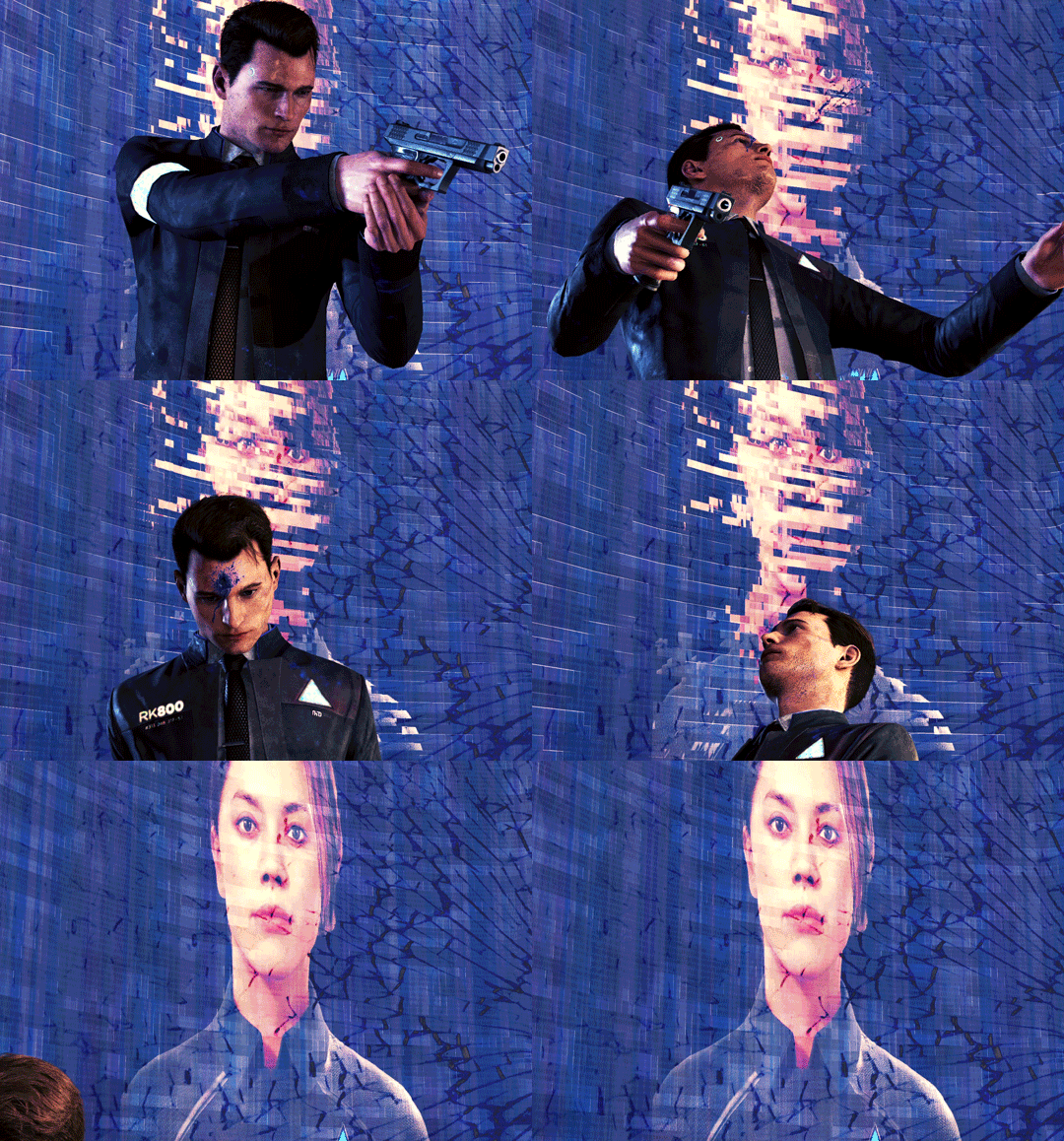
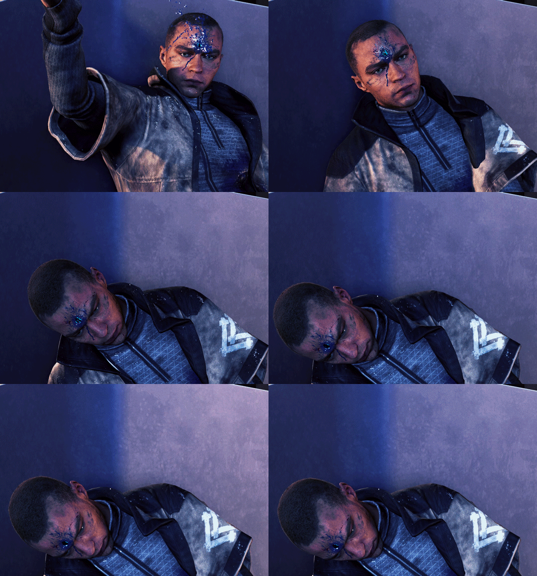
Sometimes the only road to take is the darkest Sometimes the only way out is as a carcass
Happy 6th Anniversary, Detroit: Become Human! As always, you can find these gifs and more on the Connor and Markus pages of my Gif Archive.
#dbh#detroit become human#dbh connor#connor rk800#dbh markus#markus rk200#markus manfred#cw death#cw flashing#flashing gif#gif#dbh gifs#dbh anniversary#gifsgalore#connorgifs#markusgifs#okay i managed to do this for the anniversary and live#the original concept was the main 3 and their favorite people all dying but that would have been. too much#but i might make a set that's not just this specific scene#please forgive the flipping and flopping of the lighting#i used some mods but for fuck's sake QD's swapping of lighting angles always bites me in the ass#my most recent gifs have had their lighting system turned off (for the most part)#but i had to have it turned on#ALONG WITH MODDED LIGHTING#in order to fucking see this scene smh#anyway#i know this isn't like a happy anniversary but the rks neutralizing each other is just#chef's kiss#had to edit out one of the lyrics to the song because i can't trust y'all with me putting the word “daddy” in a post
233 notes
·
View notes
Text


If you were falling, then I would catch you
If you need a light, I'd find a match
'Cause I love the way you say "good morning"
And you take me the way I am
1K notes
·
View notes
Text
A frustrating development with the growing lack of reading comprehension I've personally noticed is an emerging fervor of insisting things aren't canon unless they are explicitly stated beyond all reasonable doubt.
I can not emphasize enough how harmful a mindset this is to have. Yes, it's wonderful to have characters outright say "I'm trans," but to deny a character's identity for not saying that is dangerous.
Plenty of real people prefer not to use specific labels. Historically, people didn't have our modern terms or modes of expression. Many modern cultures don't use these terms, either, and plenty of people within those that do can't safely openly identify.
If the only representation you accept as canon is within modern (and let's be honest, wealthy white able-bodied American) standards, then you are denying yourself and others a huge amount of representation and seriously limiting the media around you.
#remembering how people were like hmm its not actually canon that Steve is trans and adam is nonbinary...#steve doesnt fucking know what 'trans' is hes an unhoused time traveling cowboy like!!!#after an arc. about werewolves. and how people become werewolves because theyre unhappy with their lives.#especially specifically regarding their body/gender#and how adam explicitly says 'your family never saw you as a man'#AND THEN FOLLOWS IT UP. with referring to Steve as 'the man who chose'#like for fucks sake#you are being deliberately and willfully ignorant if you say its not canon.#your ideas of transness are extremely extremely limited if it doesnt include people who dont use the word.#god. ugh. ive been annoyed by this since that episode came out#dont even get me started on how people barely noticed adam is nonbinary.mm#they said they dont wanna be called a boyfriend. come on!!! come on!!!!#how can i make it clearer without them saying shit they woildnt say and have no context for!!!!#scream.#anyways.#delete later lol im just frustrated again.#im not even sure i worded this how i wanted to
271 notes
·
View notes
Text
Bitch I had a lucid dream and I tried to shift but the portal didn't fucking open so I just stood there in the dream opening and closing an invisible door and I stayed there for like 20min and I got so pissed I woke up and I regret it now
#for fucks sake#how the fuck do you open a portal#like omg i was so close to shifting#but nooooooo#THE PORTAL DOESNT FUCKIGN wKRIGNOEI#anyways im ok guys<3#shifters#shiftblr#shifting blog#shifting antis dni#shifting community#reality shifting#desired reality#marauders#reality shift#reality shifter#shifting realities#marauders shifting#shifting to marauders era#anti shifters dni#shifting to hogwarts#shifting#shifting motivation#reality shifting community#shifting reality#shifter#shifting consciousness
70 notes
·
View notes
Text

phinktober day 8: tatinof
wtf a whole week done already???? i haven’t drawn this consistently since i was in high school 😭
bonus bc idk when to stop

#again don’t love this one as much as the others but i’m settling into some semblance of a style finally and learning to work w that so#i’m pleased#and i’m actually quite impressed at my development already i was a sketch portrait artist for years i forgot how much i love sketch-style#think i’m getting a bit better w anatomy without being completely dependant on grids#hmm#anyway i have a headache from trying to get this done before midnight im gonna go have a cup of tea#and maybe water idk when last i drank water#art2 and craft2#dnp#dan and phil#phanart#daniel howell#amazingphil#dan howell#phil lester#tatinof#the amazing tour is not on fire#wait he was still dinof then#danisnotonfire#i feel like i’m missing a tag but idc i need a cone#FOR FUCKS SAKE I MEANT TO POST THIS 4 HOURS AGO AND LEFT THE APP AND NEVER PRESSED POST#AAAAAAAAAA whatever it’s still tuesday somewhere
70 notes
·
View notes