#flair airlines
Explore tagged Tumblr posts
Video
Flair Airlines Boeing B-737-8 MAX by Nino Blazanovic Via Flickr: A Flair Airlines Boeing B-737-8 MAX on final approach to CYWG / YWG / Winnipeg.
#Aviation#Aircraft#Airplane#Aviation Photography#ConcordeNIck ArtPhoto#concordenickartphoto.zenfolio.com#CYWG#YWG#Winnipeg#Winnipeg Airport#Winnipeg International Airport#Winnipeg Richardson International Airport#James Armstrong Richardson International Airport#James Armstrong Richardson International#James Richardson International#OM-1#OM Digital Solutions#Transportation#Transport#Travel#Flair Airlines#Boeing#B-737-8 MAX#Jet#Jetliner#Airliner#flickr
4 notes
·
View notes
Text

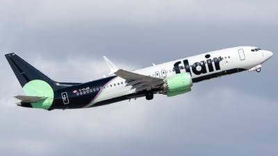
teal roots gee as flair airlines!
aircraft registration: C-FLGD
aircraft: Boeing 737-8 MAX
airline: Flair Airlines
photographer: AidanBurke05
#gerard way#mcr#my chemical romance#my chem#mcr airplane#mcr aviation#airplane#airplanes#aviation#teal roots gerard#teal roots gee#teal roots gerard way#mcr ecosystem#airplane gerard way#flair airlines
4 notes
·
View notes
Text
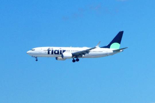
Are we there yet?
#flair airlines#orlando#florida#airplane#aircraft#boeing 737 max#plane spotting#photography#lensblr#original photography#photographers on tumblr#justgoshoot#tokyocameraclub#kei teay
8 notes
·
View notes
Text
No. 8 - Flair Airlines

I’m pleased to announce that this post is my first second ever request! (Sorry about the bumping back in the queue. Blame jetBlue, not me.) @fungaloids has requested that I cover Canada’s most complained-about airline, so let’s see if the self-proclaimed only ultra-low-cost carrier in Canada can add my opinion of their livery to their 15.3 complaints per 100 flights!
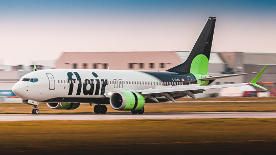
Being a relatively new carrier, you might not expect me to have anything to say about the history and evolution of Flair’s livery, but I really feel like I need to talk about the utter whiplash this airline has inflicted on me. My familiarity with Flair was only in passing beforehand, so I don’t know if Canadians have had to experience this in real time, but this company has existed since 2005 under two names and has had three liveries, none of which remotely look like they belong to the same airline.
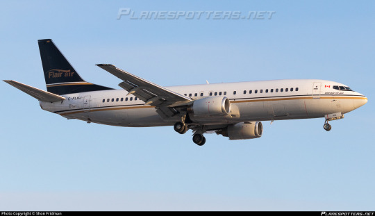
This cannot possibly be the same airline, right? This fully-servicable-yet-entirely-generic livery with what looks like a hotel logo badly centered on the tail is Flair? No, seriously, that tail looks like it’s photoshopped on badly but this is allegedly a candid photo.
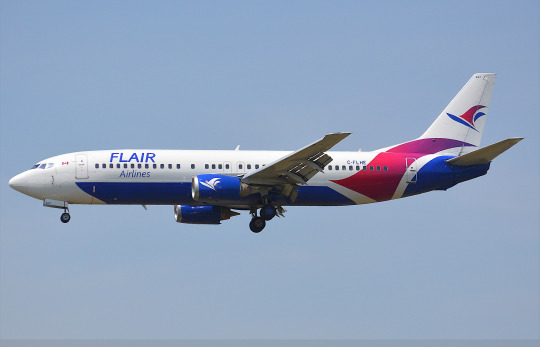
(image source: johnnyw3)
In 2017 they rebranded to this very...different look. I’m not here to talk about this but I must say it while I’m here - I enjoy the belly-centric livery and the blocking of contrasting colors here but I cannot get over how bad the wordmark is. This is a wonderful example of a livery being somewhat interesting but not very good.
Just a year later, Flair, formerly a charter operator, decided to begin scheduled service as an ultra-low-cost carrier. Clearly this set their financially minded brains churning, and what they churned up was toxic sludge.

It only took them two years of the blue and purple to decide that wasn’t the move and rebrand again to a color scheme of black and what they themselves describe as “acid green”. And I...
Oh. I’m angry at myself for this. I like it?
Let me explain myself.

I think this design is delightfully tacky in the best of ways. I like it when low-cost carriers lean into the fact that they don’t need to take themselves seriously. I think billboard-style liveries are excellent on carriers like this. We've gone from that utterly generic wordmark to this huge bold easily recognizable affair that spans the height of the fuselage, with the ascenders and big circular dot on the 'i' as a nice little pop-art-looking touch. It's a tiny detail but I also love how they lined up the crossbar on the f to be just above the windows. The huge and legible airline name keeps the white bits of the airplane from being too unbroken and boring, and the bright color scheme pops vividly.
I don’t think any other airline uses these colors, at least not that I’ve seen. The tiny bit of purple is a very classy touch, and I love the way the green is used to accentuate the black. They’re basically separate blocks, not mingling - one on the body and one on the nacelles and winglets - except for the big spotlight of bright searing green right on the horizontal stabilizer, like it’s going “look! You use this to pitch the plane up and down!”. The black section of the belly is visible from the side and helps keep the front of the plane from looking empty without creating clutter or taking away from the primary design on the tail. The entire design has a delightful pop art vibe to it, and like I said, it suits Flair’s business model to not brand itself in too self-respecting of a way. I even like the website on the belly. You can even advertise to people on the ground when you fly over them! Now that’s hustling.
This livery gets a B+.
But wait...what’s this? Well, as it turns out, Flair might have an all-737 fleet (very typical for this business model), but they operate two types of 737, and each has its own livery. What I just showed you is the livery they use for their 737MAX 8 aircraft. But what about the 737-800 NG which make up the rest of its fleet?

Well, she sure did sit in a pile of green. That said, this....is worse.
It maintains the pop art look, which is good, because I’d be furious if it didn’t, but aside from the painted radome (always a good feature due to how it makes airplanes look sort of like a little dog) this is a downgrade in every way. (To be clear, I think a painted radome would look weird on the MAX livery so I’m not mad they removed it; I just like it on the NG livery.)
It just feels like a bunch of unrelated bits merged together. It has that thing I hate where the tailfin is a different color from the main fuselage with no transition. The main thing here, of separating the plane into three vertical blocks, would be solid if there was anything which transitioned the fin to the main body (Uzbekistan Airways does a solid job of this, but it could literally be a teeny stripe and it would work), but it just feels like the black gets overpowered by the white and green and the reduced contrast honestly robs the green of its punch.

Also, they removed the text on the belly. Come on, Flair.
Overall, this livery just feels a lot less dynamic than the MAX one. I’m finding myself relieved that they seem to be phasing it out for an all-MAX fleet, with only two left in service. The phase-out was assisted, presumably, by the fact that Flair just had four of their leased aircraft repossessed by the lessor for defaulting on payments. Whoops!
The 737NG livery gets a C.
That gives Flair an overall GPA of B-, according to my calculations. It feels right, although I do feel pretty disappointed that I ended up more or less liking it. I feel like getting yet another complaint would be on brand for them. Does that count as a complaint? I don’t know. The livery’s good.
Thank you again for the request! I greatly enjoyed reviewing this very green plane.
#tarmac fashion week#requests#grade: b+#grade: c#region: north america#region: canada#era: 2010s#era: 2020s#flair airlines#low cost carriers#ultra low cost carriers#retired liveries
42 notes
·
View notes
Text
Best Airlines in Canada
Canada, a land of breathtaking landscapes, vibrant cities, and diverse cultures, offers something for every traveler. From the majestic Rockies to the stunning coastal vistas, Canada’s natural beauty is unparalleled. Explore world-class cities like Toronto, Vancouver, and Montreal, each boasting unique attractions, culinary delights, and rich history. Experience the warmth of Canadian hospitality, delve into indigenous heritage, and embark on adventures in pristine wilderness. Whether you’re seeking outdoor thrills, cultural experiences, or simply a tranquil retreat, Canada promises unforgettable memories and endless discoveries. Visit Canada and embrace the beauty and spirit of this remarkable country! Lets explore the airlines in Canada.
#airlines#Canada#Air Canada#Porter Airline#Sun Country Airlines#Sunwing Airline#Harbour Air#Flair Airlines#Pacific Coastal Airlines#Air North#CMAWestJet#Jet Blue Airways
1 note
·
View note
Text

#mccain#Schneiders Deli Meats#adobe#branding#design#infographic#wonder bread#video games#youtube video#vedio#McGregor Socks#del monte#provincial government#federal government#federal employees#provincial employees#lgtbq community#jewish tumblr#christian tumblr#elle magazine#Macleans Magazine#flair airlines#air canada#boeing#mcdonalds#Reitmans#dollarama#dollar tree#Max Factor#Revelon
1 note
·
View note
Text
People responding to my post about careers implying that I am entitled because travel writing is their dream job have a very unrealistic idea of what my day to day life is like. Yes it's a great job but if you had 8am meetings and spent four hours a day on airline websites you would also have some complaints. Most of us are not travel influencers writing blog articles about whatever we want. It's a great job! It really is! But if this is actually your dream job then you need to realize what you're in for because most of us do not write for the New Yorker or have a million instagram followers. Most of us are doing grunt work to make rich people's vacations easier.
#everyday people get annoyed with me about that and it's so irritating#yes I am very lucky to have this job! that's what the post was about!#that also doesn't mean I have to grovel on my hands and knees forever about how great this job is and never ever complain#and lie about how it's my truest passion to navigate Flair Airline's website
2 notes
·
View notes
Text
Unless you are carrying only one tiny piece of luggage, it is never, ever worthwhile to fly with a "no frills" airline.
17 notes
·
View notes
Text
god today i suddenly remembered what air canada did to my luggage in september and now i'm all panicky about next week. like yes although it was a complete inconvenience to be without my stuff for TEN whole days at least i was back home where I could wear my mum and brother's clothes (and i was staying in a hospital so clothes weren't that much of a priority tbh)....but fuck's sake if they lose it for 10 days again i'd have traveled across 3 different countries with nothing!
I did buy some off brand air tags so that i could at least know where the damn thing is but god please i beg thee!! Spare me the inconvenience! I don't want to talk to customer support on twitter again 🙏🙏🙏
#air canada west jet and flair airlines can all go suck a fuck.#haven't flown air transat so i can't speak ill of them yet
4 notes
·
View notes
Text
My flight was delayed and I got an extra 4 hours with her. FUCK you long distance I’m your lord and master here.
2 notes
·
View notes
Text
Flair Airlines JFK Terminal: Everything You Need to Know
If you're planning to fly with Flair Airlines from John F. Kennedy International Airport (JFK), it's essential to familiarize yourself with the terminal check-in process, amenities and other important travel details. Flair Airlines is a growing low-cost carrier, offering affordable flights with a focus on comfort and convenience. This guide provides everything you need to know about the Flair Airlines JFK Terminal ensuring a smooth travel experience.
Which Terminal Does Flair Airlines Use at JFK? Flair Airlines operates from Terminal 1 at JFK Airport. Terminal 1 is one of the major international terminals at JFK and is home to various international airlines. It is well-equipped with essential services, dining options, and retail stores to cater to passengers' needs
Security and Check-In at the Flair Airlines Terminal at JFK
It is advised that travelers arrive at Flair Airlines JFK Terminal at least three hours before to their scheduled departure time in order to prevent last-minute problems. This guarantees adequate time for boarding, security checks, and check-in.
Options for Check-In:
Online Check-In: This feature lets travelers choose their seats and view their digital boarding passes 24 hours prior to departure.
Self-Service Kiosks: For speedy luggage tag printing and check-in these are situated at the terminal.
Ticket Counter Check-In: For travelers who need assistance Flair Airlines staff is available at the check-in counters in Terminal 1.
Screening for security:
Passengers go through the TSA security checkpoint after checking in. To expedite the process it is recommended that you have your identity and boarding card available. TSA PreCheck is available for eligible travelers providing a faster and more efficient security screening process.
Lounges at the JFK Terminal for Flair Airlines
For a more comfortable waiting experience, travelers can use other airport lounges at Terminal 1, even though Flair Airlines is a low-cost carrier and does not own its own club. The following are a some of the well-liked lounges at Flair Airlines JFK Terminal:
Air France Lounge: Available to Priority Pass holders and select airline guests.
For walk-in travelers who would rather be in a calm and comfortable setting there is the Primeclass Lounge.
Travelers that qualify according to airline loyalty schemes can access the Lufthansa Lounge.
Flair Airlines JFK Terminal: Dining and Shopping
Travelers can get a meal, snack or last-minute necessities before their trip at the many food and shopping options available in JFK Terminal 1.
Options for Dining:
Starbucks: Perfect for a pre-flight snack or fast cup of coffee.
For tourists searching for quick breakfast options Dunkin' Donuts is a fantastic option.
Uptown Brasserie: A full-service eatery offering a selection of dishes.
Sake and soy are ideal for people who are craving Asian food.
Options for Shopping:
Duty-Free Stores: Providing a range of chocolates, booze, cosmetics, and fragrances at tax-free costs.
Hudson News: Great place to buy books, snacks, and travel necessities.
Tech on the Go: Offers gadgets and accoutrements to tech-savvy tourists
The Flair Airlines JFK Terminal Boarding Procedure
At JFK Terminal 1, Flair Airlines passengers board using a methodical procedure:
Passengers who have booked premium seats or who need assistance can board with priority.
A zone-based approach to general boarding ensures a smooth boarding procedure.
It's crucial to be at the gate promptly because the final boarding call often occurs 15 to 20 minutes prior to departure.
Transportation to and from the JFK Terminal for Flair Airlines
To guarantee that passengers can conveniently access the Flair Airlines JFK Terminal, JFK Airport provides a variety of transportation choices.
Public Transit:
AirTrain JFK: Uses Howard Beach Station (A train) and Jamaica Station (E, J, Z trains) to connect all terminals to the NYC Subway system.
MTA Bus Services: JFK is connected to various locations throughout New York City by a number of bus services.
Taxis and ridesharing:
Outside of Terminal 1's arrivals area, you can find Uber, Lyft, and taxis.
Depending on traffic, it should take 45 to 60 minutes to get to Manhattan.
Parking Choices:
Short-Term Parking: Perfect for prompt pick-ups and drop-offs, this lot is close to Terminal 1.
Long-Term Parking: Free shuttle service to Terminal 1 is offered.
Last Travel Advice for the JFK Terminal of Flair Airlines
To be informed of any changes, check the status of your flight before you leave for the airport.
For mobile boarding cards and real-time flight information, download the Flair Airlines app.
To avoid stress while checking in, going through security, and using the terminal's amenities, arrive early.
Pack in accordance with baggage regulations to prevent extra costs.
Your flight with Flair Airlines from JFK Terminal 1 will be easy and hassle-free if you follow our tips. Knowing what to anticipate at the Flair Airlines JFK Terminal can guarantee a relaxing and stress-free journey, whether you're traveling for work or pleasure.
0 notes
Text
Número de teléfono de Flair Airlines México: Cómo llamar
Flair Airlines es una aerolínea de bajo costo con sede en Canadá. Ofrece vuelos a destinos en Canadá, Estados Unidos y México. Si tienes un vuelo con Flair Airlines a México, es posible que necesites contactar con la aerolínea por teléfono. En este blog post, te explicaremos cómo hacerlo.
0 notes
Text
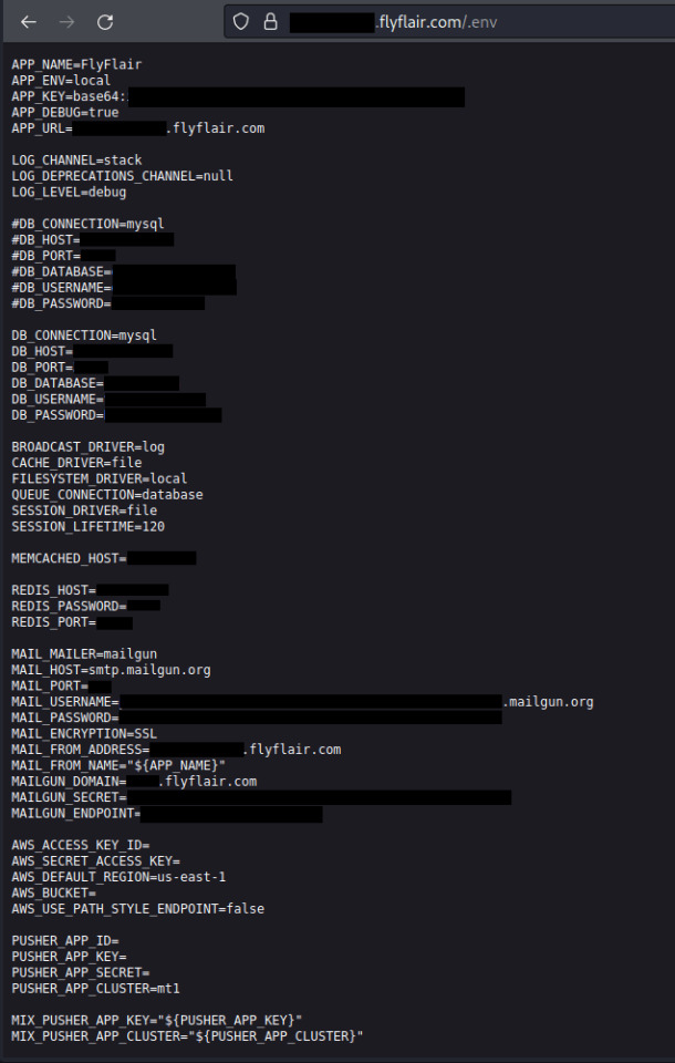
Canadian Flair Airlines left user data leaking for months
Canadian Flair Airlines left user data leaking for months Pierluigi Paganini September 26, 2023 Researchers discovered that Canadian Flair Airlines left credentials to sensitive databases and email addresses open for at least seven months Canadian Flair Airlines left credentials to sensitive databases and email addresses open for at least seven months, the Cybernews research team has…
View On WordPress
0 notes
Text
A Canadian airline canceled flights to a Tennessee city amid Donald Trump's escalating trade war. Flair Airlines, a budget airline based in Edmonton, Alberta, revealed it is calling off all flights to Nashville.
#airlines#canada#tariffs#politics#political#us politics#news#donald trump#president trump#american politics#elon musk#jd vance#law#america#us news#maga#president donald trump#elon#republicans#make america great again#trump administration#republican#democrats#flying#travel#international trade#international travel#canadians#canadian#american
35 notes
·
View notes
Text

I live in Canada and this is a billboard for Flair airlines near my house. It says “ICE IS FOR DRINKING” and “Fly to Orlando for less”
Do they think it’s clever to make light of the violent kidnappings and illegal detainments happening in the US?
5 notes
·
View notes
Text
No. 51 - Alaska Airlines

This is one of my most requested posts. Apparently, a very significant portion of my readers fly Alaska Airlines!
That tracks. Alaska Airlines is the fifth largest airline in the US. A sort of anti-Flair, they are supposedly the least complained-about full-service carrier in the US. They are also one of five remaining US legacy carriers, along with American Airlines, Delta Air Lines, Hawaiian Airlines, and United Airlines. They operate a massive network primarily on the US West Coast, with bits branching out into nearby slices of the Americas. As one might surmise from prior knowledge of the size and population of Alaska, they're actually mostly based in Seattle.
Now, when it comes to their livery, there's one thing that stands out. At least, it stood out to me, and I'm sure at least some of you have had this thought too.
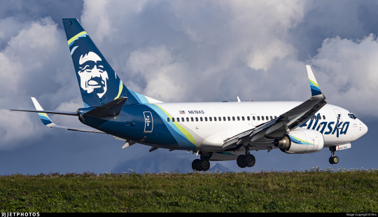
That is a human person's face on the tailfin. But who does that face belong to, and why is it on the Alaska Airlines fleet? This is precisely the sort of trivia I think anyone who knows me would expect me to be able to just rattle off, but actually...I don't know, and neither, as far as I can tell, does anyone else. Isn't that weird?
(By the way, it is indeed Alaska Airlines. I have always found that somewhat unintuitive. It's just not how you're used to hearing things phrased, right? It's Possessive Noun Airlines, Air Noun. America Airlines would sound weird. Alaska Airlines sounds weird. I am never surprised when people mistakenly say Alaskan Airlines, but it's Alaska Airlines. Just so we're all on the same page.)
Alaska's a bit of a hard place to navigate. Big empty place, lots of ice, lots of mountains, islands, trees...not very much asphalt. That's even true now, but it used to be way truer, and even back then people did still live there. And there's a lot of things those people might maybe like to have, like medical care, or food, or just the hypothetical possibility of getting somewhere without having to get the snowshoes out. In that sense, Alaska is a really perfect place for aviation to flourish.
More or less as early as physically possible, when there were planes available that weren't requisitioned for the first World War or owned by the ultra-rich, people were flying in Alaska. In a lot of ways the basic landscape hasn't changed that much. With its surplus of difficult environments and paucity of actual tarmac Alaska's harsh wilderness is an environment only suited for "bush" flying, using smaller, more rugged airplanes specialized for the environment. Some of the most popular models of bush plane are very old, not that dissimilar to what you'd see in the 50s and 60s - apparently, they just don't make them the same anymore, and as long as you don't get your de Havilland Beaver crunched horribly into the side of a mountain there's just nothing that can replace it. Alaska is full of planes on floats, planes on skis, and taildraggers on tundra tires, most of them high-wing and piston-engined. Bush pilots are a unique sort, often doing work that's neither glamorous nor lucrative (nor safe, with Alaska having two to five times the accident rate of the lower 48) but undeniably necessary.
That's not as true of Alaska Airlines. They have a modern fleet, a good safety record except for that one time, and as a category III carrier they make over a billion dollars in revenue each fiscal year, meaning their finances aren't too strained (except for that one time). Unlike the local carriers that connect remote parts of Alaska to resources and to major cities, Alaska Airlines connects Alaska to the rest of the nearby world. (Though it also does short, multi-stop milk run flights.) It's a necessary part of the ecosystem, helping to keep Alaska's beautiful but hostile terrain from getting in the way of daily life. Before they became Alaska Airlines, though, they were far more similar to what you might expect of...Alaska airlines.
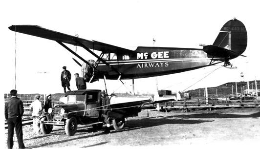
Image: Roy S. Dickson
In 1932, a man with the fantastic name 'Linious McGee' started his very own airline. You could just do that back then. In 1934 it was merged into Star Air Service, another tiny airline. Star Air Service had also been founded in 1932, born from the flight-school-starting dreams of a wealthy miner with the similarly wonderful name 'Wesley Earl Dunkle'. Apparently Star had its first ever aircraft, a Fleet B-5 biplane, brought to Alaska by steamship, which I just find fairly interesting. I guess this was before you could even ferry an airplane directly to Alaska by air. They ate up a few other small airlines (and their routes), and in 1943 they won a small scuffle against another pretender to formerly rebrand themselves as Alaska Airlines. So it's been 80 years of that now!
They've gone from flying Curtiss Robins, Ford Trimotors, and Lockheed Vegas to flying basically only 737s, save a few vestigial A320 family aircraft acquired when merging with Virgin America which they plan to phase out by the end of 2024. Their livery is also on E175 regional jets operated by Horizon Air and SkyWest. The airplanes flying for them number around 300. That's incredibly large even by the standards of major airlines (not even counting the SkyWest planes that have the livery).

The Alaska Airlines livery is not breaking any molds and I need to say that upfront. This is a very straightforward pattern I've taken to calling the Lufthansa Declined, or the Lufthansa Line SAS Variation. (Because the push and pull of trend cycles in brand identity is basically comparable to chess, right? Maybe? No? Not really?) I've recently codified the concept of the Lufthansa Line, the straight line continuing where the tailfin left off to carve through the fuselage. This is a very common and very disappointing fuselage trope. The Declined, or SAS Variation, is named for an airline I specifically contrasted with Lufthansa from my very first post on this blog, SAS.
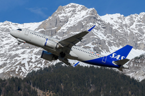
The SAS Variation simply curves this line outwards towards the front of the plane, stopping the cutoff from being quite so blunt and hopefully undoing the unbalancing effect somewhat. This can solve some of the nastier effects of Lufthansa Lines, particularly on shorter planes, but can also look very wonky if implemented without enough care. It's not always a big improvement, but it's definitely not the exact same thing, either, and it's this shape which Alaska Airlines attempts. Being introduced in 2016, this livery actually pre-dates SAS, but Delta and Lufthansa weren't starting their own namesake patterns either. The names aren't attributed based on innovation, but on formative status in my own specific understanding of airline liveries. SAS as contrasted to Lufthansa is the holotype for my creation of the taxon, and thus earlier liveries are retroactively SASlikes. Birds are dinosaurs and whales are ungulates. Taxonomy is imperfect and has to accommodate new discoveries within a sometimes unintuitive framework. That's just how it is.
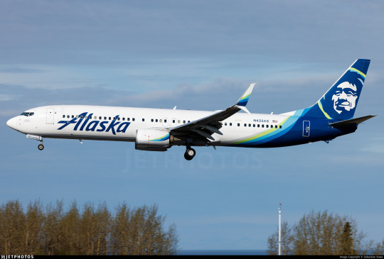
I think they do better than many. The fact that they use so many colors, layered over each other, is crucial to the effect. It accomplishes similar things as a gradient might, transitioning from dark to light with minimal pain in the process.

Image taken from Alaska Airlines's very useful branding style guide.

The shades of blue and green used resemble the Aurora Borealis. I can't find anything confirming that this is intentional but I can't imagine it isn't. I think they're very nicely chosen. Different lightings can make the blue (Alaska's material calls it midnight blue, but it's technically Prussian blue) look anywhere from true vivid blue to more of a deep ocean color, which is one of my favorite shades. In particular, the very washed out yellowish green is an absolutely gorgeous choice for a highlight color. I like that the colors aren't given equal purchase, though, and that the green is used sparingly for highlight, and to create that lovely subtle 'halo' around the face on the tail. Sometimes less is more, and this is one of those cases. In fact, their own website states:
Midnight is our primary brand color, and should be used sparingly to avoid overuse—giving more prominence to the Alaska Airlines brand.
(They also note that they took specific efforts in the design process to make sure these colors had significant contrast between them to meet accessibility standards, which I really appreciate and want to see more of.)
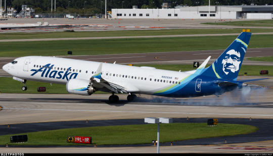
For example, if the 'intermediate' blue colors took up more of the plane, or were separate from the green, I would probably not feel any real way about them. I definitely wouldn't think they were nice if they just did a standard Lufthansa Line block with each color individually expressed. But using them as a trim to a nice clear deep blue, overlapping each other in a way that's very carefully mapped out but seems at a glance essentially random, halfway to mixing, like the dark tail is melting slowly into the fuselage...that's nice. That adds something.

The partially-overlapping, brushlike curves are further expressed as swashes on the winglets and engines. What's interesting to me is that if you look closer you can see that the little curves are on both the inboard and outboard sides of each engine and winglet, so you get that consistent curve, hypothetically, no matter what angle you see it from. I do think I appreciate that. The curves are just never going to all line up, because airplanes are inconveniently three-dimensional and there are as many angles to view them from as there are Planck lengths at a distance where you can tell what it is you're seeing. This is a weakness in all liveries more detailed than a Braniff jellybean and adding the curves to even the side of the engine that you're usually not going to see is definitely an appreciated attempt to mitigate this. Does it work? Maybe not totally, but I see the effort.

While there's never a perfect syzygy into one continuous line, the curves seem like they're part of the same nebulous body from most angles. I appreciate this approach. I think making things look pretty good from most angles is worth more than making things look really good from one angle and awkward from all others. As they say, the perfect is the enemy of the good. I absolutely love the use on just the inside middle of the scimitar winglet, which I already think is a gorgeous feature that just elevates the MAX and retrofitted 737NGs compared to the vanilla model. It's distinctive and stylish, and the limiting of the color to just the lower half of the upper blade has a real restrained elegance to it - these slashes of color are all the more effective for the way they interact with the space around them.

Just look at these winglets. They're such a tiny feature. It's absolutely wild that I can be this in love with winglets, but there's just something about split scimitar wingtips that make me go completely wild. The amount of space and the interesting shape leaves so much more room for creativity than just about any other wingtip device. Alaska Airlines does have planes with other wingtip styles, and it uses those effectively too - covering the lower half of canted/blended winglets and fully encompassing the interior of less pronounced split winglets - but this is where they look their best.
Back to bad angles, though...


Alaska Airlines has a weird weak spot, and it's from the front and slightly above. All those gorgeous swoops on the winglets and nacelles are basically impossible to see due to their two-dimensional nature, and you can see how the colors don't fully cover the back of the fuselage. My normal policy is to judge liveries by their weakest link, but I honestly almost want to be lenient on this because of how unlikely it is that you're ever going to see an airplane from this angle. The only situations you're ever above an airplane in are ones you're basically never going to encounter as a regular passenger. Don't get me wrong, I still think this could have been designed in a way which eliminates this weak point, but as far as weak points go this is quite excusable. Is that what Thetis thought when she dipped her son in the Styx? Sure, probably, but I stand by my take. For a lot of liveries their worst angle is close to side-on, which is just fully experience-ruining. This? I'm okay with this, relatively speaking.

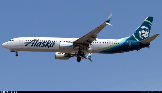
On the other hand, one of the better angles is one a lot more people will see - below and to one side. The taper of the different bands of color really prevents the awful jarring cutoff that Lufthansa Line and SAS Variation liveries often have, and I feel like they trick the eye into thinking up more of the fuselage is occupied than it really is. Also worth noting is that the grey underside, which resembles a shadow, is actually intentionally painted on, which is lovely. This is a feature common to the Deltalike livery trend that I outline at the start of my Southwest post, which I do think is one of the things that makes me honestly a bit sympathetic to Deltalikes when looking at them next to Lufthansalikes - at least there's an attempt to distribute visual detail evenly. Deltalikes were already a bit dated by 2016 (it was not the longest-lived trend, though it came at a time in my life perfectly positioned to make me think it was more prominent than it was) while SASlikes were on the rise, and this livery has aspects of each, but it feels less like a conflicted result of an intermediate period in dominant trends and more like something which intentionally pulled features from both where it thought they might work best. It's rare that I get this sense from a livery. That's the right way to use trends - as inspiration, not a template.

Alaska Airlines is definitely not a true Deltalike, and I would argue it's not a true SAS Variation either. (For the record, I would consider the 1998 SAS livery a Deltalike, funnily enough!) It incorporates features of both, which makes me feel uncomfortable classifying it definitively as either, though it's definitely more of a SASlike than not. For example, from the side it just is a SASlike, because the grey doesn't go high enough and isn't contrasting enough to be visible except from below. This is in contrast to actual Deltalikes, which have a thin but clearly visible line on the lower side where the underside's block of color bleeds out.
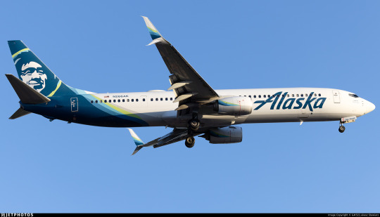

This grey color is also on the engine nacelles, although it is very subtle. This does bring up a minor gripe of mine, which is that the design on the pods cuts off at a bit of an awkwardly sharp angle, usually not worth remarking on but possible to notice from some angles if you are, say, a livery reviewer and you look at these things very closely. What I do like, though, is that the grey on the belly actively connects to the color on the tail, feeling like an extension of it instead of an awkward choice made to mitigate it.
The final specific feature of the livery I think I want to comment on is the wordmark. I really like the wordmark. It's not in their custom typeface, AS Circular, a Roboto-ish sans serif I'm not a gigantic fan of, although I really like their custom web icons. They also use Highest Praise by Adam Ladd, a fairly cheap commercially available font.

As for the wordmark itself, though, I can't seem to find what font it's based on! I have to say the original 1966 logo would be great if another airline were to use it, the 1972 is somehow giving supermarket chain, and the 1990 logo would be great if not for the weird way the K overlaps the A, which just feels sloppy and unprofessional. The 2014 and 2016 incarnations, though, are great. The 2016 one (designed by the firm Hornall Anderson) feels like a great update, just cleaning up the earlier version, though I somewhat miss the lightning-bolt S.


The placement is what I want to talk about, though. Placing a wordmark is more of an art than you might think - I'll show a couple examples of Alaska itself doing a slightly wonky job later - but when Alaska's placement is good it's great. It's one of the least cramped-looking wordmarks I've ever seen, feeling free and airy, spreading upwards above the window line. The descending line on the K and the trailing like on the A both create a feeling of freedom, like it could just keep going but doesn't want to, yet is tastefully restrained and doesn't actually overstep its bounds. I like the solid single color, and I like that it reaches almost to the engines, preventing that empty-forward-half feeling. The one thing I'll comment on for this set of images is that the left-to-right reading direction of English does mean that it looks distinctly worse seen from one side than the other. I much prefer the forward slant, which feels aerodynamic fitting with the motion of the plane, vs the alternative, in which it feels like the wordmark is trying to catch up with the aircraft's nose.
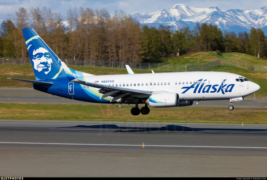
On shorter planes, though, Alaska fumbles a little. They choose to line up the wordmark with the engines instead of with the nose, creating an awkward look when it overlaps the door and nearly reaches the cockpit window. I would have leaned in the other direction were I them. This picture also demonstrates a strange feature which rears its head in certain lightings where the shading on the tailfin image makes it look almost wrinkled. I don't have anything to add to that or know how to solve it, but I need to point it out.
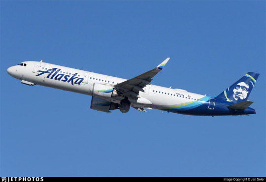
On a very long plane, conversely, the back half of Alaska's planes begins to feel that Lufthansa Line emptiness. The vast, vast majority of their planes are of a moderate enough length that neither issue is too overpowering, but I'm taking a wide view here! Also, the wordmark here seems to not be aligned with the engines, so...what's the idea?

Alaska Airlines is an interesting livery. More interesting than I thought I'd find it for sure. It's not just a SASlike with pleasing colors and a nice wordmark, it's a SASlike with thought put into features that can mitigate the inherent weaknesses of the SASlike. It doesn't always fully succeed, nor does it comprehensively fail, but it definitely tries.
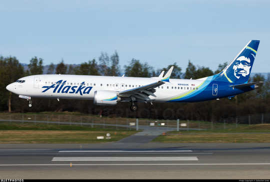
At the end of the day, as usual, I wish there was less white. I'm sure it could have been done. I don't have an obvious solution in mind like I do for some hypothetical redesigns, so it's something I would have to think over and really dig into, but, like, Alaska Airlines makes more than a billion in revenue every year so I think that's reasonable to expect from them.
I initially started using the grading system as a way to categorize liveries without limiting myself to a very specific scale that I'll dither about for years and then change my mind about later, but it's started to end up in that role. I just don't know what better solution there is, so I'm going to continue trying to make it work. Alaska Airlines is a livery that I ultimately think I like, that I think is designed decently, but that is limited by the fact that a really good SASlike is still a SASlike - mostly white and rear-heavy. It's getting the most possible out of a flawed paradigm, and I've been inconsistent so far on how I rate a good SASlike or Lufthansalike because it causes me some legitimate cognitive dissonance.
I'm giving Alaska Airlines a provisional B-.
I think I might downgrade it to C+ later, which is why I say it's provisional. A good execution of something really limited - how do I even rate that? It's somewhere between tepidly good and better-than-average, which is a really awkward place to be. But that's probably a conversation for another day, because this post is long enough and I'm still not done.
Okay, I teased this earlier.

Him. Who is he?

The short answer: nobody knows. Not me, and not Alaska Airlines.
The long answer: deserves its own post. Both because it's long, and because I've hit image limit. And there will be images. Join me in tomorrow's bonus, where we climb our way through the rugged terrain of seemingly-lost history to attempt to put a name to this ubiquitous face.

#tarmac fashion week#grade: b-#era: 2010s#era: 2020s#region: north america#region: united states#alaska airlines#legacy carriers#lufthansa declined#deltalike#skywriting
51 notes
·
View notes
